.svg)



Key Takeaways
- Glassmorphism uses static frosted blur; Liquid Glass reacts to real light.
- Liquid Glass needs GPU rendering; Glassmorphism runs on simple CSS.
- Both styles struggle with WCAG contrast ratio and text readability.
- Glassmorphism fits everyday products; Liquid Glass suits spatial and premium apps.
- Apple made Liquid Glass a full OS-level design system in 2025.
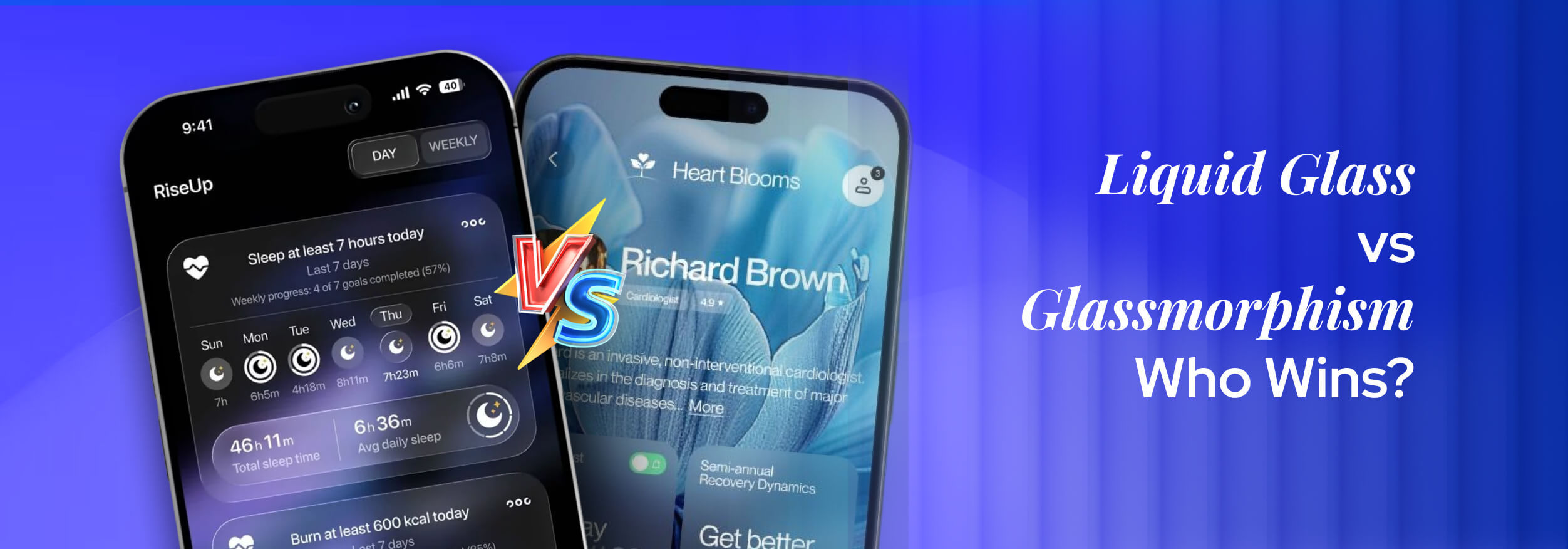
You open your phone, and the screen looks like real glass. That is not a simple trick anymore. Two design ideas are behind this visual magic: Glassmorphism and Liquid Glass.
So, what are they exactly? Glassmorphism is a popular design style that makes elements look like frosted glass. Liquid Glass is Apple's new design system that makes glass feel alive and real.
Both ideas sound similar, but they work very differently. One is a trend, and the other is a full design system built by Apple itself. Read this blog to clearly understand both terms and see how they are different from each other.
What Is Liquid Glass in UI Design?
Liquid Glass in UI is a modern style that makes digital elements look and feel like real glass. It does not just add a blur effect. It reacts to light, depth, and motion as actual physical glass does.
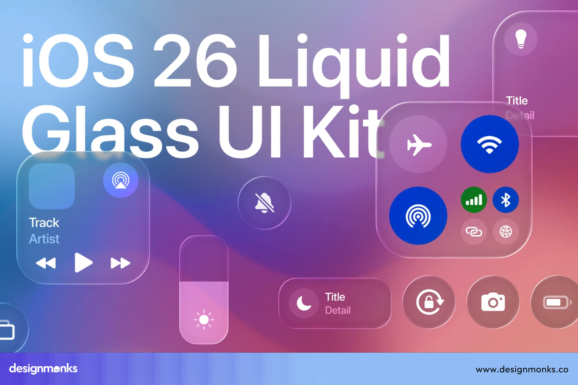
Apple introduced liquid glass style through Apple VisionOS and later brought it into iOS 26. The interface uses real-time rendering to create optical depth on screen. Every element feels like it has physical weight and a glass surface.
Apple's own design team described Liquid Glass as the most extensive software design update they have ever made, one that reshapes the relationship between interface and content through a completely new set of design principles.
This style sits on the idea of fluid transparency. A Liquid Glass UI element shifts its look based on the colors and light around it. The translucent UI layer does not stay the same; it responds, adapts, and reflects like real glass in your hand.
Core Visual Characteristics of Liquid Glass
Liquid Glass does not work like a simple filter you add on top of a design. It has several visual behaviors that work together to create that real glass feel on your screen.
- Fluid Highlights: Light moves across the surface of the element as you scroll or tilt the screen, just like real glass catches light differently at every angle.
- Refraction: The content behind a Liquid Glass element bends slightly, the same way a glass object distorts the view behind it in real life.
- Adaptive Transparency: The element adjusts how see-through it looks based on the background content. The dark content behind it makes it appear different than bright content.
- Realistic Reflection: The surface uses reflection mapping to show a soft mirror-like layer on top. This makes the element look three-dimensional and physically real.
- Soft Edge Distortion: The edges of the element do not stay sharp and clean. They use optical blur to blend softly into the background, which gives a natural glass edge feel.
What Is Glassmorphism in UI Design?
Glassmorphism is a UI design style that makes cards and panels look like frosted glass. You see a blurred background behind a semi-transparent layer, which creates a soft and modern visual feel on screen.
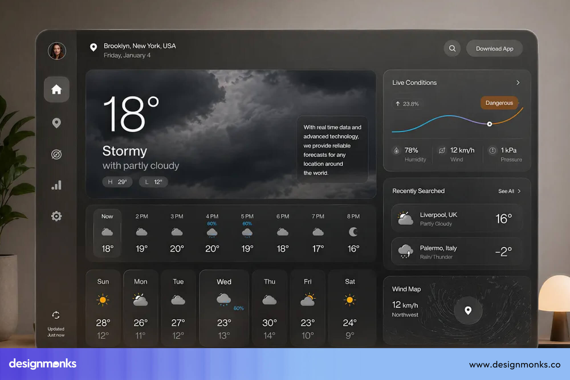
Designers use CSS backdrop-filter to create this frosted blur effect in web projects. Tools like Figma made it very easy to apply this style. A blurred translucent card sits on top of a colorful gradient background in most designs.
This style focuses on layered UI elements placed over each other with blur and transparency. The frosted glass design does not try to copy real glass physics. It creates a clean, calm, and visually light interface through blur effect UI techniques.
Nielsen Norman Group, one of the most respected names in UX research, noted that thoughtful use of Glassmorphism can help designers effectively establish visual hierarchy and depth, but without a solid grasp of visual design principles, it can pose significant accessibility and usability challenges.
Core Visual Characteristics of Glassmorphism
Glassmorphism gets its look from a small set of visual rules that work together. Each rule adds one layer of the frosted-glass feel that makes this style so easy to recognize on any screen.
- Gaussian Blur: The background behind the card gets a soft blur applied to it, which creates that classic frosted glass look people recognize immediately.
- Semi-Transparent Background: The card itself uses a transparency layer with a white or light color at low opacity, so the blurred content shows faintly through it.
- Shadow Elevation: A soft drop shadow sits below the card to make it feel lifted above the background, which adds a sense of depth to flat screen layouts.
- Soft Border Glow: A thin, semi-transparent white border wraps around the card edge, which gives the element a gentle glow and separates it clearly from the background.
- Layered Cards: Multiple glass cards stack on top of each other with slight offsets, and each layer adds more visual depth to the overall frosted glass design.
Fusing with Glassmorphism, many tech geniuses and designers have made an upgraded design. For example, Design Monks introduced Ribbedmorphism as a brand-new style when launching their official website.
Liquid Glass vs Glassmorphism: Visual Comparison
Even though Liquid Glass and Glassmorphism both use transparency and blur, they create very different feelings on screen. One feels like a static frosted window, and the other feels like a real glass object that responds to the world around it. Here are the core differences in terms of visuals:
Transparency Behavior
The opacity in Glassmorphism stays fixed after you set it once in your design tool. No matter what appears behind the card, that transparency value never shifts or adjusts on its own.
Liquid Glass works in the opposite direction. The translucency level changes automatically based on background brightness and color, so every element always looks naturally placed on the screen.
Blur and Background Treatment
One consistent Gaussian blur value covers the entire card background in Glassmorphism. The CSS backdrop-filter applies it uniformly, and nothing about that blur reacts to content or movement at all.
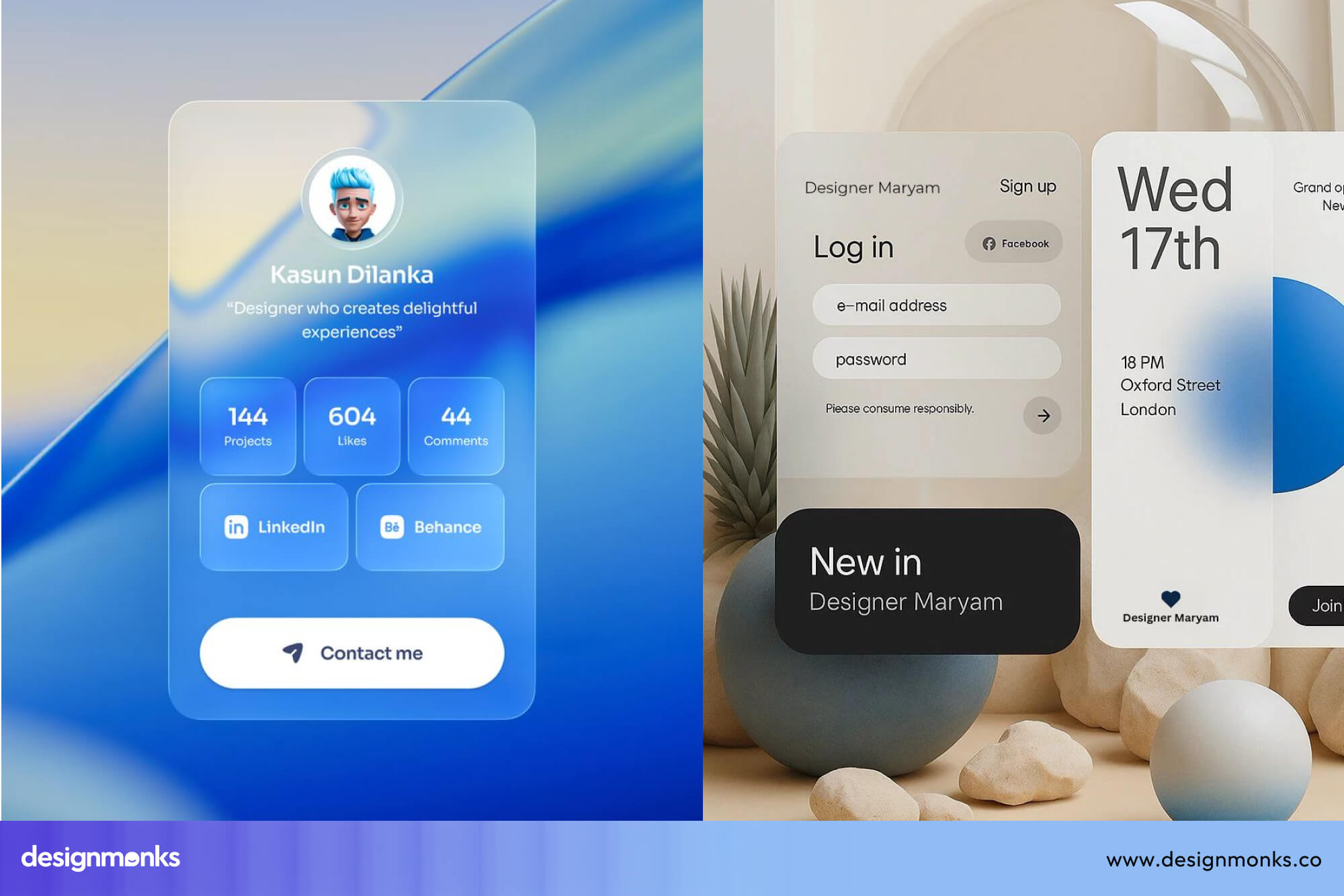
The background treatment in Liquid Glass is far more layered. Some areas refract more, others stay clearer, and the whole blur responds to motion and depth in real time across the surface.
Reflection and Lighting Realism
Real light behavior is completely absent in Glassmorphism. A soft border glow and light tint create the frosted look, but no actual surface lighting or reflection exists behind that visual effect.
Liquid Glass uses reflection mapping to bring physical realism to the screen. Highlights shift as content changes beneath the surface, and virtual light catches the glass edge in a way that feels genuinely real.
Motion Responsiveness
Here is a quick side-by-side view of how both Glassmorphism and Liquid Glass design handle movement:
Liquid Glass responds to every interaction your device registers. Glassmorphism stays exactly as the designer left it, with no reaction to any movement or change happening on screen.
Realism Level
Glassmorphism never pretends to be actual glass. It borrows the frosted look but stays clearly digital, and that honest simplicity is a big reason designers loved it so much as a UI trend.
Every detail in Liquid Glass targets physical realism. Optical blur, refraction, and soft edge distortion all work together to make the element look like a real glass object placed directly on the screen.
Texture and Surface Feel
No surface texture exists in Glassmorphism at all. The card stays completely smooth, with only color, blur, and transparency doing all the visual work across the entire element background.
Liquid Glass adds a natural, uneven surface quality that real glass has. Light catches different parts of the element at different strengths, and that variation gives the surface a physical, touchable feel.
Visual Hierarchy and Depth
Both styles handle UI depth and visual hierarchy differently, and those differences affect how a user reads the screen:
- Glassmorphism uses shadow elevation and stacked cards. Each layer sits above the previous one, and that stacking tells the user which element matters most.
- Liquid Glass builds depth through optical physics. Refraction and reflection make elements look like they occupy real space, so the hierarchy feels three-dimensional rather than flat.
The gap between these two approaches is significant. One organizes content visually, and the other makes the screen feel like a physical environment the user is looking into.
UX Differences Between Liquid Glass and Glassmorphism
Liquid Glass and Glassmorphism both look beautiful on screen, but beauty alone does not make a design work well for real users. The way each style handles readability, clarity, and user attention tells a very different story about usability.
Readability and Contrast
Text placed on a Glassmorphism card often struggles with contrast ratio. The blurred and semi-transparent background shifts in color depending on what sits behind the card, and that shift can make text harder to read.

Liquid Glass faces a bigger challenge on this front. The surface changes dynamically, so the contrast between text and background never stays predictable. Designers must work extra hard to keep text visible at every possible moment.
Accessibility Challenges
WCAG guidelines set clear rules about contrast ratio for text on any background. Both styles make it genuinely difficult to meet those standards, but each one creates its own specific type of accessibility problem for users.
Liquid Glass adds motion into the equation, which creates real problems for users with vestibular disorders. Constant surface movement and shifting highlights can cause discomfort or even dizziness for sensitive users.
User Attention Guidance
Glassmorphism guides user attention through visual hierarchy. A card with a stronger blur or deeper shadow naturally feels more important, and users pick up on that difference without any extra effort on their part.
On the other hand, Liquid Glass draws attention through movement and light. The eye naturally follows motion, so a surface that shifts and reflects pulls focus toward itself. This behavior can work powerfully in the right design context.
However, that same motion can pull attention away from the actual content on screen. A button that glows and shifts too actively competes with the message it is supposed to carry for the user.
Cognitive Load
Cognitive load means how much mental effort a user needs to understand and use the interface. A design with high cognitive load tires the user out faster and makes simple tasks feel unnecessarily hard.
Glassmorphism keeps cognitive load relatively low. The visual effect is calm and consistent, so the brain processes it quickly. Users spend their mental energy on the content, not on decoding the surface they are looking at.
Liquid Glass sits on the heavier side of this scale. The dynamic surface, shifting reflections, and constant motion give the brain more visual information to process at every single moment during use.
- A calm interface lets users focus on their task directly
- A busy surface forces users to filter out visual noise first
- Filtering visual noise uses mental energy that belongs to the actual task
- Over time, that extra effort adds up and makes the experience feel tiring
The ideal approach is to use Liquid Glass with restraint. When every element moves and glows at the same time, the accessible UI design principle of clarity disappears completely from the screen.
Performance and Development Complexity
Both styles look like they belong in the same family, but the engineering work behind each one sits on completely opposite ends of the difficulty scale. One needs a few CSS lines, and the other needs serious graphics knowledge.
Building Glassmorphism with CSS
Any front-end developer can build a Glassmorphism card in under ten minutes. The CSS backdrop-filter property handles the frosted blur, and a few transparency and border values complete the entire effect without any extra tools.
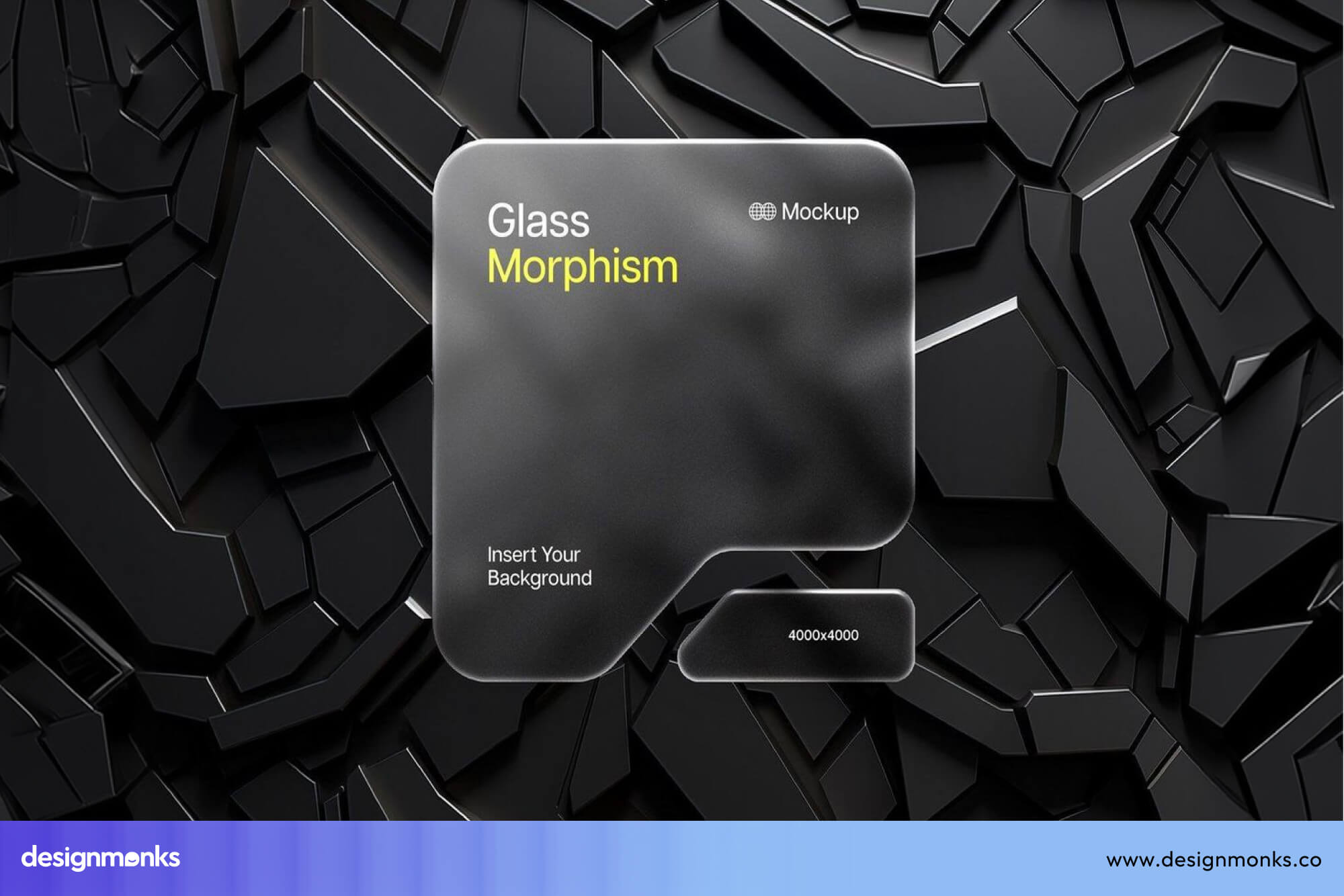
Browser support for this approach is solid across modern browsers. The rendering cost stays low because the GPU handles backdrop-filter efficiently, and the static nature of the effect means no continuous processing happens after the initial paint.
Building Liquid Glass with Shaders and Advanced Rendering
Liquid Glass cannot exist with CSS alone. It needs WebGL or Metal-level rendering to simulate refraction, reflection mapping, and real-time surface lighting across every frame the screen displays to the user.
Developers must write custom shader code to control how light bends and reflects on the surface. This level of implementation complexity sits far outside regular front-end work and requires graphics programming knowledge that most UI developers do not have.
Apple builds Liquid Glass directly into the operating system for this exact reason. Doing it in a browser or cross-platform app with the same quality is currently very difficult and resource-heavy.
According to the Graft, there is currently no standard, reliable way to recreate Liquid Glass in the browser. Developers can attempt it with SVG filters or WebGL, but the effect breaks in Safari, carries heavy rendering costs, and rarely matches what the original design file actually shows.
Mobile Performance Impact
Glassmorphism runs comfortably on mid-range mobile devices. The GPU rendering demand is low, battery impact stays minimal, and the frontend performance remains smooth even on older hardware without any major optimization work.
Liquid Glass demands significantly more from mobile hardware. Continuous real-time rendering drains battery faster and can cause frame drops on devices without a powerful GPU.
Best Use Cases for Each Style
Both styles have their right place in modern UI design, but putting the wrong style in the wrong product creates lots of user pain points. Context always decides which one fits better.
Where Liquid Glass Works Best
Liquid Glass feels at home in products where the interface itself is part of the experience. When users expect something that feels physical, spatial, and premium, this style delivers a level of realism that no other UI approach can match right now.
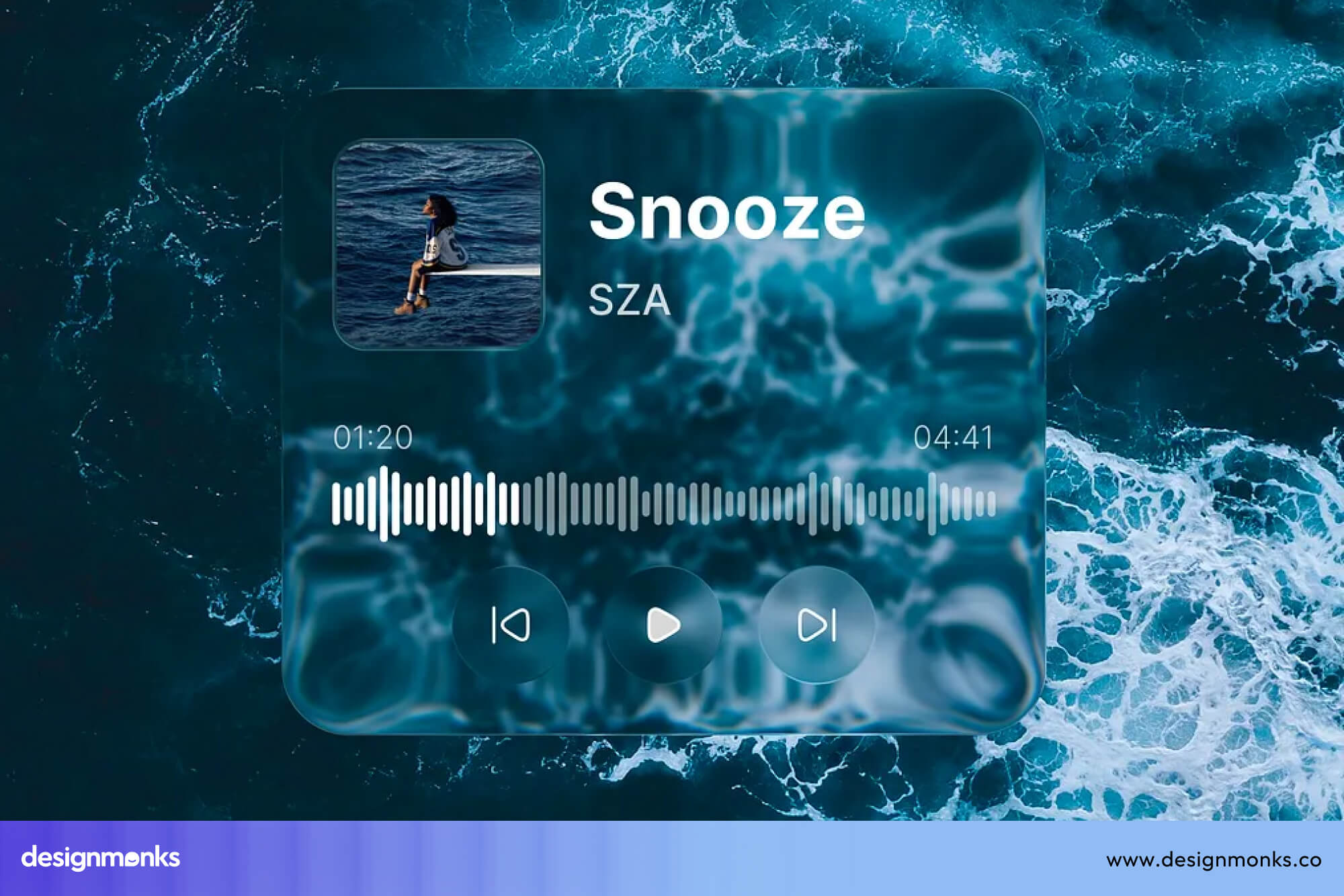
- Spatial UI: AR and VR interfaces benefit greatly because Liquid Glass elements feel like real objects placed inside a three-dimensional space around the user.
- Premium Apps: High-end mobile app UI products like luxury brand apps or professional creative tools use this style to signal quality and visual sophistication to users.
- Immersive Products: Games, cinematic apps, and experience-driven products use Liquid Glass to blur the line between the digital screen and a physical environment.
- Futuristic OS: Operating system interfaces like Apple VisionOS use this style because the entire platform is built around depth, space, and physical interaction with digital elements.
Where Glassmorphism Works Best
Glassmorphism is a practical style that works well in everyday digital products where clarity and calm matter more than realism. It adds visual polish without demanding heavy hardware or complex development work from any team.
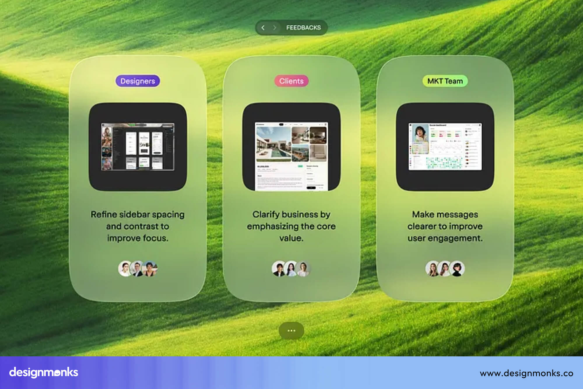
- Cards: Information cards on landing pages and modern UI examples look clean and organized with a frosted glass treatment sitting over a gradient background.
- Dashboards: SaaS dashboard products benefit because glassmorphism keeps data readable while adding a modern visual layer that feels light and professional on screen.
- Hero Sections: A frosted card placed over a bold background image in a hero section creates immediate visual contrast and draws the user's attention to the key message.
- Fintech UI: Finance apps and banking products use this style to feel modern and trustworthy at the same time, with clean cards that keep numbers easy to read.
- Auth Screens: Login and signup screens across mobile app UI and web products look polished with a centered glass card placed over a soft gradient or blurred background image.
Pros and Cons of Liquid Glass
Liquid Glass looks visually impressive, but every design style comes with trade-offs. Before adopting it, teams should understand both the value it brings and the challenges it creates.
What Liquid Glass Gets Right
The strengths of Liquid Glass are genuinely impressive, and they go far beyond surface-level beauty. This style brings qualities to the screen that no previous UI trend has managed to achieve at this level of realism.
- High Realism: Refraction, reflections, and lighting make different UI elements feel physically present on the screen.
- Premium Feel: The polished visual style helps products appear more modern, high-end, and trustworthy.
- Immersive Depth: Layered lighting and spatial effects create a stronger sense of depth and interaction.
- System-Level Polish: Native support across a system keeps the interface visually consistent and refined.
- Motion Harmony: Dynamic highlights respond naturally to user actions, making interactions feel smoother and more alive.
Where Liquid Glass Falls Short
The challenges behind Liquid Glass are serious enough that many teams should think carefully before committing to this style. The gap between how good it looks and how hard it is to build correctly is very wide.
- GPU Intensive: Real-time rendering can reduce performance on older or mid-range devices.
- Complex Engineering: Building accurate glass effects often requires advanced graphics and shader knowledge.
- Accessibility Balancing: Maintaining proper contrast and readability on shifting surfaces is difficult.
- Battery Drain: Heavy GPU usage increases power consumption, especially on mobile devices.
- Overkill for Simple Products: Basic dashboards or content-focused platforms rarely benefit from this level of visual complexity.
Pros and Cons of Glassmorphism
Glassmorphism earned its popularity for real reasons, but it also collected fair criticism over time. Both sides matter before any designer commits this style to an actual product.
What Glassmorphism Gets Right
The strengths here are practical and immediately visible. Most teams can apply this style quickly without special skills, heavy tools, or serious performance concerns on any device.
- Easy Implementation: A few CSS lines with backdrop-filter create the full effect, and no graphics knowledge is needed at all.
- Modern Aesthetic: The frosted look feels light and contemporary, which makes any product appear more polished without a large design investment.
- Trend Familiarity: Users already recognize this style, so the interface feels comfortable and trustworthy to new visitors right away.
- Lightweight Performance: GPU cost stays low, and the style runs smoothly even on older mid-range devices without extra optimization.
Where Glassmorphism Falls Short
Some weaknesses are genuinely hard to fix, and designers who pushed this style too far discovered those limits very quickly in real products.
- Contrast Problems: Text on a shifting, blurred background often fails WCAG contrast ratio standards, which hurts real users directly.
- Feels Repetitive: Years of overuse across the web made this style feel too familiar to stand out anymore.
- Background Dependent: Plain or neutral backgrounds destroy the visual effect this style depends on entirely.
Liquid Glass vs Glassmorphism: Which Is Better?
No single answer fits every product here. The right design decision depends entirely on what your product does, who uses it, and what engineering resources your team actually has available.
Liquid Glass suits immersive, premium, and spatial products. Glassmorphism fits everyday SaaS, fintech, and web products where clarity and fast development matter more than visual realism on screen.
- Choose Liquid Glass when your product lives inside a spatial, AR, or premium environment where realism is a core part of the user experience.
- Choose Glassmorphism when your team needs fast delivery, broad device support, and a clean, modern aesthetic without heavy GPU or engineering costs.
- Mix both carefully when your UX strategy calls for a hero section with depth and a functional dashboard that stays readable and accessible for all users.
Examples of Liquid Glass and Glassmorphism in Real Products
Real products show these styles better than any definition can. Looking at actual UI inspiration from shipped products helps designers understand how each style behaves outside of a controlled design tool environment.
Liquid Glass in the Real World
Apple leads every real-world example of Liquid Glass in production. These products show how the style performs when real users interact with it daily across different screen types and device categories.
- Apple VisionOS: The entire spatial interface runs on Liquid Glass, with panels and buttons that bend light and reflect the environment around the user in real time.
- iOS 26 and macOS Tahoe: Apple brought Liquid Glass into its core mobile and desktop OS, with tab bars, notifications, and control elements all carrying the dynamic glass surface treatment.
- Apple Control Center: The redesigned control panel shows fluid highlights and adaptive transparency that shift as the background content changes beneath each control button on screen.
Glassmorphism in the Real World
Glassmorphism appears across thousands of everyday digital products. Its presence in major tools and operating systems proved that frosted glass design works reliably at a production scale for real users.
- Windows Fluent Design: Microsoft used frosted blur panels across the Windows 11 system UI, which brought Glassmorphism into the hands of hundreds of millions of users worldwide.
- Figma Community: Thousands of free Glassmorphism UI kits and templates on Figma Community show how widely designers have adopted and built with this style across every product category.
- macOS Big Sur: Apple's 2020 OS redesign introduced frosted glass sidebars and menu bars that directly inspired the global Glassmorphism trend seen across the entire web design industry.
End Note
Liquid Glass and Glassmorphism both bring glass-inspired beauty to digital products, but they serve very different purposes in real design work.
Glassmorphism is proven, accessible, and easy to build for almost any team. Liquid Glass is powerful, realistic, and built for the next generation of spatial and immersive products.
Your product type, team capacity, and user needs should drive that final design decision. Pick the style that solves your actual problem, not just the one that looks impressive on a design inspiration board. By any chance, you’re confused and need professional help, reach out to Design Monks to get things done right.


.avif)
.avif)
.avif)
.avif)


.avif)
.avif)
.avif)
.avif)






.avif)