
.svg)


Key Takeaways
So, Apple surprised everyone by jumping from iOS 18 all the way to iOS 26. It caught a lot of people off guard, but there’s a good reason behind it. They wanted to bring something fresh and more connected across their devices.
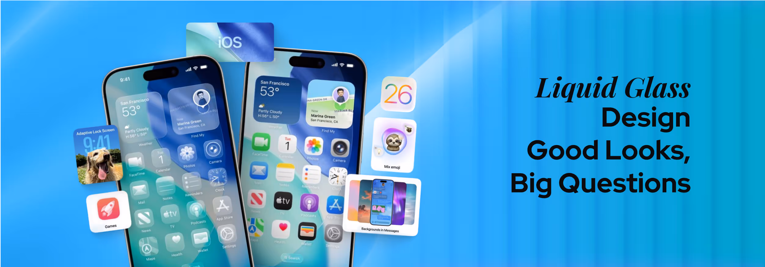
The big change this time is something they’re calling Liquid Glass design. It makes your phone screen look like smooth and frosted glass with soft edges, a bit see-through, and kind of alive when you use it. It’s a new way to make everything feel more natural and dynamic.
Well, want to know more about this liquid glass design?
No worries, I’m in. In this blog, I’m going to share what Liquid Glass really means, why Apple made this bold move, and whether it’s actually a step forward or just a pretty effect that might not work so well in everyday use.
What is Liquid Glass Design?
Liquid Glass is Apple’s fresh design style that creates a new look for how their software feels. It’s inspired by something they call visionOS, which aims to make digital screens feel more real and alive.
This design creates an effect of looking through soft, frosted glass where things aren’t completely clear, but you can see shapes and colors underneath. That’s the main idea here. The design uses layers that are see-through with a shiny and crystal-like touch that changes as you interact with it.
You’ll notice this style everywhere in iOS 26. It’s on your Lock Screen, the Camera app, Photos, Safari browser, and even CarPlay in your car. Apple Music and other services also get this sleek new look.
This doesn’t stop with just looking, though. The design reacts to your touch and moves smoothly to make everything feel more natural and alive.
The Design Philosophy Behind Liquid Glass Design
Apple says the aim is clear: they want something digital to feel alive and real. Craig Federighi, Apple’s software chief, explained during WWDC that Liquid Glass borrows its transparency and depth from visionOS so apps feel like part of the environment around you.
This new look is all about emotion, where the buttons don’t just sit there; they glow, bend slightly, and flow as you scroll. According to Apple Newsroom, Alan Dye, head of Human Interface Design, highlighted that this is Apple’s “broadest software design update ever,” designed to make even simple taps feel "fun and magical."
Apple deliberately uses layering and gentle movement to give apps a spatial feel, as if elements have room to breathe. They want your device to respond in a way that feels personal and connected.
By bringing visionOS ideas into iPhones, iPads, and Macs, Apple is unifying how everything looks. This new strategy and design philosophy simply makes their ecosystem feel more joined up than ever.
Where You’ll See Liquid Glass in Action?
Once you update your Apple device, you won’t have to go far to notice the Liquid Glass design. It’s not just a few icons here and there; it’s across many core apps and screens you use every day.
Let’s check out some of the key places where this new look really comes to life:
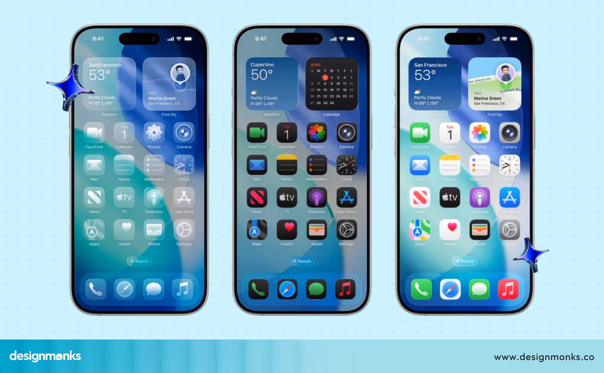
Lock Screen & Wallpapers
The moment you wake your device, you’ll see it. Wallpapers feel deeper, almost like they’re behind a sheet of frosted glass. Widgets gently respond to your touch, and everything shifts slightly with movement to make the screen feel less flat and more alive.
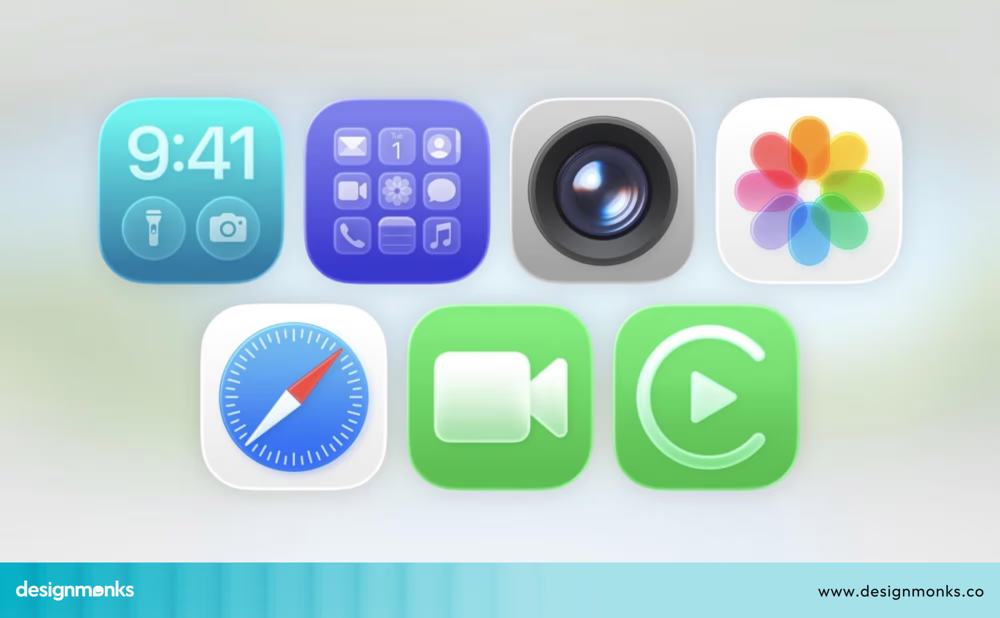
Camera App
Apple gave the Camera app a complete visual refresh. The buttons now sit inside smooth, glassy circles. It’s easier to focus on your shot because everything looks cleaner and more organized, but still playful in motion.
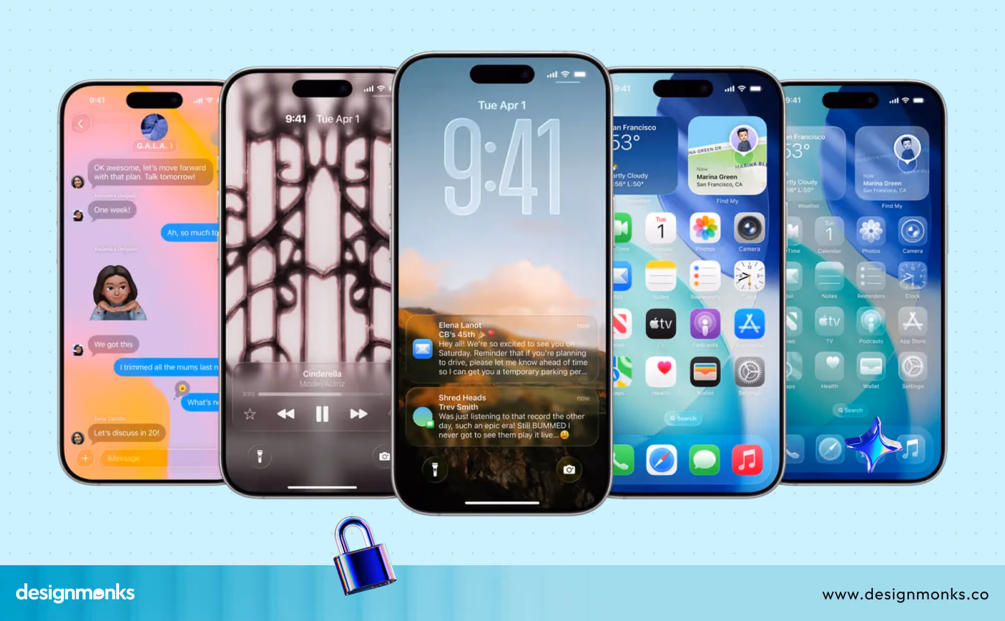
Photos App
Browsing your photos feels a bit like flipping through an interactive album. Apple added a nice 3D-like effect when you move between shots, which makes even still images seem layered and more immersive.
Safari, Messages, Music, & CarPlay
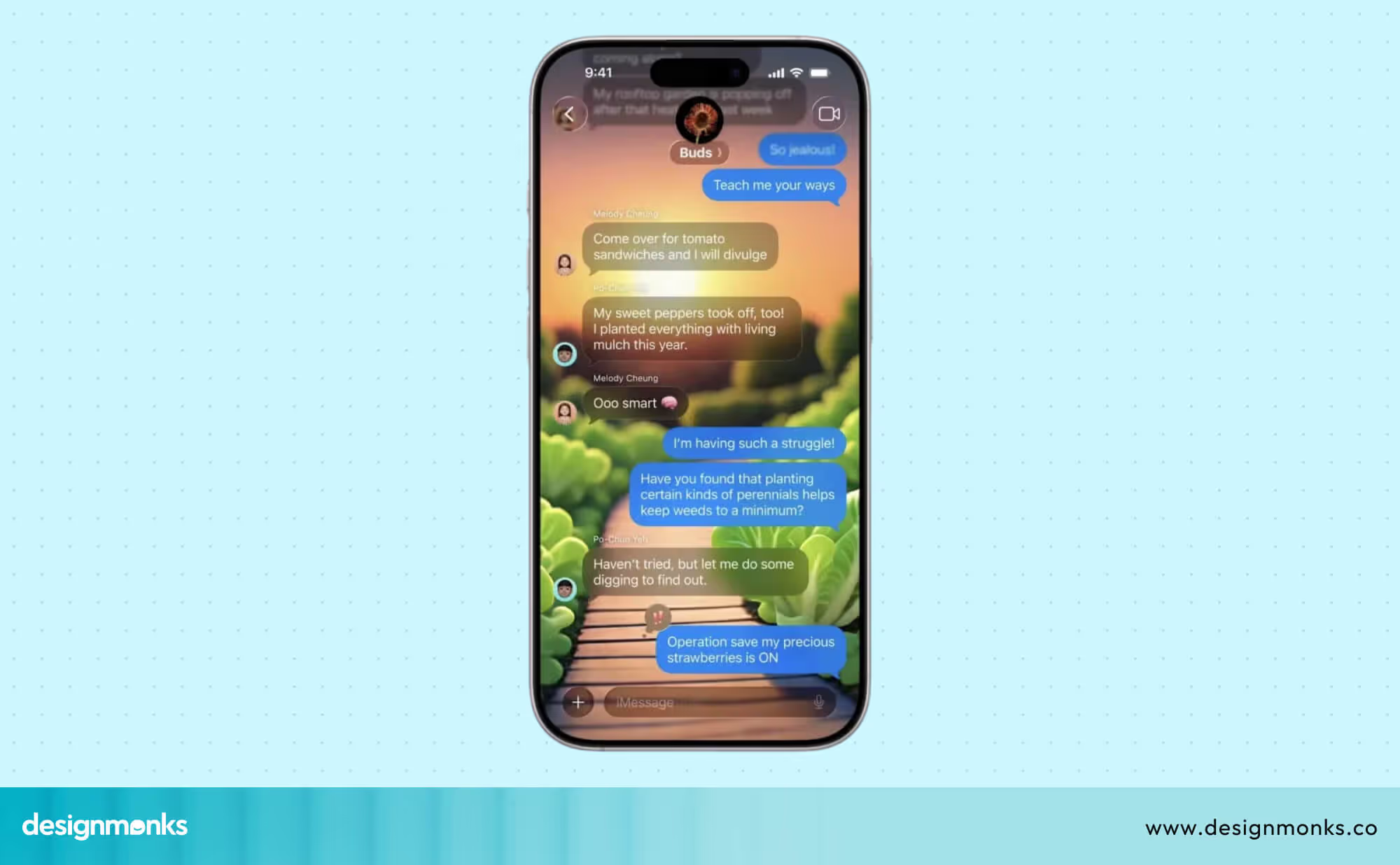
These apps didn’t get left out. Each has been adjusted to match the Liquid Glass style, sleek, light-reflective surfaces with soft edges and a consistent feel. The goal? To make every part of the system feel like one flowing design story.
The Good of Liquid Glass Effect: Praises from the Design Community
Apple’s Liquid Glass design has sparked a lot of chatter, and not all of it is criticism. In fact, many designers and UI experts are genuinely excited about this new direction. To them, it’s not just a facelift, it’s a refreshing shift in how we think about digital interfaces.
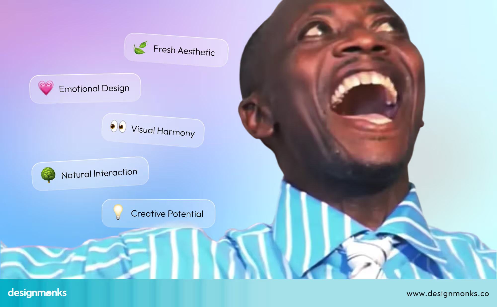
It Feels Fresh
For a while now, design across devices has felt... Well, kind of flat. Minimalist, yes. Clean, sure. But maybe too sterile. That’s why many in the design world are welcoming this move.
The softened transparency, the glowing surfaces, and the fluid motion add a sense of personality. It makes your screen feel like it's part of a living system, not just a static board of icons.
According to 9to5Mac, Serhii Popov, a design-first software engineer at MacPaw, put it simply:
“It’s really fresh. I think it will make everything look bigger and allow you to read or interact with the UI with more comfort.”
It Adds Emotion to the Interface
Interfaces are about what they do anymore and how they feel. Designers have long pushed for more emotionally rich digital experiences, and Liquid Glass takes a bold step in that direction. The animations feel soft and fluid, layers gently shift, and light bounces. It’s precise but meaningful.
According to 9to5Mac, Josh Puckett, co-founder of Iteration, shared his excitement:
“I’m excited that Apple is reintroducing feelings to their digital surfaces, creating interfaces that shimmer, bend, and breathe.”
This focus on expressiveness opens up new creative ground for interaction design. It shows that software can be more than efficient; it can be delightful.
A Step Towards Consistency
Liquid Glass also seems to be Apple’s way of syncing its design language across devices. For designers who work across platforms, like macOS, iOS, iPadOS, visionOS, this is a big deal. Having one clear visual language that ties it all together makes it easier to create experiences that feel familiar, no matter the screen.
Allan Yu, a product designer working on the workplace messaging app Output, called the new aesthetic “beautiful,” and many others agree it’s Apple’s most cohesive look in years.
Makes Interaction More Intuitive
Another win? It’s not just about looking pretty. Liquid Glass uses visual feedback smartly. The translucent layers and motion effects respond to your touch and movement in ways that feel natural. You don’t need a tutorial; your fingers just know what to do. That’s a big victory for usability.
When movement and feedback match user actions, the whole system becomes easier to navigate. It feels less like operating a machine and more like working with a responsive, flexible tool.
Designers See New Creative Possibilities
For those working in UI/UX design, this change is exciting because it opens the door to new types of creativity. When the OS allows for more dimensionality and visual depth, designers get to play with new ways to guide the user’s eye, create focus, and shape the experience. It’s like getting a new set of colors on your palette.
Even though opinions will always vary, one thing is clear: Liquid Glass is not just a style update. For many in the design world, it’s a step forward into more human, expressive, and playful digital spaces.
The Bad: Criticisms & Usability Concerns of Liquid Glass Design
As much as Liquid Glass has dazzled some designers, not everyone is clapping. The new look might feel stunning in screenshots or short demos, but using it every day tells a different story for many users.
Let’s check out what’s bothering people:
It Looks Great... Until You Try to Read Something
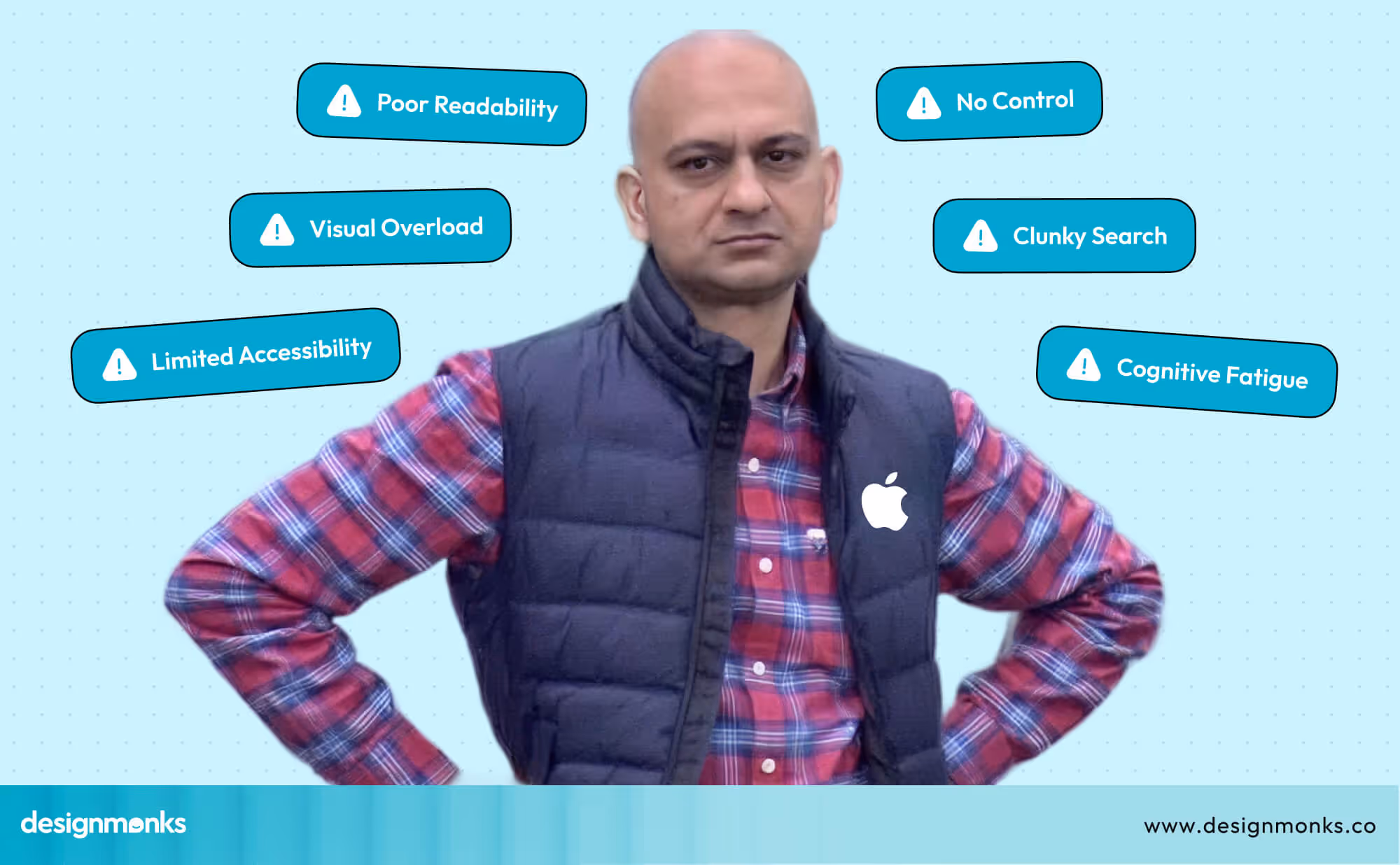
One of the biggest concerns is text clarity. With all the soft transparency and layered effects, some text ends up floating over backgrounds that aren’t really built for legibility. It’s like reading through frosted glass. You can still make out the words, but it takes extra effort, and that’s a problem.
This issue becomes especially noticeable in apps like Messages or Safari, where clean readability is essential. The cool look shouldn't come at the cost of basic usability.
As a user, Sawyer Merritt says:
“I'm gonna keep an open mind, but it definitely feels like things are going to be harder to read with this new design.”
It’s a Bit Too Much, Visually
There’s a fine line between fluid and chaotic. For some, Apple has crossed it. The constantly moving layers, the glow, the depth, especially when it’s all happening at once, it can feel like the screen never sits still. For users who prefer calm and focus, this busy style can be mentally tiring.
And let’s be real, when even just checking your calendar feels like an animation show, you start wishing for a pause button.
Accessibility? Still a Question Mark
Not everyone sees the screen the same way. For users with motion sensitivity, poor vision, or cognitive difficulties, all this eye candy can become a real challenge. Rapid movements or light shifts might cause headaches or nausea for some. Others might simply struggle to focus on key UI elements.
Apple is known for great accessibility settings, but early versions of Liquid Glass don’t yet offer much flexibility for users to turn things down or off. That’s worrying.
There’s No Way to Dial It Down
Right now, users don’t get much control over these effects. You can’t choose a simpler mode or tone down the animations across the system. This is definitely a lack of customization, which is frustrating, especially for power users or anyone who just wants a more minimal setup.
Design should feel personal. And while Liquid Glass brings a bold look, it’s not one-size-fits-all. A few simple toggles could fix a lot of these complaints.
Visual Intelligence? More Like a Visual Puzzle
Apple’s new screenshot-based search tool sounds futuristic, but in practice, it feels clunky. Unlike real-time tools like Google’s Circle to Search, this feature requires extra steps. You have to pause, take a screenshot, and then scan, breaking the natural flow of interaction.
In a world where users want fast and context-aware actions, this feels like taking the scenic route when you just want directions.
Drain Focus and Increases Fatigue
Another issue is the cognitive load. The more your eyes have to work to process shifting layers, glows, and animations, the more mentally tired you feel over time. For folks using their phones throughout the day, this adds up. What feels magical at first becomes exhausting after a while.
For sure, Liquid Glass is bold, but bold isn’t always better. When form gets in the way of function, even the most beautiful design starts to feel like a burden. If Apple hopes to win over skeptics, it'll need to find a better balance between beauty and usability.
Want to see Apple’s Liquid Glass design in action? Check out the usability video below.
Is Apple Really the First to Go “Liquid Glass”?
Short answer? Not at all. What Apple’s calling “Liquid Glass” might look fresh in 2025, but the idea of glossy and translucent UI has been around for quite a while.
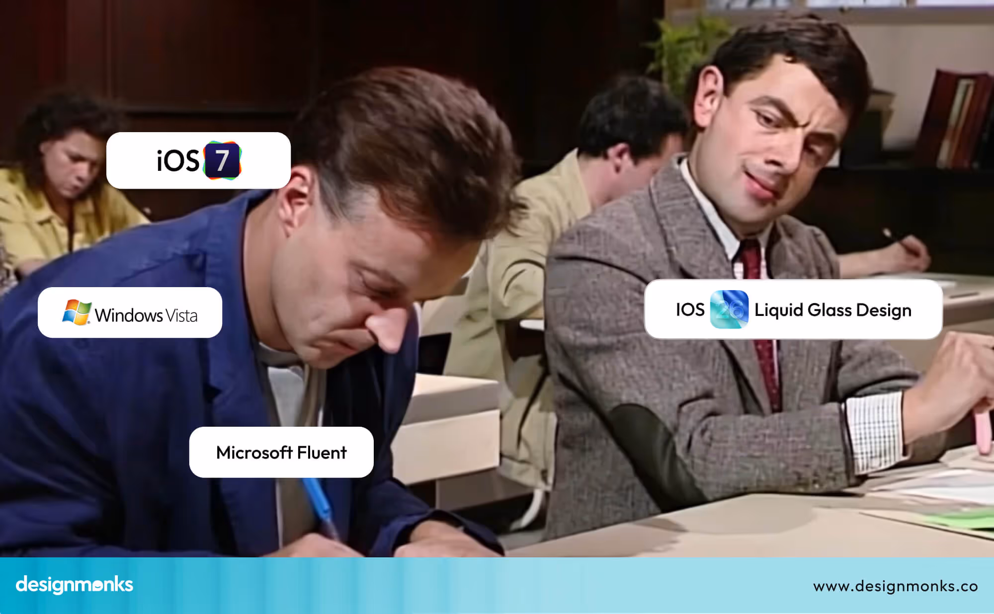
Remember Windows Vista’s Aero?
Back in 2007, Microsoft introduced a similar concept with the Aero Glass interface. It featured transparent window borders, soft light reflections, and layered UI components, exactly the kind of aesthetics Apple is now championing.
The similarity hasn’t gone unnoticed. Tech folks are already joking that Apple just gave Vista’s old look a modern twist.
Microsoft’s Fluent Design Was Also There
Years after Vista, Microsoft refined its approach with Fluent Design in Windows 10. It focused on light, motion, and depth, bringing translucency back into the spotlight, again, long before Apple’s current take.
Apple Did Try Before Too
To be fair, Apple’s own design journey isn’t entirely new to the blur-and-glass game either. iOS 7 brought in precise transparency and layering, and visionOS added spatial depth. Liquid Glass simply blends those ideas with stronger visuals.
So no, Apple didn’t invent the “liquid glass” idea, but they’ve definitely polished it for 2025.
End Note
Liquid Glass brings a fresh vibe to Apple’s interface. It feels more emotional, more alive. The design choices are bold, and many in the design world are excited about this shift.
Still, there are concerns. Some parts feel too busy, and not everyone finds it easy to use. It’s beautiful, yes, but beauty can’t come at the cost of comfort. Apple may tweak things as feedback rolls in. Until then, this update is an eye-opener in many ways.

.avif)
.avif)
.avif)
.avif)


.avif)
.avif)
.avif)
.avif)


.avif)


