
.svg)


Key Takeaways
- Liquid Glass blends blur, depth, and light to create modern, premium UI aesthetics.
- Overusing the effect hurts clarity, hierarchy, and overall user interaction quality.
- Best results come from intentional use in overlays, navigation bars, and panels.
- Designers must balance realism, readability, and motion for functional Liquid Glass interfaces.
- Liquid Glass works well for luxury, media, and AI brands needing visual distinction.
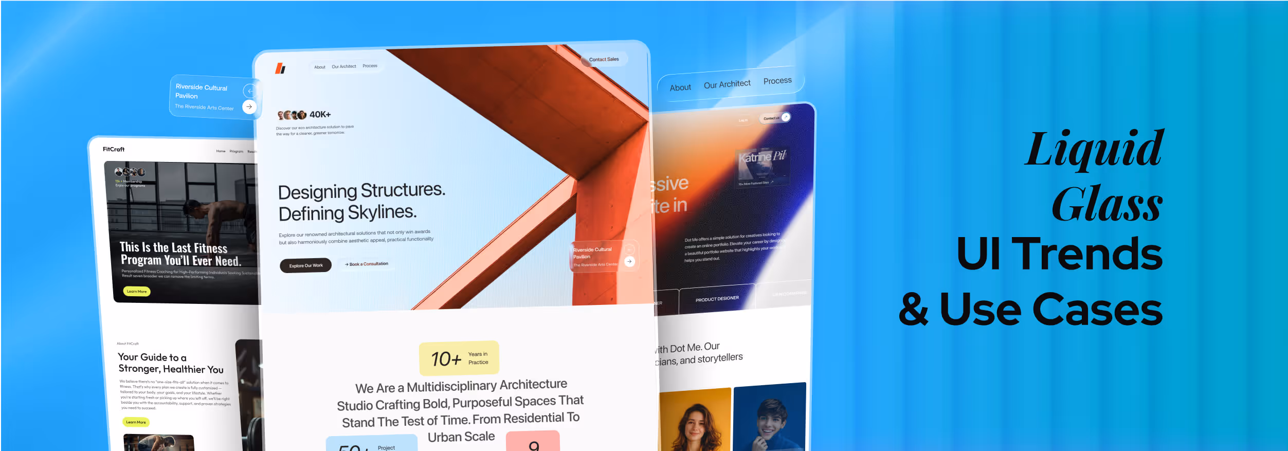
Liquid Glass in UI design is quickly becoming one of the most talked-about visual styles of the year. First seen in Apple’s iOS 26 updates, it combines blur, soft transparency, and layered depth to give interfaces a clean yet futuristic feel.
This UI style offers a premium look, echoing both modern minimalism and the nostalgia of older, more tactile designs. It’s sleek, eye-catching, and undeniably different from flat design.
But before you jump on the trend, ask yourself this: Is Liquid Glass UI the upgrade your interface needs, or is it a glossy distraction waiting to slow your users down?
Let's find out!
What is Liquid Glass in UI?
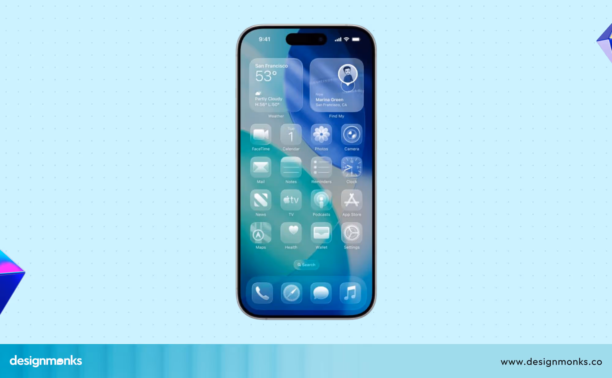
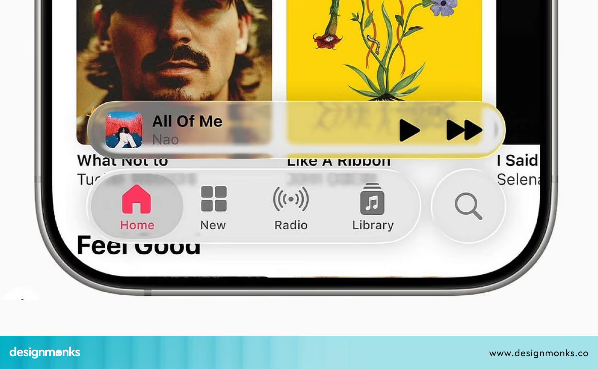
Liquid Glass in UI Design uses blur, transparency, and light to create an effect like frosted or polished glass. At WWDC 2025, Apple showed off new design tweaks in iOS 26 that lean into this look.
It will especially be used in navigation bars and page overlays. The idea is to create soft and translucent areas that seem to float over the background.
Some people might mistake Liquid Glass UI for glassmorphism, but they're quite different from each other. Glassmorphism is a broader style for any “glassy” look. Liquid Glass is more refined.

Liquid Glass UI pays closer attention to how light bends, how edges fade softly, and how layers create depth. It’s smoother, more realistic, and feels more intentional.
Comparison with Previous Apple Design Languages
Apple’s Liquid Glass marks a major visual evolution. To understand its significance, it’s useful to compare it with Apple’s earlier design languages—Aqua, Flat Design, and everything in between.
Liquid Glass blends Aqua’s realism with Flat Design’s minimalism, offering the best of both worlds. It brings back depth and light effects but in a modern, refined way, less ornamental and more purposeful.
Unlike Flat Design, which removed shadows and transparency for simplicity, Liquid Glass embraces depth through motion, blur, and translucency. It focuses on realism without distraction, enhancing usability while maintaining Apple’s signature elegance.
Why Is Liquid Glass Gaining So Much Attention?
Liquid Glass UI Design brings a new and refreshing look to UI design while improving the depth and focus of the user experience. Let's take a more in-depth look at why this style stands out in UI design:
Sleek & Modern Look
Liquid Glass gives interfaces a fresh and stylish feel. It creates a sense of depth and light and makes the screen look like a polished window into a digital world.
This modern, clean look appeals to designers who want their apps to feel cutting-edge and cool. It also helps users focus on important content by adding subtle visual hierarchy through light and transparency
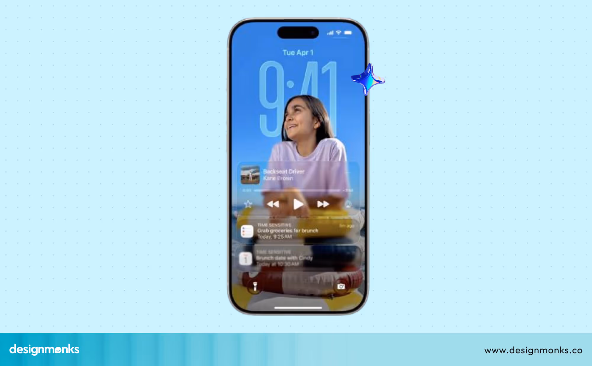
Layering and Depth
By stacking blurred, semi-transparent panels, designers can create a floating effect.
This layering adds a sense of space and helps users focus on different parts of the screen in a natural way. It’s like flipping through clear sheets that gently float above each other.
Strong Branding Opportunity
For apps in music, entertainment, luxury, or AI, Liquid Glass offers a unique way to stand out. It gives a premium, high-quality vibe that can set a brand apart from simpler or busier designs.
Using Liquid Glass thoughtfully can also build trust by making the interface feel polished and well-crafted.
A Modern Twist on Nostalgia
Liquid Glass borrows some ideas from the old “Skeuomorphism” style, which made digital things look like real-world objects.
But instead of using heavy textures and shadows, Liquid Design relies on soft blur and transparency to create a light, clean look that fits today’s simple designs. This mix of old and new helps users feel comfortable while enjoying a fresh experience.
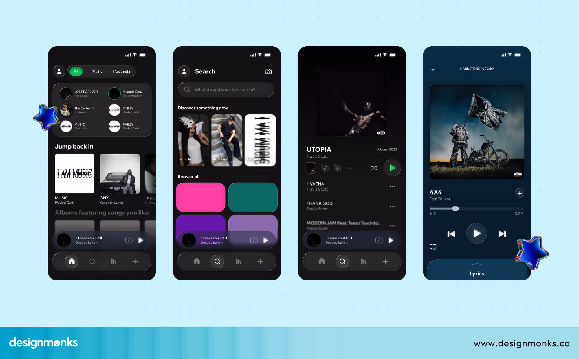
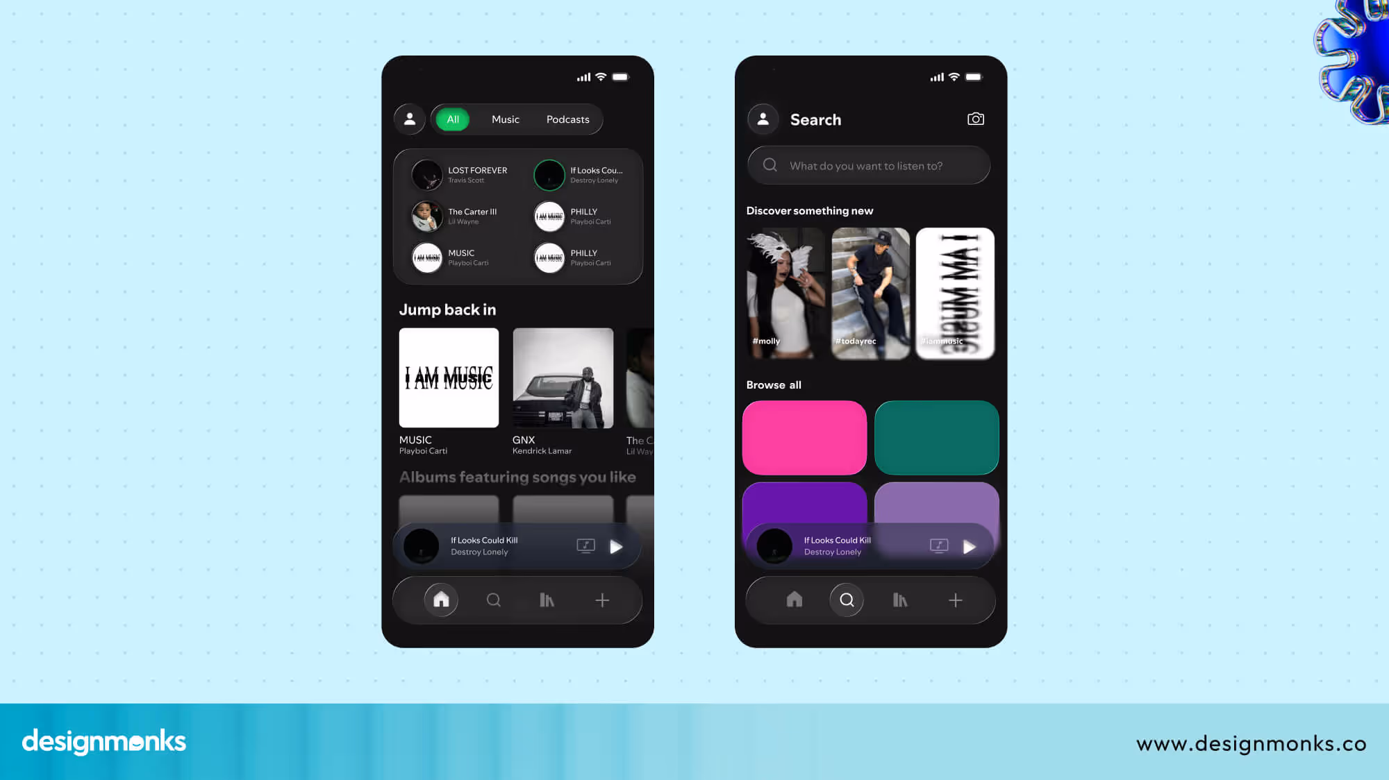
Reddit Reacts: A Case Study Breakdown of Spotify UI Redesign by 00mxhdi
Following its introduction, designers have been eager to implement Liquid Glass design. In one of Reddit's communities, r/FigmaDesign, a user named 00mxhdi shared a bold Spotify UI redesign inspired by iOS 26’s Liquid Glass style.
The mock-up featured large, floating glass-like panels over blurred backgrounds. It quickly grabbed attention for its dreamy visuals. But it also sparked a debate about where glass design UI should and shouldn't be used.
What People Loved
Many commenters were impressed by how clean and polished it looked. They praised how the layers and transparency were handled with care and gave the design a premium, cinematic feel. One user summed it up:
“I think it looks cool, man. And I like liquid glass.”
Where It Fell Short
But not everyone was convinced. Some of the users pointed out that the effect was overused. As a result, it is hard to see which buttons were most important.
One user said that they’re unsure whether Spotify is the right app to use the Liquid Glass effect on. Because it only works when it is layered over other content to refract light and color. Otherwise, it resembles a 2000s bevel or emboss effect.
Others said the heavy blur made text harder to read and could distract from the main content.
“Love how it glows, but there’s too much blur, I can’t read that text easily.”
There were also questions about whether the concept would work well in everyday use, or if it was more art than a functional interface.
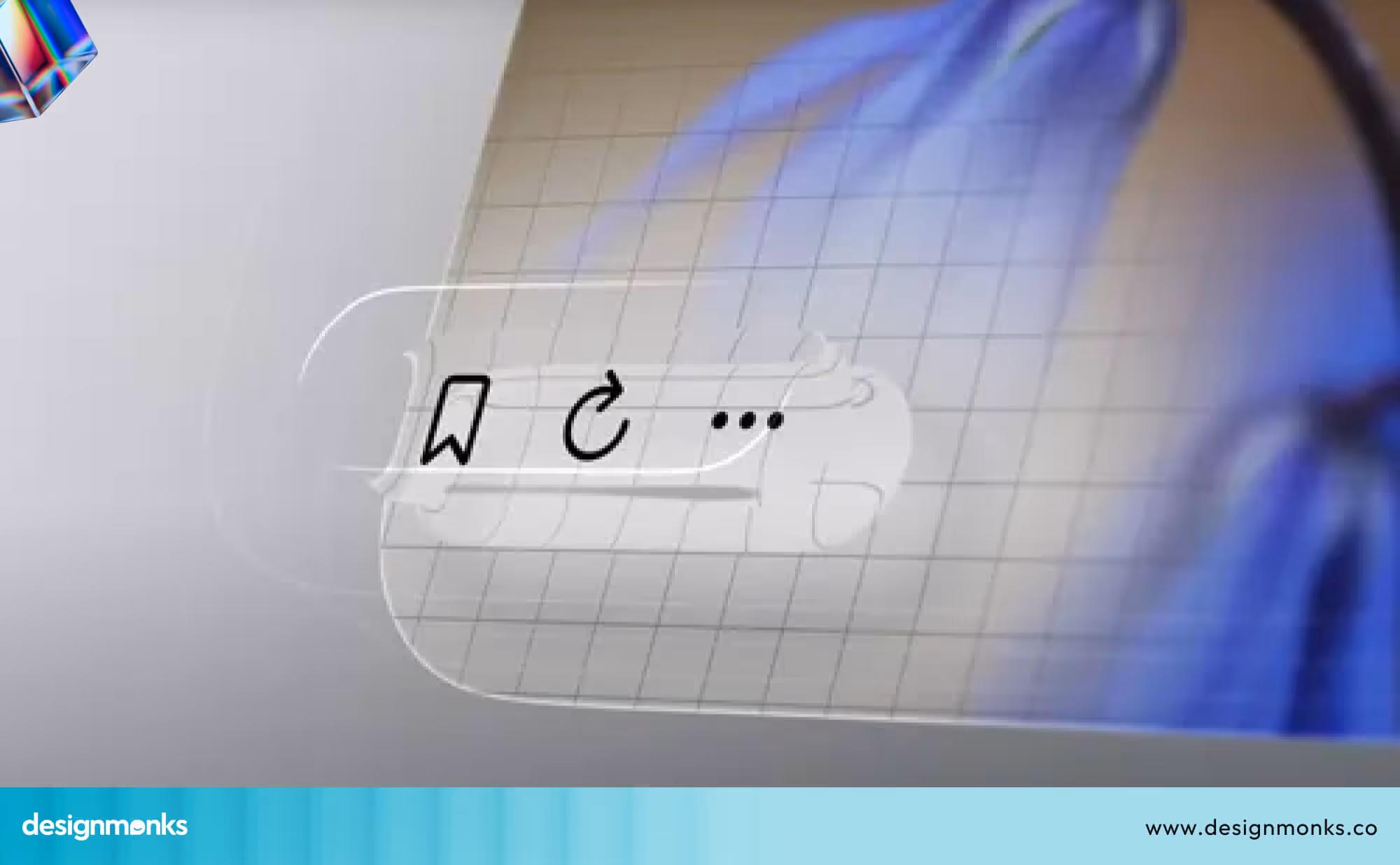
Technical Limitations
One Redditor highlighted a critical limitation in this case,
“Close, but the glass is missing the distortion and light refraction. Figma doesn’t support light refraction, so that’s understandable.”
Figma can simulate blur and transparency, but it can’t replicate how light bends and distorts through real glass. Without this refraction, the Liquid Glass effect is more of a decorative illusion.
Designers can still achieve a beautiful, polished look, but it lacks the depth and optical play you’d see in physical glass. That is why some users felt the effect here looked flatter than it could in real-world applications.
Read Also: Old Vs New Spotify Font
Common Mistakes When Using Liquid Glass in UI
Liquid Glass can make a UI feel modern and magical, but it’s also easy to go overboard. Here are the common mistakes to avoid while using Liquid Glass in UI:
1. Turning Everything into Glass
It’s tempting to apply the effect everywhere because it does look good in UI. But when every button, panel, and card is glassy, nothing actually stands out.
Your eyes stop knowing where to focus, and the whole interface starts to feel like a blurry snow globe.
2. Forgetting How Light Really Works
Real glass effect changes depending on light, so sometimes you get an effect of distorting, bending, or shifting light.
But if you skip these cues, your “glass” ends up looking more like a frosted sticker than a realistic surface. Designers need to specially focus on shadows, highlights, and subtle refraction while working with Liquid Glass
3. Letting Visuals Overpower Clarity
A busy or bright background behind a glass panel can make text nearly impossible to read. The more your users squint, the less they’ll enjoy your design, no matter how pretty it looks. Always design with legibility first, flair second.
4. Keeping it Static
Liquid Glass feels more natural when paired with motion. Smooth fade-ins, sliding panels, or hover effects make the material feel interactive and real. Without this, the glass remains purely decorative and less engaging.
5. Ignoring Hierarchy and Readability
Not every element deserves the same level of attention. Your main buttons, labels, and navigation should remain clear and high-contrast, even if they sit inside or near glass.
This will make the whole app or software easier to use and far more polished.
Where Liquid Glass Design Actually Works
From the above discussion, it's clear that Liquid Glass isn't something you can just use anywhere and everywhere and expect it to work.
No, it needs to be used correctly and in the right places. Overusing it can make everything feel cluttered and unfocused. The real impact comes when it’s applied with precision. Apple has practically turned this into an art form.
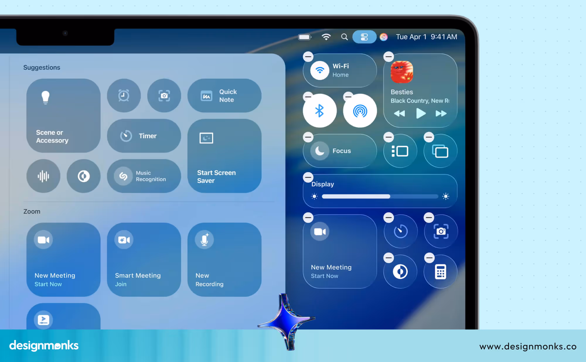
If you look at Apple’s liquid glass design guidelines, you’ll notice a deliberate strategy for blur and transparency. They reserve it for areas like modal overlays, navigation headers, and context menus. These spots are temporary, layered, and secondary to the main task at hand.
Here, the effect creates a sense of depth without pulling attention away from the primary content. It’s not there to dominate the interface, it’s there to subtly support it.
This is why their implementation feels so seamless. It’s consistent. It’s purposeful. And it ensures that the user’s focus stays exactly where it needs to be.
Ideal Places for Liquid Glass Design
Liquid glass delivers its best results in contexts where it adds clarity, separation, and visual refinement without overwhelming the content. Here are some places where we think Liquid Glass Design will suit the most:
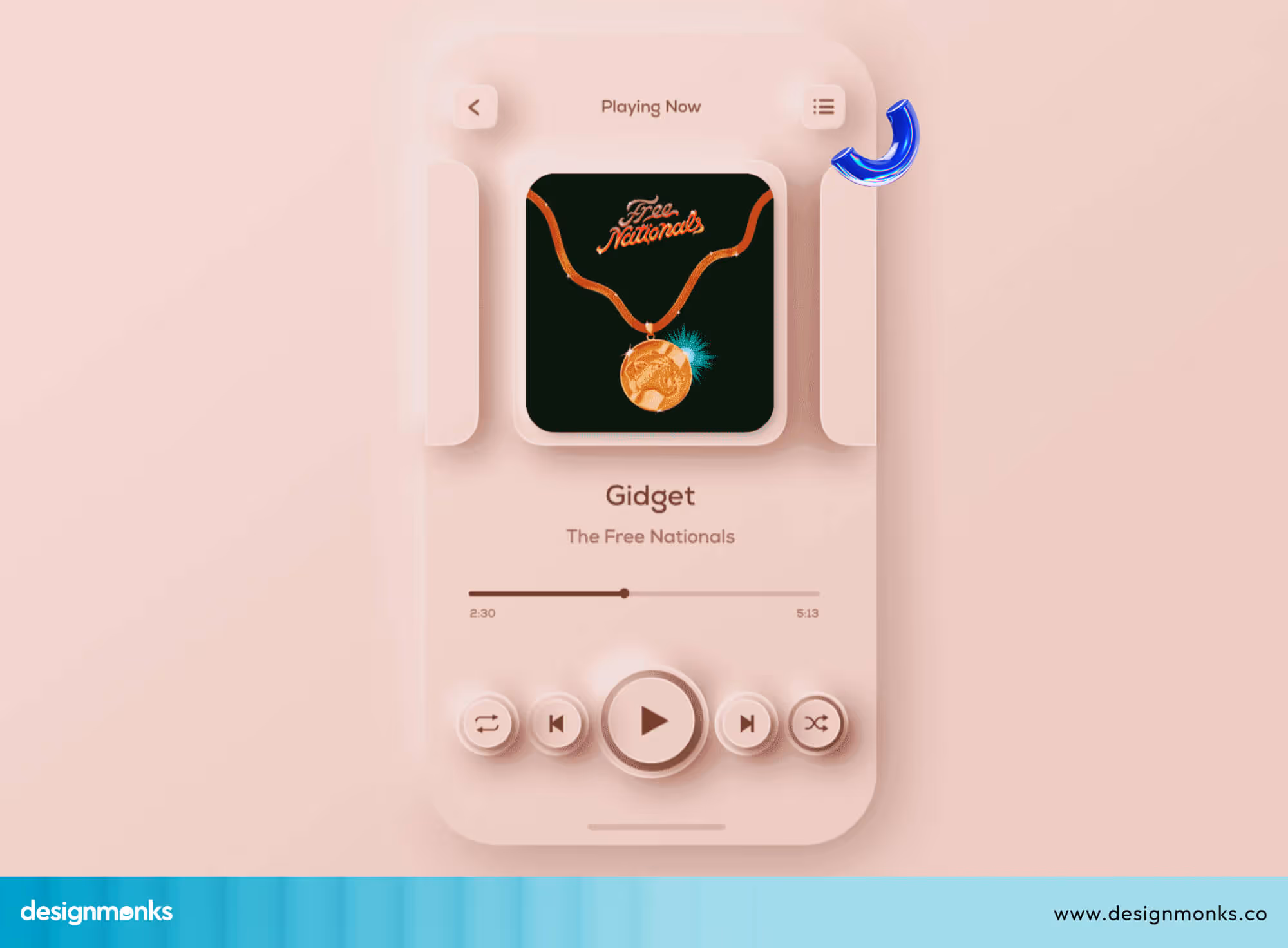
Music or Streaming Apps
In music and streaming interfaces, liquid glass can be used for playlists or “now playing” cards placed over blurred background artwork. This maintains a connection to the visual theme while ensuring the text and controls remain easy to read.
Layered Dashboards
In finance, analytics, or other data-heavy dashboards, liquid glass can be applied to filter panels, sidebars, or other overlays.
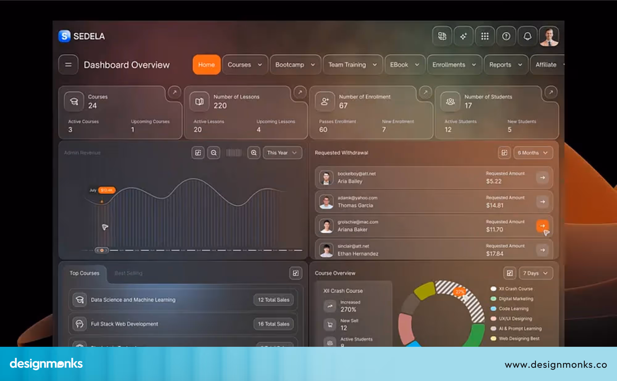
This separates interactive controls from the main data display and improves usability. It also prevents the interface from appearing cluttered.
OLED Displays
On OLED screens, the deep contrast allows glass effects with blur and subtle glow to appear crisp and vibrant. This maintains strong visual definition and avoids a washed-out look.
Micro-Interactions with Motion
When liquid glass is combined with motion like sliding panels or animated overlays, it creates smooth transitions. These transitions make the effect feel part of the interaction, not just a decorative element.
Liquid Glass UI Design Trend
The Liquid Glass UI design trend is shaping digital aesthetics with its translucent layers, depth effects, and motion-driven interfaces. It blends elegance, realism, and interactivity to deliver immersive user experiences across devices.
Origin of the Trend
Emerging from Apple’s iOS 26 design language, Liquid Glass evolved from Glassmorphism and Neumorphism. It aims to recreate realistic glass textures with light diffusion, reflections, and dynamic layering for a futuristic look.
Core Design Principles
Liquid Glass emphasizes translucency, soft gradients, subtle shadows, and realistic light play. These elements create depth while maintaining clarity and focus on key interface components, ensuring users experience both functionality and visual sophistication.
Visual Appeal and Aesthetic Impact
The style brings a sense of realism and fluidity to digital screens. Its glass-like surfaces simulate tangible materials, making interfaces feel more natural, luxurious, and engaging while retaining simplicity and accessibility.
Influence on Modern UI
Major tech ecosystems, including Apple, Microsoft, and Google, are adopting Liquid Glass elements. Designers use it to modernize apps, operating systems, and dashboards, blending minimalism with spatial depth to enhance emotional user engagement.
Practical Use in Product Design
From designing mobile apps to web dashboards, Liquid Glass is used to highlight navigation bars, widgets, and media cards. Designers utilize transparency to focus attention on essential content while adding visual dynamism.
Future Outlook
As AR and spatial computing continue to grow, Liquid Glass UI is expected to evolve further, integrating depth perception, 3D interaction, and adaptive motion effects to create more immersive digital experiences.
Design Monks’ Take on Liquid Glass
Liquid glass is a striking design trend, but it’s more than just looks. It needs to make sense for users. At Design Monks, we believe it should enhance the experience, not complicate it.
So, before adopting new trends like Liquid Glass, we rely on A/B testing to compare user performance. We conduct usability studies to observe real interactions. We also use motion prototyping to test animations like sliding panels
We usually suggest Liquid Glass for luxury, media, or AI brands because it adds a touch of elegance. For apps that need to be fast and clear, simpler designs work better.
The key is choosing the right style for the brand, goals, and users, and that’s where we can help make your vision happen. So don’t hesitate to reach out!
FAQs
Will spotify get Liquid Glass?
There’s no official confirmation that Spotify will adopt the Liquid Glass UI, but developer forums suggest Apple’s API enables third-party apps to support it. Even though people are talking about Spotify Liquid Glass, and Spotify has brought new fonts, the adoption of the Liquid Glass design is not confirmed yet.
How does Liquid Glass affect app performance?
Liquid Glass uses dynamic blurs and translucency, which can slightly increase GPU load. However, with optimized rendering and Apple’s Metal API, most modern devices handle it smoothly without noticeable performance drops.
How can developers implement Liquid Glass in their apps?
Developers can use Apple’s UIKit or SwiftUI with the UIVisualEffectView and Material components. These APIs allow precise control over blur, opacity, and layering to replicate the Liquid Glass effect efficiently.
Final Thoughts
Liquid Glass in UI design is an exciting trend that brings fresh energy and elegance to digital interfaces. Its blend of blur, transparency, and depth creates stunning visuals that stand out from traditional flat designs.
However, it’s important to use Liquid Glass thoughtfully to enhance usability, not just style. When applied with care, it can elevate your interface. So, before diving in, consider whether Liquid Glass truly improves your user experience or simply adds unnecessary shine.

.avif)
.avif)
.avif)
.avif)


.avif)
.avif)
.avif)
.avif)


.avif)


