.svg)



Key Takeaways
- Use Yes/No buttons only when users make clear, unambiguous binary decisions.
- Replace generic labels with action-oriented buttons to improve clarity and confidence.
- Maintain consistent button placement to reduce errors and strengthen user expectations.
- Design accessible buttons with keyboard support, descriptive labels, and visible focus states.
- Choose alternatives like toggles, checkboxes, or dropdowns when they better fit user tasks.
"Yes"... but yes to what? That single question explains why UX Yes No Buttons are still debated by UX designers. While they seem like the easiest way to ask for confirmation, they often leave users guessing instead of feeling confident.
Every extra second spent figuring out a button label adds mental effort. During important actions like deleting files, making payments, or changing account settings, that confusion can easily turn into costly mistakes.
This guide explores when Yes and No buttons improve the user experience, when they create problems, and the best practices that make every user decision simpler, faster, and easier to understand.
What Are Yes and No Buttons in UX?
Yes and No buttons are CTA (Call-to-Action) buttons that let users make a binary choice, meaning they can choose only one of two options.
They are commonly used when a website or app needs users to confirm an action or respond to a simple question.
You'll usually see Yes and No buttons in a confirmation dialog, the small pop-up asking users to confirm something before moving forward. They also appear in permission requests, account settings, browser prompts, and other parts of an interface where users need to make a quick decision.
These buttons play an important role in decision-making by guiding a user's next action. When the message is clear, users can quickly choose the right option with confidence.
However, if the question or confirmation message is unclear, generic labels like "Yes" and "No" can cause confusion. In those cases, more descriptive button labels often provide a better user experience.
When Should You Use Yes/No Buttons?
Yes/No buttons aren't inherently bad UX. They're a tool, and like any tool, they perform best in specific contexts. Below are the situations where they genuinely support good usability:
Confirmation Dialogs
The most common and arguably most appropriate use of Yes/No is inside a confirmation dialog for a destructive or irreversible action.
Think of a delete confirmation: "Are you sure you want to delete this file?" Here, "Yes" and "No" map directly onto the question being asked, and the stakes are clear because the surrounding dialog text explains exactly what will happen.
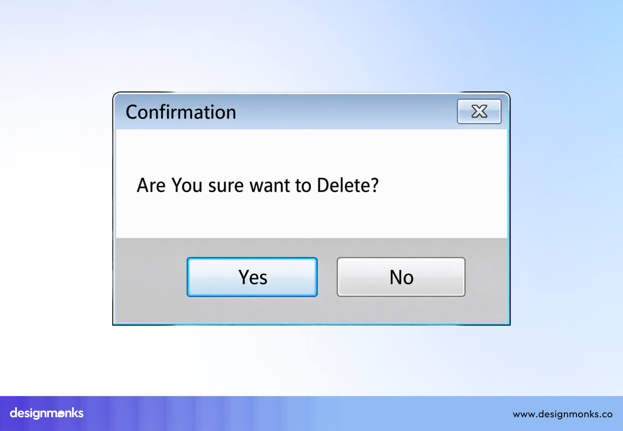
Even so, best practice increasingly favors more specific labels ("Delete" and "Cancel") over plain Yes/No, precisely because they remove any doubt about what clicking the button actually does.
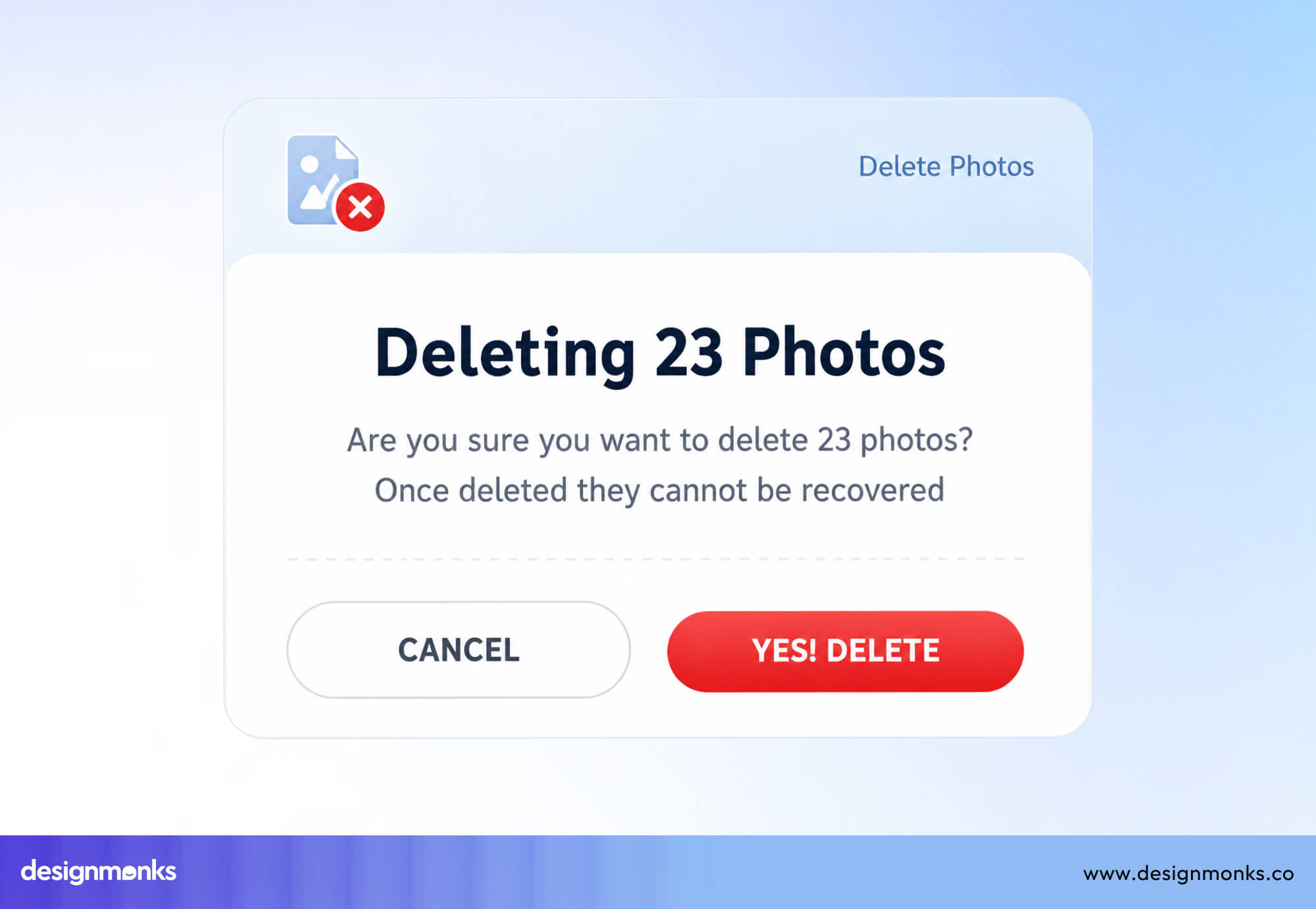
We'll cover this distinction in more detail later, but it's worth noting here, even in the "ideal" use case for Yes/No, more explicit labels usually perform better.
Permission Requests
Yes/No buttons, or similar labels like Allow and Deny, are common in permission requests. You'll see them when a website or app asks to send notifications, use your camera or microphone, access your location, or store cookies.
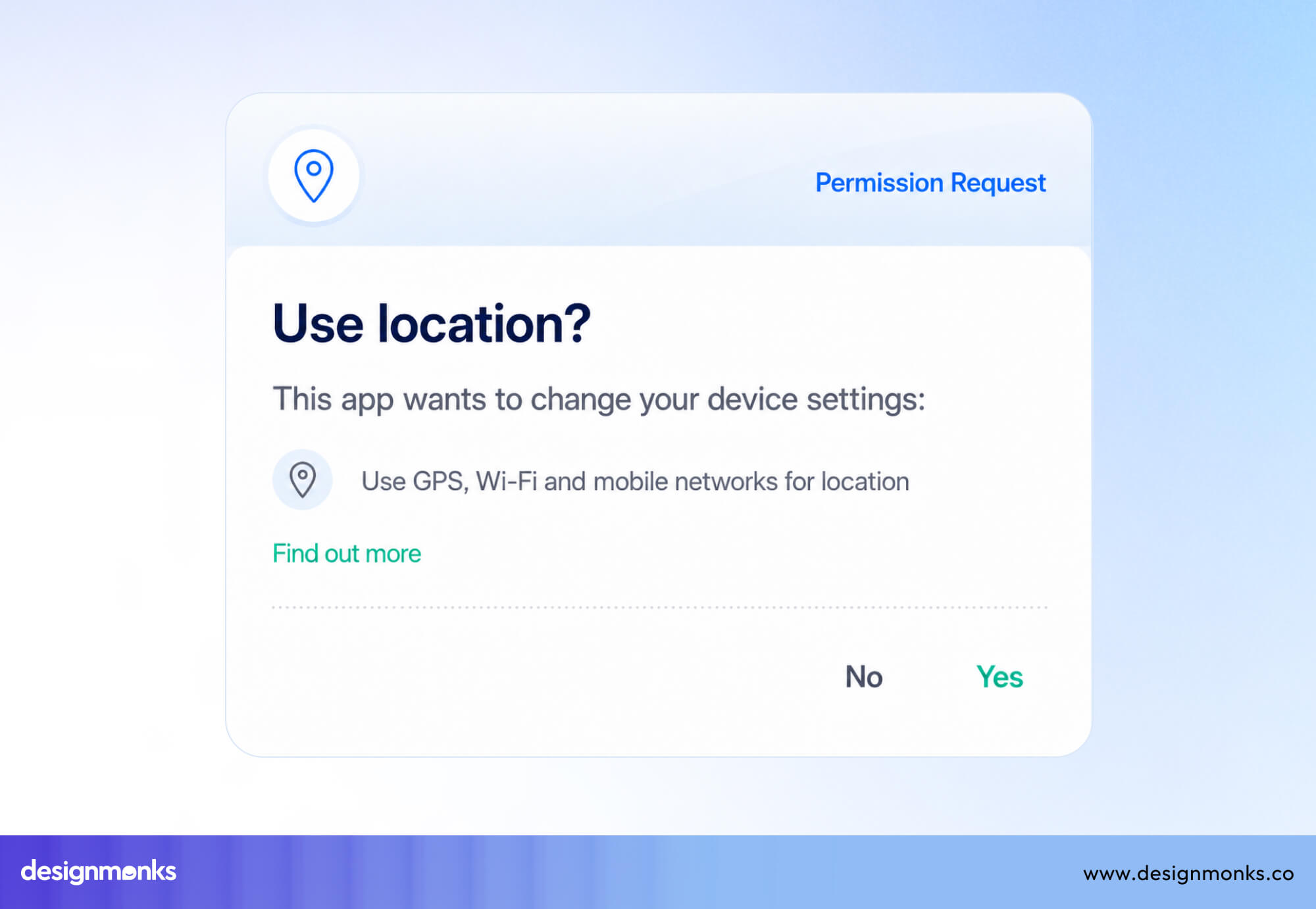
These requests usually ask a clear question, such as, "Allow this app to access your camera?" Since users only have two possible choices, a binary response makes sense.
Most people have seen these prompts many times before, so they already know what to expect. That familiarity makes the Yes/No buttons easy to understand and quick to use.
Simple Binary Decisions
Beyond dialogs and permissions, Yes/No buttons work well any time users are genuinely choosing between exactly two valid options with no ambiguity.
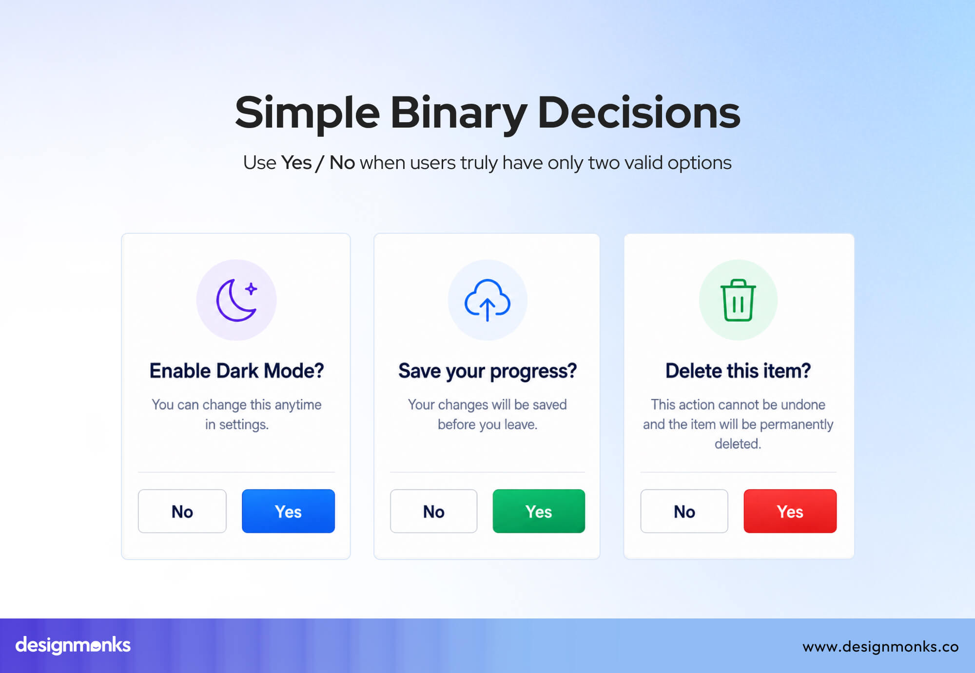
A quick preference question, such as "Do you want to enable dark mode?" or "Would you like to save your progress?", fits this pattern. The key requirement is that there is truly nothing in between, no partial answer, no "maybe," and no hidden third option that the interface hasn't accounted for.
When You Should Avoid Yes/No Buttons
Yes/No buttons are useful in some situations, but they are not the right choice for every interface. When the question is unclear, or users need more context, these buttons can create confusion instead of making decisions easier.
Knowing when to avoid them is just as important as knowing when to use them:
Ambiguous Questions
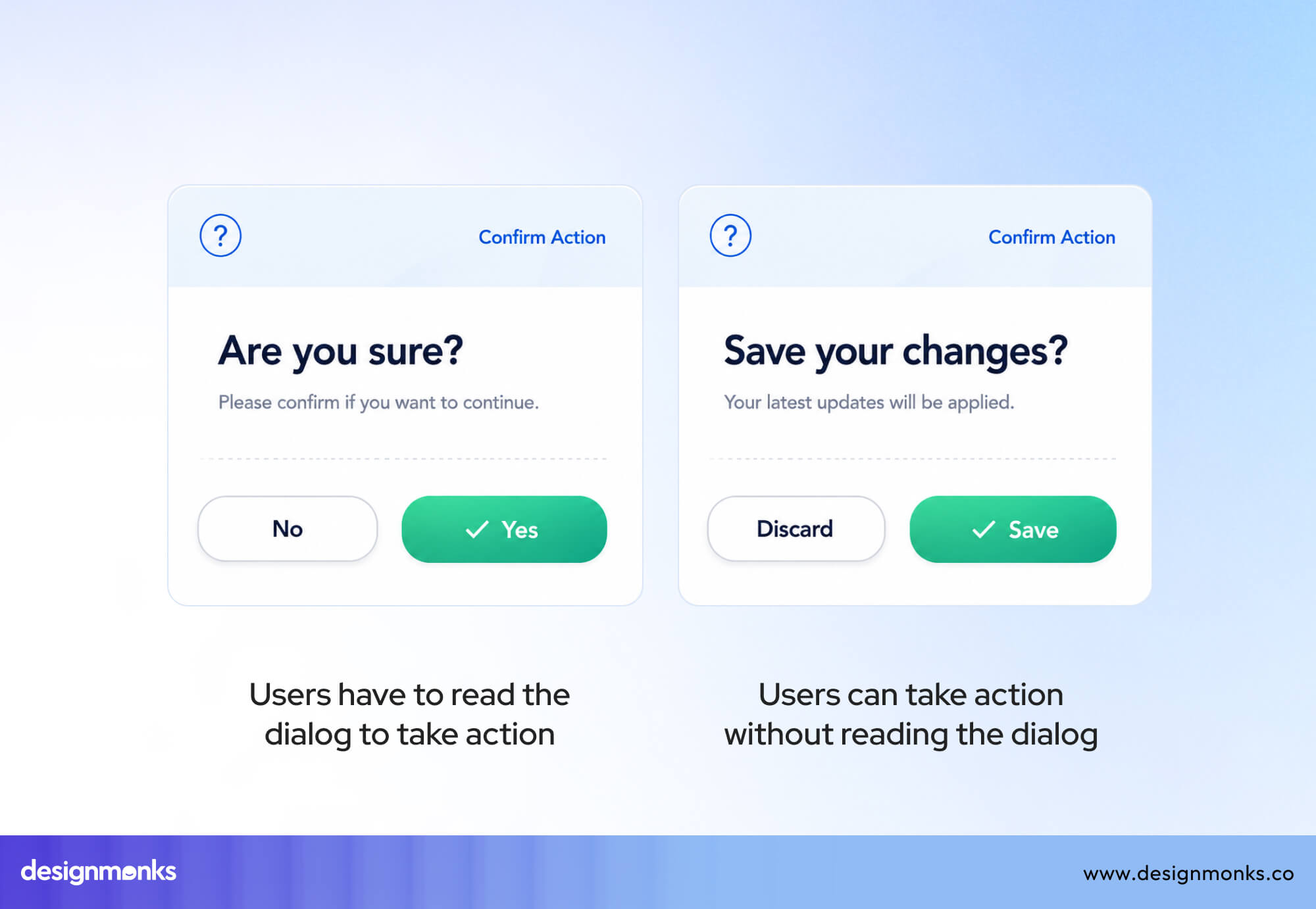
One of the biggest problems with Yes/No buttons is that they can be too vague. Most users scan a screen instead of reading every word carefully. If the message above the buttons is not completely clear, they may have to stop and think about what "Yes" or "No" actually means.
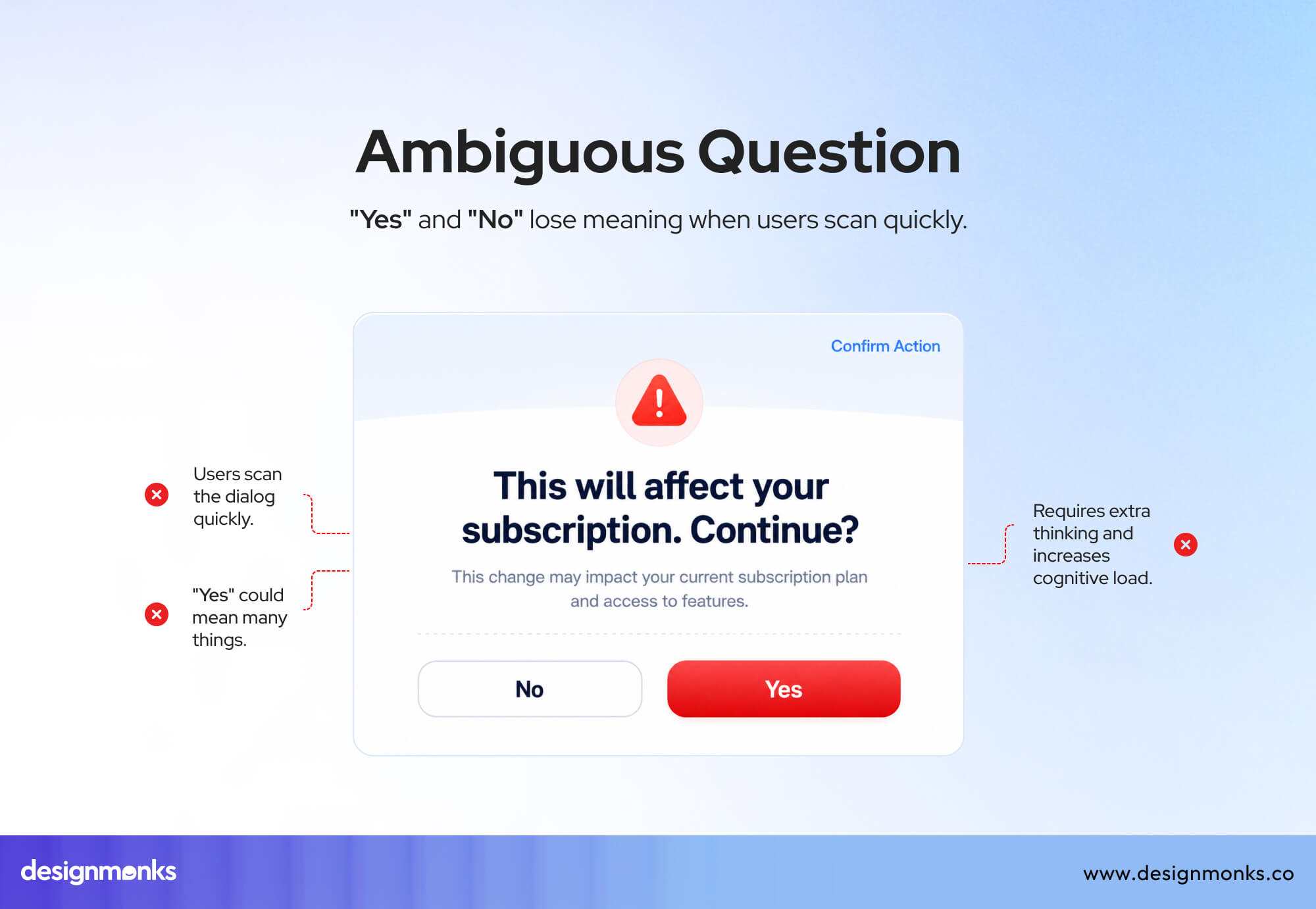
For example, imagine a dialog that says, "This will affect your subscription. Continue?" If the buttons are simply Yes and No, users may wonder what they are agreeing to.
Does Yes mean continuing with the change? Does it mean accepting the effect on the subscription? That small moment of doubt adds unnecessary mental effort.
This is why UX experts, including the Nielsen Norman Group, recommend using clear and action-based button labels whenever possible. Buttons like Continue, Cancel, Upgrade Plan, or Keep Current Plan explain exactly what will happen after the click.
Users can make decisions faster because they don't need to guess.
Forms and Multi-Step Flows
Yes/No buttons are also a poor choice in forms and multi-step processes. These experiences are designed to guide users from one step to the next. Generic labels interrupt that flow because they don't clearly describe the next action.
For example, Continue is much clearer than Yes, and Go Back is more helpful than No. Users immediately understand what each button will do without reading the message again.
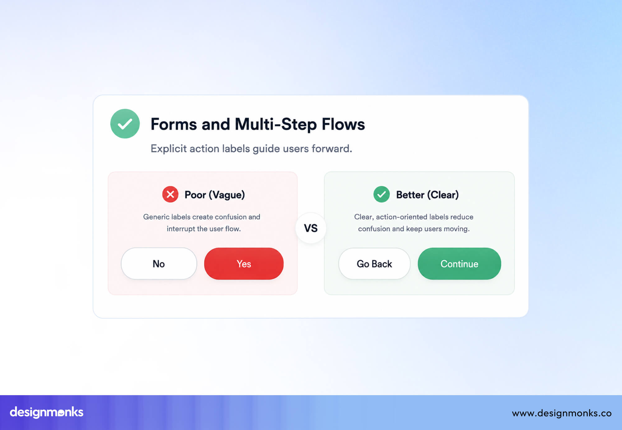
This becomes even more important during tasks like checkout, signing up for an account, updating account settings, or managing a subscription. In these situations, users need confidence before clicking.
Clear labels such as Place Order, Create Account, Save Changes, or Cancel Subscription reduce confusion, build trust, and lower the chance of costly mistakes.
Why Action-Oriented Button Labels Perform Better
The core argument against overusing Yes/No buttons isn't that binary choices are bad, it's that generic labels are weaker communicators than specific ones. Action-oriented labels tell users what will happen the instant they click, without requiring them to reference the question above the button. For example:
Yes vs Delete
A button labeled Yes forces users to connect the answer back to the confirmation message. Delete removes that extra step by stating the action directly. Users immediately understand the consequence of clicking the button, which is especially important for destructive actions.
No vs Cancel
No simply rejects a question, but it doesn't explain what happens next. Cancel clearly tells users they'll stop the current action and return to the previous screen. The label reflects the outcome instead of the response.
Yes vs Continue
In multi-step forms and onboarding flows, Continue clearly signals that the user is moving to the next step. Yes only makes sense if the user is still focused on the question above it. This makes it less effective for people who scan the interface.
No vs Keep Editing
When users attempt to leave a page with unsaved changes, Keep Editing explains exactly what clicking the button will do. No leaves room for doubt because users have to interpret what they're saying no to before they can act confidently.
The best CTA buttons describe the action, not the answer. When labels clearly communicate the result of clicking, users can make decisions faster, reduce mistakes, and navigate interfaces with greater confidence.
Even if they're quickly scanning the page instead of reading every word, a proper CTA helps them make the choice quickly.
UX Best Practices for Yes and No Buttons
If a Yes/No button pattern is the best choice for your interface, make sure it's designed carefully. Small improvements in button labels, layout, and visual hierarchy can make the experience much clearer and reduce user mistakes.
Here are some things you can do:
Make Primary Action Visually Stronger
When using Yes and No buttons, the recommended or primary choice should be easier to notice.
If Yes is the action you want most users to take, give it more visual weight with a filled style, stronger color, or higher contrast. Keep the No button visible but less prominent.
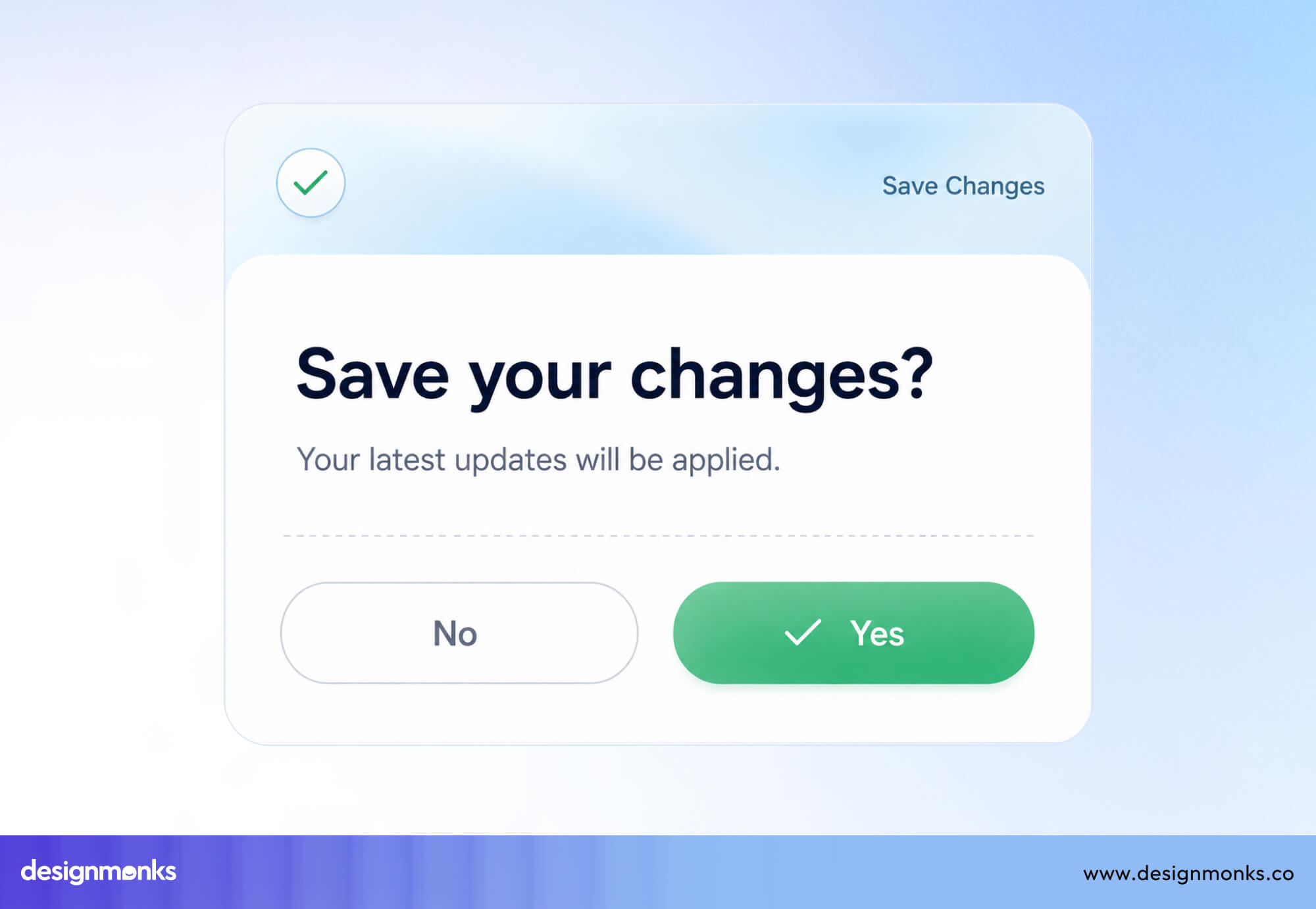
This visual hierarchy helps users make decisions faster while still making both options easy to access. However, don't use visual emphasis to trick users into choosing an option they may not want.
Keep Button Order Consistent
If you use Yes and No buttons throughout your product, keep them in the same order every time. For example, if Yes appears on the right and No on the left, don't switch their positions in another dialog.
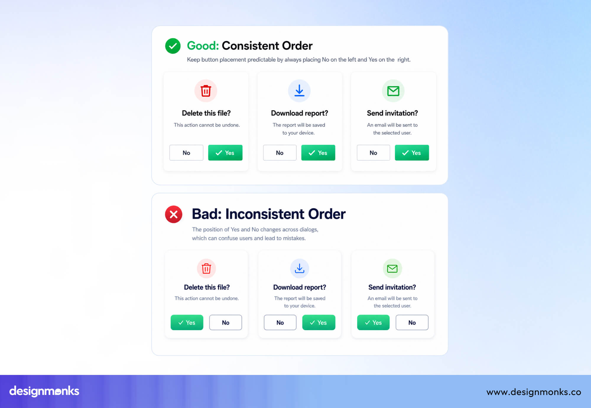
Users quickly build habits based on button placement, and changing the order can lead to accidental clicks. Choose a consistent pattern that matches your platform's conventions and use it across your entire product.
This will create a more predictable experience.
Match Labels to the User's Goal
Before using Yes and No, ask yourself whether those labels are actually the clearest choice. In many cases, action-oriented labels like Delete, Continue, Cancel, or Keep Editing are easier to understand because they describe the result of clicking the button.
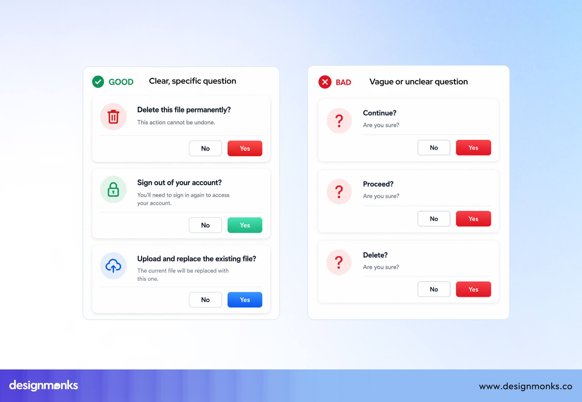
If you do use “Yes” and “No”, make sure the question above them is short, specific, and impossible to misunderstand. Users should immediately know what they're agreeing to or declining.
Reduce Cognitive Load
One downside of Yes and No buttons is that users often have to look back at the question before making a choice. This small extra step increases mental effort, especially in long forms or busy interfaces.
Keep confirmation messages short and place them close to the buttons so users don't have to reread large blocks of text. Better yet, replace Yes and No with descriptive action labels whenever possible to make the choice obvious at a glance.
Prevent Accidental Clicks
Because Yes and No buttons often appear in confirmation dialogs, they should be designed to reduce mistakes. Leave enough space between the two buttons so users don't click the wrong one by accident, especially on mobile devices.
If Yes performs a destructive action like deleting data or removing an account, make the risk clear with an appropriate color or warning message. For high-risk actions, consider using action-based labels such as Delete and Cancel, or add an extra confirmation step to prevent costly errors.
Accessibility Guidelines for Yes and No Buttons
Binary choice buttons must work for every user, including those relying on assistive technology. Accessibility isn't an optional layer added at the end, it should shape how Yes/No buttons are built from the start:
Keyboard Navigation
Every Yes/No button must be reachable and operable using a keyboard alone. Users should be able to tab between the two options in a logical order and trigger the selected button with Enter or Space.
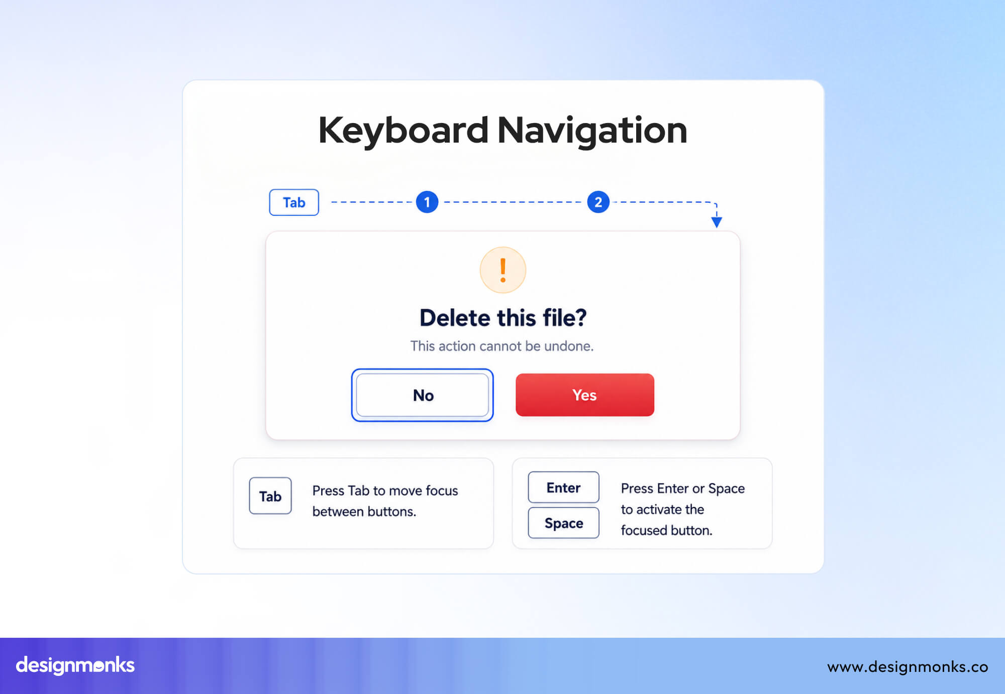
Dialogs that trap keyboard focus, or that require a mouse to dismiss, create a hard blocker for keyboard-only users.
Screen Reader Labels
A screen reader announcing only "Yes" or "No" doesn't provide enough information. Users need to know what those buttons relate to. Make sure the dialog and button labels work together so assistive technologies can announce the full meaning of each choice.
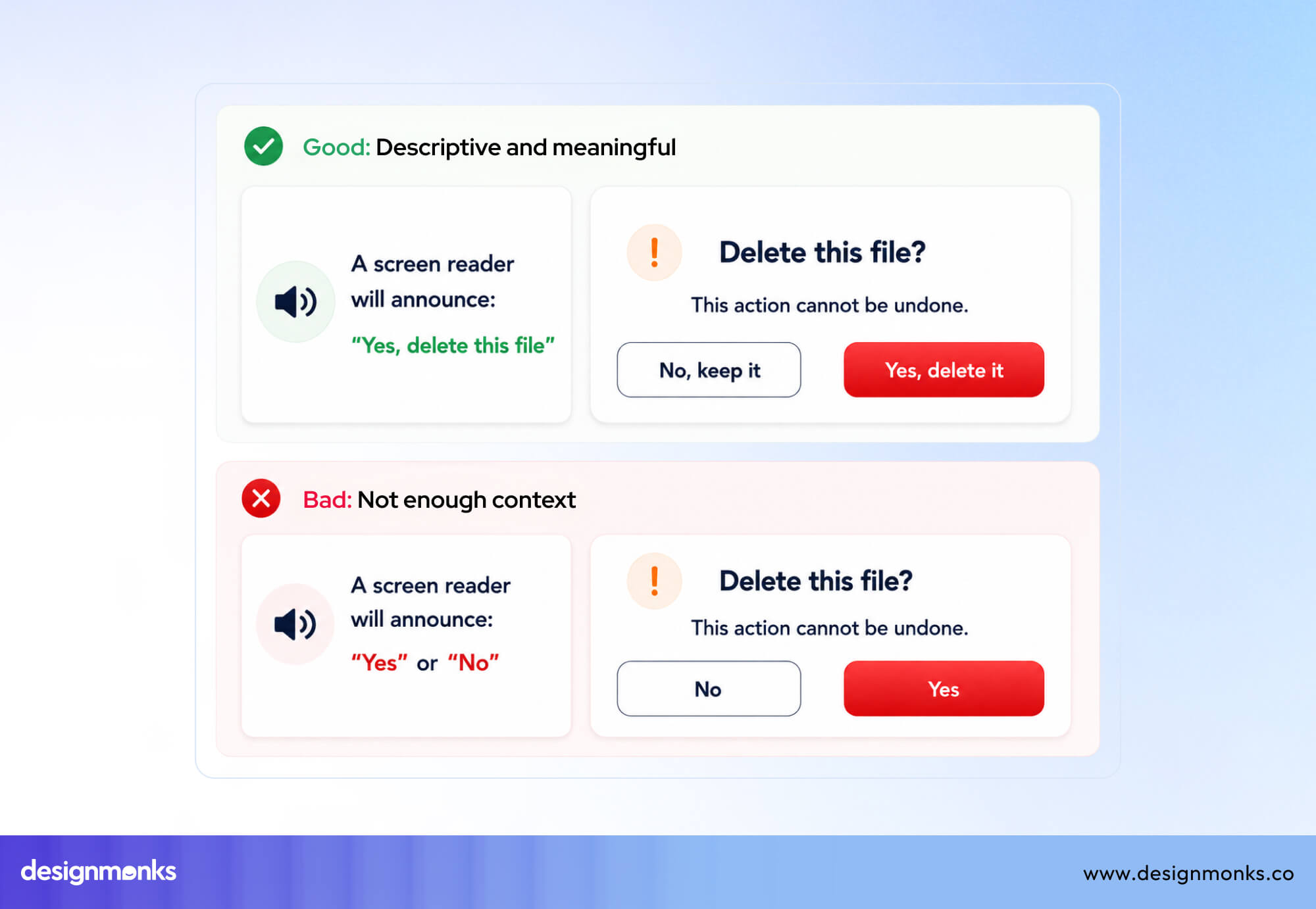
For example, instead of simply hearing "Yes," a screen reader user should understand that the button means "Yes, delete this file" or "Yes, continue."
If this isn't possible, it's often better to replace Yes and No with action-oriented labels like Delete and Cancel, which are naturally more descriptive.
Color Shouldn't Be the Only Indicator
Many interfaces use green for Yes and red for No, but color alone shouldn't communicate the difference between the two options. Some users have color vision deficiencies, while others may not notice the color at all.
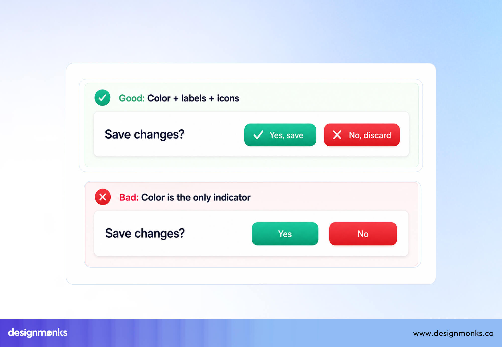
Always pair color with clear button labels, and use icons or other visual cues when appropriate, so every user can understand the available choices.
Focus States
When users navigate with a keyboard, they should always know whether Yes or No is currently selected. Add a clear, high-contrast focus indicator around the active button so it stands out from the rest of the interface.
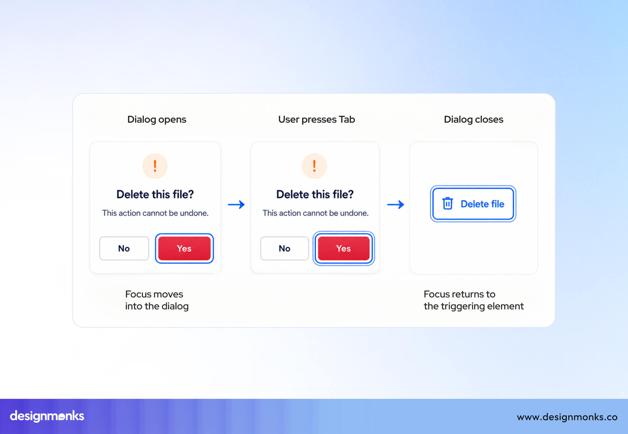
In confirmation dialogs, focus should move into the dialog when it opens and return to a sensible place after it's closed. This makes keyboard navigation smooth and predictable.
Common UX Mistakes with Yes/No Buttons
Even experienced teams fall into predictable traps when designing binary choice dialogs. Watching for these mistakes during design review can prevent significant usability issues down the line:
Double Negatives
Phrasing like "Do you not want to cancel?" paired with Yes/No buttons is a classic failure in UX. Double negatives force users to mentally flip logic twice before answering.
This dramatically increases the chance of a wrong click. Questions should always be phrased in the affirmative wherever possible.
Unclear Confirmation Messages
Yes and No buttons depend on the message above them to provide context. If that message is unclear, users won't know what they're agreeing to or rejecting.
Every confirmation dialog should explain exactly what will happen after clicking Yes or No. If the action can't be undone, make that clear before users make their decision.
Reversed Button Order
Don't place Yes on the left in one dialog and on the right in another. Users quickly become familiar with where each button appears, and changing their positions can lead to accidental clicks.
Choose one button order for your product and use it consistently across every confirmation dialog to create a predictable experience.
Using Yes/No for High-Risk Actions
For actions like permanently deleting an account, removing important data, or making a non-refundable payment, the Yes and No buttons usually aren't clear enough.
Action-based labels such as Delete Account, Remove File, or Confirm Payment make the outcome much more obvious. For especially risky actions, consider adding an extra confirmation step, such as asking users to type DELETE or confirm their decision again, to reduce costly mistakes.
Good and Bad Yes/No Button Examples
Looking at real-world dialog patterns helps illustrate the difference between effective and ineffective binary choices:
Logging Out
A simple confirmation like "Are you sure you want to log out?" can work well with Yes and No buttons.
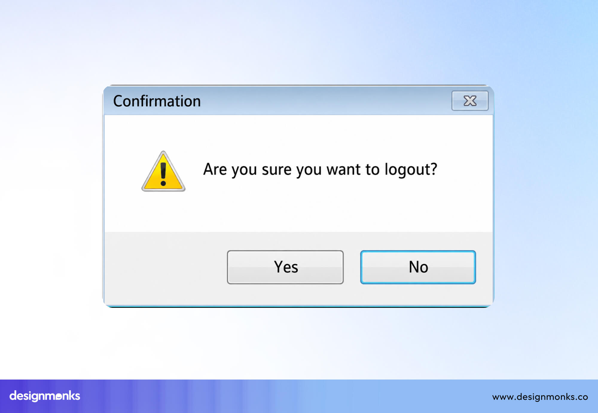
The action is easy to understand, and if users click Yes by mistake, they can simply sign in again. Since the risk is low, generic labels are usually acceptable here.
Deleting a File
Imagine a dialog that says "Delete this file permanently?" with Yes and No buttons. Users have to pause and connect Yes with the action above.
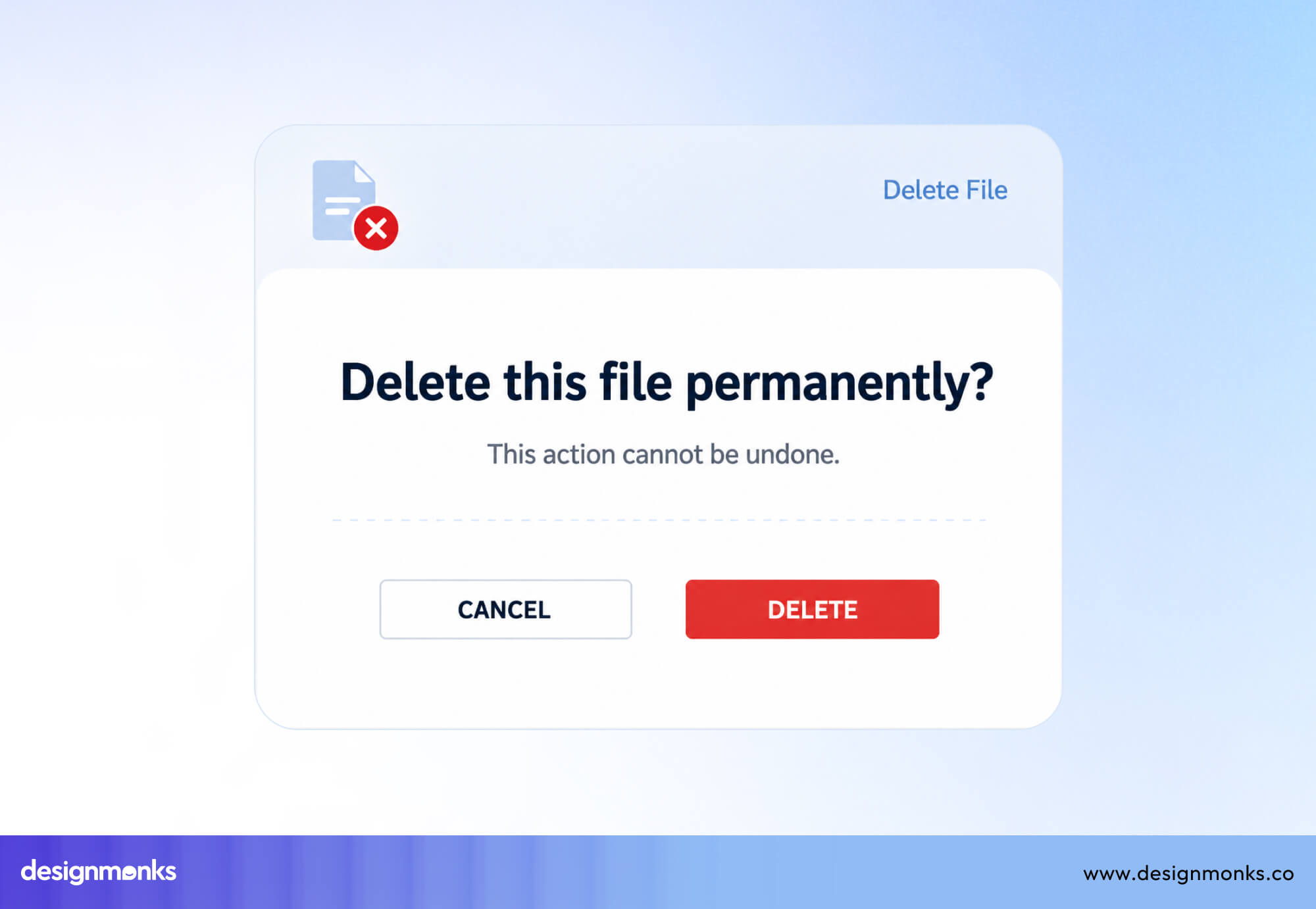
A much better design uses Delete and Cancel. The button itself explains what will happen, reducing confusion and making the decision feel more confident.
Cookie Consent
Many websites display a cookie banner with Yes and No buttons. These labels don't clearly explain what users are agreeing to. Does Yes accept all cookies? Does No reject everything or only optional cookies?
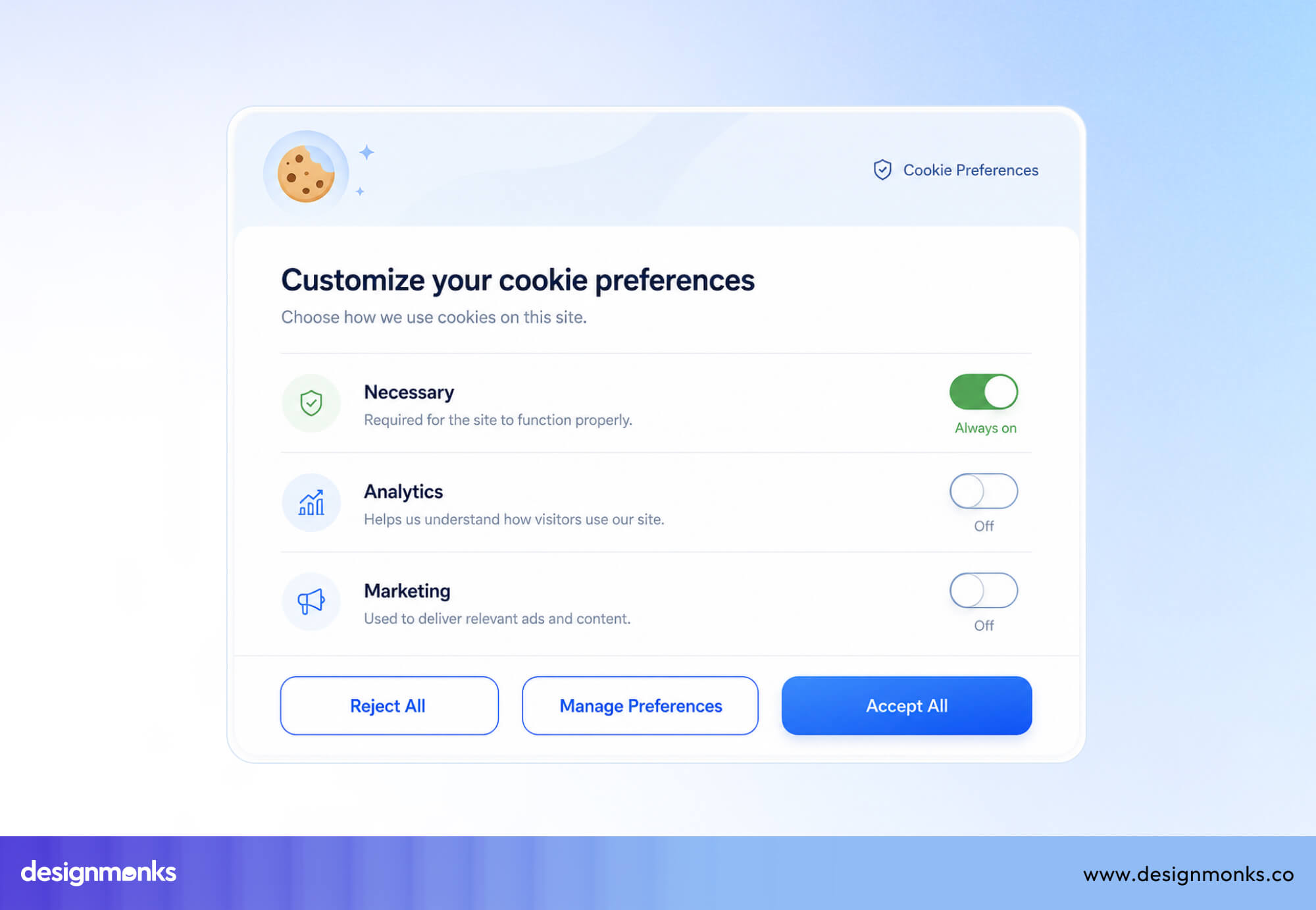
Clear labels such as Accept All, Reject All, and Manage Preferences are much easier to understand and give users more control.
Deleting an Account
Deleting an account is a permanent action, so the Yes and No buttons aren't descriptive enough. Users should see buttons like Delete Account and Cancel instead.
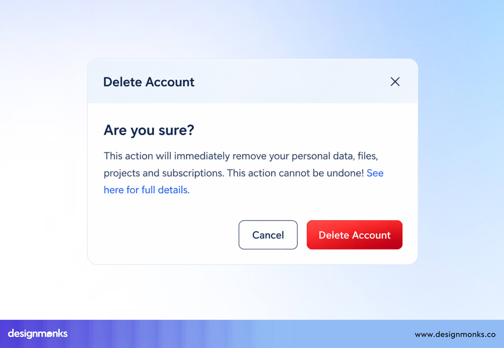
Many products also ask users to type DELETE or enter their password before completing the action. These extra steps help prevent accidental account deletion.
Confirming a Payment
A payment dialog with Yes and No buttons can make users hesitate because Yes doesn't clearly state what they're approving.
Labels like Pay $49.99, Confirm Payment, or Complete Purchase make the action obvious and build more confidence before money is charged.
These examples highlight a simple rule, Yes and No buttons are best for simple, low-risk decisions where the question is obvious. As the action becomes more important or permanent, descriptive button labels almost always create a better user experience.
Alternatives to Yes/No Buttons
Yes and No buttons aren't always the best way to ask users to make a choice. In many situations, other button UI design styles make the action clearer and easier to understand. For example:
Action-Specific Buttons
If users are confirming an action, replace Yes and No with labels that describe the outcome.
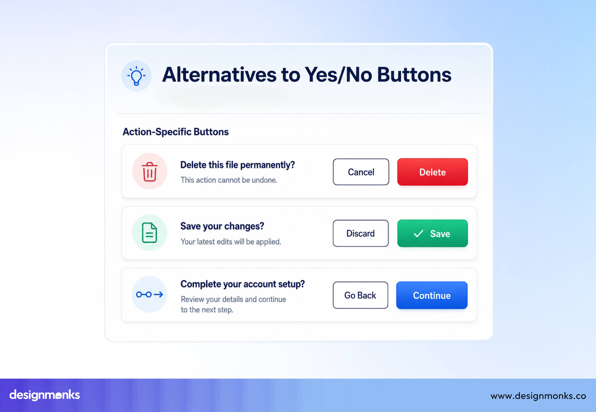
For example, use Delete and Cancel, Save and Discard, or Continue and Go Back. These labels tell users exactly what will happen when they click, so they don't have to read the confirmation message again.
Toggle Switches
If users are constantly turning a setting on or off, a toggle switch is usually a better choice than Yes and No buttons.
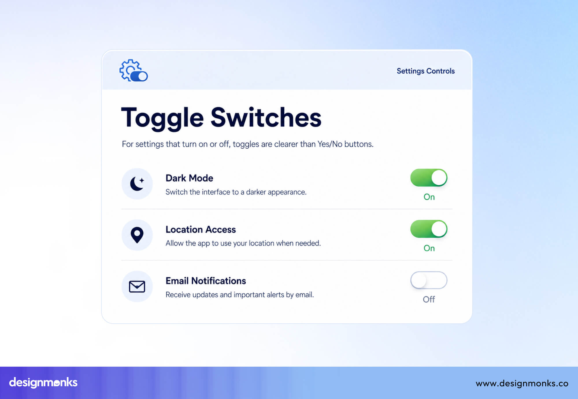
For example, enabling Dark Mode, Location Access, or Email Notifications works best with a toggle because users can immediately see whether the setting is currently on or off. There's no need to ask a separate Yes/No question.
Checkboxes
Checkboxes are better when users are choosing whether to enable or agree to something that remains in effect over time. Examples include I agree to the Terms and Conditions, Subscribe to our newsletter, or Remember this device.
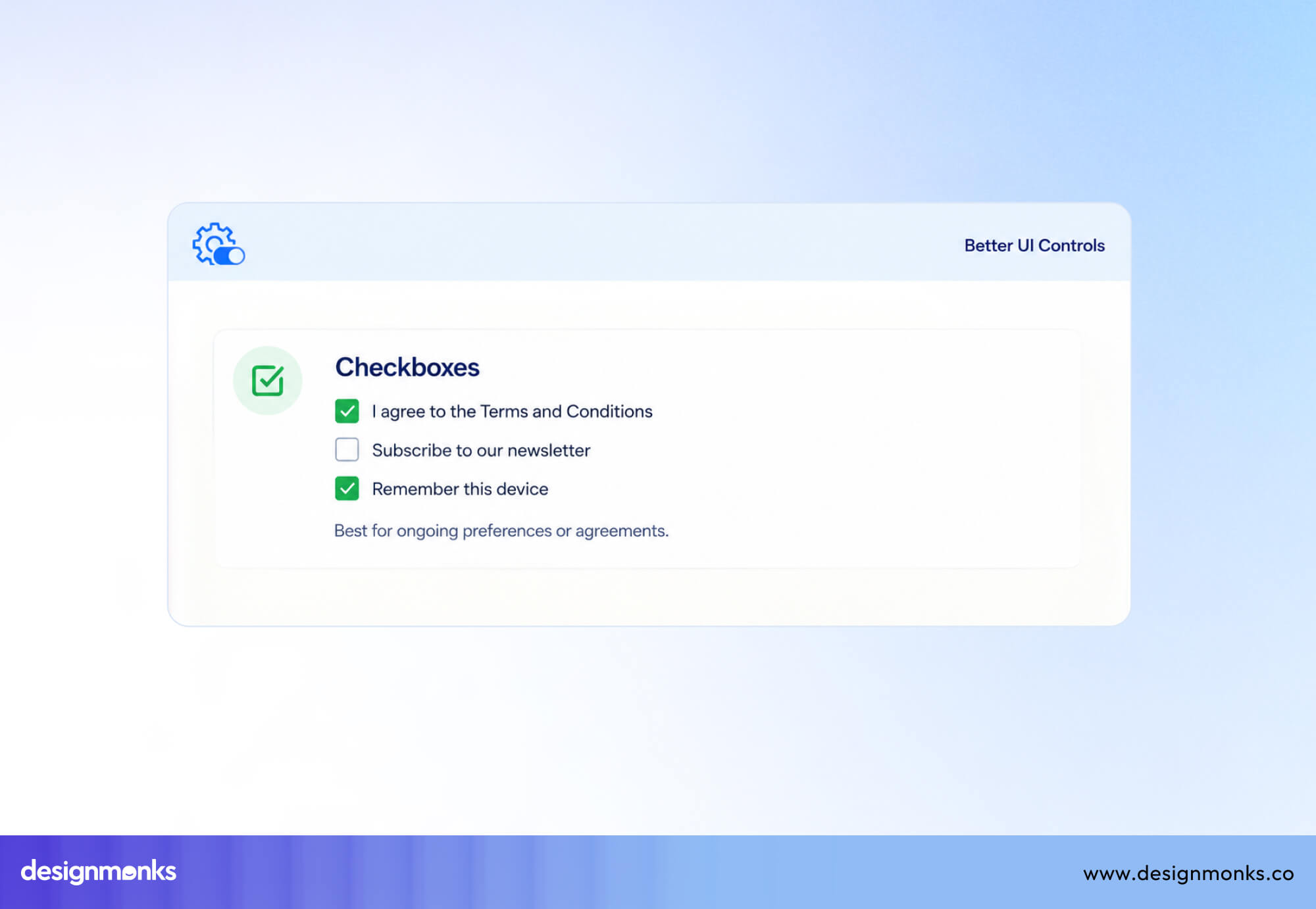
These aren't one-time confirmation actions, so a checkbox communicates the interaction more naturally than Yes and No buttons.
Dropdowns
If a decision might grow beyond just Yes and No, using a dropdown design can be a better option.
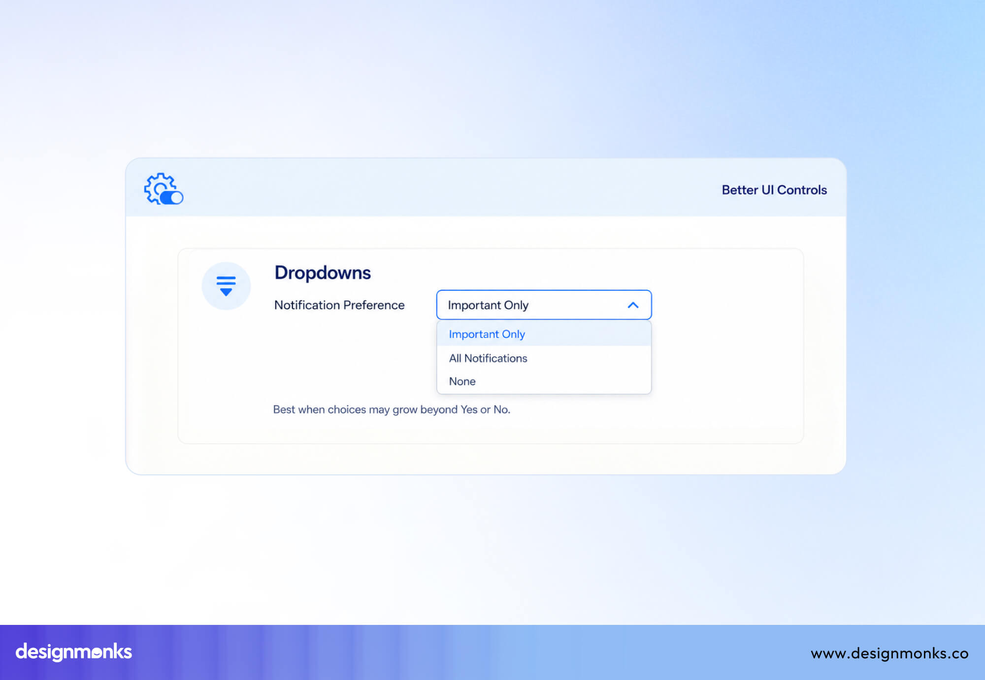
For example, instead of asking whether users want notifications, a dropdown could offer All Notifications, Important Only, or None. This gives users more flexibility without adding extra confirmation dialogs.
Frequently Asked Questions
Are Yes and No buttons bad UX?
Not inherently. They work well for clear, low-ambiguity questions like permission prompts or simple confirmations. They become bad UX when the surrounding question is vague and when more descriptive labels would reduce confusion.
Which button should appear first?
There's no single universal standard for which button to appear first. But consistency within your own product matters more than which side you choose. Pick an order for primary versus secondary actions and apply it everywhere so users can build reliable muscle memory.
Should Yes always be green?
No. Color alone shouldn't communicate meaning, both for accessibility reasons and because "Yes" isn't always the safe or recommended choice. For a destructive action, "Yes" might represent deleting something, in which case a warning color like red is more appropriate than green.


.avif)
.avif)
.avif)
.avif)


.avif)
.avif)
.avif)
.avif)






.avif)