.svg)


Key Takeaways
- Use dropdowns thoughtfully to balance space savings with ease of user selection.
- Searchable dropdowns improve usability when long option lists become difficult to navigate.
- Clear labels and logical organization help users make faster, more confident decisions.
- Accessible dropdowns support keyboard navigation, screen readers, and comfortable touch interactions.
- Selecting the right input control creates faster, simpler, and more intuitive user experiences.
UX Dropdown design often looks harmless, but it can quietly introduce friction that slows users down and disrupts their flow.
Every extra click, every confusing label, and every overloaded list make users second-guess what should be obvious. These small disruptions don’t stand out individually, but together they shape how frustrating or effortless a product feels.
But worry not, as we break down in this guide exactly how to design UX dropdowns that feel smooth, intuitive, and effortless for users.
What Is a Dropdown in UX?
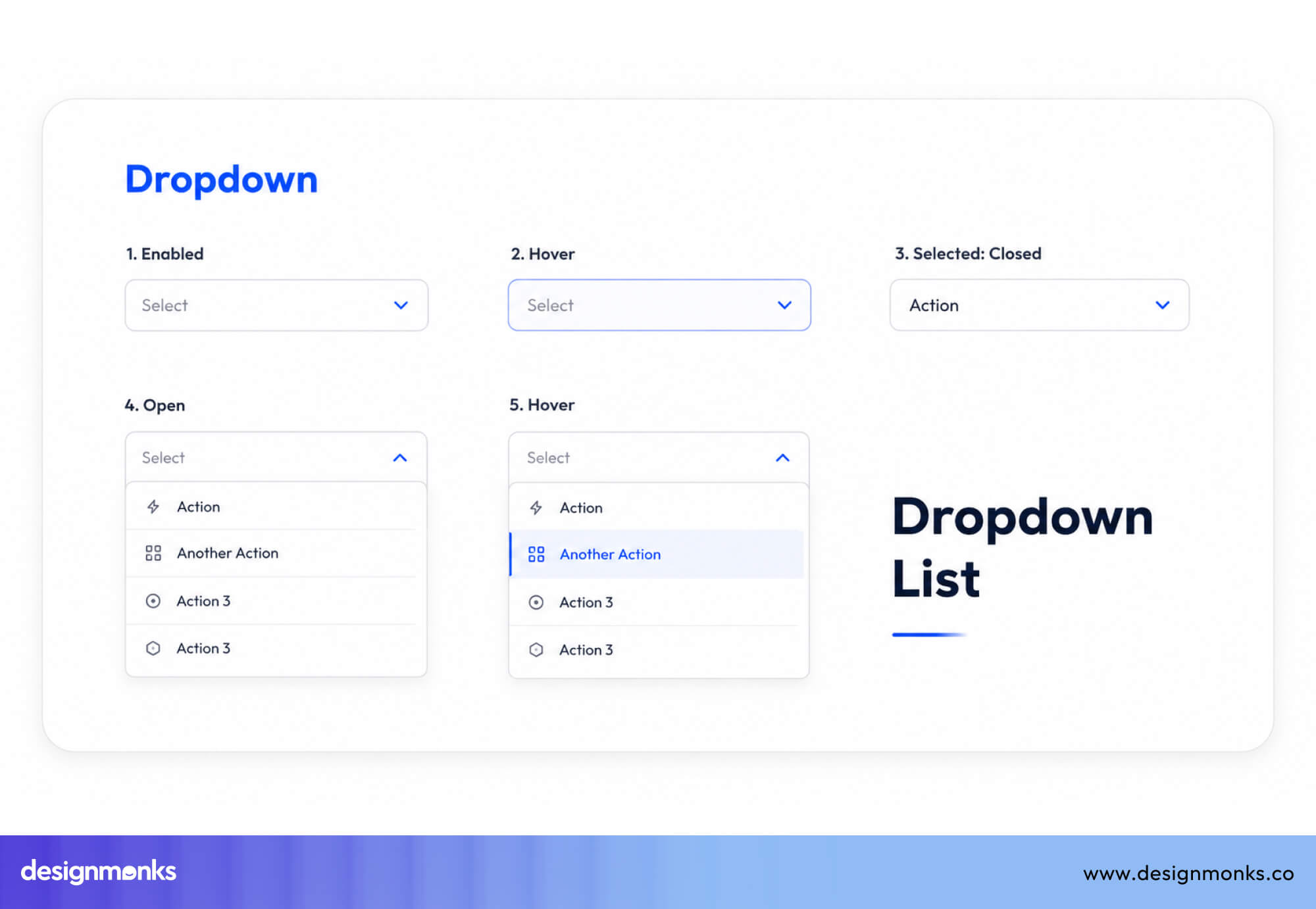
A dropdown menu is a UI control that presents a list of selectable options in a compact, collapsed state. Users click or tap the control to expand it, choose from the revealed options, and the selected value is then displayed in the collapsed field.
Dropdowns are used everywhere, for example, country selectors in checkout flows, category filters in search, settings panels in enterprise software, and top-level navigation on marketing sites.
Instead of showing all options on the screen, a dropdown hides them behind one clickable field. This keeps the interface clean, especially when there are many options or limited screen space.
How Dropdown Menus Work?
Dropdowns have two states:
- Collapsed state: Only the selected value or a placeholder (like “Select an option”) is visible
- Expanded state: A list of all options appears when the user clicks or taps
When the user picks an option, the list closes, and the selected value is shown. On mobile devices, instead of dropdowns, it has a built-in phone menu that is easier to scroll and select with touch.
From a technical standpoint, dropdowns are typically built with the native HTML<select> element, or with custom components. It normally uses a combination of a button, a hidden list, ARIA attributes, and JavaScript to manage open/close state and keyboard navigation.
Types of Dropdown Menus
There are four main types of dropdown menus:
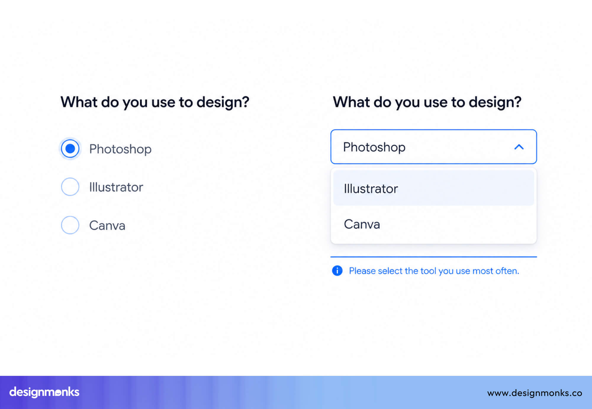
- Single-select dropdown: The most common type. The user picks exactly one option from the list, which replaces the placeholder. (e.g., country, language)
- Multi-select dropdown: Allows users to choose multiple values simultaneously. A checkbox appears next to each option, and selected values are summarized in the collapsed field
- Searchable dropdown: Adds a search input inside the expanded panel, filtering visible options as the user types. Essential for lists longer than 10–15 items.
- Cascading dropdown: A chain of two or more dependent selectors where choosing a value in the first one populates options in the second. Common in geographic selectors (Country → State → City).
When Should You Use Dropdown Menus?
Dropdowns are not the right tool for every selection task. They work best in specific situations where their space-saving qualities outweigh the hidden nature of the options.
The right choice also depends on where the selection appears in the overall user journey. A dropdown that works well in one step may introduce unnecessary friction in another.
Understanding these contexts will stop you from reaching for a dropdown by default:
Number of Options
The number of choices is the strongest signal:
- 1-2 options → use a toggle
- 3-5 options → use radio buttons
- 6-15 options → use a dropdown
- 15+ options → use a searchable dropdown
Too few options make dropdowns unnecessary. Too many without search make them frustrating.
Space vs Visibility
Dropdowns save space by hiding options, but that comes at a cost. Users must click to see choices.
If users need to compare options side by side, avoid dropdowns. If space is limited and users already know what they’re looking for, dropdowns work well.
Selection Context and Frequency
Think about how often users interact with the field:
- Frequent actions (filters, repeated choices) → keep options visible
- One-time or rare selections (country, timezone) → dropdowns are fine
High-frequency actions should feel fast and effortless, not hidden behind extra clicks.
Type of Selection (Single vs Multiple)
Dropdowns behave differently depending on selection type:
- Single selection → dropdown works well
- Multiple selections → use checkboxes if possible
Only use multi-select dropdowns when space is limited or the list is too long to show.
Complexity of the Choice
Ask yourself, “Does the user need to explore or already know the answer?”
- Known choices → dropdown is efficient
- Exploratory decisions → show options clearly
Dropdowns are good for picking a known value, not for discovering or comparing options.
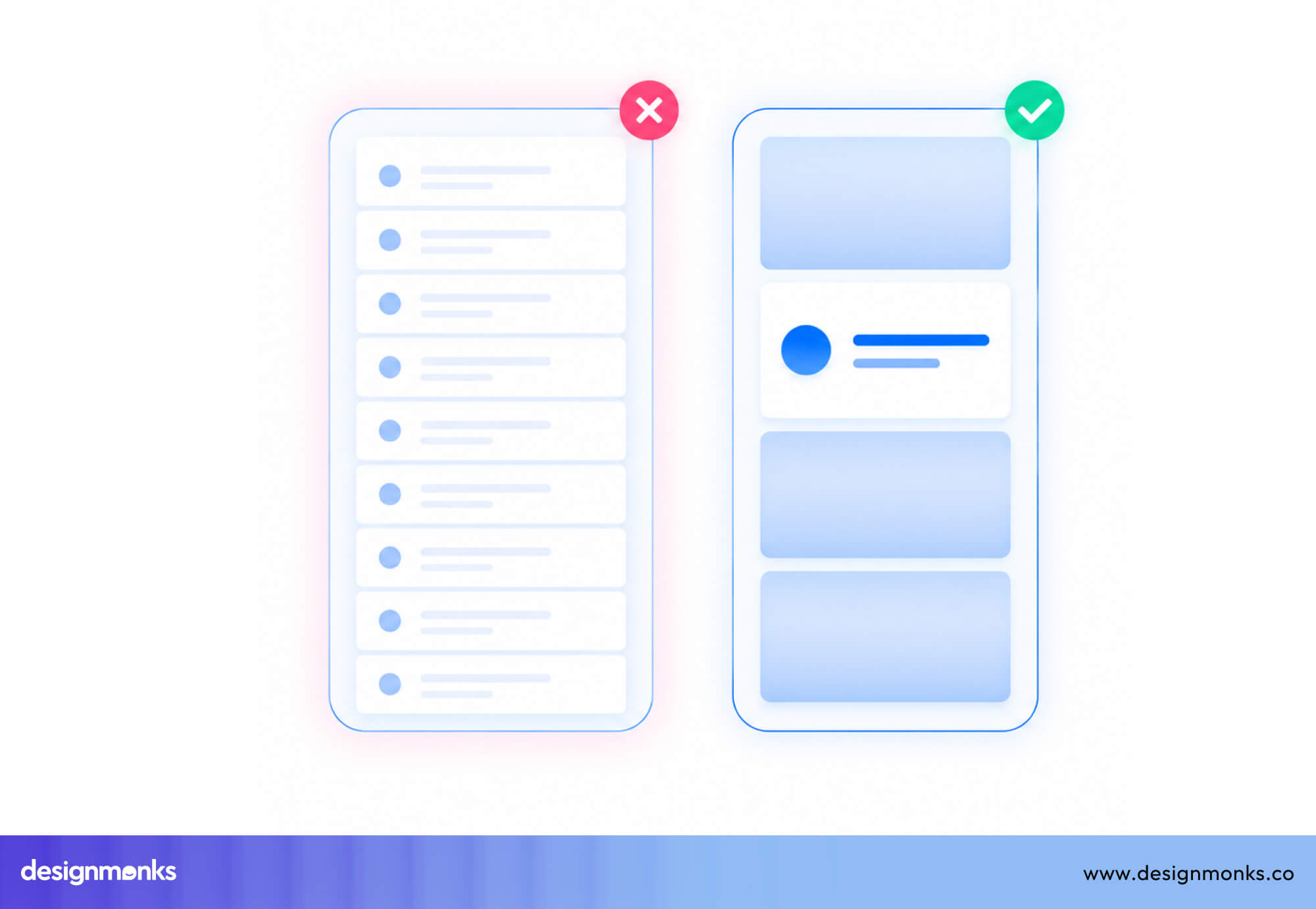
When Should You Avoid Dropdowns?
Dropdowns hide options until users click to open them. This means users must take an extra step just to see their choices. That extra step can sometimes slow things down and create friction.
UX expert Jakob Nielsen has pointed out that dropdowns are often overused. In many cases, simpler controls that show all options directly help users complete tasks faster.
Here are situations where other options work better:
When Radio Buttons Are Better
If there are five or fewer options and users can choose only one, radio buttons are usually a better choice. They show all options at once, so users don’t need to click to see them. This makes it easier to compare choices before deciding.
For example:
- Choosing a pricing plan (Basic, Pro, Enterprise)
- Selecting a contact method (Email, Phone, SMS)
- Picking a subscription frequency (Weekly, Monthly, Annually)
In these cases, radio buttons are faster and clearer than dropdowns. If showing all options does not make the screen cluttered, show them.
When Checkboxes Are Better
When users need to select multiple independent options and each choice is a yes/no toggle, checkboxes are clearer than multi-select dropdowns. A list of notification preferences, a set of dietary restrictions, or a group of feature permissions are all better expressed as checkboxes.
Multi-select dropdowns hide the current state by summarizing it as a count (“3 selected” ), whereas checkboxes show exactly what is on and what is off at a glance.
When Toggle Switches Are Better
If there are only two options (like ON/OFF or YES/NO), a toggle switch is the best choice. Toggle switches clearly show the current state and make it easy to change it. They feel more natural because they look like a real switch.
Using a dropdown for just two options adds unnecessary effort and makes a simple decision feel more complex than it is.
Quick Rule: If you can show all options without creating clutter, do it. Dropdowns should earn their place by managing complexity, not creating it.
UX Principles Behind Effective Dropdown Design
Good dropdown design is not just about UI patterns, it is based on how people think and make decisions. These behaviors are rooted in core interaction design principles.
These principles explain why some dropdowns feel easy to use while others feel confusing or slow:
Hick's Law and Choice Overload
Formulated by psychologists William Edmund Hick and Ray Hyman in the 1950s, Hick’s Law describes the relationship between the number of choices presented and the time it takes to make a decision.
In practice, this means that every additional option in your dropdown adds cognitive cost. So the more options users see, the longer it takes them to decide.
To improve this situation:
- Remove duplicate or unnecessary options
- Group related items together
- Show the most common choices first
- Hide less relevant options when possible
Fitts's Law and Click Targets
Fitts’s Law predicts that how fast you click something depends on its size and how far away it is. For dropdowns, this has two practical implications. First, the dropdown trigger itself should be large enough to click easily.
A full-width trigger on a form is easier to acquire than a narrow one.
Second, within the expanded panel, taller option rows are easier to select accurately, particularly on touch screens. The most common options (or defaults) should appear near the top of the list, reducing the distance users must travel.
Progressive Disclosure in UX
Dropdowns follow the idea of showing less information first and revealing more when needed. This helps keep interfaces clean and focused.
However, this only works when less important options are hidden. If users need to see options to make a decision, hiding them inside a dropdown creates confusion instead of helping.
Reducing Cognitive Load
Cognitive load is the mental effort required to complete a task. Poor dropdown design increases this effort and makes interactions feel harder than they should. They increase cognitive load in multiple ways:
- Opening and closing dropdowns repeatedly to compare options
- Random or unstructured option order
- Unclear or confusing labels
- No clear indication of what is currently selected
Good dropdowns reduce mental effort by being clear, structured, and predictable, so users can make decisions quickly and confidently.
Dropdown Accessibility Guidelines
Accessibility is not something you add at the end. It is an important part of design that affects real people, including users with vision problems, limited movement, or difficulty understanding complex interfaces.
Dropdowns are often hard to make fully accessible. Many custom dropdowns fail, while basic HTML dropdowns (<select>) usually work better by default. Here are things you should keep in mind:
Keyboard Navigation Best Practices
A good dropdown should work properly with a keyboard. Users should be able to:
- Press Tab to move to the dropdown
- Press Enter or Space to open it
- Use the Arrow keys (Up/Down) to move through options
- Press Enter to select an option
- Press Escape to close it without selecting
After closing, the focus should go back to the dropdown field. If you build a custom dropdown, you must add and test all of this yourself.
Screen Reader and ARIA Support
Custom dropdowns need proper ARIA semantics so screen readers can understand their state and options. Depending on the component behavior, the trigger may use role="combobox" or another suitable pattern, with aria-expanded updated as it opens and closes.
The pop-up should use role="listbox", and each item should use role="option". Also, use aria-selected to indicate the chosen option. If the dropdown includes search, consider announcing result counts with a live region.
Test the component with screen readers like NVDA and VoiceOver, because behavior can differ across platforms.
Mobile-Friendly Touch Targets
On mobile, dropdowns must be easy to tap. Guidelines recommend:
- At least 44×44 px touch size (Apple)
- At least 48×48 dp (Material Design)
This means the clickable area should be large, not just the text.
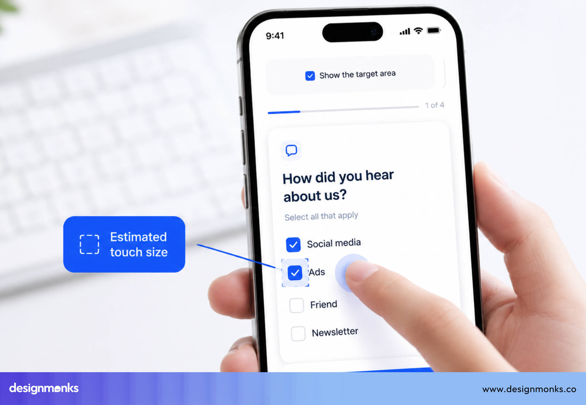
A common mistake is making the dropdown look big but keeping the clickable area small. Inside the dropdown, each option should also be at least 44 px tall. This helps users avoid tapping the wrong item.
WCAG Accessibility Recommendations
Every dropdown should follow WCAG rules, such as:
- 1.3.1 Info and Relationships: The dropdown’s structure must be clear in code, not just visually.
- 2.1.1 Keyboard: All functionality must work with a keyboard.
- 4.1.2 Name, Role, Value: Each control must have a clear name, role, and state.
WCAG 2.2 also introduces target-size guidance for clickable elements. For most products, aiming for WCAG Level AA is a practical accessibility standard.
Types of Dropdown Menus With Examples
Different types of dropdowns are designed for different use cases. Here's a brief on when to use which:
Single-Select Dropdown
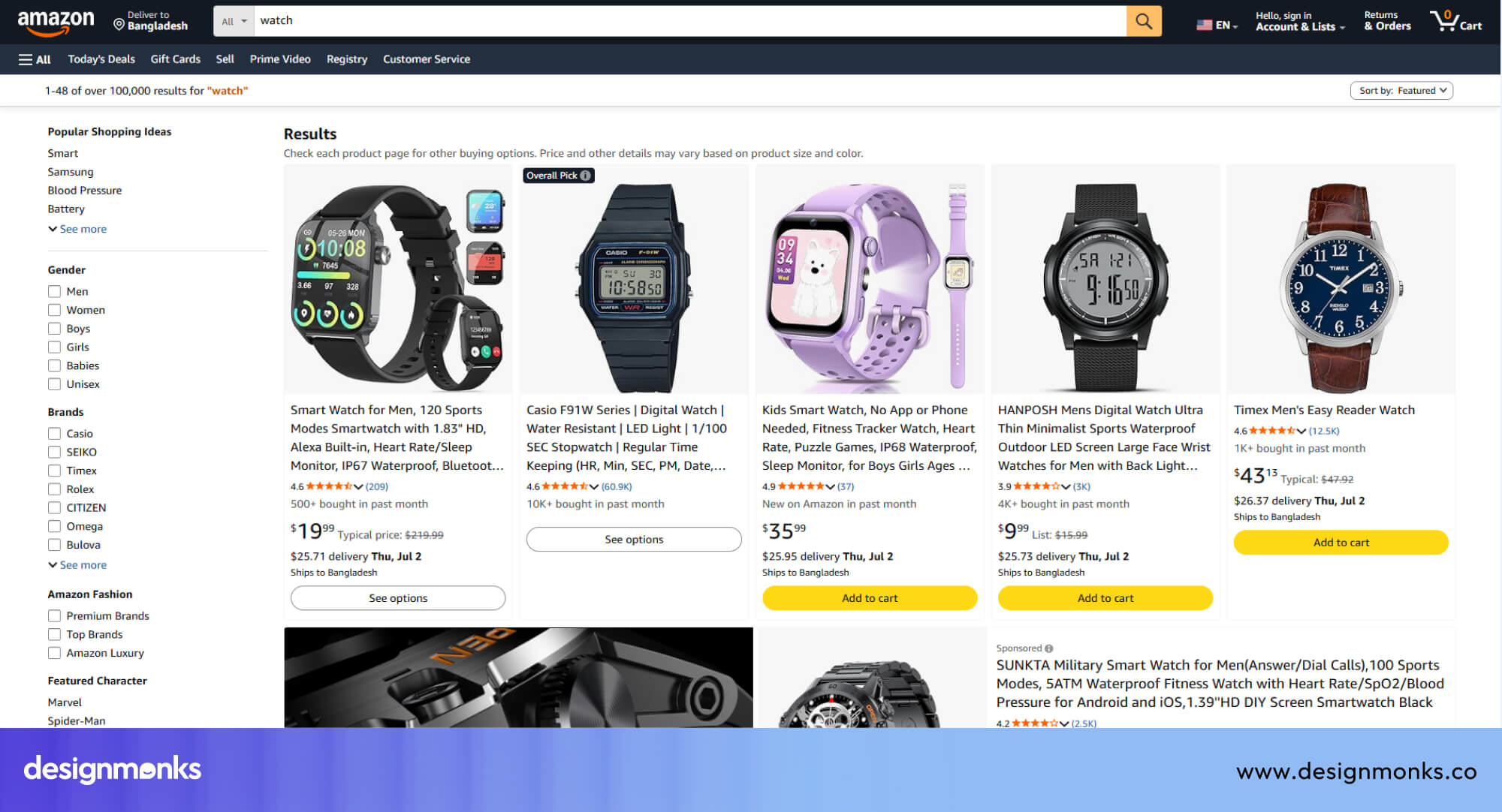
This is the standard dropdown. The user opens the panel, selects one option, and the panel closes. Used everywhere for form fields for date of birth, country, currency, and dozens of other single-value selections.
The Gmail “ Move to “ label selector is a clean example. It also adds a search to make selections faster.
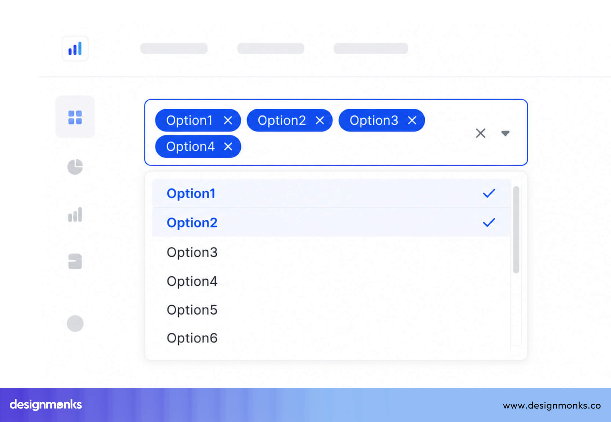
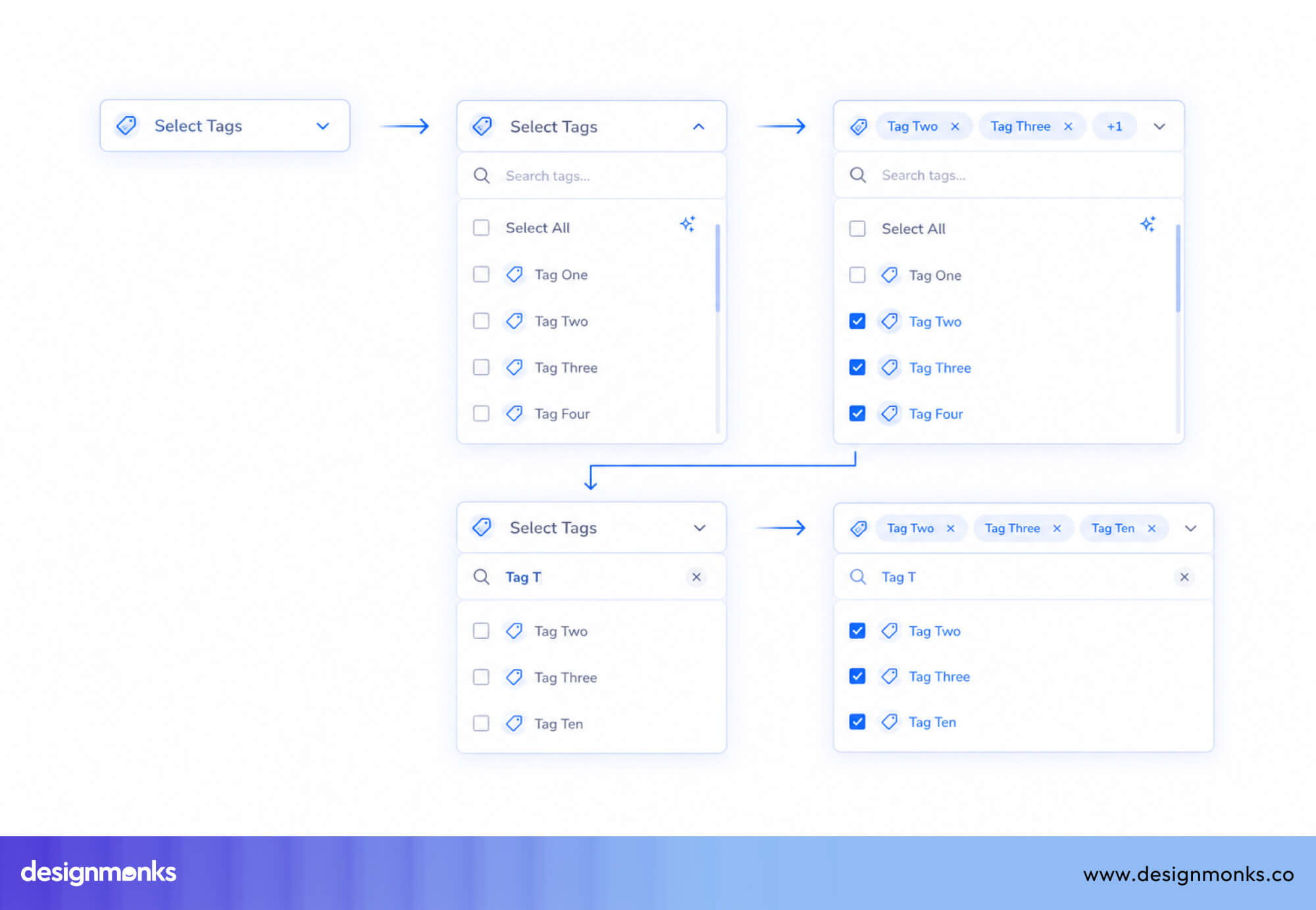
Multi-Select Dropdown
Multi-select dropdowns let users pick several options simultaneously. Each row in the expanded panel includes a checkbox, and the trigger field summarizes the selection count or lists selected values.
These are used in task management apps (assigning multiple tags or collaborators), analytics dashboards (selecting multiple dimensions), and e-commerce filter panels. Designers often choose multi-select dropdowns for analytics dashboard design because they let users apply multiple filters without taking up valuable screen space.
The key design challenge is making the current selection state obvious in the collapsed view. You can use a badge count or a comma-separated summary to indicate the selected ones, but the summary approach usually breaks down beyond three or four selections.
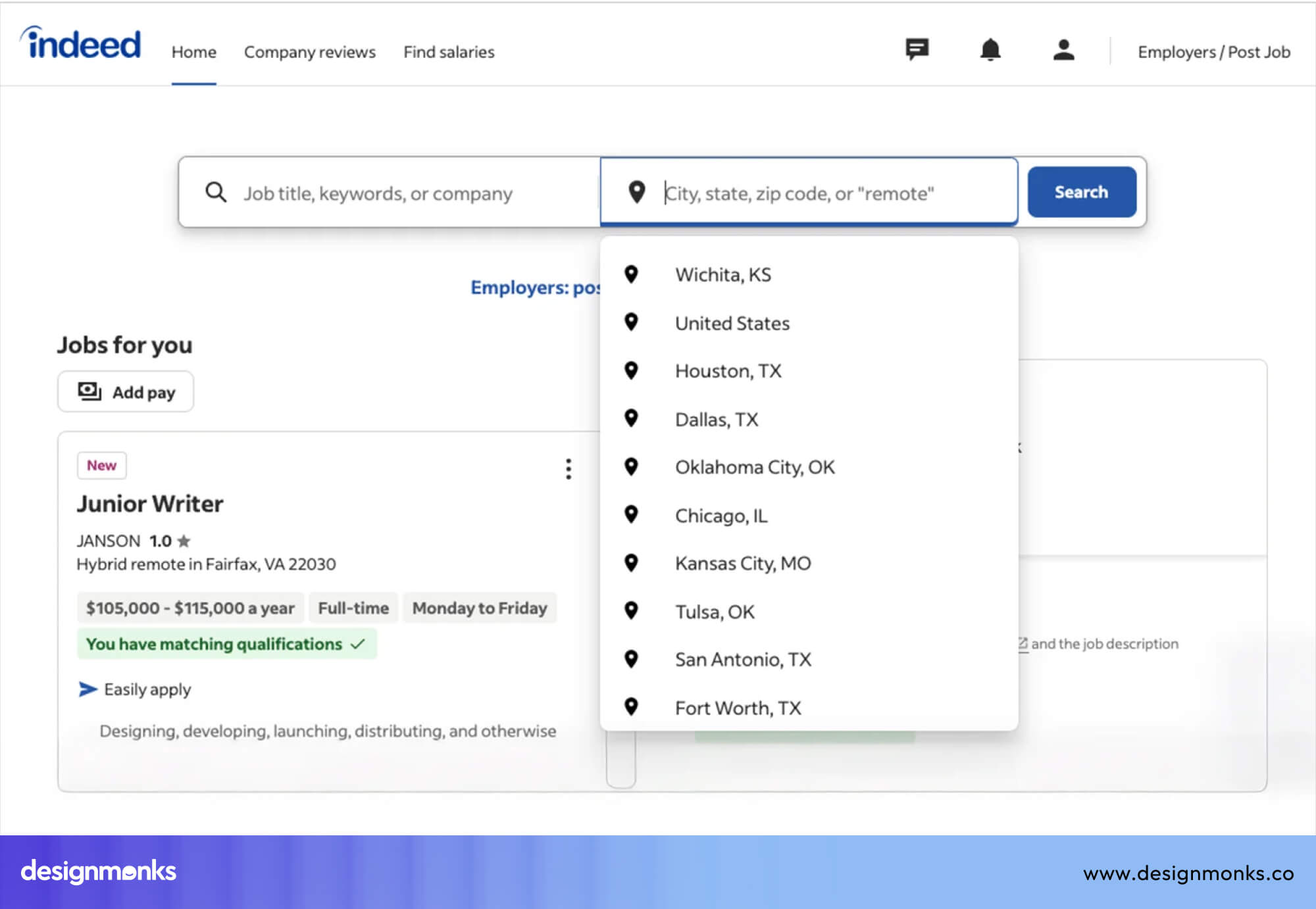
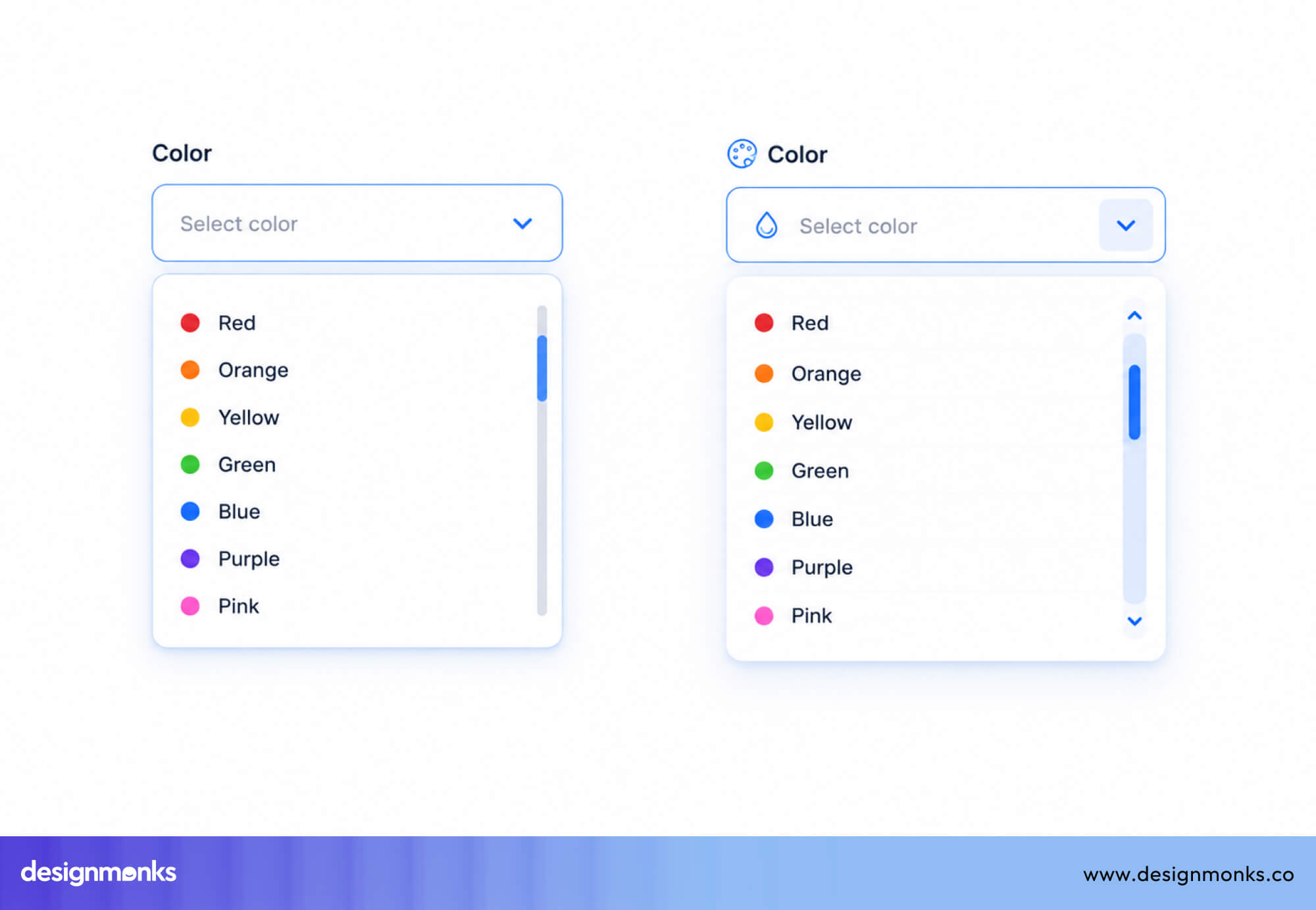
Searchable Dropdown
This is a dropdown menu with a text input that filters the option list in real time. This is essential for large datasets like a timezone selector with 300+ options, a language picker, or a product SKU search.
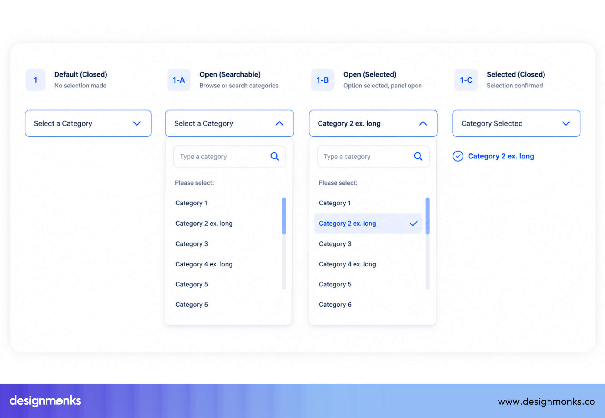
Stripe uses this in its settings to help users quickly find options like currencies or countries. This pattern is also called a combobox, but unlike autocomplete, users must choose from the given list.
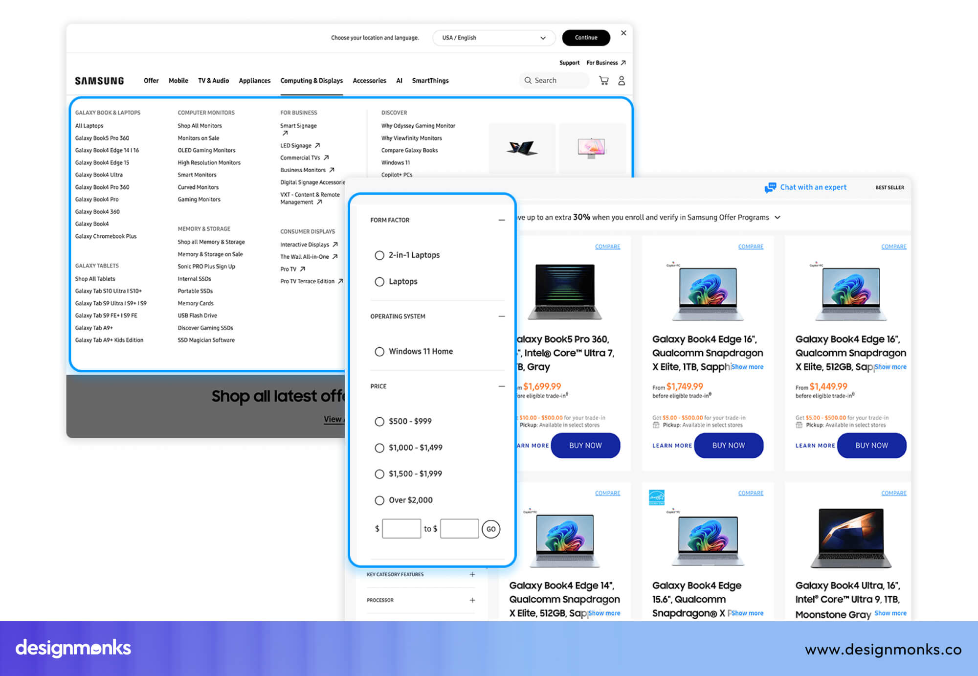
Cascading Dropdown
A set of dependent selectors where the options in downstream dropdowns are determined by the selection in upstream ones. The most familiar example is the address field cascade, like selecting “United States” fills the state dropdown with 50 states. And further with the city selector.
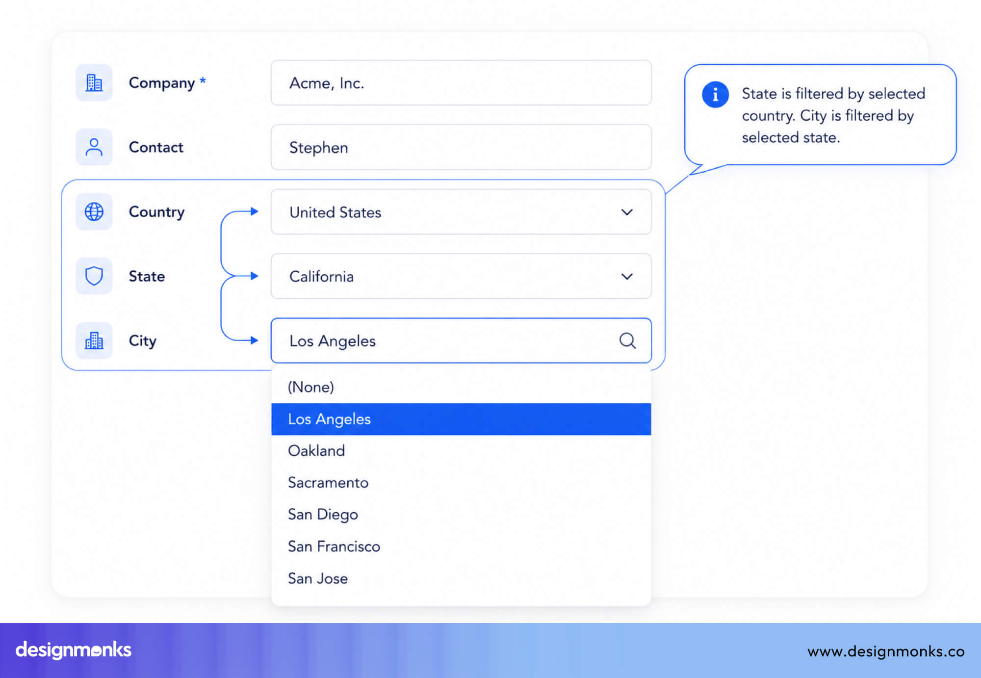
Cascading dropdowns require careful loading state management. When a user changes an upstream selection, downstream fields should visually reset and show a loading indicator, rather than displaying stale data.
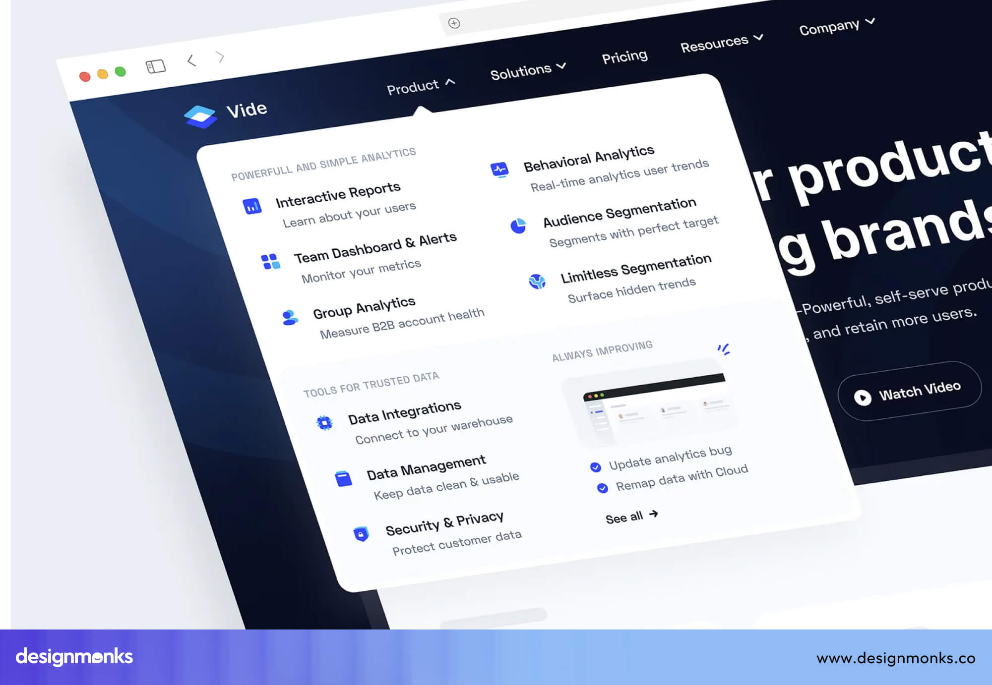
Mega Menu Dropdown
Mega menus are large dropdowns used mainly in navigation. They open into a big panel with multiple categories, sections, and sometimes images. They are often used by big websites like Apple or Amazon.
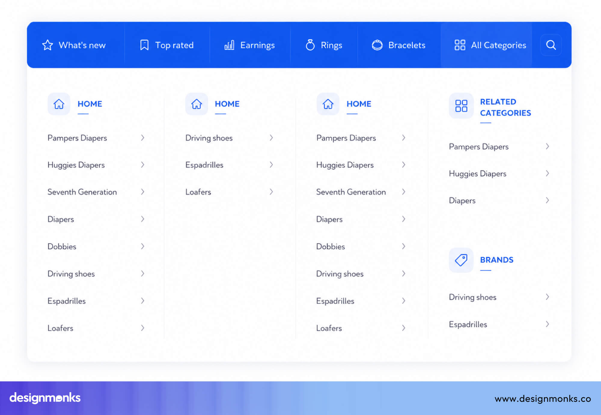
The challenge is making them easy to navigate. They must support keyboard use, stay stable when users move the mouse, and work well on mobile, where hover interactions do not exist.
UX Dropdown Best Practices
When you decide to use a dropdown, it should be easy to use, quick to scan, and smooth for users. These best practices will help you design dropdowns that feel simple and efficient:
Keep Options Short and Easy to Scan
Option labels should be short and clear, ideally under five words. Keep the wording consistent so all options follow a similar pattern. Avoid long text that wraps into two lines inside the dropdown. This makes it harder for users to scan quickly.
Use normal sentence case (not ALL CAPS or Every Word Capitalized) and avoid technical or confusing words. If an option needs extra explanation, do not try to fit everything into the label. Instead, use a tooltip or helper text below the field.
Organize Choices Logically
The order of options affects how quickly users can choose. Use a clear and logical order:
- Alphabetical order works well for things like countries or languages
- Showing the most common options first works better for things like templates or time zones
If the list is long and mixed, group similar items together using sections. Avoid random or outdated ordering that made sense during development but feels confusing to users.
Use Default Values Carefully
A default value can save time if most users will pick the same option. But it can also cause mistakes if users do not notice it and leave it unchanged. Never set a default that could lead to serious errors. For example, selecting the wrong country automatically.
Use clear placeholders like “Select your country” instead of vague text like “Select…” or leaving the field empty. If you do use a default, make sure it is easy for users to change.
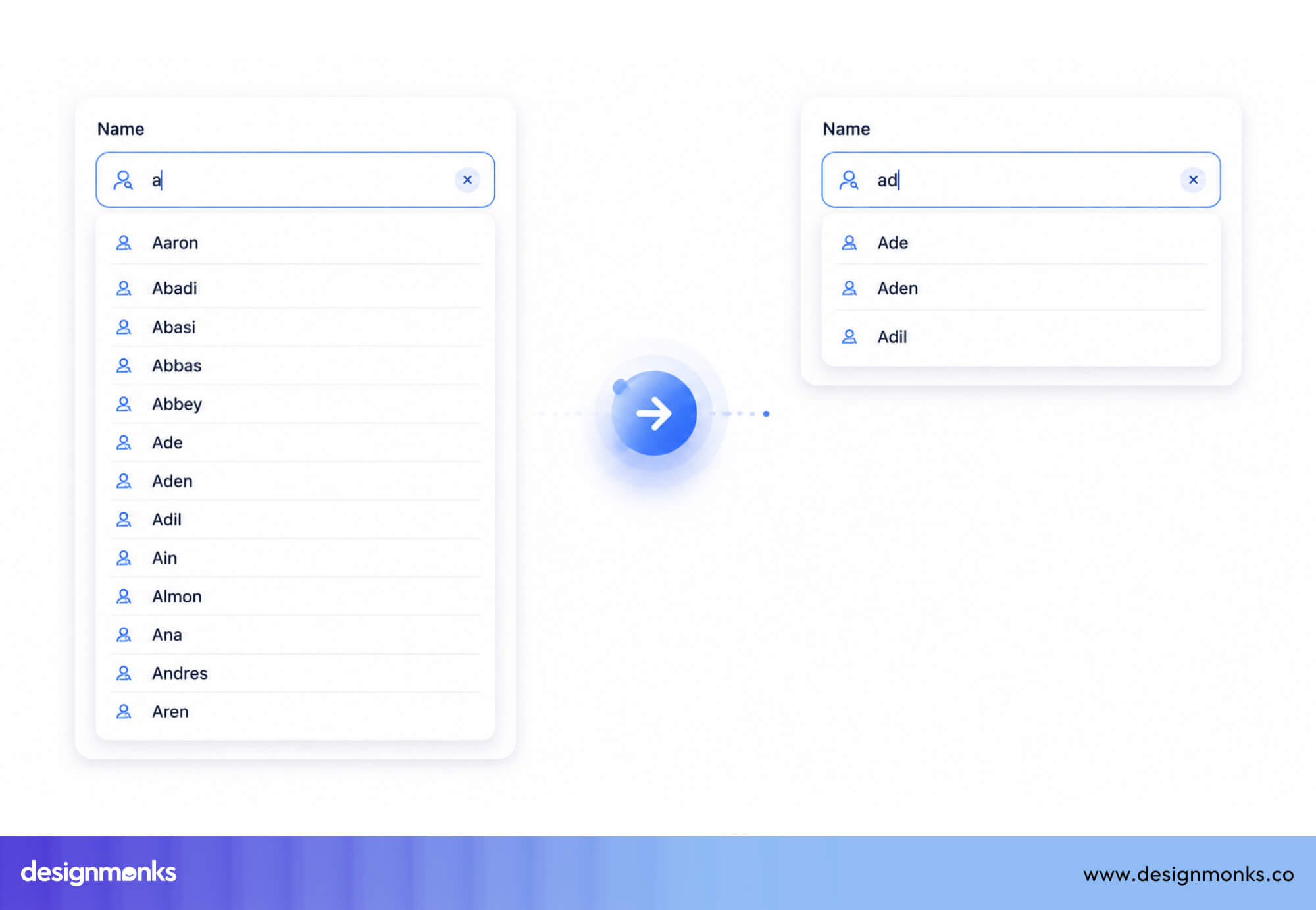
Make Long Lists Searchable
If a dropdown has more than 10–15 options, add a search field at the top. This allows users to type a few letters instead of scrolling through the entire list, saving time and effort.
A good search should:
- Filter results as the user types
- Highlight matching text
- Handle small typing mistakes (like case differences or slight typos)
Many tools like Select2, Choices.js, and React Select can help implement this pattern easily.
Avoid Deeply Nested Menus
Cascading dropdowns (where one dropdown depends on another) can be useful, but too many levels create problems.
A simple structure like Country → State → City is manageable.
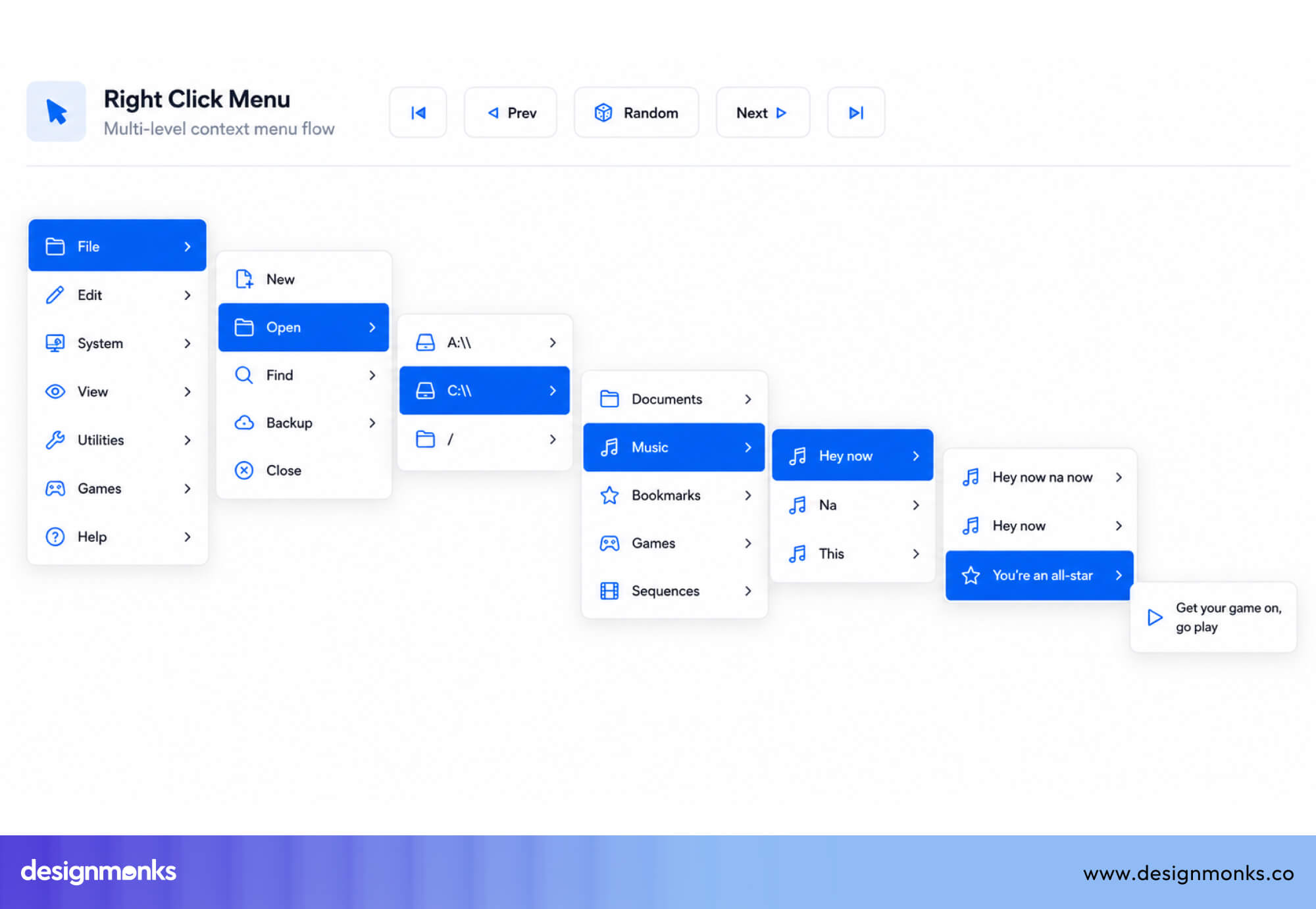
But deeper levels (like 4–5 steps) become hard to use. Users must remember previous choices and can easily make mistakes early on.
If your design needs many levels, consider using a different pattern, such as:
- A step-by-step form (stepped wizard)
- A search-first approach
- An autocomplete field that lets users type freely
These options reduce confusion and make the process easier.
Following these best practices helps create dropdowns that are easier to scan, faster to use, and more accessible. When applied consistently across an entire product, they contribute to a smoother overall user experience. And that's the goal at the heart of effective UI/UX design services.
Dropdown Menu Examples From Popular Products
Now let's look at some popular companies' examples and how they use dropdown menus to their advantage:
Google Forms Dropdown Fields
Google Forms uses single-select dropdowns as one of its core question types. The implementation is clean. A plain trigger field with a visible caret, a clean white panel with generous row heights, and keyboard navigation out of the box via the native HTML select element on most platforms.
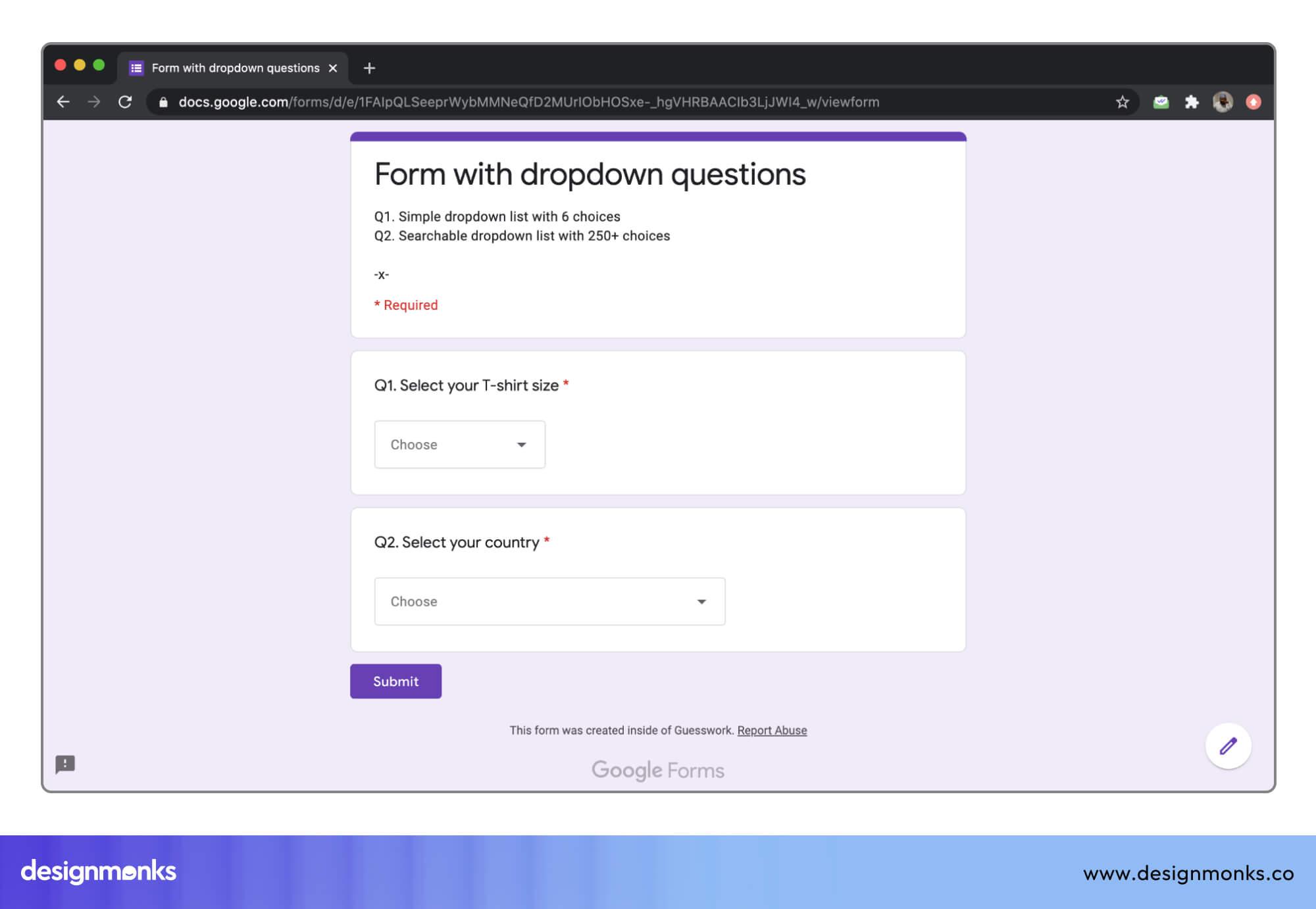
It is a great example of using the right tool for the right job. When a form question has more than five options, Forms defaults to a dropdown. But when it has fewer, it surfaces radio buttons automatically.
Airbnb Search Filters
Airbnb’s search filter interface uses a combination of popover dropdowns and panel- style selectors to handle complex multi-faceted filtering. Guest count uses a custom stepper inside a dropdown, date ranges use a calendar popover, and amenity filtering uses a full-panel multi-select.
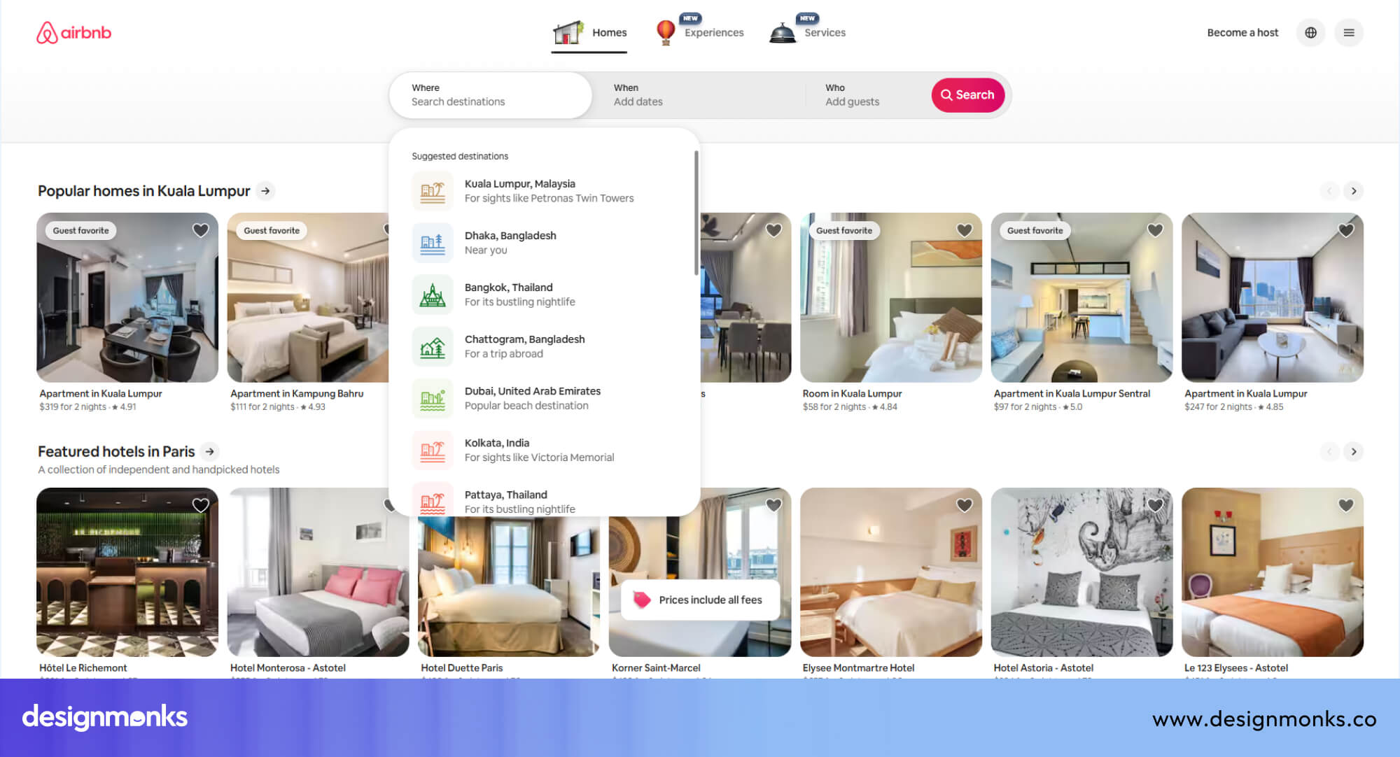
What Airbnb does well is matching the complexity of the control to the complexity of the decision. Simple numeric inputs stay compact, while decisions that require comparison (amenity types) expand into a full-page overlay on mobile.
Amazon Category Menus
Amazon’s hamburger menu uses a multi-level mega menu that organizes top-level departments, subcategories, and featured navigation into a single expandable panel. This implementation uses click-to-expand rather than hover, which is more reliable across input types and avoids the diagonal mouse-movement problem.
The sheer breadth of Amazon’s catalog makes this deep navigation necessary. But it is worth noting that search handles the majority of Amazon’s navigation load. The mega menu serves as an exploration and fallback interface.
Material Design Components
Google’s Material Design system documents dropdown behavior extensively. The Material dropdown (called “Select” in Material UI) features a clear outlined or filled variant trigger, a smooth elevation shadow on the expanded panel, and ink ripple effects on option selection.
Material Design also specifies accessibility behavior explicitly in its component documentation, making it a useful reference for teams building custom dropdowns and wanting to align with a well-considered design system.
Common UX Dropdown Mistakes
Even experienced designers make mistakes when using dropdowns. Many of these mistakes violate established usability heuristics, such as visibility of system status, consistency, and error prevention, ultimately making interfaces slower, more confusing, and less intuitive.
Here are the most common ones to avoid:
Too Many Choices and Choice Overload
Hick's Law explains that the more options people have, the longer it takes them to decide. A dropdown with 50 or 80 options is not just slightly harder, it can overwhelm users. They may feel stuck, take too long, or even leave without choosing anything.
If you cannot reduce the number of options, you should:
- Group similar options together
- Put the most common choices at the top
- Add a search feature
If the list still feels too big, consider a different approach. For example, show a smaller set first and let users expand more options only if needed.
Hiding Important Options
Dropdowns should not hide options that users need often. If most users keep choosing the same few options, those should be visible without opening a dropdown. For example, you can show popular options as Buttons, Chips, or Radio buttons. Then keep the rest inside the dropdown.
Using a dropdown for everything, no matter how often it’s used, adds extra steps and slows down the main user flow.
Complex Multi-Level Dropdown Menus
Dropdowns with many levels (like menus inside menus) are hard to use. On desktop, they often rely on hover. This can be frustrating because moving the mouse slightly can close the menu. Moreover, users may accidentally trigger other menus.
On mobile, this doesn’t work at all because there is no hover. If your navigation has more than two levels, use a better structure like:
- Sidebar navigation
- Search-first design
- Clear category pages
These are easier to use and more reliable.
Poor Labels and Ambiguous Wording
Vague labels like “Select…” or “Choose one” are not helpful because they don’t guide users clearly. Use specific instructions like “Select your country” or “Choose a plan” instead.
Keep option labels simple, clear, and easy to understand. Avoid confusing wording, abbreviations, or double negatives, as they can lead to hesitation and mistakes.
What are alternatives to dropdown menus?
Dropdown menu are not always the best choice for selection, sometimes other input types makes the selection easier, clearer, and faster:
Dropdown vs Radio Buttons
The main difference is the visibility and space. Radio buttons show all options at once, making it easy to compare and choose quickly. Dropdowns hide options, which saves space but adds an extra click.
Use radio buttons when there are five or fewer options and showing them does not clutter the screen. On mobile, they are often better because users can see and select options with fewer taps.
Dropdown vs Checkboxes
When users need to select multiple options, checkboxes are usually the better choice. They show all options and their selected state clearly, so users don’t need to open anything to check their choices.
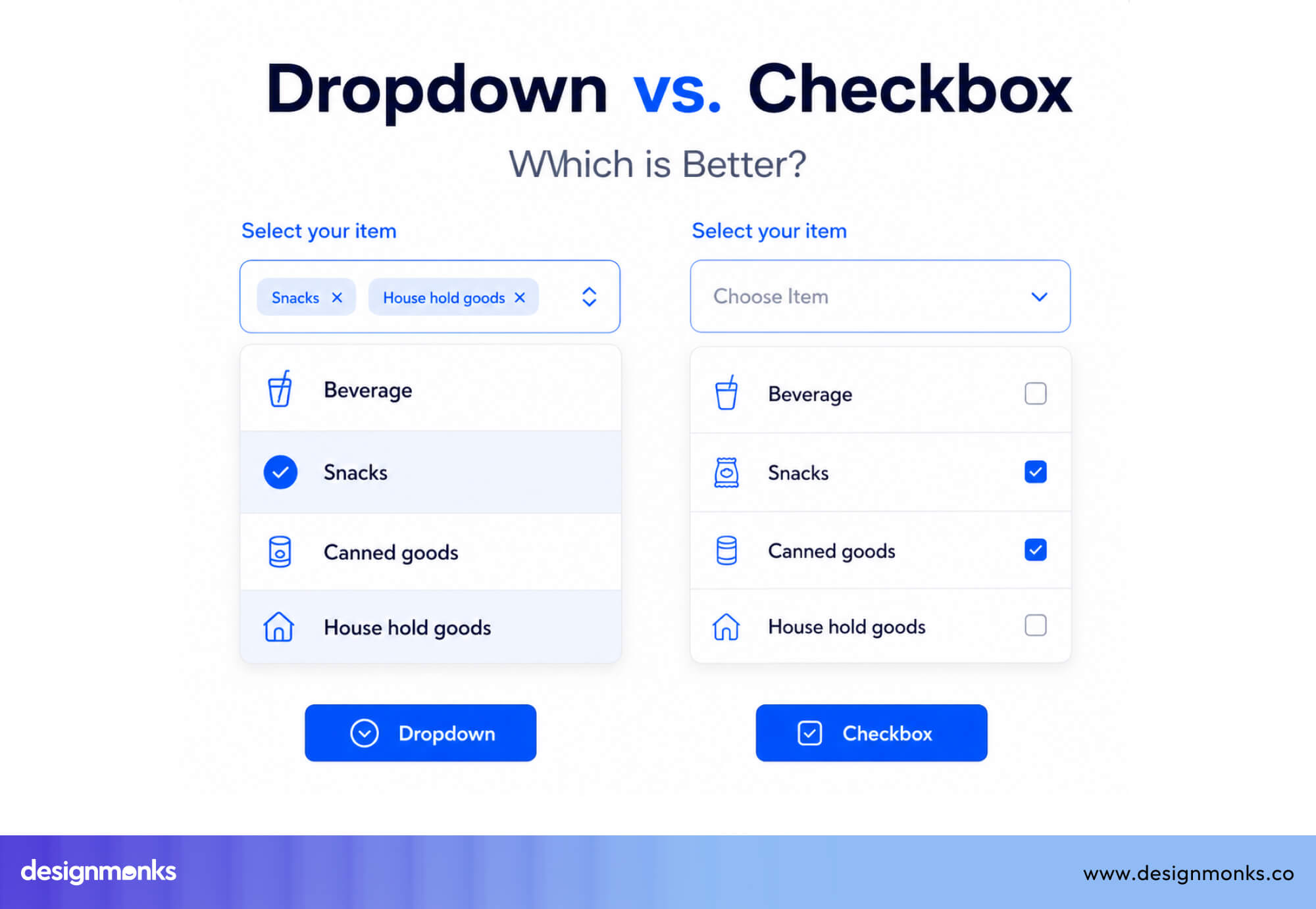
You should use multi-select dropdowns only when:
- Space is very limited
- The list is too long to show (more than 8–10 options)
Dropdown vs Autocomplete
Autocomplete lets users type freely and shows suggestions as they type. It does not force users to pick from a fixed list. You should use autocomplete when the dataset is very large (like searching cities or products) or when free input is allowed.
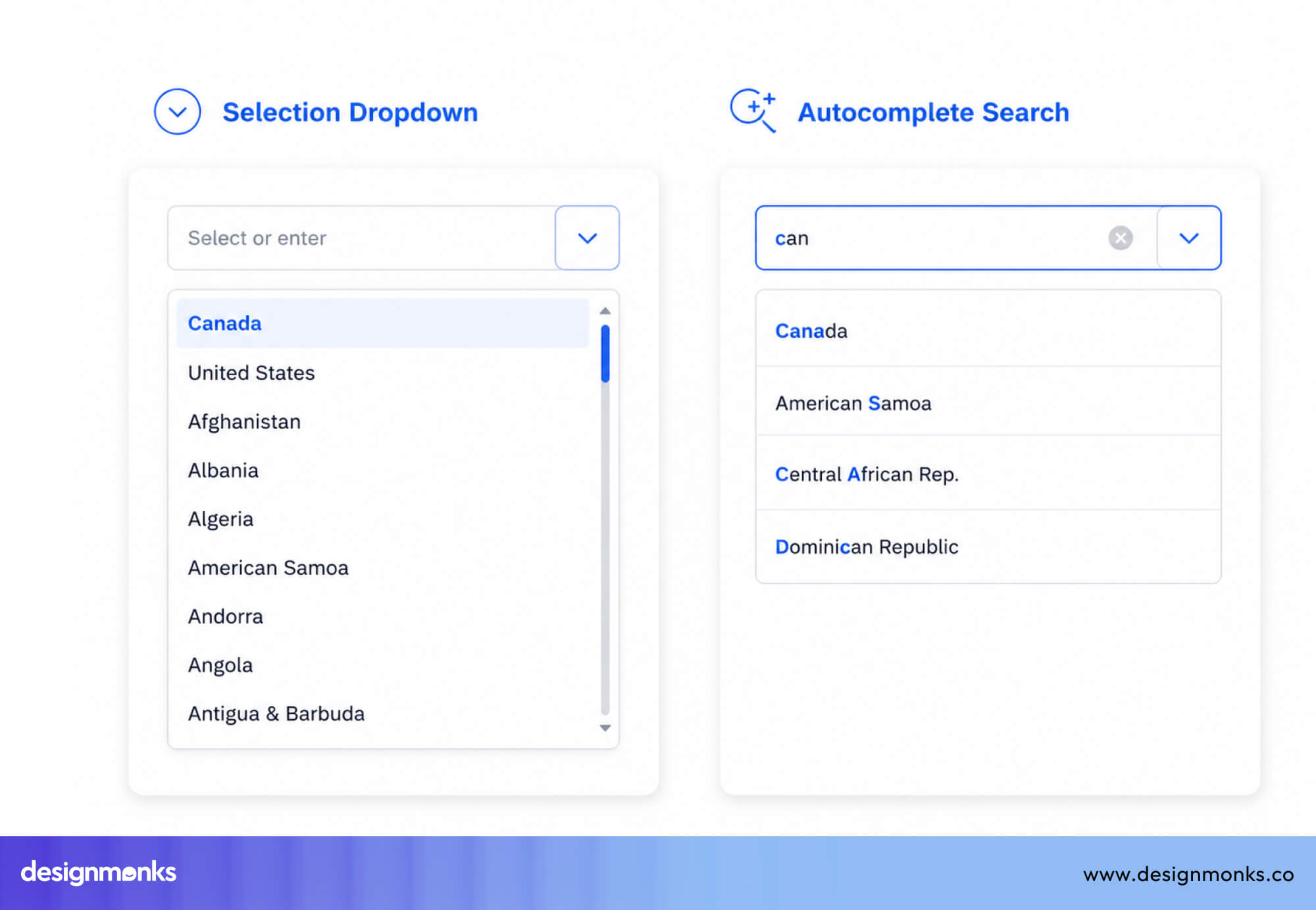
But use a searchable dropdown when users must select from a fixed list, such as choosing a currency or a team member.
Dropdown vs Segmented Controls
Segmented controls are small groups of buttons where only one option is active at a time. They keep all options visible and make switching quick and easy.
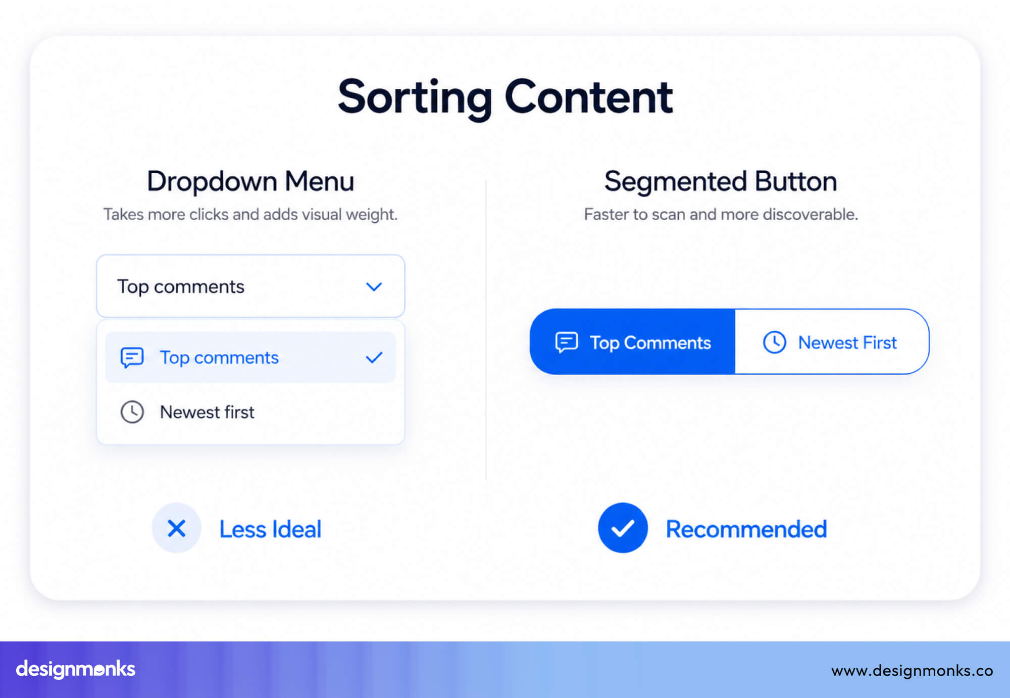
Segmented controls work best for:
- 2 to 4 options
- Cases where the choice instantly changes the interface (like switching views or filters)
Dropdowns are better when there are too many options to fit in a small space.
Mobile UX Best Practices for Dropdown Menus
Mobile screens are smaller, touch is less precise than a mouse, and keyboards take up space. So dropdowns need to be more touch-friendly and responsive:
Touch-Friendly Dropdown Design
On a mobile screen, dropdowns should be easy to tap and interact with. Make the dropdown field full-width when possible, and avoid using small icons as the only clickable area.
You need to keep option rows at least 44-48px tall and dont use small popups with too many options. A full-screen bottom sheet or a slide- up panel often works better for touch-friendly design than a small positioned overlay that forces users to scroll in a confined space.
Native iOS and Android Pickers
Native HTML <select> elements on iOS trigger the UIPickerView drum-roll selector, and on Android, they trigger a dialog with radio buttons. These native pickers are highly touch- optimized, follow platform conventions users already know, and are fully accessible out of the box.
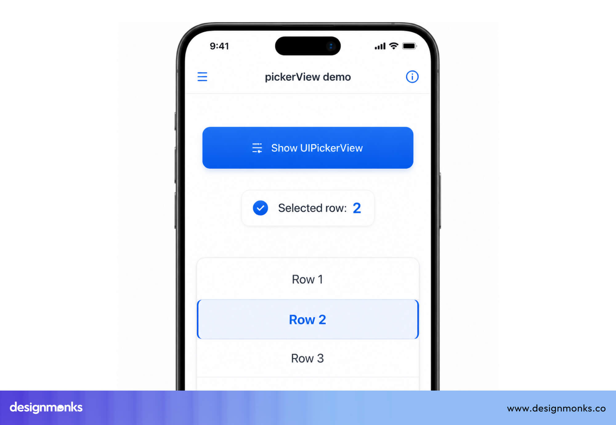
The downside is you can’t control how it looks. And you only need custom dropdowns when the built-in one can’t do what you need, like picking multiple items, searching, or matching your design.
Avoiding Small Tap Targets
A common mistake is making dropdowns look big but keeping the clickable area small. Always apply padding to the whole container, not just the text. This ensures users can tap easily without mistakes.
Also, test on real devices, because browser tools do not fully match real touch behavior.
Responsive Dropdown Menus
Dropdowns that work on desktop often need a different design on mobile. For example:
- Hover menus do not work on touch screens
- Large dropdown menus may need to become accordions or side menus
A good approach is to use the same logic but change how it appears, like a popover on desktop and a full-screen panel on mobile.
Frequently Asked Questions
When should you use a dropdown menu?
Use a dropdown when you have many options (usually more than five) and want to save space. It works best when users already know what they’re looking for.
Are dropdown menus accessible?
Dropdowns can be accessible if built properly. Native ones are usually safe, but custom dropdowns need keyboard support and screen reader compatibility.
What is a searchable dropdown?
A searchable dropdown lets users type to quickly find options. It is useful for long lists where scrolling would take too much time.
How many options should a dropdown contain?
A regular dropdown works well for 6–15 options. If there are more than that, adding a search feature makes it easier to use.
Are dropdown menus mobile-friendly?
Yes, dropdown menus are mobile-friendly if designed properly. They should have large tap areas and often work best with full-screen or native mobile pickers.

.avif)
.avif)
.avif)
.avif)


.avif)
.avif)
.avif)
.avif)


.avif)
