
.svg)


Key Takeaways
- Dashboards should prioritize clarity, simplicity, and relevance for the target user.
- Choose the right dashboard type: strategic, analytical, operational, or tactical.
- Use consistent visuals, clear labels, and purposeful color to guide attention.
- Enable intuitive interactivity, drill-downs, and filters without overwhelming users.
- Regular testing and updates keep dashboards effective, engaging, and up-to-date.
Ever opened a dashboard and felt like you needed a secret decoder ring just to understand it? Yeah, same. The truth is, dashboards aren’t just data displays. They’re decision-making tools, and when they’re built right, they can change the game.
That’s why knowing the dashboard design dos and don’ts isn’t optional; it’s essential.
So, what are the do’s and don’ts of the dashboard design? Spotlight key metrics and group-related data, and keep labels clear. Don’t clutter the layout, mix chart types at random, or overload with info. Also, you should look after the data visualization, KPIs, cognitive load, and visual hierarchy.
Want the full breakdown of dashboard design do’s and don’ts? Dive in as we will be talking in depth about building dashboards that don’t just look slick but actually work as well.
Quick Reference: Dashboard Design Dos and Don'ts At A Glance
- Prioritize critical KPIs above the fold - don't bury them below the scroll
- Group related items with a clean grid - don't scatter or misalign content
- Use color to signal meaning - not for decoration
- Match your chart type to what the data is saying - don't mislead with scale tricks
- Enable drill-downs and filters - don't overcomplicate with too many controls
- Limit each view to 5–7 widgets - don't cram every metric onto one screen
- Keep labels clear and consistent - don't use jargon your users won't recognize
Foundations of Dashboard Design
The first golden rule of dashboard design is simple: know who you’re designing for. Dashboards aren’t one-size-fits-all; they hit differently depending on the user.
A decision-maker is looking for the big picture: top KPIs, status indicators, and trend lines. But an operational team member? They’re in the details, focused on precision and control.
The same goes for technical vs. non-technical users. If you’re building for engineers, you can be direct and data-heavy. But if your audience is a marketing manager or an executive team, your design needs to be clean, visual, and easy to grasp at a glance.
When in doubt, keep it simple, simplicity always wins.
Before you add your first chart, pause and ask: What should this dashboard actually do? Is it meant for real-time monitoring, deep-dive analysis, status reporting, or operational control?
Clarifying its core purpose is essential. From there, ask yourself: What key questions should this dashboard answer? What should the user be able to understand within five seconds of logging in?
Choose the wrong type, and you risk overwhelming or under-informing your users. Choose the right one, and you’re already halfway to success.
But Which Dashboard Is the Right Pick for You?
Not all dashboards serve the same purpose, and choosing the right type makes all the difference. Here's a quick breakdown to help you match the design to your needs:
- Strategic: Focused on the big picture and long-term performance. Ideal for executives who need high-level insights.
- Analytical: Built for deep dives into data. Best suited for analysts who need to explore trends and patterns.
- Operational: Tracks real-time metrics and supports daily activities. Perfect for frontline teams who need to stay agile.
- Tactical: Delivers quick, actionable insights. Great for team leads making fast, informed decisions.
Dashboard Design Principles: The Essential Dos & Don’ts of Framework
Designing a great dashboard isn’t just about looking good, it’s about communicating the right information clearly, quickly, and effectively. Follow these core principles to build dashboards that work for your users:
Information Architecture
Do: Prioritize Information Hierarchically
Start with the essentials. Place the most important KPIs and metrics at the top-left or in the primary viewing area. This is where users naturally look first. It’s like the "above the fold" rule; if a critical metric requires scrolling to reach, most users will simply never see it. Make sure they see what matters most without having to scroll or hunt.
Don’t: Overload with Data
Less is more. Trying to cram every metric onto a single screen only creates visual noise and mental fatigue. Focus on clarity by surfacing only the most relevant data and offering deeper layers through interactivity when needed.
Visual Hierarchy & Layout
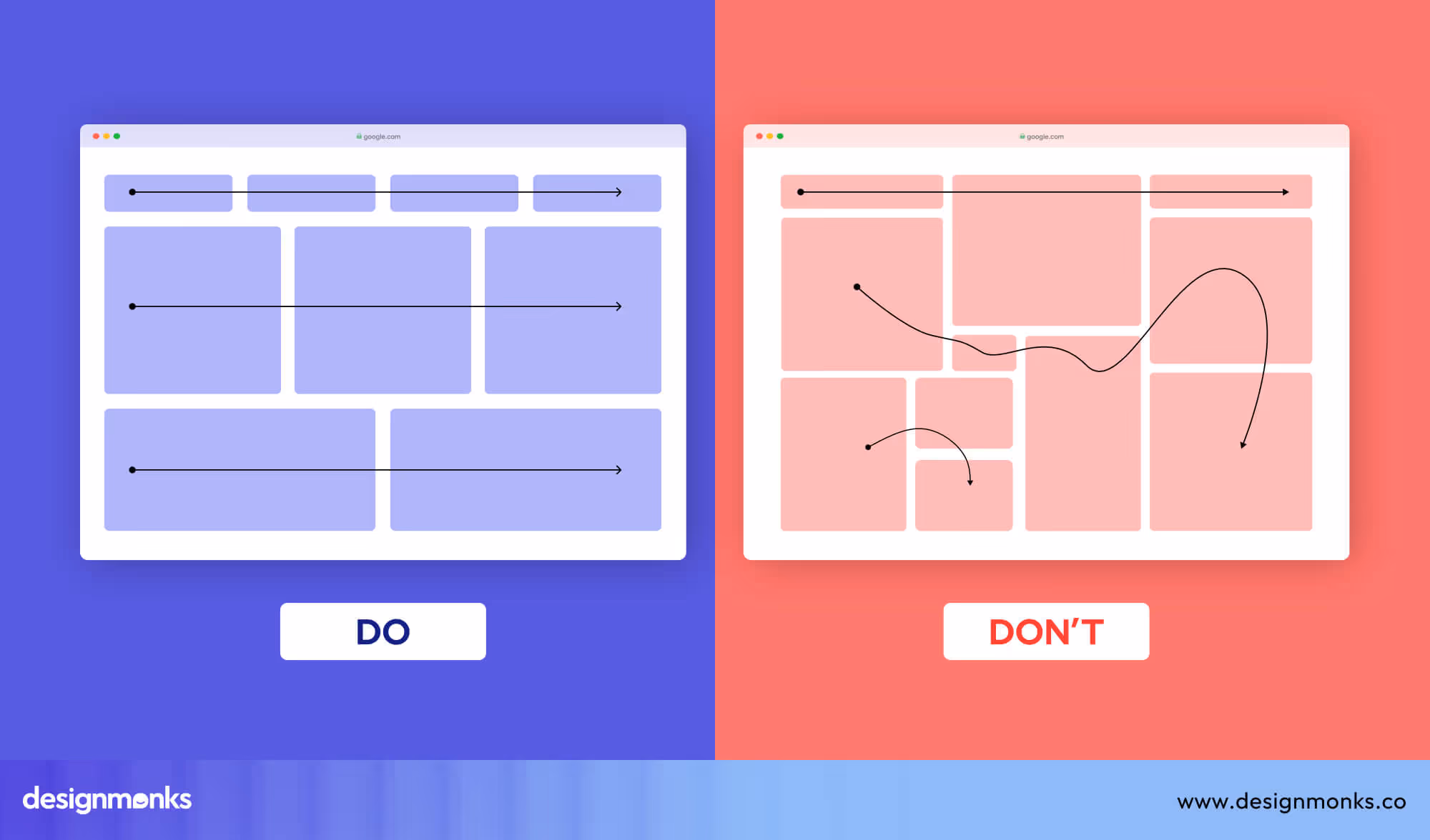
Do: Use Grids and Group Related Items
Structure matters. Use a clean grid layout and group similar elements together using proximity and alignment. Allow enough white space between sections to avoid visual clutter and guide the eye naturally across the content.
Don’t: Scatter or Misalign Content
Random widget placement or misaligned charts create confusion. It forces users to work harder to find what they need, breaking the flow and reducing usability.
Designer and statistician Edward Tufte introduced the data-ink ratio for this reason: every element on a chart should earn its place by carrying information. Remove gridlines that don't aid comparison, borders that don't separate meaning. The less decoration, the more clearly the data speaks.
Clarity & Simplicity
Do: Use Clear Labels and Titles
Every chart or widget should clearly state what it’s showing. Use simple, descriptive titles and labels so users can instantly understand the data without guessing.
Don’t: Use Jargon or Ambiguous Terminology
Avoid acronyms, buzzwords, or internal language that might not be universally understood. Your dashboard should be accessible to all users, regardless of their department or technical background.
Consistency
Do: Use Consistent Colors, Fonts, and Styles
Uniform visual elements help users recognize patterns quickly. Stick to a cohesive color palette, font set, and chart style throughout the dashboard for a seamless and professional experience.
Don’t: Mix Visual Styles
Switching between too many chart types or color schemes makes the dashboard feel chaotic. It interrupts flow, slows comprehension, and can lead to misinterpretation of the data.
Interactivity & Flexibility
Do: Enable Filtering, Drill-downs, and Tooltips
Interactive elements like filters, drill-downs, and hover tooltips empower users to explore deeper without overwhelming the main view. It keeps the interface clean while still offering flexibility and control. Progressive disclosure is the pattern behind every well-designed drill-down: show the summary first, a single number, a status indicator, a trend line.
Let the user decide if they need more. When they click in, surface the detail. This keeps the default view clean while respecting that different users need different depths.
Don’t: Overcomplicate with Too Many Controls
Too many buttons, toggles, or dropdowns can intimidate users or distract them from the core purpose. Keep interactivity purposeful and intuitive, only include what truly adds value.
Visual Design & Aesthetics
Do: Use Color Purposefully (alerts, statuses)
Color should communicate, not decorate. Use green for success, red for errors, yellow for warnings, and other purposeful cues to instantly guide user attention to what matters.
Don’t: Use Color Decoratively
Avoid turning your dashboard into a rainbow. Random or excessive use of color can dilute meaning, distract users, and make the dashboard harder to interpret.
Component-Level Dos and Don’ts
Beyond layout and structure, the effectiveness of your dashboard comes down to how well each individual component does its job. Here’s how to make sure charts, KPIs, tables, and alerts all pull their weight:
Charts & Graphs
Do: Match Chart Type to Data Intent
Choose the right visual based on what the data needs to convey. Use bar charts for easy comparisons, line charts to show trends over time, and pie charts only when showcasing parts of the data.
Don’t: Mislead with Axes or Scale Manipulation
Avoid visual tricks. Starting axes at non-zero baselines or stretching scale ranges can distort perception and misrepresent the data. Always aim for honest, proportional representation.
KPIs & Metrics
Do: Show Real-Time or Most Recent Data Clearly
Key metrics should be up-to-date, prominent, and easy to interpret at a glance. Use bold typography, color cues, and clear labeling to make them instantly recognizable.
Don’t: Bury Key Metrics Under Layers or Navigation
Never hide your KPIs behind tabs, toggles, or nested menus. If it’s critical to decision-making, it should be front and center with no additional clicks required.
Tables and Lists
Do: Use for Detail Views or Drill-downs
Tables work best for displaying detailed data that supports deeper analysis. Reserve them for dedicated views or when users need to scan exact values in context.
Don’t: Put Long Tables on the Main Dashboard
Endless rows of data clutter the interface and distract from high-level insights. Keep the dashboard focused and provide links or buttons to explore detailed tables if needed.
Notifications and Alerts
Do: Highlight What Needs Immediate Attention
Use visual cues such as red badges, icons, or banners to flag critical updates or errors. Prioritize issues that require action and make them hard to miss.
Don’t: Overuse Alerts or Use Red for Non-critical Items
Not every change warrants an alert. If everything is marked urgent, nothing is. And reserve red for serious or time-sensitive issues. Otherwise, users will start tuning them out.
Accessibility & Performance: Smart Practices for Usability & Speed
Even the most beautiful dashboard fails if it’s hard to read or painfully slow to load. Keep these points in check to make sure your dashboard is both accessible and high-performing:
Do’s
Ensure Text & Chart Contrast: Use high-contrast color schemes to make text and visuals easy to read. Always consider users with visual impairments to avoid relying solely on color to convey meaning.
Optimize for Load Time: Use lightweight charts and visual components that render quickly. For large data sets, use lazy loading in tables to keep the dashboard fast and responsive. Instead of loading all data at once, it loads only what’s needed.
Don'ts
Don’t Use Tiny Fonts or Low Contrast Colors: Small, faint text strains the eyes and gets ignored. Maintain legibility across all devices and screen sizes.
Don’t Add High-Latency Widgets or Live Video Feeds: Real-time data is great, but not at the cost of performance. Avoid adding features that delay the overall experience.
Device Responsiveness: Adapting Seamlessly to Any Screen Size
Device responsiveness is more than just shrinking content to fit a smaller screen, it’s about adapting intelligently. Design your dashboard with multiple viewports in mind, including desktop, tablet, and mobile experiences.
The goal is to preserve clarity and usability across devices. Simply scaling down a full-sized dashboard for mobile leads to cramped layouts and unreadable content.
Instead, rethink the layout, prioritize key elements, and streamline navigation for each screen size.
Common Pitfalls to Avoid
Even a well-intentioned dashboard can fall short if certain mistakes aren’t addressed early. Here are some frequent pitfalls that can derail user experience and effectiveness:
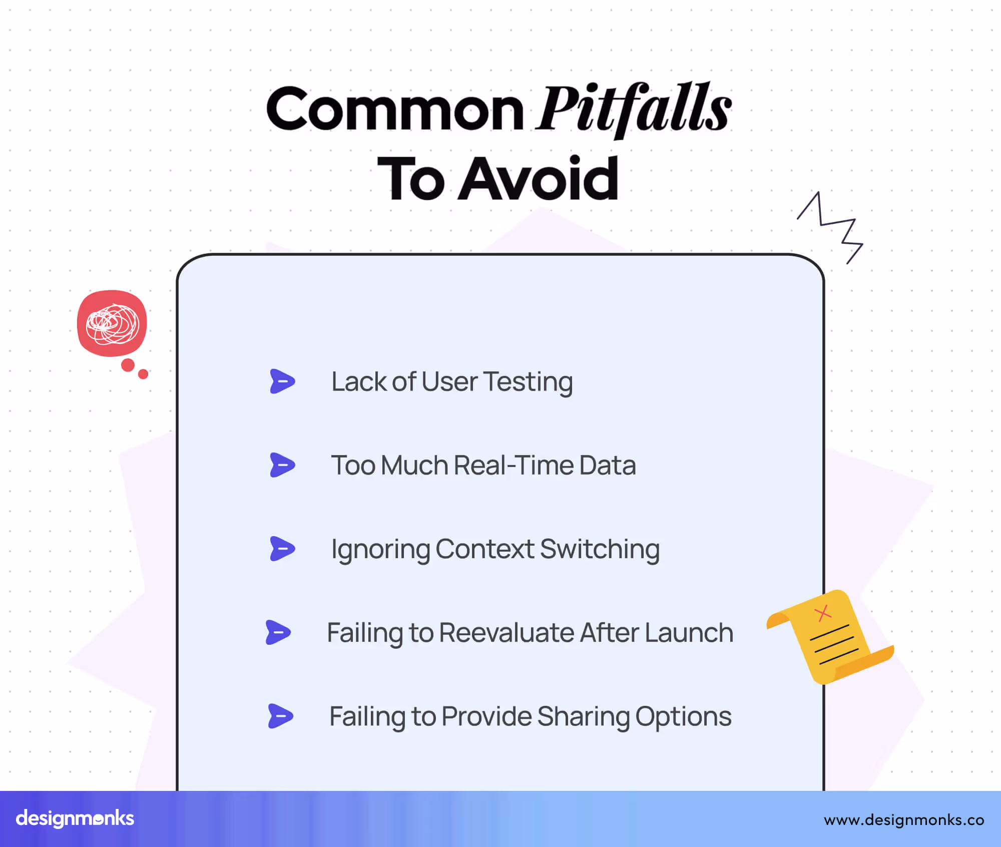
Too Much Real-Time Data
Real-time updates are powerful, but can be overwhelming when overused. Show only what truly needs constant monitoring to avoid noise and distraction.
Lack of User Testing
Skipping user feedback during development often results in dashboards that miss the mark. Test with real users to validate usefulness and usability.
Ignoring Context Switching
Users often move between multiple tools. If your dashboard doesn’t align with their workflow or priorities, it adds friction instead of clarity.
Failing to Reevaluate After Launch
A dashboard isn’t “done” at launch. User needs evolve, and data flows shift, regular updates and refinements keep the dashboard relevant and useful.
Failing to Provide Export/Sharing Options
Insights are often shared in meetings or reports. Without easy export or sharing functionality, users may resort to screenshots or manual workarounds.
Best Practices & Optimization
To create an effective and efficient dashboard, follow these best practices to ensure it’s user-friendly and optimized for long-term success:
- Conduct regular user testing to identify pain points and gather feedback. This ensures continuous improvement based on actual user needs.
- Periodically review and update the dashboard to remove outdated data, refine visuals, and make sure it stays aligned with user goals.
- Ensure data access is seamless and intuitive, supporting ongoing tasks without disruption.
- A functional dashboard is essential, but delighting users with smooth interactions and thoughtful design will boost engagement and satisfaction. Keep that in mind while designing.
- Small animations or interactions (like hover effects or loading indicators) can provide feedback and make the dashboard feel more responsive and enjoyable.
Dashboard Design Checklist
A quick reference guide to ensure your dashboard is on track:
- Are KPIs clear and prioritized?
Make sure the most important metrics are easy to find and at the forefront.
- Is the layout clean and scannable?
Organize elements for quick, intuitive understanding and scanning.
- Are chart types appropriately used?
Match the right visualization to the data type for clarity.
- Is interactivity intuitive?
Ensure that interactive elements (filters, drop-downs, etc.) are easy to use and understand.
- Are colors purposeful and accessible?
Choose colors that highlight key data and are legible to all users, including those with color blindness.
- Is the dashboard responsive?
Ensure that the dashboard adapts well to various screen sizes and devices.
Tools & Resources
To create effective dashboards, you’ll need the right tools. Here’s a selection to help you at different stages of the design process:
Design Tools: Figma, Sketch, Adobe XD
These design tools help you craft visually appealing dashboards with ease. Figma and Sketch are great for collaboration, while Adobe XD offers robust design and prototyping features.
Prototyping & Data Tools: Tableau, Power BI, Looker, Retool
Use these powerful tools for data visualization and prototyping. Tableau and Power BI help turn raw data into actionable insights, while Looker and Retool provide customization options to integrate dashboards into business workflows.
Inspiration Sites: Dribbble, Behance, UI Patterns
For design inspiration and best practices, check out Dribbble and Behance, where top designers showcase their work. UI Patterns also offers structured design solutions for dashboards.
Frequently Asked Questions
What’s the best way to balance simplicity and detail in a dashboard?
The best way to balance simplicity and detail in a dashboard is to focus on your audience’s needs. High-level decision-makers need the big picture, while operational teams require detail. So customize the complexity of the design to the user’s role.
How do I ensure my dashboard remains relevant post-launch?
To ensure your dashboard remains relevant post-launch, you need to do regular audits, user feedback, and data updates. A dashboard isn’t static, so continue refining it based on evolving business needs.
Can I use interactive elements without overwhelming users?
Yes, you can use interactive elements without overwhelming users. But use micro-interactions and limit the number of interactive elements. The key is to enhance usability without creating cognitive overload.
Conclusion
Understanding the dashboard design dos and don’ts is essential for creating dashboards that truly serve their purpose. Great dashboard UI design starts with understanding who you're designing for and why.
Keep it clear, simple, and useful. Whether it’s big-picture insights for executives or detailed metrics for day-to-day operations, your dashboard should speak your users’ language.
And remember, it’s not set it once and forget it. The best dashboards evolve with your business. So test often, listen to feedback, and refine regularly.
Until next time!

.avif)
.avif)
.avif)
.avif)


.avif)
.avif)
.avif)
.avif)


.avif)


