
Key Takeaways
- The 10 usability heuristics provide clear rules for better interface design.
- Usability heuristics make interfaces clear, simple, and stress-free for users.
- Following these rules reduces mistakes and improves overall user satisfaction.
- Heuristics work across web, mobile, apps, and modern digital interfaces.
- Beginners and experts alike benefit from clear, intuitive, and guided design.
10 usability heuristics explain why certain apps feel intuitive while others leave users guessing. Each guideline focuses on reducing friction, helping people understand actions, recover from mistakes, and navigate without confusion.
These rules show what makes a screen clear, easy, and stress-free for users, even if the design looks simple at first. When designers follow these rules, people understand what to do without guessing or feeling lost. This leads to happier users and fewer user pain points.
In the sections ahead, we will explore each of the ten heuristics in detail, showing what they mean, why they matter, and how you can apply them to create better websites and apps.
Where These Heuristics Came From and Why They Still Matter?
The 10 usability heuristics for user interface design were created by Jakob Nielsen and Rolf Molich in the early 1990s.
They studied many real-world usability problems and looked for patterns that caused users to get confused or frustrated. Based on this research, they developed 10 clear rules to guide designers in creating better, easier-to-use interfaces.
Jakob Nielsen later co-founded the Nielsen Norman Group, a leading organization in UX research and training. Their work has helped companies worldwide understand how to design websites, apps, and software that users can navigate comfortably.
These heuristics are still relevant today because they focus on human behavior, not just technology. Whether you’re designing for web, mobile, or apps, these rules help designers quickly notice and fix confusing parts in an interface, creating a smoother experience for everyone.
The 10 Usability Heuristics at a Glance
Before we dive deeper, here is a quick look at all ten heuristics. These short points help you understand the basic idea of each rule:
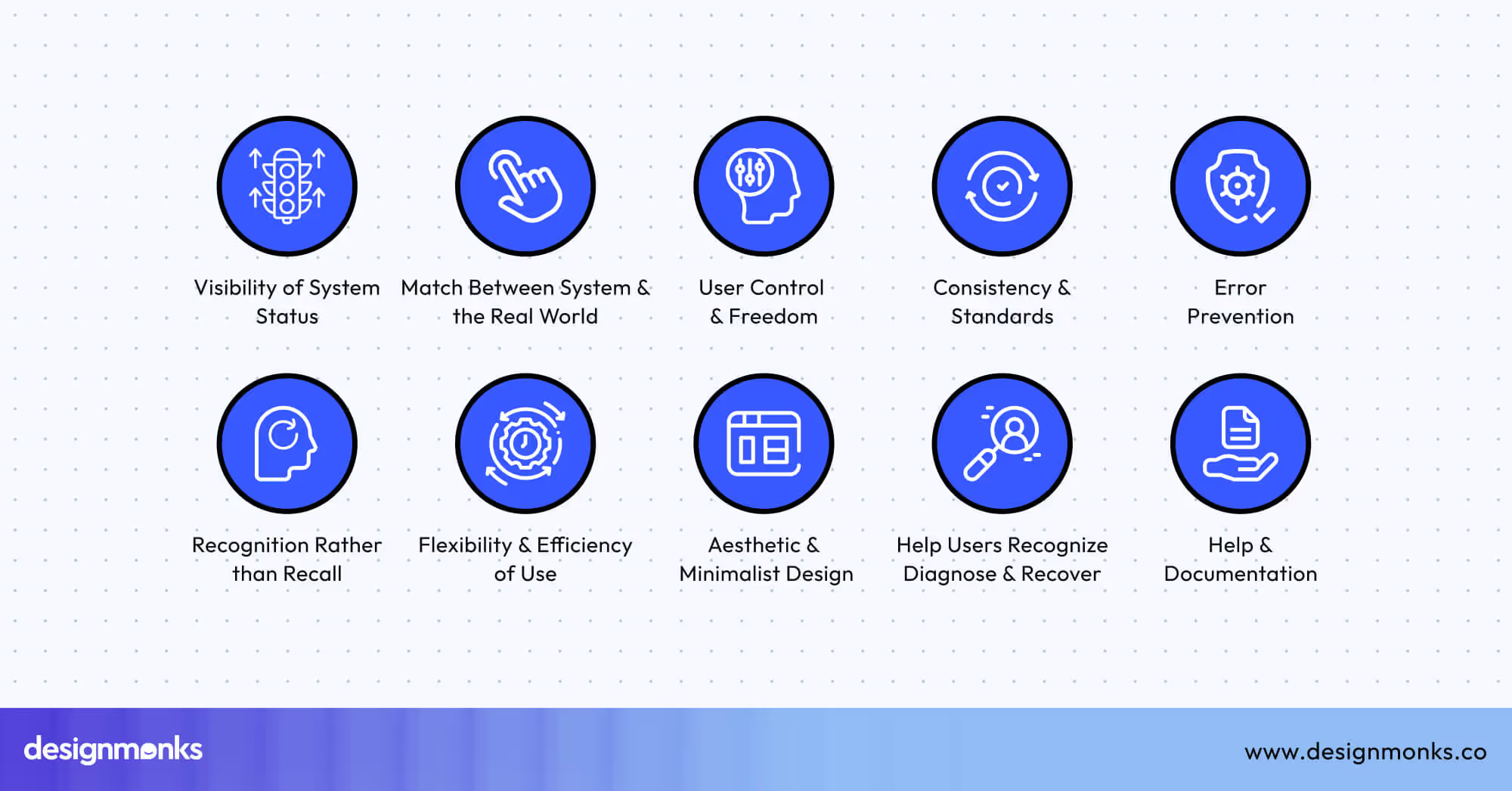
- Visibility of System Status: Keep users updated with clear signs or feedback.
- Match Between System and the Real World: Use familiar words and symbols instead of technical terms.
- User Control and Freedom: Allow users to undo, go back, or exit without trouble.
- Consistency and Standards: Keep buttons, labels, and icons the same across the whole design.
- Error Prevention: Reduce mistakes by checking information before actions happen.
- Recognition Rather Than Recall: Show choices clearly so users don’t need to remember things.
- Flexibility and Efficiency of Use: Make the interface easy for beginners and faster for skilled users.
- Aesthetic and Minimalist Design: Keep the layout clean, simple, and free from distractions.
- Help Users Recognize, Diagnose, and Recover from Errors: Give clear, helpful messages when something goes wrong.
- Help and Documentation: Offer simple help guides or tips when users need support.
In-Depth Breakdown of Each Usability Heuristic
Knowing these ten rules helps you build designs that feel natural, clear, and frustration-free. Even if you're just starting, these heuristics give you a simple way to understand why good user interface elements work so well.
They show what users expect, what confuses them, and how small changes can make a big difference. Now, let’s break down each heuristic in easy language so you can use them in your own projects.
1. Visibility of System Status
Visibility of system status means the interface should always show what is going on. Users should never be left wondering if something is working or stuck. Simple signals like loading spinners, progress bars, checkmarks, or “Saved!” messages help people feel in control.
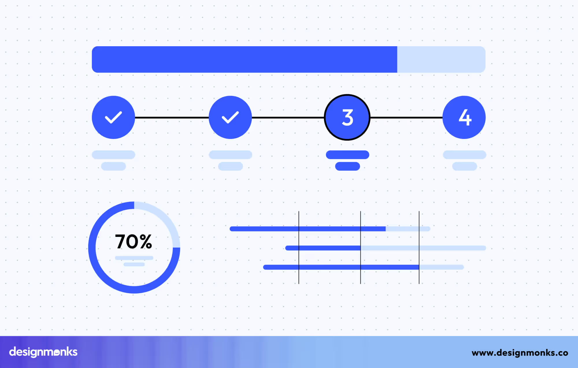
When the system gives quick feedback, users feel safe and know their actions are being processed. For example, during a file upload, a progress bar tells you how long it will take instead of making you wait blindly. Clear status updates reduce stress, prevent repeated actions, and build trust between the user and the product.
2. Match Between System and the Real World
This heuristic means using familiar words, symbols, and ideas that people already understand from daily life. When apps use natural language instead of complex technical terms, users can easily guess what to do. Icons like a trash bin for deleting or a folder for storing files follow real-world concepts. Clear labels such as “Add Friend” or “Send Message” also feel intuitive.

When a design matches real-world thinking, it reduces confusion and feels more welcoming. This approach helps users learn faster because they don’t have to study how the interface works, they simply use what they already know.
3. User Control and Freedom
User control and freedom mean users should be able to undo mistakes or go back if they choose the wrong action. People often click something by accident, and it’s frustrating when they can’t fix it..
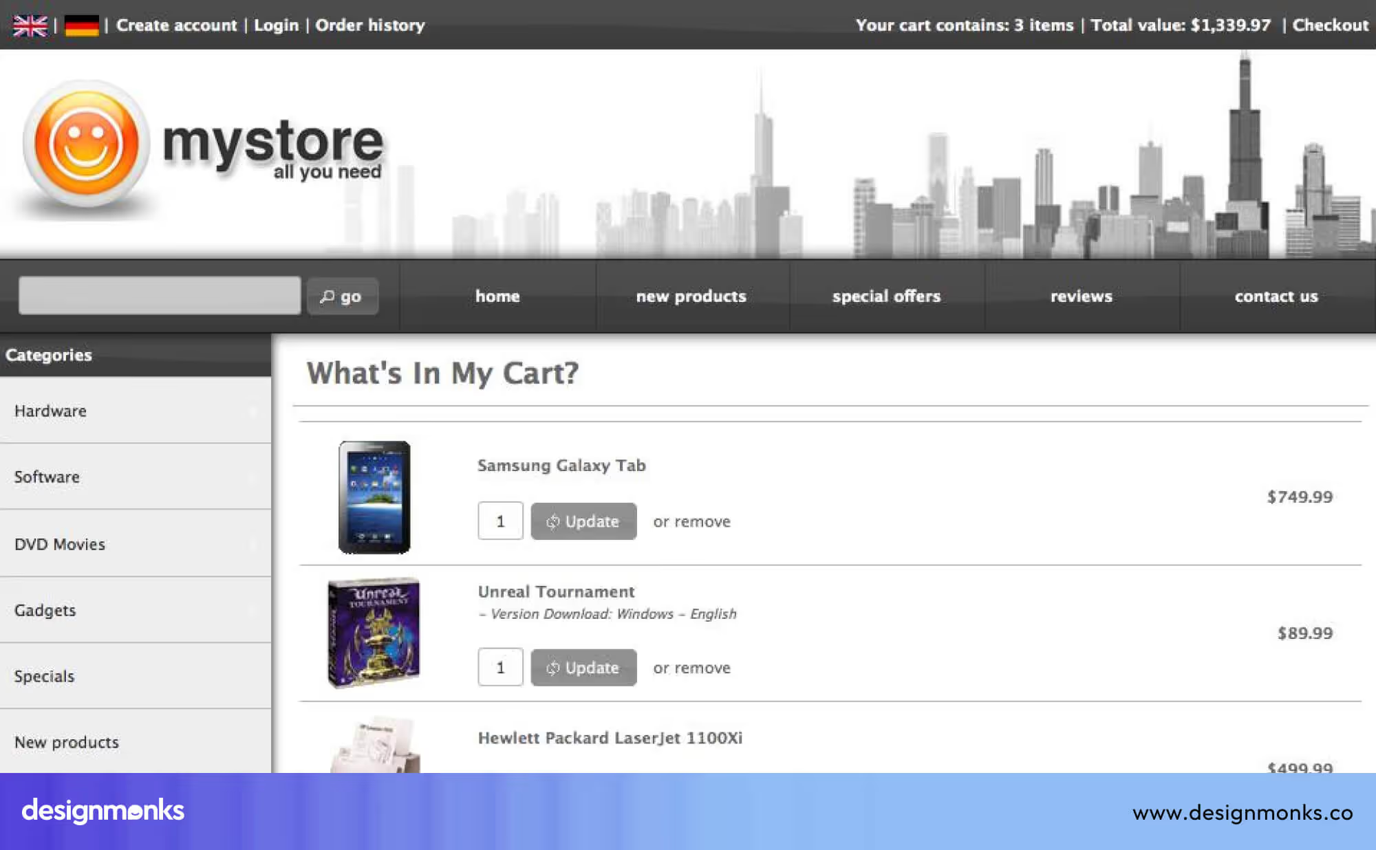
Features like “Undo,” “Back,” “Cancel,” or “Remove from Cart” help users stay in control without feeling trapped. For example, email apps let you undo sending a message for a few seconds, which reduces stress. Giving users freedom makes the interface feel safer and more friendly. When users know they can easily recover, they explore more confidently and make fewer mistakes.
4. Consistency and Standards
Consistency and standards mean keeping the design uniform so users don’t have to relearn anything from screen to screen. When buttons, colors, icons, and language stay the same everywhere, the product feels predictable and easier to use. For example, using one style of “Save” icon throughout the entire website helps users understand the action instantly.
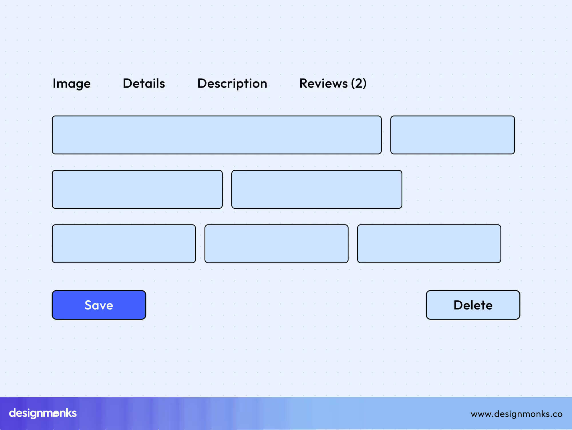
Following common design patterns also helps, such as putting the close button on the top right or using blue for links. Consistency reduces thinking effort and builds a smooth experience. When everything follows a clear pattern, users navigate naturally without confusion.
5. Error Prevention
Error prevention focuses on stopping mistakes before they happen. Instead of only showing error messages afterward, the interface should guide users gently so they avoid the problem in the first place.
This includes clear input rules, confirmation steps, or warnings before risky actions. For example, asking “Are you sure you want to delete this file?” helps prevent accidental loss.
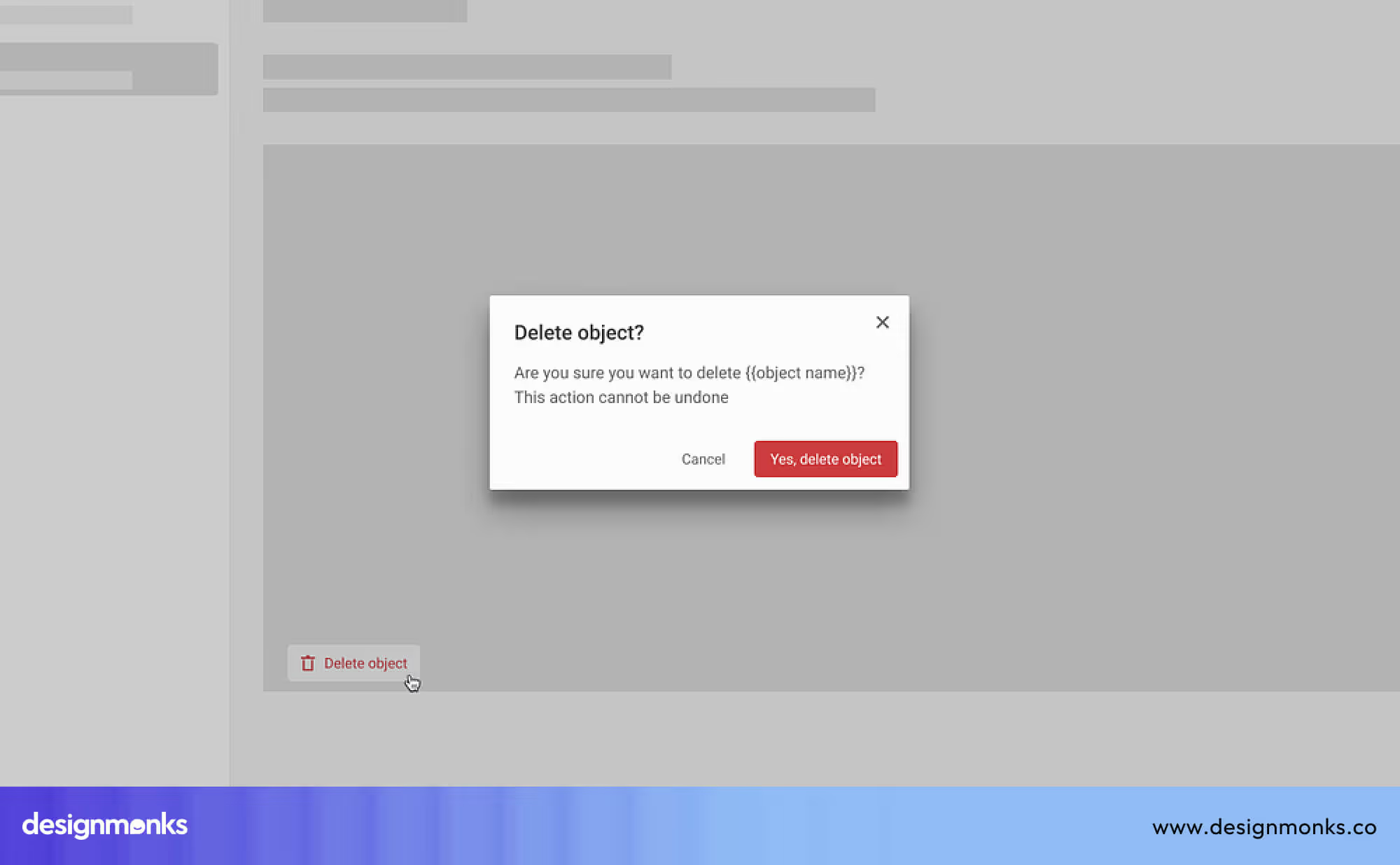
Forms that highlight missing or incorrect fields before submission also protect users. When the design prevents errors, users feel more confident, and the experience becomes smoother. Good prevention saves time, reduces frustration, and keeps tasks on track.
6. Recognition Rather Than Recall
This principle means information should be easy to see rather than stored in the user’s memory. Users shouldn’t have to remember steps, locations, or details from one page to another. Dropdown menus, autofill suggestions, tooltips, and visible navigation help users recognize choices instantly.
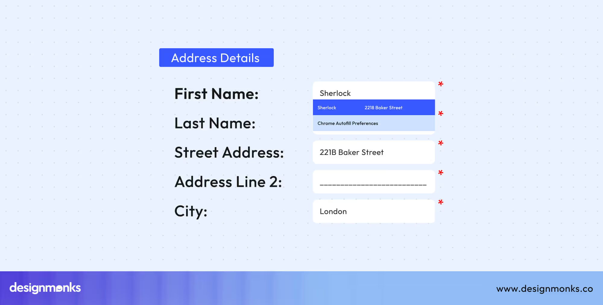
For example, when a form shows previously used addresses, it saves time and reduces effort. This approach is especially helpful for beginners who are still learning how the product works. By keeping options visible and simple to spot, the interface feels lighter and more comfortable. Users can act quickly without needing to think too hard.
7. Flexibility and Efficiency of Use
This heuristic supports both new and advanced users. Beginners need simple steps, while experienced users want shortcuts to work faster. Features like saved preferences, quick actions, keyboard shortcuts, and customizable layouts help different users work at their own speed. For example, graphic design software offers toolbars for beginners and shortcuts for experts.
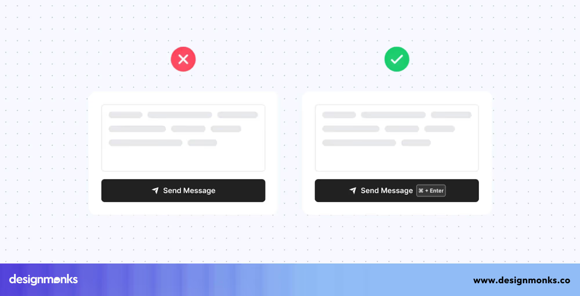
When a product supports many skill levels, users stay engaged and feel the product grows with them. Flexibility improves long-term satisfaction, and efficiency makes everyday tasks much quicker. A good interface balances simple guidance with advanced options, making everyone feel included.
8. Aesthetic and Minimalist Design
Aesthetic and minimalist design focuses on keeping the interface clean and free from unnecessary distractions. Too many colors, popups, images, or buttons can overwhelm users and make it hard to find important information.

A clean layout, calm colors, and clear spacing make the product look modern and easy to use. Minimalism does not mean removing useful content, it means removing things that add no value.
For example, simple product pages with clear text and one main action button are easier to understand. When the design looks fresh and simple, users feel more relaxed and can focus on what matters.
9. Help Users Recognize, Diagnose, and Recover from Errors
This heuristic is about making errors easy to understand and fix. When something goes wrong, users should know what happened, why it happened, and what they need to do next. Clear messages like “Password too short, use at least 8 characters” guide users step by step.
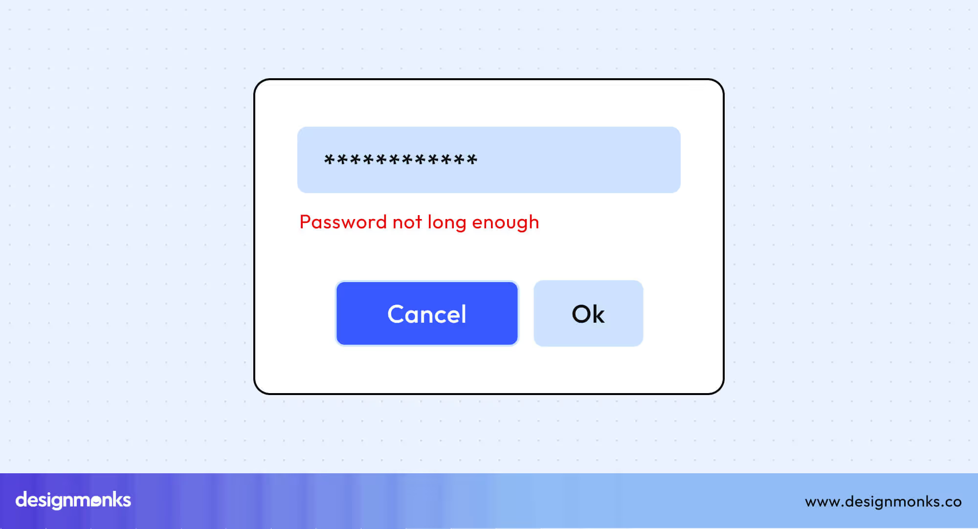
Visual cues such as red boxes, warning icons, or helpful tips also support recovery. Avoid blaming language, instead, give calm, friendly instructions. When users can fix mistakes quickly, they trust the system and feel less stressed. Good error design turns a bad moment into a simple, manageable task.
10. Help and Documentation
Even when a system is simple, users may still need help sometimes. This heuristic encourages providing clear, easy-to-find support. Help should be short, direct, and focused on real tasks. Examples include FAQs, tooltips, step-by-step guides, chatbots, and help icons inside the interface.

Users should not have to search long or read heavy documents. For example, a small “?” icon near a form field can explain what to enter. When help is available and easy to understand, users feel supported and confident. Good documentation makes the entire experience smoother and helps both beginners and regular users succeed.
How to Use These Heuristics in Real Life (Checklist)
A heuristic evaluation sounds complex, but it’s really just a structured way of checking whether an interface is easy to use. Here’s a simple step-by-step method you can follow:
Step 01: Define the goal of your evaluation
Before auditing, decide what you’re judging:
- A whole website?
- A checkout flow?
- A dashboard?
- A mobile app onboarding?
This keeps the review focused.
Step 02: Gather your materials
For this step, you’ll need:
- The interface you’re evaluating
- The Ten Nielsen Norman Heuristics list
- A place to take notes (Google Docs, Notion, Miro, FigJam)
- Screenshots or screen recordings (helpful for evidence)
Step 03: Walk through the interface like a real user
Perform the main tasks a user would complete, such as:
- Signing up
- Logging in
- Searching
- Adding to cart
- Completing a payment
- Updating a profile
Try not to rush. Move slowly and observe everything.
Step 04: Compare each step to the heuristics
Review every screen or interaction and check how well it aligns with each principle. Ask yourself whether it matches the heuristic, whether it breaks it, and how serious the issue is. This is the stage where the actual “heuristic audit” takes place. This helps you clearly identify strengths, weaknesses, and usability risks.
Step 05: Record all issues clearly
For every violation, write down:
- Heuristic number
- Description of the issue
- Where it occurs
- Why it’s a problem
- Severity rating (Low / Medium / High / Critical)
- Suggested fix
This creates a proper usability evaluation report.
Step 06: Prioritize the problems
Not every issue needs immediate fixing. Focus on:
- High frustration
- Repeated errors
- Blocks that stop users
- Security-related usability failures
- Broken workflows
Step 07: Share your findings with the team
Present your audit in a simple format:
- Screenshots
- Short explanations
- Severity labels
- Suggested improvements
This makes it easier for designers and developers to act on your insights.
Heuristic Audit Tips, Tools & Checklist
To make your heuristic journey easier, here are checklists, tips, and helpful tools for the audit:
Checklist
Use this quick checklist during your evaluation:
- Is the system status always visible?
- Are real-world words, icons, and concepts used?
- Can users easily undo or redo actions?
- Is the interface consistent across all screens?
- Are error-prone actions prevented?
- Are objects, actions, and options clearly visible?
- Are shortcuts available for advanced users?
- Is the content clean and minimal?
- Are errors clearly explained with solutions?
- Can users find help easily when stuck?
Helpful Tools for Heuristic Evaluations
These make UX audits easier:
- Figma / FigJam: for annotating screenshots
- Miro: for collaborative audits
- Maze / Useberry: for user testing + heuristic notes
- Notion / Google Docs: for reporting
- Browser DevTools: for checking layout/responsiveness
- Lighthouse: for accessibility + performance hints
Pro Tips for Heuristics audit
- Always include screenshots for every issue.
- Don’t evaluate alone, having 2–3 evaluators gives better results.
- Avoid “designer bias.” Pretend you’re a first-time user.
- Focus on clarity, not aesthetics.
- Re-run the audit after fixes to confirm improvements.
Real-World Case Studies & Examples
Let’s look at how usability heuristics play out in real interfaces, both well-designed and poorly designed. These examples show how applying heuristics can improve user experience and prevent confusion:
Well-Designed Interface: Airbnb
Airbnb’s website gets many things right. Users always know what’s happening thanks to clear loading messages and booking confirmations (Heuristic 1). The site uses simple words like “host” and “guest” with familiar icons, so it feels natural (Heuristic 2). You can easily change or cancel a booking (Heuristic 3), and buttons, colors, and menus are consistent across the app (Heuristic 4).
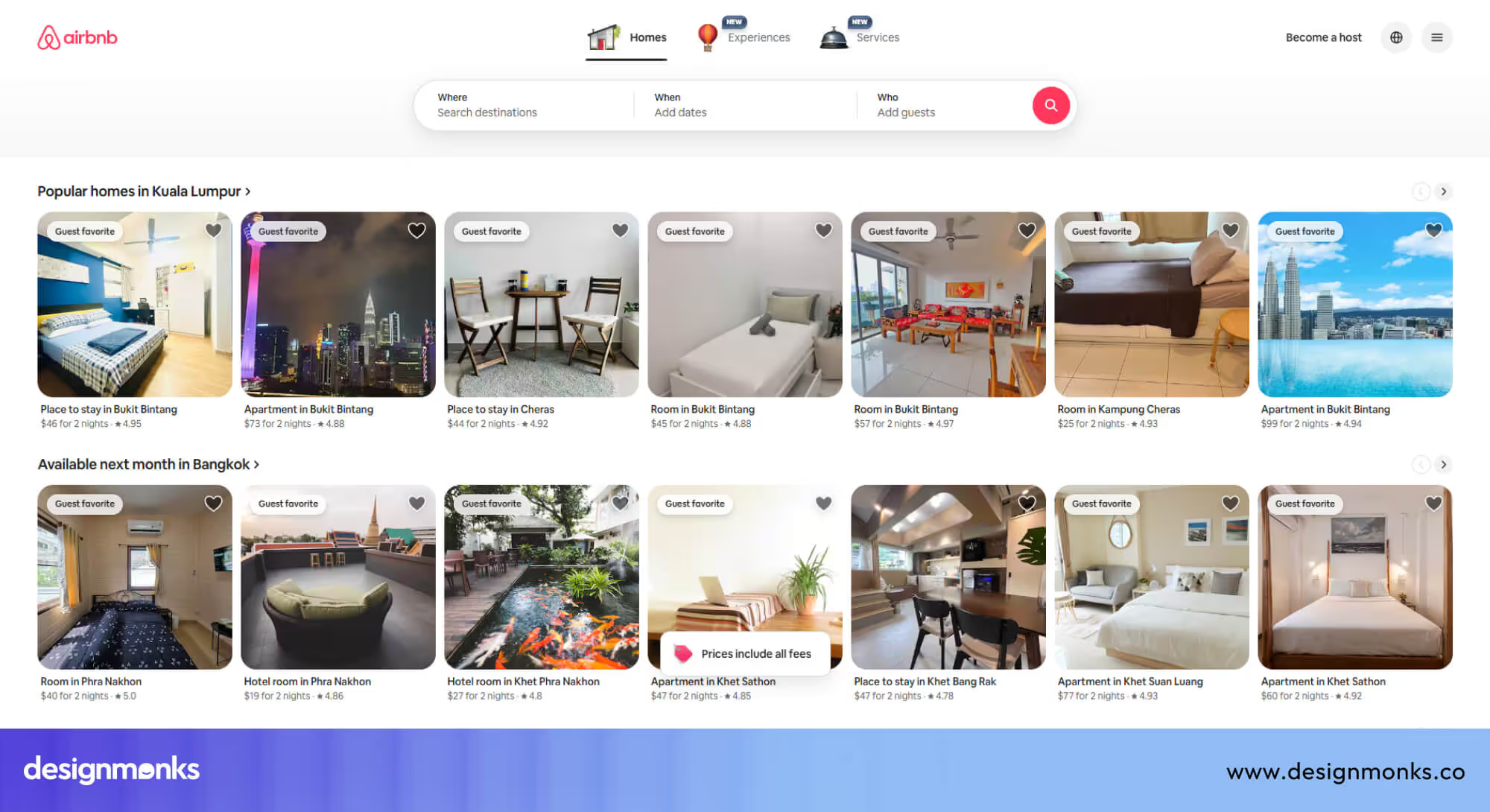
It prevents mistakes like selecting the wrong date (Heuristic 5) and shows options so users don’t have to remember things (Heuristic 6). Both beginners and experienced users can move around quickly (Heuristic 7).
The layout is clean without clutter (Heuristic 8). Clear error messages explain exactly what went wrong (Heuristic 9), and helpful tips or the support center are always available (Heuristic 10).
Poorly Designed Interface: Typical Enterprise Software
Many business platforms make the opposite mistakes. Users often don’t know if their work is saved (violates Heuristic 1). The language is full of technical terms that don’t make sense to regular users (violates Heuristic 2). Undo or back options are missing (violates Heuristic 3), and menus and buttons look different across pages (violates Heuristic 4).
Forms accept wrong input without warning (violates Heuristic 5), and users have to remember codes or IDs (violates Heuristic 6). There are no shortcuts for power users (violates Heuristic 7). The screens often feel crowded (violates Heuristic 8), and errors are confusing codes (violates Heuristic 9). Moreover, the help guides are hard to follow (violates Heuristic 10).
How to Fix These Enterprise Issues?
The solution is simple. First, give clear feedback so users always know what’s happening. Use simple words and familiar language to avoid confusion. Add undo options so mistakes can be fixed easily. Stay consistent with buttons, colors, and layouts across the interface.
You need to prevent errors by validating inputs and guiding users. Show choices clearly instead of making users remember information. Offer shortcuts for advanced users, and keep screens uncluttered.
Additionally, provide helpful error messages that explain what went wrong. Finally, make Help easy to find. Following these rules makes any interface faster, smoother, and more enjoyable for users.
Advanced Topics: Adapting the Heuristics for Modern Interfaces
The ten Nielsen Norman heuristics still apply today, but modern user interface designs like mobile apps, voice systems, AI, and AR need some extra attention. Here’s how you can use them effectively today:
Mobile UI
On mobile, make buttons and touch targets large and easy to tap. Use gestures and shortcuts to reduce steps. Always give feedback, like vibrations or visual cues. Keep key actions reachable with one thumb for comfort.
Voice User Interfaces (VUI)
Use sound or speech to confirm actions instead of visuals. Make sure users know the system heard them correctly. Speak in simple words and give examples like, “You can say: check balance or transfer money.”
Conversational UI (Chatbots & AI Assistants)
Show users what’s happening with typing indicators or processing messages. Prevent errors by asking clear questions. Keep language consistent and friendly, and provide guidance like, “You can ask me to schedule a meeting.”
Augmented Reality (AR) Interfaces
Match digital elements to real-world size. Keep spatial layout consistent. Provide clear visual anchors so users never feel lost or confused.
AI-Driven Interfaces
Explain why AI made a decision. Let users undo actions or change preferences. Highlight uncertain predictions to prevent mistakes. Keep the system predictable even when it adapts.
Frequently Asked Questions (FAQ)
Are the ten heuristics still relevant today?
Yes, these ten heuristics are still relevant today. They remain the foundation of good UX, even with modern devices and interfaces.
Do we need special heuristics for mobile apps?
Not necessarily, the original heuristics work well, but mobile apps often add extra considerations like gestures, screen size, and touch precision.
Is a heuristic evaluation the same as user testing?
No, heuristic evaluation is not the same as user testing. A heuristic evaluation is done by experts, but user testing involves real users.
How long does a heuristic audit take?
A small interface heuristic audit might take 1-2 hours. A complex one can take days.
Can beginners perform heuristic evaluations?
Absolutely, beginners can perform heuristic evaluations. The heuristics are simple once you understand them, and they help beginners spot UX issues quickly.
Conclusion
Mastering the 10 usability heuristics for user interface design gives you a clear roadmap to create interfaces that feel smooth, intuitive, and stress-free. By applying these rules, you can improve feedback, simplify actions, and reduce confusion, making your websites and apps more enjoyable for users.
Whether you are designing for web, mobile, or apps, following these heuristics helps build trust, prevent errors, and deliver a seamless experience that keeps users happy and engaged.

.svg)


.avif)
.avif)
.avif)
.avif)


.avif)
.avif)
.avif)
.avif)


.avif)


