
.svg)


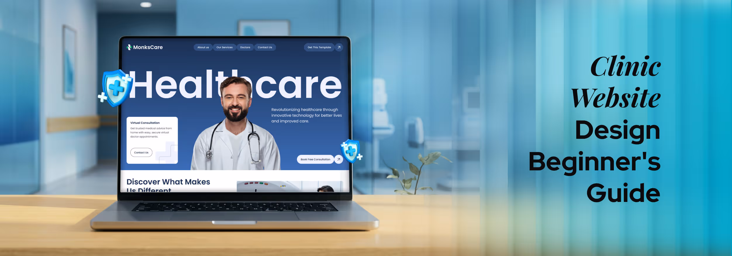

Key Takeaways
- Clinic website design builds trust and improves patient booking conversions
- Patients research clinics online before calling or scheduling appointments
- Clear UX, fast loading, and mobile-first design improve usability significantly
- Strong visuals, testimonials, and credentials increase patient's trust and confidence
- AI tools and patient portals enhance convenience and a modern healthcare experience
Before a patient ever calls or visits your clinic, they search online first. What they see in those first few seconds decides whether they trust you or move on. That first impression comes directly from how your clinic website design looks and works.
Many clinic owners think a website only needs to look nice. But a well-built site does much more. It answers questions, builds trust, and makes booking simple without extra effort from you. It is your hardest-working team member, available 24/7.
But how do you make your clinic website design work perfectly for both your patients and your team? Let’s find out.
What Is Clinic Website Design?
Clinic website design is the process of building a healthcare website that is easy to use, earns patient trust, and turns visitors into bookings. It also needs to follow medical privacy and compliance laws.
At its core, clinic website design connects four things:
- Clear information
- Easy navigation
- Emotional reassurance
- Simple booking
Unlike a typical business website, healthcare websites carry more responsibility. A regular business site might sell products or share company news. A clinic website, on the other hand, must handle sensitive health data, build deep trust, and guide worried or unwell people toward getting help.
That is why platforms like a Healthcare website design must be done with utmost care.
Modern healthcare websites also serve as a patient portal, a private online space where patients can log in, view their medical history, see test results, or message their doctor. This is something a regular business website simply does not need.
The goals of a modern clinic website come down to three things: make patients feel welcome, make it easy to get help, and make the whole experience feel safe and professional.
Essential Features Every Clinic Website Should Have
A clinic website without the right features is like a clinic without a reception desk. Here are the must-have elements that every healthcare site needs:
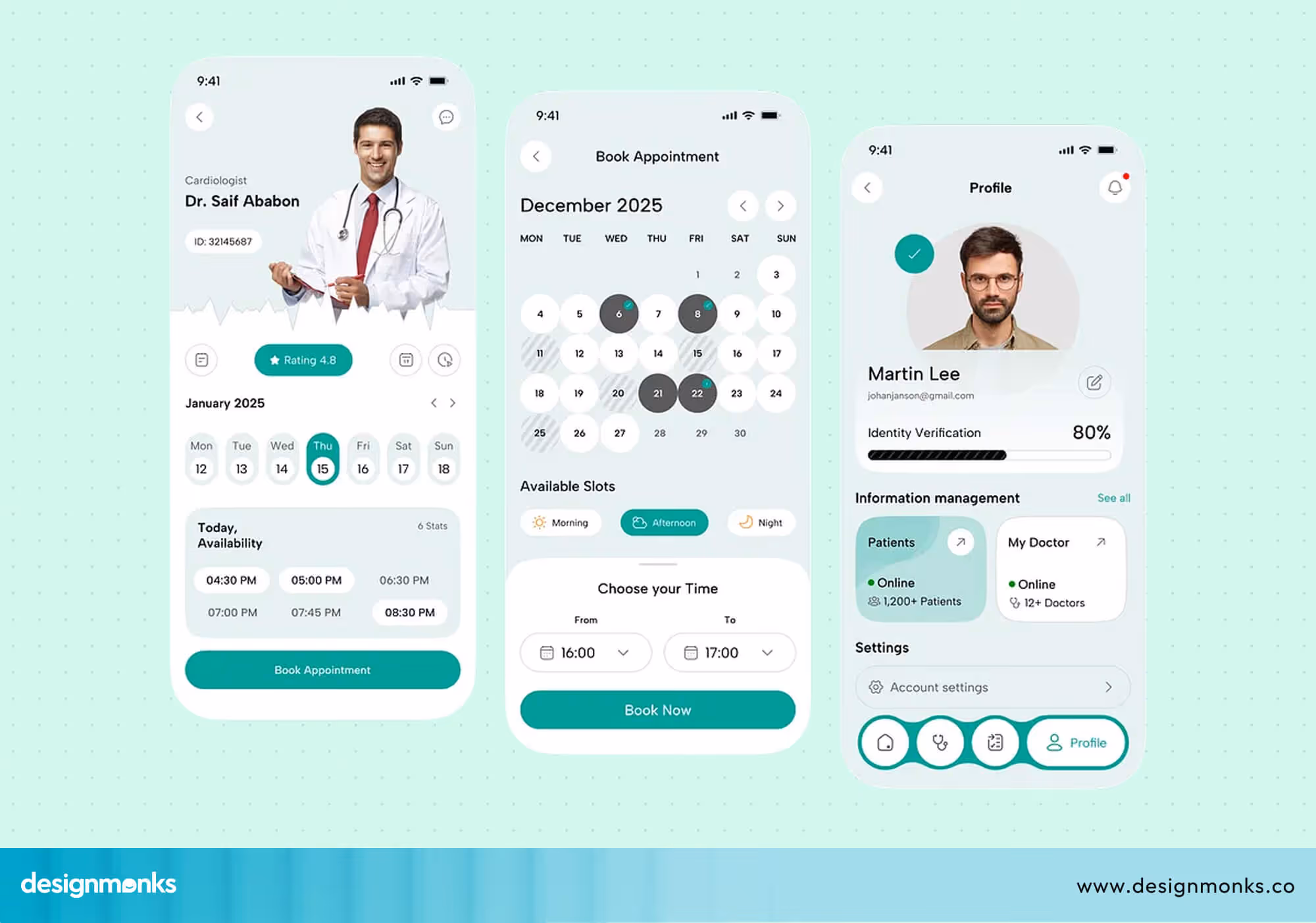
Online Appointment Scheduling
Patients today do not want to call during office hours just to book a visit. Adding an online booking tool, like a calendar system, lets patients pick a date and time that works for them, at any hour of the day.
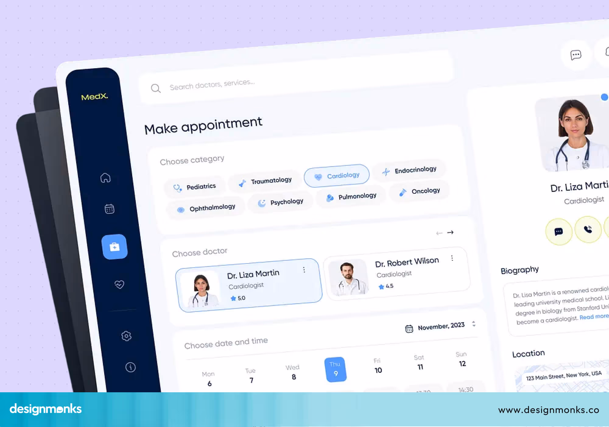
This alone can significantly increase the number of new bookings you receive. Some tools even send automatic reminders to reduce no-shows and save your team a lot of follow-up work.
If you are planning a clinic website from scratch, especially for a startup or early-stage practice, it’s important to prioritize only essential features first. You can learn more about this approach in designing for MVP launch in HealthTech startups.
It explains how to build a focused, high-impact product without unnecessary complexity.
Doctor Profiles and Credentials
Patients want to know who will be treating them. A clear profile for each doctor, including their photo, qualifications, years of experience, and specialties, builds trust right away.
When someone can put a face and a name to their care, they feel much more comfortable. You can also include a short personal bio so patients get a sense of the doctor's personality before their first visit.
Services Pages
Each service your clinic offers should have its own page. Whether it is general check-ups, dental care, skin treatments, or mental health support. Explain what each service involves in simple words.
This also helps your website show up in search engines when people look for those services nearby. A well-written services page also answers common patient questions upfront, so they arrive at their appointment already feeling informed and prepared.
Contact Information, Map, and Operating Hours
This sounds basic, but many clinics get it wrong. Your phone number, email, physical address, a Google Map, and your opening hours should all be easy to find. Ideally, it should be on every page of the site, not just the contact page.
Making this information hard to find is one of the fastest ways to lose a potential patient who is ready to book right now.
Patient Reviews/testimonials
Today, patients rarely choose a clinic without research. Data from Think with Google shows that people actively search, compare, and evaluate healthcare providers online before deciding to call or visit.
So, real reviews from happy patients are one of the most powerful trust signals your website can have. If someone is nervous about visiting a new clinic, reading a positive experience from another patient can make all the difference.
Consider placing your best reviews on the homepage, where every new visitor can see them immediately.
Patient Portal Login
A patient portal is a secure, private area of your website where existing patients can log in and access their health records, lab results, or communicate with staff. It saves time for both patients and your team.
When patients can manage their health information online at any time, they feel more in control of their care and more connected to your clinic.
Insurance Information
Be upfront about which insurance plans you accept. This is one of the first questions new patients have. Answering it clearly on your website removes a major barrier to booking.
If possible, include a simple table or list of accepted providers so patients can check in seconds without having to call your front desk.
FAQ Section
A frequently asked questions section saves your reception team from answering the same questions over and over. It also helps visitors feel informed and confident.
Cover questions like what to bring to an appointment, how to prepare for a procedure, or what your cancellation policy is. A good FAQ section also shows patients that you understand their concerns and are ready to address them before they even ask.
Clinic Website UX Best Practices
User experience (UX) in healthcare is all about helping patients feel comfortable and confident from the moment they land on your site. A good clinic website design should feel simple, clear, and easy to use without confusion.
When your site is easy to navigate, patients are more likely to stay, trust your clinic, and take the next step. Here are the key UX elements that make that experience work smoothly:
- Clear Navigation: Keep your menu simple and easy to understand. Patients should be able to find important pages like services, doctors, contact details, and booking within a few seconds. If they have to search too much, they may leave.
- Fast-Loading Pages: Speed matters more than you think. A slow website can frustrate users and reduce trust. Make sure your pages load quickly so patients can move smoothly without waiting.
- Mobile-First Layouts: Most people visit clinic websites on their phones. Your clinic website design should look clean and work perfectly on smaller screens, with text that is easy to read and buttons that are easy to tap.
- Accessibility Design: Your website should work for everyone. Following standards like ADA Compliance helps make your site more inclusive. This includes features like screen reader support, clear text contrast, and easy keyboard navigation.
- Strong CTAs (Call-to-Actions): Clear action buttons help guide patients. Options like “Book Appointment,” “Call Now,” or “Get Directions” should be easy to see and placed where users naturally look.
- Readable Typography: Keep your text simple and clean. Use easy-to-read fonts, short sentences, and avoid clutter. When content is easy to read, patients are more likely to stay and take action.
Design Elements That Build Patient Trust
Trust is everything in healthcare. A patient will not share personal health concerns with a clinic they do not trust. And most of that trust is formed through your website. It starts with how your website looks and feels, and then it continues with the small details that show professionalism and care.
Clean Clinical Visual Identity
The first thing patients notice is your overall look. This includes your colors, layout, and style. A clean and calm visual identity helps patients feel at ease right away.
Soft colors like white, light blue, or gentle green often work best because they are associated with cleanliness, safety, and care.
When a website feels too busy or uses loud colors, it can create stress instead of comfort. In healthcare, simplicity is powerful. A clean design tells patients that your clinic is organized, professional, and focused on their well-being.
This first impression sets the tone for everything that follows.
Professional Photography
Once patients feel comfortable with the design, they start looking for something more human, a real connection. This is where photography plays an important role.
Using real photos of your clinic, your doctors, and your space builds trust much faster than generic stock images.

Patients want to see where they are going and who will be treating them. A warm photo of your reception area or a friendly image of your doctor can make your clinic feel more approachable.
It helps reduce uncertainty. Instead of imagining an unknown place, patients can picture themselves there. That small shift can make them feel more confident about booking.
Security Badges and SSL Certificates
After visual trust comes data trust. Patients need to know their personal information is safe when they use your website. This is where security features like an SSL Certificate come in. When your website shows “https” and a small padlock icon in the browser, it signals that the connection is secure.
Adding visible security badges on your site reinforces that message. Even if patients do not fully understand the technology, they recognize these signs. It gives them peace of mind, especially when they are filling out forms or booking appointments online.
Certifications and Accreditations
Once patients feel safe, they start looking for proof of quality. Certifications and accreditations provide that proof. If your clinic is licensed, accredited, or part of any professional medical organizations, make sure to display those clearly.
These signals show that your clinic meets recognized standards and follows proper guidelines. For a patient, this reduces risk.
Patient Testimonials
At this stage, patients often look for validation from others. They want to know if people like them have had a good experience. This is why testimonials are so powerful. Real patient reviews, ratings, or even short video stories help build emotional trust. They turn your services into real experiences that others can relate to.
Place testimonials on your homepage and key service pages. When a patient sees positive feedback at the right moment, it can strongly influence their decision to move forward.
Before and After Results
Finally, patients want to see results, especially for treatments where outcomes are visible. Before and after images can be very effective in showing what your clinic can achieve. This works well for areas like dermatology or cosmetic treatments. It gives patients a clear, visual understanding of what to expect. However, it is important to use these carefully.
Always get patient permission and follow any local medical guidelines when sharing such images. These visuals can remove doubt and build confidence in patients.
All of these elements work together to create a strong sense of trust. From the moment someone lands on your site to the moment they decide to book, your clinic website design should consistently reassure, inform, and guide them.
Clinic Website Design by Specialty
Different types of clinics serve different patients, and your website should reflect that difference clearly:
Dental Clinic Websites
Dental anxiety is real, and your website design can either calm it or make it worse. The best dental clinic websites use bright, friendly visuals and before-and-after images that show real results.
Each service should be explained clearly so patients know exactly what to expect. An easy booking button placed prominently on every page helps turn curious browsers into confirmed appointments.
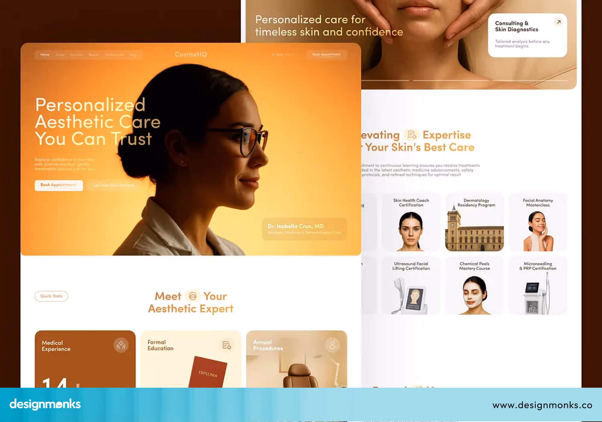
Dermatology Clinics
For dermatology, visuals are everything. High-quality images of skin treatments and clear before-and-after results (shared with full patient permission) build confidence fast.
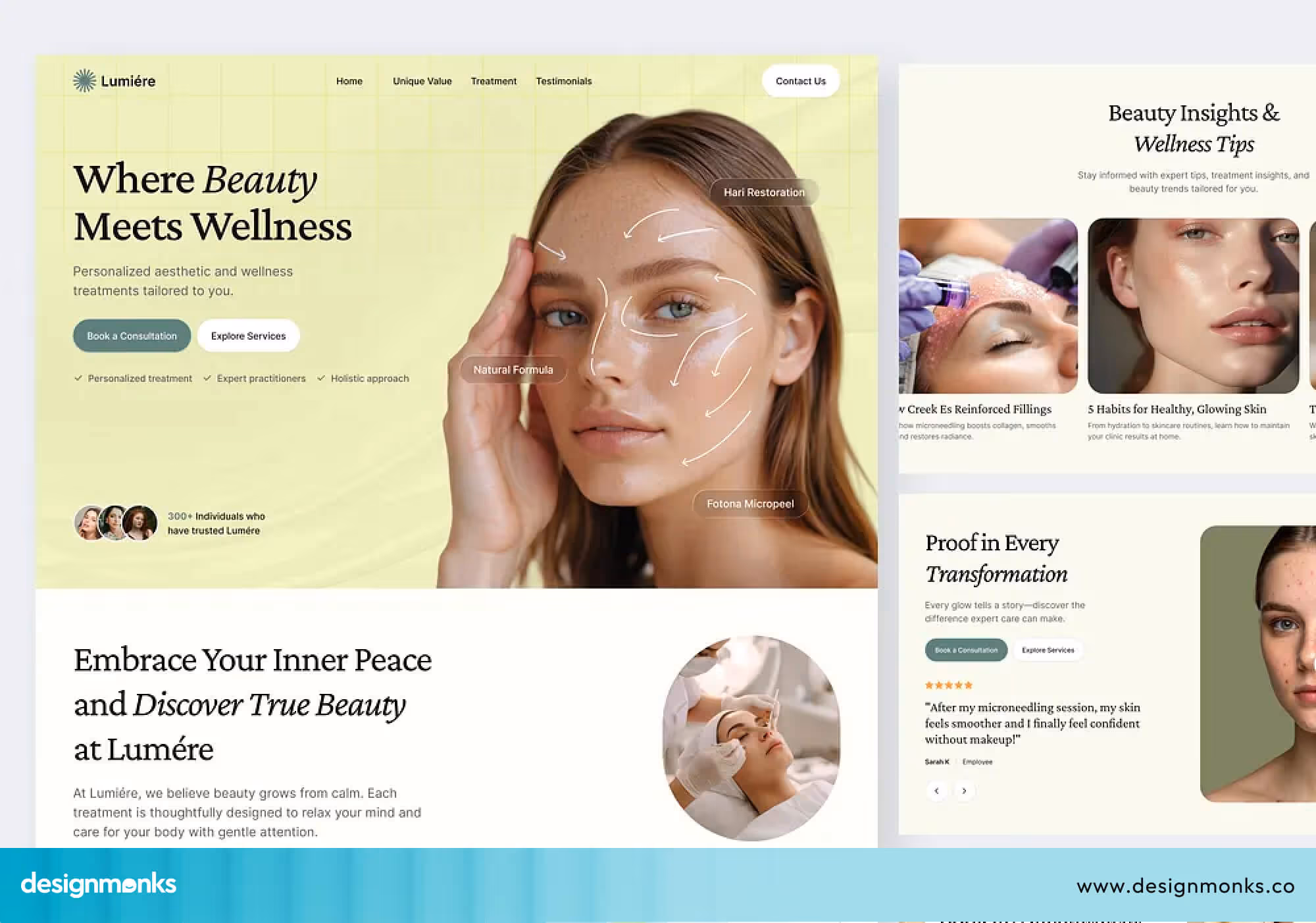
Patients comparing their options will stay on a site that shows real, honest results over one that only uses stock photos. Pair strong visuals with clear treatment descriptions, and you have a winning combination.
Mental Health Clinics
Mental health website design needs extra care and sensitivity. Soft colors, simple layouts, and gentle language help visitors feel safe right away. Privacy should be clear, and the overall tone should feel warm and reassuring, not cold or overly clinical.
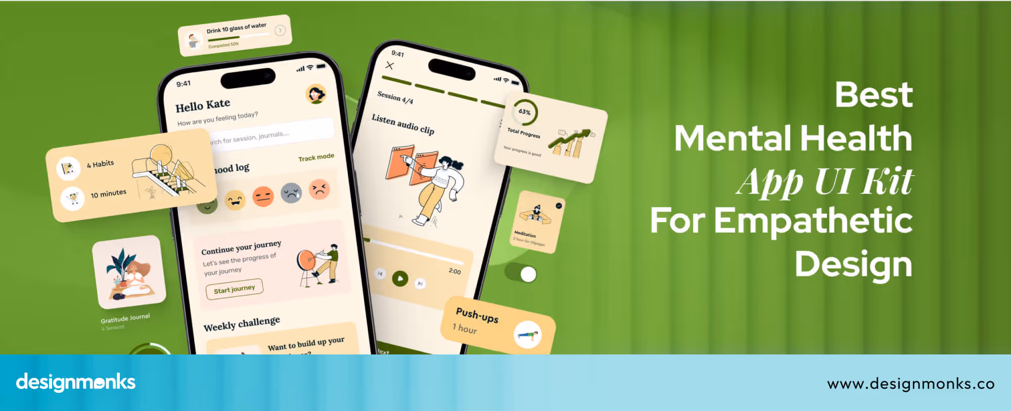
You can take inspiration from work by Design Monks, where mental health UI designs focus on calm visuals, simple navigation, and emotional comfort. Small details like friendly text and clean design can make it easier for patients to take the first step.
Pediatric Clinics
Parents are the ones browsing pediatric clinic websites, but the design still needs to feel friendly and child-appropriate. Bright but not overwhelming colors, clear service descriptions, and easy navigation make a strong impression.
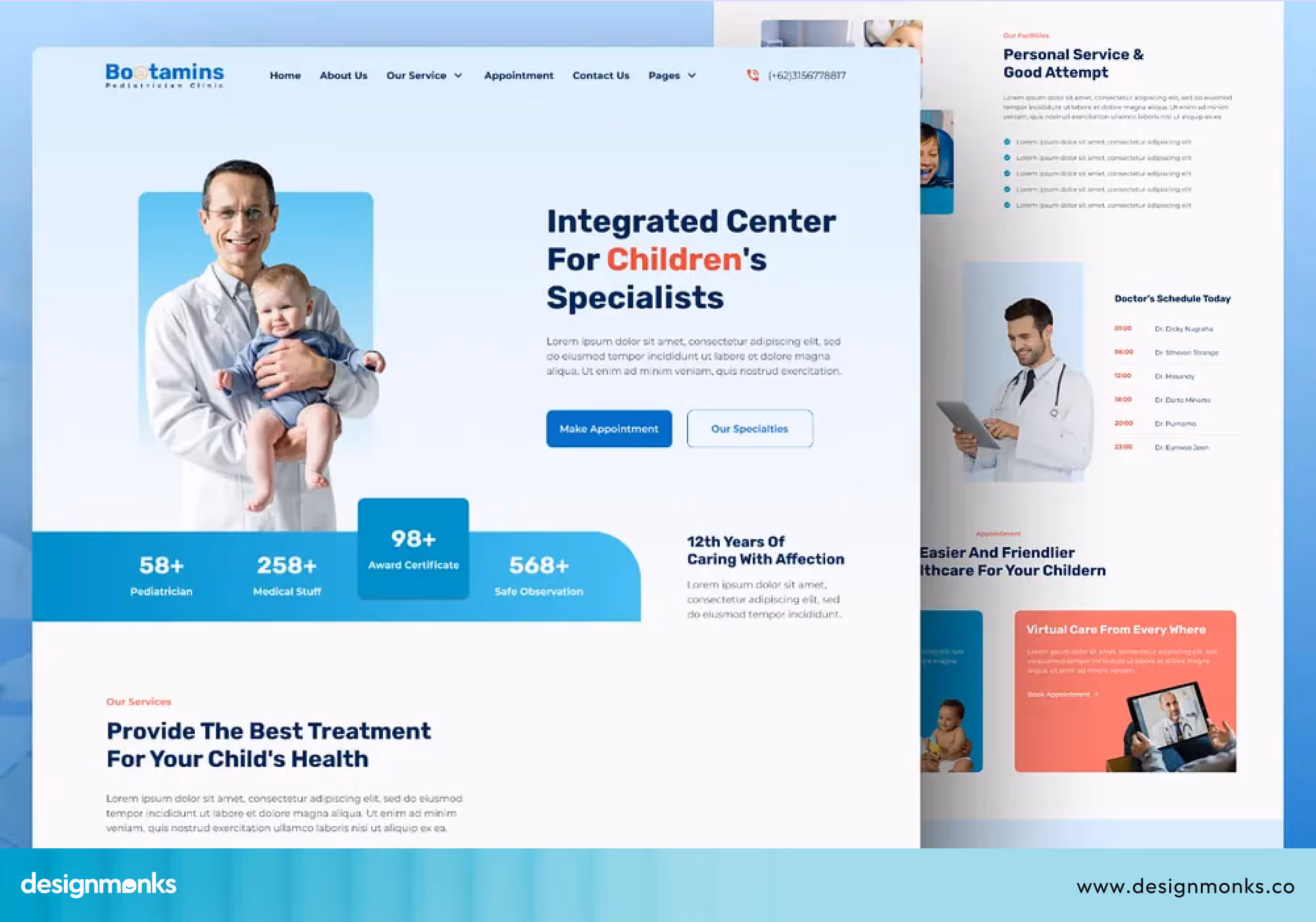
Parents are often stressed when searching for a pediatrician, a calm, welcoming site tells them immediately that their child will be in good hands.
Diagnostic Centers
Speed and clarity are the top priorities for diagnostic center websites. Patients visiting these sites usually want to find information about a specific test, understand how to prepare, and book quickly.
Make test information easy to find, keep the booking process short, and provide a clear way for patients to access their results online. Accuracy and simplicity go hand in hand here.
10 Best Clinic Website Design Examples
Looking at examples is one of the fastest ways to understand what a good clinic website design actually looks like in practice. Here are ten sites worth studying:
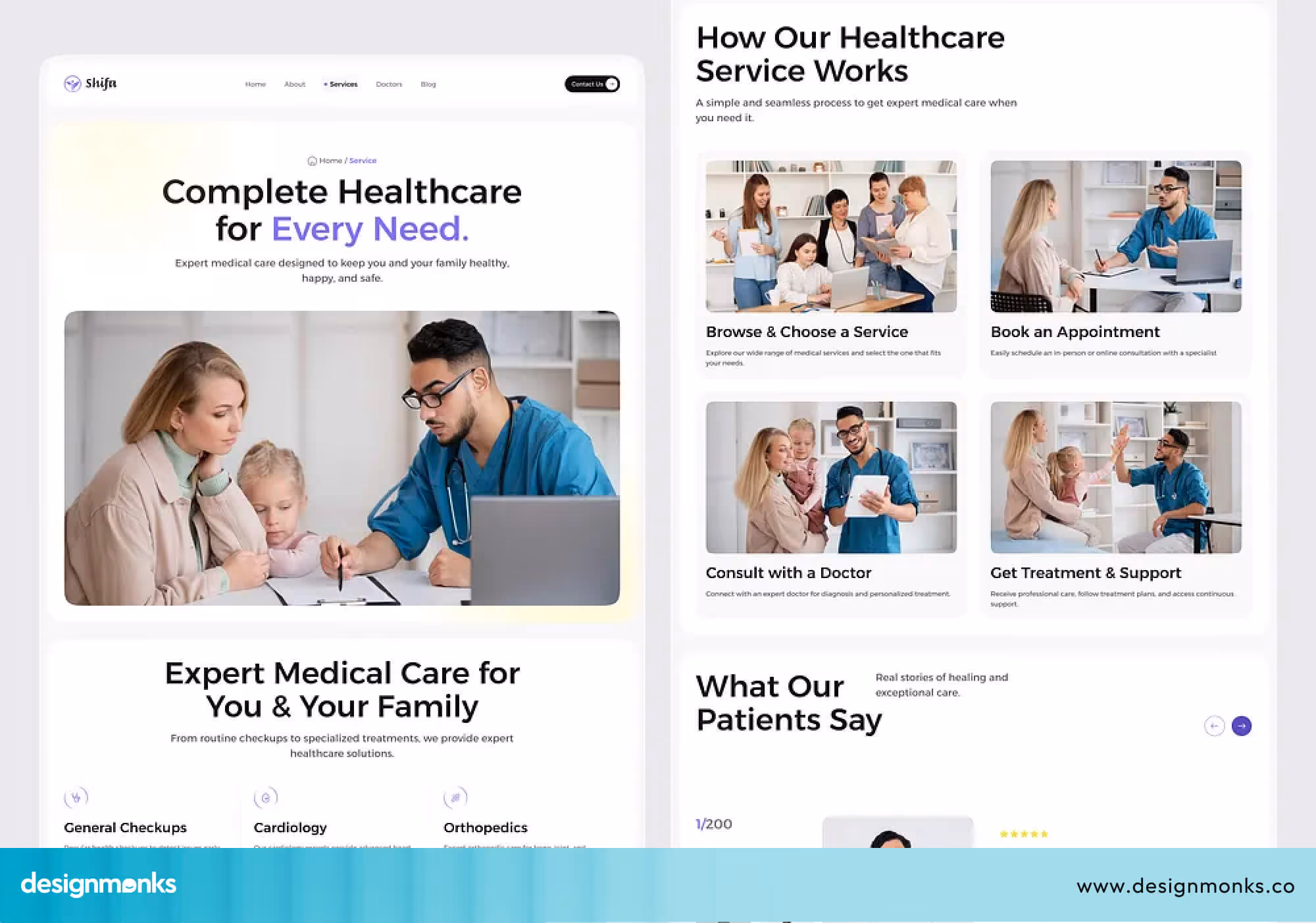
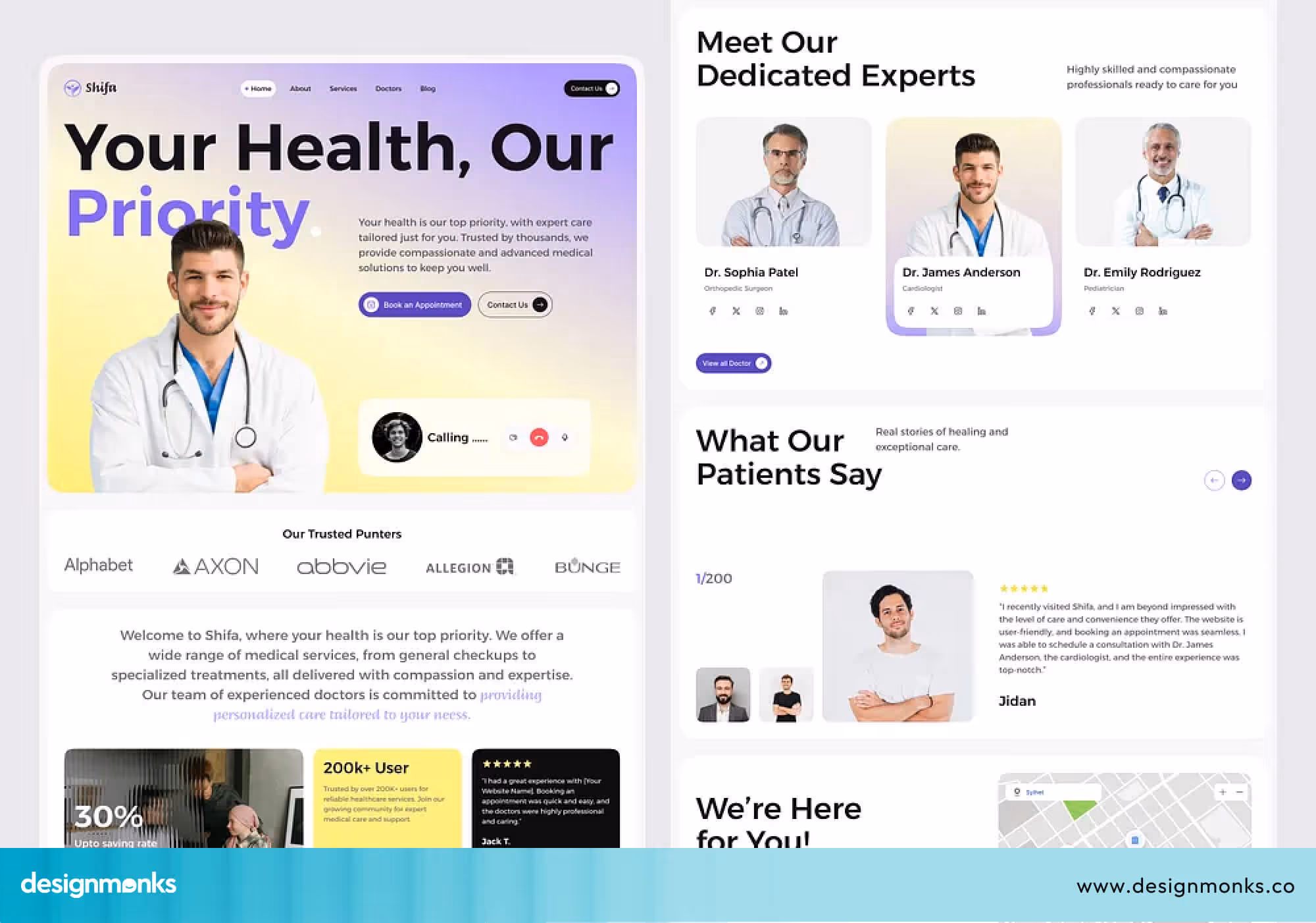
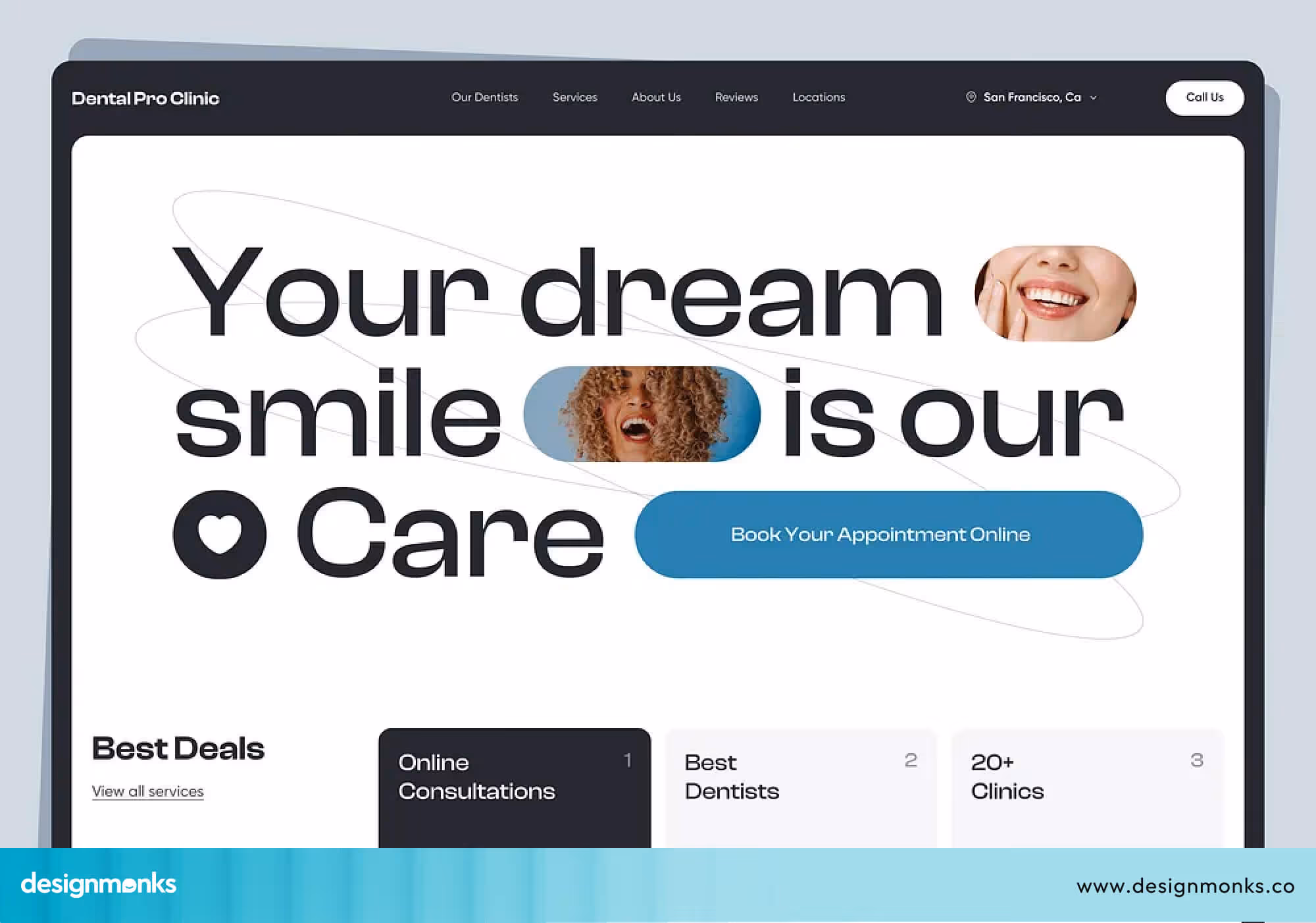
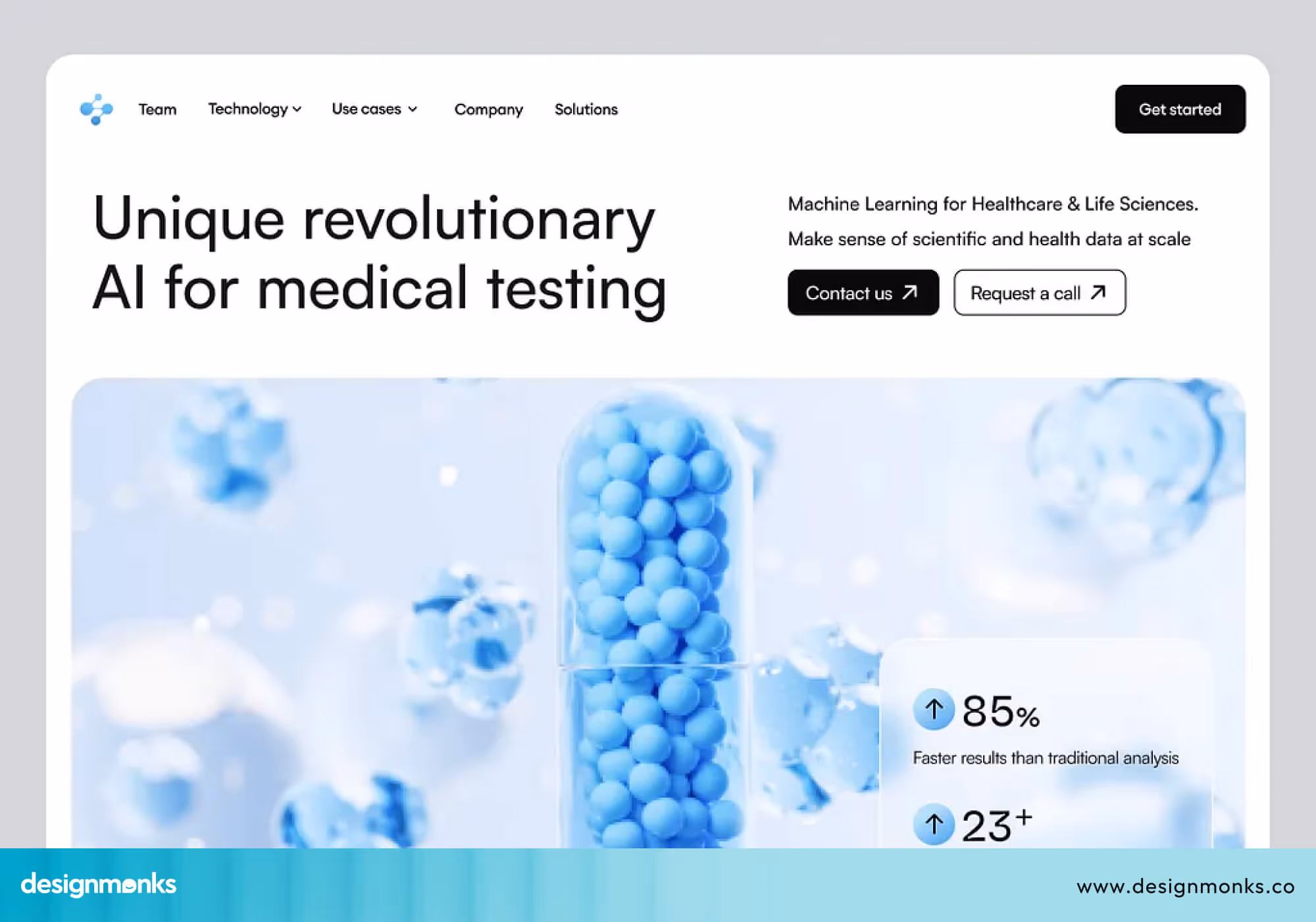
MediCare
This modern healthcare landing page concept, designed by Design Monks, is a strong example of clean and user-focused UI for clinic websites. It emphasizes simplicity, clear visual hierarchy, and well-placed call-to-action elements. It helps users quickly understand services and take action without confusion.
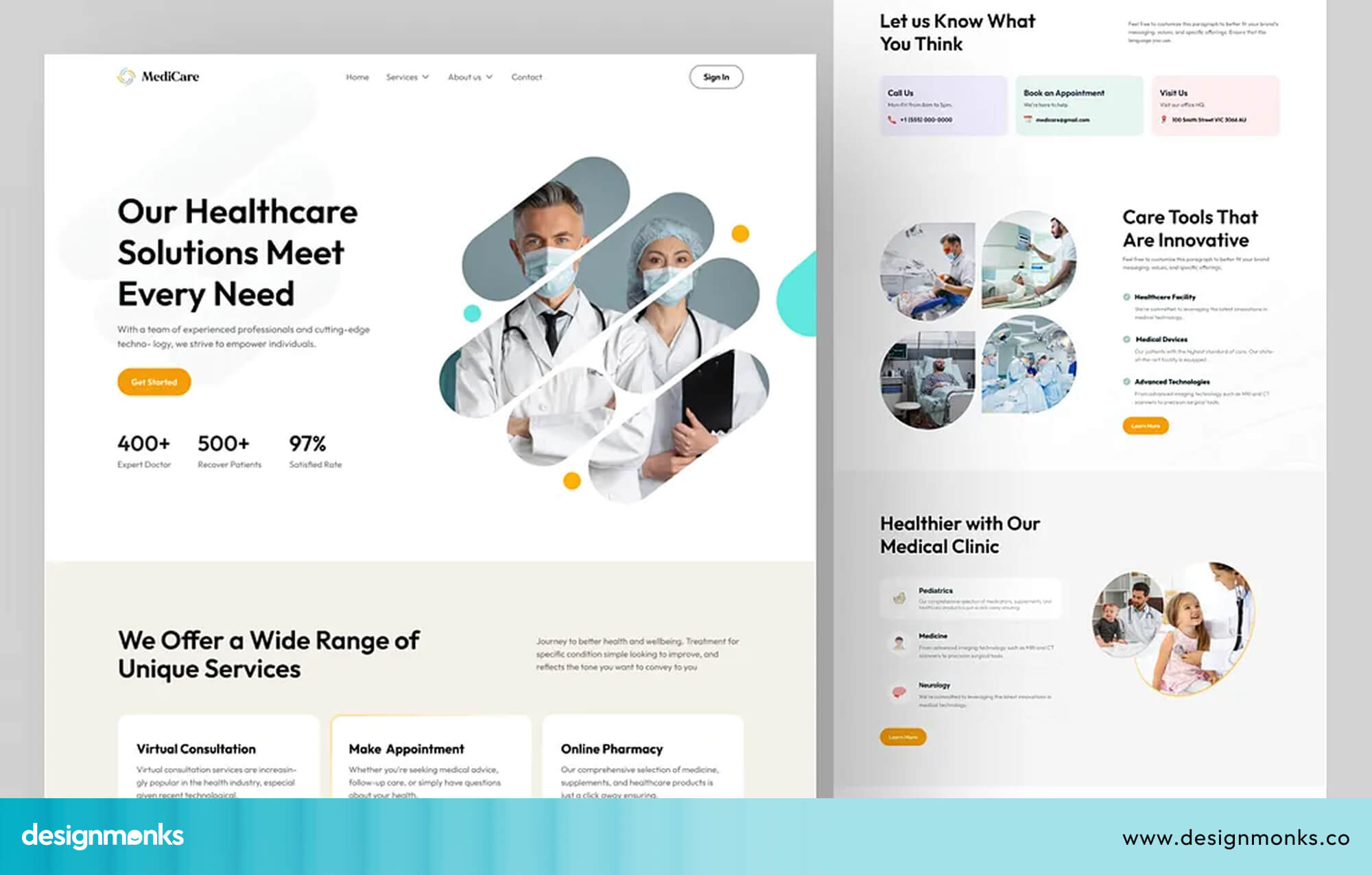
The design follows a minimal approach with balanced spacing, soft visual tones, and modern typography. This makes it a great reference for patient-centered healthcare platforms where clarity and trust are the top priorities.
Mayo Clinic
Mayo Clinic is widely considered one of the best healthcare websites in the world. Its navigation is simple and easy for anyone to find what they need in seconds.
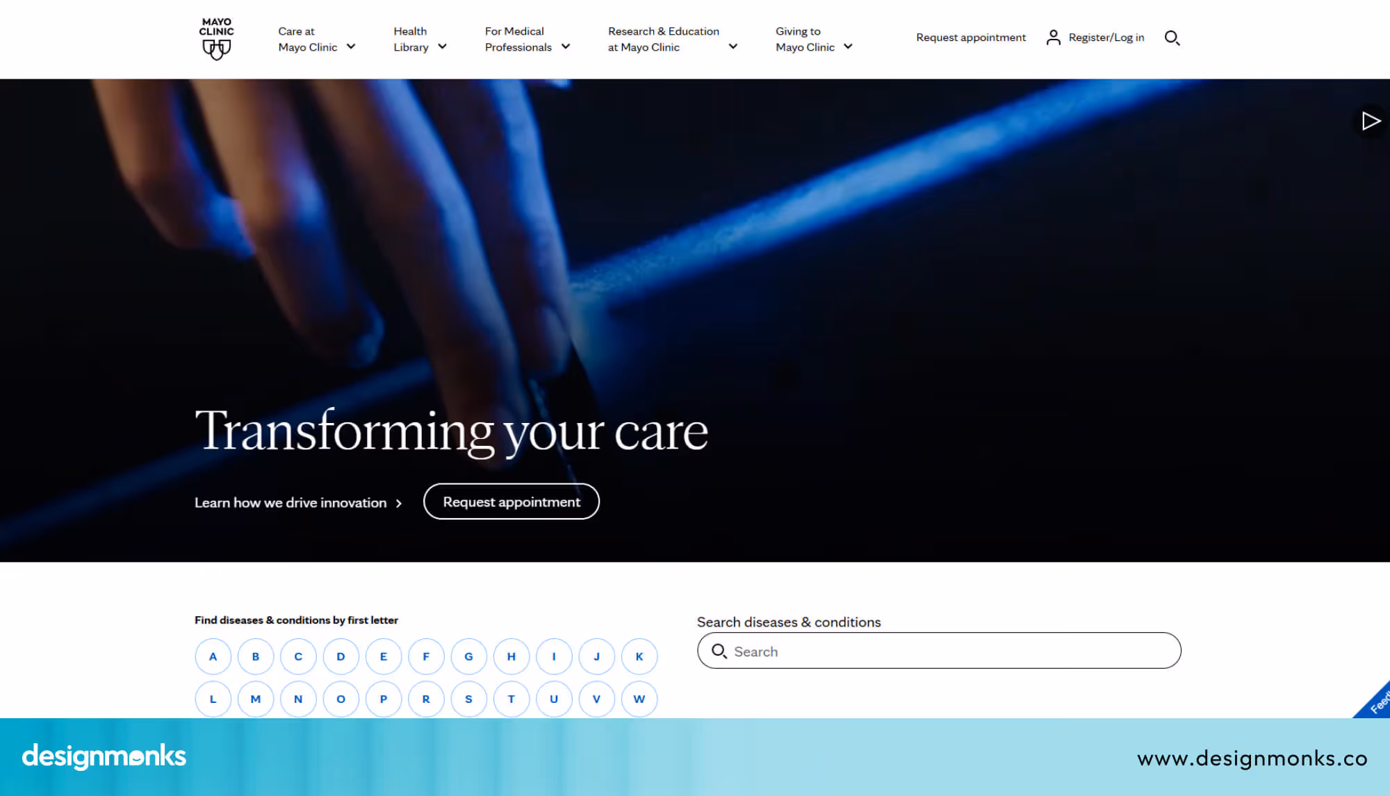
The site uses real photography, clear credentials, and calm colors to build instant trust. On mobile, it loads fast and works smoothly. It's a great benchmark for any clinic to follow.
Cleveland Clinic
Cleveland Clinic takes a content-driven approach. It offers a huge library of health articles, guides, and videos that keep patients coming back even between appointments.
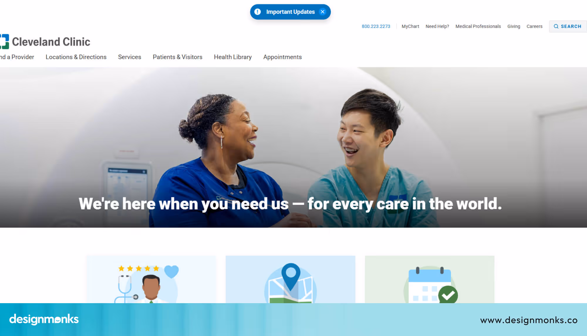
The layout is clean, the navigation is straightforward, and the overall design feels both professional and approachable.
Zocdoc
Zocdoc is all about making booking as fast and simple as possible. Patients can find a doctor, check availability, and confirm an appointment in just a few clicks.
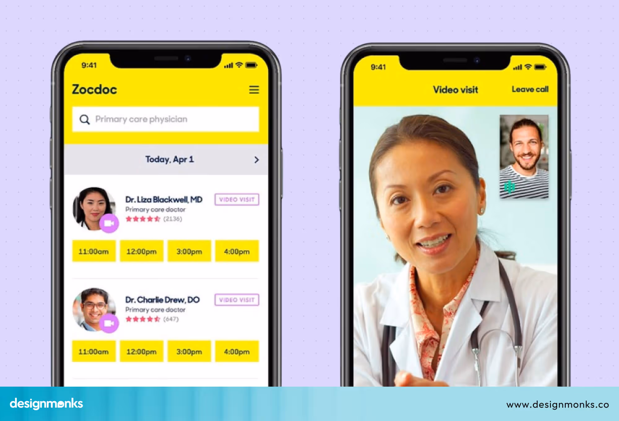
Its CTAs are clear and placed exactly where your eye goes. If easy booking is your priority, Zocdoc is the gold standard.
Practo
Practo is popular across Asia and works well for clinics that want to offer doctor discovery, patient reviews, and online booking all in one place.
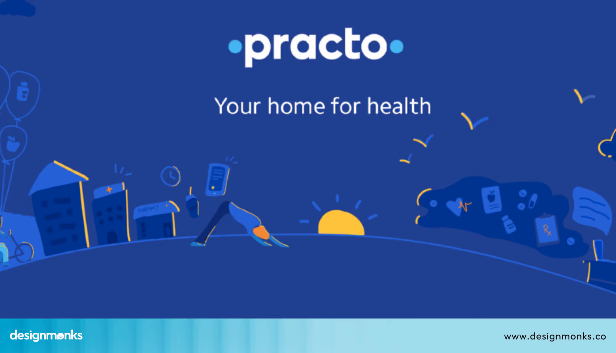
Patients can search by specialty, read reviews, and book instantly. This makes it a powerful all-in-one platform worth studying.
Healthgrades
Healthgrades is excellent for helping patients compare doctors. It features detailed doctor profiles, star ratings, and smart search filters.
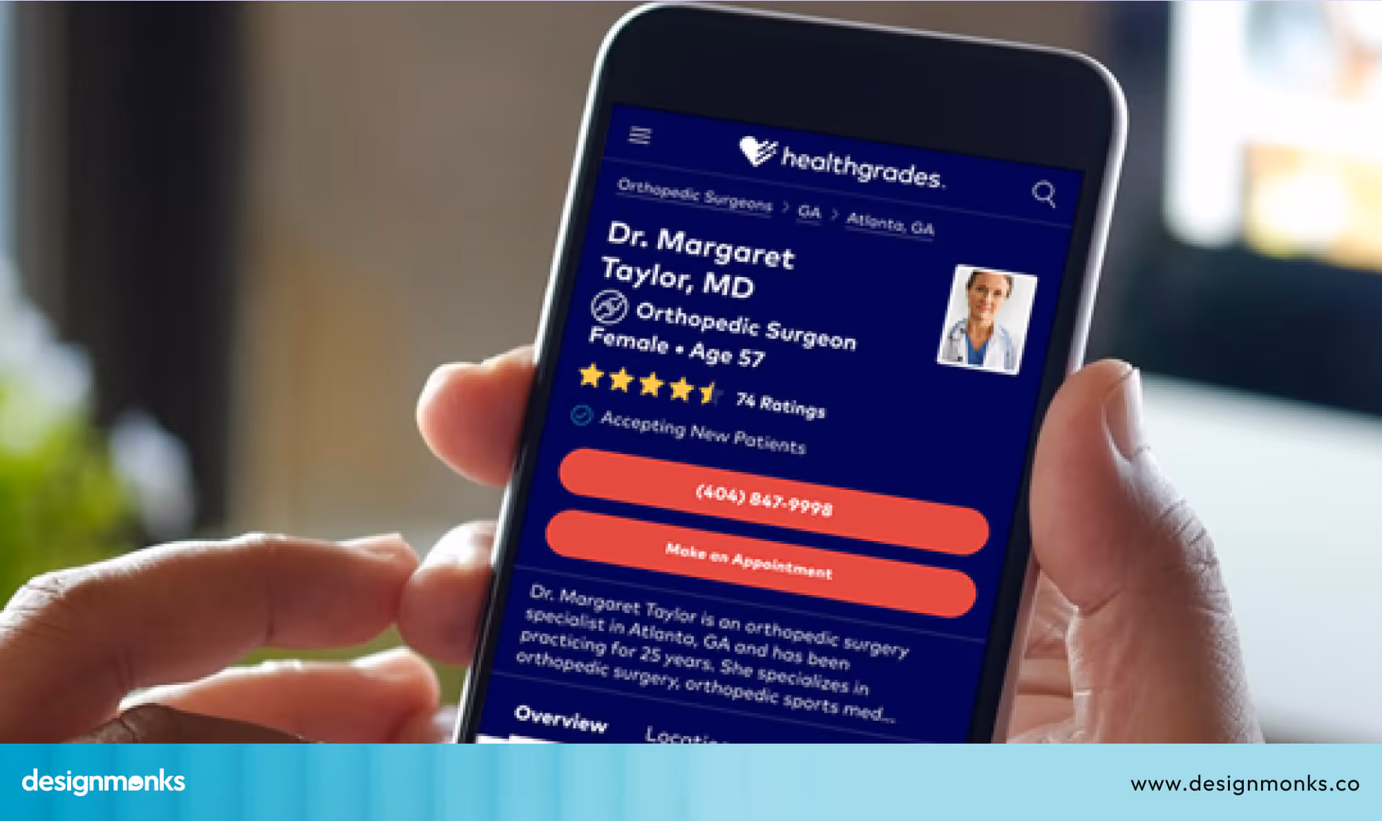
If your clinic wants to stand out through credentials and patient feedback, Healthgrades shows exactly how to present that information clearly.
WebMD
WebMD handles a huge amount of content without feeling overwhelming. Its structure is logical, its categories are clear, and patients trust it because it has been consistent and reliable for years.
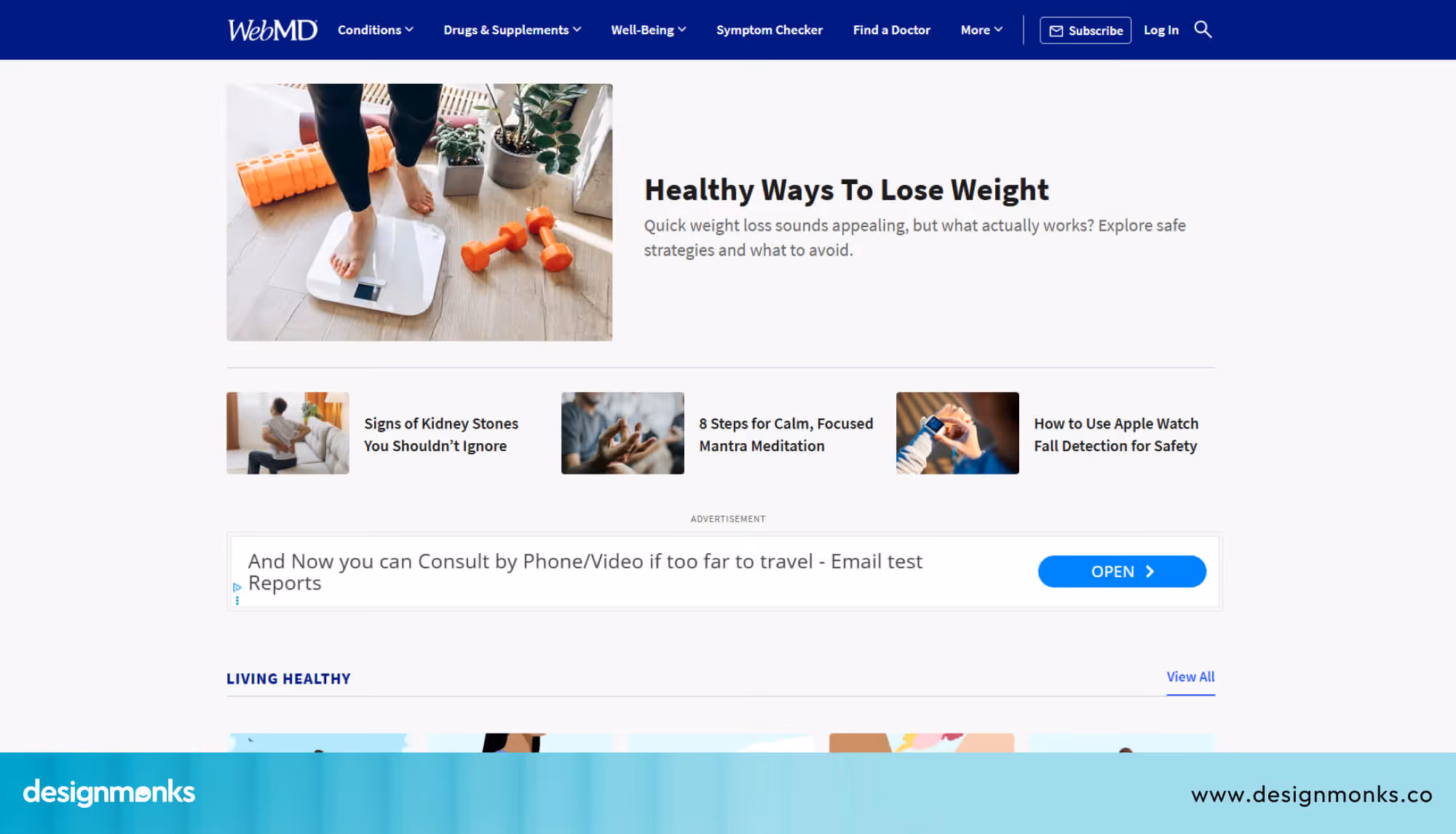
It proves that even content-heavy healthcare sites can feel easy to browse, as long as you categorize them simply.
One Medical
One Medical has one of the most modern and minimal designs in healthcare. Everything is clean, the branding is strong, and the booking process is refreshingly simple.
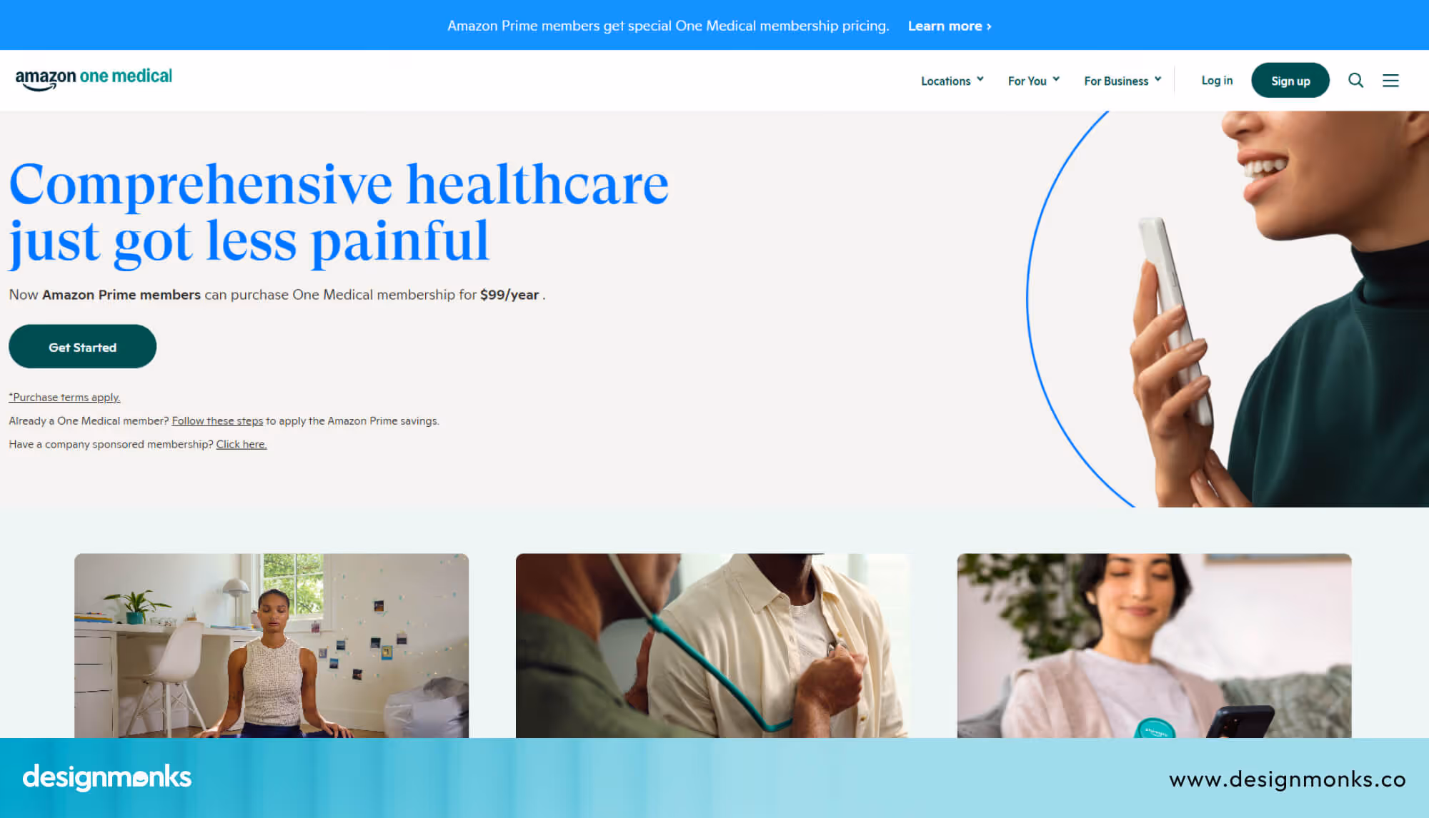
It shows that you do not need to clutter your site with information, and sometimes less really is more.
Apollo Hospitals
Apollo Hospitals serves patients across multiple specialties and locations, yet its website keeps things clear and easy to navigate.
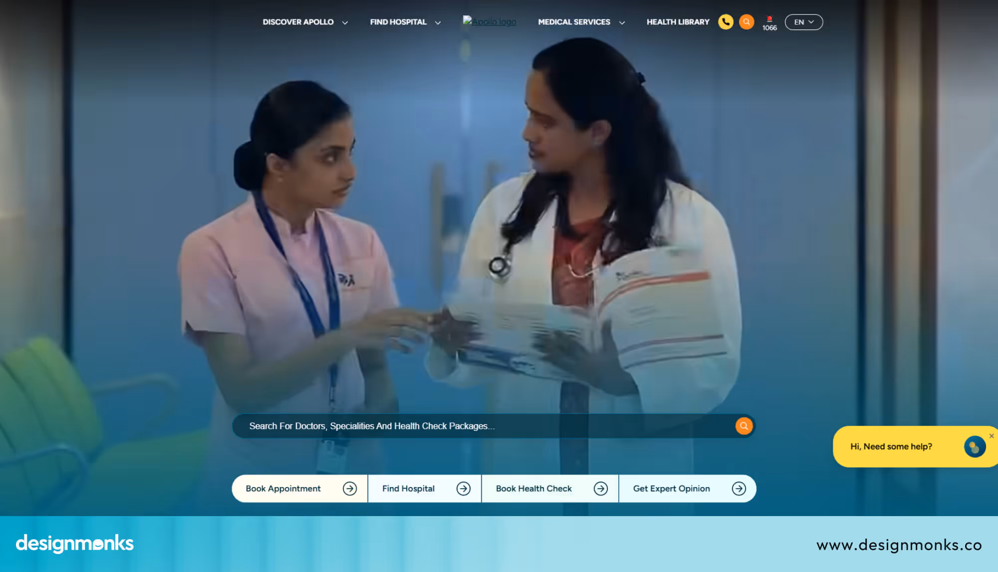
It handles complexity well and shows that even large multi-service clinics can maintain a smooth user experience with the right design approach.
NHS Website
The NHS website in the United Kingdom is one of the most accessible healthcare sites in the world.
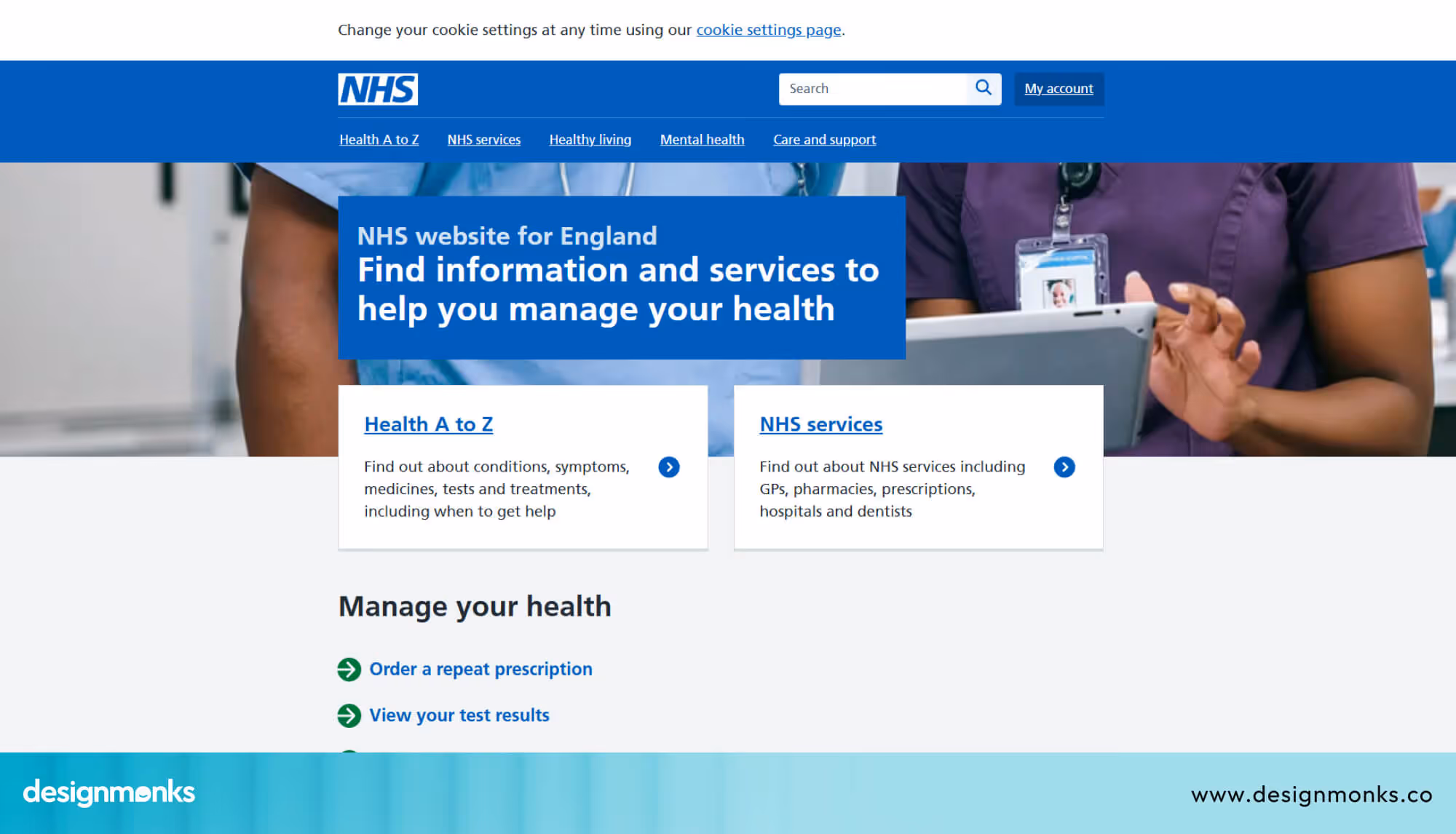
It uses plain language, a simple structure, and a strong focus on usability. It is a great example of how good design can serve a very wide and diverse audience effectively.
What All These Examples Have in Common
No matter the size or specialty, the best clinic websites all follow the same patterns. Their navigation is simple and logical. Their design feels clean and trustworthy. Their CTAs are visible and consistent on every page. Their mobile experience is smooth and responsive. And their booking process is fast, short, and stress-free.
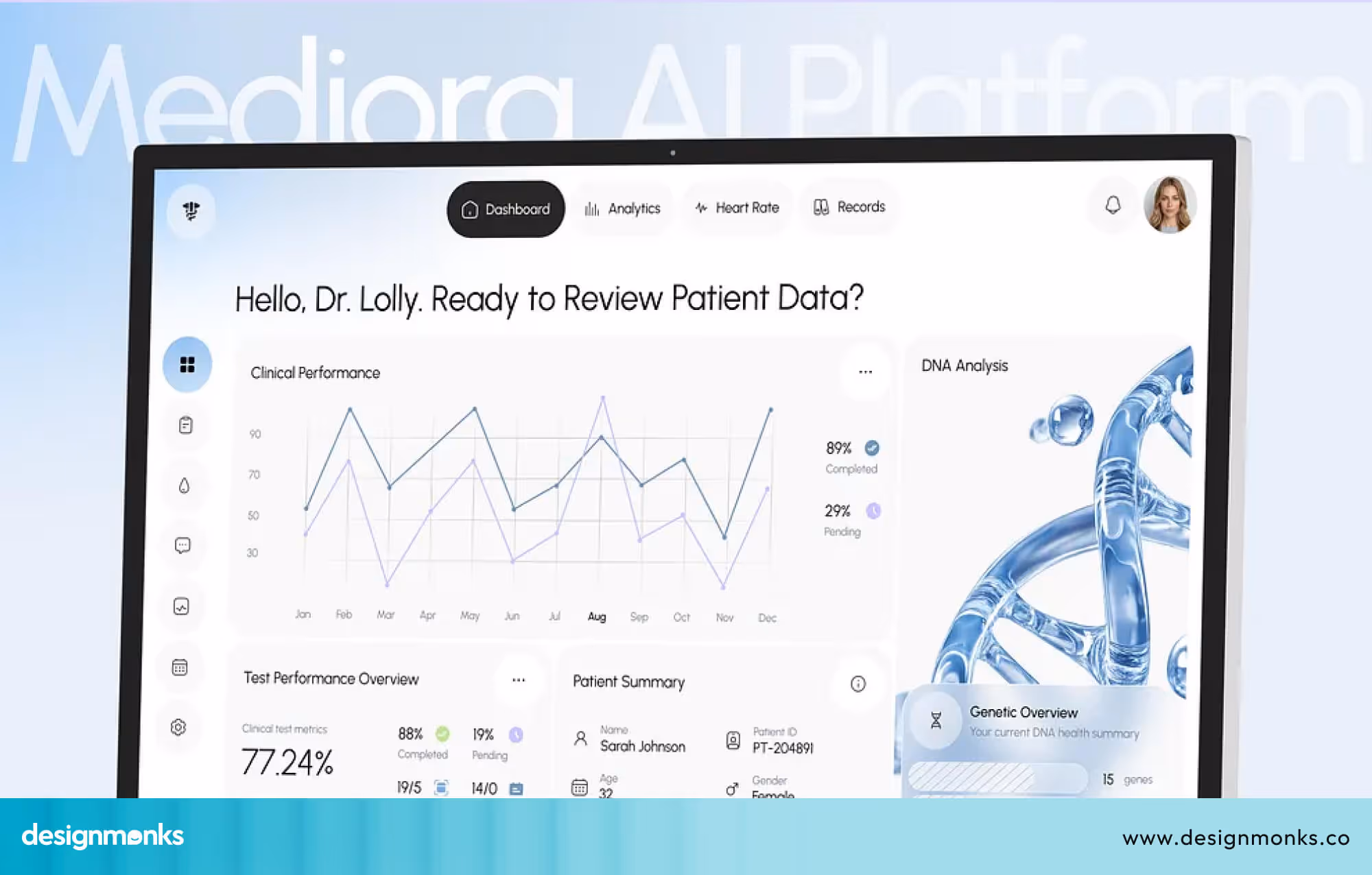
AI Features in Modern Clinic Websites
Technology is changing the way clinic websites work, and the clinics that adopt it early will have a real advantage. Today, it is not just about having a website, it is about having a smart, helpful one.
An AI chatbot is often the first step. It can answer patient questions instantly, guide them to the right service, and help them book appointments at any time, even outside clinic hours. This keeps your website active and helpful 24/7.
Image: ai assistant
Some clinics are adding symptom pre-screening tools. Patients can describe their concerns and get directed to the right doctor before they even book. This makes the process faster and helps patients feel more confident about their choice.
Booking itself is also becoming easier with smart scheduling. Instead of going back and forth, AI tools match patient availability with the right doctor automatically. This saves time and reduces delays.
For clinics serving a wider audience, multilingual support is another powerful addition. Patients can read information in their own language, which makes them feel more comfortable and understood.
Finally, the experience does not end after the visit. Automated follow-ups can send reminders for appointments, medications, or feedback. It helps you stay connected with patients without adding extra work for your team.
FAQs
How much does a clinic website design cost?
A basic clinic website design costs between $500 and $3,000. A more advanced site with booking systems and a patient portal can range from $5,000 to $15,000. The more features you need, the higher the cost.
How long does it take to build a clinic website?
A simple clinic website takes around 2 to 4 weeks to build. A full-featured site with booking, a patient portal, and multiple pages can take 6 to 12 weeks. Having your content ready from the start can speed things up significantly.
Do I need a professional developer to build my clinic website?
For a basic site, tools like Wix, Squarespace, or WordPress can get you started without a developer. For advanced features like a patient portal or HIPAA-compliant data handling, hiring a professional is strongly recommended. Getting these details wrong can create serious legal and security problems.

.avif)
.avif)
.avif)
.avif)


.avif)
.avif)
.avif)
.avif)


.avif)


