
.svg)


Key Takeaways
- Healthtech MVPs must ensure compliance, usability, and user trust.
- Core flow: discovery → wireframes → Figma UI → handoff → prototype.
- HIPAA, security, and multi-user flows are vital.
- Key cases: telemedicine, EHRs, monitoring, offline access.
- Success needs edge-case planning, real testing, and iteration
You’ve got a healthtech idea. Maybe it’s an app for patients to track symptoms or doctors to manage visits. You’ve even mapped the screens on Figma. But now what?
This is where many founders get stuck. Turning a visually appealing design into a functional MVP can be confusing, especially when a healthcare UX MVP needs to be both safe and simple, ready for real users.
In this blog, I’ll walk you through how to go from Figma to reality in terms of healthtech MVP design. Whether you’re a healthtech founder or a tech lead building your first MVP, this guide will help you avoid common mistakes and build something that actually works.
Why the Design-to-Build Gap Matters in Healthtech MVPs?
Designing your screens in Figma is just the start. But if that design doesn’t smoothly turn into a working product, it can create big problems later. In health tech, this gap can slow down your launch, confuse users, or even erode trust.
Here’s why getting this step right is so important:
You Need to Follow Rules Like HIPAA
Health apps deal with private patient information. It means your MVP must follow rules like HIPAA (a law in the U.S. that protects health data). If your design forgets about security screens, permissions, or warning messages, your app won’t be safe or legal.
User Flows Are More Complex
In a healthtech app, you’re not just designing for one type of user. Patients, doctors, nurses, and admins all use the app in different ways. If these flows aren’t clearly designed from the start, developers won’t know what to build, and users will get confused.
Design Mistakes = Costly Rebuilds
Tiny design problems like missing states, uneven spacing, or unclear interactions may seem small. But during development, fixing them takes extra time and money. Worse, if developers build the wrong thing, you may need to rebuild it all again.
Investors Want to See It Work, Not Just Look Nice
If you’re raising money, a working MVP matters more than a pretty design. Investors want to click through the product, see how it works, and feel the user experience. A non-functional prototype or half-finished build won’t impress them.
Real Users Don’t Forgive Broken Experiences
In healthcare, users expect your product to work well from the start. If the app crashes, shows wrong data, or doesn’t respond quickly, users may leave and never come back. A strong MVP helps test and fix these issues early.
Step-by-Step Healthtech MVP Design Flow
Designing an MVP is about solving real problems with real functionality, step by step. Here’s the full flow described in steps so you can go from idea to a working MVP with confidence.
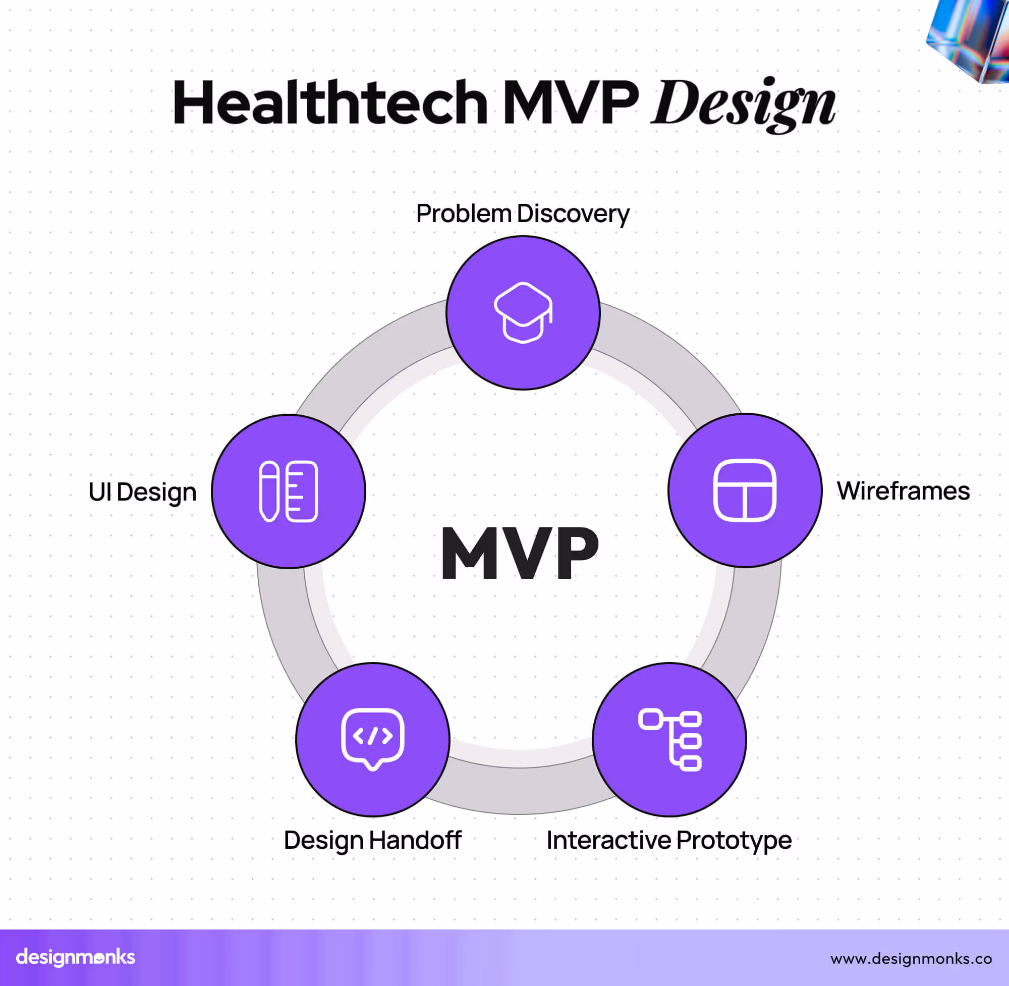
Step 1: Problem Discovery → User Flow Mapping
Before you open any design tool, start with this question: What is the main problem we are solving? For example, maybe your app helps patients log daily symptoms, or helps doctors see health stats from wearable devices. That’s your core job to be done.
From there, map out the user journey. A user journey shows how each type of user (like a patient or doctor) moves through the app. Think of it like a story: What’s the first thing they see? What action do they take next? And what happens after that?
This step helps you stay focused. Instead of designing everything at once, you design what truly matters first.
Step 2: Low-Fidelity Wireframes
Once you have your user flow, it’s time to sketch out how each screen should look. These early sketches are called low-fidelity wireframes.
They’re simple, black-and-white layouts with no images, colors, or styling. Why? Because at this point, you’re focusing on structure and logic, where buttons go, how the information is shown, and what steps users take.
Wireframes help you test the idea quickly and make changes without wasting time. You can even show them to real users to check if the flow makes sense before doing detailed design.
Step 3: Figma-Based UI Design
Now that your flow works, it’s time to design the actual interface in Figma.
Figma is a tool where you create the final look of each screen, colors, icons, buttons, fonts, and layout. But a good UI isn’t just about looking nice. It should be scalable and easy to update. That’s why smart designers use:
- Design tokens: These are reusable values for things like colors and spacing.
- Components: Pre-made elements like UI kits, buttons, or input fields that can be reused again and again
Also, don’t forget accessibility. Use colors with good contrast, readable text sizes, and a layout that works on different devices.
This step brings your idea to life visually, but it also sets the base for smooth development.
Step 4: Design Handoff to Dev (The ‘Reality’ Part)
Now comes the most important handover, turning your Figma designs into real code.
This is where your designs must be developer-ready. That means:
- Clear spacing between elements
- Defined states (like what happens when you click a button)
- Responsive layout (so it works on mobile, tablet, desktop)
Figma’s Dev Mode helps with this by letting developers see measurements, colors, and code hints. Other tools like Zeplin or Storybook also help translate design into development more smoothly.
A messy handoff can delay your MVP. A clean one makes building faster and cheaper.
Step 5: Interactive Prototype for Stakeholder Buy-In
Before you fully build your product, create a clickable prototype. This is a version of your design where users (or investors) can click through the flows, like they would in a real app, but nothing is actually built yet. It feels real, but it’s just Figma magic.
This approach helps in many ways:
- You can test it with real users for feedback.
- Investors can see the vision clearly.
- Your developers understand how the flow works.
A good prototype saves time and brings everyone on the same page.
Need help turning your Figma into a real healthtech product?We specialize in UI/UX for healthcare MVPs.
👉 Explore our Healthtech UX offering
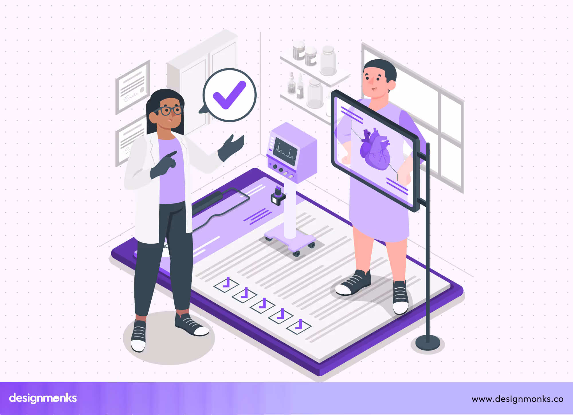
Special Considerations for Healthtech MVPs
Building a healthtech MVP is not like building a regular app. You’re dealing with real people’s health, private data, and sometimes life-critical information. Here are some key things to consider while designing your healthtech MVP:
Patient Monitoring Apps
These apps track real-time data like heart rate, oxygen levels, or sleep patterns, often coming from wearable devices. The UI must show this live data clearly, using charts, numbers, and alerts that are easy to read.
If something goes wrong, like a sudden drop in vitals, the app should show warnings right away. A delay or confusing display can be dangerous.
Telemedicine Platforms
Telemedicine apps allow patients to talk to doctors through video or chat. So, your MVP should include easy-to-use video call features, chat messages, and appointment booking tools. The design must be clean and simple, especially for older users or those who aren’t tech-savvy.
EHR Integration (Electronic Health Records)
EHR systems store patient medical history, prescriptions, and reports. While this data comes from the backend, your UI must be planned carefully to show it in a clear and helpful way.
For example, showing old reports, lab results, and doctor notes in one place can save time for both patients and doctors.
Trust & Security
In healthtech, people need to feel safe sharing their private data. Design plays a big role in that. Use things like lock icons, clear consent messages, and easy privacy settings. Showing users that their data is protected builds trust.
Multi-User Access
In many health apps, more than one person may use the same account, like a parent managing a child’s health. Your MVP should handle these cases by allowing role-based access or switching between profiles without confusion. In this case, make sure to avoid the common MVP design mistakes.
Offline & Emergency Support
Sometimes users don’t have the internet or need help during an emergency. Your MVP should plan for these cases, like storing important info offline or showing quick contacts for emergency help. Even a simple feature like “last synced at” can be helpful.
When designing your healthtech MVP, always think beyond the usual user flow. These extra considerations make your product more reliable, helpful, and ready for the real world.
UX Challenges in HealthTech MVP Design
Designing a healthtech MVP isn't just a UI problem; it's a trust problem. You're building for anxious patients, time-pressed clinicians, and compliance teams who will reject anything that feels unsafe or unclear.
- Multi-user role complexity: Patients, doctors, nurses, and admins each need separate flows, permissions, and dashboards that don't bleed into each other.
- HIPAA-compliant UI patterns: Consent screens, session timeouts, and data masking aren't backend tasks; they must be designed into every visible interaction from day one.
- Accessibility across user types: Older patients and non-technical staff need larger text, plain language, and forgiving error states that a typical SaaS product would never prioritize.
- Designing for low connectivity: Rural clinics and ward environments often have poor internet, so offline-first flows and graceful loading states aren't optional extras.
- Trust signals in the interface: Lock icons, clear data-use messages, and visible privacy controls directly affect whether users submit sensitive health information at all.
- Wearable and real-time data display: Showing live heart rate or oxygen readings sounds simple until latency, device sync errors, and alert fatigue make every design decision feel high-stakes.
Figma to Functional MVP: Important Tips for Success
Designing in Figma is exciting; it’s where your healthtech MVP starts to take shape visually. But the real challenge is turning those screens into a product that works smoothly in the real world.
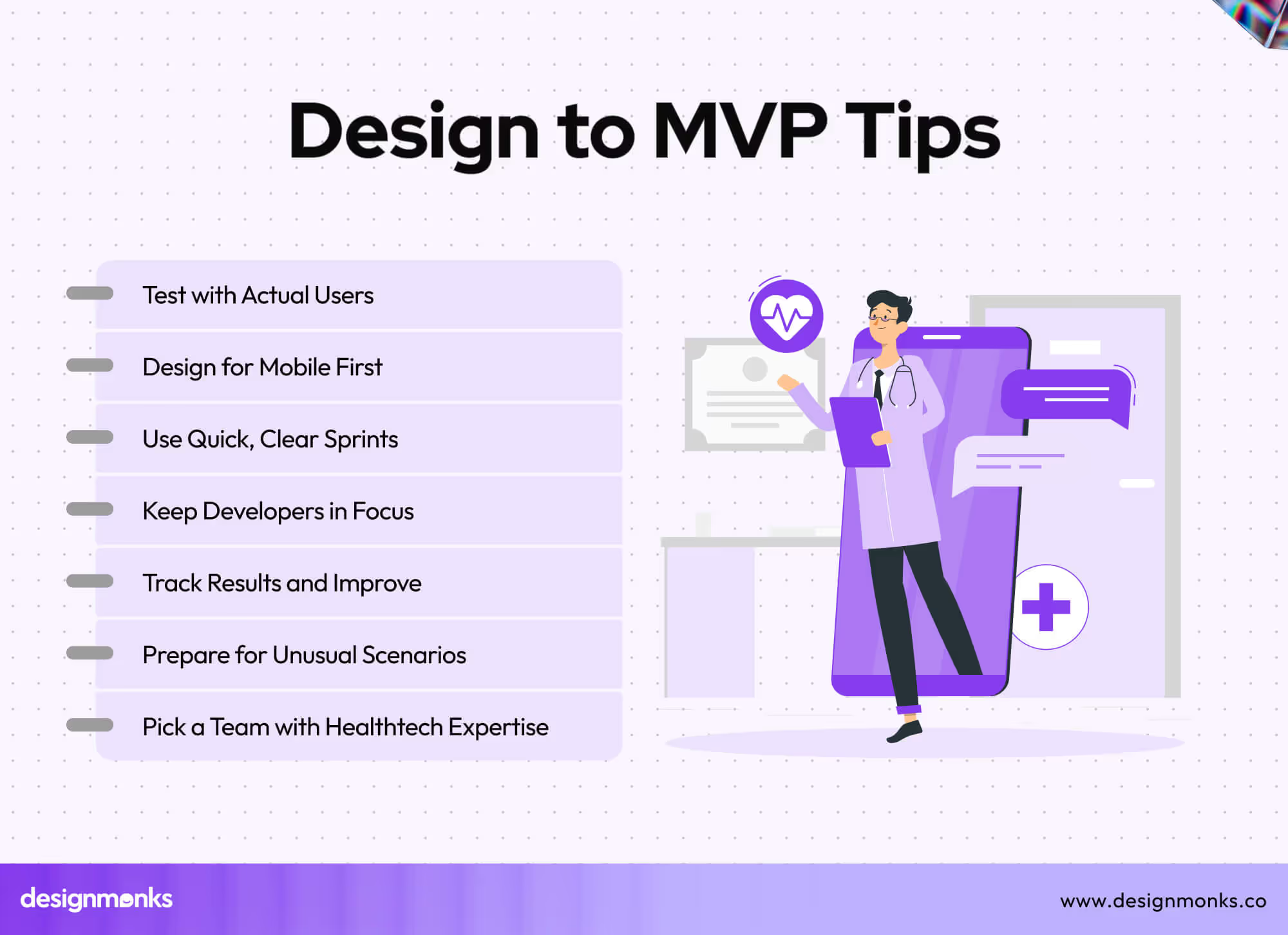
Here are some key tips to make the process easier and faster:
Plan for Edge Cases Early
It’s not enough to design for the “happy path,” where everything works perfectly. Think about what happens when things go wrong.
For example, what if a patient’s vitals drop suddenly? What if a video call fails mid-consultation? Planning these “what if” situations from the start saves you from last-minute redesigns.
Design with Developers in Mind
Avoid fancy design details that are hard or expensive to code, especially for your MVP. Stick to clean, functional layouts that developers can build quickly. This approach keeps your timeline short and your costs lower.
Work in Short Sprints
Don’t wait until the entire design is finished to get feedback. Work in small cycles: design a part, get feedback, pass it to development, and then move to the next part. This “design → feedback → build → iterate” approach will help you fix problems early.
Choose a Team That Understands Healthtech UX
If you’re hiring an outside team, make sure they know the rules, workflows, and challenges in healthtech. They’ll understand compliance needs, patient privacy, and how to design for multiple user types.
Test with Real Users, Not Just Your Team
Your idea might look perfect to you, but actual patients and doctors might use it differently. Test your MVP as early as possible with real users. Their feedback will help you improve faster.
Keep It Mobile-Friendly from the Start
Many patients and even healthcare providers use phones or tablets. If you don’t focus on a mobile-friendly design, they can’t use the product at all. Designing for smaller screens early ensures your app works well anywhere.
Measure and Learn After Launch
Your MVP is just the beginning. Track how people use it, what screens they visit, where they drop off, and use that data to improve the next version. This measuring strategy will help you in post-launch customization to make it perfect.
How to Measure MVP Success in HealthTech
Most healthtech founders celebrate launch day and forget to define what winning actually looks like. Without clear benchmarks, your Minimum Viable Product (MVP) generates noise, not direction.
Pilot Testing Completion Rate
Track how many users in your controlled pilot group complete the core task end-to-end, booking an appointment, submitting a report, or logging a reading.
A completion rate above 70% in early pilot testing is a strong signal that your core flow works. Below that, the UX / UI design for healthcare needs revisiting before you scale.
Clinical Workflow Validation Score
Sit with actual clinicians during use. Count how many steps they skip, where they hesitate, and how often they reach for workarounds. Clinical workflow validation isn't a survey; it's observed behavior. If staff are copying data into a separate spreadsheet after using your product, the workflow fit has failed.
EHR / EMR Integration Accuracy
If your MVP connects to existing hospital systems, measure data sync errors per 100 transactions using FHIR-compliant endpoints. EHR / EMR integration (FHIR) errors above 2% create clinical risk and erode trust fast.
User Retention After Week Two
One-week retention is vanity. User retention after week two tells you whether the product fits real daily or weekly clinical routines, not just curiosity.
FAQs
How does Figma help in healthtech MVP design?
Figma lets teams design, test, and refine app screens in one place. It supports real-time collaboration, reusable design systems, and interactive prototypes to help healthtech startups move from idea to developer-ready layouts quickly.
How can I make sure my MVP meets healthcare compliance rules?
To make sure my MVP meets healthcare compliance rules, you should work with experts who know laws like HIPAA. Include secure login, data encryption, and clear consent screens. Test all privacy features before launch to ensure patient data stays safe and legal requirements are met.
What features must a telemedicine MVP include?
A telemedicine MVP should have:
- Secure video and audio calls.
- Chat messaging.
- Appointment booking and reminders.
- Patient records access.
- Basic payment or billing options.
End Note
A healthtech MVP needs more than attractive screens. It must stay safe, run smoothly, and serve real people, patients, doctors, and staff alike.
Follow each step from Figma to a functional product while keeping real-world needs in focus. Start small, test often, and fix issues early. With the right approach, you can launch faster, avoid costly errors, and earn user trust from day one. A clear plan turns an idea into an MVP that makes a real impact.

.avif)
.avif)
.avif)
.avif)


.avif)
.avif)
.avif)
.avif)


.avif)


