.svg)



Key Takeaways
- Good UX button placement guides users without making them stop and think.
- Consistent button placement builds trust and speeds up every interaction.
- Prioritize one clear action to reduce confusion and increase conversions.
- Design buttons for both visibility and effortless thumb-friendly interactions.
- Consistency and accessibility are the foundation of effective button placement.
Every second a user spends hunting for a button is a second they're thinking about leaving. Poor UX button placement like this adds friction, breaks flow, and makes users give up without knowing why.
This is one of those design decisions that feels invisible when done right and painfully obvious when done wrong. Most users can't explain why an app feels clunky, they just stop using it.
But the good news? Button placement follows clear and learnable patterns. Get it right once, and users move faster, make fewer errors, and convert more. That's exactly what we break down in this guide, so let's get into it!
What Is UX Button Placement?
UX button placement is the practice of deciding where buttons appear on a screen so users can find and use them easily.
Most users don’t think about buttons, they simply expect them to be exactly where they need them. But every button’s position is a decision. It’s either placed with intention or left to chance. But this choice directly impacts how smooth or frustrating the experience feels for the user.
In UX design, button placement focuses on positioning key actions such as CTAs, submit buttons, and navigation controls. So they’re easy to spot, natural to reach, and aligned with what users want to do next.
Because in the end, it’s not just about design. Where a button lives determines whether users notice it, trust it, and actually click it.
Why Button Placement Matters in UX?
Research from the Nielsen Norman Group shows that users make decisions in milliseconds when they land on a screen. They're looking for visual cues that tell them what to do next. If your button is buried, blends into the background, or sits somewhere unexpected, users either miss it or second-guess themselves.
Poor button placement adds cognitive load. Users spend time figuring out what to do on their own. The higher the load, the more likely they are to abandon the task entirely.
Good placement does the opposite, it guides users along a clear path, reduces hesitation, and makes every interaction feel effortless.
And that's what UX design is fundamentally about, removing every obstacle between a user and their goal.
How Users Scan Interfaces Before Clicking
Before any click happens, users scan. Eye-tracking research has consistently revealed two dominant scanning patterns that shape where users look and where buttons need to be.
The F-Pattern is most common on content-heavy pages. Users read across the top of the screen first, then move down the left side in shorter horizontal sweeps. The result is an F-shaped reading path.
Buttons placed along the left edge or directly beneath blocks of content are more likely to catch the eye naturally.
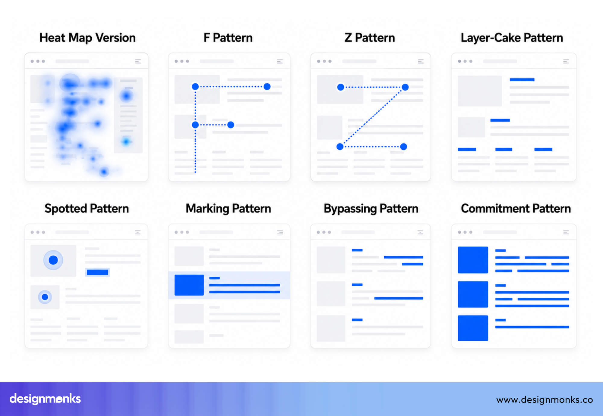
The other common pattern is the Z- Pattern. The Z-Pattern appears on simpler pages and landing pages with less text. Users scan from the top-left to the top-right, then cut diagonally down to the bottom-left, and finally sweep across to the bottom-right.
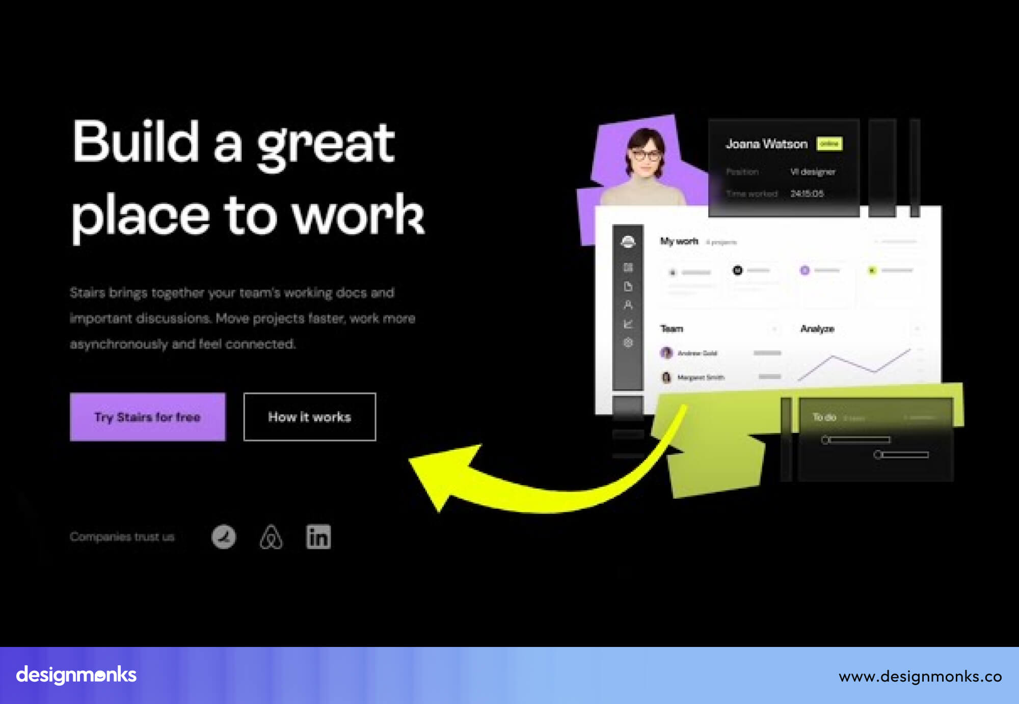
CTAs placed at the end of this path, the bottom-right, land exactly where the user's eye already travels.
These patterns show that users don’t search randomly, they follow structure. Buttons placed along these natural scanning paths are easier to find and faster to click. Buttons placed outside them often get ignored.
How Button Placement Influences User Flow
Beyond visibility, button placement shapes how users move through your product. In UX, this movement is called User Flow, the path users take to complete a task.
When buttons are placed in expected, logical positions, users move smoothly from one step to the next. The experience feels intuitive and effortless. But when placement is off, the flow breaks. Users pause, backtrack, or abandon the task entirely.
Strong button placement keeps users moving forward. It connects each step, removes friction, and turns intent into action.
Core UX Principles for Button Placement
Button placement isn’t random, it follows a set of practical design principles that help users understand where to click without thinking too hard. These aren’t strict rules, but they consistently lead to better usability and smoother interactions:
Place Buttons Close to Related Content
Users naturally assume that things placed near each other are connected. This comes from the Gestalt principle of proximity.
For example, if a “Submit” button is placed far away from a form, users may pause and wonder if it belongs to that section at all. But when it sits directly below the final input field, the connection feels immediate and intuitive.
The same applies to data tables. If users can delete an item, the “Delete” button should live inside that row, not hidden in a distant toolbar or separate area. The closer the action is to its target, the easier it is to understand.
Keep Primary Actions Prominent
Not all buttons carry the same weight. Primary actions like “Saving” should always be visually dominant. You should use a solid fill color, strong contrast against the background, and a size that's easy to spot without effort.
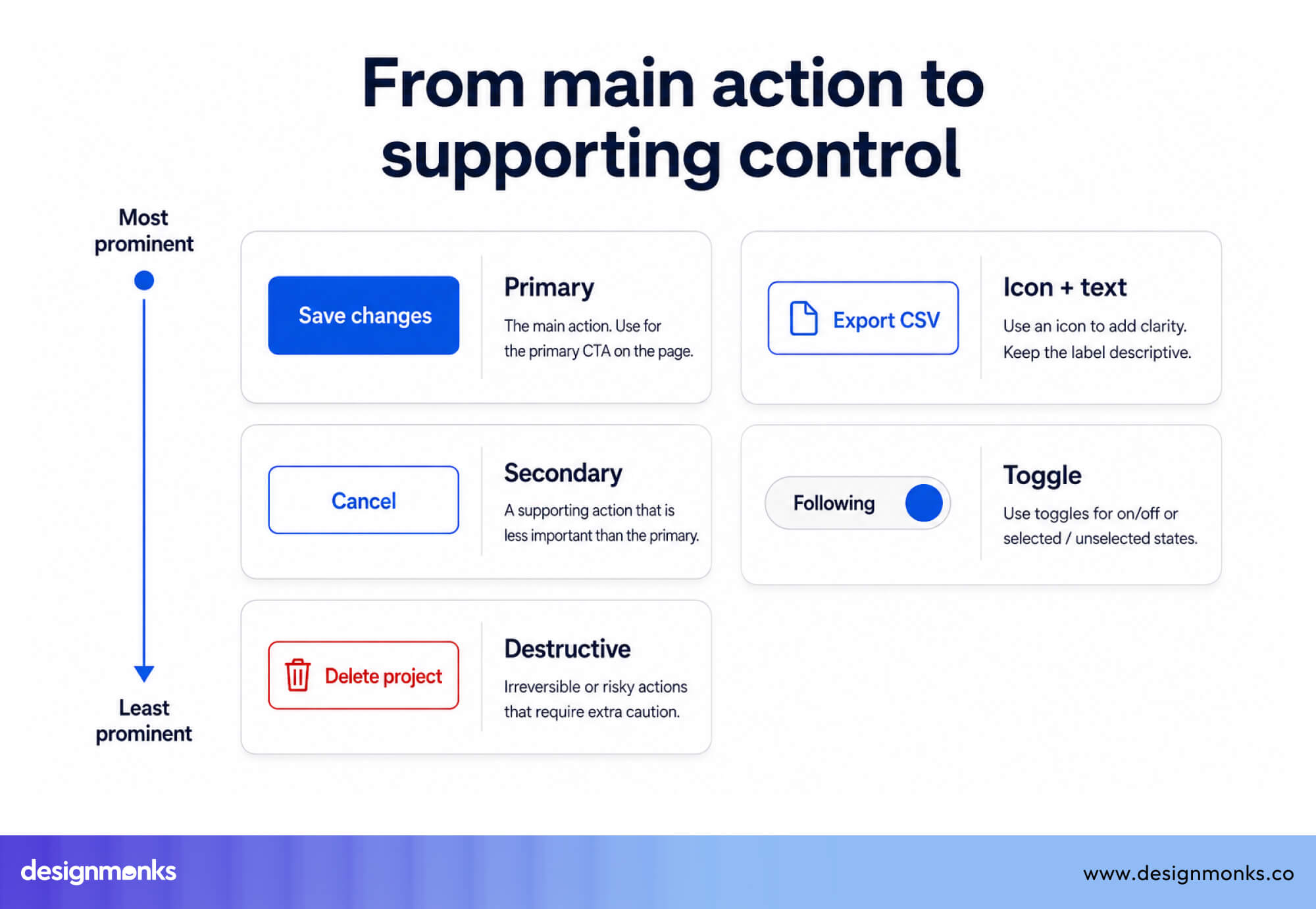
Secondary actions should step back visually. Outlined buttons, text links, or smaller styles help create a clear hierarchy. This visual difference tells users what matters most, even before they read the labels.
Maintain Consistent Button Placement
Consistency reduces thinking. If your "Save" button is always in the bottom-right of a form, users learn where to look. Move it to a different position on the next screen, and they'll pause, scan, and feel a small friction bump.
Multiply that across dozens of interactions, and the experience starts to feel unstable.
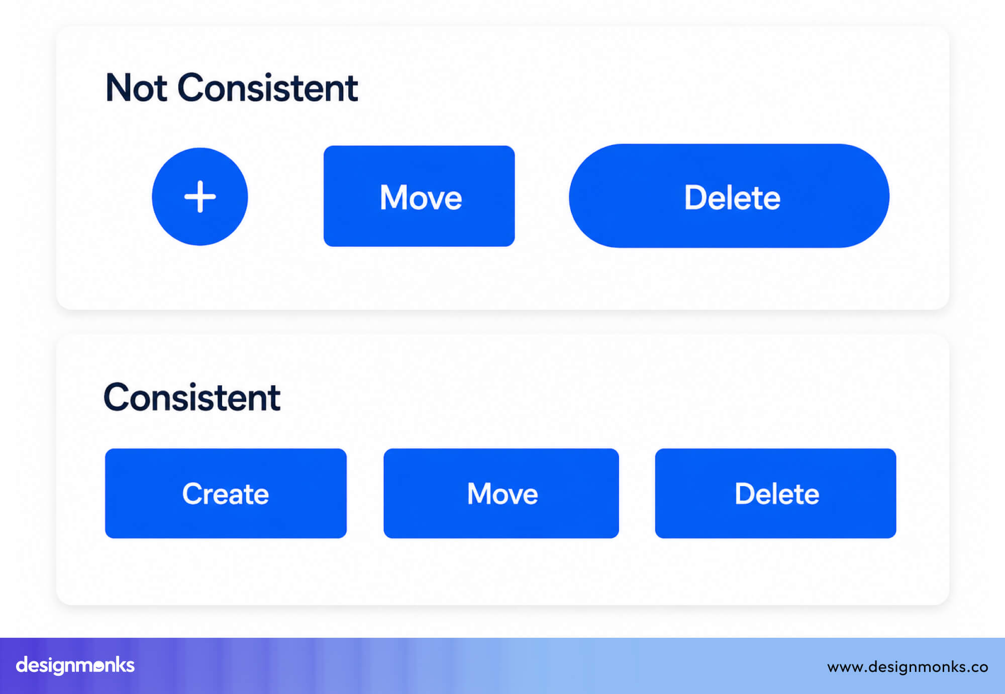
Consistent placement builds familiarity and trust. Once users learn where buttons live in your product, they stop thinking about it, and that's exactly what you want.
Use Spacing and Alignment Effectively
Buttons need space to be recognized as actions. When a button is cramped against other elements, it loses clarity and can be overlooked. Proper spacing isolates it visually, making it instantly recognizable as something clickable.
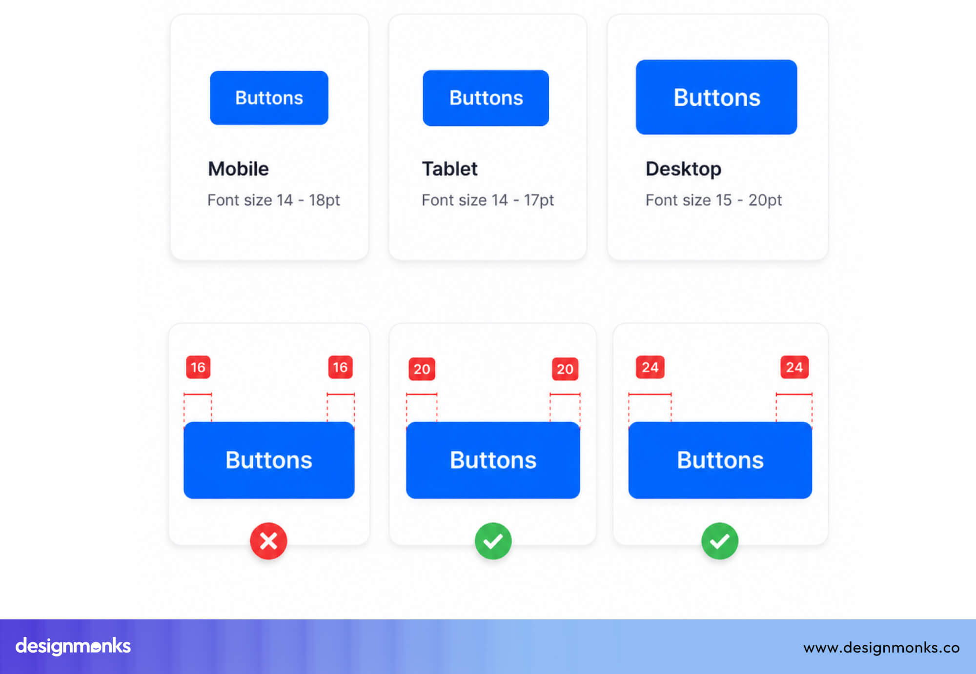
Alignment plays a similar role. Buttons that follow a clear grid and align with surrounding elements feel intentional and structured. Misaligned buttons, even if functional, often feel like design mistakes and reduce overall polish.
Primary vs Secondary Button Placement
In any interface, there’s usually one action you want users to take, and a few supporting ones. This is called action hierarchy. When done right, users instantly understand what to do next without hesitation.
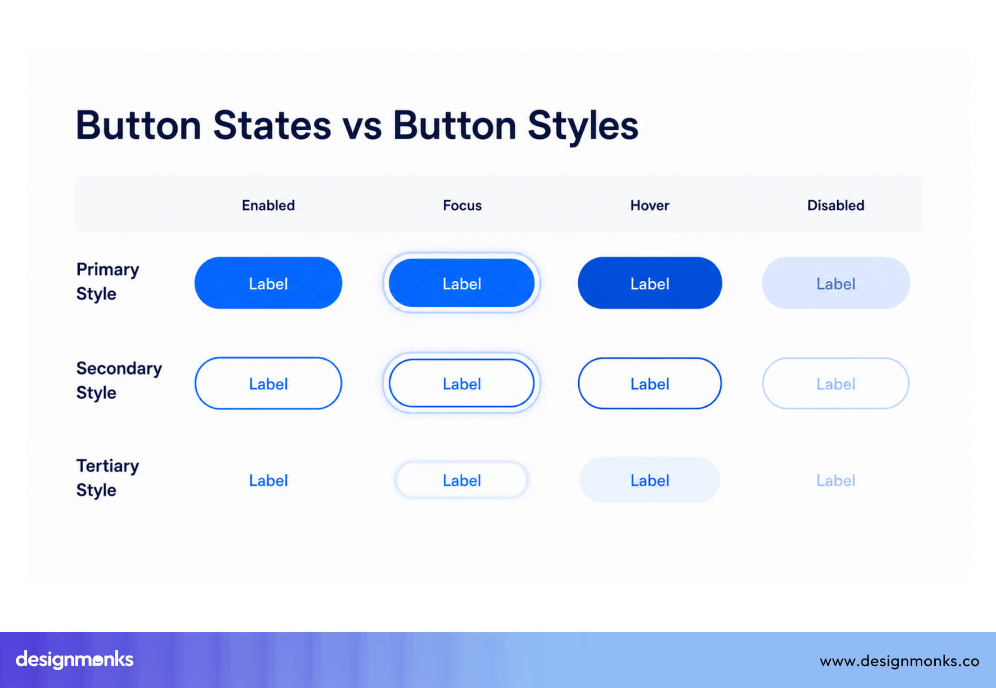
Primary, secondary, and tertiary buttons visually communicate this hierarchy. The clearer the distinction, the easier it is for users to decide and act:
What Is a Primary Button?
A Primary Button represents the main action on a screen, the one you want users to take. This could be “Sign Up,” “Continue,” “Buy Now,” or “Submit.” It’s the dominant action, and it should stand out clearly from everything else.
Primary buttons should be more prominent through color, size, and placement. They need to be designed to attract attention immediately and guide users toward the desired outcome.
If users hesitate or overlook your primary button, your conversion likely suffers.
What Is a Secondary Button?
A Secondary Button supports the primary action but isn’t the main goal. These include actions like “Cancel,” “Back,” “Save for Later,” or “Learn More.” They’re important, but they shouldn’t compete with the primary action.
That’s why secondary buttons are visually quieter. They often use outlines, lighter colors, or smaller sizes to reduce emphasis while still remaining accessible. A clear distinction between primary and secondary buttons helps users make decisions faster, without confusion.
Which Button Should Come First?
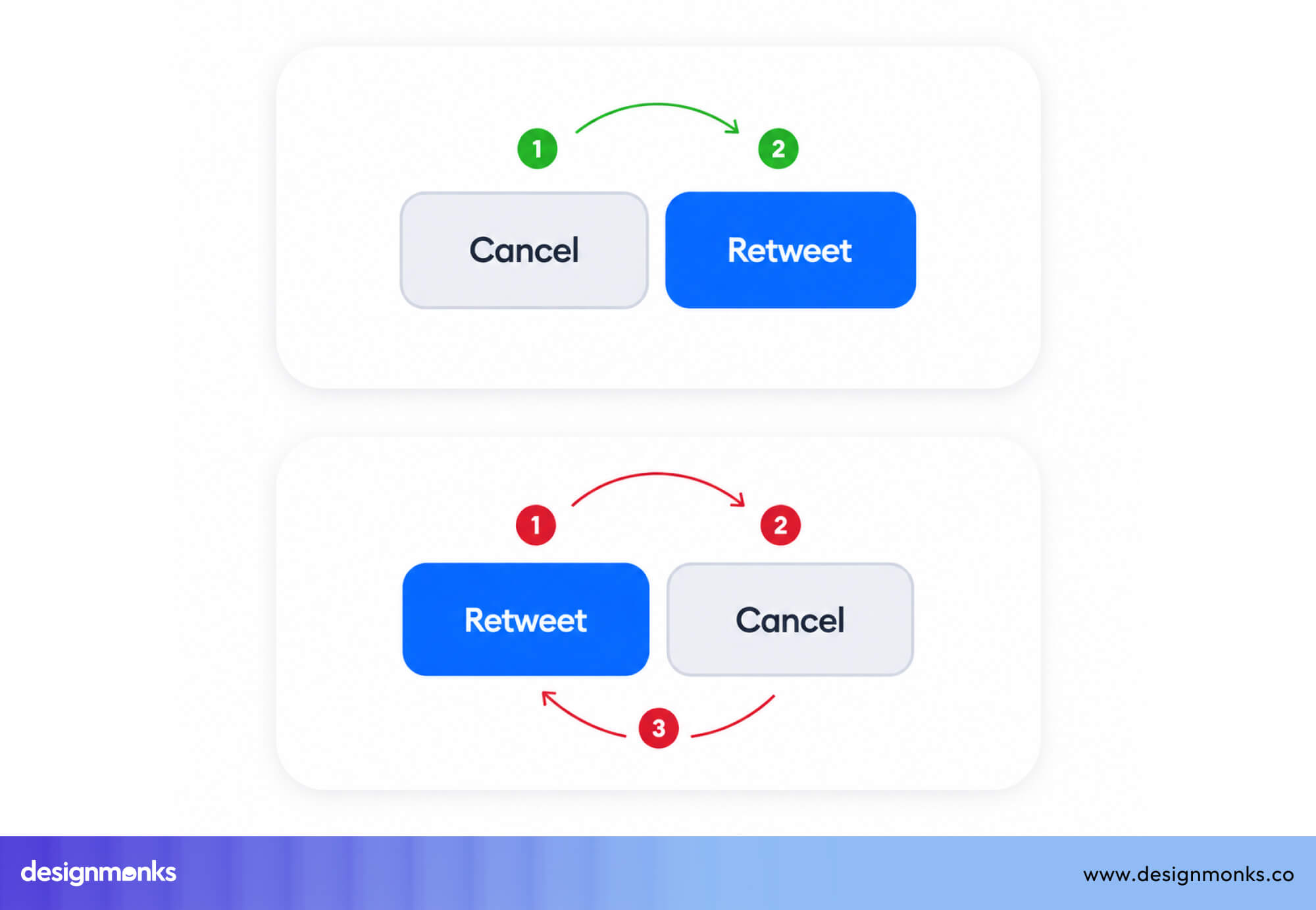
Placement plays a key role in reinforcing hierarchy. In many design systems like Material Design and Apple Human Interface Guidelines, button order follows predictable patterns. Both place their primary action on the right and secondary on the left.
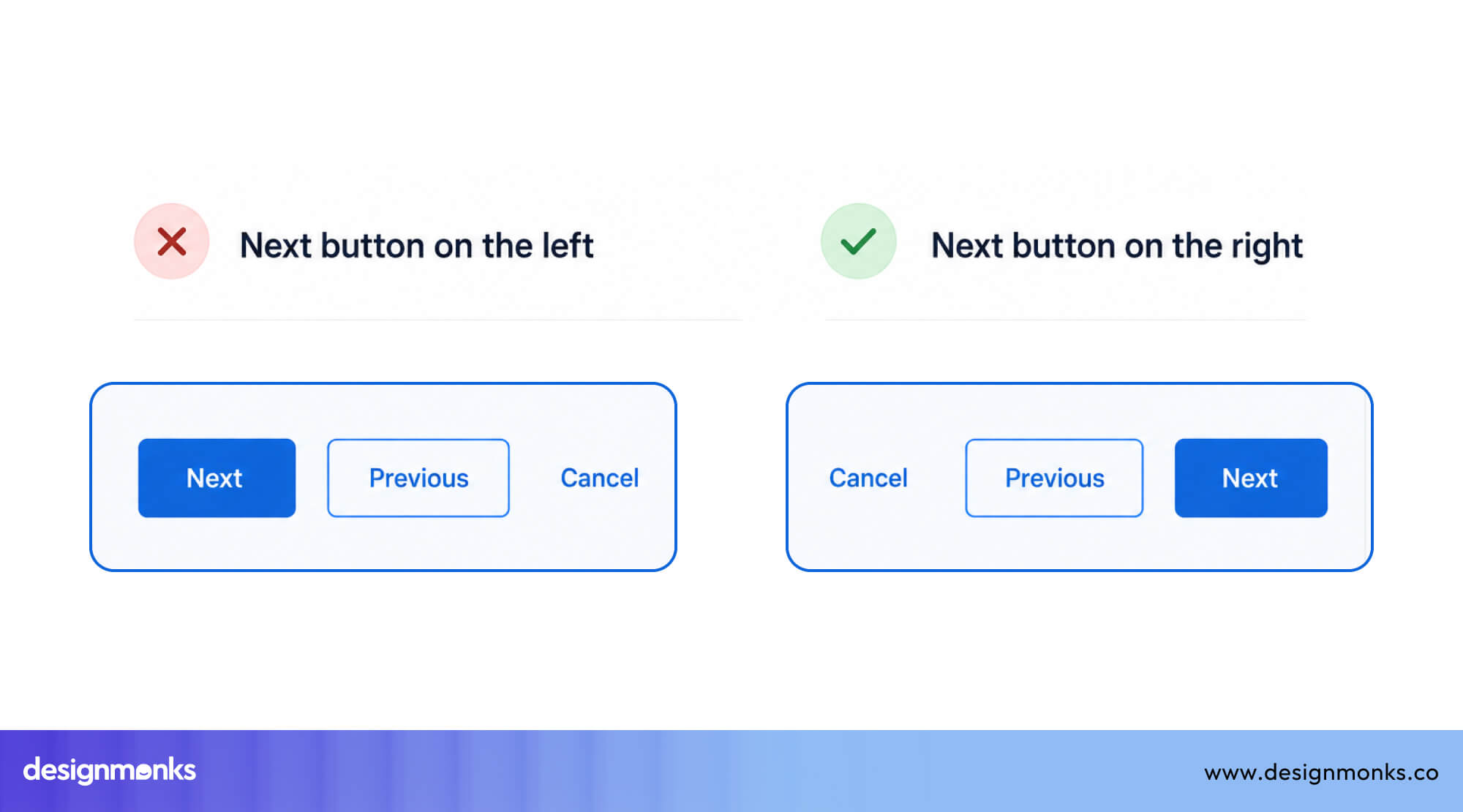
Users read left to right, and by the time they reach the right side, they've already processed the context. So the primary action landing last feels natural.
But there are exceptions, especially in destructive dialogs. Also on mobile, primary actions are often placed at the bottom or within thumb-friendly zones for easier reach. The key is consistency. Once users learn where the primary action lives, they shouldn’t have to search for it again.
How to Position Destructive Actions Safely
Destructive actions like "Delete," "Remove," or "Cancel Subscription" deserve special treatment.
Separate them visually from other buttons. If "Delete" sits right next to "Save," users will accidentally click the wrong one.
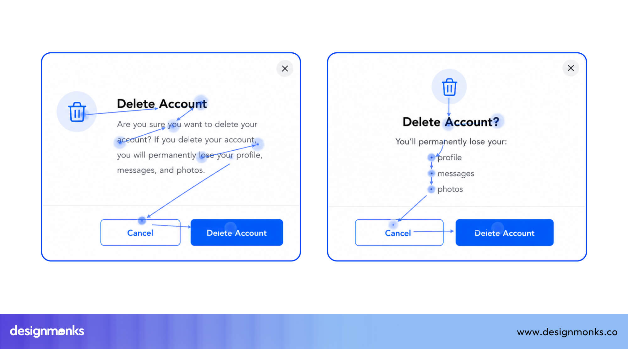
Add distance, use red for irreversible actions, and always add a confirmation dialog. Because in UX, it’s not just about helping users act fast, it’s about helping them act safely.
Desktop UX Button Placement Best Practices
Desktop interfaces give you more space, but that doesn’t mean more freedom. It means more responsibility to place buttons where users expect them. Across patterns like forms, dialogs, dashboards, and workflows, users rely on consistency. The more predictable your placement, the faster they act.
Form Submit Button Placement
For single-column forms, place the submit button at the bottom left or bottom center, aligned with the form fields above it. This follows the natural reading flow and makes the next step feel obvious.
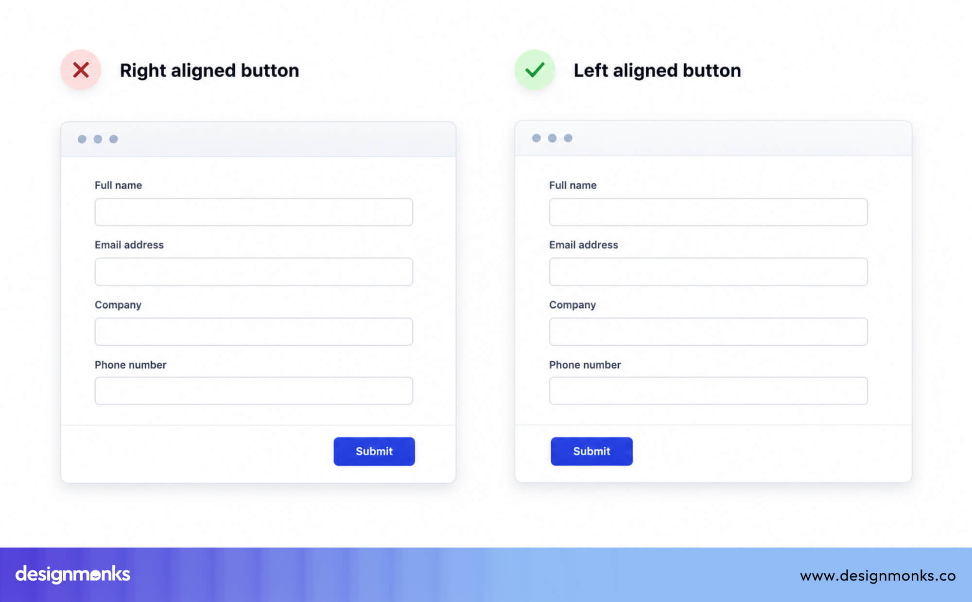
For longer forms with multiple sections, consider a sticky submit button that follows the user as they scroll. This removes the need to scroll back up to find it.
Modal and Dialog Button Placement
In modal windows, action buttons live in the bottom-right corner. This is where users expect them after reading the modal content.
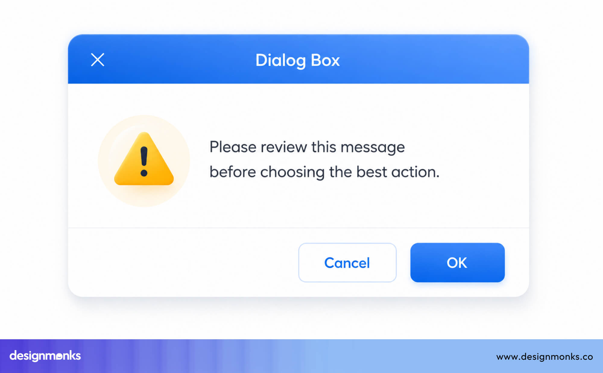
It should be secondary action like "Cancel" on the left, primary action like "Confirm" on the right. You need to keep both buttons inside the modal, don't spill them outside the modal boundary.
But spacing between buttons is just as important. When actions are too close, users are more likely to click the wrong one, especially in high-stakes scenarios.
Multi-Step Workflow Button Placement
In wizard flows or onboarding steps, position "Next" or "Continue" on the right and "Back" or "Previous" on the left. This mirrors natural reading direction and reinforces forward progress.
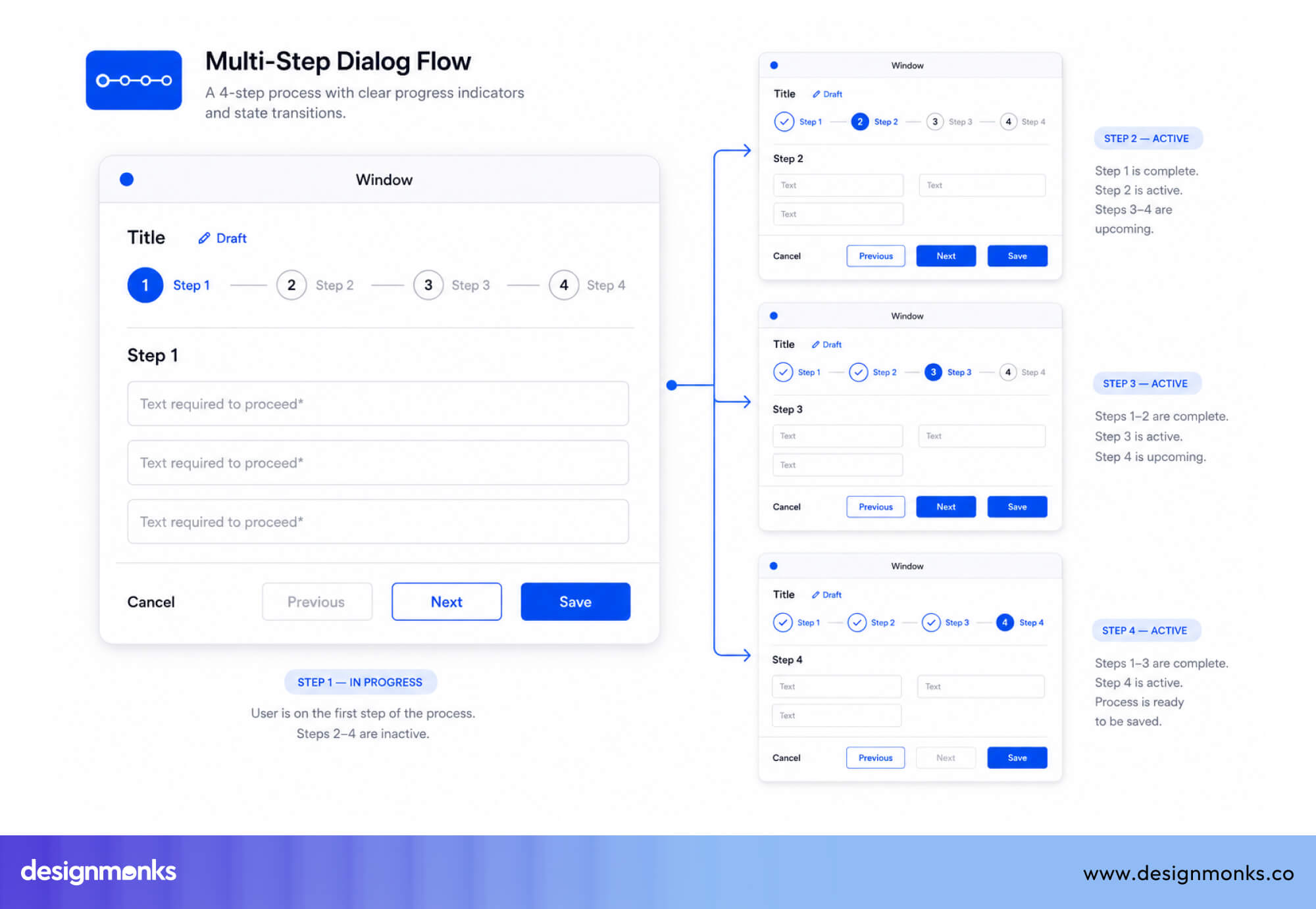
Don't hide the "Back" button. Users feel more comfortable moving forward when they know they can go back. It reduces anxiety.
Table and Dashboard Action Placement
For row-level actions (edit, delete, view), place inline action buttons at the end of each row, right-aligned. Users scan tables row by row, and having actions at the end of each row makes them easy to find without disrupting the reading flow.
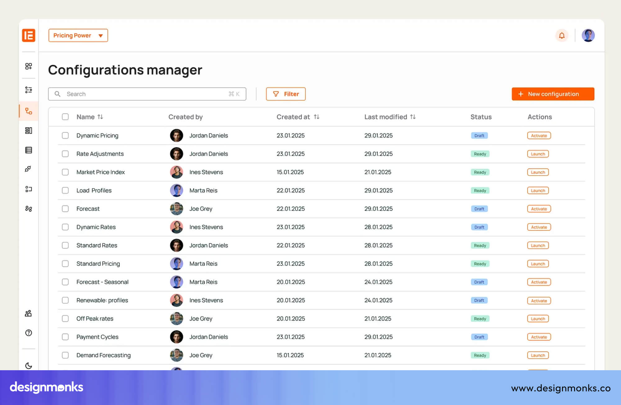
For page-level actions like "Export" or "Add New", place them at the top-right of the table, above the content. That's where users look for controls that affect the whole view.
Mobile UX Button Placement Best Practices
Mobile changes everything about button placement. Unlike desktop, users aren’t clicking with precision, they’re tapping with their thumbs, often using one hand. That means mobile isn’t just about visibility, it’s about reach.
Designing for mobile means placing actions where they’re easy to see, easy to tap, and hard to miss:
One-Handed Use Considerations
Most users interact with their phones using one hand, which means button placement needs to match natural reach. Actions placed in the lower half of the screen are easier and faster to tap, while those at the top create unnecessary strain.
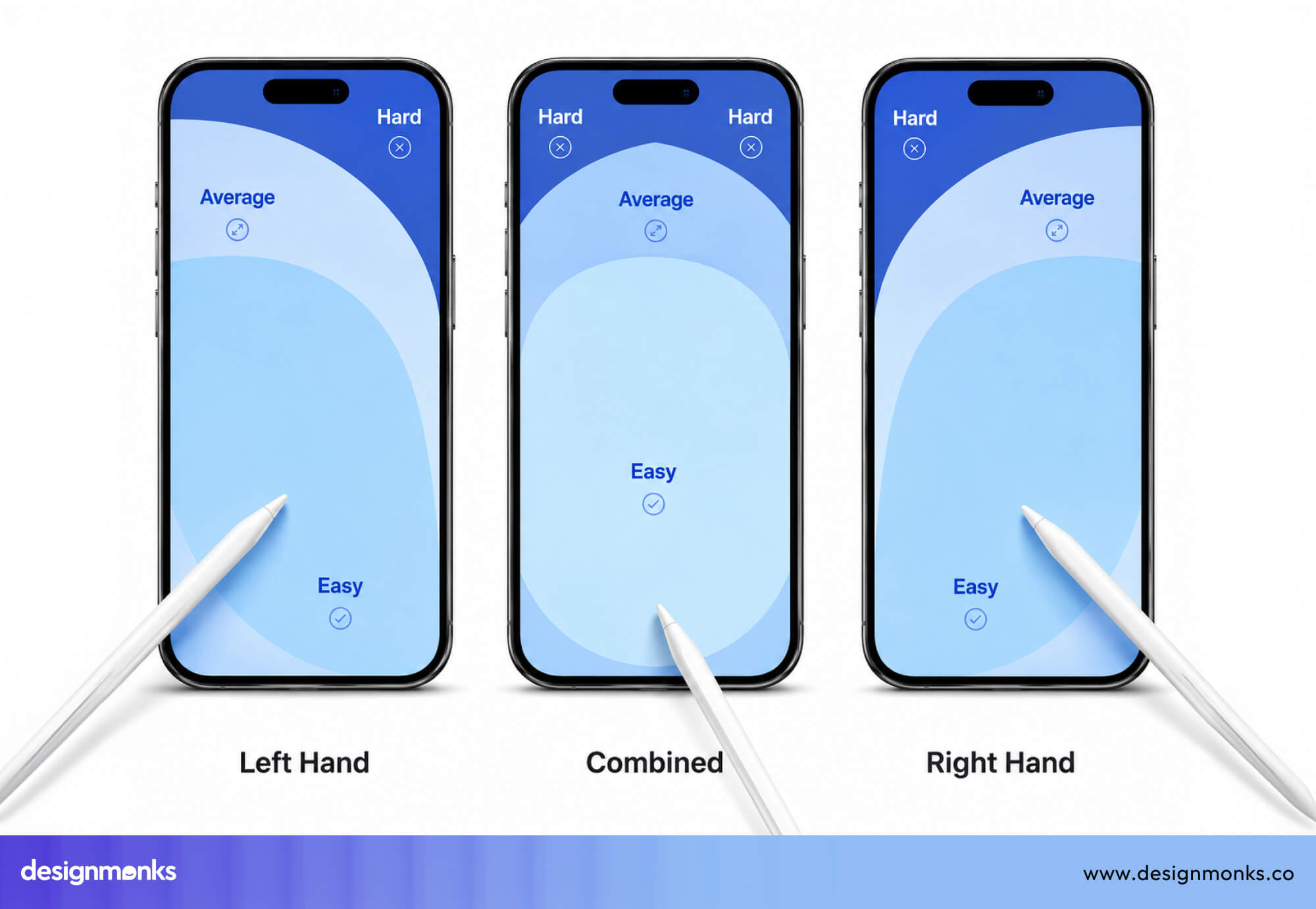
Size and spacing matter just as much, too. Mobile’s button size should be large enough to tap comfortably, at least 44×44 pixels on iOS or 48×48 dp on Android, with enough space between them to prevent accidental taps.
When buttons are easy to reach and easy to tap, users move faster, make fewer mistakes, and feel more in control of the experience.
Understanding the Thumb Zone
Steven Hoober's research on one-handed phone use shows that most users hold their phone with one hand and control it with their thumb. The comfortable thumb reach, the "thumb zone," covers roughly the center and lower half of the screen.
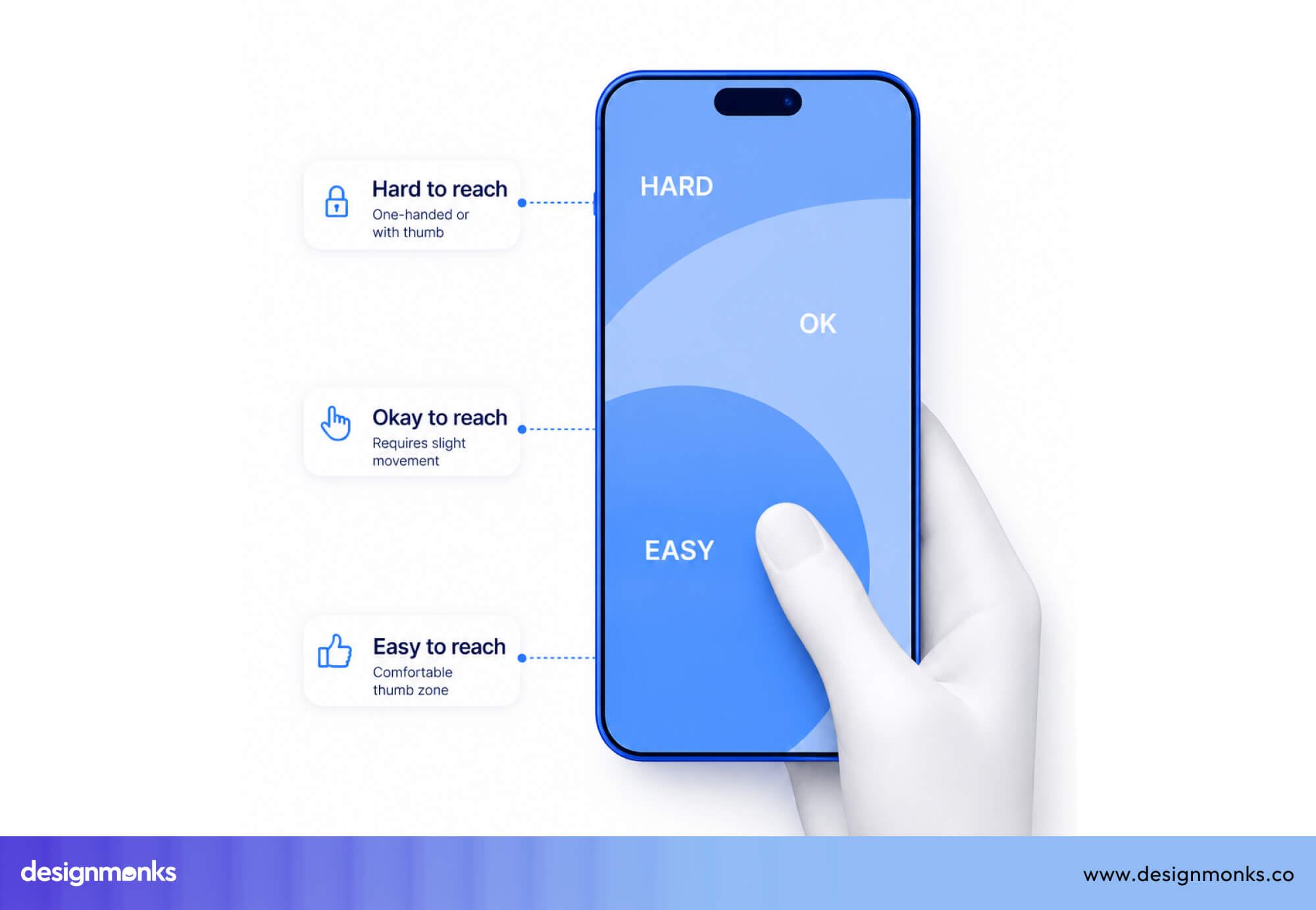
The top corners and upper areas of the screen are hard to reach without shifting grip. If your primary actions live in hard-to-reach areas, users feel friction immediately. They need to adjust their grip or, worse, abandon the action altogether. So you need to keep important buttons within easy reach, reduce effort, and make interactions feel natural.
Bottom Navigation vs Floating Action Buttons
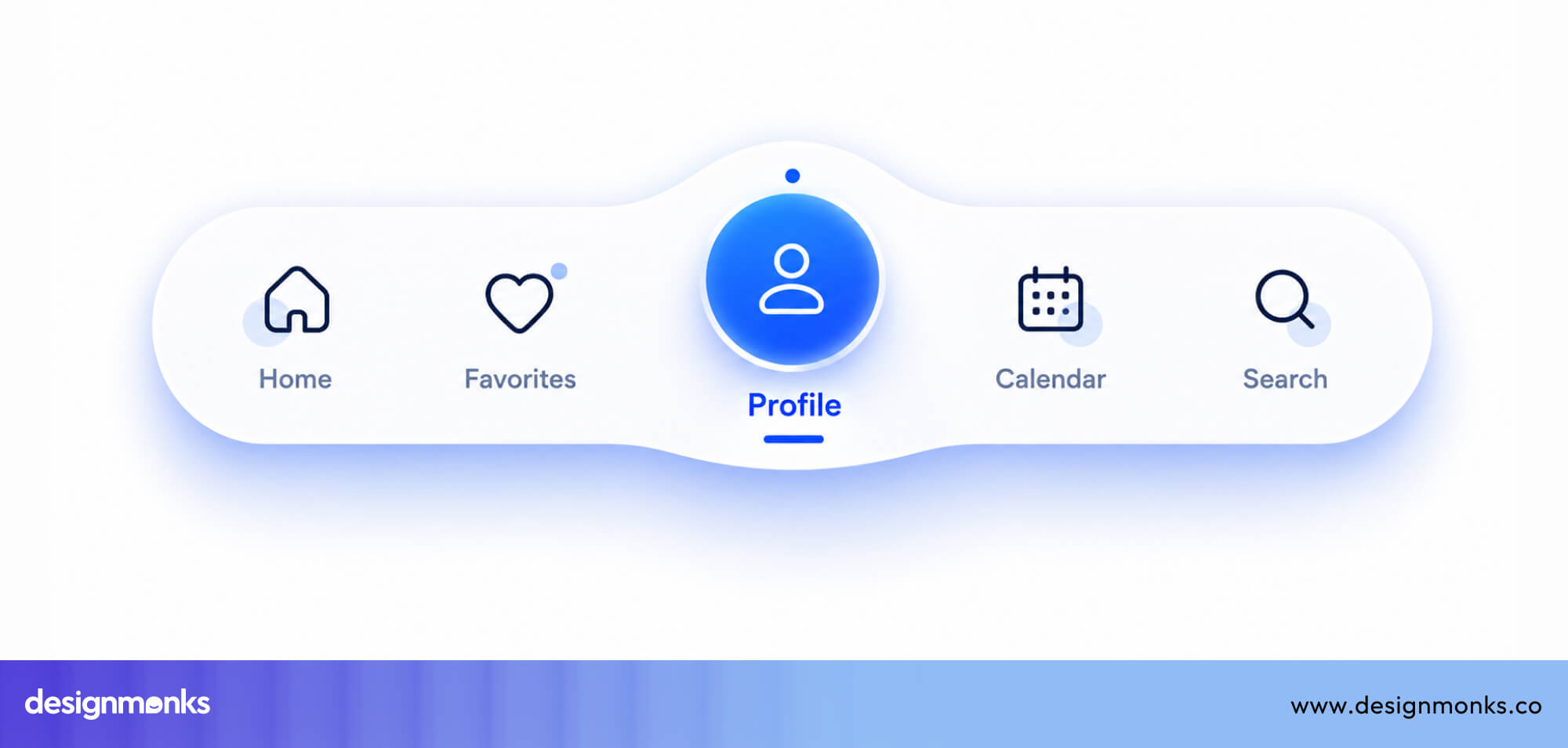
Mobile interfaces often rely on two common patterns, Bottom Navigation and Floating Action Button. Bottom navigation bars work for apps with multiple main sections (like Instagram, Twitter, or Spotify).
They keep primary navigation within thumb reach.
Floating Action Buttons (FABs), on the other hand, are circular buttons perfect for a single, high-frequency primary action. It floats above the interface, making it highly visible and easy to access.
Gmail's compose button is one of the classic and best examples of Floating Action Buttons.
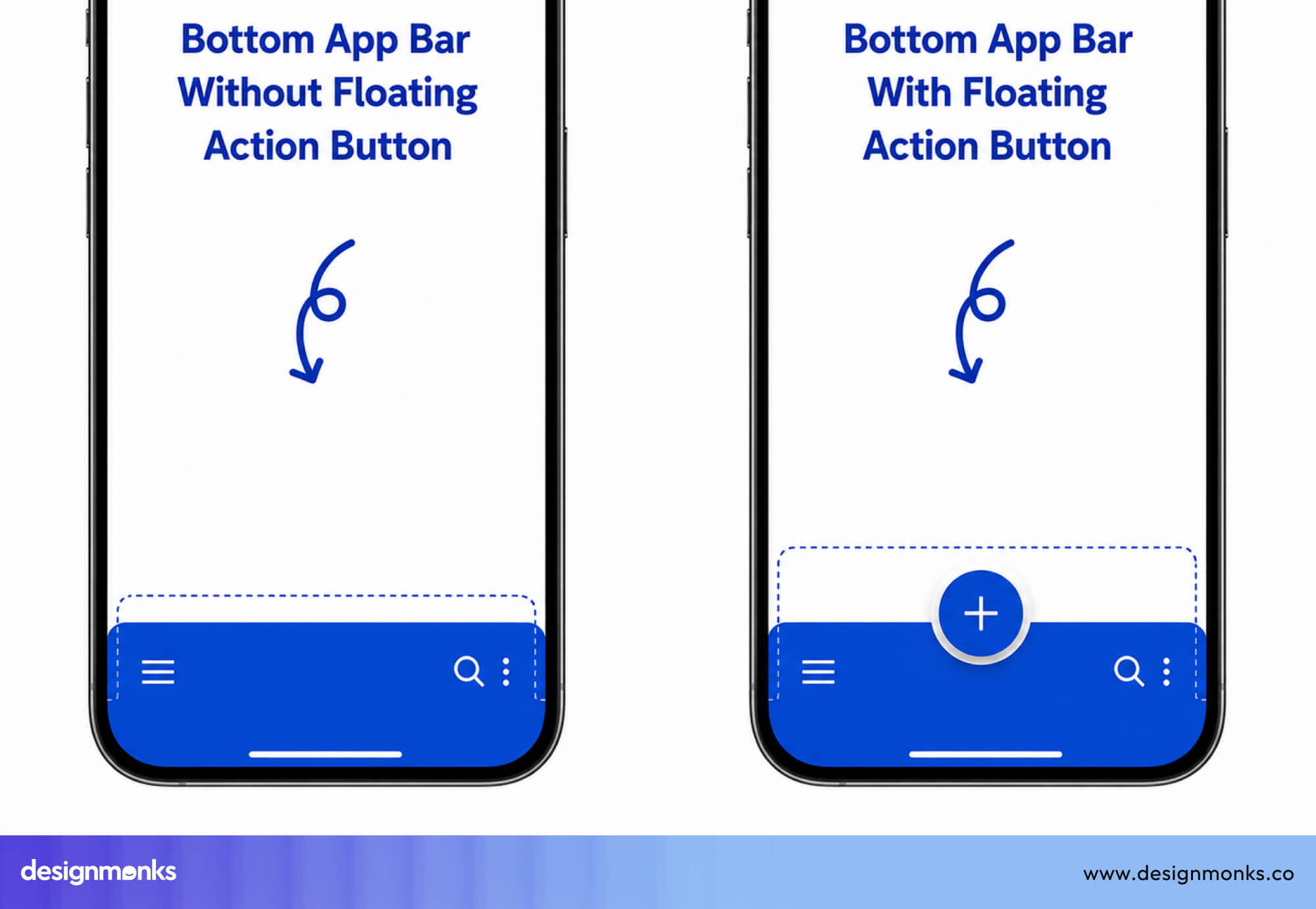
But FABs only make sense when there's one dominant action per screen. Overusing them will create clutter. So the overall choice depends on intent. Use bottom navigation for structure, and FABs for emphasis.
Sticky CTA Button Placement
Sometimes users need constant access to an action. And for conversion-focused pages like landing pages, product pages, and checkout flows, a sticky CTA button that stays fixed at the bottom of the screen is highly effective.
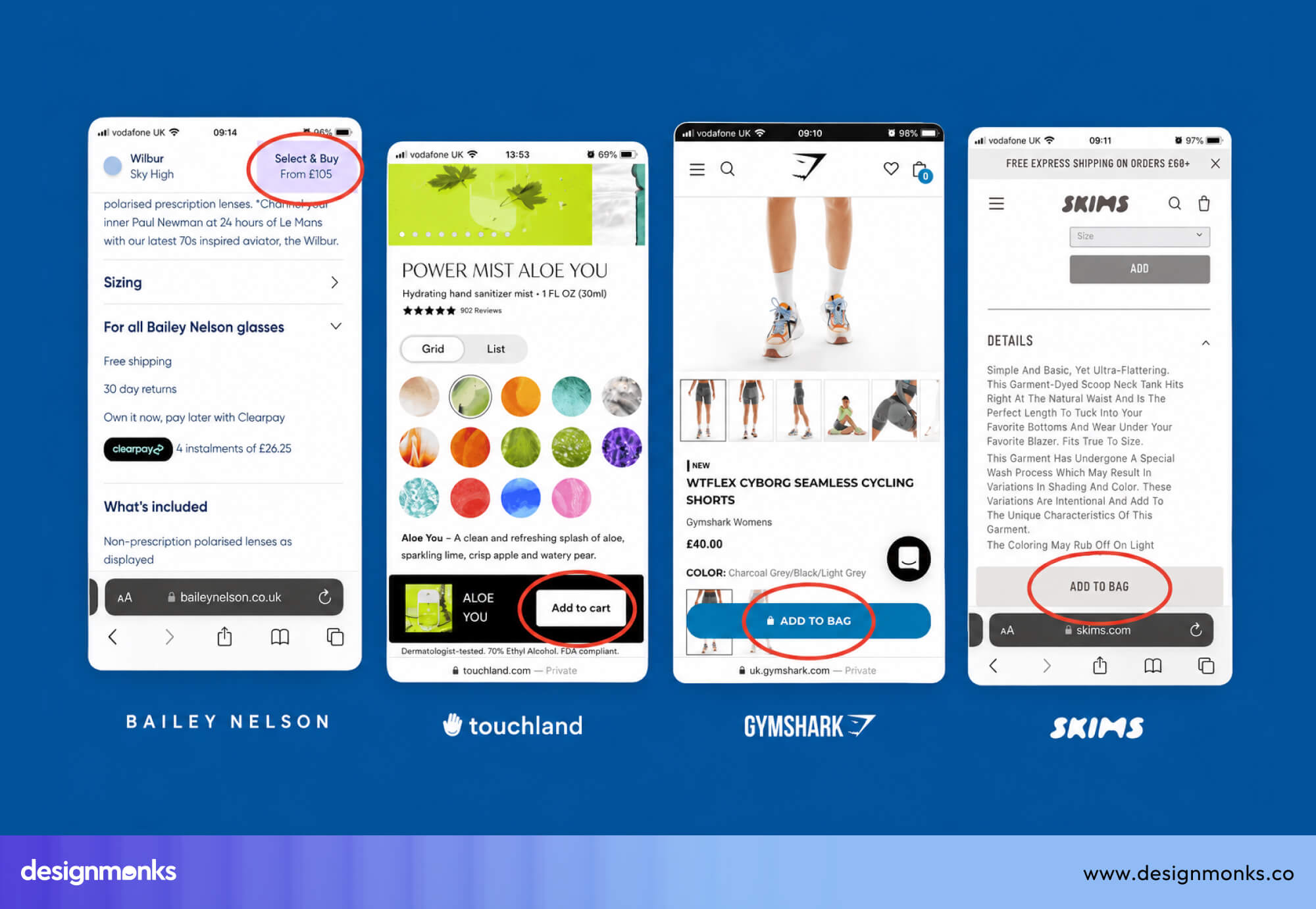
It keeps the primary action visible no matter how far the user scrolls. Apps like DoorDash and most e-commerce apps use this pattern for "Add to Cart" and "Checkout" buttons.
UX Button Placement Patterns by Interface Type
Button placement isn’t one-size-fits-all. It changes depending on the interface, user intent, and context of action. Below are practical patterns that show how buttons behave across different UI types:
Login and Signup Forms
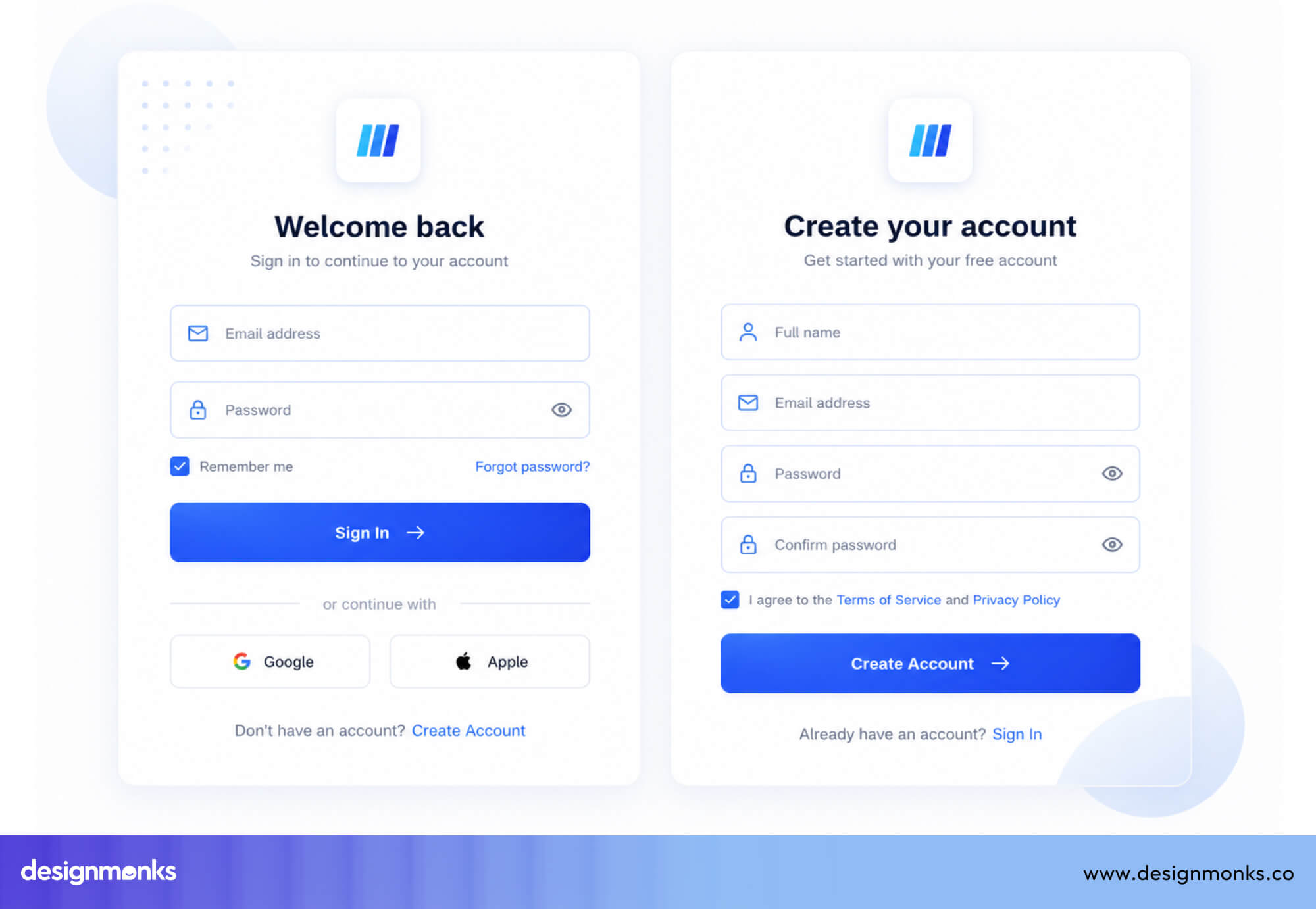
Login and signup flows are simple, focused, and goal-driven. The primary action, “Sign In” or “Create Account,” is placed directly below the last input field.
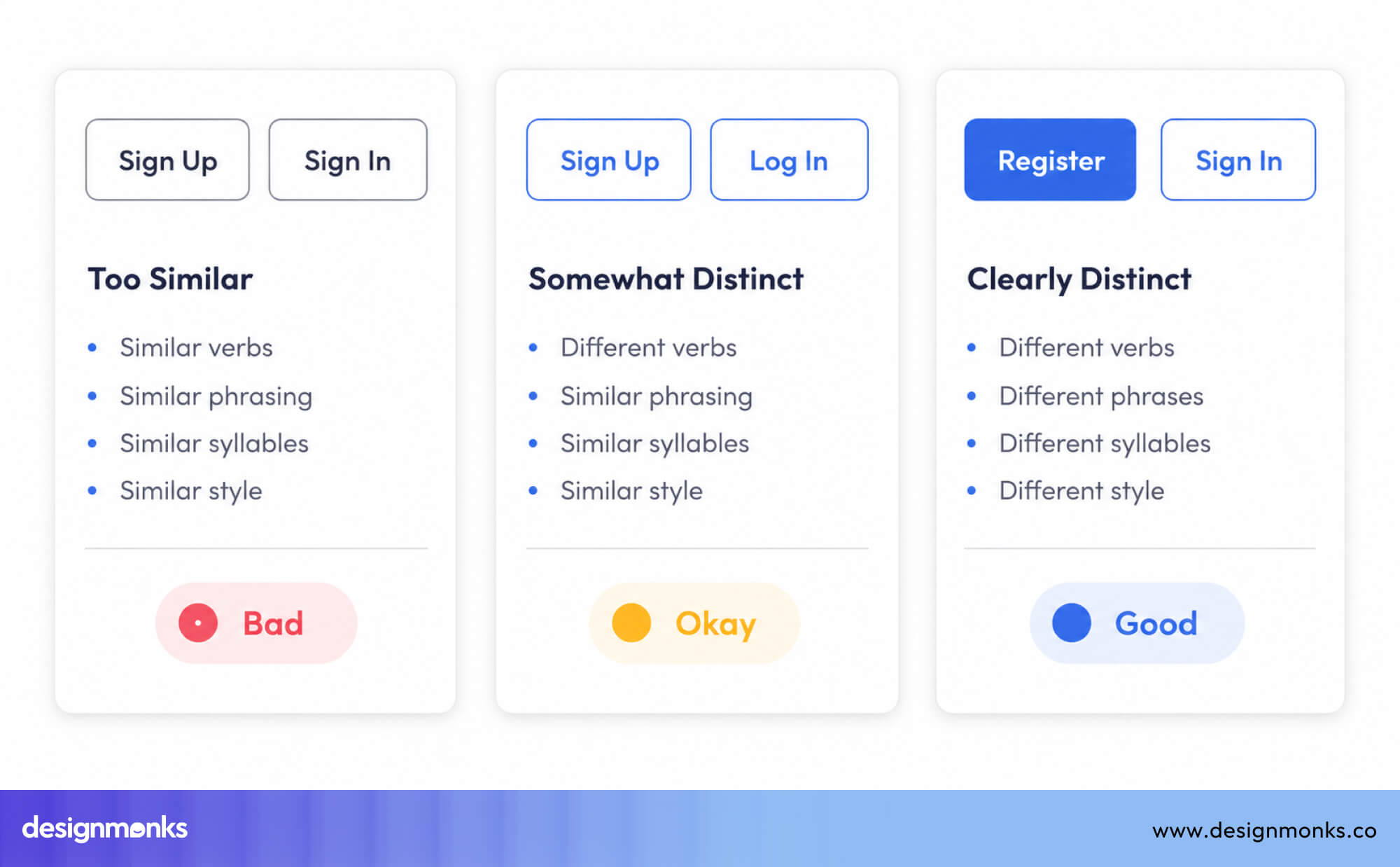
On mobile, it usually spans full width for easier tapping, while on desktop, it may be left-aligned or centered for balance. This placement keeps the flow linear, users enter details and immediately see the next step.
Checkout and Payment Pages
Checkout flows are high-stakes, so clarity and visibility are critical. The main action, “Place Order” or “Pay Now,” is the most prominent element on the page and is placed below the order summary.
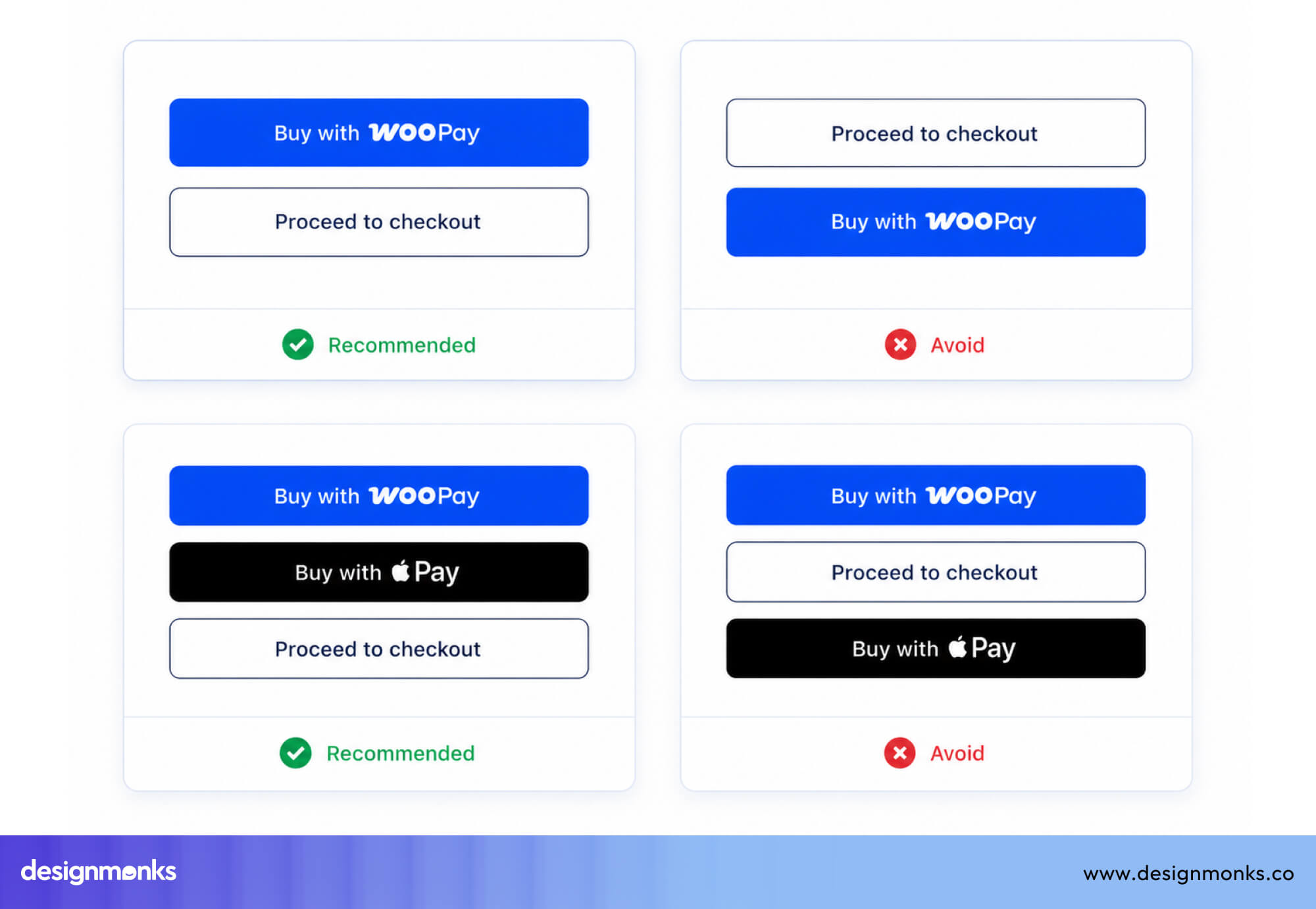
In longer checkout flows, it may also be repeated at the top to reduce scrolling friction. The goal is simple never make users search for the final action.
Search Interfaces
Search experiences depend on speed and familiarity. The search button typically sits inline with the search field on the right side, matching user expectations.
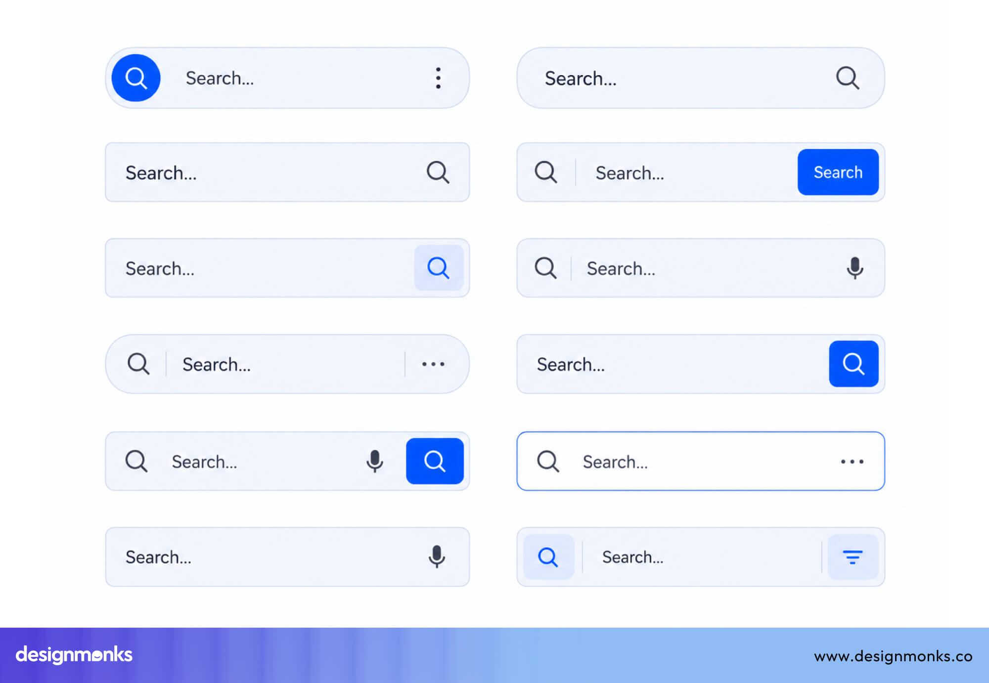
For advanced filtering, a secondary “Filter” button is placed above or near the results area. This keeps the primary search action fast while still supporting deeper refinement.
Empty States
Empty states are opportunities, not dead ends. When no content exists, the primary CTA should be centered and clearly visible. It should guide users to create their first item.
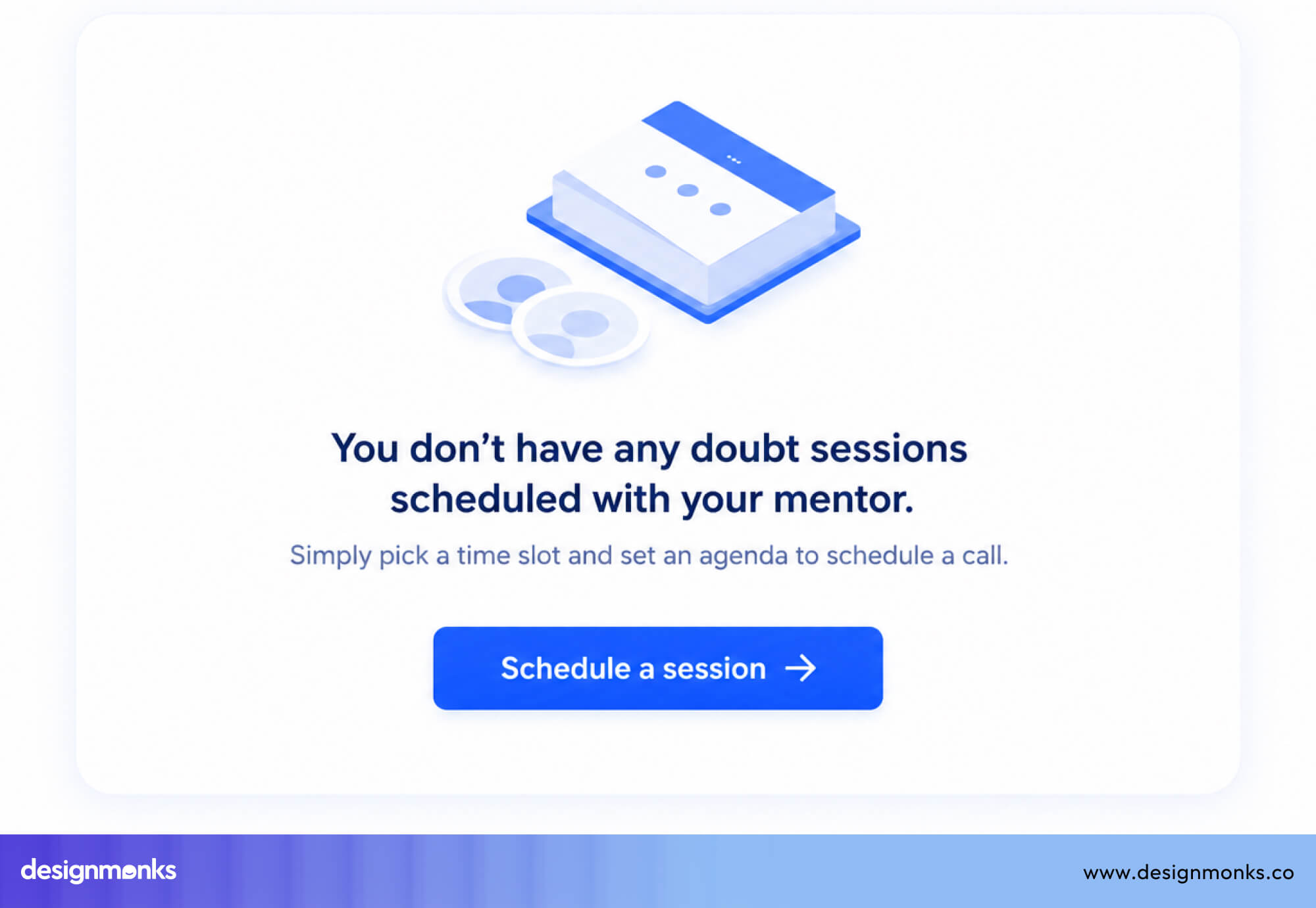
Whether it’s “Create Project” or “Add First Item,” the action should feel like the natural next step. Good empty states turn inactivity into engagement.
Cards and Lists
Cards and lists rely on contextual actions tied to individual items. Primary actions like “View,” “Buy,” or “Book” are placed at the bottom of the card, where users naturally finish scanning.
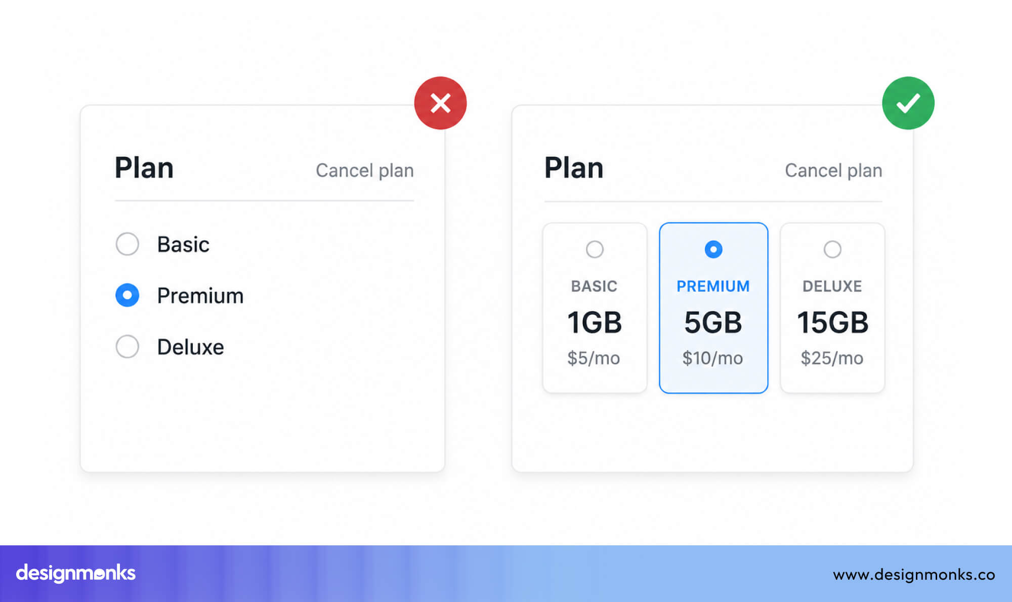
Secondary actions like “Save” or “Share” are usually positioned as subtle icon buttons in the top-right. This separation keeps the interface clean while preserving functionality.
Tables and Data Grids
Data-heavy interfaces require structured, predictable actions. Row-level actions such as edit or delete are aligned to the right of each row, keeping them tied to their specific data.
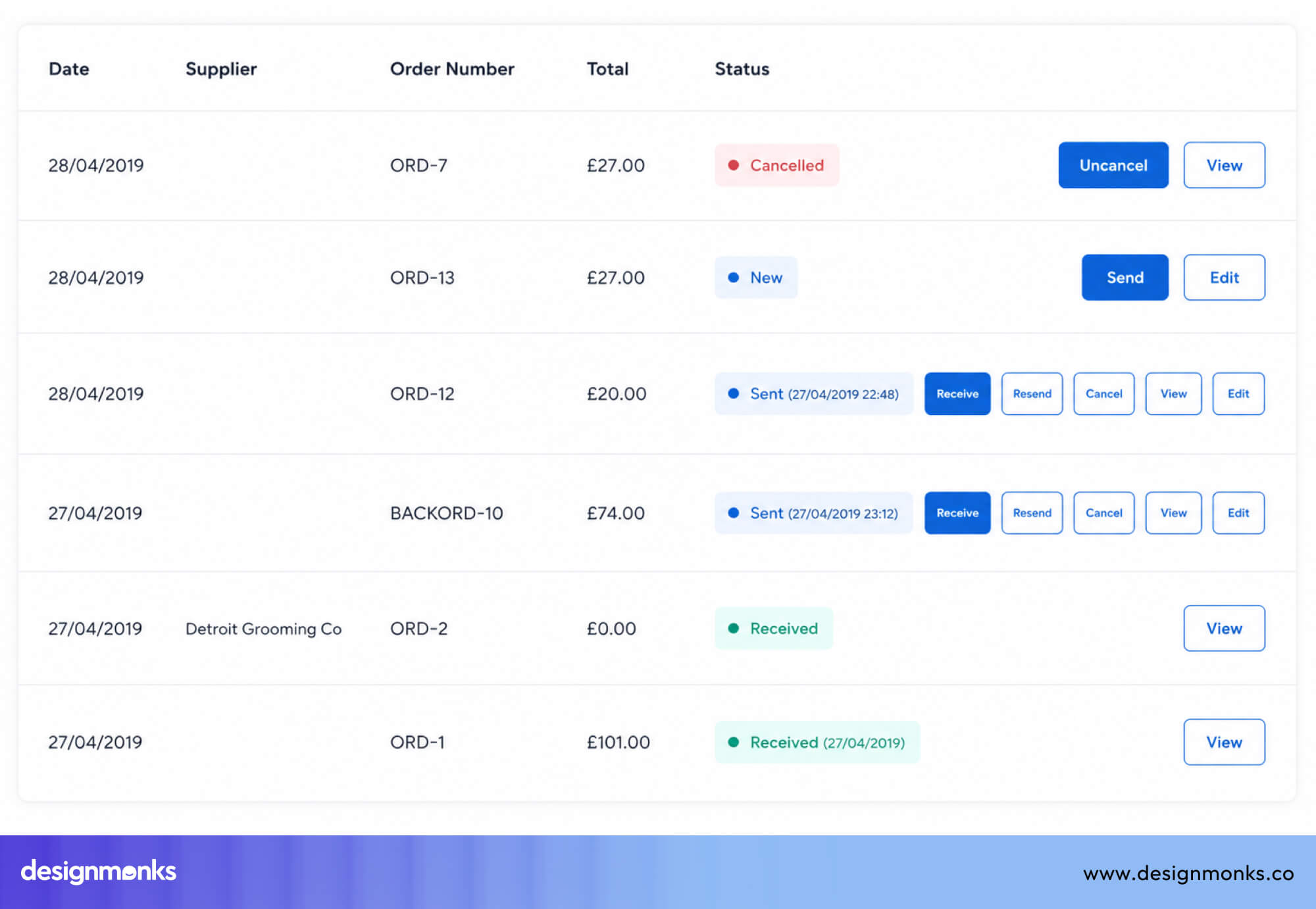
Bulk actions appear in a toolbar that becomes visible only when items are selected. This prevents clutter while supporting both individual and batch actions.
Settings Pages
Settings pages are about control and confirmation. Each section typically ends with a “Save Changes” button placed at the bottom and aligned to the right.
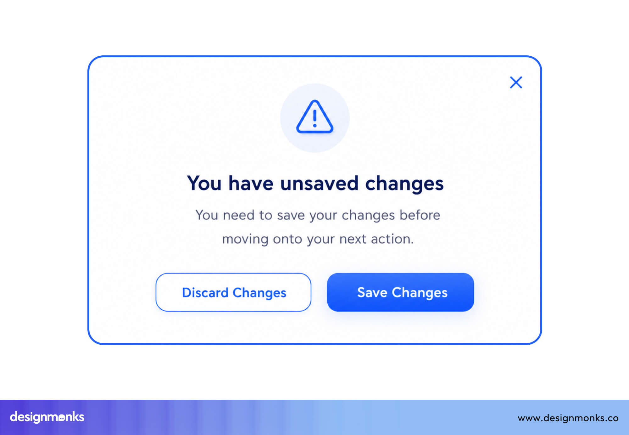
A secondary action like “Cancel” or “Discard” sits to its left, styled more subtly to avoid competition. This structure reinforces a clear decision point after every change.
Dashboards
Dashboard design needs to combine overview and action in one space. Primary actions like “Create” or “Export” are usually placed in the top-right of each widget or section, where users expect controls to live.
Destructive actions are never emphasized and are often hidden behind menus or confirmation steps. This keeps dashboards readable while still action-ready.
Common UX Button Placement Mistakes
Poor button placement often creates confusion, hesitation, and unnecessary friction. These are the most common mistakes that break usability:
- Too Many Buttons on One Screen: When every action looks equally important, nothing stands out. Users get overwhelmed and struggle to decide what to do next. A clear hierarchy with one primary action per screen keeps decision-making simple.
- Inconsistent Button Locations: If key actions like “Save” or “Next” move around between screens, users lose their mental map. This forces them to re-scan every time and slowly erodes confidence in the interface.
- Hidden or Hard-to-Find Buttons: Over-minimal designs sometimes hide important actions until hover or interaction. While this may look clean, it often confuses users who rely on visible cues to move forward.
- Placing Primary and Secondary Buttons Too Close: When high-risk and safe actions sit too close without separation, mistakes become more likely. Clear spacing, contrast, and hierarchy are essential to prevent accidental clicks.
- Misusing Color and Visual Hierarchy: If every button uses the same color or weight, users can’t tell what matters most. A strong system uses one dominant color for primary actions, neutral styles for secondary ones, and red only for destructive actions.
Real Examples of Good UX Button Placement
Leading digital products don’t treat button placement as decoration, they use it as a core part of guiding user behavior. The way they position actions directly impacts clarity, speed, and trust.
Here’s how some well-known products apply these principles in real interfaces:
Google Forms
Google Forms keeps its interaction model extremely straightforward, and its button placement reflects that simplicity.
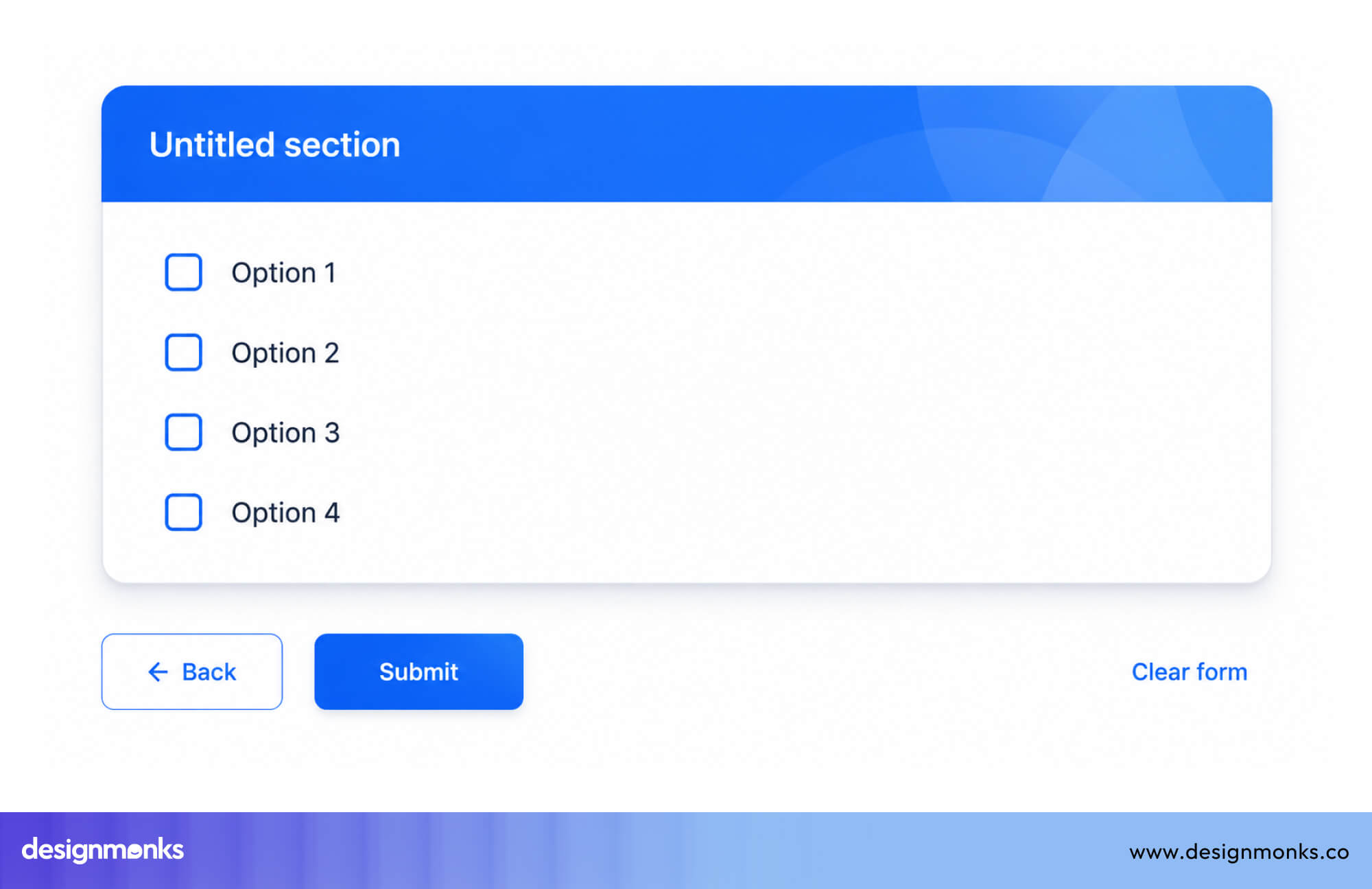
The Submit button sits at the very bottom of the form, directly after all input fields. It’s clearly separated from the content above, which helps users understand that they’ve reached the end of the process.
There’s no distraction, no competing action, just a single, predictable next step.
This works because forms are linear. Users fill out information from top to bottom, and the button naturally appears exactly where their journey ends.
Shopify Checkout
Shopify designs its checkout flow around one goal, completing the purchase with as little friction as possible.
The primary CTA, such as “Continue to payment” or “Place order,” is always large, full-width, and positioned at the bottom of each step. This makes it highly visible and easy to tap, especially on mobile devices where attention is limited.
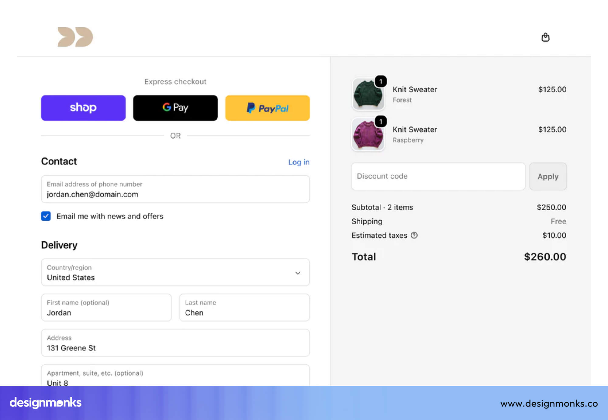
Across multiple checkout steps, this pattern stays consistent. Users never have to relearn where to look for the next action, which reduces hesitation and keeps momentum high during a high-intent flow.
Notion
Notion takes a different approach by prioritizing flexibility and minimalism in its interface. Instead of constantly visible buttons, many actions appear contextually, often on hover or when interacting with a block.
This keeps the interface visually clean and reduces cognitive overload, especially in content-heavy documents.
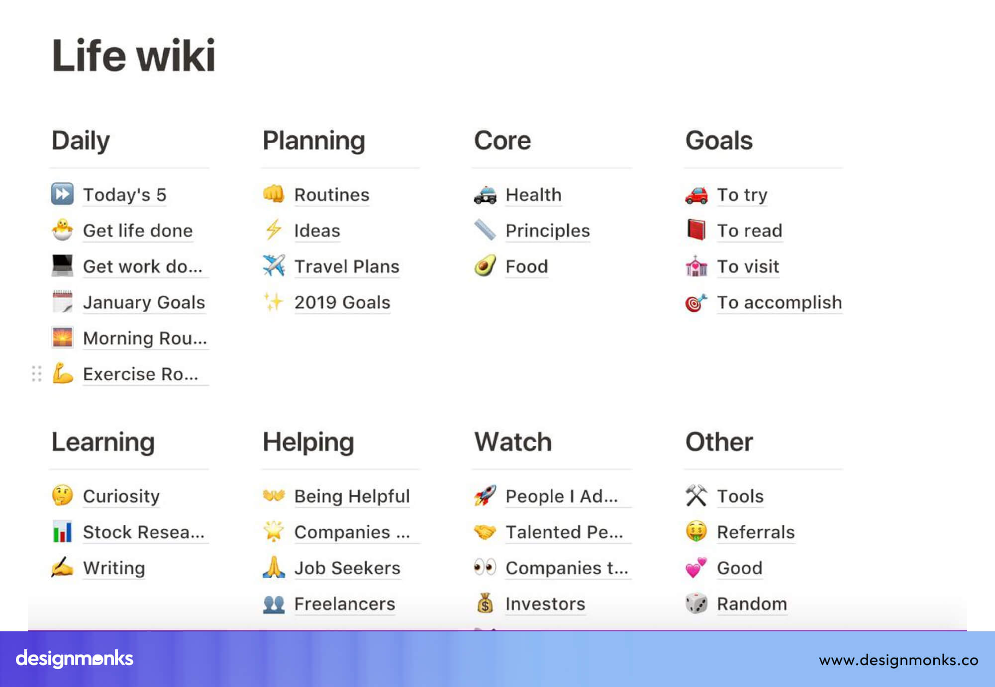
However, this trade-off is intentional. Notion users are typically more experienced, so hidden or contextual actions don’t hurt usability as much as they would in beginner-focused products.
It works because actions are still discoverable when needed.
Stripe Dashboard
Stripe focuses on consistency and predictability in a highly functional, data-heavy environment. Primary actions like “Create,” “Add,” or “Export” are consistently placed in the top-right corner of sections and dashboards.
This creates a reliable mental model, users always know where to look when they want to perform an action.
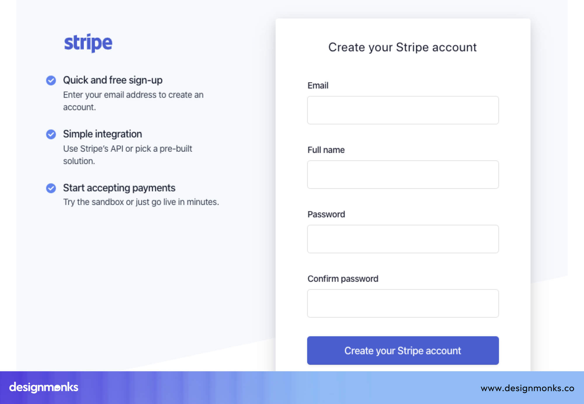
At the same time, risky or destructive actions are intentionally de-emphasized. They are often hidden behind secondary menus or require confirmation steps. This ensures that critical financial operations are protected from accidental clicks.
Airbnb
Airbnb optimizes its booking flow around urgency and accessibility. The “Reserve” or booking CTA is designed to remain visible at all times. On desktop, it often stays fixed in a side column, while on mobile, it becomes a sticky bottom button that follows the user as they scroll through listing details.
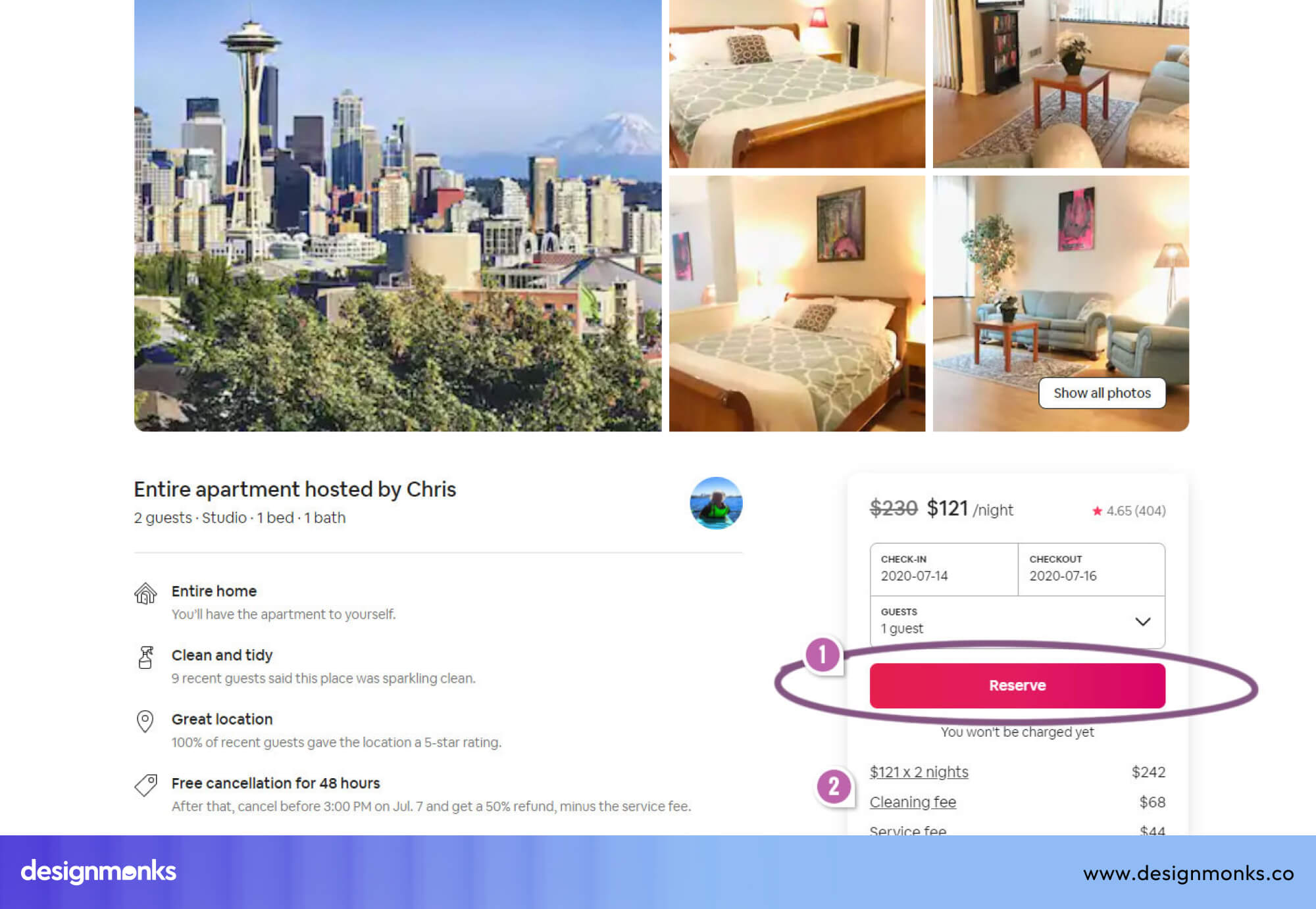
This ensures that when users are ready to book, whether early or late in their browsing, they never have to search for the action. The button is always present, reducing friction at the exact moment of decision-making.
Accessibility Considerations for Button Placement
Good button placement isn’t only about visual clarity, it also needs to work seamlessly for every user, regardless of ability or how they interact with the interface.
Recommended Touch Target Sizes
Small buttons on mobile devices are a common accessibility failure. Even if a button looks fine on a designer's screen, fingers (especially for users with motor impairments) need enough space to tap accurately.
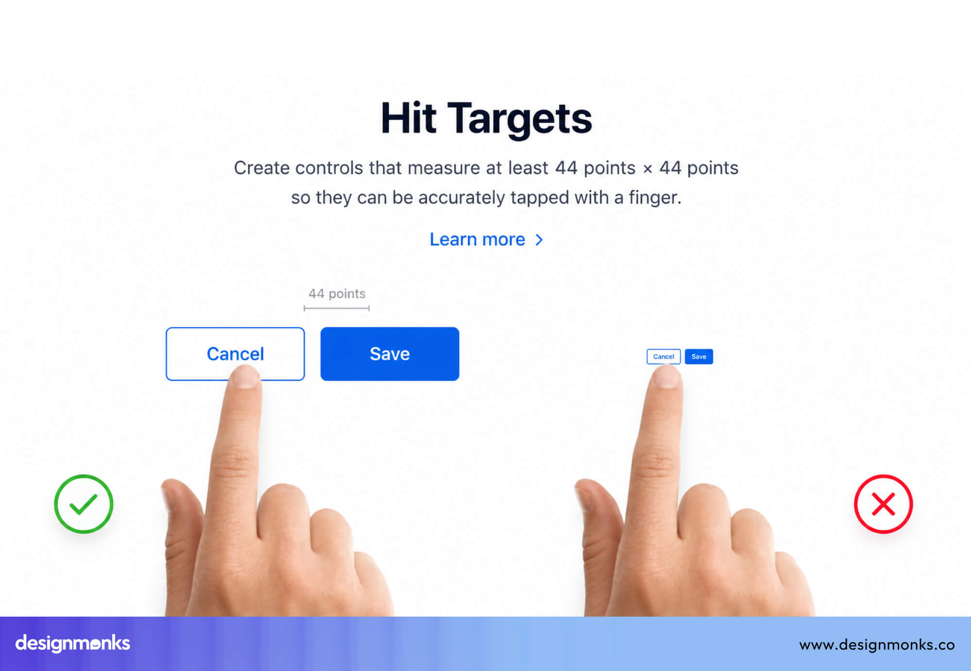
So you need to make buttons easy to tap. Industry standards set clear minimums:
- Apple recommends a minimum of 44x44 points
- Google recommends 48x48 dp
- WCAG 2.5.5 (Level AAA) recommends at least 44x44 CSS pixels
Keyboard Navigation and Focus Order
Users who navigate with a keyboard move through elements using the Tab key. Your button placement should follow a logical tab order, left to right, top to bottom, and primary actions should be reachable without excessive tabbing.
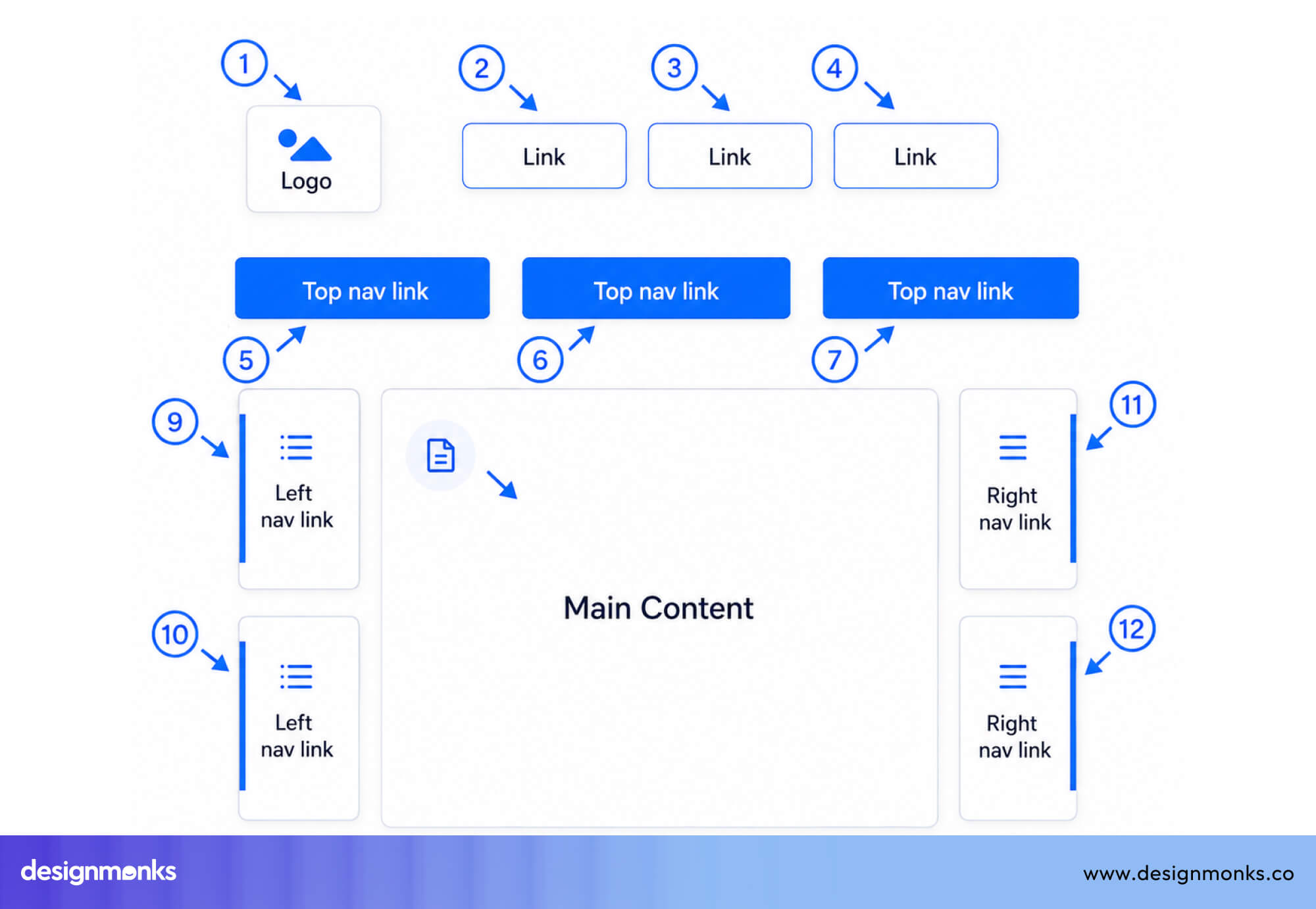
Always make sure focused buttons have a visible focus ring. If a user can’t see where they are on the page, they can’t interact confidently.
Removing the default focus outline without adding a replacement makes it hard for keyboard users to see where they are, which hurts accessibility. Clear focus states also create a more predictable experience that helps users with ADHD stay oriented as they move through an interface.
Color Contrast and Visibility
Buttons must remain readable and distinguishable in all states. To meet accessibility standards, text should maintain at least a 4.5:1 contrast ratio under WCAG.
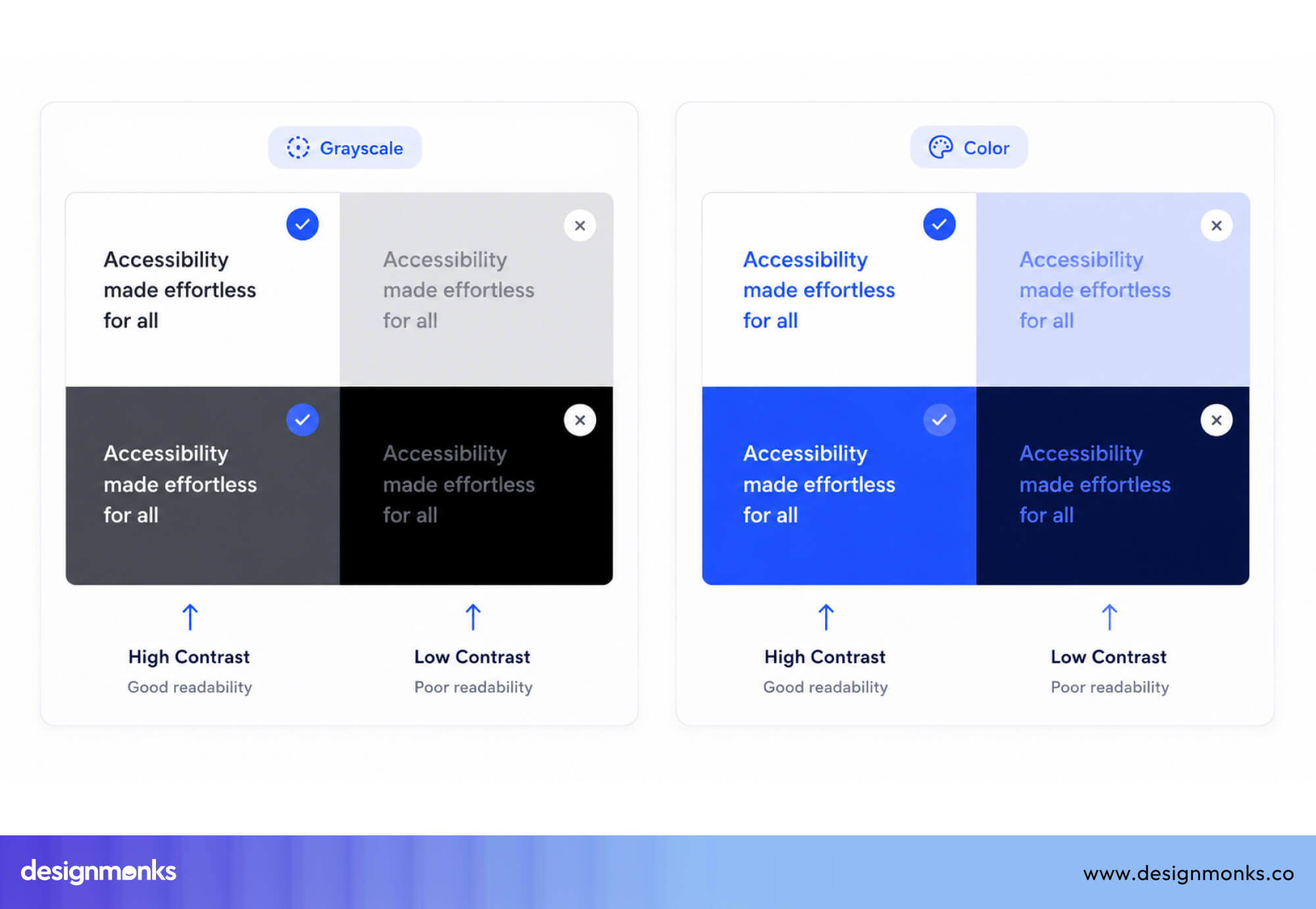
But contrast alone isn’t enough. Disabled or inactive buttons should also use cues like reduced opacity, icon changes, or styling differences.
Screen Reader Accessibility
For screen reader users, clarity comes from labels, not visuals. Button text should clearly describe the action. Instead of vague labels like “Click here,” use specific descriptions like “Add to Cart – Blue Sneakers, Size 10.”
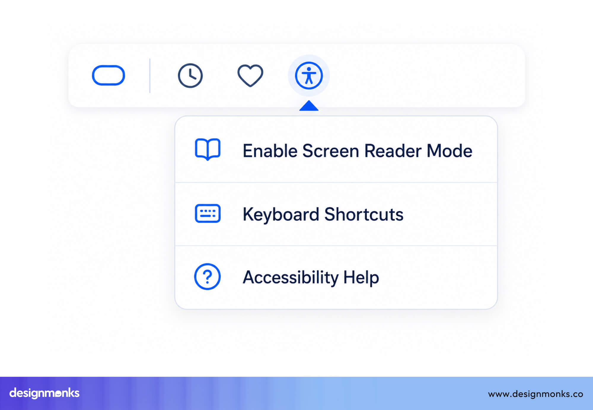
For icon-only buttons, an accessible label (such as an aria-label) is essential so assistive technologies can accurately communicate the action to the user.
UX Button Placement Guidelines From Major Design Systems
Different design systems may vary in details, but they all follow the same core idea: button placement should reduce thinking and make the right action obvious.
Material Design Guidelines
Material Design focuses on clear hierarchy and predictable action patterns. Primary buttons are typically placed at the bottom of a content area where users naturally complete tasks.
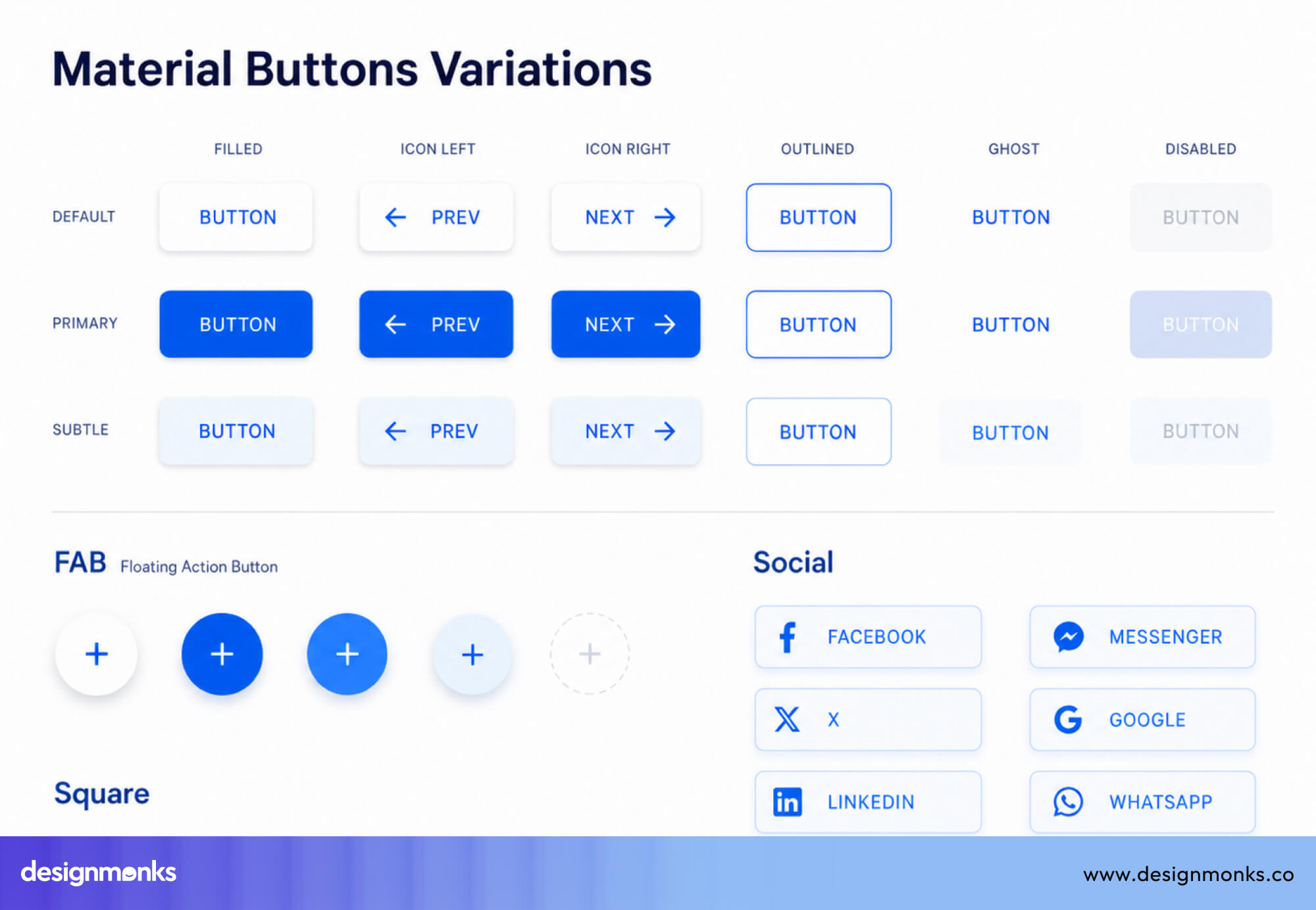
Filled buttons are used for primary actions, outlined buttons for secondary actions, and text buttons for low-emphasis actions. The Floating Action Button (FAB) is reserved for the single most important or frequent action in an app, ensuring it stands out without competing with other controls.
Apple Human Interface Guidelines
Apple Human Interface Guidelines prioritize clarity, familiarity, and expected behavior. The most likely or important action is placed where users naturally expect it, often on the right side in dialogs.
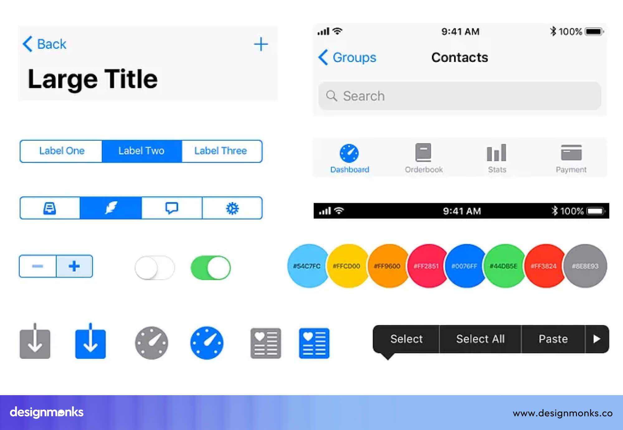
Destructive actions are always clearly separated, require confirmation when needed, and use red to communicate risk. The goal is to make decisions feel effortless while preventing accidental mistakes.
Nielsen Norman Group Recommendations
Nielsen Norman Group emphasizes evidence-based patterns grounded in user behavior. They consistently emphasize proximity (buttons near related content), consistency (same placement across similar screens), and visual hierarchy (primary actions clearly distinguished from secondary ones).
Their research reinforces that users build mental models of where buttons live. If you break those models, you break their expectations and create confusion.
UX Button Placement Checklist
Use this checklist to quickly evaluate whether your button placement follows UX best practices:
Checklist for Forms
- The submit button is directly below the last input field
- Submit is visually the most prominent element
- "Cancel" or "Reset" is secondary in style and placed to the left
- No important actions are above the fold, while the form is below
Checklist for Mobile Interfaces
- Primary CTA is in the lower half of the screen (thumb zone)
- Touch targets are at least 44x44 pixels
- Adequate spacing between all tappable elements
- Sticky CTA used for conversion-critical actions
Checklist for Modal Windows
- Primary action is bottom-right
- Secondary/cancel action is to the left of the primary
- Destructive actions are visually distinct (red, separated)
- Focus moves to the modal when it opens
Checklist for CTAs
- One clear primary CTA per screen
- Primary CTA is filled, colored, and high contrast
- Secondary CTAs are visually quieter
- CTA label is specific ("Book a Demo", not "Submit")
Frequently Asked Questions
Should the Primary Button Be on the Left or Right?
Primary buttons are usually placed on the right because users read from left to right and naturally end their scan there. This makes the action easier to notice and quicker to click. Design systems like Material Design and Apple’s Human Interface Guidelines follow this pattern for consistency.
Where Should Submit Buttons Be Placed?
Submit button should be directly below the last input field in a form, left-aligned or center-aligned depending on the form width. For long forms, a sticky bottom bar works well on mobile.
What Is the Best Button Placement for Mobile Apps?
The best button placement for mobile apps is in the thumb zone or the lower half of the screen. Use sticky bottom CTAs, it works well for conversion-focused flows. But avoid placing critical buttons in the top corners, which are hard to reach one-handed.
How Many Buttons Should a Screen Have?
You should have only one primary action per screen. You can have secondary actions, but every additional button reduces the clarity of the primary one. If you have five buttons and can't decide which is primary, that's a sign the screen is trying to do too much.
Where Should Cancel and Delete Buttons Be Positioned?
"Cancel" should be to the left of the primary action, styled as a ghost or text button. "Delete" should be separated from other actions, styled in red, and always accompanied by a confirmation step.


.avif)
.avif)
.avif)
.avif)


.avif)
.avif)
.avif)
.avif)







.avif)