
.svg)


Key Takeaways
- ADHD affects attention regulation, not intelligence or effort, despite common misconceptions.
- Progressive disclosure and persistent state reduce abandonment for distracted, overwhelmed users.
- Typography, contrast, and white space function as cognitive tools, not just aesthetics.
- Designers with ADHD often excel at hyperfocus but struggle with documentation and handoff.
- Testing with real neurodivergent users reveals that friction checklists and compliance audits are missing.
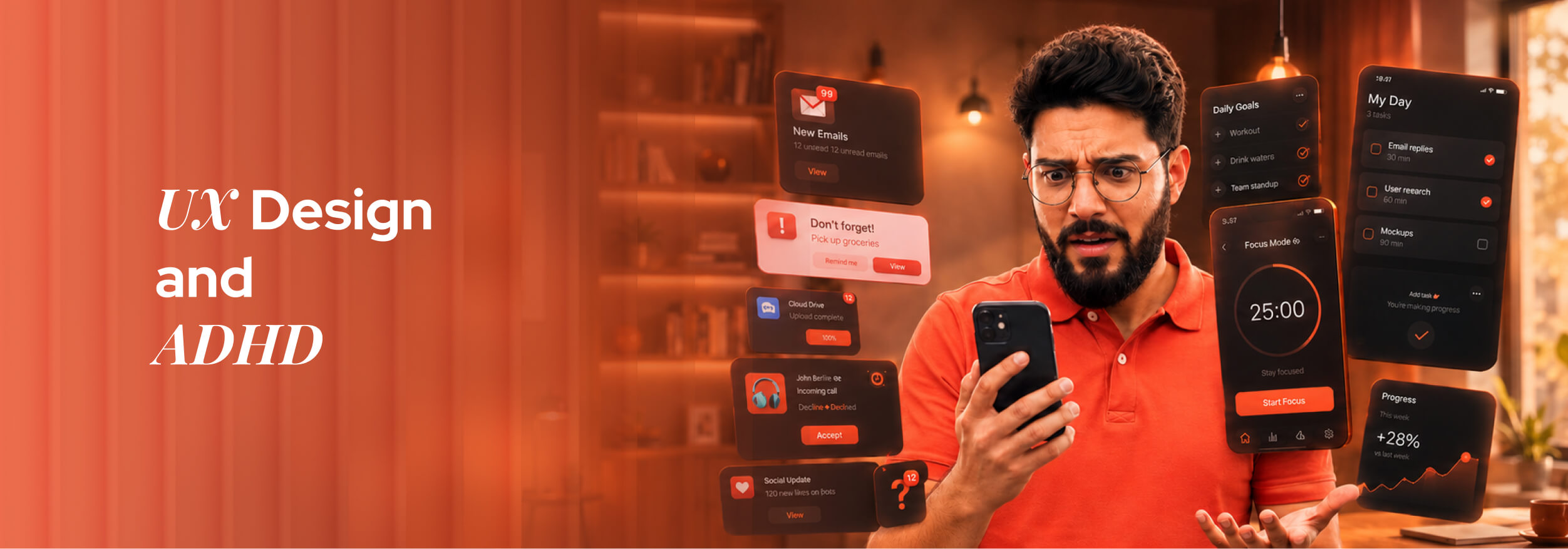
Around 366 million adults globally live with ADHD, yet most digital interfaces are built as if they don't exist. Cluttered layouts, endless forms, and unpredictable navigation don't just annoy these users; they actively lock them out of completing basic tasks online.
But here's what rarely gets asked: Can thoughtful UI/UX design genuinely reduce that friction for ADHD users? And on the flip side, can someone with ADHD actually thrive as a UI/UX service designer, or does the condition make the work harder than it's worth?
The answer to both is a firm yes, and the reasoning behind each will change how you think about design entirely. Read on to find out how.
ADHD and the Brain: What's Really Happening Beneath the Surface
ADHD, or Attention Deficit Hyperactivity Disorder, is a neurodevelopmental condition, not a character flaw or a lack of discipline. It affects how the brain regulates attention, impulse control, and emotional response, and it presents differently in every person.
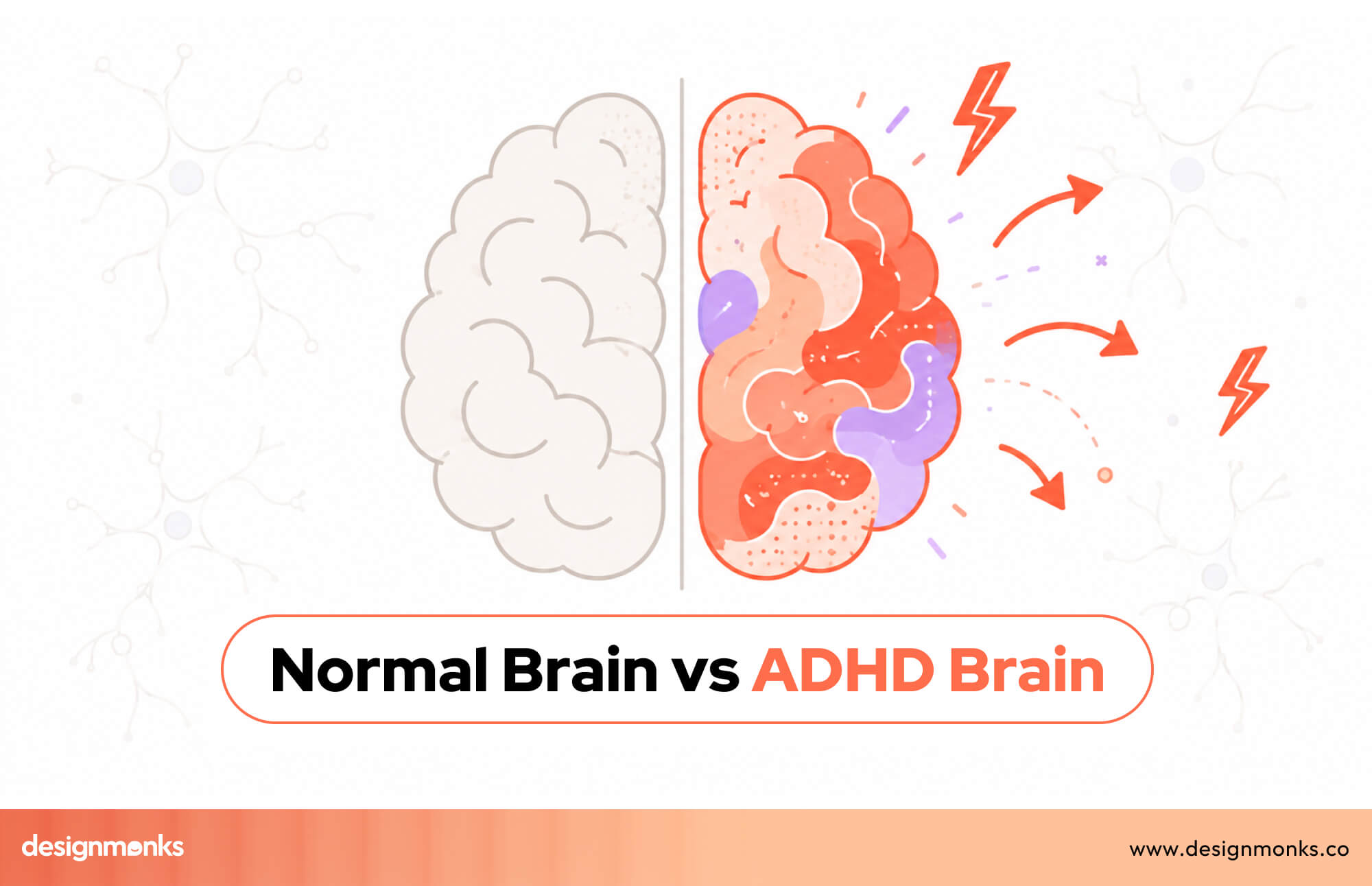
At its core, ADHD is a difference in brain wiring. The prefrontal cortex, responsible for planning and sustained attention, functions differently, making consistency the challenge, not capacity. Many people with this condition are highly capable and creative.
What makes ADHD particularly invisible is that it's situational. The same person who abandons a three-step form might spend six hours lost in a creative project. That inconsistency is exactly what makes this disorder misunderstood, in life and in design.
What ADHD does to the brain:
- Dopamine dysregulation: the brain craves novelty, making repetitive or boring interfaces easy to abandon
- Working memory gaps: users forget instructions, lose their place, or miss what just disappeared from the screen
- Executive function challenges: starting tasks and switching between steps requires disproportionate mental effort
- Time blindness: session timeouts and auto-logouts hit ADHD users harder than anyone realizes
- Hyperfocus: the overlooked flip side; when engaged, ADHD users concentrate intensely and deeply
Why Every Designer Needs to Understand This
ADHD affects roughly 1 in 14 adults globally. You are already designing for these users; the question is whether you're doing it intentionally.
- Dopamine and Abandonment Are Linked: Tedious interfaces don't just frustrate ADHD users; brain chemistry makes disengagement involuntary.
- Working Memory Failures Look Like User Error: Designs that demand too much memory get blamed on users, not the interface.
- Complex Navigation Has a Hidden Cognitive Cost: Every unclear next step forces a decision. That tax compounds fast, driving drop-off before task completion.
- Hyperfocus Shows What Good Design Can Achieve: Structured, rewarding interfaces unlock deep engagement, that's the standard worth building toward.
7 Ways Digital Interfaces Are Failing ADHD Users
Most digital products are built for users who can hold instructions in their head, ignore distractions on demand, and push through friction without losing focus. ADHD users cannot always do that, and poor UX engineering makes every one of those moments worse than it needs to be.
Infinite Scroll Removes Natural Stopping Points
Infinite scroll was designed to keep users engaged, but for ADHD users, it does the opposite. Without a natural endpoint, the brain never receives a signal that the task is complete. A user who opened an app to find one specific thing ends up scrolling for an hour and finding nothing.
Modal Pop-Ups Break Flow at Critical Moments
When a modal appears mid-task, it does not just interrupt the screen; it interrupts working memory. A user halfway through booking a hotel room sees a promotional offer pop up. By the time they close it, the original task context is already gone from their mind.
Disappearing Placeholder Text Overloads Memory
Placeholder text that vanishes when a user clicks a field forces the brain to remember instructions it can no longer see. For ADHD users whose working memory is already stretched, this small design choice turns a simple form into a frustrating guessing game.
Autoplay Video Steals Attention Instantly
Motion and sound capture ADHD attention involuntarily, regardless of what the user actually came to do. Someone visiting a pharmacy website to check store hours gets pulled into an autoplay video and never finds what they needed. The page failed them before they read a single word.
Forms Without Progress Bars Feel Endless
Without a visible indicator showing how many steps remain, ADHD users have no way to mentally prepare for the effort ahead. That uncertainty feels overwhelming rather than manageable, and user-centered design research consistently shows it drives early abandonment on longer flows.
Inconsistent Navigation Kills Orientation
When menus shift position or change labels between pages, users with ADHD lose their spatial sense of where things live. They cannot build a reliable mental model of the interface, so every new page feels like starting over rather than moving forward through a familiar structure.
Vague Error Messages Leave Users With Nowhere to Go
A user spends fifteen minutes completing a job application, hits submit, and sees "An error occurred." No field is highlighted, no explanation is given, and no clear next step appears. Good UX engineering would pinpoint exactly what went wrong and where, turning a dead end into a recoverable moment.
ADHD-Friendly UI Design Principles That Actually Work
Most designers address ADHD accessibility by adding whitespace and simplifying layouts. Those things help, but they only scratch the surface. The real user pain points run deeper, and solving them requires design principles that work with the ADHD brain rather than against it.
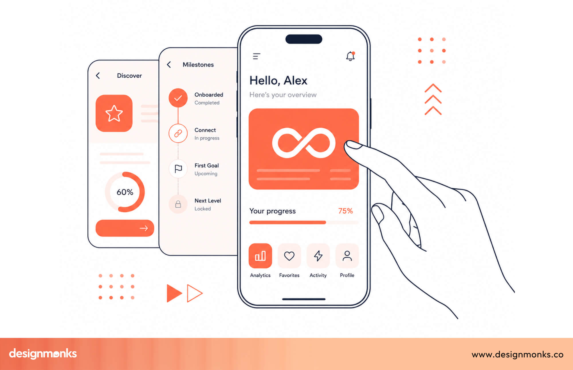
Progressive Disclosure Creates Small Wins
Progressive disclosure means revealing information gradually, one step at a time, rather than presenting everything at once. For ADHD users, each completed step triggers a small dopamine reward that motivates continued engagement. Every "Next" button click becomes a micro-win that pulls the user forward through the flow.
Persistent State Removes the Fear of Losing Progress
When a user gets distracted mid-task and returns later to find their progress wiped, the likelihood of them starting over is very low. Automatically saving progress, like Google Forms and Notion do by default, removes that anxiety entirely. It tells the brain that distraction will not be punished.
Focus Mode Patterns Reduce Visual Noise
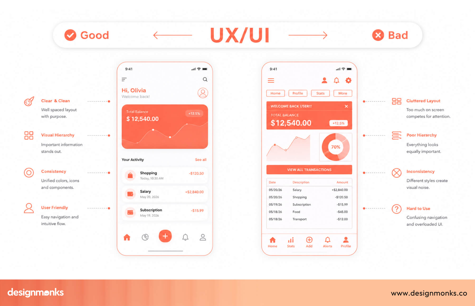
Focus modes hide non-essential interface elements so users can concentrate on one task at a time. Notion's distraction-free writing view, Bear's clean editor, and Linear's focused issue view all do this well. The principle is simple: show only what the current moment requires and hide everything else.
Sensible Defaults Reduce Decision Fatigue
Every choice an interface forces on a user costs mental energy. Pre-selecting the most common option, setting reasonable defaults, and limiting unnecessary configuration upfront means ADHD users spend that energy on the actual task rather than on setup decisions that most people skip anyway.
Feedback Loops Confirm That Actions Worked
ADHD users frequently second-guess whether something actually happened. A subtle animation, a status message, or a color change after an action provides the confirmation the brain needs to move forward confidently, rather than clicking the same button three times to be sure.
Forgiving Design Turns Mistakes Into Recovery Moments
Easy undo options, clear error explanations, and the ability to go back without losing data transform mistakes from dead ends into recoverable moments. Gmail's undo send feature is a simple example of forgiving design done right.
Standard UX vs. ADHD-Friendly UX
Typography, Color, and Visual Hierarchy for ADHD Users
Most accessibility conversations stop at color contrast ratios and minimum font sizes. For ADHD users, the details go much further than that. Among the typography trends in 2026, cognitive accessibility is finally getting the attention it deserves.
Visual design choices that feel purely aesthetic to neurotypical users can mean the difference between task completion and abandonment for someone with ADHD. Getting these details right is one of the most impactful and least discussed areas in inclusive UI design today.
Font selection:
- Readable over decorative: Inter and Atkinson Hyperlegible, recognized as the best font for UI design, reduce visual noise and improve character recognition significantly.
- Consistent weight usage: Mixing too many font weights across one screen fragments attention and makes hierarchy harder to follow.
Spacing and scanning:
- Line length control: Keeping lines between 60 and 75 characters prevents the eye from losing its place mid-sentence while reading.
- Generous line height: A line height of 1.5 to 1.6 gives the brain enough visual breathing room to track text without strain.
Color and contrast:
- Beyond WCAG minimums: Higher contrast ratios reduce the cognitive effort required to distinguish text from background in busy interfaces.
- Color as information: Using color to signal meaning, like red for errors and green for success, rather than purely for decoration, helps ADHD users process interfaces faster.
- Dark mode benefits: Reduced screen brightness and lower visual noise make dark mode genuinely easier for many ADHD users to sustain focus on.
Background and space:
- No patterns or textures: Busy backgrounds compete with foreground content for attention, creating unnecessary cognitive interference that breaks focus.
- White space as function: Generous spacing between elements is not an aesthetic choice. It is a cognitive tool that separates ideas and intentionally guides the eye.
What It Is Actually Like to Be a UI/UX Designer With ADHD
What does a UX designer actually do day to day? Research, wireframing, prototyping, stakeholder meetings, documentation, and endless feedback cycles. For a designer with ADHD, each of those tasks carries a very different weight.
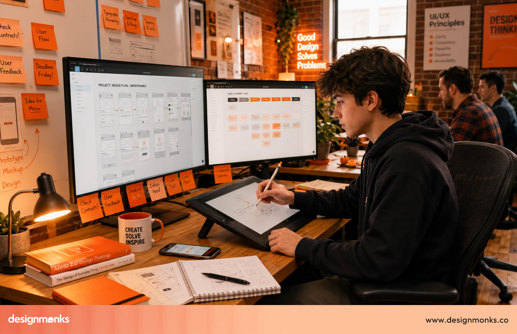
The paradox is real and rarely discussed openly. Many ADHD designers generate brilliant, original ideas quickly, yet struggle deeply with the documentation, handoff notes, and structured processes that turn those ideas into shipped products.
Hyperfocus Can Become a Genuine Creative Advantage
When an ADHD designer enters a state of flow, the output can be extraordinary. Entire user flows, wireframes, or prototypes sometimes come together in a single sitting of intense, uninterrupted concentration that others cannot easily replicate.
The Daily Struggles Rarely Talked About
Starting a new project from a blank canvas is often harder than finishing one. Switching between design tools, sitting through long stakeholder meetings, and keeping Figma files organized all drain energy that clients and managers rarely see or account for.
The Emotional Weight Behind the Work
Many designers are diagnosed with ADHD later in life, after years of believing they were simply lazy or disorganized. That delayed understanding often fuels imposter syndrome, leading many to mask their struggles carefully in professional settings.
Why Disclosure Still Feels Risky
Most designers choose not to disclose their ADHD at work, fearing it will be read as unreliability rather than a different way of thinking. That silence carries a real cost, both for the individual and for teams missing out on understanding their best people fully.
Workflow Strategies and Tools for ADHD Designers
Understanding ADHD is only half the equation. The other half is building a workflow that actually works with an ADHD brain instead of fighting it every single day.
- Time-boxed design sprints: Adapting the Pomodoro technique to design phases keeps wireframing, research, and prototyping contained within focused, manageable bursts of time.
- Body doubling sessions: Working alongside another person, even silently on unrelated tasks, creates external accountability that makes starting and continuing work noticeably easier.
- Voice note capture: Recording quick voice memos mid-session preserves sudden ideas before they vanish, without forcing a disruptive context switch away from active work.
- Friction-reducing Figma plugins: Auto-layout and component libraries act as cognitive scaffolding, reducing the number of repetitive decisions needed during every single design session.
- Batched feedback reviews: Collecting stakeholder feedback through async tools like Loom prevents the overwhelm that live, unstructured feedback meetings often create for ADHD designers.
- Focusmate and similar apps: Scheduled virtual co-working sessions, paired with white noise or controlled environment design, help signal to the brain that focus time has begun.
- Strategic hyperfocus management: Leaning into hyperfocus works well for creative exploration, but protecting against it matters during deadline-driven or detail-heavy production work.
Real-World Example: Calmora's ADHD-First Design Approach
Most ADHD design advice stays theoretical. Calmora, a branding and platform project by Design Monks, shows what these principles look like when actually applied to a product built for people who deal with distraction and overwhelm daily.
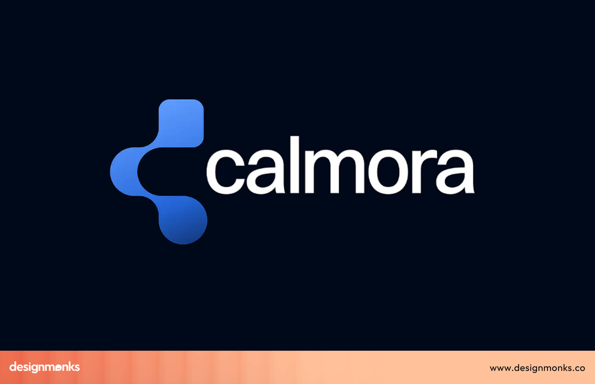
Calmora was designed around clarity rather than complexity. Every visual decision, from color palette to layout, was made to reduce cognitive load instead of adding to it.
What makes it work:
- Calm color palette: Soft, muted tones replace high-energy colors, lowering visual stimulation without feeling sterile or clinical.
- Clear communication: Copy and labels avoid jargon entirely, making every screen immediately understandable at a glance.
- Approachable visual identity: Rounded shapes and friendly typography create trust rather than pressure, which matters for users prone to overwhelm.
The result feels less like a productivity tool and more like a steady companion. That distinction matters most for users who need consistency, not another app demanding willpower they don't always have.
How to Test Your Designs for ADHD Accessibility
Most accessibility testing stops at compliance checklists, but compliance alone does not guarantee usability. Testing for ADHD accessibility means observing real friction points, not just verifying boxes on a checklist.
Recruiting Neurodivergent Users for Usability Testing
Finding ADHD participants does not require a clinical diagnosis on file. Posting in neurodivergent community groups or screening for self-reported ADHD during recruitment works well for most usability studies.
During sessions, watch closely for hesitation before clicking, repeated re-reading of instructions, and moments where users lose track of what they were originally trying to accomplish.
Tasks Worth Testing Specifically
Some flows reveal ADHD friction faster than others, making them worth prioritizing in any testing session focused on cognitive accessibility.
- Multi-step forms: Watch whether users understand how many steps remain and where they currently stand.
- Navigation consistency: Check if users can predict where key actions live after moving between pages.
- Error recovery: Observe whether users understand what went wrong and how to fix it without guidance.
A Quick Heuristic Checklist for ADHD Friction
Before formal testing, a simple internal review can catch obvious problems early. Check for clear progress indicators, consistent navigation placement, and specific, actionable error messages throughout the flow.
Low-Fi Testing Without Any Users at All
A simple internal test works surprisingly well. Open ten browser tabs, get genuinely distracted, then return and try completing the task from where it was left.
WCAG Criteria Worth Prioritizing
Three criteria matter most for cognitive load: 2.4.6 for clear headings and labels, 3.2.3 for consistent navigation, and 3.3.2 for clear instructions on every form field.
Final Thoughts
The line between designing for ADHD users and designing as someone with ADHD is thinner than most people assume. Often, they are the exact same person navigating both sides of the screen.
ADHD is not a problem waiting for a UX fix. It is a perspective that, once understood, makes every product sharper and more human.
If this helps you see design differently, share it with a designer or user who needs to read it too.

.avif)
.avif)
.avif)
.avif)


.avif)
.avif)
.avif)
.avif)


.avif)


