
.svg)


Key Takeaways
- Typography trends in 2026 focus on clarity, flexibility, and better reading experiences.
- Motion and kinetic typography help capture attention in interactive digital experiences.
- AI-generated typefaces enable flexible, adaptive, and personalized font design at scale.
- Bold, experimental, and 3D fonts create strong visual impact and brand differentiation.
- Modern serif and nostalgic styles balance familiarity with contemporary digital aesthetics.
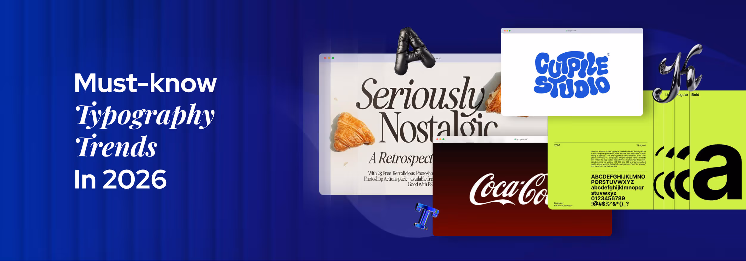
The world of fonts is changing fast, and the Typography Trends in 2026 are set to reshape how we read and interact with text. Designers are experimenting with bold letters, creative spacing, and playful styles to make every word stand out.
Trends like variable fonts and AI-generated typefaces are gaining popularity because they combine flexibility, performance, and personalization. Variable fonts make text responsive across devices, while AI-generated typefaces allow designers to create adaptive styles quickly.
These trends meet the growing need for readable and visually engaging text that works everywhere. In the sections ahead, we’ll explore more typography trends and show how you can use them to make your projects unforgettable.
What Defines Typography Trends in 2026?
A typography trend in 2026 is defined by the combination of design needs, audience preferences, and technological possibilities that make certain fonts and styles popular and widely used. Technology plays a big role, tools like Figma, Adobe Fonts, and variable font technology allow designers to create fonts that adjust to any screen or layout.
This makes trends focus on text that is flexible, responsive, and easy to read everywhere. For example, variable fonts let designers change weight or width without using multiple files, saving time and improving performance.
Culture and audience preferences also define trends. People today enjoy styles that feel bold, playful, clean, or nostalgic. Just like 2000s fashion and old music are coming back, retro and vintage font styles are also returning.
These fonts evoke memories of the past but are combined with modern design, which is why retro-futuristic typography feels both familiar and fresh. Designers follow what people watch, wear, and share online, and they choose font styles that match these moods and social trends.
Branding needs also push trends forward by influencing which fonts convey the right personality. AI and automation make it faster to test new styles, generating type that adapts to content and audience behavior. Finally, user experience shifts ensure trends focus on clarity, accessibility, and comfort, so text isn’t just beautiful, it works for real people. Together, these factors define which typography styles will dominate in 2026.
Key Typography Trends Shaping 2026
Typography in 2026 is about how fonts function across screens, brands, and user needs. These trends show how technology, culture, and digital habits shape the way text is designed and read today. Understanding them helps designers choose typefaces that look modern, stay readable, and work well in real digital products:
Kinetic & Motion-Based Typography
Kinetic and motion-based typography means text that moves on the screen instead of staying still. Letters can slide, fade, zoom, or change shape using UI animation and motion design. This type of animated typography is often seen in websites, apps, videos, and ads where interaction is important.
This trend is growing because people now spend more time on digital screens, short videos, and interactive apps. Moving text helps guide the eyes, explain actions, and make content easier to follow. It also works well on social media, where motion helps stop scrolling and hold attention.
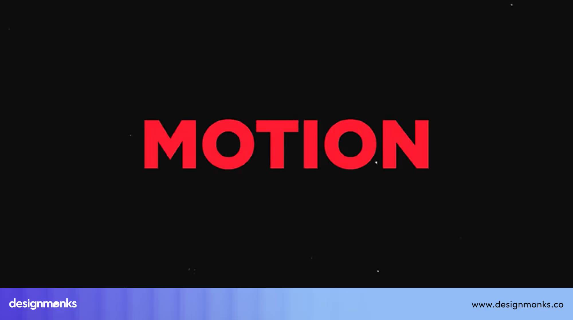
It will be even more popular in 2026 as faster internet, smoother devices, and better design tools make animations easier to create and lighter to load. As brands compete for attention in busy digital spaces, motion typography will be used more to make messages stand out, feel modern, and stay memorable.
AI-Generated & Algorithmic Typefaces
AI-generated and algorithmic typefaces are fonts created or shaped using Artificial Intelligence and machine learning. Instead of being drawn fully by hand, these fonts are produced with Generative AI, which studies large numbers of type styles and then creates new ones based on patterns, data, and user needs.
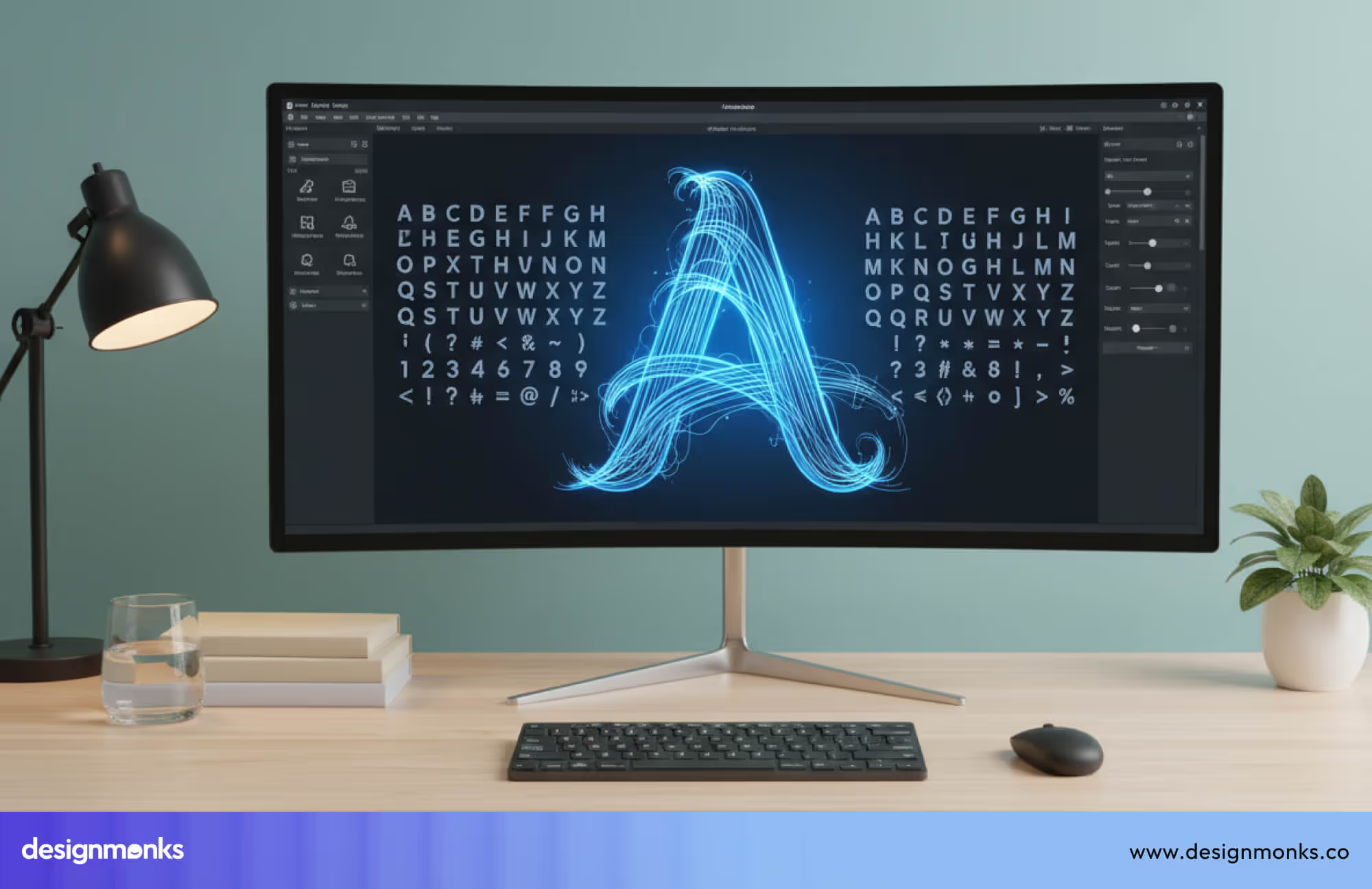
This trend is growing because AI can design and adjust fonts much faster than humans alone. For example, AI can create a font that changes its weight, spacing, or shape based on screen size, language, or reading conditions. This makes AI typography more adaptive and responsive, especially when used with variable fonts.
Moreover, AI-generated typefaces are eye-catching and can create unique and unexpected letter shapes that feel fresh and modern. In 2026, as AI tools become part of everyday design work, algorithmic typography will be popular for creating custom, flexible, and data-driven fonts that stand out across digital platforms.
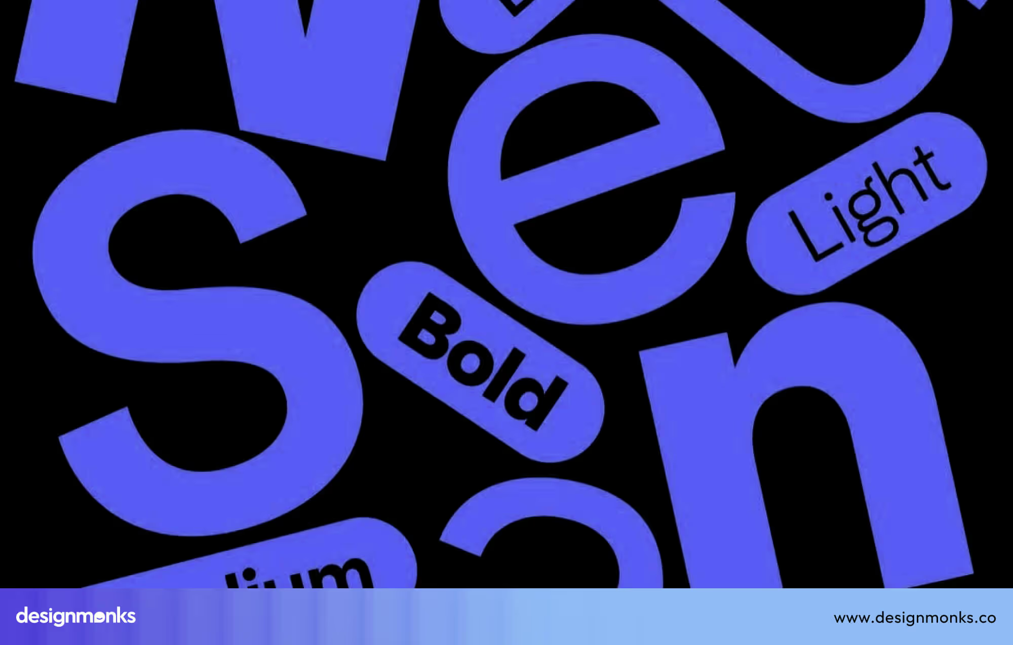
Variable and Responsive Fonts
Variable fonts are single font files that can change their weight, width, and style. Instead of loading many different font files, designers use one flexible file that adjusts as needed.
This makes responsive typography easier because the same text can look right on phones, tablets, and large screens. Many of the best fonts for UI design are now built as variable fonts, which helps them stay clear and flexible across different screen sizes and devices.
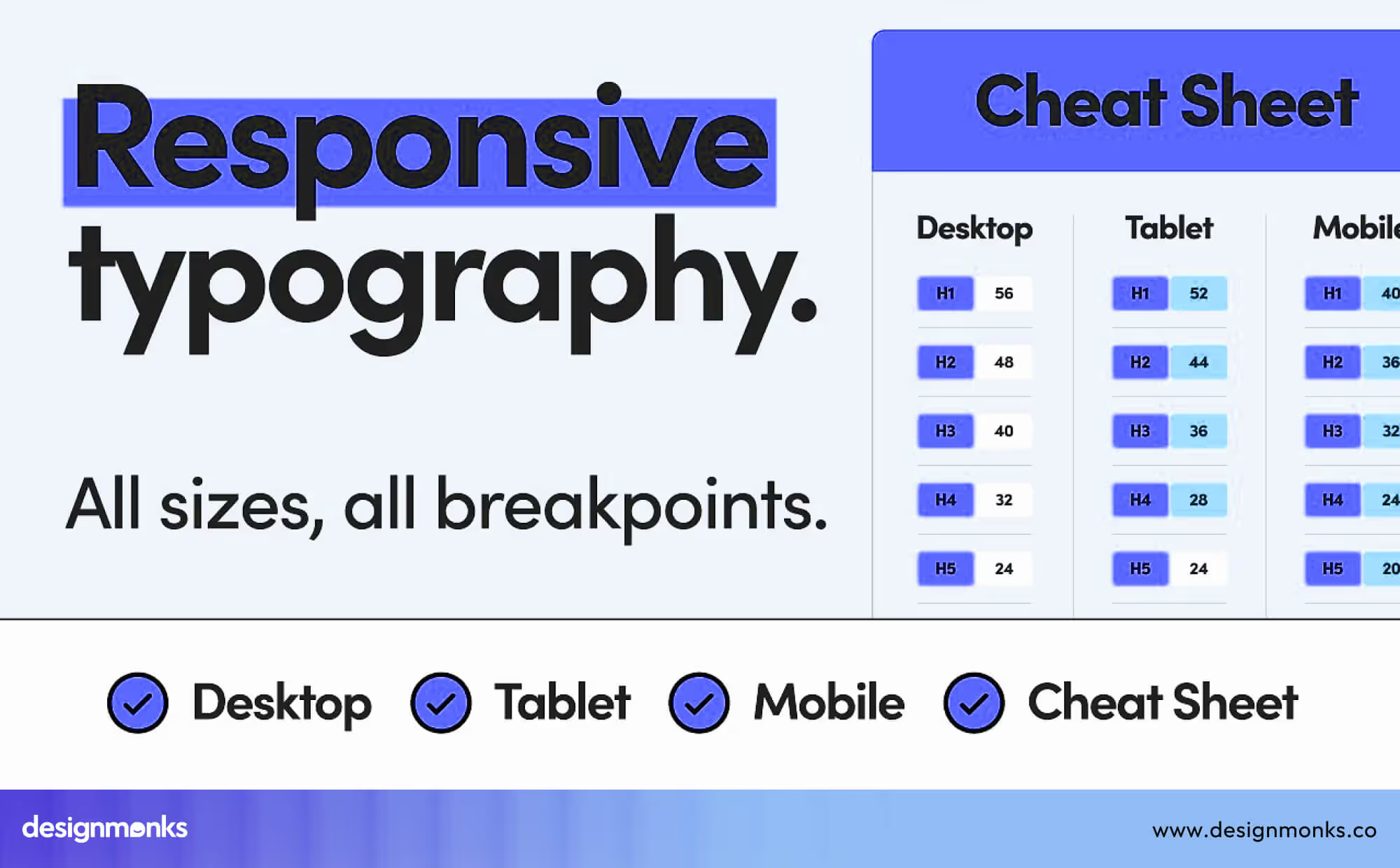
This trend is growing because it improves web performance. Websites load faster when they use fewer font files, which helps users on slow connections and mobile devices. Variable fonts also support accessibility, allowing text to become bolder or larger for people who need easier reading.
They save space, speed up websites, and make text comfortable to read on any device. This makes them one of the most practical and widely used typography trends today.
Expressive Serif Comeback (Modern Editorial Look)
Serif fonts are typefaces with small lines or strokes at the ends of letters. In 2026, these fonts are making a strong return, especially in editorial design such as news sites, blogs, and digital magazines. However, they now appear in a modern form with sharper details, higher contrast, and bolder shapes.
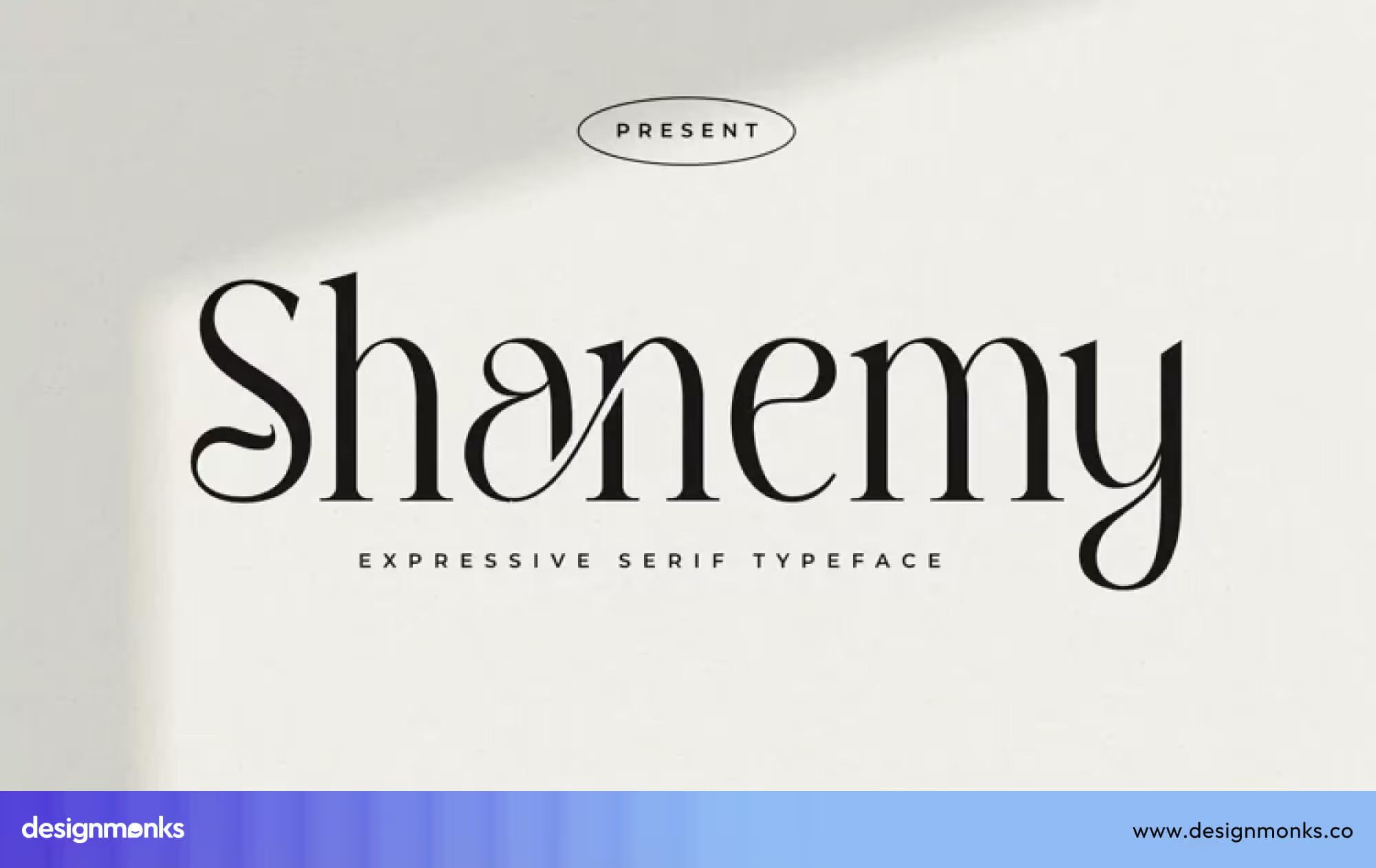
This comeback is happening because designers want text that feels both trustworthy and stylish. Serif typography is easy to read for long content and also adds a sense of quality and seriousness. Modern serif fonts mix classic structure with fresh proportions, making them feel current rather than old.
These expressive serif styles stand out because of their strong contrast between thick and thin strokes. This makes headlines look elegant and powerful, helping them catch attention while still feeling professional and clear.
Brutalist & Raw Typography for Brand Differentiation
Brutalist and raw typography uses imperfect, rough, or unconventional letterforms instead of polished, traditional fonts. This style is often found in experimental typography and brutalist design, where designers intentionally break rules to create a bold visual impact.
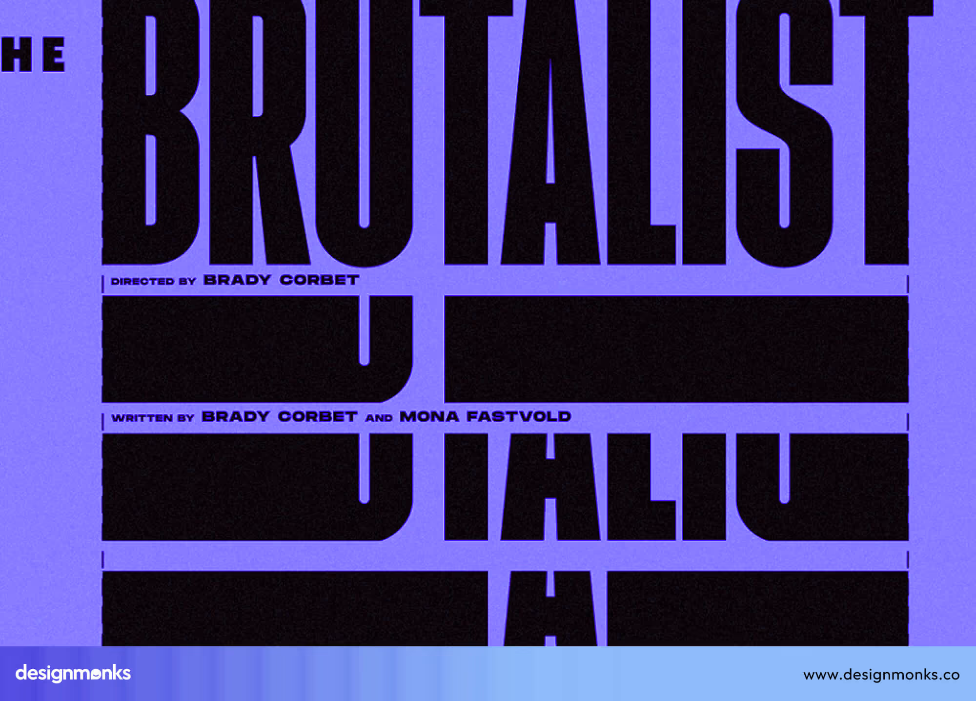
This trend is growing because brands want to stand out and communicate authenticity. Using raw typography signals honesty, confidence, and individuality. It is especially popular for startups, creative agencies, and edgy campaigns that want their brand to feel bold and different from competitors.
Brutalist fonts are eye-catching because their irregular shapes and heavy strokes grab attention immediately. In 2026, this style will remain popular as brands look for ways to create distinctive, memorable, and visually striking identities.
Retro-Futurism & Nostalgic Type
Retro-futurism and nostalgic typography blend design styles from the 1970s to 1990s with modern digital layouts. Designers use retro fonts with bold colors, geometric shapes, and vintage details while applying them in today’s websites, apps, and social media posts.

This trend is popular because audiences enjoy familiar, nostalgic styles that feel fresh when combined with modern design. It connects with current culture, including the return of 2000s fashion, retro music, and vintage visuals online.
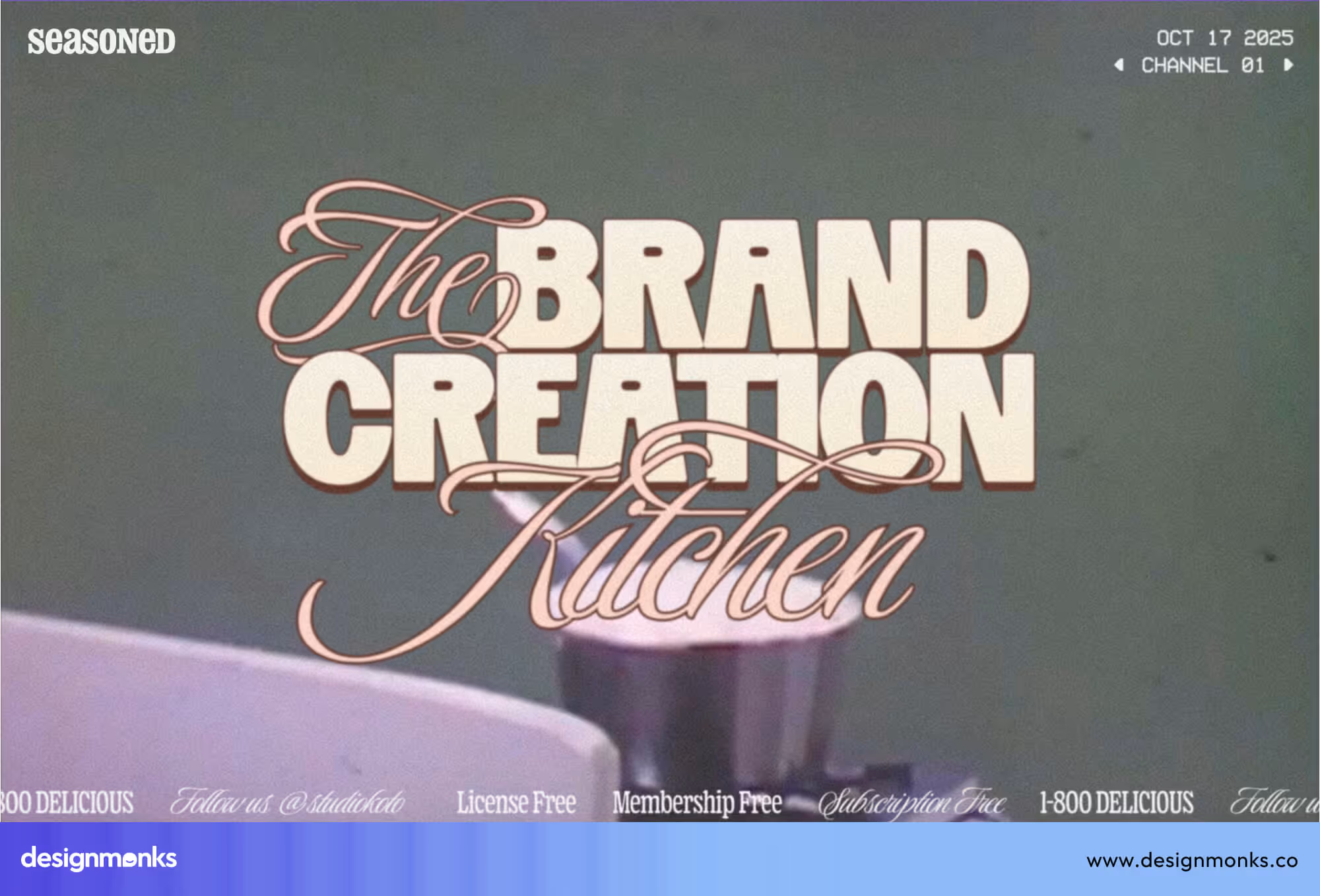
Retro-futuristic type is eye-catching because it combines recognizable, nostalgic shapes with bright, modern compositions. In 2026, it will remain popular as brands and designers aim to appeal to both memories and modern aesthetics.
Bold and Maximalist Typefaces
Bold and maximalist typefaces use large, heavy, and attention-grabbing letters. Headlines, landing pages, and ads often use this style to make messages instantly visible. This trend is growing because digital audiences have shorter attention spans. Bold type helps key messages stand out immediately, especially on social media, banners, and hero sections.
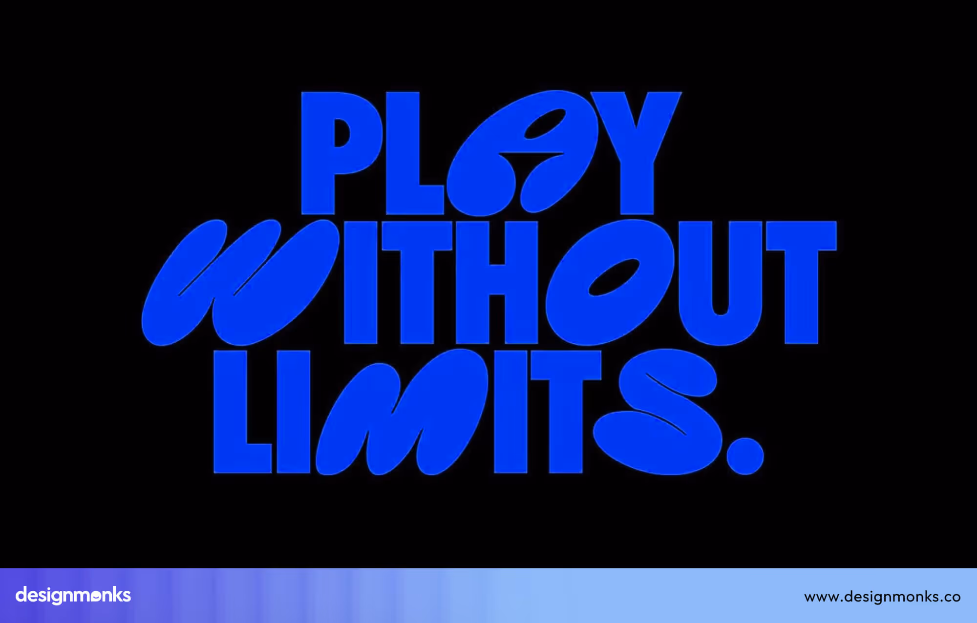
Maximalist typefaces are eye-catching due to their size, weight, and visual dominance. In 2026, these fonts will remain popular as designers look for ways to capture attention quickly in crowded digital spaces.
Experimental and Playful Letterforms
Experimental and playful letterforms break traditional rules of typography. Letters may be stretched, tilted, uneven, or unusually shaped. This style is often used in creative campaigns, branding, or social media graphics.
This trend is coming back because audiences appreciate unique, unconventional designs that stand out from standard fonts. Designers use these fonts to express creativity and make content feel fun and memorable.
These letterforms are eye-catching because they surprise the viewer and create a strong visual identity. In 2026, experimental typography will continue to grow as brands and designers push boundaries in visual storytelling.
3D and Dimensional Typefaces
3D and dimensional type adds depth, shadows, perspective, or lighting effects to letters, making them appear three-dimensional instead of flat. These fonts are commonly used in gaming, product launches, hero banners, social media graphics, and digital ads, where designers want text to feel more interactive and noticeable.
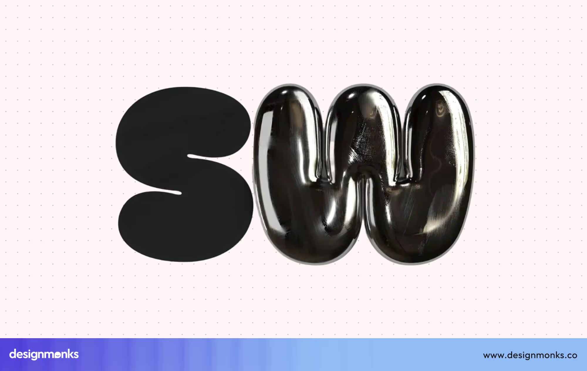
This trend is growing because modern screens, faster devices, and improved software allow designers to create complex, realistic text effects without slowing down performance. 3D type makes content feel immersive, engaging, and visually striking, helping headlines, logos, or calls-to-action stand out.
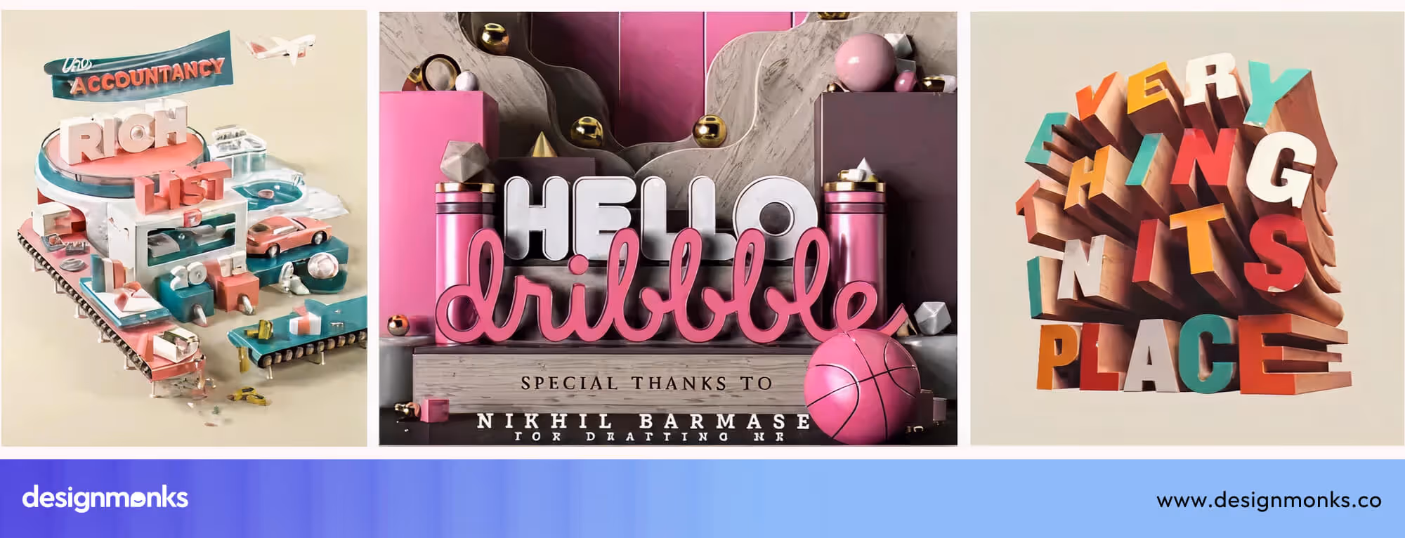
Dimensional typography is eye-catching because it creates a sense of physical space and movement. In 2026, it will remain popular as designers combine depth, texture, and shadow to make text bold, modern, and unforgettable across both digital and hybrid platforms.
Typography Trends by Use Case in 2026
Typography is used differently depending on the type of project or platform. In 2026, designers choose fonts based on the audience, purpose, and device to make text clear, readable, and visually appealing. Understanding how typography works in branding, digital products, and marketing helps create designs that are both functional and memorable:
Typography for Branding & Identity Systems
In 2026, brands will increasingly use custom typefaces to build recognition and maintain consistency across all platforms. Carefully chosen fonts help establish a brand’s personality, convey trust, and make content instantly identifiable.
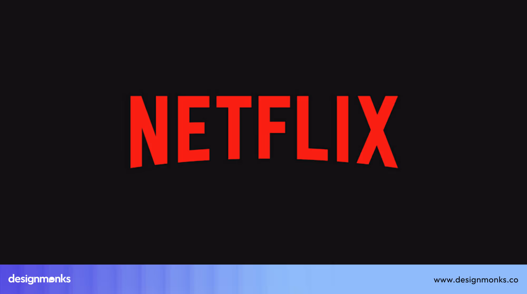
For example, Netflix uses a custom sans-serif system for its brand. Its primary font, Netflix Sans (by Dalton Maag), is used for UI and body text, while the logo employs a distinct custom wordmark similar to Sharp Sans or a modified Gotham. This ensures consistency across apps, websites, and marketing materials while keeping the logo visually unique.
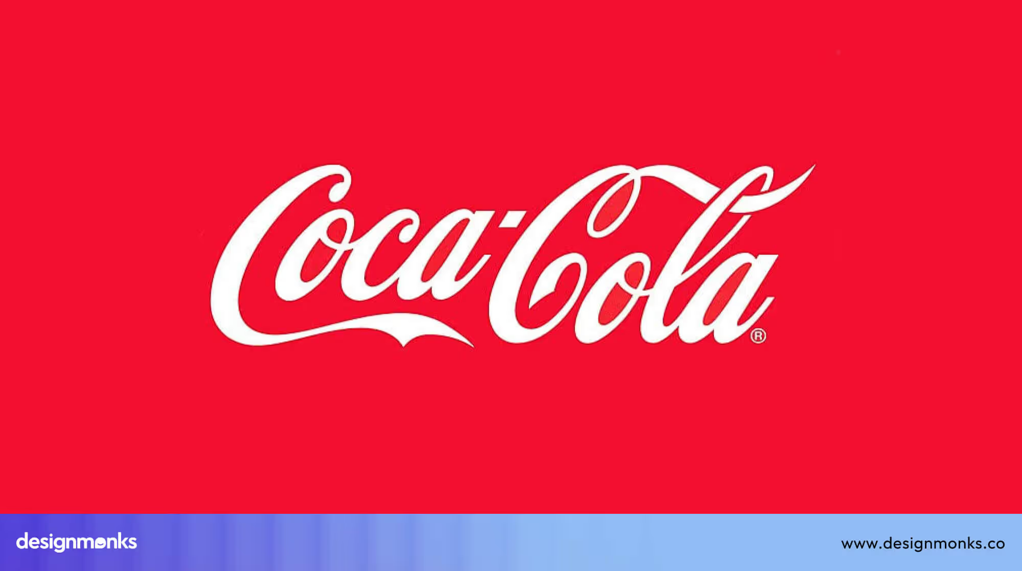
Similarly, Coca-Cola continues to use its classic Spencerian script for branding, packaging, and advertising to reinforce its iconic identity. Consistent type choices ensure that brand messages remain professional, clear, and instantly recognizable across all touchpoints.
Typography for UI/UX & Digital Products
In apps, SaaS platforms, and websites, typography prioritizes readability, accessibility, and flexibility. Designers often use variable fonts to adjust weight, size, and spacing depending on screen size or user preferences:
- Airbnb uses adjustable fonts in its app to maintain legibility on phones, tablets, and desktops.
- Google Workspace relies on clear, accessible type in Docs and Gmail to make navigation and reading easier for all users.
Good UI/UX typography improves comprehension, guides users through interfaces, and ensures digital products are usable for everyone. Accessibility features like clear letterforms and adjustable text sizes are key to this trend.
Typography for Marketing, Ads & Social Media
Marketing and social media typography focuses on bold, eye-catching fonts that communicate messages quickly to audiences with short attention spans. These fonts are often paired with motion or animation to increase engagement:
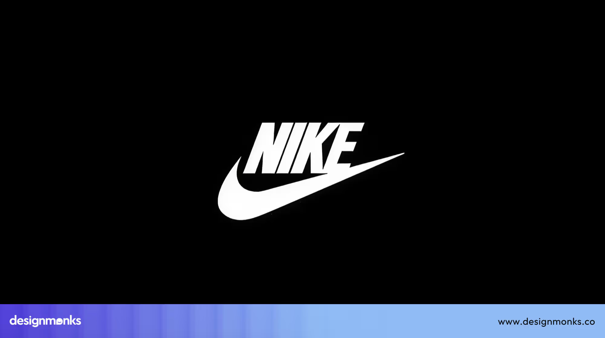
- Nike frequently uses bold, dynamic headlines combined with micro-animations in digital ads to emphasize product features and calls-to-action.
- Apple uses clean, large fonts in campaigns to clearly convey product benefits within seconds, ensuring key points are instantly visible.
Motion typography, like sliding, fading, or zooming letters, is also common on social media, helping text stand out in crowded feeds.
These approaches will particularly be popular in 2026 because digital audiences are scrolling faster and consuming more content on smaller screens. Bold, motion-friendly typography grabs attention immediately, improves message retention, and strengthens brand impact.
Tools & Technologies Driving Typography Trends
Typography trends in 2026 are shaped not only by creative ideas but also by the tools and technologies designers use. These tools make it easier to create fonts that are modern, responsive, and adaptable across different digital platforms.
- Figma: A popular design platform that allows designers to experiment with typography directly in digital layouts. Figma supports responsive design, real-time collaboration, and testing text across screens of different sizes.
- Adobe Fonts: Offers a large library of fonts that integrate with Adobe design tools. Designers can access high-quality typefaces quickly and apply them in web, app, or print projects.
- Variable Font Technology: A single font file can adjust weight, width, and style dynamically. This improves web performance, reduces load times, and allows typography to adapt smoothly across mobile, tablet, and desktop devices.
- AI Font Generators: Tools powered by artificial intelligence can generate new fonts automatically based on existing styles, user data, or brand requirements. These fonts can be adaptive, personalized, and highly experimental, giving designers more creative flexibility.
These technologies are essential for keeping up with typography trends in 2026. They allow designers to create fonts that are visually appealing, flexible, and functional, while also saving time and improving performance across websites, apps, and digital campaigns.
How to Use 2026 Typography Trends for Your Brand
Typography trends work best when they are used with purpose. You don’t need to follow every new font style just because it is popular. The real value comes from choosing the trends that fit your brand’s personality and message, then using them in the right places. When typography supports what your brand wants to say, it feels natural and professional instead of forced.
Pick one main trend to focus on
Choose one typography style that clearly matches your brand voice. For example, clean and flexible variable fonts work well for tech and business brands, while bold, 3D, or expressive serif fonts suit creative, media, and lifestyle brands. Focusing on one main trend keeps your look consistent and easy to recognize.
Use it across all brand touchpoints
Once you select your typography direction, apply it everywhere your logo, website, social media posts, ads, and presentations. Consistent font use builds trust and helps people remember your brand faster.
Balance style with readability
Trendy fonts should catch attention, but they must stay easy to read. Use eye-catching or decorative fonts for headlines and key messages, and keep simple, clear fonts for long text. This way, your design looks modern without tiring the reader.
Check how it looks on different screens
Fonts can appear different on mobile, tablet, desktop, and even print. Always test your typography at different sizes to make sure spacing, contrast, and clarity stay good everywhere.
Mix trends with care
You can combine styles if it makes sense. For example, pair bold headings with clean body text, or use a touch of motion typography with simple layouts. When mixed thoughtfully, trends add character without making the design feel crowded or confusing.
Common Typography Mistakes to Avoid in 2026
Even the best typography trends can fail if they are used the wrong way. Avoid these common mistakes to keep your designs clear, fast, and easy to read:
- Using too many typography trends on one page can make the design look crowded and confusing instead of modern.
- Choosing decorative fonts that are hard to read can frustrate users, especially on small screens.
- Ignoring accessibility, contrast, and proper font size can make text difficult to see for many people.
- Not knowing the smallest readable font size is a common mistake in modern web design. It can make text hard to read on small screens and for users with vision difficulties.
- Using too many font styles or weights can break visual consistency and weaken brand identity.
- Selecting heavy font files can slow down your website and harm user experience.
- Forgetting to test typography on mobile and responsive screens can lead to poor readability across devices.
FAQs About Typography Trends 2026
Will AI replace type designers?
AI will not replace designers, but it will help them work faster. AI can generate font styles and test layouts, but human designers still make creative and emotional decisions.
Are serif fonts good for websites in 2026?
Yes, Serif fonts are good for websites in 2026. Modern serif fonts are designed for screens and are easy to read. They are popular for blogs, news sites, and premium brands.
What typography trends improve accessibility?
Variable fonts, high-contrast text, simple letter shapes, and responsive typography improve readability. These trends help users on different devices and with different vision needs.

.avif)
.avif)
.avif)
.avif)


.avif)
.avif)
.avif)
.avif)


.avif)


