
.svg)


Key Takeaways
- Font size depends on platform, typeface design, and real-world readability limits.
- Eight points is generally the smallest comfortable size for regular reading.
- Different fonts appear larger or smaller even at identical point sizes.
- Condensed and narrow fonts help save space without extreme size reduction.
- Always balance space-saving needs with accessibility, contrast, and user comfort.
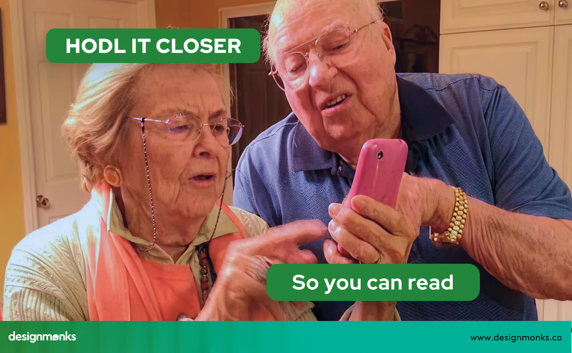
Sometimes, you just need to fit more into a small space, whether it's a label, a business card, or a tightly formatted report. That’s when people start searching “what is the smallest font?”
The answer varies depending on where you’re going to be using that font. It can be 6pt(points), 8pt, or something else, depending on whether you use it on Microsoft Word, Google Docs, or any other application.
If you're trying to figure out how small you can go without sacrificing clarity, you're in the right place. Learn how font sizes are measured and what that means for your design.
Keep on reading to find out more!
Understanding Font Sizes: What Does “Smallest Font” Mean?
Font size is measured in points, but not all fonts appear the same at the same size. Keep reading to learn how this affects readability and which sizes actually work best in real-world use:
How is Font Size Measured?
Font size is most commonly measured in points (pt), a standard unit in typography. One point is equal to 1/72 of an inch. So, A 12 pt font is about 1/6 of an inch from the top of one letter to the bottom of the lowest part.
This system helps maintain consistency across print and digital formats. But actual appearance can vary depending on the font style and platform.
In terms of millimeters and pixels, an 8 pt font is roughly equivalent to 2.82 mm in height and displays at around 11 pixels on a standard screen.
However, pixel size can change based on screen resolution and zoom settings, so a font that looks readable on one monitor may appear too small on another.
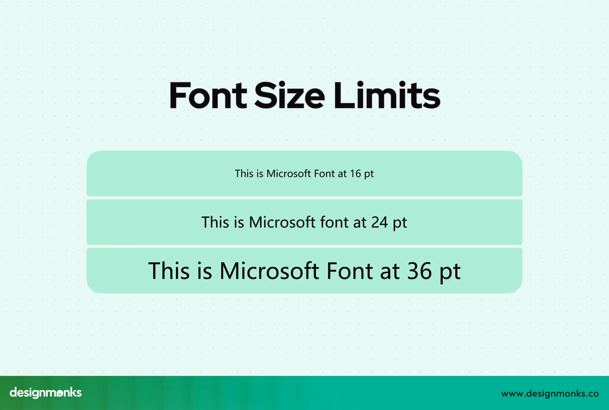
It’s also important to understand the difference between font size and perceived size.
Even when two fonts are set to the same point size, they might not look the same. That’s because each font has unique design traits, such as x-height, stroke thickness, and spacing. These factors affect how large or small it appears.
Image 03 : Font sizes at the same pt
For example, Verdana often looks larger than Times New Roman at the same size, while fonts like Arial Narrow may appear more compact.
Practical Limits of Font Sizes
Most word software, like Microsoft Word and Google Docs, lets you type in font sizes as low as 1 pt. That size is generally unreadable, which makes it impractical for real-world use.
When it comes to readability, most people find 8 pt to be the smallest size that's comfortable to read, especially for longer blocks of text. While 6 pt might be used occasionally for things like footnotes, disclaimers, or labels, it can be difficult to read and is best avoided for anything that needs to be read clearly or for extended periods.
Smallest Fonts in Common Applications
When working in Word or Google Docs, using the smallest possible font isn’t just about shrinking numbers. It’s about finding fonts that stay readable while saving space.
Here’s what you should know about minimum font sizes and space-saving font options in each tool:
Microsoft Word
You can technically type in a size as small as 1 pt in Word, but it’s nearly invisible and unusable for practical purposes. Realistically, 6 pt to 8 pt is the lower limit for readability.
Space-Saving Font Options:
- Arial Narrow: One of the most compact and efficient fonts. Its narrow design helps conserve horizontal space.
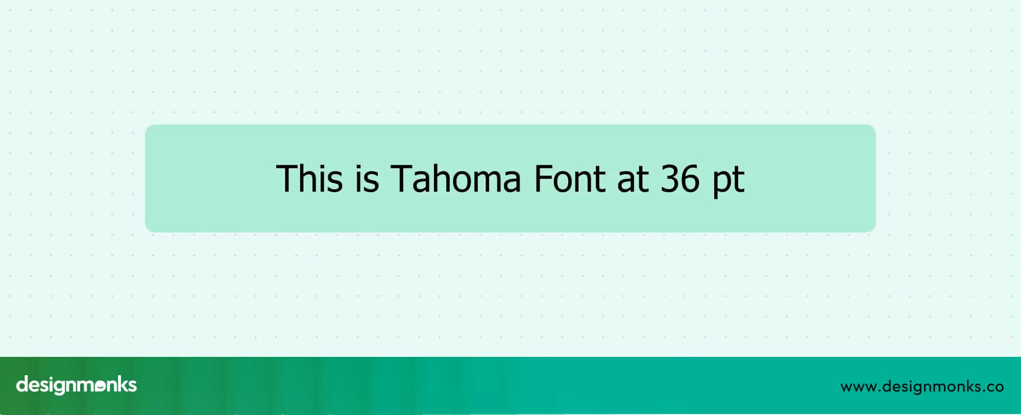
- Tahoma: Clean and readable even at smaller sizes. This makes it a solid choice for dense content.
- Times New Roman: A traditional serif font that’s space-conscious, though not as compact as the sans-serif alternatives.
Smallest Practical Font Styles: While you can use any font at 1 pt, Arial Narrow or Tahoma at 6–8 pt tend to be the most readable and space-efficient for real use.
If you're working with standard sizes(12 or 11 pt) but still want a tighter look, fonts like Arial Narrow, Roboto Condensed, or Verdana Narrow appear more compact than typical fonts like Calibri or Georgia.
Google Docs
Google Docs allows manual entry of sizes down to 1 pt (even though the dropdown starts at 8 pt), but not all fonts support smaller sizes well. Like Word, 8 pt is generally the smallest size that's still readable.
Best Fonts for Tight Spaces:
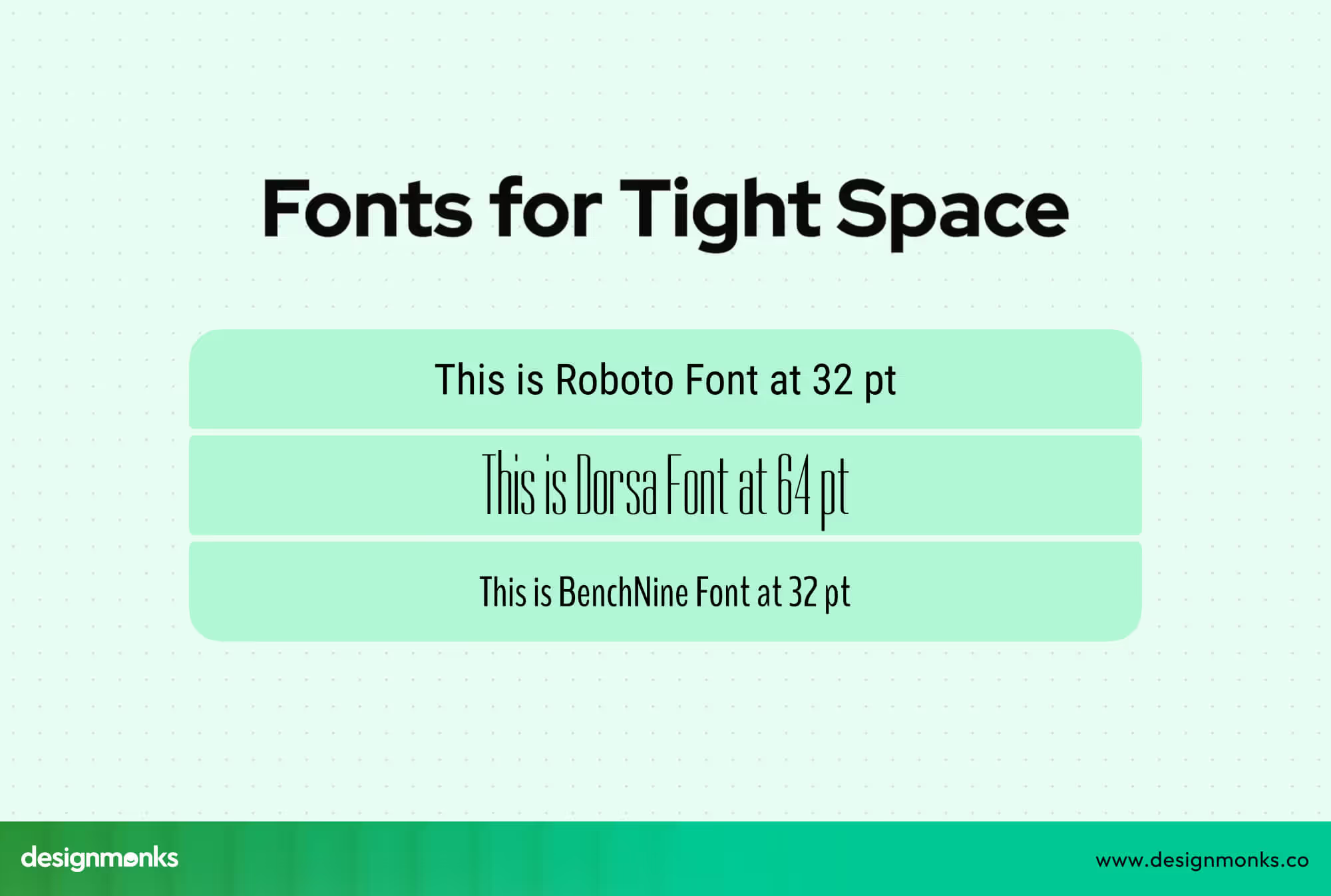
- BenchNine: Lightweight and modern, it reads well at smaller sizes.
- Roboto Condensed: Designed for space efficiency, great for dense layouts.
- Dorsa: Has a slim, compact style that appears smaller than other fonts at the same point size.
Just like in Word, font design affects how large or small it looks at the same point size. Some fonts, such as Dorsa, appear significantly smaller due to their narrow construction.
Readability and Usability of Small Fonts
When working with limited space or designing compact layouts, it's important to understand how small you can go with font sizes without sacrificing readability. Let’s take a closer look at what counts as the smallest usable font and the factors that influence how legible it actually is:
What Is the Smallest Readable Font Size?
For most readers, 8 pt is considered the minimum comfortable size for body text. It's widely used in both digital and printed formats when space is limited, but readability still matters.
In professional print, you’ll sometimes find 6 pt used for fine print, footnotes, or disclaimers, areas where the text is secondary and doesn't require prolonged reading.
Even smaller, about 5.5 pt has a historical place in newspapers for listing dense information like stock quotes or sports scores. While technically readable, fonts below 6 pt are rarely used in everyday documents due to the strain they place on the eyes.
Factors That Affect Readability
Several elements influence how easy or difficult it is to read small fonts. Both design and environmental conditions can play a role. Key factors are:
- Font weight: Bolder fonts maintain clarity better at smaller sizes.
- Typeface style: Sans-serif fonts like Arial and Tahoma tend to look cleaner at small sizes than serif fonts, which can appear crowded.
- Lighting conditions: Good lighting improves readability, while dim or uneven lighting makes small text harder to see.
- Eyesight: Individual visual ability affects how small a font can be before it becomes uncomfortable to read.
- Medium (screen vs. print): Fonts may render differently on screens due to resolution and anti-aliasing. This affects how sharp or clear they appear.
Font Styles That Appear Smaller Than Others
Some fonts naturally appear smaller or more compact than others, even when set to the same point size. Understanding these visual differences can help you choose fonts that save space without sacrificing clarity.
Fonts That Look Smaller at the Same Point Size
Not all fonts are created equal in terms of visual size. For example, Times New Roman at 12 pt appears noticeably more compact than Verdana at the same size due to its tighter letterforms and narrower spacing.
According to some users, Arabic Typesetting at 11 pt even resembles Times New Roman at 7.5 pt. This makes it an option for extremely space-conscious layouts, though it's not always ideal for readability.
Pixel Fonts and Monospaced Fonts
Pixel and monospaced fonts are specifically designed for clarity in technical settings. They are particularly useful in UI design and coding environments where alignment, consistency, and space efficiency are crucial.
Fonts like Perfect DOS VGA 437 and Proggy Clean are excellent examples. They maintain sharpness and character distinction even at very small sizes, making them practical choices for screen-based text and system interfaces.
Fonts That Take Up the Least Space
When you're working with limited layout space, like in forms, tables, or labels, using fonts that are naturally more compact can help you fit more content without shrinking the font size too much.
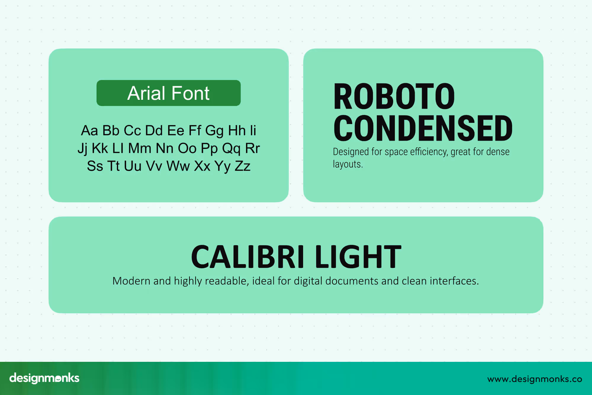
Arial Narrow, Roboto Condensed, and Calibri Light are among the top choices when you need to conserve horizontal space. Their slimmer letterforms and tighter spacing make them ideal for layouts that require clean, condensed formatting without sacrificing too much readability.
On the other hand, it's important to recognize that the effectiveness of space-saving fonts can vary depending on the medium.
While these compact fonts are helpful in conserving space, they may also impact readability. Especially in printed materials, where resolution and ink spread can blur thin letterforms.
In digital settings, screen resolution and rendering improve clarity, but even then, it's essential to balance tight spacing with comfortable readability.
Industry Guidelines for Small Fonts
Understanding industry standards can help ensure that your use of small fonts meets both practical and legal requirements while maintaining readability.
Brochures and Business Cards
For marketing materials like brochures and business cards, a font size of 10 to 11 points is generally recommended to maintain clear and professional text.
Image 09: Font Compare
Clean, sans-serif fonts such as Arial and Helvetica are often preferred in these formats. Because they offer excellent legibility, even at smaller sizes. This makes sure your message is easy to read.
Legal and Packaging Requirements
In regulated industries, font size requirements are stricter. For example, agencies like the FDA often require a minimum font size of 6 points on product labels and packaging to guarantee that important information is accessible to consumers. Compliance with these standards is essential to meet legal obligations and avoid penalties.
APA and Other Style Guides
Academic and professional writing follow specific style guidelines, such as those set by the APA. This style guide mandates the use of Times New Roman at 12 points.
This highlights the priority given to readability and consistency in scholarly documents.
If you're interested in a similar topic, you can also enjoy our blog on Spotify's new font.
Expert Tips on Choosing and Using Small Fonts
When selecting and using small fonts, thoughtful design and accessibility considerations are key to maintaining readability and a positive user experience:
Use Sparingly: Reserve small fonts for footnotes, disclaimers, or captions only.
Avoid Main Text: Don’t use small fonts for primary content to keep it clear.
Adjust Letter Spacing: Increase tracking to prevent crowded letters.
Boost Contrast: Ensure strong text-background contrast for better visibility.
Follow Accessibility: Adhere to WCAG guidelines for contrast and scalability.
Test Widely: Check readability in various lighting and on multiple devices.
Design Inclusively: Consider diverse vision needs and assistive technology users.
Frequently Asked Questions
What is the smallest font size I can use for print?
The smallest font size you can use for print is typically 6 pt, but for better general readability, 8 pt is usually safer.
What font is most readable at small sizes?
The font most readable at small sizes is generally a sans-serif font, with Verdana and Tahoma being well-known for their clarity when used in smaller sizes.
Is 6pt font readable?
A 6 pt font can be readable depending on the specific font style and the quality of printing. But it is generally considered the lower limit for readability.
What is the narrowest font in Word?
Arial Narrow is one of the narrowest and most compact fonts available in Microsoft Word.
Can I make a font smaller than 1pt?
In standard word processors, font sizes smaller than 1 pt are not supported, though some graphic design software might allow sizes smaller than 1 pt.
What's the best font for fitting more text in limited space?
The best fonts for fitting more text in limited space include Arial Narrow, Roboto Condensed, and Calibri Light, as they are designed to be space-efficient.
Conclusion
That wraps up our discussion on what’s the smallest font size you can use effectively. While tiny fonts can save space, the key is balancing size, style, and readability.
Generally, 6–8 pt is the practical limit, with font choice playing a big role. Always prioritize clear, accessible text to ensure your message is both seen and understood.
Until next time!

.avif)
.avif)
.avif)
.avif)


.avif)
.avif)
.avif)
.avif)


.avif)


