.svg)


Key Takeaways
- Choose fonts that are clear, readable, and user-friendly on screens.
- Use two fonts maximum for headings and body text consistency.
- Match font style with brand voice for a cohesive user experience.
- Test fonts across platforms, sizes, and real UI scenarios.
- Variable fonts improve performance and provide flexible design options.
Fonts may look small on a screen, but they carry big power. The right choice can make an app or website easy to read and friendly to use. The wrong one can confuse users and push them away.
That is why picking the right typeface matters in every product.
Good fonts for UI design do more than just look nice. They guide the eyes, create emotions, and help people feel at ease while using a product. A clean font can make a screen simple, while a messy one can slow users down. Fonts have taken a central role in making apps and websites usable for everyone.
In this blog, I’ll introduce the top 10 fonts for UI design in 2026. This list will help you find fonts that are modern, readable, and ready for future trends.
What Makes a Good UI Font?
A good UI font is one that stays clear, readable, and friendly on every screen size. If you want to know what makes a font work well in design, check the points below.
- Clear readability: A good UI font is easy to read on both large and small screens. Letters should not look too close or too thin.
- Simple letter shapes: Fonts with clean and simple shapes prevent confusion. It must have legibility. For example, the letter “I” and the number “1” should not look the same.
- Different weights and styles: A font family should have options like bold, medium, and light. This makes it easier to use the same font for titles, menus, and body text.
- Accessibility support: Some users have vision problems. Fonts should have enough space and clear forms to support them. This makes apps more inclusive.
- Consistent look: Fonts must stay balanced in all sizes. A font that looks nice in a heading should also stay readable in small buttons.
- Multilingual support: Many products serve people across the world. A strong UI font should support different languages and symbols.
- Good performance: Fonts must load fast like the new Spotify font. Heavy or slow fonts can affect the speed of a website or app.
Top 10 Fonts for UI Design: Quick Overview
Not all fonts are built the same, and some work better for screens than others. Check out this quick comparison of Mona Sans, Figtree, and Lato to see which one fits your UI design needs best:
10 Best Fonts for Ui Design
Fonts like Inter, DM Sans, and Satoshi have become favorites because they work well on screens and adapt to many styles. Keep reading to learn more about each of the top fonts.
1. Inter
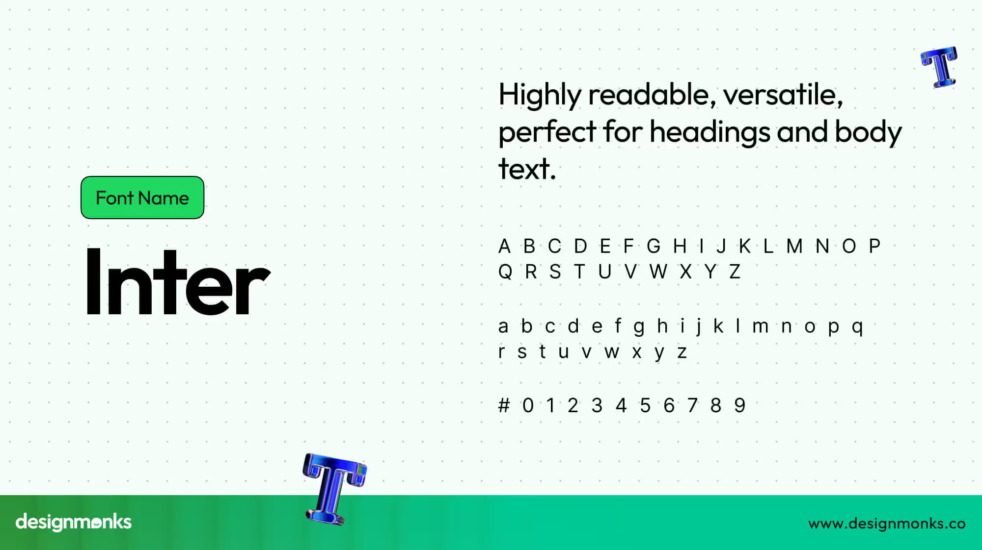
Inter is a sans-serif font designed for digital screens. It has nine weights with italics and a variable version, making it versatile for headings and body text. Its large x-height improves readability, and it is open-source and completely free, created by Rasmus Andersson specifically for UI design.
2. DM Sans

DM Sans is a geometric sans-serif with low contrast and a variable version. It was made for small font text in interfaces to improve readability on tiny labels or menus. Commissioned by Google, it supports Latin and extended glyphs. Its simple, clean design makes it ideal for startup apps and digital products.
3. Satoshi
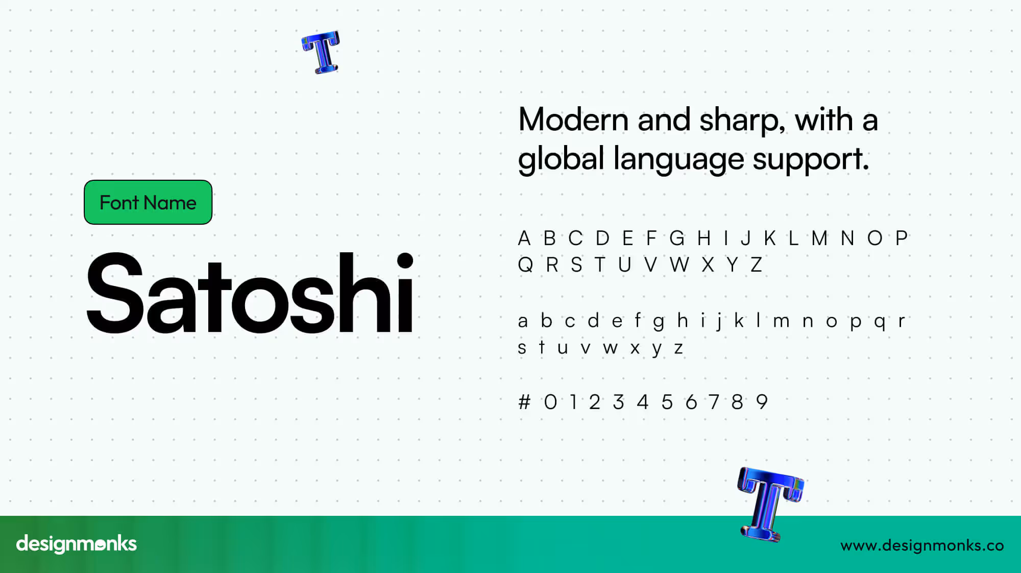
Satoshi is a modernist geometric sans-serif font with 10 static and 2 variable styles. It combines Grotesk and geometric influences. This font usually offers a sharp, modern personality.
It supports around 135 languages, and it’s completely free for personal and commercial use. Undoubtedly, Satoshi is a flexible choice for global UI projects.
4. Mona Sans
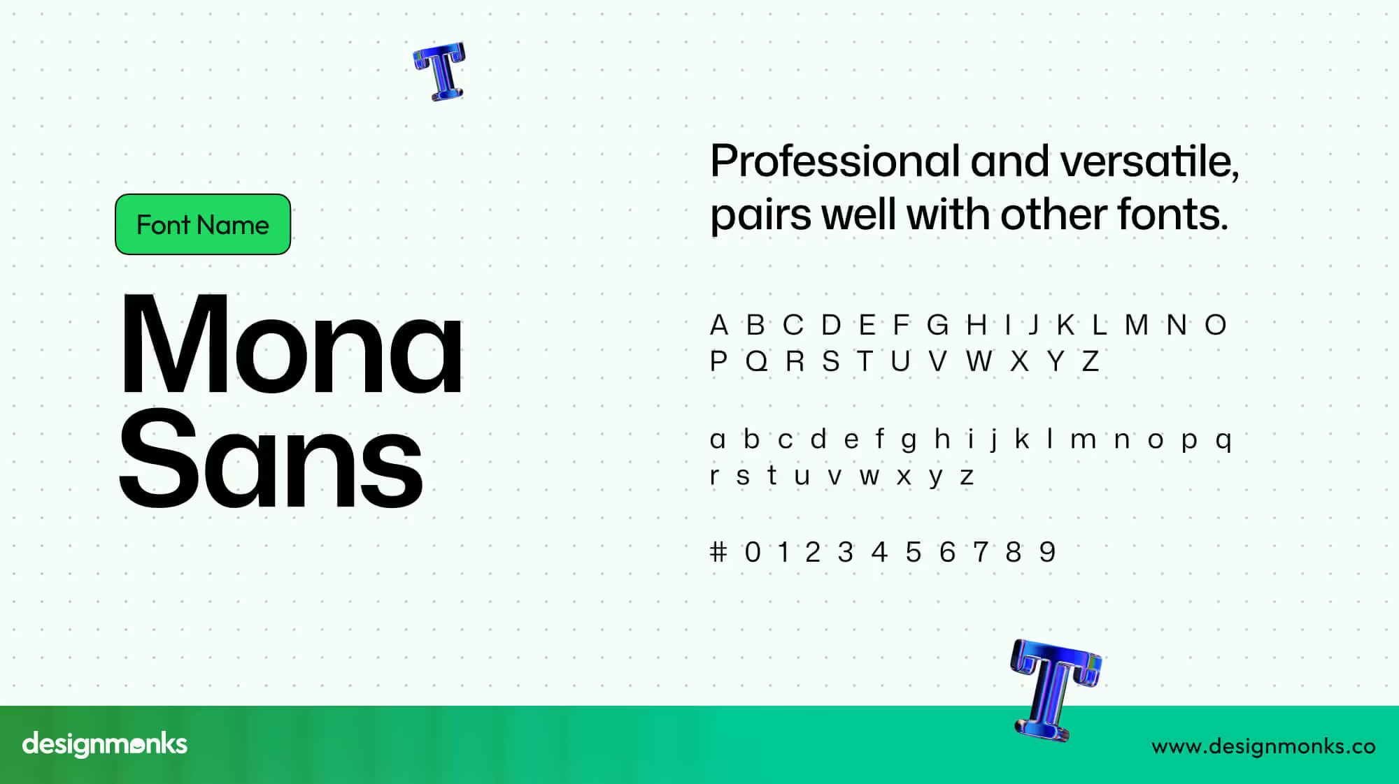
Mona Sans is a Grotesque-inspired font with 24 styles and variable axes, including weight, width, and slant. Its industrial-era design feels versatile and professional, pairing well with Hubot Sans. Released by GitHub in 2022, it is open-source and free, suitable for modern apps and dashboards.
5. Public Sans
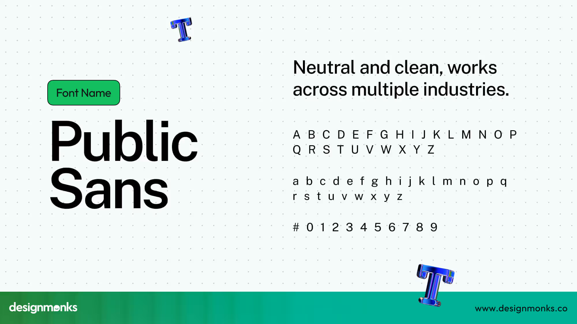
Public Sans is a neutral sans-serif font with a variable version. Designed for the U.S. Web Design System, it has a similar size to Apple’s SF Pro.
Its neutral look works across industries. Public Sans is a great choice for government, education, or corporate apps. It is based on Libre Franklin and open-source.
6. Switzer
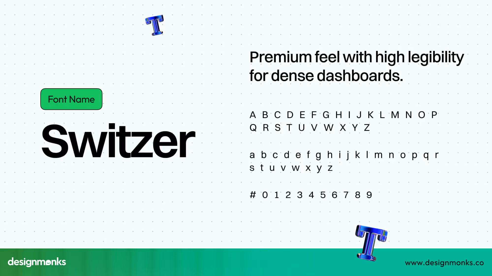
Switzer is a neo-grotesk sans-serif font with 18 styles. Its high x-height of 79% improves legibility on data-heavy dashboards. It feels modern and premium, originally called “Volkart” and relaunched on Fontshare. Free for personal and commercial use, it is perfect for tech-focused products.
7. Geist Sans
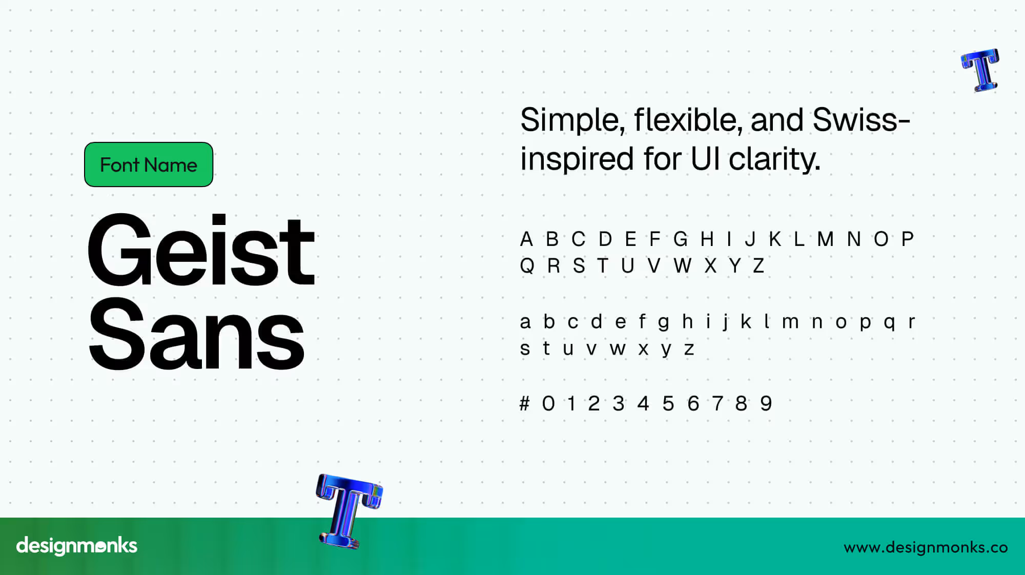
Geist Sans is a geometric sans-serif developed by Vercel. It has both variable and fixed weights and a simple Swiss-inspired design. Geist works well for UI text and display sizes. With nine weights and open-source availability, it is a flexible and reliable choice for web and mobile interfaces.
8. Space Grotesk
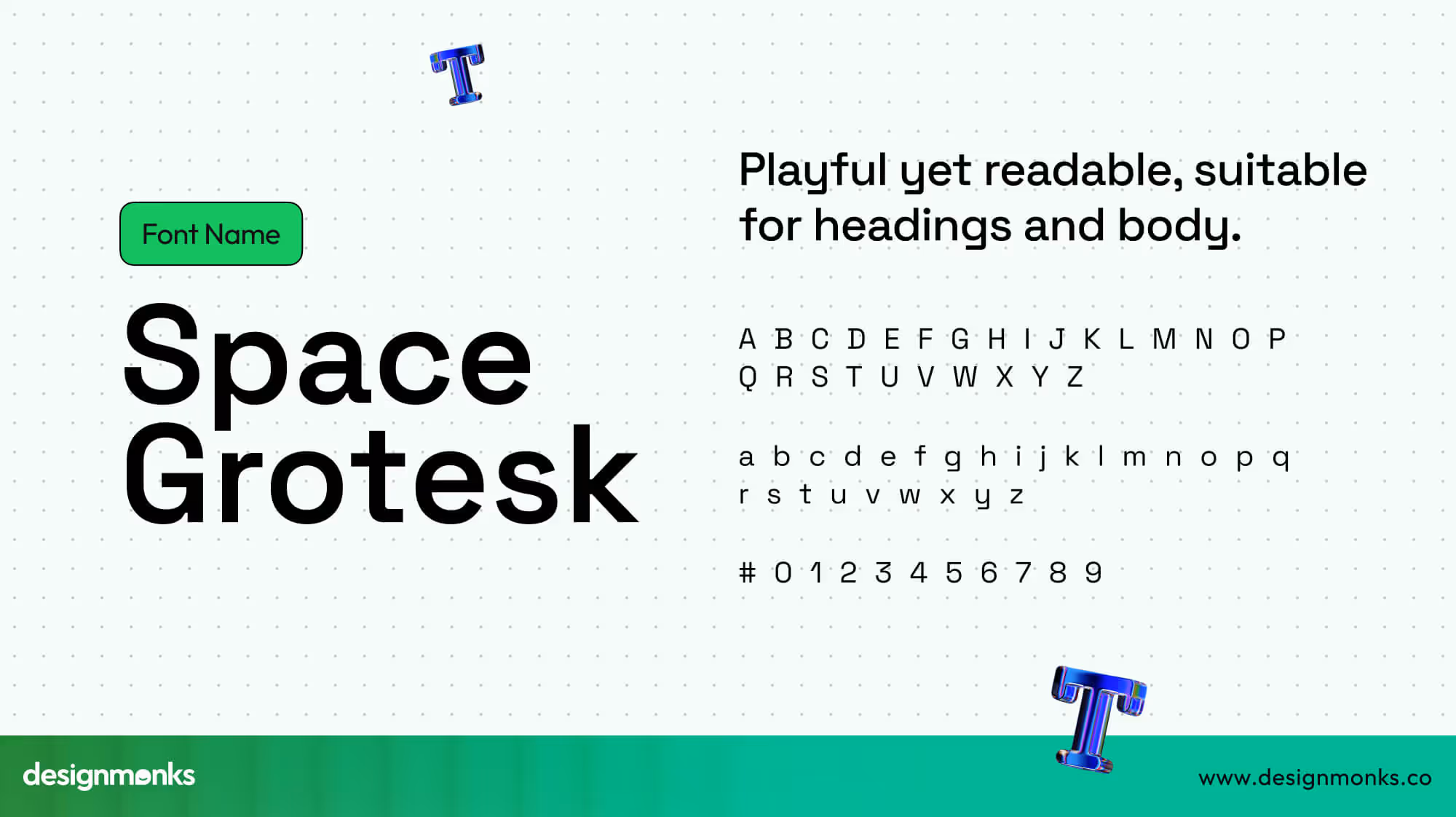
Space Grotesk is a proportional sans-serif based on Space Mono. It keeps quirky monospace details while improving readability for non-display text. Free and versatile, it works for headings, body text, and interface elements. It simply gives products a modern and slightly playful touch.
9. Figtree
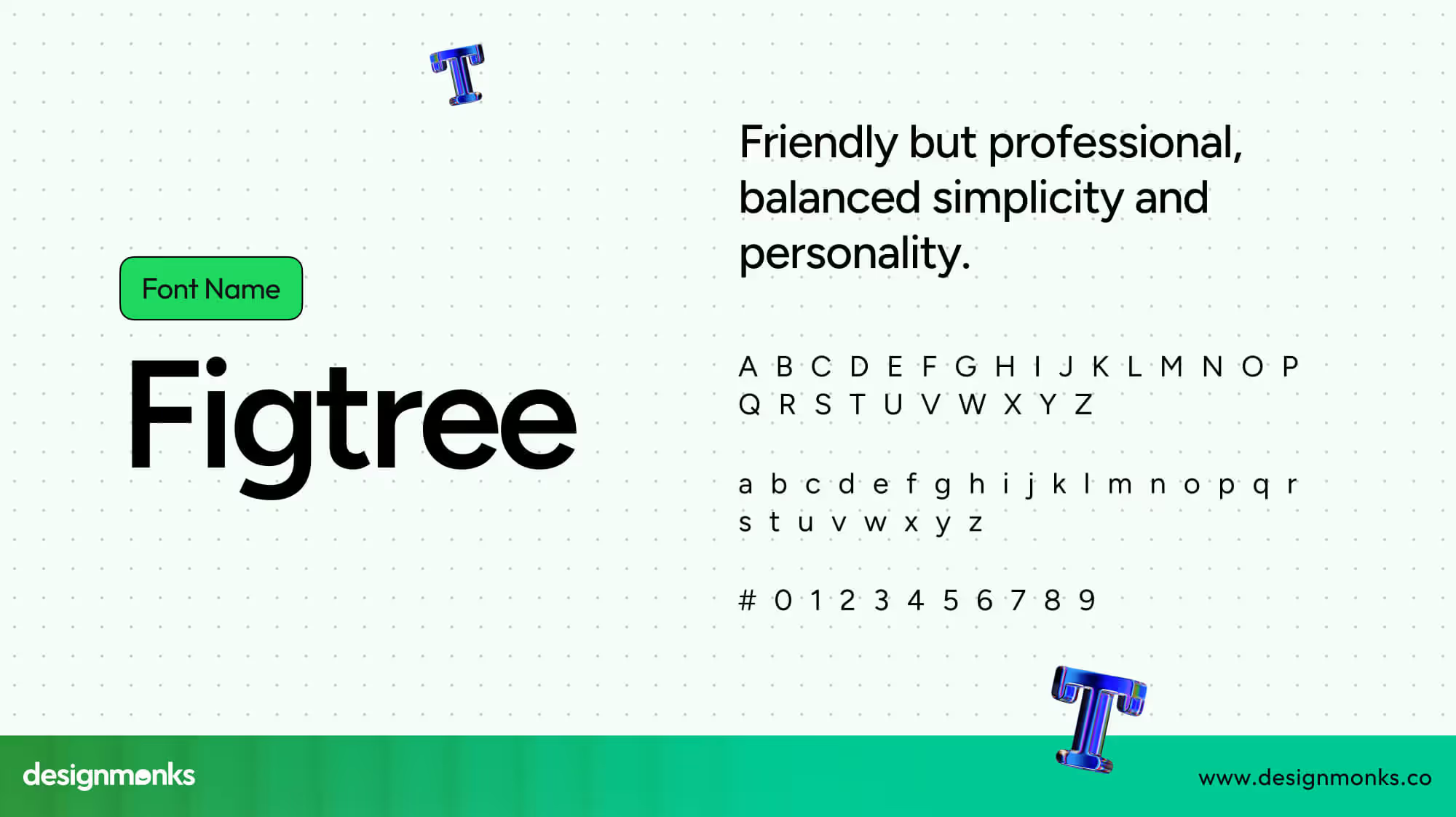
Figtree is a minimal geometric sans-serif with seven variable weights. Its curved letters like “y,” “f,” and “t” give a friendly but professional feel. It supports over 280 languages and was commissioned by Google. Free and readable, it balances simplicity and personality in UI design.
10. Lato

Lato is a humanist sans-serif with over 10 styles. It's a comprehensive family that supports uppercase, lowercase, numerals, and extended punctuation.
Also, Lato covers over 178 languages. Sleek and versatile, this font works well in apps and is included in Figma’s official font pairings, making it easy to use for UI projects.
How to Choose the Right Font for Your Product
A good font makes your product easy to read and helps users feel comfortable. The wrong font can confuse people or make your app look unprofessional. Here are key points to pick the right typeface.
Consider Platform
Different platforms have different default behaviors and styles. iOS, Android, and web apps each have their own system fonts and text scaling, so your font should work well across all of them.
A font that looks perfect on iOS may appear cramped on Android or small screens. Testing on each platform ensures your text remains readable and consistent everywhere.
Consider Audience
Think about who will use your product. Elderly users or people with vision difficulties need fonts with a larger x-height and more spacing between letters.
Choosing the right font for your audience reduces eye strain and makes reading comfortable. Small adjustments in spacing or weight can make a big difference for accessibility.
Consider Brand Voice
Fonts also communicate your product’s personality. Neutral fonts work for general or professional apps, friendly fonts suit casual apps, and luxury fonts give a high-end feel.
Matching font style with brand voice creates a cohesive experience. Users will connect better with a product that “feels right” through its typography. That’s why it’s important to work with a reliable logo and branding service provider like Design Monks.
Test Checklist
Always test your font in real scenarios. Check for proper contrast, scaling on different devices, truncation of long text, numeric table clarity, and support for right-to-left (RTL) languages.
A font may look good in design files, but testing ensures it works in actual UI conditions. Following a checklist avoids readability problems and makes your product usable for everyone.
Look for Font Flexibility
Good fonts come in multiple styles, like bold, medium, or light. This helps use one font for headings, body text, and captions. Flexibility keeps your design consistent. One font family can handle all text needs without looking messy.
Keep Performance in Mind
Heavy fonts can slow down apps or websites. Light, well-optimized fonts load faster and improve user experience. Balancing style and speed is important. A beautiful font is only useful if it works quickly and smoothly.
Tips for Font Pairing for UI
Fonts are like teammates. They don’t have to look the same, but they must work well together. Pairing the right fonts creates harmony, improves readability, and keeps your design consistent across all screens.
Contrast Without Conflict
Pairing fonts works best when there’s contrast, but not chaos. For example, a bold sans-serif heading with a clean serif body text can balance modern and classic styles.
Always check how they look together in real UI elements like buttons, menus, and tooltips. Sometimes a combination that looks good in theory feels heavy or awkward in practice. Testing in context helps you maintain a contrast-friendly design, not a distracting one.
Keep the Mood Consistent
Every font has a personality: serious, playful, or luxurious. Mixing a fun, round font like Comic Neue with a strict serif like Times New Roman feels confusing. Instead, keep both fonts aligned with your product’s brand voice so the mood stays consistent across the interface.
Mood consistency also helps users trust the design. If your headings are casual but the body text feels corporate, people sense the disconnect. Stick to fonts that reinforce one shared vibe.
Limit the Number of Fonts
Too many fonts in one design is like having too many DJs at a party; everyone fights for attention. Ideally, stick to two fonts: one for headings and one for body text. This approach keeps the design clean and avoids unnecessary distractions.
If you do use a third font, give it a clear purpose, like numeric tables or tiny captions. That way, your typography system feels intentional, not messy.
Use Hierarchy for Clarity
Fonts should guide the eye by creating a clear hierarchy. Headings need weight and presence, body text should be calm and readable, and captions or hints can be lighter. Each layer supports the other so users instantly know what’s most important.
Don’t rely only on size differences. Use weight, letter spacing, and style variations to make hierarchy visible even at a glance.
Play With Serif and Sans-Serif
One of the most reliable combos is serif + sans-serif. For example, a geometric sans-serif heading paired with a humanist serif body feels natural yet stylish. The serif adds warmth while the sans-serif brings modern clarity.
Still, experiment within limits. A pair that feels exciting in a landing page might be too much for a data-heavy dashboard. Adapt the serif-sans formula to your product’s actual use case.
Typography Trends in 2026 for UI Designers
Typography trends in 2026 are all about making digital experiences more human, inclusive, and adaptable. Designers are combining aesthetics with functionality to create type systems that work beautifully across platforms, audiences, and cultures.
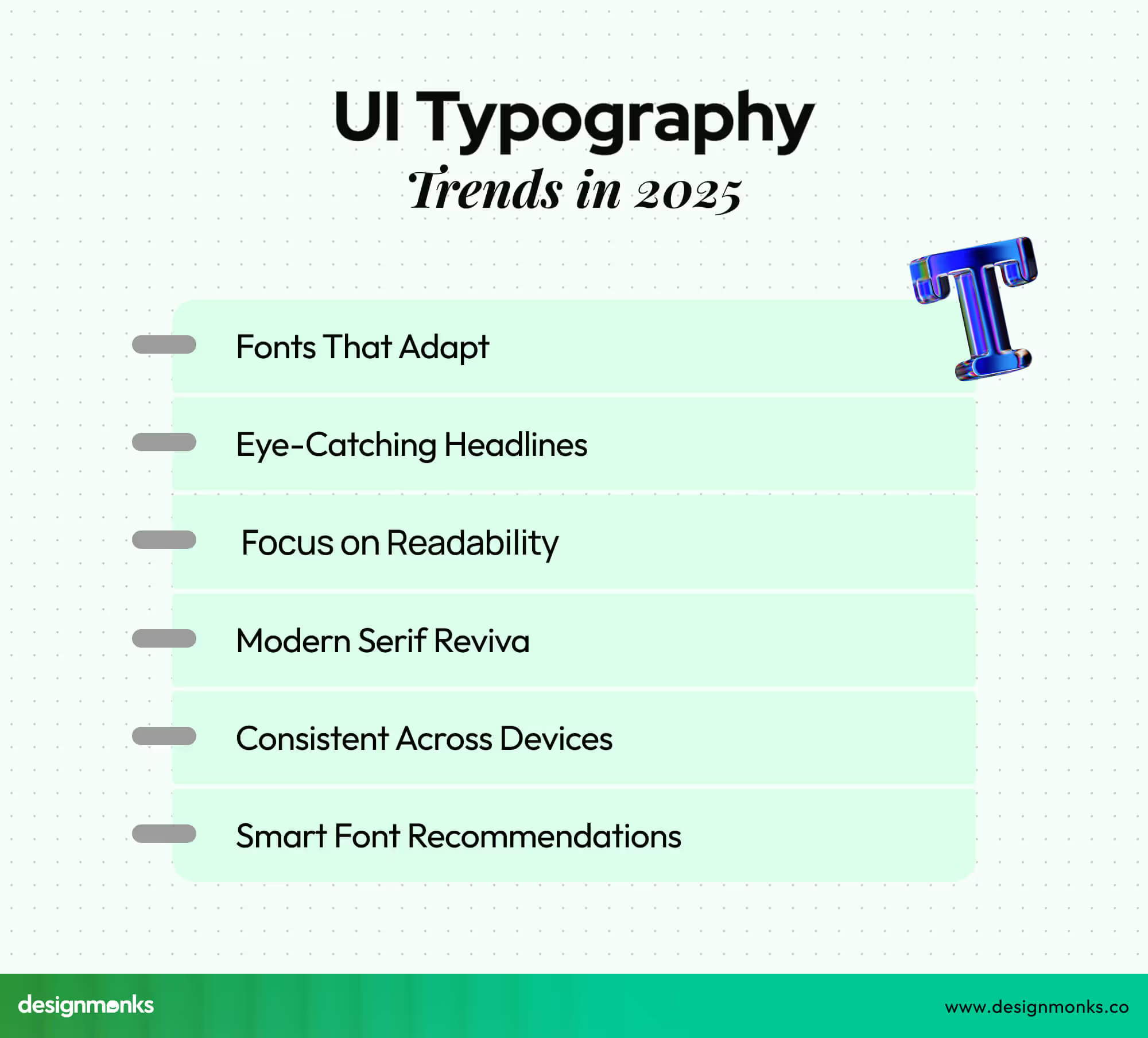
Variable Fonts Everywhere
Variable fonts are no longer just fancy; they’re the new standard. They let designers adjust weight, width, and slant on the fly, reducing file sizes and improving performance without sacrificing creativity or flexibility.
Bold & Expressive Headlines
Big and bold headlines dominate 2025 UI. They grab attention fast and bring personality to products, whether you’re building a finance app or a music platform. Typography is becoming a strong visual identity element.
Accessibility First
Readable type is not optional anymore. Designers prioritize high contrast, larger x-heights, and clear spacing to ensure everyone, including elderly users and people with visual challenges, can comfortably interact with digital products.
Playful Serif Comeback
Serifs are making a comeback in digital UI, but in a playful, modern way. Designers use them for warmth, elegance, and brand personality while balancing them with clean sans-serif bodies for usability.
Cross-Platform Consistency
Fonts are being chosen with platform differences in mind, iOS, Android, and web don’t render text the same way. In 2025, cross-platform consistency is a top priority for maintaining smooth, cohesive experiences.
AI-Driven Font Suggestions
AI is stepping into typography. Tools now suggest pairings, sizes, and styles based on your design system, brand voice, and audience data, making the designer’s job faster without losing the human creative touch.
FAQ
Which fonts are best for accessibility?
Fonts with clear letterforms, good spacing, and high readability work best for accessibility. Examples include Lato, Satoshi, Open Sans, and Inter. They reduce visual strain, support screen readers, and ensure users with visual impairments can navigate interfaces smoothly.
What font does Design Monks use?
Design Monks uses Red Hat Display for headings, Playfair Italic for special headings, and Outfit for body text. This combination ensures a modern, readable, and visually appealing style across all designs, keeping content clear and engaging for users.
What is the best free font for UI design in 2026?
Inter remains the top free font in 2026 for UI design. It’s optimized for screens, has excellent legibility at small sizes, and offers different ranges of weights. Designers love it for modern apps, dashboards, and clean user interfaces.
Are variable fonts worth using in UI design?
Yes, variable fonts are highly valuable. They reduce file sizes, load faster, and offer multiple weights and styles in a single font. This flexibility makes interfaces adaptable, responsive, and consistent across devices while improving performance and creative freedom.
How many fonts should I use in a UI project?
Stick to two fonts, one for headings and another for body text. Using more can clutter the design and confuse users. A clear hierarchy with consistent typography keeps interfaces simple, accessible, and user-friendly while maintaining a professional look.
End Note
Fonts may seem like small details, but they often determine how users feel and interact with a product. A smart font choice can improve readability, trust, and overall user experience. On the contrary, a poor font choice can be the reason of the failure of a product.
As design trends change every day, keeping your font choices modern and accessible will set your product apart. The right typeface can turn simple screens into engaging experiences to make your design not only beautiful but also easy to use.

.avif)
.avif)
.avif)
.avif)


.avif)
.avif)
.avif)
.avif)


.avif)
