.svg)


Key Takeaways
- Good button design guides users, builds confidence, and boosts engagement.
- A clear hierarchy, such as primary, secondary, and tertiary, helps users know which action matters most.
- Button states like hover and pressed improve clarity and user feedback.
- Proper size, spacing, and contrast make buttons easy and accessible.
- Consistent, tested buttons enhance usability, conversions, and overall user experience.
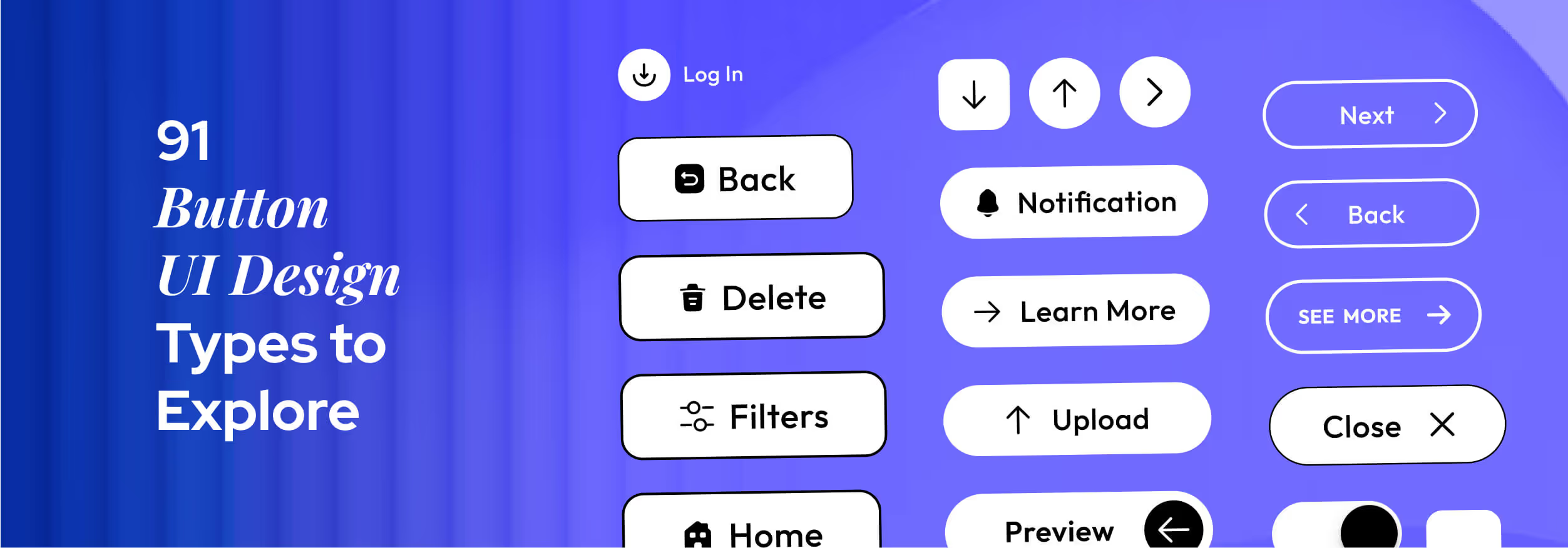
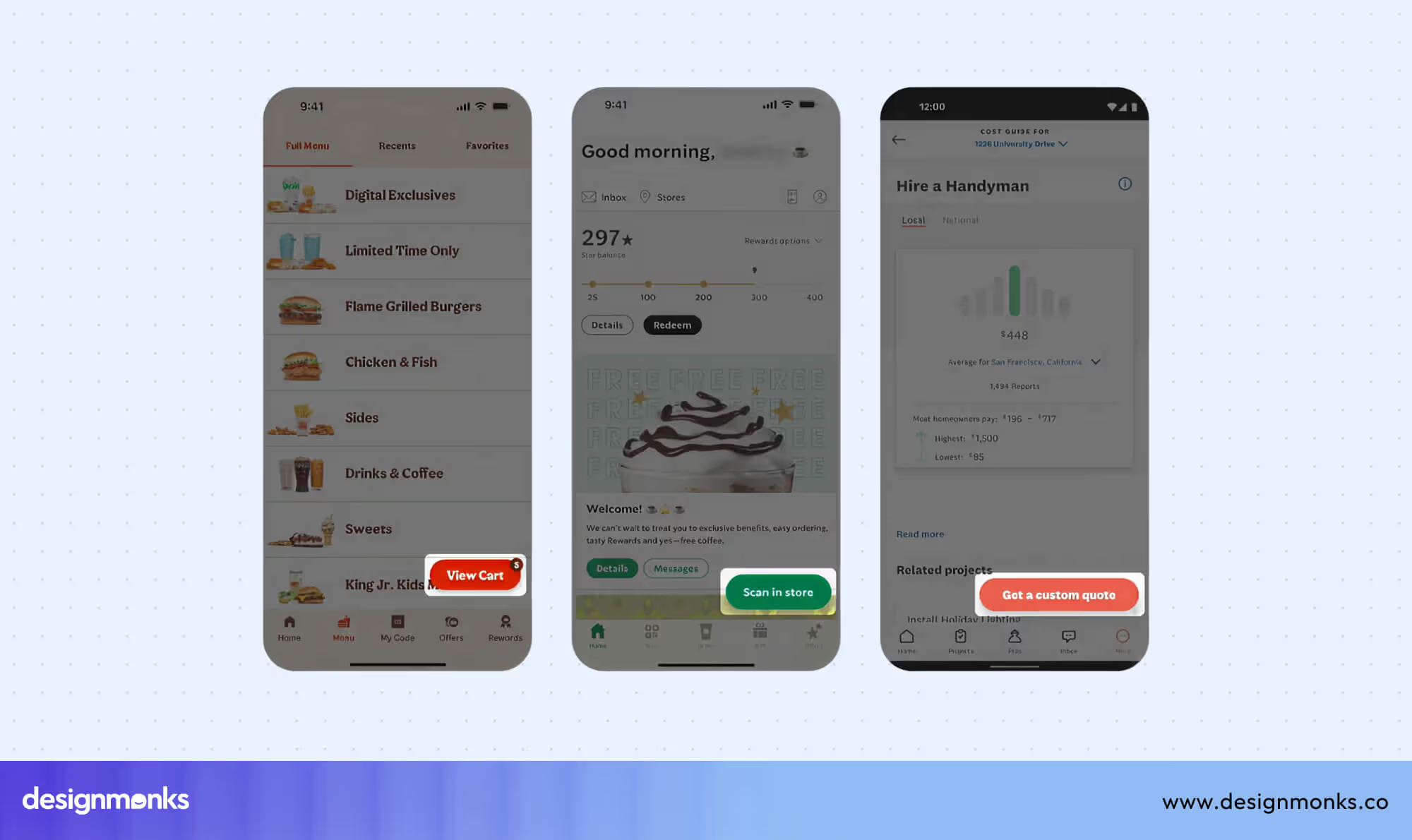
Clicks define user journeys, and button UI design is where every journey begins. Every button, from subtle ghost styles to bold toggles, can influence attention, direct actions, and boost user confidence. It shapes the overall experience.
Learning how hierarchy, spacing, and visual feedback affect user behavior turns basic buttons into powerful tools. Each style can make interactions feel intuitive, efficient, and enjoyable, enhancing both usability and engagement.
Curious to see how each type works and which design choices make the biggest impact? Keep reading to explore the world of button UI design and discover practical tips, patterns, and examples that will elevate every interaction.
Button Basics Every Designer Should Know
Clear hierarchy, intuitive placement, and visual feedback make buttons more noticeable, usable, and effective in guiding actions. Research shows users decide whether to interact within the first 3 seconds of seeing a button.
That's why understanding these fundamentals can help you design buttons that not only look good but also drive meaningful user interactions:
Button Hierarchy
Buttons have different levels of importance, and visual hierarchy helps users prioritize actions quickly. They are typically divided into primary, secondary, and tertiary buttons:
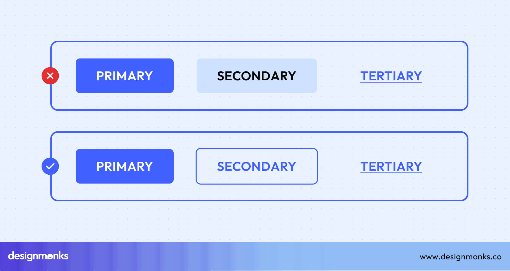
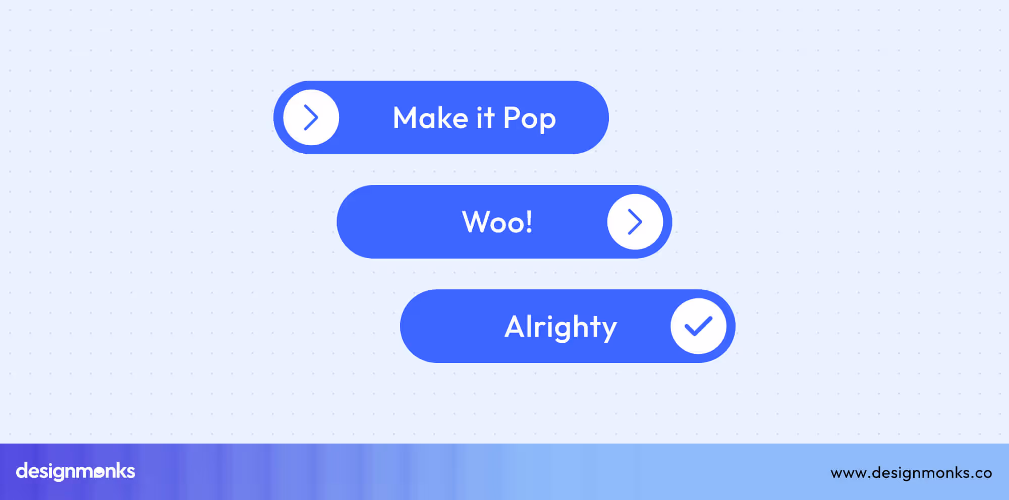
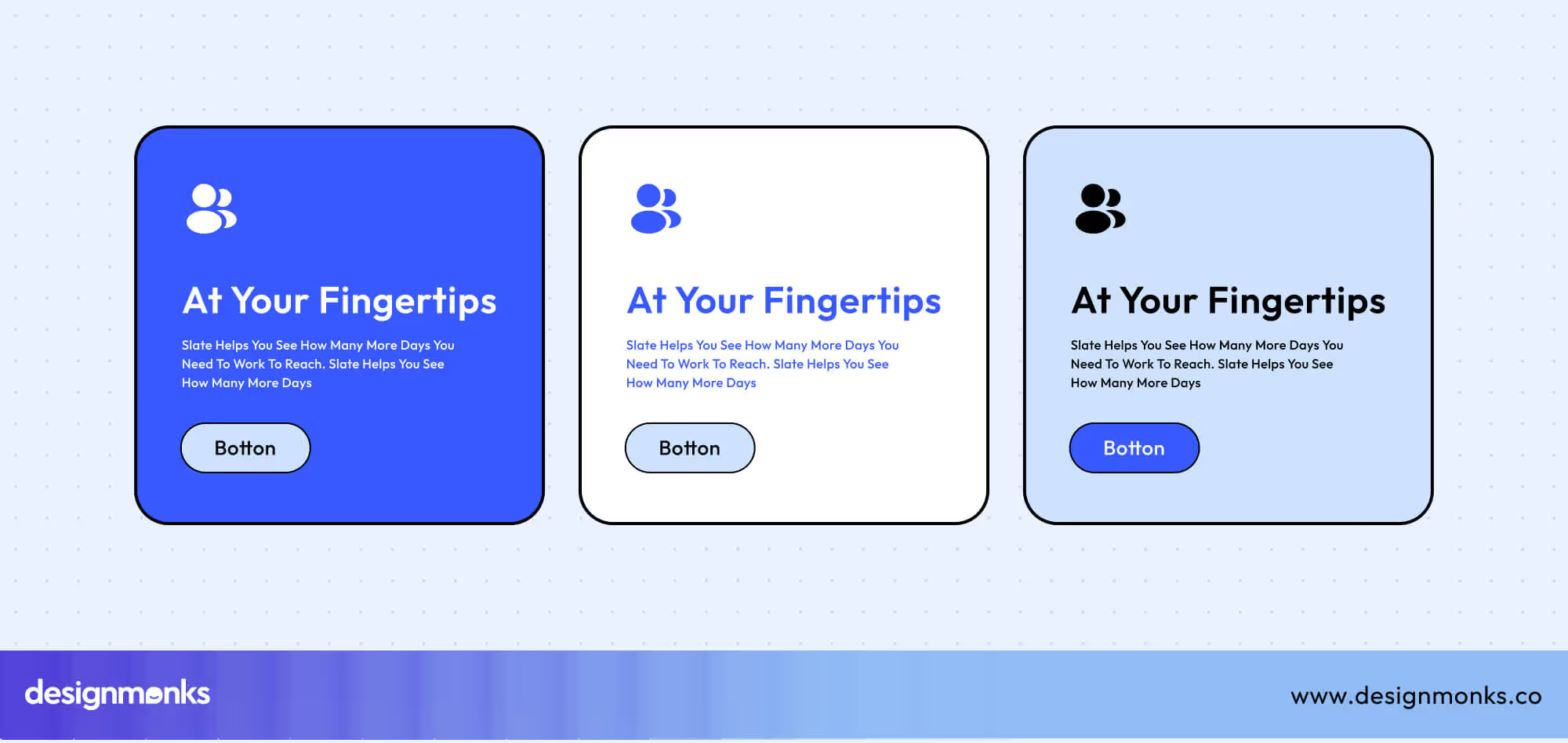
Primary Buttons: Your Main CTA
Primary buttons represent the most important actions on a page, such as “Sign Up”, “Buy Now”, or “Start Free Trial.” These buttons need to stand out instantly, guiding users toward the key goal.
Designers often use bold colors, larger sizes, or prominent placement to make them impossible to miss. Primary buttons should also maintain consistent styling across the interface to reinforce the main actions and build user trust.
Secondary Buttons: Supporting Actions
Secondary buttons complement the primary CTA by offering additional options, such as “Learn More”, “View Details”, or “Add to Wishlist.”
They are noticeable but less visually dominant than primary buttons, often using outlines, softer colors, or smaller sizes. This ensures they support the user journey without competing with the main action.
Tertiary Buttons: Subtle Options
Tertiary buttons are used for low-priority or optional actions, like “Cancel”, “Help”, or “Back to Menu.” They are typically minimal, text-based, and visually understated, so they don’t distract from primary or secondary actions.
Despite their subtlety, they remain functional and accessible, offering secondary pathways or additional choices without overwhelming the user.
Visual Hierarchy Rules
- Make key actions stand out: Use color and contrast to emphasize what matters most.
- Keep it focused: Stick to one primary button per screen to avoid confusion.
- Show the hierarchy: Size and placement should reflect the importance of each action.
- Stay consistent: Reuse styles and patterns so users instantly recognize interactive elements.
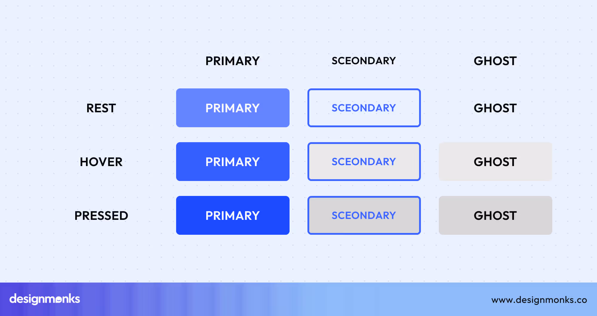
5 Critical Button States
Button states are the different visual and interactive conditions a button can have, showing users its status and how it behaves. Understanding button states with different hierarchies is essential because primary, secondary, and tertiary buttons behave differently to indicate their level of importance.
Knowing these states helps make interactions clear, intuitive, and reliable:
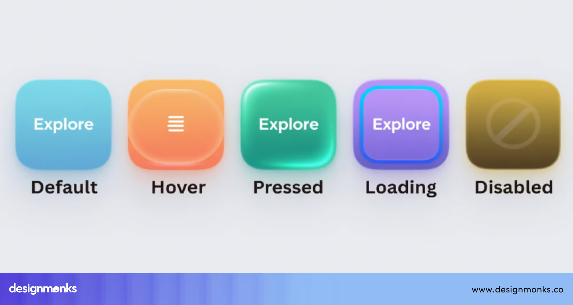
Default: Make a First Impression
The default state is the first thing users notice. Primary buttons should stand out more in this because they guide users to the main action immediately. Secondary buttons also need to remain visible but less prominent. Tertiary buttons stay subtle to support minor actions without distracting from the main CTA.
Hover: Show It’s Interactive
Hover states provide feedback, signaling that a button is clickable. Primary buttons need to change color or lift slightly because it reassures users that the button is interactive.
Secondary buttons often outline or darken to indicate readiness. Tertiary buttons may shift text or underline subtly in this state to maintain hierarchy without overwhelming the interface.
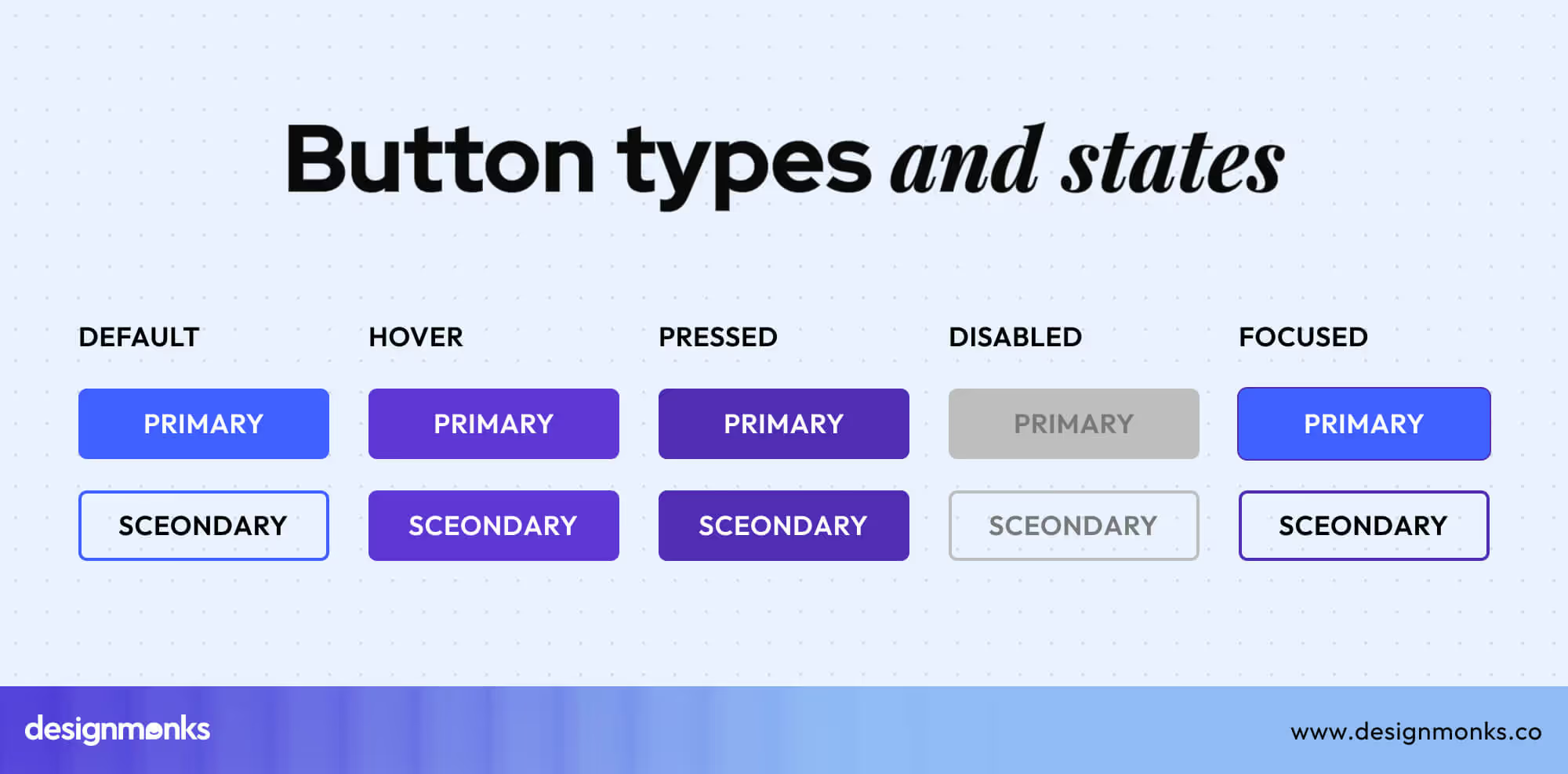
Active/Pressed: Confirm the Action
Pressed states indicate the action has been recognized. Primary buttons depress or glow, giving users immediate confirmation. Secondary buttons darken slightly to show engagement. Tertiary buttons often underline or change text color, providing subtle visual feedback.
Disabled: Indicate Unavailable Actions
Disabled buttons show actions that cannot be performed. Primary buttons fade but remain visible to give context. Secondary buttons usually lose outline contrast in this state. Tertiary buttons should appear muted, maintaining hierarchy and preventing confusion.
Loading: Keep Users in the Loop
Loading states indicate processing is occurring. Primary buttons show spinners inside to signal action progress. Secondary buttons may use subtle animations, and tertiary buttons display inline indicators, keeping users informed and preventing repeated taps.
Button Styles & Visual Design
Button UI Design goes far beyond aesthetics, it defines how users perceive and interact with your product. From sleek pill buttons that convey modernity to 3D buttons that create tactile realism, each style influences emotion and engagement.
Gradient and glass buttons add depth and polish, while ghost and toggle buttons rely on subtlety and movement to build trust and clarity. The importance of button style lies in how it shapes first impressions and guides behavior.
Studies show that design choices like contrast, depth, and color can increase interaction rates by up to 35%. As we move forward, we’ll explore how different button types work, why they matter, and how to design each one for maximum clarity and conversion.
Button Sizing Guide
Button size is critical for usability, accessibility, and effective interaction. Big buttons work especially well for mobile-first designs and make primary actions prominent.
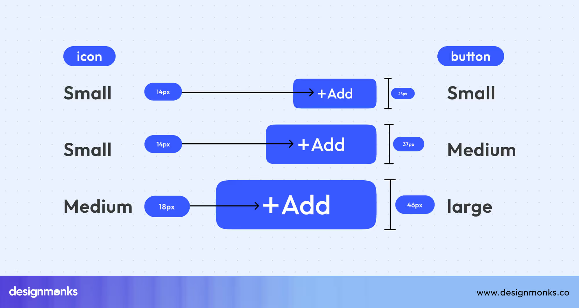
Research shows larger buttons can boost engagement by up to 20%. Icon buttons convey function through symbols, saving space without sacrificing clarity. Text buttons provide minimal, link-style options for secondary actions.
Maintain standard touch targets of 44x44px or larger to ensure comfortable, error-free tapping on all devices. Consider spacing between buttons to prevent mis-taps and ensure visual hierarchy.
Toggle & Selection Buttons: Guiding User Choices
Selection-based buttons like radio, toggle, and switch controls play a key role in shaping user decisions. According to UX research, clear selection patterns can reduce task completion time by up to 25%, proving how vital clarity is in interaction design.
These buttons don’t just capture choices, they make interfaces faster, cleaner, and more intuitive for every user.
Radio Button UI
Radio buttons let users select a single option from a defined group. It is ideal for settings like choosing a payment method, plan, or gender.
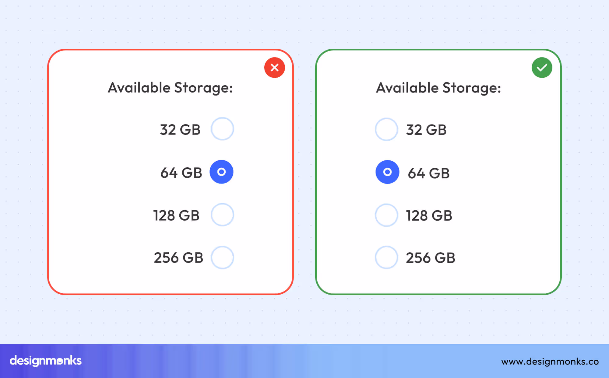
Unlike checkboxes, which allow multiple selections, radio buttons enforce one clear decision. While designing, keep labels concise, align options vertically for better scanning, and group related choices clearly to ensure quick, confident selections.
Toggle Button UI
Toggle buttons let users switch between two states, like turning notifications on or off. Unlike switches, toggles are more flexible in design and don’t always resemble physical sliders.
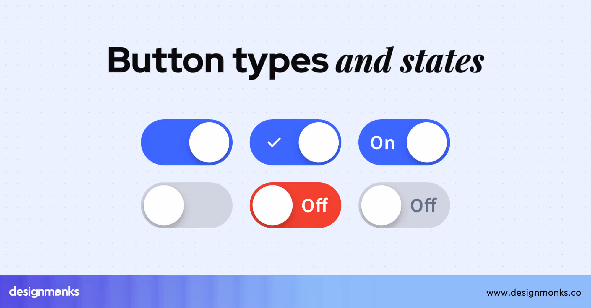
On mobile, make toggles large enough to tap comfortably and add clear labels for each state. Maintain high contrast for visibility and implement ARIA roles. You should also focus on indicators to ensure all users, including those using assistive technologies, can interact confidently.
Switch Button UI
Switch buttons allow users to turn settings on or off instantly. Their design includes a track, thumb, and label, clearly indicating the current state. On iOS, switches are rounded and minimal, while Android switches are flatter with more pronounced visuals.
You can use smooth animations to confirm actions and provide immediate, intuitive feedback. These subtle motion helps users understand state changes, reinforce hierarchy, and make interactions feel responsive and satisfying.
Split Button UI
Split buttons combine a primary action with a dropdown of secondary options, like “Save” and “Save As” or “Send” and “Schedule for later.” Designers use them when the main action is frequent but alternatives are needed..
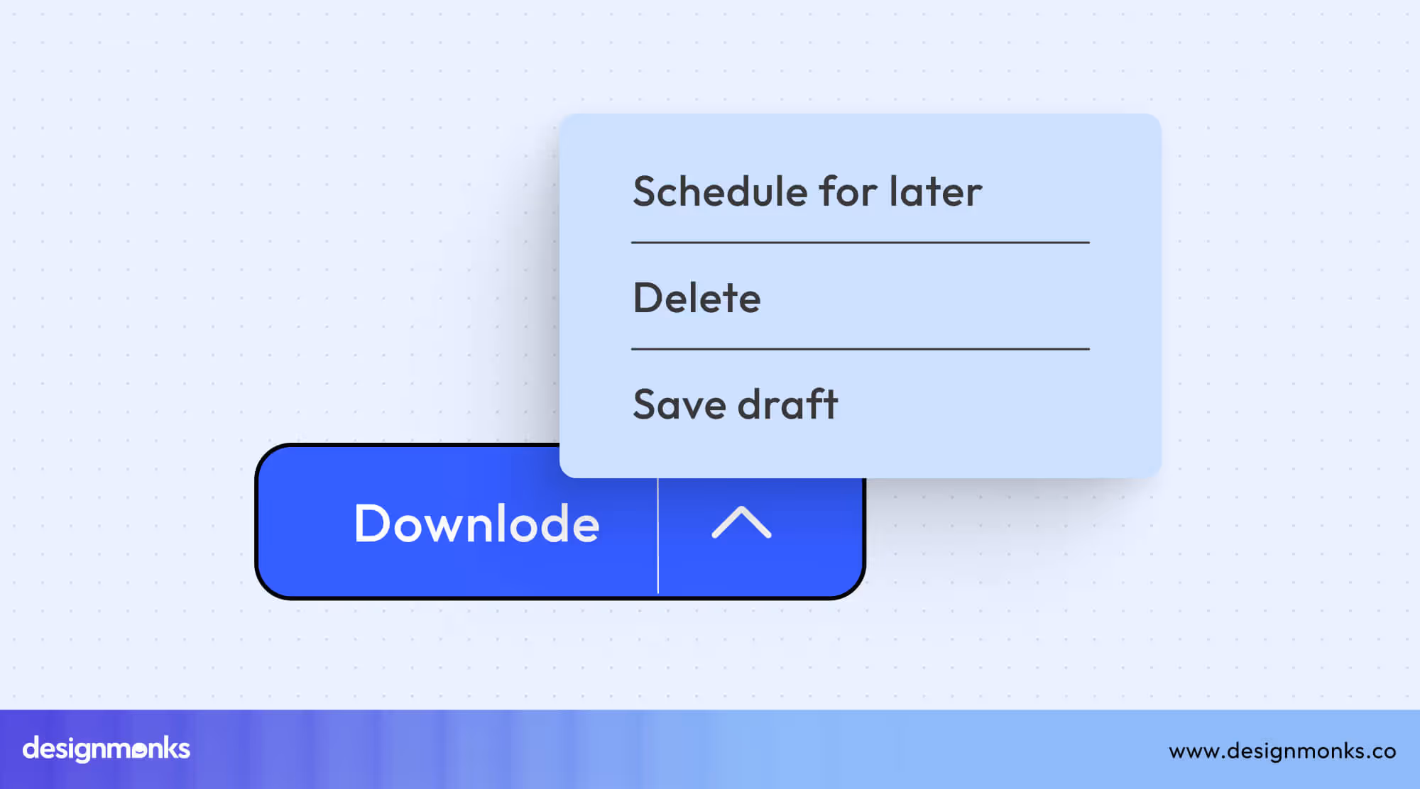
On desktop, allow wider menus for clarity, while on mobile, keep dropdowns compact and touch-friendly. This helps to maintain usability across devices.
Modern Aesthetic Buttons
Modern button design merges art and usability. By blending gradients, transparency, and depth, designers craft interactions that feel both tactile and sophisticated. Let's have a close look at them-
Ghost Button UI
Ghost buttons feature transparent backgrounds with subtle borders and give a clean, minimalist look. They work best for secondary actions or when you want to focus on surrounding content.
Make sure there's enough contrast for readability, maintain clear labeling, and pair with primary buttons. It will guide users without overwhelming the interface.
Pill Button UI
Pill buttons have rounded edges and a friendly, approachable feel. Ideal for tags, filters, or onboarding actions, they draw attention softly without being aggressive.
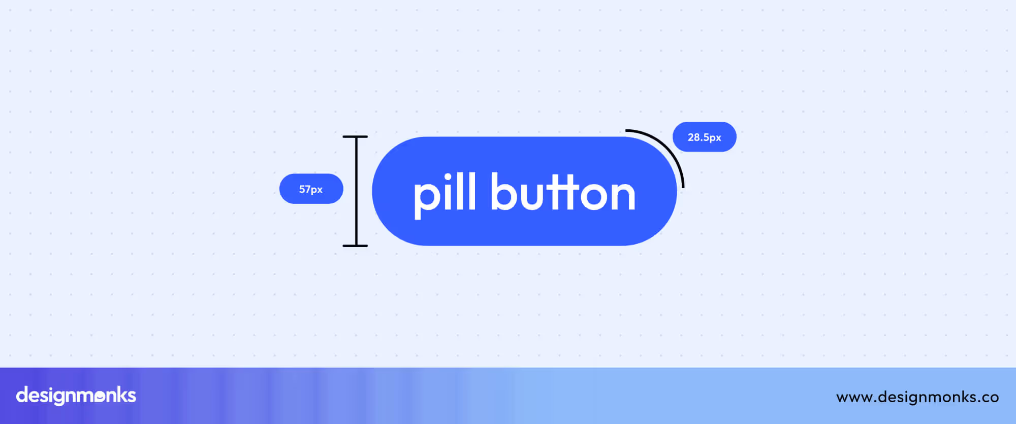
Use consistent border-radius, maintain contrast for readability, and ensure they adapt well on mobile to encourage quick, intuitive interactions.
3D Button UI
3D buttons revive the essence of skeuomorphic design, using highlights, shadows, and layered effects to mimic real-world touch and depth. This approach makes interfaces feel tactile and engaging, especially in gaming UIs or immersive digital environments where interaction feedback is key.
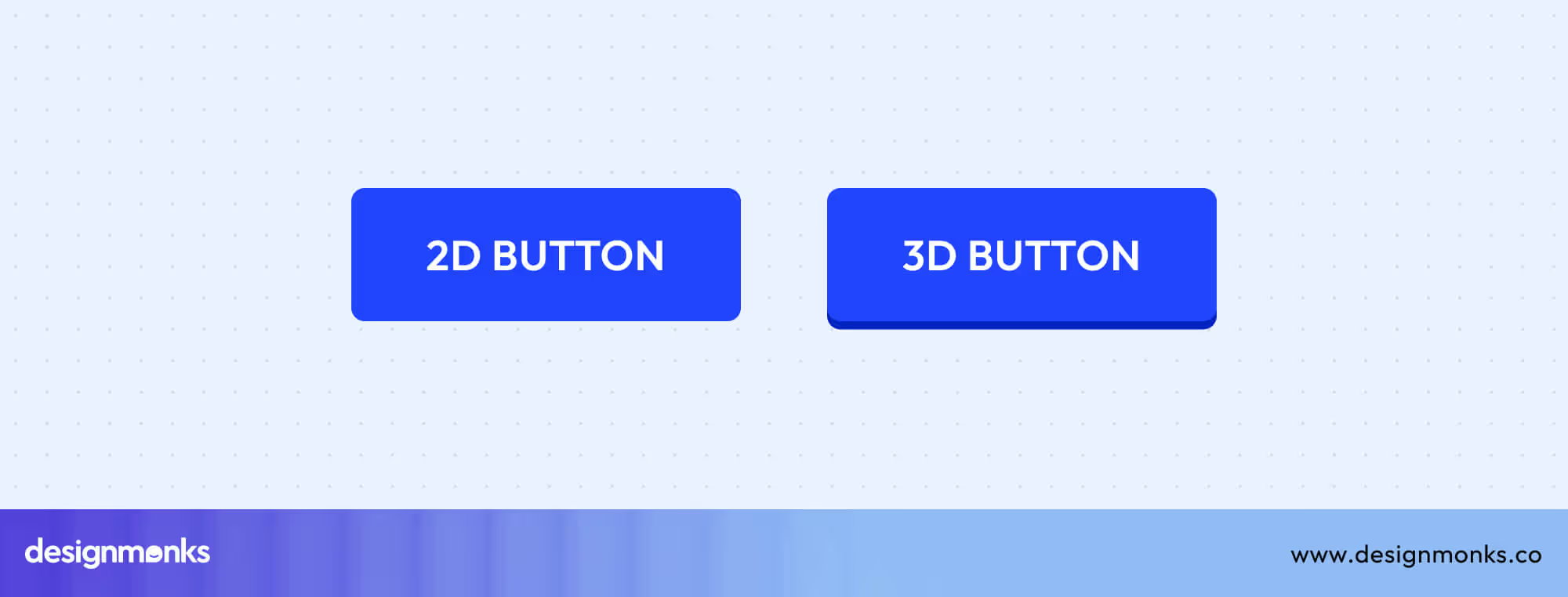
Modern neumorphism trends build on this by blending soft gradients and subtle depth for a cleaner, more futuristic look. You need to maintain consistent shadows, ensure readability in dark or light themes, and balance realism with simplicity to keep usability intact across devices.
Glass Button UI
Glass buttons use frosted glass effects and background blur techniques to create a modern, polished aesthetic that feels light and futuristic. They’re especially effective on landing pages or hero sections where visual elegance matters.
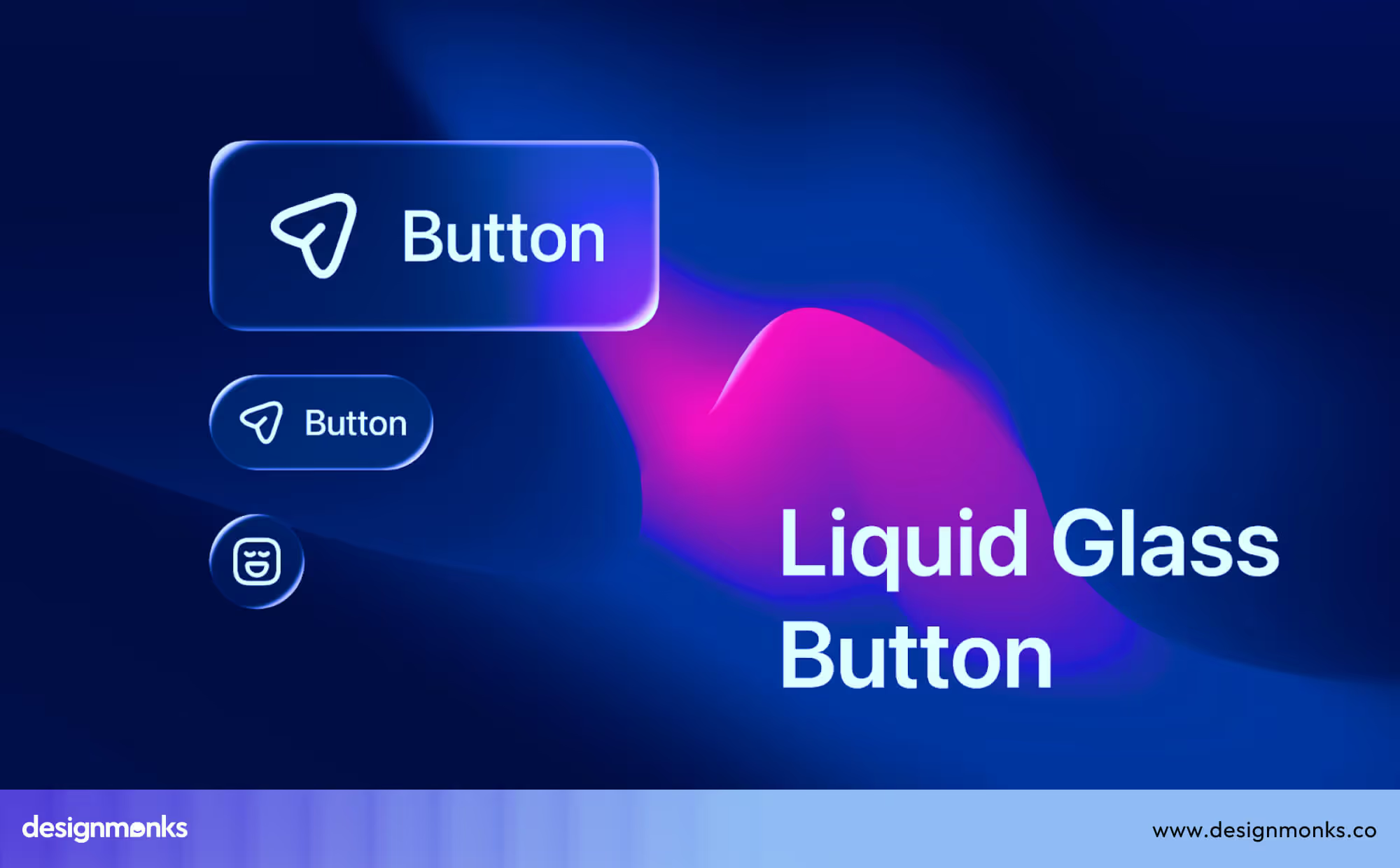
To keep them functional, ensure strong text contrast against backgrounds, use soft shadows for clarity, and test readability under different lighting. The image conditions need to be consistent for accessibility as well.
Gradient Button UI
Gradient buttons use eye-catching color transitions to make CTAs more dynamic and engaging. They draw the user’s eye naturally and add energy to digital interfaces.
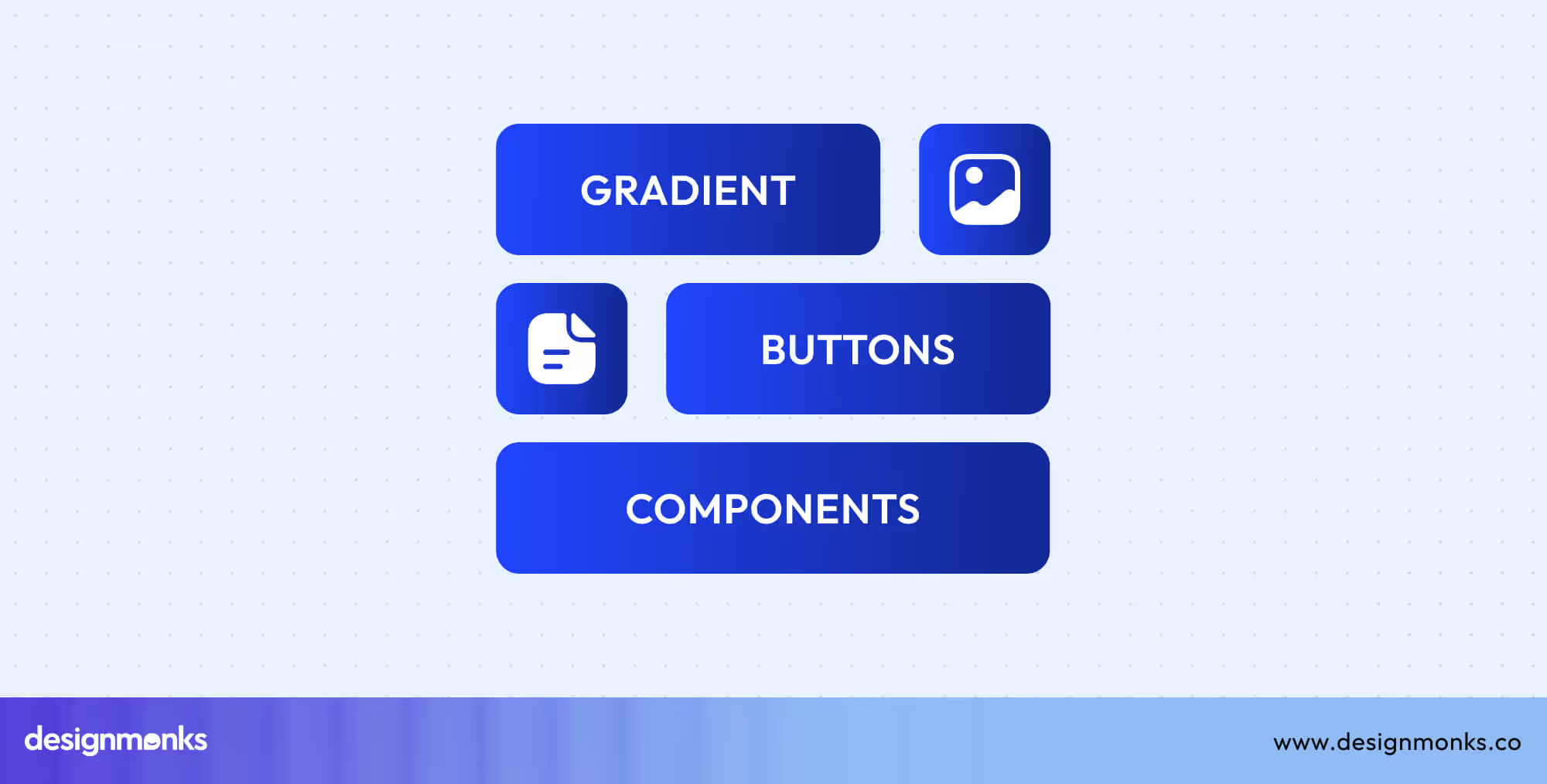
For best results, keep gradients smooth and balanced, avoid overly harsh transitions, and ensure text contrast stays strong. Use vibrant yet brand-aligned colors to create visually appealing, high-converting button designs that stand out without overwhelming the layout.
Action & Functional Buttons
Action and functional buttons define how users complete tasks and achieve goals within an interface. From bold CTAs that trigger conversions to subtle floating actions that streamline navigation, these buttons shape the overall interaction flow-
Primary Action Buttons
Primary action buttons directly drive user goals like purchasing, signing up, or starting a process. These buttons demand attention through bold colors, clear labels, and strong visual hierarchy. When placed near relevant content and sized appropriately, they can increase conversions by up to 30%.
CTA Button UI
Call-to-Action (CTA) buttons are the driving force behind conversions, prompting users to complete key actions like “Buy Now,” “Sign Up,” or “Get Started.” Their effectiveness depends on psychology, placement, and design clarity.
Position CTAs near persuasive content, use bold contrast and action-driven colors, and craft concise labels that inspire confidence. Studies show clear, well-placed CTAs can boost conversions. This proves that strong visual hierarchy and color psychology turn attention into action.
Action Button UI
Action buttons perform secondary or multi-purpose tasks, supporting main interactions like “Edit,” “Share,” or “Apply.” Combine icons with labels for clarity, and use mobile action sheets for compact and accessible button designaccessible choices.
Maintaining consistent styling, responsive sizing, and clear spacing ensures users can interact confidently across devices, making workflows intuitive and efficient.
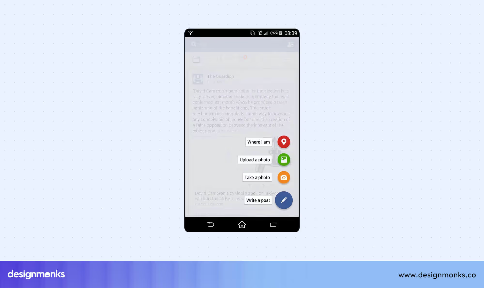
Floating Button UI (FAB)
Floating Action Buttons (FABs) offer prominent, context-aware actions, typically in mobile apps, to help users access key functions quickly.
Following Material Design guidelines, FABs use circular shapes with meaningful icons, subtle shadows, and high z-index placement to remain visible. They enhance usability by keeping critical actions within easy reach, supporting mobile app floating actions.
Form Control Buttons
Form control buttons guide users through completing or managing form inputs efficiently. Each type serves a distinct purpose to enhance usability and reduce errors-
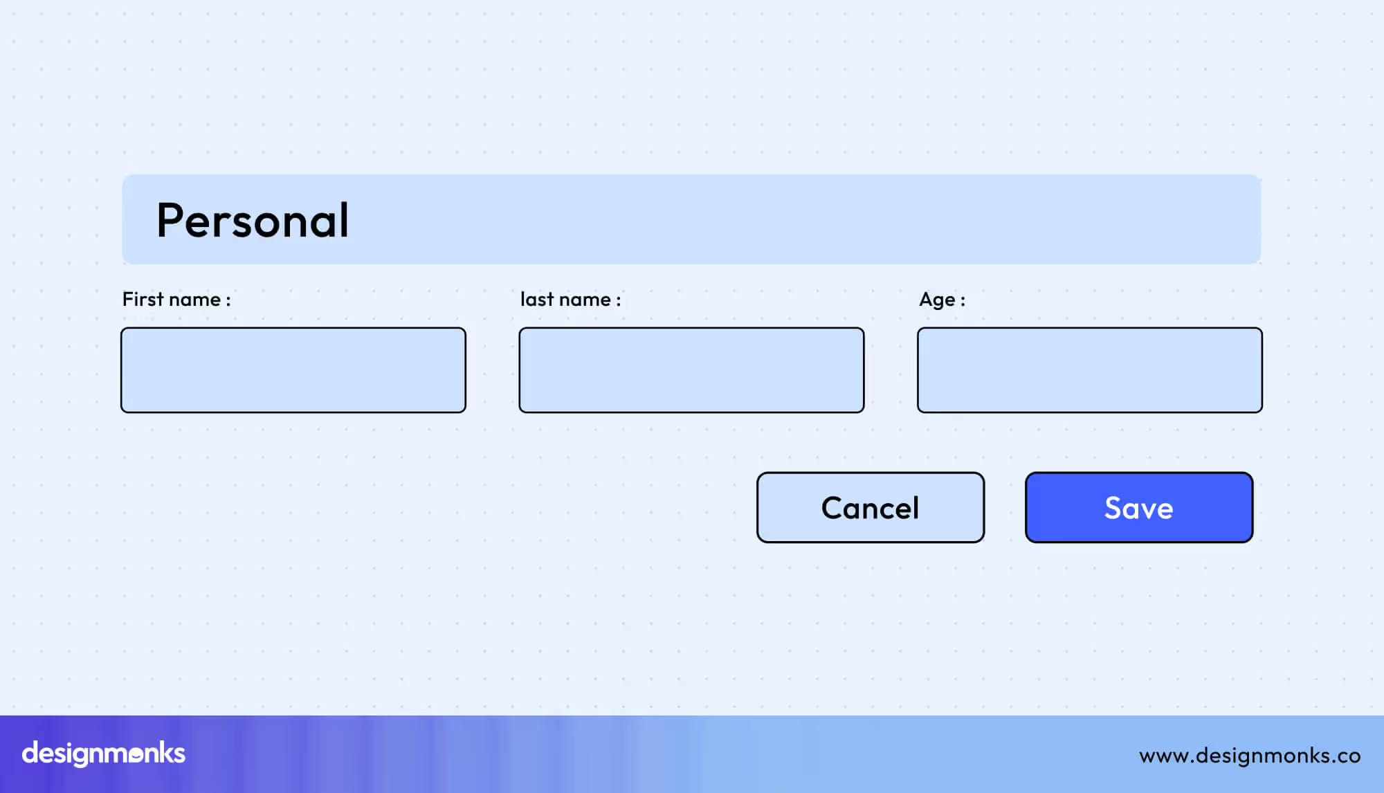
Submit Button UI
Submit buttons finalize forms, with labels like “Submit,” “Send,” or “Save” clarifying intent.
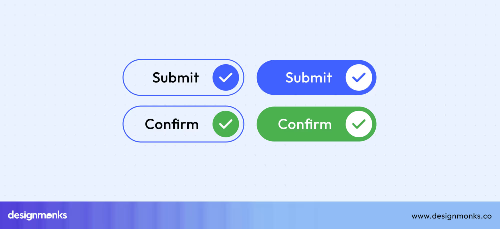
Incorporate visual validation cues and success confirmations to reassure users, reduce errors, and enhance trust. Clear labeling and responsive feedback improve form completion rates and guide users confidently through the submission process.
Reset Button UI
Reset buttons clear form inputs, but should be used sparingly to avoid user frustration.
Place reset buttons away from primary actions and use confirmation dialogs. This will prevent accidental taps that could erase data.
Cancel Button UI
Cancel buttons allow users to safely exit or back out of actions. You need to differentiate these buttons clearly from “Close” or “Back,” and maintain consistent placement.
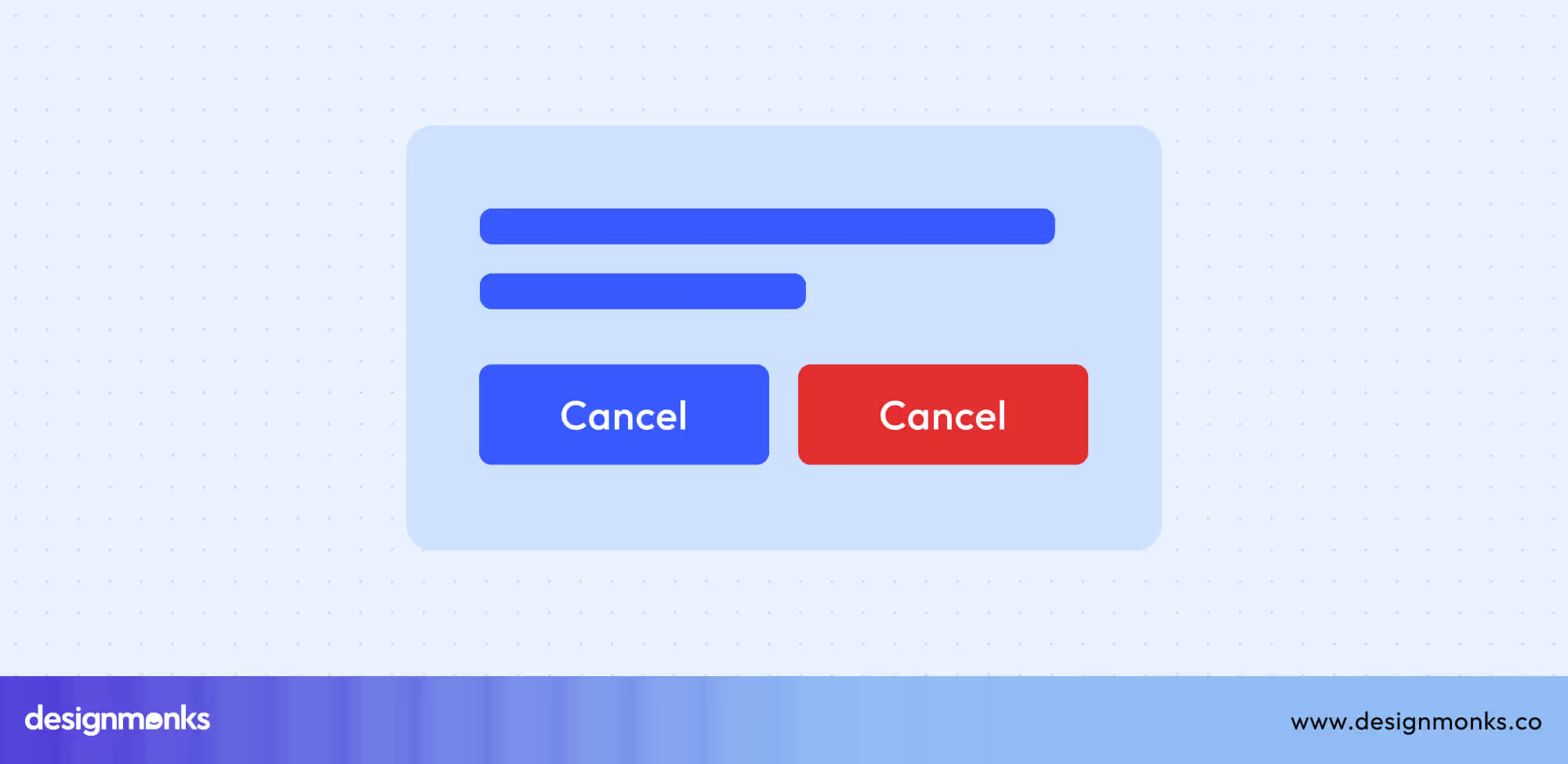
Use color coding (gray for neutral, red for destructive) to signal risk or neutrality. This reduces mistakes and guides user expectations.
Clear Button UI
Clear buttons remove individual input values, usually via an “X” icon. You need to ensure one-click functionality and keep visibility high without being distracting.
Keep enough accessible touch targets for mobile users. This makes forms easier to manage and enhances overall user experience.
Content Management Buttons
Content management buttons power the essential actions behind every interface, such as creating, editing, saving, or deleting content. These buttons are vital for managing data efficiently. Clear visuals, consistent labeling, and logical placement make these actions intuitive and prevent user mistakes:
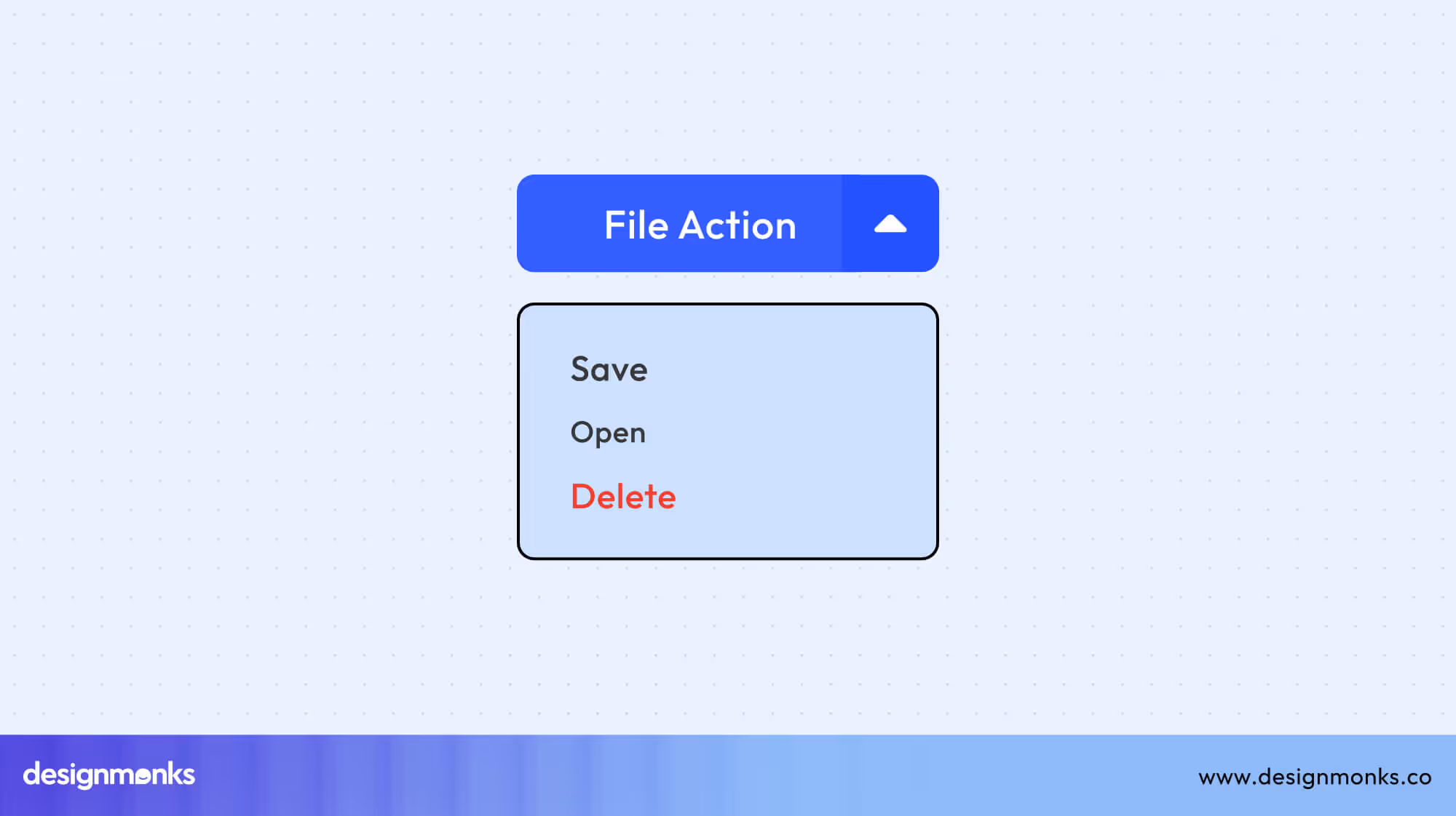
CRUD Operations (Create, Read, Update, Delete)
CRUD buttons handle the main actions users perform within dashboards, tables, or content systems. Each function, Create, Read, Update, and Delete, should look and behave differently to avoid confusion.
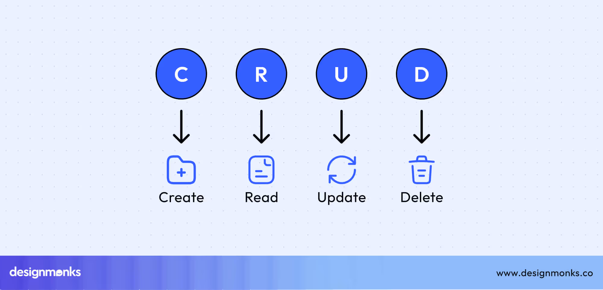
Use recognizable icons, consistent colors (e.g., green for add, red for delete), and descriptive labels. This clarity reduces errors and helps users manage tasks smoothly across the interface.
Add Button UI
Add buttons often use a “+” icon to signal new content creation. Use clear, action-driven labels like “Add New” or “Create” to make intent obvious.
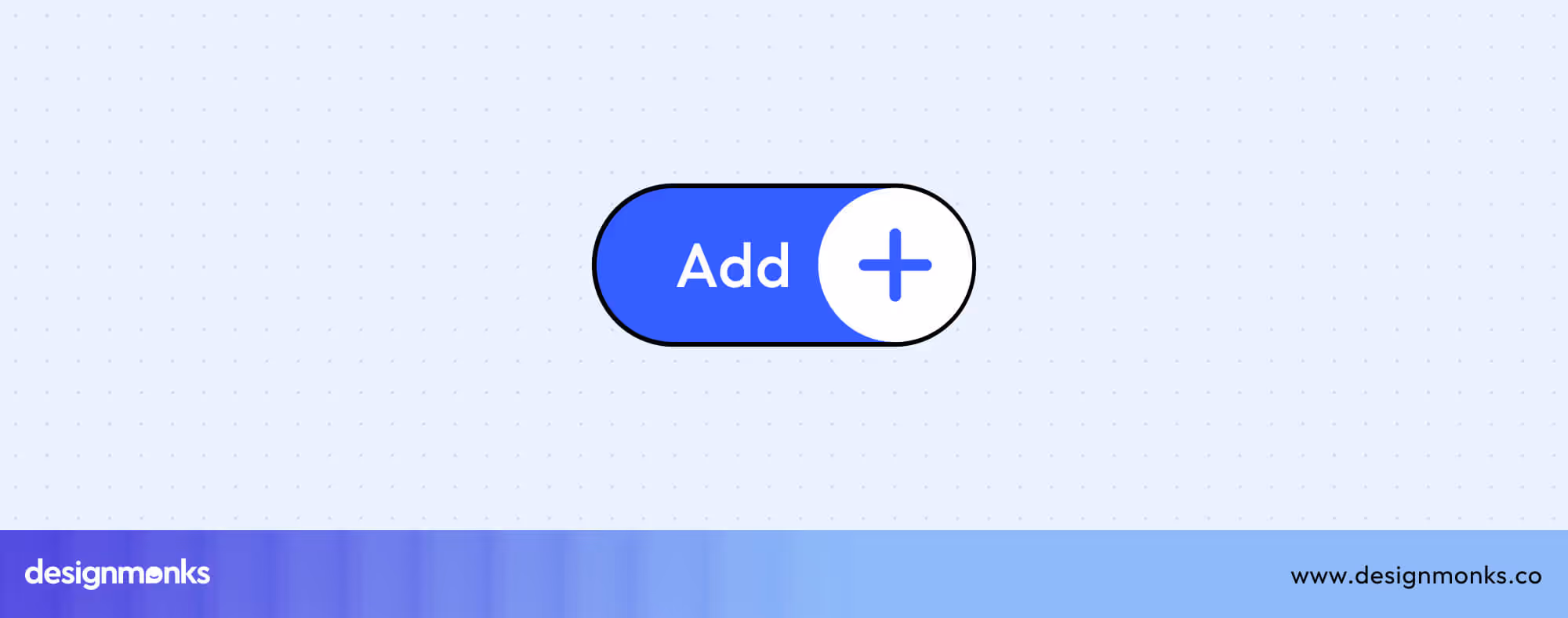
Position the button in visible areas such as the top-right of a table or above lists, and ensure it stands out with enough padding and contrast. Consistent design helps users instantly recognize where to begin creating new items.
Edit Button UI
Edit buttons typically feature a pencil icon, symbolizing change or modification. Depending on the context, they can open inline fields for quick edits or pop-up modals for detailed updates.
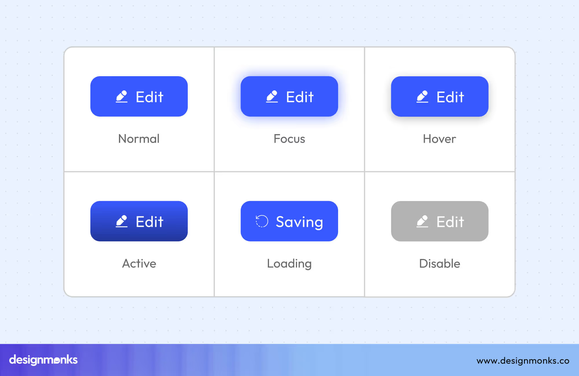
Always make permissions clear and disable edit options for restricted users to avoid confusion. Maintaining uniformity across pages helps users easily spot where they can make changes.
Delete Button UI
Delete buttons allow users to remove items and are usually marked with a trash icon. Since deletion is a destructive action, use red to indicate caution.
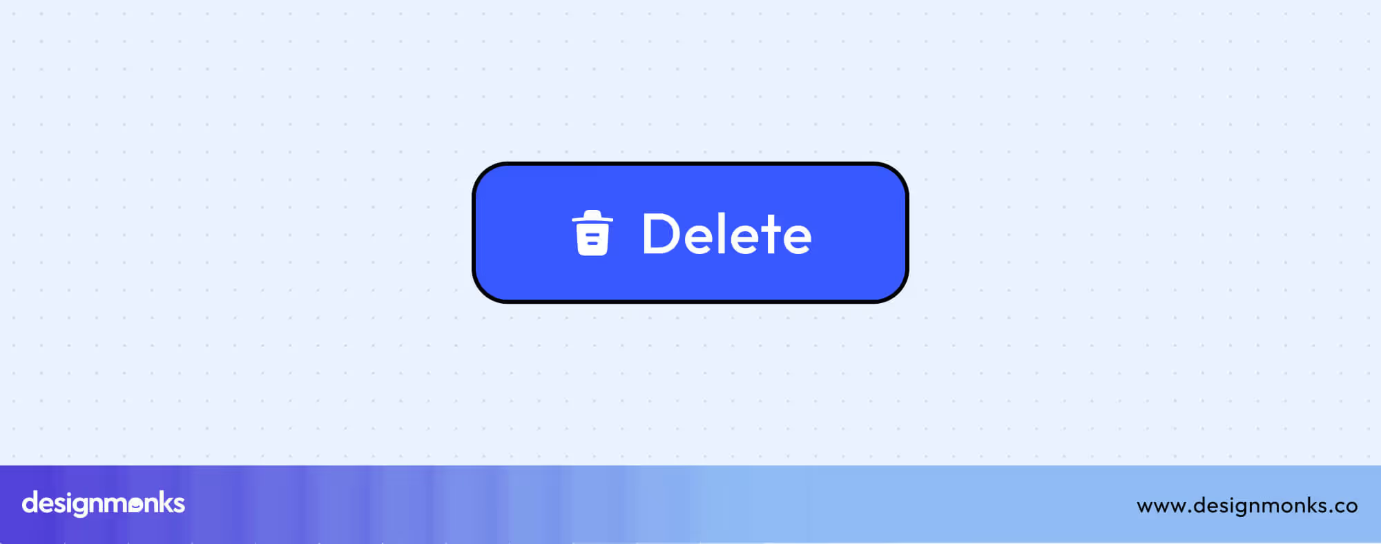
Always confirm with a modal dialog before finalizing. Where possible, include an undo option to give users a safety net and reduce accidental data loss.
Save Button UI
Save buttons confirm and store user changes. Depending on the system, this can be auto-save (saving continuously) or manual save (user-initiated).
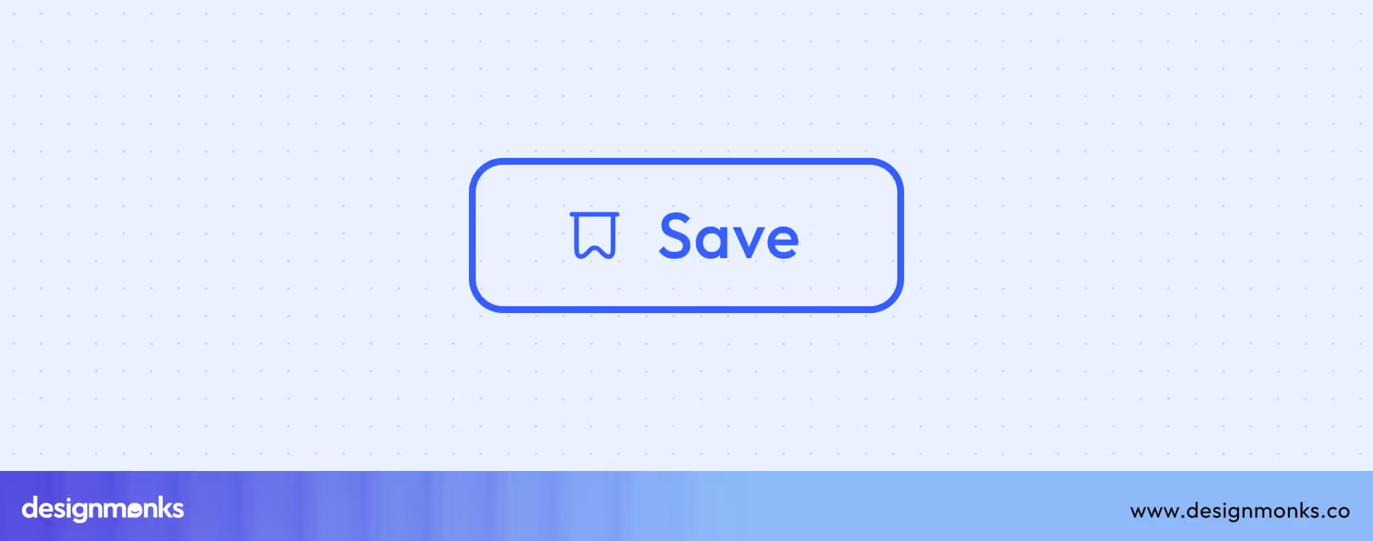
Choose labels that reflect intent “Save,” “Update,” or “Apply” to avoid confusion. After saving, provide a success message or visual feedback to reassure users that their progress is safe.
Additional Content Actions
Beyond creation and editing, modern interfaces often include secondary content actions like copying or sharing. These buttons enhance usability by making repetitive tasks faster and improving collaboration or engagement.
Copy Button UI
Copy buttons allow users to instantly duplicate text, links, or code snippets, a common feature in dashboards, developer tools, and content platforms. To improve clarity, always include visual or textual feedback such as a “Copied!” tooltip, color change, or subtle animation to confirm success.
Depending on the interface, you can use either icon-only buttons for compact designs or labeled versions for clarity. For mobile users, ensure touch targets meet accessibility standards (44x44px+) to prevent errors and improve usability.
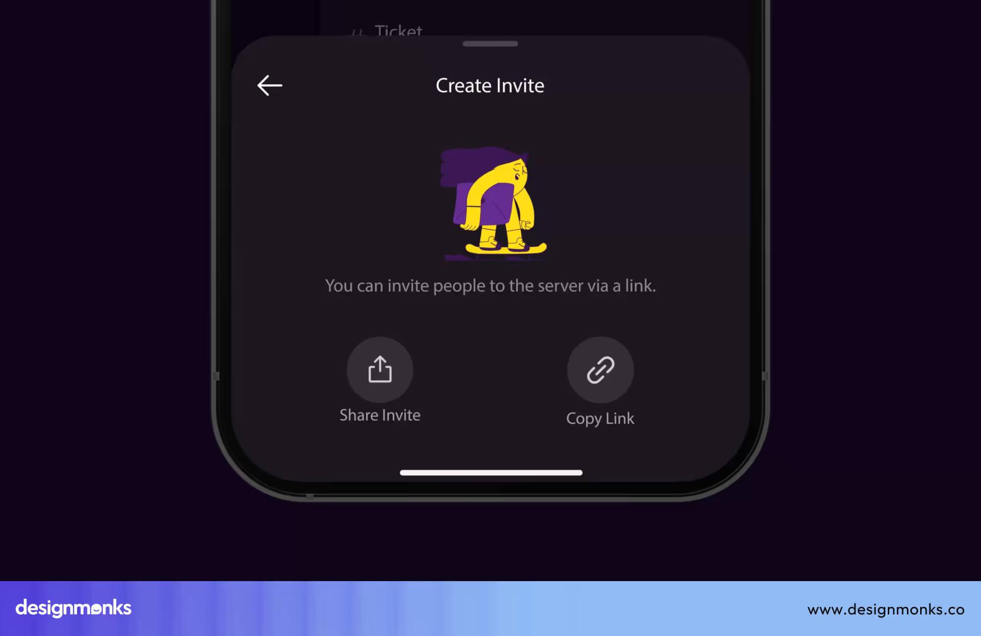
Share Button UI
Share buttons empower users to distribute content across social networks, messaging apps, or email with a single click. Design these buttons using familiar share icons (like the arrow or network logos) to ensure instant recognition. You can choose between native share sheets, which use the device’s built-in options. You can also use custom share menus that match your brand’s visual style.
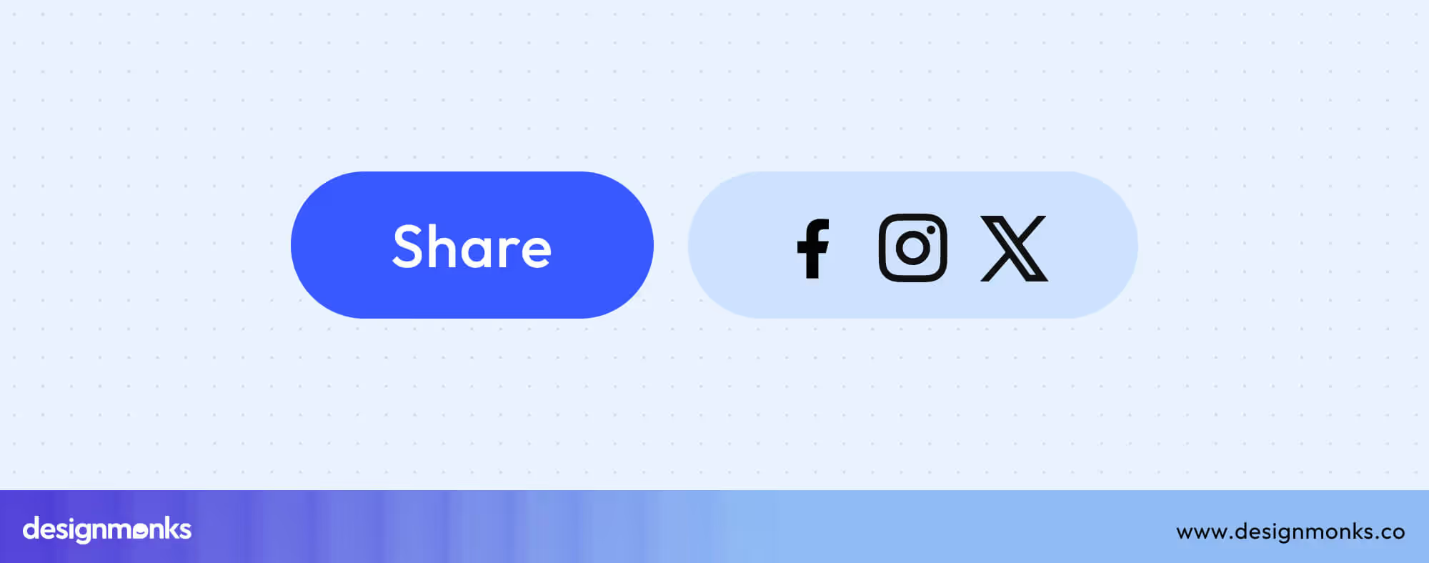
Place share buttons in prominent yet non-intrusive areas, such as near articles, products, or media previews. Consistent spacing, icon style, and color ensure the button fits seamlessly into your interface while still standing out enough to encourage engagement.
Navigation & Control Buttons
Navigation and control buttons guide users through digital experiences. From moving between pages to filtering content or closing modals, these buttons define how users explore, refine, and control what they see.
Directional Navigation
Directional navigation buttons like Back, Next, and Return help users move logically through workflows, pages, or app states. They establish a sense of orientation and progress, making interactions predictable and smooth.
When designed correctly, these buttons reduce cognitive load by following visual and behavioral conventions.
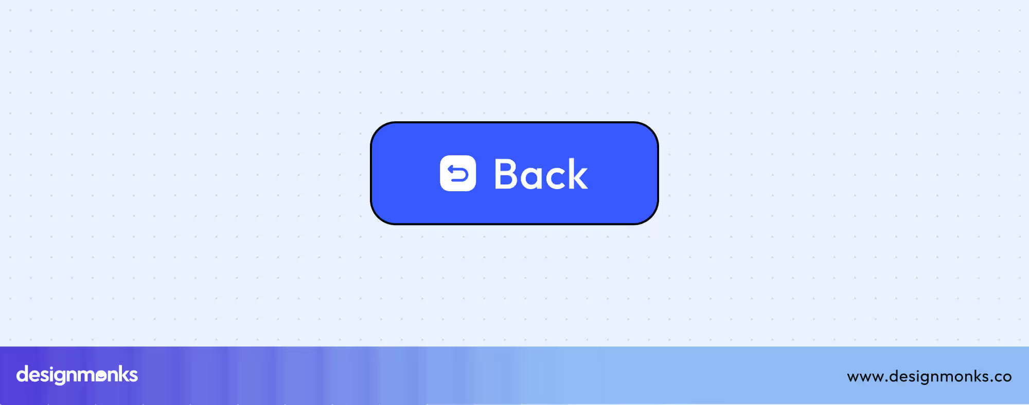
Back Button UI
Back buttons let users retrace their steps without losing progress. The left-pointing arrow (←) is the universal symbol, while an “×” icon can represent exiting a modal or overlay.
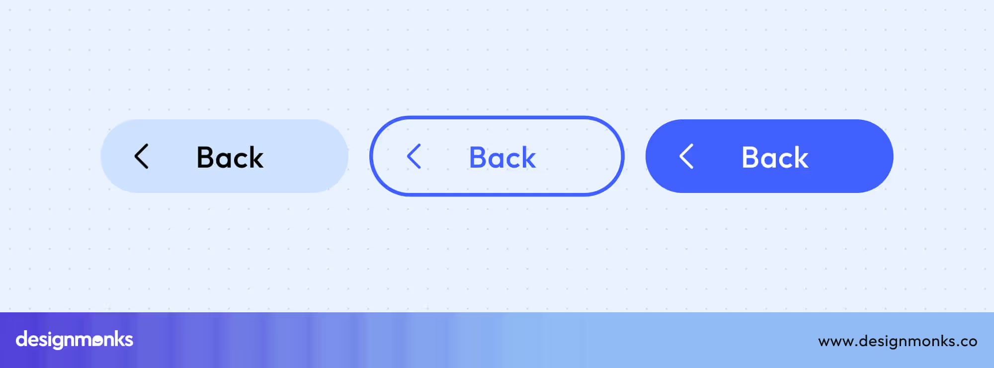
Differentiate between browser back and in-app navigation to avoid confusion. Integrating the back button within breadcrumb navigation(a secondary navigation system that shows a user's location within a site's hierarchy) further helps users understand hierarchy and location.
Next Button UI
Next buttons guide users forward, typically in multi-step forms, onboarding sequences, or tutorials. Pair them with progress indicators to communicate advancement.
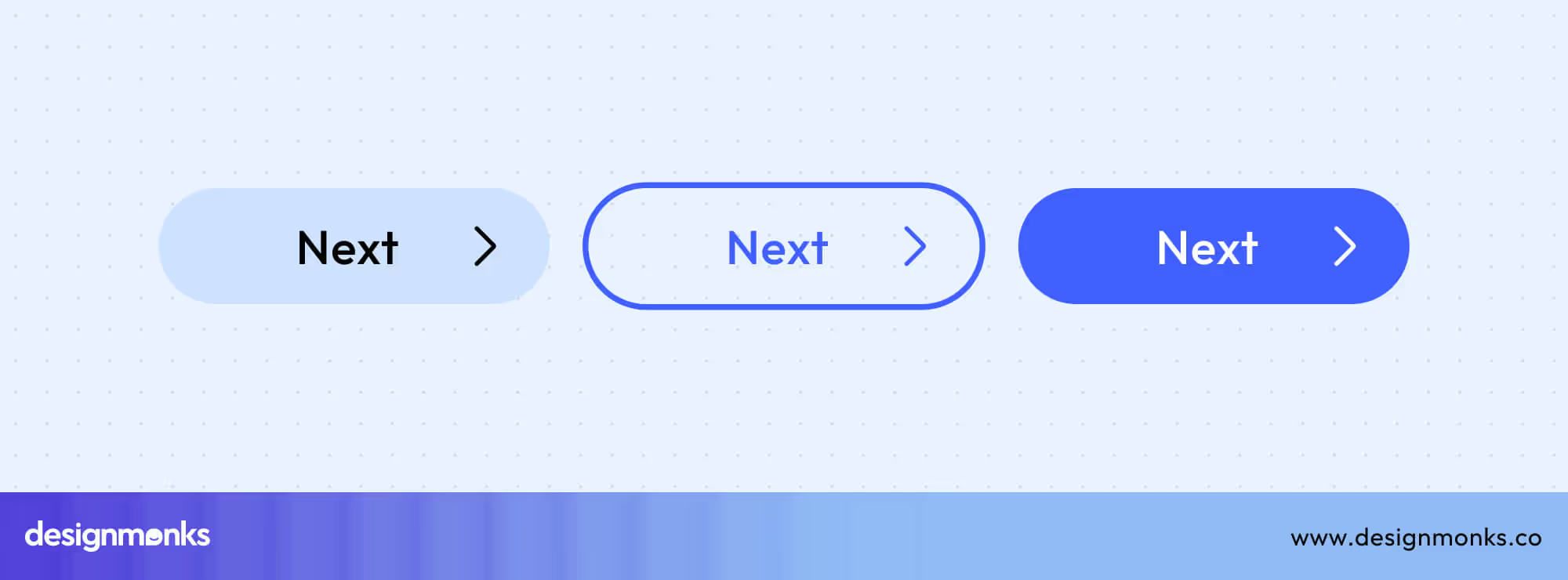
Use clear textual labels (“Next,” “Continue”) or forward arrows (→) to maintain accessibility and alignment with user expectations. Place these buttons consistently at the bottom right for intuitive navigation.
Return & Go Back Buttons
Return or Go Back buttons allow flexible movement within apps or workflows. This helps users revisit previous sections without resetting progress.
Use these to restore context rather than exit entirely. On mobile, align with native platform navigation patterns for consistency, and clearly differentiate between “Back,” “Return,” and “Exit.”
Exit & Close Buttons
Exit and close buttons let users dismiss modals, overlays, or pop-ups quickly. The “X” icon, usually placed at the top-right corner, is a universal cue for closing.
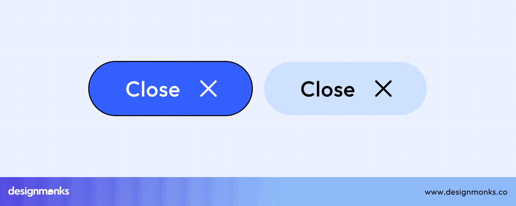
Support the Escape key as an alternative for accessibility, and ensure closing actions don’t result in unexpected data loss. Always provide confirmation prompts when exiting critical workflows.
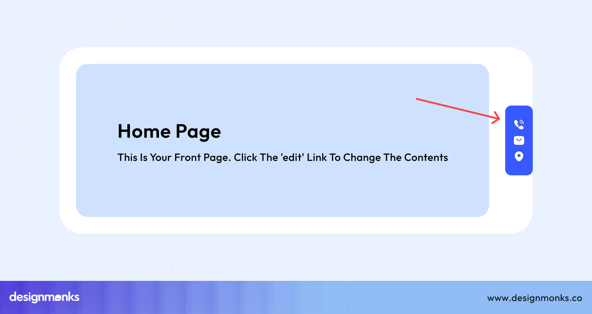
Home Button UI
The Home button, often shown with a house icon, returns users to the main dashboard or homepage. Position it consistently in the top navigation bar or mobile bottom nav for quick access.
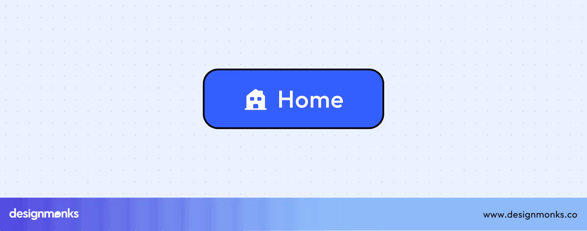
Use tooltips or labels like “Home” for clarity, and ensure it’s always visible within the navigation structure.
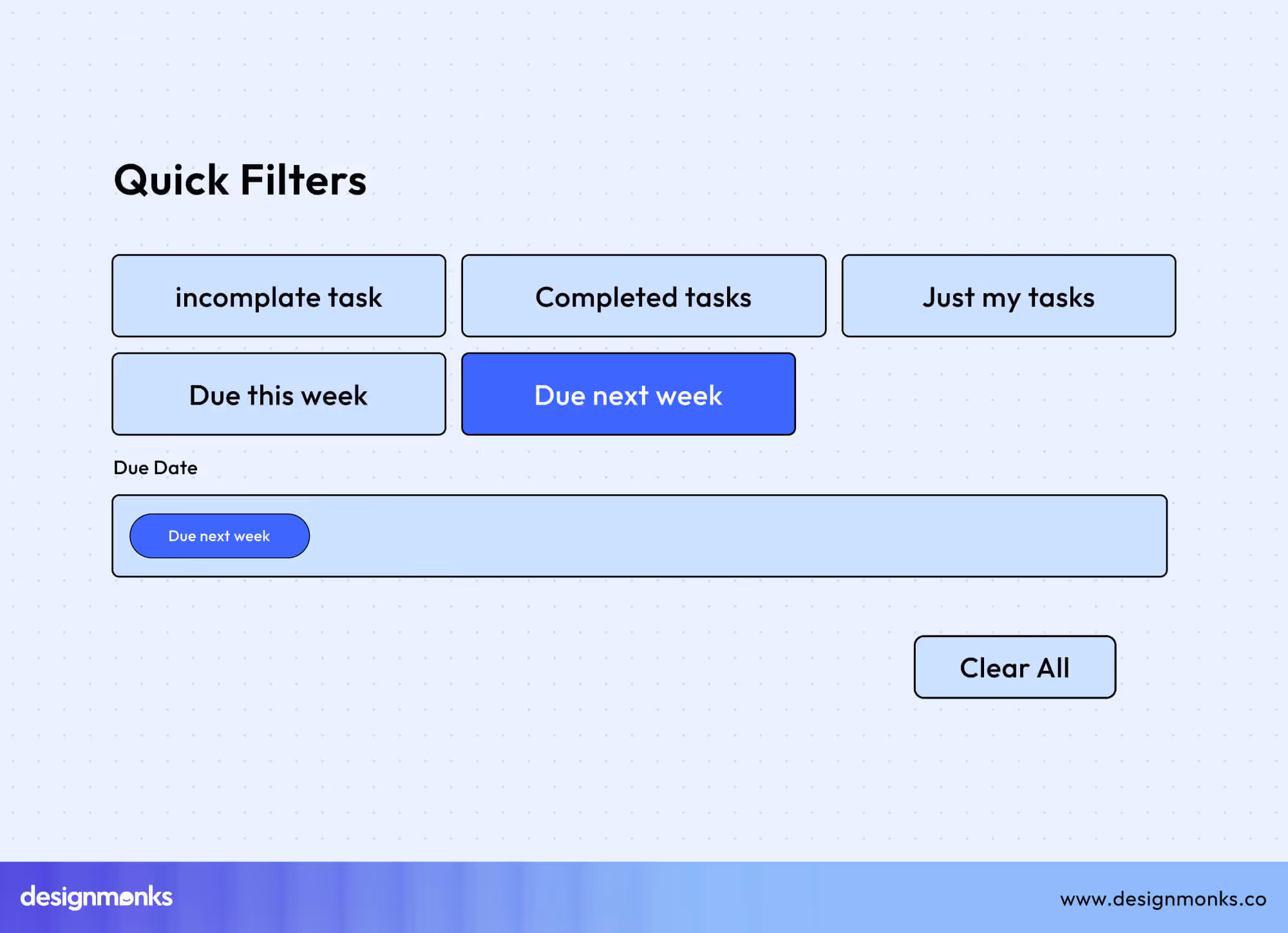
Filter & Sort Controls
Filter and sort buttons help users organize and refine content efficiently. Filters narrow down results based on selected criteria, while sort buttons arrange items by relevance, date, price, or other attributes. Proper use of icons, labels, and visual feedback ensures users quickly understand their options, improves discoverability, and reduces frustration.
Filter Button UI
Filter buttons help users refine and personalize visible data. On mobile and modern web interfaces, filters allow users to adjust preferences without leaving the main view.
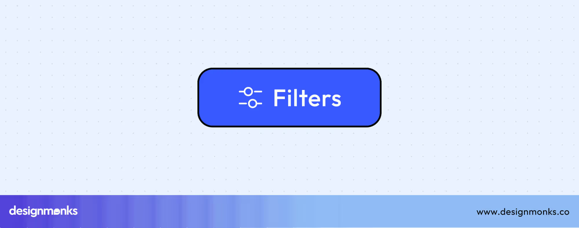
This sliding design enhances usability by keeping the interaction lightweight and focused. It provides a clear separation between content and controls while maintaining easy access. Always include visible applied filter badges and a “Clear All” option, so users can quickly review and reset their selections for a smoother, more intuitive experience.
Sort & Sort By Buttons
Sort buttons organize content by user-selected criteria like date, price, or relevance. Use ascending/descending arrows (↑ ↓) or dropdown menus labeled “Sort By.”
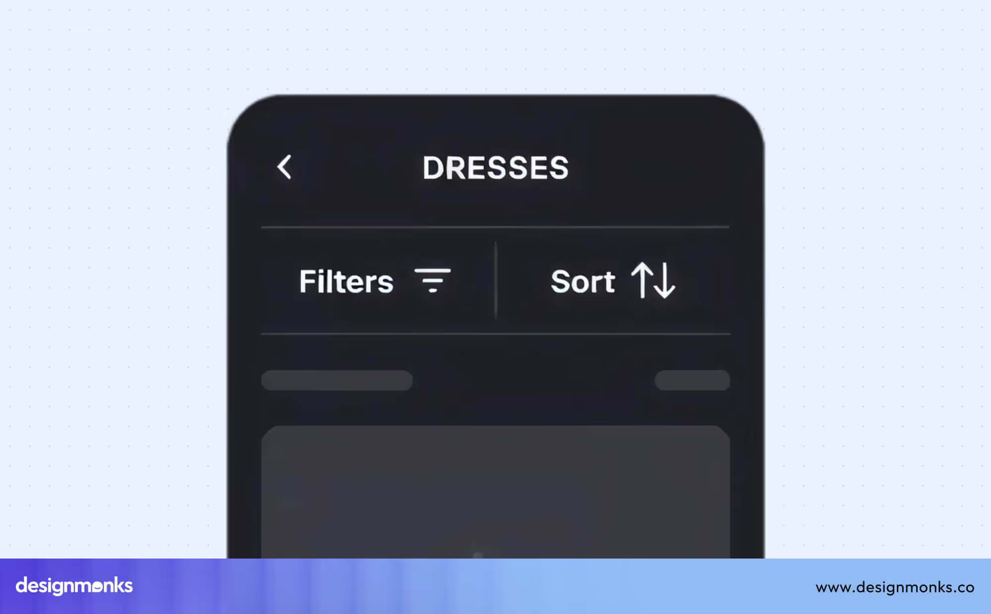
Clearly indicate the active sort order through color, icon direction, or highlighting. Maintain consistent positioning across desktop and mobile to ensure intuitive sorting.
Clear Filter Button UI
Clear Filter buttons reset all applied filters to restore the default view. Labels like “Clear All” or “Reset Filters” improve clarity.
Place them near active filters or at the top of filter drawers for easy visibility. Include badge counters to display the number of applied filters and provide instant visual feedback.
Search Button UI
The search button, represented by a magnifying glass icon, initiates user queries and drives exploration. Integrate it within or next to the search bar for accessibility.
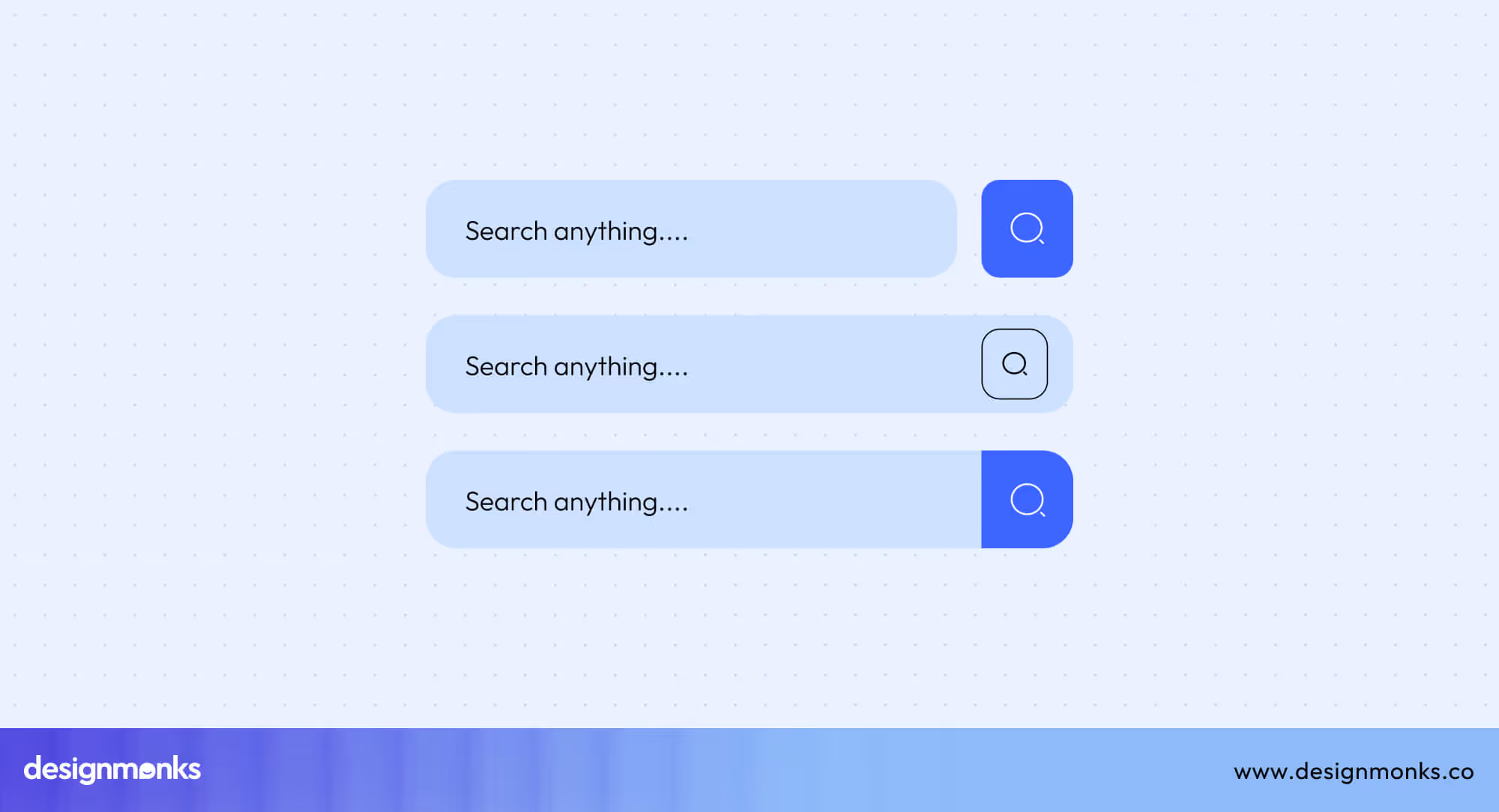
Add voice search options on mobile for convenience. Maintain high contrast for visibility, and ensure the icon remains instantly recognizable across light and dark themes.
File & Data Buttons
File and data buttons manage user files, downloads, exports, and refresh actions within apps and dashboards. They help users upload, access, and update content efficiently. It ensures smooth data interaction and feedback at every step.
File Management
File management buttons give users control over adding, saving, or updating digital content. Whether uploading new documents, exporting reports, or downloading resources, these buttons should provide clear visual feedback and progress states.
Upload Button UI
Upload buttons allow users to add files directly from their devices or through drag-and-drop zones. Use cloud upload icons for familiarity, display progress indicators, and confirm successful completion.
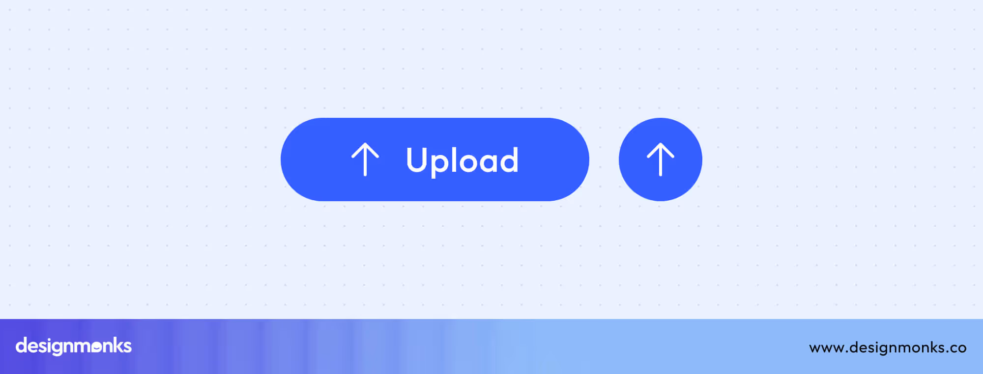
Keeping upload options clear and accessible improves user confidence and minimizes file submission errors.
Download Button UI
Download buttons enable users to retrieve files or documents quickly. The downward arrow icon universally signals file access.
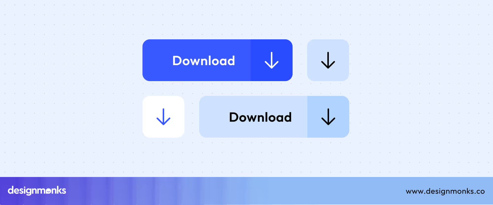
Include file type indicators (e.g., PDF, DOCX, ZIP) and use visual states to indicate when downloads start, progress, or finish, especially for larger files.
Export Button UI
Export buttons let users extract or share datasets in specific formats. They differ from downloads by offering format selection options such as CSV or PDF, and often support bulk export for multiple records.
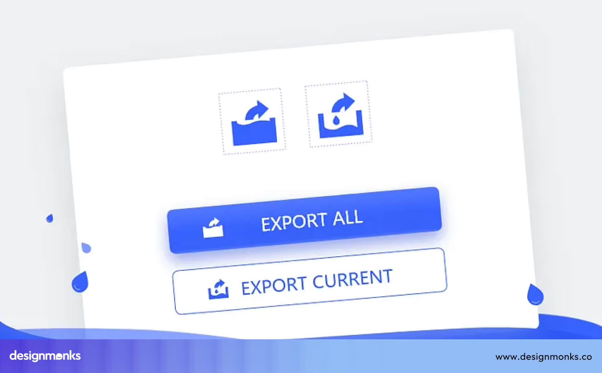
Clear labeling (“Export Report” or “Download File”) helps prevent confusion between export and download actions.
Refresh Button UI
Refresh buttons reload or sync live content and ensure users see the most updated data. It is commonly shown as a circular arrow.
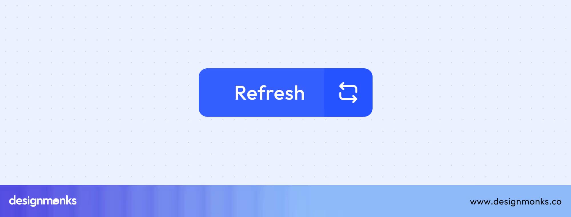
These buttons can perform manual refreshes or trigger auto-refresh features. Adding subtle loading animations provides instant feedback and confirms that the system is working.
E-Commerce & Conversion Buttons
E-commerce and conversion buttons focus on driving user decisions from adding items to a cart to upgrading a plan. Their design should build trust, clarity, and motivation to complete desired actions.
Add to Cart Button UI
Add-to-Cart buttons combine icons and text to make shopping intuitive. Features like quantity selectors and added-to-cart confirmations help users track progress.
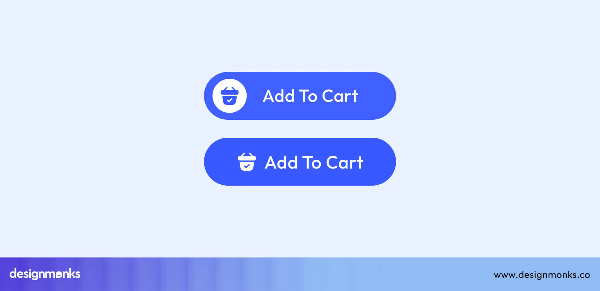
Ensure that these buttons are placed near pricing or product details to maximize engagement and conversion.
Learn More Button UI
Learn More buttons are for further exploration rather than conversion. Labels like “Learn More” or “Read More” help users discover additional product or service details.
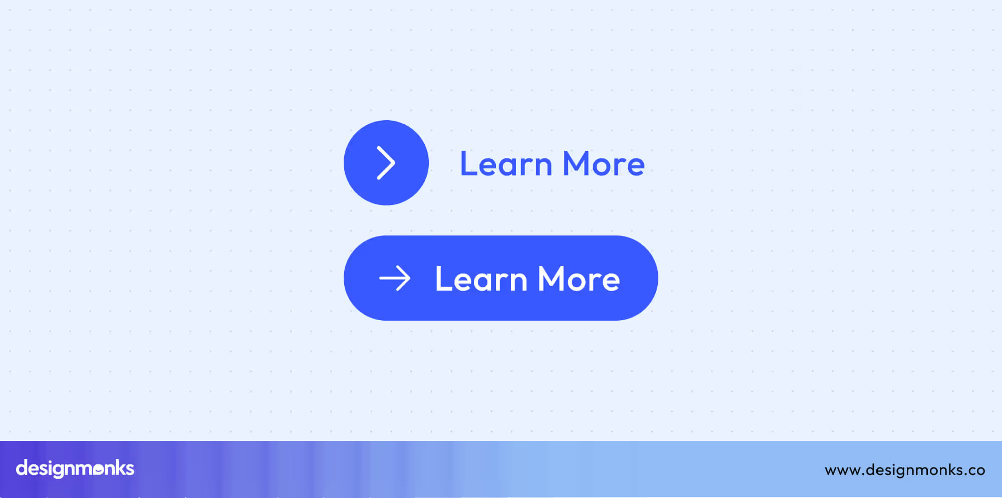
These buttons play a key role in the CTA hierarchy, acting as secondary calls-to-action that build user interest before a stronger “Sign Up” or “Buy Now” appears. Keep them visually distinct from main CTAs to preserve a clear visual and functional flow.
Preview Button UI
Preview buttons let users get a closer look at content without disrupting their browsing flow. Commonly represented by an eye icon, these buttons open quick-view modals or image galleries. It allows users to explore details without navigating away from the main page.
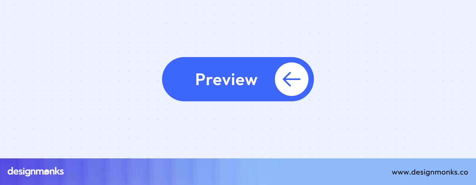
This enhances efficiency, reduces bounce rates, and keeps users engaged longer. Make sure preview interactions are responsive, provide easy exit controls, and load smoothly to maintain a positive experience across devices.
Upgrade Button UI
Upgrade buttons drive user conversion by encouraging transitions from free to paid plans or unlocking premium features. They’re often positioned near pricing tables or feature comparison sections to highlight value and motivate action.
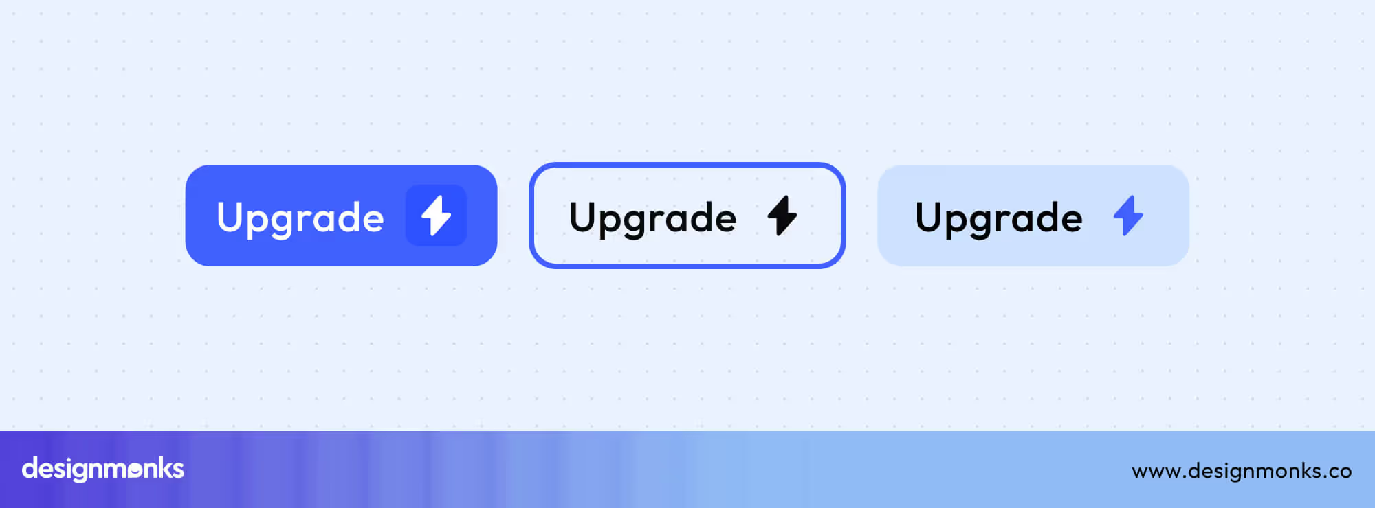
Use strong, benefit-oriented CTAs like “Upgrade Now” or “Unlock Premium,” and maintain visual contrast to make them stand out from regular buttons. Clear messaging and a smooth trial-to-paid conversion flow can significantly boost subscription rates and customer retention.
Communication & Feedback Buttons
These buttons help users communicate, give feedback, and access important information easily. Well-designed communication and feedback buttons improve engagement, transparency, and overall user trust by making interaction feel immediate and effortless.
Feedback Button UI
Feedback buttons collect user opinions, bug reports, or satisfaction ratings directly from the interface. They’re often placed as side tabs that remain visible across pages, ensuring accessibility without distraction.
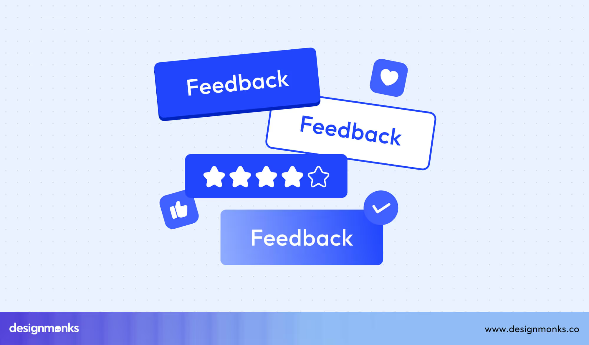
You can trigger ratings or surveys in lightweight modals or drawers, and provide real-time confirmation (“Thanks for your feedback!”) to close the loop. Maintaining visibility and consistency ensures users can share thoughts anytime without hunting for options.
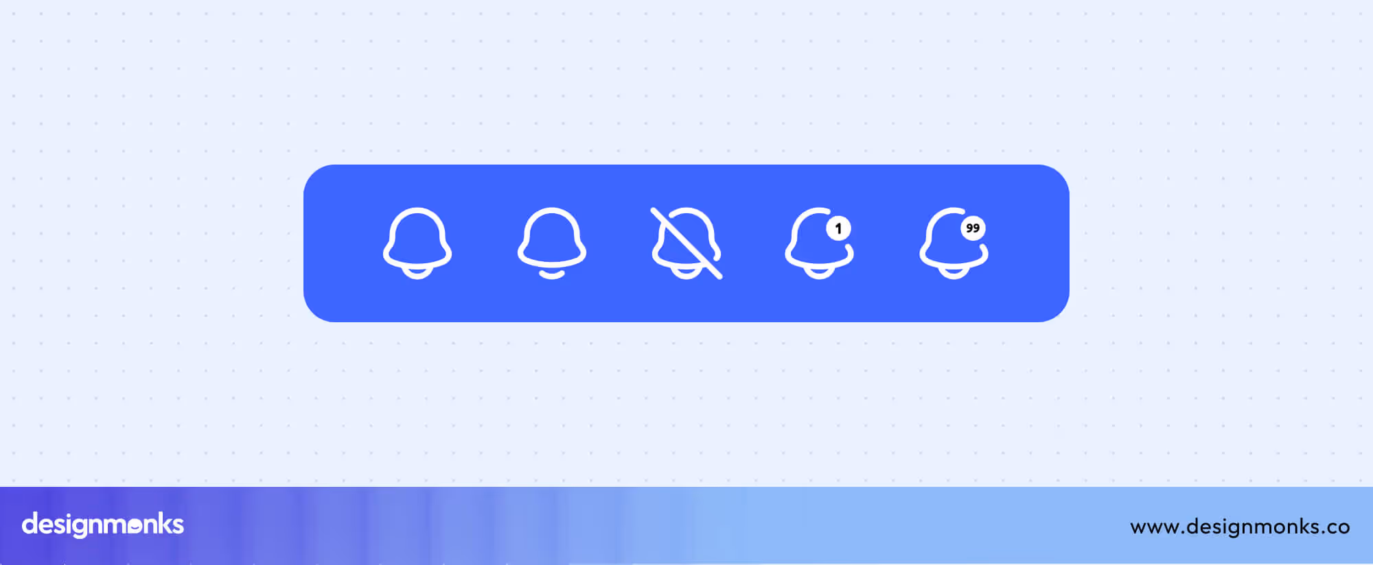
Notification Button UI
Notification buttons keep users informed about updates, alerts, or messages. The bell icon is a universal standard, often paired with a badge counter showing unread notifications.
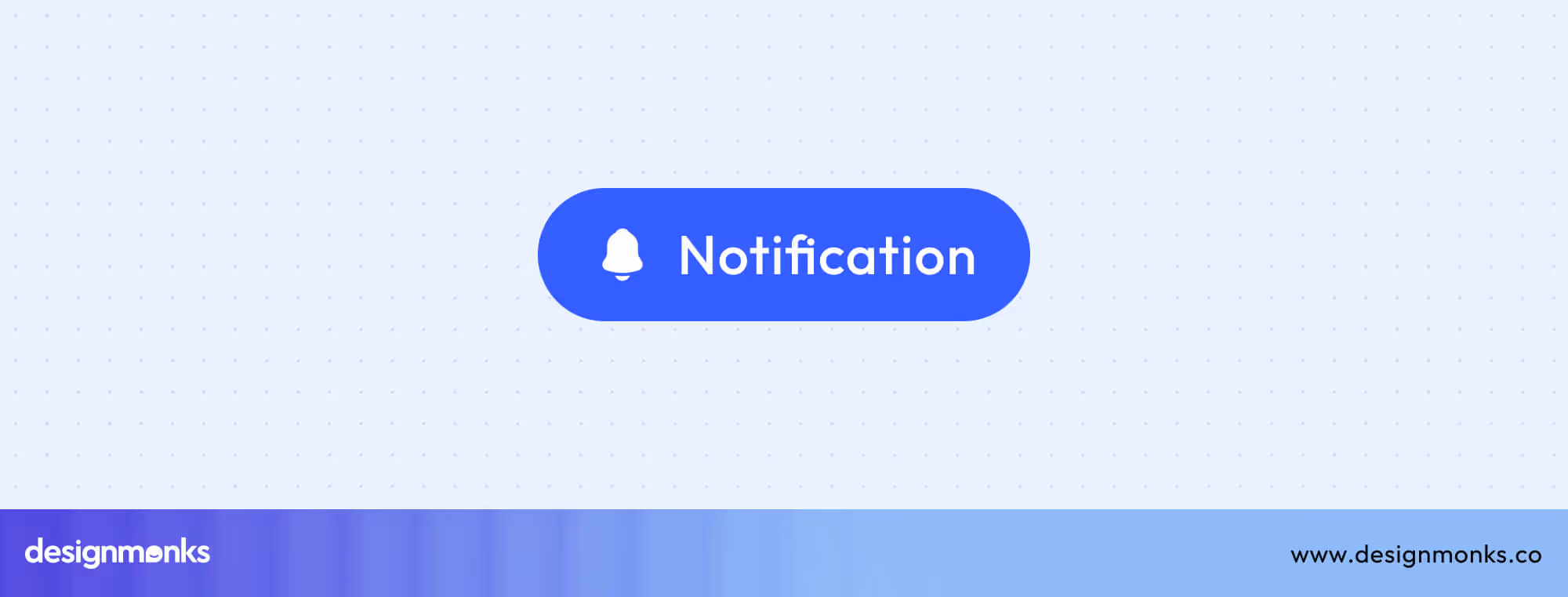
Clicking opens a notification center where users can review or clear alerts. Ensure visual clarity by distinguishing unread states (bold, highlighted, or with motion) and keeping animations subtle. Well-designed notifications balance visibility with minimal interruption.
Help & Info Buttons
Help and Info buttons provide instant access to contextual assistance or additional explanations. Typically represented by question marks or info icons, they trigger tooltips, popovers, or links to help centers.
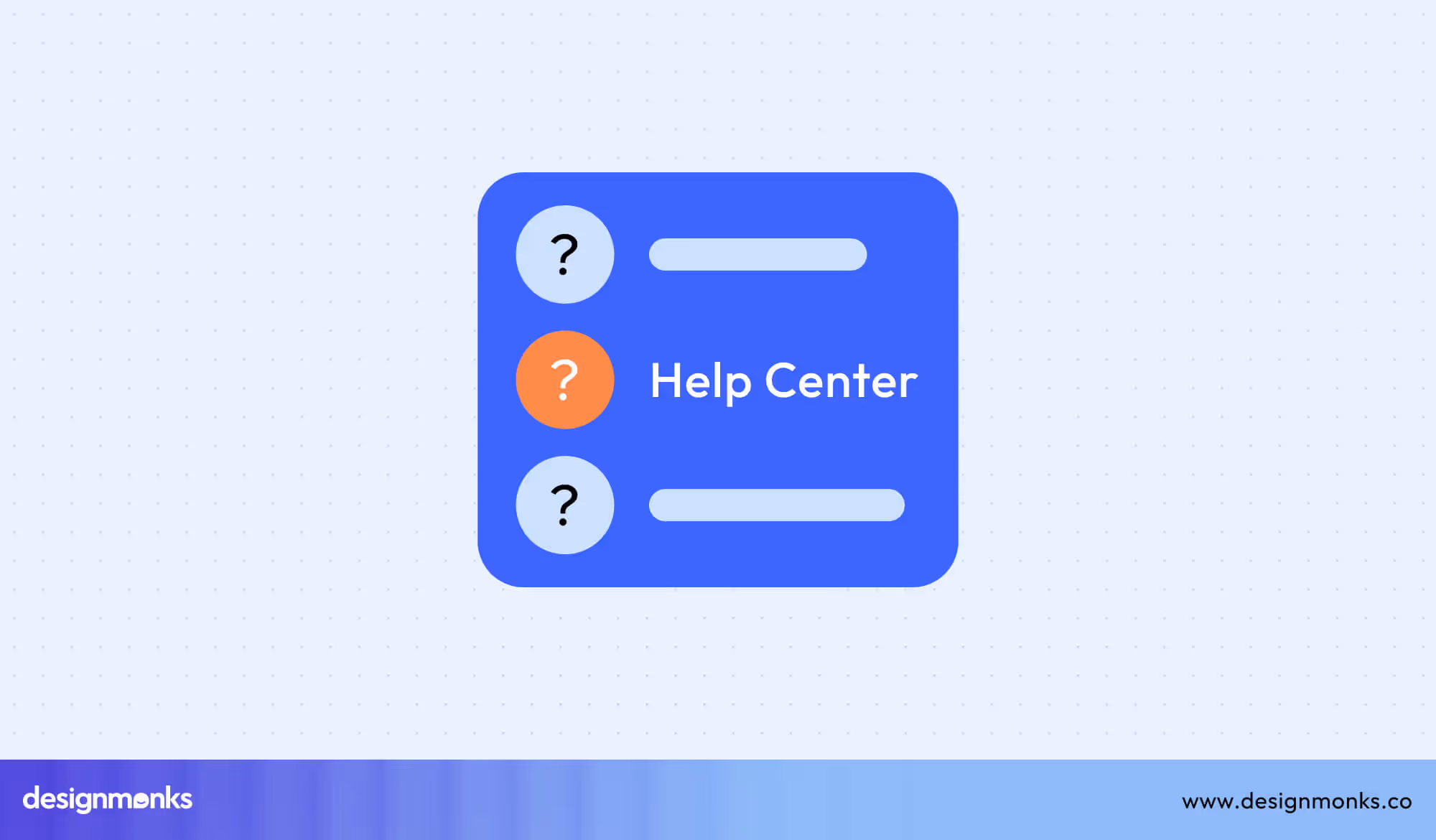
Use them strategically beside complex inputs, new features, or settings to guide users without overwhelming them. Consistent placement and clear labeling improve user confidence and reduce support requests.
Logout Button UI
Logout buttons let users safely exit accounts while preserving data security. They’re usually found in account menus and should prompt confirmation dialogs to prevent accidental logouts.
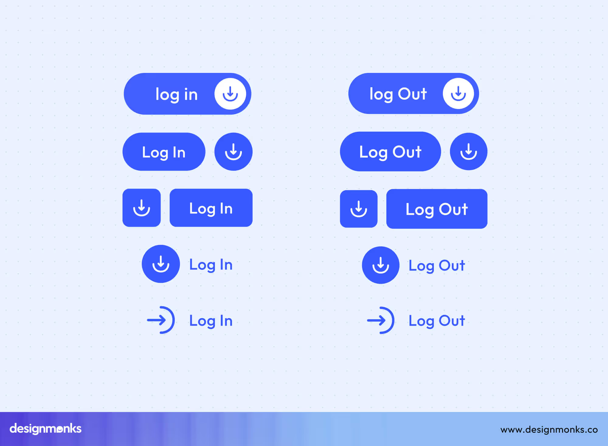
Use neutral or secondary colors but never primary colors to avoid confusion with CTAs. A clear label like “Log Out” or “Sign Out” improves recognition and consistency across apps and devices.
Advanced Button Patterns
Advanced button patterns handle complex interactions and multi-step tasks, going beyond simple clicks. These buttons enhance usability by combining multiple functions, supporting dynamic menus, or adapting to user behavior.
Dynamic & Complex Buttons
Dynamic and complex buttons introduce motion, multi-state behavior, and contextual adaptability. They respond intelligently to user inputs, expanding, revealing options, or shifting states in real time. These buttons help streamline dense interfaces, allowing users to access multiple functions without overwhelming the design.
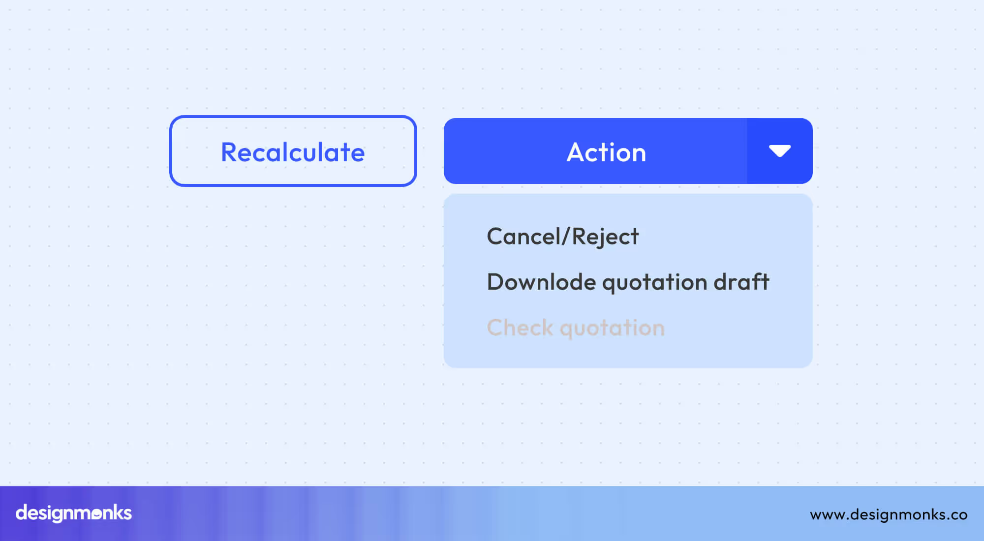
Dropdown Button UI
Dropdown buttons use chevron-down icons to reveal secondary actions or options in a compact menu. These buttons are ideal for organizing related choices without overwhelming the interface. Ensuring proper menu positioning helps maintain visibility and prevents overlapping with other elements on the screen.
Additionally, keyboard navigation support improves accessibility, allowing users to navigate and select options quickly, even without a mouse.
Multi-Action Button UI
Multi-action buttons combine multiple related actions within a single control, helping reduce visual clutter while keeping workflows efficient. They often display combined action menus that expand on tap or hover, offering users contextual choices.
In mobile or dense interfaces, context menus and long-press patterns are common implementations that enable users to select secondary actions without navigating away.
Sticky Button UI
Sticky buttons remain visible as users scroll through content, ensuring essential CTAs like “Buy Now” or “Submit” stay within easy reach. They often appear as fixed CTA bars at the top, bottom, or corners of the screen to maintain visibility.
Some designs trigger their scroll-based appearance dynamically, showing or hiding them based on user movement to prevent distraction. On mobile, sticky footers are particularly effective for maintaining conversion-driven visibility without cluttering the limited screen space.
Slide Button UI
Slide buttons introduce motion-based confirmation by requiring users to swipe horizontally to complete an action. This swipe-to-confirm pattern is ideal for security-sensitive or destructive actions, reducing accidental taps.
They often resemble unlock patterns, providing a tactile and visual sense of control. This interaction pattern is common in payment confirmations, lock screens, and app safety features, ensuring both usability and protection.
Segmented Button UI
Segmented buttons divide related actions into button group controls, allowing users to switch between different modes or filters easily. Each active segment is visually highlighted to indicate selection, providing instant clarity on the current context.
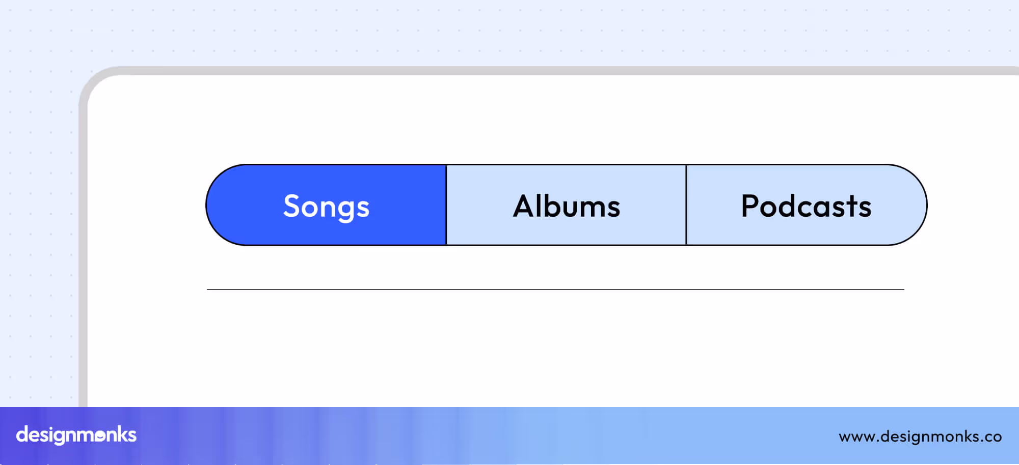
These buttons work well as mobile tab alternatives, filter toggles, or category selectors, maintaining both simplicity and functionality.
Accordion Button UI
Accordion buttons manage expandable content areas like FAQs, data lists, or detailed sections. They use expand/collapse icons, often plus or chevron symbols, to show or hide content efficiently.
This interaction pattern supports FAQ layouts or complex information hierarchies where users need to reveal nested content progressively.
Specialized UI Buttons
Each specialized UI button serves a specific purpose, from opening hidden menus to loading more content. These enhance flexibility and usability across devices. They help users explore, reveal, or access more information without cluttering the interface.
Card Button UI
Card buttons turn an entire card into a clickable area. It makes it easier for users to interact with items like product previews or blog posts. This approach improves usability, especially on touch devices.
Designers often add hover states to indicate interactivity and guide users visually. Some cards also include multiple CTAs, such as “Learn More” and “Add to Cart,” ensuring users can act directly without leaving the main interface.
Menu Button (Hamburger)
The hamburger menu button, represented by a three-line icon, is a familiar navigation tool in mobile and web interfaces. It typically opens a hidden side menu or navigation drawer, helping keep layouts clean and minimal.
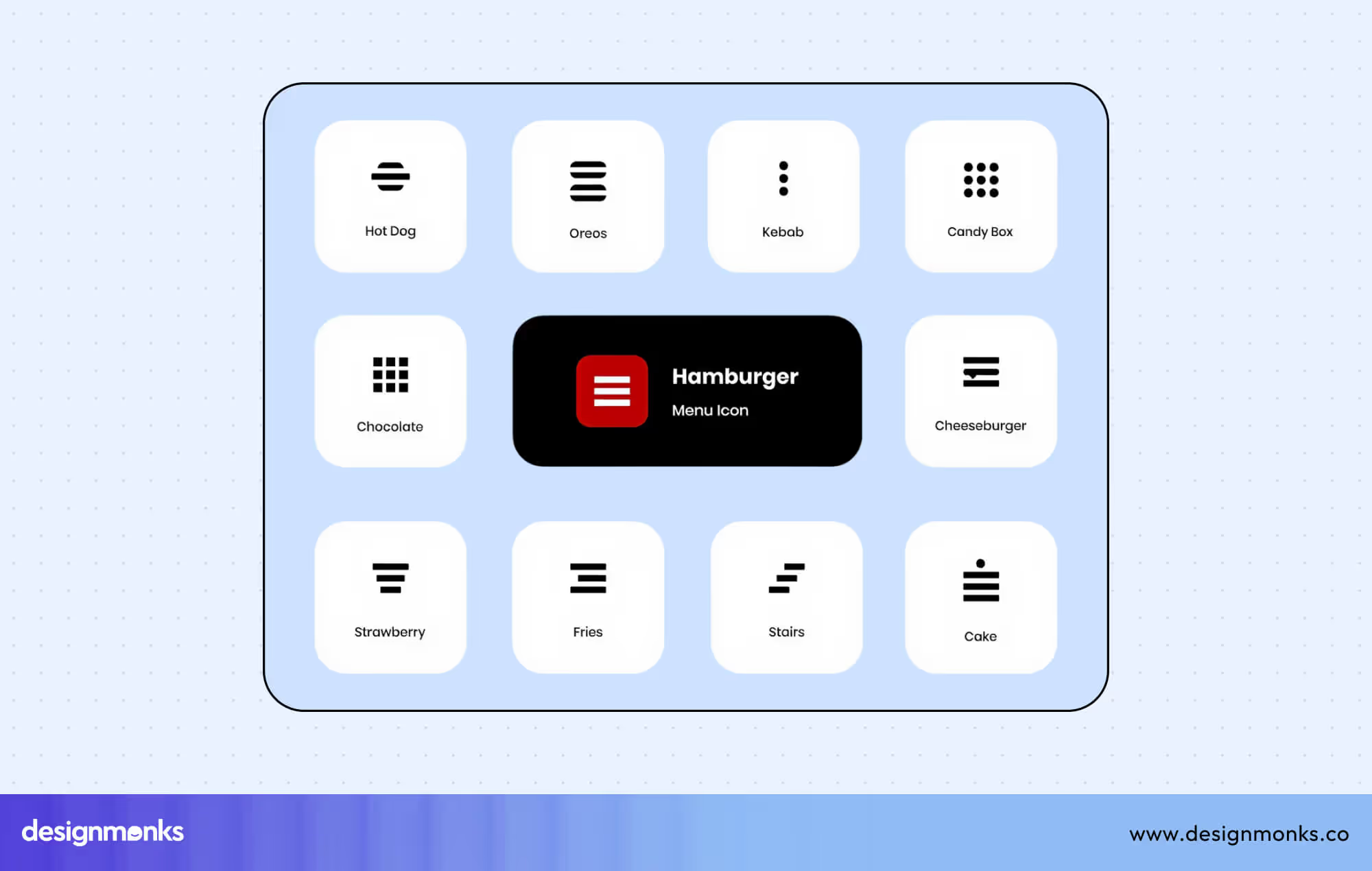
On mobile, it provides quick access to navigation without taking up space. Animated transformations like changing the icon into an “X” when opened make the interaction feel smooth and modern.
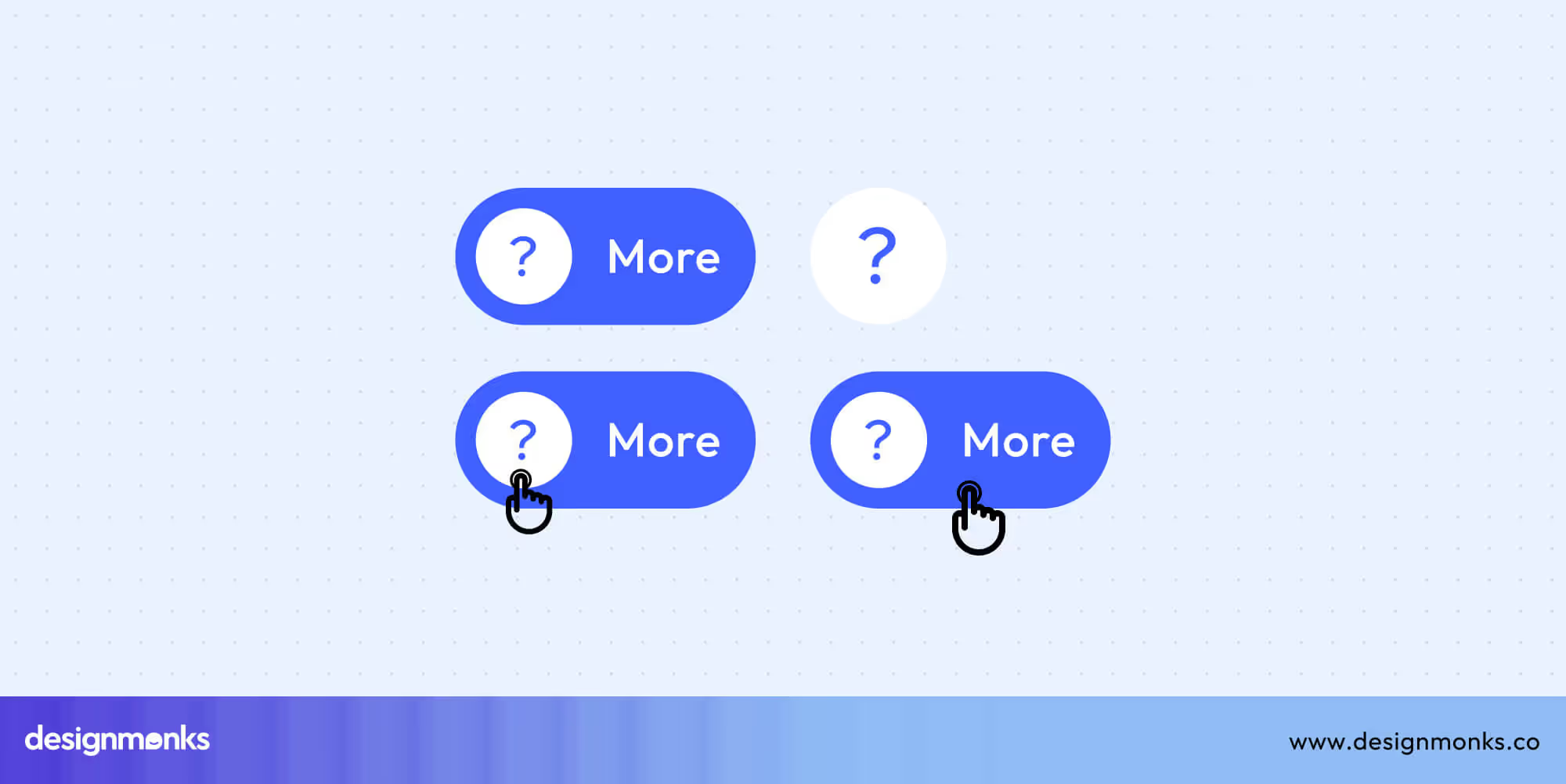
More Button UI
The More button, usually shown as a three-dot icon (•••), opens additional actions or settings that don’t fit in the main interface. It’s common in compact toolbars or mobile apps.
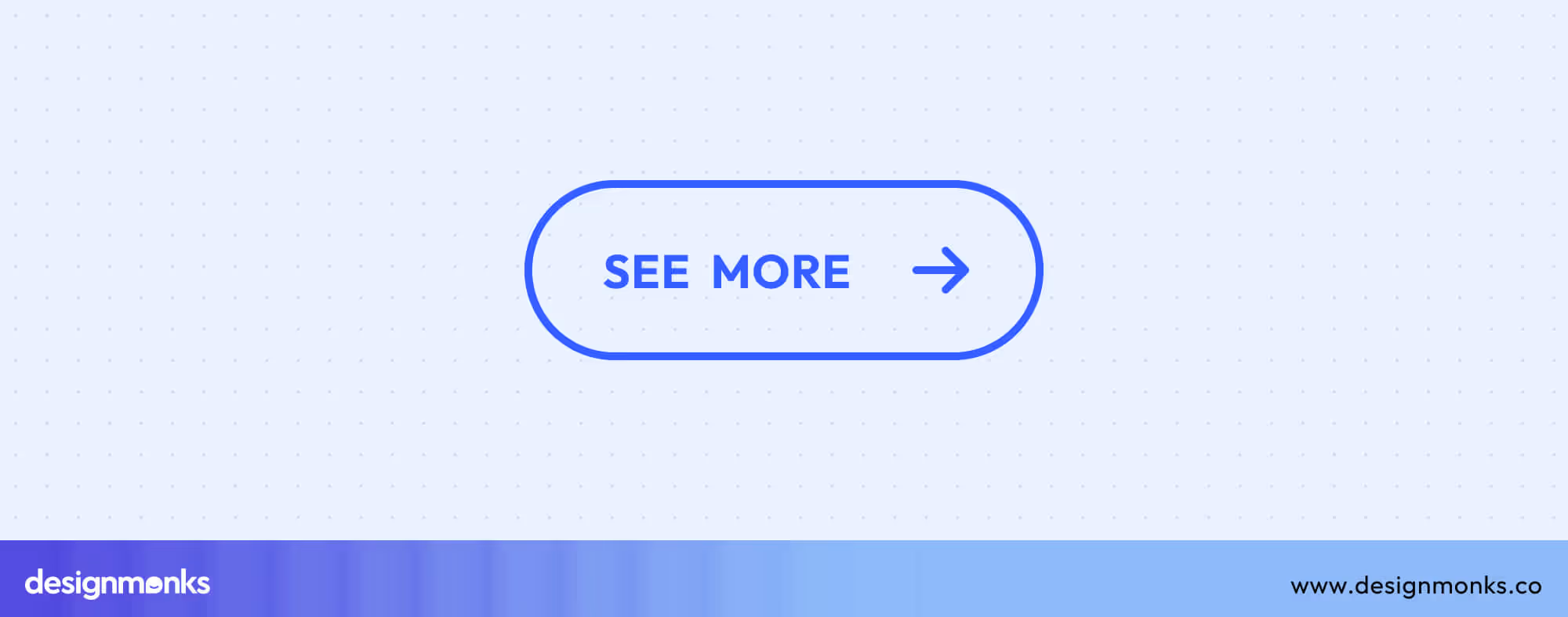
Depending on context, it can also toggle between “See More” and “Show More” to expand hidden text or content. These buttons often lead to overflow menus, keeping designs clean while still offering full functionality.
View More & See All Buttons
View More or See All buttons help users explore larger content sets, like product lists or blog categories. Instead of switching pages, these often use “Load More” patterns or lazy loading.
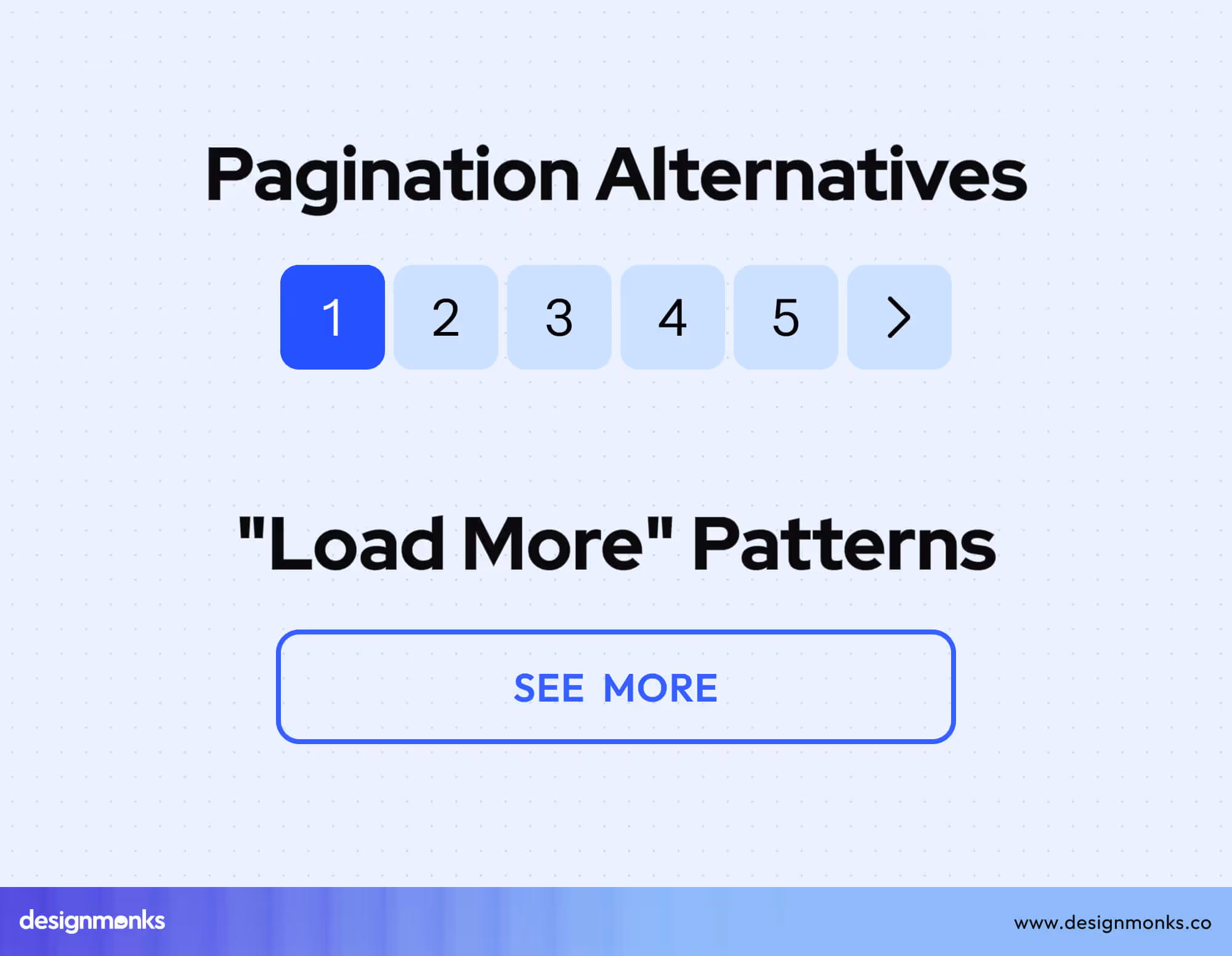
It allows new items to appear smoothly without reloading the page. This creates a faster, more seamless browsing experience and works well for infinite scroll layouts or galleries.
Expand All Button UI
The Expand All button lets users open multiple sections or items at once, saving time when browsing large datasets or FAQs. It often appears alongside “Collapse All” for full control.
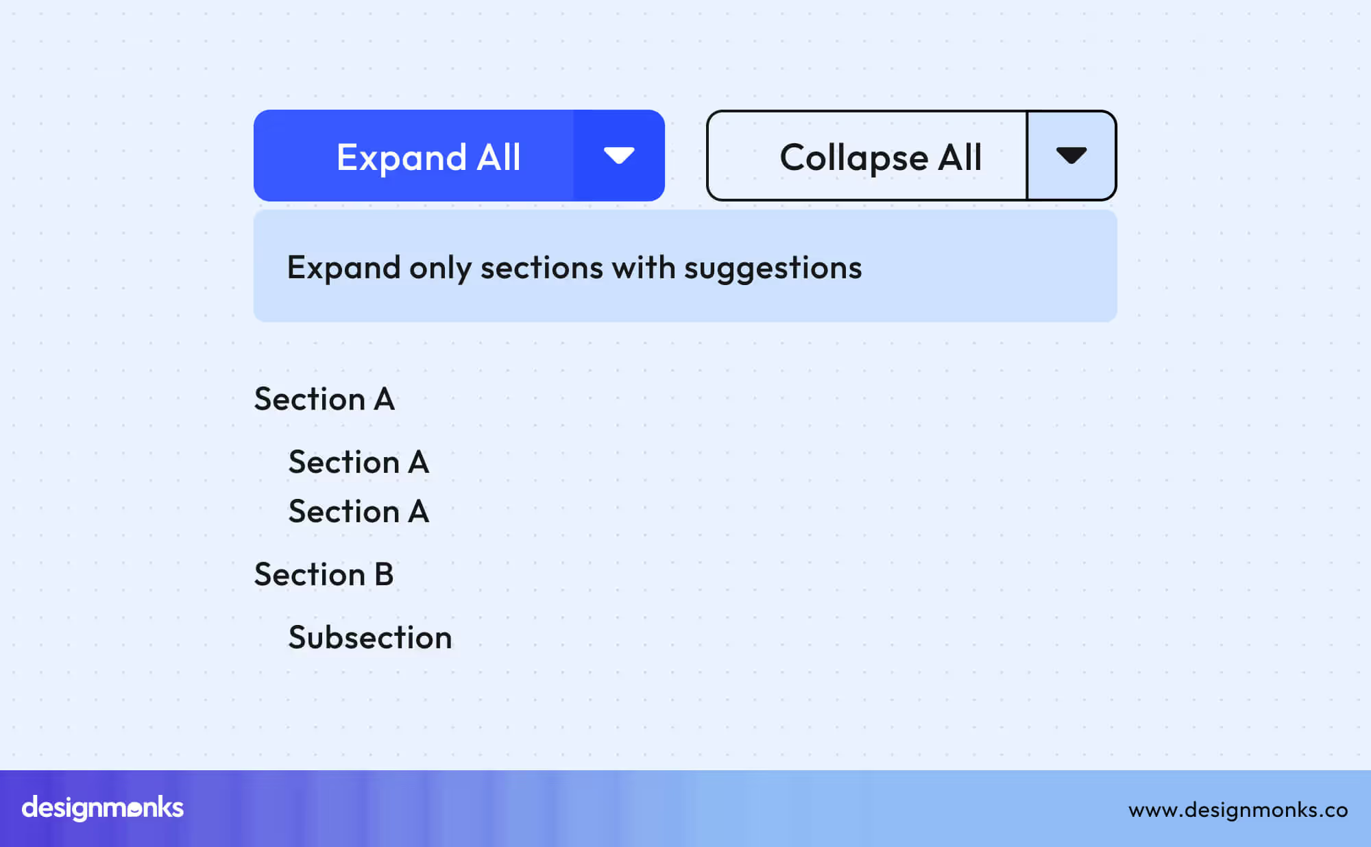
Common uses include opening all accordion sections, expanding table rows, or showing lots of content at once. Make sure it stays fast and smooth, even with many items.
Button UI Best Practices
Designing buttons isn’t just about visuals, it’s about usability, accessibility, and consistency. Great button design ensures that users can interact effortlessly across all devices and contexts. Below are key principles, accessibility standards, and optimization techniques to create buttons that perform well and feel intuitive-
Design Principles
A strong design foundation makes buttons reliable and easy to interact with:
- Minimum Touch Target: Follow platform guidelines such as 44x44px for Apple and 48x48dp for Android. Studies show users are 25% more accurate on buttons that meet these dimensions.
- Button Spacing: Keep at least 8px separation between buttons to avoid accidental taps.
- Label Clarity: Use action verbs like “Submit,” “Save,” or “Buy Now” instead of vague terms like “Click Here.” Clear language improves task completion and accessibility.
- Consistency: Build a reusable button system within your design library to ensure visual and behavioral uniformity across components and pages.
Accessibility
Accessibility ensures that everyone, including users with disabilities, can interact confidently with your interface. To achieve this, buttons should meet WCAG 2.1 AA contrast standards, maintaining at least a 4.5:1 ratio for text to ensure visibility across different lighting conditions.
Keyboard navigation must be seamless, with a logical tab order and all buttons remaining fully focusable. When users navigate via keyboard, provide a visible focus indicator, such as a ring or outline, to show which element is active.
For icon-only buttons, include aria-labels or descriptive text like “Search” or “Close menu” to support screen readers. Additionally, ensure that disabled states maintain at least a 3:1 contrast ratio compared to active buttons so users can easily distinguish between interactive and inactive elements.
Responsive Design
Buttons should feel natural across screen sizes and input types:
- Mobile-First Sizing: Start with larger, thumb-friendly buttons before adapting for desktop.
- Desktop Hover States: Use hover and focus effects for clarity on pointer-based devices.
- Touch vs. Click Interactions: Differentiate feedback between mobile taps and desktop clicks for a better tactile experience.
- Breakpoint Adjustments: Adjust button size, padding, and alignment at responsive breakpoints to preserve balance and readability.
Button States Checklist
Every button should clearly communicate its status. Common interaction states include:
- Default: Visible but neutral before user interaction.
- Hover: Changes color or shadow to indicate readiness.
- Focus: Outlined or highlighted for keyboard navigation.
- Active: Visually pressed or filled to confirm interaction.
- Disabled: Dimmed to indicate inactivity.
- Loading: Replaces text with a spinner or progress indicator.
- Success: Provides confirmation through color (e.g., green).
- Error: Uses red or alert indicators for failed actions.
Common Mistakes to Avoid
Even small oversights can disrupt the user journey. Paying attention to these details helps maintain consistency, accessibility, and user confidence throughout your interface.
Design Pitfalls
These issues may seem minor, but together they create friction, reduce usability, and make your interface feel unpolished:
- Poor contrast in disabled buttons, which causes accessibility failures and confusion.
- Too many primary buttons create visual noise and decision fatigue
- Inconsistent styles across pages break user trust and brand identity.
- Missing hover or focus states leave users unsure whether elements are interactive.
- Tiny mobile touch targets lead to accidental taps and frustration.
UX Anti-Patterns
Avoiding these anti-patterns helps maintain user trust, reduce cognitive load, and promote predictable, intuitive interactions:
- Generic labels like “Click Here” always describe the specific action.
- Using red for non-destructive actions may confuse or alarm users.
- Icon-only buttons without tooltips or labels harm clarity and accessibility.
- Fake disabled states, where buttons appear inactive but still function.
- Autoplay or instant actions without confirmation remove user control and can lead to mistakes.
Button Resources & Tools
After applying best practices and avoiding common pitfalls, the next step is using the right tools to build consistent, scalable button systems. Reliable frameworks and design libraries not only speed up development but also maintain visual and functional harmony across interfaces-
Design Systems
Design systems form the backbone of consistent button design. Frameworks like Material Design outline best practices for motion, color, and elevation, while Apple’s Human Interface Guidelines define interaction and touch behavior for iOS.
The Carbon Design System by IBM supports enterprise-grade applications with accessibility-first components, and Ant Design offers scalable, customizable options for modern web interfaces. These systems help maintain visual harmony and usability across devices and products.
UI Kits & Assets
Pre-built UI kits and asset libraries save time and support consistency. Tools like Figma, Sketch, and Adobe XD offer ready-made button components and icon sets for quick prototyping.
Using consistent PNG or SVG assets ensures that button icons, states, and spacing remain uniform across screens. It's crucial for both speed and brand alignment.
Testing & Optimization
Button design should always be tested in real-world contexts. A/B testing different colors, labels, or placements can reveal what drives higher engagement. In fact, small text or color adjustments can improve click rates by 20–40%.
Tools like heatmaps and conversion tracking help analyze performance, while accessibility audits ensure compliance and usability for all users. By combining design systems, reusable assets, and continuous testing, teams can build buttons that not only look cohesive but also perform effectively across every platform.
FAQs
What’s the ideal size for mobile buttons?
The ideal size for mobile buttons is 44x44px for Apple and 48x48dp for Android. These dimensions account for finger size and touch precision. It reduces accidental taps and improves usability, especially on smaller screens.
How many primary buttons should a screen have?
You should limit to one clear primary button per screen or context to maintain focus. Multiple primary CTAs can confuse users and reduce conversion rates by splitting attention.
What’s the best color for CTAs?
The best color for CTAs aligns with your brand palette. But it must maintain high contrast and emotional clarity. For instance, green signals progress, while red indicates caution.
Should I use icons alone for buttons?
You can use icons-only buttons, but you need to be cautious. Always pair them with tooltips, aria-labels, or text alternatives. Without context, icons can confuse users. Research shows labeled buttons improve comprehension and accessibility, especially for new or international audiences.
Conclusion
Button UI design shapes how users click, decide, and move through your product. Start with a clear button hierarchy in UI and design all button states for consistency. Always test on real devices to ensure smooth performance and make accessibility a priority for all users.
A well-crafted button system doesn’t just guide interactions, it builds trust. Keep refining your buttons, stay consistent across platforms, and let thoughtful design turn every click into a confident, seamless experience.

.avif)
.avif)
.avif)
.avif)


.avif)
.avif)
.avif)
.avif)


.avif)
