.svg)


Key Takeaways
- Reset buttons clear all inputs, unlike cancel, submit, or undo actions.
- Poor placement or styling can cause accidental data loss and frustration.
- Use clear labels, confirmation prompts, and undo options for safety.
- Avoid reset buttons on short forms or tight mobile interfaces.
- Consider alternatives like individual field clears, undo buttons, or hidden menus.
Ever clicked a button and suddenly everything you typed just disappeared? Yup, that tiny “Reset” button can cause big frustration if not used right. That’s why understanding the Reset Button UI is so important. This is especially important if you’re designing a form or app.
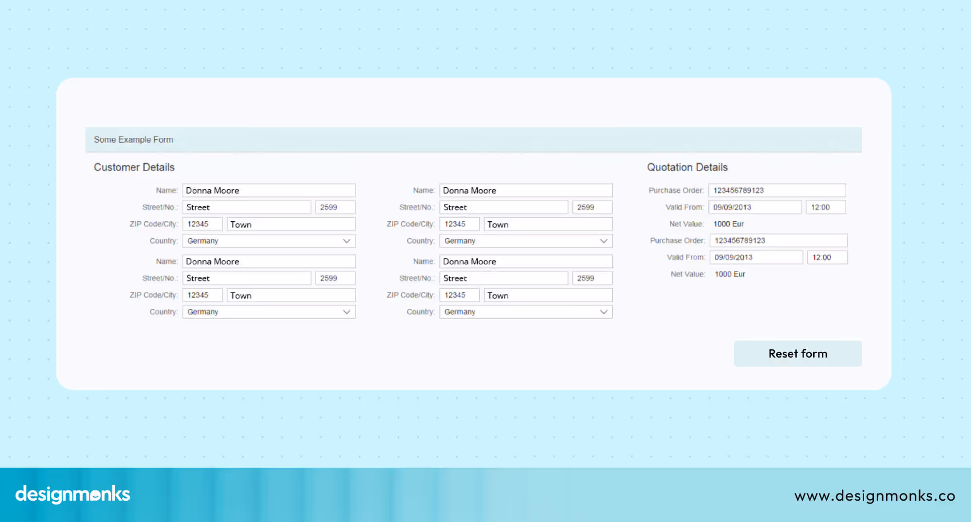
The reset button is meant to clear out all the information in a form. Sounds helpful, right? But when it shows up in the wrong place or looks like the submit button, it confuses users. That’s when trouble starts. People lose their work and feel annoyed.
In this blog, we’ll talk about what Reset Button UI really is, how it works, and when you should or shouldn’t use it. Whether you're a beginner or just curious, you’ll find this guide easy to follow. So, let’s get started!
What Is a Reset Button in UI?
A reset button in UI is a control that, when activated, reverts a system, application, or form to its default or initial state. Essentially, it's a way to "undo" any changes made and start fresh.
This button is used in places such as contact forms, shopping filters, dashboard settings, or system controls where users might want to start over quickly.
For example, you’re shopping online and you’ve chosen several filters like size, color, and brand. Instead of removing each one by hand, you can simply press the reset button, and everything goes back to default.
While many primary UI buttons serve to modify or dismiss user actions, the reset button stands out due to its sweeping effect. Let's compare it to others:
- A submit button is designed to send your input. This is typically used for finalizing and transmitting data, like submitting a completed form.
- A cancel button halts the current action. But it generally preserves any information you've entered. This allows you to resume your task later without losing progress.
- A close button is straightforward, it shuts down a window, dialog box, or pop-up.
- An undo button offers a step-by-step reversal. This allows you to gradually retract recent actions, one at a time.
In contrast, a reset button instantly clears all inputs within a form or interface simultaneously. Because of this immediate and comprehensive data erasure, it's crucial to use the reset button with caution. Accidental presses can lead to significant user frustration and data loss.
Why Reset Buttons Are Tricky in UX?
Reset buttons may seem simple, but they can cause big problems if not handled well. The problems people usually face are:
Accidental Data Loss: If someone clicks the reset button by mistake, all the information they entered disappears. This can be really frustrating, especially after filling out a long form.
People Confuse It with Cancel: Many users think the reset button works like the cancel button. But while cancel just stops the action, reset clears everything. That mix-up can lead to unwanted clicks.
It’s Not Always Needed: Most people don’t use the reset button very often. In many cases, the form works fine without it. Leaving it out can actually make things simpler.
Pressing Reset instead of Submit
Trouble on Small Screens: On phones or tablets, it’s easy to tap the wrong button by accident. If the reset button is close to submit, users might hit it without meaning to.
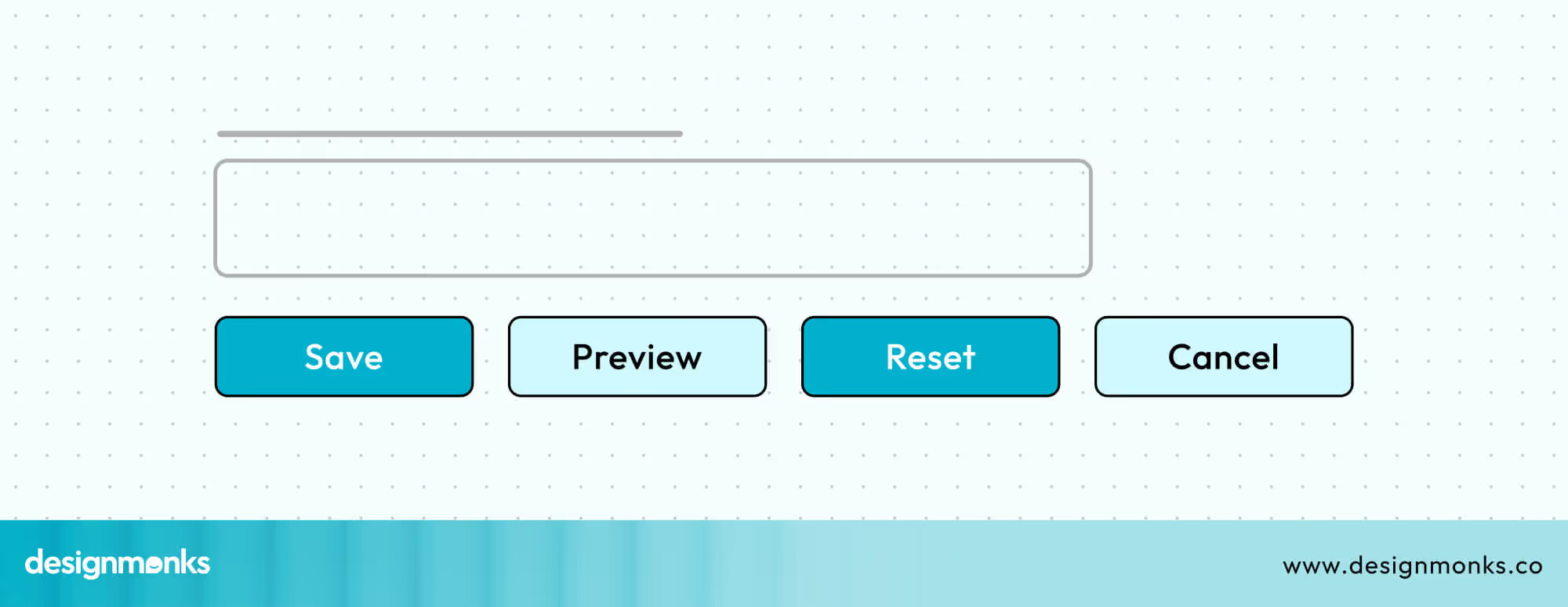
Best Practices for Reset Button UI
Designing a button might seem simple, but getting it right makes a big difference. Let’s go over some helpful tips to make sure your reset button actually helps users, not frustrates them:
Placement
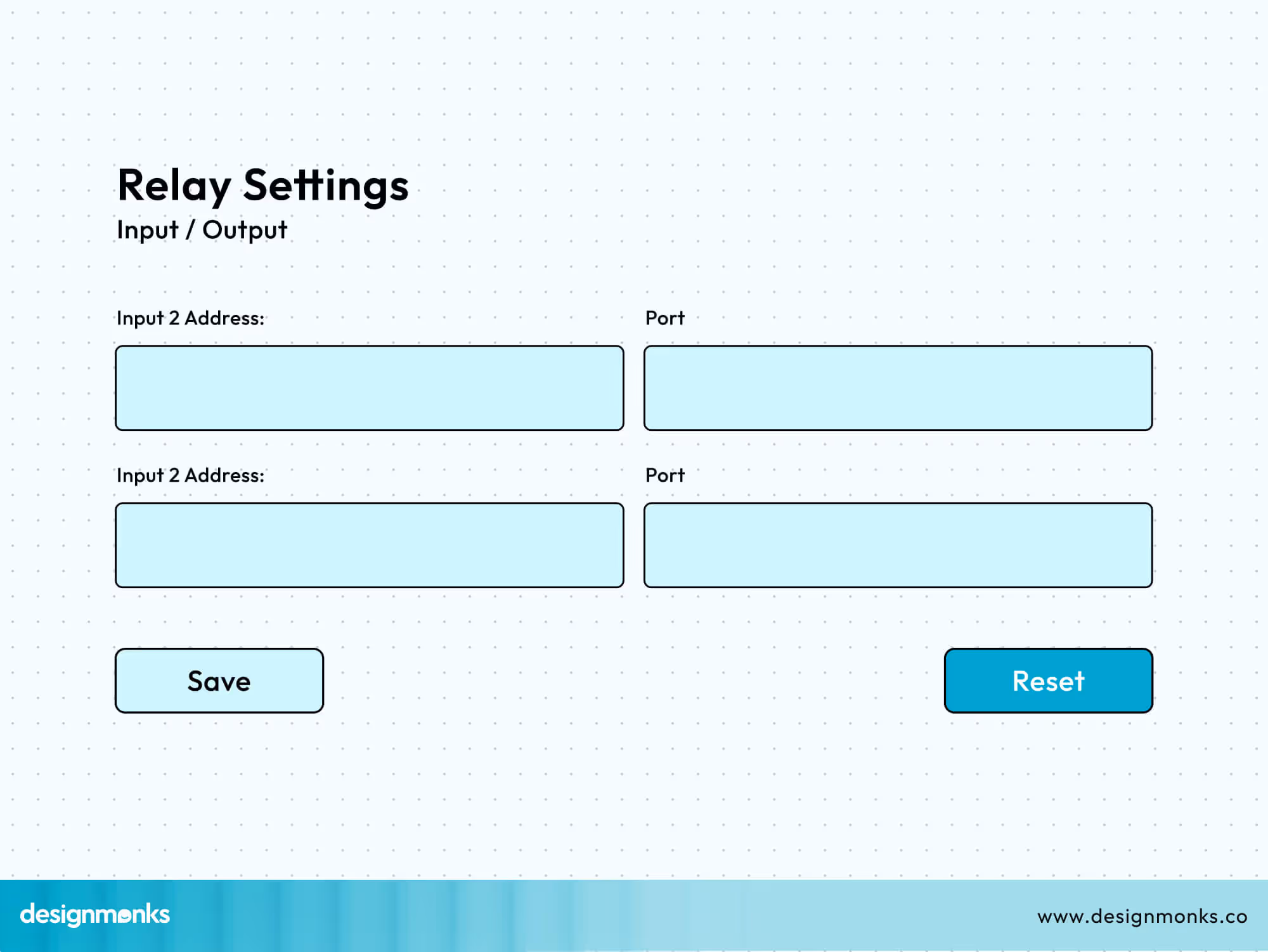
The placement of the reset button is critical to avoid accidental clicks. It should never be placed too close to primary actions like “Submit” or “Save.”
When buttons are side by side, users may click the wrong one by mistake, especially on touch devices or during quick interactions. To prevent this, place the reset button away from the main path users follow through the form.
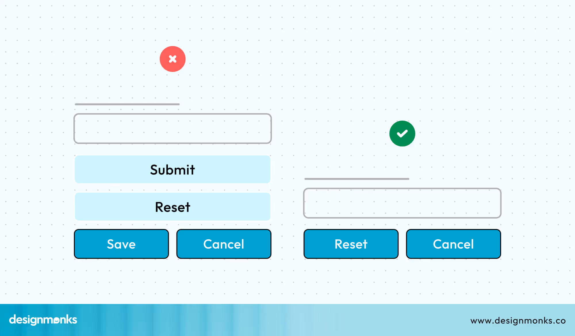
If the form includes other secondary actions, like “Cancel,” group the reset button with those instead. Also, make sure the reset button looks different from the primary action button. This visual distinction helps users quickly recognize the correct action.
Labeling
The label on the reset button UI should clearly explain what the button does. The word “Reset” on its own can be vague, especially for users who aren’t familiar with technical terms.
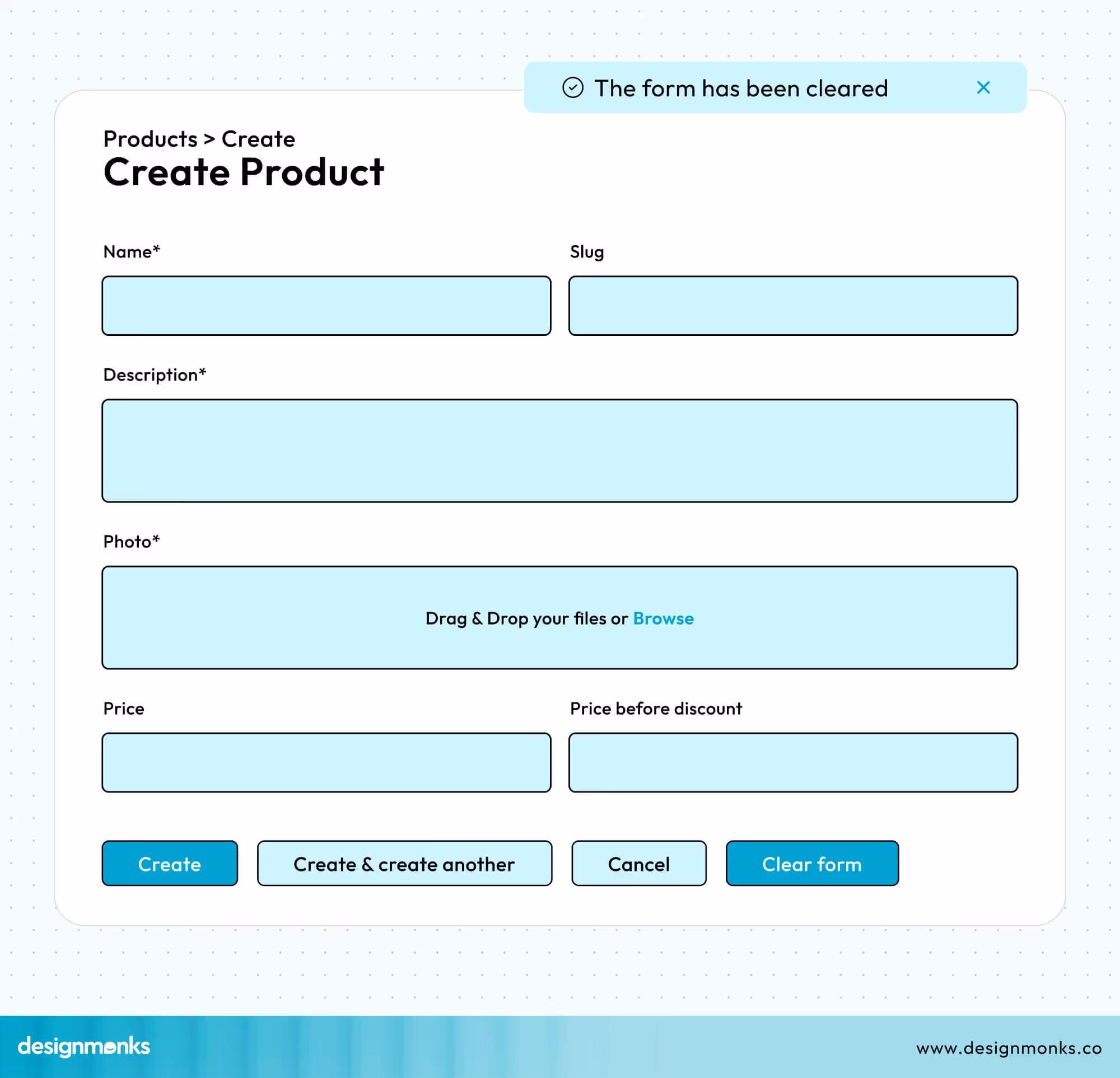
Instead, use specific and descriptive labels like “Clear Form” or “Reset Filters.” These make the button’s purpose obvious and reduce the chance of confusion. Avoid short, unclear words that leave users guessing.
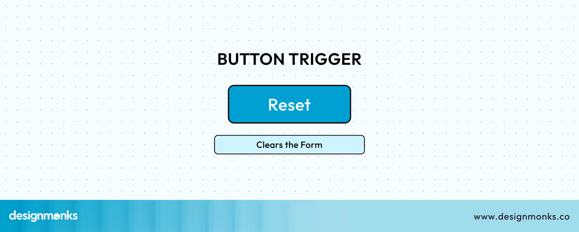
You can also add a brief tooltip or hover text, such as “Clears the Form,” over the Reset button to give users extra context before they click. When users know exactly what will happen, they’re more confident and less likely to make mistakes.
Styling & Hierarchy
The reset button UI should not compete visually with the primary action. Subtle style like an outline or ghost button, can be used to emphasize it as a secondary option.
Choose a muted color such as grey so it doesn’t draw too much attention. Avoid using red unless the reset action is destructive, such as deleting permanent data.
A more neutral look signals to users that it’s not the main task. This visual hierarchy helps guide users toward the most important action while keeping other options available but less prominent.
Confirmation
As the reset button clears the whole information, it’s important to prevent accidental loss. One way to do this is by showing a confirmation prompt before the reset is completed. This gives users a chance to reconsider and prevents them from losing all their work without warning.
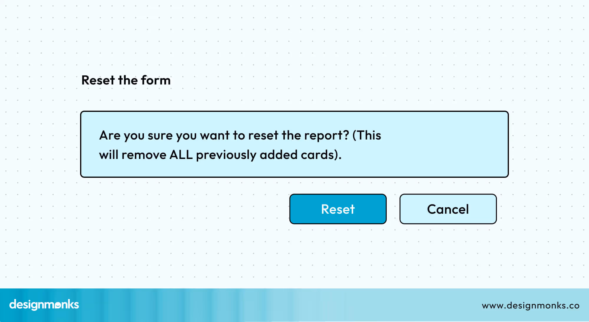
Additionally, providing a temporary “Undo” option after the reset button UI can make the interface more forgiving.
If a user changes their mind, they can recover the data immediately without needing to start over. These small additions can significantly improve user experience and reduce frustration.
Accessibility Considerations for the Reset Button
The reset button must be fully accessible with a keyboard. Users should be able to navigate to it using the Tab key and activate it with Enter or Space. This is essential for users who rely on keyboard navigation instead of a mouse.
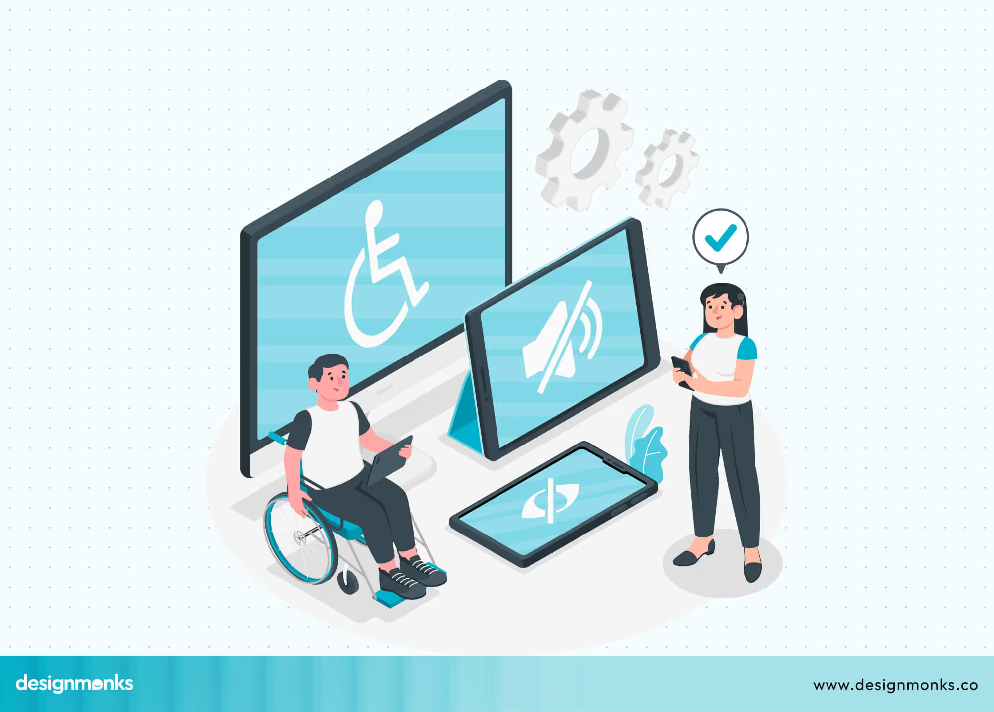
If the button’s purpose isn’t clear from the visible text, use an ARIA label to provide extra context.
ARIA (Accessible Rich Internet Applications) attributes help screen readers communicate the function of elements more accurately. For example, aria-label="Clear form" tells the user exactly what the button does.
Test the button with screen readers like VoiceOver (Apple devices) or TalkBack (Android) to confirm it’s properly announced and functions correctly.
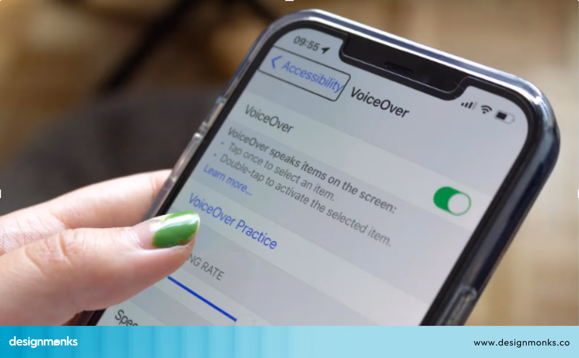
Avoid using icon-only buttons. Always include a visible text label so users can easily understand the button’s purpose, regardless of how they access the interface.
Adapting the Reset Button UI for Different Devices
Designing reset buttons requires different approaches for mobile and desktop interfaces. Each platform has its own challenges and opportunities.
Mobile Challenges & Considerations
Designing reset buttons for mobile comes with unique challenges. Mobile screens have limited space, which increases the chance of users accidentally tapping the reset button.
This happens repeatedly if the button is placed too close to primary actions like “Submit” or “Save.”
When buttons are too small and placed too close together, it’s easier for users to click the wrong one by mistake. To reduce this risk:
- Avoid placing the reset button in high-touch zones, like the bottom-right corner where thumbs naturally rest.
- Use alternative patterns when possible. For example, a swipe-to-reset gesture or a trash icon combined with a clear label or tooltip can make the action more intentional.
- Ensure the button has a clear label like “Clear Form” or “Reset Filters,” so there’s no confusion about what it does.
- Also, consider touch target size and spacing. Buttons should be large enough and far enough apart to avoid misclicks.
Overall, keeping the design minimal and well-spaced improves usability on small screens.
Desktop Challenges & Considerations
Larger layouts of desktops can lead to visual overload or unclear button placement if not designed carefully.
Users may also overlook secondary actions if they’re placed too far from the main content or not styled consistently. To improve the reset button experience on desktop:
- Maintain a clear placement hierarchy. Keep the reset button visually and physically separate from primary actions.
- Use distinct styling, like muted colors or an outlined design, to show it’s a secondary action.
- Add confirmation dialogs before clearing any data to prevent accidental loss.
- Include an undo option after reset. This gives users a quick way to recover information.
- Keep the button within visible range. Desktop users often multitask or switch focus, so clarity, visibility, and safety mechanisms like confirmations and undo are key to a better experience.
Examples of Good and Bad Reset Button UI
Knowing what makes a reset button helpful or frustrating can really improve your design. Here are some simple examples of what to do and what to avoid.
Good Examples
A better reset button is usually a soft grey color and placed away from the main “Submit” button to prevent accidents. Adding a small tooltip or message when users hover over it helps explain what the button will do.
It’s also smart to show a confirmation message before clearing the form or letting users undo their reset, so they feel safe and in control.
Apps like Amazon or Zara handle this well in their product filter sections. The “Clear All” or “Reset Filters” option is lightly styled (often in grey), separated from the “Apply” button, and placed at the top or bottom of the filters panel.
Bad Examples
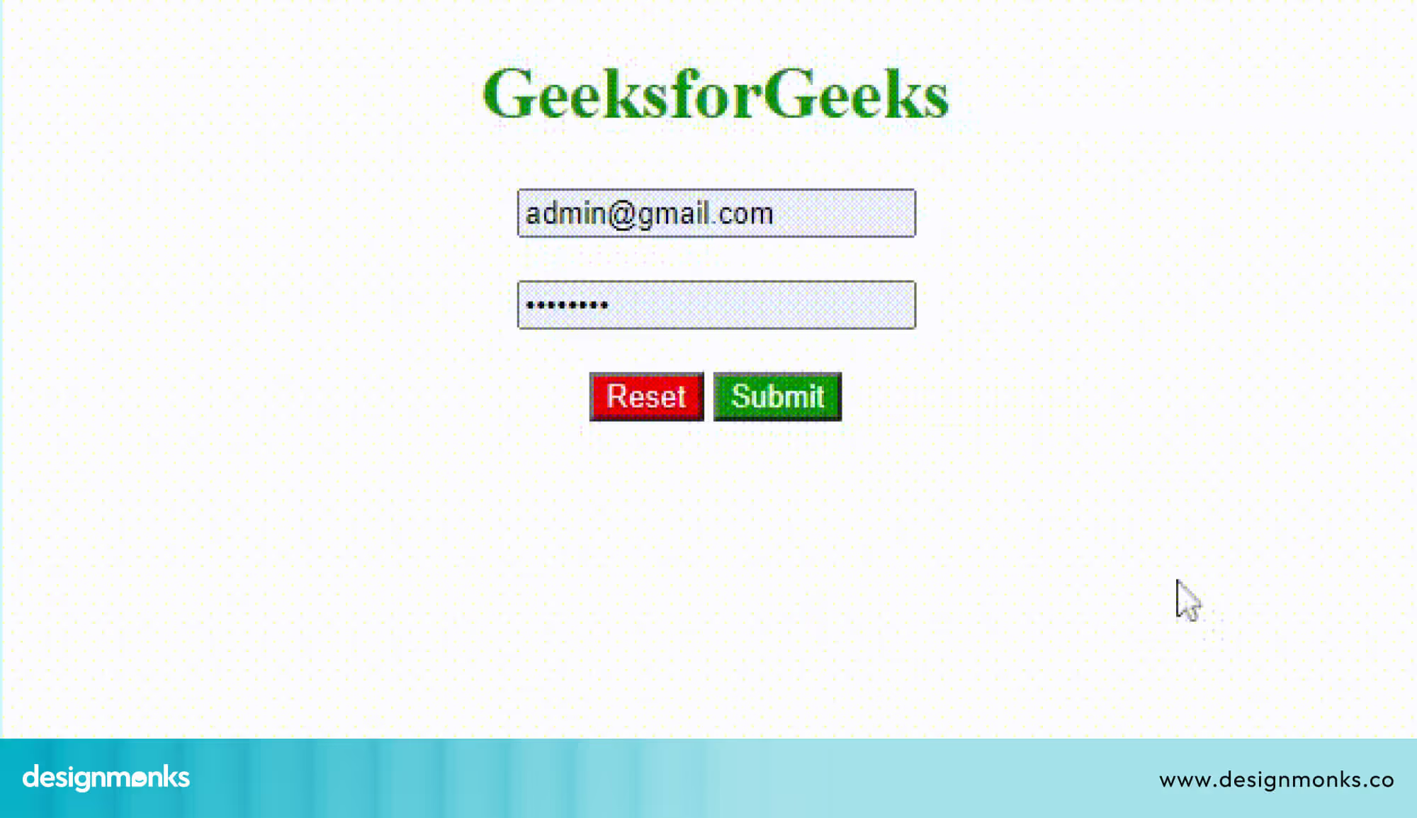
One common problem is putting a bright red “Reset” button right next to the “Submit” button. This can cause users to click reset by mistake and lose all their work.
This happened on some mobile banking apps, like older versions of Wells Fargo or smaller regional bank apps, where the “Reset” button was often placed too close to the “Submit” or “Transfer” button.
If a user accidentally taps it, all the entered payment details disappear instantly, with no warning. That’s frustrating and risky, especially during time-sensitive actions.
Reset vs Clear vs Cancel Button (UX Breakdown)
These three buttons often look similar but behave very differently in real interfaces. Misusing them can confuse users and cause data loss. Understanding their purpose helps you choose the right action and create safer, more intuitive form experiences.
Reset Button (Restore Defaults)
A reset button restores all inputs to their original default values based on HTML input type reset behavior. Good reset button design avoids primary placement and uses a subtle reset button color to reduce accidental clicks.
Clear Button (Empty Inputs)
A clear button UI removes all user-entered data, leaving fields blank instead of reverting to defaults. It is safer than reset in many cases, but still requires careful placement and visual hierarchy to prevent unintended data loss.
Cancel Button (Exit or Abort Action)
Cancel buttons let users exit a form or discard changes entirely. Unlike reset or clear, they often navigate away or close modals. They should be clearly separated from destructive actions and styled neutrally to avoid confusion.
Core Differences
Reset restores defaults, clear empties fields, and cancel exits the process. Reset relies on HTML input type reset behavior, while clear and cancel are custom logic. Clear button UI reduces risk, while reset button design demands caution.
When Should You Use a Reset Button?
Reset buttons can be very useful. But only in the right situations. Here’s when you should think about adding one:
Long Forms
If your form has lots of fields such as name, email, address, preferences, and more, a reset button helps users clear everything at once.
This is especially useful if they make a mistake early on and want to begin again without manually deleting every field.
Quick do-over
Sometimes users just want to start over. Maybe they clicked the wrong thing or changed their mind. A reset button gives them a fast way to clear the form and try again, which helps reduce frustration.
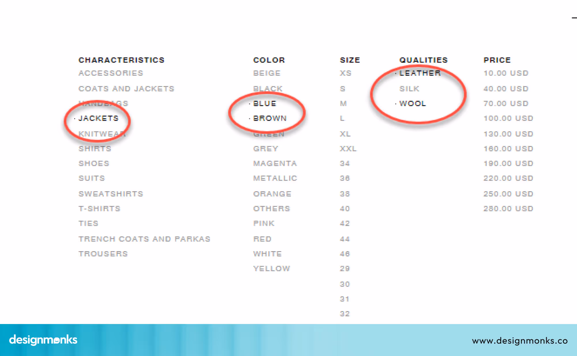
Lots of Filters
In e-commerce websites or search tools, users often choose many filters (like price, color, size, etc.).
A reset button lets them remove all filters in one step instead of clicking each one. It’s a small feature that saves a lot of time.
Actual Usage
Not sure if your reset button is helpful? Check your website analytics. If users are clicking it regularly, it means they need it. But if no one is using it, you might be better off removing it to keep the interface clean and simple.
When Should You Avoid Using the Reset Button?
Don’t add a reset button just because it’s easy to do. Sometimes, it can cause problems by making users lose their work by mistake.
Good design means thinking about what’s best for the user. If the reset button could cause more trouble than help, it’s better not to include it at all. Avoid using one when:
- The form is short: If there are only one or two fields, a reset button isn’t necessary.
- There’s an undo option: A smarter undo feature works better and feels safer.
- One click could erase a lot: You don’t want users to lose their work by mistake.
- Mobile space is tight: On small screens, every button matters, so don’t crowd the layout.
In these cases, skipping the reset button is the smarter choice.
Alternative UX Patterns for Reset Buttons
Sometimes, a full reset button isn’t the best choice. Here are some smarter options to help users without causing frustration:
Clear Individual Fields with “X” Icons
Instead of clearing the entire form, add small “X” buttons next to each field. This lets users remove or change just one part without losing all their work. It’s perfect for fixing small mistakes or changing a single filter.
Use an Undo Button
An Undo button lets users reverse their last action step by step. This is safer than wiping everything at once and helps prevent accidental loss of information.
Hide Reset under “More Options”
If you want to keep a reset option, place it inside a “More Options” menu. This keeps the main form tidy and reduces the chance of users clicking reset by mistake. At the same time, it still offers a way to start fresh if needed.
These alternatives give users more control and reduce stress, and make your form easier and safer to use.
UX Checklist - Reset Button Edition
Want to make your reset button UI easy and safe to use? Here’s a simple checklist to help you do it right:
- Use a clear and helpful label
- Keep it away from the submit button
- Make sure it works with keyboard and screen reader
- Ask before making big changes
- Test it on phones and tablets
Read Also: Nested Tab UI UX Guide
FAQs
What’s the difference between Reset and Cancel?
The difference between Reset and Cancel is how they behave. When you press Reset, it clears everything you typed in the form and makes it blank again. But when you press Cancel, it just stops the process or action without erasing what you’ve written.
What's the best order for Submit and Reset buttons?
The best order for the Submit and Reset buttons is to put the Submit button first. That’s because it’s the most important one. The Reset button should be placed farther away and styled in a lighter color so it doesn’t get clicked by accident.
Should I use a confirmation pop-up for Reset?
Yes, you should use a confirmation pop-up for the Reset button, especially if pressing it will erase a lot of information. A small message like “Are you sure you want to clear everything?” can help prevent mistakes if someone clicks the button by accident.
Conclusion
A reset button UI may look small, but it can have a big impact on the user experience. When used correctly, it helps users feel in control and gives them an easy way to start over.
But if it’s placed poorly or labeled vaguely, it can lead to confusion and lost work. So, take your time when adding a reset button.
Use clear labels, gentle design, and smart placement. And always ask yourself: “Will this really help the user, or just get in their way?”
Until next time!

.avif)
.avif)
.avif)
.avif)


.avif)
.avif)
.avif)
.avif)


.avif)
