.svg)


Key Takeaways
- Nested tabs organize complex content without forcing users to change pages.
- Limit nesting to two levels to avoid confusion and cognitive overload.
- Clear visual hierarchy helps users understand primary versus secondary navigation.
- Mobile-friendly nested tabs rely on stacking, swiping, and collapsible patterns.
- Use accessibility standards and keyboard navigation to support all users.
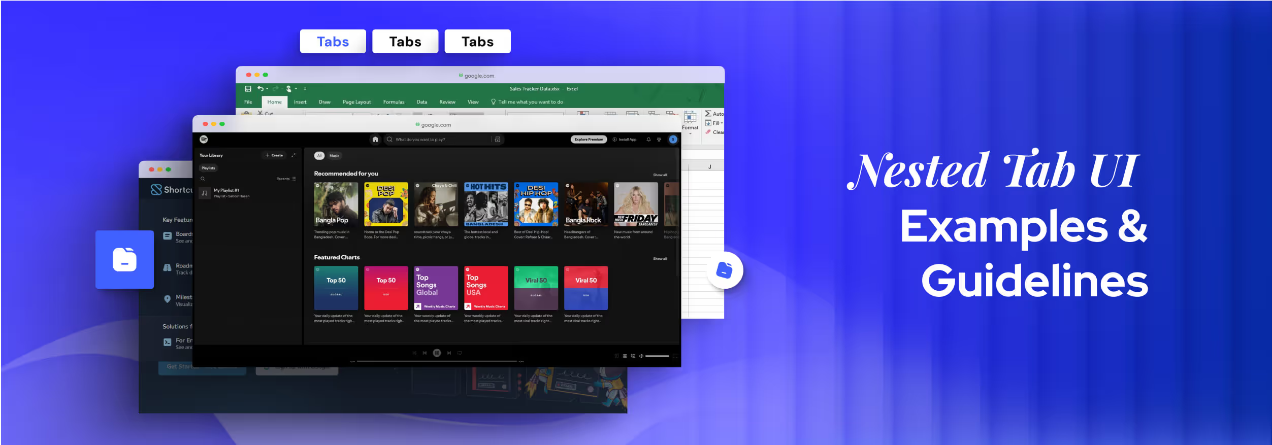
Ever opened a page with too many options and didn’t know where to look first? That’s where a nested tab UI can help. It lets you group related content in a neat and organized way. So users don’t feel lost or overwhelmed.
Nested tab UI is used in dashboards, settings pages, and admin panels. It helps users find what they need without switching to a different page every time. But if the layout isn’t done right, it can make things harder instead of easier.
Curious to know more? You're in the right place. In this article, we’ll discuss what nested tabs are, when to use them, and how to design them simply and smartly.
What Are Nested Tabs?
Nested tabs are user interface elements where one set of tabs is placed inside another. This setup helps organize large amounts of related content without showing everything on the screen at once.
For example, in a content management system (CMS), you might have a top-level tab for "Settings." Inside that, you have nested tabs for "Account Info," "Security," and "Notifications." Each nested tab shows a different group of related options.
You’ll often find nested tabs in:
- Dashboards: In order to switch between data views or reports
- Forms: Breaking up long forms into sections
- Admin panels: For organizing controls by category
- Settings pages: Group detailed preferences under a main setting
- Mobile Apps: For better organization on small screens
This structure works well when designed clearly. But if the layout is confusing, users can lose track of where they are.
Should You Use Nested Tabs in UI Design?
Not always, and many designers avoid them altogether. Nested tabs increase cognitive load by forcing users to track two navigation layers simultaneously, often leading to disorientation and lost context, especially on mobile.
That said, they aren't universally bad. In dense dashboards, admin panels, or settings pages, nested tabs can work well when the information architecture is genuinely hierarchical, and each level stays shallow (ideally no more than two levels deep).
Groups like the Nielsen Norman Group and Material Design generally recommend avoiding nested tabs where simpler alternatives, accordions, dropdowns, or progressive disclosure can do the job. Use nested tabs only when content truly demands hierarchy, not as a default organizational shortcut.
How Nested Tabs Work
Nested tabs organize content through multi-level tab navigation, where a primary tab reveals its own set of secondary tabs. This creates a layered structure, letting users drill into specific content without leaving the main section.
According to the Nielsen Norman Group, this pattern only works well when hierarchy is clear and shallow. Poorly structured layers confuse users, increasing the mental effort needed to track their location within the interface.
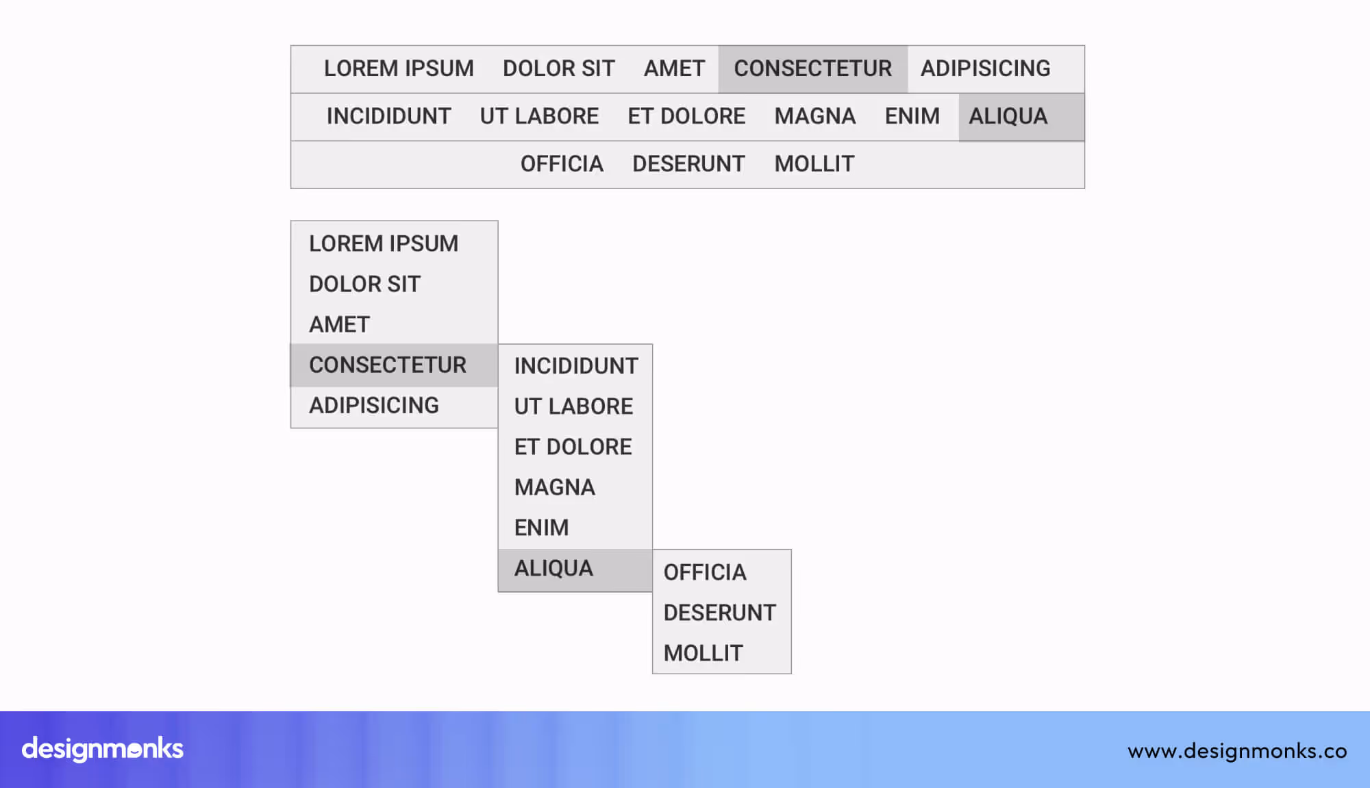
Primary Tabs vs. Secondary Tabs
Primary tabs represent top-level categories, while secondary tabs live inside them, showing related sub-content. This division helps organize dense information, but it only succeeds when each secondary set stays tightly scoped and clearly connected to its parent tab.
Understanding Navigation Hierarchy
Navigation hierarchy defines how users move between levels, top to sub-level and back. Clear visual distinctions (spacing, color, indentation) between primary and secondary tabs help users maintain orientation and avoid losing context.
Mobile and Desktop Nested Tab UI Examples
Understanding how nested tabs function in actual applications can help clarify their usability and design strengths. Let’s look at some real-world examples of nested tab UI on both desktop and mobile platforms.
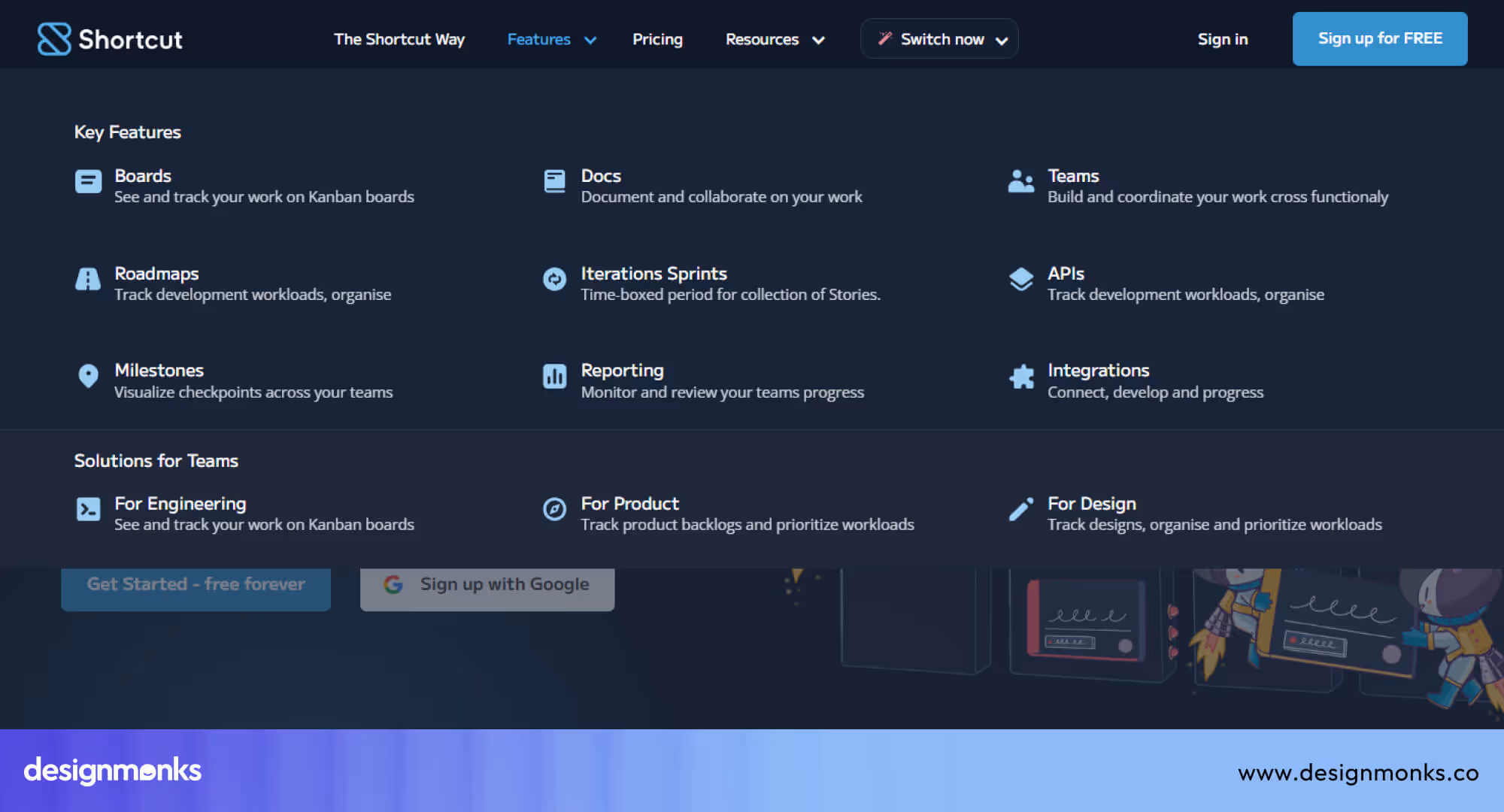
Desktop Example: Google Analytics - Reports & Explore
In Google Analytics, there are main tabs on the left side of the screen. One of these tabs is Explore. When you click on Explore, more tabs appear inside it. These tabs are Free Form, Funnel, and Path.
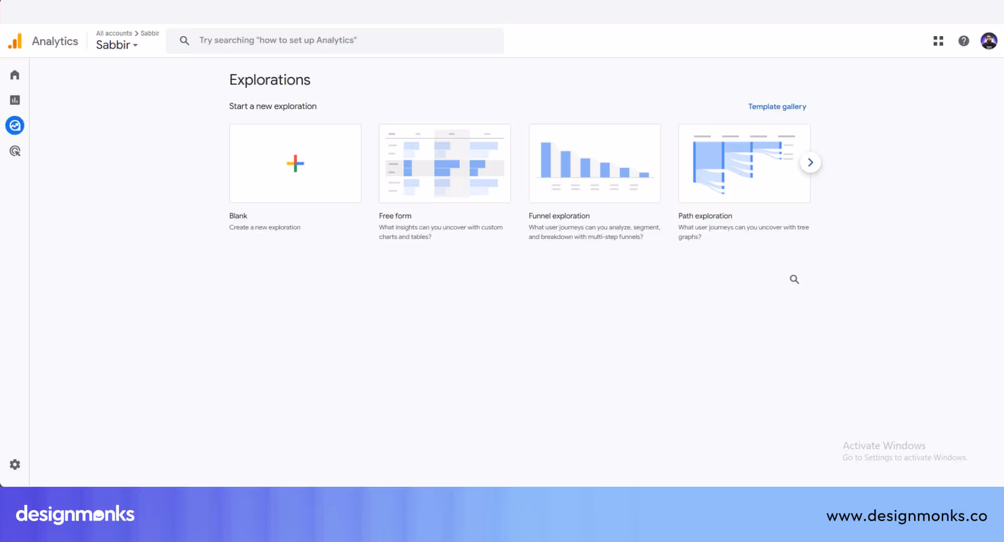
Here, Explore, Free Form, Funnel, etc, are in a nested tab structure. This nested tab structure helps organize related content in a clean, intuitive way. Instead of jumping between multiple pages or digging through long menus, users can quickly switch between different views within a single section.
It’s like clicking into a drawer (Explore) and immediately seeing labeled folders (Free Form, Funnel, Path) inside. This reduces page load times, keeps users focused, and improves navigation efficiency, especially when working with a large set of tools or data views like in Google Analytics.
Desktop Example: Microsoft Excel – Ribbon Tabs
In Microsoft Excel, there is a row of main tabs at the top of the window. These include tabs like Home, Insert, Formulas, and View. When you click on one of these main tabs, like Insert, a new set of options appears below it. These are grouped into sections such as Tables, Charts, Illustrations, and more.
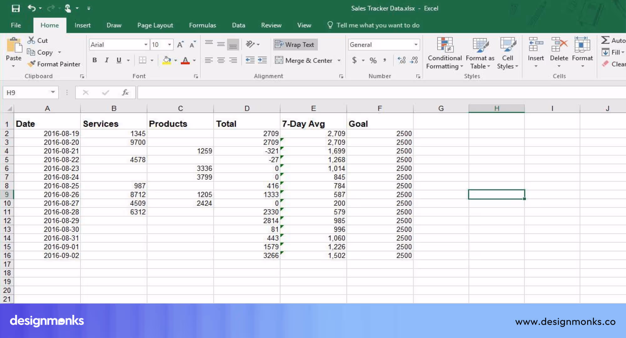
Here, Insert is the main tab, and Tables, Charts, and Illustrations are organized in nested groups within it. This nested tab structure allows users to access related tools without switching screens. Everything related to inserting content is grouped under the same tab. This makes it faster and easier to find the right tool while working in Excel.
Mobile Example: YouTube App-Profile Tab
In the YouTube mobile app, the bottom of the screen shows main tabs like Home, Shorts, Subscriptions, and Profile. When you tap on Profile, you’ll see more sections inside it, such as History, Your Videos, Downloads, and Playlists. These sections appear as separate tabs or lists within the Profile screen.
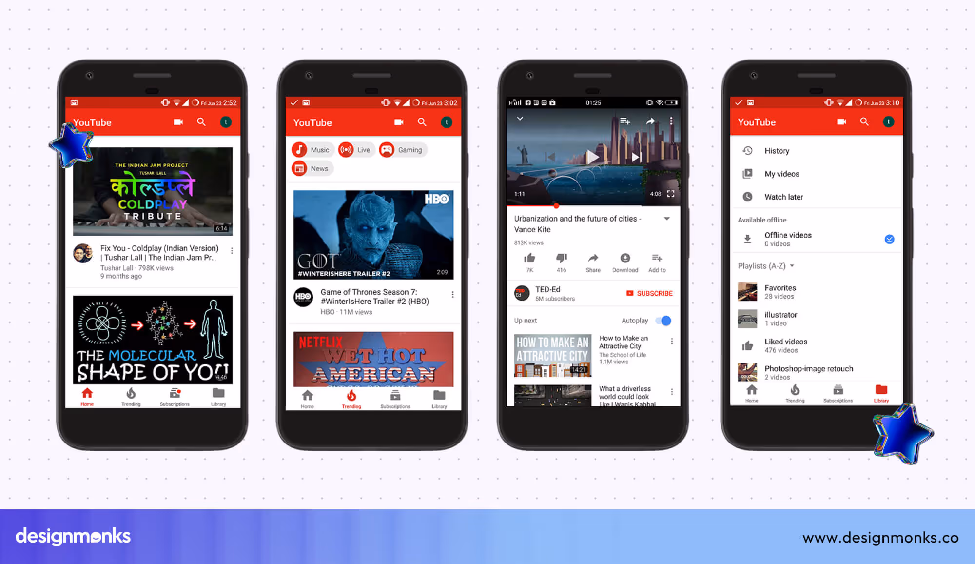
Here, Profile is the main tab, and options like History, Downloads, and Playlists are nested tabs inside it. This design groups all your personal content in one place. This design makes it simple to find and manage videos you’ve watched, saved, or downloaded without switching to other parts of the app.
UI Perspective: Designing Nested Tab Interfaces
Nested tabs are a useful UI pattern for organizing large sets of information in a compact, intuitive layout. They allow users to explore related content without leaving the current screen.
But making them work well on different devices means using a clear layout, organized content, and easy-to-use features. Below, we break down the key considerations and techniques for creating an effective nested tab UI:
Types of Nested Tabs
Nested tab interfaces can take several forms depending on the content, use case, and screen size. Here are the most common design patterns:
1. Horizontal + Vertical Combinations
This is one of the most popular nested tab structures. The primary tabs are arranged horizontally across the top, while the secondary (nested) tabs are displayed vertically along the side.
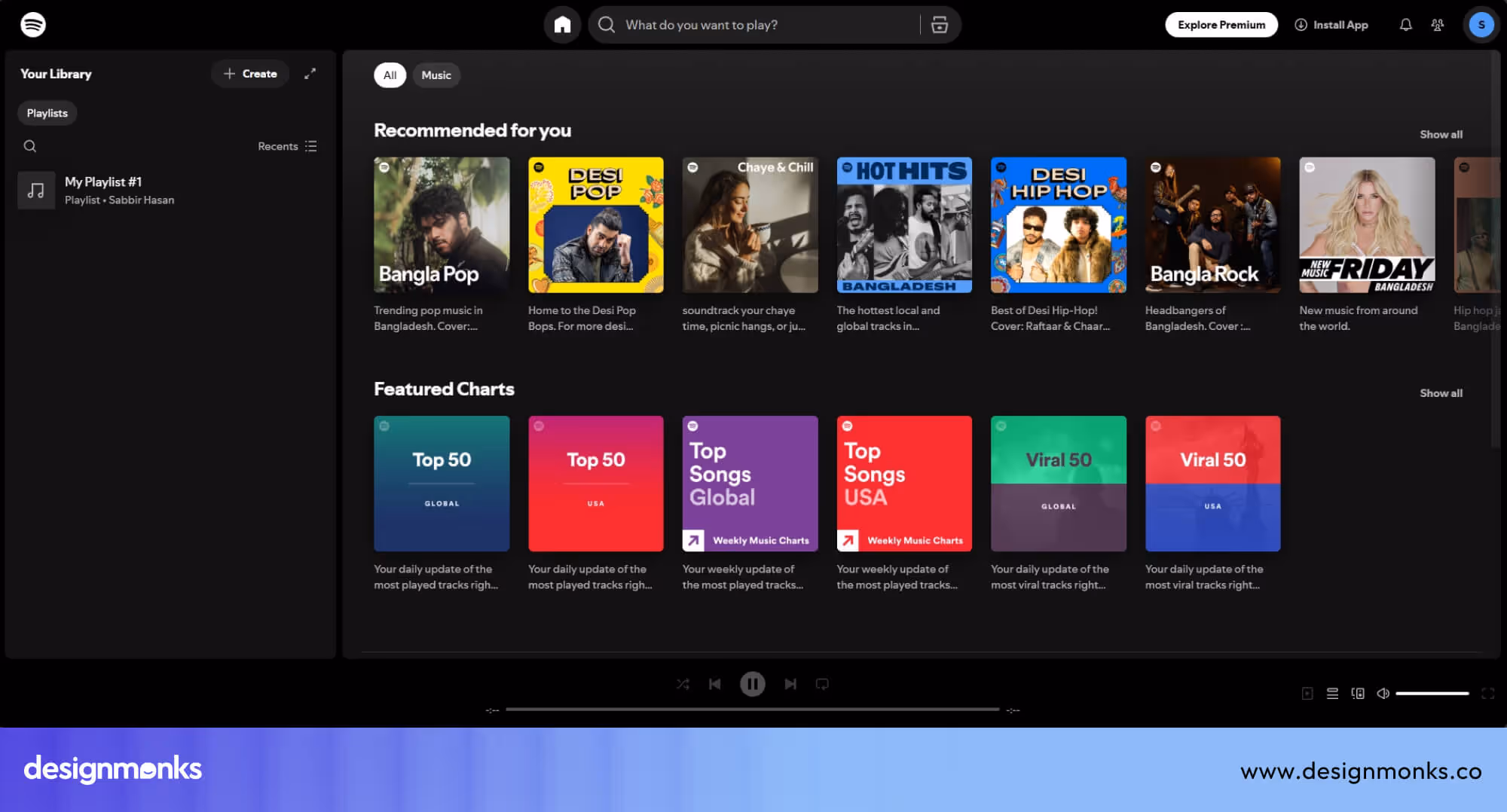
The top has main tabs like Home, Search, and Your Library. Inside Your Library, the left sidebar has vertical navigation for Playlists, Artists, Albums, and Podcasts.
Users can switch main sections horizontally, then drop down into categories vertically. This layout uses space efficiently and allows for clear grouping of subcategories.
2. Tab-in-Tab Layouts
In a Tab-in-Tab layout, one main tab contains another set of tabs or sections within the same interface. These tabs work together on a single screen, helping users stay within the same context while managing detailed information. The nested tabs can be horizontal, vertical, or a mix of both.

In Shopify’s admin panel (as shown in the image), the main sidebar includes a vertical list of top-level sections like Orders, Products, and Customers.
When you click on Products, a new group of nested vertical tabs appears just beneath it: All products, Inventory, Transfers, Collections, and Gift cards. These are sub-sections nested under the Products tab.
This layout is helpful when users need to access several groups of related information without leaving the parent context. It reduces the need for extra clicks and keeps everything organized in one workflow-friendly view.
3. Progressive Disclosure
This approach shows only the essential or basic information upfront. Additional nested tabs or sections become visible only after the user takes a specific action, such as selecting a category or moving forward in a form.
For example, when shopping on an online clothing store like Zara.com, the site first shows broad categories such as “Men” or “Women.” Once you select a category, more detailed filters appear, like size, color, brand, and price range. This step-by-step reveal helps you find exactly what you want without overwhelming you with all the options at once.
By revealing information gradually, progressive disclosure reduces overwhelm and keeps the interface clean and easy to navigate.
Visual Hierarchy & Layout of Nested Tabs UI
A well-designed nested tab UI should clearly indicate which tabs are primary and which are secondary. Visual hierarchy ensures that users can quickly scan the layout and understand the structure. Here are some techniques that help:
- Color Differentiation: Use slightly different colors or shades for primary tabs vs. nested tabs. For example, primary tabs could have a solid background, while nested tabs might use a lighter shade or border.
- Icons: Small icons (like a gear for settings or a star for favorites) next to tab labels make them easier to scan and interpret, especially when space is limited.
- Borders and Grouping: Outline the nested tab area with a subtle border or shaded box to visually separate it from the main content. This helps users recognize that they’re navigating within a sub-section.
- Spacing and Alignment: Maintain consistent padding between tab levels. Nested tabs should appear slightly indented or shifted to show they belong under a parent tab.
Responsive Behavior
Nested tab interfaces must adapt seamlessly across screen sizes, from large desktops to small mobile devices.
Without responsiveness in mind, nested tabs can become cluttered and confusing on smaller screens. Here’s how to optimize responsiveness:
Stack vs. Scroll: On mobile devices, you can switch horizontal tabs into stacked vertical sections to save space. It can become a dropdown or swipeable menu.
Collapsible Nested Tabs: When screen space is tight, use dropdowns or accordion-style nested tabs. This keeps content accessible without overwhelming the screen.
Swipe Navigation: In mobile apps, allow users to swipe between tabs instead of tapping, especially for horizontal layouts. This creates a more natural, gesture-based experience.
Breakpoint Adjustments: Make sure users can adjust your layout at different device breakpoints, one for tablets, another for phones, and so on.
Accessibility Considerations for Nested Tab UI
Designing for accessibility isn’t optional, it ensures that all users can navigate and interact with your nested tab UI. Here's what you can do to make your tabs fully accessible:
Use ARIA Roles: Apply appropriate ARIA (Accessible Rich Internet Applications) roles. Such as:
- role ="tablist" on the container holding the tabs
- role="tab" on each tab element
- role="tabpanel" on each content panel
- Use aria-selected="true" for the active tab
- Use aria-controls to link each tab to its corresponding panel
These help assistive technologies understand the tab structure and relationships.
Enable Keyboard Navigation: Users should be able to move between tabs using the arrow keys, Tab, and Enter/Return keys. For nested tabs, make sure focus states are clear and that navigation between levels is intuitive.
Screen Reader Compatibility: Ensure that screen readers can correctly announce which tab is active, what section it belongs to, and what content it controls. Use aria-selected="true" for active tabs and update labels as needed.
Focus Management: When a tab is selected, keyboard focus should move to the associated content panel so users don’t get lost.
UX Perspective: Are Nested Tabs User-Friendly?
Nested tabs are commonly used in web and app interfaces to present large amounts of information in a space-efficient way. But while they offer organizational benefits, they can also create usability challenges if not thoughtfully designed.
Here’s a breakdown of their advantages, potential pitfalls, and practical solutions to improve the user experience:
Benefits of Nested Tabs for UX
Nested tab interfaces are especially helpful in data-dense or process-heavy environments. Here’s why users and designers often lean toward them:
Organized Content for Power Users
Nested tabs allow advanced users (especially in professional tools or dashboards) to access multiple layers of information without navigating away from the current screen.
Example: In a CRM dashboard, users can view a customer’s general info, billing details, support history, and communication logs all from one location.
Familiar Pattern in B2B and Enterprise Software
Many business tools and enterprise platforms rely on nested tabs as a default UI pattern. Because of this, users in those environments already expect and understand how to use them.
Familiarity reduces the learning curve and increases efficiency in daily workflows.
Faster Navigation Within the Same View
With nested tabs, users can jump between related sections without triggering page reloads or modal windows.
This leads to a smoother, more responsive experience. This is especially useful in form-heavy applications or documentation systems.
Common UX Challenges with Nested Tabs
While nested tabs can enhance content organization, they also carry risks that can frustrate users if not handled carefully.
- Cognitive Overload: Users get overwhelmed when faced with too many tabs at once, especially nested ones.
- Deep Nesting Confusion: Nesting tabs beyond two levels makes it harder for users to maintain orientation within the interface. It’s easy to lose track of what content is related to which category.
- Context Loss: As users switch tabs, they may lose sight of the larger context or forget where they started.
- Scroll-Jump: Switching tabs can cause unexpected scroll jumps on pages with overlapping navigation. This disrupts the flow and can even hide important UI elements.
How to Improve Nested Tab UX?
Nested tabs can be both powerful and user-friendly when implemented with a few smart UX practices:
- Keep Nesting Shallow
Stick to two levels of tab depth. If additional structure is needed, consider using accordions, collapsible panels, or progressive disclosure patterns instead.
Use sidebars or inline steps for tertiary content instead of adding another layer of tabs.
- Use Sticky Labels for Parent Tabs
When scrolling through content in a nested tab, keep the main (parent) tab visible at the top. This helps users stay oriented and remember what section they’re in.
- Provide Clear Visual Feedback
Make sure active tabs stand out clearly. Use consistent color highlights, bold fonts, or icons to indicate which tab is currently open.
But don’t rely on color alone, add contrast, underline, or icon changes to help users with visual impairments.
- Autosave User Input in Forms
If your nested tabs contain form elements, make sure user progress isn’t lost when switching between tabs.
Accidentally losing entered data is one of the most frustrating user experiences, especially in multi-tab forms or surveys. You can show a “Changes saved” message as visual reassurance when autosaving.
Accessibility Considerations for Nested Tabs
Good nested tabs ui design must remain usable for everyone. Solid information architecture alone isn't enough; accessible nested tabs UX requires deliberate keyboard support, screen reader compatibility, and clear visual cues at every navigation level.
Keyboard Navigation
Users should navigate tabs using arrow keys, Tab, and Enter without needing a mouse. Nested levels must support consistent key behavior, allowing smooth movement between primary and secondary tabs without confusion.
Screen Reader Support
Screen readers must announce tab labels, states, and hierarchy clearly. Without proper markup, users relying on assistive technology can't tell whether they're inside a primary tab or a nested secondary section.
ARIA Roles and Labels
Use role="tablist", role="tab", and role="tabpanel" correctly for each level. Proper ARIA labeling ensures assistive technologies accurately convey relationships between nested tabs and their corresponding content panels.
Focus Indicators
Visible focus outlines help users track their current position, especially across nested layers. Without strong focus styling, keyboard users can easily lose track of which tab or sub-tab is active.
WCAG Considerations
Nested tabs should meet WCAG 2.1 guidelines for operability and clarity. This includes sufficient contrast, logical tab order, and predictable behavior, ensuring the component remains usable across diverse accessibility needs.
When Not to Use Nested Tabs?
Nested tabs can help organize content efficiently, but they’re not always the right solution. In some cases, using them can actually create confusion, slow users down, or lead to unnecessary complexity. Here’s when it’s better to use a different design pattern:
Situations Where Nested Tabs Fall Short
If each tab requires long blocks of content or multiple interactions, cramming everything into one screen with nested tabs can become overwhelming.
A better alternative for this would be to break the content into multiple pages, sections, or a structured mega menu for clearer navigation and faster load times.
Designing a Step-by-Step Process
If your content follows a linear flow, such as signing up, entering payment details, and confirming, nested tabs disrupt the natural sequence.
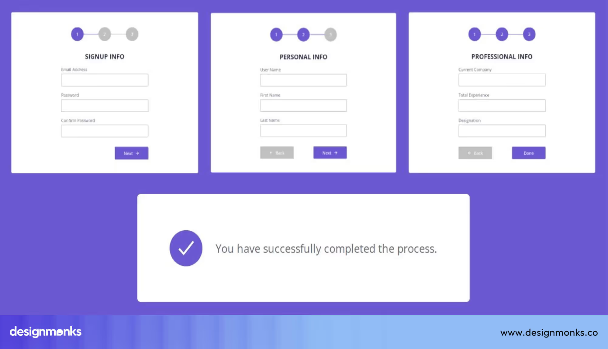
There's no need to use a nested tab in such a situation. A better alternative would be to use progressive steps or a multi-step form layout with visible progress indicators.
Only Have a Few Sections
For content with just a few short items (like FAQs or basic info), nested tabs will be overkill and take up too much space. You should use Accordions in this type of design.
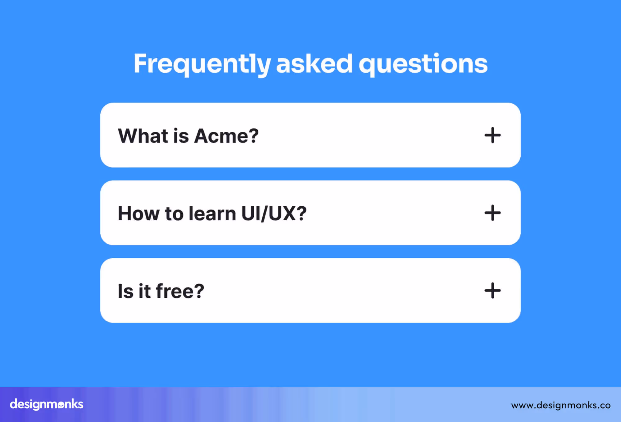
Accordions are simple, space-saving, and more intuitive when content is minimal. Such a design style will be perfect for shorter content.
Not Designed with User Needs
Nested tabs shouldn't be the default choice without considering the user's perspective.
Ask yourself: Will users easily understand how the layout works? Do they actually need to switch between sections often? And is this truly the most efficient way to present the information?
If the answer to any of these is no, it’s worth exploring other options. You can choose from options like modals, dropdowns, or inline content, which will offer a more user-friendly experience.
Design Tips & Best Practices for Nested UI
If you do choose to implement nested tabs, follow these best practices to make the experience smooth, intuitive, and user-friendly:
- Stick to two levels: Going beyond two layers of tabs can confuse users and make it hard to stay oriented.
- Keep labels short and clear: Use simple, meaningful words, long or vague labels are often cut off and hard to understand.
- Use icons for quick scanning: Adding small icons next to tab names helps users recognize sections faster, especially on mobile.
- Add subtle animations: Smooth transitions between tabs give users visual feedback without being distracting.
- Make tabs clickable, not hover-only: Hover-based tabs don’t work well on touchscreens. Always support clicks or taps.
- Support the back button: Let users move between tabs using the browser’s back button, especially in single-page applications.
FAQs
Are nested tabs bad for UX?
Nested tabs aren’t bad for UX. They can help users find information quickly. But if you stack too many tabs or make the layout confusing, users might get lost.
How do you make nested tabs mobile-friendly?
You can make nested tabs mobile-friendly by stacking the tabs vertically, using dropdowns, or allowing swiping. Make sure all text fits on smaller screens and avoid cramming too much into a single view.
What is the difference between nested tabs and accordions?
The difference between nested tabs and accordions is in how they display content. Nested tabs switch content in the same spot, while accordions expand and collapse content vertically.
Can you use tabs inside tabs in a mobile app?
Yes, you can use tabs inside tabs in a mobile app. But it’s best to keep it simple with just one level of nesting. Use clear labels, enough spacing, and a clean layout to avoid confusing the user.
Conclusion
Nested tab UI offers a powerful way to organize large amounts of content without overwhelming the user. Careful design with simple nesting, clear labels, and mobile-friendly features can improve navigation and usability.
Whether you're building a dashboard, admin panel, or mobile app, the right nested tab UI keeps your interface clean, focused, and easy to explore.
Prioritize simplicity and user needs, and your nested tab layout will work beautifully across all screens.

.avif)
.avif)
.avif)
.avif)


.avif)
.avif)
.avif)
.avif)


.avif)
