.svg)


Key Takeaways
- Delete button design prevents mistakes, builds user trust, and ensures safety.
- Undo options or confirmations reduce regret and accidental destructive actions.
- Mobile delete UIs need larger, spaced buttons due to touch imprecision.
- Clear icons, labels, and microcopy improve understanding and prevent confusion.
- Avoid dark patterns; keep deletion accessible, honest, and user-friendly.
Ever accidentally delete something important with a single click? You’re not alone, and that’s exactly why a well-thought-out Delete Button UI is essential for preventing costly mistakes.
Whether it’s erasing a post, removing a file, or clearing a message, destructive actions should never feel like a gamble.
A well-designed delete button guides users, prevents mistakes, and builds trust. From visual cues to confirmation steps and undo options, every detail plays a role in reducing stress and improving clarity.
Curious how top apps handle it and how you can do it better? Keep reading to learn practical strategies that make delete actions safer, clearer, and more user-friendly.
Delete UI Patterns Across Popular Apps
Every app has its own take on the delete button. The way something gets deleted often depends on what is being deleted and how important it is.
Let’s look at how some well-known platforms approach destructive actions and what we can learn from their design choices.
Gmail: Quick Delete with an Undo Option
Pattern: Undo Snackbar
When you delete an email in Gmail, it doesn’t disappear right away. Instead, it shows a small message at the bottom of the screen that says, “Conversation moved to trash – Undo.” You have about 5–10 seconds to click Undo if you change your mind.
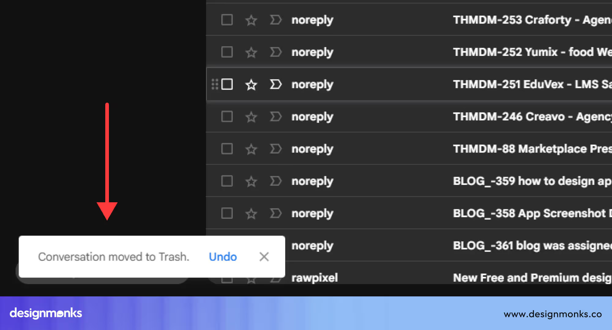
This gives users a quick way to reverse an action without interrupting their flow with a pop-up. It’s efficient and still offers a safety net.
Notion: Soft Delete with a Trash Folder
Pattern: Trash Bin with Recovery
Notion handles deletion a little more cautiously. When you delete a note, page, or database, it isn’t gone forever. Instead, it’s moved to a Trash folder, where it stays until you manually delete it for good. You can even restore items days or weeks later.
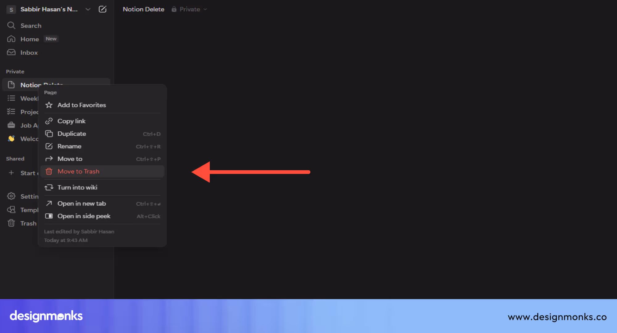
A soft delete like this works great for apps with valuable or long-form content. It gives users peace of mind and room to make mistakes.
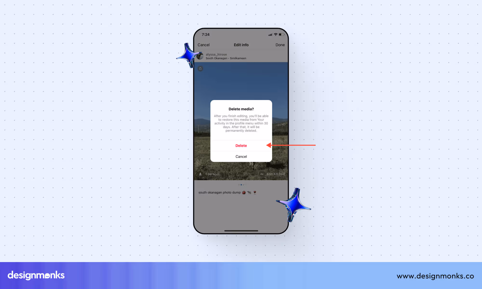
Instagram: Confirmation + Restore Period
Pattern: Confirmation + Soft Delete
On Instagram, deleting a post triggers a confirmation message:
“Delete this post?”
Once confirmed, the post disappears, but it’s not totally gone. Instagram actually keeps it in a private archive for 30 days. This gives you time to bring it back.
This two-step design, confirmation plus undo window, helps reduce regret, especially when dealing with personal content like photos.
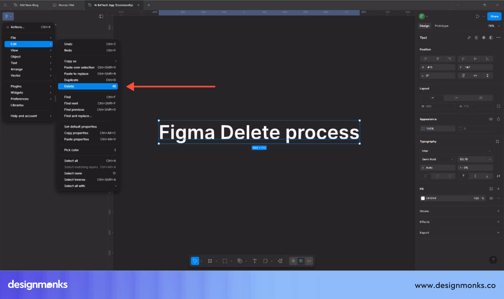
Figma: No Confirmation, Just Undo
Pattern: Undo History vs Confirmation
Figma skips the confirmation step entirely. You can delete something with one click or shortcut (like Ctrl+Z to undo). If you want to go back further, the Version History lets you rewind multiple steps, even across entire sessions.
This design is perfect for creative tools where speed is key. It supports experimentation while still giving users full control over past actions.
Interested people can also check our other blogs on
Mobile vs Desktop Delete UI Differences
Designing for mobile isn’t just about scaling down desktop layouts. It requires a different approach to interaction. Desktop users rely on a mouse and keyboard, which offer more precision. Mobile users, on the other hand, tap and swipe with their fingers, which increases the chance of accidental actions.
These input differences directly impact how delete functions should be designed across devices. Let’s take a closer look at the key differences between mobile and desktop delete UI and how to design each one effectively.
Touch-First Design vs. Precision-Based Clicking
Unlike desktop environments where users rely on a mouse for precise clicks, mobile interactions are less exact. Taps are done with fingers, which makes small or tightly packed buttons a usability risk.
That’s why mobile “Delete” buttons, especially destructive ones, should be larger, well-padded, and spaced apart from other actions.
On a desktop, it's more acceptable to place buttons closer together since users can click with accuracy. But on mobile, cramped layouts increase the chances of accidental taps. Giving delete and edit buttons enough separation helps reduce those errors and keeps the experience frustration-free.
Gesture-Based Deletion vs. Visible Click Actions
On desktops, delete actions are usually visible through context menus, toolbars, or right-click options. Users know exactly what to click. In mobile apps, though, gestures like swiping or long-pressing are commonly used to reveal delete options.
These gesture-based patterns feel intuitive on touchscreens but require clear visual feedback once triggered. After a user swipes or taps, the delete option should immediately appear with a recognizable icon or label, never hidden or vague.
Tap Target Separation vs. Cursor Control
Desktop UIs can safely place two primary buttons closer together because of fine cursor control. But on mobile, finger taps cover more area. This makes it easy to hit the wrong button if the spacing is too tight.
To reduce accidental deletions, mobile layouts should keep a clear buffer between destructive actions and other controls like “Save” or “Edit.” Even small changes in spacing can make the interface safer and more comfortable to use.
Microcopy & Icons in Delete UI
Now let’s talk about the tiny but crucial things that sit next to the delete button: icons and text. These elements may be small, but they play a huge role in helping users understand what the button will do.
Trash Icon or Text?
When designing a delete button, there are typically three options to consider: using an icon, a text label, or a combination of both.
A trash can icon is one of the most universally recognized symbols for deletion, and most users instantly understand what it represents. A red “X” icon, however, can be tricky, it often signals “close” or “cancel,” which can create confusion about what the button will actually do.
Then there’s plain text, like the word “Delete,” which offers the most clarity but takes up more visual space, especially on smaller screens.
The best practice is to use both an icon and a label whenever possible. This combination helps make the interface more intuitive, particularly for users who may not be familiar with the meaning of a standalone symbol.

It also adds a layer of accessibility and reduces the risk of misinterpretation. It’s worth noting that icons don’t always carry the same meaning across cultures.
For example, a trash can may not universally signal “delete” to all users. That’s another reason why pairing an icon with descriptive text leads to a more reliable user experience.
Writing Effective Delete Microcopy
Microcopy is the tiny bit of text you place near buttons to explain what they do. When it comes to delete actions, your wording needs to strike a balance between serious and supportive. Good delete microcopy should:
- Be clear: Say exactly what’s being deleted
- Be calm: No need to scare the user
- Set expectations: Tell them if the action is permanent
Example 01: “Are you sure you want to delete this file?”
Example 02: “This action can’t be undone.”
Tone Tip: Keep it serious, but not alarming. Avoid using ALL CAPS or too many exclamation marks. The goal is to guide, not stress your users.
Dark Patterns to Avoid in Delete UI
Dark patterns are sneaky design tricks that make it harder for users to make clear choices. In the delete button design, these tricks can cause confusion, frustration, or even accidental loss of data.
To create a better user experience, it’s important to avoid common dark patterns. Here are some examples to watch out for.
Hidden Delete Options
One of the most common dark patterns in delete UI is making the delete option hard to find. When users can’t locate the delete button easily, it creates friction and frustration. It may seem like a clever way to prevent deletion, but it often comes off as dishonest or controlling.
A common example is burying the delete action three layers deep inside menus on dropdowns. Users should never feel like they need a manual to remove something.
If deletion is a valid action in your product, it should be accessible, without needing to guess where it’s hidden.
Confusing or Deceptive Microcopy
Using tricky or unclear language creates hesitation and increases the chance of mistakes. For example, asking “Are you sure you don’t want to delete this?” adds an extra mental step that makes users second-guess what’s happening.
This isn’t just awkward, it’s bad UX. A better approach is to use direct, neutral language like “Delete this item?” or “Are you sure you want to permanently remove this?” The goal is to inform, not to trick.
Forcing Too Many Steps
Adding too many steps before something gets deleted might sound like a safety feature, but it can quickly turn into an annoyance. Not every delete action needs three confirmation screens and a password prompt.
Yes, it makes sense to add an extra step for sensitive content, like deleting a personal file or closing a bank account, but for simpler items (like a comment or to-do list item), one confirmation is enough.
The key is to match the level of protection to the value or impact of the item being deleted.
Why the Delete Button UI Deserves Serious UX Attention
Deleting content is an important action that requires careful consideration. Accidentally deleting something like a work document, a personal note, or an email can lead to the loss of valuable information.
Because of this, the design of delete buttons isn’t just about looks, it’s about building trust, providing safety, and giving users control over their data.
Common Problems in Delete UX
There are several common mistakes that can make delete actions frustrating or risky, such as:
- Placing delete buttons too close to important actions like “Save”
- Not offering a confirmation step or an undo option
- Using unclear or confusing icons
- Poor button placement, especially on mobile devices
It’s also important to remember that not every feature needs a delete button. In many cases, options like archiving, hiding, or marking items as complete can be better solutions that reduce the chance of accidental deletion.
Principles of a Safe & Effective Delete Button
Creating a delete button that users trust and find easy to use depends on following some key principles. Let’s take a look at them:
Clarity: Make It Clear What Will Be Deleted
Users should always know exactly what they are deleting. Using clear labels helps a lot. For example, say “Delete post” instead of just “Delete,” or “Remove image” instead of simply “Remove.”
When possible, show a preview of what will be deleted, like a thumbnail or hover text, so users can double-check before confirming.
Confirmation: Prevent Mistakes Before They Happen
Adding a confirmation pop-up that clearly asks, “Are you sure you want to delete this?” gives users a moment to reconsider.
Use a red button inside the confirmation to emphasize the seriousness of the action. This extra step, sometimes called friction design. It helps prevent accidental deletions.
Undo Option vs. Confirmation: Choosing the Right Approach
There are two common ways to handle deletions:
Undo Snackbar: Offers a quick way to undo a deletion. This makes the experience smooth and fast. The downside is that users might miss the short undo window.
Confirm Model: Forces users to confirm before deleting, which is safer but can slow down the process.
The best approach is to use undo for small or frequent deletions (like emails or notes) and confirmation for important or irreversible deletions (like accounts or major posts).
Visual Hierarchy and Color Use
Colors convey the meaning of any object clearly and effectively. Using red buttons for delete actions easily signals caution or danger.
Softer colors or ghost buttons are good for less critical actions like canceling. Also, keep delete buttons physically separated from primary actions such as “Save” or “Submit” to reduce mistakes.
Accessibility Best Practices
Delete buttons should be usable by everyone:
- Keyboard users should be able to navigate to the delete button using the Tab key.
- Screen readers need clear labels like “Delete this image” for easy understanding.
- On mobile, tap targets should be large enough to accommodate all users, including those with limited motor skills.
Best Practices for Destructive Actions in UI
Here’s a quick checklist:
- Use clear and specific labels
- Add confirmation or undo (based on task)
- Keep delete buttons away from others
- Use red to show it’s a serious action
- Never trick the user
- Make it accessible to all
FAQs
Should the delete button always be red?
No, the delete button doesn't always have to be red. But red is the standard color for destructive actions. It grabs attention and tells users to stop and think.
What’s better: confirmation or undo?
Confirmation or undo use depends on the need. Use an undo option for quick, low-risk actions where mistakes are easy to fix. For more important or irreversible actions, a confirmation step is better to ensure users are deliberate.
How do I test if my delete flow works well?
You can test your delete flow by asking real users to try it. Then observe if they make mistakes, time how long the process takes, and check whether users feel confident and comfortable with the action.
What are the best practices for the Delete Button UX?
The best practices for the delete button UX are to focus on clarity, honesty, safety, simplicity, and respecting the user’s control and choices throughout the delete process.
Conclusion
The delete button might be small, but its impact is huge. A single wrong click can cause lost work, frustration, or worse. That’s why a well-designed Delete Button UI is essential, it guides users, reduces errors, and builds trust.
Always provide clear warnings, include an easy-to-find undo option, and use straightforward labels and colors. Testing your delete button with real users is key to making sure it feels reliable.
When users trust your delete action, you create a safer, more intuitive experience that minimizes mistakes and keeps them confident.
Until next time!

.avif)
.avif)
.avif)
.avif)


.avif)
.avif)
.avif)
.avif)


.avif)
