.svg)


Key Takeaways
- Side Drawer UI keeps navigation organized while saving valuable screen space.
- Different types include persistent, temporary, mini, and modal drawers for flexibility.
- Best practices: clear labels, prioritization, accessibility, animations, and easy closing.
- Mobile drawers are usually temporary; desktop drawers can remain visible for multitasking.
- Well-designed drawers improve usability, focus, and overall app aesthetics effectively.
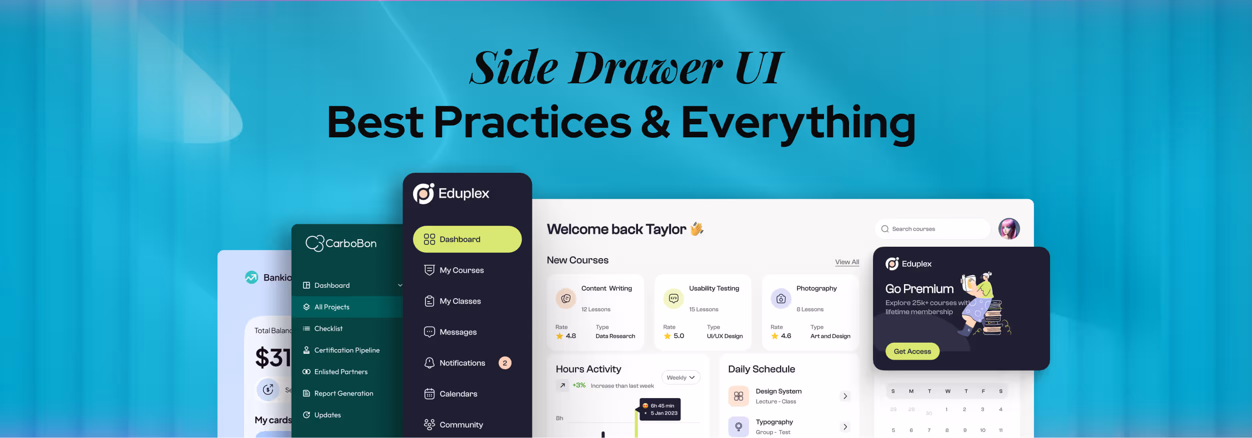
Side Drawer UI is the quiet hero behind your favorite app's smooth experience. Whether you're checking emails or navigating through a shopping app, there's a good chance you've used one without even thinking about it.
That’s the magic of great design: it works without shouting for attention. So, what exactly is Side Drawer UI, and why do modern apps rely on it so much?
It’s a menu that slides in from the side of the screen. Users can tap it to reach links or tools. Modern apps rely on side drawers because they keep navigation simple while saving valuable screen space.
Curious how this sleek design works so well behind the scenes? Let’s explore the patterns, best practices, and UX tips that make Side Drawer UI a smart choice for modern apps.

What Is a Side Drawer UI?
A Side Drawer UI is a hidden navigation panel that slides in from the left or right side of the screen. It is typically triggered by tapping a menu icon (often called a hamburger icon).
It contains important links, options, or tools that help users move through different sections of an app or website.
Once the user selects what they need or taps outside the drawer, it closes to keep the main screen clear. Side drawers are commonly used in mobile apps but also appear in web dashboards and desktop applications.
They help organize complex content without overwhelming the user and make navigation simple, especially on smaller screens.
Types of Side Drawers
Depending on the app’s layout and user needs, designers use different styles of side drawer UI design to make navigation smooth and practical. Here are the most common types of Side Drawers used in design:
Persistent Drawer
This type of drawer is always visible and stays fixed on the screen, usually on the left side. It’s common in desktop apps where there’s more screen space to work with.
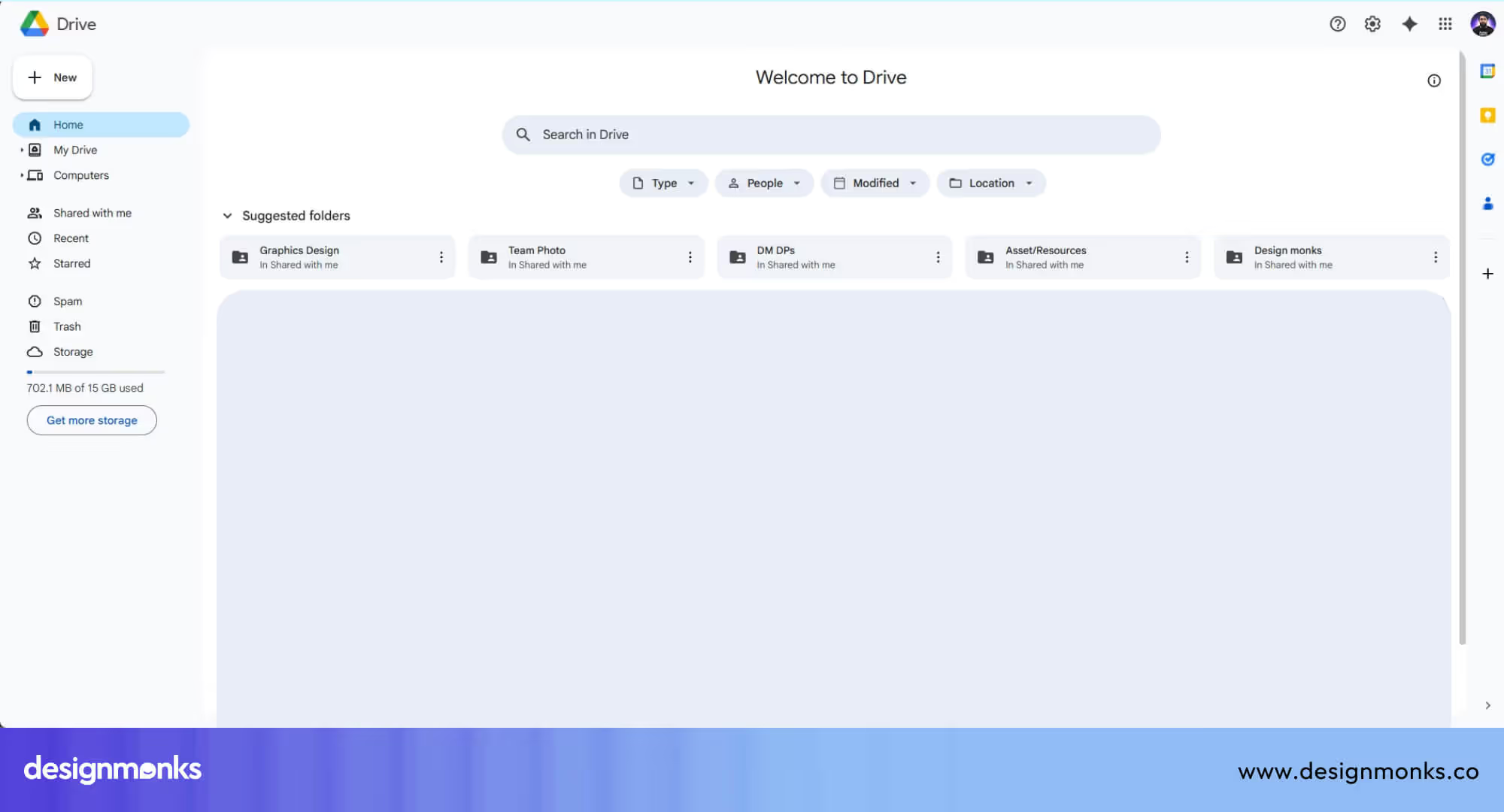
For example, Google Drive on desktop uses a persistent drawer to show folders and navigation links at all times. This makes it easy to switch between sections without needing to open and close a menu.
Temporary Drawer
A temporary drawer stays hidden until you tap a button to open it, and it disappears after use. This is very common in mobile apps, where space is limited.
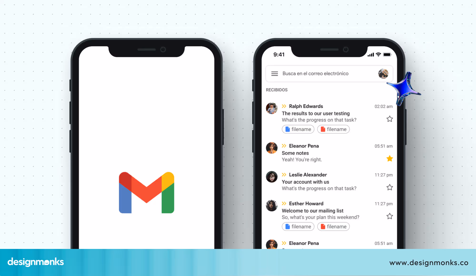
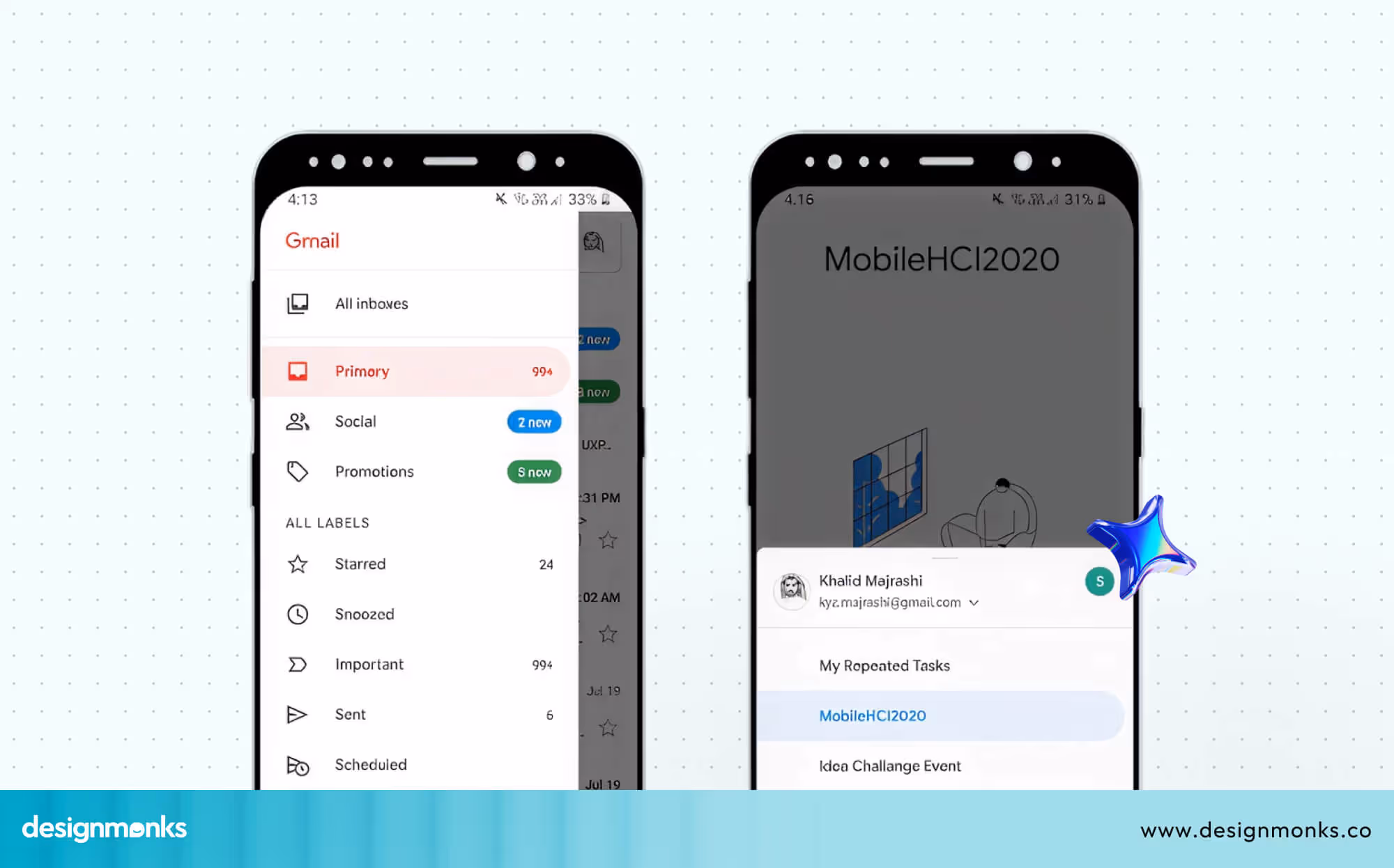
For instance, the Gmail mobile app uses a temporary drawer that appears from the left side when you tap the hamburger menu. It shows folders like Inbox, Sent, and Drafts, and closes automatically when you select an option or tap outside the drawer.
Mini Variant
The mini variant drawer stays narrow and shows only icons by default. It expands when hovered over or clicked, revealing more details. This is great for advanced users who don’t need constant text labels.
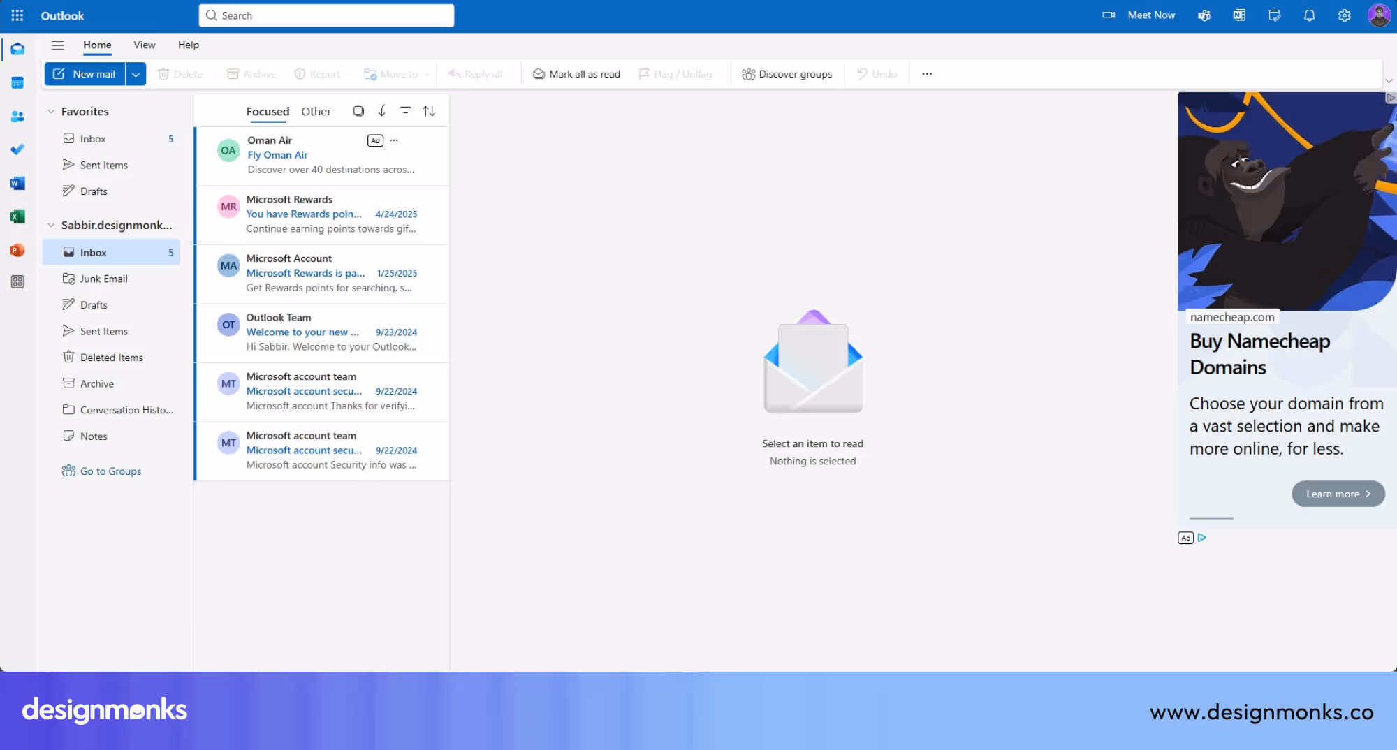
A good example is the desktop version of the Microsoft Outlook Web App, where the sidebar can collapse into icons and expand on interaction.
Modal Side Drawer
This drawer pops up in front of everything else and often darkens the background to focus user attention. It's used for settings or actions that need full attention without distractions.
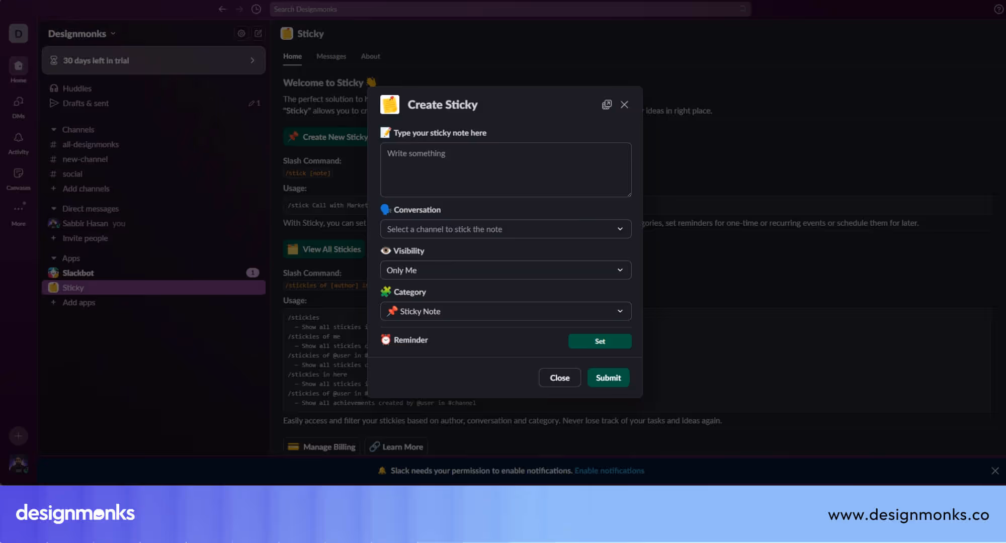
For example, Slack on mobile uses a modal drawer for workspace settings. This ensures users' concentration on the choices before returning to the main screen.
Each type of side drawer serves a specific purpose, and choosing the right one depends on the screen size, content complexity, and how often users need to access the navigation menu.
Benefits of Using Side Drawer Navigation
Side Drawer navigation is widely used in modern apps because it improves both the user experience and the overall layout of the interface. Here are the key benefits that make side drawers so effective:
1. Maximizes Screen Space
Smartphones and tablets come with limited screen sizes. Displaying too many buttons or links at once can make the interface feel crowded.
A side drawer keeps less important options hidden until needed. This allows the main screen to stay clear for content like messages, photos, or videos.
2. Keeps Users Focused
By hiding secondary tools and navigation links inside a drawer, users can focus on their main task without visual distractions. This leads to a smoother and more task-oriented experience, which is especially important in productivity and content-heavy apps.
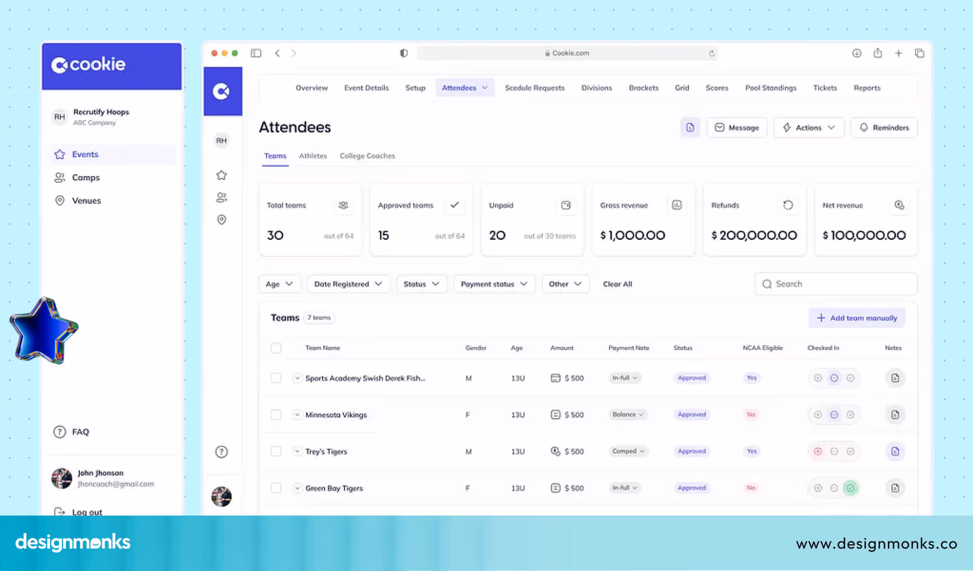
3. Supports Complex Navigation Structures
Apps with multiple sections or features, such as dashboards, project tools, or eCommerce platforms, need a way to organize their navigation.

Side drawers help group related options under categories and reduce cognitive load by showing only what’s needed at the moment.
4. Ideal for Mobile-First Design
Touch gestures like tapping and swiping make side drawers a natural fit for mobile use. They work well with minimal interaction and give users a smooth way to access menus without jumping between screens or tabs.
5. Widely Recognized by Users
Side drawers have become a standard pattern in app design. Whether someone is using Gmail, Facebook, or a note-taking app, they usually know that tapping the three-line icon opens a menu. This familiarity reduces the learning curve and boosts confidence in using the app right away.
6. Improves Overall App Aesthetics
A clean layout helps apps look more modern and polished. Instead of cluttering the interface with too many visible items, side drawers store them in an easy-to-access space. It also creates a more professional and user-friendly appearance.
Accessibility Considerations for Drawer Navigation
Accessibility plays an important role in effective side drawer ui design. Since a drawer menu usually appears dynamically, designers must ensure every user can open, navigate, and close it easily across devices and assistive technologies.
A well-designed drawer UI improves Drawer UX by making navigation predictable and accessible for everyone.
Key accessibility practices include:
- Keyboard navigation: Ensure users can open the navigation drawer and move between items using the Tab, Enter, and Esc keys.
- Clear focus states: Highlight the active element inside the drawer menu so keyboard users know where they are.
- Screen reader support: Use ARIA labels and roles so screen readers can correctly interpret the drawer UI.
Visible close option: Always provide a clear close button to improve overall Drawer UX.
Side Drawer UX Best Practices
To create a side drawer that’s both useful and enjoyable to use, it’s important to design it with clarity, efficiency, and accessibility in mind. Below are key best practices that will help improve the user experience and avoid common design mistakes:
Limit Content to Essentials
Only include the most important and frequently used links or actions in the drawer. Cramming too many items inside can overwhelm users and slow down navigation.
If your app has a lot of options, consider using categories, collapsible sections, or secondary menus to keep things organized.
Use Both Icons and Clear Text Labels
While icons can save space and improve visual appeal, not everyone understands icon meanings right away.

Always pair icons with simple, clear text labels to avoid confusion, especially for first-time users or those with cognitive disabilities.
Organize Items by Priority and Function
Place the most-used items at the top of the drawer where they are easiest to reach, especially on mobile devices.
Group related items together, for example, user settings, account info, and logout options can be placed in one section. This helps users scan the menu more quickly and find what they need without frustration.
Design for Accessibility
Make sure your side drawer is usable by everyone, including people who rely on keyboards, screen readers, or assistive technologies.

Assign proper roles and ARIA (Accessible Rich Internet Applications) labels to menu elements. Also, allow full keyboard navigation (e.g., tab to move, enter to select, Esc to close).
Provide Multiple Ways to Close the Drawer
Always make it easy for users to close the drawer. Allow closing via a visible “X” or back arrow icon, tapping outside the drawer, or swiping from the mobile edge. Avoid trapping users in the drawer, there should always be a quick exit.
Use Meaningful Animations and Transitions
A smooth sliding animation makes the drawer feel modern and intuitive. Transitions should be fast (usually under 300ms) and consistent. It should help users understand where the menu came from and where it goes. Avoid overly complex animations that might slow down performance on low-end devices.
Test Across Devices and Orientations
Side drawers should behave well in both portrait and landscape orientations. Test how your drawer menulooks and functions on various screen sizes, especially tablets and foldable phones. The layout should remain usable and comfortable regardless of device type.
Maintain Visual Contrast and Readability
Make sure the drawer’s background, text, and icons have enough contrast so they’re readable in different lighting conditions. Avoid light gray on white or very small font sizes. Good readability supports both usability and accessibility.
Side Drawer Interaction Patterns
Different interaction models shape how users experience a drawer navigation pattern. Designers choose patterns based on screen size, user behavior, and content priority. A well-structured mobile navigation drawer keeps the interface clean while allowing quick access to key sections.
Common interaction patterns include:
- Overlay drawer: The panel slides over the main interface. This slide out menu design keeps navigation hidden until users need it and works well for mobile apps.
- Push drawer: The mobile navigation drawer pushes page content aside when opened. This pattern provides more context and helps users stay oriented.
Persistent drawer: Often used on larger screens, this drawer navigation pattern stays partially visible, offering constant access to navigation without covering the main content.
Side Drawer vs Sidebar: When to Use Each
Side drawers and sidebars serve similar navigation purposes but differ fundamentally in visibility and behavior. Understanding these differences helps designers choose the right pattern for their specific use case and screen size requirements.
While sidebars remain persistently visible on screen, side drawers hide off-canvas until triggered by user action. This distinction significantly impacts screen real estate usage, mobile navigation drawer accessibility, and overall user experience across different device types.
Here are the core differences between a side drawer and a sidebar:
When to Use a Side Drawer
Use side drawers when screen space is limited and navigation is accessed infrequently, prioritizing content visibility over persistent menu access.
- Mobile-first applications where maximizing viewport space for content consumption is critical to user experience.
- Content-heavy platforms like social media feeds, news readers, or video streaming apps prioritize immersive viewing.
- Infrequent navigation patterns where users spend most time engaging with content rather than switching between sections.
- Touch-based interfaces that benefit from swipe gestures and large tap targets for opening navigation menus.
- Single-task focused apps where users concentrate on one activity and don't need constant navigation reference.
When to Use a Sidebar
Implement sidebars when users need constant navigation visibility and have sufficient screen width for persistent menu structures without compromising content.
- Desktop applications and dashboards where ample screen width supports always-visible navigation without sacrificing the content area.
- Frequent navigation workflows in productivity tools where users regularly switch between sections, folders, or project areas.
- Complex information architectures require users to maintain orientation within deep hierarchical structures while working.
- Multi-tasking environments like admin panels, project management tools, or file explorers with simultaneous navigation and content interaction.
- Professional software, such as design tools, IDEs, or documentation sites, where persistent navigation improves efficiency and reduces cognitive load.
Common Mistakes to Avoid
Even though side drawers are useful, poor implementation can frustrate users. Here’s what to watch out for:
- Overcrowding the Drawer: Stuffing too many links or tools into the drawer creates cognitive overload. Limit items to essential navigation and group them logically using dividers or headers.
- Tiny or Hard-to-Tap Touch Areas: Buttons and links must be large enough for fingers, not just cursors. Aim for at least 48x48 pixels for touch targets to prevent mis-taps, especially important on mobile.
- No Clear Open/Close Indicators: Users should instantly know when the drawer is open or closed. Use clear animations, shadow overlays, or icon changes (e.g. hamburger to “X”) to show state transitions.
- Poor Responsiveness: A drawer that works on mobile but breaks on tablets or desktops causes usability issues. Design with fluid layouts and media queries to adapt behavior across breakpoints.
- Ignoring Accessibility Features: Side drawers must support screen readers, keyboard navigation, and focus management. Use proper ARIA roles, tab indexing, and labels so all users can navigate effectively.
Side Drawer Behavior: Mobile vs Desktop
Side Drawer UI should adapt based on the user’s device to provide the best experience. On mobile devices, where screen space is limited, drawers are usually hidden by default and slide over the content as a temporary layer.
They automatically close when the user taps outside, swipes, or selects an option. This helps reduce clutter and makes better use of limited space.
On desktops, drawers can remain visible at all times. They typically sit beside the main content rather than covering it, and allow designers to display more links, icons, and tools.
This approach works well for dashboards and complex applications where constant access to navigation is important.
When to Use Modal vs Persistent Drawers?
Choosing between modal and persistent drawers depends on how much screen space is available and how users interact with your app.
Use modal drawers when space is limited and navigation isn't the user's main focus, for example, on mobile. These temporarily overlay the screen and are ideal for apps like shopping or content platforms, where the menu is only needed occasionally.
Use persistent drawers when users need constant access to menus, such as in admin panels or email clients. With more screen space, these drawers can stay open to support multitasking without disrupting the main content.
Drawer on Left vs Right: Usability Differences
The position of a side drawer can affect how intuitive and efficient your app feels to users.
On mobile, use a left-side drawer for primary navigation since it matches natural reading flow and user expectations. The right side works best for secondary features like chats, filters, or quick-access tools.
On Desktop, keep the left-side drawers for main navigation, it's the most familiar and accessible layout. A right-side drawer is useful for supportive tools like notifications or side panels that don’t require constant interaction.
Design Inspirations & Real-World Examples
Great side drawer design is used in every leading app to simplify navigation without overwhelming the interface. Here are some standout examples that do it right:
Gmail (Mobile): Tapping the hamburger icon reveals a clean, modal drawer from the left. It organizes key folders like Inbox, Sent, and Trash. This keeps primary tasks just a tap away.
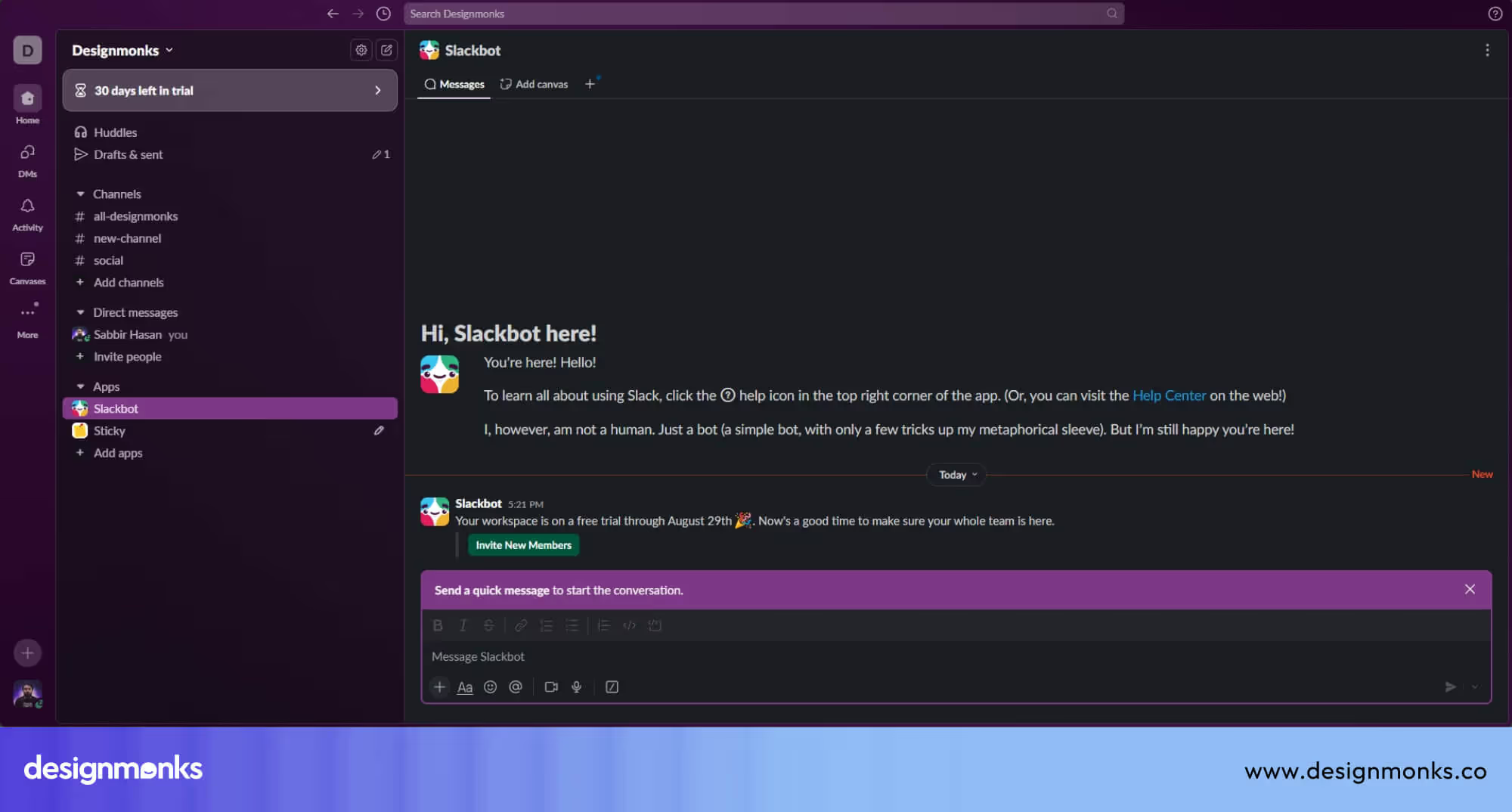
Slack: Slack’s drawer handles team navigation seamlessly and shows channels, DMs, and settings. It adapts well across mobile and desktop and offers quick switching with minimal clutter.
Image 13: Shopify Admin Dashboard
Shopify Admin Dashboard: Uses a persistent drawer on desktop to give merchants instant access to Products, Orders, and Customers. It supports multitasking without interrupting the workflow.
Figma & Notion: These tools use collapsible, responsive drawers to manage pages, layers, or tools. Their sleek design improves productivity while keeping the main workspace clear.
FAQs
Are side drawer UIs good for mobile user experience?
Yes, side drawer UIs work well on mobile when used for secondary navigation. They save screen space, reduce visual clutter, and keep primary content focused, as long as key actions are not hidden behind the drawer.
How does a navigation drawer improve app usability?
A navigation drawer enhances app usability by consolidating secondary destinations in one location. It reduces cognitive load, maintains a clean interface, and helps users move between sections without overwhelming the main screen.
Is a side drawer suitable for desktop web interfaces?
Yes, side drawers can be suitable for desktop interfaces when used in a contextual manner. They work best for filters, settings, or secondary menus, but should not replace always-visible navigation for core user tasks.
Conclusion
Side Drawer UI might be subtle, but its impact is huge. It keeps interfaces clean, users focused, and navigation just a swipe away. From mobile apps to complex dashboards, this design pattern continues to prove its value across devices.
When done right, Side Drawer UI enhances usability without getting in the way. So whether you're designing your first app or refining an existing one, don’t overlook this simple yet powerful tool. It’s a modern essential for smart, user-friendly navigation.

.avif)
.avif)
.avif)
.avif)


.avif)
.avif)
.avif)
.avif)


.avif)
