.svg)



Key Takeaways
- Choose new tabs only when they genuinely improve the user's browsing experience.
- Keeping navigation predictable builds trust and makes websites easier to use.
- Protect users from losing progress during important tasks with thoughtful link behavior.
- Accessible link behavior helps every visitor navigate websites with greater confidence.
- Smart link decisions reduce frustration while supporting usability, security, and conversions.
Small UX decisions often have the biggest impact on how users experience a website. UX open links in a new window is a perfect example. While opening a link in a new tab may seem harmless, it can influence user flow, accessibility, and how easily visitors complete their tasks.
The challenge is finding the right balance. Opening every link in a new tab creates clutter, while opening everything in the same tab is not always the best solution. Strong UX comes from understanding user intent and choosing the option that supports it.
In this guide, you'll learn when new tabs genuinely help users, when they hurt the experience, and the practical UX principles that lead to smarter navigation decisions.
Should Links Open in a New Window?
The short answer is usually no.
Opening links in the same tab is the better choice most of the time. It keeps things simple and matches how people already browse. But there are clear exceptions, and knowing them is what actually matters.
Good user experience (UX) isn't about picking one rule and sticking to it forever. It's about reading the situation. A blog link, a related article, or an internal page usually works fine in the same tab.
But a checkout page, a payment form, or a downloadable file often deserves its own new window, so users don't lose the progress they have already made.
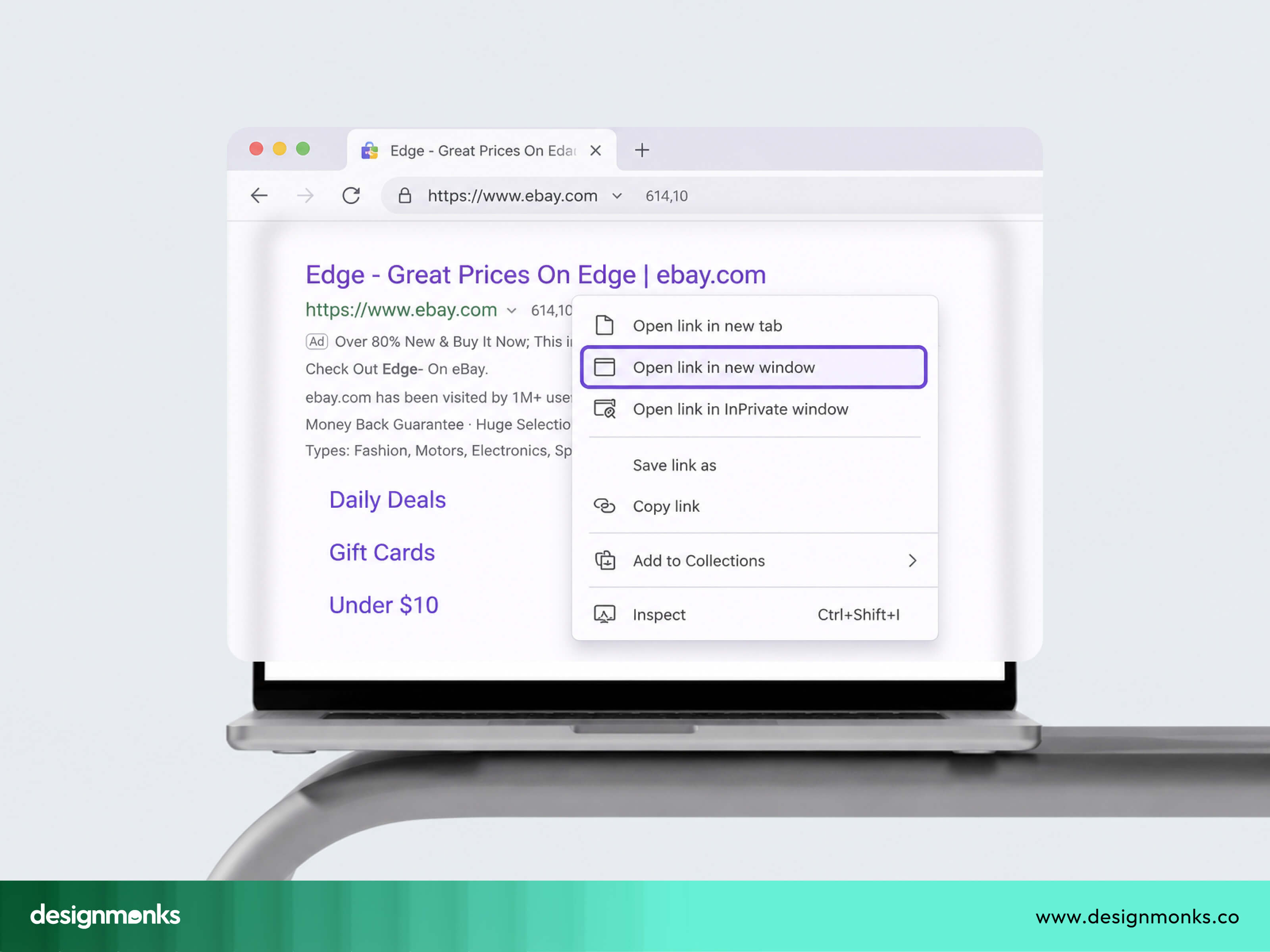
This is really a web usability question at its core. Every extra tab adds friction if it's not needed. Every lost page adds frustration if a tab was needed and didn't open. The goal is balance, not a fixed rule you apply everywhere without thinking.
So the real skill isn't deciding between a new tab or the same tab as a permanent choice. It's learning to spot the moments where breaking the default actually helps the user, instead of just following whatever's easiest to code. That's why a good UX asks one simple question before opening a new tab:
“Will this make the user's job easier, or will it interrupt what they are doing?”
If opening a new tab reduces interruptions, it can improve usability. If it creates unnecessary tabs or surprises users, it usually makes the experience worse.
Why Opening Links in the Same Tab Is the Default UX Pattern
Before we get into exceptions, let's talk about why same-tab links are the standard. This isn't some random design rule. It comes from how people actually use browsers every day.
User Expectations and Navigation
Every user learns browser habits early on. Click a link, read the page, then hit the back button to return. This consistent pattern in button placement and navigation is so deep in people's muscle memory that they don't even think about it anymore.
When a link opens in the same tab, the back button works exactly as expected. One click and you're back where you started. Simple as that.
Now imagine that same link opens in a new tab without warning.
You finish reading and click the Back button, expecting to return to the article. Instead, nothing happens because there is no previous page in that new tab. You now have to notice that another tab is still open and switch back manually.
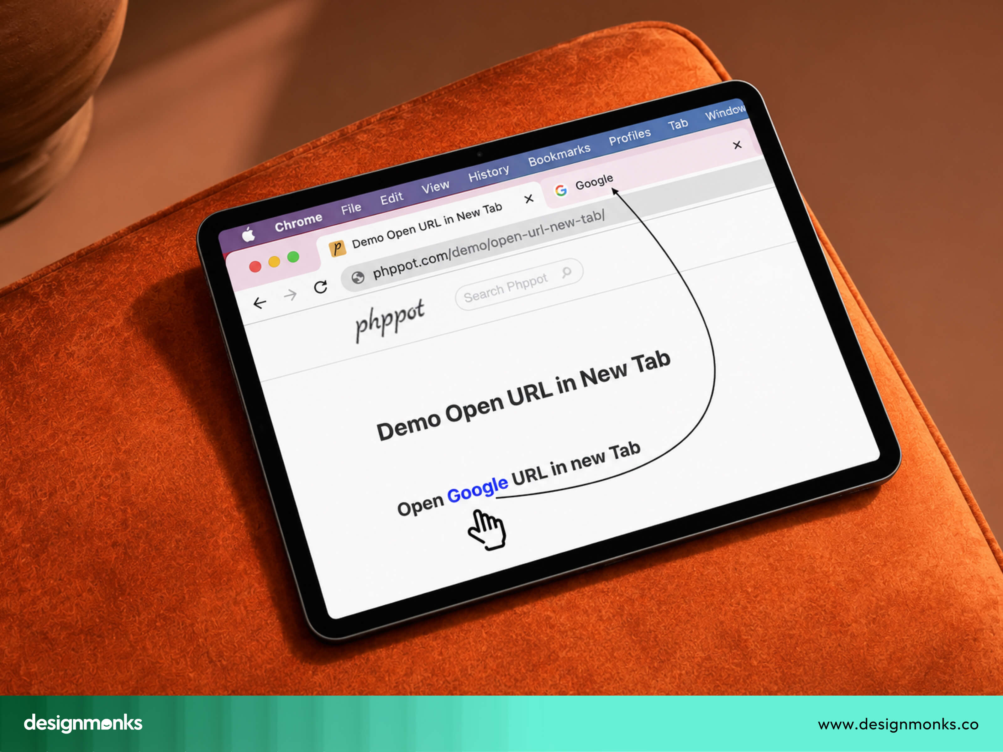
It is a small change, but it forces users to stop and think. Good UX tries to remove these tiny moments of confusion whenever possible.
Research in Web Usability, which focuses on making websites easier to use, has shown that people perform better when websites behave in familiar ways. Users should not have to learn different navigation rules for every website they visit.
Keeping navigation consistent also helps users build confidence. They know what will happen before they click, which makes the website feel easier to use.
Benefits of Keeping Users in the Same Tab
There are some real, practical wins when you stick with the same tab pattern:
- Simplicity: One tab, one journey. Users don't have to manage multiple windows just to read your content.
- Predictability: People know what will happen when they click. That builds trust, even if they never consciously think about it.
- Reduced cognitive load: Every extra tab is one more thing for the brain to track. Fewer tabs mean less mental clutter, and users can focus on what actually matters, which is your content.
- Better mobile experience: On phones, tab switching is clunky. Most users don't even bother going back to check a previous tab. If a link opens in a new tab on mobile, there's a good chance the user just forgets about it and moves on. That's lost engagement for you.
So the same-tab pattern isn't just tradition. It genuinely makes browsing smoother for most people, most of the time.
When Opening Links in a New Window Is the Better UX Choice
Now here's where it gets interesting. There are specific situations where opening a link in a new tab is actually the smarter move. Let's go through them one by one:
External Links That Interrupt Important Tasks
If users are in the middle of something important, sending them away from the current page can be frustrating. For example, a user is halfway through filling out a form, maybe entering their shipping address during checkout. Then they click a link to check the store's return policy.
If that link opens in the same tab, they lose all their form progress. That's a bad experience, and it can cost you a sale. This applies to a few common situations:
- Checkout pages, where losing progress means starting over
- Online forms, especially long ones with multiple fields
- Applications, like job applications or loan applications
- Surveys, where people might lose their answers halfway through
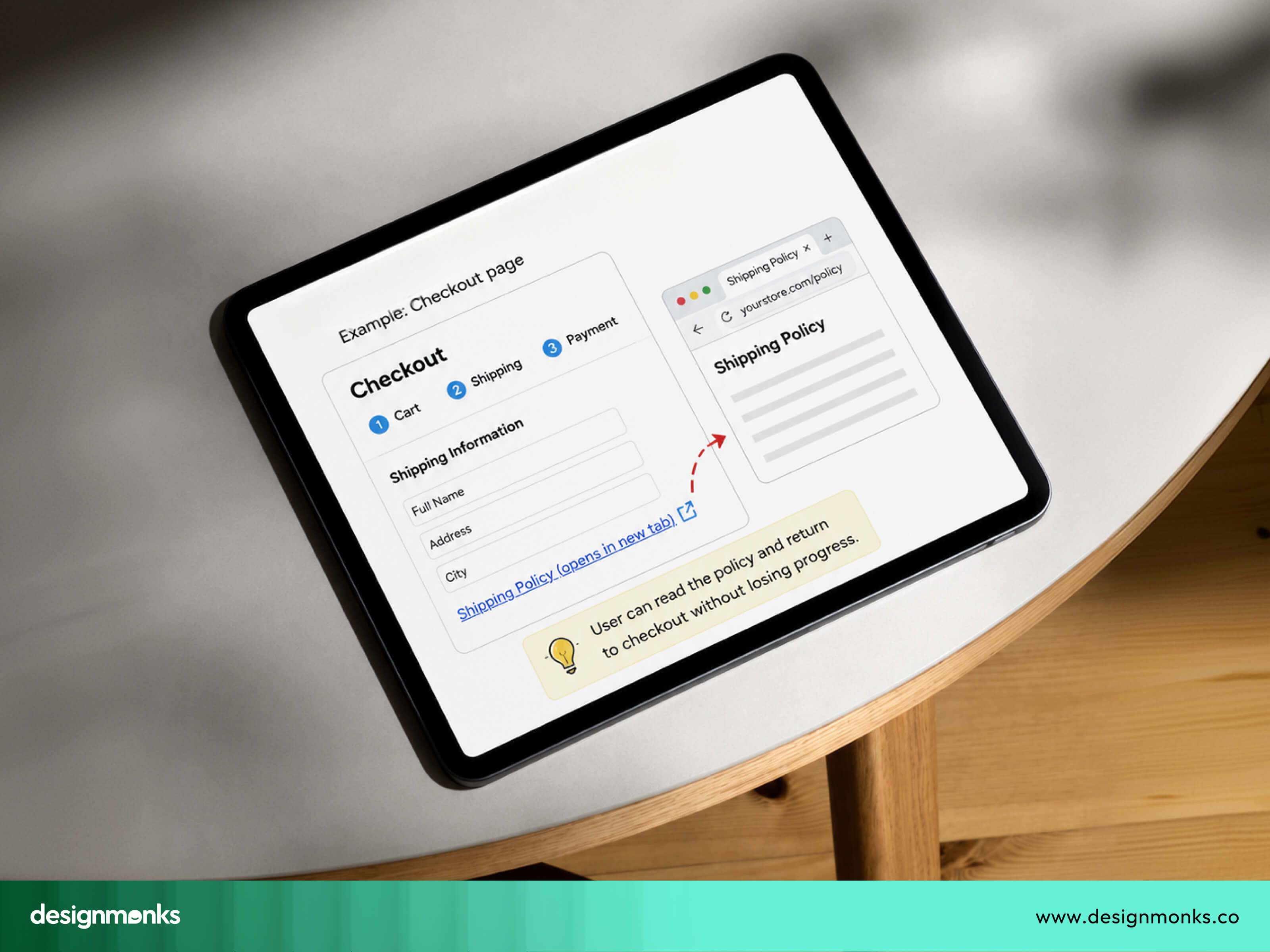
In these cases, opening the external link in a new tab protects the user's work. They can check the info they need and come right back to where they left off, without any of their effort going to waste.
Users have to spend several minutes entering personal details, payment info, or answering survey questions. If a single accidental click wipes all of that out, the user isn't just annoyed. They might abandon the task entirely rather than start over.
That's a direct hit to your conversion rate, and it's completely avoidable with web design best practices such as opening the link in a new tab.
Documents and Downloadable Files
Files behave differently from regular web pages. When a user clicks a link to a PDF, Word, or Excel file, opening it in the same tab can feel jarring. The browser suddenly switches into document viewer mode, and the user's original page is gone.
If they want to go back, they're stuck fumbling with the back button, and sometimes that doesn't even work well with file viewers.
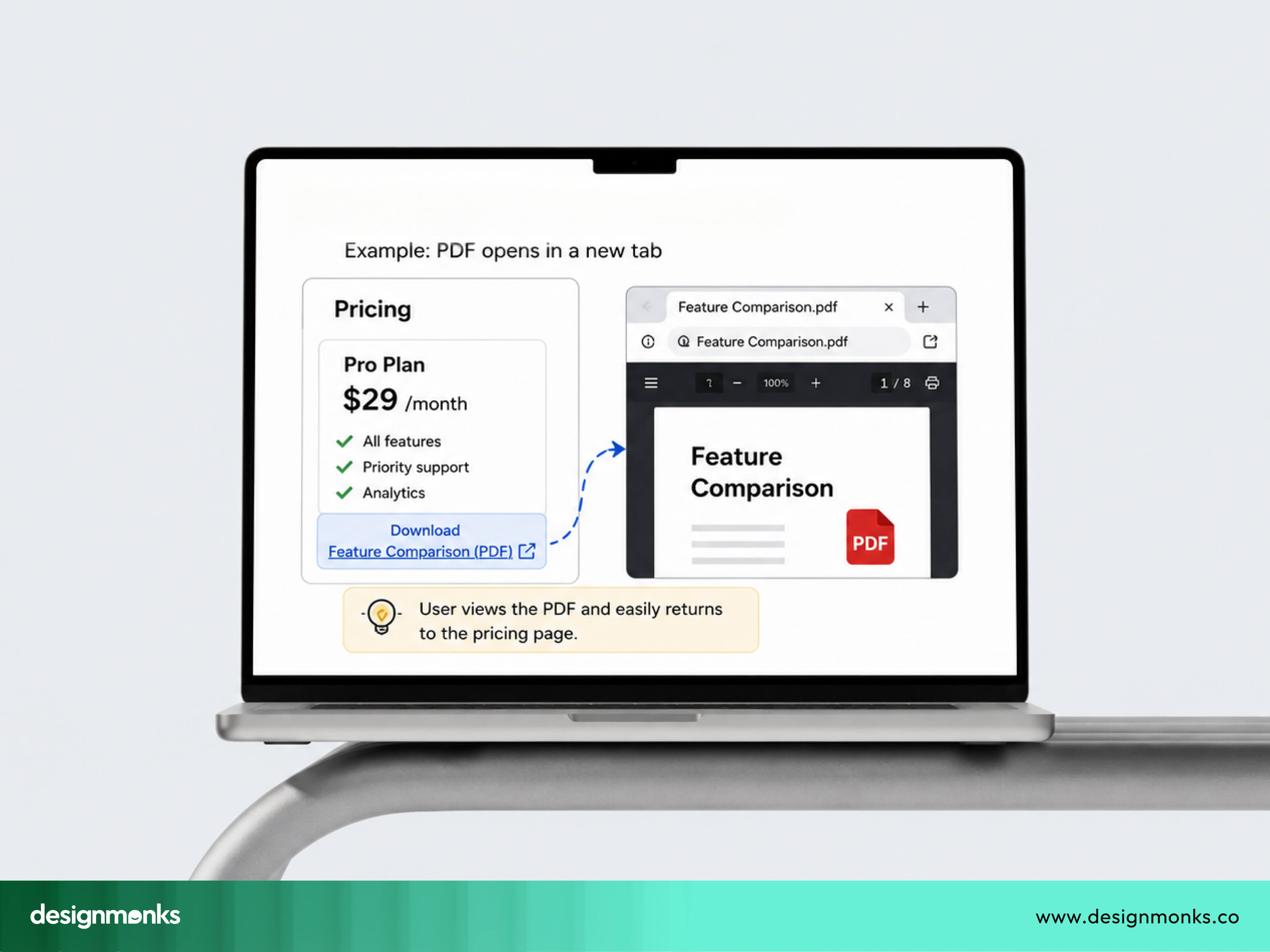
Opening documents in a new tab solves this cleanly. The user gets to view or download the file, and their original page stays exactly where they left it. This is especially useful for reports, guides, or resources that people want to reference while still browsing your site.
Third-Party Tools and External Applications
Some links take users completely outside your website's ecosystem. These are the moments where a new tab genuinely makes sense. For example:
- Payment gateways that process transactions on a separate, secure domain
- Google Maps when showing directions or a location
- Support portals for tickets or live chat
- Authentication pages like third-party login screens
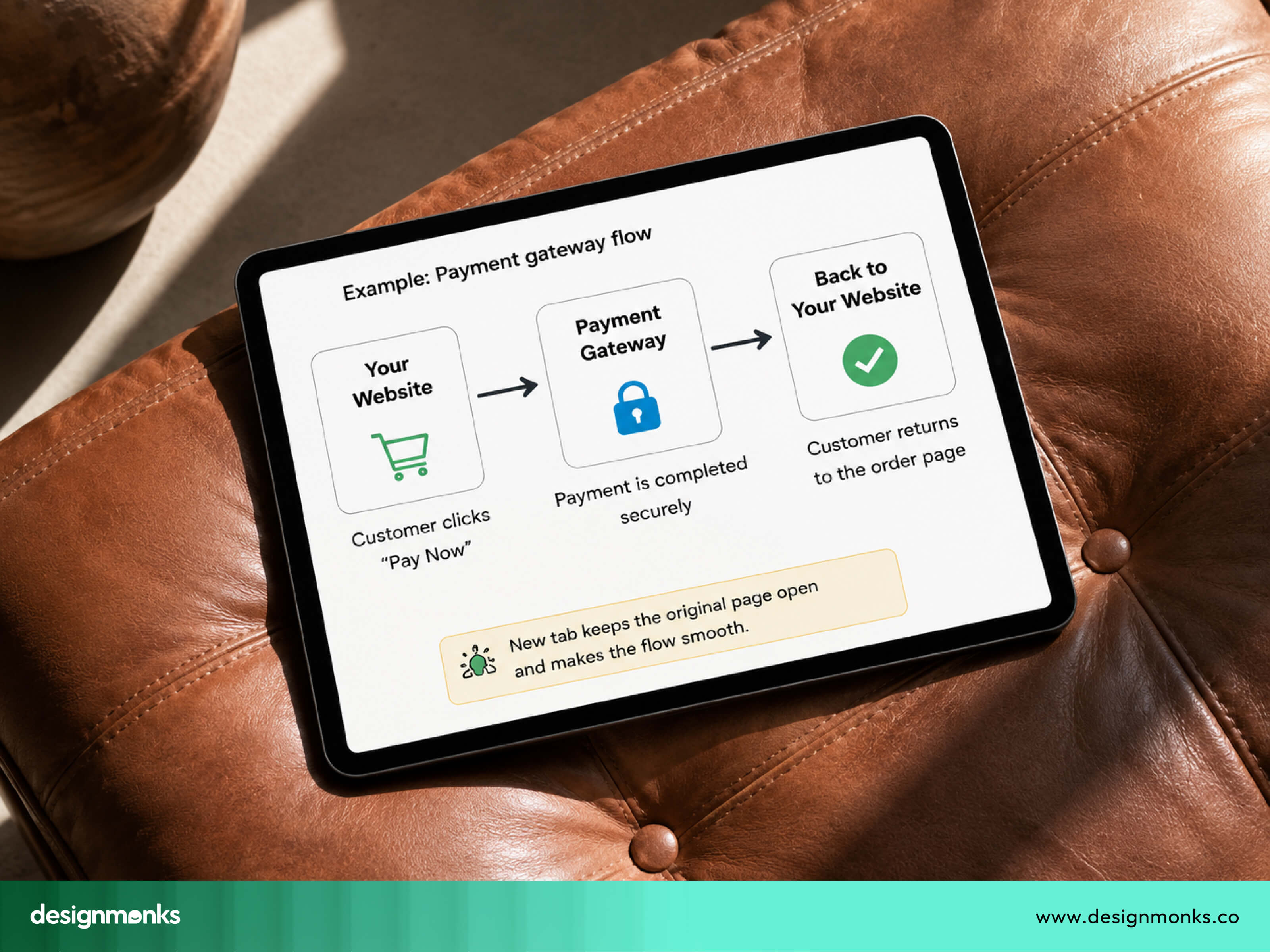
These tools often require the user to complete a task and then return to your main site. Opening them in a new tab keeps your site alive in the background, so users don't have to reload everything or lose their session just to come back.
However, this should not become a rule for every external link. A simple reference to another website usually does not need its own tab. The purpose is to support the user's task, not to keep your website open at all costs.
Accessibility Considerations for Opening Links in a New Window
Good UX is not only about making websites easy to use. It is also about making them usable for everyone. This is something a lot of designers overlook.
New tabs can be confusing, even harmful, for certain users, particularly people using assistive technologies.
Why Unexpected New Windows Can Be Confusing
Most people can quickly notice when another browser tab appears. Someone using a screen reader may not receive that information in the same way.
Imagine clicking a link expecting to move to another page. Instead, a new tab opens without any warning. The user may think the original page changed when it actually did not. This makes navigation more difficult because they must figure out where they are before continuing.
The same issue affects some people with memory or attention difficulties. Unexpected changes require extra mental effort and can make a website feel harder to use.
This is one of the reasons accessibility should be part of every UX decision. Before choosing to open a new tab, it's important to understand what accessibility guidelines recommend and how they help create a more predictable experience.
WCAG Recommendations
WCAG, or the Web Content Accessibility Guidelines, is an international set of recommendations for making websites accessible to everyone.
The main idea behind WCAG is predictability. Users should understand what will happen before they click something. WCAG does not say that opening links in a new tab is always wrong. Instead, it recommends avoiding unexpected changes that users did not ask for.
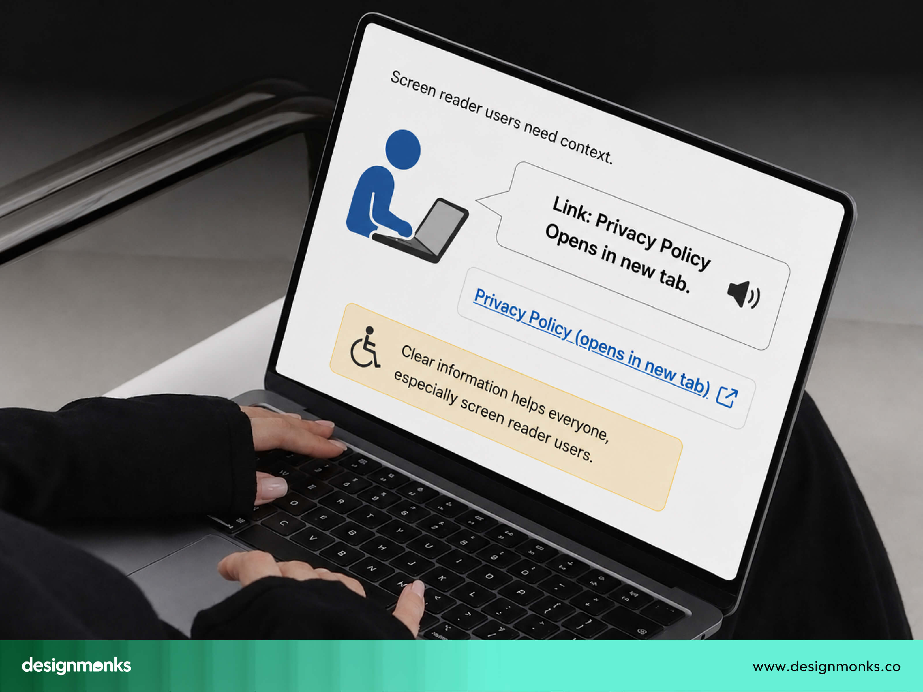
And if a link needs to open in a new tab, users should know about it in advance. That simple warning helps everyone, especially people using assistive technology.
Accessibility is not just about following guidelines. It is about respecting your users and making sure every visitor has a comfortable experience.
How to Inform Users Before Opening a New Tab
The good news is there's an easy fix. You just need to tell users clearly, before they click. Here are a few simple ways to do that:
- Link labels that literally say "opens in new tab"
- Icons next to the link, like a small arrow symbol, that visually hint at external navigation
- ARIA labels that screen readers can pick up and announce out loud
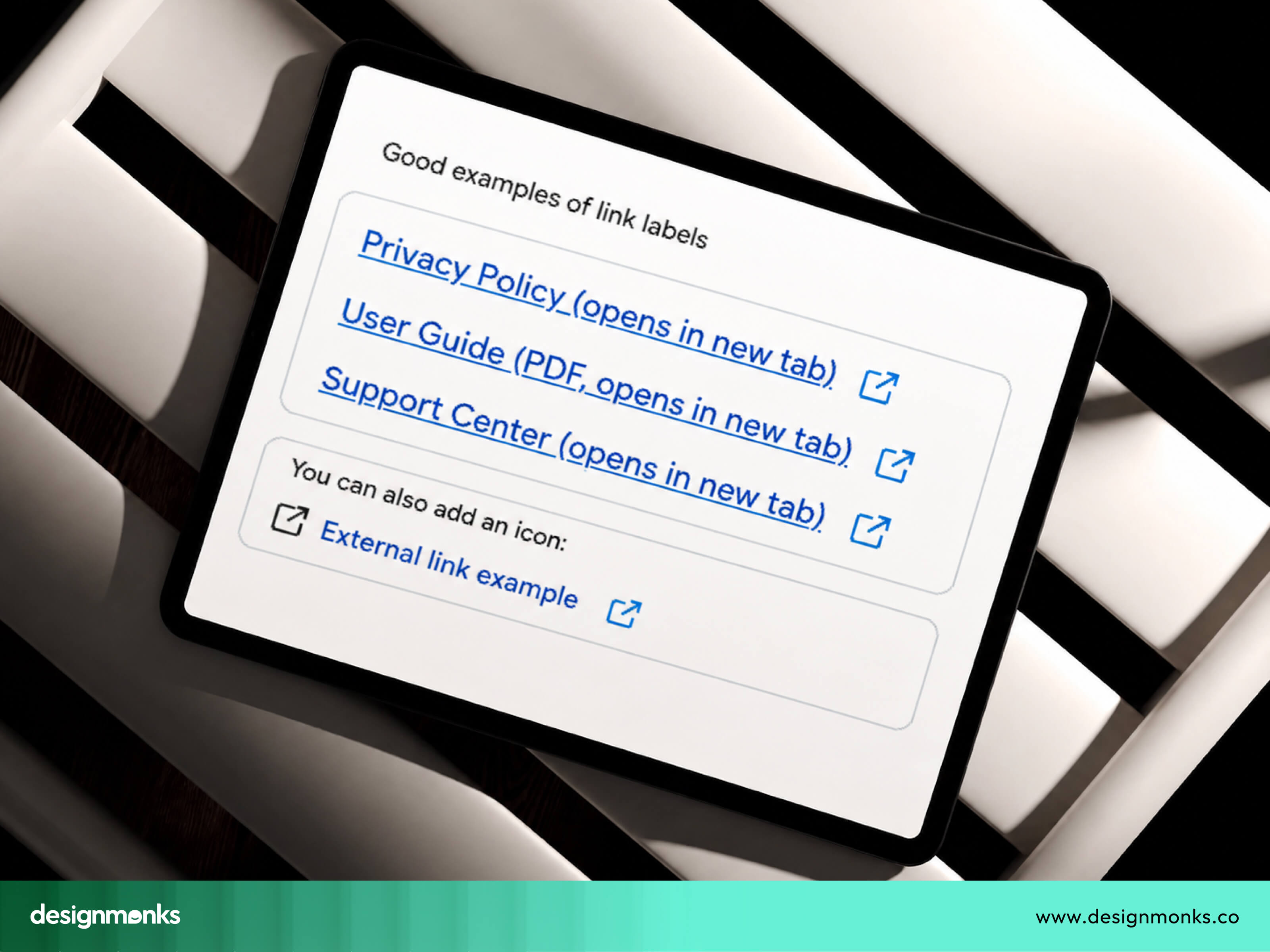
None of these takes a lot of effort to add. But they make a real difference for accessibility, and everyone else. With a clear indication of what will happen before they click, users feel more confident using your website.
UX Pros and Cons of Opening Links in a New Window
There is no single rule that works for every website. Opening links in a new window has both advantages and disadvantages. The right choice depends on what users are trying to do. Let's look at both sides:
Advantages
Opening links in a new tab does bring some real benefits.
- Preserves Current Page: Users don't lose their spot, their progress, or their session.
- Easier Comparison: If someone's comparing two products or two articles, having both open side by side in separate tabs is genuinely useful.
- Supports Multitasking: Some users like to open several things at once and go through them one by one. New tabs support this style of browsing naturally.
Disadvantages
But there are downsides too, and they're worth taking seriously:
- Unexpected Behavior: Users don't like surprises, especially small ones that break their expectations without warning.
- Too many tabs: If every link opens a new tab, people quickly end up with a browser full of tabs they never asked for. That's frustrating, not helpful.
- Navigation Confusion: As we mentioned earlier, the back button stops working the way people expect, which throws off their whole sense of control.
- Accessibility concerns: Without proper warnings, new tabs can create real barriers for screen reader users and others relying on assistive technology.
So the takeaway here is balance. New tabs aren't good or bad on their own. It depends entirely on how and when you use them.
Common Use Cases and Examples
Understanding the theory is helpful, but seeing real examples makes it easier to decide what to do. Here are some common situations:
Blog References
Suppose you're writing an article about how UX design tells your brand story and mention a research study from another website. There are two reasonable options:
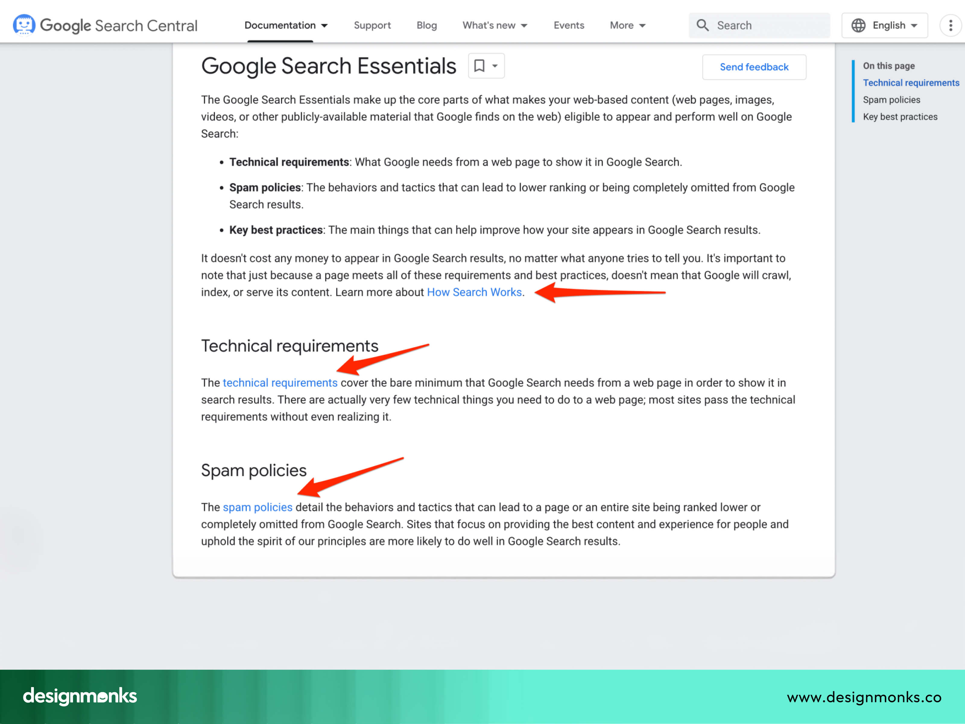
- If the reference is important but not required immediately, opening it in a new tab lets readers continue reading your article without losing their place.
- If the external source is the main thing readers want to see next, opening it in the same tab is also a good choice.
The best option depends on what helps readers continue their journey more easily.
Documentation
Documentation often contains many supporting resources. For example, a developer reading API documentation may open several reference pages while continuing to follow the main guide.
In this situation, new tabs can improve productivity because users frequently switch between multiple documents.
SaaS Dashboards
Users working in a SaaS dashboard often need to open other articles, support guides, or documentation while completing a task. Opening these resources in a new tab lets them find the information they need without losing their place or interrupting their workflow.
The same approach works well for reports, user manuals, release notes, and knowledge bases connected to the product. Once users have the information they need, they can simply close the tab and continue working.
E-commerce Checkout
During checkout, customers often need to check information like shipping policies, return policies, size guides, or warranty details before completing their purchase.
Opening these pages in a new tab keeps the checkout process open, so customers can quickly find the information they need and return without starting over. This reduces interruptions and helps users complete their purchase with more confidence.
Educational Platforms
Students often use multiple learning resources while studying. They may watch a lesson, read a glossary, or check a reference article at the same time. Opening these resources in a new tab makes it easier to switch between them without losing their place in the lesson or assignment.
Admin Systems
People working in admin systems often need to view reports, invoices, customer records, or documentation while completing their daily tasks. Opening these resources in a new tab lets them access important information without interrupting their current workflow. This makes it easier to stay organized and productive.
Across all of these examples, the same principle applies: open a new tab only when it helps users keep their place and complete their task more easily.
SEO Impact of Opening Links in a New Window
Now let's clear up a common myth. Many people believe that target="_blank" (HTML attribute that tells a web browser to open a link in a new tab or window)affects search rankings directly. It doesn't.
Google's algorithms don't penalize or reward a page just because its links open in a new tab. Search engines care much more about things like helpful content, page speed, and a good user experience.
However, opening links in a new tab can affect how people use your website. If users end up with too many tabs or feel confused by unexpected behavior, they may leave your site sooner or have a poorer experience. While this does not directly affect rankings, it can reduce user engagement.
But when you use target="_blank", you should always pair it with rel="noopener". Without this, the new page gets partial access to the original page through the JavaScript window.opener property.
This is a security risk known as tabnabbing, where a malicious site could manipulate the original tab. Adding rel="noreferrer" also prevents the browser from sending referrer information to the new page.
This is useful when you want extra privacy for your users, though it does mean the destination site won't know where the traffic came from.
So the SEO story here is simple. Don't worry about target="_blank" hurting rankings. But do worry about using it responsibly, both for security and for user experience.
Best Practices for Opening Links in New Tabs
There is no universal rule for opening links in a new tab. The best choice depends on what helps users complete their task with the least amount of effort.
But the following best practices can help designers and developers make better decisions:
- Open links in the same tab by default: Only use a new tab when it clearly improves the user experience.
- Use new tabs for the right situations: Payment pages, maps, external tools, and downloadable documents are good examples.
- Let users know: Tell people when a link will open in a new tab using text, an icon, or an accessible label.
- Always use rel="noopener": Whenever you use target="_blank", add rel="noopener" to improve security.
- Test for accessibility: Check how new-tab links work with screen readers and other assistive technologies.
- Keep the experience consistent: If external links open in new tabs, follow the same approach across your entire website.
Common Mistakes Designers and Developers Make
Opening links in a new tab seems like a small decision, but it is easy to get wrong. Here are some of the most common mistakes to avoid:
- Opening every external link in a new tab: Not every external link needs a new tab. Use one only when it helps users keep their place or complete an important task.
- Not warning users: If a link opens in a new tab, let users know beforehand with a clear label such as "(opens in new tab)."
- Forgetting rel="noopener": Always pair target="_blank" with rel="noopener" to improve security and follow modern HTML best practices.
- Being inconsistent: If similar links behave differently without a clear reason, users may become confused. Follow the same pattern across your website.
- Opening internal links in new tabs: Internal links should usually open in the same tab so users can navigate your website naturally using the Back button.
- Ignoring user expectations: People already know how browsers work. Choose link behavior that feels familiar and predictable instead of creating unnecessary surprises.
UX Decision Guide: Should This Link Open in a New Tab?
Frequently Asked Questions
Should external links open in a new tab?
Not always. Only open external links in a new tab when the user needs to preserve their current page, like during checkout or when using a third-party tool. Regular external references, like blog citations, can often open in the same tab without issue.
Is opening links in a new tab good UX practice?
It depends on context. It's a good UX practice when used sparingly and with proper warning. It becomes a mistake when it's applied to every link without thought, as that creates clutter and confusion.
Should PDFs open in a new tab?
Generally yes. PDFs and other downloadable files behave differently from regular web pages, and opening them in a new tab keeps the user's original page intact while they view or download the file.


.avif)
.avif)
.avif)
.avif)


.avif)
.avif)
.avif)
.avif)






.avif)