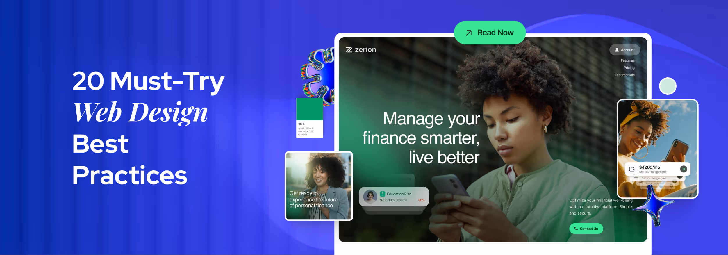
.svg)


Key Takeaways
- Effective web design builds trust, guides user actions, and increases website results.
- A clear layout and smooth user flow strongly influence visitor experience.
- Mobile-friendly design is crucial, as most users browse on smartphones today.
- Fast-loading pages, clear content, and trust signals shape user decisions quickly.
- Small design improvements can lead to significant gains in engagement and conversions.
A perfect website design can make or break a business in seconds. Visitors decide to stay, trust, or leave almost instantly. But how can you make sure your website leaves the right impression every time?
The answer lies in applying best web design practices. Instead of guessing or copying, using proven design rules helps you create clear layouts, readable text, balanced colors, and smooth navigation that work for real users. This is the fastest way to turn a simple site into one people love to use.
In this blog, you will learn simple steps that web design service providers utilize to structure pages, pick fonts, manage colors, speed up sites, and make them mobile-friendly. Read on to build websites that truly impress.
20 Best Web Design Practices (Complete List)
Best practices like clear layout, clean style, fast speed, and mobile support help a site grow with ease. These rules help users move with comfort and take action with less effort. Below are the 20 best web design practices that every site should follow for better results.
1. Prioritize User Experience (UX)
User experience is the heart of web design. Every decision should make the user journey simple and smooth. Reducing friction, arranging content logically, and following usability guidelines ensure visitors move naturally through the site.
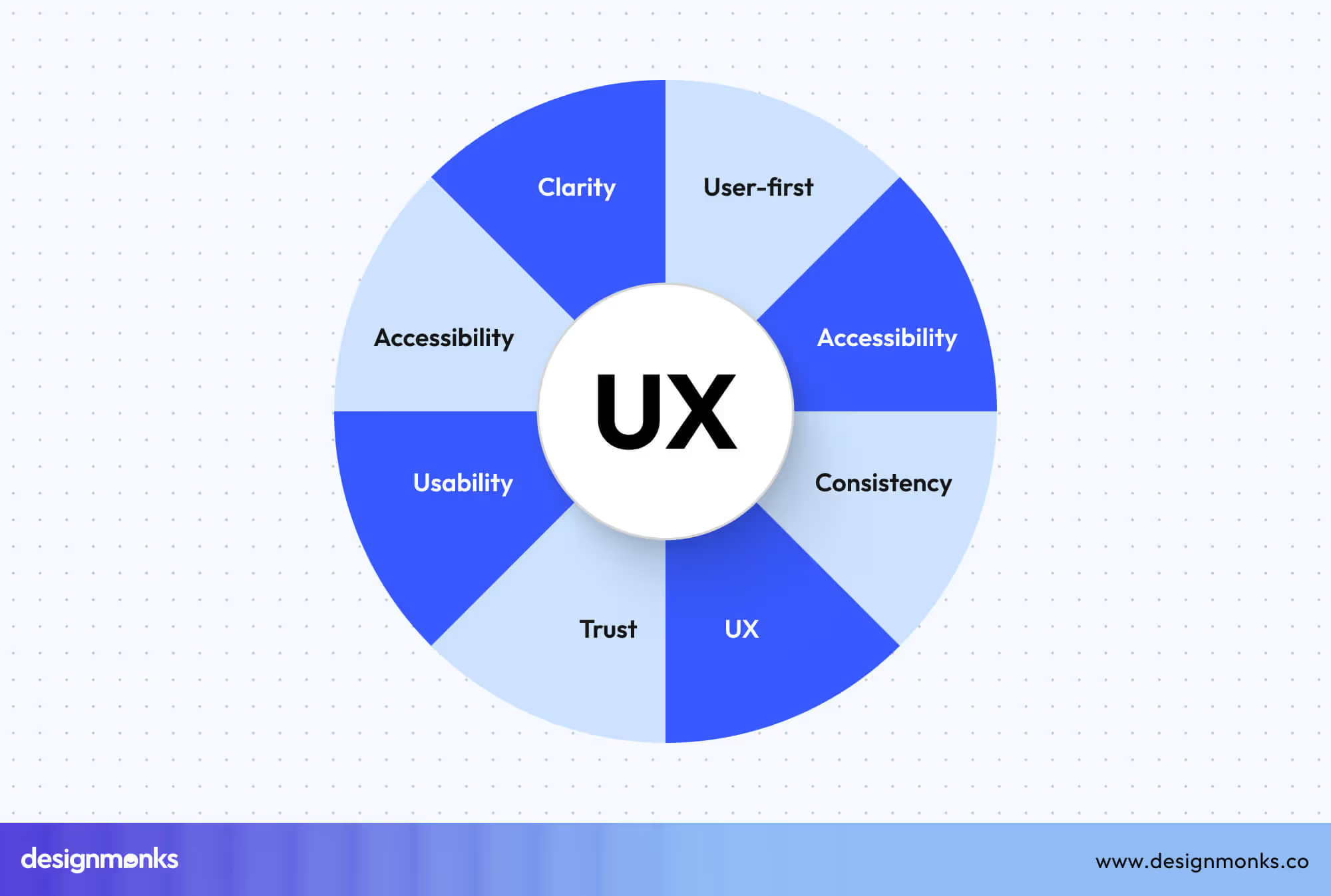
Good UX design also encourages repeat visits and increases satisfaction. When you focus on user-centered design principles, visitors find what they need faster, trust your brand more, and interact with your site confidently.
2. Create Intuitive Navigation
Navigation helps users find their way without overthinking. A clear menu structure, logical hierarchy, and breadcrumb support improve scanning and flow, keeping users engaged on your site.
Predictable navigation also makes the site accessible and search-engine-friendly. Using intuitive navigation strategies, like grouping related pages and consistent menu labels, ensures visitors can explore the site without confusion.
3. Apply Strong Visual Hierarchy
A website’s layout directs attention to the most important areas. Using headings, white space, and color contrast properly helps users scan pages easily. Here are practical steps you can follow:
- Make headings larger than body text to guide reading.
- Add white space to reduce clutter and focus attention.
- Highlight primary actions with color or size.
- Organize content sections logically for easier flow.
4. Design Modern & Clean UI
A clean interface makes your site trustworthy and easy to use. Consistent spacing, grid layouts, and predictable patterns reduce cognitive load and help visitors navigate naturally.
Modern UI design improves clarity and usability. Every button, menu, and section should follow clear design principles to make the site feel professional and approachable, even to first-time visitors.
5. Maintain Consistent Branding
Consistent branding improves recognition and confidence. Using unified colors, typography, and icon styles makes a website appear polished and professional. Here are practical steps you can follow:
- Keep your color palette consistent across pages.
- Follow typography rules for headings and body text.
- Use uniform icons and imagery style.
- Maintain consistent tone in content.
6. Create High-Converting CTAs
Strong call-to-action guides users to take action. Using contrasting colors, strong action verbs, and clear placement ensures visitors notice and interact with them.
Well-crafted CTAs support conversion optimization. Strategic positioning and design patterns help users complete tasks, whether signing up, purchasing, or contacting, making your website more effective and goal-driven.
7. Make the Website Mobile-First
Designing for mobile first ensures your site works on small screens before larger ones. Mobile-first layouts, large tap targets, and collapsible menus improve usability and search performance.
Here are practical steps you can follow:
- Prioritize mobile-friendly layouts.
- Make tap targets big enough to interact easily.
- Use collapsible menus for a cleaner design.
- Keep essential content visible first.
8. Ensure Full Responsive Design
Responsive design adapts your site to any screen size. Fluid grids, responsive images, and testing across breakpoints ensure content looks correct everywhere. These steps can help you in this case:
- Use fluid grids that adjust automatically.
- Ensure images scale without distortion.
- Test layout at multiple breakpoints.
- Adapt elements for tablets and desktops.
9. Optimize Website Speed & Performance
Fast-loading websites improve user satisfaction, SEO, and conversions. Reducing server requests, using CDNs, and limiting heavy animations help pages load quickly. Prioritize these steps for speed optimization:
- Reduce server requests for faster loading.
- Use a fast hosting provider or CDN.
- Limit heavy animations and scripts.
- Compress files and optimize delivery.
10. Optimize All Images
Optimized images make sites faster and save bandwidth. Compressing, resizing, and using next-gen formats like WebP improves performance while keeping visuals sharp.
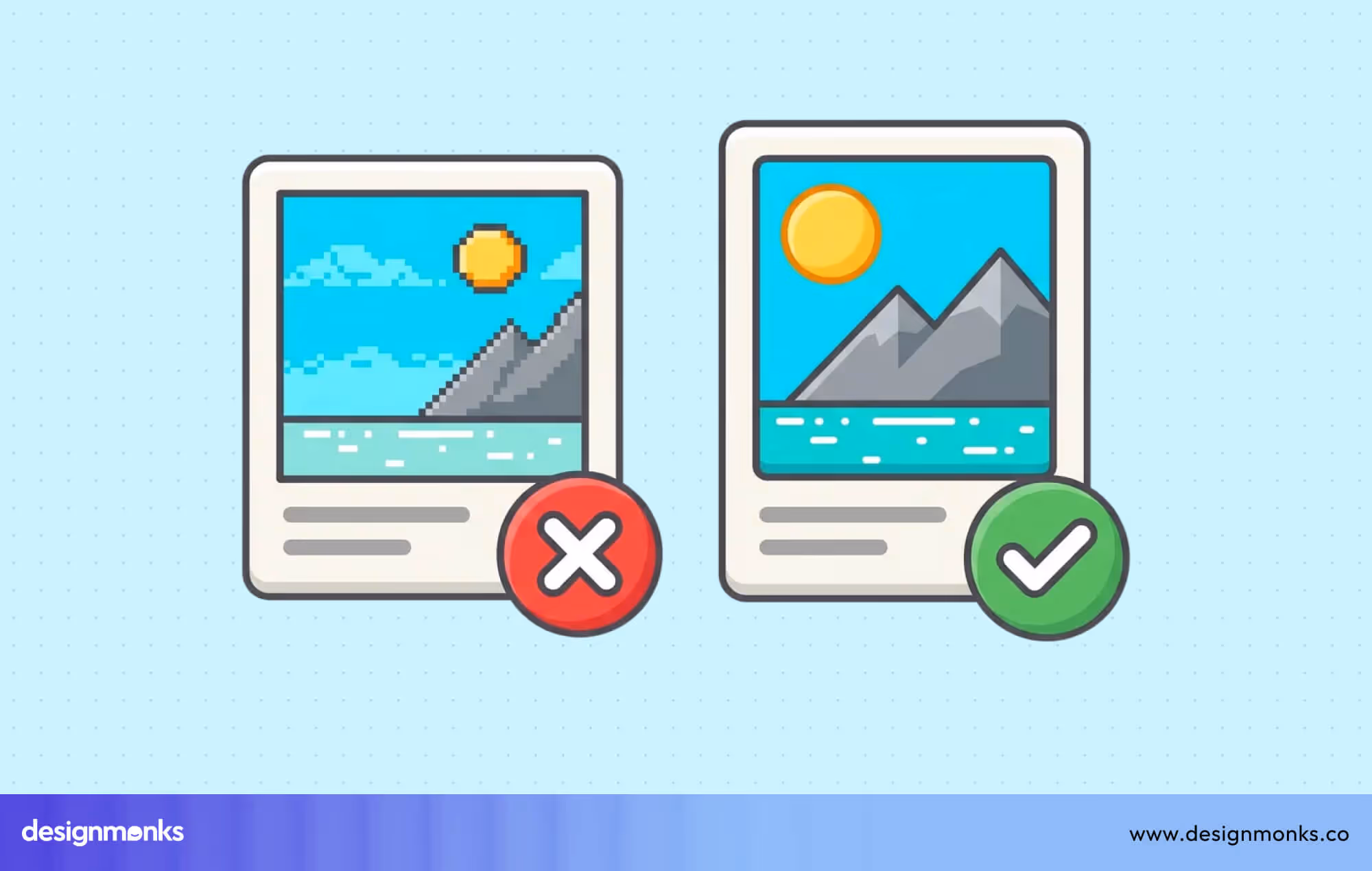
In this case, you should use WebP or other next-gen formats to make the image accessible on all platforms. Also, compress images without losing quality and enable lazy loading for below-the-fold images. Don’t forget to resize images to fit the layout requirements.
10. Write Clean, Minimal Code
Clean code keeps a website fast and stable. When you minify HTML, CSS, and JS, pages load with less weight. Fewer files and fewer errors lead to smoother views and better user trust.
Remove unused libraries and choose lightweight frameworks for daily work. This approach lowers bug risk and cuts load time. Lightweight code also helps future updates stay simple and safe across browsers and devices.
12. Improve Accessibility (WCAG)
Accessibility lets every user use a site with ease. WCAG 2.1 gives clear rules for inclusive design. When a site follows these rules, it meets legal needs and also shows care for real people.
Alt text helps screen readers describe images. Strong color contrast aids weak vision. Full keyboard navigation helps users who avoid a mouse. These steps improve reach, trust, and comfort for a wide user group.
13. Use Structured Data (Schema Markup)
Structured data helps search engines understand your site more clearly. With Schema.org markup, pages share clear details about content type, page purpose, and business data. This often leads to rich results in search.
WebPage schema helps define a page's meaning. BreadcrumbList schema helps show site paths. The product or service schema adds key details to offers. Together, these tags lift search visibility and raise proper click rates.
14. Keep the Interface Minimal & Clean
A minimal interface lifts clarity and focus. Fewer items on a screen guide the eye with ease. Minimalist UI keeps users calm and reduces confusion, which helps each action feel clear and direct.
Set one main action per screen to avoid doubt. Limit long text blocks to protect focus. Keep margins consistent across pages. This form of minimalism supports a clean interface that feels balanced and easy to use.
15. Use Meaningful Microinteractions
Microinteractions help users feel each small action on a website. These tiny UI interactions give clear feedback and guide movement. They add life to the interface and make steps feel smooth and easy.
Good interaction design also improves navigation clarity. When users see an instant response after a tap, click, or swipe, they feel more sure about what to do next. This raises comfort and control.
Here are practical ways to use microinteractions with purpose:
- Button hover states to show click-ready areas.
- Soft scroll effects to guide page movement.
- Progress indicators to show task status.
16. Add Trust & Social Proof Elements
Trust elements help users feel safe before they act. Social proof shows that real people already trust your service. This lowers doubt and reduces friction at key decision points on a website.
Strong credibility signals also support first-time visitors. When users see proof of real work and real results, they feel less risk. This builds confidence before a purchase, signup, or contact action.
Here are simple ways to add trust and social proof:
- Real customer testimonials with name and role.
- Short case studies with clear results.
- Security badges for payment and data safety.
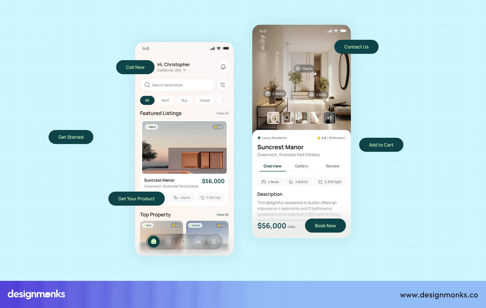
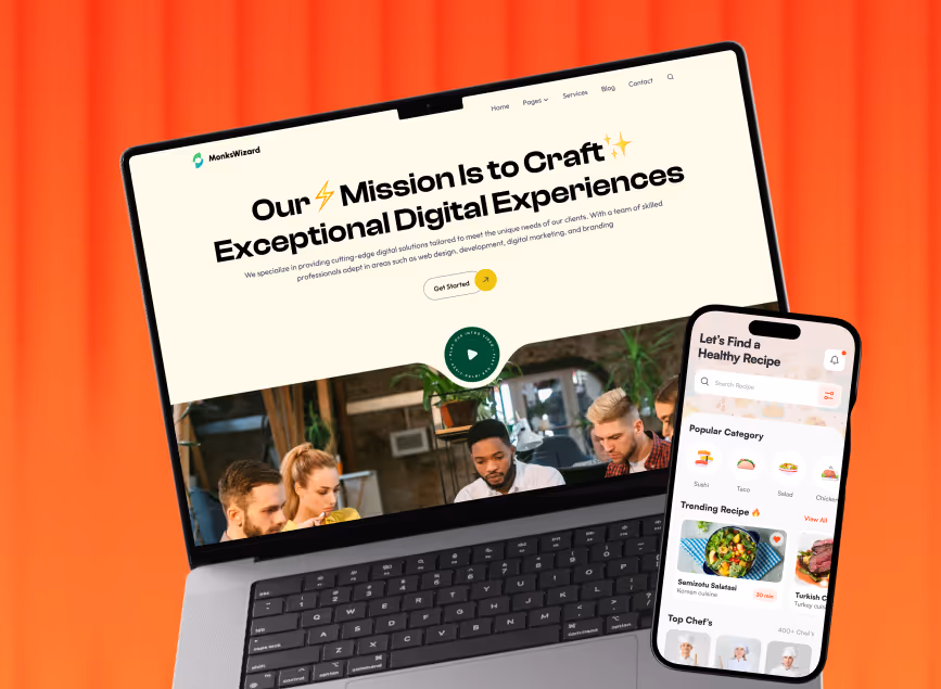
17. Use High-Quality Visuals & Media
Strong visuals hold attention and shape the first impression. High-quality photos, clear icons, and custom illustrations turn plain pages into engaging spaces. These visual assets help users scan faster and connect with content without effort.
Engaging visuals also support brand tone and message clarity. When a design uses relevant icons and original graphics, users trust the site more. Good visual content makes ideas easier to grasp and keeps users active on the page.
18. Conduct UX Audits Regularly
A UX audit helps spot weak areas before users complain. Regular checks review the user flow, layout clarity, and action steps. This approach keeps the experience smooth and supports steady site growth with fewer sudden issues.
.avif)
A proper UX audit uses usability testing, heuristic review, and real feedback loops. These steps follow iterative design logic, where each review leads to a better version. Also, this steady review cycle protects both user trust and product quality.
19. A/B Test Key Elements
A/B testing helps compare two design versions to learn what works better. Small layout shifts, CTA changes, or hero section updates can lift results. These optimization experiments rely on a clear experiment design to guide decisions.
With steady A/B testing, teams remove guesswork and rely on real user action. This method helps you improve conversions over time and helps pages evolve with user needs instead of fixed design ideas.
20. Design with Accessibility-First Color Contrast
Choosing a strong color contrast helps all users read and interact easily. Accessibility-first design supports those with vision issues, color blindness, or low-light conditions, ensuring content remains clear and legible for every visitor.
High contrast improves comprehension and directs attention to key elements like buttons and links. It reduces eye strain while keeping the design visually appealing. Following accessibility guidelines makes your site inclusive, professional, and trustworthy for all users.
Best Practices for Industry-Specific Website Design
Each type of website serves a different user need. A travel site sells experience, a SaaS site sells ease, and a portfolio sells skill. These best practices change by industry, not by trend.
Travel Website Design Best Practices
An ideal travel website project must create emotion at first glance. Large immersive images help users feel the place before they reach it. Strong visuals build desire and trust at the same time.
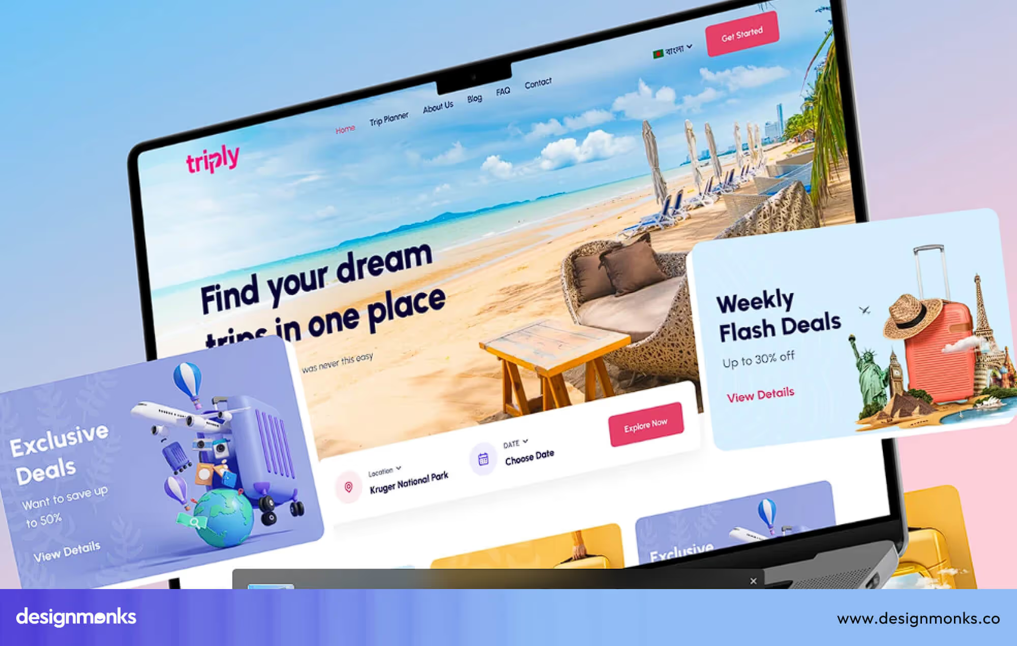
Search and filter systems help users save time. Clear date, price, and location filters reduce stress during trip planning. Interactive maps also guide users with a real location view and travel route sense.
Reviews and social proof remove doubt before booking. A mobile-first booking UI keeps the process fast on small screens. When booking feels easy, users move from interest to action without delay. All these travel website best practices help you make something great.
Cybersecurity Website Design Best Practices
Websites for the Cybersecurity industry must build trust within seconds. Users deal with data risk and privacy fears here. Trust-focused visuals, clean layouts, and calm colors help users feel safe before they read any technical details.
Technical topics must feel simple to non-technical users. When services, risks, and solutions appear in plain words, users stay longer. A clear layout also helps users scan documents without mental pressure.
Here are the core design focus points for cybersecurity sites:
- Data protection badges for visual trust.
- Clean documentation layout for easy reading.
- Simple explanation of technical topics.
- Strong CTA for demo or free trial.
SaaS Website Design Best Practices
A SaaS website must state its value in seconds. A clear hero section with one strong message helps users know what the product does and who it is for without confusion.
Feature highlights work best when icons support short text. Comparison charts help users judge plans with ease. These visual tools guide users through choice without heavy reading.
Easy onboarding flow turns interest into real use. When signup feels short and smooth, users stay active. Testimonials and case studies add belief through proof of real business success with the same tool.
E-commerce Website Design Best Practices
An e-commerce website must remove all buying. High-quality product images help users judge size, texture, and detail. When visuals feel real, trust grows before price and offers discussion.
The checkout flow must feel short and clear. Fewer steps reduce cart loss. Sticky CTAs also help users act at the right time without constant scrolling fatigue.
Here are the key design focus areas for better sales flow:
- High-quality product images should show clear angles, zoom views, and real-life usage to reduce buyer confusion.
- Smooth, low-step checkout should remove extra fields and distractions that slow down the purchase process.
- Sticky CTAs should stay visible so users can act at any moment without searching for the buy option.
- Personalization should suggest products based on user interest and past behavior for a better match.
- Real product reviews should show honest user feedback to build strong buyer trust.
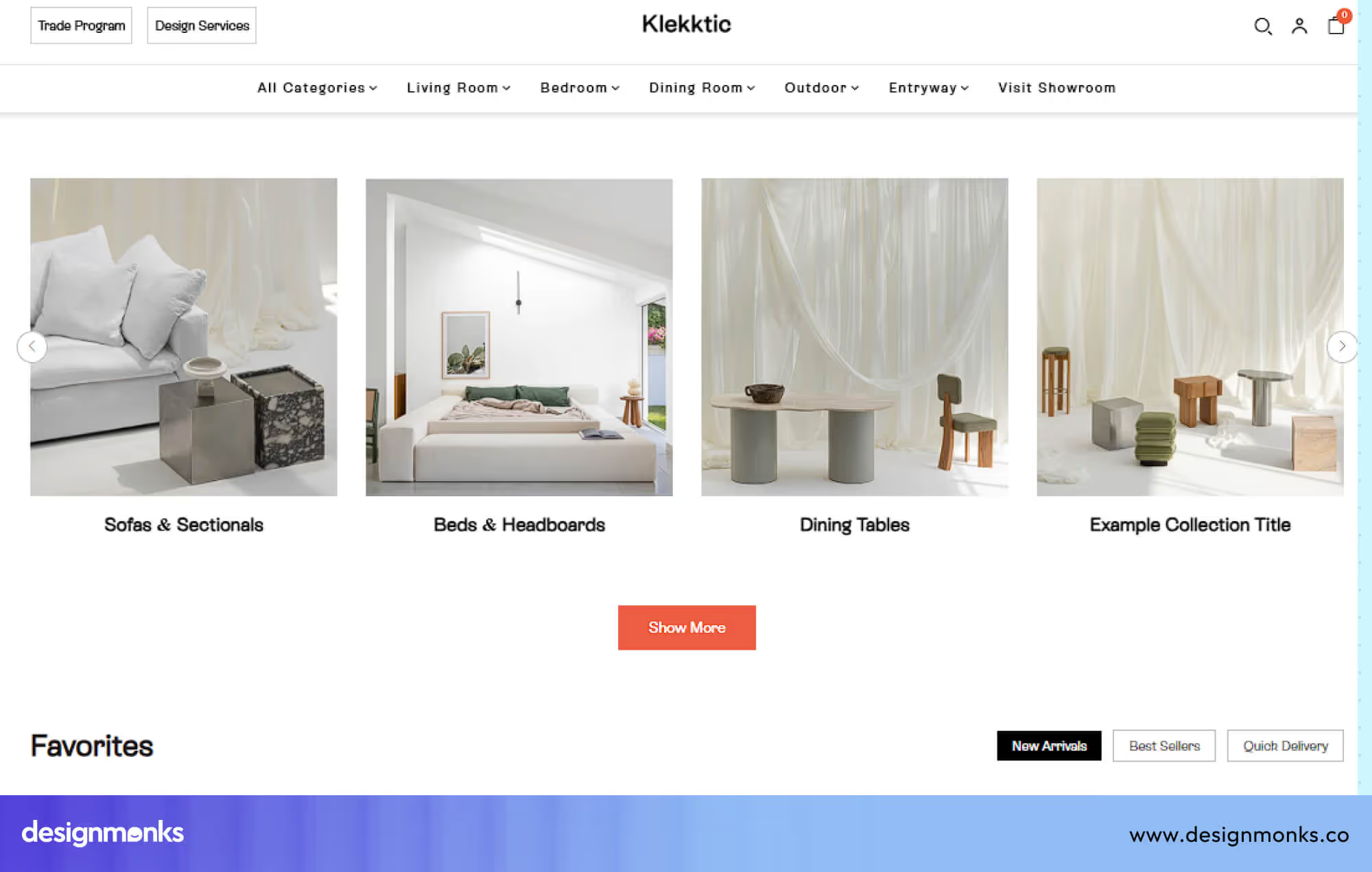
Portfolio Website Design Best Practices
A portfolio website must show skill without noise. A clear showcase grid helps visitors scan projects with ease. Strong visual order helps work shine without heavy text blocks.
Speed also matters for a first impression. Fast-loading galleries protect user patience. An “About” section with credibility proof builds trust beyond visuals and adds human value to skill display.
Here are the core design focus points for portfolio websites:
- A clear showcase grid should organize projects in a simple structure so visitors understand the work quickly.
- Visual storytelling through layouts should guide users through each project with purpose and flow.
- Fast-loading image galleries should keep the site light and responsive on all devices.
- The About section should clearly show experience, skills, and a real background for credibility.
- A clear contact CTA should guide visitors toward a direct conversation without confusion.
Maintaining all these practices might seem difficult, and that’s why business owners, especially startups, decide to hire an agency. However, choosing the right web design agency can be even more difficult.
Well, if you don’t want to for such hassle, contact Design Monks where you’ll get reliable web design services at affordable and transparent pricing.
Common Web Design Mistakes to Avoid
Even good-looking websites fail due to small but serious design errors. These mistakes hurt user trust, reduce action, and block growth. Fixing them early saves time, effort, and business value.
Making the Website Hard to Use
Many websites look nice but feel confusing to use. When buttons hide, text feels unclear, or steps feel long, users feel lost. This causes fast exits and low action, even on strong offers.
Ignoring Mobile Users
Some websites still focus only on desktop screens. On phones, text breaks, buttons feel small, and pages feel heavy. Since most users browse on mobile, this mistake alone can cut traffic and sales.
Using Too Many Colors and Fonts
Too many colors and fonts create visual noise. Users struggle to focus, and trust drops fast. A messy look also hides key actions, which blocks clear reading, smooth flow, and confident decision-making.
Slow Page Load Time
Slow websites lose users before the page fully opens. Heavy images, large files, and weak hosting create a delay. Even a few extra seconds push users away and damage search visibility and trust.
Weak or Hidden Call-to-Action
Many websites hide their main action or make it unclear. When users do not see what to do next, they pause or leave. A weak CTA breaks the entire page goal and reduces results.
No Trust Signals for New Visitors
Users hesitate when they see no proof of safety or quality. Without reviews, real photos, or brand identity, doubt grows fast. People avoid sharing data or money on sites that feel unknown.
End Note
A strong website is not built by chance. It comes from clear structure, smart design choices, and a deep focus on how users think and act. When you follow proven web design practices, your site becomes easier to use, faster to explore, and more trusted by visitors.
Whether you are building your first website or improving an old one, these principles will help you create better experiences that turn visitors into real users and customers.

.avif)
.avif)
.avif)
.avif)


.avif)
.avif)
.avif)
.avif)


.avif)
