
.svg)


Key Takeaways
- A user-friendly telecom website makes tasks easy, builds trust, and keeps customers satisfied.
- Self-service portals and clear dashboards help users solve problems faster without calling support.
- Simple navigation and mobile-friendly design make it easy for anyone to find what they need.
- Built-in chat, quick help, and clear bills improve user confidence and reduce confusion.
- Working with a telecom UX agency ensures a smooth, consistent, and easy digital experience.
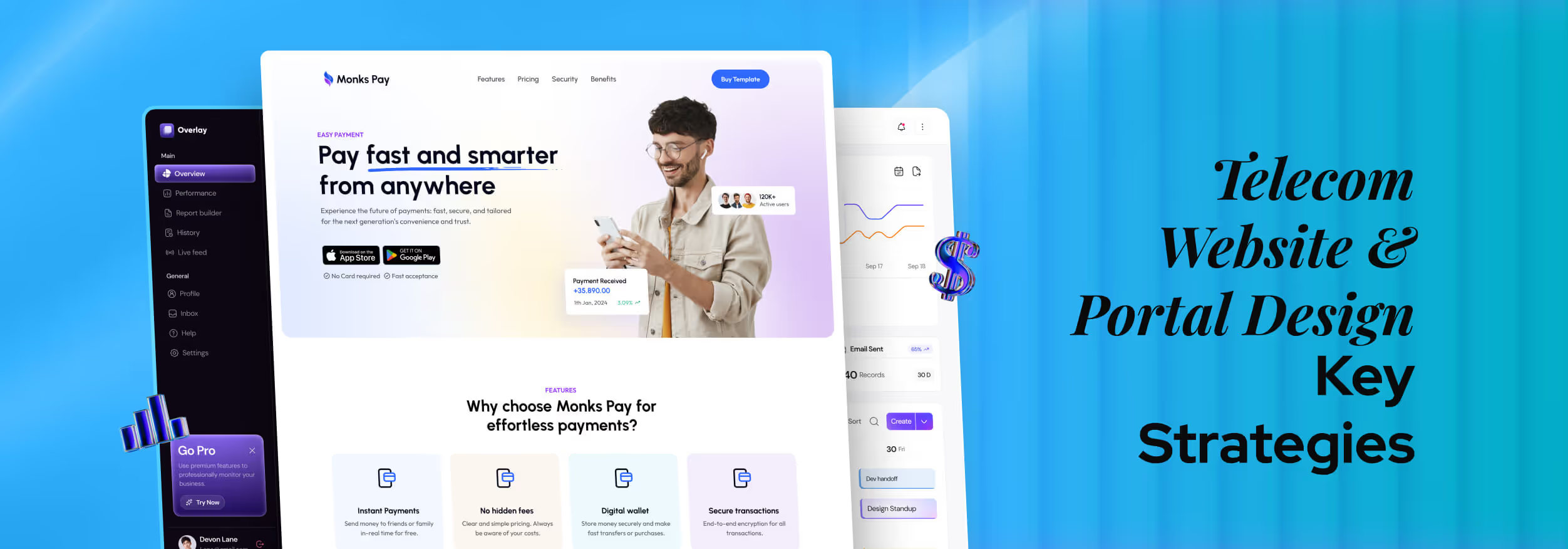
Your telecom website and portal design is often the first impression customers have of your brand. It’s more than just looks. It’s a strategic tool that can boost conversions, reduce support calls, and turn frustrated users into loyal advocates.
That's why designing for telecom means prioritizing simplicity and clarity, especially for complex tasks like billing and device management.
By focusing on a user-centric approach and addressing common pain points, you can transform your portal into a powerful, user-friendly hub. Keep reading to discover essential best practices that keep customers engaged.
What Makes Telecom Website Design Unique
Telecom websites are very different from regular online stores or apps. While a typical e-commerce site mainly focuses on selling products, a telecom website does much more.
It not only showcases services but also helps customers manage their accounts and access support. This combination of marketing and functionality makes telecom UX design unique. A telecom website usually handles things like:
Guiding New User Sign-Ups
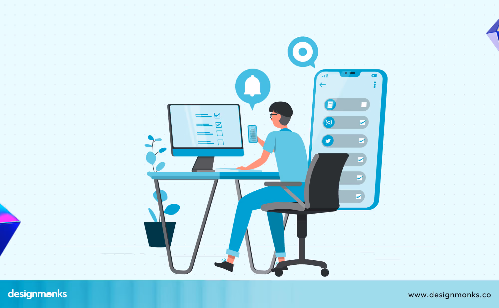
A telecom website must clearly explain different plans, highlight the benefits, and guide new users through registration. Image 02: Simple Signup Process
A smooth and simple sign-up process helps people get started quickly and reduces frustration.
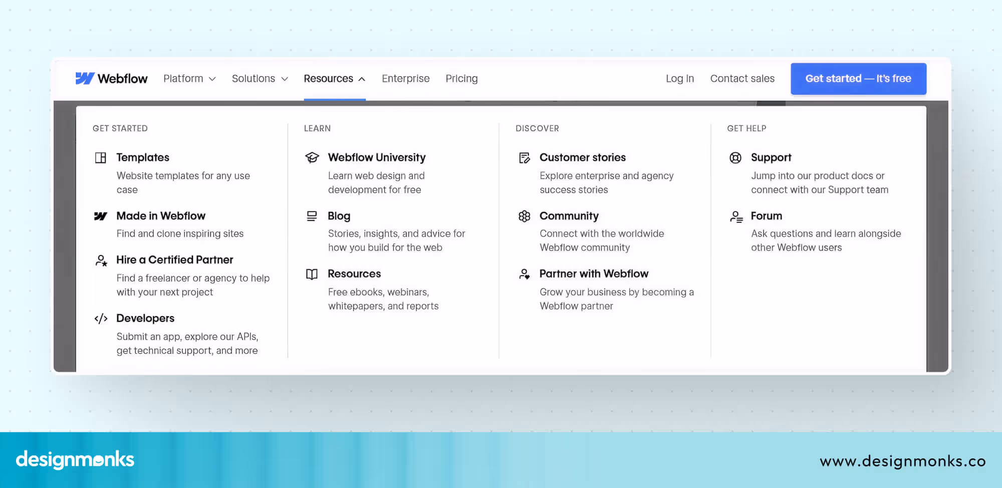
Offering Self-Service Portals
Unlike regular websites, telecom sites' dashboards often include portals where customers can log in to check usage, pay bills, or update details.
These self-service options save time and reduce the need for support calls and make the experience more convenient.
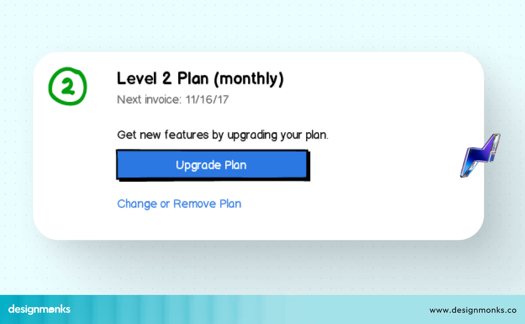
Simplifying Plan Management
Telecom customers frequently need to switch, upgrade, or downgrade their plans. If this process is complex, it can lead to frustration. A well-designed plan management system makes these changes simple, clear, and fast.
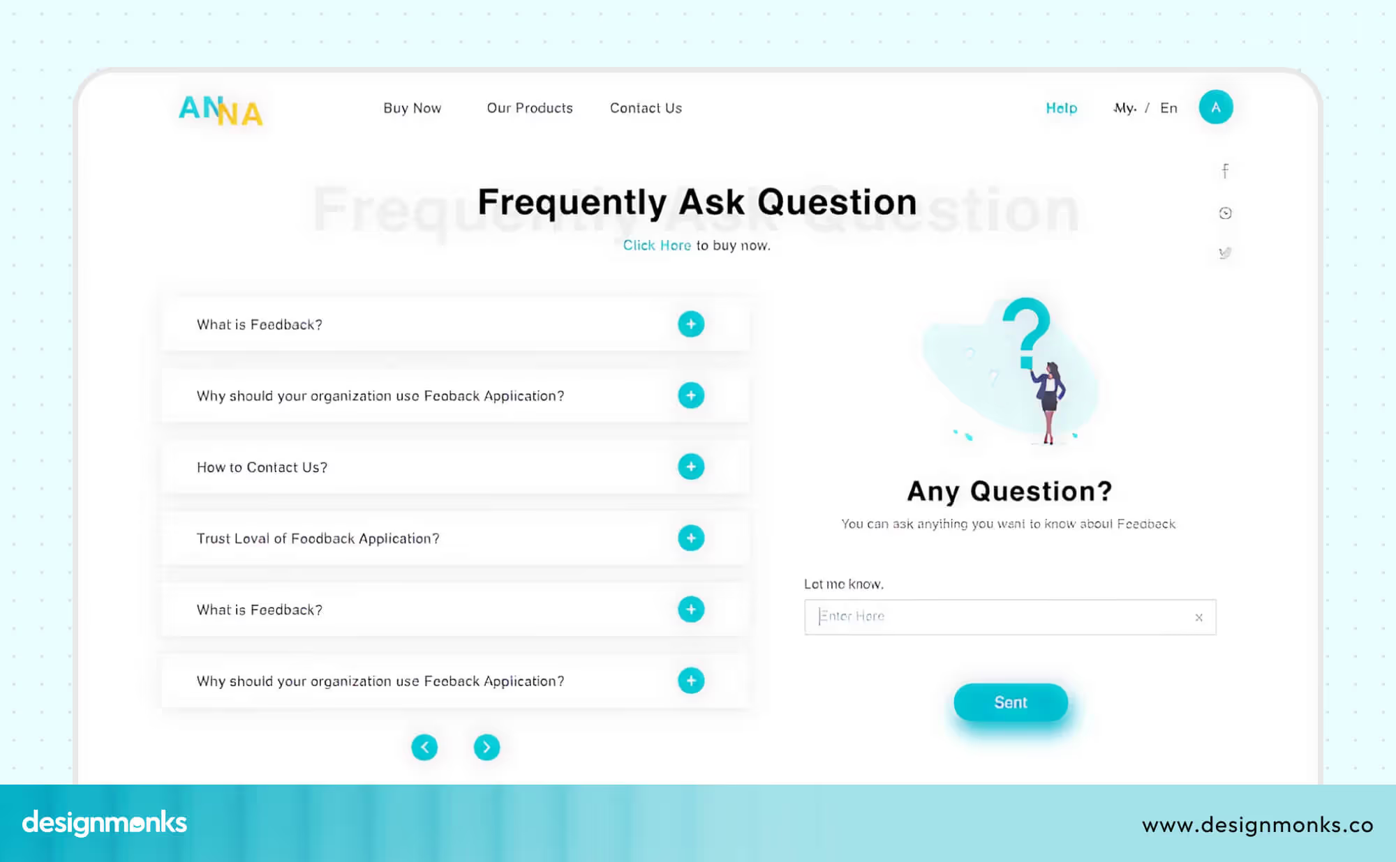
Providing Strong Support Channels
From live chat to FAQs and ticket systems, telecom websites must give users quick access to help. Easy-to-find support builds trust and ensures problems are solved without unnecessary stress.
Because of these unique needs, standard UX approaches for online stores or simple apps don’t always work. A telecom website must balance marketing design to attract new customers with functional UX to keep existing users happy.
This is why hiring a specialized telecom UX agency or telecom UI agency can make a big difference, they know how to handle both sides effectively.
Common UX Issues in Telecom Websites and How to Fix Them
Even large telecom companies, with millions of customers, often face serious UX challenges on their websites and portals. These problems can frustrate users, increase support calls, and reduce customer loyalty. Below are some of the most common issues, along with practical fixes:
Cluttered Homepages With Too Many Options
Telecom homepages usually try to show everything at once, like the plans, offers, devices, promotions, and support links. While the intention is to showcase value, the result is often information overload. Users feel lost and don’t know where to click first.
Fix: Build a clear content hierarchy. Highlight the most important actions like “Choose a Plan” or “Pay Your Bill” using large buttons or banners. Keep secondary links available but less prominent. A focused homepage helps users know exactly where to begin.
Confusing Navigation for Plan and SIM Selection
Choosing a mobile plan or SIM type can be difficult if the website menu is hidden, crowded, or full of technical terms. Most users don’t understand the complicated technical jargon. This often forces customers to call support instead of completing the task online.
Fix: Use mega menus with clear labels, add filters to narrow down options, and offer side-by-side comparison tools. This helps users quickly compare prices, data limits, and features, so they can make informed decisions without confusion.
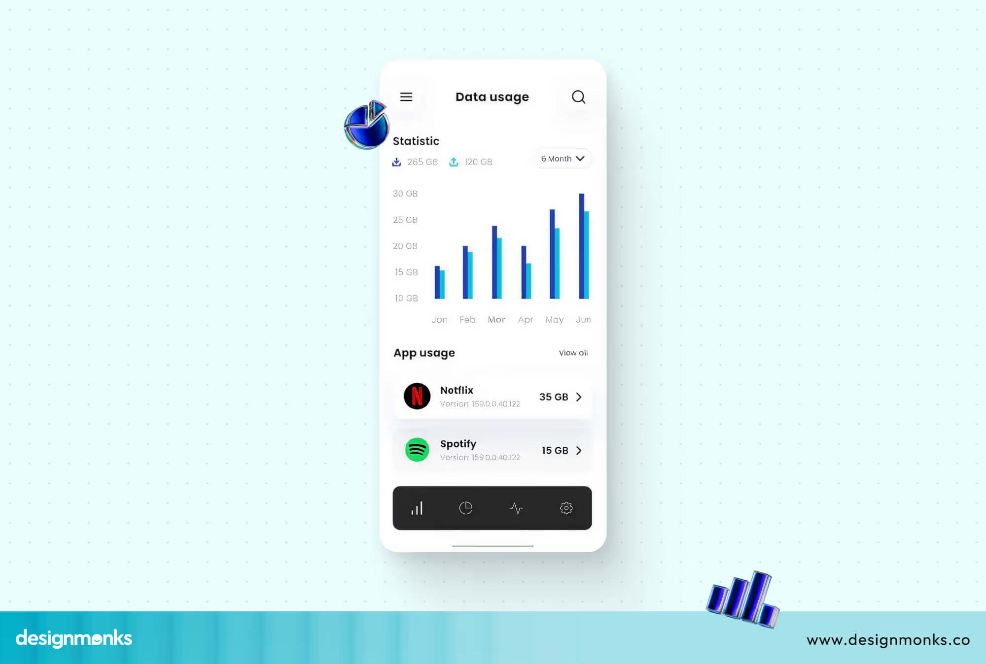
Poor Self-Service Dashboards
Many older dashboards look outdated, with too many tabs, small buttons, and scattered information. Customers often struggle to find key details like usage data or billing history. This leads to frustration and extra support requests.
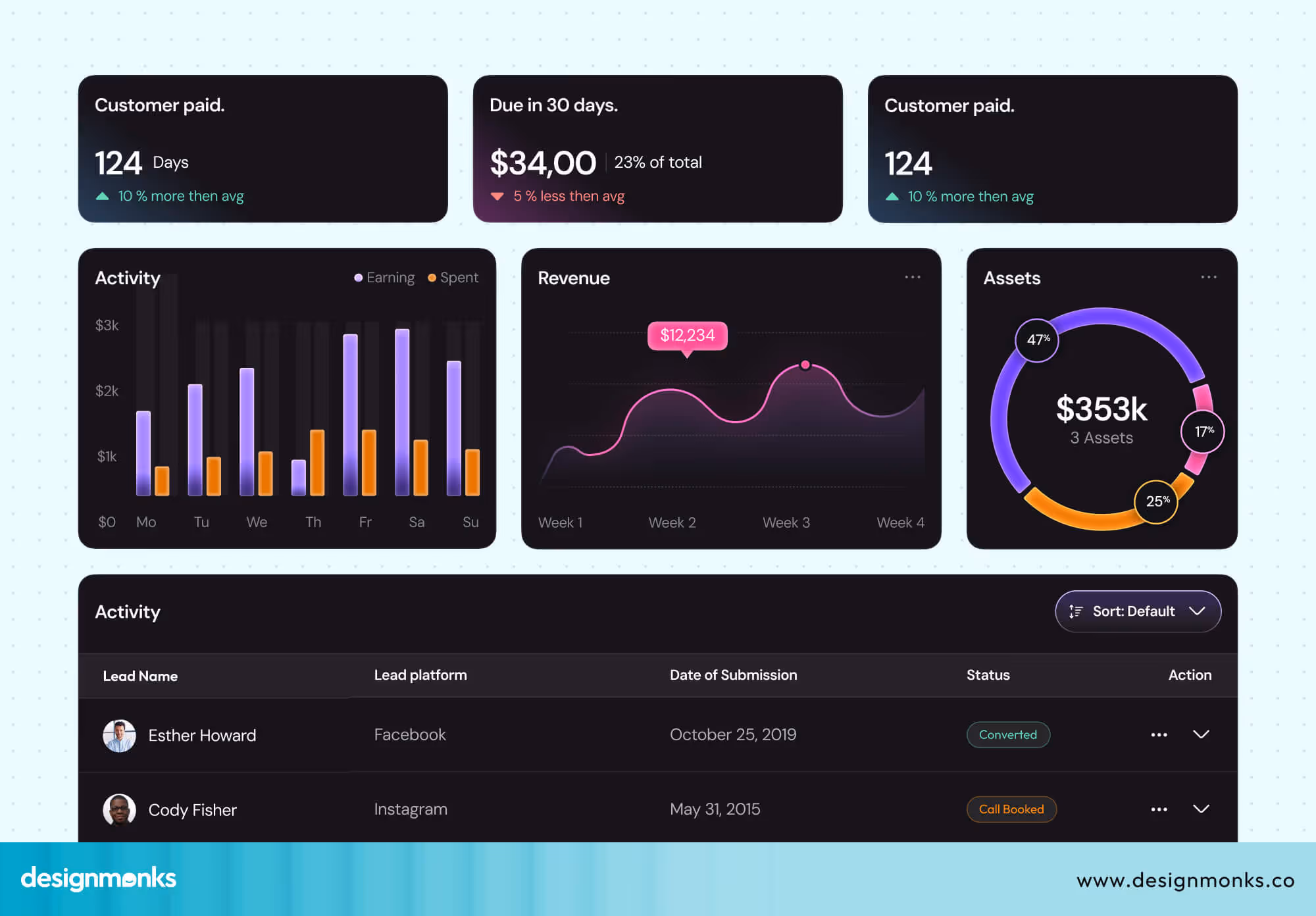
Fix: Redesign dashboards with a card-based layout. Cards present information in small, easy-to-read sections, such as “Data Usage,” “Billing,” or “Support Tickets.” Showing only relevant information for each user type (for example, business vs. individual) keeps the dashboard simple and useful.
Long & Frustrating Checkout or Plan Change Flows
Switching to a new plan or purchasing a SIM card should be quick, but many telecom websites make it feel like a never-ending process. Multiple confusing pages, unclear instructions, and missing progress indicators cause users to abandon their tasks halfway.
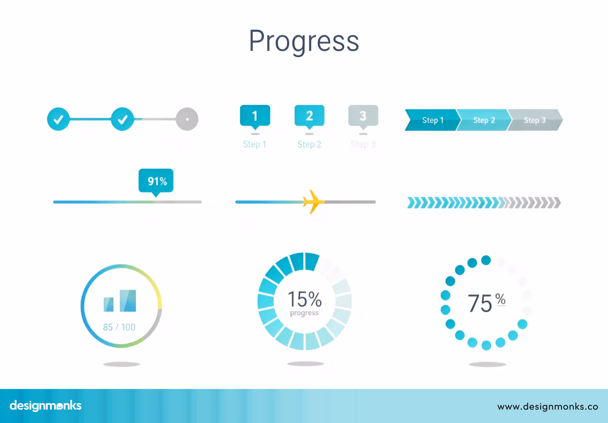
Fix: Streamline the process into fewer steps. Use a progress bar at the top of the page to show how far along the user is. Add tooltips (small helpful pop-ups) to explain tricky details like “activation fees” or “data rollover.” This builds confidence and keeps users engaged.
Lack of Mobile Optimization
Today, most customers access telecom sites from their phones. But many sites are not mobile-friendly. Tiny text, small buttons, and long forms of websites make the experience frustrating. A customer trying to pay a bill or recharge data on the go may give up if the site doesn’t work smoothly on mobile.
Fix: Prioritize responsive design. Buttons should be thumb-friendly, text large enough to read without zooming, and forms kept short. Mobile users should feel like the site was designed just for them, not simply shrunk down from a desktop.
Inconsistent Branding Across Portal and Website
Often, the main telecom website looks different from the user portal or dashboard. Colors, fonts, and icons don’t match. This makes customers feel like they are jumping between unrelated platforms. This lack of consistency can reduce trust.
Fix: Create a unified UI system. Keep the same brand colors, typography, and icon style across the marketing website, customer portal, and dashboards. A consistent design builds brand recognition and reassures users they’re still within the same trusted platform.
Key UI/UX Best Practices for Telecom Websites
Designing a telecom website is not just about making it look modern, it’s about making it useful, simple, and stress-free for customers. Since telecom sites handle many tasks at a time following smart design practices can make a huge difference. Here are some best practices that leading telecom brands follow:
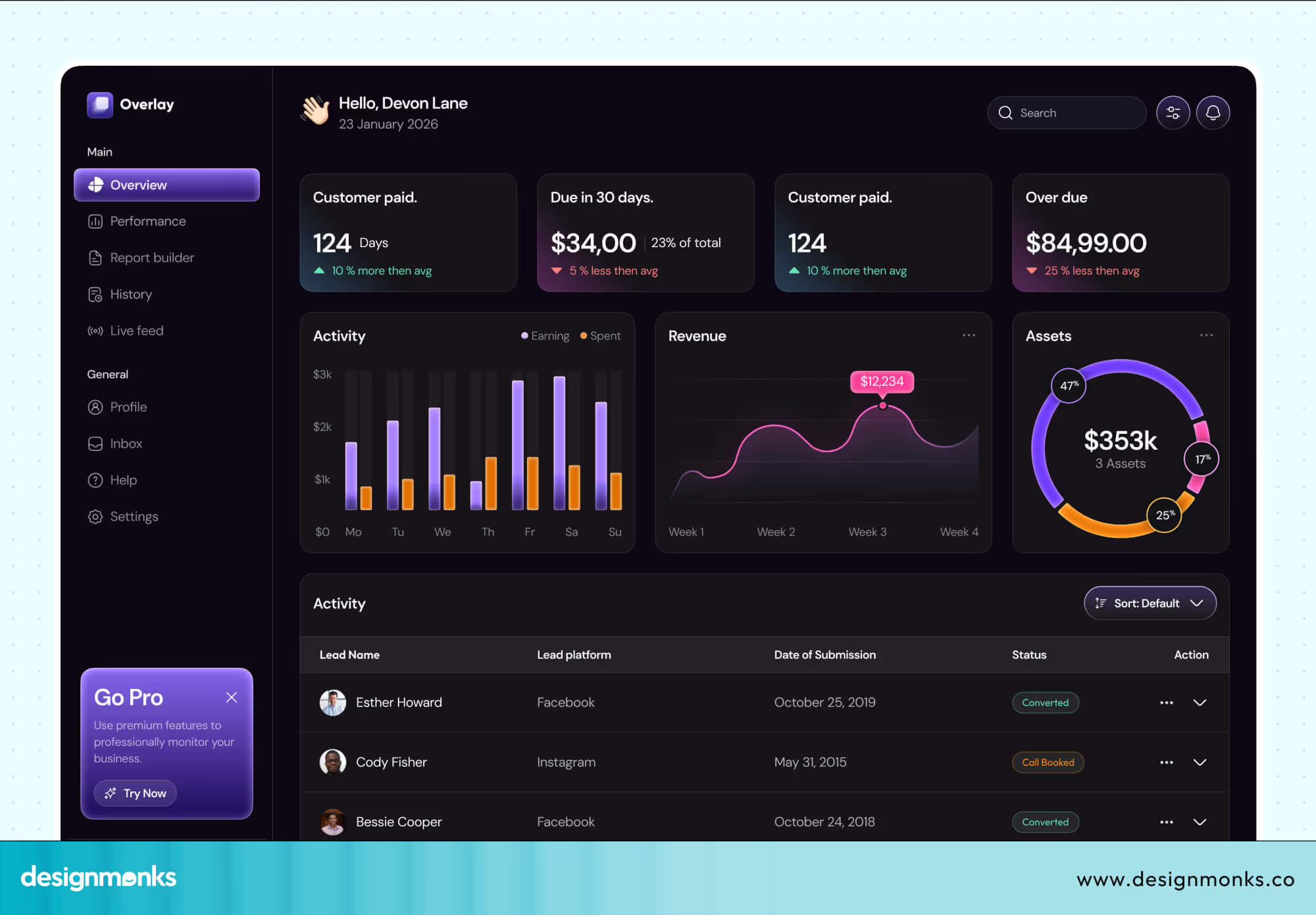
Role-Based Dashboards
Show only what matters to each user. Customers see bills and data usage, while admins get tools to manage multiple accounts.
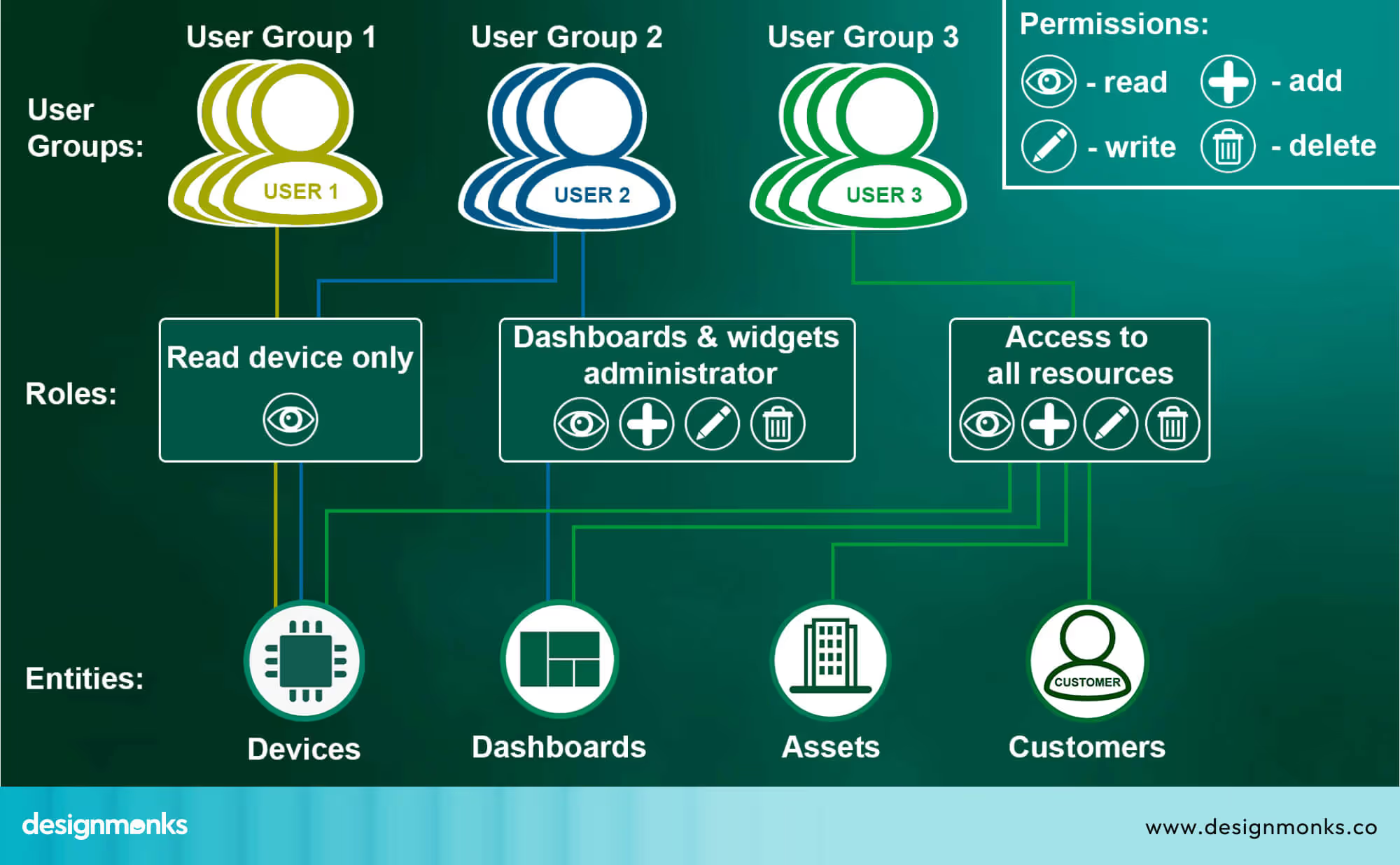
Vodafone Business gives admins control over employee SIMs, while individuals see their own usage.
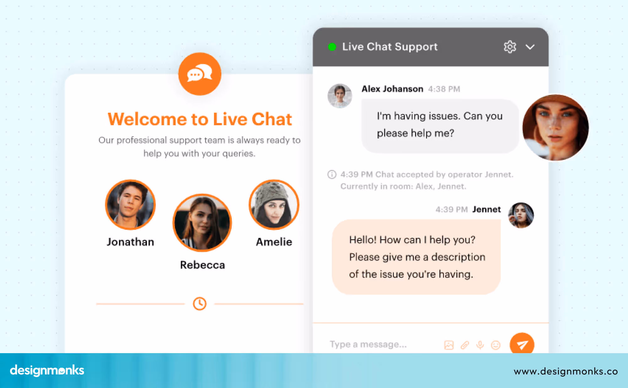
Integrated Chat and Support
Place chat or help buttons right on service pages so users get instant answers. This reduces drop-offs because customers don’t waste time searching for support. T-Mobile offers chat help across most account pages for quick support.
Personalization
Customize content to each user, like plan upgrades, region-specific offers, or reminders.
Personalized touches make users feel valued and increase the chances of plan upgrades. MyJio app suggests recharges based on past usage.
Inline Help
Add tooltips and FAQs inside dashboards so users don’t need to leave the page.
This keeps the flow smooth and prevents confusion when technical terms appear. AT&T billing portal explains tricky charges with info icons.
Mobile-Optimized Forms
Make SIM activation, porting, and payments short, tap-friendly, and easy to complete on mobile. A mobile-first design ensures customers can finish tasks anytime without switching to a desktop. Airtel Thanks app simplifies number porting with a clear 3-step form.
Telecom Portal UX: Key Features That Matter
A telecom portal is more than just a login page. It’s the place where customers manage their accounts, check usage, and get support. When designed well, it saves users time, reduces frustration, and builds loyalty. Here are the key features that matter most in a telecom portal:
Plan Switch UX
Customers often want to upgrade, downgrade, or change their mobile or broadband plans. If this process is long or unclear, users will either give up or call customer support, which increases costs for the company.
T-Mobile USA offers a guided plan switch flow in its app and shows users step-by-step what will change, like price difference, data limits, or added benefits, before confirming. This reduces confusion and gives customers confidence in their choices.
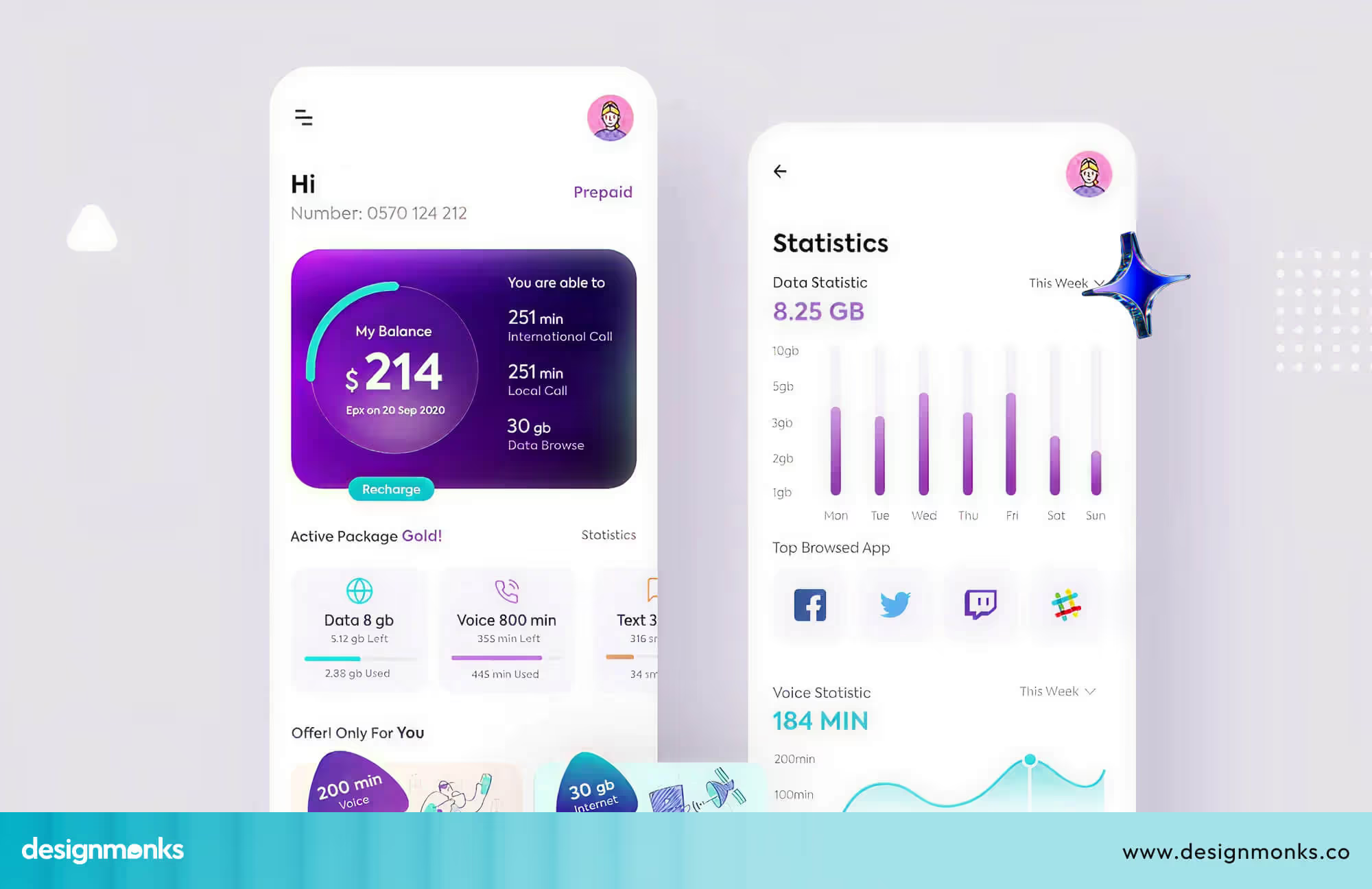
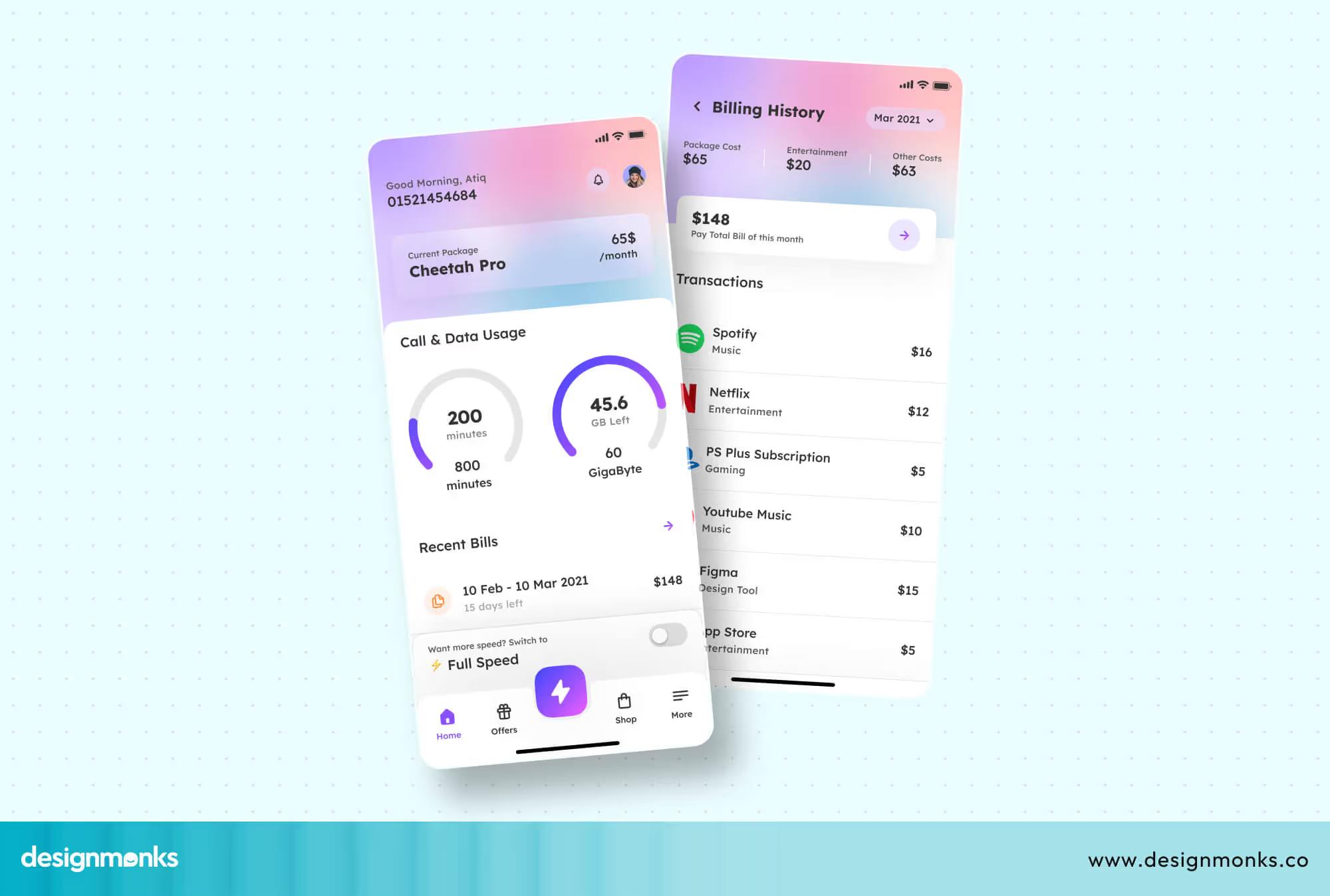
Usage Overview
One of the most common reasons people log into their telecom portal is to check usage. Customers want to know how much data, talk time, or SMS balance they’ve used and how much remains. If this information is buried under menus, users get frustrated.
Verizon’s My Verizon app displays a clean dashboard with a simple progress bar showing data usage for the month. Jio’s MyJio app in India does the same, showing data consumed and remaining balance right on the home screen.
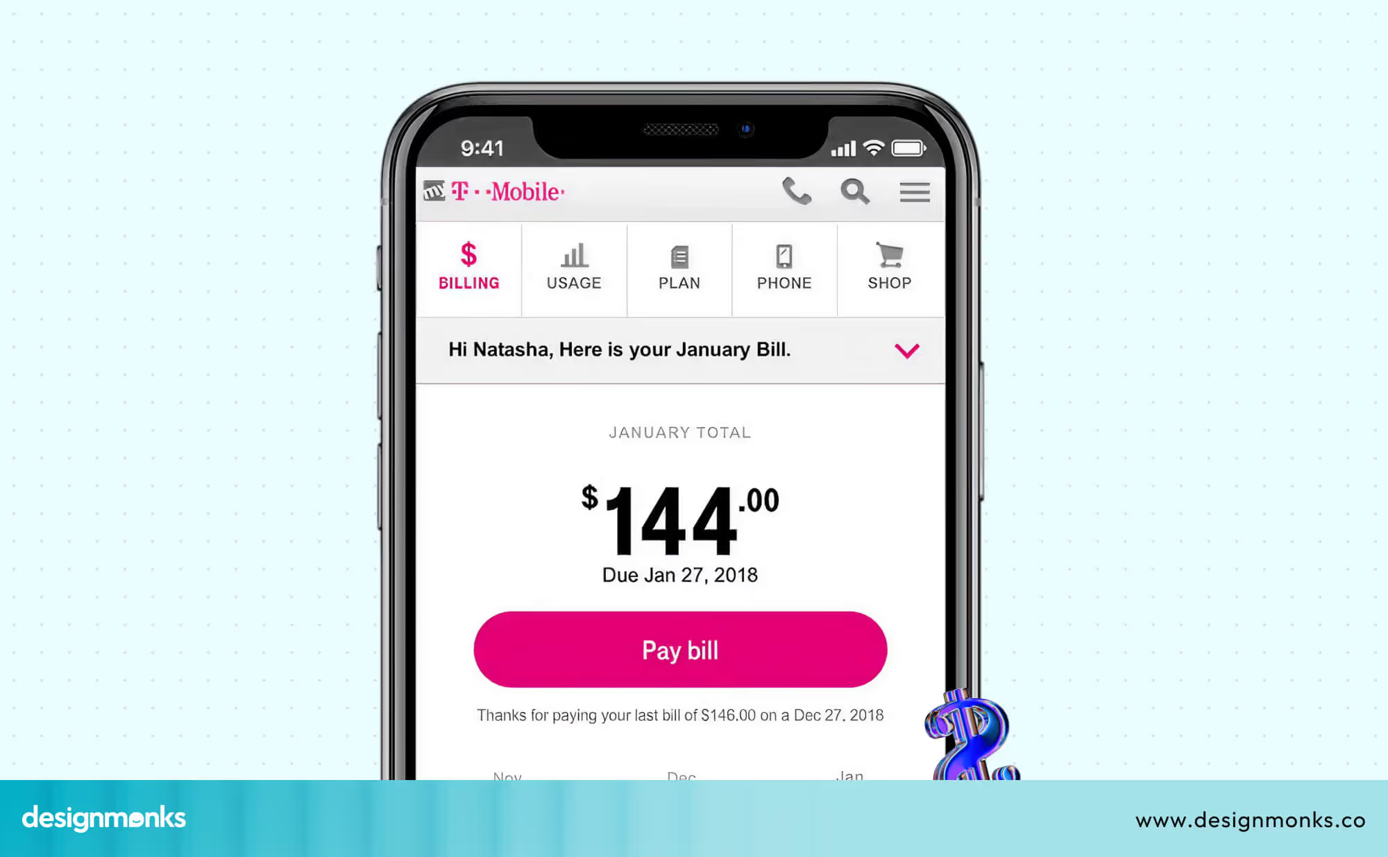
Billing Breakdown
Telecom bills can be complex, especially with multiple services, add-ons, and fees. Customers want transparency and the ability to filter or download past invoices. Without this, many call customer support just to clarify charges.
AT&T’s portal allows users to view current bills, past invoices, and even see a detailed cost breakdown (like data add-ons or roaming charges). Similarly, Vodafone UK lets customers filter billing history by month and download PDFs for official use.
Support Ticket Tracking
When customers face technical problems, they often raise support tickets. But if they can’t see the status of these tickets, they feel left in the dark and keep calling customer care for updates.
BT (British Telecom) provides a ticket-tracking system in its customer portal, showing whether an issue is “open,” “in progress,” or “resolved.” This transparency saves time for both users and support teams.
Device and SIM Management
Many customers manage multiple devices and SIM cards, family plans, business accounts, or secondary numbers. Without proper tools, it can be a nightmare to handle all of them.
Airtel India’s Thanks app lets users manage multiple SIMs in one account. They can recharge different numbers, swap devices, or check compatibility with new services. Similarly, Vodafone Idea (Vi) allows customers to manage family plans and add/remove numbers easily from their portal.
Together, these features make a telecom portal genuinely useful instead of frustrating. A customer who can switch plans, check bills, track tickets, and manage devices in just a few clicks is far less likely to call customer support or turn to a competitor. Companies that invest in portal UX not only improve customer happiness but also save operational costs.
How to Choose a Telecom UI Design Agency
A good agency must understand the unique challenges of telecom websites and portals, not just general web design. When choosing a partner, look for one that:
Understands complex portals and dashboards: Telecom users manage multiple tasks like billing, SIM activation, and plan upgrades. The agency should know how to design dashboards that are simple but powerful.
Designs with a mobile-first approach: Most telecom interactions happen on mobile. From recharging to paying bills, the agency should create experiences that work flawlessly on smaller screens.
Maintains consistent branding: Every touchpoint, whether it’s the website, portal, or dashboard, should feel like part of the same brand. Consistency builds trust and recognition.
Choosing the right telecom UX agency ensures your platform is more than attractive, it becomes a reliable tool that improves engagement, satisfaction, and retention. At Design Monks, we specialize in helping telecom brands create user-friendly and scalable websites that not only look great but also make daily tasks easier for customers. Take a look at one of our successful Telecom Website UX and how it's performing-
What a Good Telecom Website UX Looks Like
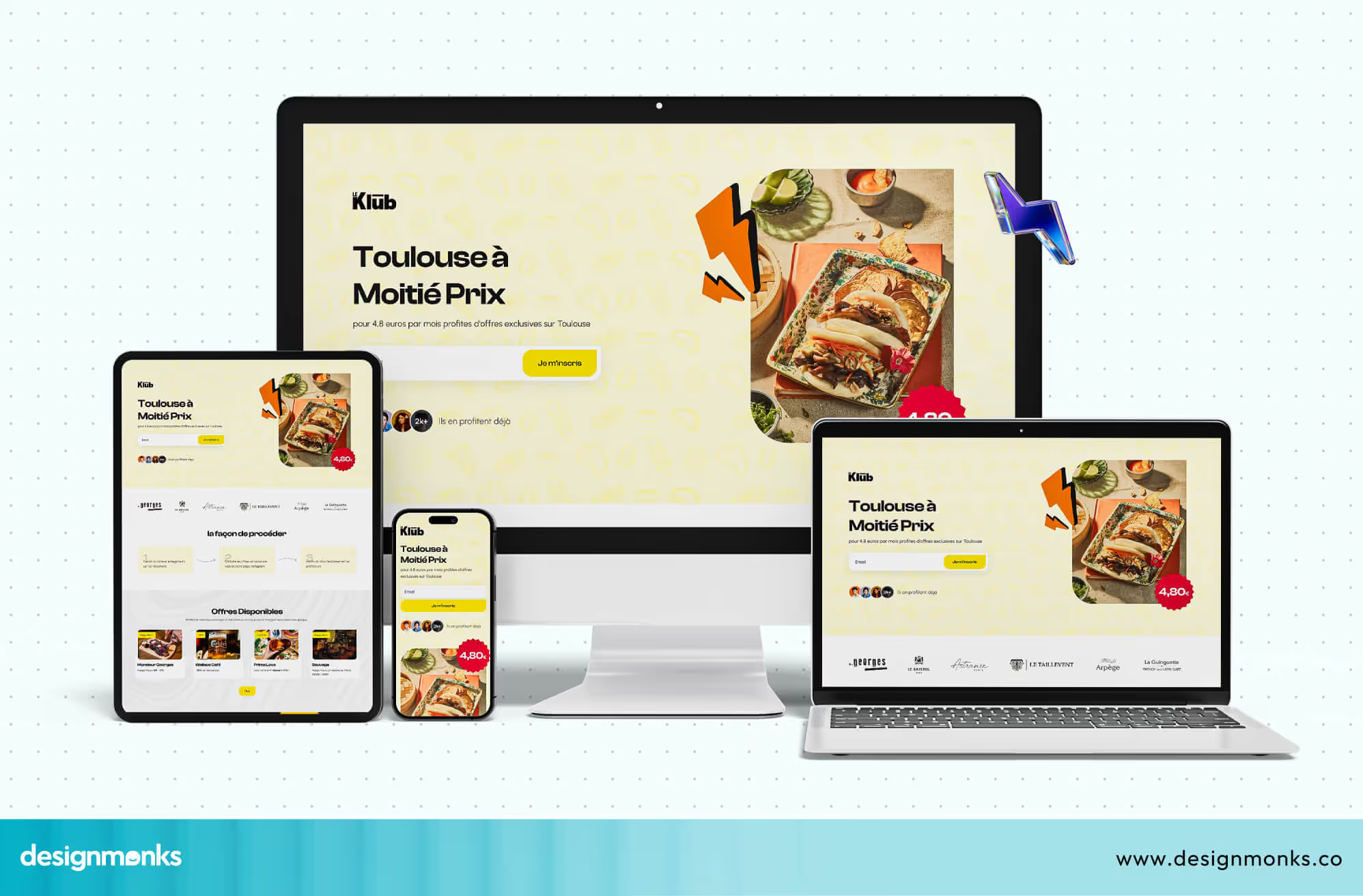
At Design Monks, we’ve worked on several telecom UI design projects where the goal was to simplify complex user journeys. Here’s one example from our work.
A telecom client struggled with users abandoning their site. Customers found it hard to select the right plan, and the existing dashboard was cluttered. This makes it difficult to track data usage and billing. Support calls were high, and overall satisfaction was low.
So, we redesigned the homepage with a clean hero section that highlighted the most important action. We added a simple plan selector tool with filters for prepaid, postpaid, and data bundles so users could compare options side by side.
For the customer portal, we built a card-based dashboard that displayed Call & data usage, outstanding bills, and support tickets at a glance. After launch, the telecom brand saw a 30% drop in support calls and a noticeable increase in online plan conversions. Customers reported that the website felt much easier to use and more modern.
This project shows how thoughtful telecom website and portal design can transform user frustration into satisfaction. By focusing on clarity, simplicity, and real customer needs, we turned a complicated journey into a smooth experience that both users and the business benefited from. If your telecom platform faces similar challenges, our team at Design Monks can help you achieve the same results.
Final Thoughts
A well-designed telecom website and portal design goes beyond looks, it creates a seamless journey that makes billing, plan changes, and device management effortless. When customers find clarity and ease, they stay loyal, reducing support calls and boosting satisfaction.
By focusing on user needs and consistent design, your portal becomes a true business asset. Want to make your telecom portal simple, engaging, and user-friendly? Let Design Monks help you achieve it.

.avif)
.avif)
.avif)
.avif)


.avif)
.avif)
.avif)
.avif)


.avif)


