
.svg)


Key Takeaways
- Smart telecom dashboards turn complex data into clear, actionable business insights.
- Prioritize clarity, speed, and intuitive layouts to improve decision-making efficiency.
- Include key modules like billing, data tracking, and device monitoring.
- Role-based personalization ensures every user sees only what they need.
- Clean, consistent, and transparent UI builds trust and reduces user confusion.
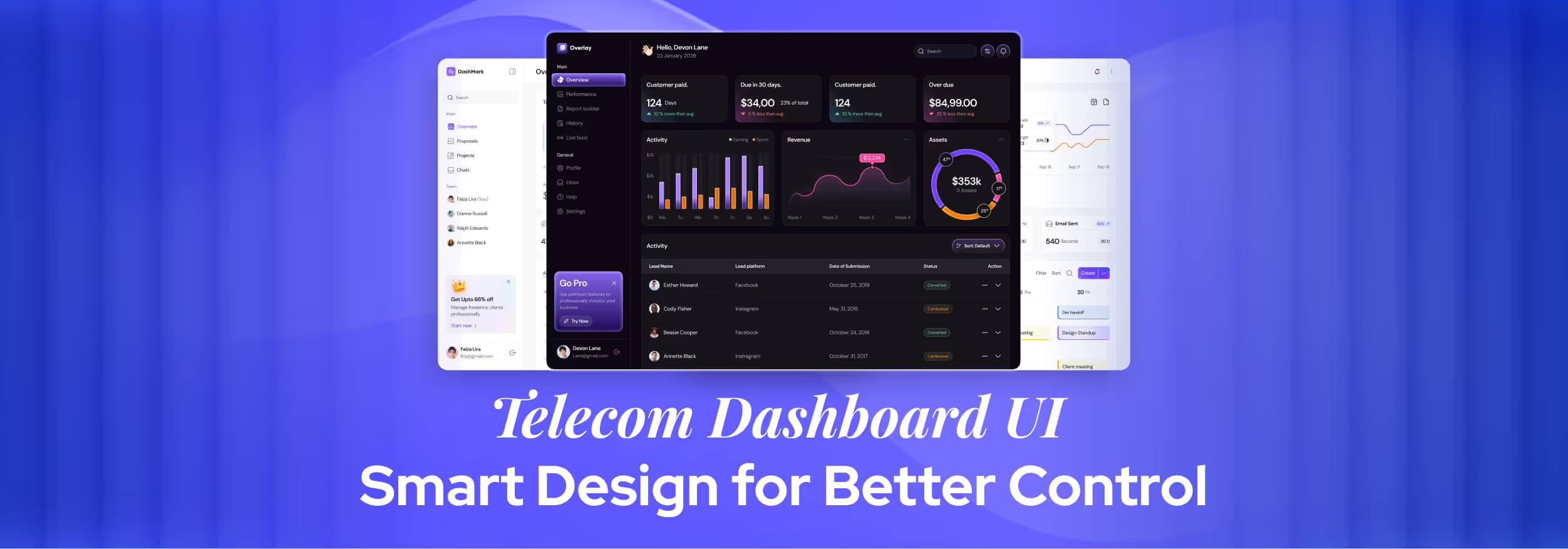
Data chaos is the silent killer of efficiency in the telecom industry. With the right Telecom Dashboard UI, that chaos turns into a clear, real-time picture of operations. It’s not just about pretty visuals, it’s about giving decision-makers instant, accurate insight.
Messy, outdated dashboards are no match for today’s telecom demands. That's why modern designs focus on clarity, speed, and intuitive navigation. Every click delivers meaningful insight, not confusion.
Whether you’re monitoring network health, managing billing, or resolving customer issues, the right dashboard UI keeps you in control. Keep reading to discover how smart UI design can turn complex telecom data into a genuine strategic advantage.
Key UX Challenges in Telecom Dashboards
Designing an effective Telecom dashboard UI requires balancing a huge amount of data with usability. Here are some of the most common UX challenges :
1. Information Overload
When dashboards display too many modules, menus, or data points at once, users struggle to locate what matters most. Without logical grouping, clear hierarchy, and visual prioritization, the interface quickly becomes cluttered and overwhelming.
2. Slow Performance
Telecom platforms process massive datasets in real time. If a dashboard attempts to render all this information simultaneously, load times increase, interactions lag, and user productivity suffers.
Slow dashboards frustrate users and make it hard to find the information they need quickly. Over time, this can lead to mistakes, missed alerts, and a poor overall user experience
3. Unclear Billing Flows
Telecom billing structures often include multiple plans, discounts, surcharges, and taxes. Without transparent labeling, easy-to-read summaries, and contextual explanations, users will feel uncertain or distrustful about their charges.
4. Multiple User Roles and Needs
A single dashboard serves different audiences, such as administrators who manage system-wide settings and customers who simply track usage or make payments.
Designing an interface that accommodates varying permissions, tasks, and priorities without confusion is a major challenge.
5. Limited Data Visualization Clarity
Telecom dashboards often display highly technical data signal strength, bandwidth usage, and error rates. It can be difficult for non-technical users to interpret. Poorly chosen chart types, inconsistent color schemes, or a lack of labels can make insights harder to grasp, leading to misinformed decisions.
Must-Have Modules in a Telecom Dashboard
An effective Telecom dashboard UI should have key functionalities in distinct modules, so that users can access critical information quickly. These essential modules that every dashboard should include are :
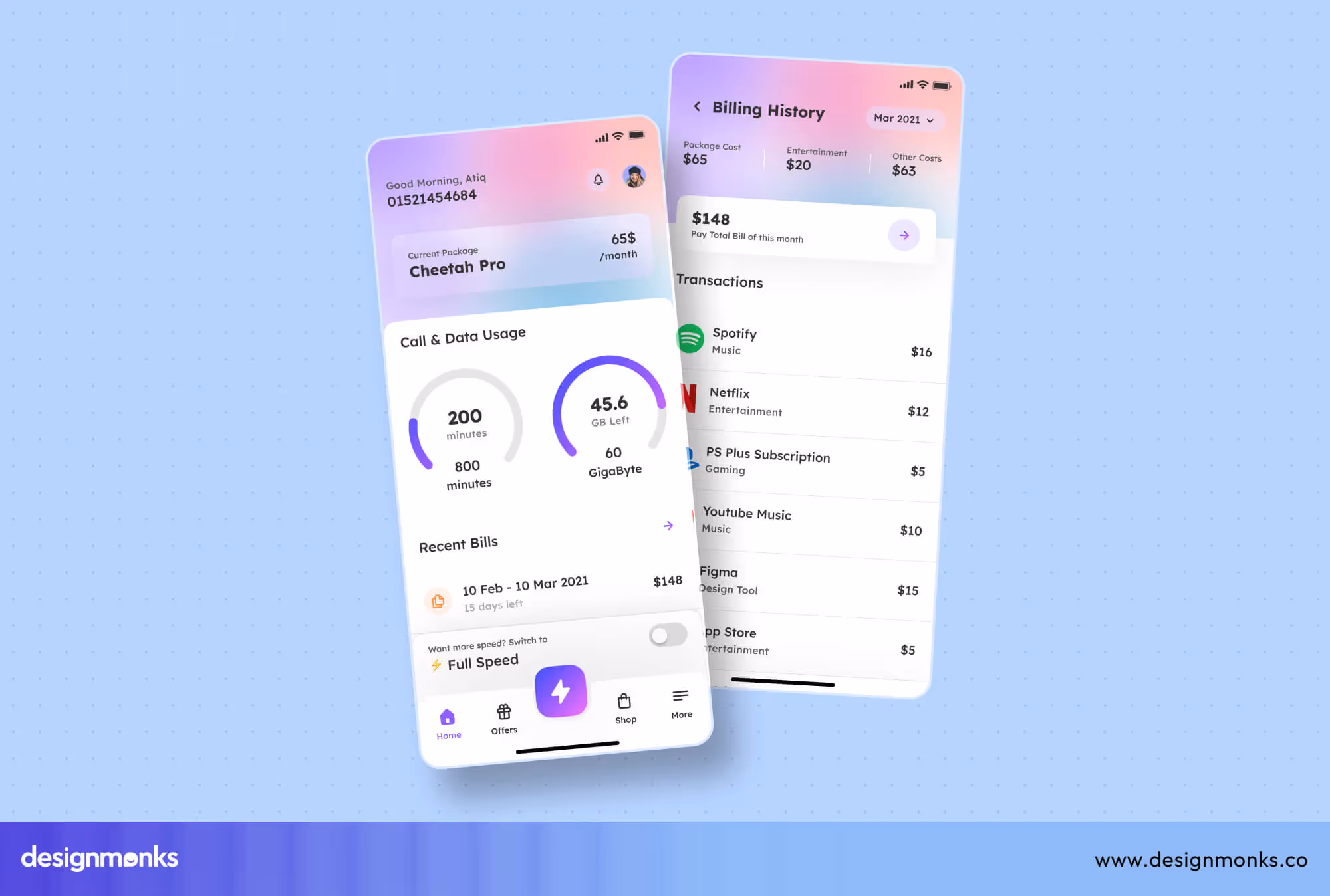
Billing Overview
This module keeps users informed about charges, payments, and balances. There's also alerts for due dates or unusual activity to prevent surprises.
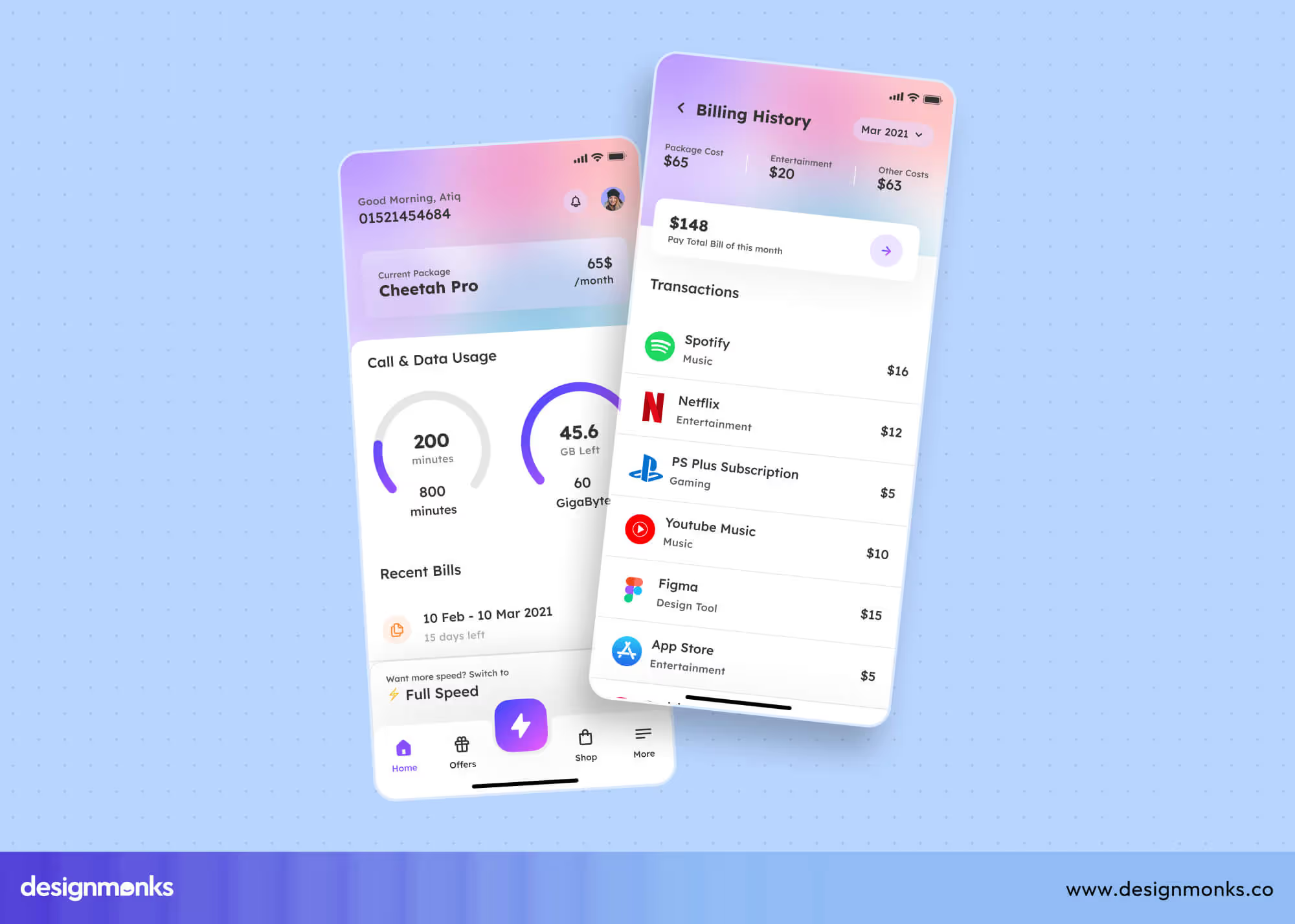
Detailed billing history and visual summaries also make financial management clear and efficient. It helps identify unusual billing patterns early, reducing disputes.
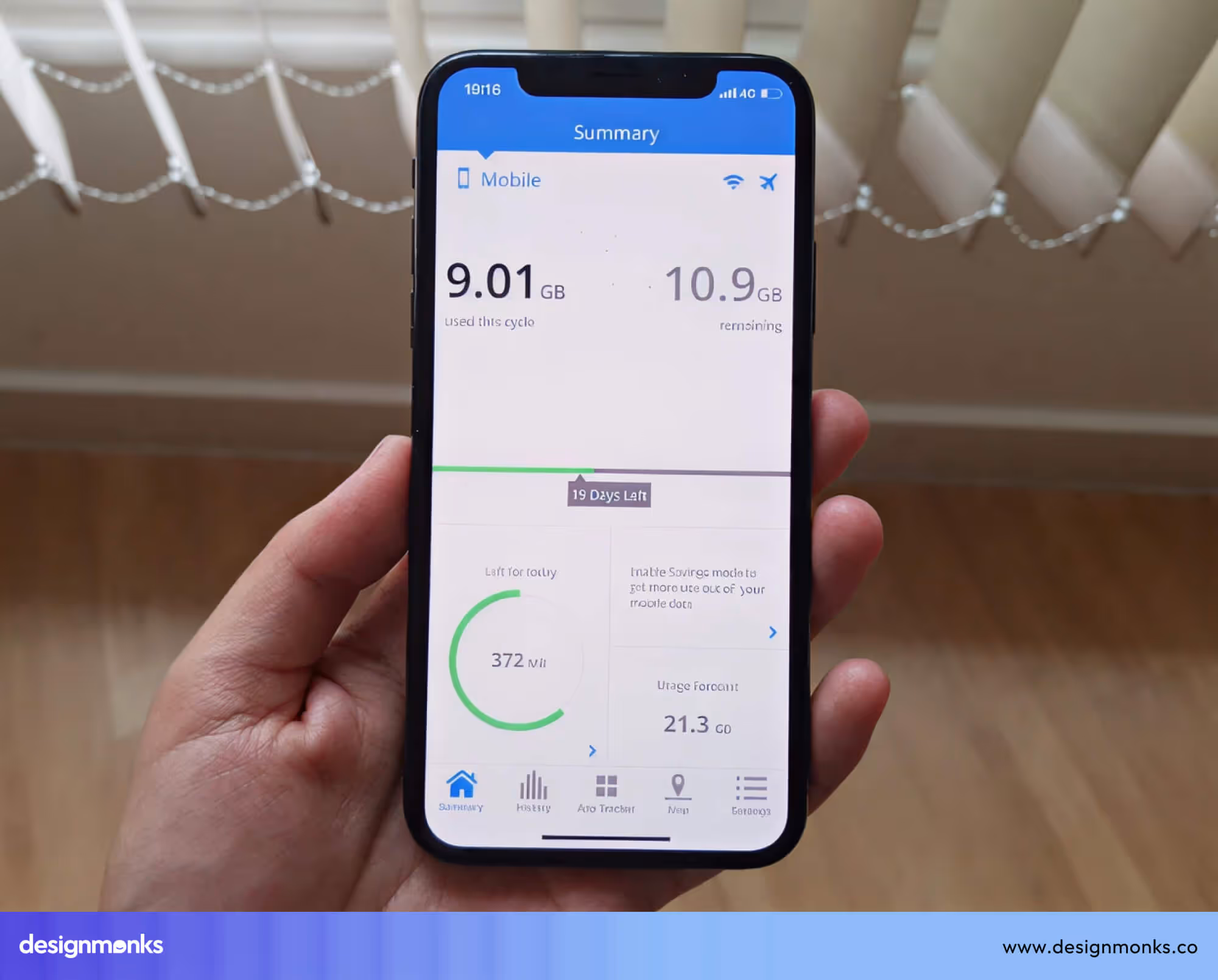
Data Usage Tracking
Displays real-time data consumption, remaining allowance, and historical usage trends. This helps users monitor consumption patterns, avoid overage charges, and plan their usage efficiently.
Advanced dashboards can also provide predictive insights and show estimated usage based on current trends. Notifications can be configured for thresholds and alert users before they exceed limits.
SIM and Plan Management
Allows users to view all active and inactive SIM cards, switch plans, or upgrade services. Centralized management like this simplifies plan modifications and ensures users always know their active subscriptions.
Users can also assign SIMs to specific devices or locations, streamlining operations for multiple lines. Detailed plan comparisons and cost summaries help in making informed decisions regarding upgrades.
Device Connectivity Status
Shows the real-time connection health of devices, signal strength, and network quality. This enables users to quickly identify and troubleshoot connectivity issues.
Dashboards can also track downtime history, device errors, or maintenance alerts for potential failures. Visual cues like color-coded statuses make it easy to spot devices that require immediate attention.
Support Ticket Tracking
Keeps users informed about ongoing service requests or reported issues. Updates on ticket status, response times, and resolution history improve transparency and customer satisfaction.
Users can filter tickets by priority, type, or department. This will help them manage multiple requests efficiently. Automated notifications and escalation alerts ensure critical issues are addressed promptly.
UX Patterns That Work in Telecom Dashboards
Effective UX patterns help organize information so users can access what they need quickly and without confusion. In Telecom dashboards, certain patterns have proven especially useful for improving clarity and efficiency:
Card-Based Summaries
Cards are small boxes showing key info at a glance. For example, one card shows your total bill due, another shows active SIMs, and another shows data usage.
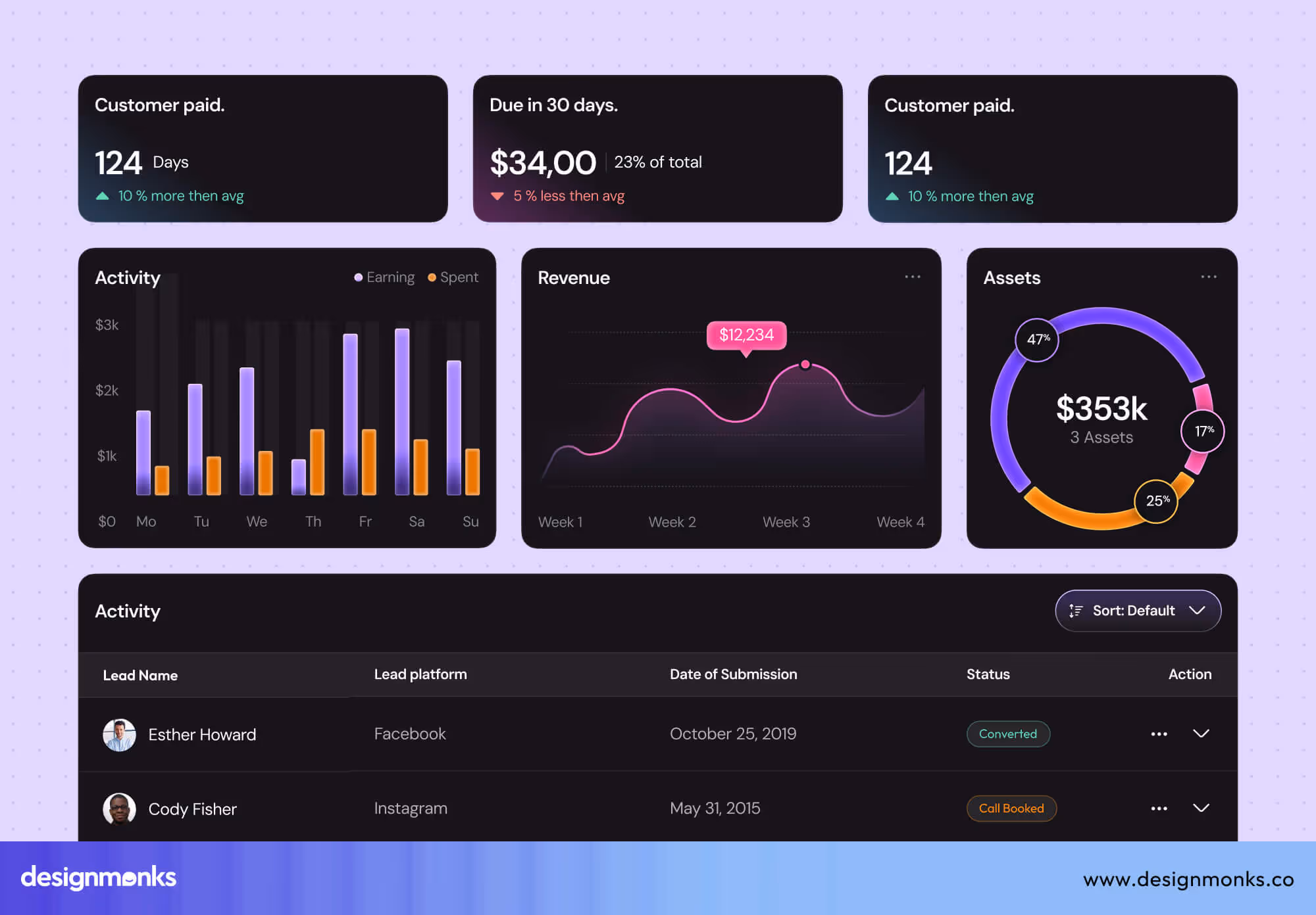
These cards make it easy for customers to spot important information quickly. By separating each information, it gives a sleek and polished look to the whole dashboard.
Progressive Disclosure
This means showing only the most important info first. Users can click or tap on the dashboard to see more details if they want.
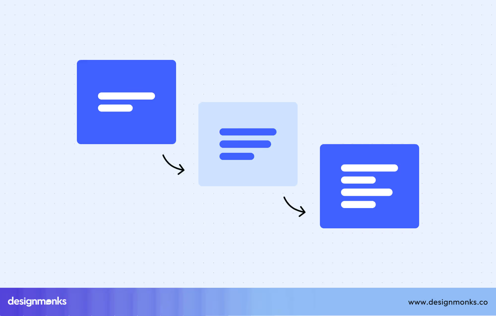
For example, you see the total bill amount, and if you click, you will get a detailed list of the overall charges.
Visual Graphs for Usage & Spend Trends
Graphs and charts provide a clear view of trends over time. Telecom dashboards can use this to show monthly data usage, overuse alerts, or cost breakdowns visually. Users can quickly identify patterns, such as rising data consumption or increasing call charges, and take action before issues escalate.
Role-Based Personalization
Based on the user, the dashboard shows different information in this pattern. Admins get access to controls and detailed reports, while customers get simple views focused on their needs. This keeps things clear for everyone.
Billing UX: Designing for Transparency & Trust
Billing is one of the most sensitive aspects of telecom services, and poor presentation can quickly lose the trust of your customers.
A good billing UX makes charges easy to understand, helps avoid confusion, and shows customers they are treated fairly. What your billing UX should include:
- Clear Invoice Breakdowns: Present each charge with a clear label and context, such as monthly plan fees, extra data usage, or applicable taxes. Avoid showing totals without explanations. Itemized details help users understand exactly what they’re paying for.
- Estimated vs. final billing: If the bill is based on estimated usage, clearly mark it as such and display both the projected and final amounts once adjustments are made. This eliminates surprises and improves payment accuracy.
- Flexible Payment Methods: Offer multiple payment options, including online portals, mobile apps, bank transfers, and automatic renewals. A streamlined process reduces friction and increases on-time payments.
Common Dashboard UX Mistakes to Avoid
When creating a Telecom dashboard UI, even small design mistakes can hurt the user experience. Here are some common issues to watch for:
- Overloaded Layout: Packing too many buttons, charts, and data into one screen makes it hard to focus. Keep the design clean and organized.
- No Data Hierarchy: Important information should be easy to spot at a glance. Without prioritization, critical data can get lost in the mix.
- Slow Performance: Heavy or unoptimized dashboards take too long to load. This can lead to frustration and lower productivity.
- Inconsistent Design Elements: Using different button styles, colors, or layouts across the dashboard makes it feel unpolished and harder to navigate.
Real-Life UI: Telecom Dashboard Case Snippet by Design Monks
At Design Monks, we collaborated with a leading telecom provider to design a complete Telecom app UI kit that transformed their dashboard into a clean, intuitive, and highly functional experience.
The goal was to create a single interface where both customers and administrators could manage all telecom services effortlessly. Our UI kit includes:
- Billing Overview Module: Provides crystal-clear charge breakdowns and smart alerts for upcoming or overdue payments. This ensures complete transparency.
- Data Usage Tracking: Features interactive graphs and historical patterns. This helps users monitor consumption and avoid extra fees.
- SIM and Plan Management: Allows quick activation, suspension, or plan changes for seamless account control.
- Device Status Monitor: Displays real-time network health and connectivity updates for immediate issue detection.
- Support Ticket Tracking System: Shows live status updates, response timelines, and resolution history to improve service efficiency.
By combining these modules into a unified UI kit, the telecom provider gained a flexible design system that can scale across web and mobile platforms. Customers reported fewer billing concerns, solved issues faster, and engaged more with self-service tools.
Internally, the company saw improved satisfaction scores and reduced support calls. This is proof that thoughtful design can drive measurable results. So team up with Design Monks today to transform your telecom dashboard into a tool that drives satisfaction and efficiency.
Final Takeaways
A well-designed Telecom Dashboard UI is more than a reporting tool, it’s a control center for better decision-making. By focusing on clarity, speed, and intuitive layouts, telecom companies can turn massive data into actionable insights.
The right dashboard keeps teams aligned, customers informed, and operations running smoothly. In a competitive industry, this isn’t optional, it’s a strategic necessity.
Until next time!

.avif)
.avif)
.avif)
.avif)


.avif)
.avif)
.avif)
.avif)


.avif)


