.svg)



Key Takeaways
- Choose a SaaS pricing page design pattern that matches your business model.
- Keep pricing simple with clear plans, comparisons, and action-focused CTAs.
- Use pricing psychology ethically to help customers compare plans with confidence.
- Optimize pricing pages for mobile, trust, and easy feature comparisons.
- Regularly test and improve your pricing page to increase conversions over time.
SaaS pricing page design pattern is one of the biggest factors that influences whether visitors become paying customers. If people can't quickly understand your pricing, compare plans, or see the value, they're more likely to leave without signing up.
The best SaaS pricing page design pattern removes that uncertainty. It presents pricing clearly, highlights the right plan, and makes the next step feel obvious.
In this guide, you'll learn the most effective SaaS pricing page design patterns, when to use them, and the UX best practices that help turn more visitors into customers.
What Are SaaS Pricing Page Design Patterns?
A SaaS pricing page design pattern is a proven way of organizing pricing information so visitors can quickly understand their options and choose the right subscription plan.
Instead of creating a pricing page from scratch, many SaaS companies use layouts that have already been tested and shown to help users make faster purchasing decisions. The goal isn't just to make the page look good. It's to make pricing easy to understand. A well-designed pricing page layout reduces confusion, helps users compare plans, and guides them toward the option that best fits their needs.
Most pricing pages are built around a pricing table with individual pricing cards. Each card represents one subscription plan and typically includes the plan name, price, key features, and a call-to-action button.
Displaying plans side by side makes it easy for visitors to compare differences and decide which option fits their needs.
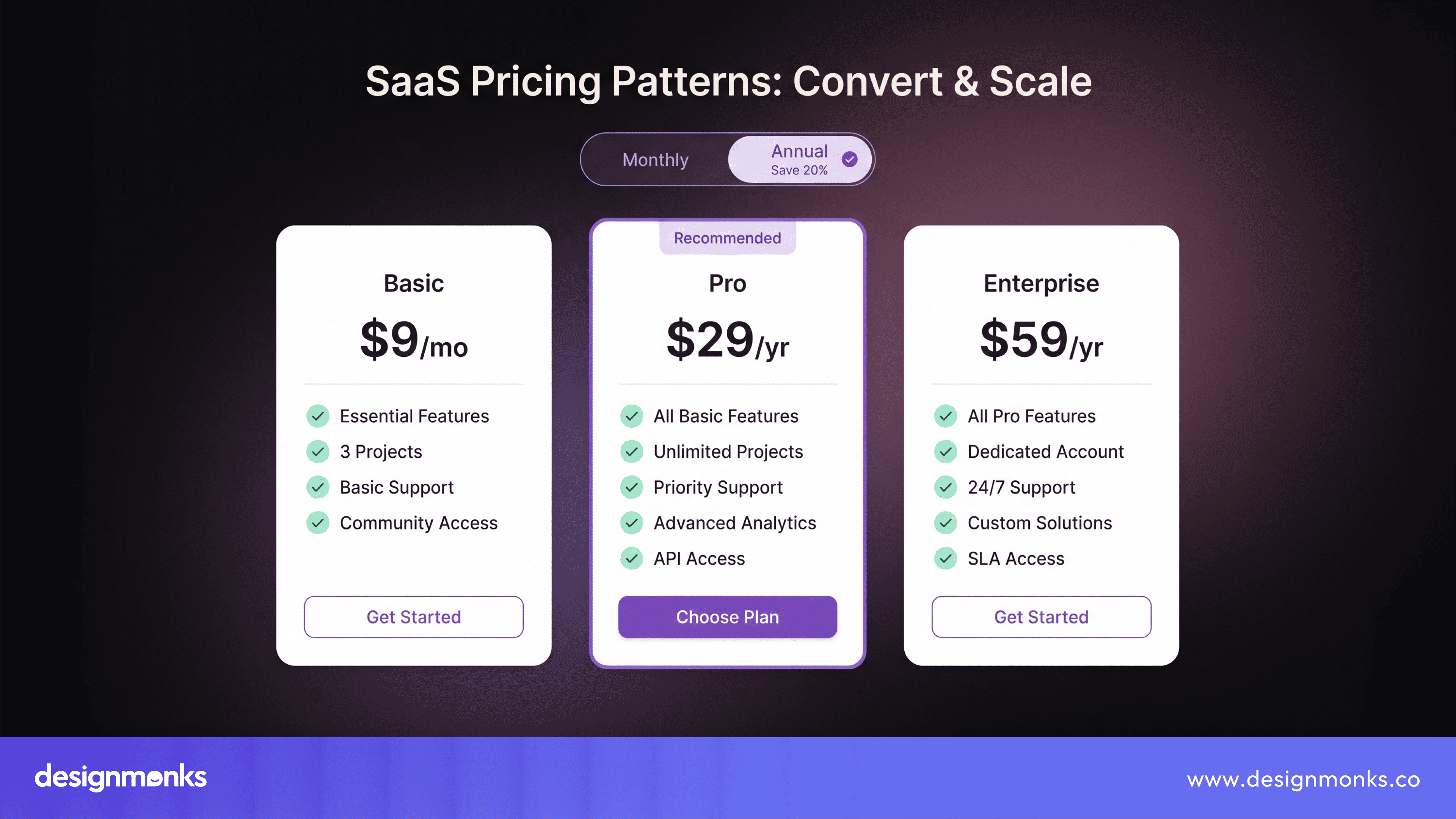
A good pricing page layout also supports your SaaS pricing model. Whether you offer tiered pricing, freemium, usage-based pricing, or enterprise plans, the layout should clearly explain what each plan includes and how customers are charged.
Many successful SaaS companies use three or four pricing plans. This gives customers enough choice without making the decision overwhelming. Too many options can slow people down, while too few may not meet different customer needs.
Ultimately, a good pricing page design pattern does more than show prices. It creates a clear pricing structure, highlights the value of each plan, and helps visitors make confident purchasing decisions.
Most Common SaaS Pricing Page Design Patterns
There isn't one pricing page that works for every SaaS business. The right SaaS pricing page design pattern depends on your product, your customers, and how you charge for your service.
Some companies keep pricing simple with a few fixed plans. Others charge based on usage or offer custom pricing for larger businesses.
The goal is always the same, make it easy for visitors to understand their options and choose a plan with confidence. Here are the most common pricing patterns used by successful SaaS companies:
Tiered Pricing
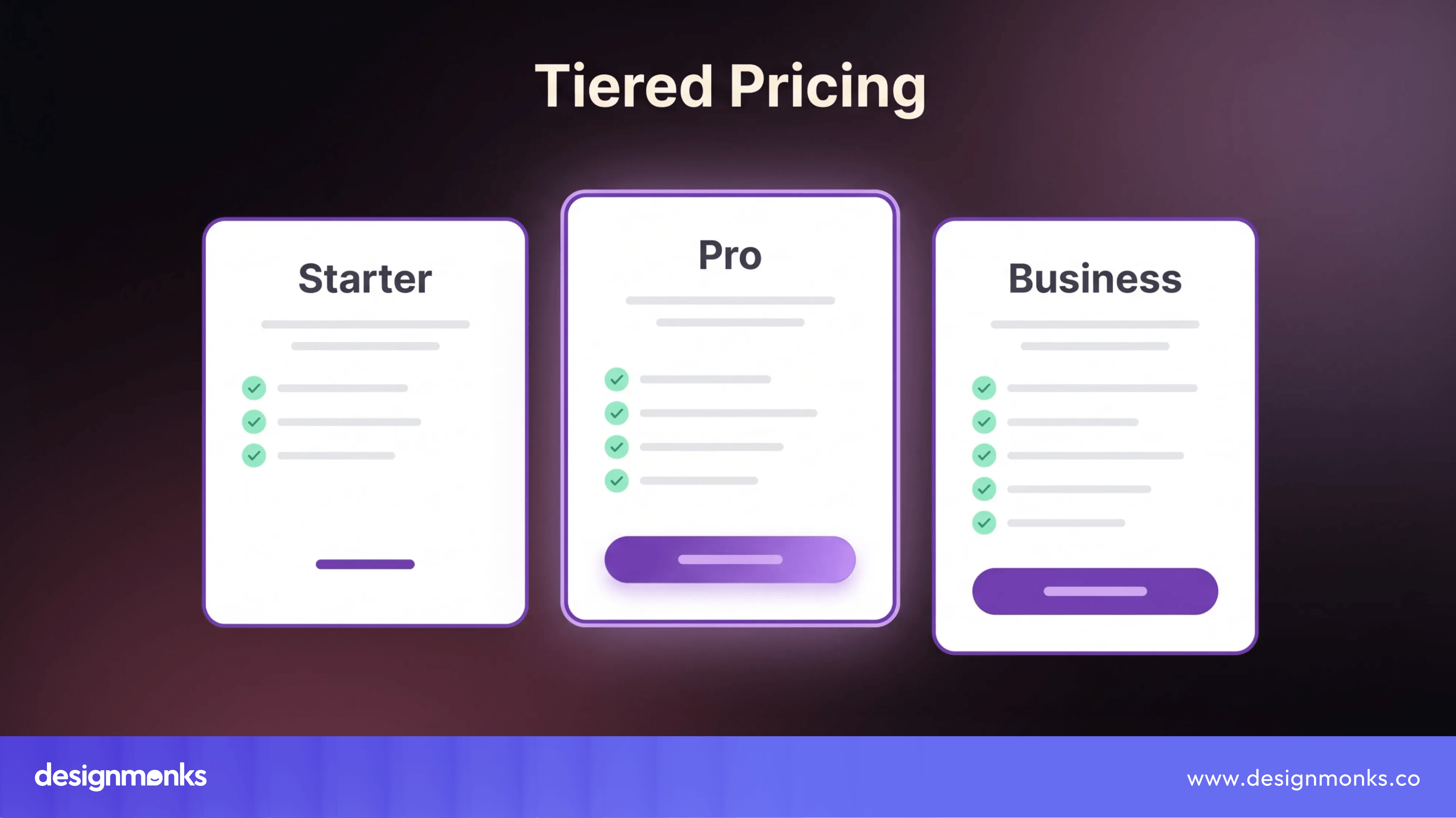
Tiered pricing is the most common pricing model used by SaaS companies. It offers several pricing tiers, with each plan including more features or higher limits than the one before it.
For example, you might see plans like Starter, Pro, and Business/Enterprise. As customers grow, they can upgrade to a higher tier without switching to a different product.
Best for:
- Project management tools
- CRM software
- Marketing platforms
- Design tools
Why it works:
- Gives customers different options based on their needs.
- Makes upgrading simple as businesses grow.
- Helps visitors compare plans side by side.
Freemium
Freemium gives users free access to the product with limited features. Customers can use the software for as long as they like, then upgrade when they need more storage, users, or advanced features.
This lets people experience the product before spending money.

Best for:
- Productivity apps
- Collaboration tools
- Design software
Why it works:
- Lowers the barrier to getting started.
- Builds trust before asking for payment.
- Encourages upgrades as users become more engaged.
Usage-Based Pricing
With usage-based pricing, customers pay based on how much they use the product. The more they use, the more they pay. Usage can be measured in different ways, such as API requests, storage, AI credits, emails sent, or transactions processed.
Best for:
- Cloud platforms
- AI tools
- API products
- Infrastructure services
Why it works:
- Customers only pay for what they use.
- Costs grow alongside customer usage.
- Works well for businesses with changing needs.
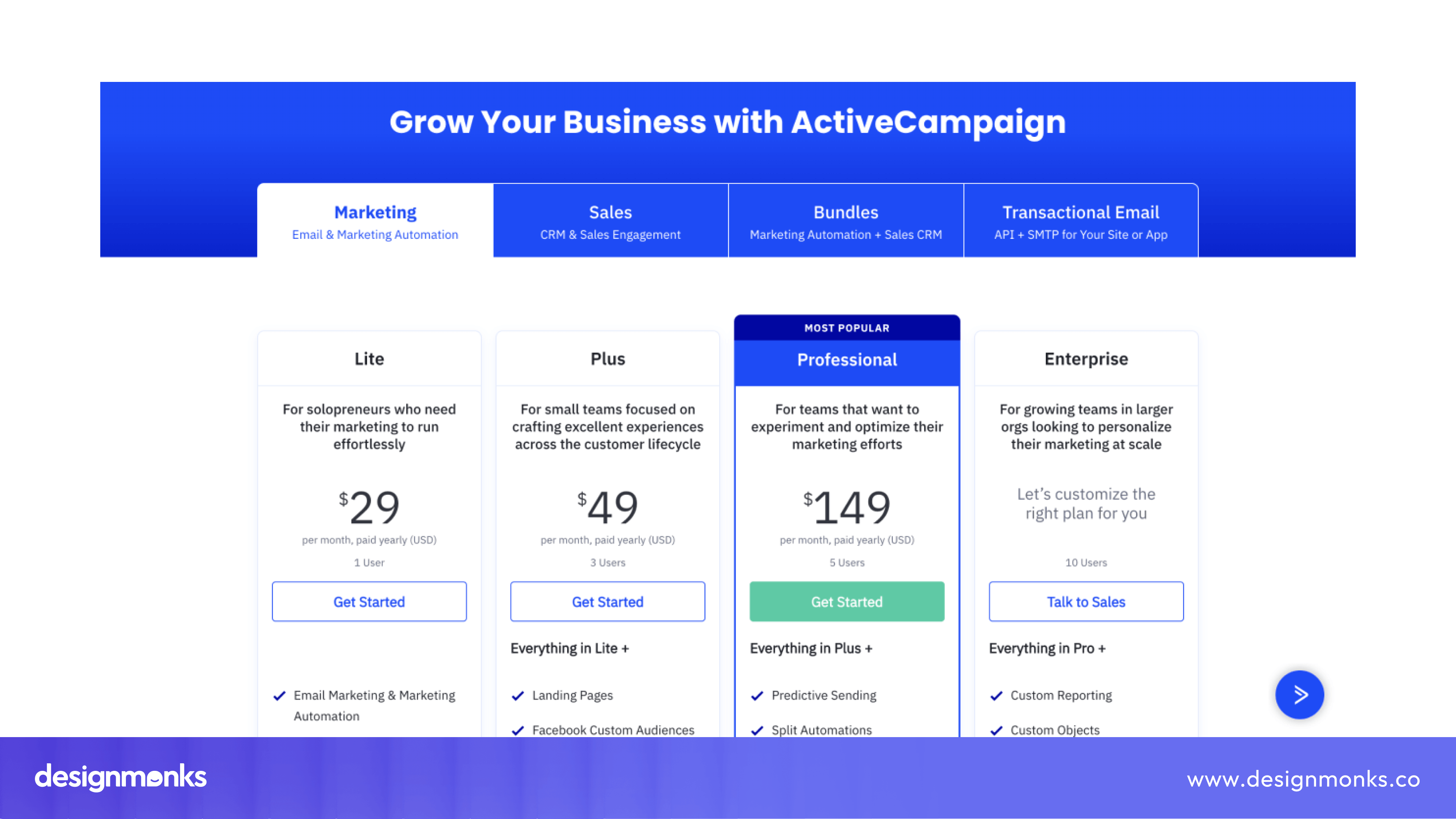
Enterprise Pricing
Enterprise pricing is designed for large organizations with unique requirements. Instead of displaying a fixed price, companies usually ask customers to contact the sales team for a custom quote.
Enterprise plans often include advanced security, dedicated support, custom integrations, and service agreements.
Best for:
- Enterprise software
- Large B2B platforms
- Complex SaaS products
Why it works:
- Supports custom business requirements.
- Allows flexible pricing for large contracts.
- Creates opportunities for sales discussions.
Example: Slack Enterprise, HubSpot Enterprise
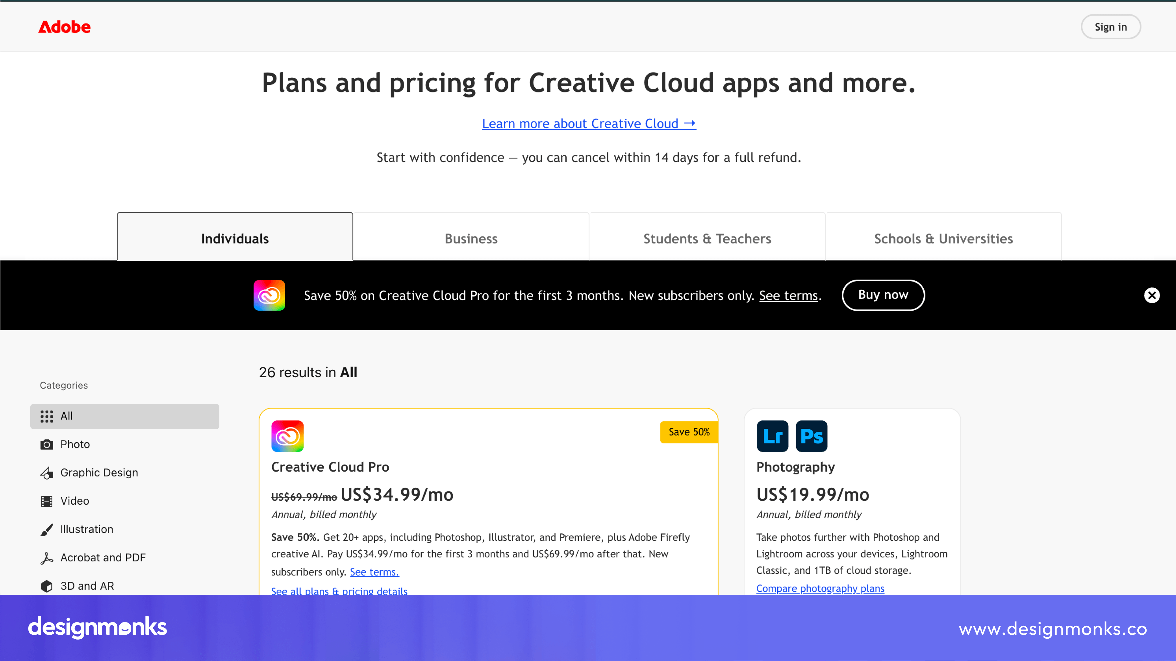
Bundled / modular pricing
Bundled and modular pricing both give customers flexibility, but they work in different ways.
With bundled pricing, several products or features are combined into one package for a single price. Customers get everything included in the bundle, often at a lower cost than buying each product separately.
With modular pricing, customers start with a core product and add only the modules or features they need. This lets them build a solution that matches their specific requirements.
Best for:
- Platforms with multiple products
- Businesses offering several software tools
- Products with optional features or add-ons
Why it works:
- Gives customers more flexibility.
- Prevents paying for features they don't need.
- Makes expanding easier as customer needs grow.
Examples:
- Bundled pricing: Adobe Creative Cloud combines apps like Photoshop, Illustrator, and Premiere Pro into one subscription.
- Modular pricing: HubSpot lets customers purchase individual Hubs, such as Marketing Hub or Sales Hub, instead of buying the entire platform.
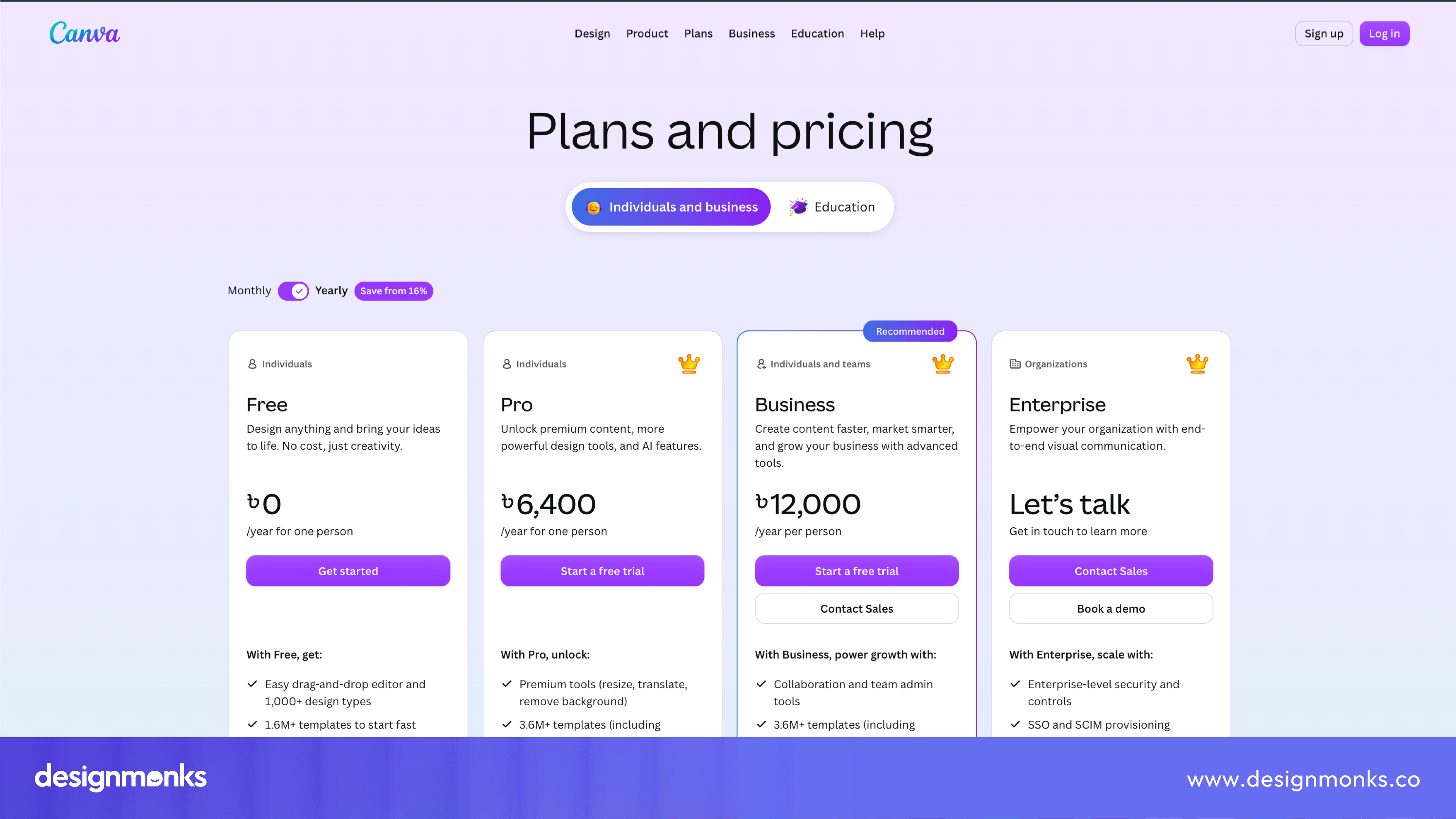
Annual Discount Anchoring
Many SaaS companies encourage yearly subscriptions by showing how much customers can save compared to paying monthly. For example, a page might display "Save 20% with annual billing." This makes the yearly plan feel like the better value.
Best for:
- Subscription-based SaaS products.
- Businesses looking to increase annual revenue.
Why it works:
- Encourages longer commitments.
- Makes annual pricing more attractive.
- Improves customer retention.
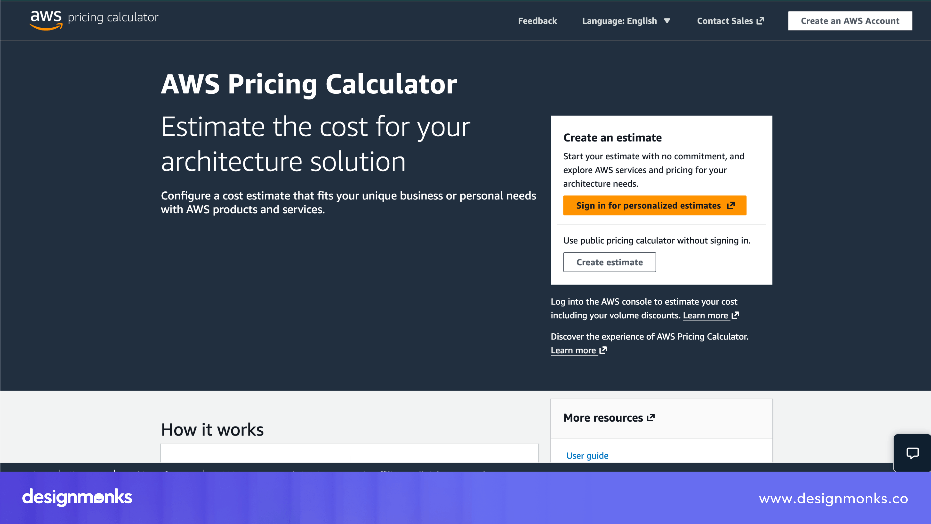
Calculator-driven Pricing
Some SaaS products have pricing that depends on many factors. This makes it difficult to display fixed prices. A pricing calculator allows customers to enter their expected usage and instantly see an estimated monthly cost.
Best for:
- Cloud services
- Infrastructure platforms
- AI products
- Developer tools
Why it works:
- Makes complex pricing easier to understand.
- Helps customers estimate costs before buying.
- Reduces uncertainty.
Example: AWS Pricing Calculator, Azure Pricing Calculator
Hybrid Pricing
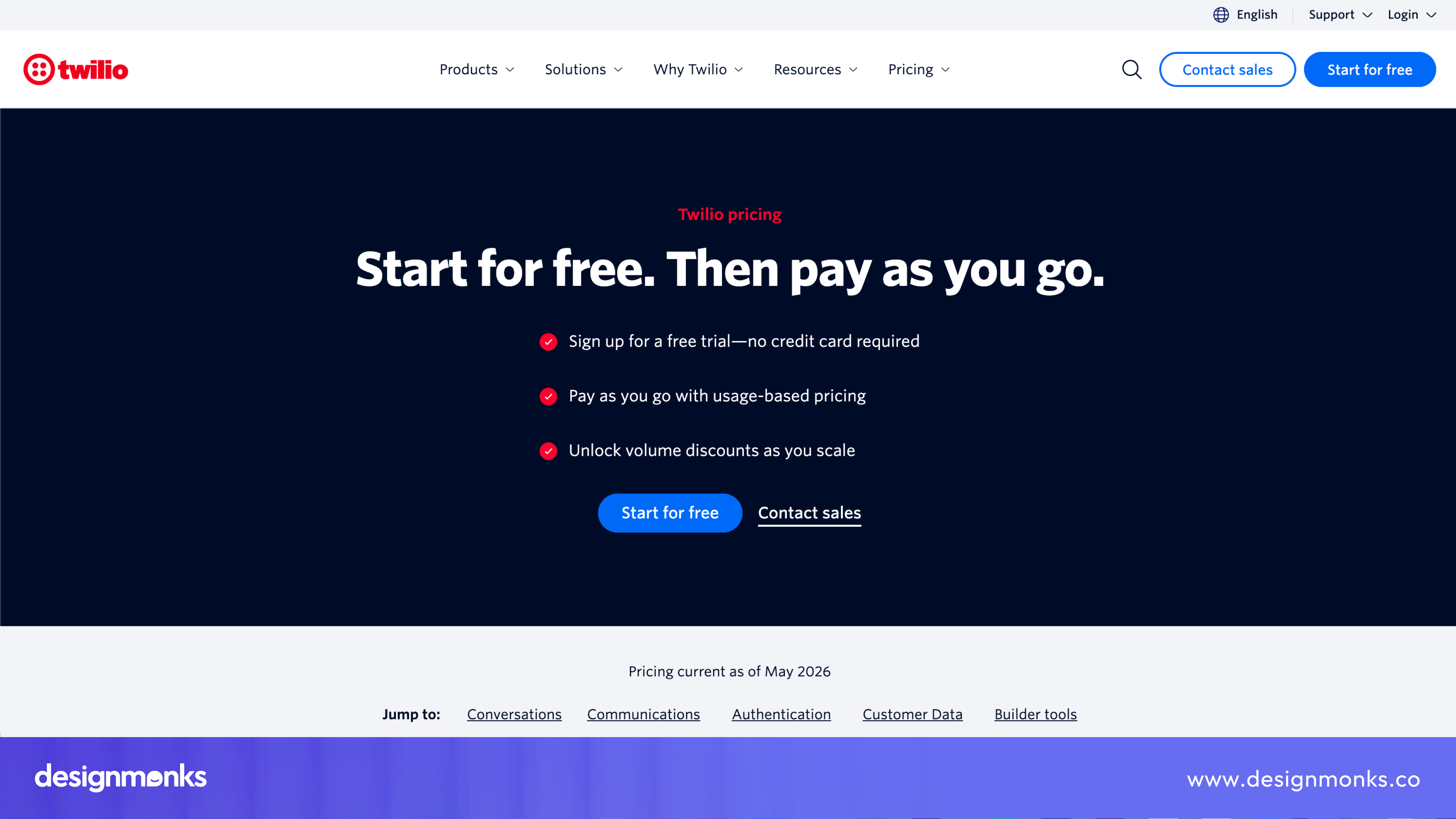
Hybrid pricing combines a fixed subscription with usage-based charges. Customers pay a monthly fee for the core service, then pay extra if they exceed certain limits or use additional resources.
For example, a plan may include a set number of API calls, with extra charges once that limit is reached.
Best for:
- API platforms
- AI software
- Communication tools
Why it works:
- Creates predictable monthly pricing.
- Lets customers grow without changing plans.
- Matches costs with actual usage.
Example: Twilio, OpenAI API
How to Choose the Right Pricing Pattern for Your SaaS
Picking a pricing pattern isn't about copying competitors. It's about matching your pattern to your business model and your audience.
B2B SaaS companies usually benefit from tiered pricing with an enterprise option. B2B buyers compare plans carefully, often with input from a team. They want clear feature breakdowns before they commit.
B2C SaaS products often do better with freemium. Regular consumers want to try before they buy. A free plan removes the risk and gets people through the door. So ask yourself these questions before choosing your subscription model:
- How complex is my product? Complex tools need more tiers to explain value at each level.
- Who makes the buying decision? One person or a whole team?
- Does usage vary a lot between customers? If yes, usage-based pricing might fit better than flat tiers.
There's no universal winner here. The right pricing framework depends on your product, your customer, and how they like to buy.
SaaS Pricing Page UX Best Practices
Your pricing page should make choosing a plan feel simple. If visitors have to search for information or struggle to compare plans, they're more likely to leave without signing up.
These pricing page UX best practices help create a smoother experience and encourage more users to become customers:
Keep the Visual Hierarchy Simple
Your most important information should stand out first. Start with a clear headline, followed by your pricing plans, and then supporting details like feature comparisons and FAQs.
Use headings, spacing, and font sizes to guide users through the page. A clean visual hierarchy helps visitors find what they're looking for without feeling overwhelmed.
Limit the Number of Pricing Plans
More choices don't always lead to more sales. Too many pricing plans can make it harder for users to decide. For most SaaS products, three or four pricing plans are enough. They give customers options without creating unnecessary confusion.
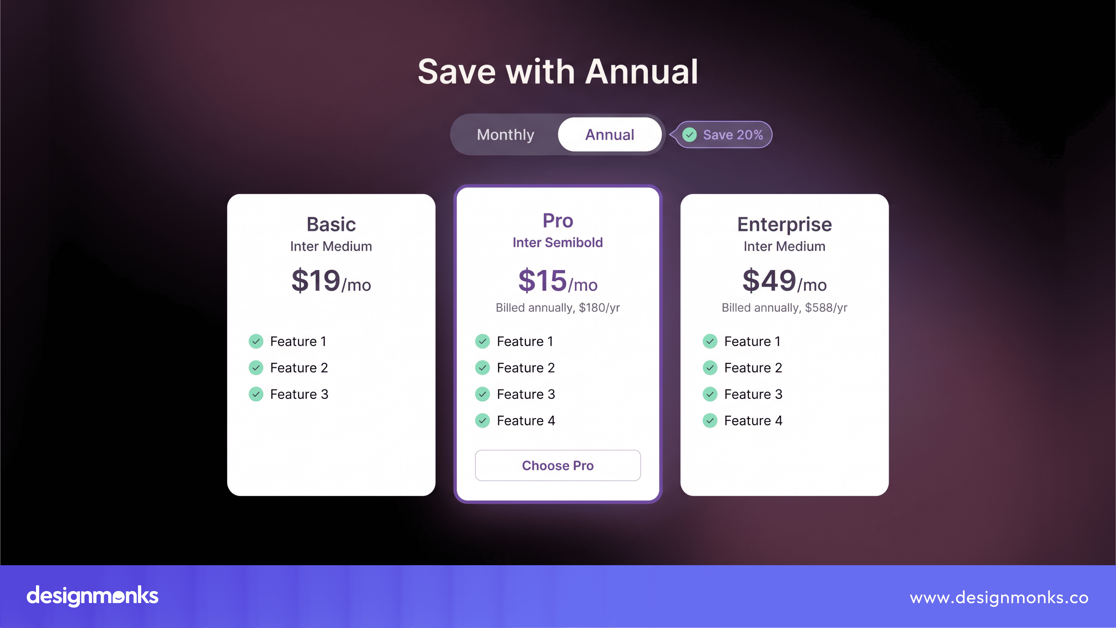
Use a Billing Toggle
A billing toggle lets users switch between monthly and annual pricing with one click. It's a simple feature that helps customers compare costs instantly while showing how much they can save with yearly billing.
This often encourages more annual subscriptions.
Highlight the Recommended Plan
Many visitors aren't sure which plan they should choose. Highlighting one pricing card with a label like Most Popular or Best Value helps guide their decision.
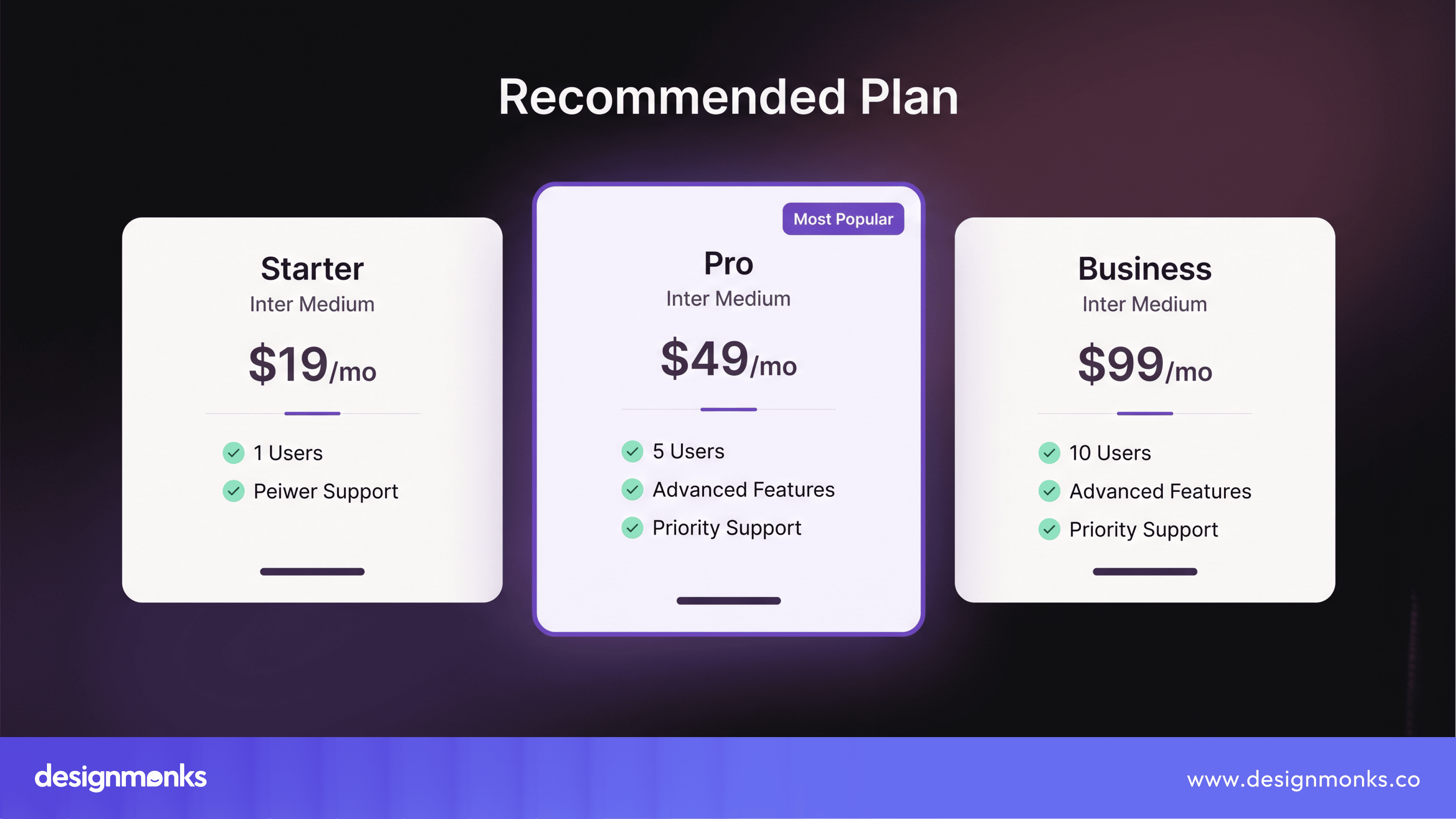
You can make the recommended plan stand out with a different border, background color, or badge. This works best when the highlighted plan is genuinely the best fit for most customers.
Make Feature Comparison Easy
Some users make decisions quickly, while others want to compare every detail. Adding a Feature Comparison Table below your pricing cards allows visitors to see exactly what's included in each plan.
Keep the table simple and focus on the features that matter most.
Write Action-focused CTAs
Every pricing card should include a clear CTA that tells users what to do next. Instead of generic buttons like Submit or Learn More, use action-oriented text such as:
- Start Free Trial
- Get Started
- Choose Plan
- Contact Sales
Clear CTAs reduce hesitation and make the next step obvious.
Build Trust Near the Pricing Section
Visitors often have questions before they're ready to pay. Adding trust signals near your pricing helps build confidence. These can include:
- Customer reviews
- Company logos
- Security badges
- Money-back guarantees
- Free trial information
Placing these elements close to your pricing plans reassures users at the moment they're making a decision.
Design for Mobile Users
A large number of people visit SaaS websites on their phones, so your mobile pricing page should be just as easy to use as the desktop version. Make sure pricing cards stack neatly, text is easy to read, and buttons are large enough to tap comfortably.
A responsive design creates a better experience and can improve conversions.
Answer Common Questions
Many visitors leave a pricing page because they still have unanswered questions. Adding a short FAQ below your pricing section can remove those doubts before users leave the page. Answer common questions like:
- Can I change my plan later?
- Is there a free trial?
- Can I cancel anytime?
- What payment methods do you accept?
- Do you offer refunds?
Providing these answers on the pricing page helps visitors feel more confident and reduces the need to contact support.
Pricing Psychology Behind High-Converting SaaS Pricing Pages
The way prices are presented affects how customers compare options and make decisions. This is known as pricing psychology. Good pricing psychology doesn't trick customers. Instead, it helps them understand their choices more easily and feel confident about their decision.
Here are some of the most common techniques used on SaaS pricing pages:
Price Anchoring
Price anchoring is when a higher-priced plan is shown alongside lower-priced plans to create a point of comparison. For example, if your plans are:
- Starter - $29/month
- Pro - $99/month
- Enterprise - $499/month
Many visitors will compare the Pro plan with the Enterprise plan. As a result, the Pro plan feels more affordable because it offers many of the same benefits at a much lower price.
This technique helps customers judge value by comparing plans instead of looking at each price on its own.
Decoy Effect
The Decoy Effect is used to make one pricing plan look like the best choice. For example:
- Starter - $19/month
- Pro - $39/month
- Business - $42/month
Since the Business plan costs only a little more than the Pro plan but includes many extra features, customers often feel it's worth paying the small difference. This makes the Business plan seem like the better value.
The goal isn't to force people into a certain plan. It's to make comparing plans easier by giving customers a clear value difference.
Social Proof
People are more likely to trust a product if they know others are already using it. This is why many SaaS pricing pages include social proof near the pricing section.
It might be customer logos, testimonials, star ratings, awards, or messages like "Trusted by 10,000+ businesses." These trust signals help reduce uncertainty and give visitors more confidence before they subscribe.
Pricing psychology works because people don't always make decisions based only on numbers. They also consider value, compare different options, and look for signs that they are making a safe choice. Using these techniques thoughtfully can make your pricing page easier to understand and help more visitors choose the right plan.
SaaS Pricing Page Examples That Get It Right
One of the best ways to improve your own pricing page is to study companies that already do it well:
Stripe
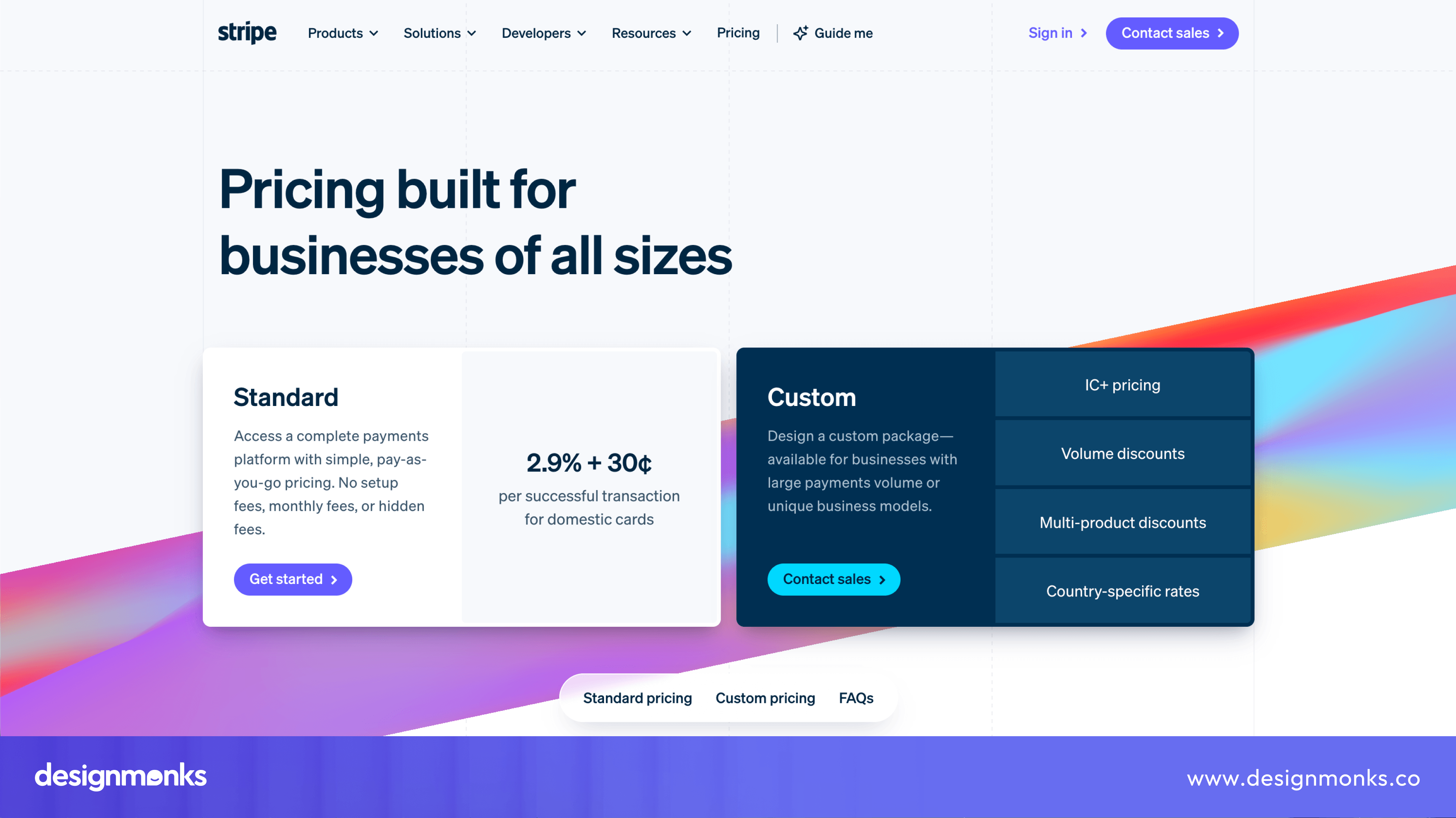
Stripe is a great example of a company using usage-based pricing. Its pricing page explains transaction fees in simple language, so businesses know exactly how much they'll pay.
Instead of overwhelming visitors with complicated pricing, Stripe focuses on transparency and keeps the layout clean. This makes it easy for customers to understand the pricing model and trust the product.
HubSpot
HubSpot has a much more complex product offering, but its pricing page remains easy to navigate.
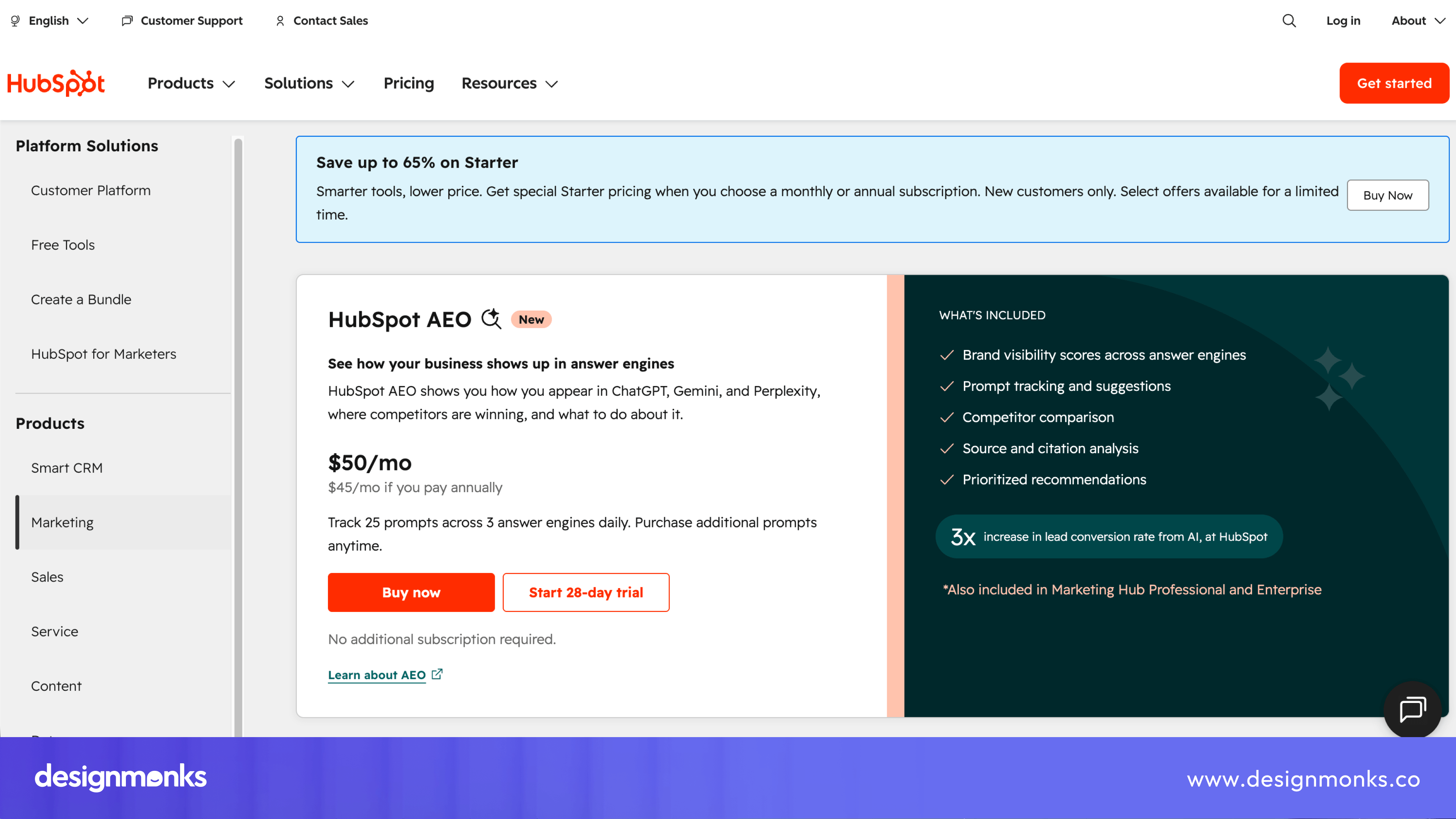
It uses tiered pricing with detailed feature comparisons, which helps businesses understand what each plan includes. The page is well organized, making it simple to compare pricing tiers without feeling overwhelmed by the large number of features.
Notion
Notion uses a freemium pricing model that allows individuals to start using the product for free. As users need more collaboration, security, and team features, upgrading becomes a natural next step.
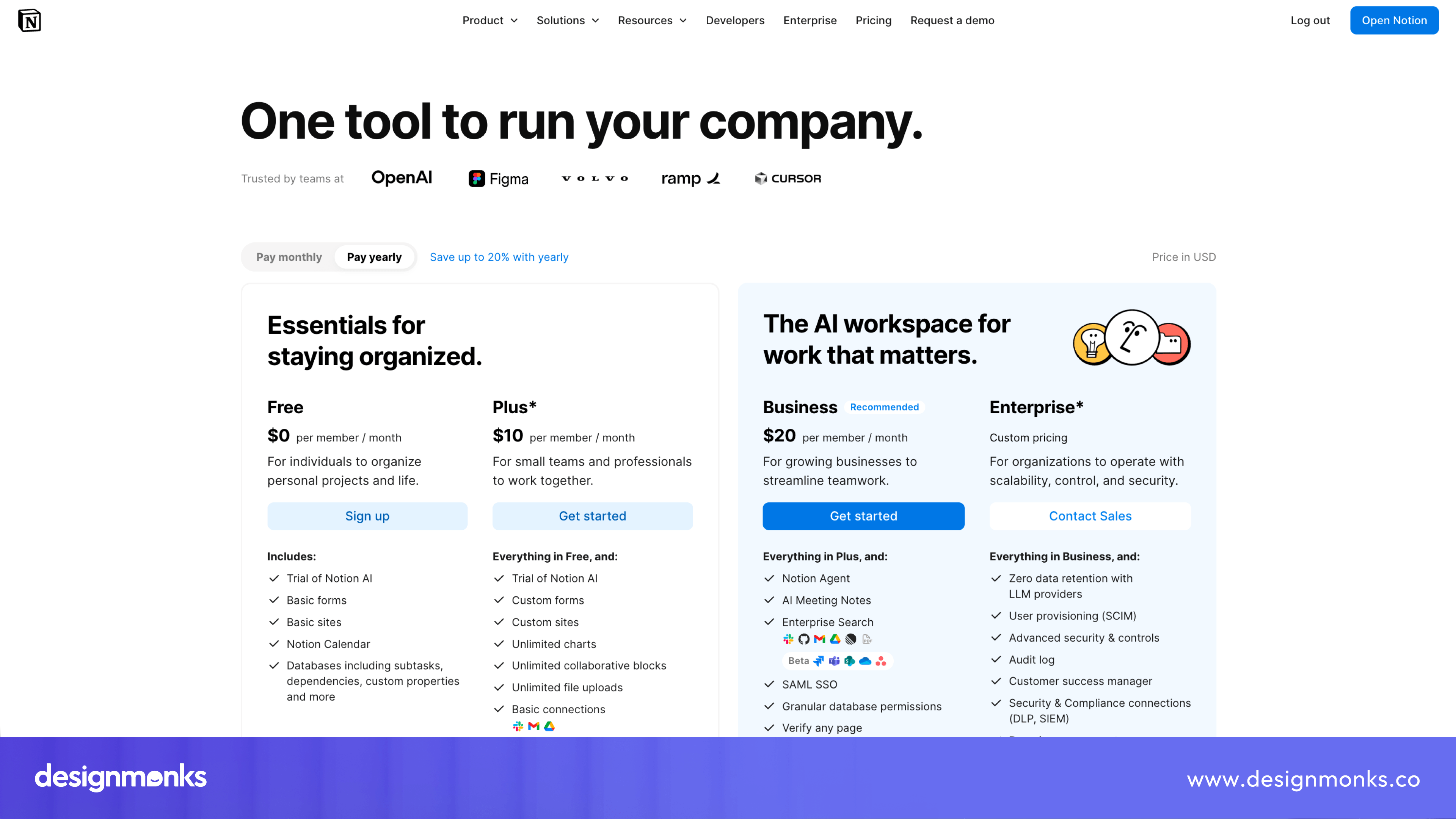
The pricing page clearly explains the differences between plans and makes it easy for visitors to decide when a paid subscription is worth it.
Slack
Slack also follows a freemium approach, but its pricing page focuses on how teams grow over time.
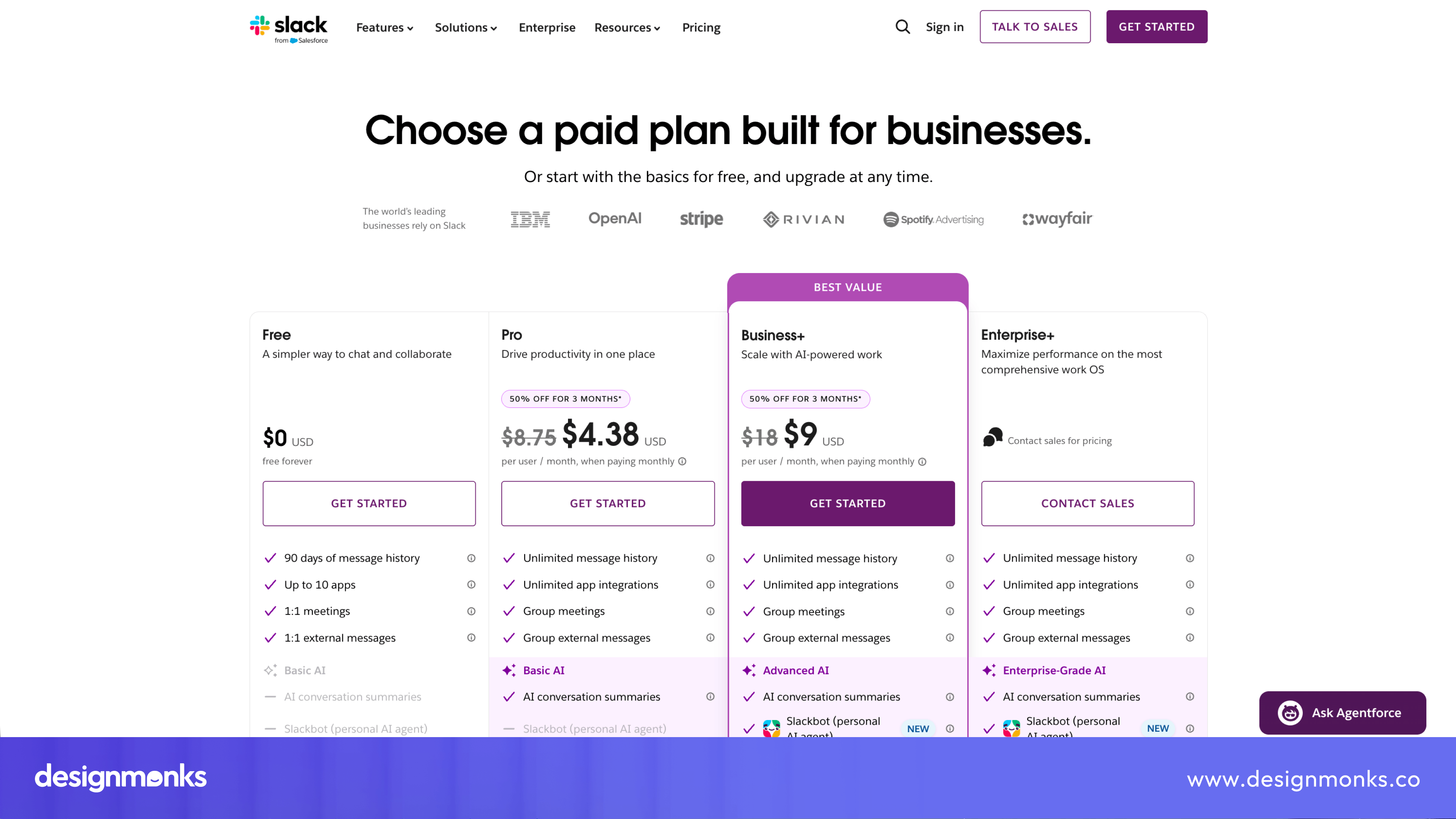
The free plan offers enough features for small teams to get started, while the paid plans introduce additional collaboration tools, security features, and administration controls. This creates a clear upgrade path without making customers feel pressured.
Figma
Figma combines a freemium model with tiered pricing to support individuals, professional teams, and large organizations.
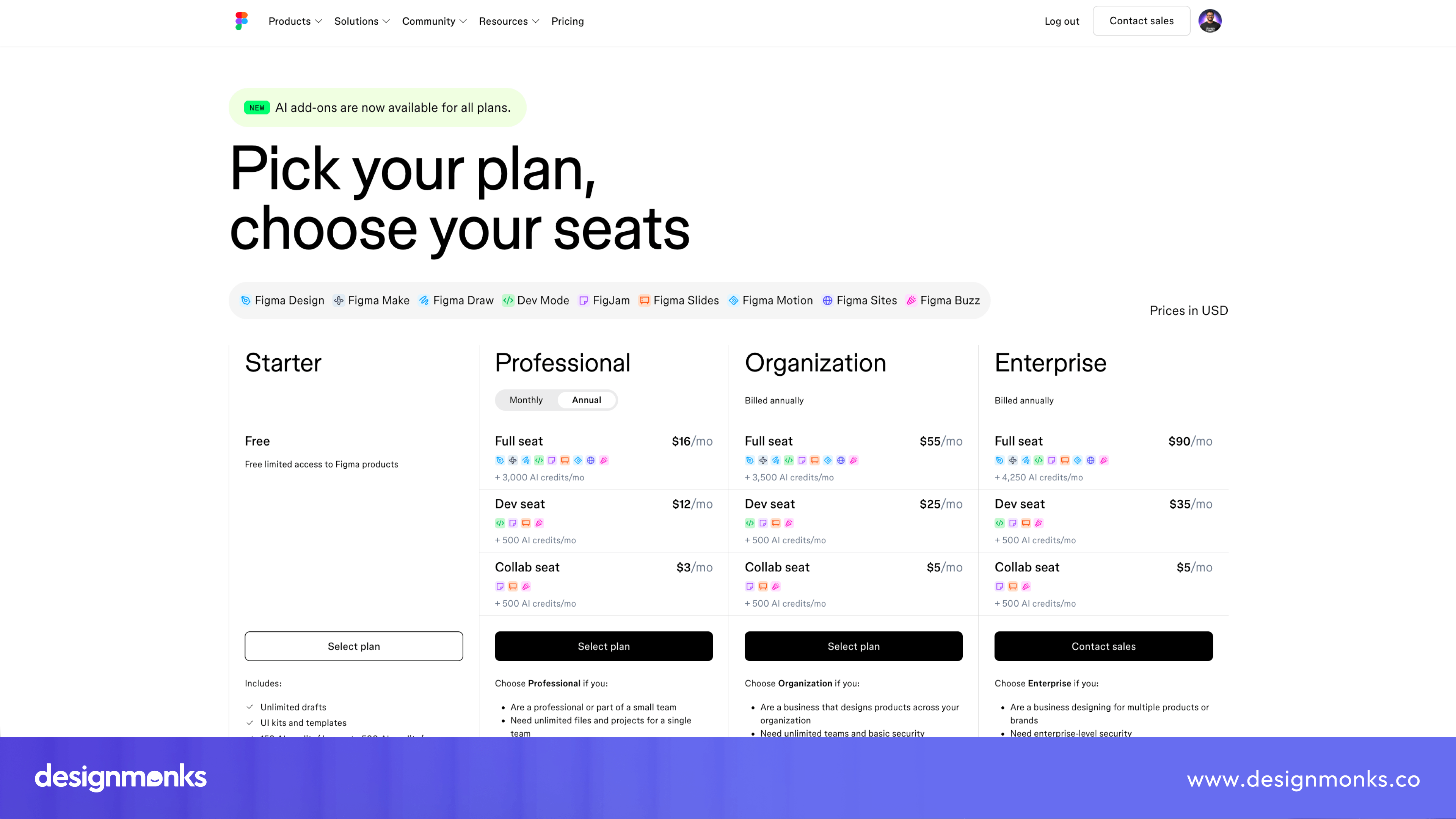
Its pricing page uses clean pricing cards and an easy-to-read feature comparison table. It allows visitors to compare plans quickly. Annual billing discounts are also clearly displayed, encouraging customers to choose longer subscriptions.
Webflow
Webflow serves a wide range of customers, from freelancers to large businesses, so it separates its pricing into Site Plans and Workspace Plans. This approach helps visitors find pricing relevant to them rather than comparing plans they don't need.
The page stays organized despite offering multiple pricing options, making the buying process much simpler.
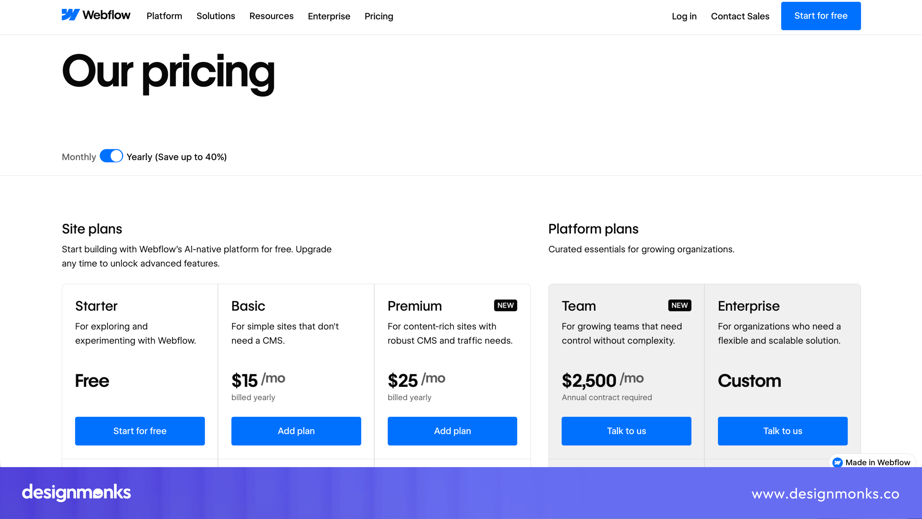
These examples show that there isn't a single pricing page design pattern that works for every SaaS business. Instead, successful companies choose a pricing model and layout that match their product, their customers, and the way people expect to buy their software.
Common SaaS Pricing Page Design Mistakes to Avoid
Even good products lose customers because of pricing page mistakes. Watch out for these common SaaS pricing page design mistakes:
- Choice overload: Too many plans confuse people. If someone can't decide in ten seconds, you've lost them. Stick to three or four tiers.
- Hidden pricing: Making people "Contact Us" for basic plans frustrates buyers. Save that approach for enterprise deals only.
- Weak CTA: A boring button with vague text won't convert. "Submit" tells people nothing. "Start Your Free Trial" tells them exactly what happens next.
- No visual hierarchy: If every plan looks the same, users don't know where to look first. Highlight your recommended plan clearly.
- Ignoring mobile users: A pricing table that breaks on phones is a conversion killer, plain and simple.
These mistakes seem small, but they add up fast. Fixing them often boosts sign-ups without changing your actual prices.
SaaS Pricing Page Design Checklist
Before you launch your pricing page, run through this checklist.
- Three to four pricing tiers, not more
- Clear, bold CTA button on every plan
- Feature comparison table below the pricing cards
- Monthly/yearly billing toggle included
- Most popular plan visually highlighted
- Mobile-friendly layout tested on real devices
- Social proof, like logos or testimonials near the pricing table
- No hidden pricing for standard plans
- Fast page load speed
- Clear, simple language in feature descriptions
Run a regular UX audit every few months to identify usability issues and improve your pricing page as your product evolves. Pricing pages aren't a "set it and forget it" thing. As your product grows, your pricing page should grow with it too.
FAQ
How many pricing tiers should a SaaS pricing page have?
Most SaaS companies stick to three or four tiers. This range gives buyers enough choice without causing decision fatigue. Fewer than three feels limiting, and more than four often confuses people and slows down sign-ups.
Should I show pricing publicly or hide it behind a "Contact Sales" button?
For standard plans, show your pricing openly. Hidden pricing frustrates buyers and makes your product feel harder to trust. Save the "Contact Sales" approach for Enterprise plans only, where custom deals and negotiated terms actually make sense.
Does offering a free plan hurt SaaS revenue?
Not usually. A free plan, when done right, brings in more users who later upgrade once they hit feature limits or need more from the product. Companies like Slack and Notion grew fast using freemium, turning free users into paid customers over time through word of mouth and natural upgrade paths.


.avif)
.avif)
.avif)
.avif)


.avif)
.avif)
.avif)
.avif)






.avif)