
.svg)


Key Takeaways
- Best Real Estate Website UX Design Examples such as Realtor, Zillow and others show search clarity drives engagement.
- High-quality photos and pricing help users compare homes faster.
- Interactive maps make neighborhoods understandable, as seen in Zillow.
- Mobile-first performance keeps users engaged across devices in these top examples.
- Soft CTAs and saved searches drive conversions without pressure.
When UX is done well, searching for homes online becomes much easier, and the best real estate website UX design examples, such as Zillow and Redfin, show exactly why. Their simple layouts, clear filters, and friendly pages help people move forward without stress.
Good UX makes pages load fast, keeps buttons easy to find, and helps visitors understand what to do next. It also makes important details like prices, photos, and contact options easy to compare. So people feel more confident while browsing.
In this guide, we’ll look at what these top sites do right and how you can use the same ideas. Keep reading to learn simple ways to make any real estate website easier and more helpful.
7 Best Real Estate Website UX Design Examples
A great real estate website makes searching for homes simple, fast, and stress-free. It should come with a clear search bar, easy-to-use filters, high-quality photos, helpful maps, and straightforward ways to contact an agent. All these features guide visitors step by step, so finding the right property feels natural and worry-free.
The websites below are some of the best real estate website UX design examples:
Zillow
Zillow is one of the largest home-search marketplaces, connecting buyers, sellers, and renters all in one place. It positions itself as a comprehensive platform where users can explore homes, compare prices, and connect with agents seamlessly.
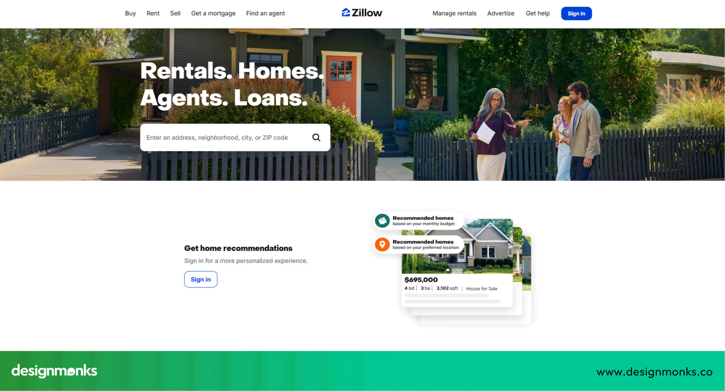
Why Zillow UX Works:
- Homepage UX & first impression: Clean search box at the top makes it immediately obvious where to start searching.
- Property discovery experience: Large, high-quality photos, price info, and “save” options simplify browsing.
- Filters, maps & navigation: Interactive map search allows users to view homes by area in one click.
- Mobile UX quality: Smooth scrolling and large tap targets make mobile browsing easy.
- Conversion triggers (CTA, lead forms): Prominent “Contact Agent” and “Request Tour” buttons guide users to act.
Zillow’s UX focuses on clarity and trust, making the home search smooth and reliable.
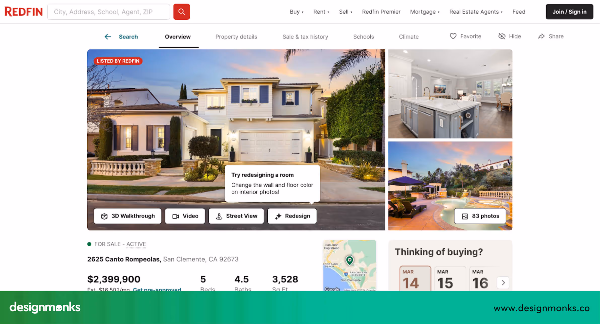
Redfin
Redfin combines property listings with tools that help users understand market value. It positions itself as a helpful, data-driven platform for buyers and sellers who want detailed insights alongside ease of use.
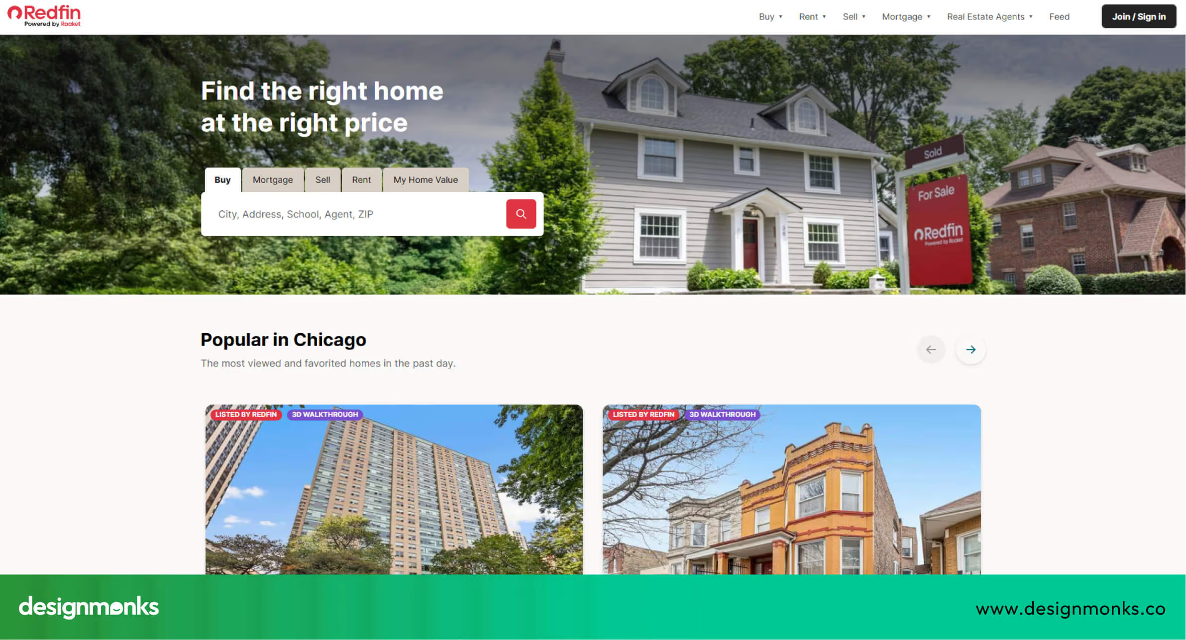
Why Redfin UX Works:
- Homepage UX & first impression: Search is front-and-center with friendly tips and clear guidance.
- Property discovery experience: Price trends, neighborhood stats, and detailed descriptions keep users informed.
- Filters, maps & navigation: Smart filters allow quick narrowing of results without confusion.
- Mobile UX quality: Fast-loading pages and clean layouts ensure smooth mobile browsing.
- Conversion triggers (CTA, lead forms): Clear buttons for booking tours or contacting agents encourage immediate action.
Redfin’s UX helps users feel confident and informed throughout their property search.
Emsleys Estate Agents
Emsleys is a local estate agency platform that focuses on personalized service and community trust. Its UX emphasizes simplicity for users seeking local listings.
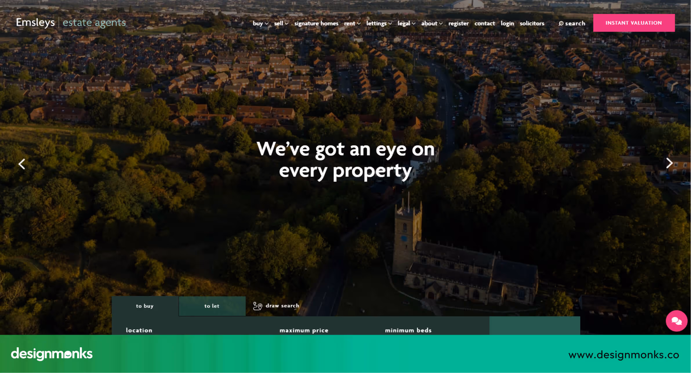
Why Emsleys UX Works:
- Homepage UX & first impression: Warm, welcoming layout with simple, intuitive search options.
- Property discovery experience: Clear addresses and neighborhood information make properties easy to evaluate.
- Filters, maps & navigation: Easy-to-understand categories for buying, selling, or renting.
- Mobile UX quality: Clean, uncluttered layouts optimize mobile use.
- Conversion triggers (CTA, lead forms): Quick, friendly contact forms encourage inquiries without pressure.
Emsleys’ UX creates a personal and approachable experience, ideal for local buyers and sellers.
Realtor
Realtor.com is a large-scale platform providing official, comprehensive listings across the U.S. It positions itself as a reliable and data-rich source for buyers, sellers, and renters.
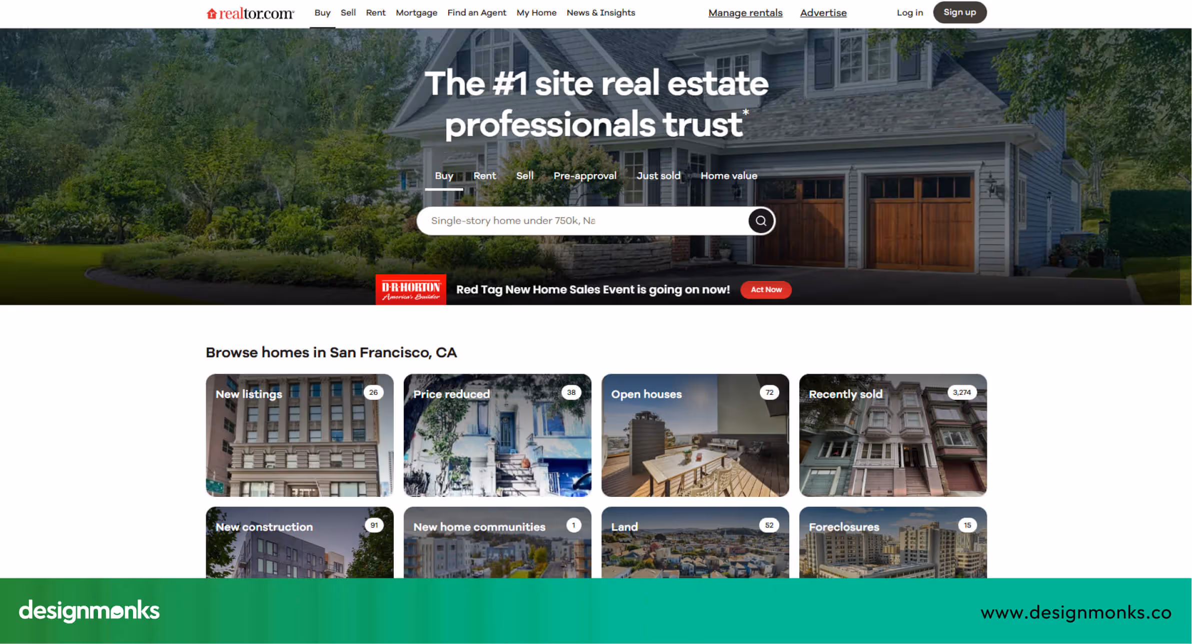
Why Realtor UX Works:
- Homepage UX & first impression: Direct search bar with helpful suggestions makes navigation immediate.
- Property discovery experience: Side-by-side images and detailed property info simplify comparison.
- Filters, maps & navigation: Sliders and filters for price, beds, and more make refining results easy.
- Mobile UX quality: Smooth scrolling and fast page loads enhance the mobile experience.
- Conversion triggers (CTA, lead forms): Clear “Get More Info” buttons guide users toward next steps.
Realtor’s UX balances massive data with simplicity, helping users trust and navigate the platform efficiently.
Homes.com
Homes.com focuses on clarity and ease of browsing, aiming to simplify the home search for buyers and renters. It positions itself as a beginner-friendly, straightforward real estate platform.
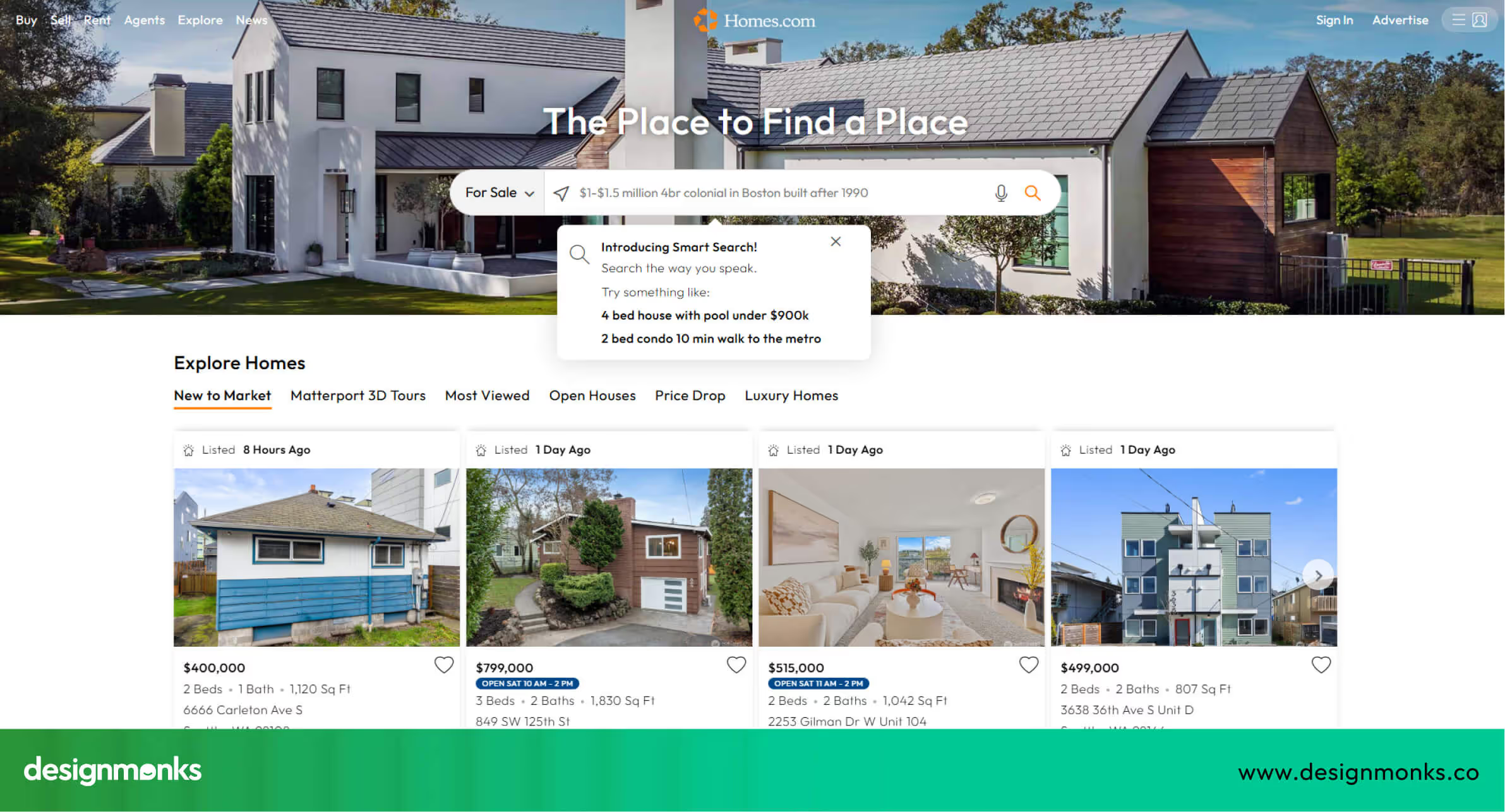
Why Homes.com UX Works:
- Homepage UX & first impression: Simple search with clearly labeled categories.
- Property discovery experience: Organized listing pages reduce confusion and allow quick comparison.
- Filters, maps & navigation: Friendly icons and labels make searches intuitive.
- Mobile UX quality: Tap-friendly layouts make browsing easy on phones.
- Conversion triggers (CTA, lead forms): Prompts to contact agents or save homes are clear and accessible.
Homes.com demonstrates how simplicity and organization can improve user confidence and engagement.
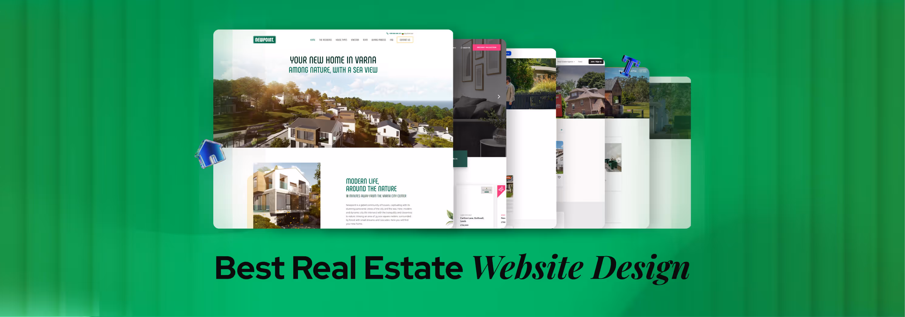
Newpoint
Newpoint is a modern real estate platform designed by professional architects and designers, which gives it a more thoughtful and practical perspective on user needs. It positions itself as a clean, distraction-free environment where users can explore suburban homes and modern living concepts with clarity.
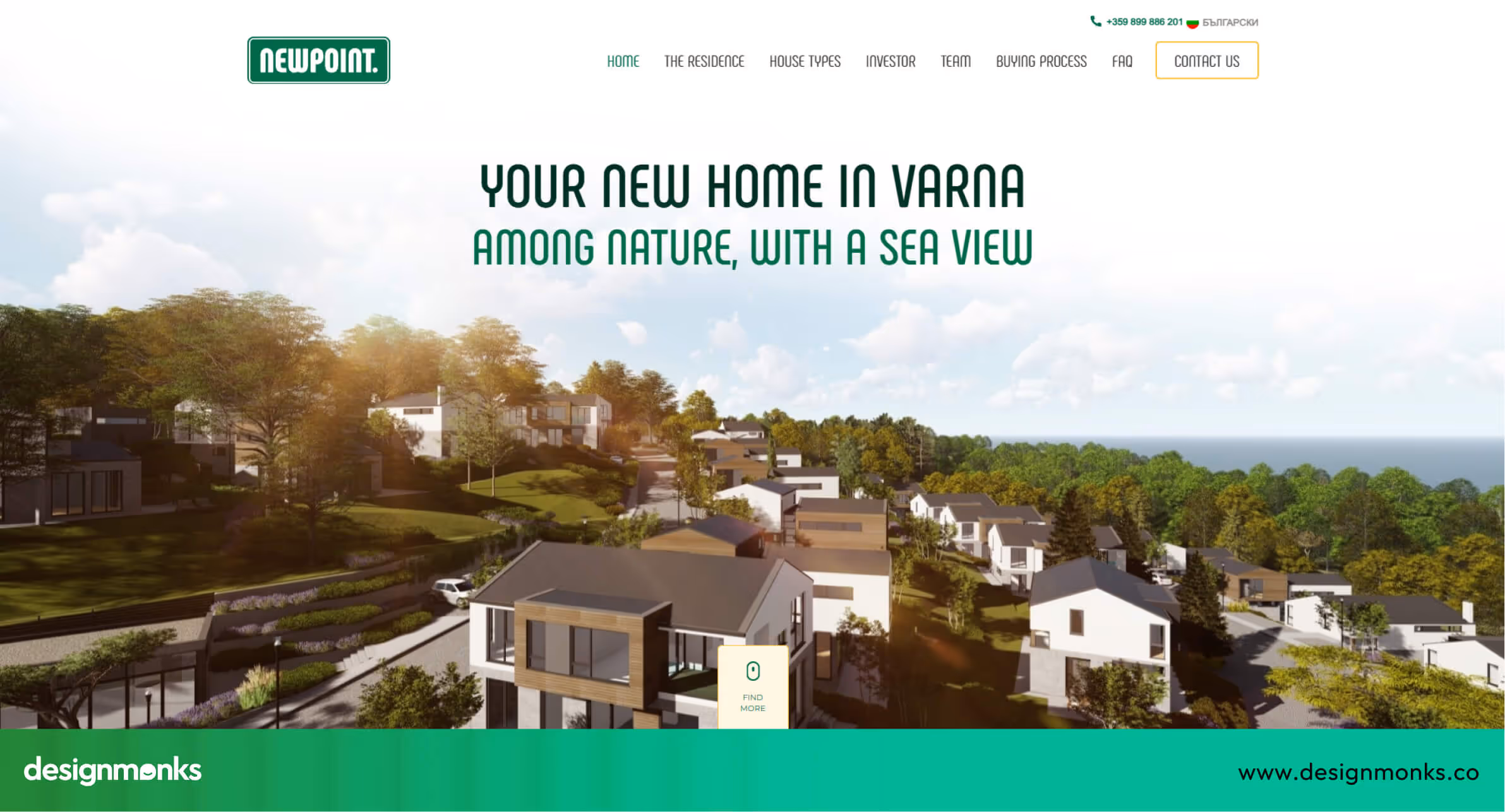
Why Newpoint UX Works:
- Homepage UX & first impression: Modern design with clear starting points for searches and smooth parallax effects.
- Property discovery experience: Detailed listings with big photos, blueprints, and practical info like area, floors, and parking.
- Filters, maps & navigation: Simple, intuitive filters and an embedded Google Map make finding properties easy.
- Mobile UX quality: Works well on mobile, though the desktop version provides a richer interactive experience.
- Conversion triggers (CTA, lead forms): Clear contact info, phone numbers, and inquiry forms guide users naturally.
Newpoint shows that when a site is designed by architects themselves, clarity, practicality, and attention to real user needs make the UX much stronger.
WanderJaunt
WanderJaunt offers a fresh take on short-term rentals, providing an interactive and engaging user experience that stands out from platforms like Airbnb. Its focus on storytelling, 3D visuals, and immersive content makes browsing exciting while giving users a sense of the properties and brand personality.
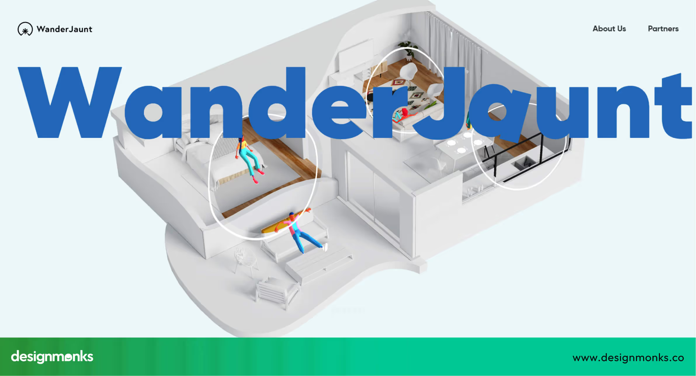
Why WanderJaunt UX Works:
- Homepage UX & first impression: The homepage presents the entire story of the platform in one scroll, including visuals, About Us info, partners, and a contact form.
- Property discovery experience: Strong storytelling and interactive 3D elements engage users, though it currently lacks detailed property galleries and key booking info.
- Filters, maps & navigation: Navigation is minimal and straightforward, keeping the focus on the experience rather than complex search.
- Mobile UX quality: The site can lag on some devices, and certain content may overlap, showing mobile optimization needs improvement.
- Conversion triggers (CTA, lead forms): Clear contact info, phone numbers, and forms allow users to reach out easily.
WanderJaunt demonstrates how immersive, interactive design can create excitement and engagement, even if some traditional property details are missing. It’s an experimental, attention-grabbing UX that shows the potential of storytelling in real estate websites.
UX Secrets Top Real Estate Websites Get Right
The best real estate websites don’t just look good, they follow smart UX patterns that make searching, browsing, and contacting seamless. By studying platforms like Zillow, Redfin, and WanderJaunt, we can identify patterns that help users find properties faster, feel confident in decisions, and take action without frustration:
Smart Property Search & Filtering UX
The most useful real estate websites make searching fast, easy, and intuitive. A clear search bar is usually at the top of the page, so users immediately know where to start. Filters appear progressively, for example, first select location and price, then narrow down by bedrooms, bathrooms, or amenities like parking and pool.
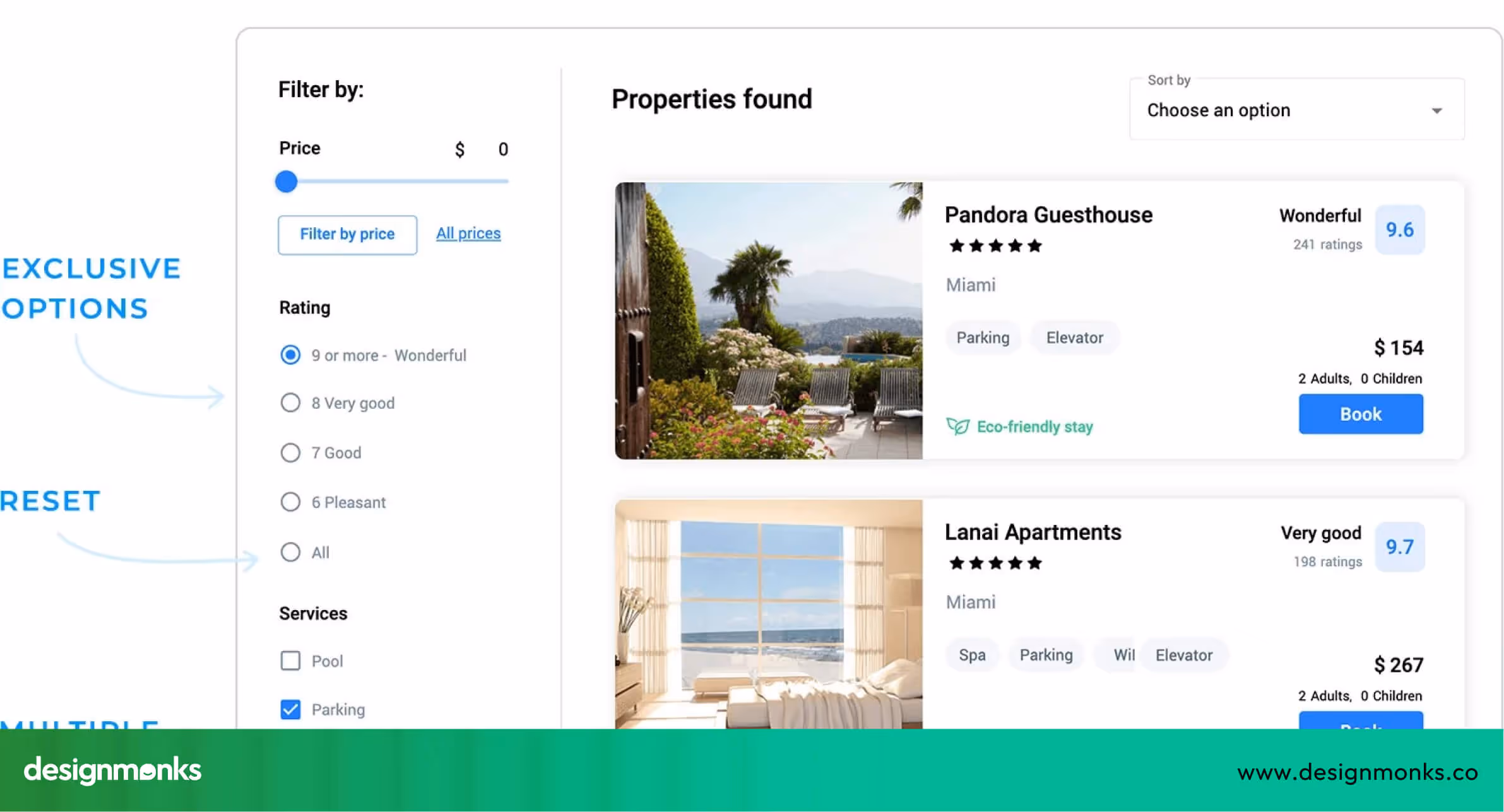
Some sites also remember preferences, letting returning users continue their search without starting over. Fast-loading search results and instant updates reduce frustration. This approach helps users find relevant homes quickly, making them more likely to stay on the site and explore further.
Map-First & Location-Driven UX
Maps are a key UX feature for real estate websites because location is everything. Interactive maps let users see exactly where homes are, explore neighborhoods, and check nearby schools, shops, and parks. Features like clickable pins, hover previews, and zooming make it easy to find areas of interest.
Map-driven UX also encourages discovery. Users may spot neighborhoods they hadn’t considered before, which increases engagement. By showing properties visually on a map rather than only in a list, websites make searching more natural and enjoyable, giving users context that numbers and text alone can’t provide.
Visual-First Listings With Context
People respond to images first, so listings need to show clear photos alongside important details. Big images help users imagine themselves in the property, while price, size, and basic info give context without overwhelming them.
Extra UX touches like hover effects, quick “save” buttons, or swipeable galleries make exploring listings smoother. Sites like Zillow and Redfin balance visual appeal with information.
Their simple layouts and clear filters show why color psychology in UX design matters in guiding user decisions. Users can compare properties quickly while keeping the browsing experience clear and engaging.
Lead Generation Without Disrupting UX
Generating leads is crucial for real estate sites, but annoying pop-ups or interruptions can frustrate users. The best UX uses soft CTAs like “Save Search,” email alerts for new listings, or inline contact forms that blend into the page.
These methods encourage users to act, like contacting an agent or saving a property, without breaking the browsing flow. This UX pattern keeps visitors engaged while also supporting the business goals of the site.
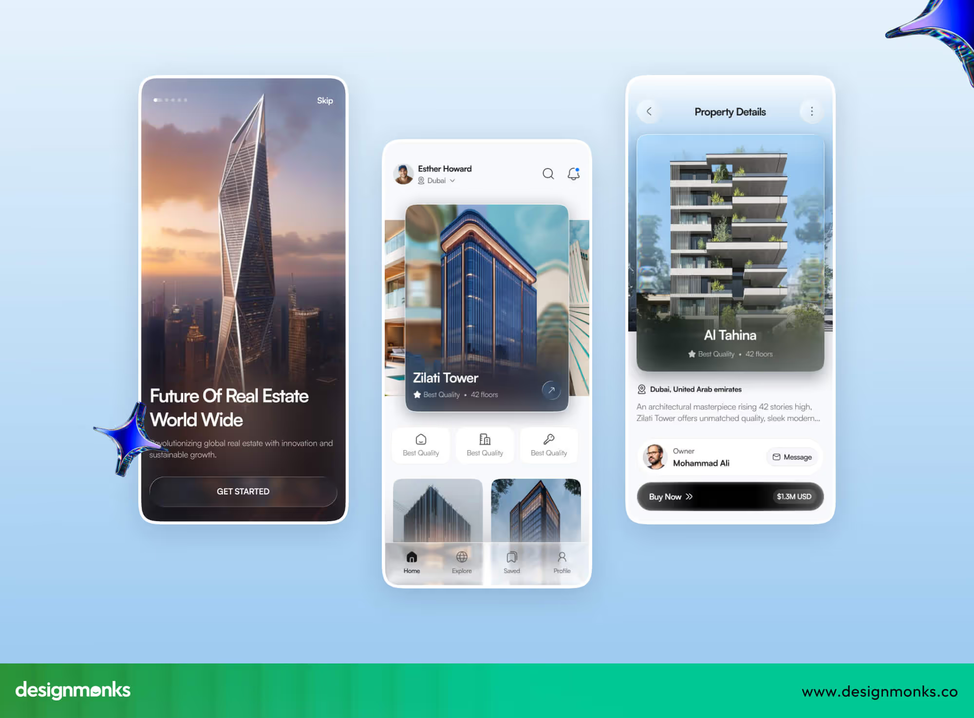
Mobile UX Examples from Top Real Estate Websites
With most users searching for homes on their phones, mobile-friendly UX is no longer optional, it’s essential. Real estate websites must make browsing fast, intuitive, and touch-friendly, because users expect to find and act on information in seconds.
The best platforms focus on thumb-friendly navigation, fast loading times, and easy access to key actions. Let's take a look at them:
Thumb-Friendly Filters
- Zillow: Large sliders and buttons allow users to filter by price, beds, or property type with a single thumb swipe. Filters are spaced well to avoid mis-taps, making searches faster and less frustrating.
- Redfin: Progressive filters appear step by step and help users narrow options gradually. This prevents overwhelm and guides them toward the most relevant properties quickly, even on a smaller screen.
Sticky Actions
- Realtor.com: Persistent “Contact Agent” and “Save Home” buttons follow users while scrolling, so they can act anytime without scrolling back to the top. This encourages more inquiries and saved searches.
- Homes.com: Sticky bars provide access to saved searches and inquiry forms. These let users engage immediately while browsing listings, without breaking the flow of exploration.
Performance & Loading UX
- Zillow & Redfin: Images and property data load quickly, even on slower connections, and lazy-loading ensures smooth scrolling. Users don’t get frustrated waiting for content.
- Realtor.com & Homes.com: Responsive layouts adapt to different screen sizes, keeping text readable and buttons tappable. Pages feel fast and intuitive, so users stay longer and interact more.
These platforms show that mobile UX isn’t just shrinking desktop designs. Instead, it’s shaped by thoughtful layouts, fast performance, and touch-friendly interactions, similar to modern mobile app UX design. When implemented well, users can search, filter, compare, and contact agents easily, making mobile browsing just as effective if not better than, desktop.
UX Checklist for Designing a High-Converting Real Estate Website
A high-performing real estate website is more than pretty pictures, it guides users, builds trust, and encourages action. This checklist gives designers and businesses specific, actionable steps to create a site that’s easy to use and optimized for conversions:
- Keep the search bar and key actions visible above the fold.
- Use step-by-step filters to guide users without overwhelming them.
- Include interactive maps with neighborhood details like schools, parks, and transport.
- Highlight high-quality images with clear pricing, property size, and key info.
- Make contact and booking options one-tap or easy to access.
- Allow users to save searches and favorite properties for personalization.
- Optimize for fast mobile loading and thumb-friendly navigation.
- Show trust signals like reviews, testimonials, verified listings, and agent credentials.
- Provide clear next steps after viewing a listing, like scheduling a tour.
- Include soft lead-generation tools like alerts for new listings and saved search notifications.
- Make forms short, simple, and user-friendly to reduce friction.
- Add social proof and recognizable partner logos to increase credibility.
For further details, you can also explore our UX audit checklist for startups to ensure your site follows proven UX patterns.
Final Thoughts: Designing Trust-Driven Real Estate Experiences
In summary, the best real estate website UX design examples, like Zillow and Redfin, prove that good UX makes home searching faster, easier, and stress-free. Clear layouts, intuitive filters, and smooth mobile experiences guide users naturally from browsing to taking action.
By focusing on speed, simplicity, and helpful details, any real estate website can inspire confidence and trust. Applying these UX principles ensures visitors stay engaged, find what they need, and are more likely to take the next step.

.avif)
.avif)
.avif)
.avif)


.avif)
.avif)
.avif)
.avif)


.avif)


