.svg)


Key Takeaways
- Color shapes emotion, trust, and user behaviour in digital interfaces.
- Consistent color patterns improve recognition, predictability, and visual hierarchy.
- Contrast, hue, and saturation enhance readability and accessibility for everyone.
- Semantic and limited palettes reduce cognitive load and guide user actions.
- Testing and iteration ensure color choices align with users’ real needs.
Do you know that one of the biggest reasons users stay, trust, or convert on a product comes down to a simple detail? That’s color. It’s a Powerful Tool in UX Design, and color is now more than a design topic; it’s a behavioural topic.
Color shapes how people feel, judge credibility, and decide what to do next. A single hue can calm users, warn them, guide attention, or make an interface instantly trustworthy. When done right, color becomes a silent UX assistant.
In this blog, you’ll learn how color psychology, clarity, and consistency influence real user behaviour, and how you can use them wisely. Keep reading…
Why Color Matters in Digital Product Design
Color is one of the fastest ways users form opinions about a digital interface. When used with intention, color becomes a communication tool that works long before any text or icon does.
In UX, color helps guide behaviour by highlighting what matters most. It can direct attention, reduce hesitation, and make interactions feel effortless. Strong contrast improves readability, while balanced palettes create a sense of structure and calm throughout the experience.
Color also strengthens brand identity. The right palette makes a product memorable, consistent, and instantly recognisable across screens. It builds emotional connection and sets the tone for how users perceive the entire digital product.
Below are bullet points highlighting the key ways color impacts UX:
- Emotional influence: Colors trigger feelings that shape how users interpret the interface.
- Behaviour nudging: Strategic colors subtly guide users toward intended actions and choices.
- Readability & contrast: Proper contrast improves clarity, accessibility, and overall visual comfort.
- Brand identity: Consistent colors help users recognise your product across platforms instantly.
- User confidence: Harmonious color choices make an interface feel trustworthy, stable, and reliable.
The Psychology Behind Color Associations
Color plays a silent but powerful role in UX. Users often react to an interface emotionally long before they think logically. These reactions come from deep-rooted color associations that shape trust, urgency, comfort, and decision-making.
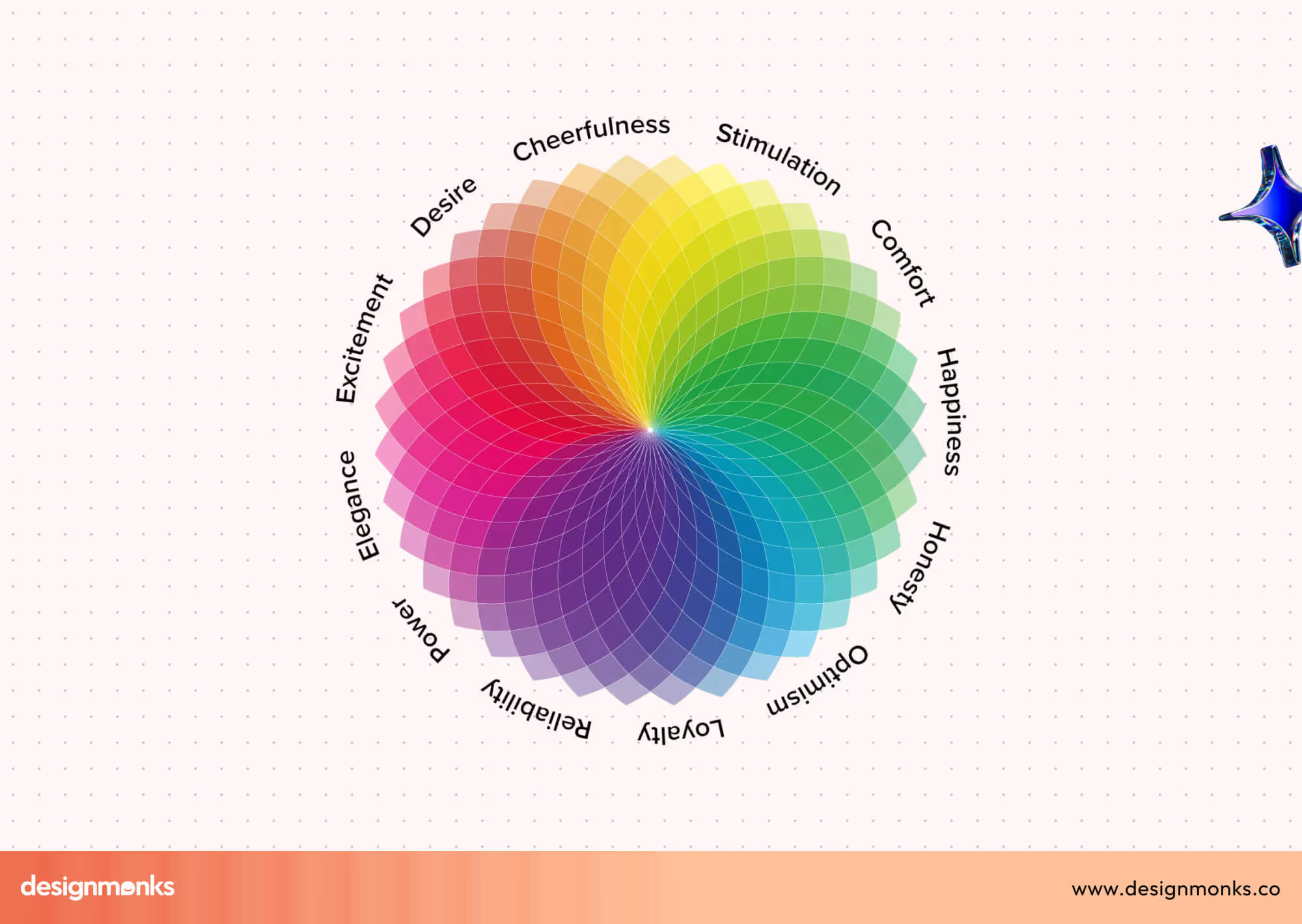
Let’s learn about the psychology behind different colors:
Red: Energy, Urgency, & Close Attention
Red creates instant visibility because the brain processes it as a signal. In UX, it works best for warnings, alerts, and high-impact CTAs that require quick decisions. It’s emotional, bold, and impossible to ignore.
Best used for:
- Strong CTAs when urgency is required
- Error states or warning messages
- Attention-grabbing promotional badges
Orange: Playful, Creative, & Motivating
Orange feels friendly and active. It’s less aggressive than red but still eye-catching, making it ideal for onboarding steps, hints, or features that encourage exploration. It adds energy without overwhelming users.
Best used for:
- Highlights in casual or fun products
- Feature discovery or micro-interactions
- Encouraging user engagement in light-hearted contexts
Yellow: Optimistic, Bright, & Attention-Focused
Yellow signals positivity and clarity. It naturally draws the eye, making it useful for subtle highlights or informative prompts. Overuse can cause strain, so designers apply it carefully.
Best used for:
- Highlighting helpful tips or guidance
- Creating warmth in empty states
- Drawing attention without heavy urgency
Green: Safety, Balance, & Reassurance
Green is deeply associated with growth and stability. It’s widely used for success states, positive confirmations, and financial dashboards because it communicates safety and “all good” feedback instantly.
Best used for:
- Success messages and verification states
- Financial or health-related dashboards
- Calming, nature-inspired product experiences
Blue: Trust, Calm, & Professionalism
Blue is one of the most reliable colors in UX. It conveys security and ease, making it a common choice for fintech, SaaS, and productivity apps. It reduces tension and supports long user sessions.
Best used for:
- Main UI backgrounds in professional apps
- Actions requiring reassurance or trust
- Interfaces aiming for clarity and low cognitive load
Purple: Creativity, Wisdom, & Depth
Purple feels imaginative and premium. It works well in products that want to stand out or feel unique, especially in education, wellness, or creative tools.
Best used for:
- Branding for premium or artistic products
- Features highlighting creativity or insight
- Differentiating accents in modern UI palettes
Black: Elegance, Clarity, & Authority
Black offers visual strength and contrast. It makes interfaces feel confident and structured, often used in luxury products or minimalistic designs. When balanced well, it enhances focus.

Best used for:
- High-end or minimalist product themes
- Strong visual hierarchy
- Emphasising clarity with white or bright accents
White: Simplicity, space, and ease
White brings breathability into UI layouts. It improves readability, reduces friction, and helps users process information comfortably. It’s essential for clean, modern interfaces.
Best used for:
- Layouts needing clarity and space
- Neutral backgrounds for long reading time
- Making colors and elements feel balanced
How Color Theory Shapes User Experience
Color theory is more than a design concept; it’s a practical decision-making tool in UX. The way hue, saturation, and brightness work together determines how users interpret information, notice key actions, and feel while interacting with a product.
When these three elements are balanced well, interfaces become clearer, more accessible, and visually consistent.
On the contrary, when they’re misused, even a beautiful layout can feel confusing or hard to navigate. Understanding these basics helps designers create digital experiences that feel intentional, intuitive, and trustworthy.
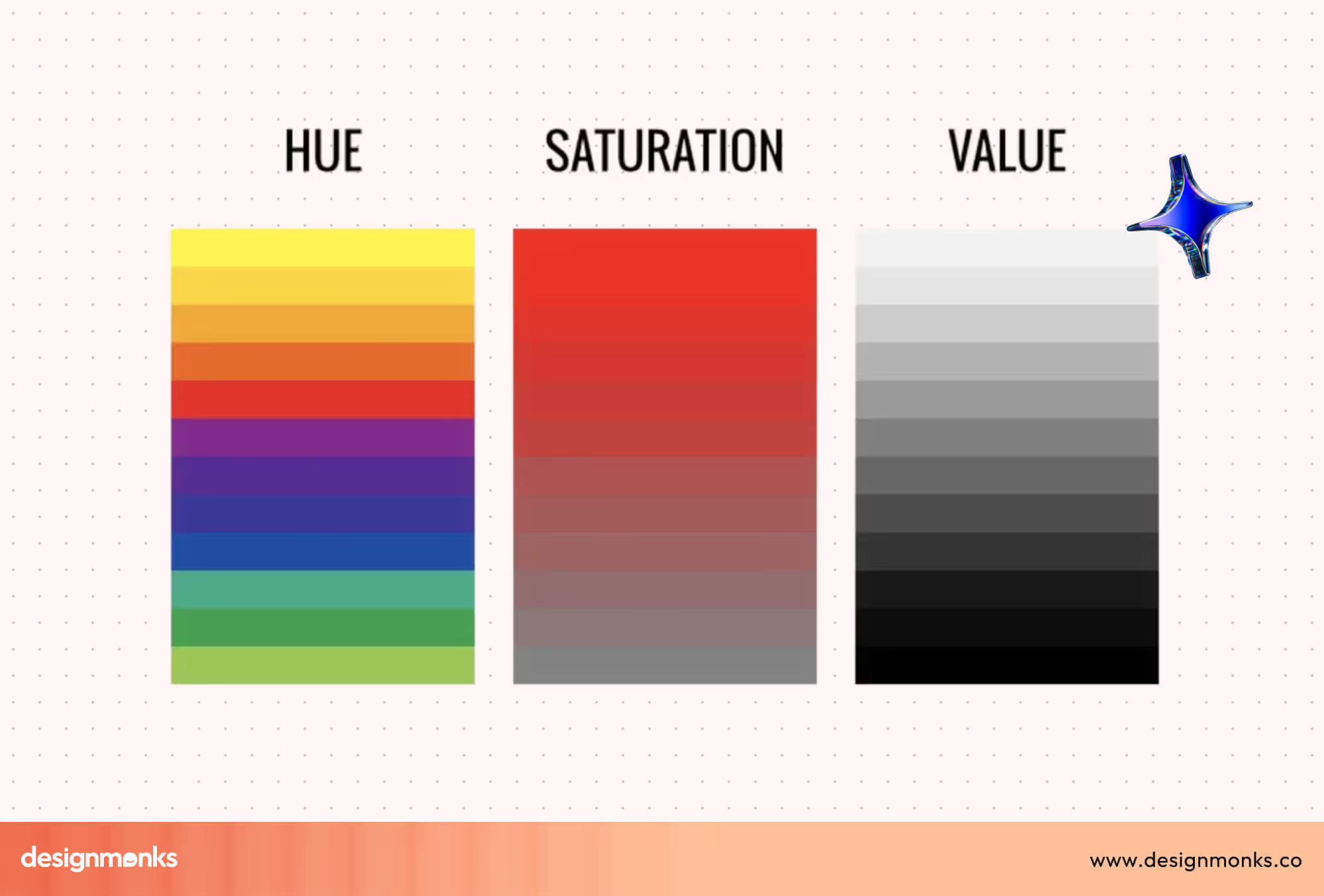
Hue
Hue represents the actual color itself, red, blue, green, yellow, and everything in between. In UX, choosing the right hue sets the emotional tone and supports the product’s purpose.
Calming apps often lean toward cool hues like blue or green, while energetic or promotional experiences use warmer hues like red or orange.
Designers use hue relationships (analogous, complementary, triadic) to maintain harmony across the interface. Hue influences emotional impact, element contrast, and how users mentally categorise visual information.
Saturation
Saturation describes how intense or muted a color appears. Highly saturated colors look bold and vibrant, making them ideal for key actions or high-priority elements.
Low-saturation colors feel soft and subdued, perfect for backgrounds or secondary components that shouldn’t compete for attention. Saturation helps create a visual hierarchy by controlling what stands out and what stays subtle without overwhelming the user.
Brightness / Value
Brightness (or value) controls how light or dark a Color is. It strongly affects legibility, contrast, and accessibility. Light Colors help create open, minimal layouts, while darker values add depth and highlight structure.
Proper brightness contrast ensures that text, icons, and interactive components remain easy to see for all users, including those with visual impairments. Brightness directly impacts readability, accessibility, and how comfortably users can scan an interface for important information.
How to Apply Color Psychology in UX Design
Color psychology becomes truly valuable when it moves from theory into real design decisions. In UX design, applying color thoughtfully helps align user emotions, brand intent, and usability goals into a clear, functional experience.
Step 1: Define Brand Personality & User Intent
Before choosing any color, understand what your product stands for and how users should feel while using it. A finance app may need to feel secure and reliable, while a fitness app might aim for energy and motivation.
User intent matters just as much. Are users here to explore, decide quickly, or complete tasks calmly? Color choices should support both emotional tone and functional goals, not personal preference.
Step 2: Choose a Primary Brand Color
The primary color becomes the visual foundation of your interface. It reflects your brand identity and appears most frequently across screens. This color sets the mood and anchors user recognition.
Designers usually apply it to headers, key UI elements, and brand touchpoints. A strong primary color feels consistent, accessible, and emotionally aligned with what the product promises.
Step 3: Select Secondary & Accent Colors
Secondary colors support the primary ones by adding balance and structure. They help separate sections, define UI states, and improve hierarchy. Accent Colors, on the other hand, are used sparingly to draw attention to important actions like buttons, alerts, or highlights.
Too many accent colors can confuse users, so restraint is essential. Each color should have a clear purpose.
Step 4: Consider Cultural Differences
Color meanings are not universal. While white may signal simplicity in some regions, it can represent mourning in others. Red might feel energetic in one culture and aggressive in another.
UX designers must research their target audience’s cultural background to avoid misunderstandings. This is especially important for global products, where color misuse can break trust or reduce engagement.
Step 5: Test, Validate & Iterate
No color decision should be final without testing. User feedback, A/B testing, and accessibility checks reveal whether your color choices improve clarity or create friction.
Testing helps identify contrast issues, emotional mismatches, or missed attention cues. Iteration ensures your color system evolves with user behaviour and product growth.
60-30-10 Rule in UX Design
The 60-30-10 rule is a practical color distribution guideline that helps designers create a clear visual hierarchy and reduce cognitive load. It works because the human brain processes structured visual patterns faster to make interfaces easier to scan, understand, and navigate.
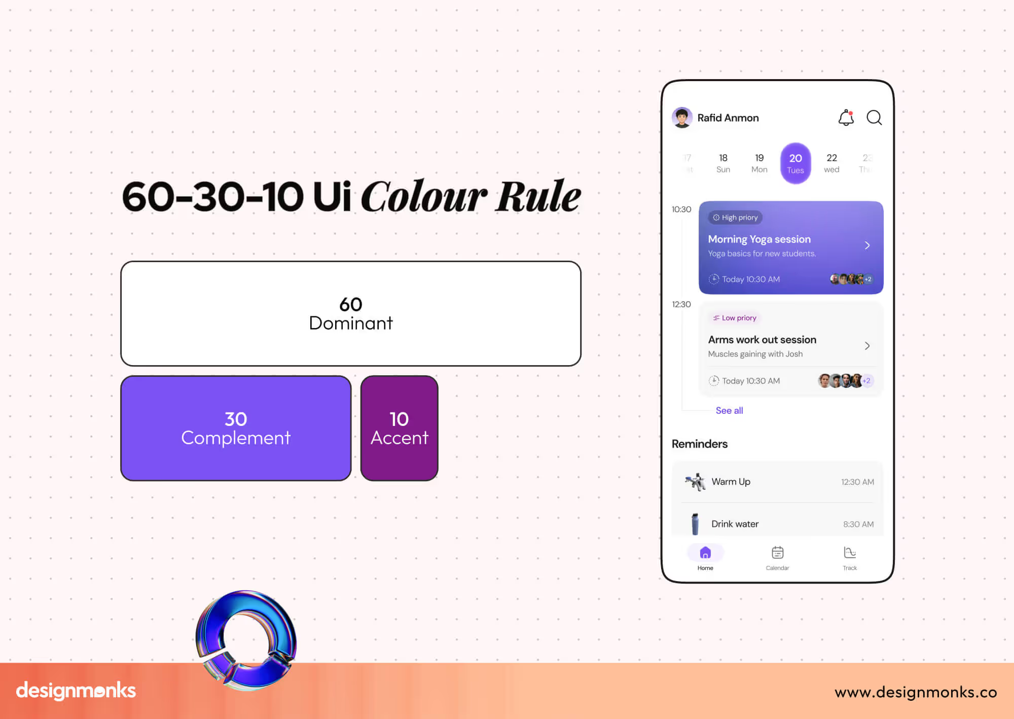
In this rule, 60% is your dominant color, 30% supports it as a secondary color, and 10% acts as an accent. This balance prevents visual clutter and ensures no single color overwhelms the user experience.
Why the 60-30-10 Rule Works in UX Design?
Cognitively, users rely on contrast and repetition to scan interfaces quickly. When Colors follow predictable proportions, the brain doesn’t need to work harder to interpret layout importance. This improves focus, reduces confusion, and strengthens usability, especially for first-time users.
It also supports accessibility by maintaining consistent contrast and spacing across screens.
However, this 60-30-10 rule is just a guide of an ideal UX color ratio. It doesn’t mean this rule will work for every single project. You can customize your suitable number based on your project needs.
60-30-10 Rule in Landing Page Hero Section
On a landing page hero:
- 60% is usually a neutral background color (white, light grey, soft gradient).
- 30% supports content sections, text blocks, or imagery overlays.
- 10% highlights the primary CTA button or key message.
This approach ensures the call-to-action stands out without feeling aggressive.
60-30-10 Rule in Dashboard UI Design
In dashboards:
- 60% is applied to the main canvas and background areas.
- 30% differentiates cards, tables, or side navigation.
- 10% highlights alerts, status indicators, or key metrics.
This approach improves data scannability and prevents visual fatigue during long usage sessions.
60-30-10 Rule in Mobile App Screen
For mobile interfaces:
- 60% keeps the screen calm using light or neutral colors.
- 30% structure, content sections, and navigation.
- 10% draws attention to action buttons, icons, or notifications.
On smaller screens, this balance becomes even more critical for clarity and usability.
Color Consistency & UI Pattern Recognition in UX Design
Color consistency helps users understand an interface without thinking. When colors behave predictably, users recognise interaction cues faster and feel confident navigating the product.
Inconsistent color usage breaks the visual rhythm. Consistent color patterns strengthen visual hierarchy, reduce confusion, and improve the results of overall usability testing.
How Color Consistency Supports UX
When users see the same colors used repeatedly for the same actions, their brain forms patterns. This pattern recognition speeds up interaction and lowers cognitive load.
Consistent colors help with:
- Clear interaction cues (what is clickable, active, or disabled).
- Strong visual hierarchy across screens.
- Faster pattern recognition in complex interfaces.
- Better behavioural predictability during repeated use.
Users don’t need instructions; they learn by experience.
Impact on Navigation & User Behaviour
Color consistency teaches users what to expect next. Over time, users act based on memory rather than exploration.
This strategy leads to:
- Fewer hesitation moments.
- Faster task completion.
- Higher user confidence.
- Reduced error rates.
Especially in dashboards and SaaS products, predictable color behaviour is critical.
Brand Consistency vs. Functional Consistency
Brand consistency focuses on recognition. It ensures your product looks familiar across marketing pages, apps, and platforms.
Functional consistency focuses on usability. It ensures that colors signal the same actions everywhere.
Key difference:
- Brand colors build identity.
- Functional colors guide behaviour.
A strong UX system balances both, but never sacrifices clarity for branding.
Best Practices for Using Color in UX
Effective color usage improves clarity, accessibility, and decision-making in digital products. These best practices help designers create predictable, inclusive, and user-friendly interfaces without overwhelming users or weakening usability.
Design for Accessibility and Readability
Accessibility-driven color choices ensure that text, icons, and interactive UI elements remain visible for all users. Proper contrast reduces eye strain and helps users consume content comfortably across devices and environments.
Readable Color combinations for logos and other designs also support users with visual impairments or temporary limitations. When accessibility is prioritised, interfaces feel clearer, more professional, and easier to trust during extended usage.
Always Check Contrast Ratios
Contrast directly affects how easily users can read and interact with content. Ignoring contrast rules can make even well-designed interfaces unusable for many people.
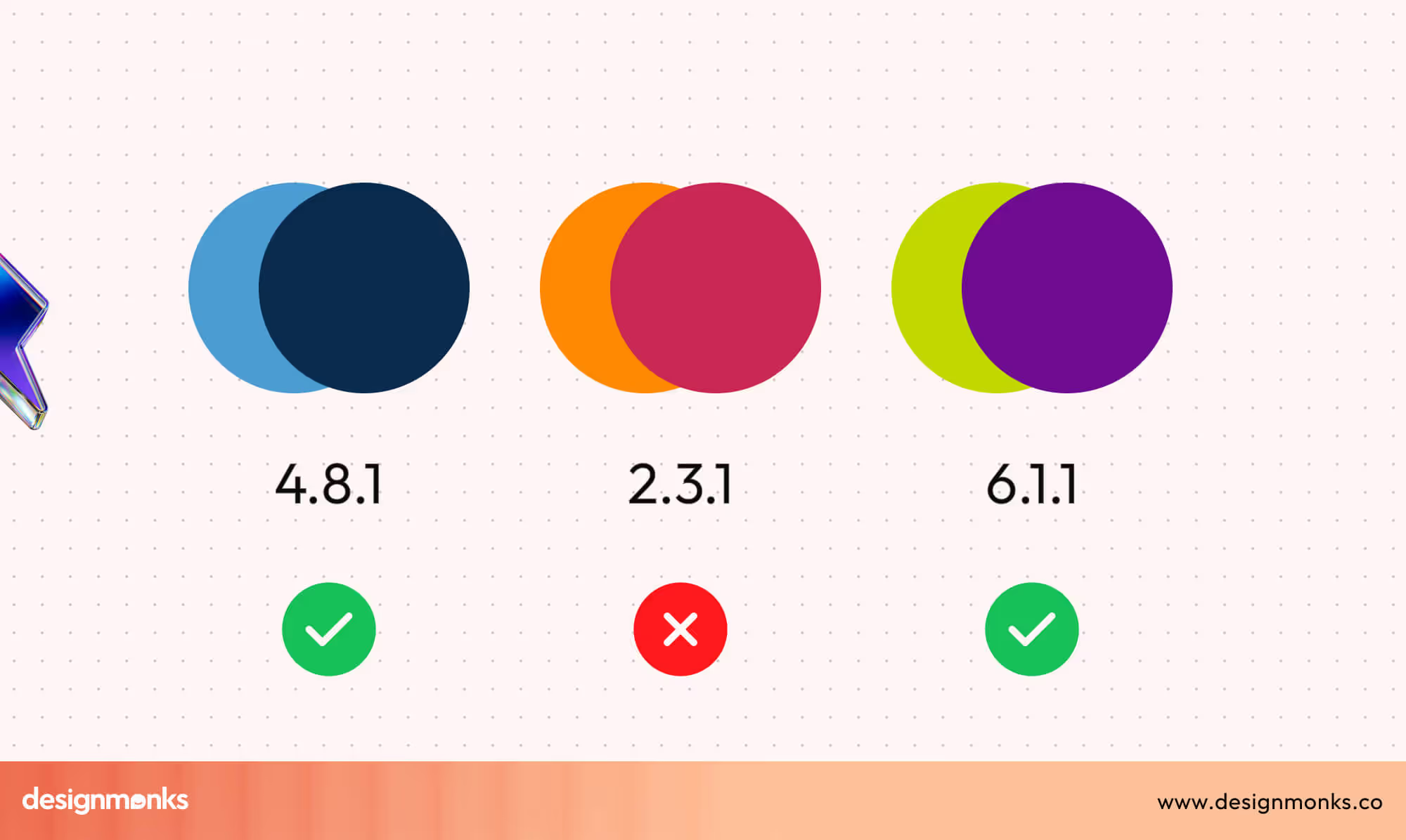
Consistent contrast checking prevents accessibility issues early and avoids costly redesigns later in the process. Here’s how you can ensure WCAG-compliant readability:
- Test text and background contrast using WCAG contrast ratio tools.
- Maintain sufficient contrast for buttons, links, and icons.
- Avoid light text on light backgrounds and dark on dark.
- Recheck contrast after adding overlays or gradients.
Don’t Rely on Color Alone for Meaning
Color communicates fast, but it should never work alone. Users who cannot distinguish certain colors may miss critical information if color is the only signal. Supporting color with text, icons, or shapes ensures messages are understood clearly and reduces the risk of errors during key interactions.
Use Semantic Colors Consistently
Semantic colors assign fixed meanings to specific colors across the interface. This consistency helps users recognise patterns and understand system feedback instantly. When semantic colors remain predictable, users act confidently without stopping to interpret visual signals.
These are how you can maintain a consistent UI:
- Use green consistently for success and confirmations.
- Reserve red strictly for errors and destructive actions.
- Apply yellow for warning or caution states.
- Keep semantic Color usage identical across all screens.
Limit the Color Palette Intentionally
Too many colors increase cognitive load and distract users from important actions. A restrained palette improves focus and strengthens visual hierarchy. Limiting colors also makes interfaces easier to scale and maintain, especially as products grow in features and complexity.
Design Colors for Context and Usage Duration
Color choices should consider where, how, and how long users interact with the product. Bright or intense colors may look attractive but cause fatigue over time.
Context-aware color systems support long sessions, reduce visual stress, and adapt better to different environments and lighting conditions.
Examples of Effective Color Use in Popular Apps
Successful apps use color strategically to guide emotion, attention, and behaviour. These real-world examples show how intentional color choices support usability, reinforce brand identity, and create strong, memorable user experiences.
Calm: Blue for Relaxation and Trust
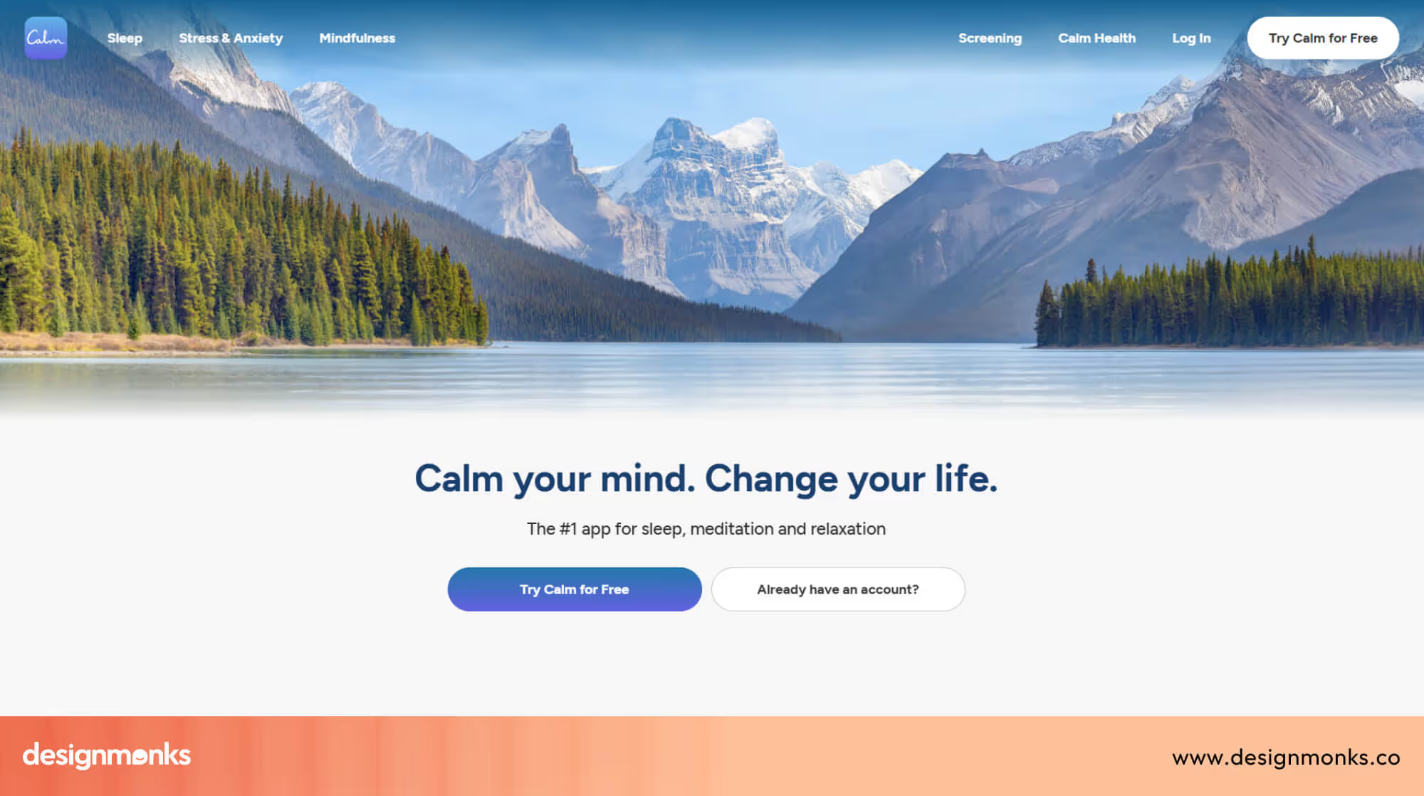
Calm uses soft blue tones to immediately reduce mental tension. The Color supports the app’s purpose by creating a peaceful atmosphere that encourages slower breathing and focused attention.
Blue also improves long-session comfort. Users can spend extended time reading or listening without visual fatigue, reinforcing trust and emotional safety.
YouTube: Red for Attention and Action
YouTube’s red is bold and impossible to ignore. It draws attention to key actions like recording, subscribing, and notifications, encouraging fast engagement.
Red also supports urgency and energy. This aligns with YouTube’s dynamic, content-driven environment where users are encouraged to click, watch, and interact quickly.
Duolingo: Green for Progress and Motivation
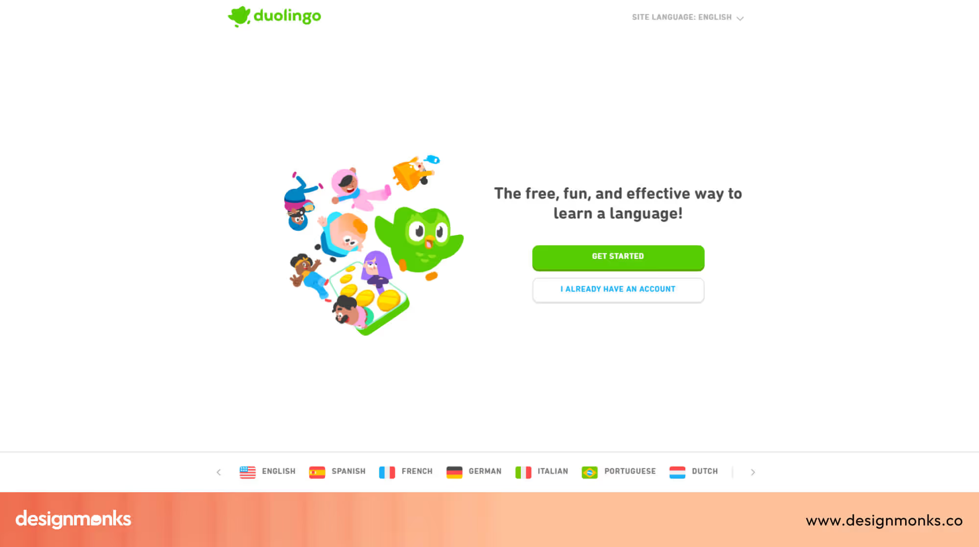
Duolingo’s green creates a friendly and encouraging learning environment. It signals growth, success, and positive reinforcement, which is critical for habit-based learning.
Green is used consistently for progress indicators and success states. This builds motivation and reduces anxiety during learning sessions.
Netflix: Black and Red for Focus and Impact

Netflix combines black backgrounds with red accents to create a strong contrast and visual focus. Black keeps attention on content, while red highlights key actions.
This color pairing feels cinematic and immersive. It reduces distractions and supports binge-watching behaviour by keeping the interface bold yet minimal.
End Note
Color is not decoration, it’s communication. Every shade you choose influences how users feel, where they look, and what actions they take. When color supports clarity, accessibility, and emotional intent, it quietly improves usability and trust across the entire experience.
By applying color psychology with structure and consistency, designers can guide behavior without friction. Treat color as a UX tool, not a visual afterthought, and your interfaces will feel more intuitive, predictable, and effective for real users.

.avif)
.avif)
.avif)
.avif)


.avif)
.avif)
.avif)
.avif)


.avif)
