.svg)



Key Takeaways
- Look and feel design combines visual style with user experience.
- Color, typography, layout, imagery, and motion shape product personality.
- A clear design process helps create consistent and usable interfaces.
- Design systems keep look and feel consistent as products grow.
- Strong look and feel should support brand, users, usability, and accessibility.
Why do some digital products instantly feel right while others make you want to leave? The answer often lies in the Look and Feel Design of the product. It brings together the visual and interactive choices that shape how users see, understand, and experience a digital product.
But it goes beyond colors and fonts. The spacing between elements, icon styles, screen transitions, button states, images, and even tiny interaction details can influence how the entire product feels. When these elements work together, they create an experience that feels natural, consistent, and intentional.
So, what actually goes into creating that experience? Let’s explore the essential elements of look and feel design, walk through the design process, and uncover practical tips for getting it right.
What Is Look and Feel Design?
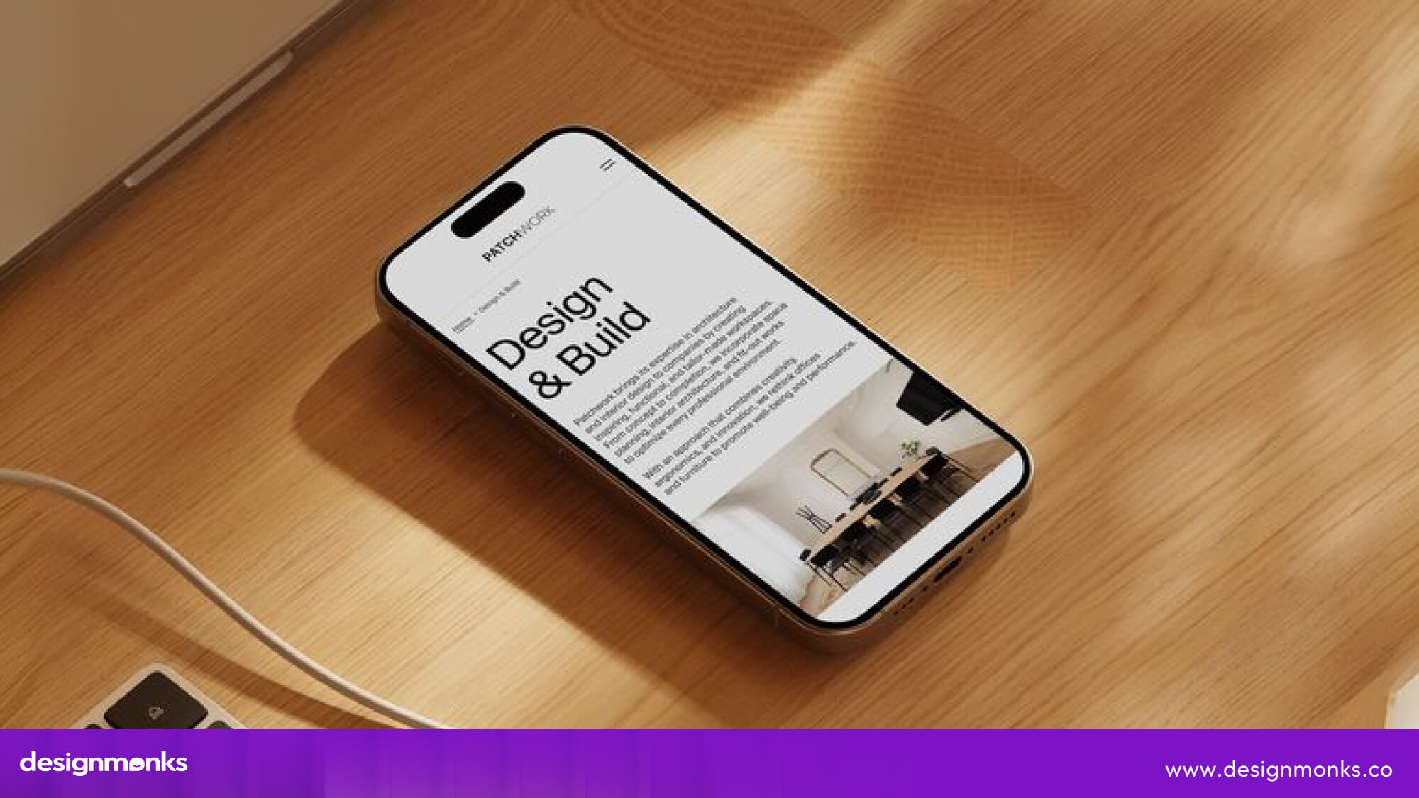
Look and feel design defines how a digital product looks, behaves, and feels when users interact with it. It combines visual design and user experience to create a consistent impression.
Simply put, the “look” is what users see, while the “feel” is how the product feels to use.
What Does “Look” Mean in Design?
The “look” covers the visible elements that shape a product’s visual style, including:
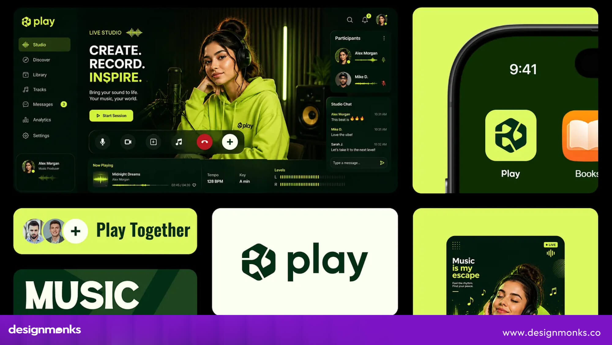
- Colors: Set the tone and reinforce brand identity.
- Typography: Affects readability, hierarchy, and personality.
- Layout: Organizes content and guides attention.
- Imagery: Includes photos, illustrations, and graphics.
- Icons and shapes: Add character and help users understand actions.
- Visual hierarchy: Shows users what to notice first.
Together, these elements create the product’s visual language and interface appearance.
What Does “Feel” Mean in Design?
The “feel” describes the user experience of interacting with the product. It includes usability, interactions, motion, feedback, and emotional response.
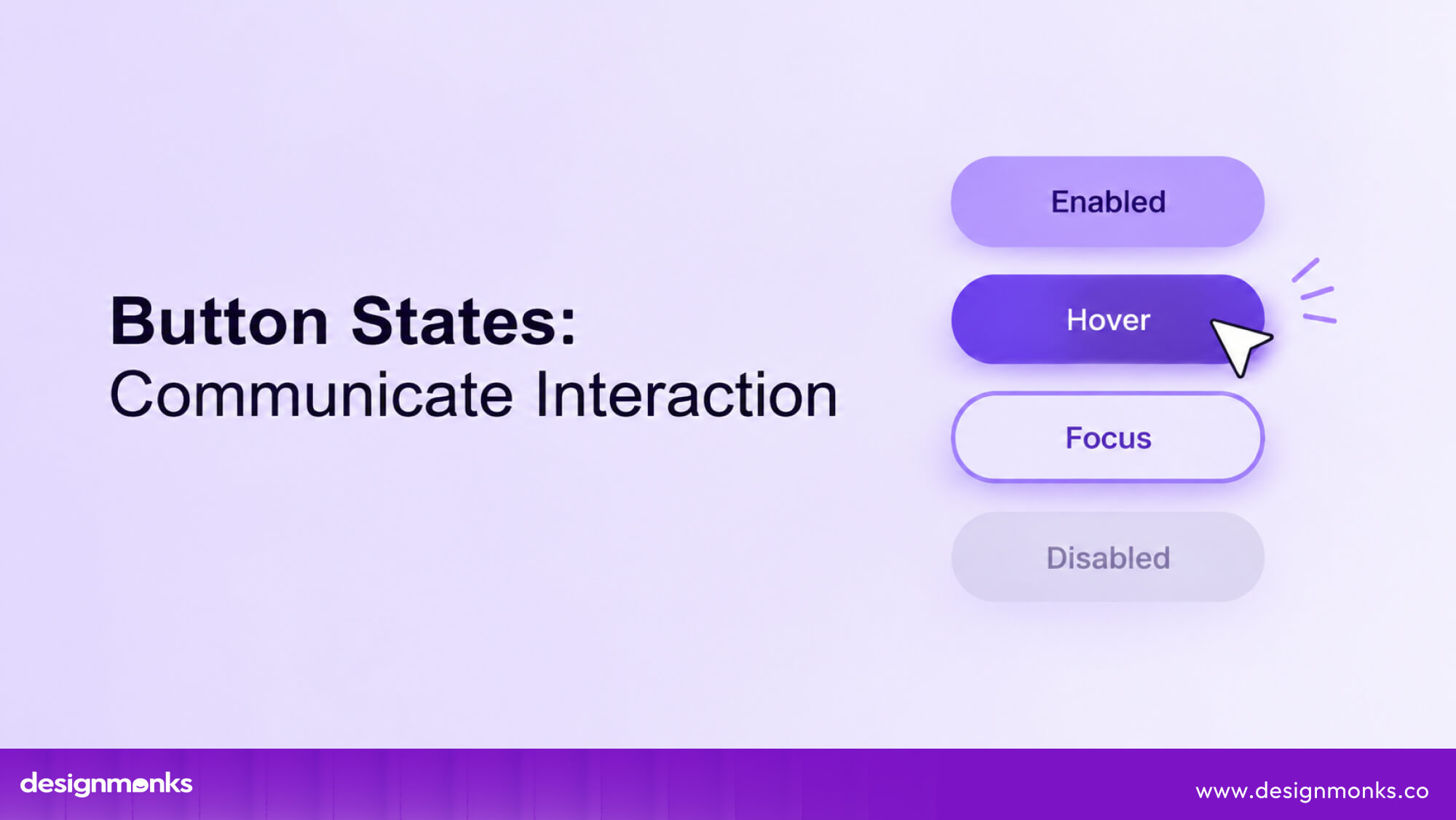
Microinteractions, button states, transitions, and clear feedback can make an interface feel smooth and intuitive. “Feel” is not just about adding animations. It comes from the overall experience and how easily users can complete tasks.
Look and Feel vs UI/UX Design
Look and feel design brings several parts of product design into one clear direction. UI design defines the interface users interact with, while visual design shapes its color, typography, imagery, and layout.
UX design focuses on making the experience useful and easy to navigate, while interaction design determines how the interface responds to user actions. The key difference is that look and feel design connects these decisions into one consistent experience. It makes sure a product’s visual style supports how it works.
So the interface doesn’t just look good but also feels natural, clear, and purposeful to use.
Why Does Look and Feel Matter in Design?
Look and feel matters because it shapes how people perceive and experience a product.
A recognizable visual style helps users connect with a brand, a polished interface can influence perceived quality and trust, and clear design choices can make a product easier to understand and use.
These benefits are closely connected, but each plays a different role in creating a stronger product experience:
Builds Brand Recognition
A consistent look gives users visual cues they can quickly connect with a brand. Repeating colors, typography, imagery, shapes, and other elements across touchpoints creates familiarity.
So users do not have to rely on the brand name or logo alone to recognize it. Over time, these patterns become part of the brand’s visual identity. Apple, for example, uses minimalist layouts, typography, product imagery, and restrained visual styling across its ecosystem.
This consistent style creates a look that users can recognize almost instantly.
Improves User Perception and Trust
People often judge a product before they fully interact with it. A well-organized interface can signal that the product is thoughtfully built, while inconsistent or poorly structured design can create doubt.
Clear layouts, consistent components, readable content, and polished details help establish perceived quality and credibility. Airbnb, for example, uses consistent UI patterns, strong imagery, and clear information to make browsing and booking feel organized and dependable.
Supports Usability
Visual design can guide users toward the information and actions they need. Typography establishes content hierarchy, spacing separates related and unrelated information, contrast makes important elements easier to notice, and consistent components help users predict what will happen next.
Google applies these principles across its products. This makes familiar actions easier to find and understand. Accessible contrast and readable text further ensure that these visual cues work for more users.
What Are the Key Elements of Look and Feel Design?
Look and feel design is not created by one visual choice. It comes from how different elements work together to shape a product’s visual style, personality, and user experience.
Color, typography, layout, imagery, components, and motion all contribute to this experience. Each one of these elements shapes a different part of how users see and interact with the product:
Color Palette
Color is often one of the first things users notice. It can set the mood, strengthen the brand, and guide attention. Primary colors represent the brand, while secondary and neutral colors support the interface.
Semantic colors show states such as success or error, while accent colors highlight important actions.
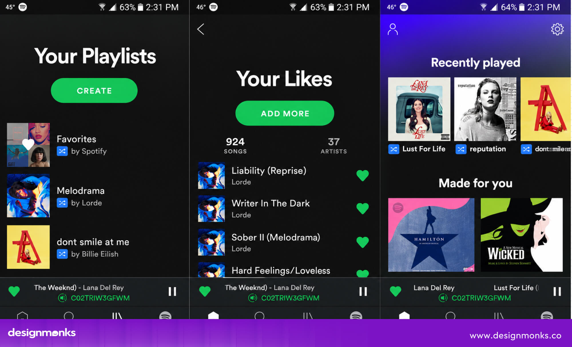
For example, Spotify uses black with bright green accents. The green helps users notice important actions and active states. Good color contrast is also important because it makes text easier for everyone to read.
Typography and Type Hierarchy
Typography builds on the visual style by shaping how content looks, feels, and is read. The font style, size, weight, and line height all influence the product’s personality and readability.
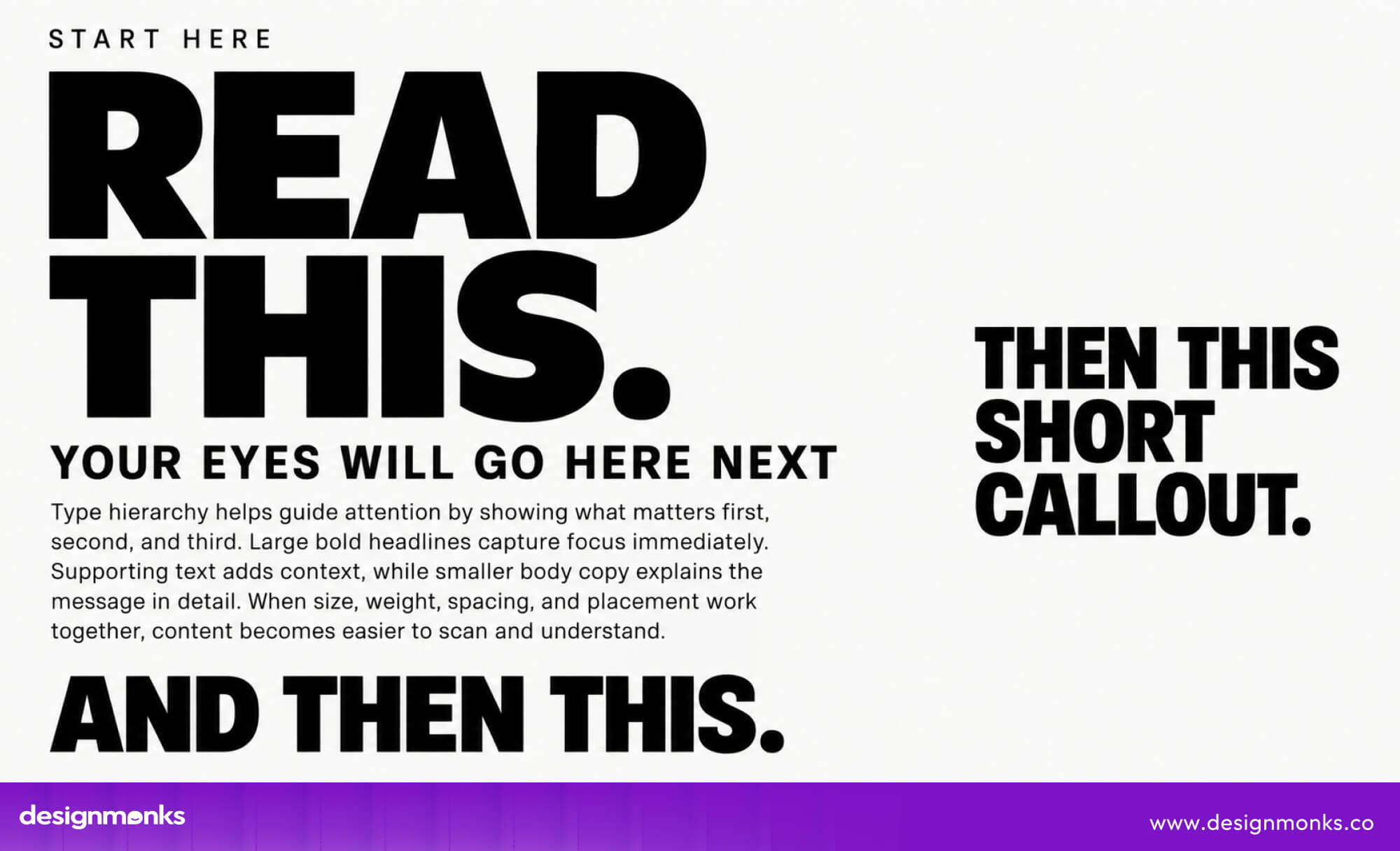
Rounded fonts can feel friendly, while clean, simple fonts can feel modern and professional. Bold or larger text can make important information stand out, while smaller text and more spacing can create a cleaner, calmer look.
Type hierarchy also helps users scan content by showing what to read first, second, and third.
Apple’s website, for example, uses large, bold headlines to make its products the main focus, followed by smaller text for supporting information. This simple hierarchy keeps the page easy to scan while supporting Apple’s clean and minimal visual style.
Layout, Grid, and Spacing
The way content is arranged also changes how a product feels. Grids, alignment, and spacing create structure and control how much information users see at once. Tight spacing can make an interface feel busy and efficient, while generous whitespace can make it feel calm and premium.
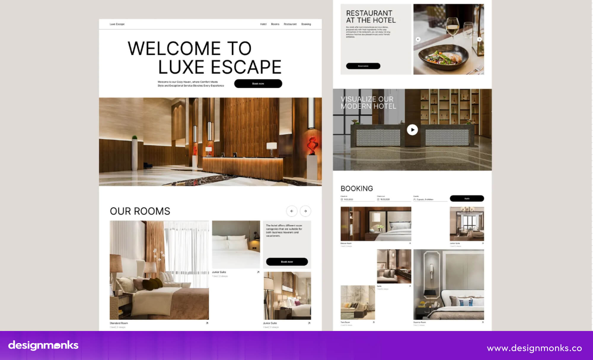
For example, an airline booking site may pack more information into each screen for users, while a luxury hotel site may use more whitespace and larger images to create a relaxed experience.
Iconography and Illustration
Icons and illustrations add personality while helping users understand information quickly. Their shape, stroke weight, size, and level of detail should work well together to create a consistent visual language.
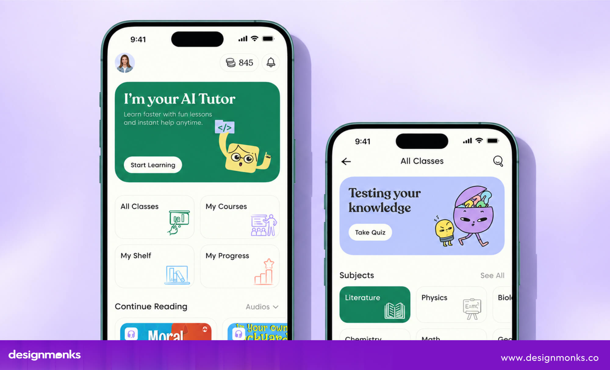
For example, a productivity app might use simple, rounded icons and soft illustrations to create a friendly and approachable feel. If one screen suddenly uses sharp, detailed icons, the product can start to feel inconsistent.
Imagery and Photography
Images play an important role in shaping a product’s visual identity and emotional feel. Photography style, lighting, cropping, composition, and image treatment should match the brand and work well with the rest of the interface.
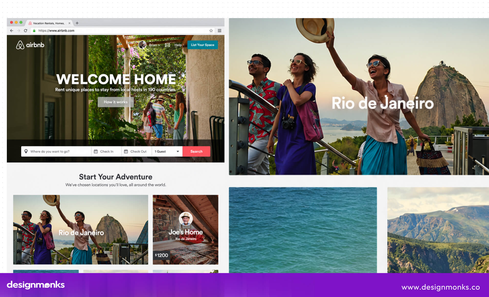
Airbnb, for example, uses bright, natural-looking photos that show real spaces and experiences. This gives its platform a warm and welcoming feel that fits its brand.
Components, Shapes, Borders, and Effects
UI components such as buttons, cards, and input fields are a big part of how an interface looks and feels because users interact with them throughout the product.
Rounded corners can make elements feel softer and friendlier, while sharp corners can create a more structured look. Shadows and elevation make cards and buttons appear raised, while simple borders and flat surfaces can create a cleaner feel.
These choices work together to give the interface a recognizable visual style.
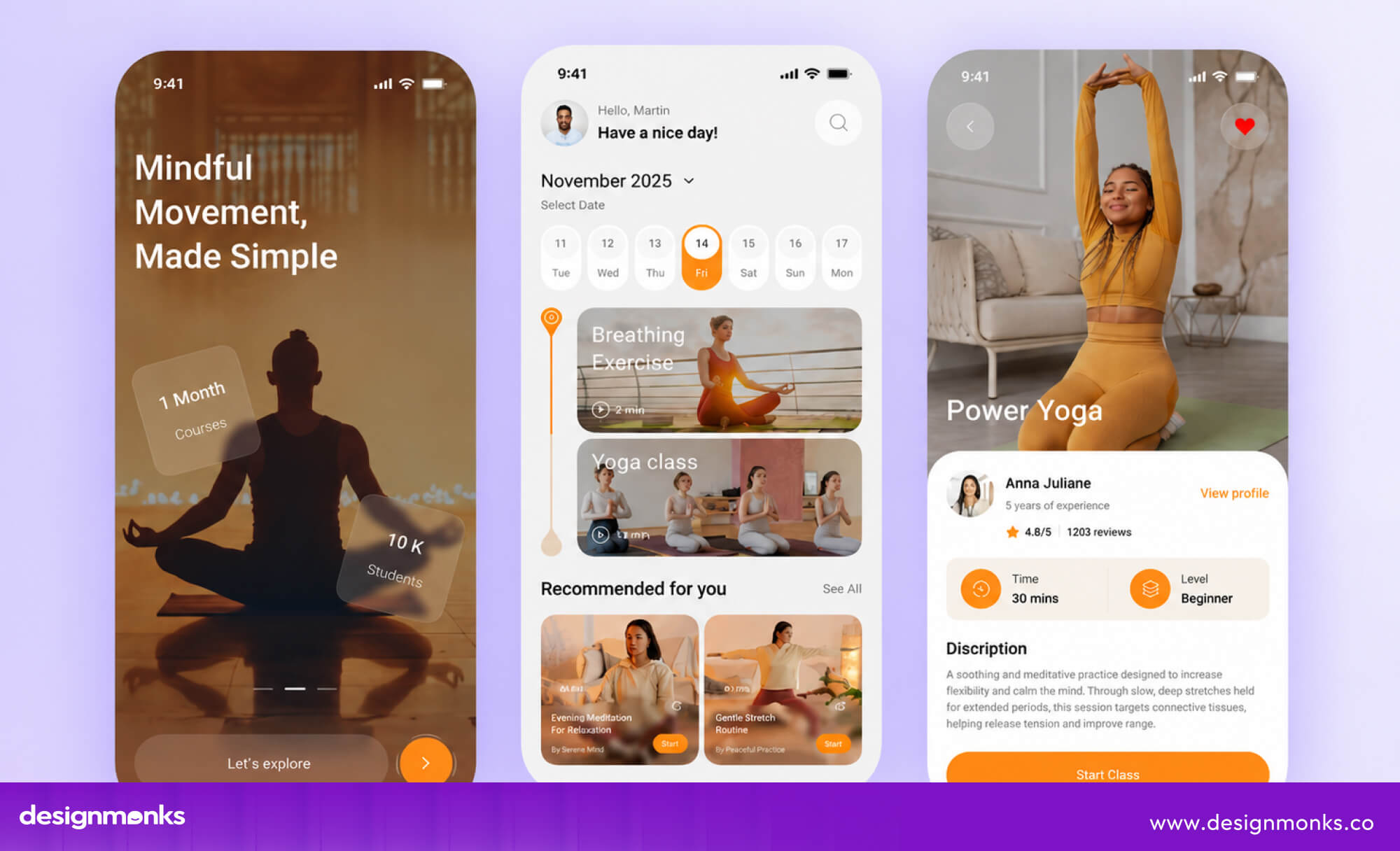
A meditation app might use rounded buttons and soft shadows to create a calm feel, while a finance dashboard may use sharper corners and minimal shadows for a more precise look. A design system can help keep these choices consistent across screens and make the interface easier to scale.
Motion and Micro-interactions
Motion adds another layer to the user experience by showing how the interface responds to actions. Animations, transitions, hover states, loading states, and other micro-interactions can make a product feel smooth and responsive.
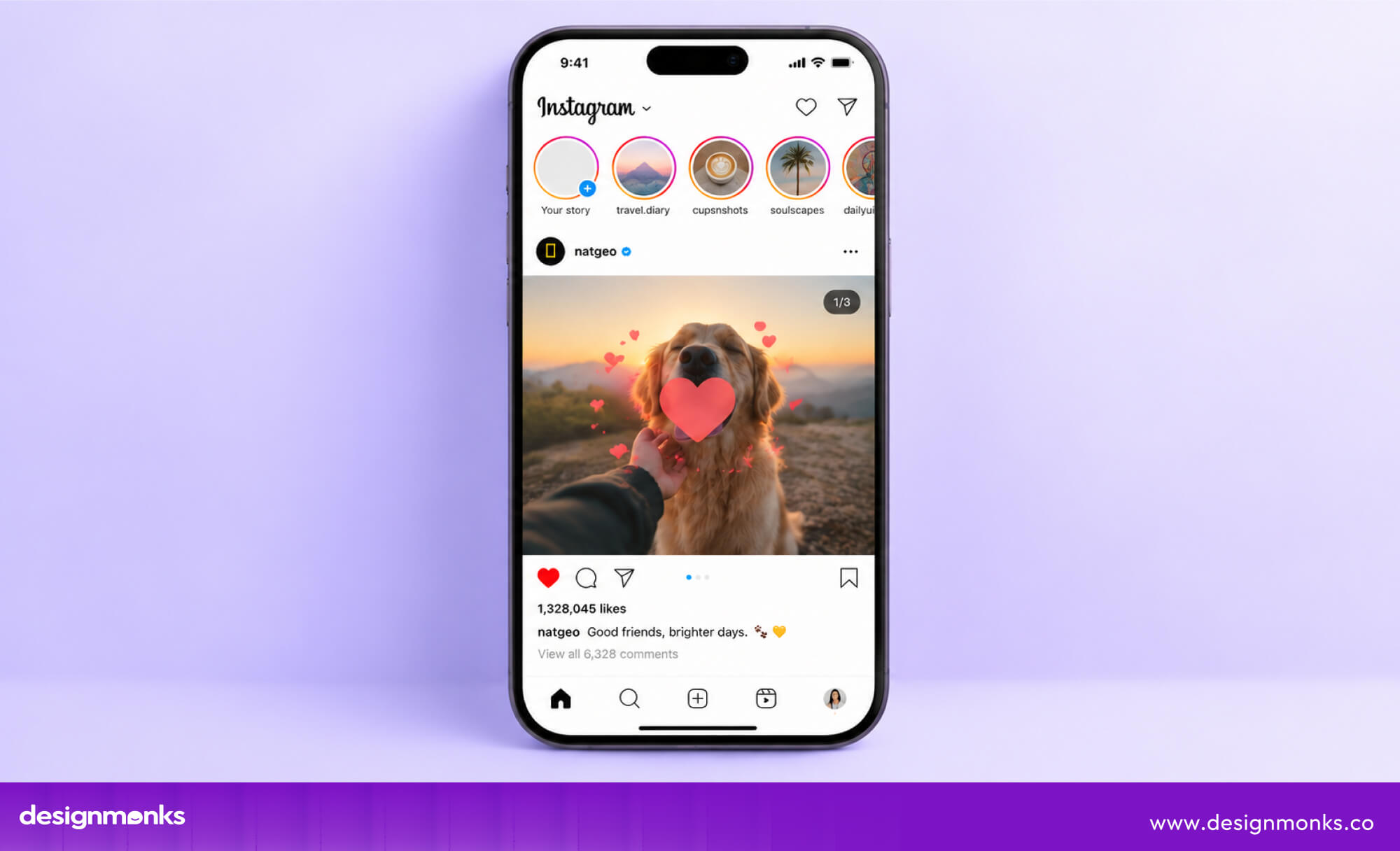
For example, when you like a post on Instagram, the heart briefly pops and changes color. This small response confirms that the action worked and makes the interaction feel more engaging.
The goal is not to add motion everywhere, but to use it in ways that support the product’s personality and make interactions clearer.
How to Create a Look and Feel for a Website or App
Creating a look and feel is a step-by-step process. You first understand the brand and audience, then explore visual directions, test them in the interface, and refine what works.
Once the direction is approved, it can be turned into a design system that keeps the final product consistent.
Define the Brand Personality and Target Audience
Start by deciding how the product should feel and who it is designed for. Think about qualities such as professional, playful, premium, minimal, bold, technical, or approachable. These choices give designers a clear starting point.
For example, Starbucks builds its brand around a warm, welcoming, and familiar coffee-shop experience.
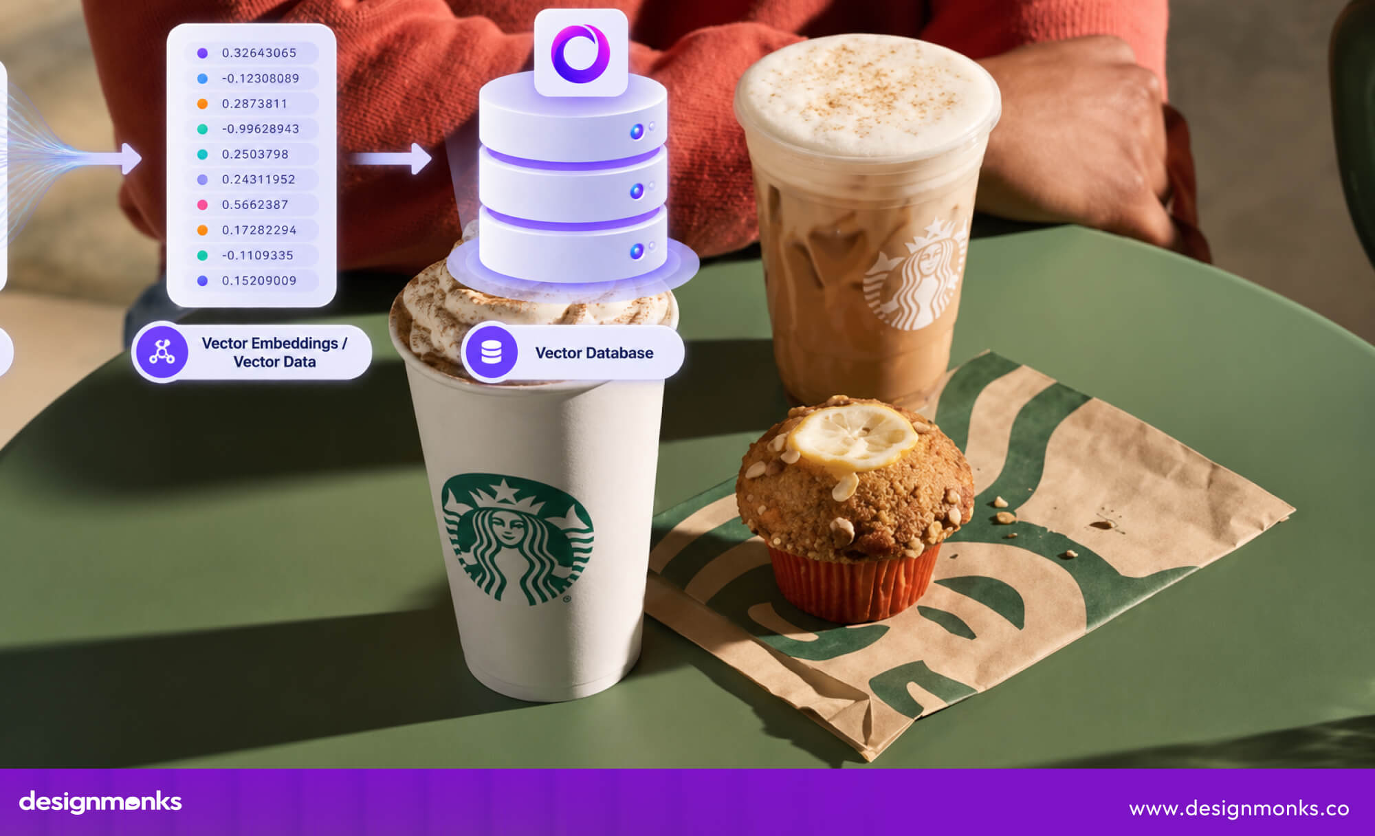
Its use of earthy green tones, simple typography, natural imagery, and familiar visual elements supports this personality. It easily appeals to people looking for a comfortable, everyday coffee experience.
Research Competitors and Visual Conventions
Look at similar products to understand what users already recognize and expect. Pay attention to their colors, typography, layouts, imagery, and interface patterns. This can reveal common design choices as well as opportunities to stand apart.
For example, if most products in a market use dark blue and formal imagery, a brand might choose a warmer color palette while still keeping familiar navigation and UI patterns. The goal is to learn from competitors, not copy them.
Create a Mood board and Visual Direction
Once you understand the brand and audience, collect references that show how the product could look and feel. A useful mood board can include colors, fonts, photography, illustrations, UI examples, shapes, textures, and other visual references.

For example, a premium travel brand might collect elegant typography, spacious layouts, muted colors, and high-quality destination photography. Together, these references create a clear visual direction instead of leaving the design open to guesswork.
Develop Look and Feel Concepts
Next, turn the visual direction into actual interface screens. Tools such as Figma can help designers explore different combinations of color, typography, layout, components, and imagery.
Rather than designing the entire product at once, start with a few important screens. A homepage, dashboard, or product page can show whether the chosen direction works in a real interface. This makes it easier to compare ideas and choose the strongest one.
Test, Review, and Refine the Direction
A look and feel may look good to the design team but still create problems for users. Review the concept with stakeholders and users to see whether it matches the brand, feels clear, and supports the intended experience.
For example, a design may use light gray text because it looks subtle and minimal. Testing may show that users struggle to read it. The team can then increase the contrast without losing the overall visual direction.
Turn the Direction Into a Design System
Once the look and feel is approved, turn the main decisions into reusable styles and components. A design system can define colors, typography, spacing, buttons, cards, icons, and other interface patterns.
This makes the look and feel easier to maintain as the product grows. Instead of designing every new screen from scratch, designers can reuse the same rules and components to create a consistent experience.
How Does Look and Feel Compare With Other Design Concepts?
Look and feel is often discussed alongside mood boards, visual concepts, and high-fidelity UI. While they are connected, each serves a different purpose in the design process. Understanding these differences helps teams know when to use each one:
Mood board vs Look and Feel Concept
A mood board is used to explore and communicate a visual direction. It brings together references such as colors, typography, photography, illustrations, layouts, and UI examples to show the kind of style the product could have.
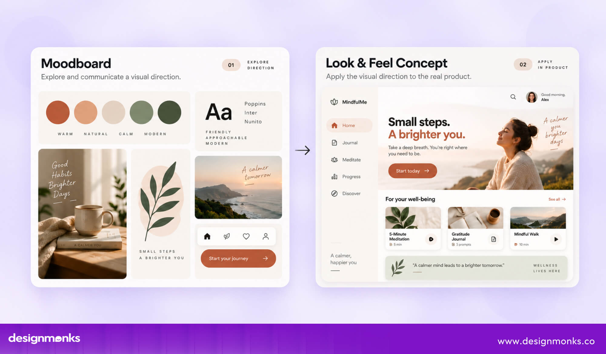
A look and feel concept takes that direction a step further by showing how those choices work in the actual product.
For example, a mood board might show warm colors, rounded type, and natural photography for a wellness app. The look and feel concept would apply those choices to a real app screen, such as its homepage or dashboard.
Simply put, a mood board shows the inspiration, while a look and feel concept shows how that inspiration could appear in the product.
Look and Feel vs High-Fidelity UI
Look and feel and high-fidelity UI are also different stages of the design process. Look and feel focuses on establishing the overall visual direction and experience, while high-fidelity UI applies that direction in detailed, production-ready screens.
For example, the look and feel stage may decide that an app should use soft colors, rounded components, spacious layouts, and subtle motion. The high-fidelity UI then applies those decisions to every screen, button, form, state, and interaction.
Look and Feel Design Process: From Concept to Final UI
Creating a strong look and feel is easier when the process is broken into clear stages. Each stage answers a different question and helps turn an initial idea into a consistent, usable interface.
Research → Moodboard → Visual Direction → Look and Feel Concept → Feedback → Design System → Final UI
- Research: Understand the brand, target audience, competitors, and product goals. This helps you decide what the product should communicate and how it should feel.
- Moodboard: Collect colors, typography, imagery, icons, layouts, and other visual references that match the desired personality. This gives the team something concrete to discuss and explore.
- Visual Direction: Turn those references into a clear design direction. Decide on the main color palette, typography style, imagery, shapes, and overall design aesthetic.
- Look and Feel Concept: Bring the direction into real interface screens using tools such as Figma. A homepage, dashboard, or key app screen can show how the different elements work together.
- Feedback: Review the concept with stakeholders and users. Check whether it fits the brand, appeals to the audience, and remains easy to use. Make changes before expanding the design.
- Design System: Turn approved choices into reusable styles, design tokens, components, and patterns. This makes it easier to keep the same look and feel across the product.
- Final UI: Apply the approved system across the complete product, including screens, states, interactions, and responsive layouts.
This process helps teams make the big visual decisions early. Instead of styling every screen separately, they first establish a clear direction and then use it consistently throughout the final UI.
Look and Feel Design Examples
Different combinations of color, typography, spacing, imagery, components, and motion can give a product a completely different personality. These real-world examples show how those choices work together:
Minimal and Clean
Apple is a strong example of a minimal look and feel. Its interfaces use plenty of whitespace, simple typography, restrained colors, clean layouts, and limited visual effects.
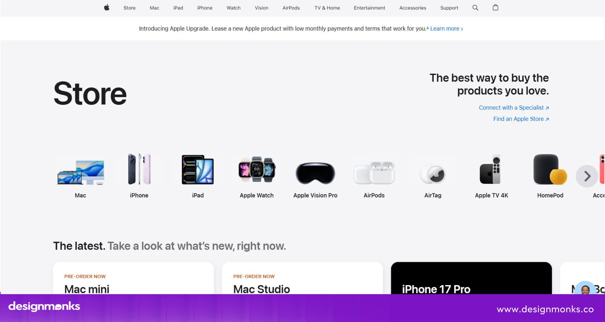
Product imagery gets most of the attention, while the rest of the interface stays quiet. This makes the experience feel focused and easy to navigate.
Bold and Expressive
Spotify uses a much more expressive visual style. Bright colors, bold typography, large album artwork, and strong contrast give its interface an energetic feel.
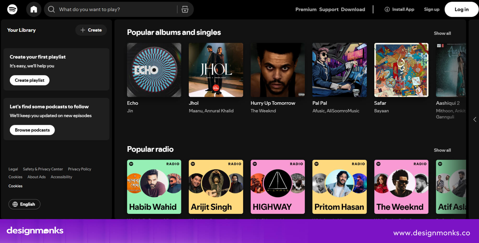
Its animations and changing visual content also make the experience feel active and engaging. These choices fit a platform built around music, discovery, and personal expression.
Professional and Enterprise
Microsoft 365 shows how a product can create a professional and structured feel through consistent components, clear hierarchy, familiar icons, and a controlled color palette.
Screens can contain a lot of information, but consistent spacing and interface patterns help keep everything organized. This works well for products where users need to complete work efficiently.
Premium
Rolex is a strong example of a premium look and feel. Its use of elegant typography, dark and neutral colors, high-quality photography, generous spacing, and carefully controlled layouts creates a refined experience.
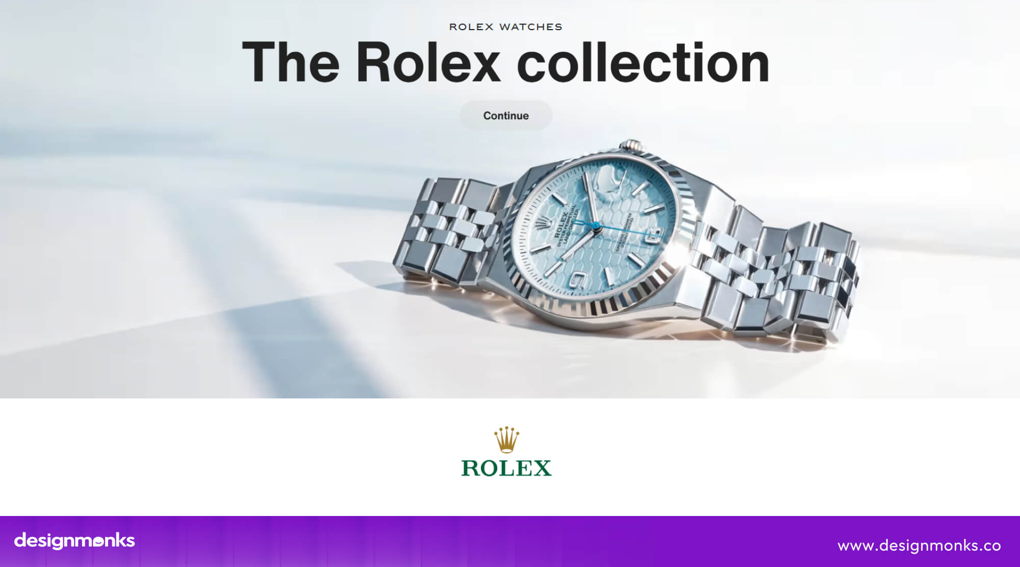
The design avoids unnecessary visual effects and lets the products and imagery take center stage. These choices reinforce Rolex’s sense of craftsmanship, exclusivity, and luxury.
Playful
Duolingo uses bright colors, rounded shapes, expressive illustrations, and animated characters to make learning feel more approachable. Its playful visuals and frequent interaction feedback give the product energy and personality.
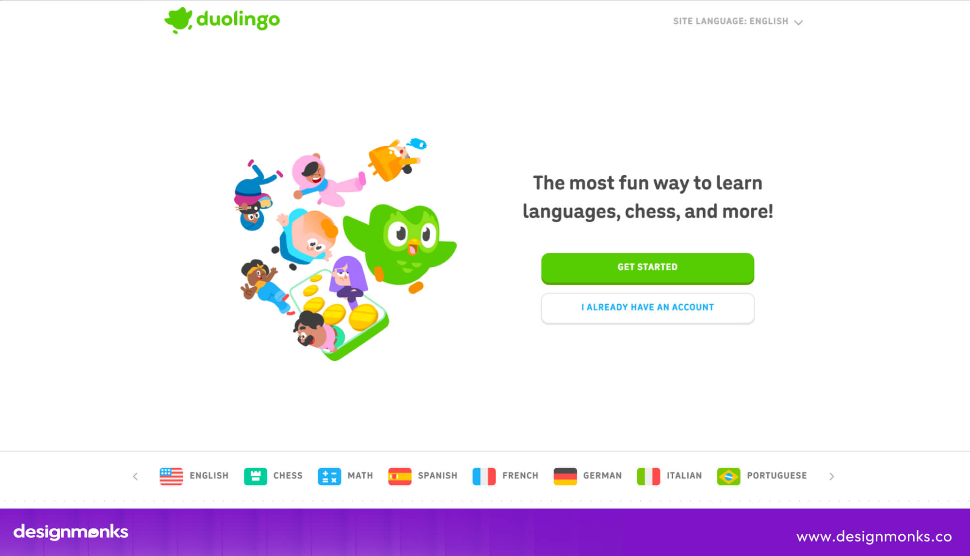
Instead of making the interface feel like a traditional classroom, the design makes learning feel more engaging.
Futuristic and Technology-Focused
Tesla’s digital interfaces use a more technology-focused style through dark themes, clean typography, strong contrast, data displays, and simplified controls.
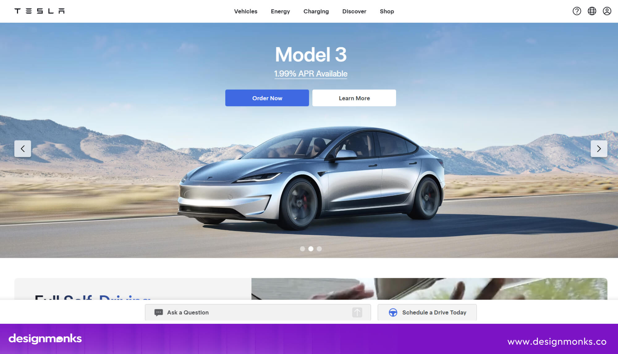
The interface keeps visual decoration limited while giving important information and controls more focus. This supports the brand’s modern, technology-driven identity.
These examples show that there is no single formula for good look-and-feel design. A minimal product may rely on whitespace and simple type, while a playful product may use bright colors and expressive illustrations.
What matters is how the different design choices work together to support the brand, audience, and product experience.
How to Maintain a Consistent Look and Feel Across Products
A strong look and feel design should stay consistent as a product grows, adds features, or expands across platforms. Design systems, reusable components, and clear design rules help teams maintain the same visual language.
Style Guides and Design Tokens
A style guide defines key look and feel elements, including colors, typography, spacing, border radius, and shadows. Design tokens turn these choices into reusable values for designers and developers.
For example, instead of choosing a different shade of blue for every button, a team can define one primary button color and reuse it across the product. This keeps the interface consistent and makes future updates easier.
UI Components and Patterns
Reusable UI components such as buttons, forms, cards, and navigation help maintain a consistent look and feel across screens.
For example, if every primary button uses the same color, shape, text style, and hover state, users quickly recognize what it does. This improves consistency while making the interface easier to use.
Should Look and Feel Be the Same Across Web and Mobile?
The core look and feel should remain recognizable across platforms, but the interface does not need to be identical. Web and mobile have different screen sizes and interaction patterns, so layouts and controls should adapt.
For example, a brand can use the same colors, typography, icons, and visual style on its website and app while using a desktop navigation bar on the web and a mobile navigation pattern in the app. This keeps the brand consistent while fitting each platform.
Common Look and Feel Design Mistakes
Several mistakes can make a product feel inconsistent or difficult to use:
- Choosing a visual style before understanding the audience
- Using too many colors without a clear purpose
- Mixing unrelated typefaces
- Using inconsistent spacing between elements
- Giving similar components different styles
- Adding too many animations
- Copying a competitor’s visual style
- Following trends that do not fit the brand
- Ignoring color contrast and other accessibility needs
- Creating a visual style that becomes difficult to scale
A good look and feel should not only look attractive. It should fit the brand, audience, product, and platform while remaining usable and consistent.
How to Evaluate a Look and Feel Design
Before approving a look and feel, check whether it works from both a design and user perspective. Ask:
- Brand alignment: Does it reflect the brand’s personality?
- Audience relevance: Does it suit the people using the product?
- Usability: Can users easily understand and navigate the interface?
- Accessibility: Can people with different needs read and interact with it?
- Consistency: Do the different elements feel like part of the same product?
- Differentiation: Does it stand apart from similar products?
- Scalability: Can the same design rules work as the product grows?
If the answer is yes across these areas, the look and feel is more likely to work beyond a few attractive screens and support the product as a whole.
End Note
A strong look and feel design brings visual and interactive elements together to create a product experience that feels clear, consistent, and polished. By defining the right visual direction early and maintaining it through a design system, teams can build interfaces that are recognizable, easy to use, and aligned with the brand.
If you’re looking to create a user-focused digital experience with a strong visual identity, Design Monks can help bring that vision to life.


.avif)
.avif)
.avif)
.avif)


.avif)
.avif)
.avif)
.avif)






.avif)