.svg)


Key Takeaways
- Keep device controls simple and clear to reduce user confusion
- Use dashboards that show all important devices at a glance
- Provide real-time feedback to build trust and improve control
- Design automation flows that are easy to understand and manage
- Use consistent layouts and icons for faster user recognition
Home automation apps sit at the center of daily home control, where people expect quick and smooth actions every time. Still, many users feel confused during simple tasks because the interface does not guide them clearly.
This confusion often starts when buttons look unclear, and menus hide important actions in odd places. A clean layout with clear labels helps users feel calm and complete tasks without doubt or delay.
So, when it comes to this specific industry design, that menas home automation, you should be extra careful. How about I tell you what to do? Sounds good? Then keep reading and learn real UI examples, simple UX patterns, and practical ideas.
What Is Home Automation App UI Design?
A smart home interface is the screen people see when they control their devices in one place. Good UI design makes connected home apps easy to use, so users feel confident while controlling lights, cameras, or thermostats.
A home automation dashboard should clearly show all devices and actions, so no one feels lost. When a device control interface is simple, users can complete tasks quickly and without mistakes.
UI design is critical because smart home systems like IoT devices can be complicated, and a clear design keeps everything simple for everyone.
How Smart Home Apps Control Connected Devices?
Smart home apps connect with devices through platforms like Amazon Alexa, Google Home, and Apple HomeKit, which link different products into one simple control system.
- Device connection: The app links with devices using WiFi or Bluetooth, so users can control them remotely.
- Live status view: The app shows if lights are on, doors are locked, or cameras are active.
- Quick actions: Users can tap buttons to turn devices on or off or adjust settings easily.
- Automation rules: Users can set actions like lights turning on at night or cameras activating when needed.
- Central control: All devices stay in one place, so users do not switch between multiple apps daily.
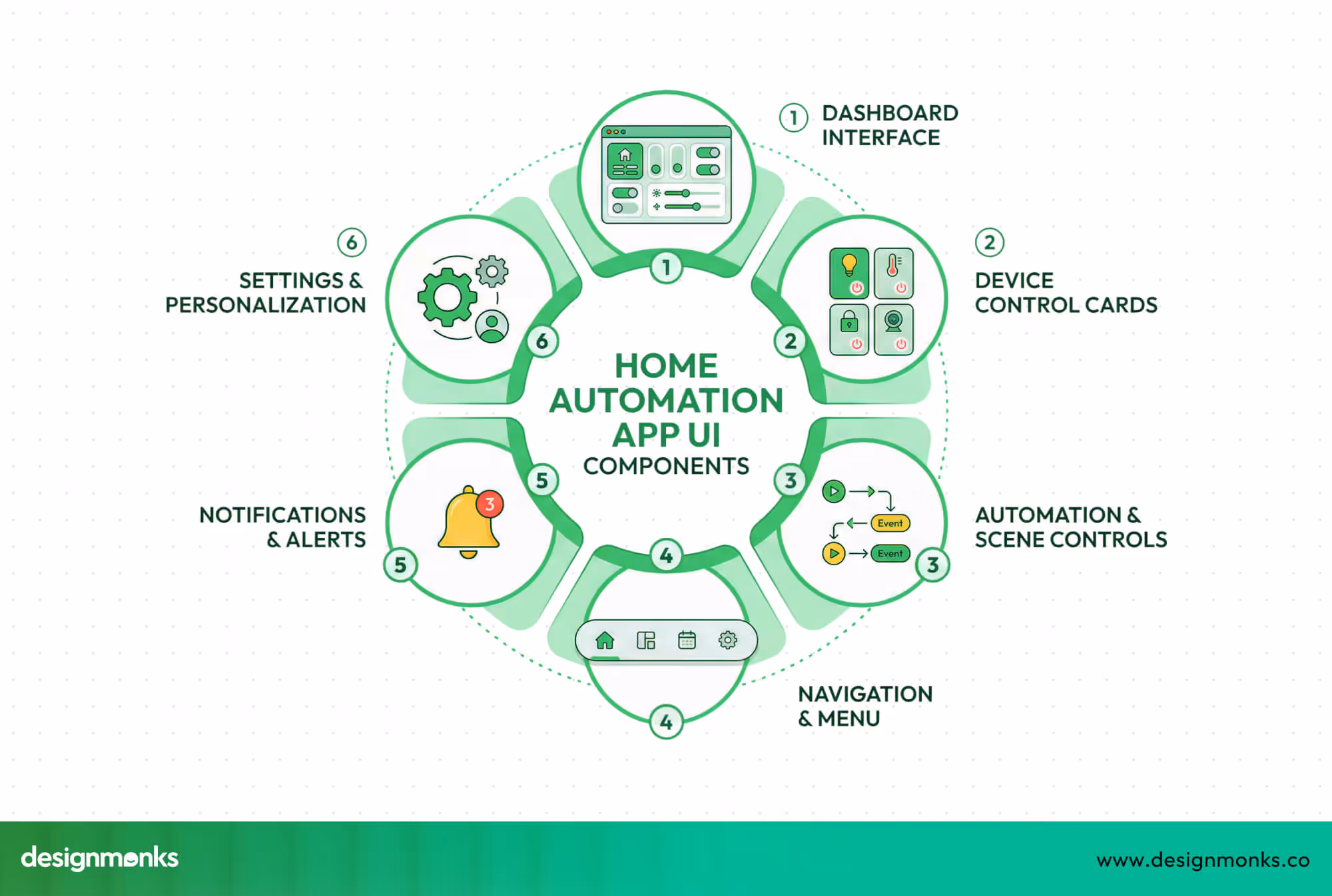
Key UI Components of a Home Automation App
A home automation app needs clear and simple UI parts so users can control devices without confusion. Each section should guide users step by step, so the full experience feels easy and smooth every day.
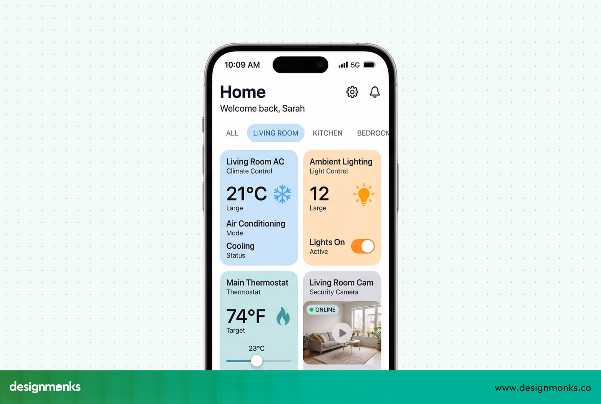
Smart Home Dashboard Interface
The Dashboard UI works as the main home automation dashboard where users see all Smart Devices at once. A smart home control panel shows device status clearly, while a device overview interface helps users check everything quickly without opening many screens.
Device Control Cards
Device control cards show each device in a small block, which keeps the screen clean and easy to scan. Each card shows basic details like device name, status, and the main action button. Users can tap once to control lights, locks, or thermostats without extra steps.
Here, maintaining a proper button UI design and other UI elements is almost mandatory.
Automation and Scene Controls
Automation and scene controls help users manage multiple devices with one action using a Smart Scene. An automation trigger starts actions based on time or events, like turning lights off at night or activating security when users leave home.
Navigation and Menu Structure
A clear navigation system helps users move through the app without confusion or delay. Tabs, bottom menus, or simple icons guide users to main sections like dashboard, devices, and settings. When navigation stays simple, users feel confident and complete tasks faster.
Notifications and Alerts
Notifications inform users about important updates like motion detection, door activity, or device errors. Clear alerts help users take action quickly and stay aware of the home status. Good UI keeps alerts simple, so users understand messages without stress.
User Settings and Personalization
Settings allow users to adjust preferences based on their needs and daily habits. Users can rename devices, group them by rooms, or change control options. Personalization makes the app feel familiar, which helps users feel comfortable and in control.
Best Home Automation App UI Design Examples
Real app examples help you understand how good design works in real situations. By looking at strong home automation apps, you can see how layouts, controls, and flows make device control simple and clear.
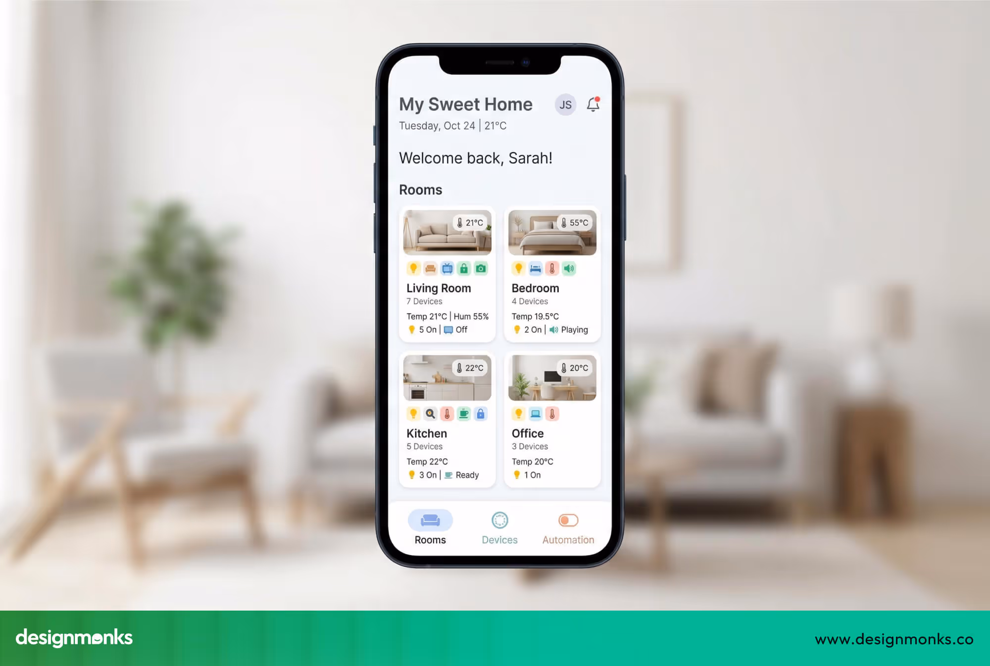
1. Smart Home App UI by Design Monks
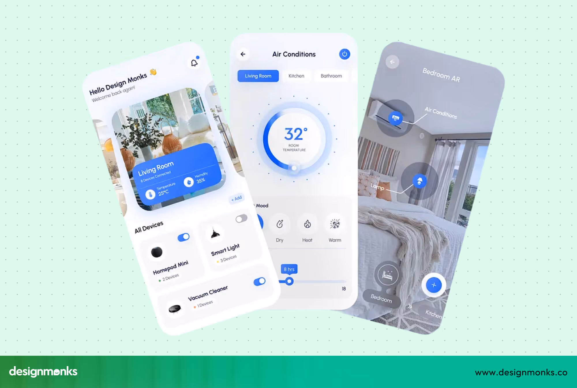
The smart home app UI by Design Monks feels easy right from the first screen with a clean and calm layout. The design keeps things simple, where users can understand actions quickly without extra thinking or confusion.
The layout uses a clear structure where each device has its own space, so users never feel lost. Smart use of icons, colors, and quick action buttons helps users control lights, temperature, and security with very few taps.
What makes this design strong is how smooth and practical it feels in real use. Features like quick toggles, real-time feedback, and organized screens help users stay in control, which makes the full experience feel simple and reliable every day.
2. Google Home App UI Design
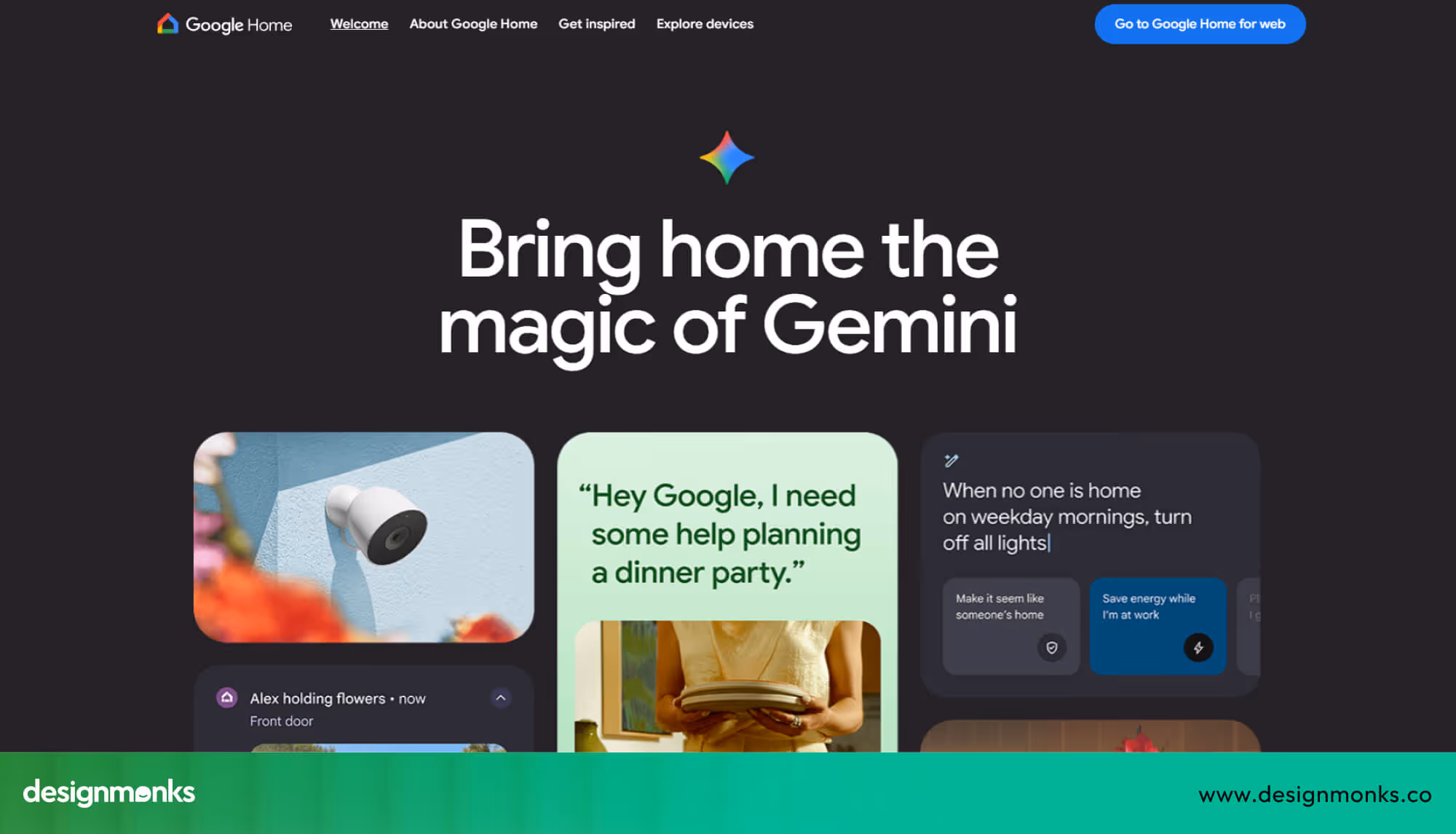
Google Home uses a room-first layout, showing rooms at the top and devices inside each room. The dashboard hierarchy feels structured as it helps users understand which devices belong to which spaces. Navigation between rooms is smooth.
Device cards use minimal icons and clear labels, which simply make basic actions easy. However, tapping through multiple rooms can slow down quick access. In this case, the Design Monks smart home UI performs better as it shows all devices at a glance on a clean grid.
However, Google Home highlights device status with color-coded indicators. Users can quickly spot active devices, yet some advanced controls require extra taps.
3. Apple HomeKit App UI Design
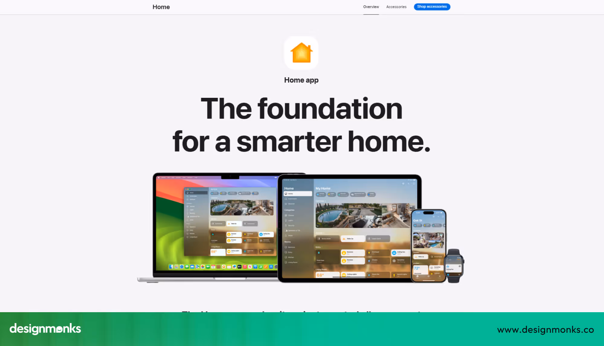
Apple Home uses a minimal card-based interface, with each device or scene displayed in a small box. Cards show names, icons, and quick actions, keeping the screen clean and easy to scan.
Scenes like “Good Night” or “Away” appear as separate cards. Users can activate multiple devices with one tap, which reduces repetitive actions. The consistent style across cards gives a calm, organized feeling.
The app highlights important device information without clutter. The simplicity works well for beginners who prefer visual clarity.
4. Amazon Alexa Smart Home Interface
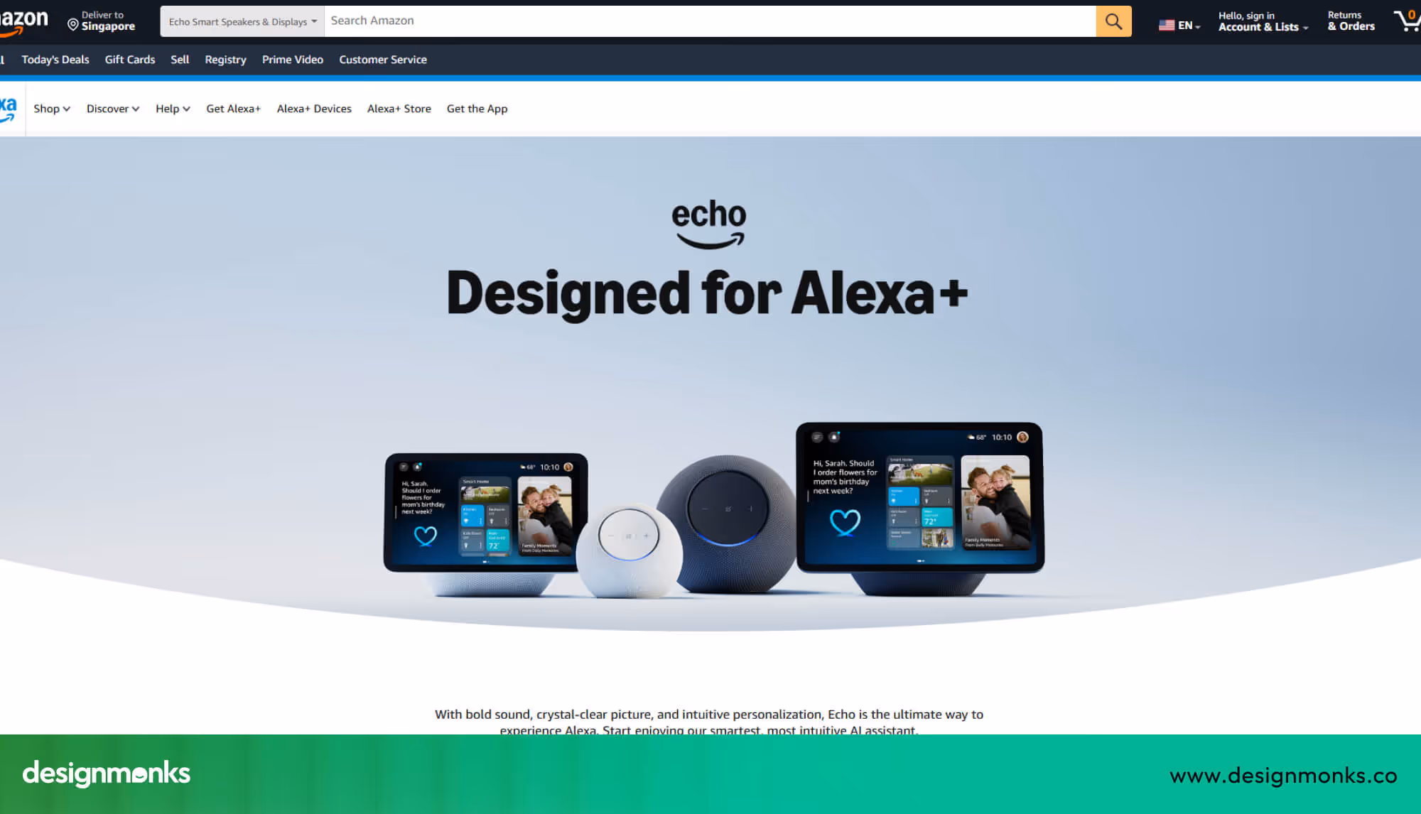
Amazon Alexa focuses on voice-first interactions but still shows a device list and quick action buttons. Devices display names, icons, and basic status, letting users tap if they prefer screen control over voice.
Navigation between voice, devices, and routines is straightforward but requires multiple taps to reach specific actions. Design Monks handles this better by keeping core actions visible on the main screen.
The interface uses color and small icons to indicate device status and connectivity. Feedback after each action is clear so that users can feel in control even when switching between voice and touch commands.
5. Samsung SmartThings UI Design
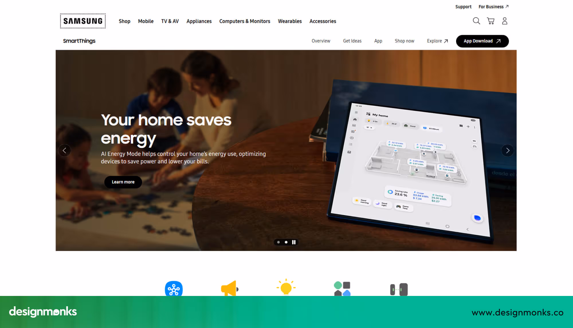
Samsung SmartThings highlights automations, scenes, and device groups. Panels show how devices work together to help users see rules, schedules, and timing actions all in one place. The design supports complex setups for power users.
While SmartThings is powerful, the interface can feel busy for beginners. Users managing simple home control may prefer fewer options per screen to reduce confusion, keeping the experience calm and easy to follow.
UX Design Principles for Home Automation Apps
Good UX Design helps users control devices without stress or confusion in daily life. Strong IoT UX focuses on clarity, speed, and trust, so users feel safe while managing their smart home systems.
Simplicity in Device Controls
Simple controls help users act fast without thinking too much about each step. When mobile button sizes are perfect, they look clear, and actions stay direct, users feel confident and avoid mistakes. A clean layout reduces mental effort and keeps the experience smooth during daily use.
Real-Time Status Feedback
Users need clear feedback to understand what happens after each action inside the app. Status indicators show if a device is on or off, or if it has connection issues. This feedback builds trust and helps users feel in control at all times.
- On and off states: Clear labels or colors show whether a device is active or not at any moment.
- Connection status: Icons or messages inform users if a device is online or facing network problems.
- Action response: Small visual changes confirm that the app has received and completed the user action.
Clear Automation Flow Visualization
Automation flows should feel easy to understand, so users know what will happen next. A simple visual path shows triggers, actions, and results in a clear order. When users see this flow, they trust the system and manage it without confusion.
Consistency Across Screens
Consistency keeps the app predictable, so users do not need to learn new patterns on each screen. Similar layouts, icons, and button styles help users move easily through the app. This reduces confusion and improves overall comfort during use.
Error Prevention and Recovery
Good UX design prevents errors before they happen and helps users fix them quickly. Clear warnings and simple undo options reduce stress during device control. When users feel safe from mistakes, they trust the app more.
Navigation Patterns Used in Smart Home Apps
Smart home apps need clear navigation so users can control devices quickly without confusion. Designers use different patterns to help users reach devices, check status, or run automations in a few taps. Navigation should feel natural and avoid extra steps.
Room-Based Navigation
Room-based smart home navigation groups devices by rooms, like the living room, bedroom, or kitchen. Users tap a room to see all devices inside so that it feels easier to find and control items in a specific area. This method gives a clear sense of where each device belongs.
Device-Based Navigation
Device-based navigation lists all devices by type, such as lights, locks, cameras, or thermostats. The device grouping interface helps users act on a particular category without switching rooms. It works well for users who want quick access to all similar devices at once.
Automation Tab Navigation
Some apps use a dedicated tab for automations and scenes. Users can view or run routines like “Good Night” or “Away Mode” quickly. This approach keeps rules and smart scenes separate from device control, making the interface simpler and easier to follow.
This combination of patterns ensures users feel in control and can manage their smart home efficiently without confusion or extra effort.
Smart Home App Interaction Design Patterns
Interaction design in smart home apps shows how users actually control devices through the interface. Good patterns make actions clear, fast, and reliable, so users feel confident while managing their connected devices.
Toggle Controls and Sliders
Toggle switches and sliders are common for turning devices on or off or adjusting levels. Lights, thermostats, and speaker volume often use sliders, while simple switches handle on/off commands. These controls give immediate feedback and feel intuitive.
Gesture-Based Controls
Some apps use gestures, like swiping or sliding, to adjust brightness or temperature. Swiping across a light card can dim or brighten instantly so that users have precise control without extra taps. Gestures add a tactile and responsive feeling to the interface.
Voice Control Integration
Voice UX lets users speak commands instead of tapping. Platforms like Amazon Alexa and Google Assistant integrate with apps to turn on devices, run scenes, or check status. Clear voice feedback ensures users know the command worked.
Quick Action Shortcuts
Many apps use quick-action buttons on dashboards or device cards. Users can perform frequent tasks, like turning off all lights or locking doors, without opening multiple menus. This strategy saves time and keeps the interface efficient.
Contextual Feedback and Alerts
Interaction design also includes instant feedback when users act on devices. Visual cues, sounds, or small pop-ups show device status, errors, or success. Clear feedback reassures users and prevents confusion in everyday smart home control.
Visual Design Best Practices for Home Automation Apps
Visual design helps users read and control devices without stress or confusion. A clear and simple interface makes every action easy to understand, so users feel comfortable while managing devices across different screens and situations.
Color Coding for Device Status
Color helps users understand device status quickly without reading long text. For example, yellow can show lights are on, while blue can show that cooling is active. Clear color use reduces confusion and speeds up decisions.
Dark Mode for Smart Home Dashboards
Dark mode is useful for nighttime control, when bright screens can feel uncomfortable for the eyes. A darker home automation dashboard reduces strain and helps users check or control devices without disturbing their sleep.
Icon-Based Device Identification
Icons help users recognize devices faster than text alone. A simple bulb icon for lights or a lock icon for doors makes the interface easy to scan. Clear icons reduce effort and improve quick understanding.
Typography and Text Clarity
Clear text makes the interface easy to read for all users, even from a distance. Simple fonts, proper size, and enough spacing help users understand labels, device names, and actions without confusion or strain.
Spacing and Layout Balance
Good spacing keeps the interface clean and prevents the screen from feeling crowded. Proper gaps between cards, buttons, and sections help users focus on each element and complete actions without distraction.
Common UX Problems in Home Automation Apps
Many smart home apps feel difficult because of small UX mistakes that affect daily use. These user pain points ridiculously slow down tasks and reduce trust in the system, especially when people expect quick and simple control.
Too Many Device Controls
Showing too many controls on one screen makes the interface feel crowded and hard to scan. Users may struggle to find the right action, which increases effort and creates confusion during simple daily tasks.
Complex Automation Setup
Automation setup often feels difficult when steps are unclear or too long. Users may not understand how actions connect, which leads to mistakes or unused features, even though automation should save time and effort.
Poor Device Status Feedback
Users feel unsure when the app does not clearly show device status. Missing or unclear feedback makes it hard to know if a device is on, off, or disconnected, which reduces trust in the system.
Slow Response Time
Slow response after tapping a button creates frustration and doubt. Users may tap again or think the app is broken, which leads to repeated actions and a poor overall experience.
Confusing Navigation Structure
A weak navigation system makes it hard to move between devices, rooms, or settings. Users may feel lost inside the app, which increases time spent on simple actions and reduces overall comfort.
Lack of Error Handling
When errors appear without clear messages or solutions, users feel stuck and unsure about what to do next. Proper guidance helps users fix problems quickly and continue using the app without stress.
FAQs
Should I use a grid or list layout for device control cards?
Use a grid layout when users need quick access to many devices at once on one screen. Use a list layout when devices need more details or actions, so users can read and control each item more carefully.
How can I reduce user confusion in device control interfaces?
Keep controls simple with clear labels, familiar icons, and direct actions that users understand instantly. Place important actions in visible areas, avoid too many options on one screen, and show clear feedback after every tap.
Where should I place automation controls for quick access?
Place automation controls on the main dashboard or a clearly visible tab so users can find them quickly. Use shortcut buttons for common scenes like “Good Night” to help users run actions without opening multiple screens.
End Note
Home automation apps need a clear design so users can control devices without confusion or delay. Simple layouts, clear actions, and quick feedback help users trust the system and feel comfortable during everyday tasks at home.
By following the right UI and UX patterns, you can build an app that feels easy and reliable. Focus on clarity, reduce extra steps, and keep actions visible so users stay in control every time.

.avif)
.avif)
.avif)
.avif)


.avif)
.avif)
.avif)
.avif)


.avif)
