
.svg)


Key Takeaways
- Clear FAQ pages reduce confusion and guide users to faster, accurate answers.
- Organize questions by category to keep navigation simple and intuitive throughout.
- Use concise language so users quickly understand solutions without extra effort.
- Add search and filtering to help users find information instantly and easily.
- Update FAQs regularly to maintain reliability and support evolving user needs.
A good FAQ page helps users feel safe when they look for answers. Many people visit this page before they try a service, so the design must feel calm and easy.
Clear groups, short questions, and simple tools guide users without stress. When the page feels friendly, people stay longer and trust the product more.
This guide explains how to build an FAQ page that supports users, reduces confusion, and improves the whole site experience. Each best practice here gives you a simple step you can follow right away.
What is an FAQ page?
An FAQ page is a place on a website where people look for quick answers. The full form is “Frequently Asked Questions.” It works like a small help desk inside the site. A person comes with a doubt or a user pain point, and the FAQ page gives a clear reply without any extra steps.
Many visitors go there when they feel confused. A simple answer lowers their stress and helps them move forward. Brands also use FAQ pages to guide new users who do not know how a product works. It saves time for both the visitor and the support team.
Most FAQ pages follow a simple layout. The questions stay on top, and the answers sit right under them. Each part is small, so anyone can read it without effort.
Key features of an FAQ page:
- Clear list of common questions.
- Short and direct answers.
- Easy layout for quick reading.
- Helpful links for extra details.
- Search bar to help users find answers faster.
- Organised categories that group related questions together.
Does the FAQ Page Matter?
An FAQ page is important because many visitors feel lost when they first enter a site. They look for a quick path to clear answers. A simple FAQ page helps them relax and stay on the site. It works like a small guide that waits beside the user and shows the right direction.
A good FAQ page also helps a business. It reduces extra support requests and frees the team for deeper tasks. It builds trust because people see that the brand cares about clear help. When users find answers fast, they feel more confident about the product.
Why the FAQ page matters:
- Fast Help: Users do not wait or search around. They see the answer in front of them.
- Lower Confusion: Short replies remove doubt and stop visitors from leaving the site.
- Stronger Trust: Clear answers show honesty and make the brand look dependable.
- Better User Flow: People move through the site with ease because each answer guides their next step.
- Less Support Load: Fewer questions reach the help desk, and the team saves time.
- Higher Conversions: When doubts go away, more users complete sign-ups, purchases, or other goals.
Best practices for FAQ site design
A well-planned FAQ page guides users with ease and gives them clear answers without stress. Simple structure, neat layout, smart UI elements, and helpful content choices make the whole page feel friendly and useful.
Grouping And Categorising
A neat FAQ page starts with proper groups. People understand topics faster when similar questions stay in one place. Clear groups also help first-time users because they can guess where their doubt fits.
When each set stays small, the whole page feels lighter. A strong structure also helps search engines read the page with ease, so the site may appear for more helpful queries.
- Put common topics together so users follow a simple path.
- Use short group names that make sense at first glance.
- Keep each set small to avoid long scrolls.
- Add clear separators so eyes rest between groups.
- Use simple order: broad topics first and narrow ones later.
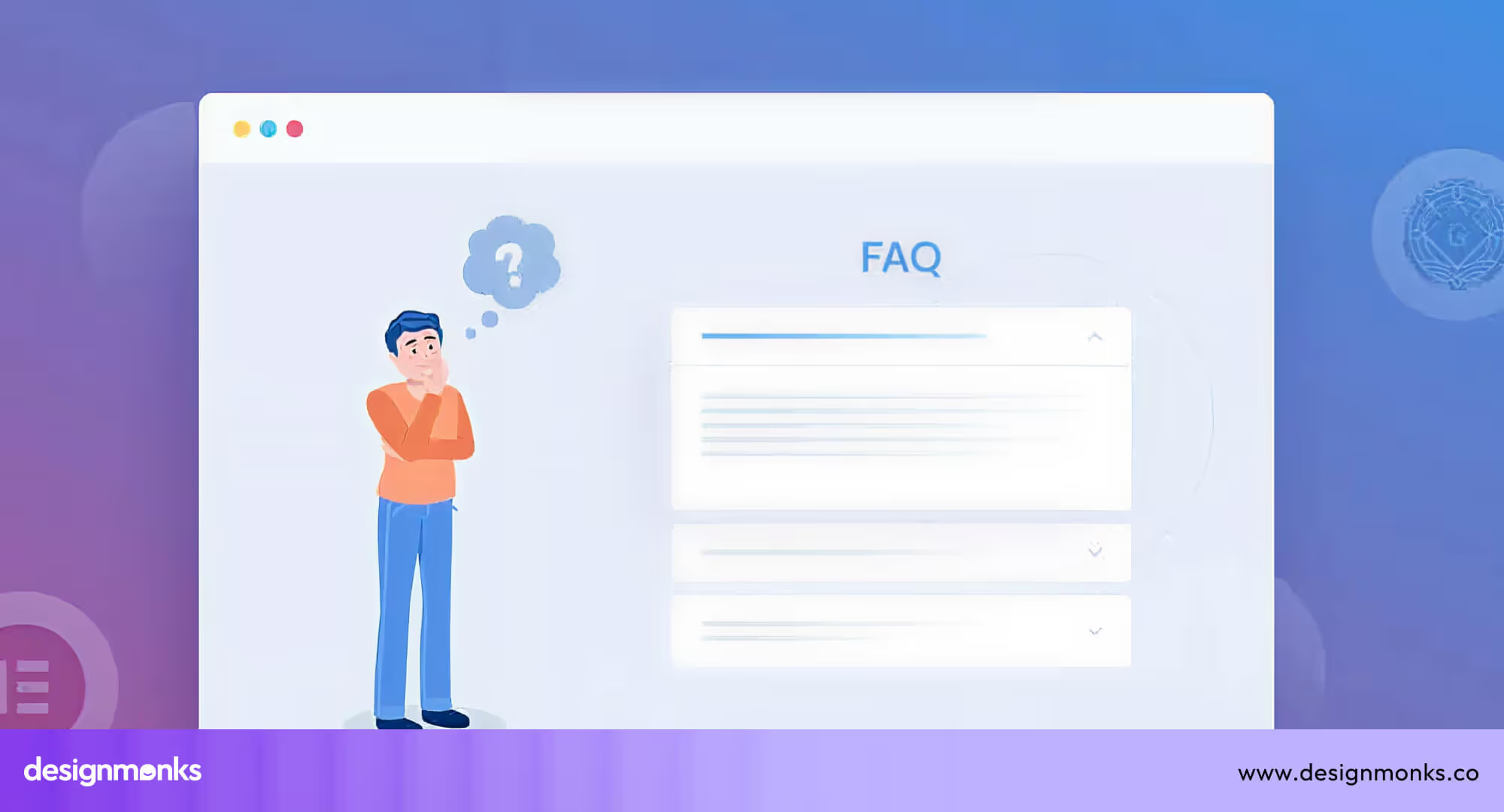
Accordion vs Full List
Some FAQ pages use a long list. Others use an accordion. Both have a place. An accordion hides answers under each question, so the page stays short. Users tap to open and see the details. This works well when you have many questions.
A full list shows everything at once. This fits small FAQ pages with short replies. The best choice depends on page size, device view, and user habits. You can also mix both. For example, small and very common questions may stay open, while deeper questions sit inside accordions.
Easy Findability
A good FAQ page helps users reach answers without effort. Usually, a search box helps a person type a word and jump straight to the right area. A jump menu helps users move to the exact section with one tap. A sticky sidebar keeps all group names on the screen so users never lose their place. These tools reduce confusion and save time for everyone.
However, to make the answers more findable, you should follow the search UX best practices like below:
- Add a search bar at the top of the page.
- Place group links inside a side menu for easy jumps.
- Keep the page light so each search feels fast.
- Use simple labels so new users know what to press.
- Let mobile users see key controls without long scrolls.
Concise Q&A Copy
Short and clear writing helps the FAQ feel warm and direct. Each question acts like a small heading, so users understand the topic at once. Each answer must stay short and free from heavy words.
When a topic needs more detail, you can link to a deeper page. This keeps the FAQ clean while still guiding people to the full story. Clear lines also help global users who may not speak English as their first language.
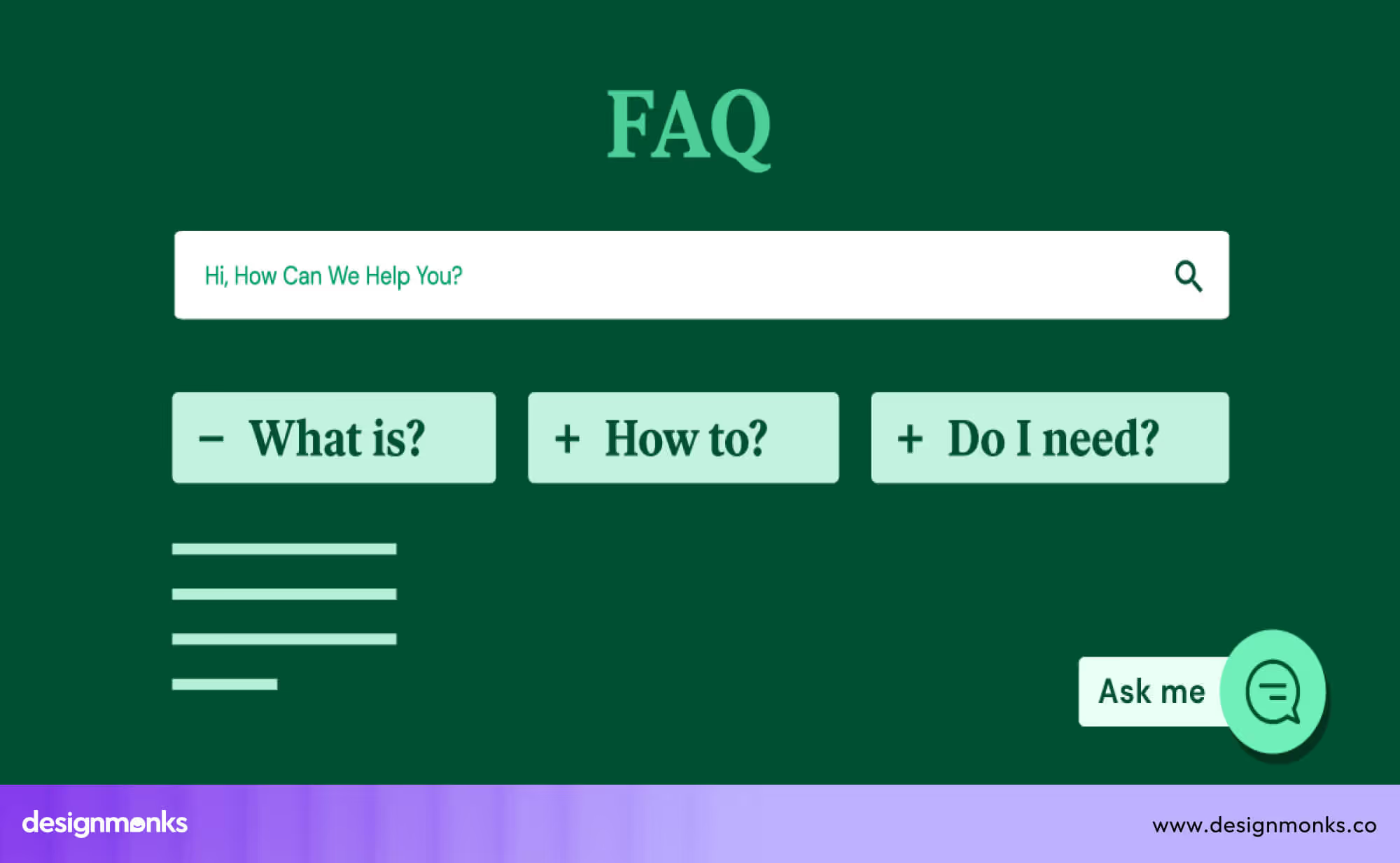
Visual & Interactive Elements
A few visual cues can make an FAQ page more friendly. Small icons near each group help users understand the topic without reading too much text. Simple arrows show where to tap. Short videos or step-by-step images can solve doubts faster than words.
These tools work best when used in small amounts. Too many visuals may distract users, so balance is key.
You can also add tiny micro-actions, such as a smooth open-close effect in the accordion. These small touches make the page feel modern and alive without slowing it down.
Accessibility & Performance
Perfect FAQ pages must support every user, no matter their device or ability. Clear colours help people read without stress. Text must have suitable UI fonts and be large enough for weak eyesight.
Some users cannot use a mouse, so every question must be opened with keyboard keys. Screen readers must read each part in the right order so users with vision limits can follow the flow without confusion. The page must also stay fast and light. Slow pages break trust and frustrate users, especially on weak internet or old phones.
You can check your page with simple online tools that show contrast issues, text problems, or screen reader gaps. Each small fix helps more users enjoy the page with ease.
Here, you can prioritize the following points:
- Strong colour contrast for easy reading.
- Text size that stays comfortable on small screens.
- Full keyboard access for all FAQ actions.
- Smooth screen-reader flow in the right order.
- Fast loading on weak networks and old devices.
SEO & Schema Markup
The search engine reads your FAQ page by looking at the structure. Each question must stay as a clear heading so the crawler sees the topic fast. A small code called “FAQ schema” tells the search engine that the page has questions and answers.
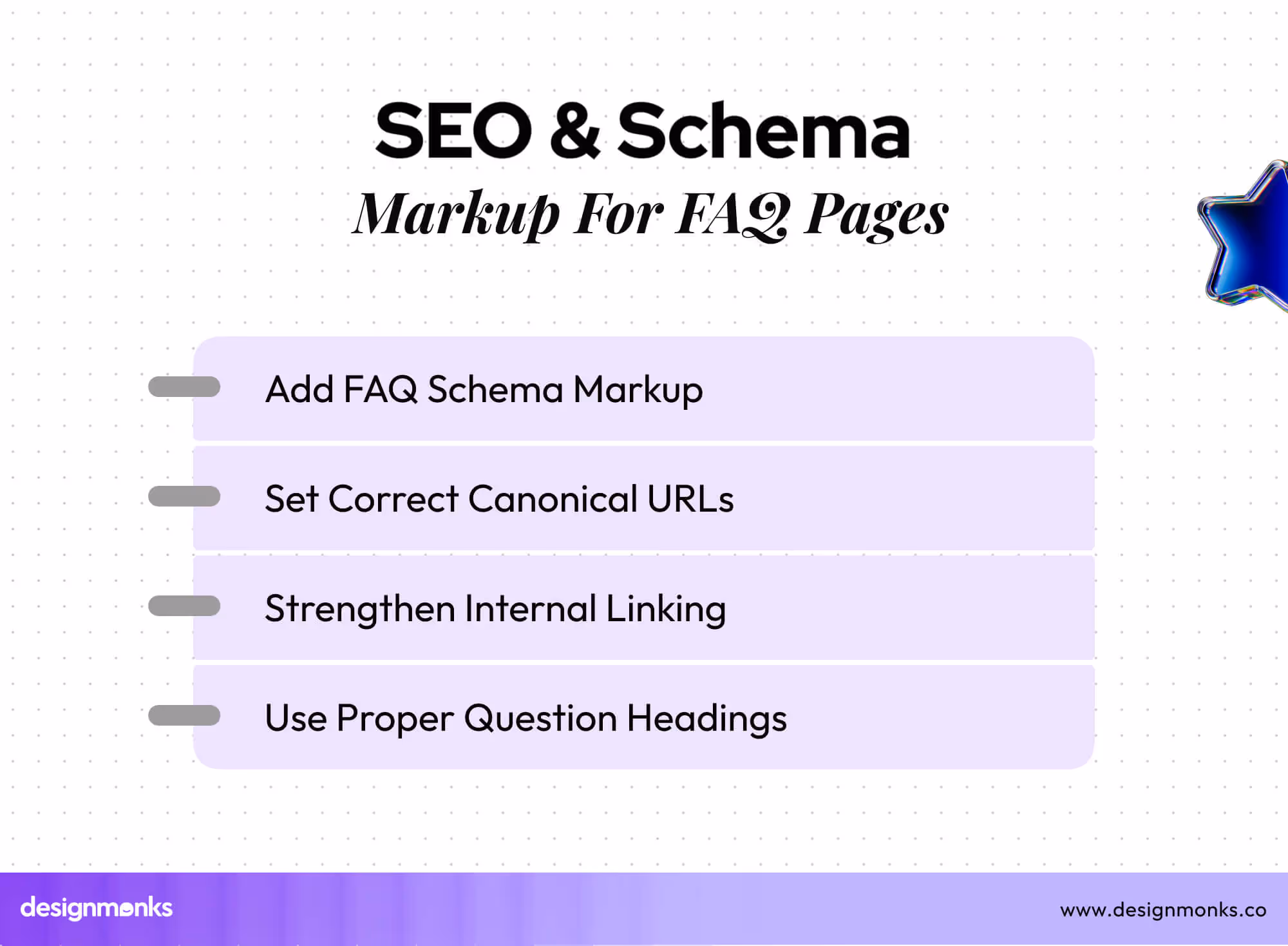
This code may help your answers show up inside search results, which pulls more visitors to your site. Good internal links also help search engines trace deeper pages with value.
Each question must sit under a clean URL with no mess. Canonical tags stop search engines from mixing similar pages. These careful steps help your FAQ rank better and build trust.
Prioritise Key Questions
Some questions matter more than others. Users search for them often, and they help them take the next step. These key questions must appear at the top of the page or at the top of each group. This approach keeps the most helpful answers easy to see.
You can shift these questions over time based on user behaviour. This simple step boosts clarity and helps users feel safe because their common doubts appear right away.
Consistent Layout Patterns
A steady pattern builds comfort. When each question, answer, icon, and divider follows the same style, the FAQ feels clean. Users know where the next line will appear, so their eyes travel faster.
Even small parts like arrow styles, text size, and spacing add to the overall feel. A stable layout also helps mobile users who rely on clear spacing to move through each block. A tidy pattern reduces mental load and helps the page feel smooth.
Internal Linking
Links inside answers guide users toward deeper pages without opening many tabs or stepping through menus. A simple link can lead to a help guide, a product page, or a tool demo. These links also help search engines understand the site’s structure.
When links stay neat, users feel supported. Each link must be placed with care, and the anchor text must make sense. This strategy helps users know where the link leads before they tap.
Continuous FAQ Updates
A strong FAQ page grows with time. Users doubt change, products evolve, and new questions arise. A regular update cycle keeps the page relevant. You can review support tickets, user chats, and search queries to identify new concerns.
As soon as you find the new questions that appear, add them to the FAQ. When old questions lose value, remove them. This simple cycle keeps the page fresh and useful. A living FAQ page becomes a smart guide for new and old users.
FAQ Page for Your Design Agency - Structure & Checklist
When a new client works with Design Monks, we guide them with a clear FAQ plan. This helps them shape a simple page that answers real doubts and supports their users from the first visit. The structure stays light, the steps stay clear, and the whole page feels easy for any audience.
Suggested Structure for a Client FAQ Page
- Intro Block: A short welcome line that tells users what they will find on the page. It sets the mood and lowers stress for new visitors.
- Main Question Groups: Groups help users move through topics without guesswork. Each set should cover an area like service details, process steps, pricing basics, support rules, or account help.
- Question List or Accordion: Each question sits as a clean heading. Answers stay short and helpful. If the list is long, an accordion keeps the page tidy.
- Extra Help Links: Some topics need more detail. Internal links send users to guides, policy pages, or deeper docs.
- Search Bar or Jump Menu: Simple tools that help users reach answers faster, especially when the FAQ grows larger.
- Contact Block: A small part that shows how to reach the team if the FAQ does not solve the doubt.
Design Monks’ FAQ Page Checklist
- Clear topic groups that match real user doubts.
- Short questions that act as helpful headings.
- Simple answers with no heavy words.
- A clean layout that works on all screen sizes.
- Smooth accordion or list pattern with steady spacing.
- Strong contrast and readable text for all users.
- Fast loading on slow networks.
- Internal links for deeper help.
- FAQ schema added for search engines.
- Clean URLs and proper page order.
- Updated questions based on user support data.
Design Monks Provide the Best Design for FAQ Sites
A strong FAQ page helps users feel calm, safe, and guided. Design Monks builds FAQ pages that do exactly that. We shape each page with clear groups, easy words, and smooth layout patterns.
Every part stays simple, so even new users move through the page without effort. Our team also checks how fast the page loads, how it feels on small screens, and how each question appears for search engines.
We study the client’s product, the common user doubts, and the support history. This helps us place the most helpful questions in the right spots. We also add small tools like search bars, jump menus, and neat accordions, so users can reach answers quickly.
Our goal is simple: give your audience a clean and friendly help space that builds trust. With Design Monks, your FAQ page becomes a smart guide that supports users and improves your full product experience.
Common Mistakes in FAQ Page Design
Many FAQ pages fail because they confuse users instead of helping them. These issues increase bounce rate and raise cognitive load, which makes visitors leave the site early. Below are the most common mistakes that weaken an FAQ page:
Poor Question Grouping
Some FAQ pages place questions in random order, which forces users to scan the entire page without knowing where to start. This raises cognitive load and creates a confusing flow. When people cannot guess where their doubt belongs, they often leave the page early.
Overloaded Long Answers
Many sites try to explain too much in one place. Very long replies turn a simple FAQ into an FAQ page overload. Users feel tired because they must read through large blocks of text. This slows them down and increases the chance of a higher bounce rate.
Missing Search Function
A big FAQ page without a search bar becomes hard to use. Users cannot jump to the right section quickly, so they scroll again and again. This creates frustration and makes the page feel like an unscannable FAQ page.
Inconsistent UI Patterns
When icons look different, spacing changes suddenly, or the accordion behaves in strange ways, the page loses clarity. Users expect the same pattern across all questions. Any break in the pattern increases confusion and makes the FAQ feel less trustworthy.
No Schema Markup
Some FAQ pages ignore schema markup, which helps search engines understand the question-and-answer format. Without it, you miss the chance to appear in rich results. This reduces search visibility and keeps helpful content hidden from users.
Outdated or Irrelevant FAQs
Old answers, broken links, and outdated details push users away. When content does not match the current product, people feel unsure and lose confidence. This problem creates doubt and increases the chances of visitors leaving the site.
FAQ Page Example Designs for Inspiration
Before building your own FAQ page, looking at good FAQ examples helps a lot. You can see how big companies group questions, write clear answers, and design for both users and search engines.
Below are two FAQ pages from popular business websites you can check out:
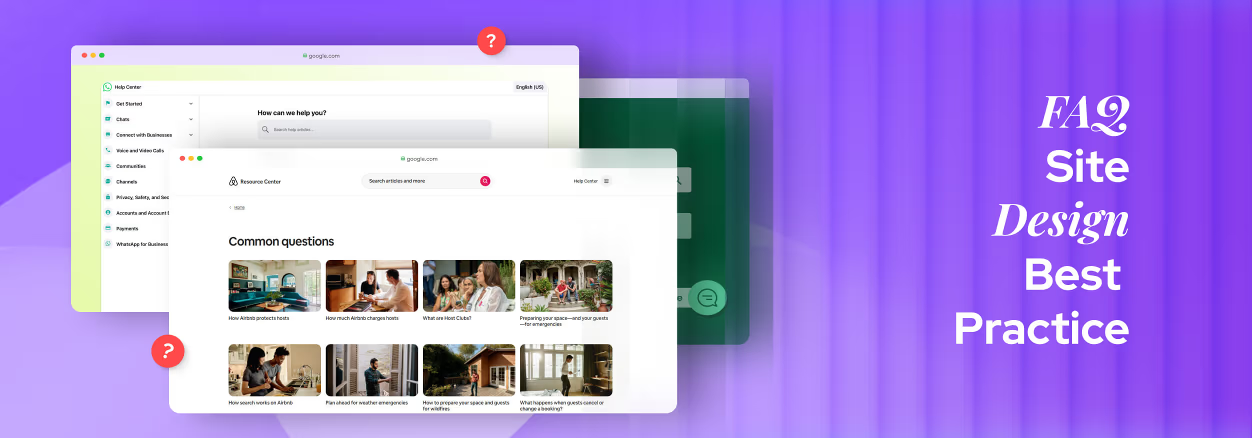
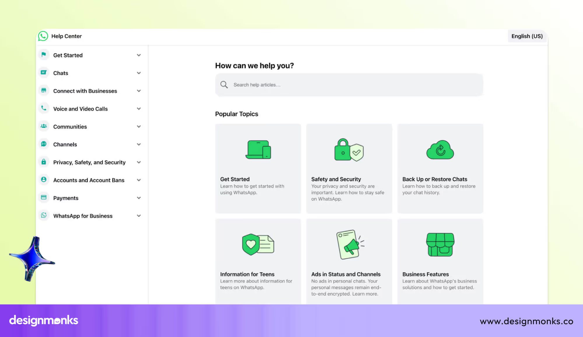
Airbnb FAQ Page
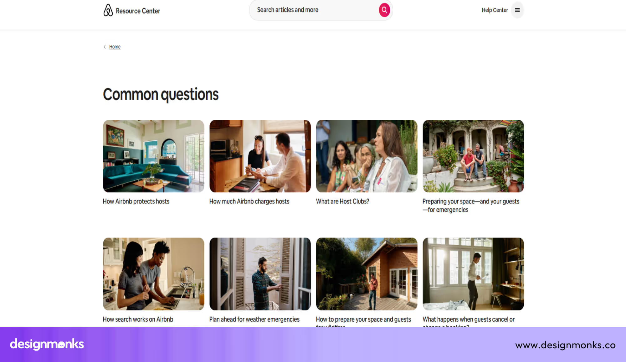
The Airbnb “Common Questions” page gives hosts a clean, well-organized list of very important topics, from how hosts earn money to how cancellations work.
It helps users find real answers fast by grouping questions about payments, safety, policies, and emergencies. The clear structure means hosts don’t need to guess where to look; everything is laid out so they can click in and learn.
Microsoft 365 FAQ Page
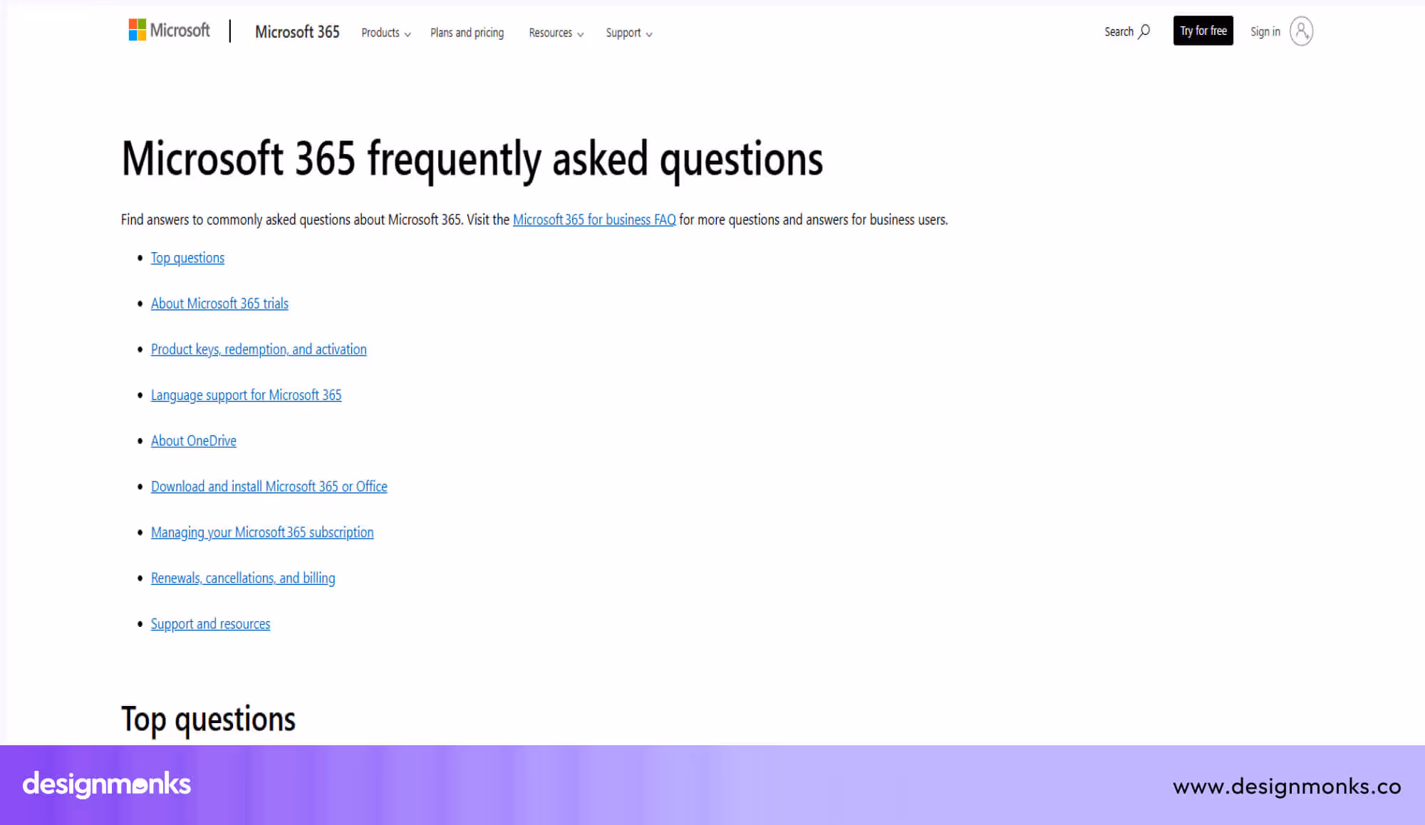
The Microsoft 365 for Home & School FAQ page organises its content into very clear categories: trials, activation, installation, billing, OneDrive, language support, and more. This approach helps users find exactly what they need without digging.
Each question is written as a heading, and the answers are broken into digestible parts. The page also explains technical terms (like “product key”) simply, so beginners can follow. Additionally, Microsoft provides direct links to setup pages, billing settings, and support resources, making it easy for users to take action based on what they learn.
World Animal Protection US
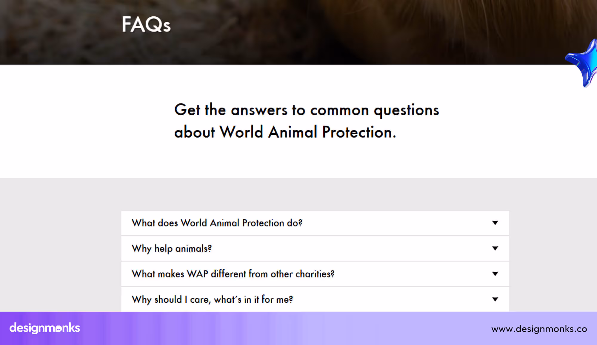
The World Animal Protection FAQ page gives clear answers about the organisation’s mission, global work, and commitment to ending animal cruelty. It explains how they protect animals in farms, communities, and the wild, helping visitors understand their long-term impact.
The page also guides users through practical questions about donations, monthly giving, contact updates, and communication preferences. Its simple structure makes it easy for supporters to find information, take action, and stay connected with the organization’s work.
End Note
A strong FAQ page serves as a mini-help desk within your website. When users find answers fast, they feel more confident and continue their journey without doubt.
These best practices give you a clear path to shape an FAQ page that feels simple, honest, and helpful. With steady updates and a clean structure, your page becomes a trusted guide for every visitor.

.avif)
.avif)
.avif)
.avif)


.avif)
.avif)
.avif)
.avif)


.avif)


