
.svg)


Key Takeaways
- Good search UX improves trust, engagement, and directly boosts conversions.
- Visible, well-designed search boxes guide users to start their journey easily.
- Autocomplete, filters, and typo handling make search faster and frustration-free.
- Advanced search patterns like personalization and predictive suggestions delight users.
- Continuous testing, updates, and analysis keep the search fresh and effective.
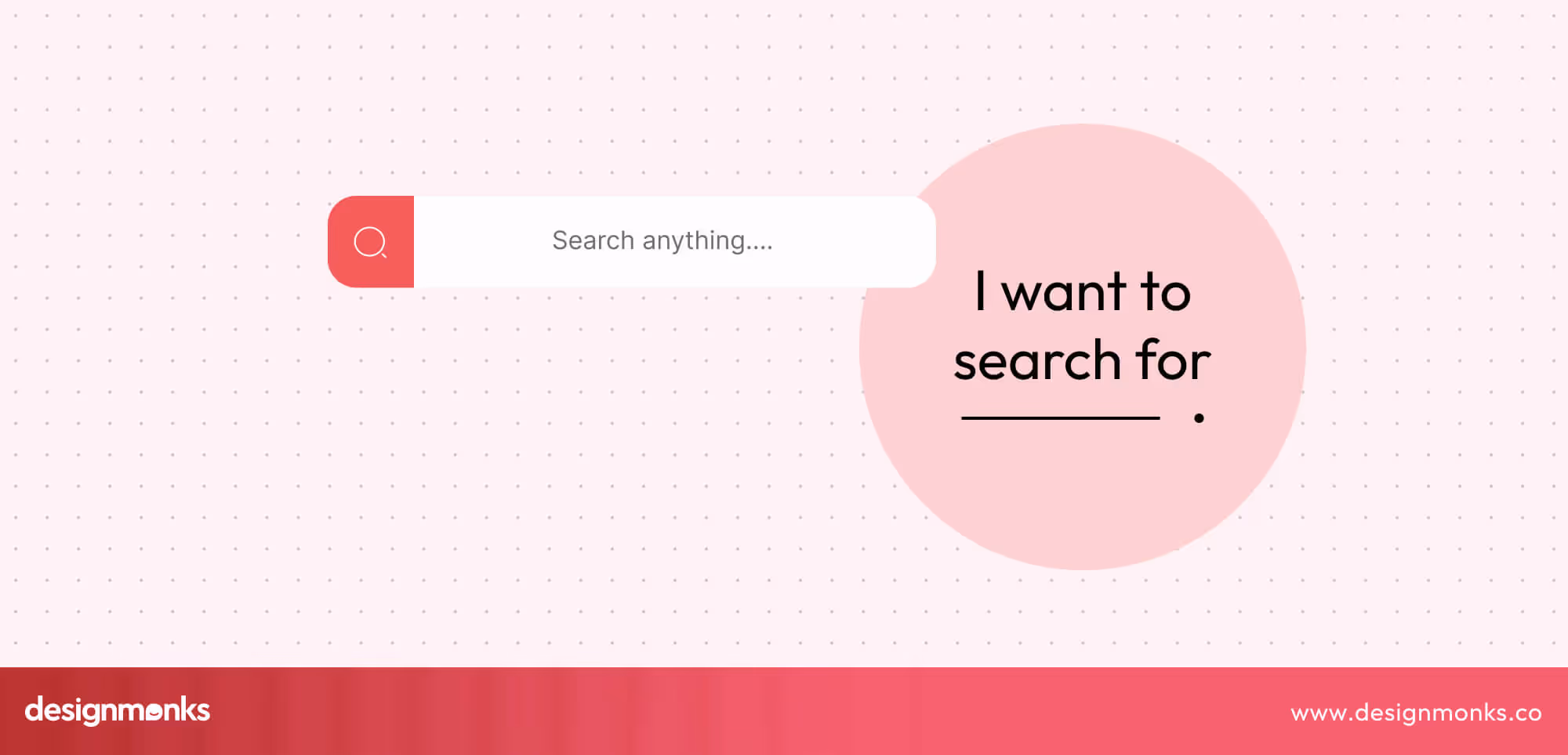
Every designer knows a bad search can ruin the user experience. But search UX best practices turn that pain point into a smooth, intuitive journey that keeps users engaged and satisfied.
Search UX isn’t just a search box, it’s about guiding users from typing queries to seeing suggestions to finding exactly what they need. Every detail, from autocomplete to filters, shapes the overall experience.
In this guide, designers will discover core strategies, common mistakes, and advanced patterns to create search experiences that are fast, helpful, and enjoyable. By the end, you’ll have practical tips to make every search smarter and more user-friendly.
Why Search UX Matters
Search UX refers to how easy, fast, and helpful a website or app’s search function is for users. For designers, it’s much more than just placing a search box, it’s about crafting a seamless journey that guides users from typing a query to finding exactly what they need.
Poor search results lead to frustrated users and lost revenue, as people leave sites that don’t provide them with quick and relevant answers. Studies show that users who actively use search are more likely to convert.
That means a well-designed search directly impacts business outcomes. A good search experience anticipates user intent, handles typos gracefully, provides helpful suggestions, and presents results clearly. Every element from the placement of the search bar to filters, sorting options, and result highlights affects usability.
Beyond functionality, search is also a trust factor. When users can find what they need quickly and reliably, they feel confident in the product and the brand. Designing for search UX means thinking through the journey, interactions, and outcomes.
It's about turning a simple feature into a tool that drives engagement, satisfaction, and conversions.
Anatomy of a Search Experience
A seamless search experience isn’t accidental, it’s carefully designed at every stage. From the moment users see the search bar to the results they click on, each step affects how easily they find what they need.
Understanding the key stages of search helps designers create interfaces that are intuitive, helpful, and frustration-free:
Before Search: Placement & Design of the Search Bar
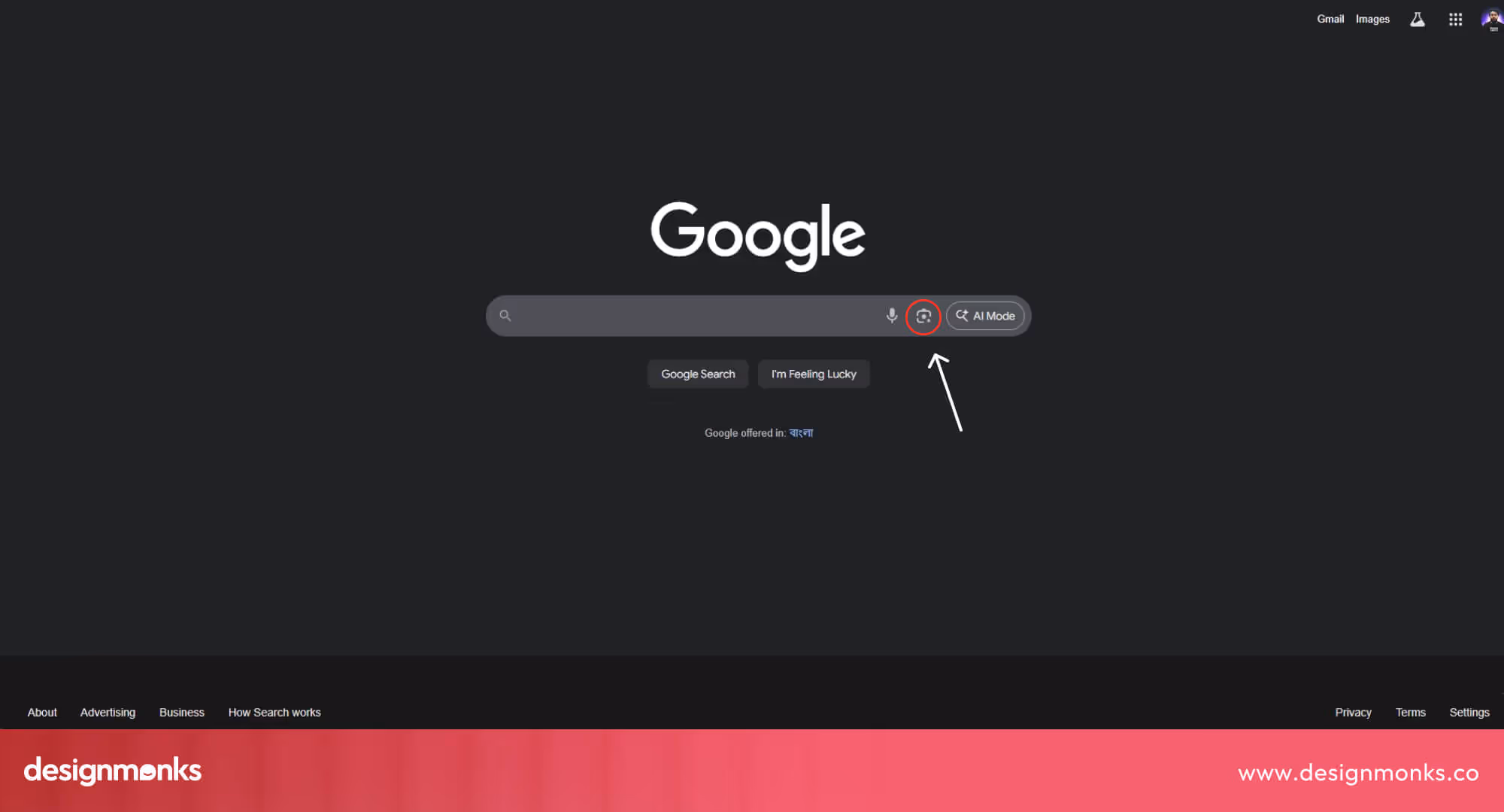
Where and how you place your search bar sets the stage for a smooth experience. Users should notice it immediately, recognize it as interactive, and understand what to type.
Use familiar icons, clear borders, and helpful placeholder text like “Search products, articles, or help topics.” A well-designed search bar invites users to start their journey confidently, reducing confusion and improving engagement.
During Search: Autocomplete, Suggestions, and Feedback
Once users start typing, autocomplete and suggestions guide them, saving time and showing relevant options.
Providing real-time feedback, like correcting typos or indicating no results, prevents frustration. These small interactions keep users on track, improve success rates, and make your search feel intuitive and responsive.
Results: Ranking, Highlighting, and Filters
The way results are displayed determines how quickly users find what they need. Clear, scannable results help users make decisions faster and improve overall satisfaction.
Use visual hierarchy, whitespace, and consistent typography to make scanning easier. Implement filters and sorting that match user goals, highlight keywords in results, and test different layouts to maximize clarity and usability.
After Search: Refinement, Clicks, and Handling Errors
Search doesn’t end with the first result. Users may need to refine queries, click through results, or handle zero-result scenarios. Thoughtful refinements, clear error messaging, quick filters, clear CTAs, and alternative suggestions ensure users stay on the path to success. This makes the entire search journey seamless and frustration-free.
Core Search UX Best Practices
A strong search experience can directly impact engagement, conversion, and user satisfaction. Designers who implement these best practices can turn search from a simple feature into a strategic tool that guides users efficiently:
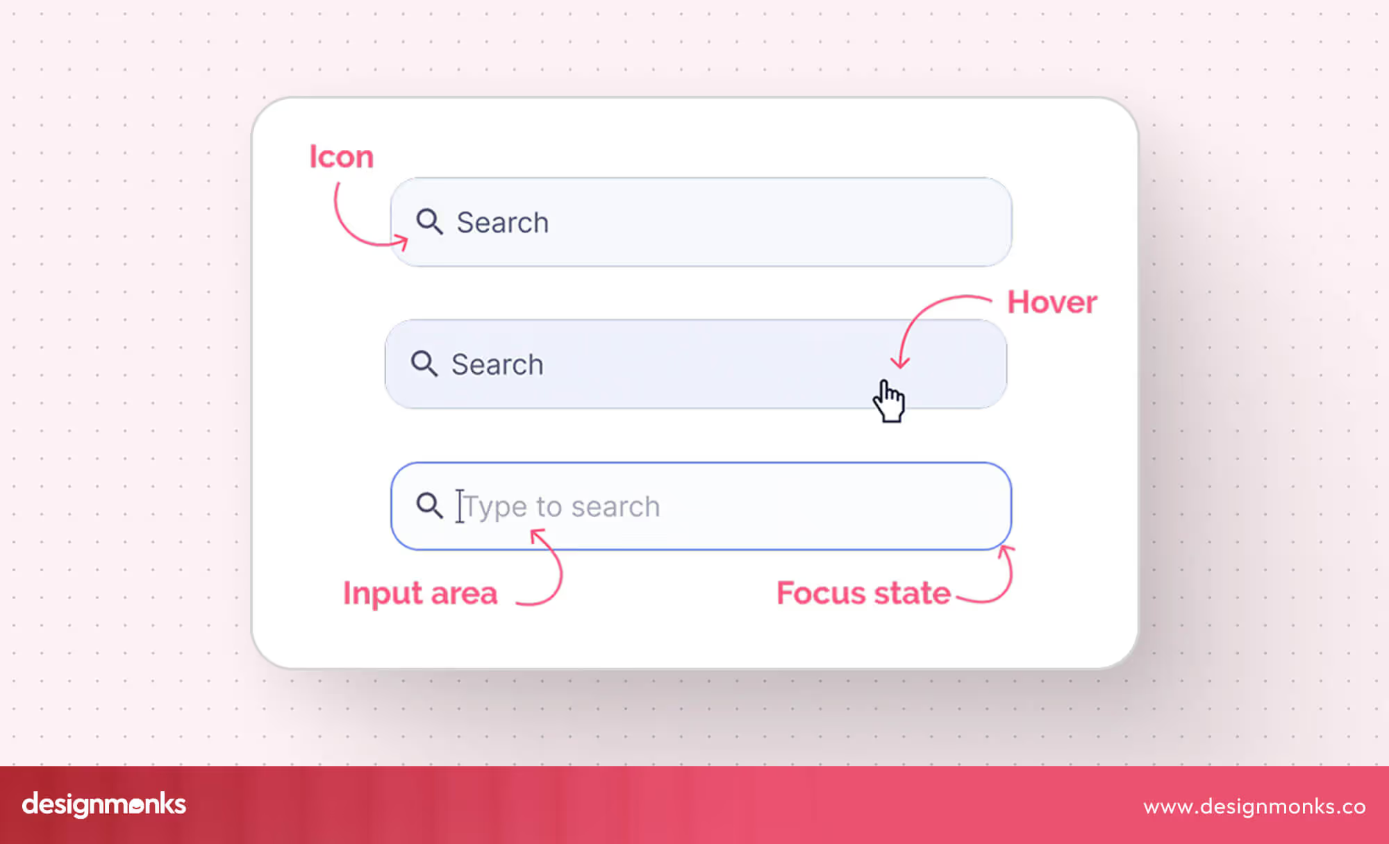
Make the Search Box Visible & Accessible
A search box that’s hidden or hard to find frustrates users immediately. Placement, size, and visual cues determine whether users engage or abandon search. Place the search bar consistently on all pages.
It should be prominent with high contrast, use clear placeholder text like “Search products, help topics, or articles,” and ensure it’s easily accessible via keyboard or touch. Test visibility in different layouts and responsive breakpoints.
Use Helpful Autocomplete & Suggestions
Autocomplete reduces typing effort and guides users to relevant results, increasing success rates. It also helps users discover content they might not have thought to search for, improving engagement and satisfaction.
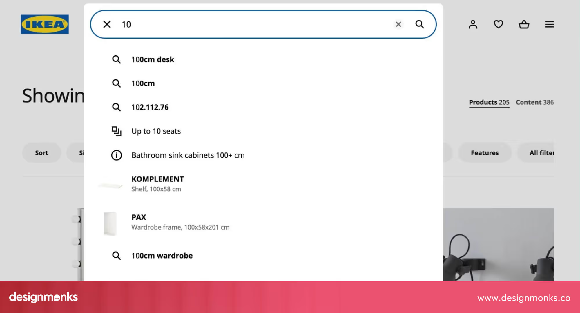
Include recent searches and trending queries, highlight matching terms in suggestions, and provide visual cues like icons or images for better scannability. Test which suggestions increase click-throughs and engagement.
Consider personalizing suggestions based on user behavior or location to make the search feel more relevant.
Handle Typos & Fuzzy Queries Gracefully
Users frequently make spelling mistakes. If the search fails here, they leave frustrated. Handling typos ensures users feel confident that the system understands their intent, reducing friction and abandonment.

Implement fuzzy matching, show “Did you mean…” suggestions, and provide alternative results that cover partial matches. Track common misspellings and adjust suggestions dynamically. Use analytics to identify frequent errors and optimize the algorithm to catch them proactively.
Show Relevant & Clear Search Results
Irrelevant or cluttered results create friction. Users need to scan and act quickly. Clear results increase trust and help users complete tasks faster, which directly impacts conversions and retention.
Highlight keywords, use clear headings and snippets, include thumbnails where relevant, and order results by relevance, popularity, or personalized context. Use grouping or categorization for large result sets.
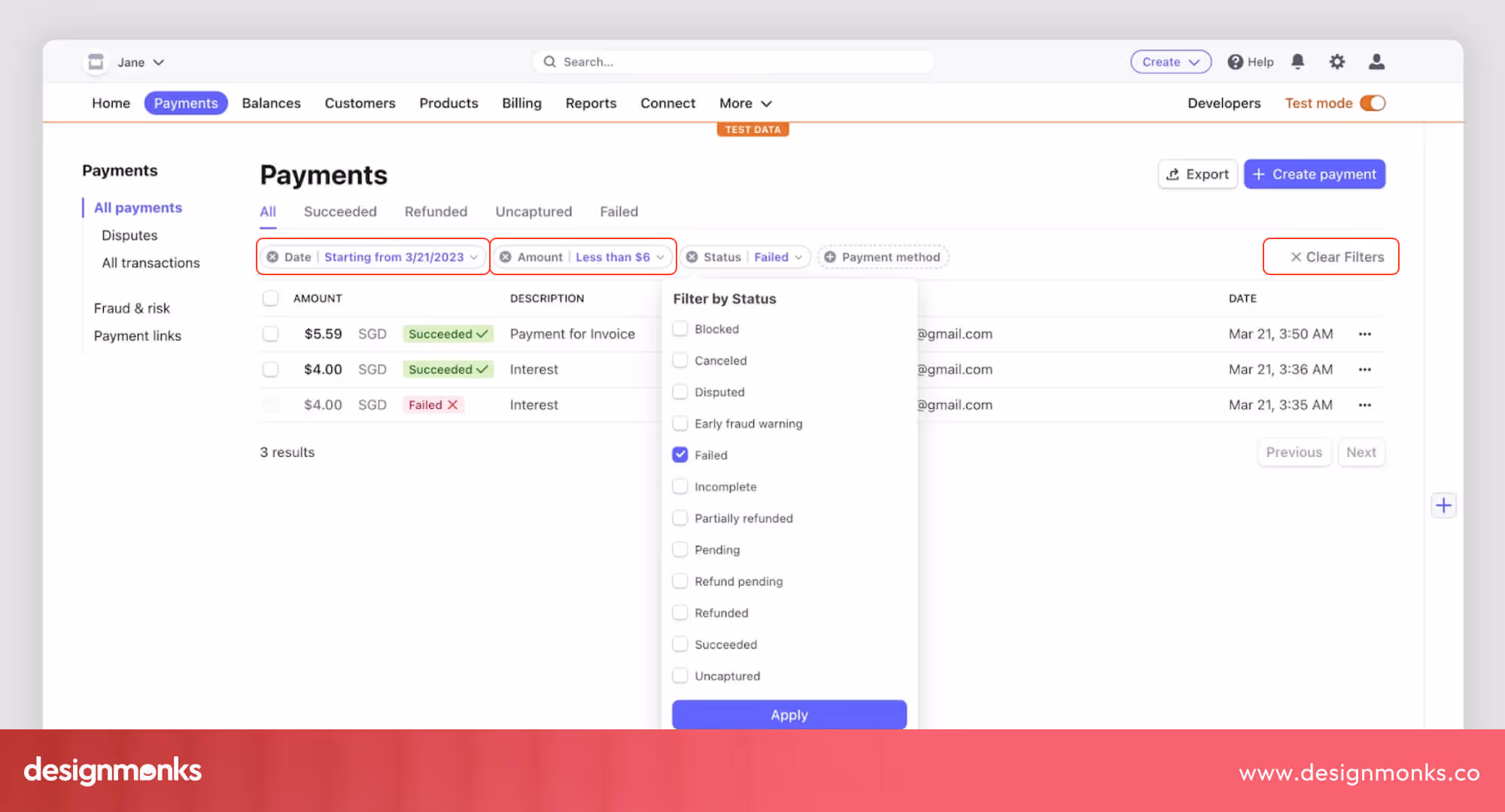
Provide Filters, Facets, and Sorting Options
Filters allow users to refine results, reducing decision fatigue and speeding task completion. They also empower users to feel in control, especially when dealing with large or complex datasets.
Use collapsible or sticky filters on mobile, and test combinations to ensure usability. Consider contextual filters that adapt to the user’s query for smarter, dynamic results.
Deal with Zero Results the Right Way
A zero-result page can feel like a dead-end. Handled well, it’s an opportunity to retain users and guide them toward other valuable content.
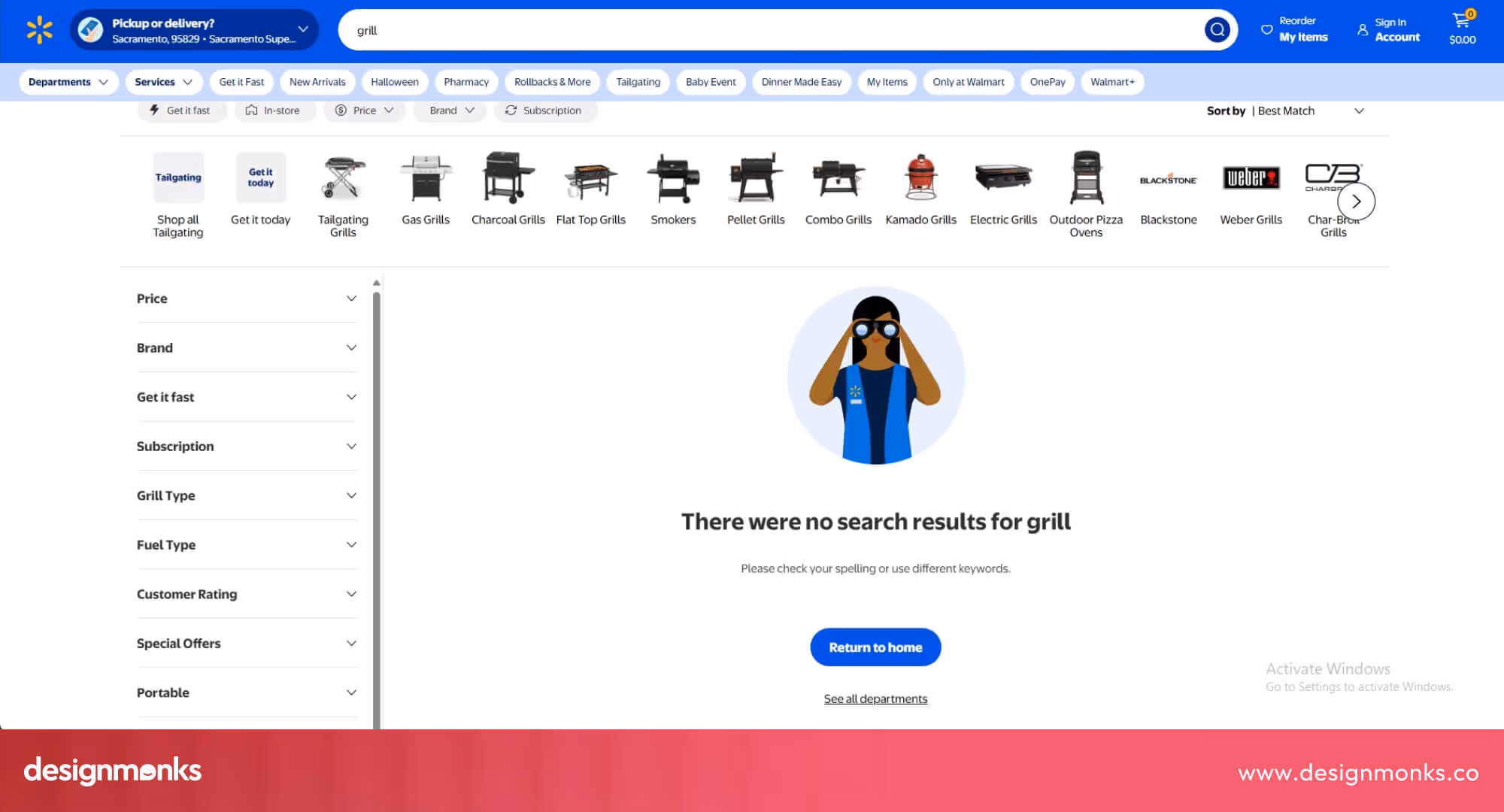
Show suggested alternative queries, related content, popular searches, or help links. Use friendly, encouraging messaging and keep the user engaged instead of leaving them frustrated. Include options to browse categories or search again with modified terms.
Optimize for Speed & Performance
Slow searches frustrate users and make them leave. Fast search keeps users happy, engaged, and confident in your product. Make search results load quickly by optimizing the backend, using caching, and preloading common suggestions.
Reduce delays on the front end and test speed on mobile devices. You can also use lazy loading and optimize images to make results appear faster.
Design for Mobile & Responsive Use
Search UX must be consistent and usable across devices. Mobile users expect the same efficiency and clarity as desktop users, despite smaller screens. Ensure touch-friendly input fields, responsive filters, and scrollable results.
Maintain visibility of the search bar on small screens and test gestures like swiping and tapping. Adjust layouts dynamically for different orientations and screen sizes.
Ensure Accessibility & Inclusive Design
Search should be usable by all users, including those with disabilities. Accessible search builds trust and broadens your audience. Implement semantic HTML, proper ARIA labels, keyboard navigation, and screen reader support.
Use color contrast and font size guidelines, and test with assistive technologies to ensure everyone can search effectively. Include captions, alternative text, and voice-accessible elements when possible.
Advanced & Emerging Search UX Patterns
As search continues to evolve, modern platforms are moving beyond basic keyword matching to create intelligent, adaptive, and highly relevant experiences. These advanced patterns leverage context, AI, and emerging technologies to make search faster, more accurate, and more engaging for users.
1. Personalization & Contextual Ranking
Personalized search shows results based on a user’s past actions, location, and preferences. This makes results feel tailored to them and saves time. Contextual ranking takes this further by considering the situation or intent behind the search.
For example, if a user searches for “wireframes” while browsing a design blog, results might show articles first. But if they search for the same word inside a design tool, templates might show up first.
Together, personalization and contextual ranking make search feel smart, showing the most helpful results for each person, in each situation.
2. Conversational & Voice Search
Conversational and voice search allow users to interact using natural language, either by typing or speaking queries.
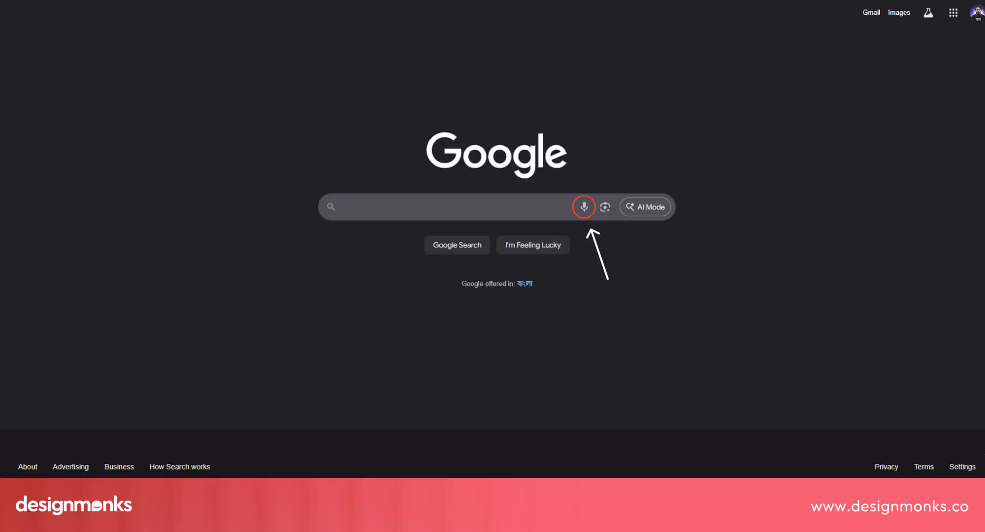
This makes search feel more intuitive and human-like, supporting long-tail questions and commands that traditional search might not handle well.
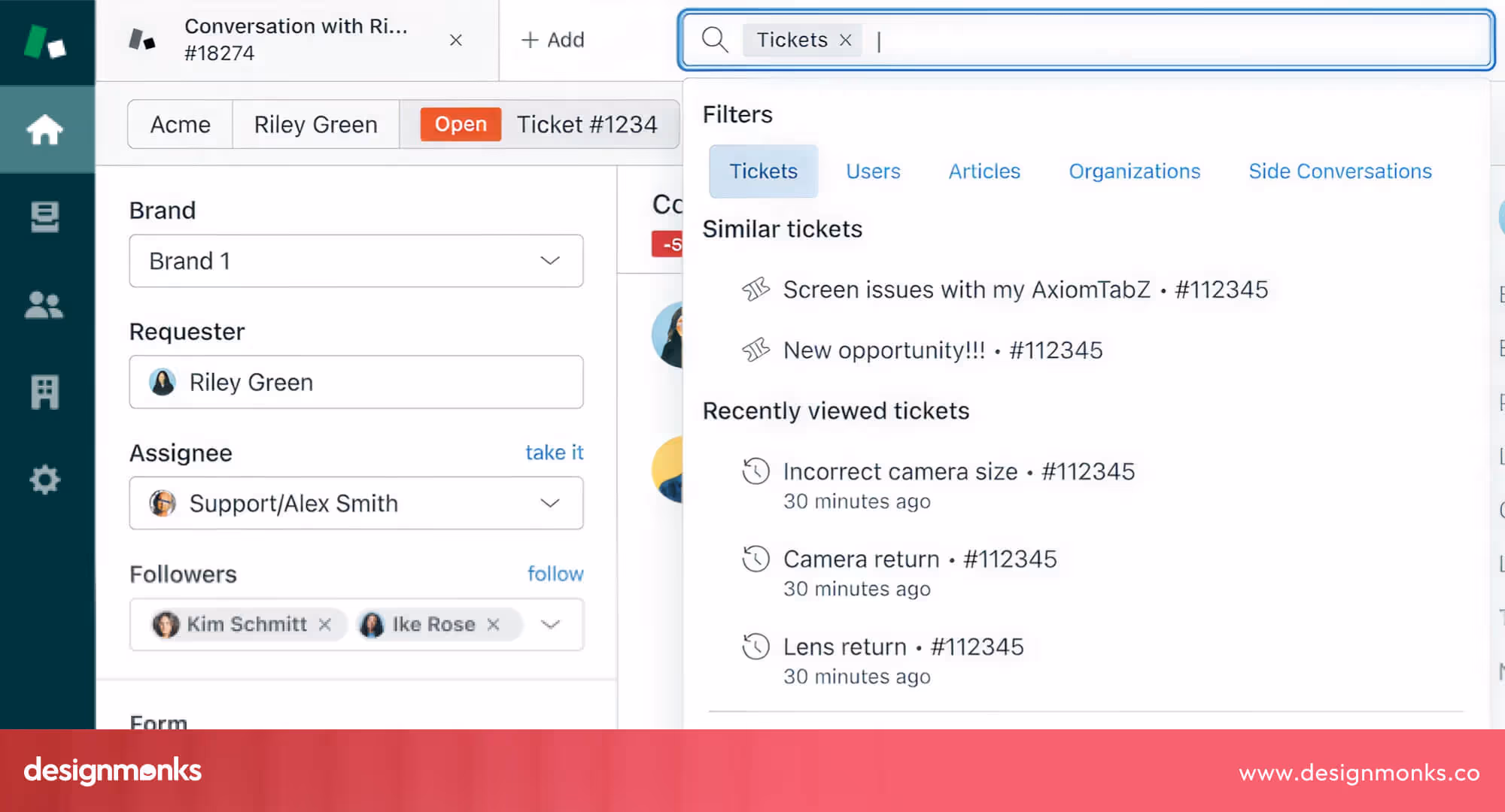
3. Federated / Unified Search Across Sources
Federated search gathers results from multiple places, like product catalogs, help articles, community forums, and even third-party tools, and displays them together in one search page.
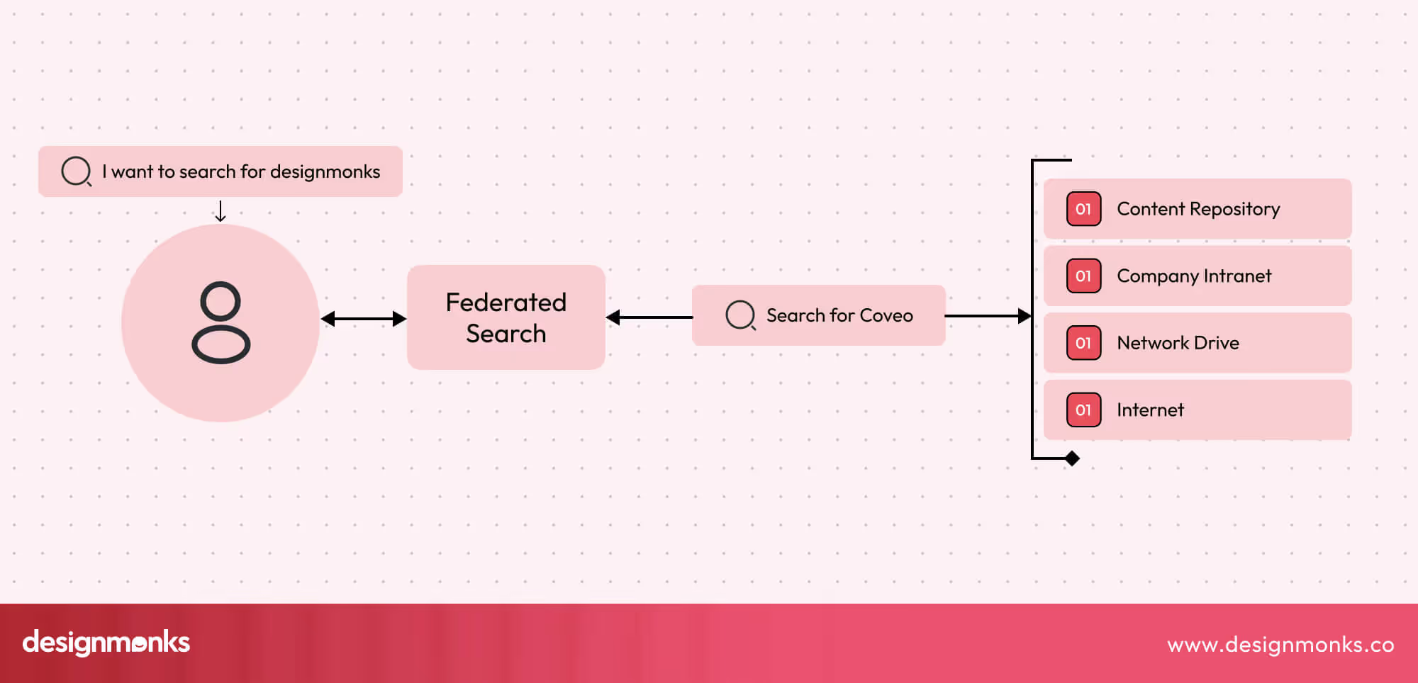
This saves users from running the same search across different systems and makes the process faster and less frustrating.
Unified search goes beyond simply gathering results. It merges everything into one consistent, ranked list, so users feel like they’re searching a single, well-organized source rather than juggling multiple silos.
Both approaches give users a complete view of available information, build trust, and reduce the risk of missing something important.
4. Predictive & Proactive Search Suggestions
Predictive search helps users find what they need before they finish typing. It offers suggestions based on trends, popular queries, or the user’s previous searches. It makes searching faster and easier to get relevant results.
Proactive search goes a step further by showing helpful recommendations even before a search begins. For example, a homepage might highlight trending topics, recent searches, or suggested content that matches a user’s interests. Together, predictive and proactive suggestions reduce effort and guide users to the right content. Sometimes, it even helps them discover things they didn’t know they were looking for.
5. Visual Search & Cross-Device Continuity
Visual search allows users to find information using images instead of text, which is perfect for products, design inspiration, or visual content. A user could upload a photo of a chair and instantly see similar items, styles, or products.
Cross-device continuity ensures that a user can start a search on one device and continue on another without losing progress. Combined with visual search, this creates a smooth, modern experience that feels effortless and convenient, helping users get what they need quickly, no matter where or how they search.
How to Measure & Improve Search UX
Launching a search feature is just the beginning, the real magic happens when you keep improving it over time. Search is like a living, breathing part of your product.
If you don’t maintain it, it can quickly become slow, outdated, or irrelevant, leaving users frustrated. By tracking the right signals and making small, smart updates, you can turn search into one of the most powerful parts of your user experience:
Key Metrics
Numbers can reveal exactly how well your search is working. Three of the most important ones are:
- Abandonment rate: This measures how often users search but leave without clicking on anything. A high abandonment rate usually means your results aren’t relevant, or users can’t quickly spot what they need.
- Refinement rate: When users retype or tweak their search, it’s their way of saying, “Nope, not what I wanted, let me try again.” A small amount is normal, but if most users refine their search, you might need better autocomplete, spelling correction, or broader matching.
- Click-through rate (CTR): This shows which results users actually click. A high CTR means your results are useful and easy to scan. If CTR is low, results might look too similar, lack key info (like prices or images), or be ranked poorly.
Did you know? Users who perform a search are 2–3x more likely to convert than those who just browse. This means improving search not only helps usability, it also directly grows revenue.
Test, Learn, Improve
Great search UX is built by experimenting, not guessing. Run quick A/B tests to see what really helps, like whether showing 5 or 10 autocomplete suggestions makes users click faster, or if reordering results boosts engagement.
Dive into your search logs, they’re a treasure map of user intent. Spot patterns like common spelling mistakes, searches that return zero results, or topics people look for but you don’t have content for. Each of these is a clue to what users truly need, and fixing them can turn a frustrating dead end into a satisfying “aha!” moment.
Keep It Fresh
Search isn’t a “set it and forget it” feature, it needs regular tune-ups. Your users, content, and products are always changing, and your search experience should keep up.
Review search rules, add new filters, and adjust ranking so results stay relevant and useful. Even small tweaks, like promoting trending items or hiding outdated content, can make a big difference. A fresh, well-maintained search keeps users happy and reduces frustration before it even starts.
Real-World Examples
Nothing explains good search UX better than seeing it in the wild. By looking at how leading platforms design their search, you can uncover patterns, best practices, and creative solutions that make user journeys smoother:
E-commerce Search
Think about Amazon or your favorite Shopify store. Their search bars aren’t just functional, they’re designed to sell. Predictive search starts showing products as soon as you type a few letters, making it effortless to find what you want (and discover things you didn’t even know you needed).

Smart filters let you narrow results by price, size, rating, or color, removing friction from the buying journey. This combination of speed and personalization isn’t just convenient, it’s proven to boost conversions and average order value because users feel guided rather than overwhelmed.
Knowledge Base & Documentation Search
Platforms like Zendesk and Atlassian offer excellent examples of how search can empower users. Their systems use structured data, tags, and categories to surface the most relevant guides and FAQs first.
This reduces frustration, keeps users self-sufficient, and dramatically lowers the number of support tickets. For businesses, that means fewer hours spent answering repetitive questions and more time spent on higher-value tasks.
In-App SaaS Search
Tools like Figma and Notion show how search can be part of the workflow itself. Their lightning-fast autocomplete feels instant, pulling up files, pages, or components without breaking focus.

Contextual ranking ensures the most relevant results appear first, like the file you opened yesterday or the project your team is actively working on. Add cross-device continuity, and users can start a search on desktop and finish on mobile without losing progress.
The result? A smooth, distraction-free flow that makes users feel like the product just “gets” them.
Search UX Checklist
A quick checklist for your startup search UX experience hits all the right points:
- Make the search box easy to find.
- Offer helpful autocomplete and suggestions.
- Handle typos and fuzzy queries gracefully.
- Show relevant, clear results.
- Provide filters and sorting options.
- Handle zero-result pages effectively.
- Optimize speed and responsiveness.
- Ensure accessibility and mobile usability.
FAQs
How many autocomplete suggestions are ideal?
5-8 autocomplete suggestions are ideal. They are enough to be helpful, not overwhelming for the users to complete a search.
Should the search be visible on every page?
Yes, the search should be visible on every page. Consistent visibility ensures users can start a search anytime without frustration.
What’s the best way to handle zero results?
The best way to handle zero results is to offer alternative queries, related content, or popular searches. This keeps users engaged and helps them easily redirect their search and not leave the page.
Infinite scroll vs pagination: which is better?
This depends on your need. Pagination works better for structured results, while infinite scroll can be useful for visual-heavy content. Choose based on content type and user goals.
Conclusion
Great search doesn’t just happen, it’s designed with care. By following these search UX best practices, you can turn frustrating dead ends into smooth, satisfying journeys that keep users coming back.
Whether it’s smarter autocomplete, clearer results, or faster performance, every improvement builds trust and boosts engagement. Keep testing, refining, and listening to your users, because the best search experiences are always evolving. Now it’s your turn to design a search that truly works.

.avif)
.avif)
.avif)
.avif)


.avif)
.avif)
.avif)
.avif)


.avif)


