
.svg)


Key Takeaways
- A UX checklist ensures startups build clear, user-friendly products from day one.
- Prioritizing usability, accessibility, and consistency prevents costly redesigns later.
- Lean personas, JTBD, and success metrics keep design aligned with real needs.
- User flows, microcopy, and clear CTAs guide users smoothly through tasks.
- Testing prototypes early uncovers usability issues before expensive development begins.
- Post-design testing with users and heuristics ensures intuitive, reliable experiences.
- After launch, tracking metrics, feedback, and A/B tests drive continuous improvement
Some apps make you wonder, “Why did I even download this?” It happens when the business doesn’t prioritize UX. Poor UX is like a trap for startups that they can’t avoid without a proper UX checklist for startups.
Users decide in seconds whether they like a product. A startup with a clear UX plan can guide them smoothly, solve their problems, and keep them coming back. Skipping this step often leads to frustration and wasted effort.
In this blog, you will find practical steps to build products users love. These easy strategies will make your product clear, engaging, and ready for real people, right from day one.
Why is the UX Checklist a Must-Have for Startups?
Startups often have limited time and money. A properly made checklist can help them save cost and time by ensuring a clear focus, improving conversion rate, and maintaining consistency. Let’s learn more about the benefits of having a UX checklist for startups.
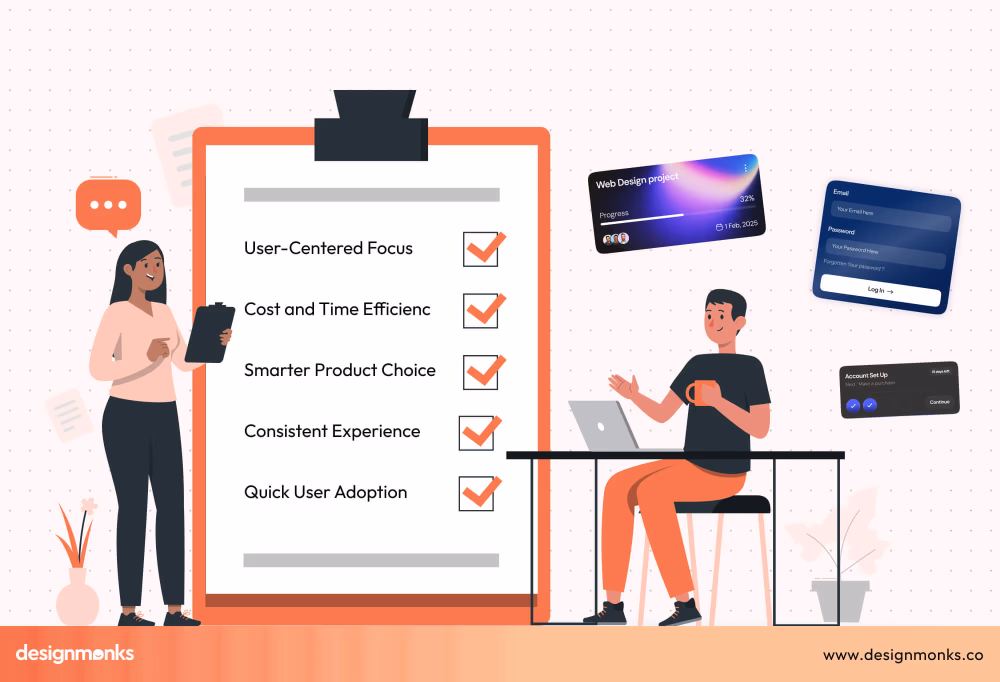
Clear Focus on Users
A UX checklist guides the team to think about how users will interact with each part of the product. It ensures proper user-centric product development, and no important detail is overlooked, and every feature feels natural and easy to use. This strategy helps startups create a product that solves real problems clearly.
Save Time and Money
Planning UX properly from the start avoids redesigns later. When the team checks important user experience points early, it prevents mistakes that can be expensive. It ultimately saves money, reduces wasted effort, and lets the startup grow faster.
Improve Conversion Rate
A clear UX checklist helps startups avoid costly design mistakes. It also speeds up product launches and builds user trust from day one. As a result, more early users turn into loyal customers and boost long-term growth.
Better Product Decisions
A checklist helps the team make smarter decisions about every feature and element. By reviewing the product through the lens of the user, startups can prioritize what matters most. This approach ensures the product stays useful, simple, and meaningful for the audience.
Consistency Across the Product
A structured UX plan keeps the design consistent across screens and features. Buttons, menus, and actions follow the same style, which makes the product easy to understand. Users can move through the app without confusion, improving their overall experience.
Faster User Adoption
When all elements are thoughtfully designed, users learn the product quickly. Using a UX checklist ensures that all parts of the experience are considered during the design process
It helps users feel confident and satisfied. This approach simply leads to happier users and better chances of success for the startup.
Once you keep a UX checklist, you can easily make sure your startup product designs don’t miss anything important. It guides your team to focus on what matters, utilize the benefits of UX for startups, avoid costly mistakes, and deliver a product users love from the very first day.
Core UX Principles for Startups
For your startup, you can’t just jump into the detailed features. Some guiding rules are important for UX. These principles help make decisions that keep the product simple, useful, and enjoyable for users. If you get a proper startup UX consultancy, they’ll make the checklist following the principles for you.
Usability First
Every part of your product should be easy to understand. It’s essential to follow buttons, menus, and call-to-action best practices to feel natural and predictable. The design should forgive small mistakes so users don’t feel lost or stuck.
Clear labels, simple instructions, and logical navigation all make a product more usable. Even first-time users should be able to figure out the core features without help.
Accessibility by Default
Design your product for all users, not just the “average” person. This means thinking about people with different abilities, vision, or hearing limitations, or older users.
Using professional small fonts, proper color contrast, and easy navigation helps everyone use the product. Accessibility ensures no one is left out and increases the potential user base.
Consistency Matters
Layouts, labels, and interaction patterns should stay the same throughout the product. Buttons that look or act differently in different places can confuse users.
When things feel familiar, users can move through the app confidently. Consistency also speeds up learning because users can predict what will happen next.
Feedback for Every Action
Users need to know what is happening after every action. Showing messages, animations, or indicators helps users understand progress.
For example, a loading spinner or confirmation message tells them that the product is responding. Clear feedback prevents frustration and builds trust in the product.
Mobile-First Mindset
Designing for small screens first ensures the core experience is solid. Start with mobile layouts, simple navigation, and essential features.
Then scale up for larger screens like tablets or desktops. Since most users interact via phones, focusing on mobile makes the product usable everywhere and helps prioritize the most important elements.
Pre-Design UX Checklist for Startups
Before creating screens or coding features, a startup must set strong UX foundations. This stage ensures that every design decision connects back to real users, their needs, and clear business goals.
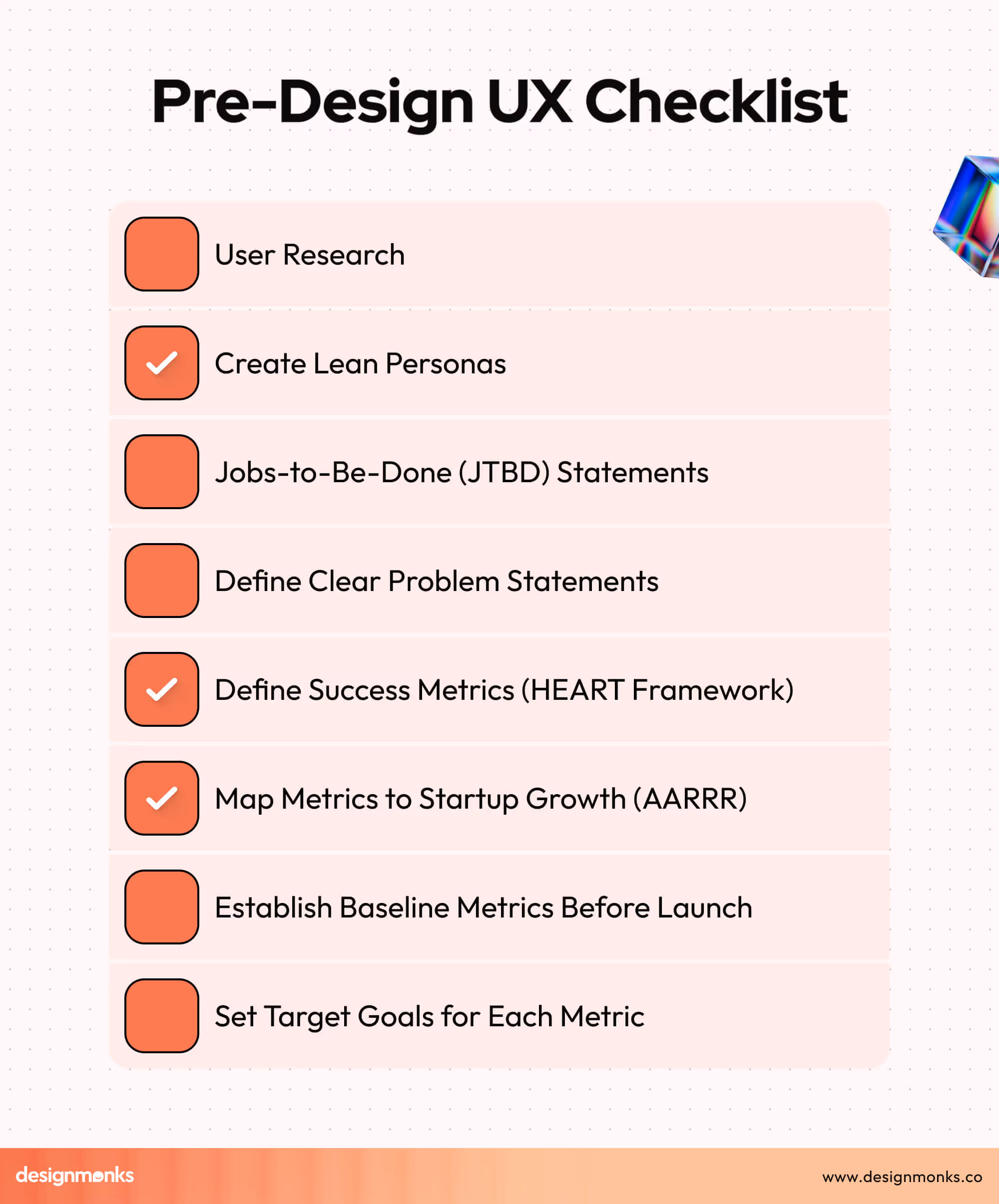
1. User Research
Good UX begins with understanding people. Talk to potential users, observe their habits, and note their challenges. Even a few interviews or surveys can uncover insights that shape the product in the right direction.
2. Create Lean Personas
Personas help you picture your users more clearly. A lean persona includes a name, goals, pain points, and behaviors. These simple profiles guide design decisions by reminding the team who they are building for.
3. Jobs-to-Be-Done (JTBD) Statements
JTBD frames what problem your product solves in daily life. The format is simple:
“When I face [situation], I want to [motivation], so I can [outcome].”
This strategy ensures features match real user needs.
4. Define Clear Problem Statements
A clear problem statement keeps the team focused. It explains what challenge users face, why it matters, and what outcome they expect. Without this focus, it’s easy to build features that nobody truly needs.
5. Define Success Metrics (HEART Framework)
UX success should be measurable. The HEART framework covers five areas: Happiness, Engagement, Adoption, Retention, and Task Success. Each area turns user experience into trackable results to help startups see if design choices actually work.
6. Map Metrics to Startup Growth (AARRR)
Link UX goals to business outcomes using AARRR: Acquisition, Activation, Retention, Revenue, and Referral. This approach ensures every UX improvement supports startup growth, not just usability, creating a clear bridge between design and business success.
7. Establish Baseline Metrics Before Launch
Collect baseline numbers early, like current engagement or task success rates. These act as a starting point to measure progress later. Without a baseline, you won’t know if changes are making a real difference.
8. Set Target Goals for Each Metric
Clear targets help teams stay focused. For example, aiming to raise task completion by 20% or retention by 15%. These goals guide design work and give startups a way to measure success after launch.
UX Design Checklist for Startups
Once research and goals are set, it’s time to design with users in mind. This checklist ensures that every screen, button, and message works together to give people a smooth and enjoyable experience.
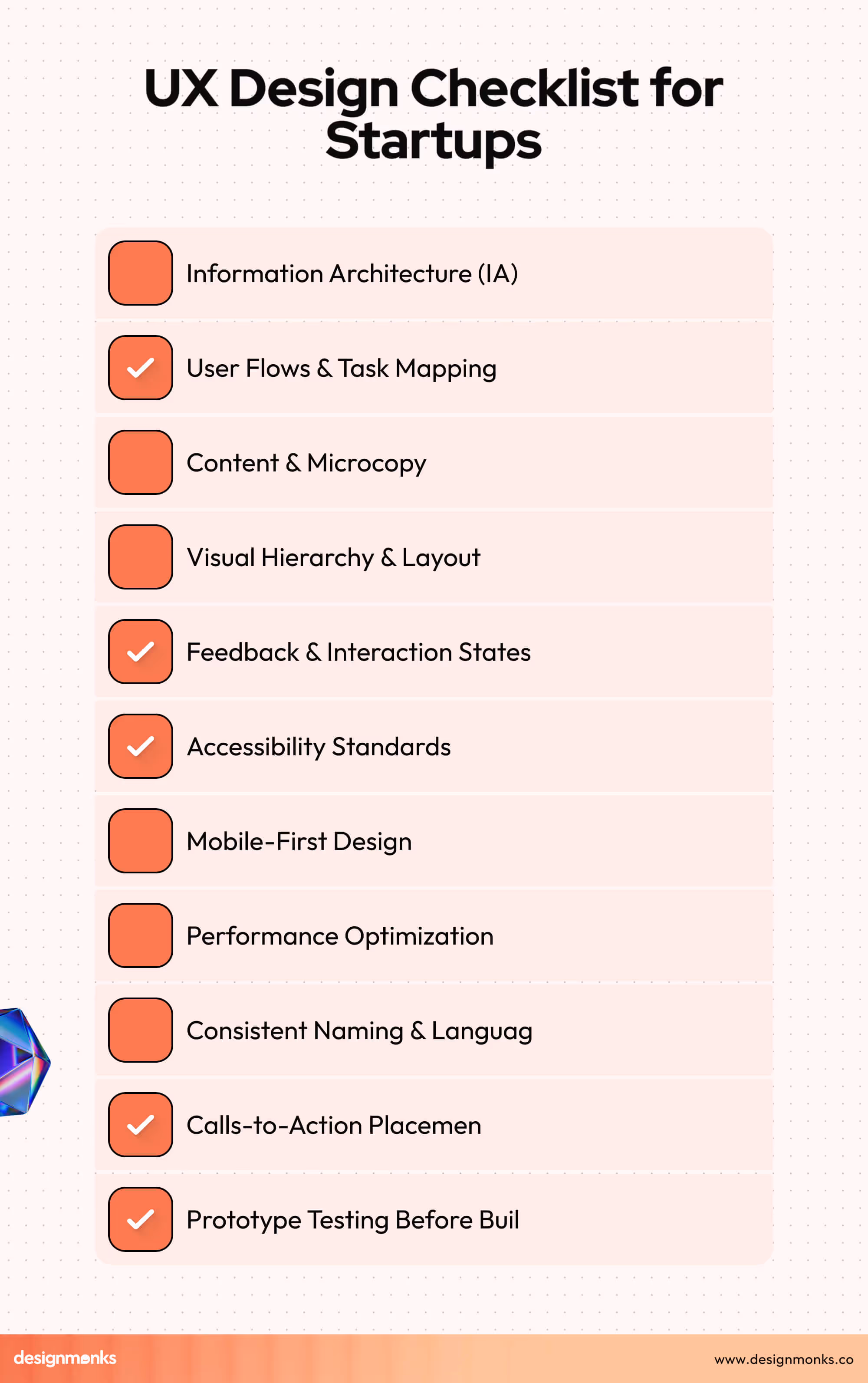
1. Information Architecture (IA)
Information Architecture is about organizing content so users can find it easily. A logical sitemap, supported by clear categories and labels, prevents confusion and helps people reach their goals without unnecessary searching or frustration.
2. User Flows & Task Mapping
User flows outline the path someone takes to complete a goal. By mapping tasks like sign-up, onboarding, or payments, startups can remove extra steps and ensure users always know what action to take next.
3. Content & Microcopy
Words are part of the experience. Action-oriented buttons, helpful error messages, and guiding text in empty states make interactions easier. Simple, friendly language helps users understand what’s happening and how to move forward confidently.
4. Visual Hierarchy & Layout
Good design directs attention. Using size, color, and spacing, you can highlight what matters most. A balanced layout ensures important actions stand out, while consistent spacing keeps the overall look clean and comfortable.
5. Feedback & Interaction States
Every user action should trigger a response. Loading indicators, success confirmations, and error notifications reassure people that the system is working. Even disabled buttons should look distinct, so users understand their current options clearly.
6. Accessibility Standards
Design should work for everyone. Features like keyboard navigation, visible focus outlines, and alt text for images ensure inclusivity. Accessibility also includes making sure touch targets are large enough and colors have proper contrast.
7. Mobile-First Design
Since many users access products on mobile, the design should start with small screens first. Responsive layouts, readable typography, and tap-friendly spacing create a comfortable mobile experience, which can then be expanded for larger devices.
8. Performance Optimization
Slow products frustrate users. Meeting Core Web Vitals, like fast loading (LCP), smooth interaction (INP), and stable layouts (CLS), is crucial. Techniques like lazy loading non-essential content ensure users get speed without losing functionality.
9. Consistent Naming & Language
Consistency across menus, labels, and buttons prevents confusion. When users see the same wording and patterns repeatedly, they learn the product faster. Avoiding jargon keeps the design approachable for people with different levels of experience.
10. Calls-to-Action Placement
Clear calls-to-action (CTAs) guide users at every step. Whether signing up, upgrading, or completing a task, CTAs should stand out visually and use simple words. This approach helps reduce hesitation and supports smooth task completion.
11. Prototype Testing Before Build
Clickable prototypes allow teams to test ideas before writing code. By observing how users navigate mockups, startups can catch usability problems early. This strategy saves development time and ensures the final product feels intuitive from launch.
Post-Design UX Checklist for Startups
After creating designs, it’s important to test and refine before launch. This stage ensures that the product is practical, easy to use, and ready for development without carrying hidden issues that frustrate users later.

1. Usability Testing with Real Users
Testing with actual users reveals problems that designers may overlook. Even with 5 to 8 participants, you can see where people get stuck, confused, or drop off. It will help refine the design before investing in full development.
2. Apply Nielsen’s 10 Heuristics
Nielsen’s heuristics are simple rules for good design, such as visibility of system status, error prevention, and consistency. Running a heuristic evaluation helps catch common usability problems early, saving time and effort down the line.
3. Prototype Validation (Clickable Prototypes)
Clickable prototypes let teams test designs in real interactions, not just static screens. This hands-on testing shows whether navigation flows make sense and if users understand what to do. It significantly reduces the chance of confusion later.
4. Test Critical Flows Before Build
Flows like sign-up, onboarding, and payments are business-critical. Testing them before development ensures they work smoothly. Fixing issues at this stage is cheaper and prevents major roadblocks once coding has already begun.
5. Gather Qualitative Feedback (Interviews, Surveys)
Qualitative feedback reveals feelings and frustrations that metrics can’t capture. Simple interviews or surveys help uncover what users like, dislike, or expect. These data will give you valuable insights for making the design more human and relatable.
6. Gather Quantitative Feedback (Analytics, Metrics)
Numbers tell another side of the story. Tracking task success, completion rates, and errors shows how users behave with the product. This data-driven feedback supports objective decisions instead of relying only on opinions.
7. Prioritize Issues Based on Impact
Not every problem is equally urgent. Sorting issues by their impact on usability and business goals helps teams fix what matters most first. This strategy ensures limited resources are spent where they create the biggest improvement.
8. Prepare Documentation for Hand-off
Clear documentation bridges the gap between designers and developers. Notes on flows, components, and interactions prevent misunderstandings. A well-documented hand-off ensures the product built in code matches the design that users already tested successfully.
After Launch UX Checklist
Launching is only the beginning. A product needs constant care after release, as real users interact with it in unpredictable ways. Tracking, feedback, and ongoing improvements ensure the experience keeps meeting expectations over time.

1. Analytics Tracking (Activation, Retention, Drop-offs)
Track where users join, stay, or leave. Monitoring activation, retention, and drop-off points highlights weak spots in the experience. These insights guide improvements and help stop users from abandoning the product too early.
2. Monitor Engagement Metrics (HEART)
The HEART framework, Happiness, Engagement, Adoption, Retention, and Task Success, provides a simple way to measure experience quality. Checking these regularly helps identify whether users are satisfied and returning, or if the product needs adjustments.
3. Collect User Feedback Continuously
User feedback doesn’t end after launch. Through surveys, interviews, or in-app prompts, gathering opinions ensures the product evolves with real needs. Continuous listening prevents teams from drifting away from what users actually want.
4. Support Ticket & Review Analysis
Customer support tickets and app reviews reveal issues directly from users. Analyzing them regularly helps uncover pain points that analytics may miss. Identifying these quickly shows users that feedback is valued and acted upon.
5. Run A/B Tests for Key Flows
A/B testing compares two versions of a feature to see which works better. Running these experiments on sign-up, onboarding, or checkout flows ensures changes are based on real user behavior, not assumptions.
6. Monitor Onboarding Completion Rates
Onboarding is critical for first impressions. Startups must track how many users complete the onboarding process and show if the journey is too long or confusing. Improving this flow boosts activation and increases long-term retention rates.
7. Monthly UX Reviews
A regular monthly review helps catch issues early. By looking at analytics, feedback, and usability reports together, startups can spot trends. It also helps them adjust the product before small problems grow into major frustrations.
8. Maintain Open Feedback Channels
Keeping communication open builds trust. Offering chat support, email, or feedback forms lets users share thoughts easily. This openness not only uncovers issues but also helps strengthen relationships with early adopters.
9. Document UX Experiments
Every test and change should be documented. Tracking what worked and what failed avoids repeating mistakes and builds a knowledge base. Documentation also helps new team members quickly understand past decisions.
10. Continuous Iteration & Improvement
UX is never finished. By combining feedback, analytics, and testing, teams can keep refining the product. Small, regular updates prevent the experience from becoming outdated and ensure it continues to meet user expectations.
FAQs
How does UX affect user satisfaction for startups?
Good UX makes a product easy to use, clear, and enjoyable. When users can achieve their goals without confusion or frustration, they feel satisfied, stay longer, and are more likely to recommend the product to others.
Do I need a UX checklist for a small startup?
Yes. Even small startups benefit from a UX checklist. It helps organize design tasks, focus on user needs, prevent mistakes, and ensure that every feature contributes to a smooth and enjoyable experience for users from the very beginning.
Who should make the UX checklist for a startup?
The UX checklist should be created by the design team, ideally with input from product managers, developers, and anyone involved in building the product. Collaboration ensures that all user experience aspects are covered and everyone follows the same standards.
How do I measure the success of a startup's UX design?
UX success can be measured through user feedback, engagement metrics, and task completion rates. High satisfaction, low errors, and repeated usage indicate that users find the product intuitive, enjoyable, and useful, reflecting strong UX design.
End Note
A strong UX checklist is not just a design tool, it’s a roadmap to creating products that people enjoy and trust. Startups that follow it can avoid common mistakes and focus on delivering real value.
By thinking about usability, accessibility, and consistency from the start, you set the foundation for long-term success. Build with your users in mind, and they will reward you with loyalty, positive feedback, and lasting growth for your product.

.avif)
.avif)
.avif)
.avif)


.avif)
.avif)
.avif)
.avif)


.avif)


