
Key Takeaways
- Cognitive load is the mental effort visitors spend to understand a screen.
- Working memory holds about four items, so every extra choice costs attention.
- Task difficulty creates intrinsic load, while poor design creates extraneous load you can cut.
- Progressive disclosure, chunking, and consistency lower effort and help visitors finish tasks.
- NASA-TLX, usability testing, and A/B tests prove which fixes actually reduce effort.
Your visitors can hold only about four chunks of information in mind at once. Add a fifth, and something slips. So what is cognitive load in UX design, and why does it cost you sales?
Cognitive load in UX design is the mental effort a person spends to understand a screen and finish a task. Simple screens ask for little, while cluttered ones overload working memory and push visitors away.
Business owners, marketers, and designers: this guide shows you what overwhelms visitors and how to fix it. Read on today to make every screen easier, faster, and far more profitable.
What Does Cognitive Load Mean in UX Design?
Cognitive load is the mental effort a person spends to understand a screen and finish a task. Working memory holds only a few items at once, so every extra choice crowds it.
Cognitive Load Theory explains why a crowded screen feels tiring. Nelson Cowan’s research concluded that people hold about four chunks of information at a time, so every extra item pushes something out.
How Cognitive Load Affects User Experience
When a screen asks too much of the brain, people stop moving forward and leave. Heavy mental effort costs your business time, trust, and sales.
- Confusion: Cognitive overload hits when a screen offers too many options. Visitors freeze, guess, or leave.
- Slower tasks: Every extra second spent decoding a menu delays the checkout, booking, or sign-up you want.
- More mistakes: Crowded forms cause typos, wrong clicks, and abandoned orders.
- Weak usability: A product that feels hard gets called hard, even when every feature works.
- Changed user behavior: Tired visitors skim, skip steps, and close the tab instead of asking for help.
A good UI/UX design service removes these roadblocks, so visitors reach the button you want them to click.
Cognitive Load vs. Mental Workload
The terms overlap but differ. Cognitive load measures the effort of one screen. Mental workload covers the total effort a person carries at that moment.
The Three Types of Cognitive Load in UX Design
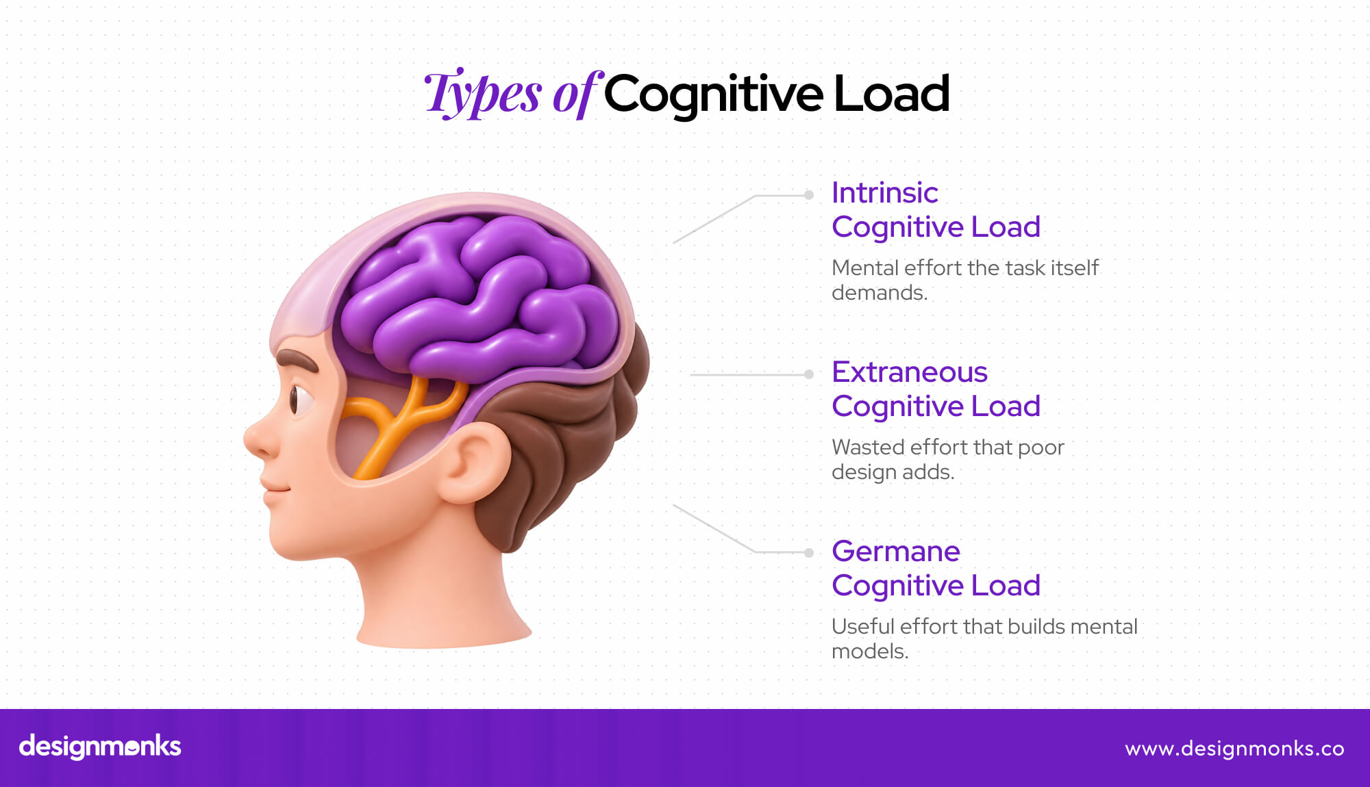
Psychologist John Sweller developed Cognitive Load Theory and split mental effort into three types: intrinsic, extraneous, and germane. A UX audit service shows which type hurts your product the most.
Intrinsic Cognitive Load
Intrinsic load is the effort the task itself demands. Comparing insurance plans carries high task complexity, and a person’s prior knowledge decides how heavy the job feels. A first-time buyer feels it more.
- Split a long insurance comparison into short steps, so buyers decide one thing at a time.
- Show the three details people use most in the first view, with the rest one tap away.
- Add plain-language hints for beginners, like “This covers hospital stays.”
- Show the live price as buyers pick each option in a product configurator.
Extraneous Cognitive Load
Extraneous load is wasted effort. Visual clutter, confusing navigation, vague labels, and unrelated information add interface complexity that helps nobody. Designers control all of it, so it is the easiest load to cut.
- Visitors have time to read only about a quarter of the text on a page, so filler hides the line that matters (according to NN/G).
- Trim the main menu to the few links people actually use.
- Rename vague buttons. “Get my free quote” beats “Submit.”
- Remove banners, pop-ups, and side widgets that compete with the main action.
Germane Cognitive Load
Germane load is useful effort. It goes into learning how a product works and building mental models. Each new pattern feeds schema formation, the brain’s habit of storing shortcuts, so the next visit feels faster.
- Keep familiar patterns, like a cart icon at the top right, so users learn once and reuse it everywhere.
- Use the same button style and wording on every page, so each lesson sticks.
- Add a short, skippable first-use tour that teaches the one feature people need first.
- Give new users a small early win, like a quick setup checklist, so the product’s logic clicks.
How Cognitive Load Affects the Human Brain and Working Memory
Information processing in the brain works in steps: attention picks what to notice, working memory holds it, and long-term memory stores what sticks. Each step has a limit, so no visitor can absorb unlimited information.
The Relationship Between Working Memory and Cognitive Load
Working memory works like the brain’s sticky note. It holds what a person needs right now, and cognitive load measures how full that note gets.
Working Memory vs. Short-Term Memory
Short-term memory holds information, like a phone number. Working memory holds and uses it, like dialing that number. Interfaces mostly tax working memory because users juggle and act at once.
Holding Details While Clicking
A shopper reads a coupon code, switches pages, and types it in. Each second the code sits in memory, it can fade. Show it right beside the payment field instead.
Where Attention Fits In
Cognitive processing means reading, comparing, and deciding. All three need attention, and attention is limited. A ringing phone or a surprise pop-up steals it, and the whole task slows down.
How Long-Term Memory Lightens the Load
Long-term memory stores habits. A shopper who knows the cart icon spends no effort finding it. Familiar layouts borrow that stored knowledge, so working memory stays free for the task.
Why Too Much Information Causes Cognitive Overload
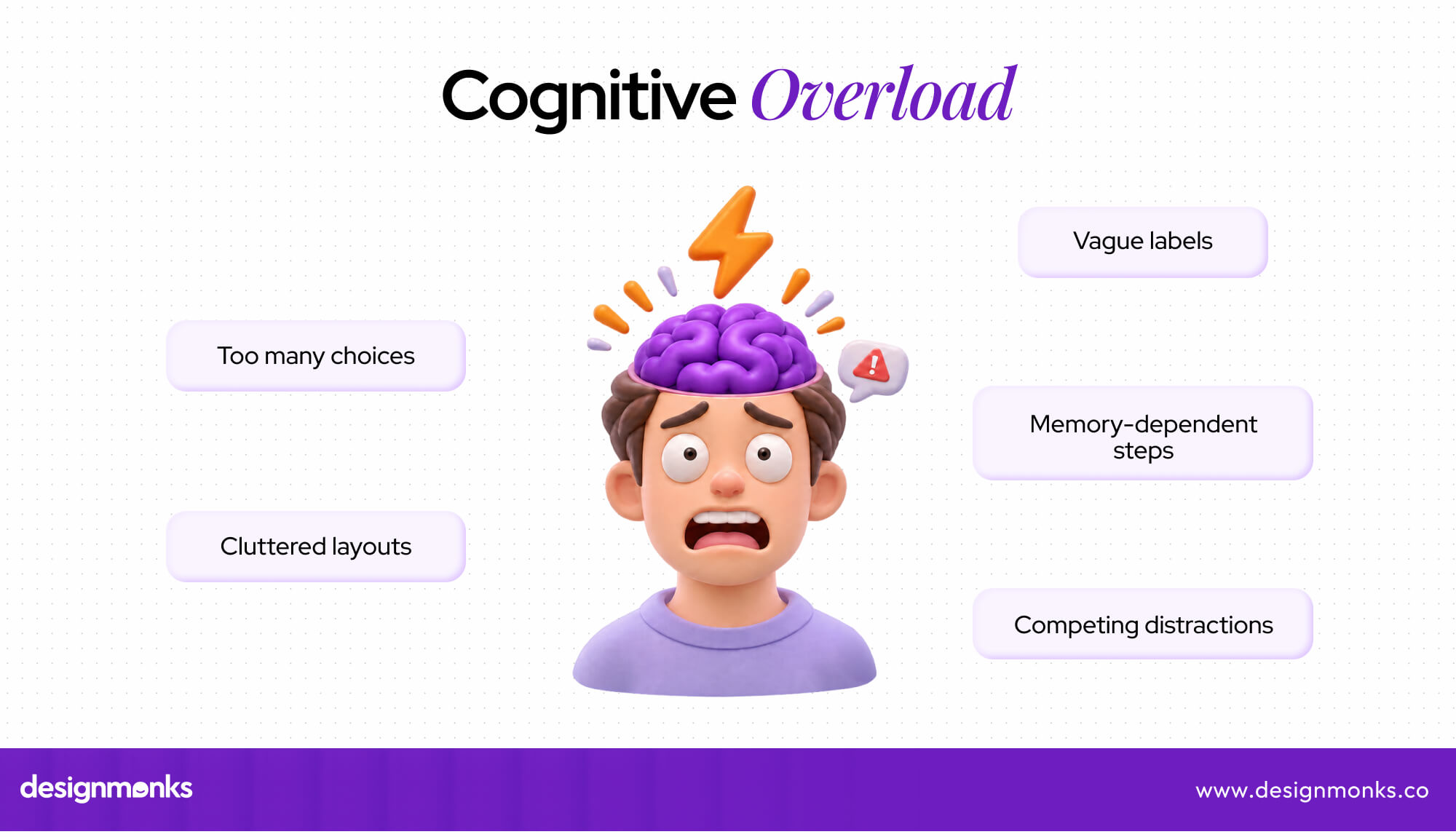
Cognitive overload happens when the brain gets more input than it can sort. Attention span shrinks, mental effort climbs, and the visitor quits before finishing.

- Competing information: A banner, a chat pop-up, and a sale timer all shout at once. Attention splits, and nothing gets read.
- Too many decisions: Five plans, three add-ons, and two delivery options in one view force visitors to weigh everything together. Many give up.
- Memory demands: A form that expects people to remember a choice from the previous page piles extra mental effort onto an already full working memory.
- Uneven attention: ADHD in UX design shows why this matters. People with ADHD often find it harder to filter out distractions, so clutter hurts them first and everyone else soon after.
Common UX Design Mistakes That Increase Cognitive Load
Most mistakes look harmless on the design file. A busy banner, a clever menu name, or one more button feels fine to the team. Visitors pay for each one with extraneous load, and the bill arrives later as lost sales.
Too Many Choices and Decisions on One Screen
Hick’s Law says more options mean slower decisions, and decision fatigue follows. In a famous jam study, 30% of tasters bought from six jams, but only 3% from 24, a clear case of choice overload.
Complex Navigation and Inconsistent UI Patterns
Visitors arrive with mental models from other sites. Odd navigation, buttons that change style, and unexpected behavior force them to relearn everything. Consistency protects usability: the same action should look and work the same way.
Poor Visual Hierarchy and Information Overload
When visual hierarchy fails, every element shouts equally. Dense layouts add visual clutter. Poor information architecture buries key points. Color psychology in UX design helps: one strong color guides the eye to the main action.
Making Users Remember Instead of Recognize
Nielsen’s Usability Heuristics favor recognition rather than recall. Hidden menus, buried settings, and memory-dependent steps overload working memory. Show options on screen, so people click what they see instead of hunting for what they remember.
Practical Ways to Reduce Cognitive Load in UX Design
Cognitive load reduction does not need a redesign from scratch. Six UX design principles, borrowed from well-known usability heuristics, help visitors understand screens faster and finish tasks with less effort. Each one below fixes a frustration and protects usability.
Use Progressive Disclosure to Simplify Complex Interfaces
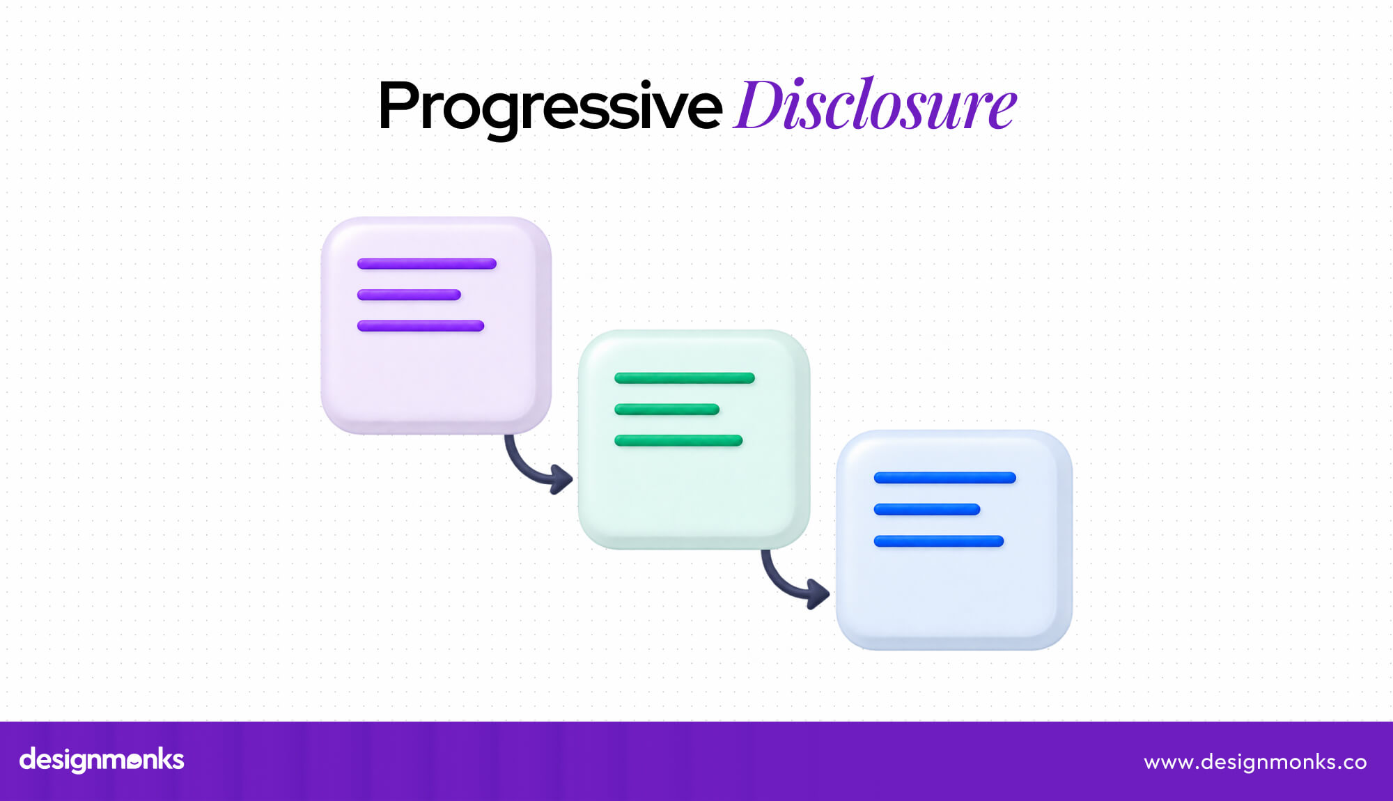
Progressive disclosure reveals details only when a visitor needs them. Put the main answer at the top of the information hierarchy and tuck extras behind links, so nobody drowns in details they never asked for.
- Show three to five key plan features first, with a “See all features” link.
- Collapse long FAQs into question headings that open on tap.
- Hide advanced filters behind a “More filters” button until someone needs them.
- Reveal optional form fields, like a promo code, only when a visitor clicks.
Apply Chunking to Organize Information
Chunking groups related items into small, scannable sections. Information processing gets easier because working memory handles a few groups better than many scattered items. A phone number in three short parts beats ten loose digits.
Prioritize Recognition Over Recall
Nielsen’s heuristics favor recognition rather than recall. Use visible options, familiar icons, and clear labels that match visitors’ mental models. Good search UX practice goes further. It suggests past searches so people can pick instead of retyping.
Maintain Consistency Across Interface Elements
Consistency lets visitors learn once and reuse that knowledge on every screen. Design systems store reusable buttons, menus, and form fields, so each page behaves the same and matches the mental models people already carry.
Use Clear Language and Visual Hierarchy
Plain language beats clever wording every time. Meaningful labels, readable type, and generous whitespace create a visual hierarchy that shows the most important item first, while solid information architecture puts related content in predictable places.
Reduce Unnecessary Steps and Automate Repetitive Tasks
Good interaction design removes the steps nobody wants. Smart defaults, autofill, and saved preferences hand repetitive work over to automation, and recognition replaces recall because the product remembers what the visitor already typed last time.
- Pre-fill the shipping address from the last order.
- Pre-select the most popular option, like standard delivery.
- Remember language, currency, and size, so visitors set them once.
- Merge two-page forms into one page.
Real-World Examples of Cognitive Load in UX Design
Three everyday products show the gap between hard and easy screens. A high-load screen triggers cognitive overload and fills working memory fast. A low-load screen applies progressive disclosure and strong usability to keep effort low.
Cognitive Load in Website Navigation
A high-load site buries pages deep inside three menu levels with odd names. A low-load site uses just five clearly named top links. Sound information architecture lets navigation match the mental models visitors already expect.
Cognitive Load in Ecommerce Checkout
Poor checkout UX costs sales. According to the Baymard Institute research, nearly 1 in every 5 shoppers abandoned a cart because checkout felt too long or complicated. Good form design trims fields and spares shoppers the decision fatigue of repeated, unclear steps.
- Long forms: Ask only for what shipping needs. Cut the rest.
- Repeated information: Never ask for the same address twice. Let shoppers tick “billing is the same.”
- Hidden fees: Show shipping and tax early, so the final total holds no surprises.
- Unclear steps: Show a progress bar and keep order details visible, so shoppers recognize what they picked instead of recalling it.
Cognitive Load in SaaS Dashboards
A high-load dashboard crams twenty charts, competing metrics, and controls onto one page. Information overload follows quickly. A low-load one uses clear data visualization and visual hierarchy to put the three numbers that matter first.
How to Measure Cognitive Load in UX Research
UX research turns a vague feeling of “this is hard” into numbers. Researchers measure cognitive workload with NASA-TLX, usability testing, and experiments, so teams fix real problems instead of guessing which screen tires your visitors.
Use NASA-TLX to Evaluate Perceived Mental Workload
The NASA Task Load Index (NASA-TLX) has people rate a task after finishing it on six subscales: mental demand, physical demand, temporal demand, performance, effort, and frustration. High mental demand and effort scores flag trouble.
Observe User Behavior During Usability Testing
Usability testing reveals strain through user behavior. Slow tasks, a low task completion rate, a high error rate, long pauses, repeated clicks, and quitting signal mental effort. A usability testing service can run the tests.
Use A/B Testing to Compare Interface Complexity
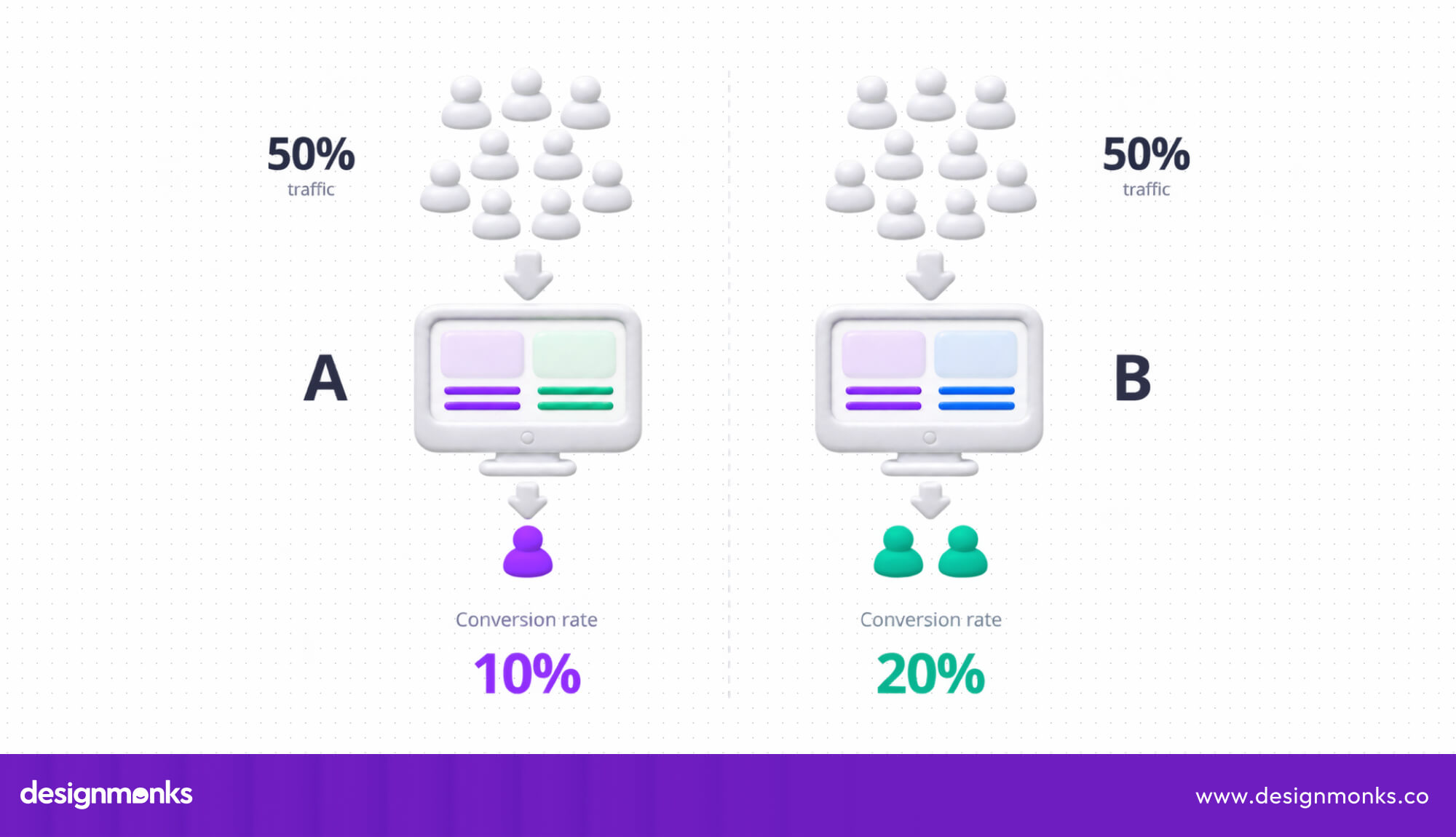
A/B testing shows two versions of a screen to different groups of visitors. Compare task success, errors, completion time, and conversion rate. When the simpler version wins on these usability metrics, mental effort likely dropped.
How to Audit an Interface for Cognitive Overload
A UX audit finds where an existing interface spends visitors’ mental energy for no reason. Follow these six steps to spot cognitive overload before it costs you customers.
- Map the key tasks: List the three to five jobs visitors come to do, such as buying or signing up, and note where each one starts.
- Run a cognitive walkthrough: Step through each task as a first-time user, asking at every screen, “Will they know what to do next?”
- Review with usability heuristics: Review every screen for clutter, vague labels, hidden options, and inconsistent patterns using a trusted checklist, like Nielsen’s ten heuristics.
- Count the decisions: Tally the choices, fields, and clicks on each screen. Flag any screen that asks visitors to decide too much at once.
- Spot memory traps: Mark every place where visitors must remember something from an earlier screen, then show that detail where they need it.
- Test with real people: Ask five users to finish the key tasks, note where they hesitate, and rate effort with a short NASA-TLX form.
- Rank and fix: Score each problem by how many visitors it affects and how much effort it adds, then fix the top three first.
Short on time? A specialist team can run this audit and hand you a ranked fix list. To get that for your product, contact Design Monks.
End Note
Cognitive load decides how many visitors finish a task and how many walk away. Working memory has strict limits, so every extra choice, vague label, and cluttered layout costs effort. Cut that waste, and people grasp your product much faster.
Start small. Test the one task that matters most, trim extra steps, and measure again with NASA-TLX or a quick A/B test. Each simple fix lowers effort, raises task completion, and turns tired visitors into loyal customers who come back.
FAQs
How does working memory affect user experience?
Working memory holds only a few items at once. When a screen asks visitors to remember codes, compare options, and follow instructions together, it overflows quickly. People slow down, make mistakes, or leave before finishing.
How can UX designers reduce cognitive overload?
Show less at a time. Use progressive disclosure, group related items, keep patterns consistent, write in plain language, and cut extra steps. Each change frees working memory, so visitors can focus on their actual goal.
What is the difference between intrinsic and extraneous cognitive load?
Intrinsic load comes from the task itself, like comparing insurance plans. Extraneous load comes from poor design, like clutter and vague labels. Designers can ease the first, but they should cut the second one entirely.
How do you measure cognitive load in usability testing?
Combine three signals. Ask participants to rate effort with the NASA-TLX questionnaire, track completion time, errors, and abandonment, and watch for hesitation or repeated clicks. Compare results between design versions to confirm each fix helped.