
.svg)


Key Takeaways
- Brand design in 2026 prioritizes adaptive systems over static visual identities.
- AI accelerates creativity, but human judgment defines authenticity and trust.
- Motion, fluid typography, and interaction shape brand perception across platforms.
- Emotional color, nostalgia, and controlled chaos drive memorability and engagement.
- Transparency, sustainability, and clarity make trust a core design requirement.
Stop settling for visuals that look nice but fail to get noticed online. Brand design trends of 2026 show that being “beautiful” is no longer enough to grab attention. Today’s strongest brands use clear, human-focused design that feels personal, simple, and easy to connect with at first glance.
As people move between apps, websites, and new AI tools, brand design must flow smoothly across every screen. In 2026, brands rely on flexible layouts, simple structure, and gentle motion to stay familiar while adjusting to different spaces and moments.
So, which design trends should brands follow in 2026 to stay noticeable, trusted, and easy to remember? Keep reading to find out!
What Defines Brand Design in 2026?
Brand design in 2026 is not about repeating what worked in the past. Instead, it’s about looking forward and preparing brands for a digital world that keeps changing. Today, brand design is about creating a complete system that works everywhere,
The focus is on future-ready strategies that help people understand, trust, and remember a brand no matter where they encounter it.
A big part of this future is AI-native design. Brands are using artificial intelligence to generate layouts, color palettes, and logo options quickly. AI explores many possibilities, but humans guide the final choices to ensure designs match the brand’s personality, values, and voice.
This combination makes design faster, smarter, and ready for future platforms and audiences.
Another major trend is adaptive brand systems. Unlike static visuals from the past, designs in 2026 can adjust depending on where and how they are seen. Logos, colors, and layouts may shift slightly for mobile screens, apps, or social media, but the core brand identity stays the same. These flexible systems help brands stay ready for whatever the digital world may demand next.
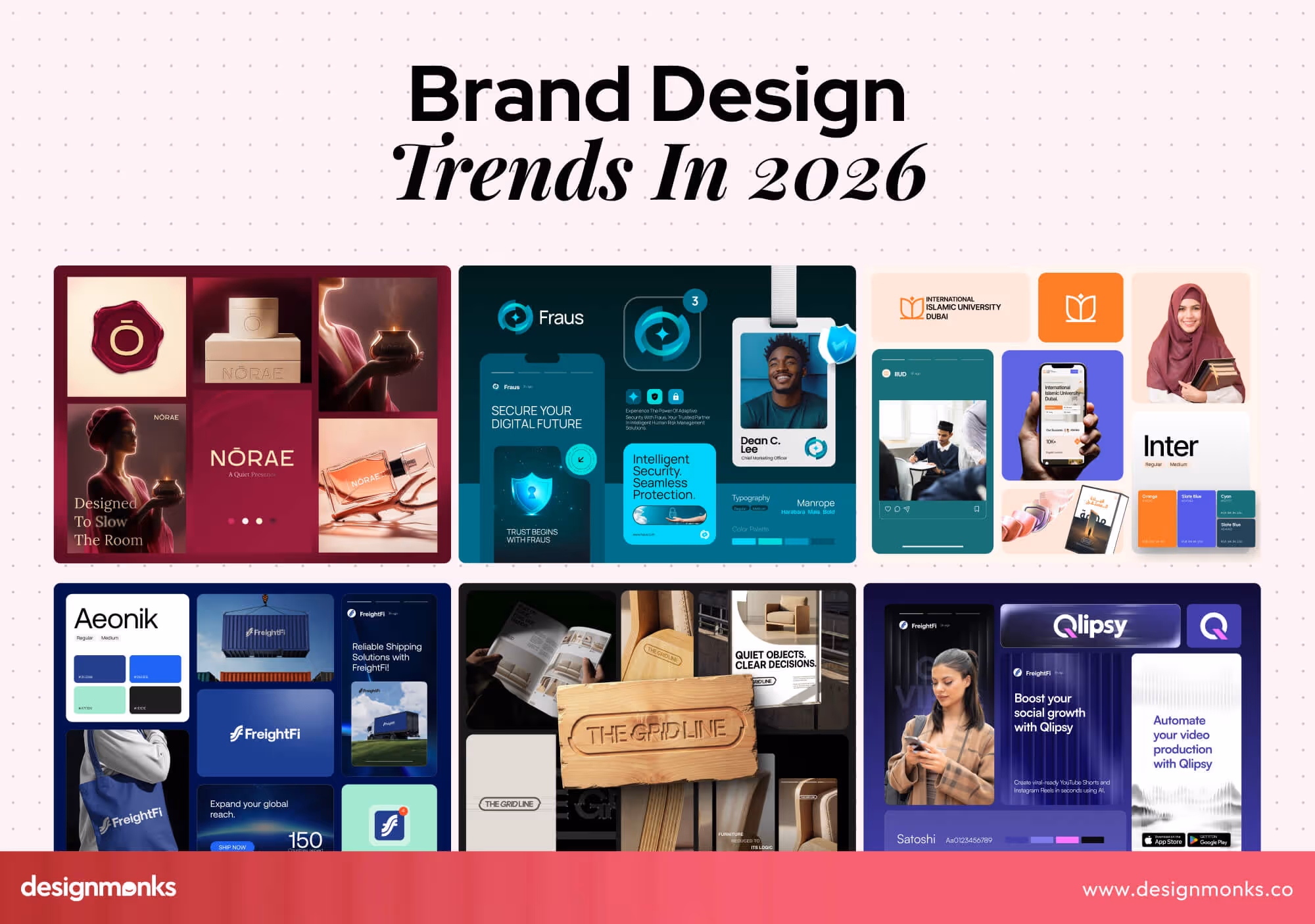
Key Brand Design Trends Shaping 2026
Strong brand design focuses on systems that adapt, stay clear, and build trust across platforms. The trends below highlight the key shifts shaping modern brand design. Understanding them will help you to see what works, why it matters, and how to apply these ideas to your own brand:
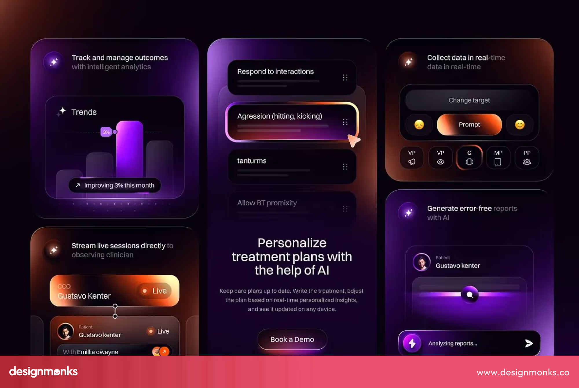
AI-Generated but Human-Curated Brand Systems
AI tools can create logos, layouts, and full visual systems in seconds, and 2025 saw this grow fast with generators like Nano Banana. AI made it possible to produce a huge volume of creative work quickly, and many brands benefited from it.
At the same time, people are starting to feel fatigued by overly polished, AI-generated designs. Everything can look perfect, but it often feels impersonal.
Because of this, designs with a human touch or small imperfections are expected to grow in popularity in 2026. This trend could mark a shift toward more intentional, human-centered branding, even when AI is part of the process.
Cultural Personalization & Localized Brand Systems
Global brands now reach people in many regions at the same time. The problem is that one visual style no longer feels relevant everywhere. What connects with one audience can feel distant or unfamiliar to another.
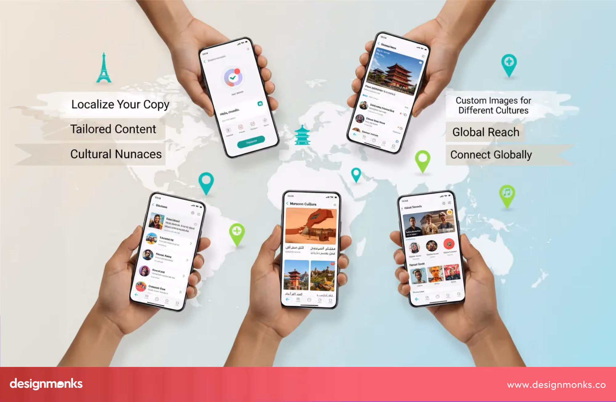
Because of this, branding is shifting toward localized design systems. Instead of changing the entire identity, brands adjust parts of it. Typography, colors, imagery, and language adapt to local culture while the core brand stays consistent. This trend is growing because users expect brands to understand their context. Local references feel more personal and more respectful. They build trust faster than generic global visuals.
In 2026, cultural personalization will move from campaigns to core brand systems. Brands will design flexible identities that can respond to regional culture without breaking visual consistency. This allows brands to stay recognizable while feeling local, relevant, and human in every market.
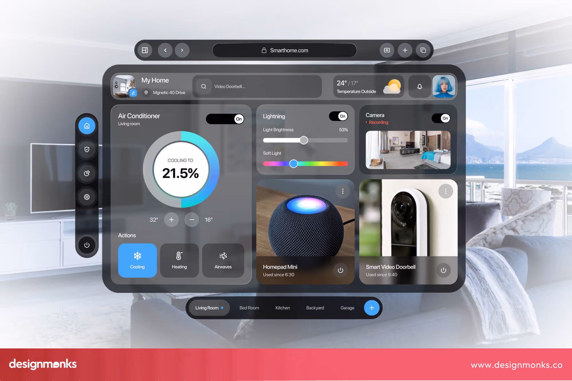
Motion-first branding & 3d Immersive Interface
Brand design is shifting away from static screens. More teams now start by defining how a brand moves, not just how it looks. Motion shapes how a brand appears, pauses, reacts, and guides attention.
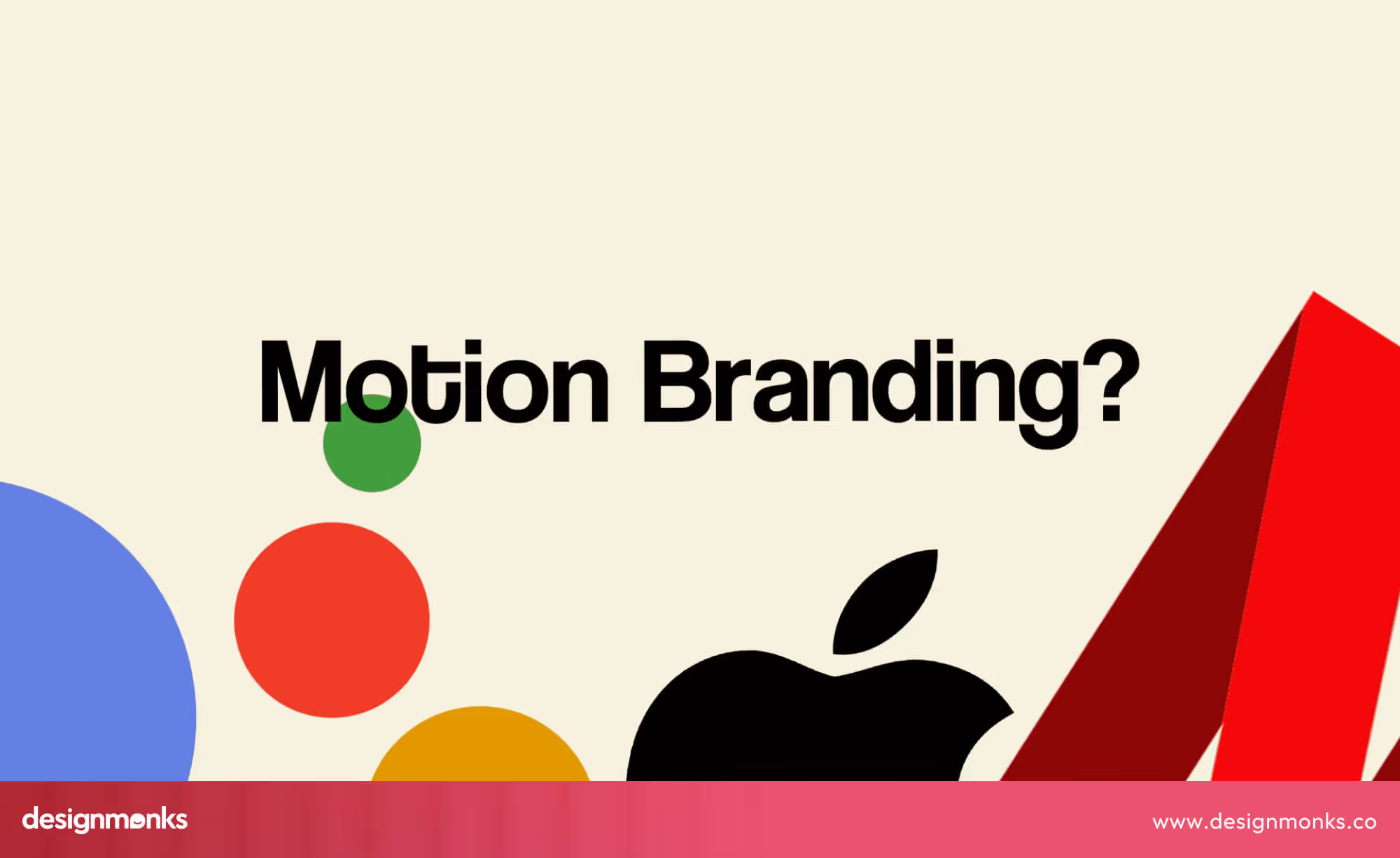
This shift is important because motion carries meaning. The way elements enter the screen, respond to scroll, or transition between states helps express personality. Brands are no longer designed as pages. They are designed as sequences of interactions.
3D is part of this trend, but it is not the goal. Simply adding 3D elements does not create a strong experience. What matters is how motion and depth support the story. If movement or 3D does not clarify the message, it feels unnecessary.
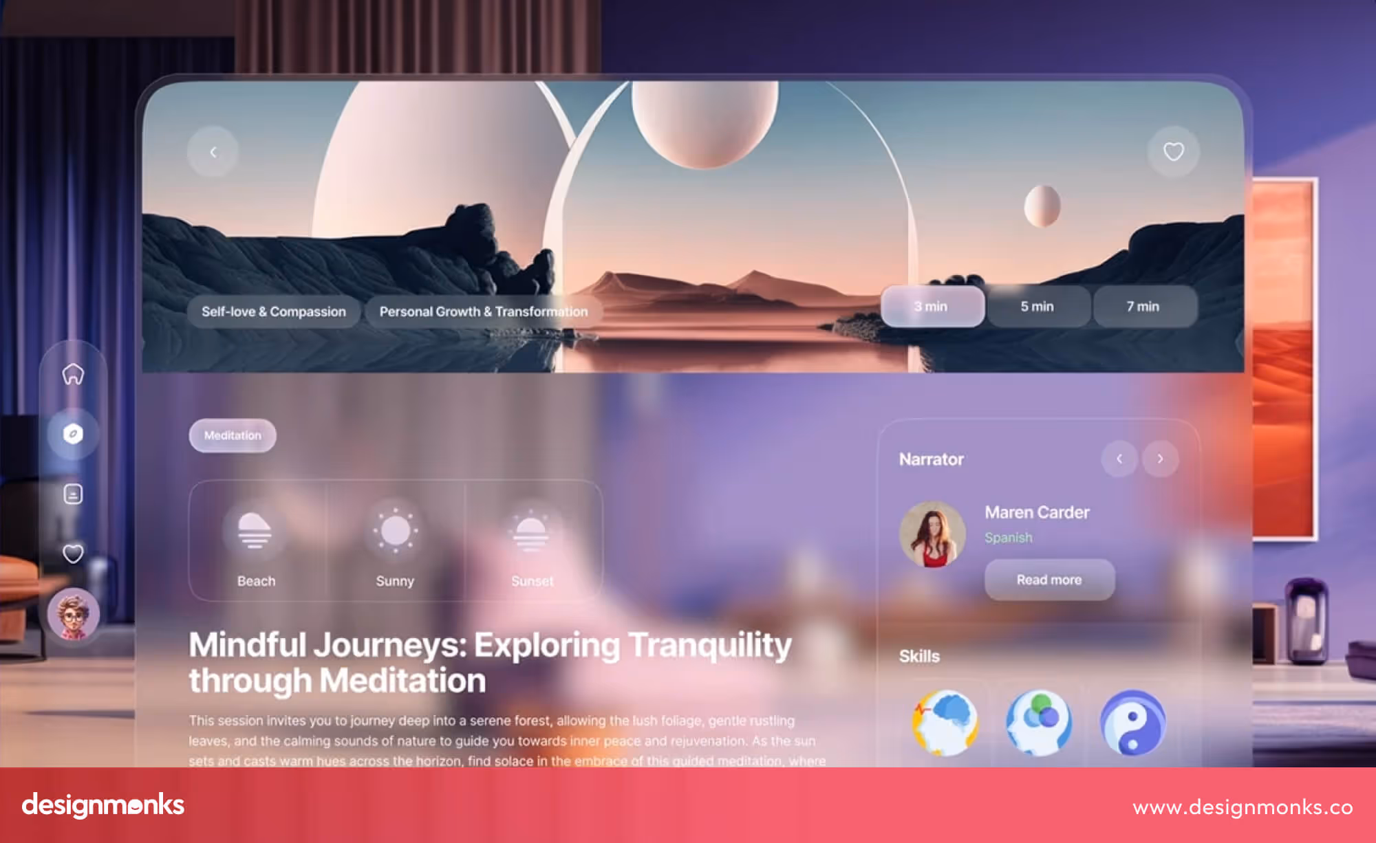
In 2026, immersive interfaces will work best when motion leads and 3D support. Depth, parallax, and spatial elements should be used to explain products, show scale, or improve navigation. They shouldn't be added just to impress.
Brands that treat motion as behavior, not decoration, will create experiences that feel intentional and trustworthy. This approach will help users understand the brand and stay engaged as they move through it.
Color, Nostalgias & Emotional Palettes
Color is becoming louder and more emotional. Brand design trends are stepping away from soft pastels and safe neutrals. High-contrast palettes and confident colors are taking their place.
One reason is nostalgia. Early-2000s design is back in culture. People are responding to familiar colors from music, fashion, and tech they grew up with. This emotional connection makes brands feel warmer and more personal.
As a result, bold color combinations are becoming more common. Bright blues, reds, oranges, and neon accents are being used with intention. These palettes help brands stand out in crowded digital spaces where muted colors often disappear.
This shift was already visible in product and interface design in 2025, and it will continue in 2026 as well. The new iPhone color releases, like coral tones, show how tech brands are reintroducing expressive color.
Moreover, Cultural trendsetters are also influencing this move. When artists like Taylor Swift choose coral or orange for major releases, those colors quickly spread across design, fashion, and branding.
Even dark mode is changing. Instead of plain black and gray, interfaces are adding neon highlights and vivid accent colors. This keeps dark mode readable while making it feel energetic and modern.
In 2026, brands that embrace emotional color will feel more alive. Color will not just decorate the design. It will communicate mood, memory, and identity in a clear and confident way.
Glassmorphism Continues
Glassmorphism is gaining momentum again. Its return became more visible after iPhone interfaces adopted soft transparency, blur, and layered depth of Liquid Glass design in mid-2025. This visual style quickly gained popularity and began influencing wider interface and brand design.
The appeal is clear. Glass-like surfaces help organize information without making screens feel heavy. They add depth while keeping layouts clean and readable, which works well for modern digital products.
As interfaces become more complex, brands need better visual structure. Glassmorphism helps separate layers, guide attention, and improve clarity. This is why more apps, dashboards, and brand websites are adopting it.
In 2026, glassmorphism will be used with more control and purpose. It will support usability rather than decoration. Combined with strong typography and thoughtful color, it helps brands feel modern and refined.
Dynamic & Fluid Typography
Typography is becoming more flexible and expressive. Instead of staying static, type is starting to stretch, morph, respond to scroll, and adapt to screen size and context. This shift accelerated in recent years as variable fonts and motion-friendly web technologies became easier to use.
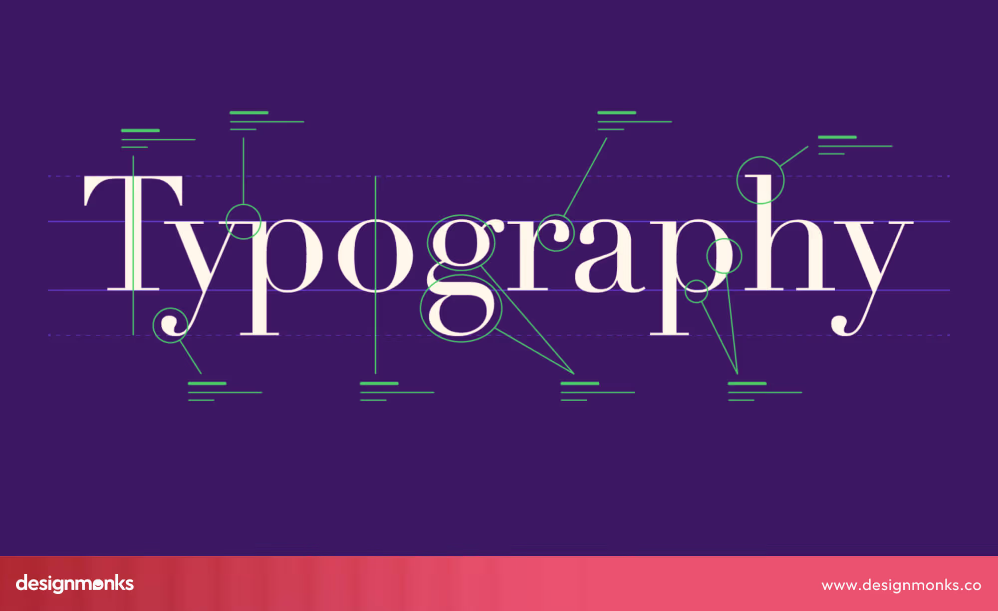
What’s changing is intent. Brands are no longer using fluid typography just to look modern. They are using it to guide attention, set rhythm, and communicate personality. A headline might expand as you scroll, tighten on mobile, or subtly animate to highlight meaning.
In 2026, typography will act like a living part of the brand system. Brands that adopt fluid type will feel more responsive and human. Those who stay rigid may start to feel dated, especially in digital-first environments where movement is now expected.
Ethical, Transparent & Trust Driven
Trust has become a design requirement, not a messaging choice. As AI products, data-driven services, and automation continue to grow, users want clarity, honesty, and control. Design plays a key role in signaling those values.
This shows up through calmer layouts, readable typography, clear data cues, and interfaces that explain what is happening instead of hiding it. Visual choices like spacing, contrast, and hierarchy help users feel informed rather than overwhelmed.
In 2026, brands that visually communicate responsibility will stand out. Ethical design will not look loud or promotional. It will look clear, calm, and intentional. Brands that fail to show transparency through design may struggle to earn long-term trust.
Sustainable & Smart Packaging
Packaging design is shifting from appearance to responsibility. Environmental concerns and smarter consumers are pushing brands to rethink materials, structure, and messaging. This change has been building for some time, but it is expected to accelerate further in 2026.
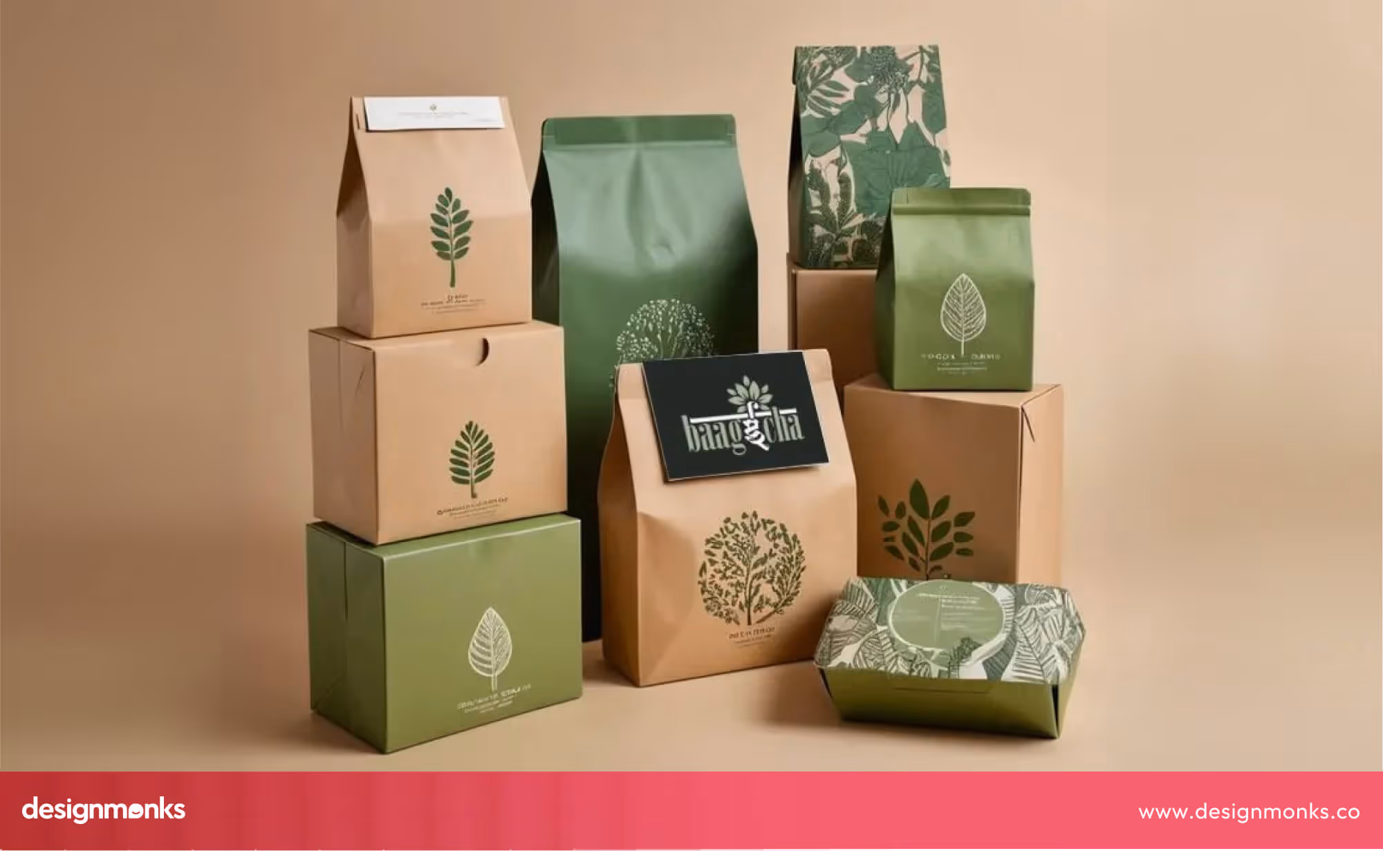
Smart packaging uses less material, clearer labeling, and sometimes interactive elements like QR codes. These codes are used to explain sourcing, reuse, or recycling. The design is often simpler, but more thoughtful. Every visual choice has a reason.
In 2026, sustainable packaging will become a brand signal. It will show values before a product is even opened. Brands that invest in smart and honest packaging design will build stronger trust and relevance in a market that increasingly rewards responsibility.
Controlled Chaos
After years of minimalism dominating digital and print design, brands are starting to embrace controlled chaos. In 2026, bold, layered, and expressive visuals will become more popular. This trend balances energy and structure, showing personality without losing clarity.
Controlled chaos is not random. Each element, color, shape, typography, or image, is deliberately placed to guide attention and communicate a brand’s character. Early experiments in 2025, like Spotify Wrapped’s layered visuals or Mailchimp’s playful dashboards, show how expressive design can still feel intentional and readable.
This trend works well alongside motion-first interfaces, fluid typography, and immersive 3D elements. When done right, maximalism keeps users engaged and creates a sense of brand personality that minimal design often struggles to deliver.
In 2026, brand design will focus on systems that adapt, respond, and connect across every touchpoint. Brands that embrace these trends will feel alive and relevant, while those that don’t will risk feeling static and disconnected.
Real-World Brand Design Examples
Some brands are already applying design approaches that reflect the trends we expect to dominate in 2026. These examples show how AI-human collaboration, cultural personalization, motion, emotional color, and sustainable systems are being used effectively today:
Netflix
Netflix adapts thumbnails, posters, and UI visuals for different regions while keeping the core identity consistent.
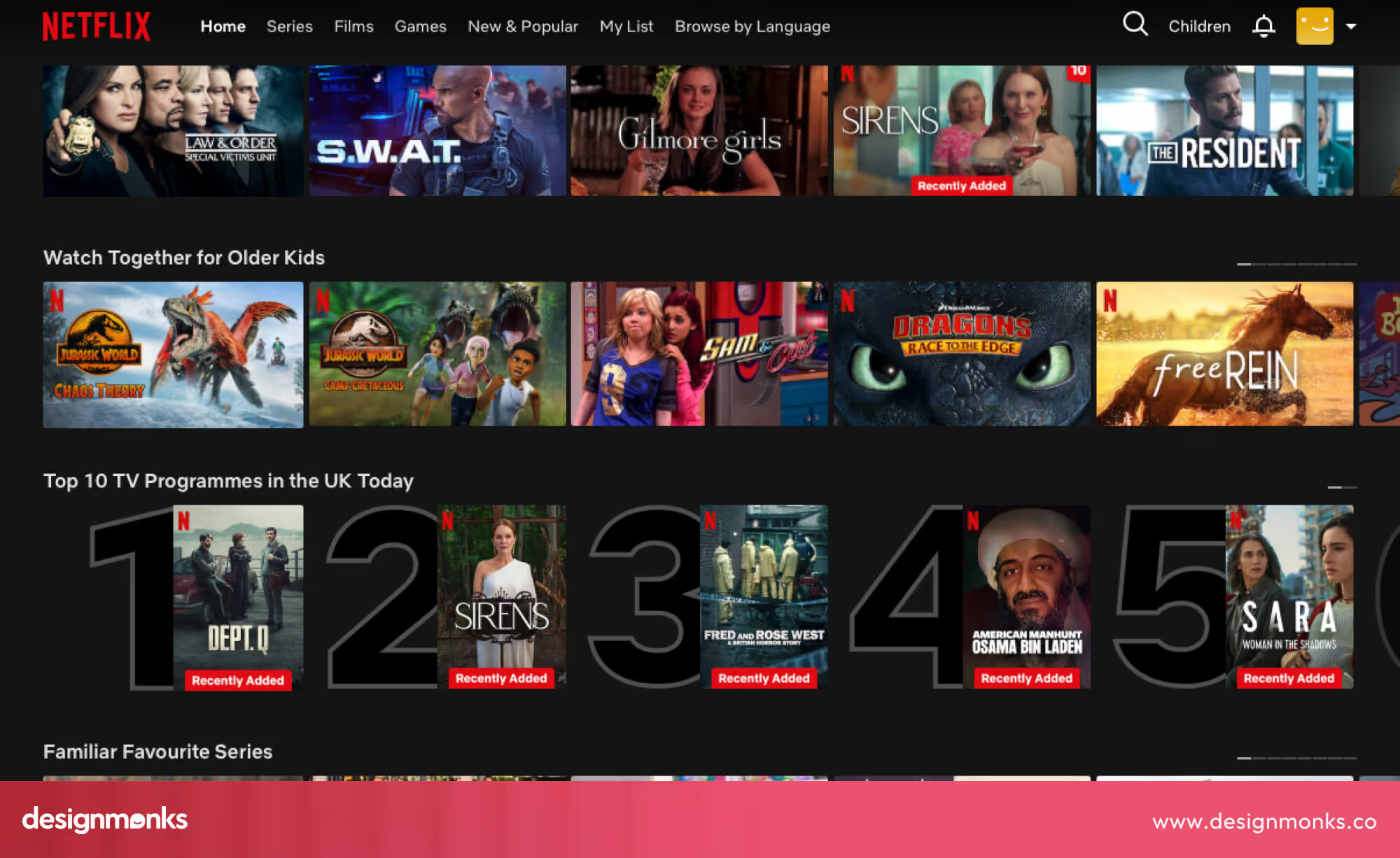
This shows how cultural personalization helps brands feel relevant locally without losing global recognition. It also improves user engagement by connecting with specific audiences.
Spotify’s Wrapped Campaigns
The Spotify Wrapped campaign combines high-contrast, emotional colors with dynamic visuals.
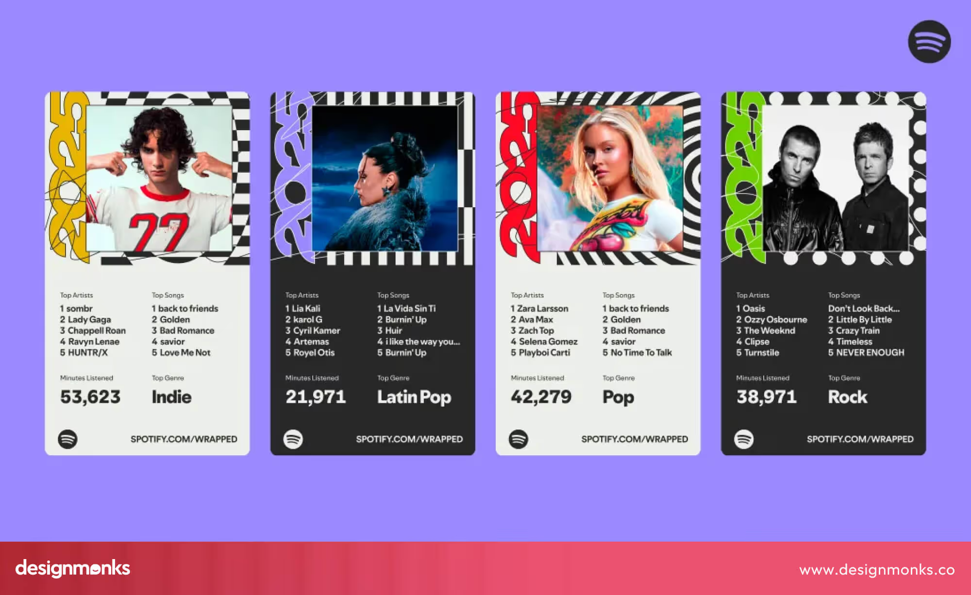
Each year, the campaign feels fresh, playful, and shareable, showing how nostalgia, emotion, and bold palettes can make campaigns memorable and highly engaging.
PepsiCo Limited Edition Packaging
PepsiCo creates packaging for specific regions and events, using colors and imagery that reflect local culture. At the same time, the designs stay consistent with the global brand.
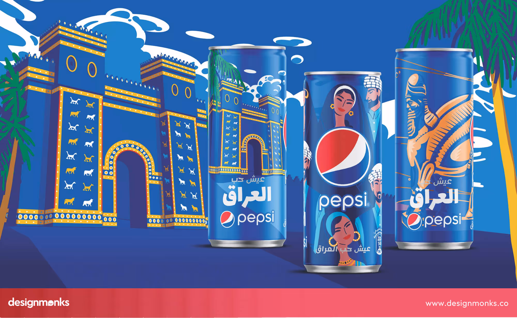
This is a strong example of localized design systems that respect culture while keeping identity recognizable.
Nike AR Try-On (2025–2026)
Nike’s AR experience allows users to try on products virtually, adding motion, interaction, and immersion.
.avif)
This is a practical example of motion-first and interactive design, where the brand experience goes beyond static visuals and encourages engagement.
Lush Packaging Update
Lush now uses biodegradable, refillable packaging that is visually appealing and functional. This shows how sustainable and smart packaging is becoming an essential part of a brand’s identity, making environmental responsibility visible to consumers.
These examples demonstrate how forward-thinking brands are already preparing for 2026. They show how adaptable, culturally aware, emotionally engaging, and sustainable design is not just a trend but a practical strategy to connect with users.
Brand Design Trends 2026 vs 2024–2025
Brand design has been evolving rapidly over the past few years. In 2024–2025, trends focused on minimalism, flat layouts, and early experimentation with AI-generated visuals. Brands were testing new tools, exploring dynamic typography, and starting to incorporate subtle motion, but much of the design remained static and restrained.
In 2026, the shift is clear, design is becoming adaptive, expressive, and intentional. AI-human collaboration, cultural personalization, motion-first interfaces, emotional color palettes, glassmorphism, and sustainable systems are moving from experimentation to standard practice.
Brands are not just updating visuals, they are building living, flexible systems that respond to users, platforms, and cultural context. The difference is simple, while 2024–2025 was about exploration, 2026 is about integration, adaptability, and human-centered purpose. Brands that embrace these changes now will feel modern, relevant, and trusted.
Making Every Choice Count: How Brands Can Stand Out in 2026
In 2026, the strongest brands are deliberate. Every choice from color to motion should communicate personality, build trust, and feel human. With AI able to generate endless options, the difference comes from intentional decisions. Ask yourself:
- Where should our brand show human touch, and where stay precise?
- What visual details make our identity unique and memorable?
- How should it move and respond across screens and platforms?
- Where can AI help, and where should humans lead?
- How bold or restrained should our style be, and how do we stay consistent?
- Which design choices are core for the next several years?
- What should people feel after interacting with our brand?
Answering these questions turns trend noise into meaningful, purpose-driven design. Brands that make intentional choices will stand out, feel authentic, and stay relevant in the fast-moving world of 2026.
FAQs About Brand Design Trends 2026
Will AI replace brand designers?
No, AI will not replace the brand designers. AI will help generate ideas and speed up workflows, but human designers are still essential for taste, ethics, and making decisions. Most successful brands will combine AI efficiency with human judgment for better results.
Is minimalism dead in 2026?
Minimalism is not dead entirely in 2026, but it’s evolving. Minimal design will coexist with expressive, maximal, and nostalgic approaches. Brands will choose the style that best communicates personality, emotion, and context rather than following trends blindly.
How often should brands refresh their identity?
There’s no fixed rule for brands to refresh their identity. The key is to refresh when it improves clarity, relevance, or emotional connection.
Can brands use AI everywhere?
No, AI shouldn't be used everywhere. AI is best for accelerating design, testing variations, or generating creative options. But key identity elements, storytelling, and user experience decisions should remain human-led to keep the brand authentic.
How do brands balance bold and calm design choices?
It’s about purpose. Some platforms or campaigns may benefit from bold, energetic visuals, while others need restraint. The important part is consistency and intentionality, so every choice reflects the brand’s identity.
Conclusion
Brand design in 2026 is about systems that adapt, visuals that connect, and experiences that feel intentional. From AI-human collaboration to emotional color and sustainable packaging, the trends are guiding brands toward flexibility, clarity, and trust.
The key takeaway is that every design choice matters. How your brand moves, responds to users, and communicates emotion and culture will define your relevance in the coming years.
In a world where AI can generate anything, human decisions and intentional design are what make a brand memorable, trustworthy, and future-ready.

.avif)
.avif)
.avif)
.avif)


.avif)
.avif)
.avif)
.avif)


.avif)


