
Key Takeaways
- Big brands survive design mistakes, but small businesses lose customers fast.
- Hidden buttons and vague error messages waste time and push people away.
- Pushy checkouts and hard cancellations leave customers feeling cheated and unhappy.
- Pretty designs fail when people cannot read the text or find buttons.
- Test changes with real users first and offer an old-layout option.
You tap the wrong button, miss a hidden setting, or quit halfway through a long form, and you blame yourself. Most of the time, the screen failed you. Each of those moments is a bad UX example, and you probably meet a few every day.
Big names are no exception. YouTube covers the last seconds of a video before it ends. Spotify shows errors that explain nothing. Amazon Prime reportedly took six clicks to cancel. Small things like these quietly eat up your time and patience.
Business owners, designers, and everyday app users, this blog is for you. Stay till the end, because you will start spotting these mistakes everywhere, and you will know exactly how to fix them.
15 Bad UX Examples That Annoy Users
Today, we’re not talking about the lame, unpopular, nobody-ever-visited type of websites or apps to show you examples of bad UX. Instead, we decided to find the flaws we are seeing in sites and apps that millions, no, billions of people are using today.
Those enterprise-level businesses can make UX mistakes that can annoy users, but for their popularity, these mistakes may not have an effect on their user counts.
However, if it’s for your product and if you are not such a popular face like them, mistakes like these must cost your users. So, check out the bad UX examples that you can’t ignore even though these big businesses do:
1. Spotify Says Something Broke but Not What
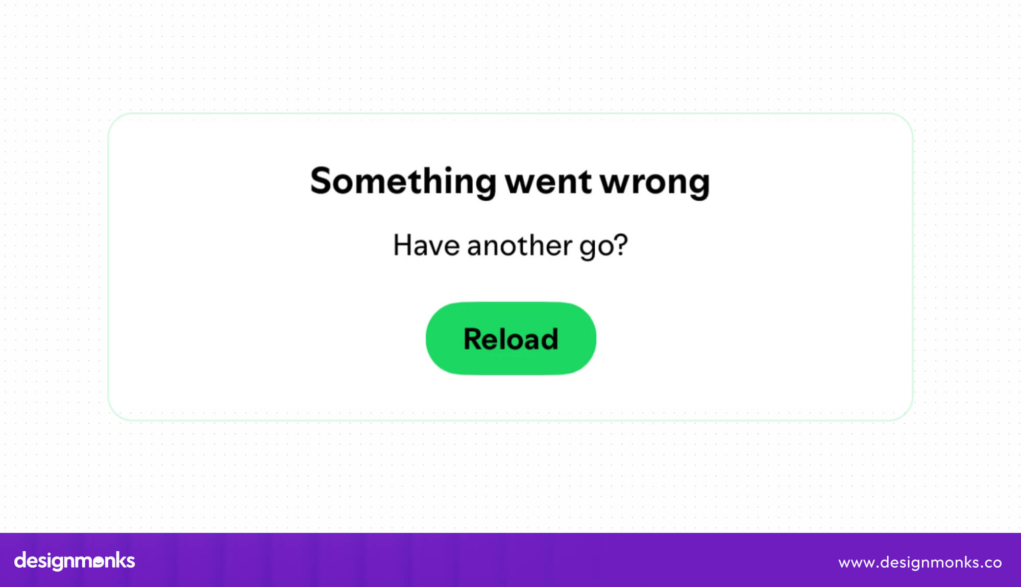
A login problem hits, and Spotify shows a short, generic error box. It never names the cause, so nobody can tell if the internet, the account, or the app is to blame.
The box offers no button to fix anything and no hint about what to try next. Users end up tapping the same screen again and again, hoping the problem disappears.
Effects on Users: Listeners get stuck at the door of their favorite app. They wonder if their account is gone, restart their phone for no reason, and sometimes give up and open a rival app.
Possible Solution: A clear message fixes most of this. Something like “Your connection dropped. Check your Wi-Fi and try again” takes minutes to write. Skipping error screens ranks among the MVP design mistakes new apps make.
2. Ryanair Pushes Extras Until You Give In
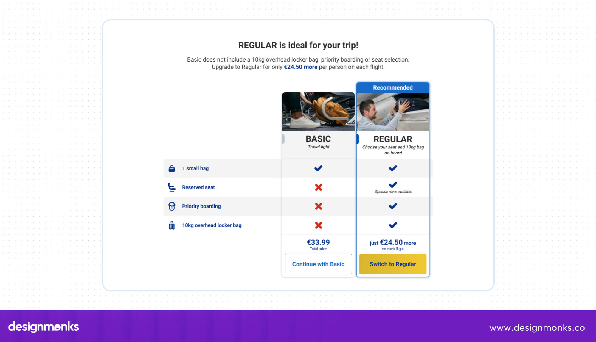
Booking a ticket with only a small bag triggers a full-page pop-up that pushes a pricier luggage plan. The upgrade button glows in bright color, while the basic option is easy to miss.
Later screens keep going. Warning text hints at heavy fees at the gate, the cabin-bag add-on arrives bundled with priority boarding, and travel insurance gets the same treatment.
Effects on Users: Travelers feel pressured instead of helped. Some pay for extras by accident, and others feel tricked. A brand that feels pushy loses return customers, even if the first sale goes through.
Possible Solution: If the airline ran the page, it could show both bag options side by side in the same size. Honest prices upfront and separate add-ons would feel fair and bring travelers back.
3. YouTube Covers the Ending Before the Video Ends

Near the end of a video, suggestion boxes slide over the picture. They show up 10 to 20 seconds early, so they cover the last stretch of the screen while the video still plays.
Many creators save names, credits, links, or a final tip for those closing seconds. Viewers see a row of thumbnails instead, and no obvious button removes them.
Effects on Users: Viewers miss the exact information they stayed for, like a movie’s cast list, a recipe’s final step, or a website address. They then replay the video or search for the details somewhere else.
Possible Solution: Suggestions work better after the video finishes, when attention is free. A small close button, or a switch in settings, would also let each viewer decide how the last seconds look.
4. Amazon Prime Made Leaving Harder Than Joining

At checkout, the FTC says the button “No, I don’t want free shipping” really meant declining Prime. The wording confused shoppers, and the FTC says many joined a paid plan without meaning to.
Leaving was the hard part. The complaint describes a cancellation path of four pages, six clicks, and fifteen options. Amazon reportedly called it “Iliad,” after the famously long ancient poem.
Effects on Users: According to the FTC, millions paid for something they never wanted and struggled to leave. In September 2025, Amazon settled for $2.5 billion without admitting fault, including refunds for about 35 million people.
Possible Solution: Subscriptions should offer a visible “No thanks” button at checkout and a cancel button one click from the account page. If joining takes one tap, leaving should take about the same.
5. HBO Max Hides Where You Are on the Menu
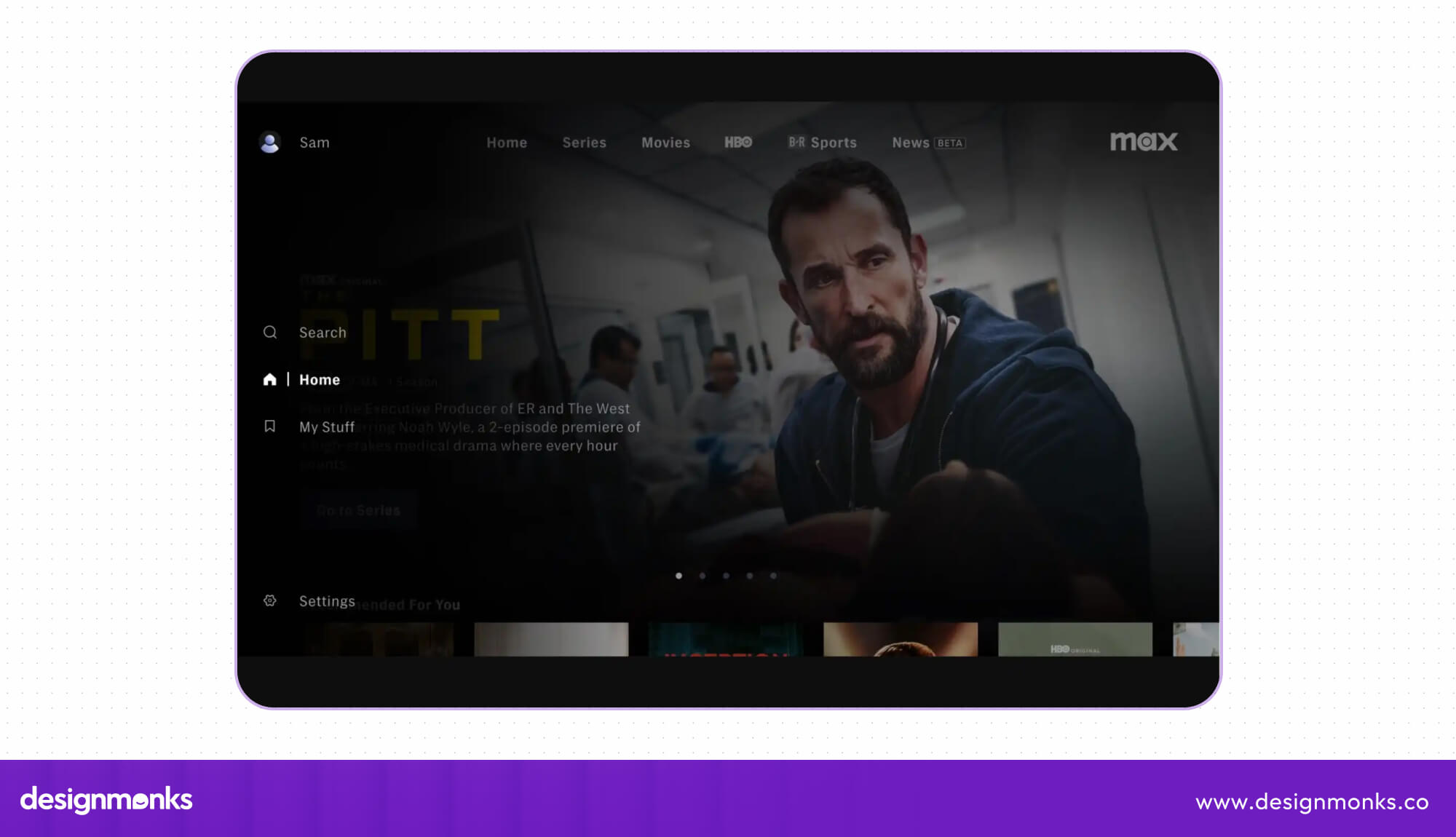
Every menu should show where you are. HBO Max marks the active tab mostly through a color change, and that shade sits very close to the colors around it.
In screenshots, the highlighted item barely differs from its neighbors. No underline, border, or bold text helps the eye catch it, so the screen asks viewers to guess.
Effects on Users: Color-blind viewers struggle most, yet everyone loses time on a dim TV across the room. People click around to confirm where they landed and lose the feeling of smooth, relaxed browsing.
Possible Solution: A quick check from a UX Audit service would flag this fast. The fix is small: stronger contrast, plus an underline, a bold label, or an icon so color is not the only signal.
6. LinkedIn Sends More Alerts Than Anyone Can Read
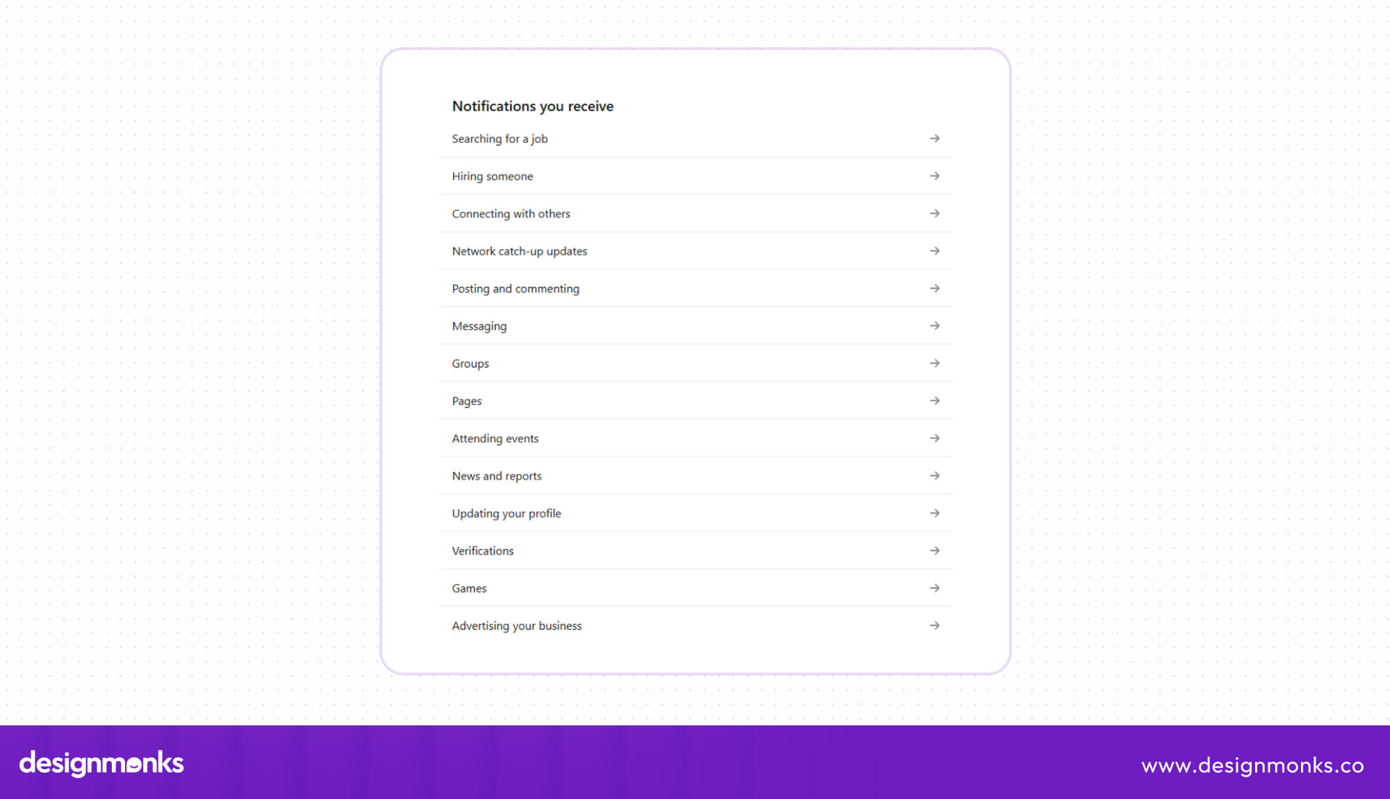
Out of the box, LinkedIn sends many alerts across 14 categories, each with extra sub-types. Updates reach you through the app, through email, and through phone alerts.
You need patience to turn them off. Settings hide each toggle inside a category, so you tap about three times per notification type before the buzzing stops.
Effects on Users: Important messages sink under a pile of minor pings, so people start ignoring all of them. The app that should connect people to jobs and contacts ends up feeling like background noise.
Possible Solution: Fewer default alerts would help right away. Keep messages, connection requests, and job updates switched on, and place an on/off toggle beside each category so nobody has to dig through menus.
7. Windows 11 Asks for a Microsoft Login Before You Can Start
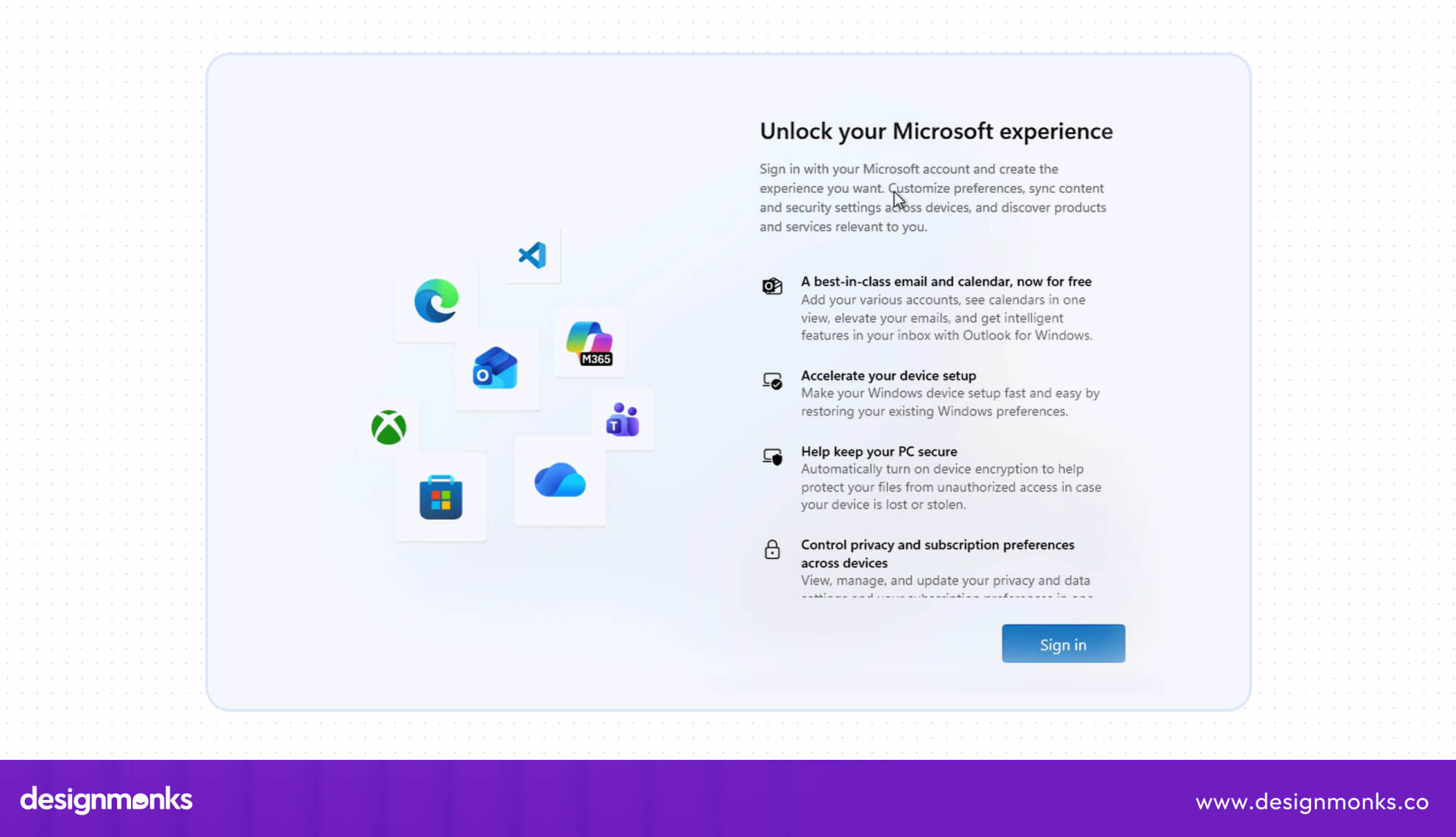
A brand-new Windows 11 PC, Home or Pro, will not finish setup without an internet connection and a Microsoft account. Until you sign in online, you cannot reach the desktop.
Tech-savvy users used to skip this with small tricks. In late 2025, Microsoft removed several of those workarounds from test versions, which closed the easiest exits for people who prefer a local account.
Effects on Users: People who want a private, offline computer lose the choice at the very first screen. A simple setup becomes a forced sign-up, and the tricks to dodge it keep changing.
Possible Solution: A visible “Use a local account” button on the setup screen would settle it. Short notes about what each option offers, such as cloud backup or privacy, let people pick with confidence.
8. CAPTCHAs Treat Every Visitor Like a Robot
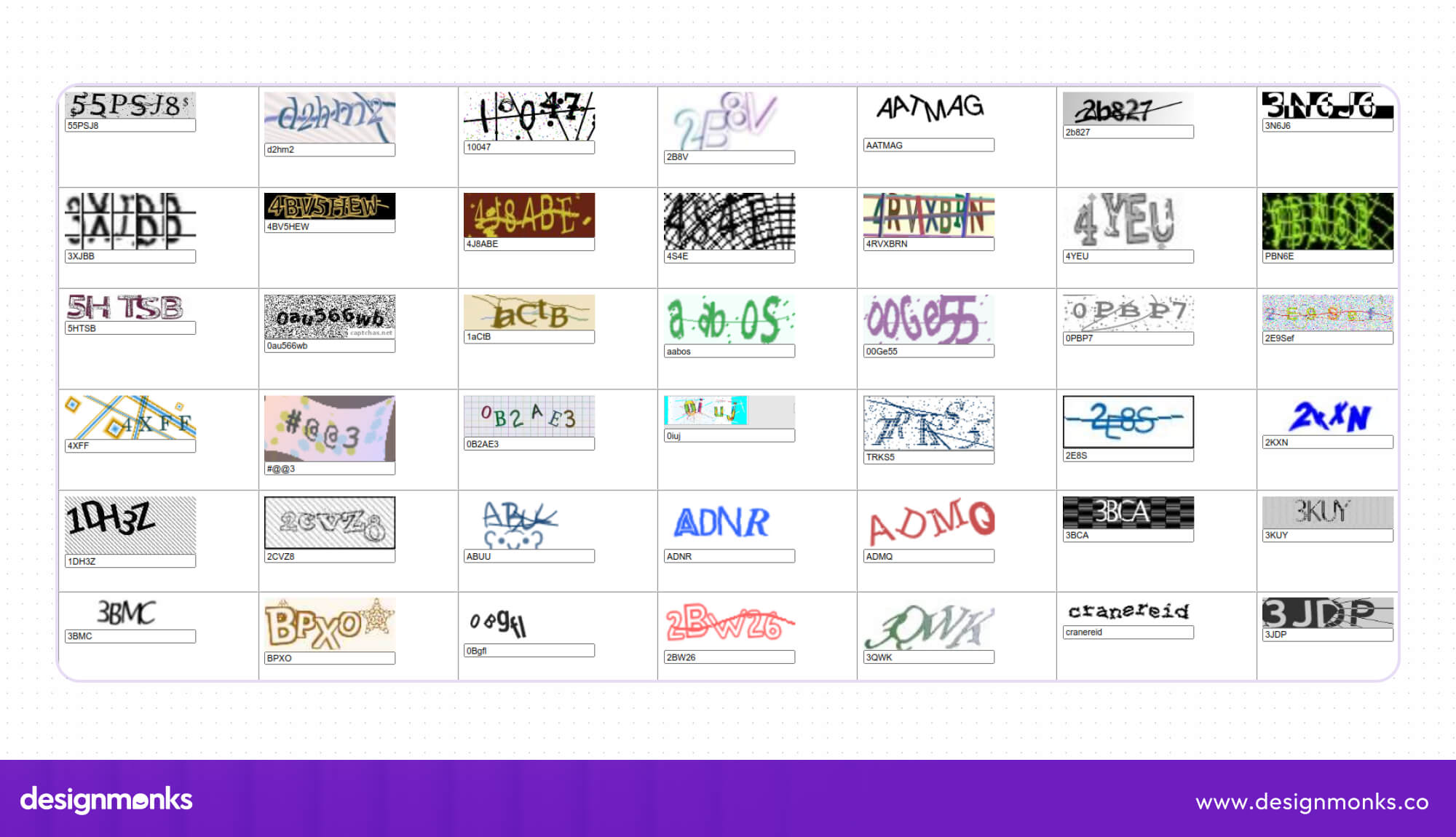
Some websites show a puzzle before anything else: wobbly letters, blurry traffic lights, or tiles to match. Poor setups assume each new visitor is a bot, so everyone must pass the test.
Codes can run too long or fail to load. A misread letter sends the person back to a new puzzle, and the wait for the actual page keeps growing.
Effects on Users: Older adults and people with mild vision trouble get hit hardest. Many simply close the tab for good, so the website loses visitors and sales before anyone sees a single product.
Possible Solution: Use the puzzle only when traffic looks suspicious, and offer an easier option such as an audio test or a simple checkbox. Then watch how many visitors quit at that step and adjust.
9. MyFitnessPal Moved the Food Log Out of Reach

In April 2026, the calorie-tracking app replaced its familiar Diary tab with a new “Today” screen. Reports say the food log now sits behind a “View All” button, below a stack of big cards.
Users also report that per-meal nutrition details are harder to find and that swiping between days is gone. The company calls the new tab “the path forward” and offers no way back.
Effects on Users: Food entries for breakfast, lunch, and dinner used to take a few quick taps. Now the one daily task takes extra effort, and angry reviews on Reddit and app stores followed.
Possible Solution: The one task people open the app for should stay one tap away. A “classic view” switch, plus a Usability Testing service run with long-time users before launch, would have caught the complaints early.
10. Zoom Hides the Buttons You Need Mid-Call
Mid-meeting, you may want to invite someone or start a recording. Those basic options hide among many controls, while buttons like Reactions, Apps, and Host tools sit in plain view.
Helpful hint pop-ups often land on top of the chat window and need a manual close. The mute shortcut on Mac, Command-Shift-A, is hard to remember in the heat of a call.
Effects on Users: A hidden invite option costs real minutes while colleagues wait. People look unprepared, the conversation loses its flow, and the host ends up apologizing for a tool that should stay out of the way.
Possible Solution: Keep the buttons people press most, like invite, record, and mute, in the main bar and tuck the rest into a menu. A short UX Audit Checklist can rank them by use.
11. Apple’s See-Through Design Hides the Words on Your Screen
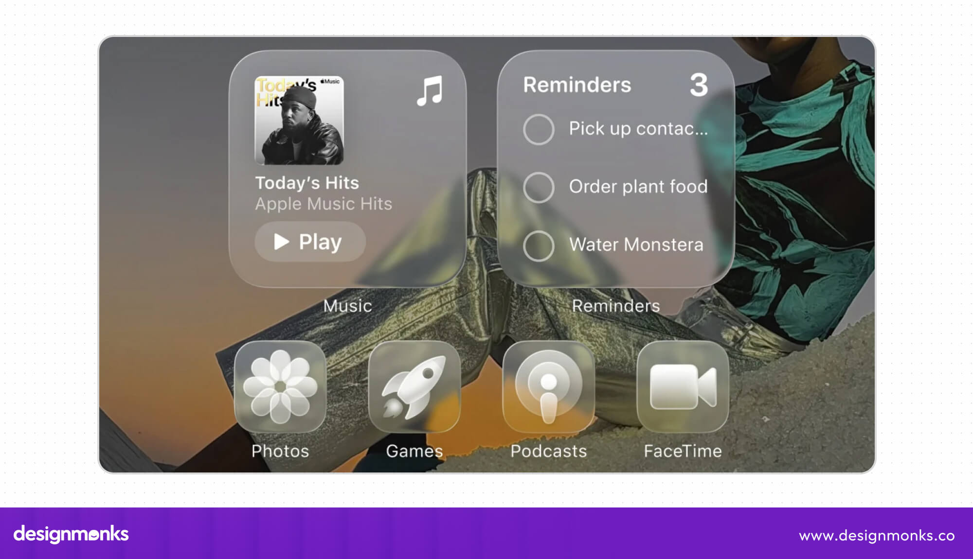
With iOS 26, Apple gave the iPhone a glossy, see-through look called Liquid Glass. Notifications, buttons, and menus now blend into wallpapers, so letters lose their sharp edges.
Usability experts at the Nielsen Norman Group published a critique titled “Liquid Glass Is Cracked, and Usability Suffers in iOS 26.” Developers also noted that the effect appears unevenly across the system.
Effects on Users: A notification over a busy photo takes extra squinting to read. Tab bars shrink as you scroll, so familiar buttons move around, and anyone with weak eyesight feels it the most.
Possible Solution: Text needs a clear, solid backing no matter which wallpaper sits behind it. Apple has since added a “Tinted” option in iOS 26.1 beta, and a visible transparency switch would give every user control.
12. Zara’s Website Looks Like a Magazine but Acts Like a Maze
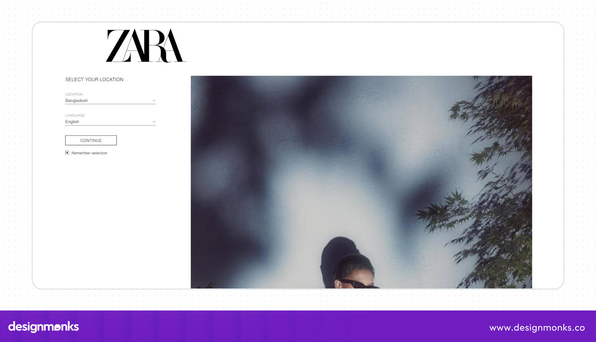
Open the homepage, and you see one big picture after another. There is no headline, no short description, and no button telling you where to click first.
On the desktop, the menu hides behind a three-line icon, which many shoppers expect only on phones. Menu links sometimes overlap the photos, and the footer links come in tiny type.
Effects on Users: A first-time visitor cannot tell where the clothes live or how to start. Rather than hunt around, they leave for a store with a clear menu, and Zara loses a sale it could have won.
Possible Solution: Web design best practices suggest a plain menu bar across the top, a main banner with a “Shop new arrivals” button, and text big enough to read. Style can stay; usability just needs room.
13. WhatsApp’s Delete Button Leaves a Trace
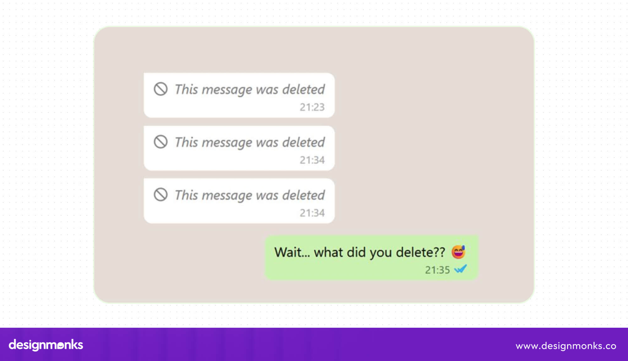
You send a message to the wrong chat and tap “Delete for Everyone.” The words promise a clean wipe, yet a note reading “This message was deleted” stays in the conversation.
The label sets one expectation, and the app delivers another. Telegram, in contrast, removes the message completely, so nothing remains in the chat to stir up doubt.
Effects on Users: The other person now wonders what you wrote, and that curiosity can lead to awkward questions or even arguments. The mistake you tried to hide becomes an even bigger conversation.
Possible Solution: Honest wording would fix it quickly. A button named “Mark as deleted” tells people what really happens. Better still, the app could erase the message fully and skip the placeholder.
14. Netflix Starts Playing Before You Ask

Rest your mouse on a title and a trailer starts playing, sometimes with sound. Log in and previews can begin even before you have picked anything to watch.
Before 2020, no setting existed to stop this. Today you can switch it off, but previews still run by default, so every new user must dig through settings first.
Effects on Users: A simple browse turns into a game of dodging the cursor. Sudden noise surprises people in quiet rooms, and the constant motion makes it harder to read titles and decide what to watch.
Possible Solution: Previews could start muted, or stay off until a person switches them on. A one-time question at sign-up, “Want trailers to play as you browse?”, would let each viewer set the rule.
15. Instagram Changed Every Profile Grid Without Asking
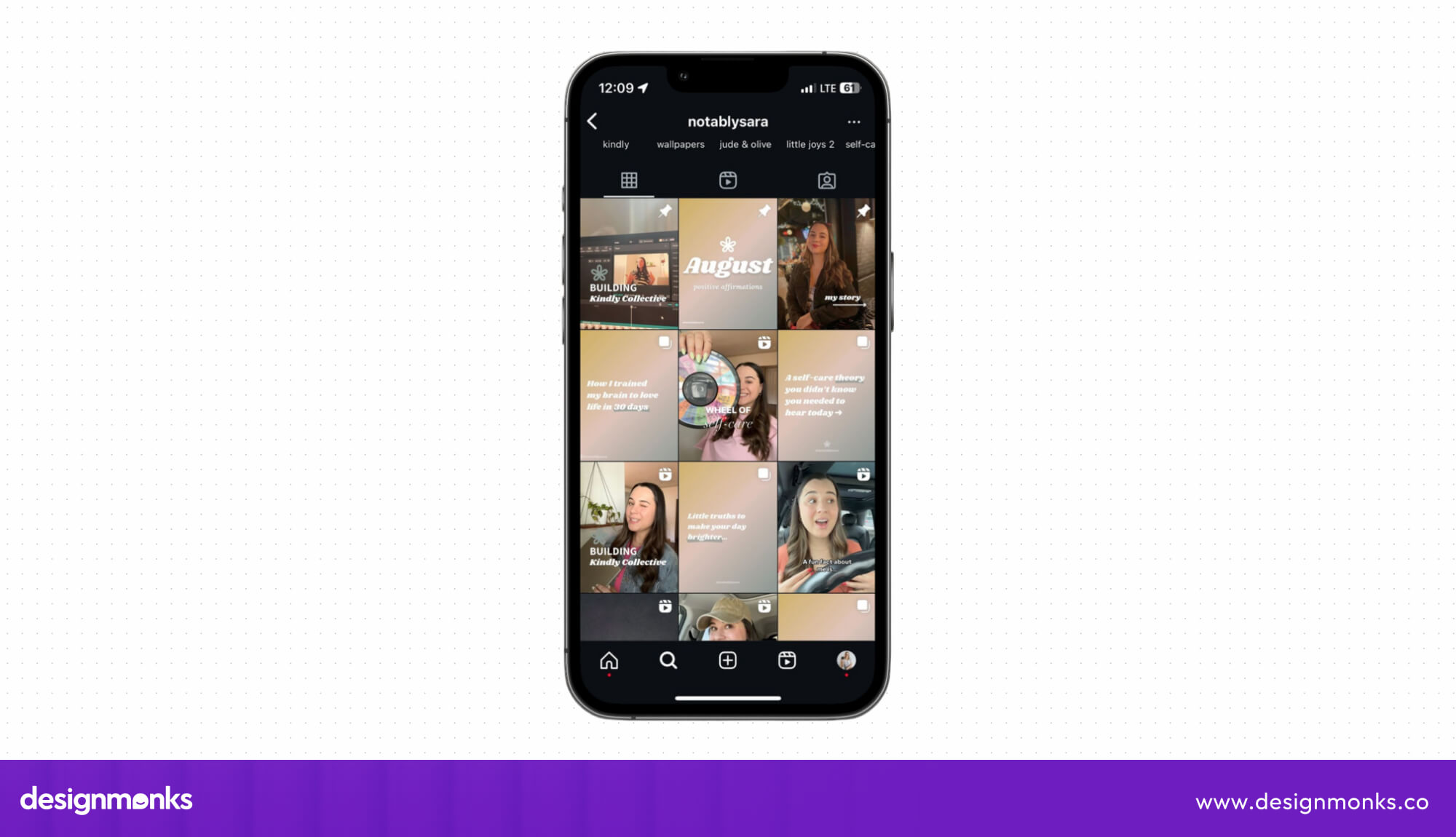
In January 2025, Instagram quietly swapped the square thumbnails on profile pages for tall rectangles. Posts that once fit neatly now show different crops, and the whole grid looks changed.
Instagram gave little warning and offered no switch to go back. Its head, Adam Mosseri, later admitted users should have received more notice, and promised better tools for adjusting thumbnails.
Effects on Users: Creators and brands had spent years building checkerboard patterns and gallery-style layouts. Those designs fell apart in a weekend, and owners had to rebuild their whole look from scratch.
Possible Solution: Announce changes weeks ahead, offer a toggle for the old square layout, and give creators a preview tool to adjust their grids. People accept change faster when they feel included, not surprised.
End Note
Every example above has one thing in common. Somebody built the screen without watching a real person use it. Spotify, Zoom, and Instagram have millions of fans, so they can survive a few annoyed users.
Your business probably can’t. A confusing page costs you a customer, and that customer rarely complains. They simply close the tab and open your competitor’s site instead. Test early, and the fixes stay small.
Want a website or app without these silly mistakes? Contact Design Monks. We design simple screens, test them with real users, and review your product to fix whatever annoys visitors.