.svg)




Key Takeaways
- Fintech UX should make complex financial tasks simple and easy to understand.
- Trust is essential when designing experiences that involve users’ money.
- Clear navigation helps users complete financial tasks with less confusion.
- User research helps fintech products solve real customer needs effectively.
- Strong fintech UX balances usability, accessibility, security, and business goals.
People lose trust in a financial app when a fee appears too late, a payment gets stuck, or a security step makes no sense. But a strong fintech UX can tackle these moments by making financial information clear, actions predictable, and risks easier to understand.
That means looking beyond screens and thinking about the entire user journey. Account setup, payments, dashboards, errors, confirmations, and financial decisions all need thoughtful design. Even small points of confusion can create doubt when money is involved.
So, what does better fintech UX actually look like? This guide breaks down the principles, patterns, examples, and 2026 trends that help financial products become clearer, more accessible, and more trustworthy.
What Is Fintech UX?
Fintech UX is the process of designing digital financial products, such as banking apps, payment platforms, lending tools, investment apps, insurance services, and personal finance apps.
The goal is to make these products easy to understand, use, and trust when people are making decisions about their money.
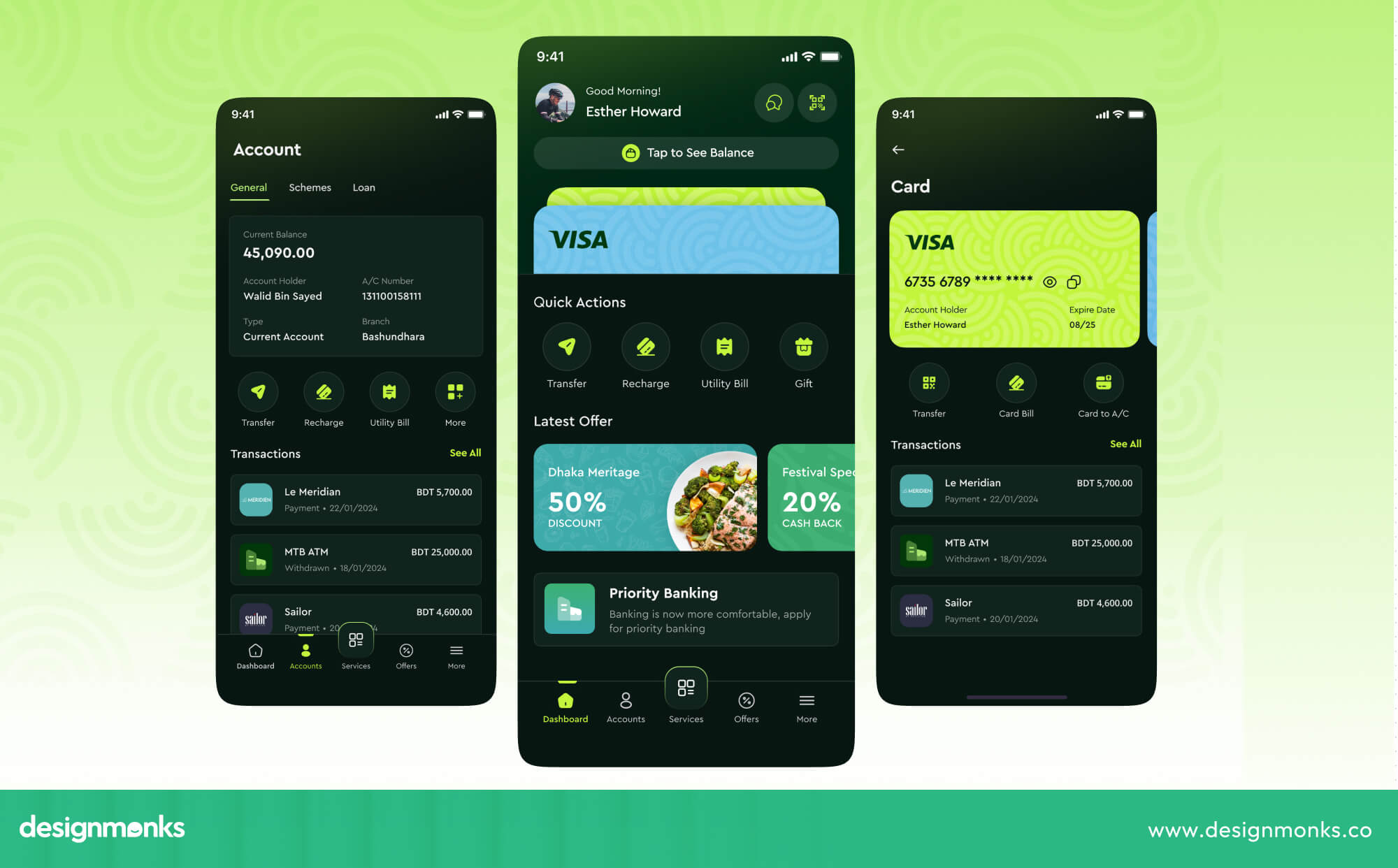
It uses common UX principles like usability, accessibility, and clear information structure. But fintech products need extra care because they deal with money and sensitive information.
What Makes Fintech UX Different From General UX?
Most digital products help users do everyday tasks, such as booking a room, ordering food, or watching a video. Fintech products deal with something more sensitive, such as people’s money, personal data, and identity.
They also need to follow financial rules and regulations. This makes fintech UX different from general UX.
A confusing button on a media app may simply annoy the user. On a banking app, it could cause someone to send money to the wrong account, miss an important fee, or leave an application before completing identity verification.
Because money and personal information are involved, fintech users need more clarity and confidence at every step.
Why UX Is Critical for Fintech Products
Good UX can help fintech businesses get more users to open accounts, complete transactions, and stay with the product. But fintech UX is about more than making an app easy to use. It should also reduce confusion and help users feel safe when handling their money.
For example, users should clearly understand how much a transfer costs, when the money will arrive, and what happens if something goes wrong. When these details are clear, users are more likely to trust the product and use it again.
If they feel unsure or confused, they may stop the process or leave the product altogether.
What Are the Core Principles of Fintech UX Design?
Before getting into specific flows like onboarding, payments, or account setup, it helps to understand the basics of good fintech UX. These principles help make financial products clearer, easier, and more comfortable to use, while also improving the overall fintech website design:
Make Financial Information Easy to Understand
Financial products can come with plenty of numbers, legal terms, and industry jargon like APR, escrow, and underwriting. Good fintech UX makes this information easier to understand by using simple, everyday language.
Clear labels, helpful headings, and strong visual hierarchy can help users quickly find what matters. You can also show the most important details first and let users explore more information when they need it.
For example, a loan app can show the loan amount, interest rate, and payment details upfront, then offer extra information about the payment schedule. Small tooltips and short explanations can also make unfamiliar terms much easier to understand.
Design for Trust and Transparency
Trust is a big part of any financial product. Users want to know where their money is going, what they are paying, and what happens next.
Good fintech UX keeps this information clear and visible. Show fees before a transfer is confirmed, display exchange rates before a currency conversion, and explain permissions when users connect an account.
After a transaction, provide clear updates so users know whether it is complete, pending, or failed. When users always know what is happening, they feel more confident using the product.
Reduce Cognitive Load
Money decisions can already feel stressful. A complicated interface can make them even harder. Good fintech UX keeps things simple by breaking complex tasks into smaller, manageable steps.
Group related information together, highlight the details users need most, and avoid filling one screen with too much information. The goal isn't to hide important details. It's to present them in a clear order so users can focus on one decision at a time.
Give Users Control and Reassurance
Financial actions should feel clear and manageable, not risky or mysterious. Confirmation screens can give users a chance to check important details before sending money or making a payment. Cancel and undo options can also provide extra peace of mind when they are possible.
Clear transaction updates are just as helpful. After sending money, users should immediately know whether the payment is pending, completed, or failed.
A simple status message can go a long way in helping users feel confident that their money is safe.
Design for Accessibility and Inclusion
Financial products should work well for as many people as possible. Accessibility makes that easier by considering users with different abilities, devices, and needs.
Designers can follow WCAG guidelines, support screen readers, use good color contrast, allow text resizing, and create buttons that are easy to tap. These details may seem small, but they can make a financial product much easier and more comfortable for everyone to use.
How to Build Trust Into Fintech UX
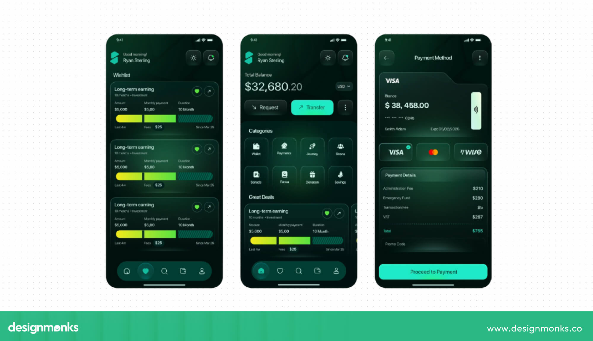
Trust should be part of the entire product experience, not just something mentioned on a security page. Every screen should help users feel informed, safe, and confident about what they are doing.
Research on digital financial services also shows that security awareness, service quality, and the overall experience can influence how much users trust a financial product:
Show Security at the Right Moments
Security messages work best when users need reassurance. This could be when they log in, connect a bank account, verify their identity, or make a payment.
A short message explaining why you need certain permissions or confirming that a connection is secure can make users feel more comfortable. This is especially useful during onboarding, when users are sharing sensitive information for the first time.
Research on digital financial services in Bangladesh, for example, found that trust, fear, and privacy concerns can shape the onboarding experience. The key is timing.
A useful security message at the right moment can do more than a long security page that users may never visit.
Make Fees and Financial Consequences Clear
Users should never have to guess how much a financial action will cost. Transfer fees, exchange rates, interest, penalties, and subscription costs should be easy to see.
Show the total cost before users confirm a payment or transfer. Don't hide important fees inside long terms and conditions. Recent research on digital financial pricing found that clearer pricing, combined with helpful tools, improved users' understanding of costs and their trust in the platform.
When users can see the full cost before they click “Confirm,” they can make a decision without second-guessing the product.
Use Clear Transaction Confirmations
A good confirmation screen gives users one last chance to check their details before completing an important action. Show information such as the amount, recipient, fee, and expected delivery time.
After the transaction, confirm what happened and provide useful details such as a receipt or reference number. This gives users something they can check later if they need help.
This small step can make a big difference. After sending money, users naturally want an answer to one simple question: “Did it go through?” A clear status such as “Payment completed” or “Transfer pending” removes that uncertainty and reduces the urge to check repeatedly or contact support.
Avoid Dark Patterns in Financial Products
Dark patterns are design choices that push users toward actions they may not want to take. In fintech, these can include hidden fees, confusing cancellation steps, misleading buttons, pre-selected options, or making it difficult to say no.
This is more than an ethical design issue. Regulators are paying closer attention to how digital design can affect financial decisions. Research from the UK Financial Conduct Authority found that different interface designs can change how well people understand financial products and the choices they make.
Avoiding these patterns makes the product more honest and easier to use. It can also help create stronger relationships with users, especially as people become more aware of manipulative design. Recent research also highlighted practices such as hidden fees and guilt-based design as threats to user trust.
The key idea is simple, fintech trust is built when users feel informed and in control, especially when money is involved. Every clear fee, helpful confirmation, and honest interaction makes the experience easier to trust.
Fintech UX Design for Onboarding and KYC
Onboarding is one of the first big tests of a fintech product. It can also be where users face the most friction, especially when they need to complete KYC (Know Your Customer) and verify their identity.
So here are things you need to do to avoid most friction:
Simplify Account Registration
Ask users for only the information you need at each step. Avoid putting a long form in front of them from the start.
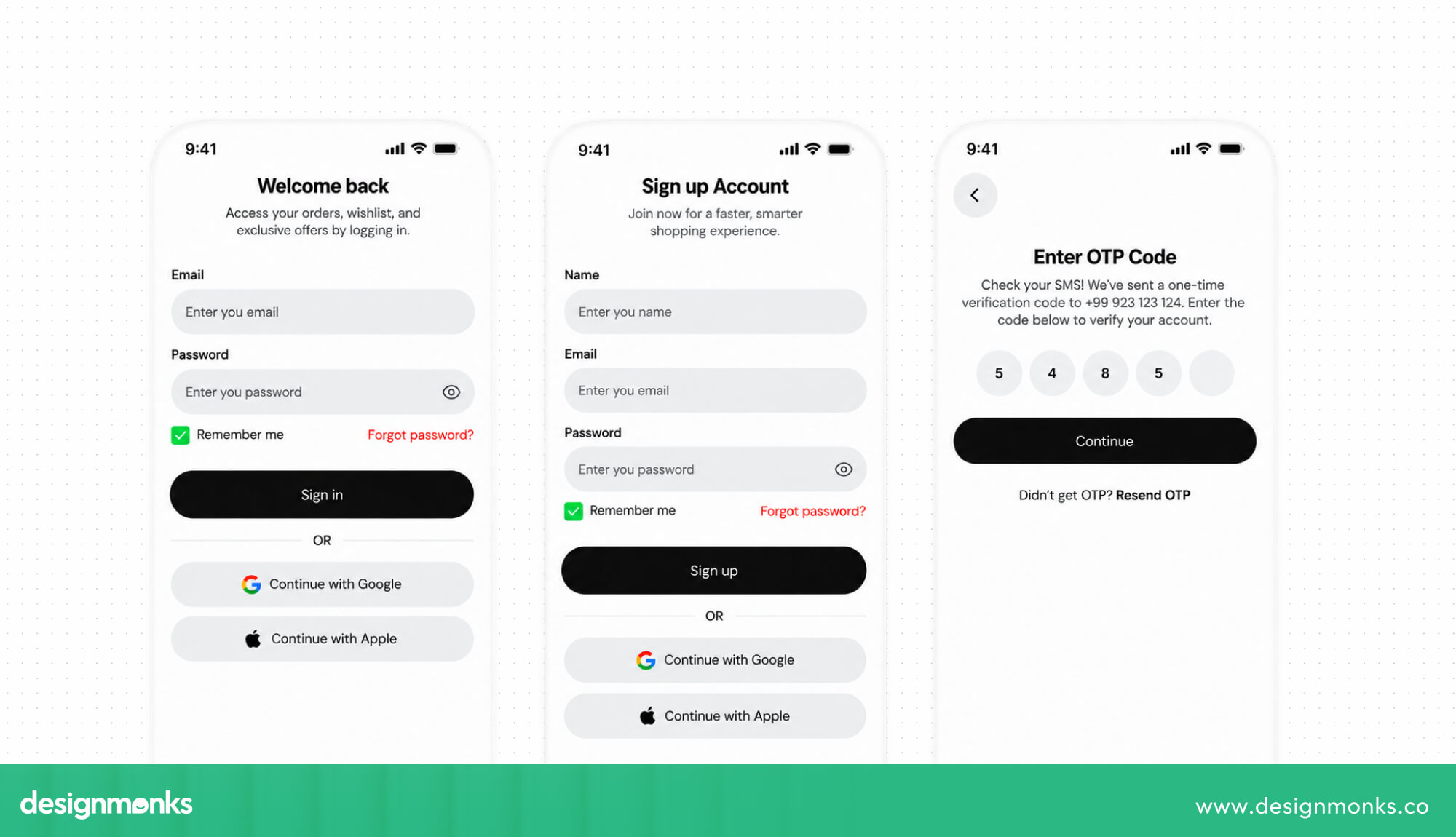
You can collect less important details later as the user gets further into the product. A shorter registration process feels easier and can help more users complete it.
Design Better Identity Verification
Identity verification flows should be guided step by step, with clear instructions about what type of document is needed and how to capture it (lighting, angle, file type). If possible, add in-app camera capture. This is far less error-prone than requiring a manual upload.
Explain Why Documents and Information Are Required
KYC can feel intrusive when users don't understand why so much information is needed. A simple explanation can make the process feel much more reasonable.
For example, you could say, “We need this to confirm your identity and meet financial regulations.” A little context can make users more comfortable sharing sensitive information.
Handle Verification Errors Clearly
When verification fails, don't leave users wondering what went wrong. Tell them the specific problem, such as a blurry photo, expired ID, or name mismatch. Then give them a clear way to fix it and try again. A helpful error message turns a frustrating moment into a simple next step.
Show Progress Through Multi-Step Onboarding
Long onboarding processes can feel easier when users can see their progress. A simple progress bar or step indicator shows where they are and how much is left.
This is especially helpful for KYC, where users may need to complete several checks before accessing their account. When people can see the finish line, the process can feel much more manageable.
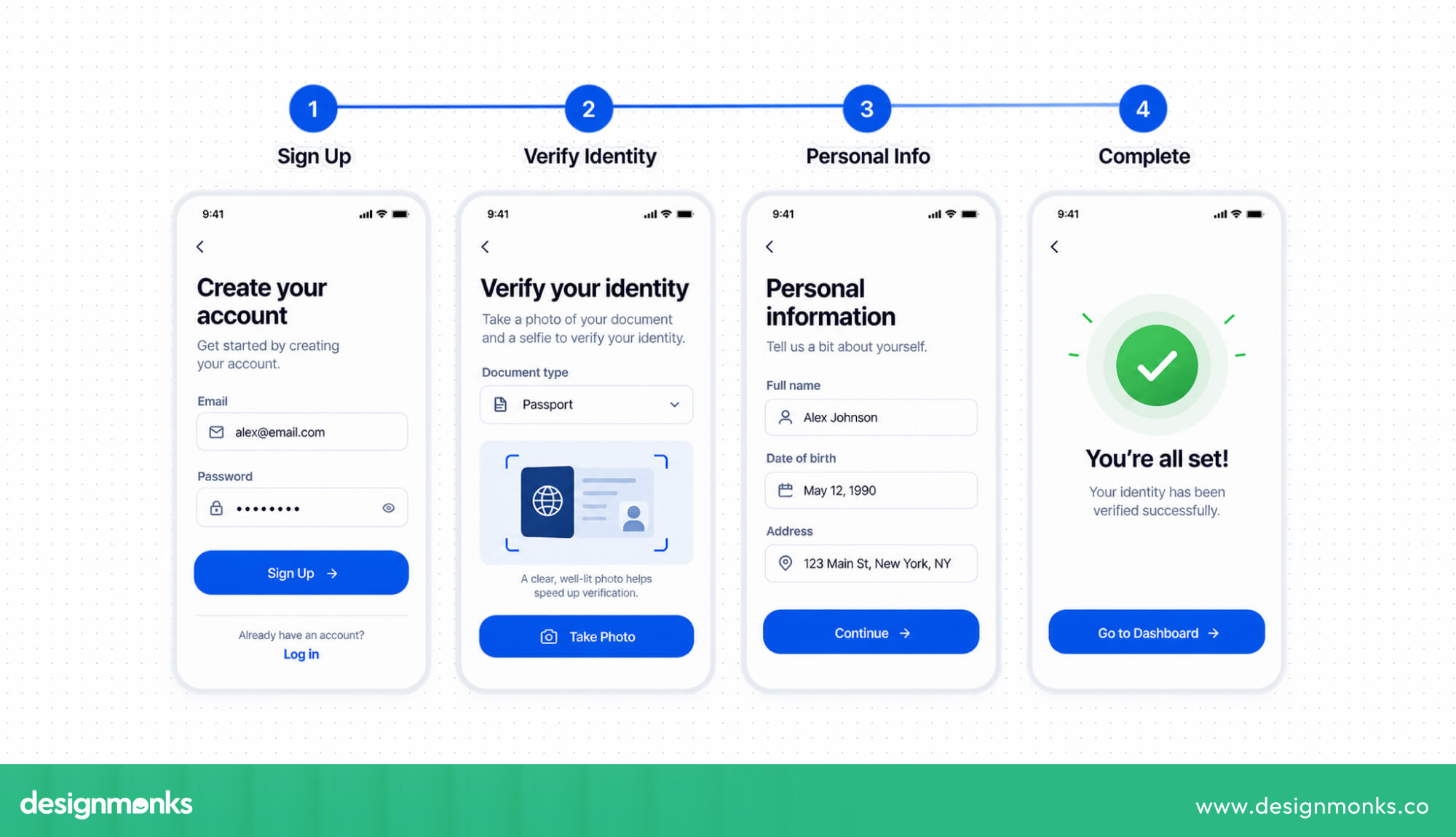
Online account opening is still a common user pain point in banking. This makes onboarding one of the best areas for fintech companies to improve their UX. Small changes to forms, instructions, errors, and progress indicators can make a noticeable difference in completion rates.
Fintech UX Patterns for Payments and Transactions
Payment UX is about more than making the “Pay” button easy to find. Users need a smooth experience before, during, and after they send money. You can follow these to make the transaction easier:
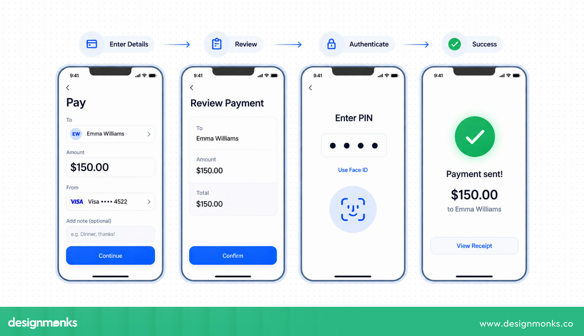
- Keep payment flows short and predictable: Remove unnecessary steps and use helpful defaults, such as saved cards and recognized recipients. This helps users complete payments faster and with less effort.
- Show fees and rates before confirmation: Clearly display transfer fees, exchange rates, total costs, and processing times before users confirm a payment. This prevents unexpected charges and builds trust.
- Make success and failure messages clear: Users should immediately know whether their payment worked. If it fails, explain the reason, such as insufficient funds or an expired card, and tell them what to do next.
- Make pending payments easy to understand: Don't leave users wondering what happened to their money. Show when the transaction started, its current status, and when they can expect an update.
- Make recurring payments easy to manage: Let users quickly find, update, pause, or cancel subscriptions and recurring transfers. They shouldn't have to search through settings or contact support.
- Keep supporting users after they pay: The experience continues after the “Pay” button. Clear receipts, status updates, and easy error recovery can help users feel confident about their money.
Fintech Dashboard UX and Financial Data Visualization
A good financial dashboard should help users understand their money quickly. It shouldn't show every piece of data just because the system has it. Here's what you can do instead:
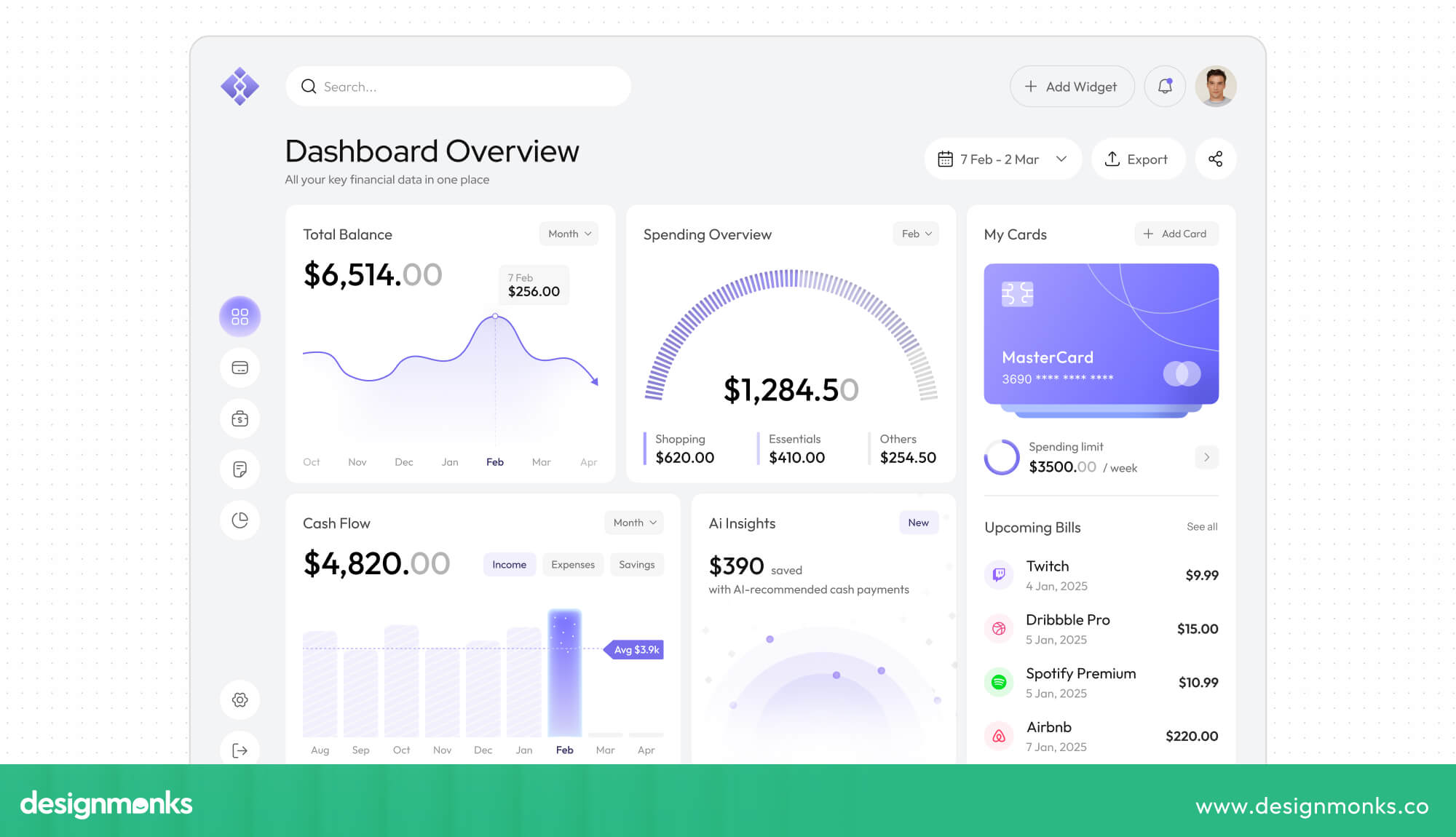
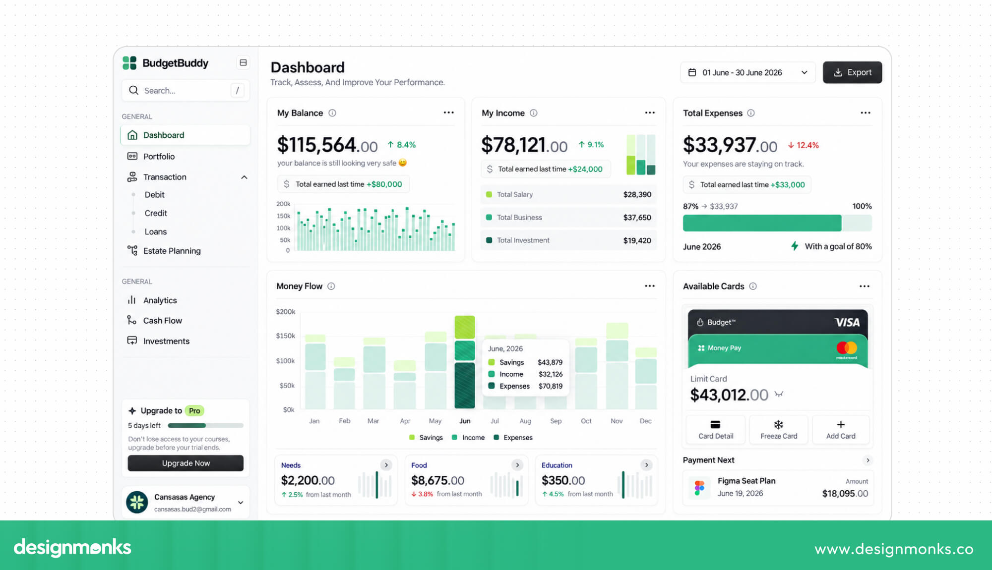
- Show the most important information first: Put key details like current balance, recent transactions, upcoming bills, and spending near the top. Users shouldn't have to search through menus to find them.
- Make balances and transactions clear: Clearly separate available and pending balances. Transaction lists should also show whether a payment is completed, pending, or failed so users always know what is happening.
- Use charts to explain trends: Charts are most useful when they answer a clear question, such as how spending changed this month. Avoid adding charts that look good but don't give users useful information.
- Make transaction history easy to scan: Group transactions by date, category, or merchant. Clear icons and consistent formatting help users quickly find a specific payment in a long list.
- Make multiple accounts easy to manage: Many users have more than one account or card. Give them an easy way to switch between accounts and see their overall financial picture when needed.
- Offer useful financial insights: Spending alerts, budget updates, and savings suggestions can help users make better decisions. These insights should be specific and actionable, rather than giving users information they already know.
A strong fintech dashboard should give users quick access to balances, income, expenses, transactions, budgets, and accounts. The less users have to dig around to find these basics, the more useful the dashboard becomes.
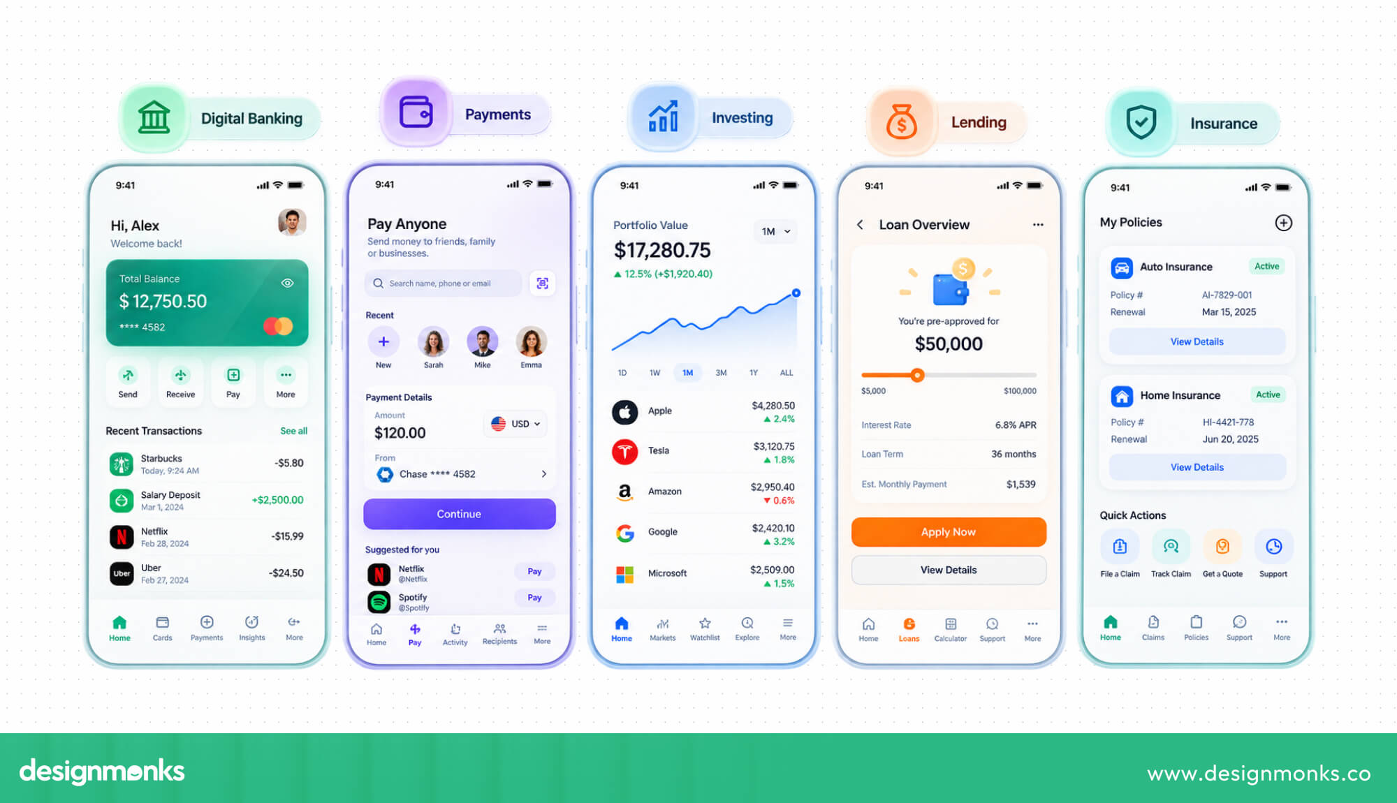
UX for Different Types of Fintech Products
Not every fintech product should be designed like a banking app. Each type of product has different goals, user needs, and risks, so its UX should focus on the areas that matter most:
The key is to match the UX to the product, so users can complete financial tasks with clarity, confidence, and less friction.
How to Design Better Fintech UX for Financial Decisions
Fintech UX should do more than help users finish a task. It should also help them understand their options and make better financial decisions. Here are a few ways to make that experience clearer and more useful:
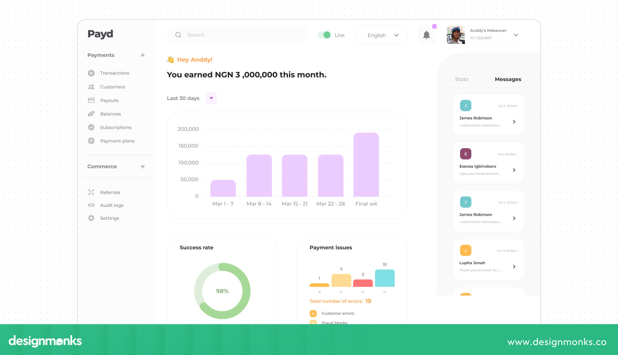
- Explain complex financial information: Break loans, investments, fees, and other financial details into small, easy-to-understand sections. For example, show the interest, fees, monthly payment, and total repayment instead of only showing the final loan cost.
- Show risks before important actions: Make users aware of important risks before they make decisions involving their money. For large transfers, investments, or loans, place relevant warnings where users can see them instead of hiding them in long legal notices.
- Show important information first: Give users the key details upfront and let them open more information when they need it. For example, an investment app can show the expected return and risk level first, with detailed information available for users who want to learn more.
- Add context to financial numbers: Numbers are easier to understand when users can see what they mean. Instead of only showing “You spent $340 this month,” show how that compares with last month or break it down by spending category.
Good fintech UX isn't only about helping users move faster. It should help them understand their choices and feel confident about the decisions they make.
Personalization in Fintech UX
Personalization can make fintech products more useful by showing users information that actually fits their needs. Users should always know how their data is being used and have control over it.
When done well, personalization can make everyday financial tasks feel more relevant and easier to manage. Here are a few ways fintech products can use it effectively:
- Use AI financial assistants: AI assistants can answer account questions, explain transactions, or help users manage their budgets. This can save users from searching through menus or contacting support for simple questions.
- Make banking more conversational: Chat-based interfaces can make simple tasks easier, such as checking a balance, asking about a fee, or reporting a transaction. Users can simply ask what they need instead of searching through several screens.
- Use AI to find useful patterns: AI can spot changes in spending that users might miss, such as higher subscription costs or unusual spending. These insights can help users pay closer attention to their finances.
- Explain AI recommendations: If AI suggests a financial action, users should understand why. For example, saying “Your dining spending is 20% higher this month” is much more useful than recommending with no explanation.
- Provide human support when needed: Some problems are too important or sensitive to handle through AI alone. Fraud claims, locked accounts, and other serious financial issues should give users an easy way to reach a human.
The goal isn't to add AI everywhere. Good fintech UX uses AI where it makes things easier while keeping users informed and in control of important financial decisions.
AI and Conversational UX in Fintech
As fintech products become more personalized, they also have more opportunities to use AI to make those experiences more helpful. AI can handle simple tasks, surface useful information, and give users quicker ways to get answers.
When used carefully, it can make financial products easier to navigate without taking important decisions away from users. This is where AI and conversational UX can add real value.
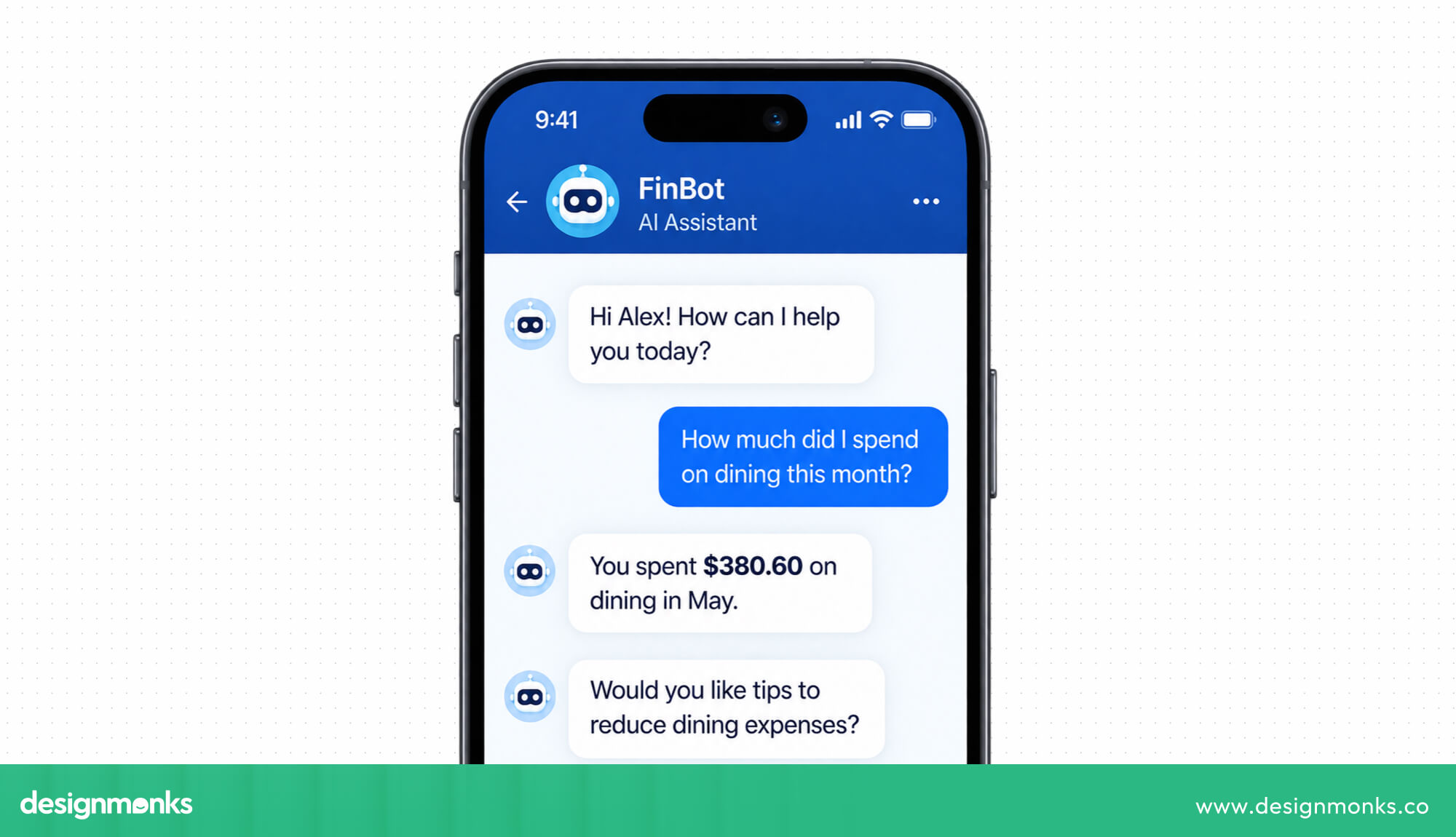
AI financial assistants can answer account questions, explain transactions, and help with budgeting. Chat-based banking can make simple tasks, such as checking a balance or asking about a fee, easier than searching through menus.
AI can also spot patterns like unusual spending or rising subscription costs and turn them into useful insights. For financial recommendations, users should understand why AI made a suggestion.
But for sensitive issues like fraud or locked accounts, there should always be a clear way to reach a human.
Accessibility and Inclusive Fintech UX
Financial apps should be easy for everyone to use. Accessibility is especially important in fintech because users need to manage their money independently and securely. A good fintech product should consider:
- Screen readers: Make sure important information and buttons can be understood by screen-reader users.
- Keyboard navigation: Let users move through the interface without needing a mouse or touchscreen.
- Text scaling: Allow users to increase text size without breaking the layout.
- Color contrast: Use clear contrast so text, buttons, and important information are easy to see.
- Large touch targets: Make buttons and controls large enough to tap comfortably.
- Plain language: Avoid complicated financial terms and explain important information in simple words.
- Clear error recovery: Tell users what went wrong and give them an easy way to fix it.
- Voice interaction: Support voice controls where they can make financial tasks easier.
- Accessible authentication: Make login and verification methods usable for people with different abilities.
These details can make the difference between someone being able to manage their money independently and needing help from another person.
Common Fintech UX Problems and How to Fix Them
Fintech products can become difficult to use when important information is hidden, processes are too long, or users aren't sure what to do next. Here's how to address some common UX problems:
A strong fintech UX doesn't try to remove every bit of complexity. It makes necessary complexity easier to understand, navigate, and manage.
Fintech UX Metrics to Measure
You need more than user feedback to know whether a fintech product is easy to use. These UX metrics show where users complete tasks smoothly, where they drop off, and which parts of the experience need improvement:
Looking at these metrics together gives UX teams a better picture of the product. For example, a low KYC completion rate combined with a high support contact rate could point to problems in the verification flow.
Teams can use these insights to find the problem, test improvements, and measure whether the changes actually help.
Fintech UX Design Best Practices Checklist
Use this quick checklist to review your fintech product before launch:
- Financial terms are clear and easy to understand.
- Fees and charges are shown before confirmation.
- Security steps are clearly explained when needed.
- KYC steps are simple, and progress is visible.
- Transaction statuses are clearly marked.
- Errors explain the problem and next steps.
- Important financial information is easy to find.
- The interface works well for users with different needs.
- High-risk actions include clear confirmation steps.
- Users receive clear feedback after each important action.
Fintech UX Examples and Case Studies
Real fintech products show how small UX improvements can make financial tasks easier, faster, and more trustworthy.
Revolut
Revolut makes the onboarding and identity verification process easier by guiding users through each step inside the app. Users may need to provide personal details, a government ID, and a selfie. If more information is needed, the app explains what is missing and prompts users to provide it.
This approach keeps users informed throughout KYC instead of leaving them unsure about what to submit or why verification is taking longer.
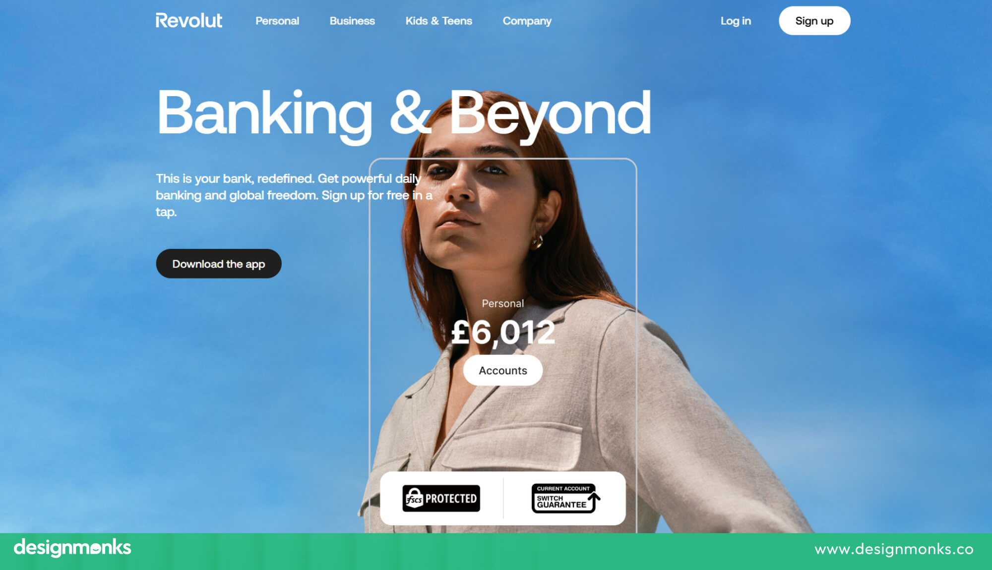
UX lesson: Clear instructions, progress updates, and helpful error messages can make a required KYC process feel much easier to complete.
Monzo
Monzo focuses on making everyday banking tasks simple and easy to understand. Its app brings key information such as balances, transactions, spending, and savings into a clear interface. Features like spending notifications also help users see what is happening with their money soon after a transaction.
Instead of making users dig through menus, Monzo keeps important financial information easy to find and uses clear language to explain what is happening.
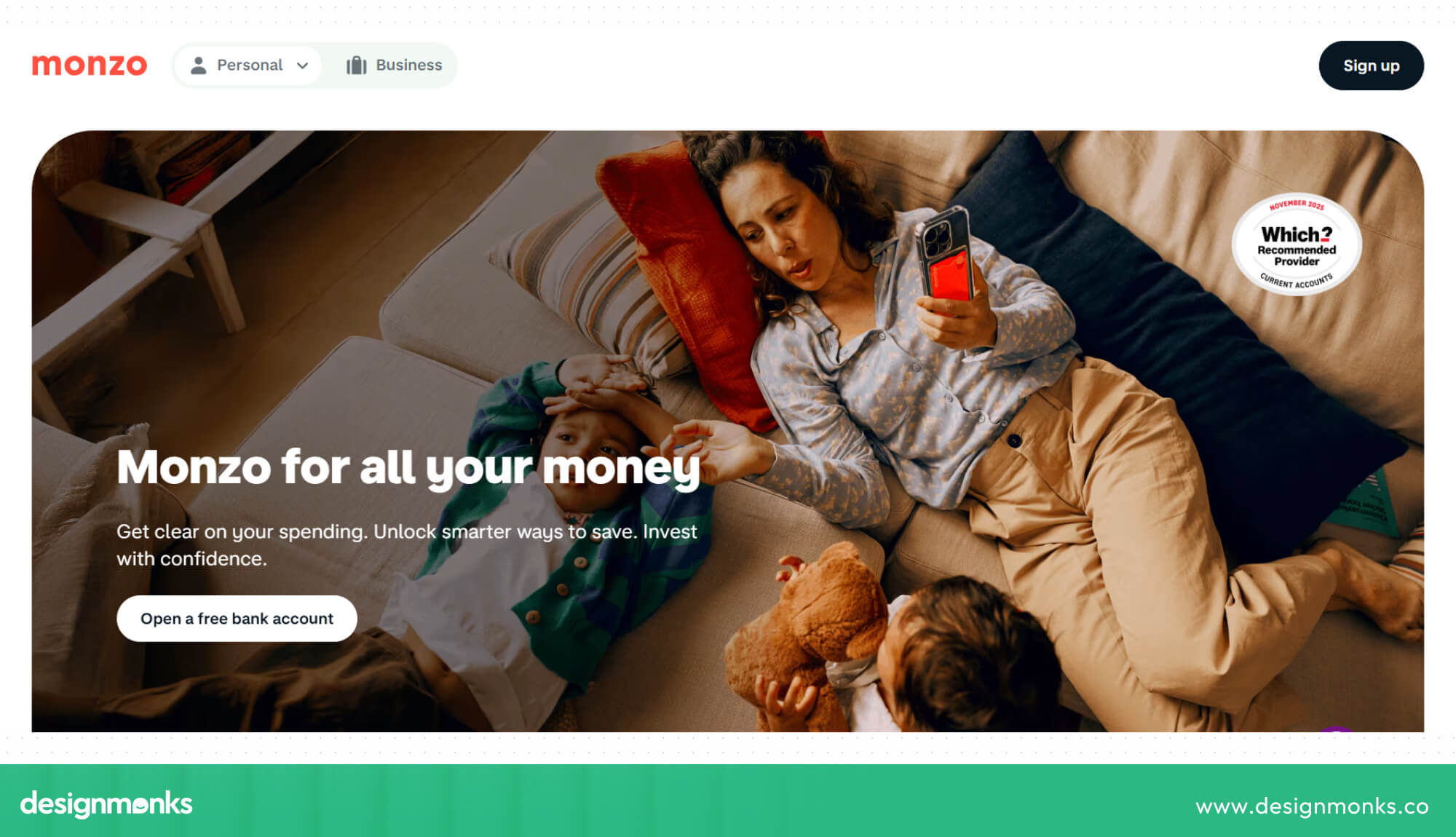
UX lesson: A simple interface, timely updates, and easy-to-find financial information can help users feel more in control of their money.
Zerion
Zerion redesigned its experience to make complex financial information easier for users to understand. The redesign uses clearer content blocks, stronger visual hierarchy, better spacing, and simpler layouts across desktop and mobile.
These changes help users scan information more quickly and understand important financial details without having to work through dense screens.
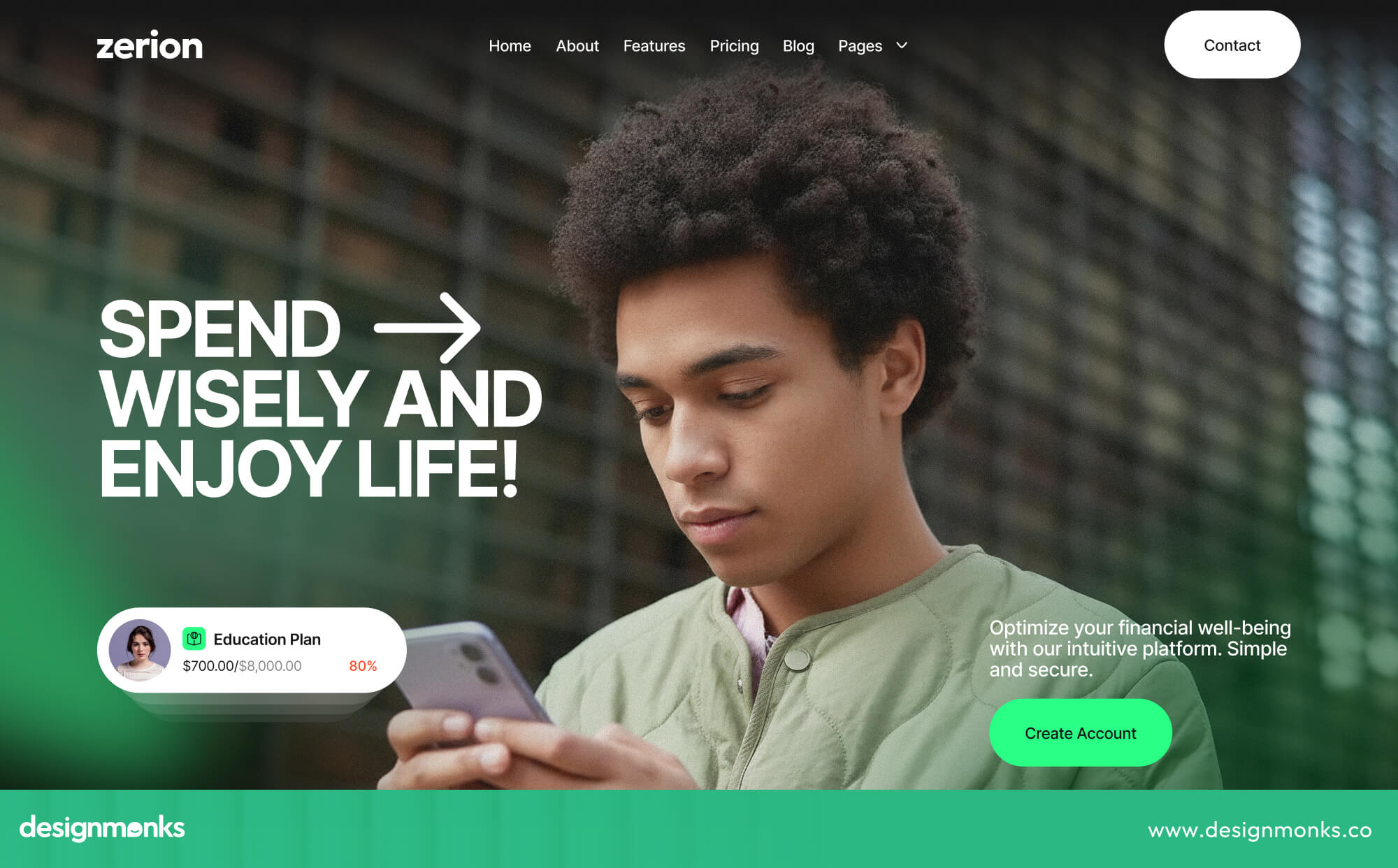
UX lesson: Better structure and visual hierarchy can make complex financial information easier to understand.
MTB Mobile App
The Mutual Trust Bank (MTB) mobile app had confusing navigation, inconsistent screens, and a KYC process that sent users outside the app. The redesign brought KYC into the app, simplified the transfer flow, and created a more consistent interface for key banking features.
The transfer process went from more than 22 taps to just 9, while user satisfaction increased by 45%.
UX lesson: Removing unnecessary steps and keeping important tasks inside the app can make everyday banking systems much easier.
Affine
Affine deals with complex DeFi features such as liquid restaking and cross-chain strategies. For many users, the technical nature of these services made them difficult to understand and created uncertainty around financial and security risks.
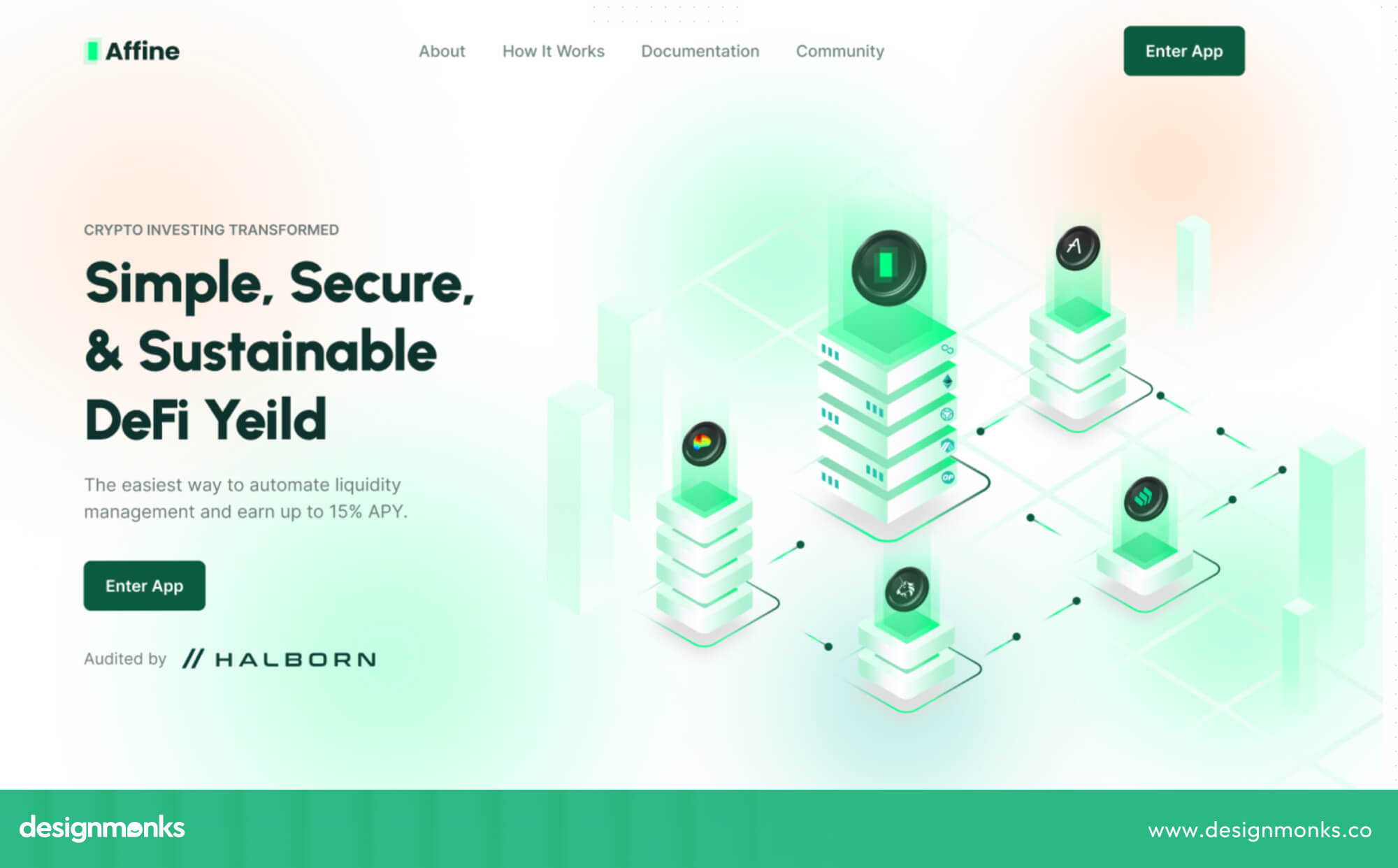
The redesign simplified the interface, added clearer instructions and educational content, improved cross-chain guidance, and gave users personalized dashboards with real-time information.
UX lesson: Complex financial products become easier to use when the design explains difficult concepts and guides users through each step.
Looking for the Right Fintech UX Design Partner?
Good fintech UX can solve very different problems, from simplifying banking tasks to making complex financial products easier to understand. The right approach depends on the product, its users, and the challenges they face.
That kind of hands-on experience matters when choosing a fintech UX partner. Design Monks has worked on products such as Zerion, MTB Mobile App, and Affine and helped teams improve complex financial experiences through clearer flows, simpler interfaces, and better usability.
If you're building or redesigning a fintech product, that hands-on experience can help you turn complex features into experiences users can understand, navigate, and trust.


.avif)
.avif)
.avif)
.avif)


.avif)
.avif)
.avif)
.avif)






.avif)