
.svg)


Key Takeaways
- Clear messaging above the fold builds trust immediately with users.
- Simple layouts and spacing make financial information easy to read.
- Trust signals reduce fear during sign-up or payment actions.
- Micro-interactions guide users and provide feedback without causing confusion.
- Onboarding step by step increases confidence and improves user retention.
Money apps win or lose trust in five seconds. That is why one should think twice before designing a finance website. A clear site shows safety and speed, and care. Besides, there are many factors that are closely connected to trust matters and conversion.
In the fintech industry, the site acts like a front desk. It must look clean and feel safe. Simple text, clear buttons, and calm colors help users act with no fear and no doubt today. These details may sound small, but their impact is unimaginable.
However, in today’s guide, I’ll show you some real fintech website design examples and explain what works, what fails, and what fits your product so you can plan a better fintech website.
What Makes a Great Fintech Website Design?
A great fintech website must feel safe from the very first second a visitor opens the page. People share card details, bank data, and private information, so the site must look calm and clean. The layout must stay simple so users can read content without stress or doubt.
Every button must look clear so users know where to click without fear. The main message must explain the product in easy words that anyone can understand. A good fintech website must also help people finish tasks fast without extra steps or confusion.
Users do not want to search for simple things like balance, payment, or account details. Each page must show one clear goal so the user stays focused and confident. The site must load fast so people do not lose trust before the first action. A helpful design makes users feel guided instead of lost.
- Clear message on the first screen that explains the product in very simple words.
- Simple layout with space that helps eyes rest and helps users read content easily.
- Easy steps that guide users to sign up, pay, or check accounts without confusion.
- Strong trust signs like locks, badges, and short notes about data safety and privacy.
- Fast page speed so users do not wait and do not lose trust in the product.
- Support links and help options that stay easy to see on every important page.
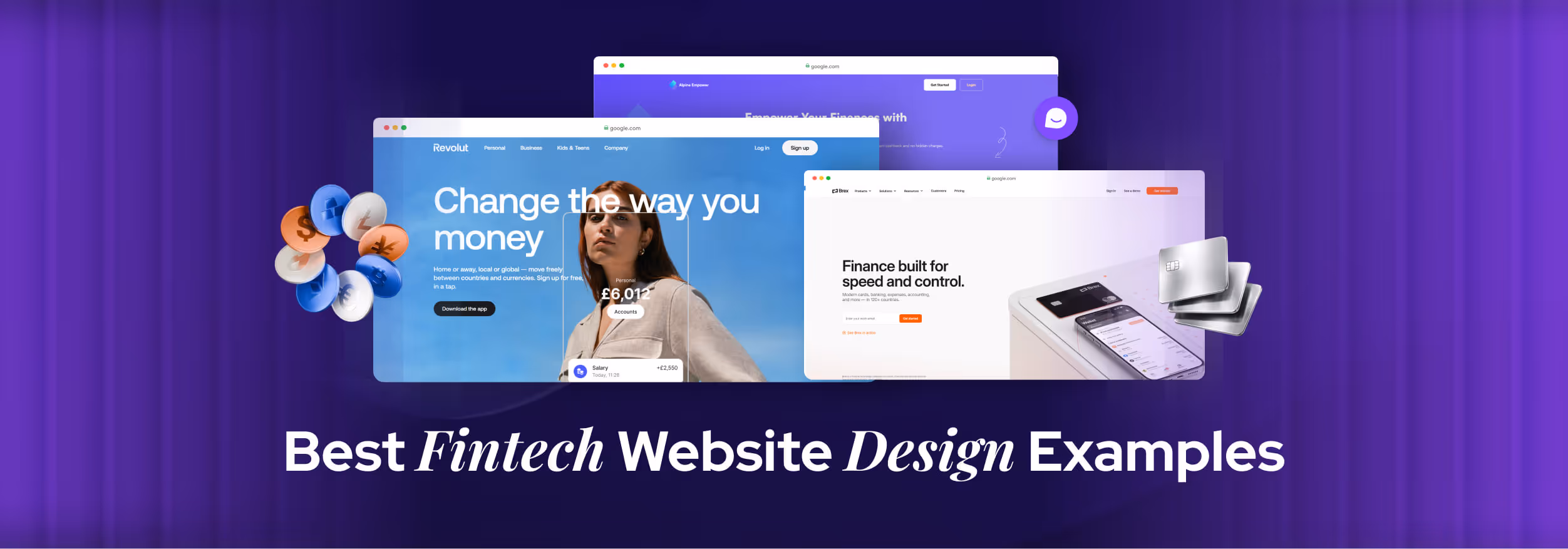
7 Best Fintech Website Design Examples
Undoubtedly, fintech https://fintechlabs.com/websites need different attention as it’s closely related to users’ trust issues and reliability facts. That’s why it’s important to check how famous websites grab users’ attention in this fintech industry. Here are 7 fintech website design examples, you can get inspired by:
1. Alpine
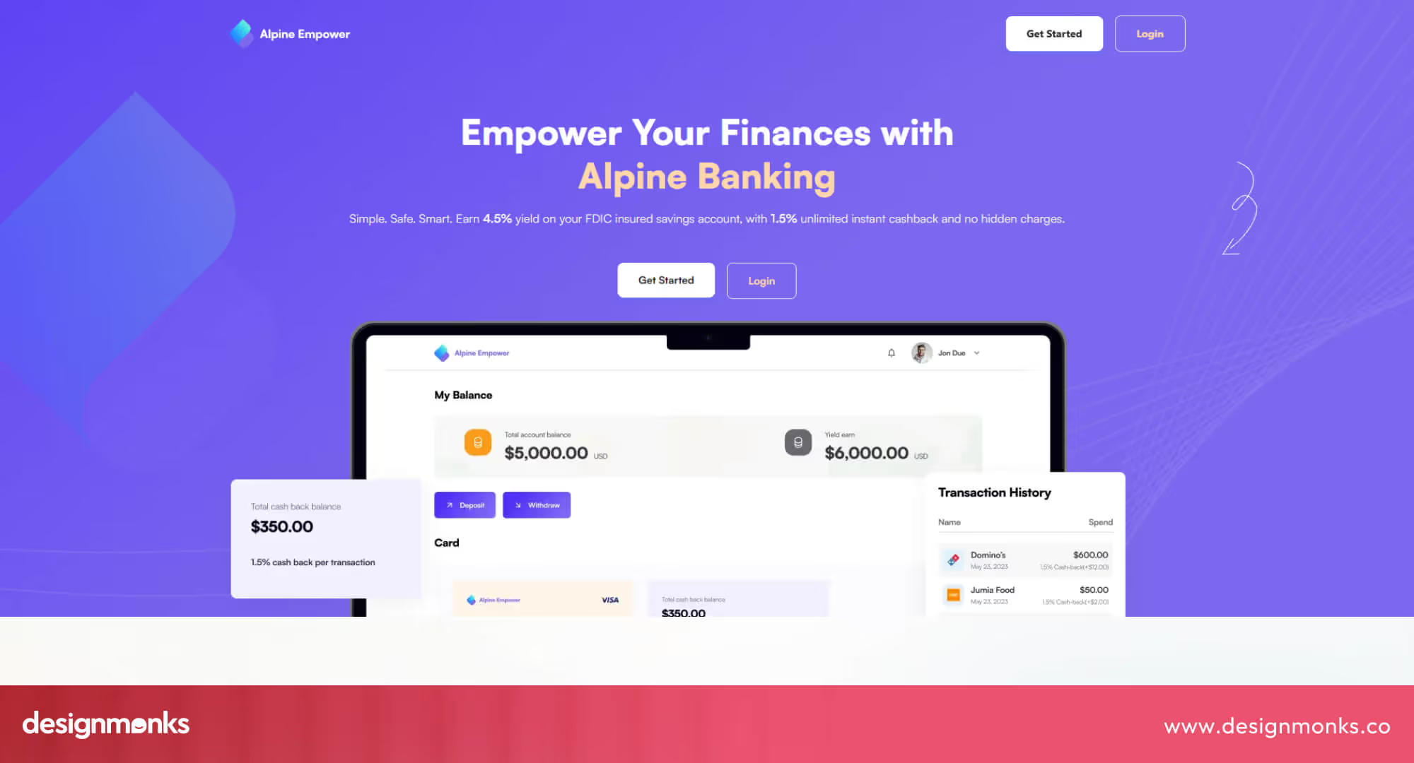
Designed by Design Monks, the Alpine website uses a calm and modern theme with soft colors and strong spacing that makes money topics feel simple and safe. The hero section explains the product fast, and every block keeps the page clean, readable, and focused.
This one is one of many fintech projects of Design Monks. Here, the UI places main actions in clear view and keeps each section easy to scan. The UX guides users through features in a straight path, shows trust details early, and uses clear text blocks that reduce doubt and decision time.
2. Stripe
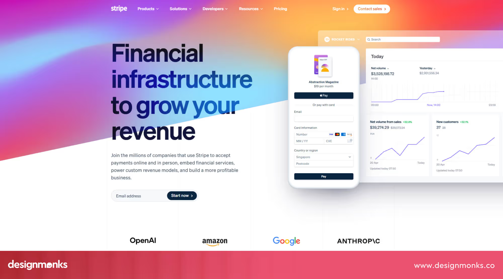
Stripe fits this category because it helps businesses accept online payments in a safe and fast way. The site uses clean space, strong contrast, and clear text. Each section explains one idea, and all the buttons stand out. The page guides new users with calm colors and simple steps.
The design works because actions stay easy to see, and trust signs appear early on the page. Forms feel short, prices stay clear, and docs stay close. The layout keeps focus on tasks, so teams finish setup fast and feel confident about the money flow daily.
3. Affine
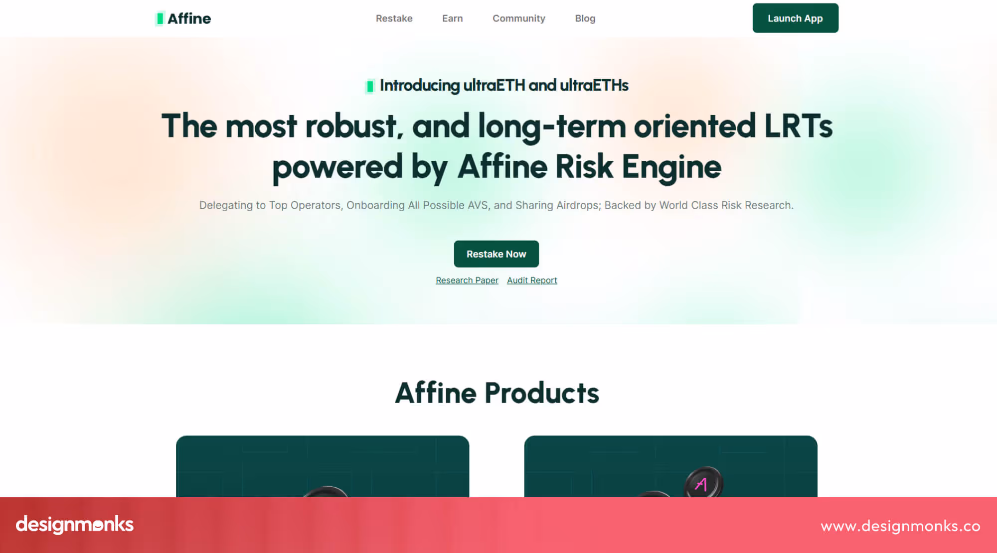
The site features a dark theme with bright highlights that make key information stand out, yet maintains a serious and modern feel. The homepage of Affine features core elements, such as yield baskets and restaking options, in bold text blocks, allowing users to understand what the product offers immediately. Navigation stays simple, letting people jump between tools without stress.
Design Monks designed this version of the site, and the UI shows clean icon sets and spaced sections that help guide users slowly through complex crypto ideas. The UX feels step-by-step, with clear labels and modern typography that reduce confusion.
4. Revolut
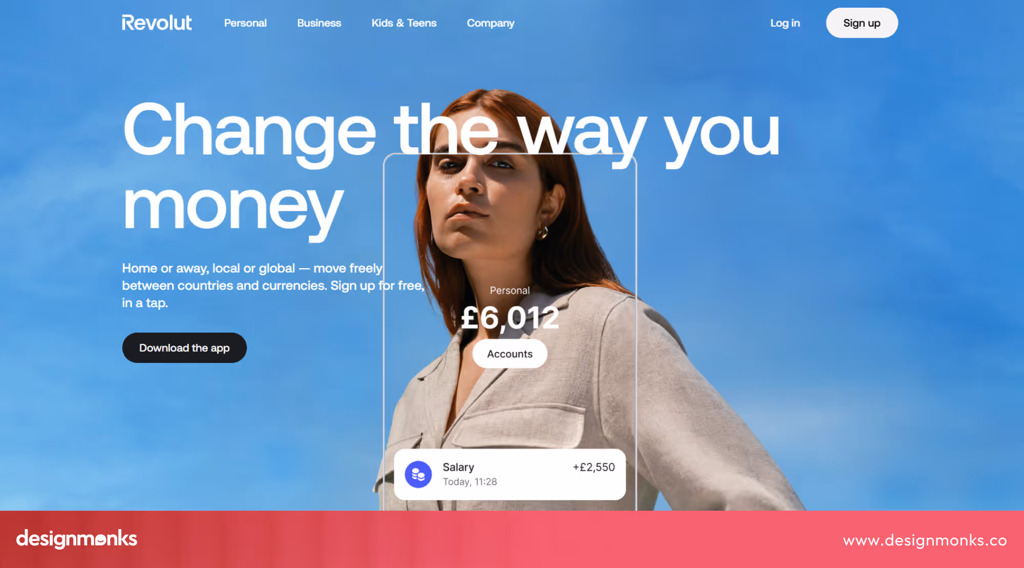
Revolut offers banking, cards, and payments inside one app with a nice UI. The website uses bold colors, text, and clear sections. Each screen shows one main message, and buttons are easy to spot. The layout feels fast and modern, which matches the product promise.
You’ll love the design because plans, fees, and features stay simple to compare. Trust badges and security notes appear early. Pages load fast and avoid clutter. Users can sign up or log in without searching. This clear path helps people feel safe and use money tools daily.
5. Wise
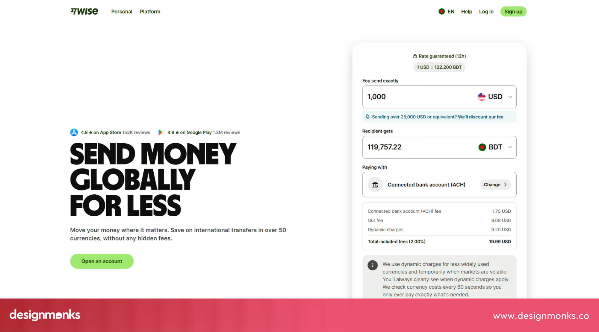
Wise is a fintech service that helps people send money abroad at a low cost. The Wise website uses a bright, friendly color scheme with white space that keeps information easy to read and digest. The homepage highlights the key benefit, low fees, right away, without heavy text.
Here, icons and simple visuals help explain how the service works without confusion or noise. It uses large numbers and simple words to show savings and speed. Navigation stays light and logical, so users find transfer tools fast. Every section feels open, calm, and easy to scan, which helps build trust and makes finance feel less intimidating.
6. Robinhood

Robinhood’s website and app use a dark, bold style with strong contrast, large charts, and focused screens. It simply pushes attention toward prices and actions, while short labels, simple menus, and clear buttons keep the interface quick to scan and easy for new users.
The design works because sign up, search, and buy stay close to the center, fees and limits show in plain text, and charts load fast, so people move from interest to action without stress, build habits, and return daily with confidence about their money decisions on their own.
7. Brex
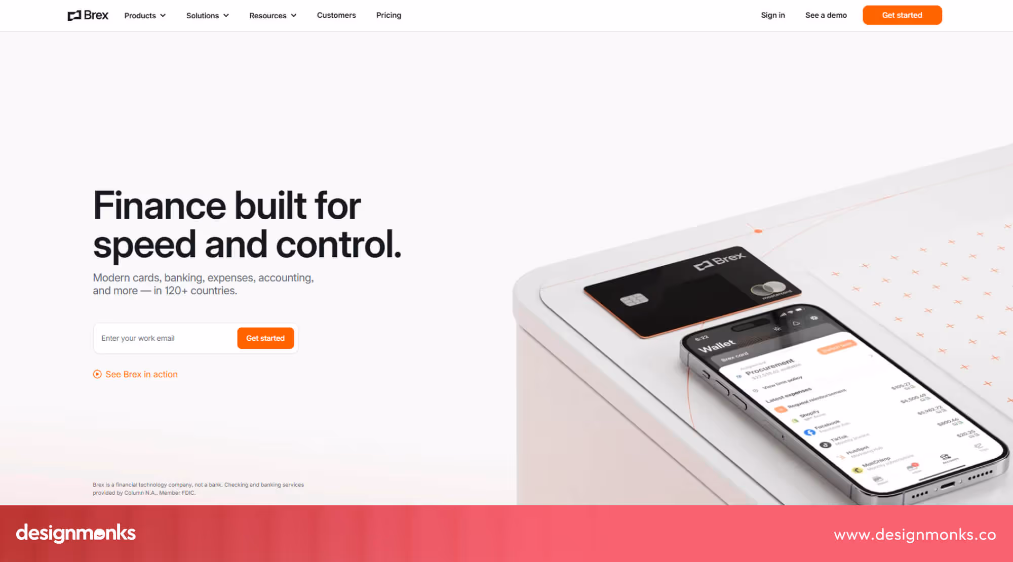
Brex presents a clean, business-focused website with strong spacing, calm colors, and sharp sections. These features explain cards, spending control, and finance tools in a clear order. The homepage uses short blocks, clear numbers, and simple charts to help teams see value fast without reading long text or feeling lost during first visits.
For this website design, the best parts are the visible key actions, trust signals that appear early, fast loading pages, and every feature sits in a clear group. Together, they help founders, finance teams, and operators move from interest to setup with less doubt and fewer steps.
Fintech Website Design Patterns You Should Learn From These Examples
Great fintech sites do not rely on luck. They follow proven design patterns that work across many products. These fintech UI patterns help explain value, build trust, and guide actions. When you study good examples, you can turn those ideas into reusable rules for your own product.
Clear Value Proposition Above the Fold
Every strong fintech site explains its main benefit before users scroll. The top section uses simple words, clear numbers, and one main action. This design pattern reduces doubt, sets expectations, and helps visitors decide fast without reading the full page.
Simplified Pricing & Feature Comparison
Good fintech UI patterns show prices and plans in clean tables or blocks. Each plan stays easy to compare. Hidden fees do not stay hidden. This design pattern helps users pick faster and prevents fear about future costs or surprise charges.
Strong Visual Hierarchy & Typography
The best examples use size, space, and font weight to guide the eyes. Important words look bigger. Less important text stays quiet. The right User Interface elements help users scan pages fast and understand what matters without deep reading.
Micro-interactions & Motion Design
Small motions show what just happened after a click or form action. Buttons react. Numbers change with soft movement. These fintech UI patterns give feedback, reduce confusion, and make the product feel alive without noise or visual stress.
Trust Signals Placed at the Right Moments
Good fintech sites place security notes, partner logos, and safety messages near actions like sign up or payment. This design pattern removes fear at the exact moment it appears and helps users continue without second thoughts.
Simple Onboarding Flow
The best examples break the setup into small and clear steps. Each screen asks for one thing only. This fintech UI pattern reduces effort, avoids overload, and helps new users reach their first success without quitting halfway.
Fintech Website Design UX Checklist (Actionable)
A good fintech website must help users feel safe, act fast, and understand everything without effort. This checklist turns common fintech UI patterns and design patterns into clear actions. Use it to review your pages, fix weak points, and build a product that people trust and use.
Clear First Screen Message
The first screen must explain what your product does in one short line. Add one main button and remove extra links. Users should understand the offer in five seconds and know exactly what to do next.
Simple and Honest Pricing Section
Show prices in a clean layout with clear labels. Place features under each plan. Avoid hidden terms. Add short notes for limits or rules so users do not feel tricked after signing up.
Easy Navigation and Page Flow
Menus must stay short and clear. Group pages by purpose. Each page must lead to one main action. Users should reach any important section in two or three clicks without guesswork.
Strong Trust and Security Signals
Place security notes near forms, sign-up buttons, and payment steps. Use clear words about data safety. Show partner or compliance logos only where they support decisions, not as decoration.
Fast Load Speed and Light Pages
Heavy pages reduce trust in finance products. Compress images. Avoid large effects. Test on slow networks. The site must open fast so users do not leave before they see the main message.
Forms That Feel Short and Friendly
Ask only for the required information. Split long forms into steps. Show progress. Use clear labels and error messages so users can fix mistakes without stress or support.
Clear Buttons and Action Text
Buttons must explain what happens next. Use words like “Create account” or “Send money.” Avoid vague labels. One main action per screen keeps users focused and reduces wrong clicks.
Helpful Empty States and Error Messages
When no data exists, explain what to do next. When errors happen, explain the problem in simple words. Never blame the user. Good messages keep people calm and moving forward.
Mobile Experience Treated as First Priority
Many users will visit from phones. Text must stay readable. Buttons must stay easy to tap. Important actions must stay near the thumb area for comfort and speed.
Simple Onboarding With Early Success
Guide new users step by step. Show progress. Help them finish one useful task fast. This builds confidence and proves value before asking them to explore advanced features.
Who Designs the Best Fintech Websites?
Fintech website design requires skill, trust, and usability focus. Fintech design agencies help brands build safe, clear, and high-converting finance websites. Here are the top agencies excelling in this field.
Design Monks
This one specializes in fintech UI/UX with a smooth, trust-driven approach. They craft clean layouts, clear messaging, and step-by-step flows that guide users confidently while boosting conversions. Every detail supports safety and usability. You can contact Design Monks to get affordable and personalized packages for your next fintech project.
PixelPioneer
PixelPioneer focuses on modern fintech branding combined with interactive UI. Their sites feature bold visuals, clear value propositions, and simple navigation, making complex financial products feel approachable and professional for users.
FintechLabs
FintechLabs emphasizes performance and trust. They build fast-loading, minimal, and secure interfaces. Their design combines analytics-driven layouts with clear calls-to-action, ensuring users feel confident while completing critical finance tasks online.
FAQs
What makes fintech UX different?
Fintech UX is different because it must focus more on trust, safety, and clear actions. Users share money and private data here, so every screen must reduce fear, explain steps clearly, and avoid any action that feels risky or confusing.
How important is compliance in design?
Compliance is very important in fintech design because laws and rules protect users' money and data. The design must show required notices, permissions, and warnings in clear places so the product stays legal and users feel safe and informed.
Are fintech websites different from SaaS sites?
Yes, fintech websites are different because mistakes here can cost real money. They need stronger trust signals, clearer actions, and more careful form design, while most SaaS sites can focus more on features, speed, and general product benefits.
End Note
Good fintech design is not about style or trends. It is about trust, clarity, and smooth actions. The examples in this blog show how small choices shape big results.
When the layout stays clean and the messages stay clear, users feel safe and move forward. Use these ideas as a guide, not as a copy. Test them with your own product, improve weak areas, and build a fintech website that people trust, return to, and recommend to others.

.avif)
.avif)
.avif)
.avif)


.avif)
.avif)
.avif)
.avif)


.avif)


