
.svg)


Key Takeaways
- A clear ecommerce UX audit shows where users lose trust.
- Small UX fixes can raise conversion rate and total revenue.
- Mobile UX and page speed shape most buying decisions.
- Real user data always beats guesswork in UX decisions.
- Regular audits keep your online store ready for growth.
Clicks do not pay bills; orders do. Learning how to audit ecommerce UX reveals why visitors leave before buying. It studies how real people interact with your store and where they get stuck or confused.
A proper UX audit for online stores links user experience directly to conversion. By fixing friction points on key pages, more visitors complete orders, boosting revenue and building trust.
Following a structured approach helps teams act efficiently. Understanding how to audit ecommerce UX for better conversions provides clear steps to improve layouts, navigation, product pages, and checkout flow. Read this blog to learn the full process.
eCommerce UX Audit Checklist
An eCommerce UX Audit checklist helps you review every key part of your online store in a clear order. It prevents missed issues, reduces guesswork, and guides you to fix real user problems that affect sales and trust. Here’s a complete checklist you can follow:
- Explain what the store offers in the homepage headline.
- Show the main product or value clearly in the hero banner.
- Place trust badges near key action buttons.
- Display featured products above the fold area.
- Place category links where users can notice them fast.
- Group similar products under clear category names.
- Keep the main menu clean and easy to scan.
- Add live product hints inside the site search.
- Show only useful filters for each product category.
- Keep sorting options short and simple.
- Display product image, price, and action clearly on cards.
- Use sharp product images with smooth zoom support.
- Show price, stock, and delivery details near Add to Cart.
- Write short and clear product descriptions.
- Display real customer reviews and star ratings.
- Show shipping, tax, and total cost inside the cart.
- Save cart items after the user leaves the page.
- Keep guest checkout active by default.
- Shorten checkout forms and guide each field clearly.
- Offer trusted payment methods with visible security signs.
- Adjust layout for easy thumb reach on mobile screens.
- Test page speed on slow internet connections.
How to Do an eCommerce UX Audit
A good audit reviews each part of your store with clear tasks. Follow the steps below to spot problems, set fixes, and raise trust, speed, and sales with steady, measurable work.
Step 1: Homepage & First Impression Audit
The homepage shapes the first user view of your store. This step checks if users understand what you sell, if the hero message feels clear, and if trust signs help users feel safe at once. This step starts your work on how to audit ecommerce ux at the surface level.
Hero Section and Value Proposition Clarity
The hero section is the first large block users see. It must guide users with a simple message. The value promise must match the store's goal and the customer's need without delay.
- Headline clarity: The headline must explain the store offer in one clear sentence. A user must read it once and know what the store sells without doubt or extra scrolling.
- Offer communication: The offer must stand near the headline and show the main benefit. This may include price support, delivery support, or return support.
- Relevance: The hero message must align with the product in the store. If users see a message that feels off-topic, they will leave fast.
Featured Products and Category Entry Points
This part checks how users move from the homepage into real shopping paths. Strong entry points reduce confusion and boost browse comfort.
- Product exposure: Featured products must appear in the top screen area. Users should not need to scroll to view the main product range.
- Discoverability: Category links must stay visible and easy to spot. A user must reach any main category with one clear tap.
Step 2: Navigation & Site Architecture Audit
Navigation controls how users travel across the store. This step ensures users find products with less effort and no mental load. It is a key phase in any ux audit for online stores.
Category Structure and Logical Grouping
Product groups must follow logic that matches the real user's thought. Poor grouping breaks the flow and causes an early exit.
- Category hierarchy: Each main group must hold related items only. Mixed items inside one group raise confusion.
- Predictable structure: Users must guess where a product will sit before they open the category. This shows structural health.
Search Bar and Predictive Search
Search helps users who want speed. It must sort intent fast and avoid wrong result display.
- Search intent match: Search results must match the user query in meaning, not just in text match.
- Predictive help: Live hints during search must guide users toward the right product name or group.
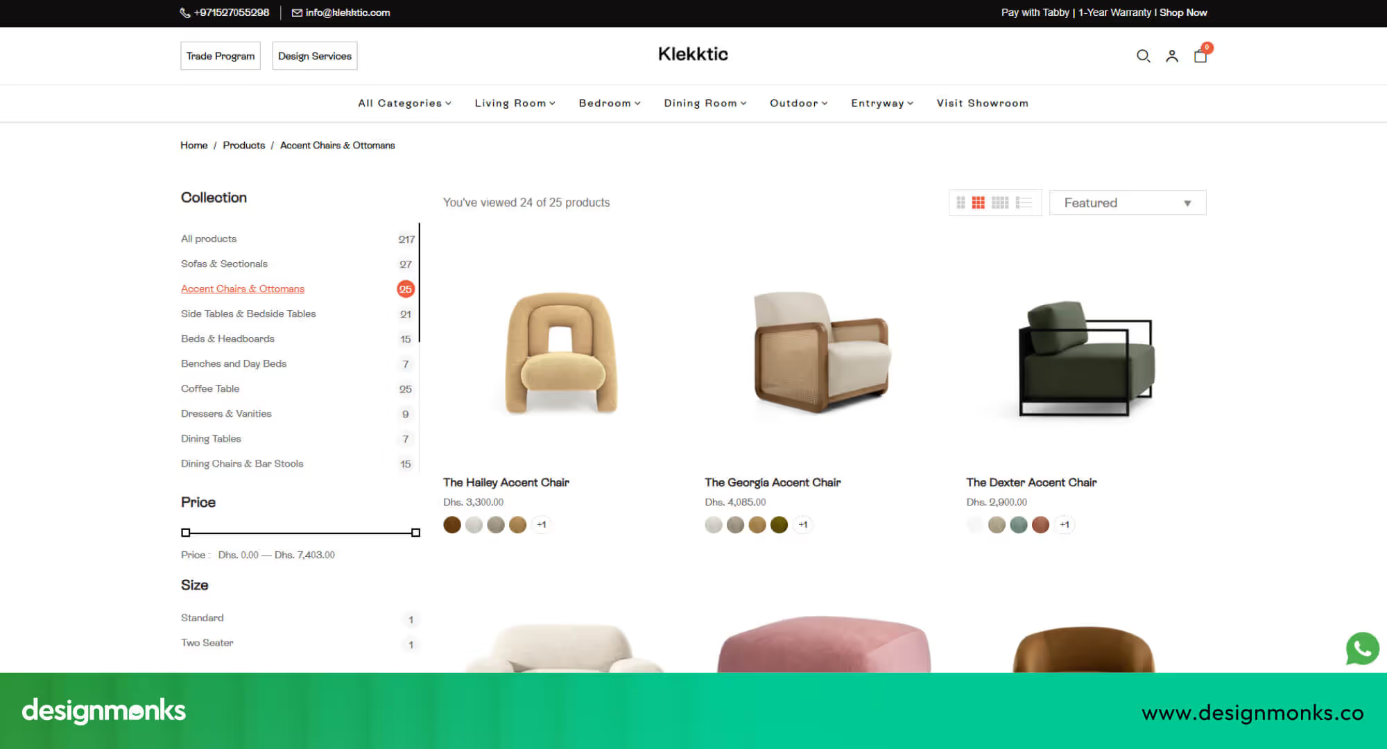
Step 3: Product Listing Page (PLP) Audit
This step reviews how products appear inside category lists. The goal is to help users scan fast and compare with ease. This step plays a direct role in guiding how to audit ecommerce UX for better conversions.
Filter and Sort Usability
Filters shape product control. Sorting shapes product order. Both tools must stay clean and helpful.
- Visibility: Filter tools must stay visible at all times during list view without a layout jump.
- Relevance: Filter options must match the product type. Useless filters must stay removed.
- UX pattern: Filter layout must follow common store standards so users do not need mental effort.
Product Card Design
Product cards guide first buy signals. Each card must show only the most important data.
- Image clarity: The product image must stay sharp and clean without background noise.
- Price visibility: The price must stay easy to spot and must not hide behind visual clutter.
- Add to cart action: The action button must clearly guide the next step.
Step 4: Product Detail Page (PDP) UX Audit
The product detail page is where intent turns into action. This is the final decision point before purchase. A weak layout, unclear pricing, or missing trust signals can break confidence instantly, even if your traffic quality is strong.
Image Quality, Gallery, and Zoom Interaction
Product images replace physical touch in online shopping. The gallery must show multiple clear angles, while fast, sharp zoom helps users inspect details and judge quality with confidence.
Pricing, Variants, Stock, and Delivery Info
Price, variants, stock status, and delivery timelines must stay grouped and visible. This helps users understand total cost, availability, and fulfillment expectations before committing to purchase.
Product Description and UX Writing
Product descriptions must clearly explain value in the first lines. Short paragraphs, clean spacing, and simple language help users scan quickly and understand benefits without mental effort.
Trust and Social Proof
Customer reviews and star ratings reduce purchase fear. Ratings must appear near the title, while genuine reviews add credibility and help users validate their buying decision.
Step 5: Cart UX Audit
The cart is the final decision space before checkout begins. A weak cart experience causes sudden exits, even after strong product interest.
Shipping, Tax & Total Cost Transparency
Users abandon carts when extra costs appear at the last moment. Shipping fees, taxes, and final totals must remain visible and consistent throughout the cart stage to maintain trust and reduce surprise-driven exits.
Save for Later & Cart Persistence
Cart items must stay saved across sessions and devices. When users return, their selected products should reload instantly, preserving intent and supporting delayed decision-making without forcing users to rebuild the cart.
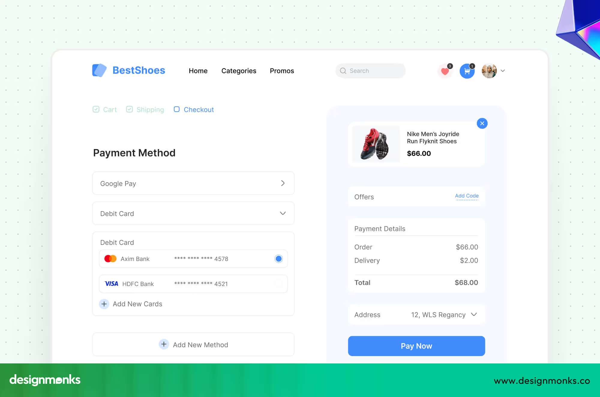
Step 6: Checkout UX Audit (Most Critical)
The checkout stage directly controls revenue. Even small usability issues here cause massive drop-offs. This step focuses on removing friction from forms, simplifying actions, and building strong payment trust signals.
Guest Checkout vs. Forced Account Creation
Forcing account creation increases abandonment. Users want speed and control, especially on first-time purchases.
- Allow checkout without mandatory registration
- Offer account creation after order completion
- Clearly explain the future benefits of creating an account
Form Usability & Error Prevention
Checkout forms must feel effortless. Errors, confusion, or repeated typing break flow and raise frustration.
- Use clear field labels with visible instructions
- Enable autofill for address and personal details
- Show real-time validation to prevent submission errors
Payment Methods & Trust Assurance
Payment is the final emotional barrier. Users must feel safe before entering card or wallet details.
- Display multiple trusted payment options
- Show SSL security indicators near payment fields
- Use visible trust badges and encryption confirmation
Step 7: Mobile eCommerce UX Audit
Mobile users behave differently from desktop users. They rely on gestures, thumb reach, and fast feedback. When learning how to audit ecommerce UX, mobile must be treated as a separate experience, not a resized desktop version.
A focused ux audit for online stores on mobile evaluates tap accuracy, scroll comfort, and content priority. Poor mobile UX silently destroys conversions.
Step 8: Performance, Speed & Technical UX Audit
Speed directly controls user patience and trust. If your store loads slowly, users leave before engaging. In ecommerce UX, performance audits reveal invisible conversion killers like layout shifts and delayed interactions.
A technical ux audit for online stores reviews Core Web Vitals, image delivery, script weight, CDN usage, and Lazy Loading.
Step 9: Behavioral Analytics & Heatmap Review
Behavioral data shows how users actually interact with your store, not how you think they behave. This step validates earlier UX assumptions using real usage patterns.
Funnel Behavior & Drop-Off Detection
Using GA4, track where users exit most frequently across product views, carts, and checkout. This reveals which UX stages leak revenue and where your UX audit for online stores must focus first for impact.
Click, Scroll & Attention Mapping
With Hotjar heatmaps and Session Recordings, analyze how users scroll, what they ignore, and where they hesitate. These visual behavior insights strongly support audit ecommerce UX for better conversions.
Step 10: CRO-Focused Audit (Conversion Barriers)
This final step connects all UX issues directly to revenue. A CRO-focused UX audit identifies exact friction points inside the Conversion Funnel, from product discovery to payment success.
By combining UX findings with A/B Testing, this step validates what actually improves conversions versus what only “looks better.” If you truly want to master how to audit ecommerce UX for better conversions, this is where design turns into measurable business growth.
So, these are the steps. By any chance, if you find them difficult or you don’t have time for that to focus on your business, simply contact Design Monks and enjoy the world-class yet affordable UI/UX service for your ecommerce business.
Why UX Audit is Important?
An ecommerce UX audit is a deep check of the User Experience inside an online store. It shows where users feel blocked during the purchase journey and why sales stay low.
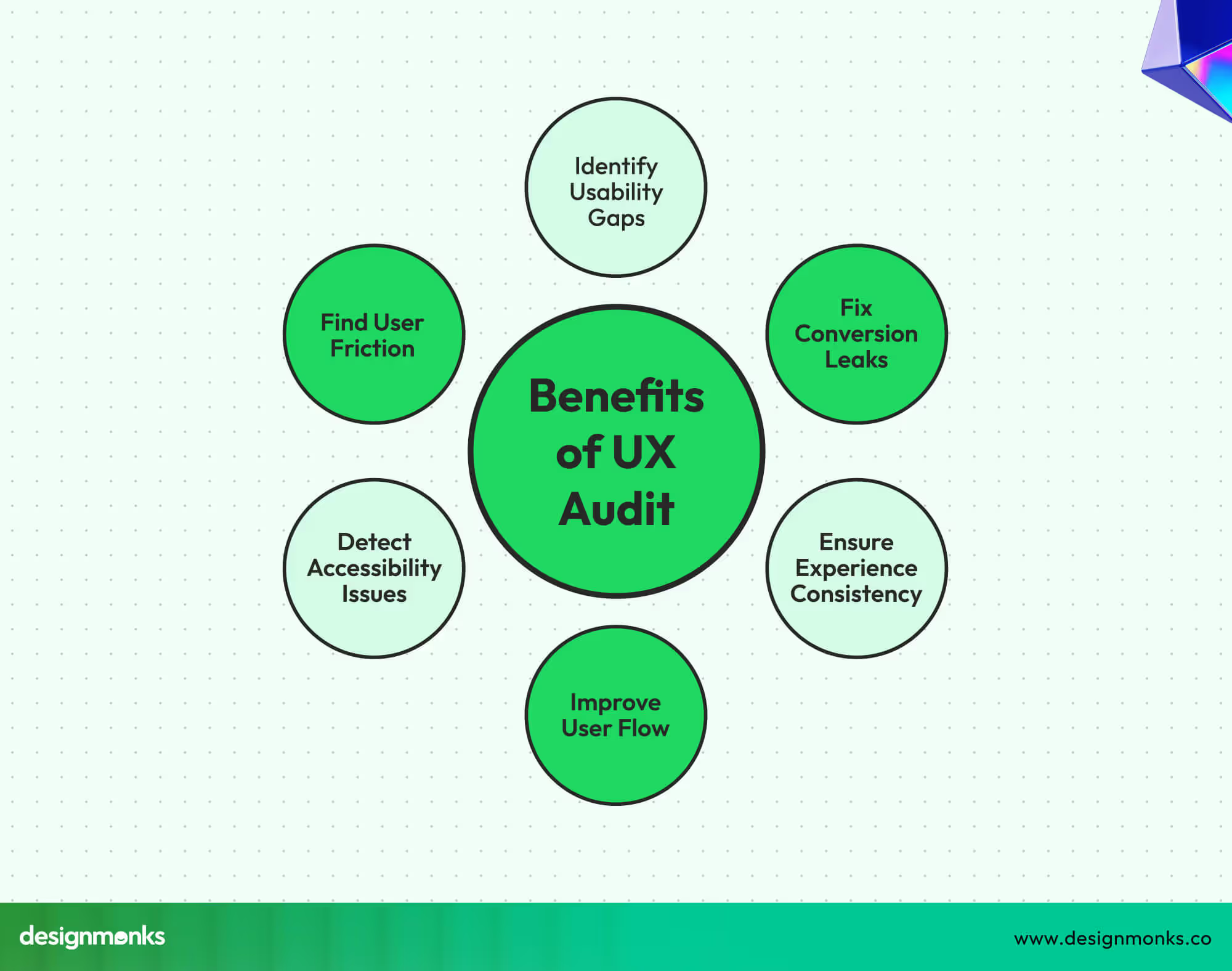
Shows User Friction
An ecommerce dashboard UI audit points out places where users feel stress. This may include hard menus, slow pages, or unclear buttons. These small issues push users away without a single sale.
Reduces Cart Abandonment
A UX audit for ecommerce shows why buyers leave before payment. It reveals long forms, hidden costs, or weak checkout flow. Fixing these steps helps users move ahead with comfort.
Builds User Trust
Trust breaks when users doubt safety or clarity. An audit checks payment flow, error messages, and layout balance. A clean online store helps users feel safe to share details.
Improves the Purchase Journey
The purchase journey should feel simple and smooth. A UX audit checks every step from the first visit to the final order. Weak paths get repaired, so users move without delay.
Lifts Low Conversion Areas
Some pages bring traffic but no sales. An ecommerce usability audit finds these weak areas. After fixes, these pages guide users with clear actions that push sales forward.
Supports Long-Term Revenue
Better User Experience leads to repeat buyers. A UX audit keeps the online store easy to use. Happy users return more and refer friends, which grows revenue over time.
Best Practices for Conducting a UX Audit
An ecommerce UX audit is a deep check of the User Experience inside an online store. It shows where users feel blocked during the purchase journey and why sales stay low.
Check User Flows
Review every step users take from the landing page to purchase. Look for confusing buttons, slow-loading pages, and unnecessary clicks. Understanding how users move helps remove obstacles and keeps them on track.
Analyze Page Performance
Slow, cluttered, or messy pages frustrate buyers. Measure page speed, layout clarity, and visual consistency. Pages that load fast and feel clean encourage users to stay longer and complete purchases.
Test Mobile Experience
Most shoppers now use phones or tablets. A UX audit for ecommerce must check text size, buttons, navigation, and images on smaller screens. Smooth mobile performance increases trust and sales.
Observe Real Users
Watch how people interact with your store. Notice where they pause, hesitate, or click the wrong things. These observations highlight friction points that analytics might miss. Simple fixes often improve major areas.
Review Checkout Process
The checkout is the most critical part of the purchase journey. Identify steps where users abandon carts or feel unsafe. Streamlining checkout and showing clear instructions reduces lost sales and builds confidence.
Use Data & Feedback
Combine analytics, session recordings, heatmaps, and customer feedback. This data shows how users behave and what frustrates them. Decisions based on real facts improve the store’s UX and lift conversion rates.
FAQs
How does a UX audit improve conversion rates?
A UX audit finds areas where users struggle or leave your online store. Fixing these problems makes navigation smoother, checkout easier, and pages clearer. This encourages more purchases and increases conversion rates naturally.
Can a UX audit identify user friction?
Yes. A UX audit highlights points where users hesitate, click wrong buttons, or leave pages. By spotting these friction areas, you can simplify the store layout, improve usability, and make the shopping experience stress-free.
How often should I perform an ecommerce UX audit?
Performing a UX audit every 6 to 12 months is ideal. Frequent updates, design changes, or seasonal campaigns also require extra checks. Regular audits keep your online store smooth, user-friendly, and conversion-ready.
What tools are useful for conducting an ecommerce UX audit?
Analytics tools, heatmaps, session recordings, and user feedback forms are key. Tools like Google Analytics, Hotjar, and Crazy Egg show behavior patterns and problem areas. These help make informed UX improvements efficiently.
End Note
A strong ecommerce UX audit uncovers hidden issues that stop users from buying. It improves navigation, checkout, and overall experience to make your online store smoother and easier to use.
Fixing friction points and building trust leads to higher conversion rates and more sales. Regular UX audits keep your store user-friendly and reliable. Following the steps alongside a proper UX audit checklist for an ecommerce site can help you create a better experience and grow your ecommerce business.

.avif)
.avif)
.avif)
.avif)


.avif)
.avif)
.avif)
.avif)


.avif)


