
.svg)


Key Takeaways
- Cybersecurity dashboard design helps teams detect threats faster and respond efficiently.
- Role-based cybersecurity dashboards improve usability for analysts, IT teams, and executives.
- Real-time alerts are essential for effective threat monitoring.
- Simple visuals and consistent colors improve dashboard user experience.
- Combining real-time, historical, and predictive analytics strengthens cybersecurity dashboard security.
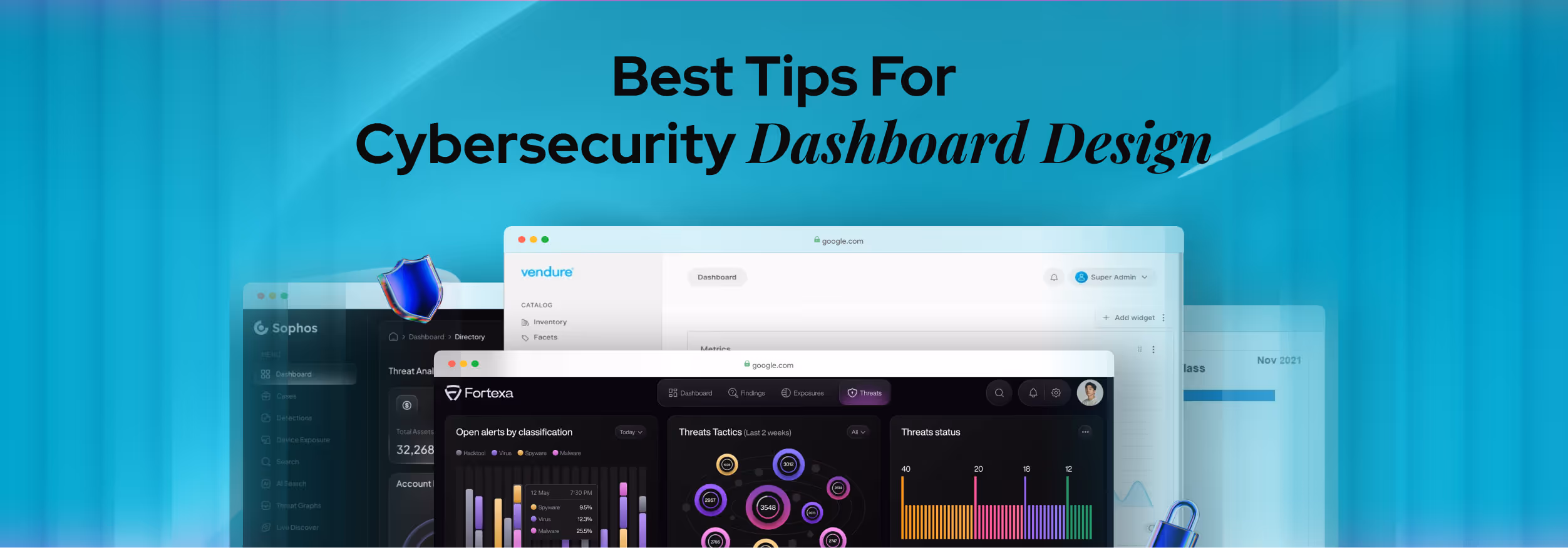
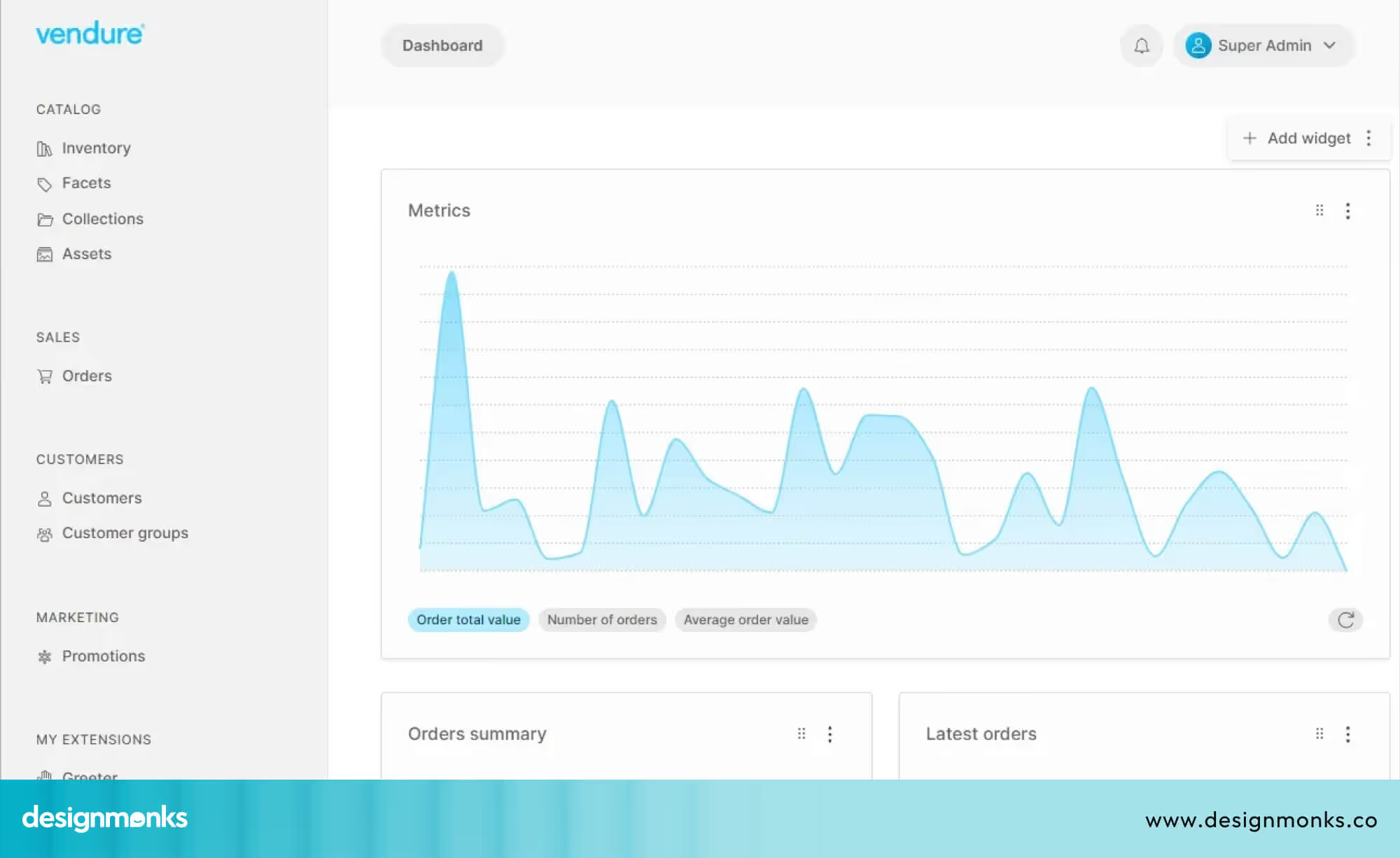
Surprising how one simple screen can decide how safe your system is. That’s why cybersecurity dashboard design matters. A clear dashboard helps you spot danger early, understand issues quickly, and fix problems before they grow.
Good dashboards don’t need complex tools to work well. They need smart choices that keep everything clear. When information is grouped well, shown with simple visuals, and written in plain words, anyone can understand what is happening.
With a few steps, your dashboard becomes more than a screen, it becomes a guide. And in this article, you’ll learn how to design one well, explore the best practices, and discover tips that make your dashboard effective.
What is a Cybersecurity Dashboard and Why It Matters
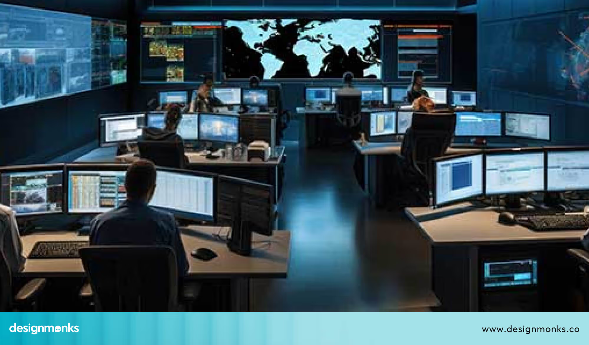
Every minute, thousands of cyberattacks happen around the world, even on small businesses. With so much danger moving so fast, teams need a simple way to see what’s happening. That’s where a cybersecurity dashboard comes in. It acts like a security control room on one screen, showing risk scores, real-time alerts, past incidents, and the overall health of the systems.
A cybersecurity dashboard is important because it helps people understand threats quickly instead of searching through hundreds of logs. Inside a SOC (Security Operations Center), analysts depend on it to catch attacks early and fix issues before they spread. CISOs (Chief Information Security Officers) also use these dashboards to explain risks to leadership and decide where to focus security efforts.
Whether the dashboard is for security operations, threat monitoring, or checking the organisation’s security posture, its purpose is simple. Give a clear picture so teams can respond fast, stay organised, and keep data safe. A well-designed dashboard turns complex cybersecurity work into something easy to understand and even easier to act on.
Who Uses Cybersecurity Dashboards & Key Stakeholders
Cybersecurity dashboards are used by several important groups inside an organisation. These groups are called key stakeholders, and each one depends on the dashboard for different reasons. The main stakeholders are SOC analysts, IT administrators, CISOs, executives, and the wider security operations team.
SOC Analysts: The Front-Line Defenders
SOC (Security Operations Center) analysts are the first group of key stakeholders. They watch the dashboard all day to spot new threats and unusual activity. Since analysts may receive hundreds of alerts in a single shift, a clear dashboard helps them see which issues are truly dangerous.
They use it to respond quickly, track incidents, and understand how an attack might be spreading. Their view needs to be fast, detailed, and ready for action.
IT Administrators: System and Device Managers
IT administrators are another important stakeholder group. They look after the organisation’s systems, apps, and devices. Their dashboard helps them check device health, update software, monitor user activity, and catch weak spots early.
Because many attacks begin with outdated systems, IT admins rely on dashboards to prevent small issues from turning into big problems. Their view focuses on technical fixes and system maintenance, but still shows urgent security alerts.
CISOs and Executives: The Big-Picture Leaders
CISOs (Chief Information Security Officers) and senior executives are key stakeholders who need a high-level view. They don’t need deep technical details. Instead, they want simple summaries that show the organisation’s overall risk, major trends, and the most important issues to focus on.
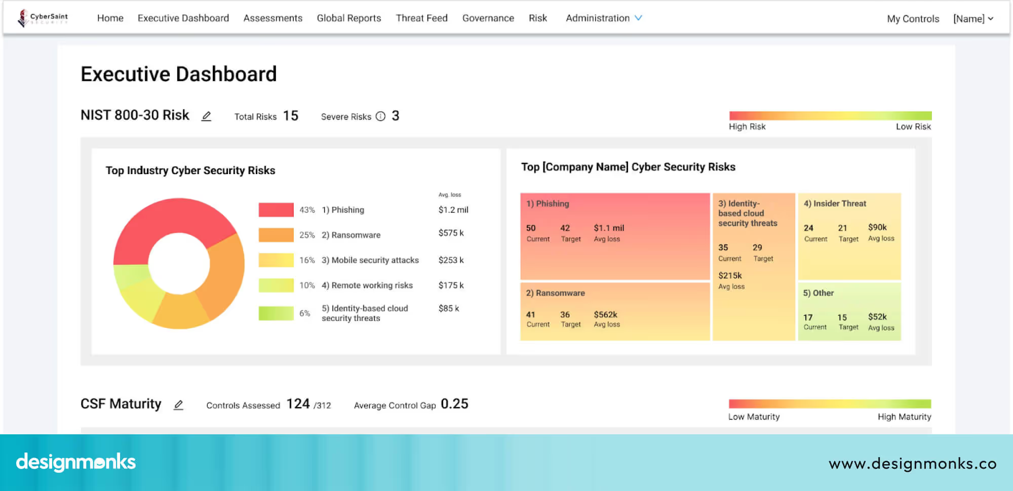
Dashboards are often used in board meetings to explain risks and guide budget and future planning decisions. A clear executive dashboard helps leaders stay informed without feeling overloaded.
Why Identifying Key Stakeholders Matters
When each stakeholder group receives the right type of information, the entire organisation becomes stronger and more secure. Analysts get real-time alerts, IT teams get system insights, and leaders get easy summaries. A well-designed cybersecurity dashboard supports every stakeholder’s needs and helps everyone work together to protect the organisation.
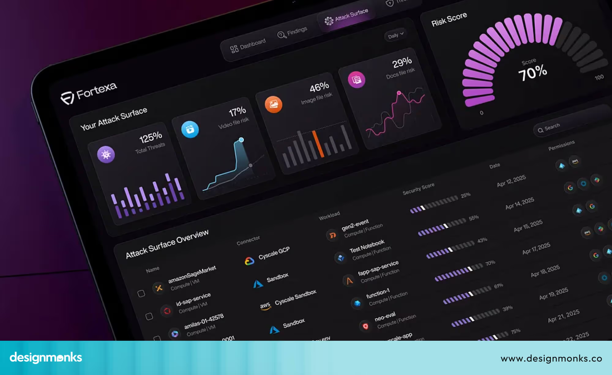
Core Components & Metrics of an Effective Cybersecurity Dashboard
An effective cybersecurity dashboard brings different types of security data into one clear view. It helps teams understand what is happening in the system, what problems exist, and what needs attention. To do this well, a dashboard must have the right data sources, the right metrics, and visuals that are easy for users to understand quickly:
Data Sources That Power the Dashboard
An effective dashboard pulls information from several security tools. This includes SIEM systems that collect logs, IDS tools that detect suspicious activity, MITRE ATT&CK mappings that show how an attack works, and CVSS scores that rate the severity of vulnerabilities. Bringing all these sources together gives teams a complete view rather than separate pieces of information scattered across different tools.
Key Metrics That Matter
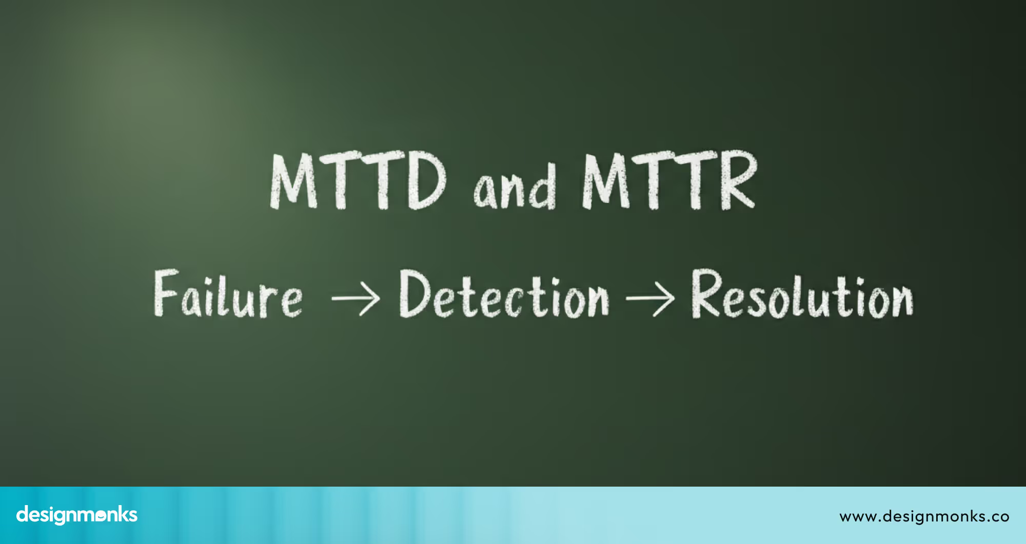
The dashboard focuses on essential security metrics. Mean time to detect (MTTD) shows how long it takes to notice a threat. Mean time to respond (MTTR) shows how quickly teams are able to take action once a threat is identified.
Vulnerability scores help identify the most dangerous weaknesses. The size of the attack surface shows how many assets need protection. Compliance tracking shows whether the organisation is meeting required security standards. These metrics help teams understand how well their security processes are working.
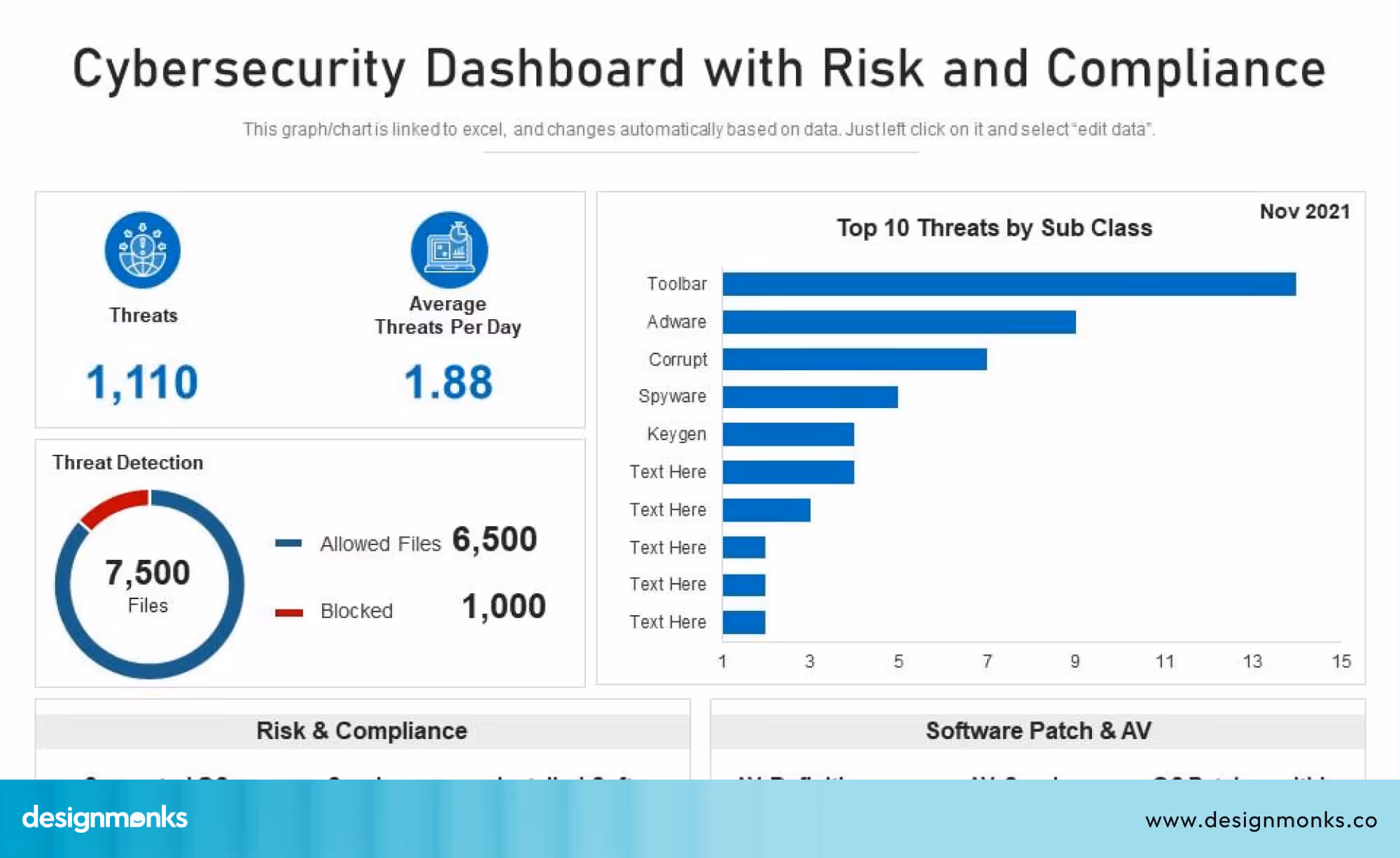
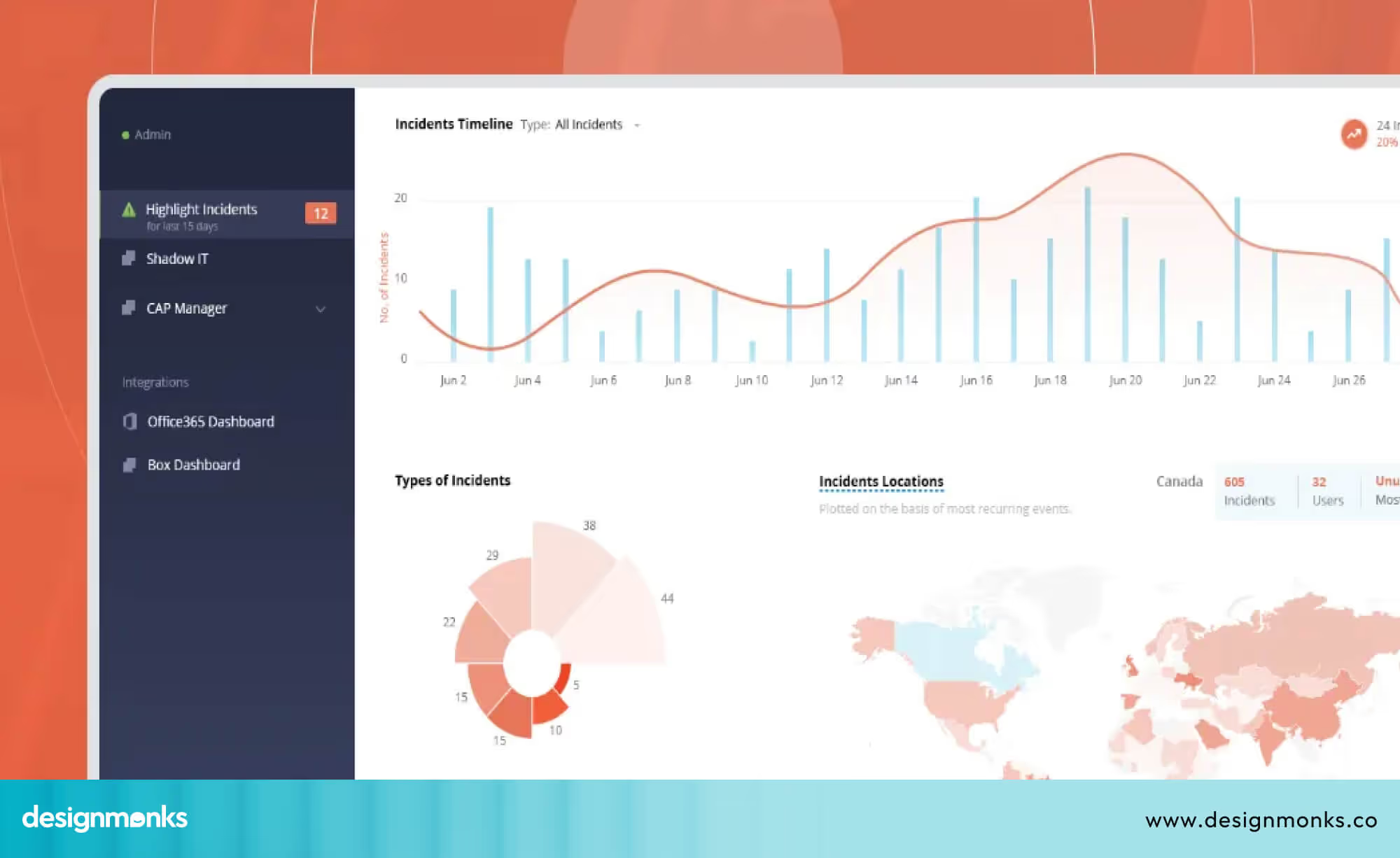
Clear and Actionable Visualisation
The information in the dashboard must be presented in a simple and clear way. Visual elements such as charts and trend lines make it easy to see changes over time. For example, a graph of MTTD over the past six months can help teams see whether detection is improving or slowing.
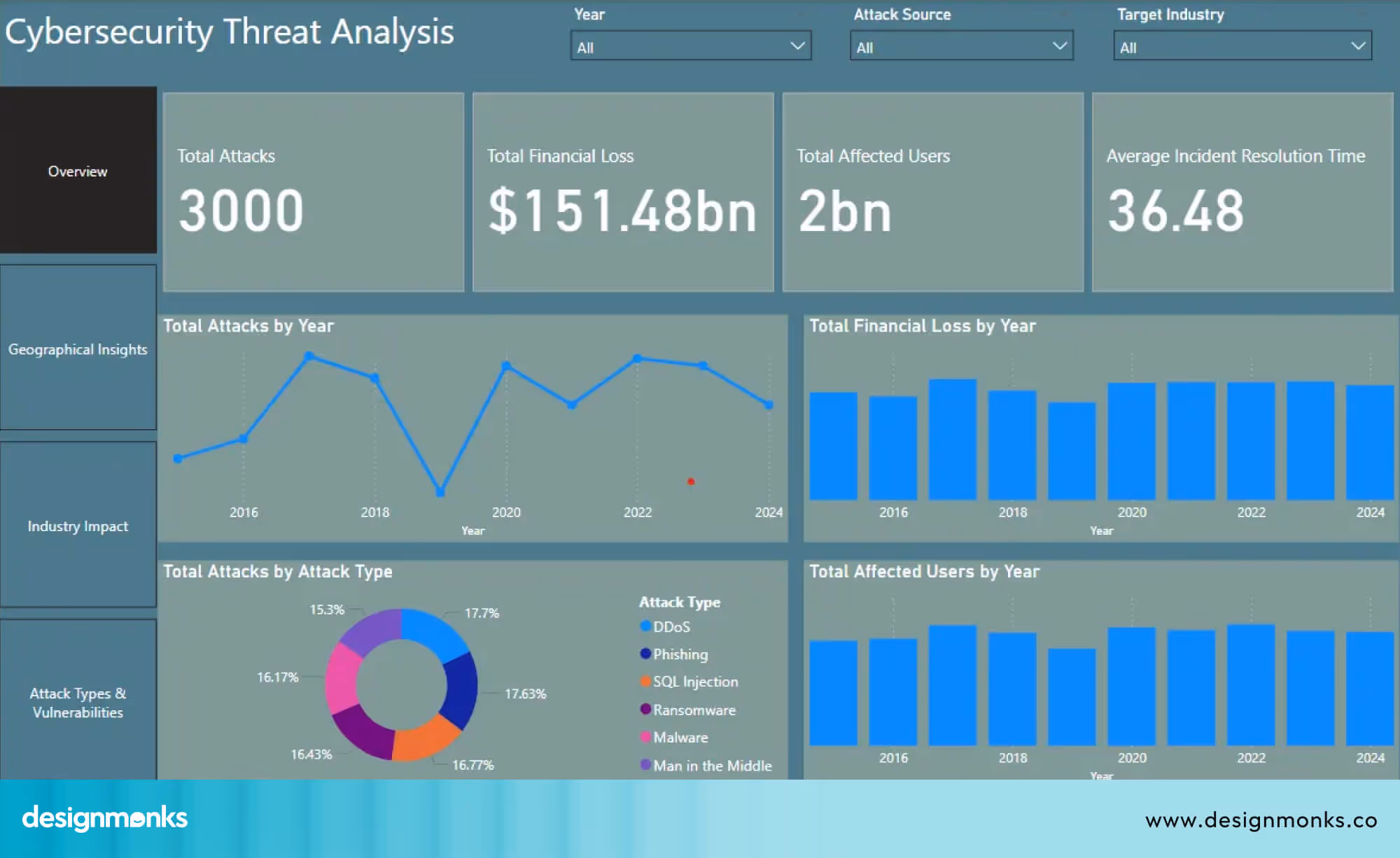
A visual list of high-risk vulnerabilities can help teams decide which issues to fix first. When data is shown clearly, teams can quickly understand what needs attention.
Supporting Better Security Decisions
When all key components and metrics are displayed in one understandable view, teams can make faster and better decisions. They can spot unusual patterns, identify gaps, and plan improvements. A well-structured dashboard keeps everyone aligned and ensures no important detail is missed.
Design Principles for Cybersecurity Dashboards
Good design in cybersecurity dashboards is not just about making them look attractive. The main goal is to help teams make faster and better decisions by presenting information in a clear and actionable way:
Clarity Over Complexity
A dashboard should show information in a simple way. Overloading the screen with too many metrics or charts can confuse users. By keeping the layout clean and only highlighting important data, security teams can focus on what requires immediate attention. This way, they can make decisions more efficiently.
Prioritize Real-Time Signals
Alerts must be easy to notice and act upon. The dashboard should clearly separate high-priority alerts from less critical information. So that SOC analysts and IT teams can respond quickly to threats as they appear.
For example, a good dashboard places urgent alerts at the top, making it clear what needs attention first. A poor dashboard mixes urgent alerts with small updates, which can cause real risks to be missed.
Modular Layouts
Each section of the dashboard should have a clear purpose. Keep related metrics in the same section and clearly separate day-to-day operational data from high-level summaries. A modular layout makes information easier to scan, so users can quickly find what they’re looking for without any confusion.
For dashboards with side navigation or multiple sections, learning from well-structured cybersecurity website sidebar designs can help designers improve navigation clarity and reduce visual clutter.
Consistent Color Usage
Using color consistently helps users quickly understand the severity of issues. For example, red can indicate critical threats, yellow for medium-level alerts, and green for safe status. This consistency reduces mistakes and speeds up response time.
When used well, these colors always keep the same meaning across the dashboard. When used poorly, colors change meaning on different screens, which confuses users and slows down response time.
Visual Hierarchy
Information should be presented in order of importance. Critical KPIs and alerts should appear first, followed by trend graphs and more detailed data. This hierarchy guides the user naturally from urgent tasks to deeper insights.
Drill-Down Navigation
Users should be able to explore details without leaving the main dashboard. Drill-down features allow analysts to click on a metric or alert to see related information. This helps investigate incidents efficiently.
To better understand how these principles come together, reviewing real-world cybersecurity dashboard design examples can be especially helpful for beginners.
Accessibility & Cognitive Load of Dashboard Designing
Many dashboards overlook accessibility and cognitive load, which ultimately reduces their effectiveness. Design Monks prioritizes these aspects from the start, ensuring every cybersecurity website is designed inclusively and easy to navigate.
Designers should keep the following considerations in mind when designing for accessibility and managing cognitive overload:
- Color-blind friendly palettes: Use color schemes that don’t rely on red–green contrast, and support them with textures or icon-based indicators to ensure all users can interpret the information accurately.
- Screen-reader compatibility: Ensure the interface works seamlessly with screen readers. This is especially critical in compliance-driven industries where accessible communication is mandatory.
- Minimal cognitive overload: Present information in manageable chunks, limit how many data points appear at once, offer summarization widgets, and provide guided tooltips to help users understand complex details without feeling overwhelmed.
- Attention management: Direct the user’s focus by highlighting only the elements that require immediate action or awareness.
Customisation & Role-Based Views of Cybersecurity Dashboards
While we know who uses the cybersecurity dashboard, it’s important to see how the dashboard adapts to each role. Not every user needs the same information, so dashboards should be customisable and role-based.
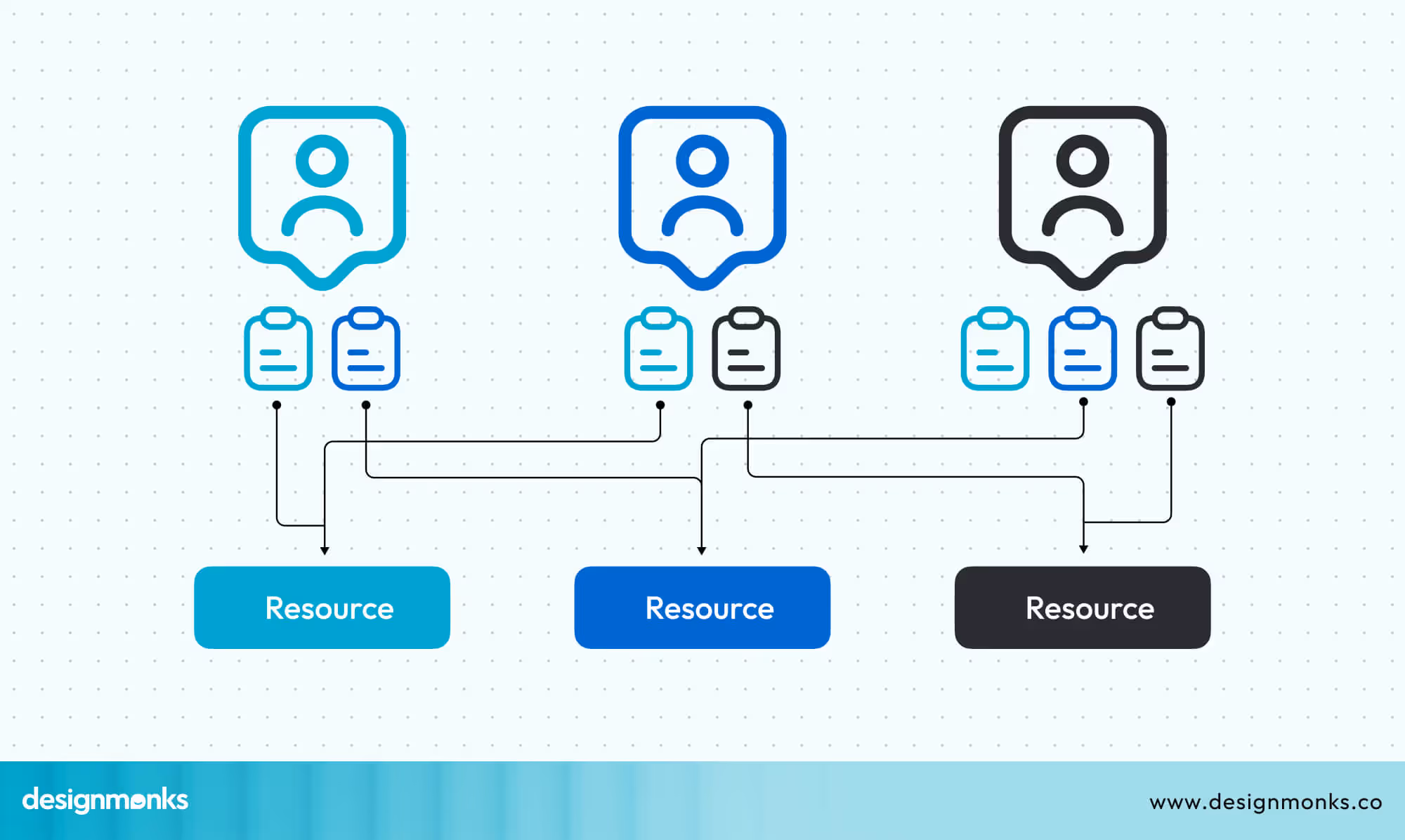
Role-Based Access Control (RBAC) allows administrators to control what each user can see. For example:
- Analysts get detailed views of alerts, incidents, and logs.
- IT administrators can monitor system and device health.
- Executives see high-level summaries, trends, and overall risk.
Adding Multi-Factor Authentication (MFA) ensures that only authorized users can access sensitive data. This adds a layer of security on top of passwords.
Dashboards can also include customisable widgets, which are small display units like charts, graphs, or lists. Users can arrange these widgets based on what they need to see most often. For example, an analyst might place a real-time threat map at the top, while an executive focuses on risk trend graphs.
By designing dashboards with role-based views and customizable widgets, users see only the most relevant information, allowing them to focus on urgent tasks and respond faster. A good dashboard adapts to each role instead of forcing everyone to use the same screen.
Real-Time vs Historical Analytics & Predictive Modelling
Cybersecurity dashboards are most useful when they show both what is happening right now and what has happened in the past. This helps teams act quickly and also plan for future threats.
Real-Time Analytics
Real-time analytics display live data, such as active alerts, unusual login attempts, network traffic spikes, or malware behavior. For example, if a user logs in from two different countries within a short time, the dashboard can immediately flag this as suspicious.
According to a 2023 report by Gartner, organisations that monitor real-time security events reduce mean time to detect (MTTD) threats by up to 40%. This means they can respond to attacks faster and prevent larger breaches. Dashboards that show live alerts clearly, using color codes or priority labels, help analysts focus on the most critical issues first.
Historical Analytics
Historical analytics focus on past data to identify patterns or trends. For example:
- Tracking the number of phishing emails over the last six months.
- Seeing which servers were most frequently targeted.
- Understanding seasonal attack patterns.
This helps teams identify long-term risks, plan defenses, and improve security strategies over time. Historical charts and trend graphs make it easier to spot recurring problems or weaknesses that might otherwise be missed.
Predictive Analytics & Machine Learning
Modern dashboards can also include predictive analytics powered by machine learning (ML). These tools analyze data to forecast potential threats or unusual behavior. One common feature is anomaly detection, which identifies activity that does not match normal patterns.
According to a 2022 report by Cybersecurity Ventures, AI and predictive analytics can help organizations reduce security incidents by up to 25%, because potential threats are identified before they escalate.
For example, if a user suddenly downloads large amounts of sensitive data at night, ML algorithms can flag this as abnormal.
Predictive dashboards can suggest which systems are most likely to be targeted next, helping teams take preventive action. However, it is important to note that predictive analytics is only as effective as the data it receives. Poor data quality, limited tools, or an early security setup can reduce accuracy and reliability.
By combining real-time monitoring, historical trend analysis, and predictive features, cybersecurity dashboards provide a proactive security posture. Analysts can respond faster, IT teams can maintain stronger systems, and executives can make informed decisions based on both current events and long-term trends.
Compliance & Regulatory Reporting Features in Cybersecurity Dashboards
When designing a cybersecurity dashboard, it’s important to include features that help teams track compliance with rules and standards. These rules include NIST CSF, ISO 27001, GDPR, and SOC 2. A well-designed compliance dashboard helps users see what’s working, what’s missing, and what needs attention, all on one screen.
Designing Dashboards for Compliance
Beginner designers should focus on showing compliance information clearly and simply:
- NIST CSF: Include visual indicators for the five core functions: Identify, Protect, Detect, Respond, and Recover, so users can quickly see which areas need work.
- ISO 27001: Show which controls are in place and which are missing using charts or status cards.
- GDPR: Highlight the handling of personal data, including access and transfer activities.
- SOC 2: Use dashboards to display security, availability, and confidentiality controls for audits.
Adding audit trails to the dashboard is helpful. These are logs that track who accessed what data and when. Designers can show them as clickable tables or visual lists, so users and auditors can easily see activity without scrolling through raw logs.
Key Design Features to Include
According to a 2023 ISACA survey, organisations that use dashboards for compliance cut audit preparation time by up to 50%, showing how effective visual reporting can be. So you should add:
- Control Status Cards: Use colored cards or simple charts to show which systems meet standards and which need attention.
- Audit Log Widgets: Display recent activities or access events in an easy-to-read table.
- Non-Compliance Alerts: Show alerts when controls are missing or outdated, so users can act quickly.
- Trend Graphs: Include historical compliance data to visualize improvements or recurring issues over time.
Design Tip for Beginners: Start simple. Focus on key compliance metrics first, use clear visuals like colored cards and charts, and add drill-down options for more details. This makes the dashboard easy to understand and actionable for all users.
Implementation Roadmap: From Planning to Deployment
Creating a cybersecurity dashboard can seem complicated, but breaking it into steps makes it much easier. Here’s a clear roadmap for beginners:
Step 01: Define Objectives
Decide what the dashboard should do. Do you want to track alerts, monitor compliance, or visualize trends? Clear goals help you focus on what to include and avoid unnecessary features.
Step 02: Choose Metrics
Pick the most important measurements for your dashboard, such as:
- Mean Time to Detect (MTTD): How quickly threats are spotted.
- Mean Time to Respond (MTTR): How fast teams take action.
- Vulnerability scores: Which weaknesses need attention first?
- Compliance status: Which systems meet security standards?
Start with the essentials and add more metrics as your dashboard grows.
Step 03: Select a Platform
Choose a dashboard tool that can connect to your security systems. Beginners can start with easy-to-use platforms like Power BI, Grafana, or Splunk. If needed, use an ETL (Extract, Transform, Load) pipeline to gather data from different sources.
Step 04: Design the UI
Organize information clearly. Use simple charts, color codes, and role-based views so different users see what’s relevant to them. Keep dashboards clean to avoid confusion and make important data easy to find.
Step 05: Test & Refine
Share the dashboard with your team and collect feedback. Watch how users interact with it, identify confusing areas, and adjust the layout. A SOC team can test it in real-world conditions to make sure it works well.
Step 06: Roll Out & Maintain
Launch the dashboard and keep it updated. Security threats change constantly, so dashboards need regular maintenance. Track issues, improve features, and adapt metrics as new threats appear.
With Design Monks, you don’t have to worry about how it looks or works. Our team handles every step from defining objectives and selecting metrics to designing the interface and maintaining the dashboard, so you get a ready-to-use, effective, and user-friendly cybersecurity dashboard without stress.
Challenges & Common Pitfalls to Avoid While Designing Cybersecurity Dashboard
Beginners often make mistakes when designing dashboards. Knowing these in advance can save time:
- Too Many Widgets: Overcrowded dashboards confuse users. Only show the most important metrics.
- Raw Logs: Avoid displaying unprocessed logs. Use summaries, alerts, or charts instead.
- Ignoring Role-Based Views: Different users need different information. Analysts and executives should have customized views.
- Neglecting Accessibility: Consider users with color blindness or those using screen readers. Use clear colors, icons, and labels.
- Alert Fatigue: Too many alerts can make teams ignore critical issues. Prioritize and color-code alerts to highlight urgent items.
- Cognitive Overload: Don’t overwhelm users with too much data at once. Present information in manageable sections and use drill-downs for details.
Keeping dashboards simple, clear, and customized to users’ needs helps teams respond faster and reduces mistakes.
Frequently Asked Questions (FAQ)
1. What metrics should a cybersecurity dashboard include?
A cybersecurity dashboard should include key metrics like MTTD, MTTR, vulnerability scores, compliance status, and top alerts. Add more metrics as you gain experience.
2. How often should the dashboard refresh?
Dashboard refresh depends on each particular segment. Critical alerts should update in real-time, while historical trends can refresh daily or weekly. Balance speed with system performance.
3. How do I measure the ROI of a dashboard?
Track improvements such as faster threat detection, fewer incidents, reduced audit time, or better compliance reporting.
4. Can dashboards support multiple roles?
Yes, the dashboard can support multiple roles. You can use role-based views and customizable widgets so each user sees only the information they need.
5. How do I start as a beginner?
As a beginner, you should focus on simplicity. Start with a few essential metrics, test with real users, and gradually add features based on feedback.
Conclusion
A smart cybersecurity dashboard design turns complex security data into clear, actionable insights. The right dashboard helps teams spot threats fast, track issues clearly, and respond effectively.
By using simple visuals, role-based views, and key metrics, even beginners can create dashboards that work for analysts, IT teams, and executives. Following these best practices ensures your cybersecurity dashboard design is effective, easy to use, and keeps your systems safe.

.avif)
.avif)
.avif)
.avif)


.avif)
.avif)
.avif)
.avif)


.avif)


