.svg)



Key Takeaways
- Clear value propositions help B2B SaaS websites capture attention and build trust.
- Simple navigation guides buyers toward demos, trials, and informed purchasing decisions.
- Product visuals and social proof reduce uncertainty and strengthen buyer confidence.
- Fast, accessible websites improve user experience and increase conversion opportunities.
- Continuous testing and optimization help SaaS websites generate more qualified leads.
Every click on your website is a decision for your user to stay or leave. That's why B2B SaaS website design best practices focus on much more than appearance. The goal is to make visitors understand your product quickly, trust your company, and feel confident taking the next step.
B2B software isn't an impulse purchase. Buyers research, compare competitors, and involve different stakeholders before making a decision. Your website needs to answer those questions long before someone talks to sales.
In this guide, you'll learn how successful SaaS companies design websites that educate buyers, reduce friction, and consistently convert more visitors into qualified leads.
What Makes B2B SaaS Website Design Different From Other Websites?
A B2B SaaS website does much more than showcase a product. Its purpose is to help potential customers understand what the software does, why it matters, and whether it's the right solution for their business.
Instead of pushing for an instant sale, it guides visitors toward the next step, whether that's exploring features, booking a demo, or starting a free trial.
What makes this approach different from other websites comes down to two key factors:
Unique B2B SaaS Buying Journey
The B2B SaaS customer journey is longer than most online purchases. Buyers often compare products, explore features, and revisit websites several times before requesting a demo or starting a free trial.
That means the website has to provide helpful information at every stage, not just on the first visit. Clear messaging, strong feature explanations, and easy access to product details all help move visitors closer to conversion.
Multiple Decision-makers
Software purchases usually involve managers, IT teams, finance, and executives. Each group has different concerns, so a B2B SaaS website needs to address them with clear messaging, product details, security information, and customer success stories.
The easier it is for every decision-maker to find what they need, the more likely the website is to generate qualified leads.
Together, these differences mean a B2B SaaS website must do more than attract traffic. It has to educate, build trust, and guide multiple stakeholders toward a confident buying decision. Otherwise, you may eventually need to redesign your SaaS dashboard UX to deliver the experience your website promised.
B2B SaaS Website Design Best Practices
Now that you know what makes a B2B SaaS website different, the next step is designing it to match how buyers actually make decisions.
Every page should help visitors understand your product, answer their questions, and encourage them to take the next step. Here are the best practices that consistently improve user experience and conversions:
Start With a Clear Value Proposition Above the Fold
Visitors decide within seconds whether to stay on your website or leave. If they can't quickly understand what your product does and why it matters, they'll likely move on. That's why your value proposition should appear above the fold, where it's visible without scrolling.
The value proposition should be communicated through your main headline. Instead of vague lines like "The Future of Business Software," get specific about the outcome. Something like " Track Your Team's performance without spreadsheets" tells visitors exactly what they get, in one line.
Use your subheadline to back up that promise with a bit more detail. If your headline states the outcome, your subheadline can point to how you get there. For example, "Automated reports, live dashboards, zero spreadsheets." This gives visitors one more reason to believe the headline before they even scroll.
Finally, place a clear CTA beside your headline so visitors know what to do next. Action-oriented buttons like "Start Free Trial," "Book a Demo," or "See It in Action" work well because they match different stages of the buying journey.
Someone ready to explore can start a trial, while a buyer still comparing solutions may prefer a demo first.
Design Website Navigation Around User Intent
Good navigation isn't about looking clean. It's about giving people what they need without making them think. Every extra click is a chance for someone to give up and leave.
Keep your navigation menu short. Five to seven items are usually enough. Too many options overwhelm visitors and bury your most important pages. Group related content together instead of listing every single page in the menu bar.
Prioritize the ones buyers look for most, such as Product, Solutions, Pricing, Customers, Resources, and Book a Demo.
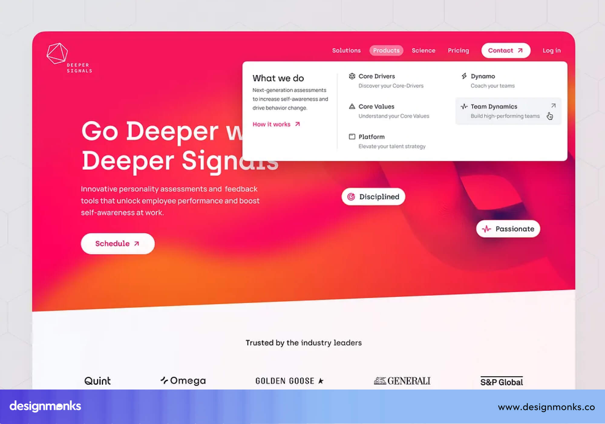
Next, structure your navigation around different buyer types. Someone from IT wants security details. Someone from finance wants pricing. Someone from operations wants to see the product in action.
Structure your navigation so each type of visitor can find their path through the customer journey without digging around. Organizing pages by industries, use cases, or roles creates a better SaaS website UX.
Finally, keep your most important CTA visible as users scroll. A sticky navigation bar with buttons like "Start Free Trial" or "Book a Demo" lets visitors take action whenever they're ready, instead of making them scroll back to the top.
Small improvements like this reduce friction and can have a noticeable impact on your conversion rate.
Build Product-Focused Pages That Demonstrate Real Value
Don't expect visitors to trust marketing claims alone. They want to see your product before they commit. The more clearly you show how your software works, the easier it is for buyers to imagine using it in their own business.
Start by using product screenshots strategically. Instead of filling a page with random dashboard images, highlight the screens that support your value proposition.
For example, if your headline promises "Track projects in one place," show the project dashboard first, not the settings page. Pair each screenshot with a short explanation of the benefit so visitors understand what they're looking at.
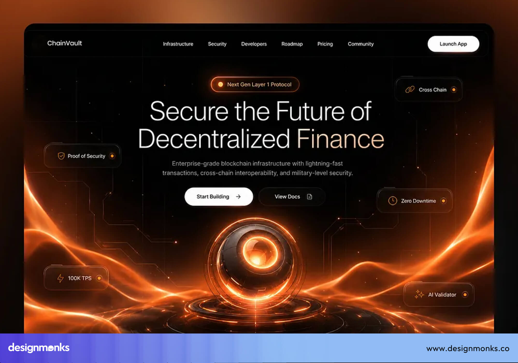
You can go a step further with interactive product walkthroughs. Let visitors click through important workflows, watch a short demo, or explore key features before signing up.
Giving people a chance to experience the product reduces uncertainty and often increases product demo requests because they already know what to expect. Finally, explain every feature through a real outcome or use case. Instead of saying "Custom dashboards," explain that users can "Monitor sales, marketing, and support metrics from one dashboard without switching." Connecting features to real business outcomes makes your value proposition much stronger.
It also helps buyers move confidently through the customer journey.
Establish Trust With Social Proof and Credibility Signals
B2B buyers are cautious. They're not spending their own money, they're spending their company's, and that comes with risk. But social proof reduces that risk by showing them other companies have already trusted you.
Customer testimonials can highlight specific outcomes of your product. Instead of a generic quote like "Great product!" use one that shares measurable results, such as "Reduced onboarding time by 45% in three months."
Specific customer testimonials are far more convincing because they show real business impact. Try to use one with full names, job titles, and companies whenever possible. But don't forget to ask the customer’s permission before using it.
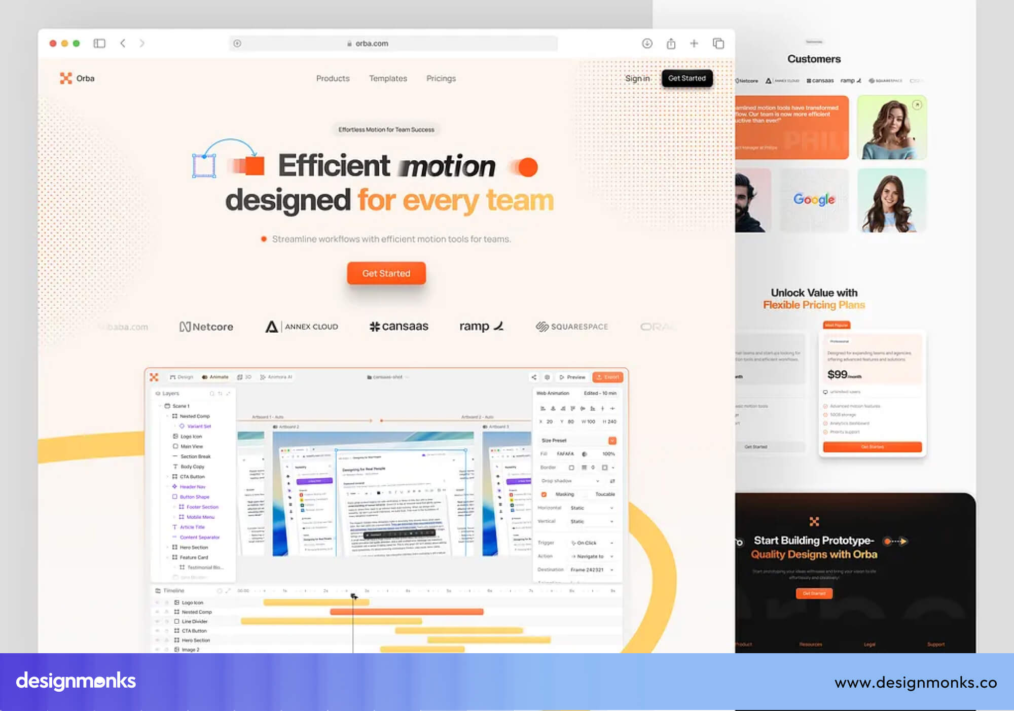
If you work with well-known companies, show their logos near the top of your homepage. This is a fast form of social proof. Visitors see familiar names and instantly assume you're a safe choice.
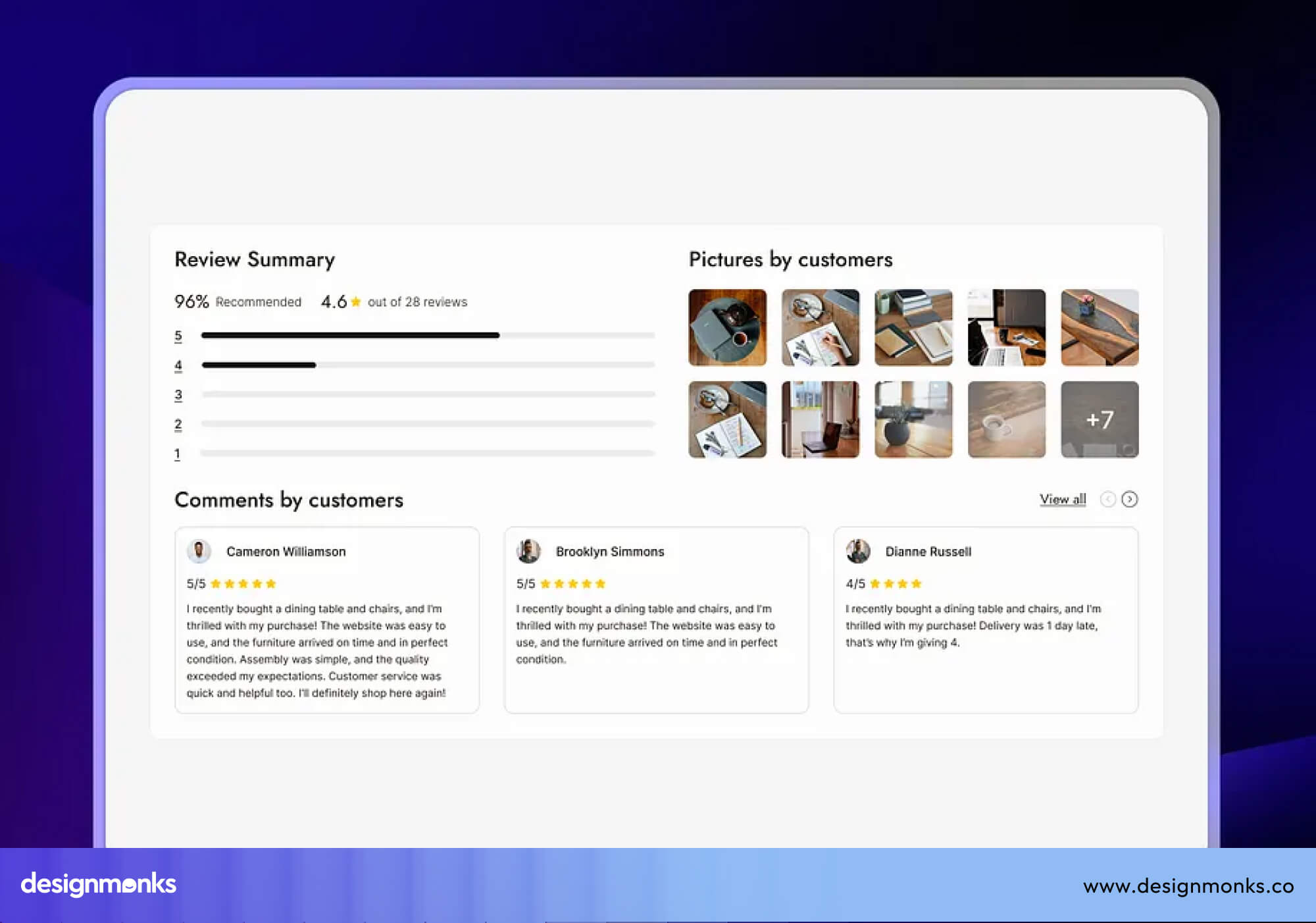
Support those logos with case studies that explain the problem, the solution, and the results. Numbers matter here. "Improved efficiency" is vague, but "Reduced processing time by 35%" is proof. This is where CRO and storytelling come together and help buyers trust your claims.
Finally, for B2B software, especially anything handling sensitive data, weak security is a dealbreaker. Show your ISO certifications, GDPR compliance badges, and data protection practices clearly. These trust signals matter most to IT and security stakeholders, and their approval can make or break a deal.
Optimize Every Page for Conversion
Every page on your website should have a purpose. Whether someone lands on your homepage, a feature page, or a blog post, there should be a clear next step that moves them closer to becoming a customer. If visitors consume your content and leave without taking action, you're missing an opportunity to improve your conversion rate.
Start by matching your CTA to the visitor's level of interest. Not every visitor is ready to book a demo. Someone reading a blog post for the first time isn't at the same stage as someone comparing pricing pages.
Match your CTA to where they are. Early-stage visitors respond better to a free trial or a guide. Late-stage visitors respond better to a product demo.
Once someone clicks a CTA, don't make the next step harder than it needs to be. Long forms kill conversions. Ask for only what you truly need at that stage. You can always collect more information later, once someone is already engaged.
Don't rely on a single CTA at the top of the page. Place CTAs after key sections such as feature explanations, testimonials, and pricing highlights. Visitors become ready to act at different moments, so strategic CTA button placement creates more opportunities to capture qualified leads on a SaaS lead generation website.
Design for Product-Led Growth (PLG)
Modern SaaS companies don't always ask visitors to speak with sales before using the product. Instead, they let people experience the software first. This Product-Led Growth (PLG) approach reduces sales friction, builds confidence, and helps users discover the product's value on their own.
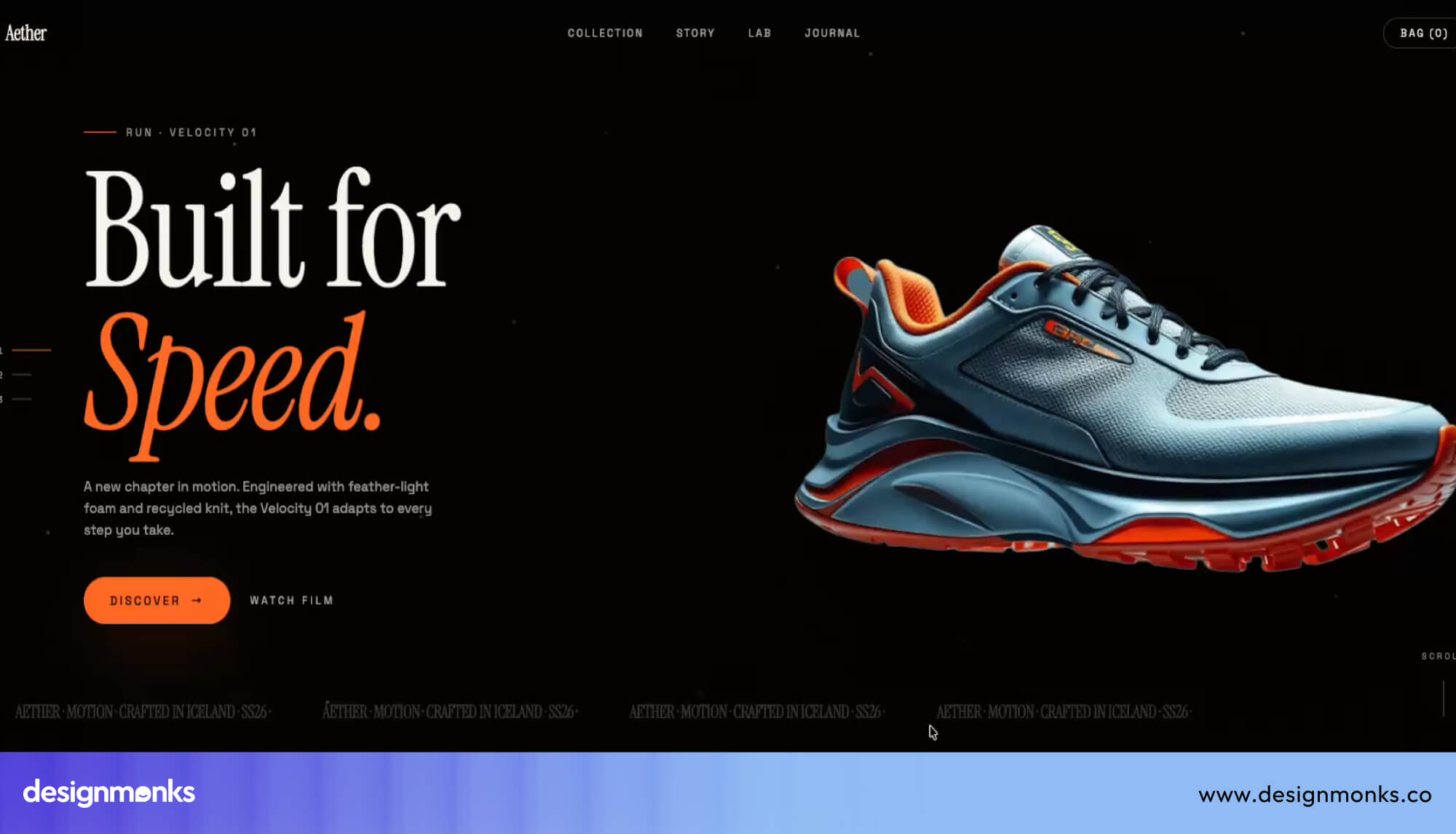
In such cases, you need to start with self-serve signups. If someone is ready to explore your product, they shouldn't have to wait for a sales call. A simple signup process with instant access makes it easier for interested visitors to get started while their interest is still high.
Beyond walkthroughs, some SaaS companies let visitors use a real, limited version of the product directly on the website. This hands-on approach often converts better than any amount of written explanation.
When users can experience the product before buying, they're more likely to trust it and continue through the signup process. You can also lower the barrier to entry with a free trial or freemium plan. Not every visitor is ready to make a purchase, but many are willing to test the product. It shifts the decision from "should I buy this?" to "let me just try it and see."
Giving them a chance to experience the value firsthand is one of the most effective Product-Led Growth strategies for turning curious visitors into paying customers.
Improve Website Performance and Technical UX
None of your messaging or design matters if your website is slow or hard to use. Technical quality directly affects whether visitors stay long enough to convert.
One of the biggest priorities is Core Web Vitals and page speed. Compress images, remove unnecessary scripts, and optimize your code so pages load quickly. Even a one-second delay can increase bounce rates and reduce conversions.
Performance also needs to extend across every device. Many buyers first discover SaaS products on their phones before switching to a desktop later. A mobile-first design ensures your website is easy to read, navigate, and interact with. This creates a consistent SaaS website UX wherever people visit.
Accessibility deserves the same attention. Use readable fonts, strong color contrast, descriptive button labels, and keyboard-friendly navigation. These improvements make your website easier for everyone to use while creating a better user experience and helping more visitors reach your product.
Use Data-Driven Design Decisions
The best SaaS websites aren't built once and left unchanged. They improve continuously by watching how real users interact with the site. Instead of guessing what works, successful teams use data to remove friction and increase the conversion rate.
Heatmaps show you where visitors click, scroll, and lose interest. Session recordings let you watch real visits happen. Together, they reveal exactly where people get stuck or drop off. This gives you a clear starting point for improvement.
The next step is testing improvements instead of making assumptions. A/B testing lets you compare different headlines, CTAs, layouts, or forms to see which version performs better. Even small changes, like rewriting a button or moving a CTA, can have a noticeable impact on SaaS conversion optimization.
It's equally important to analyze your conversion funnel. Track how visitors move from landing pages to pricing, demos, or signups, and identify where they drop off.
Fixing one weak step in the funnel can often deliver bigger results than redesigning the entire website. This makes CRO an ongoing process rather than a one-time task.
Examples of High-Converting B2B SaaS Websites
Looking at successful SaaS websites is one of the best ways to understand what works in practice. While every product is different, the highest-converting websites all have a few things in common.
They communicate value quickly, guide visitors toward the right action, and build trust throughout the buying journey:
Homepage Messaging Examples
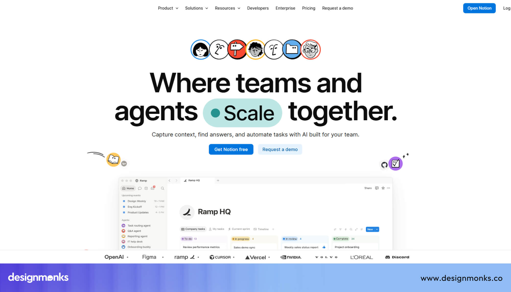
Notion's homepage keeps its messaging simple and benefit-focused. Rather than trying to describe every feature of a famously flexible product, the headline focuses on outcome and identity. It positions the tool as the workspace for teams that want everything in one place.
The messaging is deliberately broad at the top of the page, then gets progressively more specific as the visitor scrolls, with dedicated sections for different use cases (docs, projects, wikis). Different visitor segments can select themselves into the message that resonates with them.
What makes it convert:
- A single, memorable value proposition above the fold instead of a feature list
- Actual product screenshots showing the interface in use
- Broad promise first, but specific use cases as you scroll, so both a solo user and an enterprise buyer find what they’re looking for.
- Low-friction primary CTA ("Get Notion free") that removes the risk of the first click
Tracktory takes a more direct, product-led approach on its homepage. Instead of leading with abstract brand language, the messaging goes straight to the specific problem the product solves and who it solves it for.
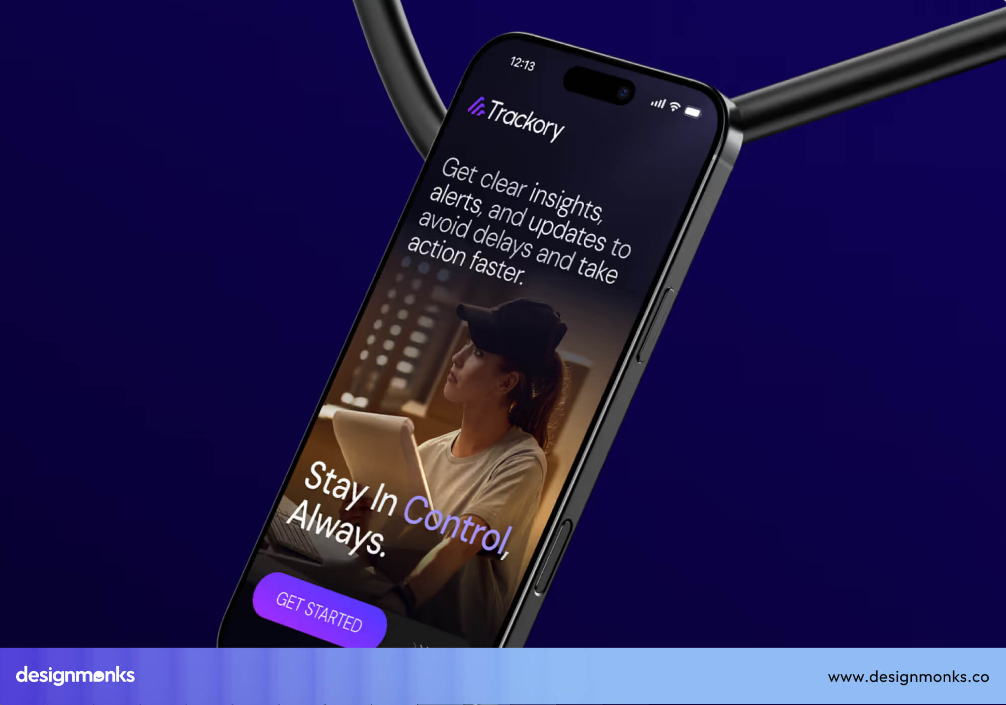
This is a common and effective pattern for narrower, more technical SaaS products. The more specific your audience, the more you can afford and benefit from being specific in your headline.
What makes it convert:
- Problem-first headline that speaks directly to the target buyer's pain point
- Immediate product visual so visitors don't have to imagine what the tool does
- It doesn't try to be everything to everyone, which builds trust with a niche audience
Neither company tries to sell the entire product on the homepage. They sell the first click. Everything else is designed to happen on the next page.
Demo Page Examples
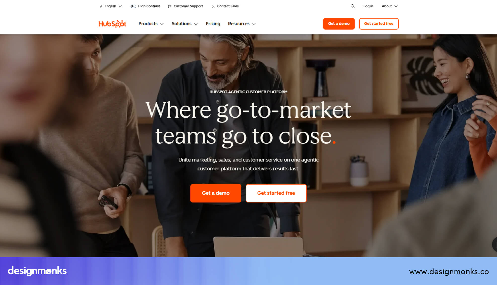
HubSpot's demo experience is built around reducing perceived risk at every step. Rather than a single generic "Request a Demo" form, the page segments visitors by need and company size. So the demo that gets booked is already relevant to the visitor's actual situation.
The form itself asks only for what's needed to route the request, and the surrounding copy reinforces what happens after the form is submitted. This removes the "black hole" feeling that kills a lot of B2B lead forms.
What makes it convert:
- Clear options help visitors choose the demo that's right for them.
- A short form asks only for essential information, making it quick to complete.
- Simple "what happens next" messaging removes uncertainty after booking.
- Customer logos, testimonials, or review ratings beside the form build confidence before visitors submit it.
Netra's demo page leans into specificity and credibility rather than broad reassurance. The copy is written for a buyer who already understands the category and wants to know, precisely, what they'll see in the walkthrough.
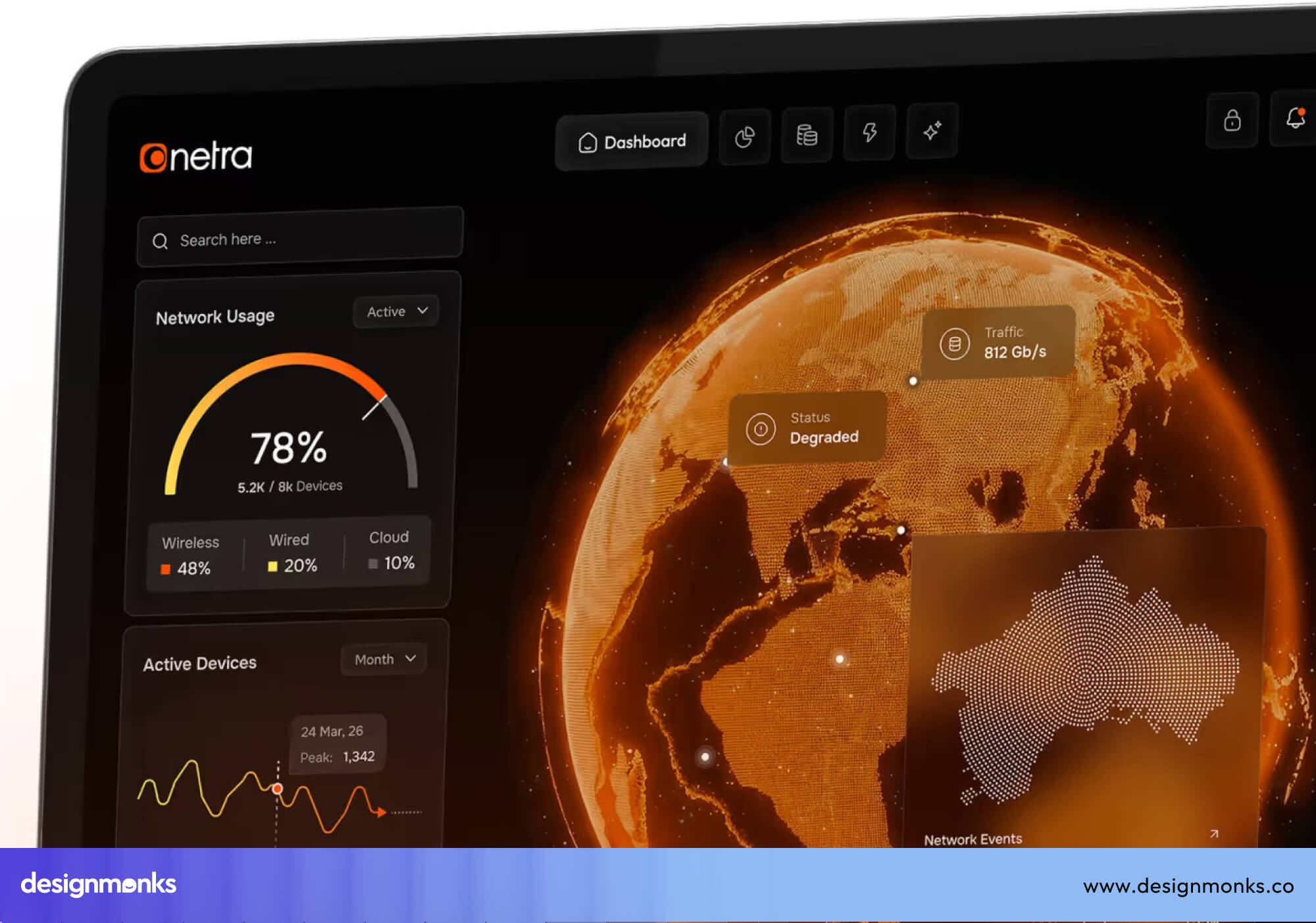
This is a smart move for more technical or emerging categories, where a generic "see how it works" CTA doesn't do enough to justify a prospect's time.
What makes it convert:
- Clear, outcome-focused CTA instead of a generic "Book a Demo"
- Helpful content that answers common questions before visitors book
- A focused layout with minimal distractions and one clear goal
The highest-converting demo pages treat the form as a commitment device, not a data-collection exercise. Every element around the form exists to lower the perceived cost of saying yes.
Pricing Page Examples
Slack's pricing page is built around clarity and default guidance. Plans are laid out side by side with consistent formatting, so comparison takes seconds, not minutes.
Rather than leaving visitors to guess, the page nudges toward the plan most new teams should choose. It still makes the full feature breakdown available for buyers who want to dig deeper.
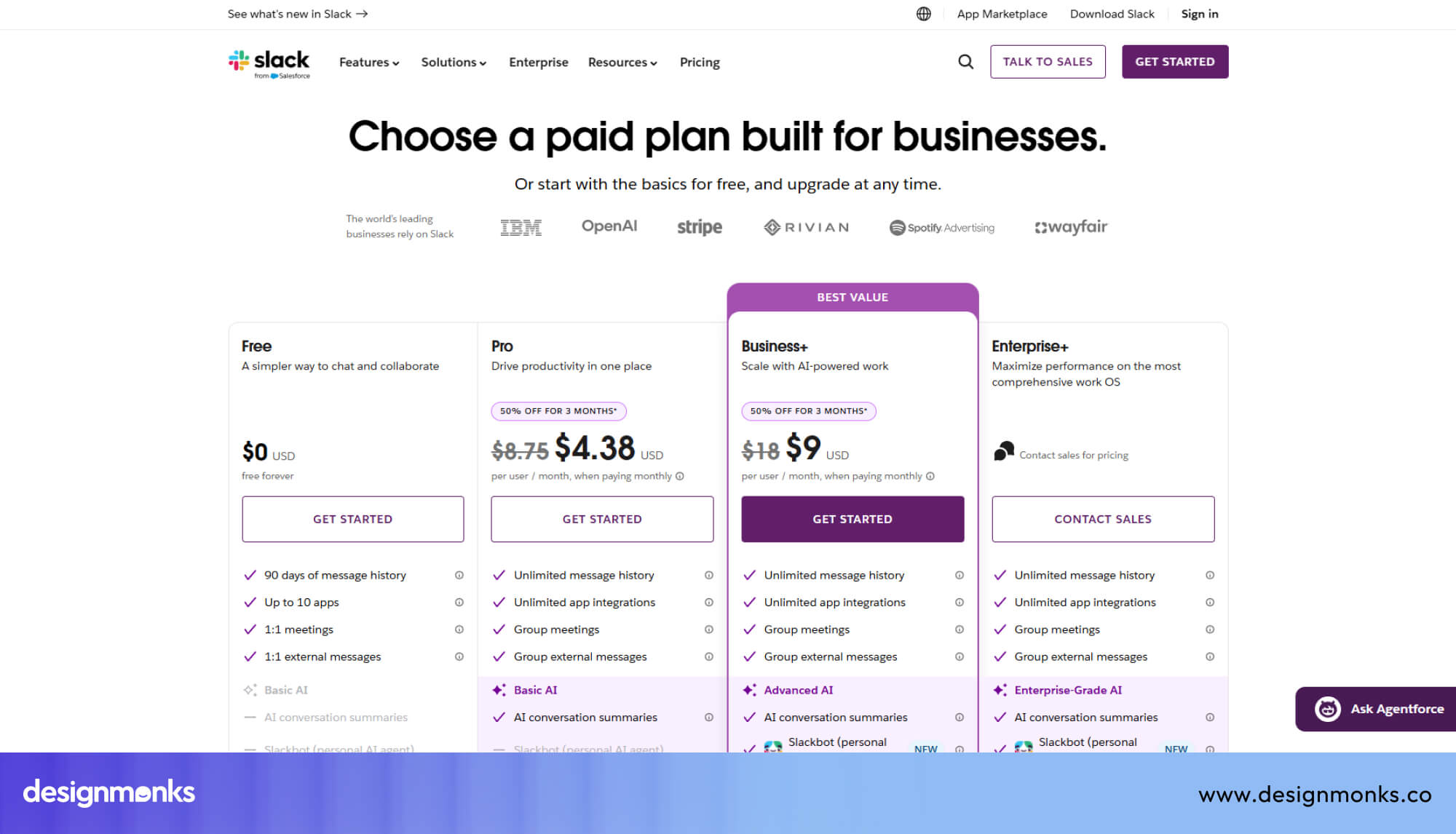
Import and support details are handled transparently, which reduces the number of pre-sales questions the team has to field manually.
What makes it convert:
- Consistent, scannable plan structure across every tier
- A recommended plan that removes decision paralysis for the majority of visitors
- Expandable detail for feature-level comparison, without cluttering the default view
- FAQ content addressing common objections directly on the page, instead of forcing a support ticket
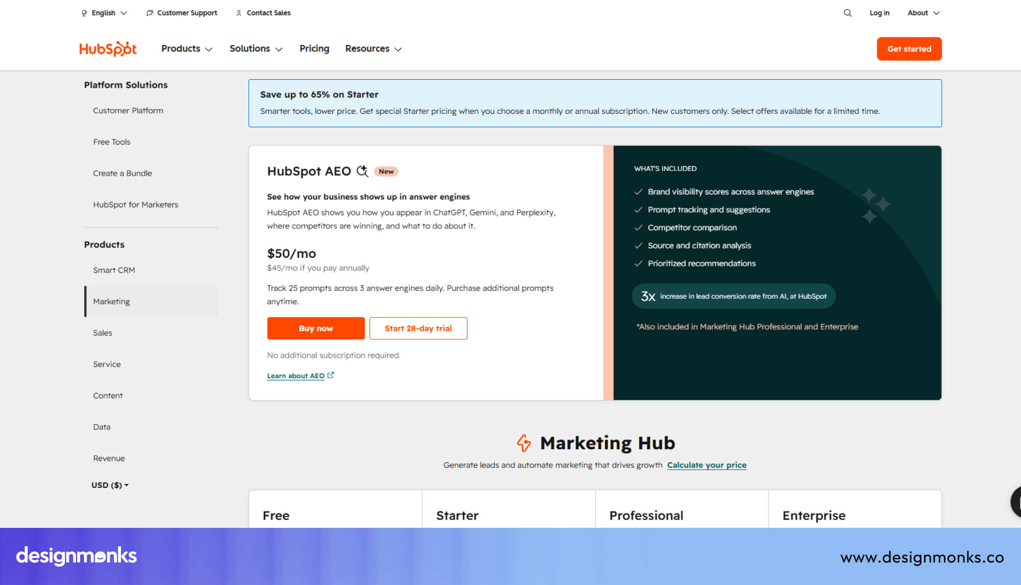
HubSpot's pricing page tackles a harder problem. A genuinely complex, multi-product suite with many tiers and add-ons. Its solution is to let visitors filter by product (Marketing, Sales, Service, etc.) and by company size.
This keeps the page from overwhelming a visitor who only cares about one piece of the platform.
Bundling incentives are shown transparently and encourage expansion without hiding the base price.
What makes it convert:
- Filtering before pricing so visitors only see plans relevant to them
- Transparent bundle savings build trust rather than feeling like a sales tactic
- Consistent CTA language ("Get started free" / "Talk to sales") mapped to buyer intent at each tier
- Enterprise escape hatch shows a clear path to a sales conversation for buyers whose needs don't fit a self-serve plan
B2B SaaS pricing pages don't try to make the decision for the visitor. They make it easy for the visitor to make their own decision quickly, with the friction and ambiguity engineered out.
B2B SaaS Website Design Checklist
Before launching or redesigning your website, use this checklist to make sure every important element is covered. Even small improvements across these areas can create a better user experience and generate more qualified leads.
- Clear value proposition above the fold
- Benefit-focused headline with a strong CTA
- Product screenshots and interactive demos
- Customer testimonials and recognizable client logos
- Case studies with measurable results
- Security and compliance trust signals
- Simple, intuitive navigation
- Fast-loading pages with good Core Web Vitals
- Mobile-friendly and accessible design
- Conversion tracking, heatmaps, and A/B testing
Final Verdict
B2B SaaS website design best practices are the foundation of a website that attracts qualified leads and turns them into customers.
The best B2B SaaS websites combine clear messaging, intuitive navigation, strong trust signals, and conversion-focused experiences to support every stage of the buying journey.
By applying these B2B SaaS website design best practices, you can create a website that educates buyers, reduces friction, and consistently improves conversions.


.avif)
.avif)
.avif)
.avif)


.avif)
.avif)
.avif)
.avif)






.avif)