.svg)


Key Takeaways
- SaaS dashboards succeed when clarity and usability guide every design decision
- Overloading dashboards with features reduces focus and increases user confusion
- Effective UX design aligns product structure with real user goals
- Continuous testing and iteration ensure dashboard improvements actually solve problems
- Strong onboarding experience significantly improves activation and long-term retention rates
SaaS products are built to solve a real problem. But if users have to solve another problem just to use it, you've created a loop that kills engagement fast. But redesigning SaaS dashboard UX can break that loop.
Most dashboards don’t become messy overnight. Teams keep adding new features and more data over time. Each addition feels useful on its own, but together they start to fight for attention. The result is a screen where nothing feels clear, and users spend more time searching than actually working.
If this sounds familiar, don’t worry, this guide will show you how to redesign SaaS Dashboard UX in a simple, structured way so users can focus on value instead of confusion.
Core SaaS UX Principles for Better Dashboard Design
A great SaaS dashboard doesn’t feel complicated to use, it feels obvious. Users should not need training or long explanations to understand where things are or what to do next. This is where strong UX thinking comes in.
When a dashboard is designed with the right principles, it quietly guides users instead of forcing them to figure things out on their own. Below are some core SaaS UX principles that help create clearer, easier, and more user-friendly dashboards:
Build Dashboards Around Real Usability Needs
Good SaaS dashboards are built to support real user behavior. This is where usability testing becomes important. It helps teams see how real people interact with the product instead of guessing.

A strong dashboard design system also keeps everything consistent, so users don’t feel lost when moving between screens. When interaction design is done well, users don’t need to think too hard, they just understand what to do next.
The goal is to create an intuitive dashboard experience where actions feel natural, rather than forced.
Prioritize Information Hierarchy
A dashboard should never treat all information equally. Some data and actions are more important than others, and they must appear first. This is called information hierarchy.
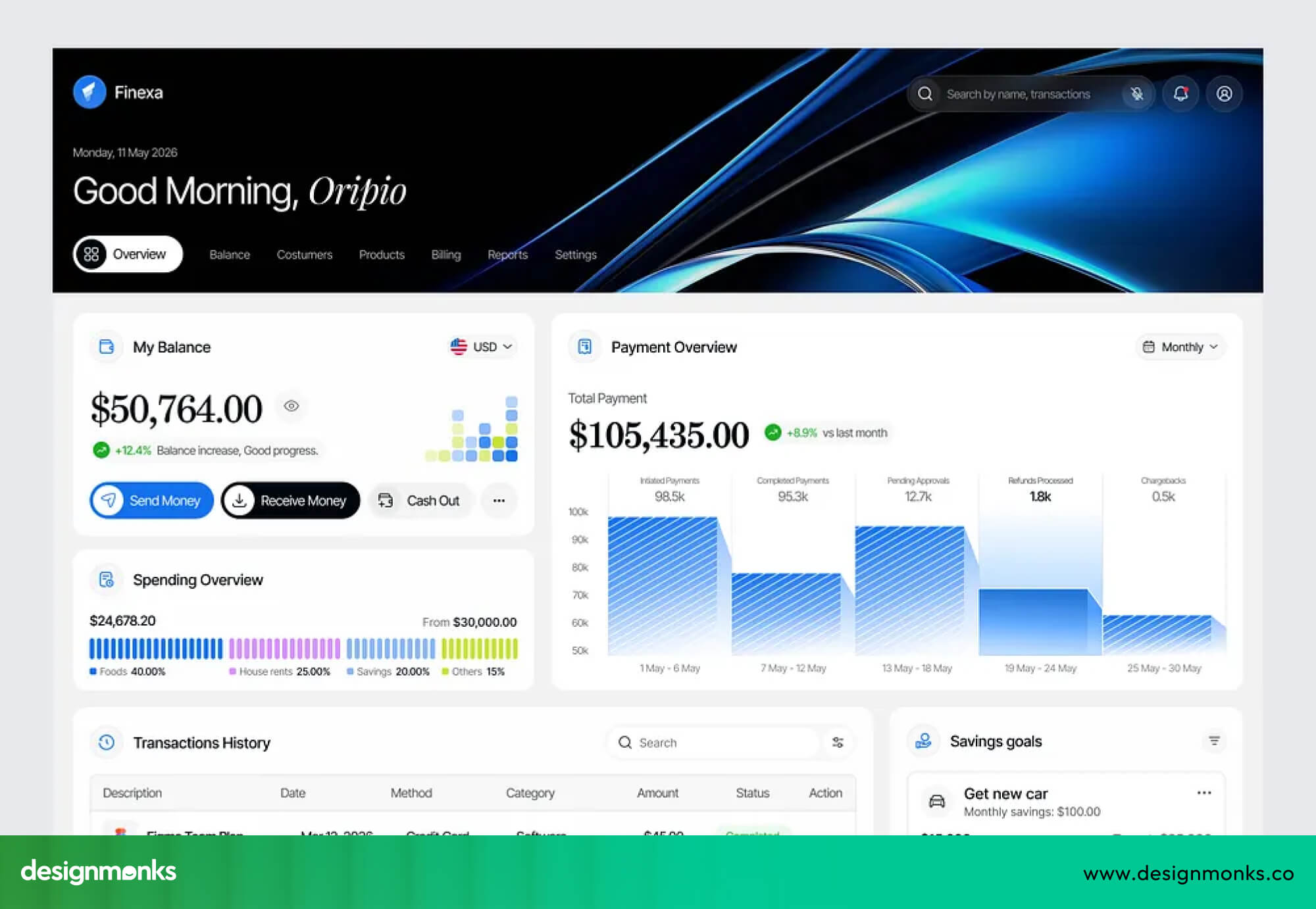
When users open a dashboard, their eyes should immediately land on the most important numbers, alerts, or actions. If everything is shown at the same level, users get confused and waste time searching.
A clear user flow helps guide attention step by step, while strong visual hierarchy makes it easy to understand what matters most at a glance.
Reduce Cognitive Load in Complex Interfaces
Cognitive load simply means how much mental effort a user needs to understand something. In SaaS dashboards, this should always be low. You can reduce it by grouping related items together, using proper spacing, and showing only what is needed at the right time.
This idea is often called progressive disclosure, where advanced details appear only when users need them. A clean layout helps users focus instead of feeling overwhelmed, especially in data-heavy tools. Too much information can quickly become confusing.
Improve Navigation and Feature Discoverability
If users cannot find features easily, even the best SaaS product fails. Navigation should act like a clear map. A well-structured sidebar helps users move between sections without thinking too much.
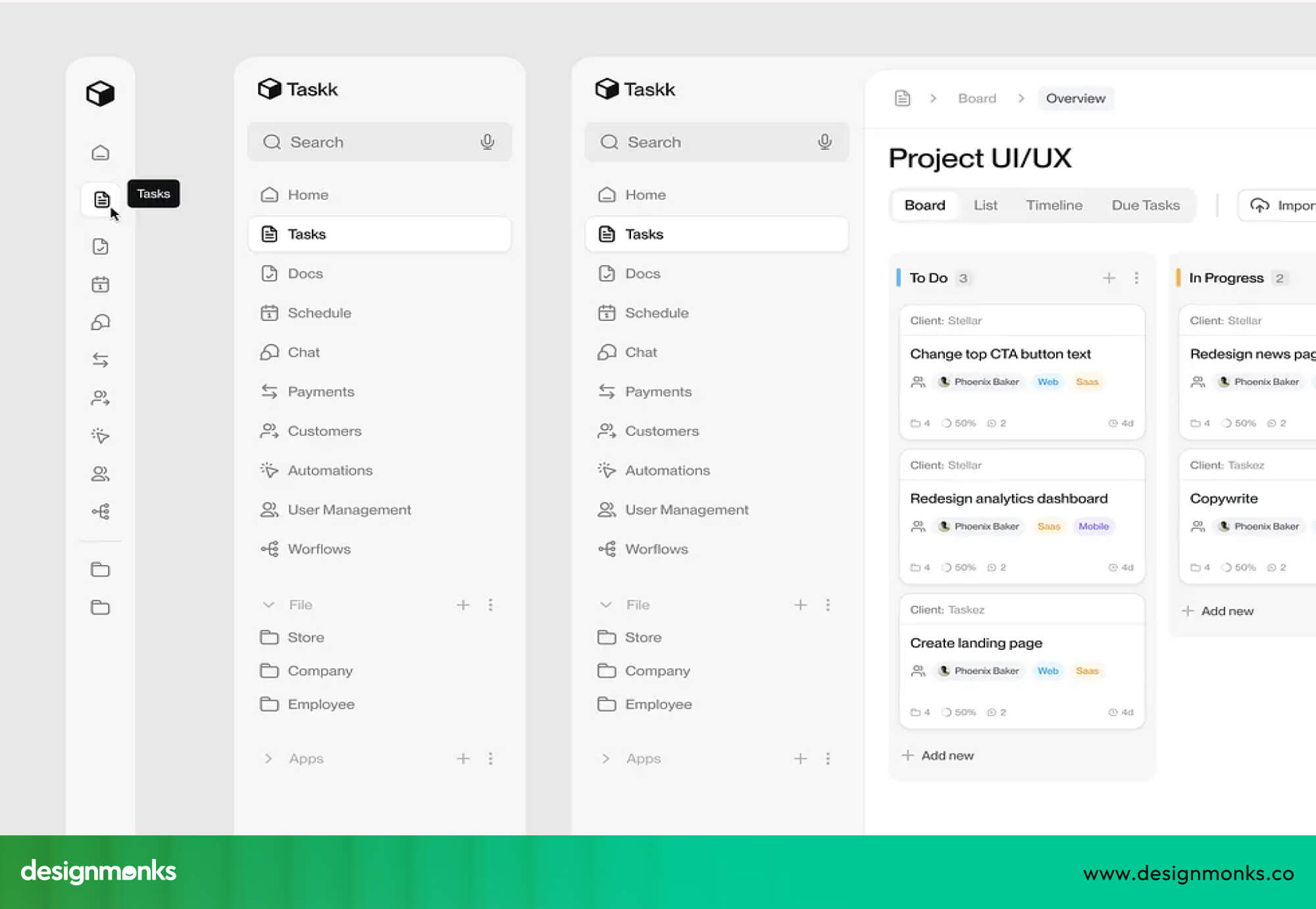
Search is also important because it allows users to directly find what they need. Breadcrumbs help users understand where they are inside the product. Good navigation design is a key part of interaction design, and it ensures users never feel stuck or lost inside the system.
Design for User Goals Instead of Features
Many SaaS dashboards fail because they are built around features instead of real user goals. But users don’t think about features, they think about tasks like “check revenue” or “track performance.”
A better approach is to design workflows around these goals. When dashboards focus on solving real problems, users move faster and with less confusion. This creates a smoother and more intuitive dashboard experience.
Every action feels purposeful and directly connected to what the user wants to achieve.
Step-by-Step SaaS Dashboard UX Redesign Process
A good redesign is not random, it follows a clear UX strategy. Instead of jumping straight into visuals, teams need a structured redesign workflow. Many teams choose to work with specialized SaaS design services at this stage to ensure the redesign is driven by real user behavior and not assumptions.
Once the foundation is clear, the next step is to follow a structured redesign process:
Audit Existing User Flows and Analytics
The first step is to study how users actually behave inside the product. A proper UX audit looks at product data like drop-offs (when users leave before finishing a task), rage clicks (when users click repeatedly out of frustration), session recordings (videos of real user activity), and workflow bottlenecks (points where users get stuck or slowed down).
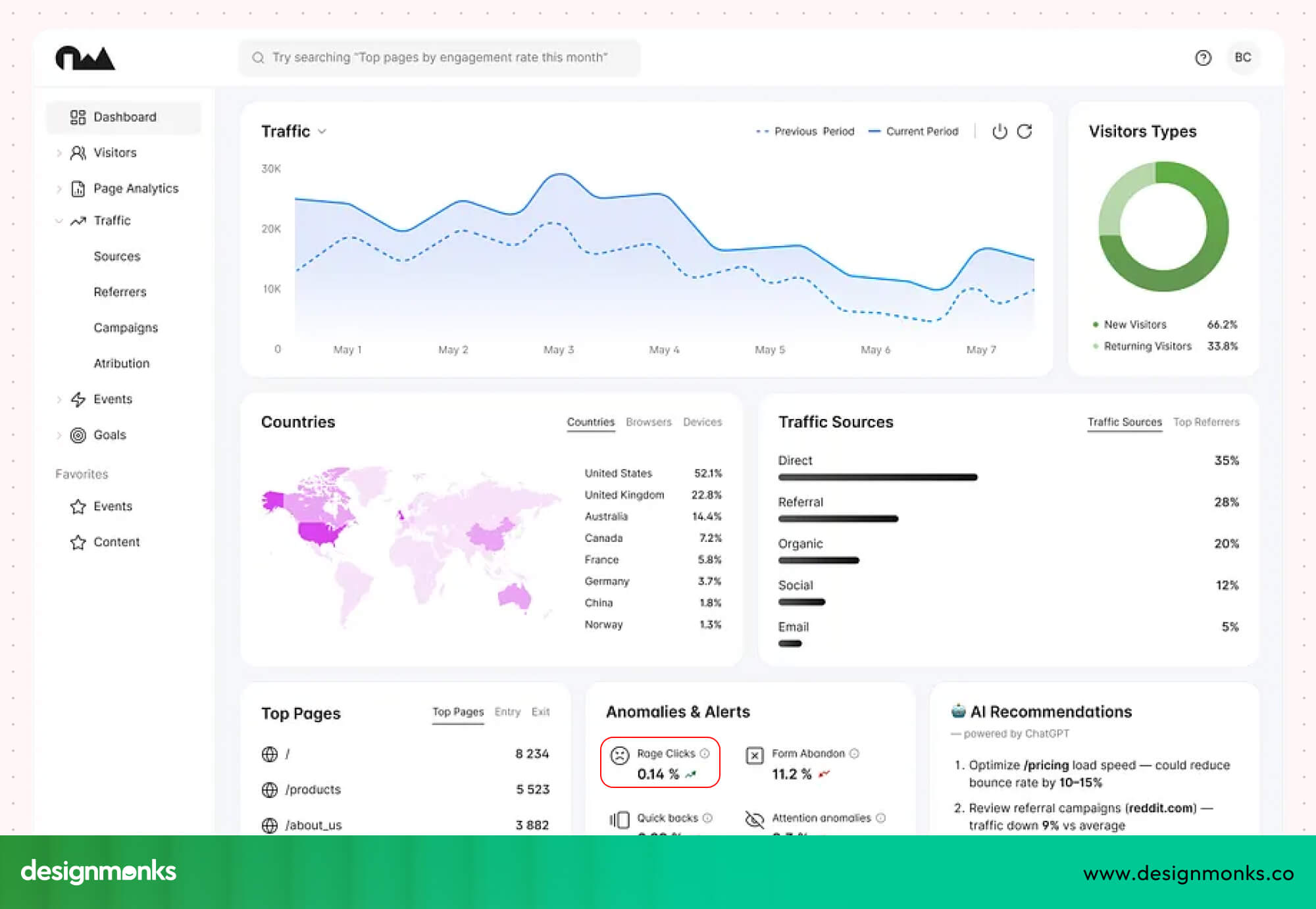
Tools like product analytics (data that shows user actions) and heatmaps (visual maps showing where users click or scroll most) help show where users get stuck or confused.
This step is all about understanding real user behavior, not assumptions, so teams can clearly see what is working and what is failing.
Conduct User Research and Stakeholder Interviews
Numbers alone are not enough. You also need to talk to real users and internal teams. Usability testing and interviews can help uncover hidden problems in this stage. Customers explain their struggles, while product teams share business goals and limitations. Together, this creates a complete picture of what needs to change and why.
Identify Dashboard UX Friction Points
Once research is complete, the next step is to find the exact problem areas. These are called UX friction points (places where users feel difficulty or confusion). They can include confusing navigation, too much visual clutter, inconsistent design patterns, or weak onboarding flows.
The goal is to clearly map where users slow down, get lost, or drop off inside the product.
Redesign Wireframes and User Flows
Now the actual design process begins. Teams first create low-fidelity wireframes (simple sketches or basic layouts without colors or details) to explore ideas quickly.
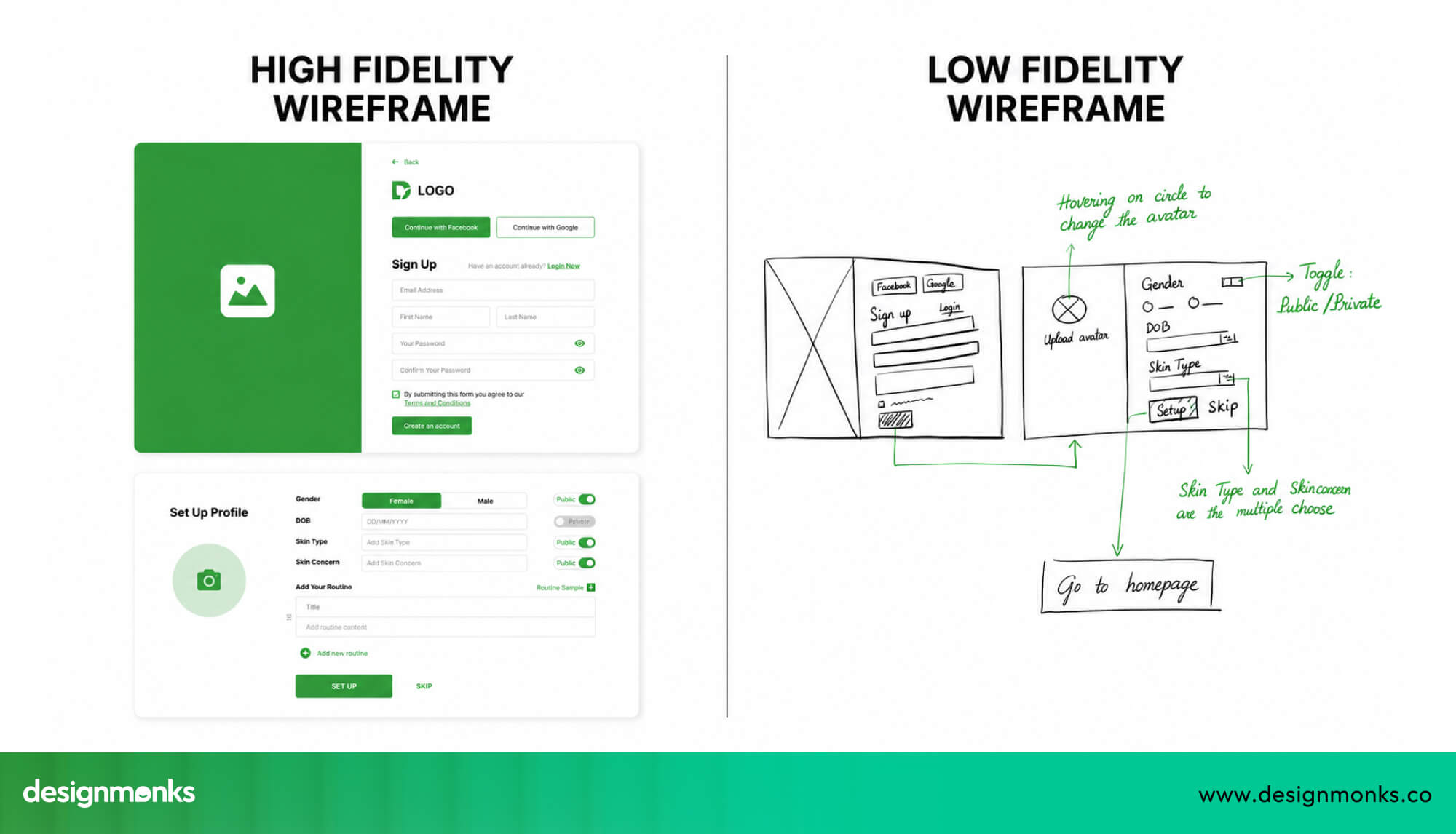
Then they move to high-fidelity designs (detailed, polished screens that look like the final product). This step focuses on improving structure, simplifying flows, and making sure every screen supports a clear user goal.
Test Prototypes Before Development
Before writing code, designs must be tested. This includes usability testing, A/B testing (comparing two versions to see which works better), and prototype validation (checking if early designs solve the problem).
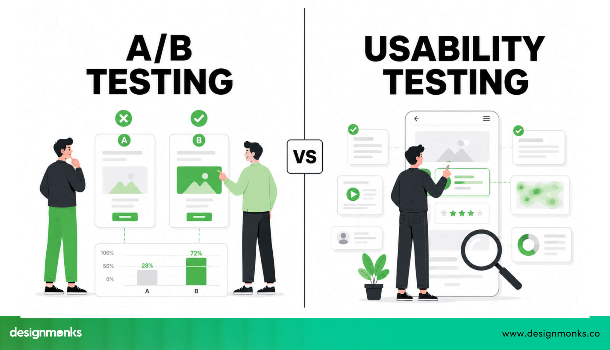
Users interact with early versions of the dashboard to see what works and what doesn’t. This step helps prevent costly mistakes and ensures the redesign actually improves the experience.
Measure UX Improvements Post-Launch
After launch, the work is not over. Teams need to track key metrics like activation rate (how many users start using the product), retention (how many users keep coming back), task completion (how easily users finish actions), and support requests (how often users need help).
These numbers show whether the redesign is truly helping users. If the results improve, it confirms that the UX strategy was successful and the redesign solved real problems.
How to Choose a SaaS UX Design Agency for Dashboard Redesign
Choosing the right SaaS UX agency can decide whether your redesign succeeds or fails. Many agencies can make things look better, but very few truly understand how SaaS products work in real life.
A good agency doesn’t just focus on visuals. It focuses on product strategy, real user behavior, and long-term usability. When you’re redesigning a dashboard, you need a partner who understands data-heavy interfaces, complex workflows, and what users are actually trying to achieve every day.
This is where dashboard expertise becomes important. The right agency will show real UX case studies, explain their process clearly, and connect every design decision to real business outcomes.
And to understand why this matters so much, you first need to see how SaaS dashboard UX is different from regular web design.:
What Makes SaaS Dashboard UX Different From Traditional Web Design?
SaaS dashboards are not like normal websites. A website is often about browsing, but a SaaS dashboard is about doing tasks.
Users log in to complete actions like checking data, managing workflows, or tracking performance. That means design must focus on speed, clarity, and efficiency. In SaaS:
- Users come back daily (not once)
- Workflows matter more than visuals
- Data must be easy to understand
- Navigation must feel obvious
Because of this, hiring a general web design agency often leads to poor results. They may design something that looks good, but it won’t support how users actually work inside a SaaS product.
Questions to Ask Before Hiring a SaaS UX Agency
Before you hire anyone, ask these simple but important questions:
- Have you worked on SaaS dashboards before?
- Can you show case studies with real results?
- How do you study user behavior before designing?
- What is your redesign workflow from research to testing?
- How do you measure success after launch?
These questions help you separate real experts from general designers.
Red Flags When Evaluating UX Agencies
Not every UX agency is the right fit. You need to watch out for these warning signs:
- They talk only about visuals, not user behavior
- No clear UX process or research phase
- No real SaaS or dashboard experience
- No mention of testing or analytics
- Focus on trends instead of usability
If an agency cannot explain how they improve user experience, they are not the right partner.
Best Practices for Modern SaaS Dashboard Design
Modern SaaS users expect dashboards to feel simple from the first click. They don’t want to spend time learning how things work, they want everything to feel natural and easy. This is why modern SaaS UI patterns focus on clarity, speed, and flexibility.
A well-designed dashboard layout should guide users step by step. It should help them find information quickly, complete tasks faster, and avoid confusion. Below are the key practices that make a SaaS dashboard feel modern and easy to use:
Responsive and Mobile-Friendly Dashboard UX
Today, users don’t always access SaaS products from a desktop. They switch between laptops, tablets, and mobile devices. That’s why a responsive dashboard is essential.
Responsive design means the layout adjusts based on screen size. But it’s not just about shrinking content, it’s about adapting the experience. For example:
- Important data should stay visible even on smaller screens
- Navigation should remain simple and easy to tap
- Charts and tables should adjust without breaking
Good responsive design ensures users can complete tasks smoothly, no matter what device they are using.
Accessibility and Inclusive UX Design
A modern dashboard should work for everyone, including users with different abilities. Simple improvements can make a big difference.
Such as using proper color contrast so text is easy to read, supporting keyboard navigation for users who cannot use a mouse, and making sure screen readers can understand the content.
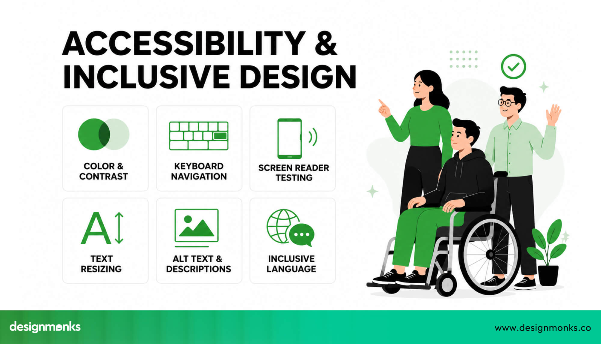
Following accessibility guidelines like WCAG helps create an inclusive product.It also improves usability for all users by making the interface clearer and easier to use.
Consistent UI Components and Design Systems
Consistency is what makes a dashboard feel simple and easy to learn. When buttons, forms, and layouts behave the same way across the product, users don’t have to stop and think every time they interact with something.
This is where a design system becomes useful. A design system is a collection of reusable components like buttons, input fields, cards, tables, and navigation menus.
Using these consistent elements across the dashboard creates a predictable experience for users, while also helping teams build and scale the product faster without breaking design consistency.
Smart Data Visualization for SaaS Products
SaaS dashboards are often filled with data, but showing more data is not the goal,showing it clearly is. Good data visualization means:
- Using simple charts that are easy to read
- Highlighting key numbers (KPIs) that matter most
- Avoiding misleading visuals like stretched graphs or unnecessary effects
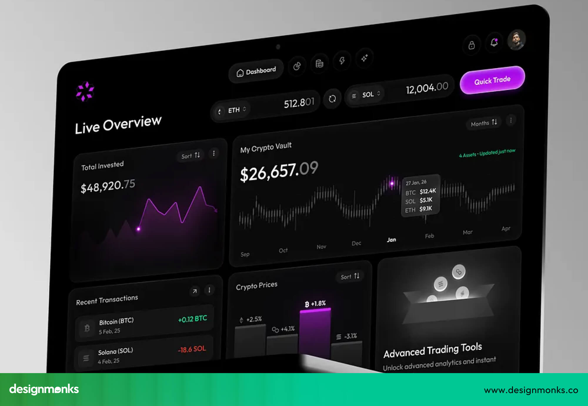
Users should be able to understand insights at a glance without needing to study the screen. Clear visuals help users make faster decisions and reduce confusion.
SaaS Dashboard UX Mistakes to Avoid
Even experienced teams make mistakes when redesigning dashboards. The problem is not making mistakes,it’s repeating them. Many SaaS dashboards fail because teams focus on adding more instead of improving what already exists.
Avoiding these common mistakes can save time, reduce user frustration, and lead to a much better user experience:
Adding Too Many Features to the Dashboard
It’s easy to think that adding more features will make your product more powerful, but the opposite often happens. When too many options are placed on one screen, users feel overwhelmed and don’t know where to focus. This creates confusion and slows down decision-making.
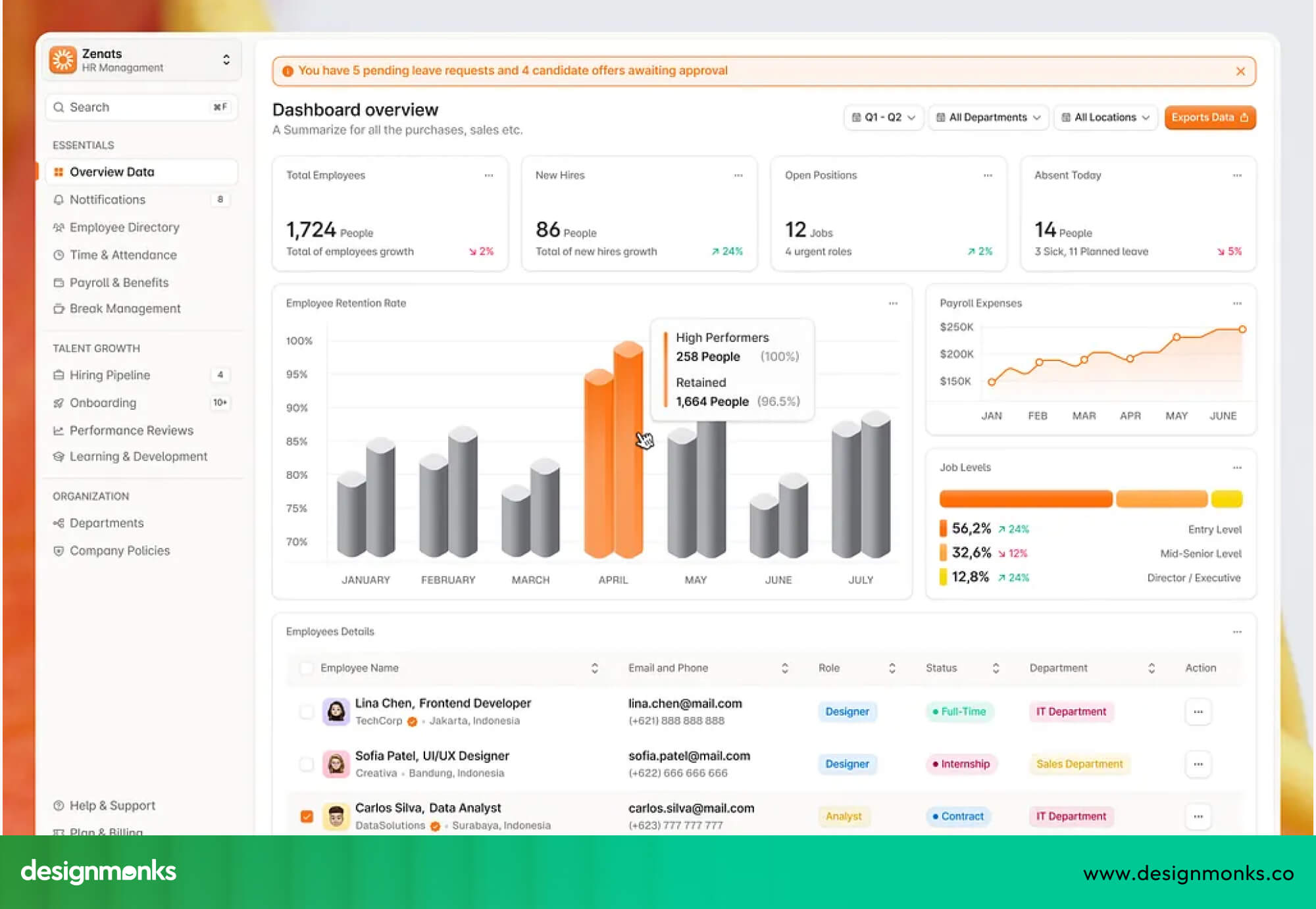
A good dashboard should highlight only the most important actions and data first, while keeping secondary features in the background. Simplicity helps users move faster and with more confidence.
Ignoring User Behavior Data
Designing without real data is like guessing what users want. Many teams rely on opinions rather than actual user behavior, which leads to poor decisions.
Data from analytics, heatmaps, and user sessions shows where users click, where they get stuck, and where they drop off. Without this insight, redesign efforts can miss the real problems.
Using real user data ensures that design changes solve actual issues instead of creating new ones.
Prioritizing Aesthetics Over Usability
A dashboard can look modern and visually appealing but still fail if it is hard to use. Good design is not just about colors, animations, or trendy layouts, it is about clarity and ease of use.

If users struggle to find information or complete tasks, the design has failed, no matter how good it looks. Usability should always come first, and visual design should support it, not replace it.
Redesigning Without User Testing
Skipping testing is one of the biggest mistakes teams make. Without testing, you don’t know if your redesign actually works. Teams may assume the new design is better, but users might still face the same problems.
Usability testing allows real users to interact with the design before it is fully built. This helps catch issues early, reduce costly changes later, and ensure the final product truly improves the user experience.
Poor Onboarding and First-Time User Experience
Many SaaS dashboards fail right at the beginning because new users don’t understand what to do after logging in. If users feel lost in the first few minutes, they are likely to leave and never return.
This usually happens when too many features are shown at once without any guidance. A good onboarding experience should guide users step by step. It should highlight key actions, explain important features in simple ways, and help users achieve their first goal quickly.
When onboarding is clear and focused, users feel more confident, which leads to better engagement and higher retention.
SaaS Dashboard UX Redesign Examples and Case Studies
The best way to understand good SaaS design is to see how real products solve real problems. A strong case study doesn’t just show a polished UI, it explains what was broken before.
It shows what decisions were made and how those changes improved product adoption, usability, and workflow efficiency.
Across modern SaaS platforms like HubSpot, Salesforce, Notion, and Airtable, the same pattern appears again and again, dashboards become powerful but messy over time. The redesign goal is always the same, bring clarity back without removing functionality.
Now let’s look at real dashboard redesign examples and what good UX improvements actually look like in practice:
Example of Improving Dashboard Navigation
One of the most persistent challenges in SaaS design is navigation overload. As products grow, menus get crowded, and users lose track of where things are. This leads to frustration and slower workflows.
The fix isn't adding more features. It's reducing friction by simplifying structure, grouping related actions, and surfacing what matters most.
Design Monks tackled this head-on with Netra, a network monitoring dashboard. Tools in this category tend to suffer from a familiar problem, such as too much raw data, not enough clarity.
Users are bombarded with real-time information but lack the visual hierarchy to make sense of it quickly.

Design Monks' solution was to lead with clarity and layer in complexity. Rather than presenting all data at once, the Netra dashboard guides users toward what needs attention first. They organized information around immediate insight rather than raw completeness.
The result is a dashboard that's faster to read, easier to act on, and far less overwhelming, even in high-data environments. Users can assess system status at a glance, without digging through dense tables or fighting a cluttered interface.
Example of Simplifying Data Visualization
Another common SaaS failure is drowning users with data. Dashboards packed with charts, tables, and KPIs often create more confusion than clarity. The real design challenge is turning this dense information into something people can actually act on.
Design Monks faced exactly this with Trackory, a shipment tracking and delivery coordination platform. Research with 28 logistics professionals revealed a familiar pattern: fragmented tools, delayed decisions, and no single source of truth.
Teams were working across scattered systems, and critical information was getting lost in the noise.

They solved it with a centralized dashboard that brought real-time tracking, workflow management, and actionable insights into one place.
The result is an interface that reduces cognitive load without sacrificing operational depth. Complex shipment data is translated into clean visual insights, priorities are immediately visible, and decision-making is faster because the hierarchy does the heavy lifting.
Much like how Airtable makes structured data feel approachable, Trackory’s dashboard design proves that the best dashboards don't just display information, they make it obvious what to do next.
Example of Improving User Onboarding UX
A SaaS product can have every feature in the world and still fail if users can't figure it out on day one. Poor onboarding is one of the most common causes of low activation. First-time users suddenly get dropped into a complex interface with no clear path forward in such cases.
Design Monks addressed this directly in their redesign of Onethread, a project management tool that was struggling with exactly that problem. The existing product lacked built-in collaboration tools, had no centralized project view, and offered little guidance for new users trying to orient themselves.
The interface asked too much of people who were still learning the basics.
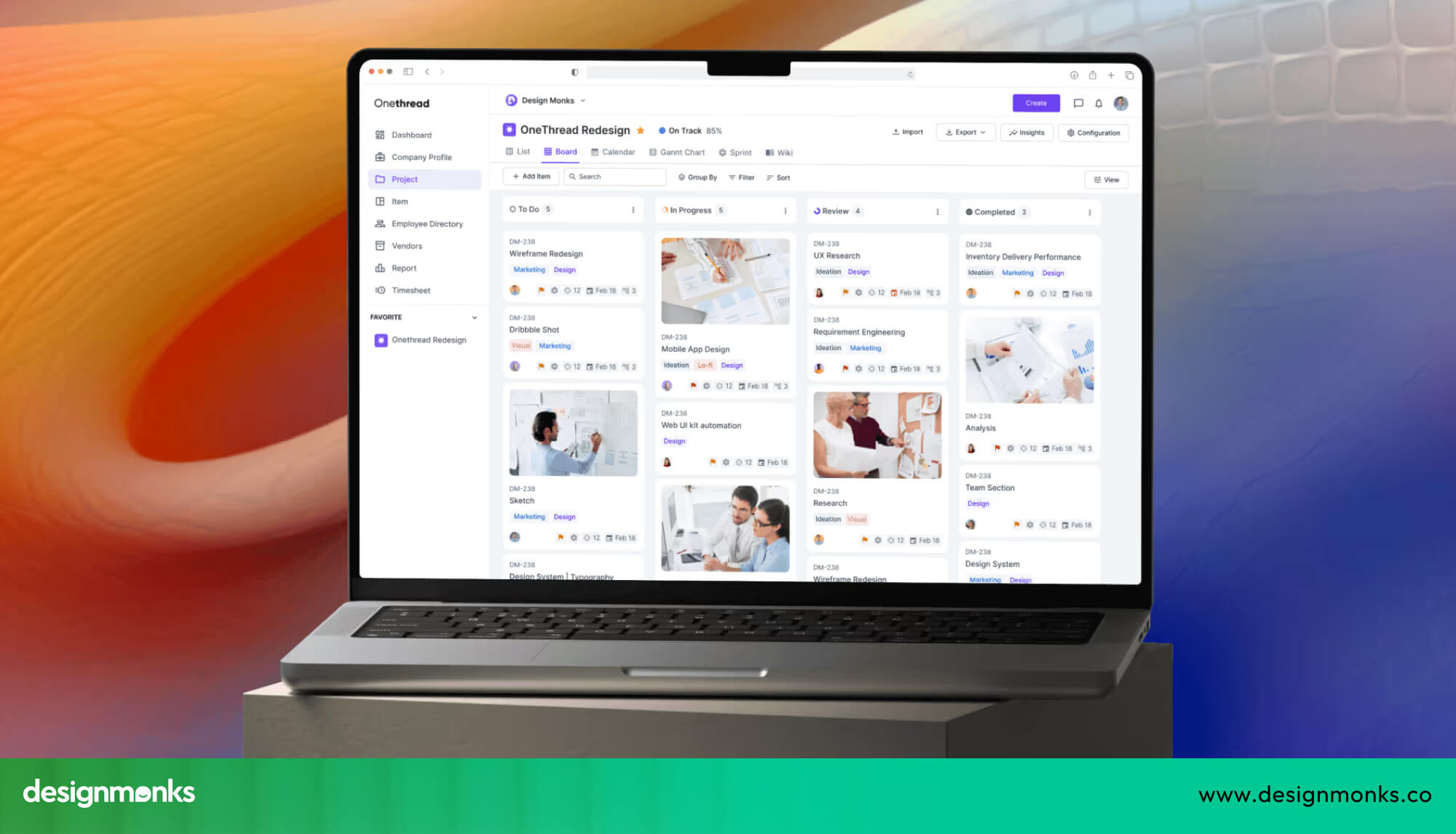
The redesign shifted the entire approach and introduced key actions gradually, reducing the cognitive weight of early interactions. They built an experience where tasks feel simple from the start rather than something to be figured out.
The philosophy mirrors what Notion does well, teach users by doing, not by overwhelming them with everything at once. The result was faster time-to-value, stronger early engagement, and a product that users could actually adopt rather than abandon.
Why Design Monks Is a Good SaaS UX Partner?
Across projects like Netra, Materio, Trackory, Onethread, and Transforming Micro Book Experiences, Design Monks shows a clear strength in SaaS dashboard design. They don’t just focus on visuals, they focus on how users actually work inside the product.
Their approach starts with real user behavior and product insights, not assumptions. They identify friction points early, simplify complex workflows, and design dashboards that scale as the product grows. Instead of creating one-off screens, they build structured systems that stay consistent and easy to use over time. They also test ideas before development, which reduces risk and improves final outcomes.
This leads to stronger results, faster task completion, better product adoption, higher user retention, and less confusion overall. In simple terms, Design Monks is a good choice because they design with purpose, not just appearance, and focus on making SaaS products easier to use at every level.
Tools Used for SaaS Dashboard UX Redesign
A successful SaaS dashboard redesign depends on the right tools for research, design, testing, and analytics. These tools help teams understand user behavior, create better interfaces, and test ideas before development so fewer mistakes happen later.
For UX research and analytics, tools like Hotjar are used to study how users interact with a dashboard through heatmaps and session recordings. This shows where users click, where they get stuck, and what they ignore.
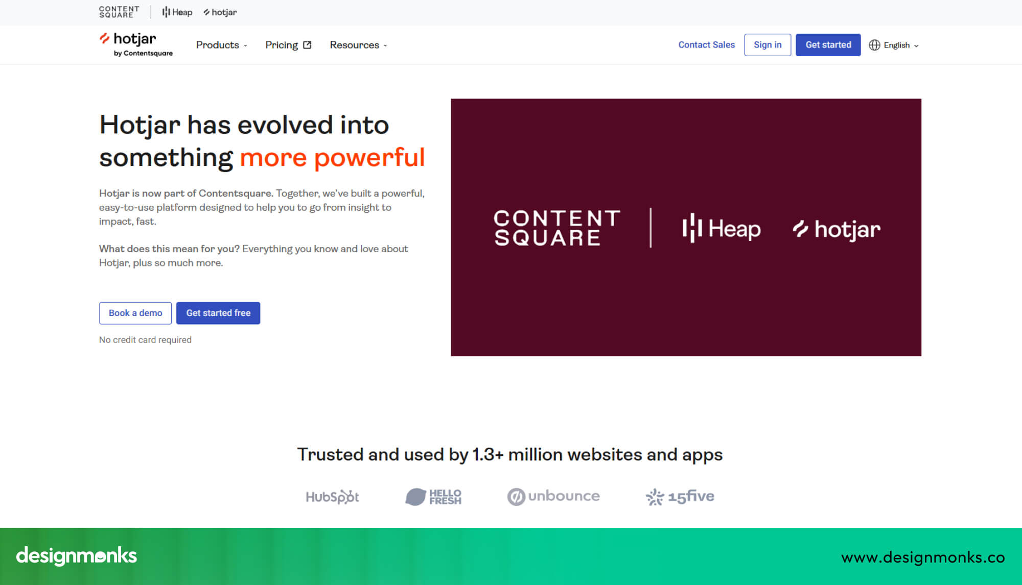
Mixpanel helps track user actions inside the product, while Amplitude is used to understand full user journeys and how people move through different features.
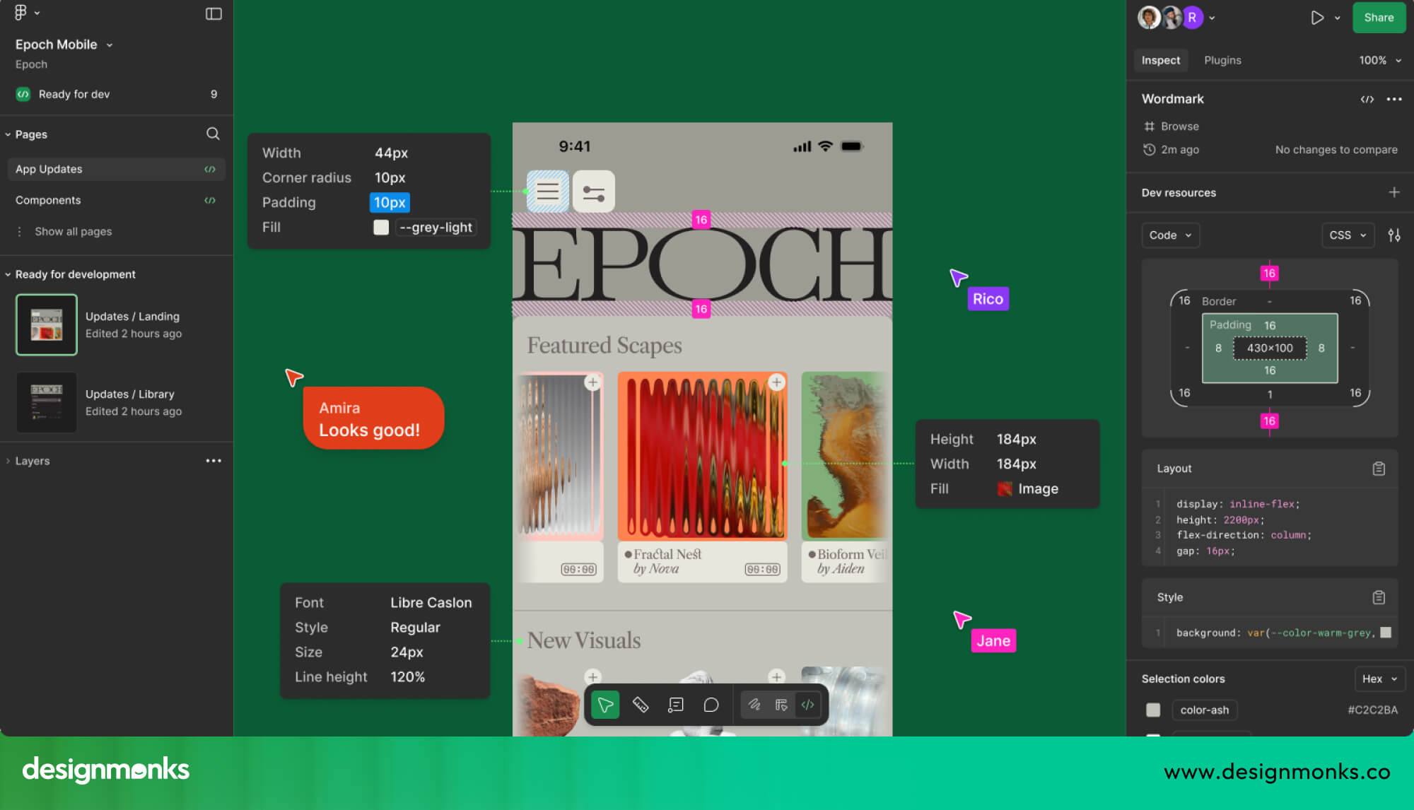
For wireframing and prototyping, Figma is used to design layouts and build clickable prototypes before development. This helps teams quickly test ideas and improve structure.
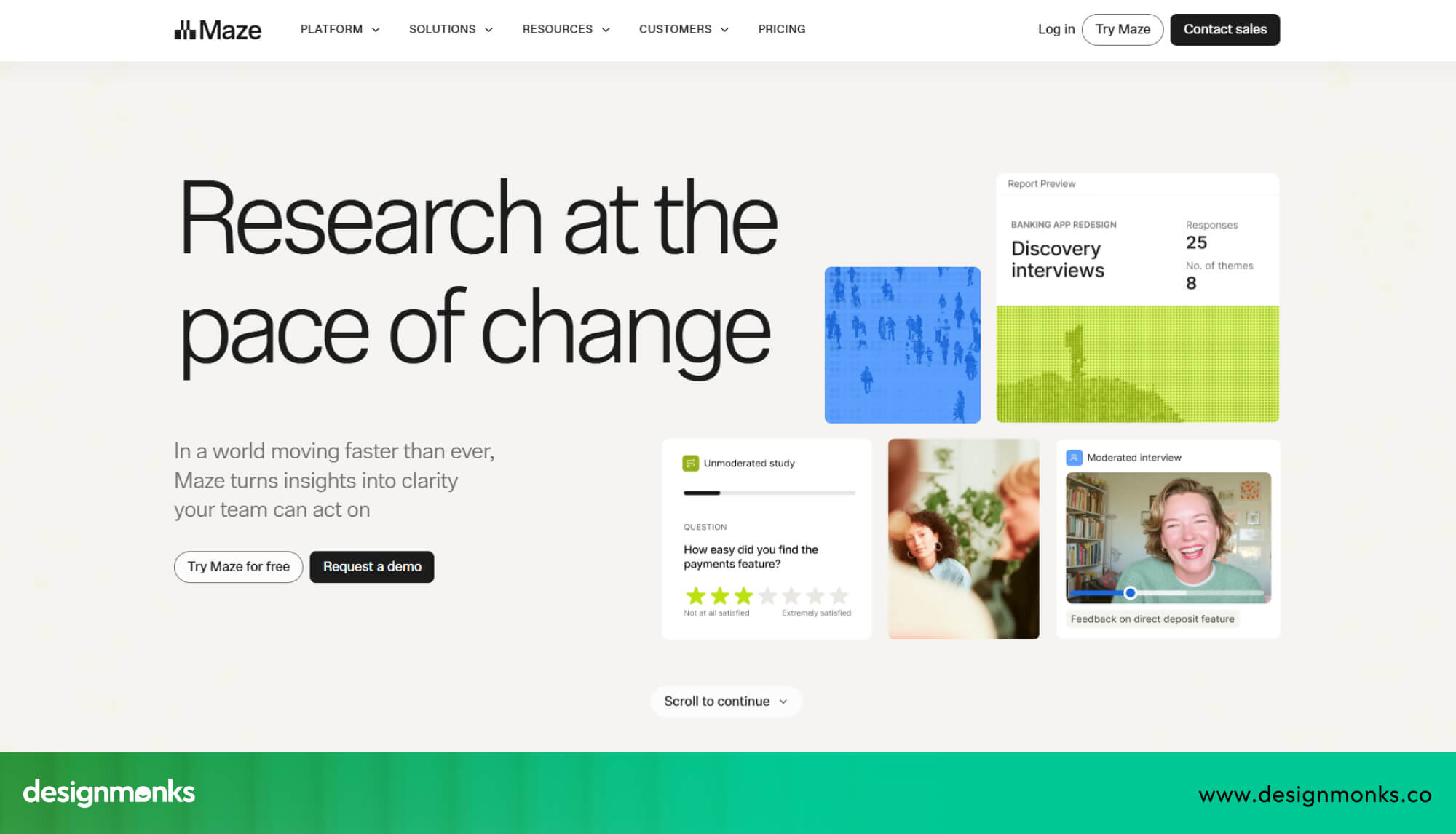
For usability testing, tools like Maze allow real users to test designs and give feedback early. This ensures the final dashboard is clear, simple, and easy to use.
Why Does SaaS Dashboard UX Redesign Matter?
A SaaS dashboard is the core place where users interact with a product, so its usability directly affects business success. When dashboard usability is poor, users struggle to understand features, which lowers activation, reduces user retention, and increases churn rate.
Even if the product is powerful, weak UX makes it hard for users to see value quickly. Good UX optimization, supported by product analytics, helps improve user engagement, workflow efficiency, and overall satisfaction.
Common Signs Your SaaS Dashboard Needs a UX Redesign
A dashboard often shows clear warning signs when it is not working well. These issues usually build up slowly, but they directly affect how easily users can use the product:
- A cluttered interface causes cognitive overload, making users feel overwhelmed.
- A weak information hierarchy makes it hard to see what matters most.
- Navigation friction slows users down when moving between sections.
- Low feature adoption shows users are not using key tools.
- More support tickets indicate frequent user confusion.
- General user confusion appears during basic tasks.
- Growing UX debt makes the product harder to improve over time.
Business Impact of Poor Dashboard UX
Bad dashboard UX doesn’t just hurt users, it directly impacts business growth. When users cannot easily understand or use the product, it leads to lower engagement and weaker SaaS retention.
This affects product-led growth, reduces customer lifetime value, and slows down expansion revenue. Poor UX also reduces feature discoverability, meaning users never fully explore what the product offers. Over time, this creates revenue leakage and higher churn.
How to Measure the Success of a SaaS Dashboard Redesign
The success of a SaaS dashboard redesign should always be measured using clear UX and business KPIs, not assumptions. After launch, teams need to look at real numbers to understand whether the new design is actually improving the user experience. Key metrics you need to check are:
- Activation Rate: How many users start using the product successfully
- Time-to-value: How quickly users reach their first meaningful result.
- Feature Adoption: How many features do users actually use
- Task Completion Rate: How easily users finish important actions
- NPS: How satisfied users are overall
Together, these metrics show how well users understand the product and how smoothly they can complete their work. When these numbers improve, it means the redesign has successfully improved engagement, usability, and overall workflow efficiency.
Using product analytics helps teams move away from guessing and focus on real, measurable results.
Conclusion
Redesigning SaaS dashboard UX is not just about making things look better, it’s about making the product easier to use, faster to understand, and more valuable for users.
When you focus on real user behavior, simplify workflows, and test before building, the results are clear: better engagement, higher retention, and stronger product growth.
Planning a product or website redesign? Explore Design Monks' B2B SaaS Workflow and Dashboard UX Design to see the workflows, relevant work and services that can shape your project scope.


.avif)
.avif)
.avif)
.avif)


.avif)
.avif)
.avif)
.avif)







.avif)