
.svg)


Project Description
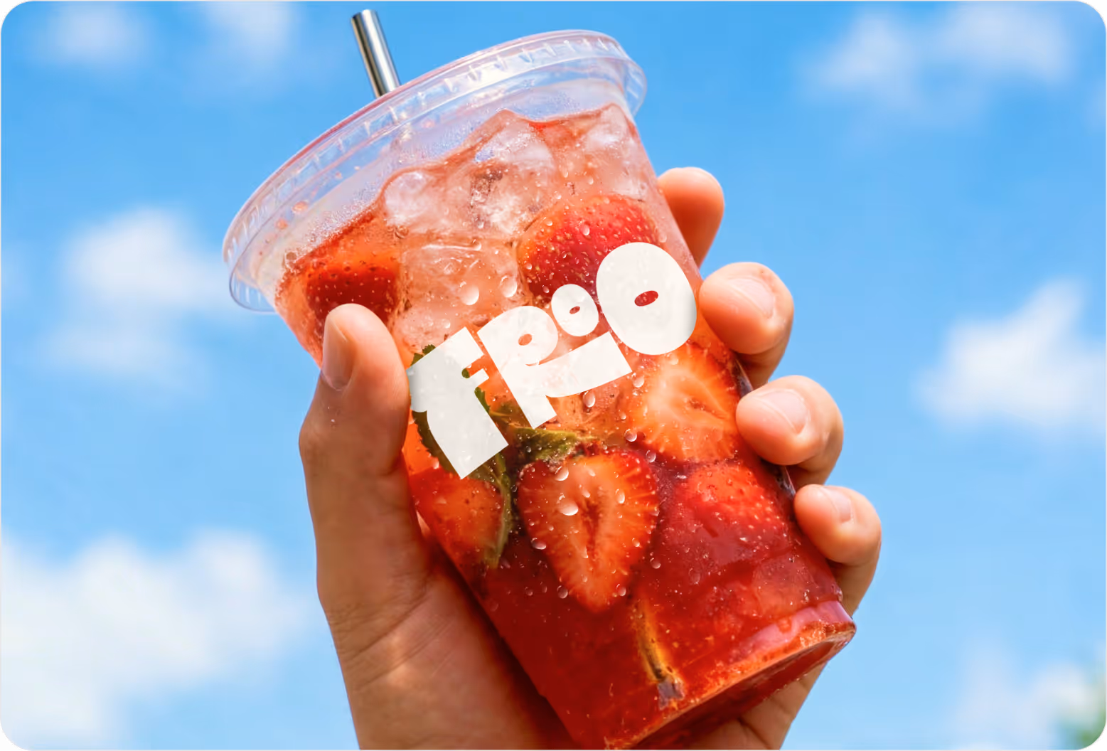
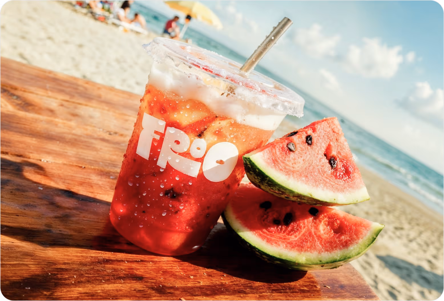
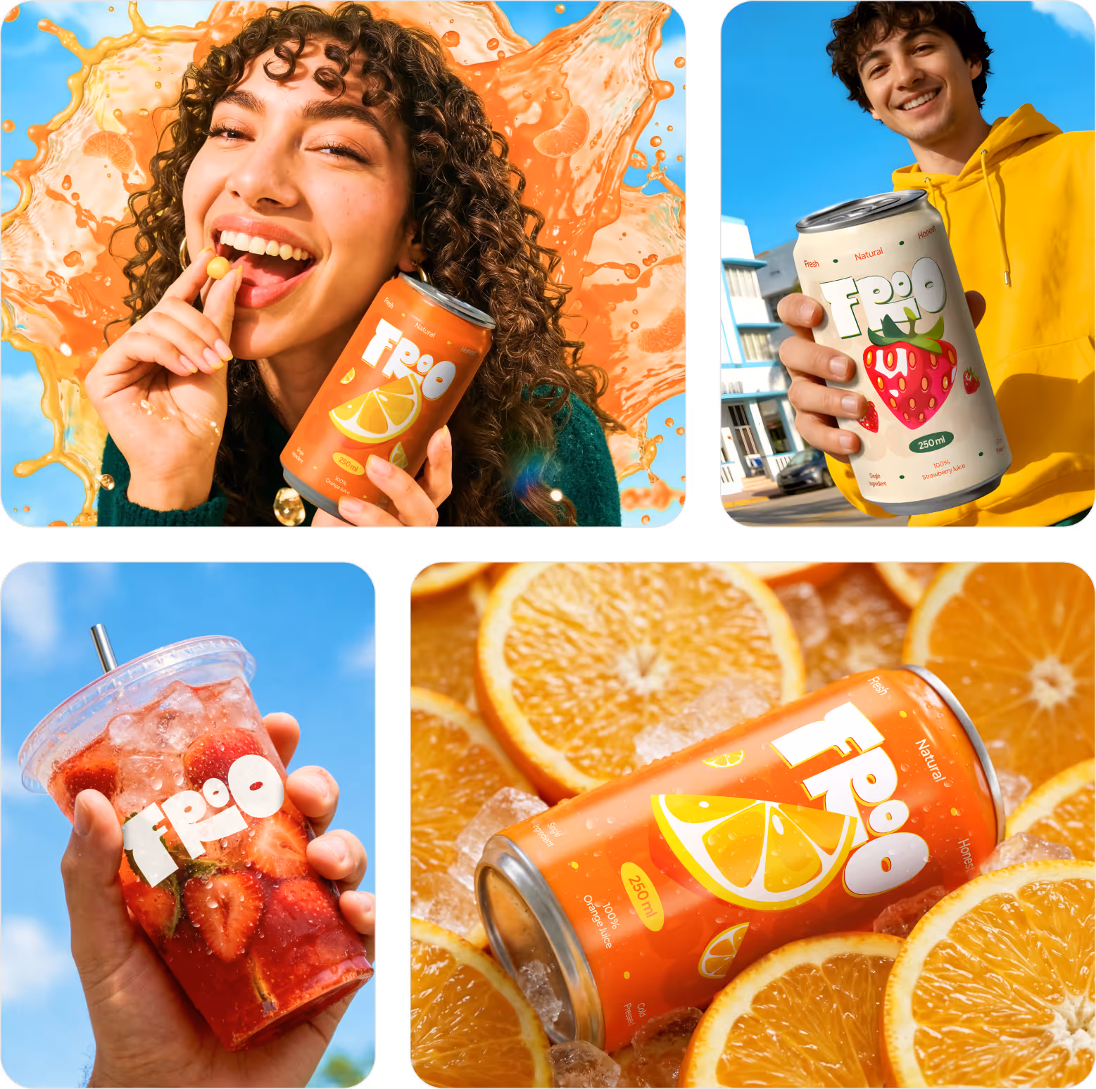
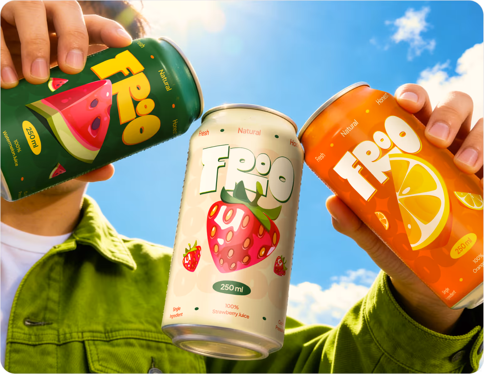
FROO packaging design project focuses on building a cohesive visual identity system for a raw juice brand. The design translates freshness, simplicity, and urban energy into physical packaging. It includes cups, bottles, and aluminum cans, each highlighting single-ingredient juices. A bold, color-driven approach ensures strong shelf presence and instant recognition.
Problem
Designing the FROO packaging system came with the challenge of translating a single-ingredient juice concept into a visually distinct identity across multiple formats. The team needed to maintain consistency while ensuring each fruit variant felt unique, bold, and instantly recognizable in fast-paced street and retail environments.
- Problem 1
Maintaining strong visual consistency across cups, bottles, and aluminum cans.
- Problem 2
Differentiating single-ingredient variants while keeping a unified brand language.
- Problem 3
Ensuring instant shelf recognition in crowded retail and street settings.
Solution
We developed a bold, color-led packaging system that clearly expresses FROO’s single-ingredient concept. Each fruit variant was assigned a distinct visual tone while maintaining a unified identity structure. The design was optimized for quick recognition, ensuring a strong impact across street carts and retail shelves through simplicity and clarity.
- Solution 1
Created a consistent layout system across all packaging formats and sizes.
- Solution 2
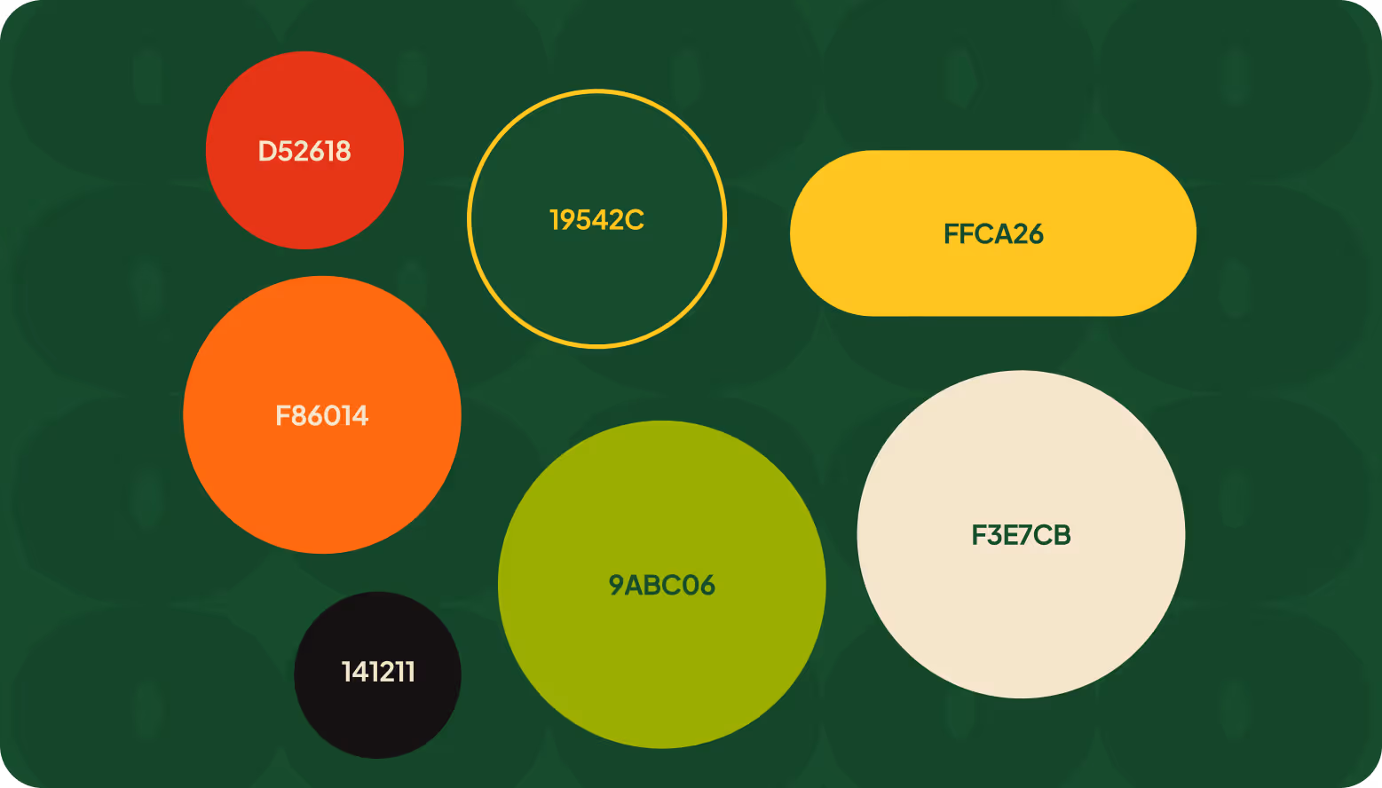
Assigned distinct color identities for each single-ingredient juice variant clearly.
- Solution 3
Designed minimal, high-contrast visuals for faster recognition in busy retail spaces.

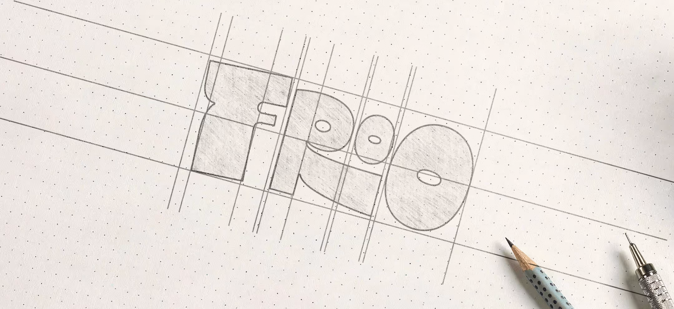
Design Process
We follow a structured UI/UX design process focused on research, strategy, and seamless execution to create digital products that engage users and drive business results.

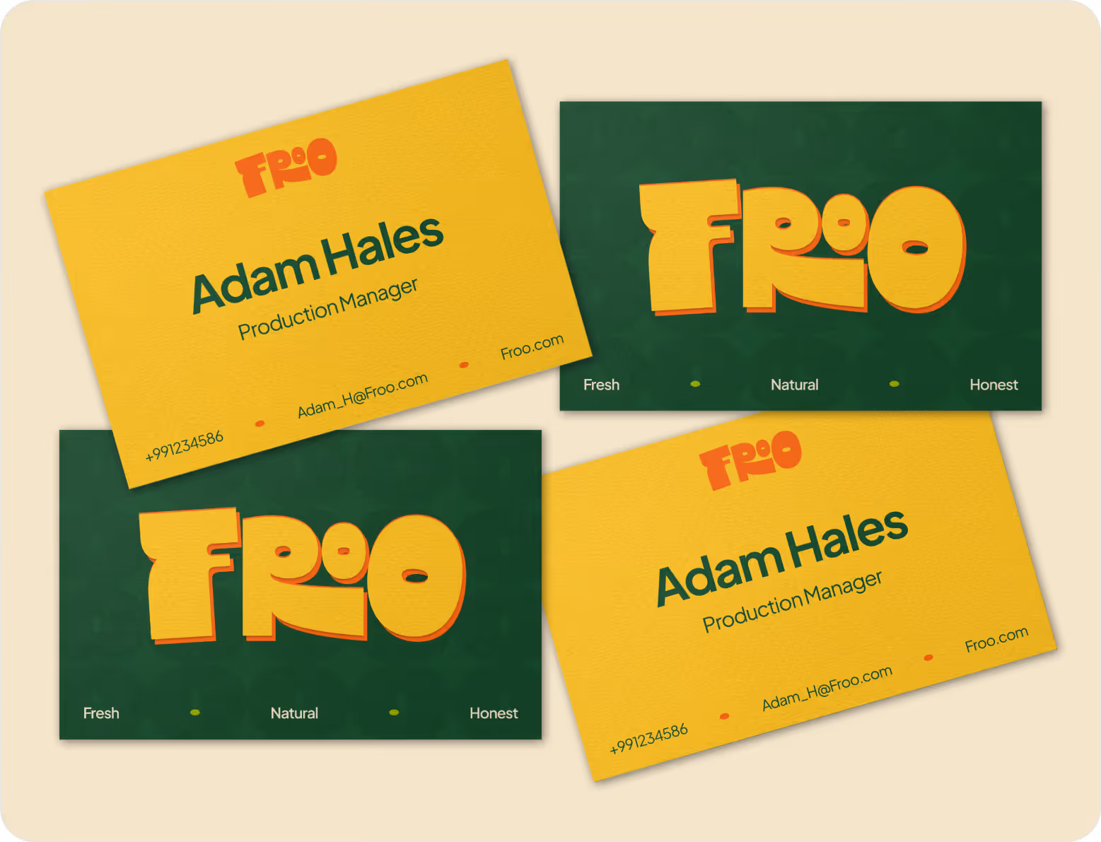
Style Guide & Component
.avif)
.avif)


Wireframe
& UI Design
Workflow Scenario
The workflow began with analyzing FROO’s brand idea and packaging needs. We moved into structuring layouts for different formats, ensuring consistency across cups, bottles, and cans. Color systems were developed for each variant, followed by refinement of visual hierarchy and details to achieve a bold, unified, and easily recognizable identity.

The Result
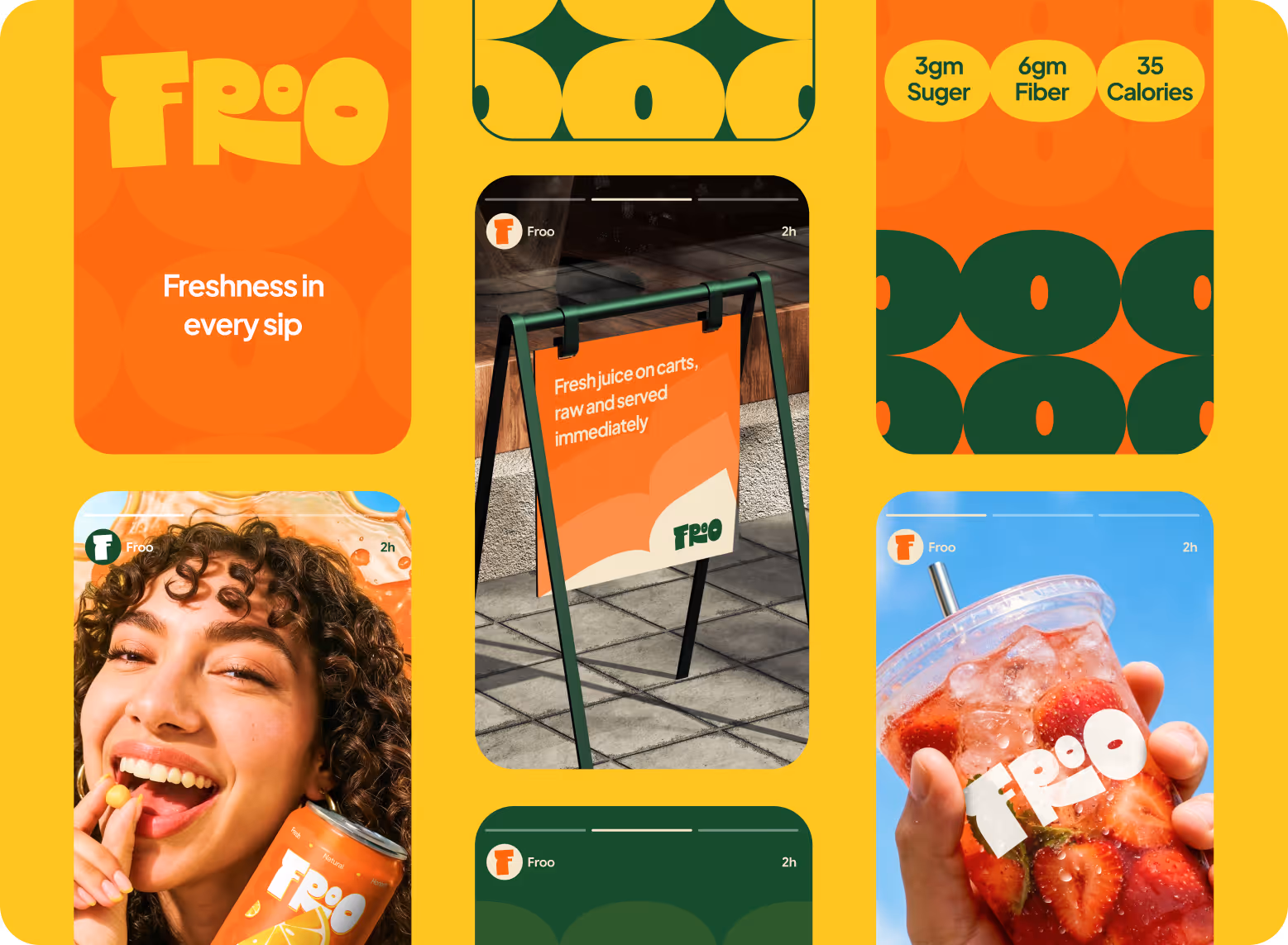
The ultimate packaging system established a bold and cohesive identity for FROO across all formats. Each single-ingredient juice gained distinct visual recognition while maintaining brand unity. The design improved shelf visibility, strengthened brand recall, and delivered a fresh, energetic presence suitable for both street carts and retail environments, ensuring clear communication of freshness in every touchpoint.

Client feedback

.svg)

Success Stories
That Inspire Us
Design Monks delivered beautiful, functional UX that truly drove business results. Their expert team blends aesthetics with real business value, boosting our user engagement and growth. Highly recommended!

Fahim Aziz
Founder @ Backpack (YC), Affine, AlpineX
Fantastic experience working with Design Monks. They did more homework than I expected and actually studied details related to a whole new industry to iterate designs. Super professional, sleek, and fresh design output.

Rifah Tasfia
Product Consultant @ Carbobon
I've had the pleasure of collaborating with Design Monks for a while now on my new project. They're lightning-quick in addressing any questions or feedback I have, and they consistently go the extra mile to make sure I'm thrilled with the final outcome. I wholeheartedly endorse them
.avif)
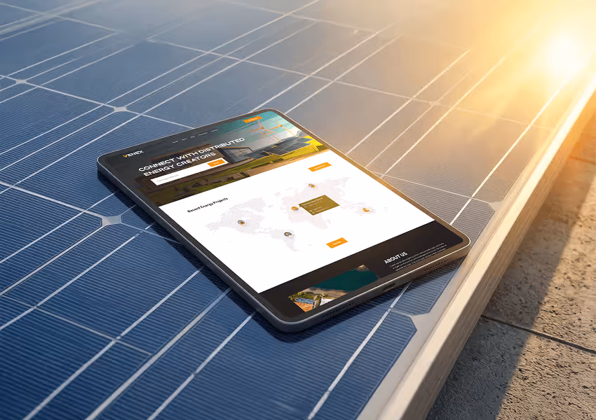
Ted Nash
Founder & CEO @ Yenex
Enhance Your Brand Potential At No Cost!
Expect a response from us within 24 hours
We’re happy to sign an NDA upon request.
Get access to a team of dedicated product specialists.


Why risk it with the wrong partner? Get 100% value and guarantee. Don’t miss out - Secure your brand’s future today.
Why risk it with the wrong partner? Get 100% value and guarantee. Don’t miss out - Secure your brand’s future today.
