
.svg)


Project Description
While the spotlight often falls on performance, the habits behind it are rarely seen. KIMO was built around those everyday moments of movement, recovery, and balance. The project challenged us to create a wellness brand that feels calm, intentional, and modern, replacing industry clichés with a cleaner and more human-centered experience.
Problem
The biggest challenge was breaking away from the visual language commonly associated with supplements. We needed to create a brand that still communicated performance and trust while feeling softer, more refined, and lifestyle-driven. Every element had to balance wellness, movement, and premium appeal without relying on industry stereotypes.
- Problem 1
Creating a wellness identity without using aggressive fitness industry visual cues.
- Problem 2
Balancing performance-focused messaging with a calm and approachable brand personality.
- Problem 3
Designing packaging that feels premium, minimal, and highly recognizable instantly.
Solution
Instead of amplifying performance through noise, we chose clarity. The brand was shaped around the feeling of balanced movement, combining a refined visual identity with thoughtful packaging and lifestyle-inspired storytelling. Every touchpoint was designed to make wellness feel more natural, accessible, and seamlessly integrated into everyday routines.
- Solution 1
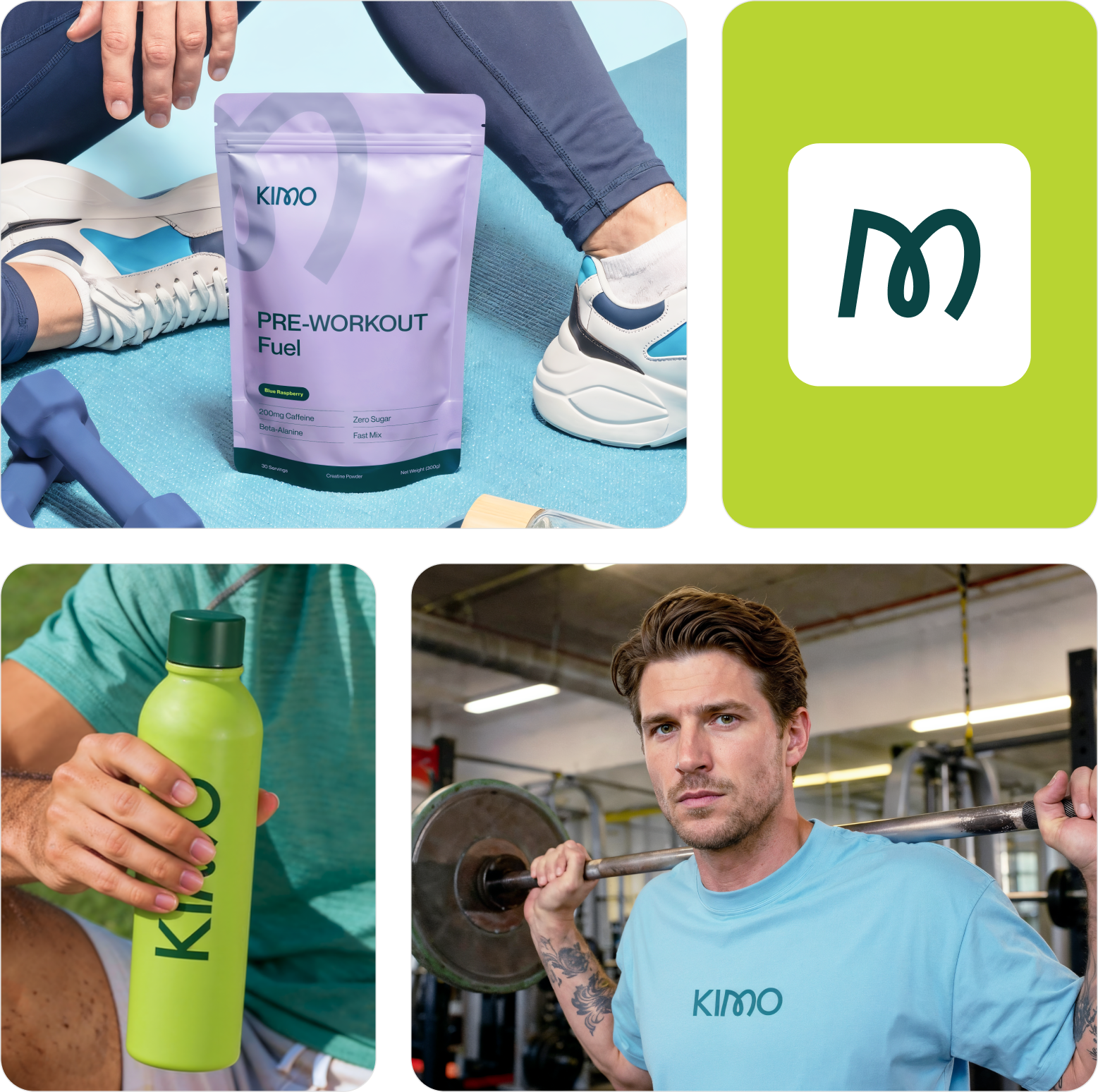
Crafted a calm visual identity inspired by intentional movement and balance.
- Solution 2
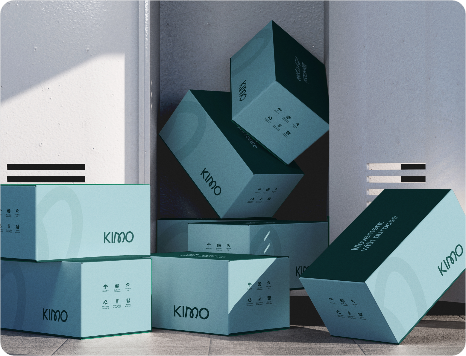
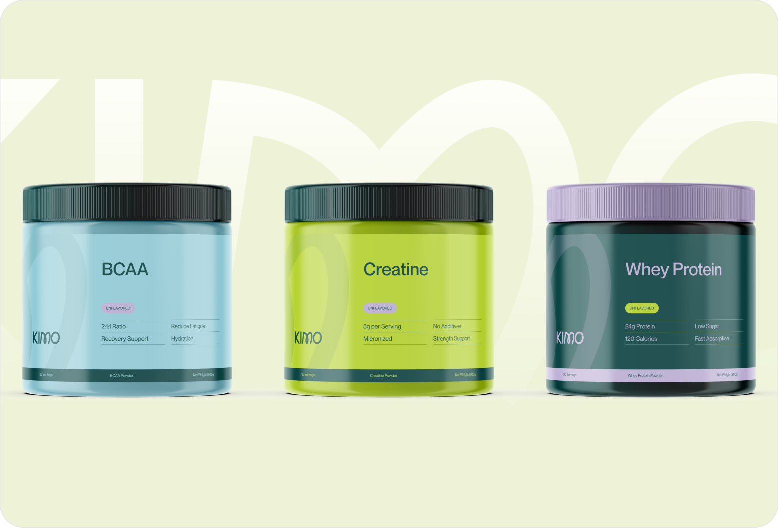
Introduced minimal packaging that stands apart from conventional supplement products.
- Solution 3
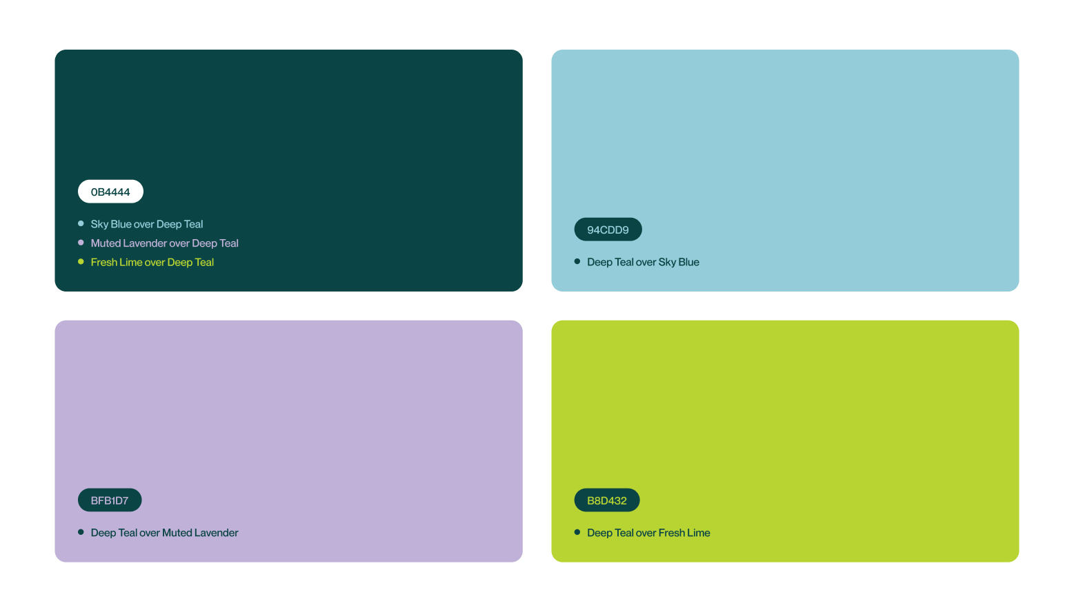
Built a cohesive brand system using clean typography and soft colors.

Design Process
We follow a structured UI/UX design process focused on research, strategy, and seamless execution to create digital products that engage users and drive business results.

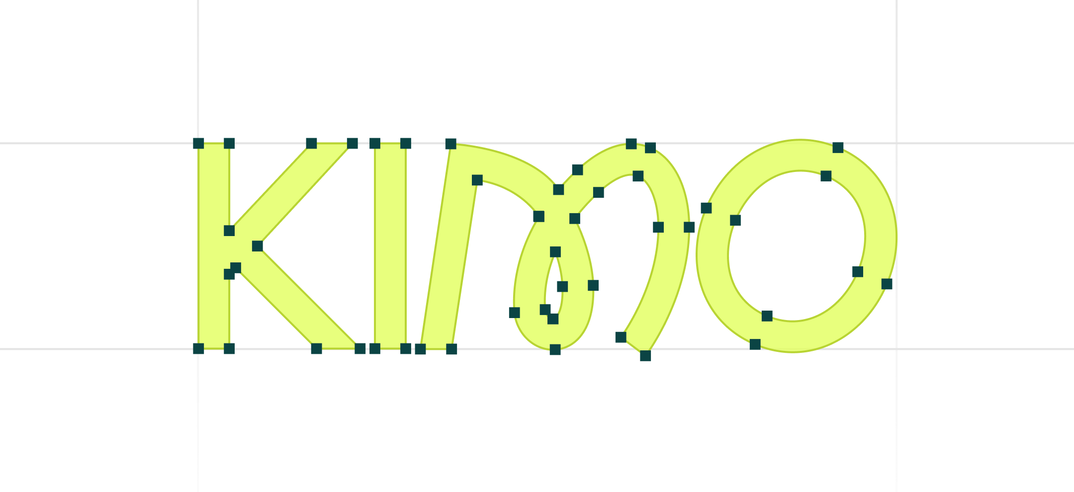
Style Guide & Component
.png)
.png)


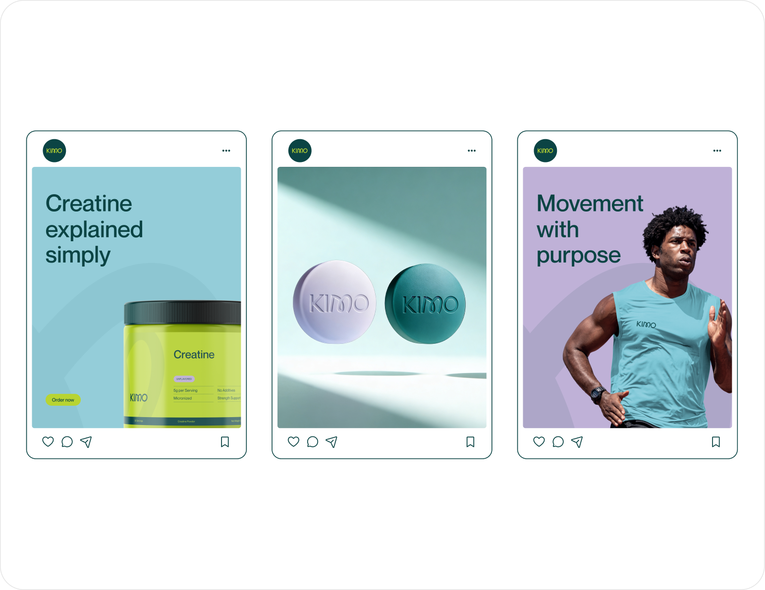
Wireframe
& UI Design
Workflow Scenario
Every decision began with understanding how modern wellness fits into daily routines. From defining the brand's personality to refining its visual language, we explored multiple creative directions, shaped a cohesive identity system, and translated it into packaging that feels premium, approachable, and consistent across every customer touchpoint.

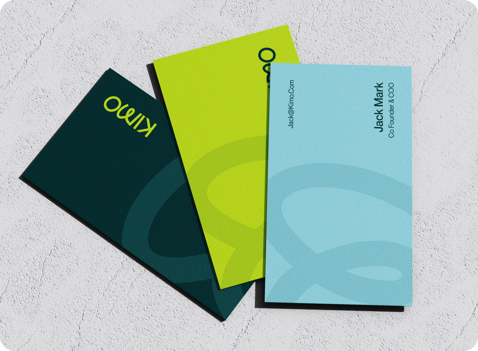
The Result
What emerged was more than a supplement brand. KIMO became a wellness experience built around simplicity, movement, and modern living. The final identity combines clean visuals, thoughtful packaging, and a balanced aesthetic that feels both premium and approachable. Every element works together to create a stronger, more memorable connection with consumers.

Client feedback

.svg)


Success Stories
That Inspire Us
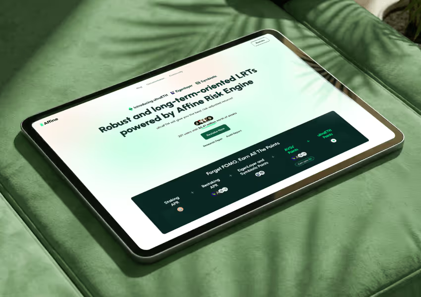
Design Monks delivered beautiful, functional UX that truly drove business results. Their expert team blends aesthetics with real business value, boosting our user engagement and growth. Highly recommended!

Fahim Aziz
Founder @ Backpack (YC), Affine, AlpineX
Fantastic experience working with Design Monks. They did more homework than I expected and actually studied details related to a whole new industry to iterate designs. Super professional, sleek, and fresh design output.

Rifah Tasfia
Product Consultant @ Carbobon

I've had the pleasure of collaborating with Design Monks for a while now on my new project. They're lightning-quick in addressing any questions or feedback I have, and they consistently go the extra mile to make sure I'm thrilled with the final outcome. I wholeheartedly endorse them
.avif)
Ted Nash
Founder & CEO @ Yenex
Enhance Your Brand Potential At No Cost!
Expect a response from us within 24 hours
We’re happy to sign an NDA upon request.
Get access to a team of dedicated product specialists.


Why risk it with the wrong partner? Get 100% value and guarantee. Don’t miss out - Secure your brand’s future today.
Why risk it with the wrong partner? Get 100% value and guarantee. Don’t miss out - Secure your brand’s future today.
