
.svg)


Key Takeaways
- Simple, clear design helps patients access healthcare without confusion or stress.
- Accessibility ensures telehealth works for elderly and disabled users too.
- AI features like chatbots and smart scheduling reduce friction significantly.
- Security and HIPAA compliance must be built into every design decision.
- Always test with real users before launching any telehealth product.
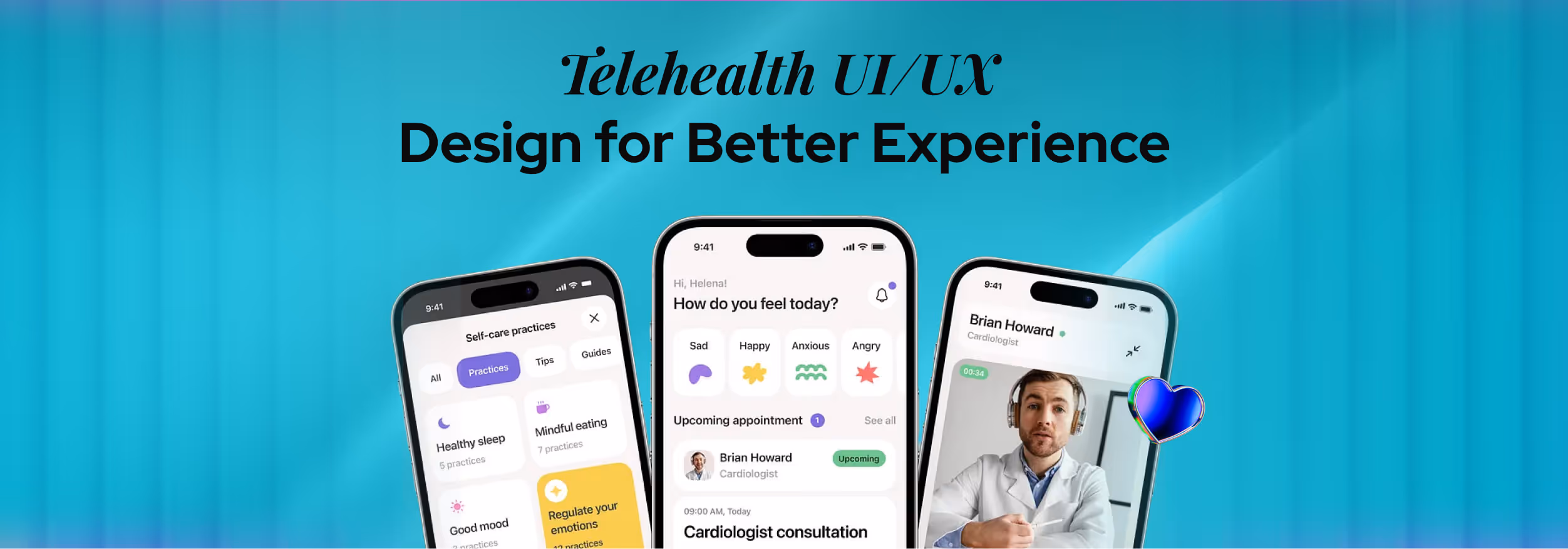
A missed click can mean a missed doctor. That’s how sensitive digital healthcare really is. Telehealth UI/UX design plays a big role in making sure patients can book, connect, and get help without confusion or stress. When everything feels simple, people trust the experience more.
Many healthcare apps look advanced but feel hard to use. Patients struggle to find buttons, join calls, or understand their reports. This leads to frustration, missed appointments, and less trust in digital care.
But it doesn’t have to be this way. With the right design, telehealth can feel smooth, safe, and easy for everyone. Let’s explore how better UX can completely change the way people experience healthcare online.
What Is Telehealth UI/UX Design?
Telehealth UI/UX design means designing healthcare apps and platforms that are easy to use, clear to understand, and safe for patients and doctors. It focuses on helping users complete tasks like booking appointments, talking to doctors, and checking reports without confusion.
To understand this better, let’s break it into two parts. UI (User Interface) is what users see on the screen, like buttons, text, and layout. UX (User Experience) is how easy and smooth it feels when they use the app.
Good telehealth UI/UX design combines both, so users can navigate the app without errors or stress. This is especially important in healthcare because users may already feel worried or unwell. They should not have to struggle with the app.
That is why telehealth platforms are designed to be simple, fast, and easy for everyone, including people who are not very comfortable with technology.
Telehealth UI/UX design is also different from regular app design. In many apps, small issues may not matter much. But in healthcare, even a small confusion can lead to missed appointments or delays in care.
Because of this, telehealth design focuses more on clarity, safety, and ease of use at every step.
Telehealth vs Telemedicine UX
To understand telehealth better, it is important to know how it is different from telemedicine. These terms are often used together, but they do not mean the same thing.
Telemedicine mainly focuses on online doctor consultations. It is about communication between patients and doctors through video or chat. Telehealth is a broader system. It includes consultations, appointment booking, medical reports, health tracking, and more.
For example, telemedicine is just one step where a patient talks to a doctor online. Telehealth covers the full journey, including booking the appointment, joining the call, and managing health records afterward.
Because telehealth includes many features, its UX design needs to be more structured. Users should be able to move easily between different sections without getting confused.
In simple terms, telemedicine is a part of telehealth. Both require strong UI/UX design to create a smooth and user-friendly healthcare experience.
Core Telehealth UX Features Every Platform Needs
A successful telehealth platform is not just about technology. It depends on how easy and clear the experience is for users.
The right UX features help patients and doctors complete tasks quickly without confusion. These features also improve patient experience, reduce errors, and make healthcare more accessible.
Let’s look at the most important features every telehealth platform should have:
Appointment Scheduling UX
Booking an appointment is usually the first thing a user does on a telehealth platform. This step should feel quick and easy, without too many steps or confusing options.
A well-designed scheduling system shows a clear calendar, available time slots, and gives instant confirmation after booking. It also sends reminders so users do not forget their appointments.
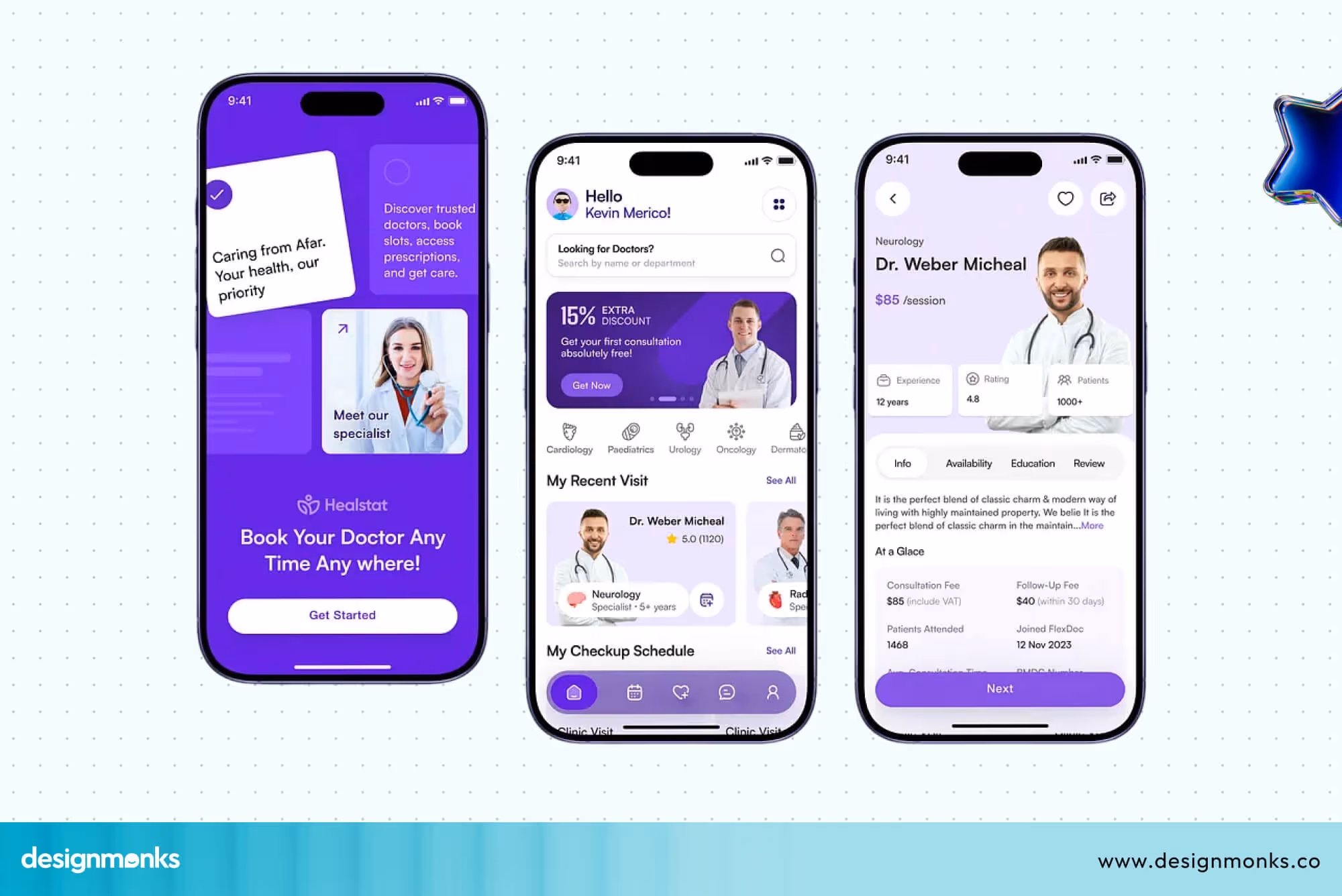
If this process feels complicated, users may leave before completing it. That is why designers focus on making the booking flow simple, clear, and fast so that users can schedule appointments without any difficulty.
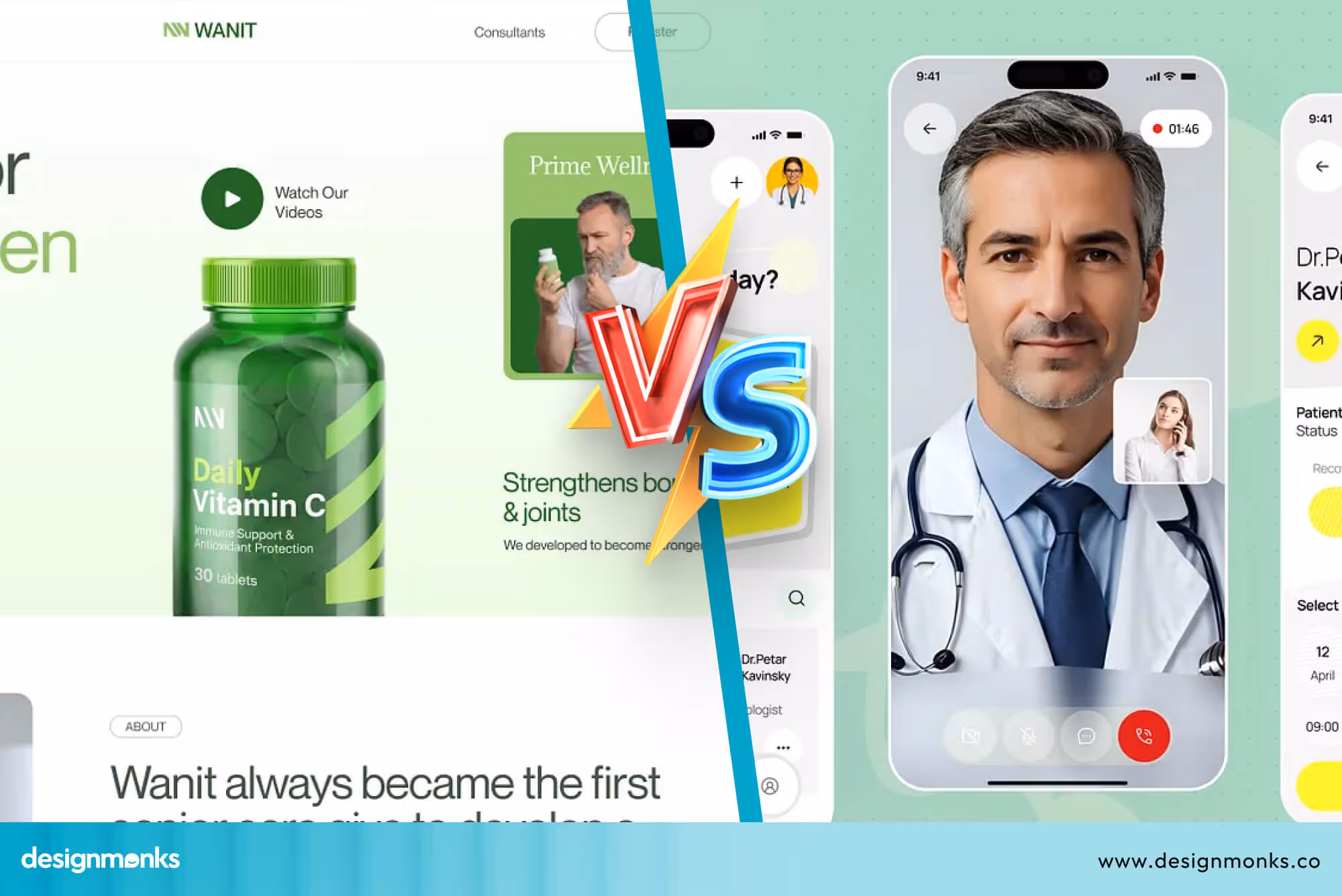
Video Consultation Interface
Video consultation is the core feature of most telehealth platforms. This is where patients and doctors connect directly, so the experience must be smooth and reliable. The interface should allow users to join calls quickly, with clear audio and video quality.
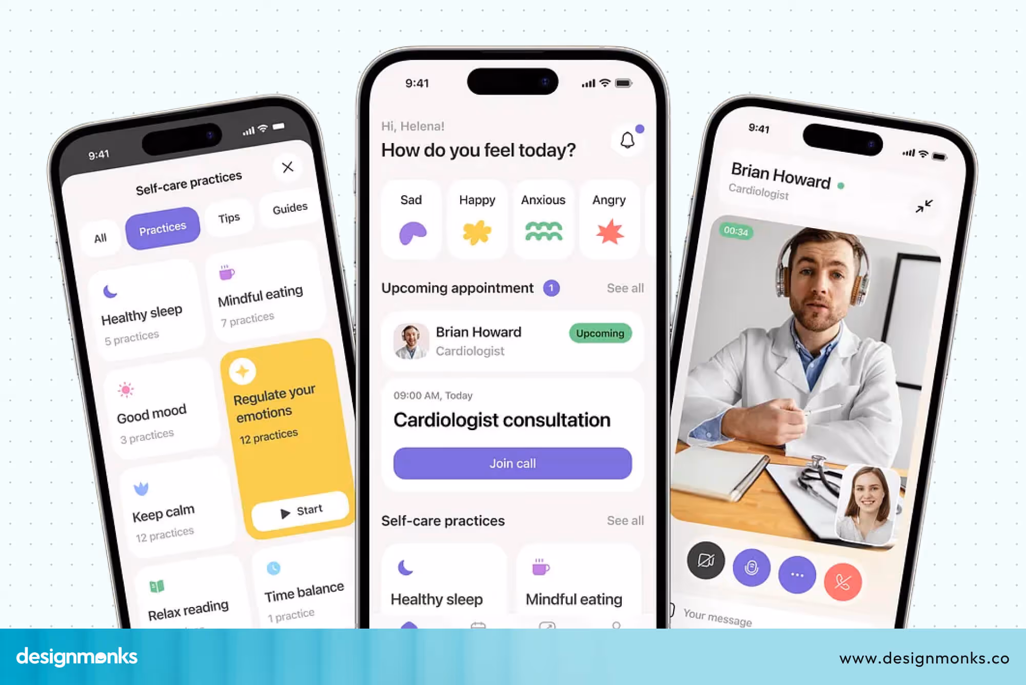
Controls like mute, camera on or off, and ending the call should be easy to find and use. During a medical consultation, users should not have to think about how the system works.
Everything should feel straightforward so they can focus on the conversation.
Secure Messaging & Patient Communication
Not every situation requires a video call. Sometimes patients just want to ask a quick question or share an update. Secure messaging makes this possible by allowing patients and doctors to stay connected even outside appointments.
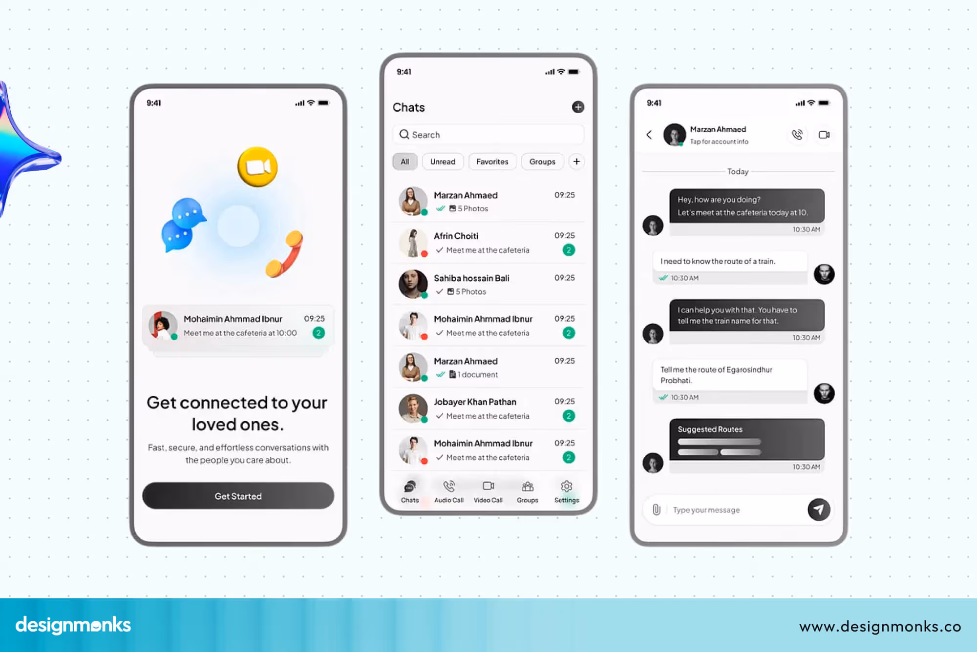
The messaging system should feel simple, like a regular chat, but it must also protect user data. Easy communication helps patients feel supported and ensures that care continues even after the consultation is over.
Medical Records & Patient Dashboard UX
A patient dashboard brings all health information into one place. It allows users to view reports, prescriptions, test results, and their medical history without searching through different sections.
The design should present this information in a clear and organized way so users can understand it easily.
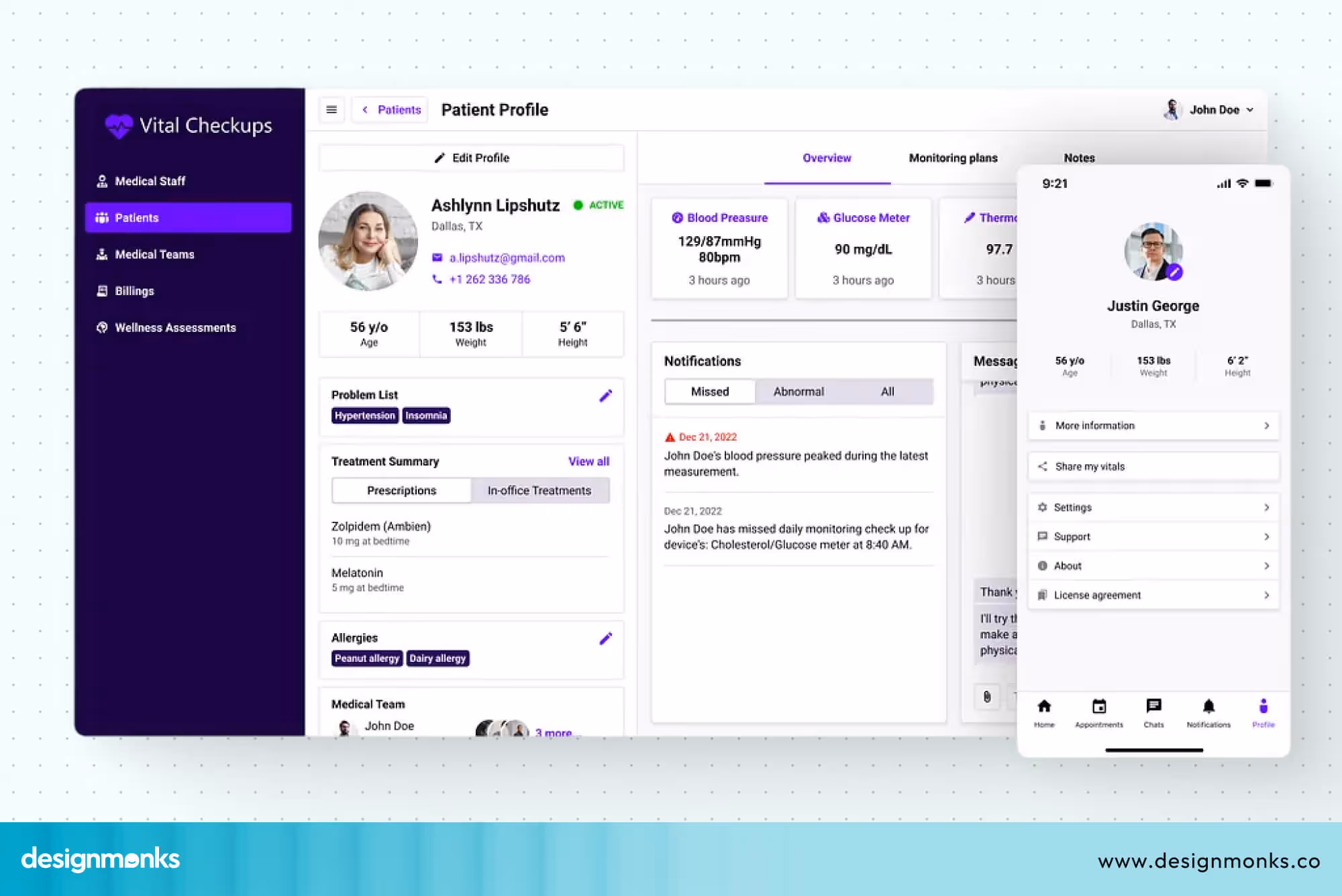
Medical terms can often be confusing, so using simple language is important. When users can quickly find and understand their health data, they feel more in control of their care.
These features work together to create a smooth telehealth experience. When each part is designed with clarity and simplicity, users can move through the platform with confidence and ease.
Accessibility in Telehealth UX
Accessibility is not an add-on, it is a core part of good UX design. A telehealth platform should be usable by everyone, including elderly patients, people with disabilities, and those who are less familiar with technology.
Building with accessibility in mind ensures no one is left out of digital healthcare. Key accessibility features you must include:
- Bigger Buttons: Larger tap targets and buttons make it easier for users with limited motor control or shaky hands to interact without frustration.
- Readable Font Clean: High-contrast fonts in adequate sizes reduce strain and improve legibility for users with low vision.
- Voice Support: Voice commands and audio prompts allow hands-free interaction, supporting users who find typing difficult or impossible.
- Screen Reader Compatibility: Full compatibility with screen readers like NVDA(Windows) and VoiceOver(Apple) ensures visually impaired users can navigate every part of the platform.
- Elderly-Friendly Navigation: Simplified menus, larger icons, and clear step-by-step flows make the experience less overwhelming for older adults.
When telehealth platforms prioritize accessibility, they extend the reach of quality healthcare to those who need it most.
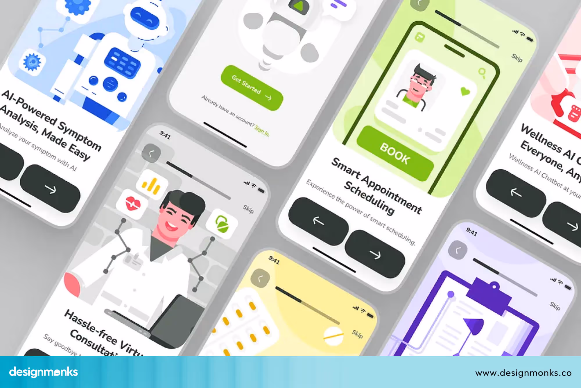
AI-Powered Telehealth UX
Accessibility makes healthcare reachable. AI makes it smarter. Once users can comfortably navigate a platform, AI takes the experience a step further by making it faster, more personal, and more helpful at every stage.
Take the AI symptom checker, for example. Instead of searching symptoms online and landing on scary results, users simply describe how they feel inside the app and get a calm, clear assessment right away.
Then there's the chatbot, available 24/7 to answer questions about medications, appointments, or reports. No waiting, no hold music. Just quick answers, and a handoff to a real doctor when it actually matters.
Smart scheduling goes beyond a calendar picker. It suggests the best appointment slots based on the user's history and sends reminders automatically. So fewer appointments get missed. And the personalized dashboard ties it all together. Instead of showing every user the same screen, it surfaces what actually matters to them, such as upcoming visits, recent results, and active prescriptions.
It all works quietly in the background. The user just experiences something that finally feels like it was built for them.
Telehealth Compliance & Security UX Considerations
In telehealth, users are trusting an app with very personal medical information. So security and privacy are not just features, they are the foundation of good design. If users don’t feel safe, they won’t use the product, no matter how good it looks.
Healthcare rules also shape every design decision. A telehealth app must be easy to use, but it also must protect data at every step, from login to sharing reports. This is where compliance standards like HIPAA come in, setting clear rules for how patient information should be handled.
To design better telehealth experiences, you need to focus on three key areas of security and privacy UX:

HIPAA-Compliant UX Design
HIPAA is a healthcare privacy rule that protects patient data. It makes sure sensitive medical information is only accessed by authorized people and is stored safely. In UX design, this means building systems that protect user data without making the experience confusing.
It includes clear permission controls, safe data handling, and simple ways for users to understand that their information is protected. When done right, it helps users feel confident while using the platform.
Designing Secure Authentication Flows
Secure login is the first step in protecting a telehealth platform. This is where users prove their identity before accessing any personal health information. A strong authentication system usually includes:
- Passwords for basic access
- OTP verification for extra security
- Fingerprint or face recognition for faster login
- Multi-factor authentication for sensitive actions
These steps help ensure that only the right person can access medical data, while still keeping the process smooth and easy.
Privacy-First Healthcare Interfaces
Privacy-first design focuses on being clear and honest with users about their data. People should never feel unsure about what is happening behind the screen. This means the interface should clearly show:
- What data is being collected?
- Why is it needed?
- How will it be stored and protected?
When users understand how their information is handled, they feel more comfortable using the platform. This transparency builds long-term trust, which is very important in healthcare apps.
Telehealth UX Design Process (Step-by-Step)
Building a telehealth product is not random. It follows a clear and structured process. Each step helps reduce confusion, improve usability, and make sure the final product works well for both patients and doctors.
A good UX process also reduces mistakes later in development and improves the overall experience:
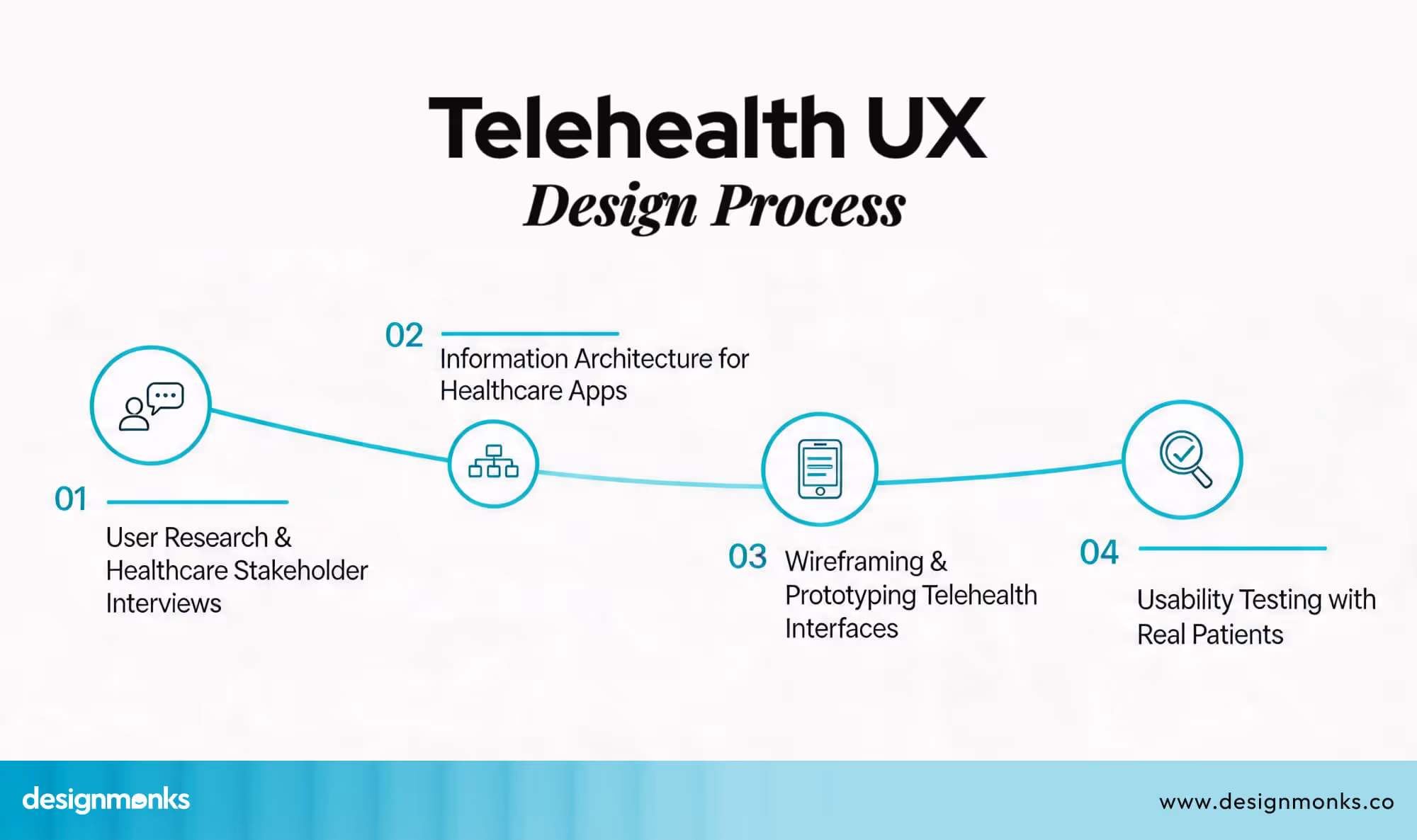
User Research & Stakeholder Interviews
The process starts with understanding the people who will use the product. Designers talk to patients, doctors, and other healthcare staff to learn about their needs and challenges.
Patients may struggle with booking or understanding reports, while doctors may need faster access to patient data. By studying these real problems early, designers can build solutions that actually help users instead of guessing what they need.
Information Architecture for Healthcare Apps
Once the needs are clear, the next step is organizing the entire system in a simple way. This is called information architecture. It decides how everything is structured inside the app.
For example, a telehealth app usually includes sections like appointments, reports, chat, and a user profile. The goal is to make sure users can find anything in just a few taps without feeling lost or confused.
Wireframing & Prototyping Telehealth Interfaces
Wireframes are basic sketches of how the app will look and function. They do not include final colors or design details. Instead, they focus on layout and structure.
These early designs help teams test ideas before building the actual product. Prototypes make it possible to see how users will move through the app and whether the flow feels natural or needs improvement.
Usability Testing with Real Patients
After designing and building early versions, real users are invited to test the product. This step is very important because it shows how people actually use the app in real situations.
During testing, designers observe where users get confused, what steps feel difficult, and what features may be missing. Based on this feedback, improvements are made to make the experience smoother and more user-friendly.
From research to testing, this entire process ensures that telehealth products are built with real user needs in mind. Each step helps create a smoother user journey and improves the overall healthcare experience.
Who Needs Telehealth UI/UX Design Services?
Telehealth UI/UX design services are needed by organizations that want to build or improve digital healthcare products. The goal is to make healthcare apps easier to use, more reliable, and more user-friendly for patients and doctors. Key groups that need these services:
- Healthcare startups: For design, clear, simple products from the start, and build user trust early
- Hospitals going digital: They need it to convert offline services into easy-to-use online systems for patients
- Telemedicine platforms: For improving booking, video consultations, and report access without confusion
- Healthtech SaaS companies: In order to build scalable products that work smoothly for doctors, clinics, and patients
In simple terms, anyone building a digital healthcare solution needs a telehealth UI/UX design to make their product clear, trusted, and easy to use.
Design Monks Telehealth UI/UX Design Services
Design Monks focus on building telehealth products that are easy to use. Our goal is to reduce confusion and make every step feel smooth, from booking an appointment to talking to a doctor.
Along with this, we also provide ready app UI kits and structured design systems that help teams build faster without losing consistency. This is especially useful in healthcare products where small design mistakes can affect user trust and experience.
To understand how we approach this in practice, it’s important to look at the core services behind telehealth product design:
Telehealth Product UX Strategy
Our process always starts with the most important part of any business, the UX strategy. Before designing anything, we spend time understanding the product, the users, and the healthcare goals behind it. We look at how patients and doctors will use the platform and what problems they currently face.
This step helps us define the product clearly. It also ensures we are not adding unnecessary features. Instead, we focus on solving real user problems simply and practically.
UX Research for Healthcare Applications
We believe good design starts with understanding people. That is why UX research is a key part of our process. We talk directly with patients, doctors, and nurses to learn how they interact with healthcare systems.
This helps us identify real issues like confusing workflows, missing information, or difficult navigation. Once we understand these problems, we design solutions that are easier to use and more helpful in real situations.
Telehealth App UI Design
After research, we move into UI design, where we create the actual screens of the app. This includes layouts, buttons, colors, typography, and overall structure.
Our focus is always on clarity and simplicity. We make sure users can easily understand what to do without needing instructions. In healthcare apps, this is very important because users should be able to complete tasks quickly and without confusion.
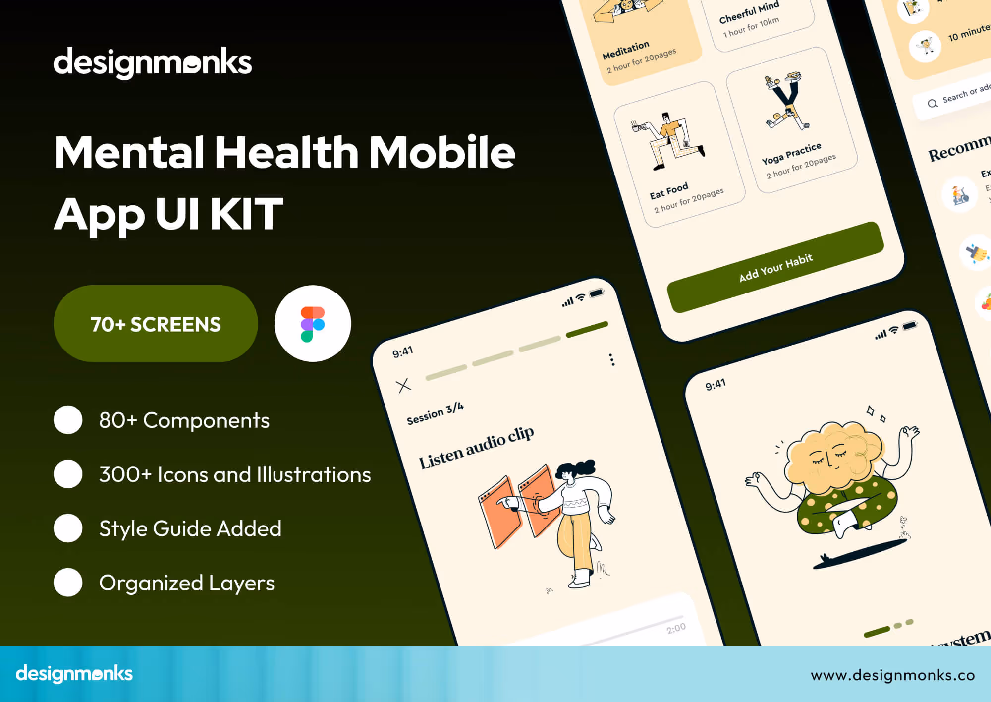
Check our Mental Heal App UI Kit here.
Usability Testing for Healthcare Platforms
Before any product goes live, we test it with real users. This step helps us see how people actually use the app in real situations.
We ask users to complete tasks like booking appointments or joining video calls, and observe where they face difficulty.
Based on this feedback, we improve the design. This helps us remove confusion and make the experience smoother and more reliable for both patients and healthcare providers.
Healthcare UX Expertise & Process
Our work is shaped by a deep understanding of healthcare workflows and user behavior. We combine this expertise with a structured, step-by-step process from strategy to testing and ensuring every design decision improves usability, trust, and real-world outcomes.
We also follow healthcare best practices like accessibility, data clarity, and error prevention to reduce user risk. At every stage, we work closely with stakeholders and iterate quickly, so the product stays aligned with both user needs and business goals.
Telehealth UX Case Studies
Real-world examples help us understand how UX design improves healthcare apps. In telehealth, even small design changes can have a big impact on how easily people access care, manage health, and interact with doctors.
Teladoc Health redesign
Teladoc Health improved its digital experience by redesigning its platform into a single integrated app. Earlier, users had to switch between different services for primary care, mental health support, and chronic condition management. This created confusion and made the experience harder to use.
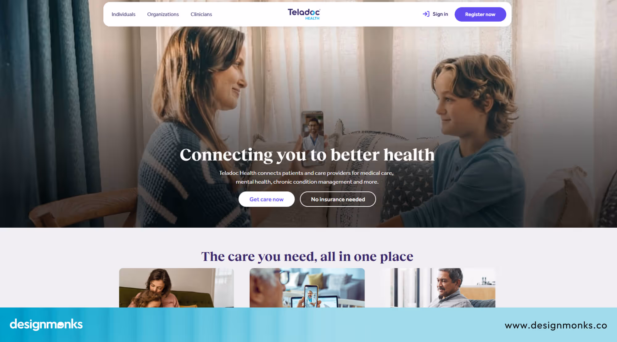
To solve this, Teladoc combined everything into one place. Now users can access all healthcare services in one place, including consultations, mental health support, and ongoing care.
This change made navigation easier and helped users manage their health more smoothly, improving overall usability and engagement.
DokiCare telehealth app case study
The DokiCare telehealth app is designed to make healthcare access fast and simple. It focuses on connecting patients with doctors anytime, without long waiting times or complex steps.

Users can quickly book appointments or request medical advice with minimal effort. The design focuses on clear communication, simple flows, and fast access to care.
This makes the experience especially useful for users who need immediate help and do not want to deal with complicated steps.
Design Monks Mental Health UI Kit
Design Monks created an AI-powered mental health UI kit that helps teams build healthcare apps faster and more consistently. It includes over 70 ready screens, 80 reusable components, and 300+ icons and illustrations.
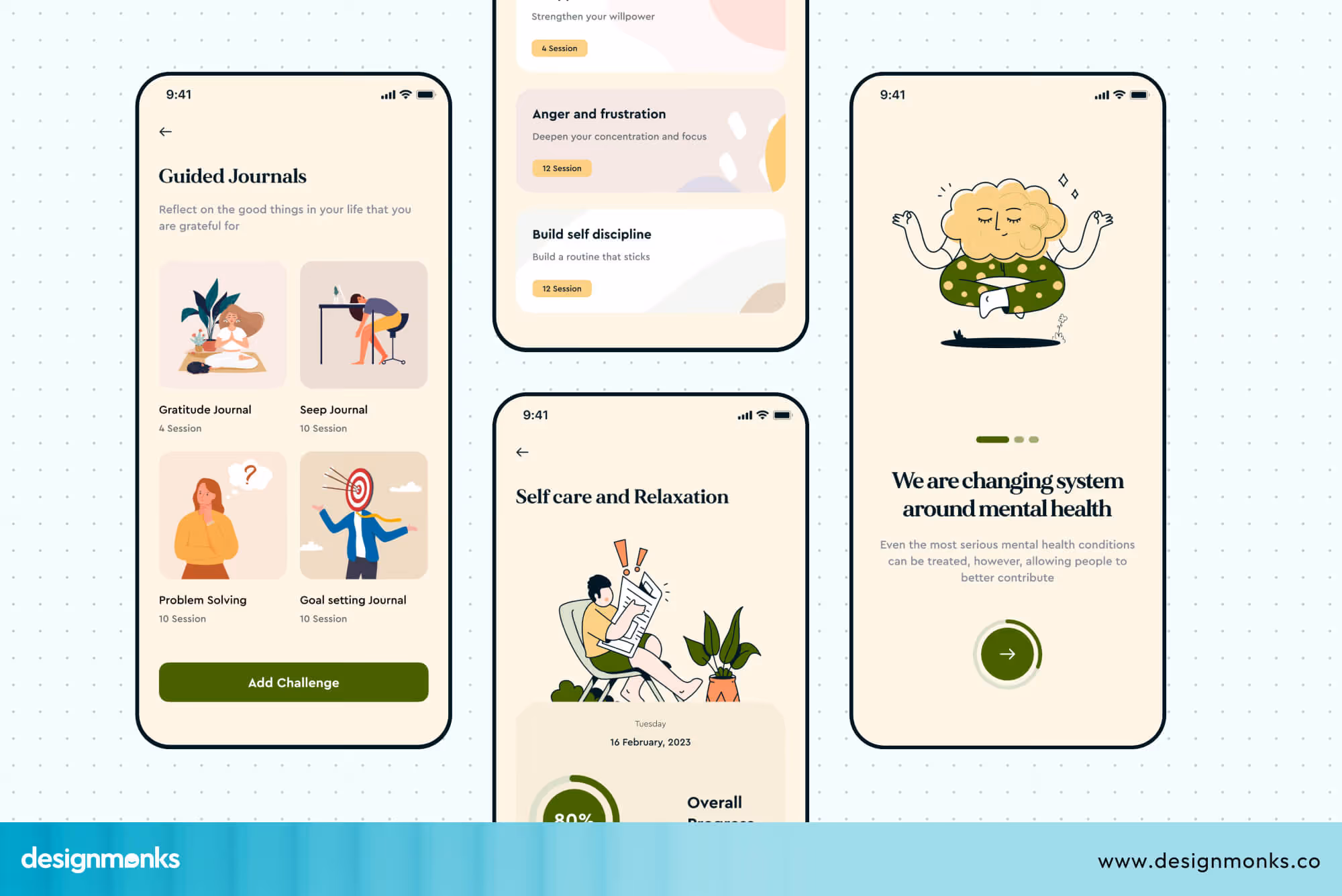
Instead of designing everything from scratch, teams can use these ready elements to build faster while keeping the experience consistent. This reduces design effort and helps create user-friendly healthcare apps that feel clean, calm, and easy to use.
These examples clearly show how UX design improves telehealth products. In each case, the main problems were confusion, complexity, or slow access.
After redesigning the experience, users found it easier to complete tasks and stay engaged. They show how design decisions lead to real improvements in healthcare experiences.
Common Mistakes in Telehealth UI/UX Design
Before improving a telehealth product, it’s important to understand where most designs go wrong. Many issues come from ignoring real user behavior and skipping proper testing. These mistakes can reduce trust, usability, and overall patient experience:
- Complicated onboarding that confuses first-time users
- Poor video call experience with unclear controls
- Important features like reports or appointments are hard to find
- No reminders for appointments or follow-ups
- Not testing the app with real users before launch
Telehealth UI/UX Design: Do’s and Don’ts
Do’s (Best Practices)
These are the key things to follow for a smooth and user-friendly experience:
- Keep the interface simple and easy to understand
- Make appointment booking quick and smooth
- Use clear labels and instructions for every action
- Ensure fast performance and reliable video calls
- Design for all users, including non-tech and older users
Don’ts (What to Avoid)
These are common design mistakes that can confuse or frustrate users:
- Don’t use complex medical terms without explanation
- Don’t overload screens with too much information
- Don’t hide important actions like booking or joining calls
- Don’t create long or confusing user flows
- Don’t ignore data privacy and security
FAQs
Why is UX important in telemedicine apps?
UX is important in telemedicine because it helps patients use the app easily without confusion. A simple and clear design reduces stress, especially during health-related situations. It also improves trust and makes users more likely to continue using the platform.
What makes a telehealth app user-friendly?
Telehealth can be user-friendly by keeping the design simple, clear, and easy to navigate. Users should be able to book appointments, join video calls, and check reports without confusion. Fast loading, clear instructions, and easy access to features make the experience smooth and comfortable.
How long does telehealth product design take?
Telehealth product design usually takes 4 to 16 weeks. Simple apps may take around 4–6 weeks, while complex platforms can take 12–16 weeks. This includes research, design, testing, and final improvements.
Conclusion
Telehealth UI/UX design is what turns complex healthcare systems into simple, easy-to-use experiences. When apps are clear and user-friendly, patients can book, connect, and manage their health without stress.
This not only improves access to care but also builds trust in digital healthcare. As telehealth continues to grow, focusing on better UX will be key to creating safe, smooth, and reliable experiences for everyone who depends on it.

.avif)
.avif)
.avif)
.avif)


.avif)
.avif)
.avif)
.avif)


.avif)


