.svg)


Key Takeaways
- Best UX sites like Airbnb and Medium guide users naturally with clarity.
- Studying top examples like Stripe and Notion helps agencies apply design lessons.
- Consistency, accessibility, and performance are essential for enjoyable user experiences.
- Flexible, clear interfaces empower users while reducing confusion and errors.
- Iteration, testing, and benchmarking ensure UX improves continuously and reliably.
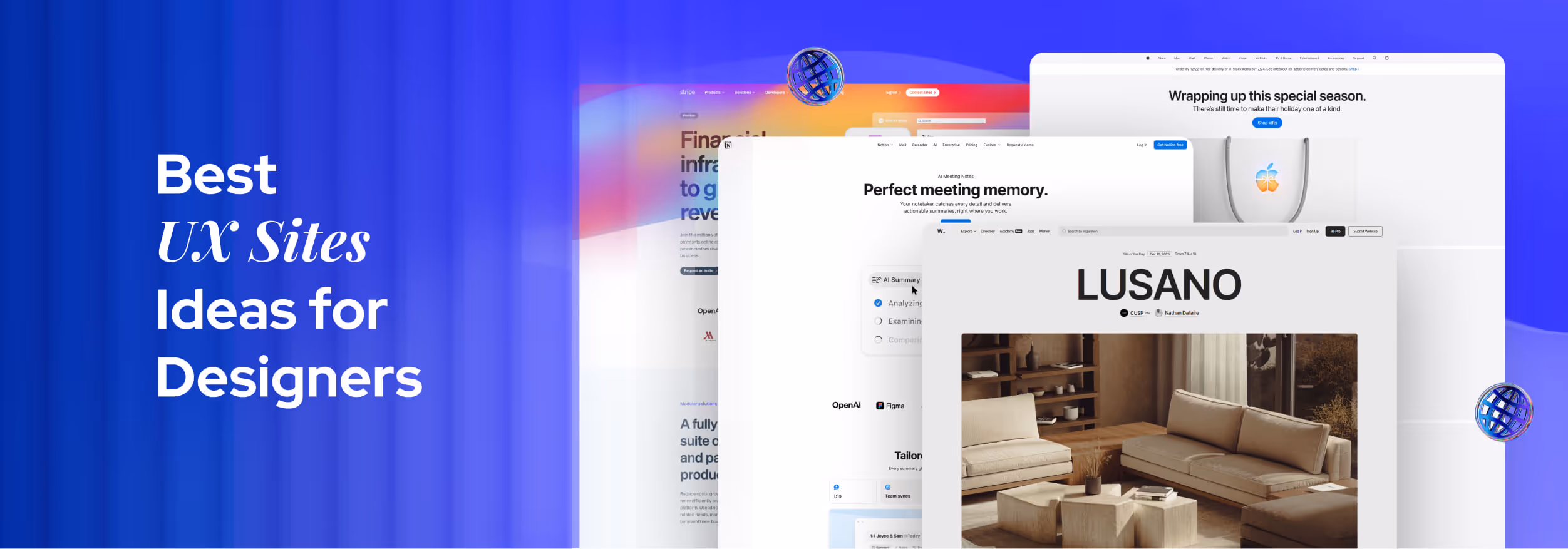
Smooth, simple, and smart, these are the signs of the best UX sites in action. From the first interaction, users are guided through a straightforward and usable experience.
Great user experience isn’t about flashy effects or crowded pages. It’s about helping people find what they need quickly. Clear menus, readable text, and intuitive layouts work together so visitors feel confident, comfortable, and in control while exploring the site.
In this blog, we’ll look at the best UX sites like Airbnb, Medium, Adobe Color, and others. You’ll discover why they succeed, what design choices matter, and simple lessons anyone can apply to create friendlier websites.
What Defines a “Best UX” Site in 2026
The best UX site in 2026 makes browsing simple, smooth, and enjoyable. It’s the site where visitors can find what they need quickly, understand information easily, and complete tasks without confusion.
Key features of such sites are clear navigation, readable content, fast performance, and a design that guides users naturally. Elements like user experience (UX), accessibility, and conversion rate optimisation (CRO) work together to create a seamless experience that keeps users engaged.
Top UX sites often follow a mobile-first approach, designed for smartphones and tablets. This not only makes pages load faster, sometimes up to 50% quicker. It also ensures users feel comfortable and confident on any device.
By blending simplicity, accessibility, and speed, these sites turn casual visits into smooth, satisfying interactions.
Examples of Top UX Websites & What They Do Right
Some websites make users stop and think, while others guide them naturally from the first moment. That ease comes from clear layouts, smooth navigation, and thoughtful design. The examples below show how this approach works in real websites:
Stripe: Seamless developer-centric UX
Stripe is an online payment platform that helps websites and apps accept payments safely and easily. What makes Stripe one of the best UX sites is how clearly it explains complex payment tasks. The interface is clean, steps are well organised, and the documentation guides users one action at a time.Users always know what to do next, which reduces mistakes and saves time. Even someone new to Stripe can set up payments without feeling lost or overwhelmed.
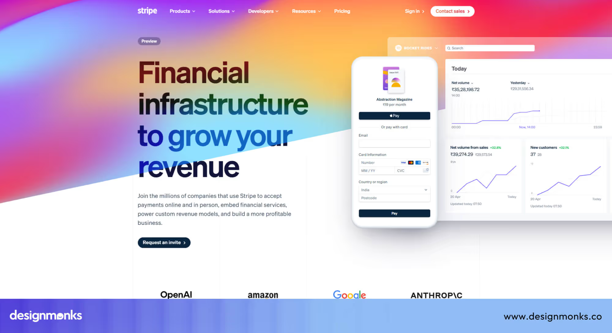
Lesson: When complex systems are explained clearly with step-by-step guidance, users feel confident and in control instead of confused.
Airbnb: Humanised navigation & booking experience
Airbnb’s website makes the process of finding and booking a house feel natural and stress-free. The experience stands out because each step is clear and supportive. Filters are easy to use, maps update smoothly, and helpful prompts guide users as they explore homes and confirm their stay.
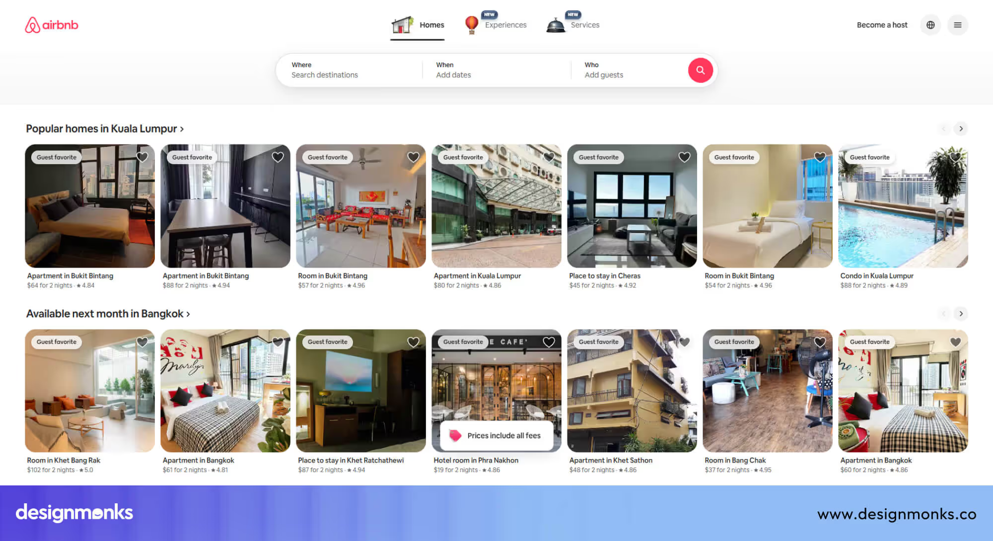
From browsing houses to completing a booking, users always know where they are and what to do next.
Lesson: When navigation feels human and reassuring, even multi-step actions like booking a house become simple and comfortable for users.
Apple: Brand-driven precision in UX
Apple’s website reflects the same care and precision found in its products. Layouts are clean, navigation stays consistent, and interactions feel smooth and deliberate. Subtle animations guide attention without distraction, while familiar patterns help users move confidently from page to page.
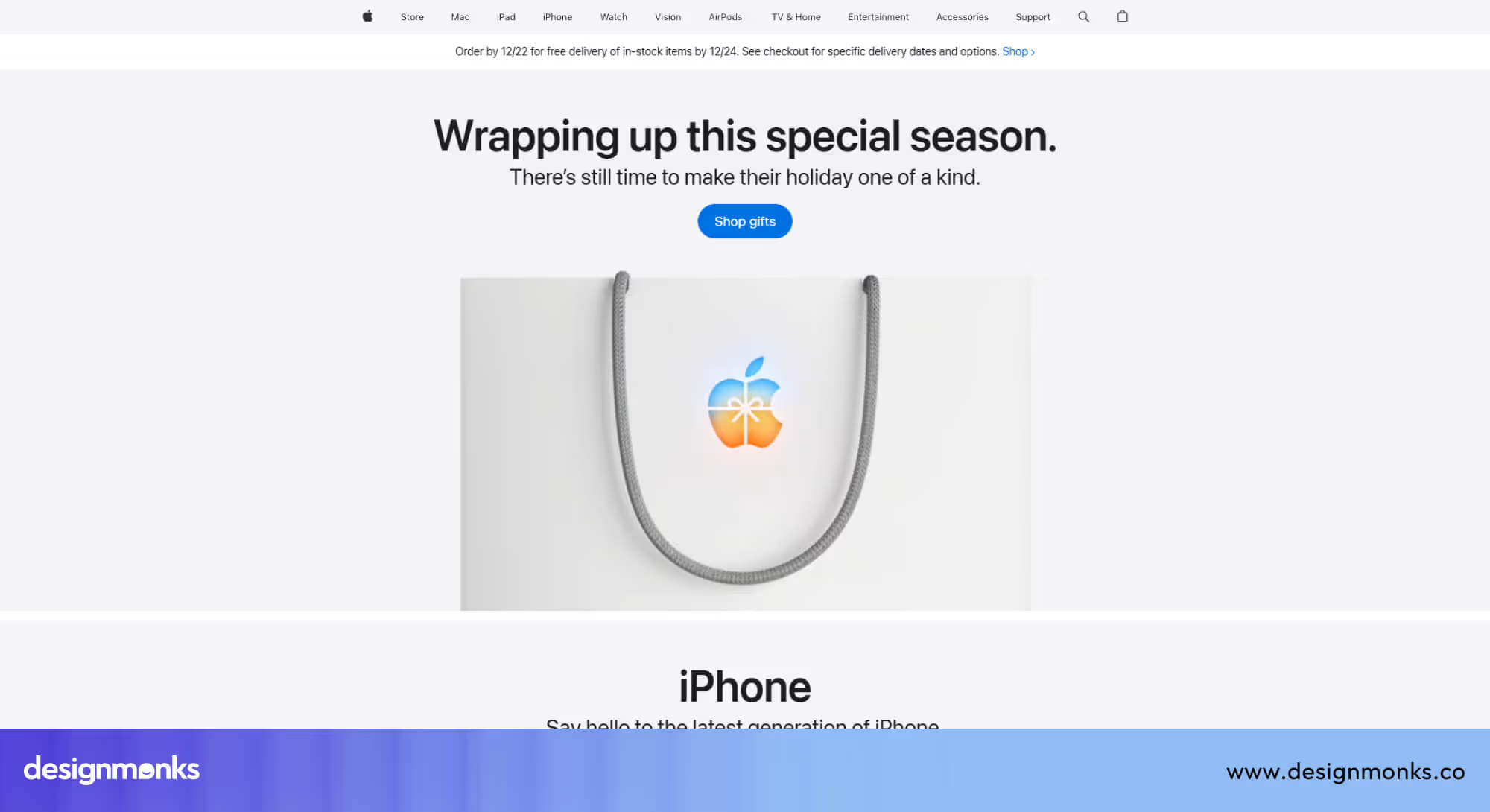
Nothing on the Apple website feels accidental, which makes the experience calm, predictable, and trustworthy.
Lesson: When every detail is intentional and consistent, users feel confident, trust the brand, and enjoy a more polished experience.
Notion: Customisation, flexibility & user control
Notion gives users the freedom to create and organise their workspace exactly how they want, while keeping the interface clean and intuitive. Everything from pages and blocks to templates is clearly structured, so users can add, move, or adjust content without feeling lost.
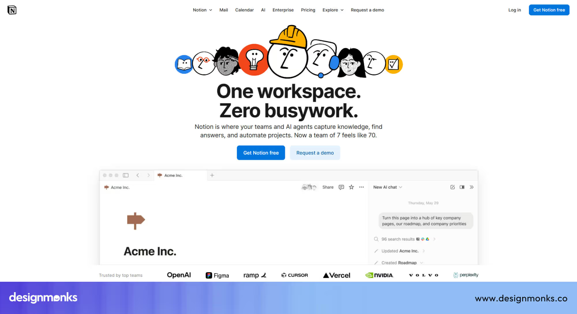
Drag-and-drop functionality, keyboard shortcuts, and pre-built templates of Notion make complex projects manageable. The platform grows with the user, offering advanced features without ever overwhelming newcomers.
Lesson: When flexibility is combined with a clear, organised structure, users feel empowered, confident, and more likely to engage with the product long term.
Adobe Color: Creative inspiration made simple
Adobe Color makes exploring, creating, and saving color palettes effortless for designers of all levels. The interface is clean and uncluttered, guiding users through tasks without distractions. Interactive tools let users experiment with color combinations, generate themes from images, and save palettes for projects seamlessly.
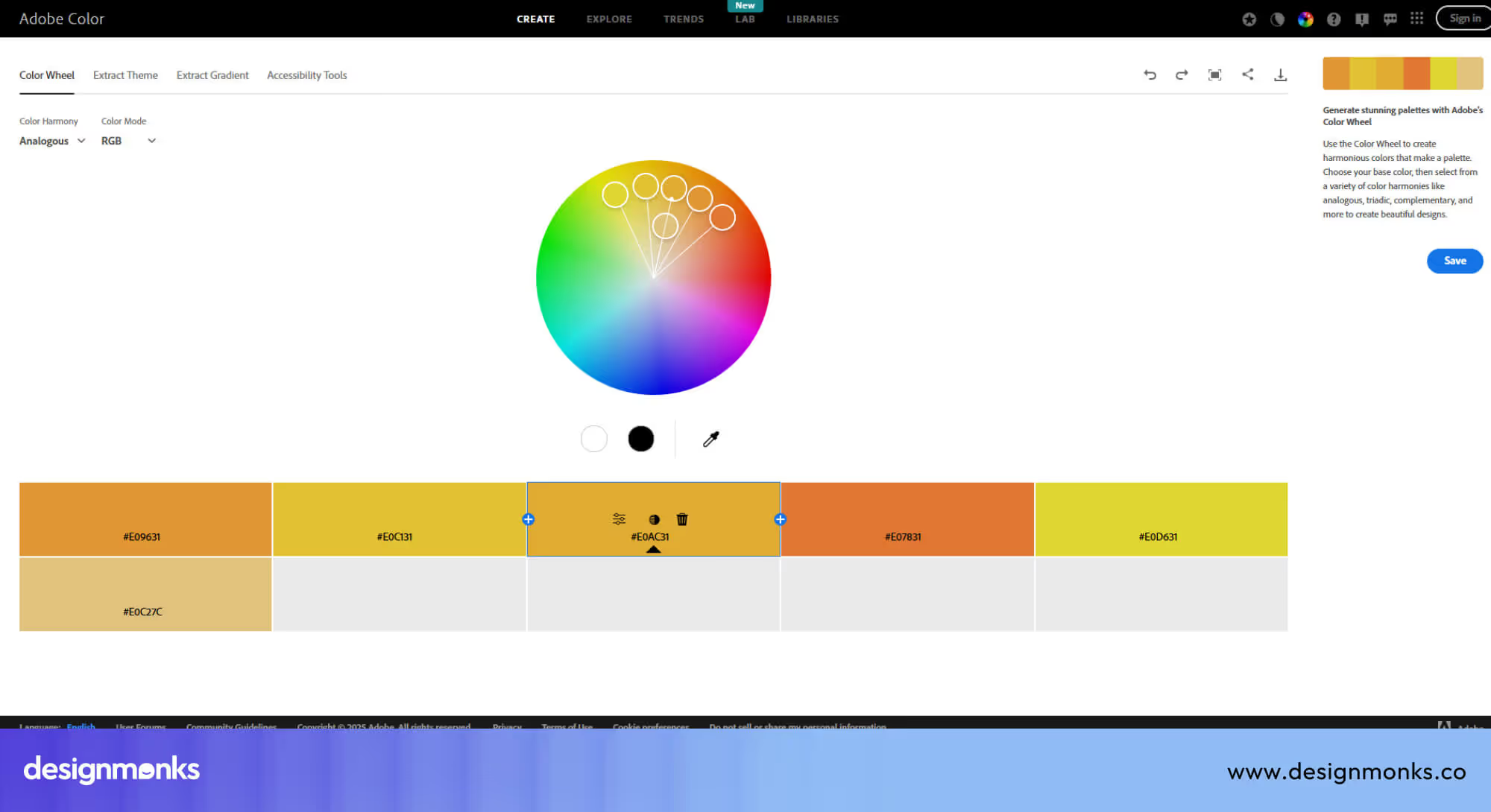
Whether a beginner is learning about color harmony or a professional is preparing assets for a client, every interaction is smooth and intuitive. The platform balances power and simplicity, helping users focus on creativity instead of struggling with the interface.
Lesson: Clear, focused tools and a simple workflow make even complex creative tasks approachable and enjoyable.
Medium: Readable, distraction-free content
Medium prioritizes the reading experience above all else. Clean layouts, well-spaced typography, and smooth scrolling make long-form content easy to digest. The platform minimizes visual distractions, so users can focus fully on the story, while subtle cues and intuitive navigation help them discover related articles naturally.
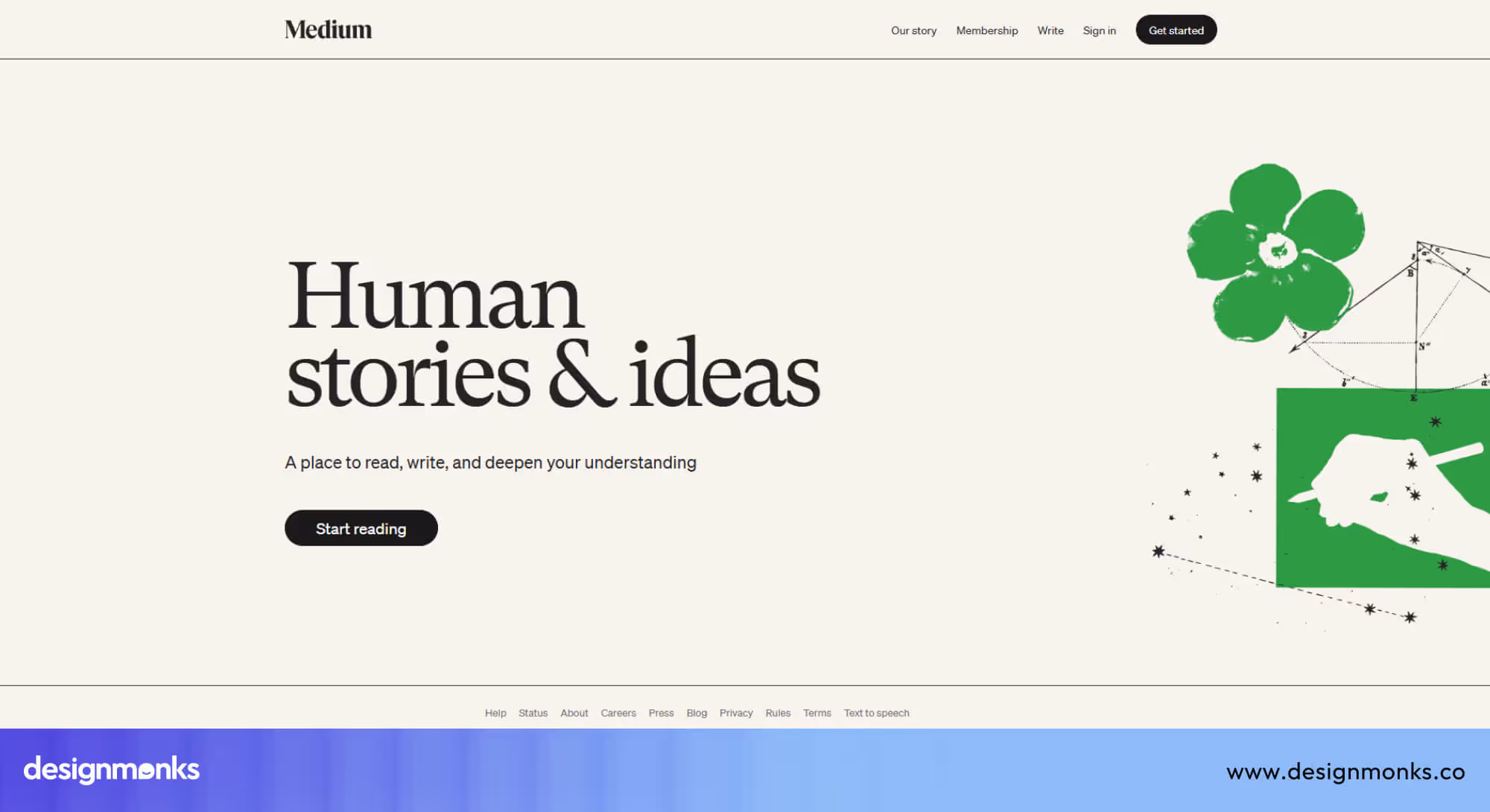
Features like highlighting, comments, and easy sharing enhance engagement without cluttering the page. Whether someone is reading a single post or exploring multiple topics, the experience feels calm, guided, and comfortable.
Lesson: Focusing on readability and simplicity keeps users engaged, encourages repeat visits, and makes content the star of the experience.
Zeplin: Streamlined collaboration for designers & developers
Zeplin makes it easy for designers and developers to work together efficiently. Design files, specifications, and assets are organised clearly, so everyone knows where to find what they need. The interface highlights key details, reduces guesswork, and ensures handoffs happen smoothly without miscommunication.
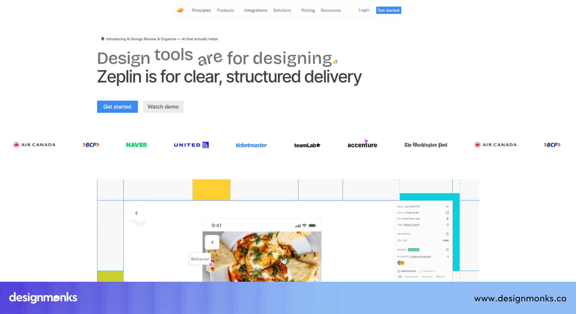
Teams can comment, track updates, and follow consistent workflows, which saves time and avoids errors. By providing clarity and structure, Zeplin keeps projects moving and ensures both designers and developers feel confident in their work.
Lesson: UX that supports collaboration and clear communication boosts productivity, reduces mistakes, and creates a smoother experience for all team members.
Inspiration Sites for UX/UI Design Professionals
Great UX doesn’t happen by guessing. Designers and agencies learn best by studying strong examples, proven patterns, and real products that already work. Inspiration sites give UX and UI professionals a window into what’s possible, helping them spot trends, explore layouts, and borrow ideas that solve real user problems.
These platforms are not about copying designs, they show structure, flow, and interaction approaches that can be adapted to client projects, especially service-based websites and SaaS platforms. Below are some of the most trusted resources for UX and UI designers, along with what makes them valuable for agencies:
Awwwards: Curated galleries of award-winning sites
Awwwards showcases websites that have been recognised for excellence in design, usability, and creativity. Every site is evaluated by professional designers, which makes it easy to see what “high-quality UX” looks like in action. Beyond aesthetics, Awwwards highlights thoughtful navigation, interactive elements, animations, and performance optimisations that make the user experience stand out.
Agencies can use Awwwards to study best practices, compare layouts and user flows, and explore emerging design trends. Being featured alongside leading digital studios also reflects design quality. Our own work at Design Monks is showcased on Awwwards, demonstrating how thoughtful UX and design standards translate into real projects.
Explore our profile here: https://www.awwwards.com/sites/design-monks
Mobbin: Real-world mobile/web UI pattern library
Mobbin collects real screens from popular apps and websites. It is then organised by feature type, such as onboarding flows, checkout processes, dashboards, or forms. Unlike purely conceptual examples, it focuses on practical solutions that have been tested in live products. This makes it easier for agencies to see which patterns actually work for users and how they solve real UX problems.
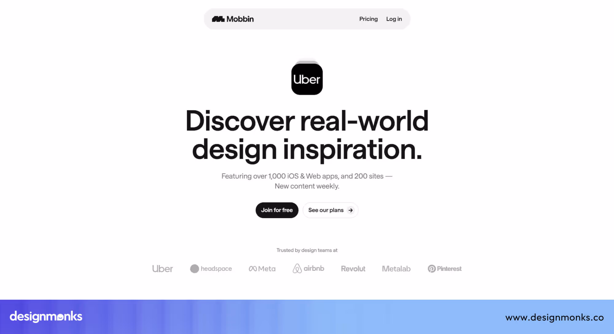
It's perfect for agencies building SaaS platforms, fintech apps, or mobile-first websites. Mobbin provides reliable, proven patterns that save time and improve usability for complex workflows.
Dribbble
Dribbble is a community-driven platform where designers share UI shots, motion graphics, and interaction experiments. While not all designs are fully functional, it’s a rich source of inspiration for visual styles, creative layouts, and micro-interaction ideas.
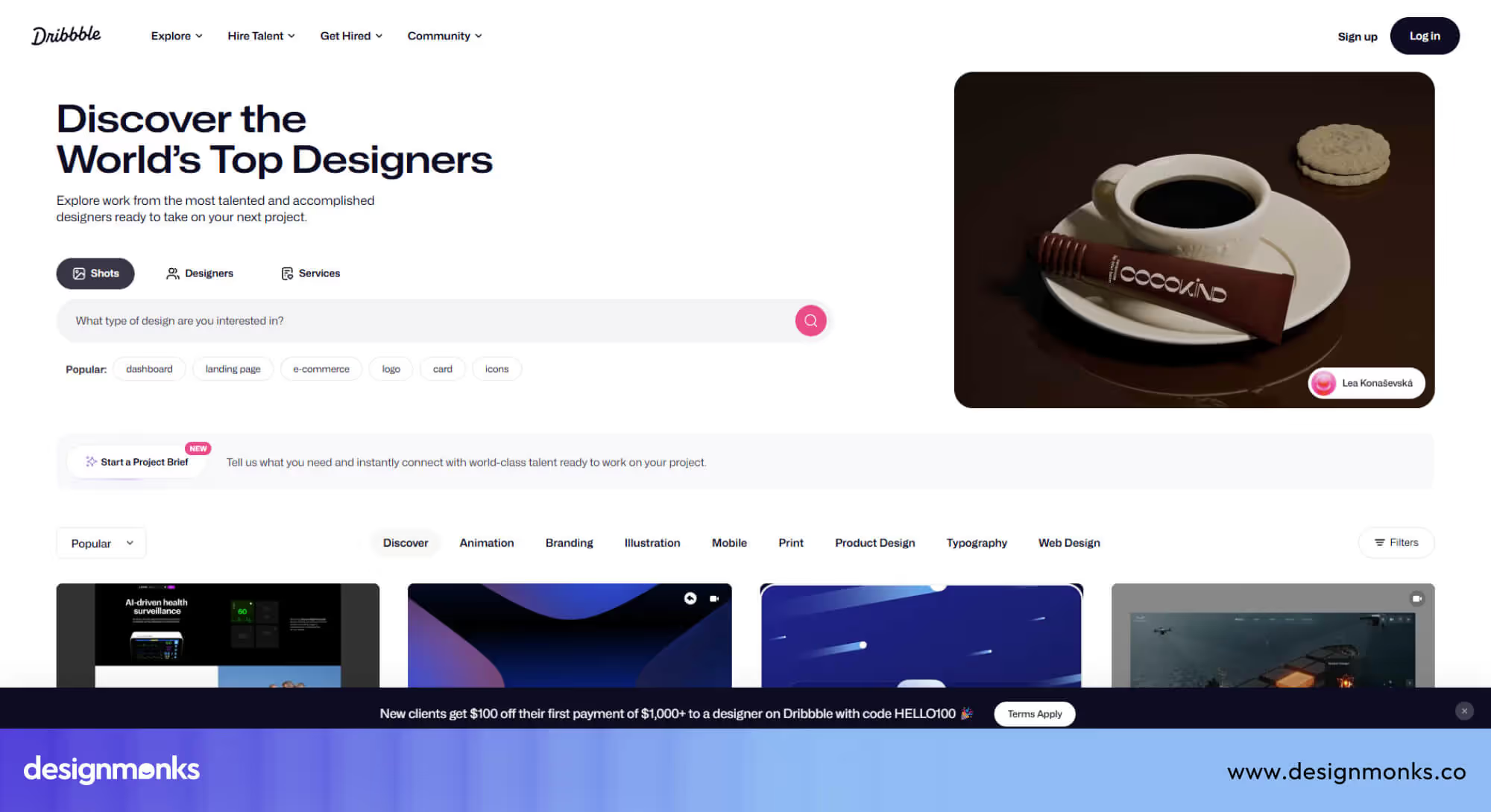
Agencies can explore modern trends, test visual directions, and spark creativity for projects before committing to detailed UX flows. Dribbble is ideal for agencies looking to explore animations, contemporary UI design, and conceptual ideas that can later be refined into usable interfaces.
Behance: Portfolio and concept inspiration
Behance features full case studies from designers and agencies, often detailing the entire process from problem identification to final results. Many projects include explanations of UX decisions, user research, and design iterations, giving readers insight into why certain choices were made.
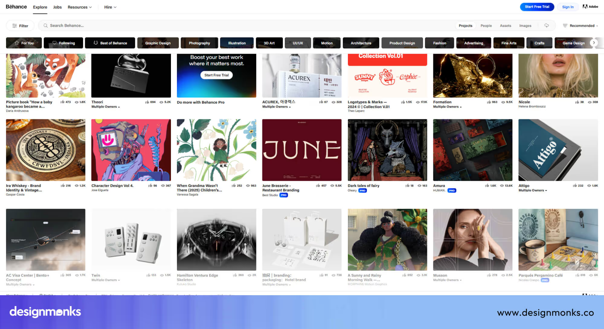
For agencies, Behance is invaluable for understanding how to communicate design rationale to clients and for showcasing process-driven UX. It also helps translate inspiration into actionable strategies that can be applied to real projects.
How to Apply These UX Lessons in Your Agency & Client Projects
Studying great UX sites is valuable, but the real impact comes from applying those lessons to client work. For design agencies, having a clear, repeatable workflow helps turn inspiration into measurable improvements. The process below can be used for service websites, SaaS platforms, and other digital products to ensure every project benefits from best-in-class UX principles:
Step 01: Audit Your Current UX Against Best-in-Class Examples
Start by reviewing your client’s website or product carefully. Examine navigation, page flow, readability, speed, and mobile usability.

Compare these elements to leading examples from Stripe, Airbnb, or patterns from Mobbin. Identify friction points such as confusing menus, long forms, or unclear calls-to-action.
Step 02: Define UX KPIs & Benchmark Against Champions
UX should always be measured, not assumed. Set clear KPIs like task completion rate, bounce rate, time on page, and conversion rate. Then benchmark these metrics against top-performing sites or industry leaders. Use this benchmarking to understand how your client’s product compares to the top 1% UX performers and where improvements are needed.
Step 03:Craft a Design System Anchored in Your Brand
A design system ensures consistency across pages and platforms. It includes colors, typography, buttons, spacing, and interaction rules aligned with the brand’s personality.
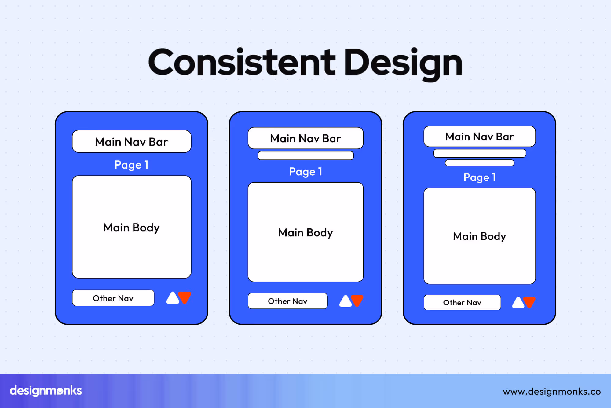
Build a system that prioritises usability first, then style, so every design choice supports a smooth and predictable user experience.
Step 04: Iterate with User Testing and Performance Measurement
UX is never truly finished. Test designs with real users, track performance, and refine based on feedback. Use interactive prototypes to explore new ideas before implementing them fully.
Improve gradually through testing, avoiding large, risky redesigns that may confuse users. Clients trust agencies that follow a structured UX process, rather than relying solely on visuals. A clear workflow demonstrates expertise, reduces risk, and ensures measurable improvements in user experience.
Common Mistakes & How to Avoid Them
Even experienced teams can fall into common traps when aiming for “best UX.” Avoiding these mistakes often improves user experience more effectively than adding a new feature:
- Too Much Animation: Heavy or unnecessary animations can slow down a website and distract users from completing tasks. Use motion purposefully, only to guide attention, indicate changes, or confirm actions.
- Slow Performance: Large images, excessive scripts, or unoptimised elements can make pages load slowly, frustrating users. Focus on performance optimisation, compress assets, and aim for fast load times on all devices.
- Ignoring Accessibility: Poor contrast, small text, or missing alternative text can exclude users with disabilities. Follow accessibility standards from the start, ensuring content is readable and usable for everyone.
- Inconsistent Navigation: Menus and links that behave differently across pages confuse users and break flow. Keep navigation predictable and consistent, so users always know where they are and how to move forward.
- Skipping Usability Testing: Designing without testing assumes you know what users want, often leading to mistakes. Conduct simple usability tests early and regularly, collecting feedback to guide improvements.
Avoiding these common pitfalls can have a bigger impact than flashy features. Good UX is often about clarity, consistency, and responsiveness, not just visual design.
FAQs About Best UX Sites
Can a minimal website still have the best UX?
Yes, a minimal website can absolutely have the best UX. This is because they remove distractions, clarify priorities, and guide users toward one clear goal or action.
How does the best UX apply to SaaS platforms?
For SaaS, UX is all about clarity. This includes simple onboarding, intuitive dashboards, and smooth task flows. Best UX reduces learning time, lowers user frustration, and keeps users engaged longer.
What about multilingual UX?
Multilingual UX requires clear language switching, consistent layouts, and content adapted for local audiences. Poor implementation can confuse users and even break trust quickly.
Are animations good or bad for UX?
Animations are helpful when they guide attention, indicate progress, or explain changes. Overusing them can slow performance, distract users, and reduce clarity.
Do micro-interactions really matter?
Yes, micro-interactions do matter. Small details like button feedback, hover states, or form validation make the experience feel responsive. They improve user confidence, reduce errors, and make the product feel polished.
Takeaway for Design Monks Clients & How We Can Help
Great UX is not about copying popular brands. It is about understanding users, reducing friction, and building trust through clear design. The best UX sites succeed because they balance usability, performance, accessibility, and emotion.
At Design Monks, we apply these principles through structured audits, benchmarking, design systems, and testing. Our UI/UX design services focus on real user needs, whether it’s SaaS design, product platforms, or AI product design. We help clients move closer to the top 1% UX performance and not just better visuals.
Want to improve your website’s UX? Explore our UX audits, design systems, and product design services to build experiences that users trust and enjoy.

.avif)
.avif)
.avif)
.avif)


.avif)
.avif)
.avif)
.avif)


.avif)
