
.svg)


Key Takeaways
- Clear cybersecurity dashboards improve threat visibility and support faster security decisions.
- Role-based views ensure every team member sees only their essential metrics.
- Good dashboards balance visuals and data to prevent analyst overload.
- Strong architecture and live integrations keep security insights accurate and timely.
- Studying real dashboard examples helps teams design smarter, action-focused interfaces.
Good design can make a big difference when it comes to cybersecurity. Many of us consider a cybersecurity dashboard a screen full of data. But it’s the place where a SOC analyst or a CISO looks for clues to keep systems safe.
If the layout is messy or unclear, they may miss important alerts. But if the design is simple and smart, they can act fast and stop threats in time. Seeing strong cybersecurity dashboard examples helps beginners and teams understand what really works. It’s also helpful to hire the right cybersecurity design service.
However, in this blog, I’ll show you 10 real-world cybersecurity dashboard examples so that you can learn how others organize data, utilize color to illustrate risks, or emphasize key security metrics.
Anatomy of a Great Cybersecurity Dashboard Example
A great cybersecurity dashboard shows the right information clearly and fast. It helps teams act quickly and avoid mistakes by using smart visuals, useful metrics, and role-based insights.
Clear Data Visualisation
Good dashboards turn raw data into simple pictures like charts or maps. These visuals help a SOC analyst see patterns and detect threats early. A smart threat-intelligence visualisation shows which attack paths match the MITRE ATT&CK framework, which makes complex data easier to understand.
Alert Prioritisation
Security teams face hundreds of alerts every day. Without a clear order, this causes alert fatigue. A good dashboard sorts alerts by risk level. It pushes the most dangerous ones to the top so analysts can focus on what truly matters.
Role-Based View
A CISO and a SOC analyst do not need the same data. That’s why role-based views matter. A dashboard should show business-level risks to leaders and technical details to analysts, keeping each user focused on their tasks.
Integration of Metrics
The best dashboards connect performance and security numbers. Metrics like MTTD (Mean Time to Detect) and MTTR (Mean Time to Respond) show how fast teams handle incidents. Strong data integration makes all these numbers easy to compare in one place.
Compliance Tracking
Cybersecurity work also includes rule checking. A dashboard that tracks compliance shows whether a company follows laws and standards. It helps teams fix gaps quickly and prove readiness during audits or reviews.
Customisable Widgets
Every company fights different types of threats. Dashboards with customisable widgets allow teams to adjust what they see, add new panels, or set up a real-time security monitoring panel that fits their daily workflow.
10 Real-World Cybersecurity Dashboard Design Examples
Before you start creating your own cybersecurity dashboard design or collaborating with a design team, you must have some inspiration to get an idea from. For that, you don’t have to check countless sites. Here, get 10 nicely-designed cybersecurity dashboard design examples in a list:
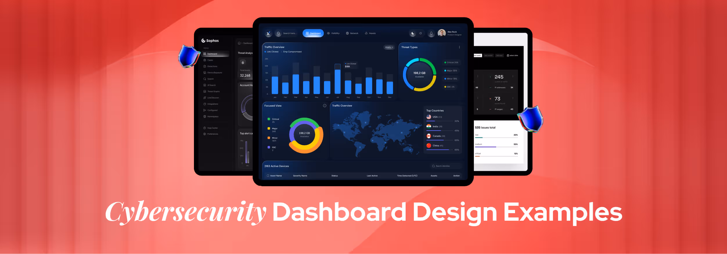
1. Cyber Security Admin Dashboard
The Cybersecurity Admin Dashboard is a perfect starting point for beginners. Its clean layout, balanced spacing, and intuitive navigation make complex data easy to read and manage. The dark theme with clear typography enhances visibility and gives it a modern, professional feel.
Beginners can learn how to organize metrics through cards, charts, and filters effectively. The consistent icon use and structured hierarchy teach essential dashboard design principles like clarity, prioritization, and component reusability.
2. AI-Powered Cybersecurity Platform Dashboard
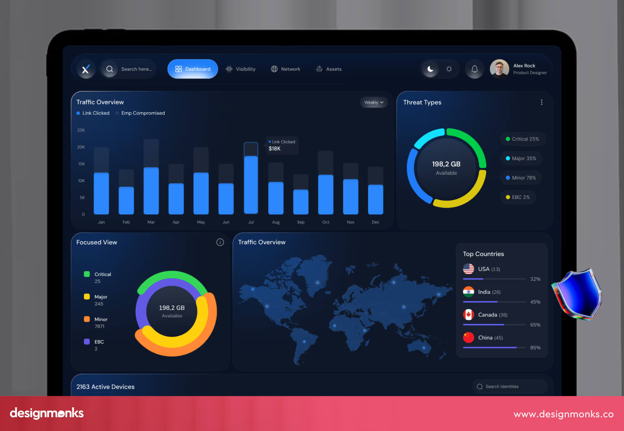
This AI-Powered Cybersecurity dashboard presents a dark-themed interface packed with rich visuals: bar charts, pie/donut indicators, and a world map showing threat distribution. It centres on high-level metrics like total threats detected, threat types by category, and geographical attack vectors, all laid out clearly for immediate grasp.
It integrates AI-driven analytics to highlight risk scores, detection trends, and swift alerts. The design incorporates a sidebar/filter area, live updating elements, and multiple drill-down panels so that users can go from overview to detail with ease.
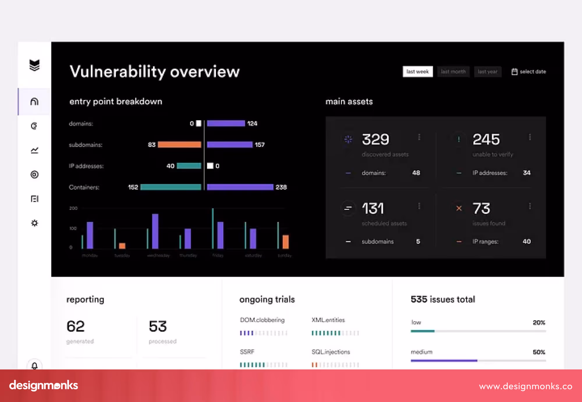
3. Cybersecurity Dashboard
This Cybersecurity Dashboard design features a dark-mode interface paired with vivid accent colours, delivering strong visual contrast that draws attention to critical metrics quickly. The layout is clean and thoughtfully structured, with cards and charts organised in a way that balances information density and readability.
It simply highlights core analytics, like threat counts, categories, and trends, right up front, while providing secondary widgets for deeper insight. The intuitive grouping of data and smart use of space suggest a high degree of usability: users can scan at a glance yet dive into specifics when needed.
4. Cybersecurity platform: dashboard
The design of this Cybersecurity platform delivers a polished and modern interface with a dark-theme backdrop, bold title types, and vibrant accent colours. Key stats and alerts are front and centre, while graphs, maps, and panels are arranged in a clean hierarchy that supports fast reading and intuitive visual flow.
Function-wise, it offers a clear overview of threat counts, classifications, and geographic spread, all essential for security work. The layout suggests dynamic filters and real-time updates, making it convenient for users who need to act quickly on changing security data.
5. AI Smart Cybersecurity Dashboard Design

This AI cybersecurity dashboard uses a bold, dark theme with vibrant accent colours that immediately draw the eye to key metrics and analytics. Beginners will appreciate the clear separation of panels, summary cards, trend charts, and geographic visualisations, which simply make it easy to understand at a glance what matters most.
The design incorporates AI-driven elements, including risk scores, threat categories, and live update indicators. The sidebar filters and modular cards show how you can build reusable components and support drill-down interactions. It’s a smart reference for anyone starting out in cybersecurity dashboard design.
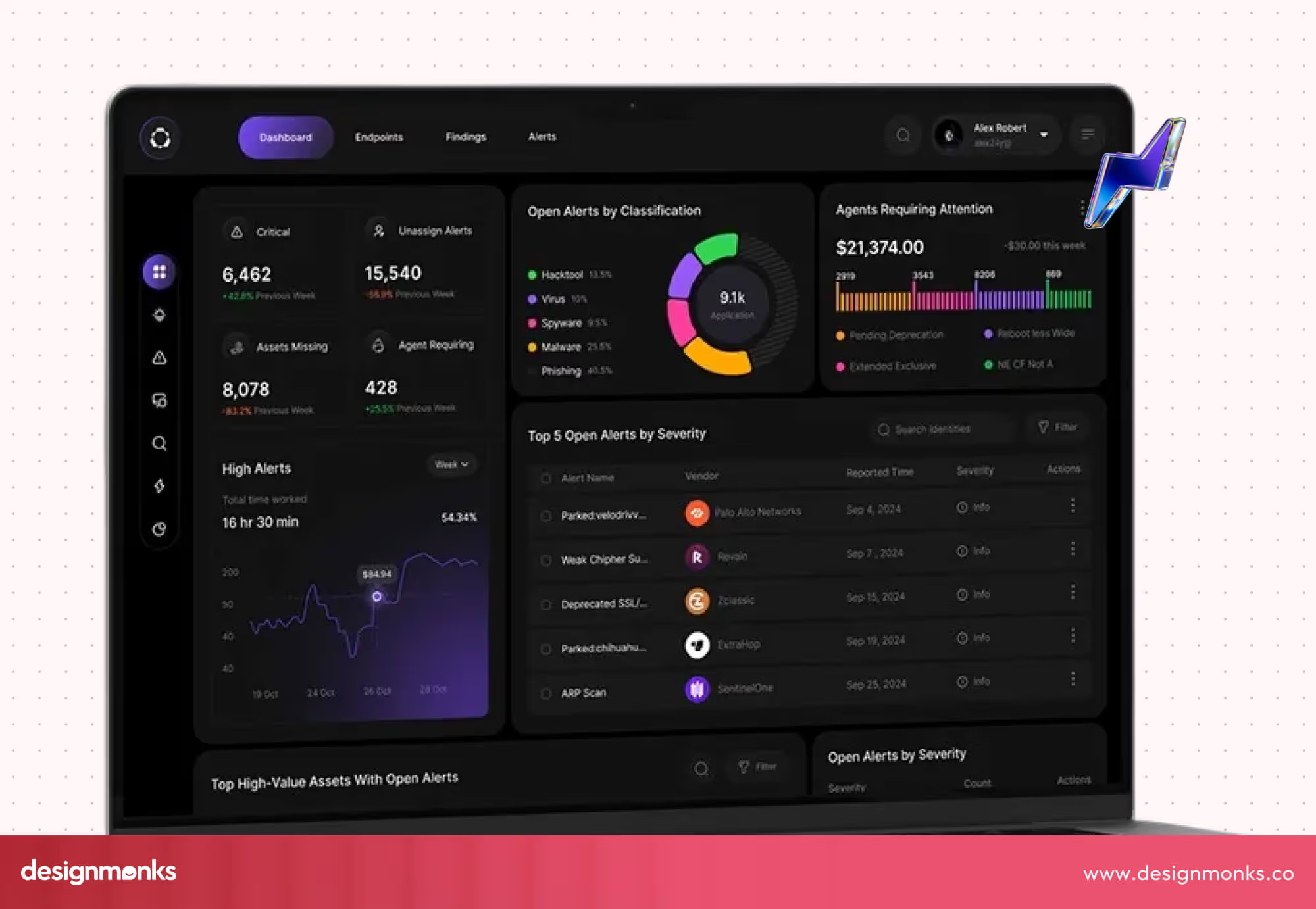
6. Cybersecurity Dashboard - CyFocus
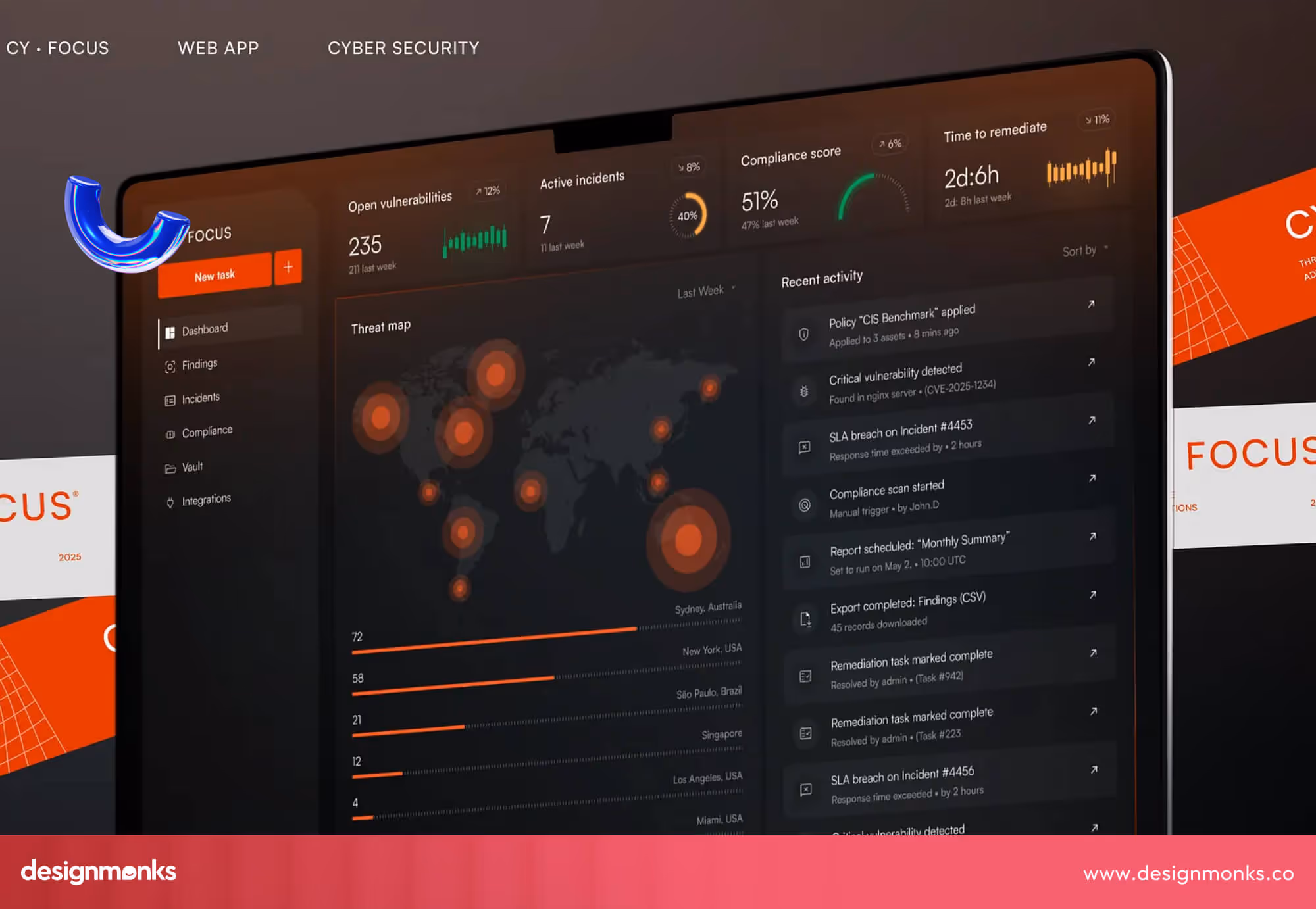
The design for CyFocus offers a bold and high-contrast dark theme paired with vibrant orange and red accents, which immediately signal urgency and actionable items. Navigation is intuitive, with a sidebar, and the main view is dominated by high-impact visuals, like risk heat maps, KPI cards, and incident feed panels.
Besides, it supports real-time monitoring of vulnerabilities, compliance control status, and incident management workflows. The inclusion of customizable layouts and a streamlined issue resolution flow shows how this UI balances depth and simplicity. It’s a strong reference for designing dashboards that serve both analysts and decision-makers.
7. SOCius - Cyber Security SaaS Dashboard Web App
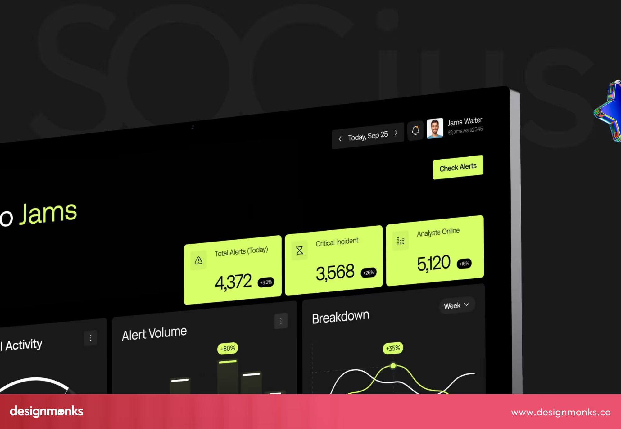
The design of the SOCius - Cyber Security SaaS Dashboard Web App features an elegant dark-mode interface paired with bright lime-green highlights. Key metrics like alert volumes and deployment trends are prominently placed so beginners can see how to prioritise the most important information.
From a features perspective, the dashboard supports real-time threat tracking, alert management, and scalable card layouts for both web and mobile. Its modular components, clear typography, and structured grid setup offer a solid foundation for beginners learning dashboard UI design in the cybersecurity domain.
8. Cybersecurity Pentester
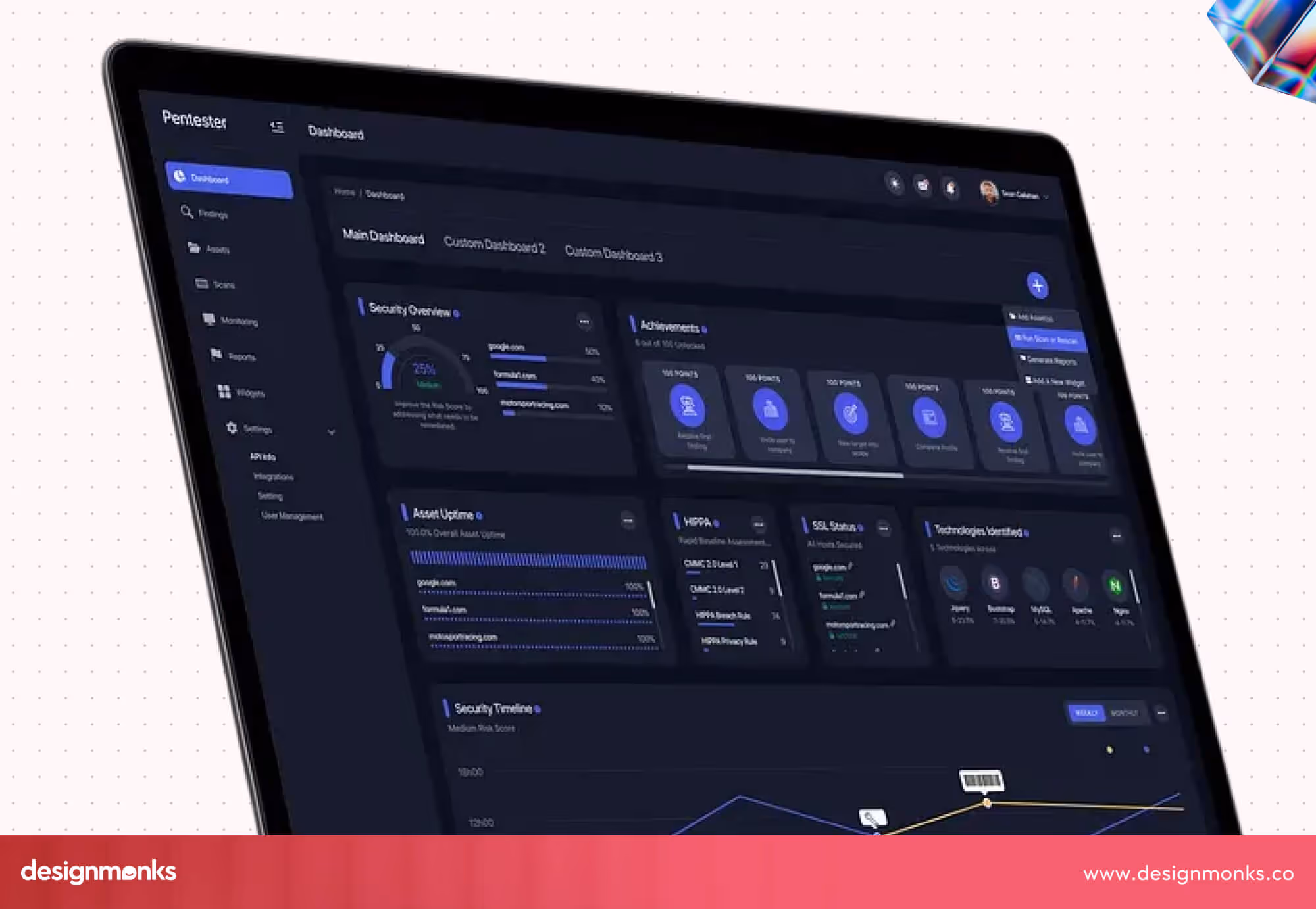
The Cybersecurity Pentester dashboard showcases a clean card-based layout with dark tones and bright accent highlights. Key vulnerability metrics are prominently placed, enabling users to instantly spot urgent issues and dive deeper into categories and trends with ease.
The design supports both desktop and mobile views, includes clear category tabs, and presents vulnerability data in a visually organised way. Beginners can learn how to balance aesthetics with functionality and build intuitive dashboards for security monitoring contexts.
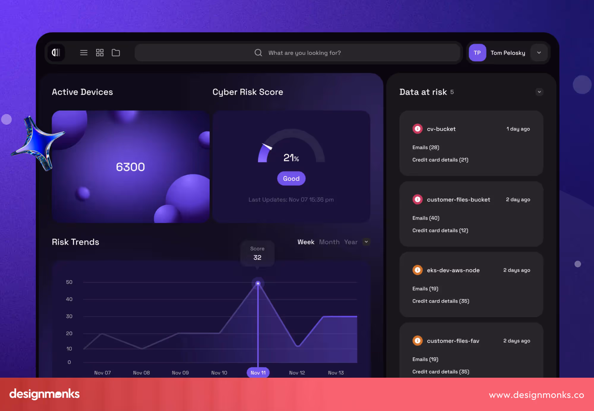
9. Dashboard To Track Cyber Threats
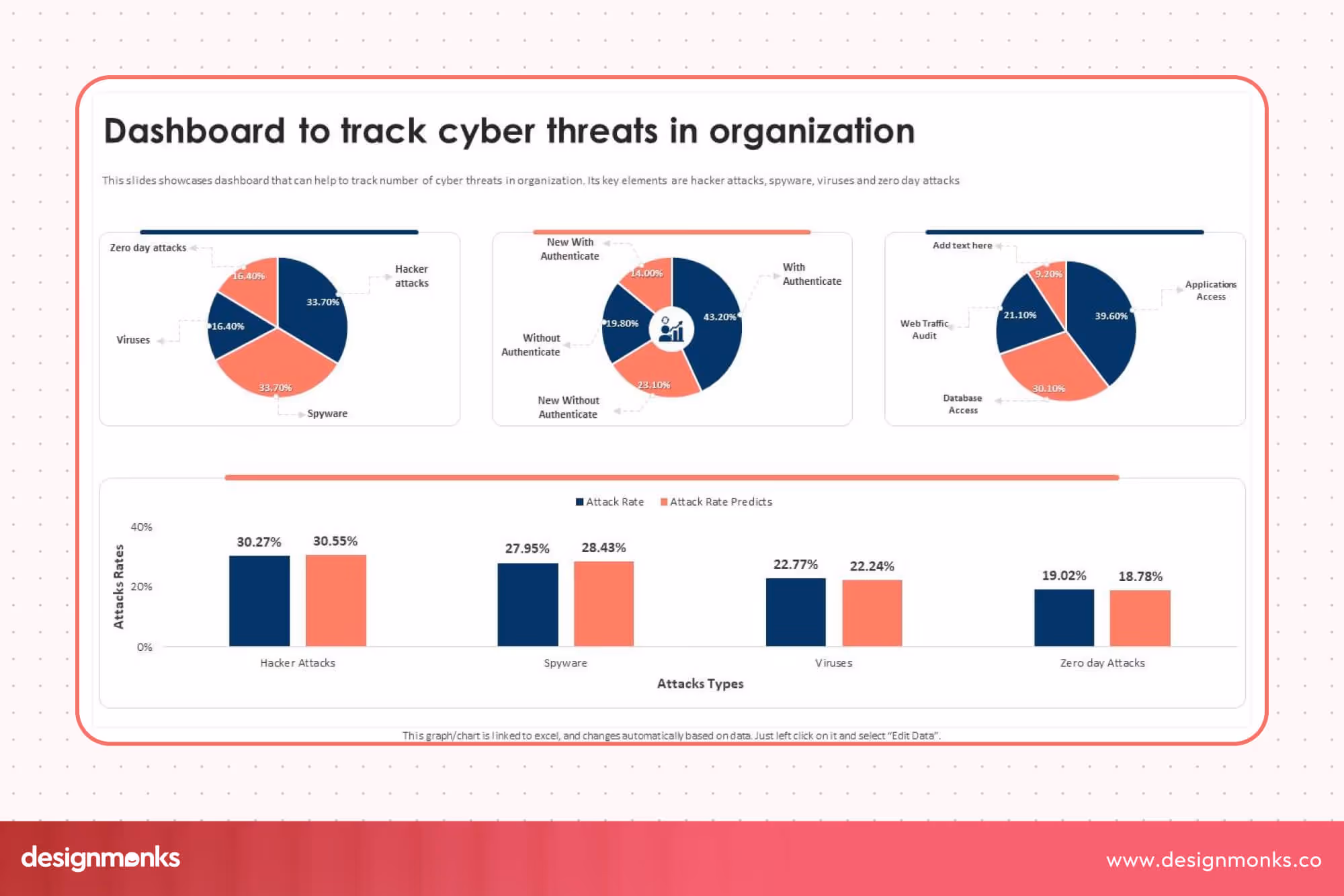
The layout of Track Cyber Threats clearly emphasises mobile-device threat categories (like viruses, spyware, zero-day attacks) using pie and bar charts. This criterion makes it easy for beginners to visualise attack profiles. The use of contrasting colours and clean segmentation helps non-experts scan key metrics quickly.
It presents device security status across an organisation, supports breakdowns by threat type and device class, and enables tracking of trending threat percentages over time. Also, the design offers a strong starting point for learning how to organise cybersecurity data for mobile endpoints.
10. Repid7 - Cybersecurity Dashboard
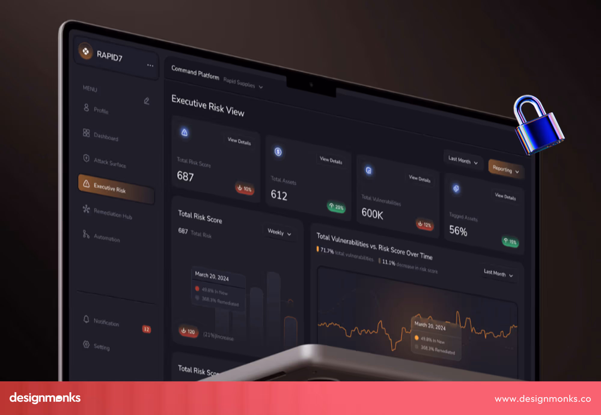
The Repid7 dashboard presents a sleek and dark-themed interface with clean typography, intuitive icons, and well-structured data visualization. Its modern layout highlights essential metrics clearly, enhancing readability and creating a professional, high-tech impression.
Feature-wise, it offers organized sections for alerts, incidents, and analytics, which simply makes it convenient for users to track security issues efficiently. The smooth navigation and well-placed filters ensure effortless monitoring and quicker decision-making.
Implementation Tips: How to Build a Dashboard
Building a cybersecurity dashboard takes careful steps. Each stage, from goal-setting to testing, makes the system stronger, faster, and easier for analysts to use in real-time.
Step 1: Choose Clear Objectives
Start with one question: what problem will the dashboard solve? A clear goal keeps the design focused. For example, some teams want better alert control, while others want faster response tracking. Knowing this early avoids confusion later.
Step 2: Select the Right Metrics
Good dashboards focus on the right numbers. Pick key security metrics like attack attempts, response time, and user access logs. These metrics show real performance, helping teams improve results and reduce risk.
Step 3: Choose a Strong Architecture
Behind every great dashboard lies a solid data structure. A smart setup includes an ETL pipeline for clean data flow and API integration for pulling live data from different tools. This ensures updates happen smoothly and without delays.
Step 4: Design the UI and UX
The best dashboards are easy to read and quick to use. Use clear labels, color codes for threat levels, and a balanced layout. A good design helps users act fast, even in pressure moments.
Step 5: Prototype and Test
Before launching, create a simple model and check how users interact with it. This dashboard testing step helps find weak spots in layout, data accuracy, and usability before the final version goes live.
Step 6: Deploy and Iterate
After launch, follow a deployment checklist to ensure everything runs well. But the process does not stop here. Keep improving through an iteration cycle, update visuals, fix slow parts, and adjust to new threats during the maintenance cycle.
How Our Design Agency Can Help You Create a Bespoke Cybersecurity Dashboard Design
Every cybersecurity team has unique needs. Design Monks creates dashboards that fit your tools, goals, and user roles to help you monitor, decide, and act with full confidence.
So, what we offer:
Bespoke Dashboard UI/UX Design
We design every custom cybersecurity dashboard from scratch. As a security dashboard UI/UX service agency, we focus on usability and clarity. Each panel, chart, and alert is placed to guide the user’s eye naturally, so even complex data feels simple to understand and manage.
SaaS Design Expertise
Our team also specializes in SaaS design, building dashboards that run smoothly on the web or cloud. We make sure your platform connects safely with APIs, supports real-time updates, and offers a fast, reliable experience for every user session.
Role-Based Dashboard for Cybersecurity Teams
Every role inside a security team needs different data. We build role-based dashboard designs that match each user, from a SOC analyst tracking threats to leaders reviewing system health. This professional dashboard design ensures each person gets the right insight at the right time.
Smart Integration and AI Product Design Support
We also help integrate your data systems and connect AI-driven tools for faster insights. With our AI product design skills, you get dashboards that learn, adapt, and guide your team in every security challenge.
Why Choose Our Custom Design Service
Our service offering covers everything from planning to final deployment. We focus on custom design that fits your workflow, looks polished, and performs well under real-world pressure, a true partner for your digital security success.
Design Patterns by Use-Case
Each cybersecurity team has a different goal. Some focus on big-picture reports, while others handle daily alerts or compliance checks. Let’s see how dashboard designs change for each use case.
Executive Reporting Dashboards
These dashboards help CISOs and board members understand the company’s security posture without too much detail. They use clean visuals, short summaries, and key metrics.
A typical executive summary screen includes a risk score, system uptime, and a compliance dashboard view. Charts are simple, colors are calm, and every number tells a story about overall safety. This design helps leaders make decisions fast, even without a technical background.
SOC/Analyst Dashboards
A SOC analyst needs full control and speed. This dashboard shows real-time alerts, open incidents, and active defenses. To avoid alert overload, it uses clear filters and a strong layout.
Analysts can drill into details, follow the incident response playbook, and check vulnerability scores or endpoint protection metrics. Each part of the design supports fast reaction and teamwork during live threats.
Compliance & Audit Dashboards
These dashboards keep track of security rules and standards. They help teams follow NIST CSF, ISO 27001, or other frameworks. A good compliance tracking layout shows control maturity, audit findings, and a full audit trail of activities.
Every control area has a color-coded status: green for complete, yellow for partial, red for missing. This setup makes it easy for auditors and managers to review reports and fix gaps on time.
Common Mistakes Seen in Dashboard Examples
Even the best teams sometimes create dashboards that slow users down instead of helping them. Recognising these mistakes can save time, reduce errors, and improve decision-making speed.
Too Many Widgets
Some dashboards try to show everything at once. This causes cognitive overload and confusion. Users cannot focus on what matters. To avoid this, limit the number of widgets and show only key metrics. Prioritize visuals that support fast understanding.
Static Reports
Dashboards that do not update in real-time are frustrating. They hide active threats and make teams react late. Always use live data feeds or frequent refreshes so the dashboard reflects the current situation.
Not Role-Tailored
A dashboard that shows the same view to everyone creates alert fatigue. A SOC analyst needs live incident details, while a CISO needs high-level summaries. Tailor the view to each role to reduce mistakes and wasted time.
Poor Visual Contrast
Some dashboards use hard colors to distinguish or have cluttered layouts. This makes alerts hard to see and metrics difficult to read. Use clear contrasts, simple layouts, and highlight high-risk items for quick recognition.
FAQ
What makes a good security dashboard example?
A strong dashboard shows key KPIs clearly, highlights risks, and uses simple visuals. It guides users to act quickly, avoids clutter, and presents data that supports decisions with measurable ROI.
How many examples should I review before starting my own?
It is helpful to study 5 to 10 well-designed dashboards before starting your own. You must focus on layouts, color use, alert organisation, and refresh rate. Comparing examples helps you see patterns and choose what fits your team.
How to customise a dashboard for my role?
You can customize the dashboard to what your job requires. Analysts need detailed alerts and incident steps, while managers need summaries and risk scores. Show metrics relevant to the role for faster understanding and action.
End Note
A well-designed cybersecurity dashboard is more than a tool; it’s the center of smart defense. It helps teams see, think, and act faster when threats appear.
As you explore these examples, notice how design choices shape clarity and response time. If you want to build a custom dashboard that fits your team’s goals, consider working with a design agency that understands both security and user experience.

.avif)
.avif)
.avif)
.avif)


.avif)
.avif)
.avif)
.avif)


.avif)


