.svg)


Project Description
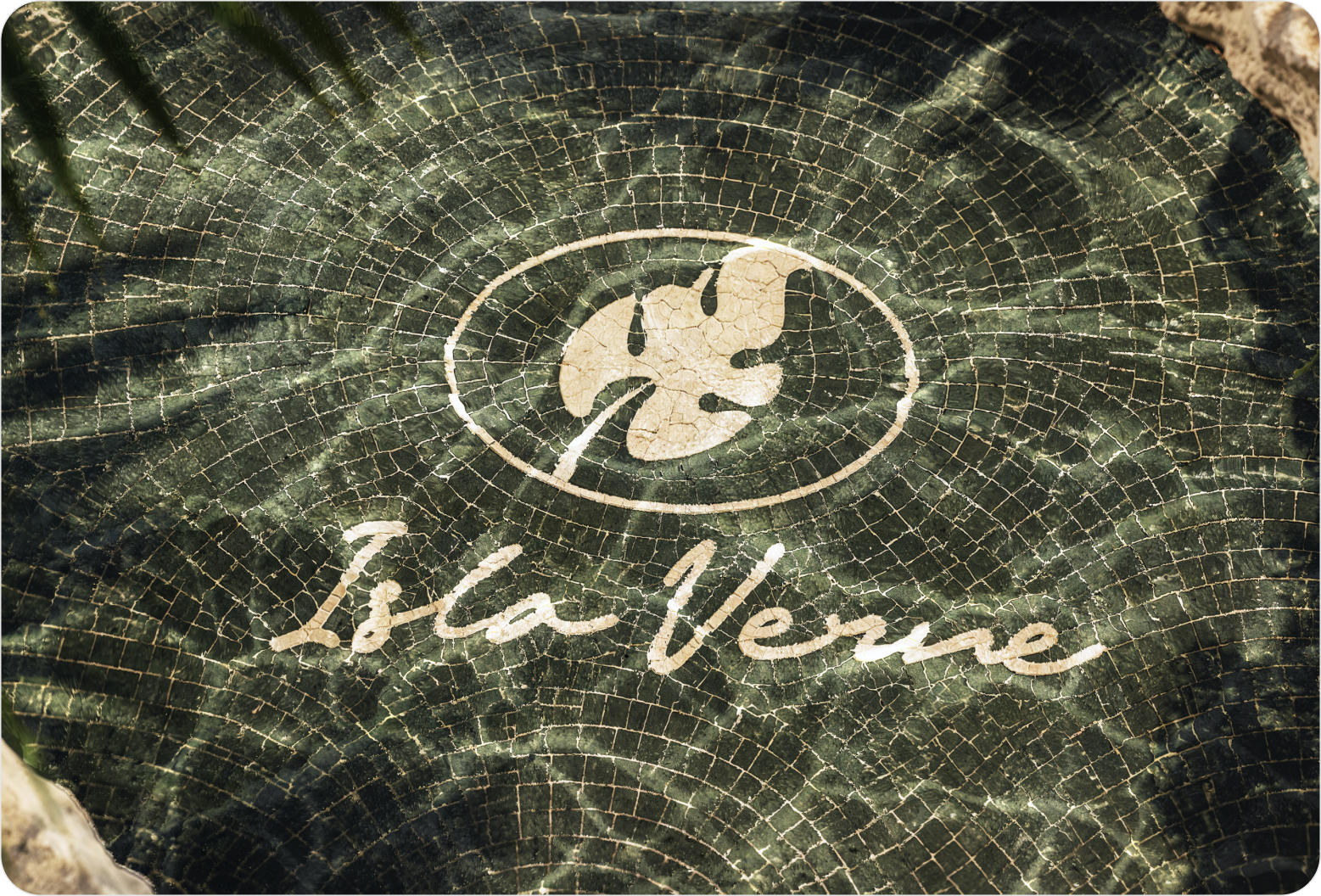
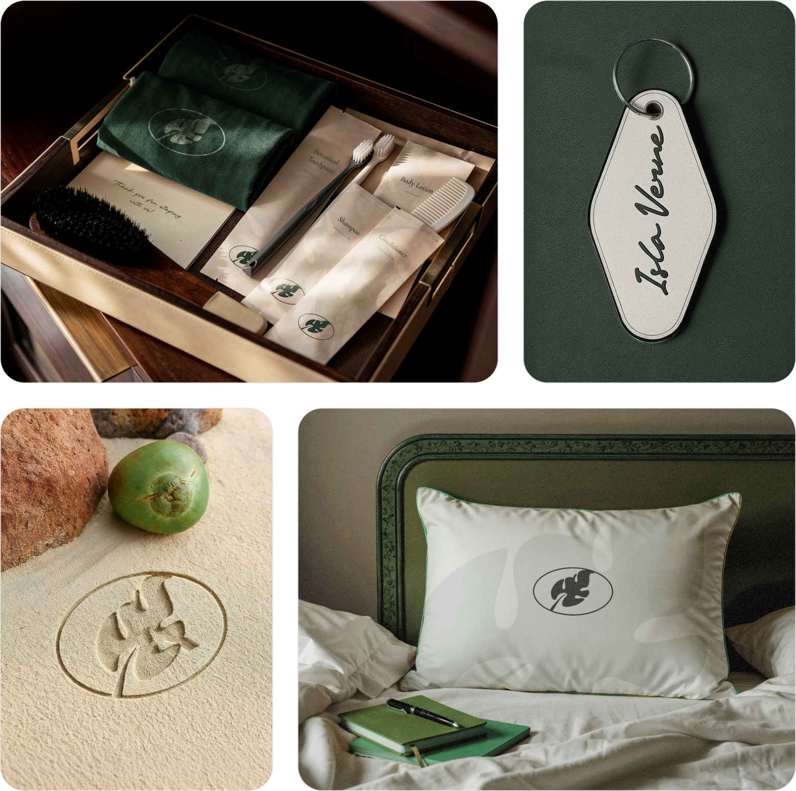
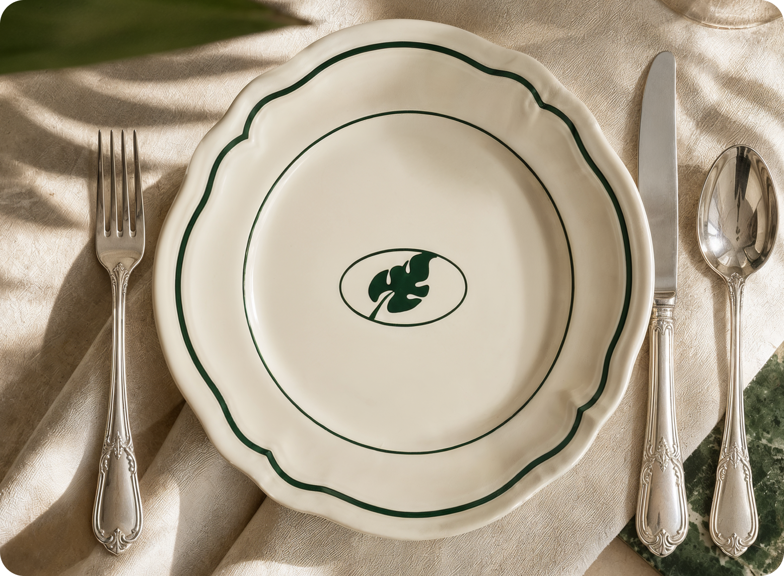
Paradise rarely needs branding; it just needs recognition. Isla Verne started there: a resort built on tranquility, nature, and quiet luxury, asking to be seen the way it feels. Design Monks answered with deep greens, warm sand, soft gold, and organic forms, shaping a full identity where every touchpoint whispers instead of shouts.
Problem
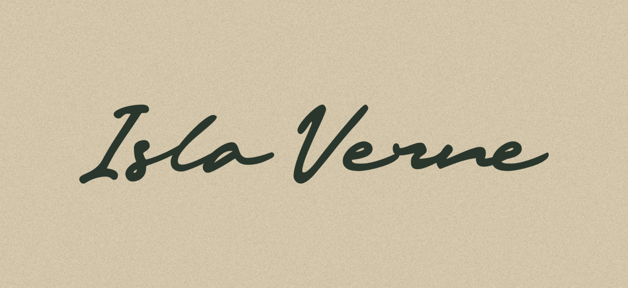
Luxury and calmness rarely sit in the same sentence, yet Isla Verne demanded both at once. Balancing tropical warmth with refined sophistication meant avoiding clichés of typical resort branding. Every color, form, and typographic choice had to whisper premium quality without losing the raw, organic soul of the island itself.
- Problem 1
Combining organic, natural forms with a polished, high-end luxury feel.
- Problem 2
Translating quiet, calming emotions into strong, memorable visual brand elements.
- Problem 3
Avoiding generic tropical resort clichés while staying rooted in nature's identity.
Solution
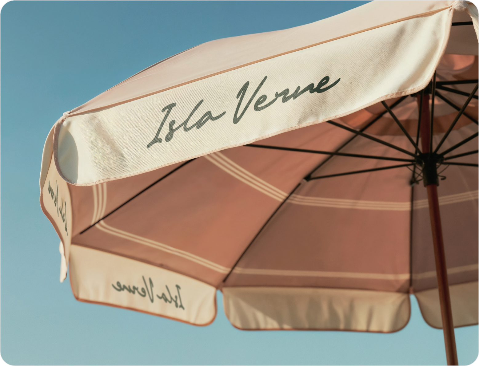
The answer was restraint, not excess. Every design choice leaned into stillness rather than spectacle, letting nature set the tone instead of loud luxury cues. Deep greens, soft gold, and elegant typography came together to build calm confidence, a brand identity that feels less designed and more discovered.
- Solution 1
Deep greens and warm sand tones brought the island's natural palette to life.
- Solution 2
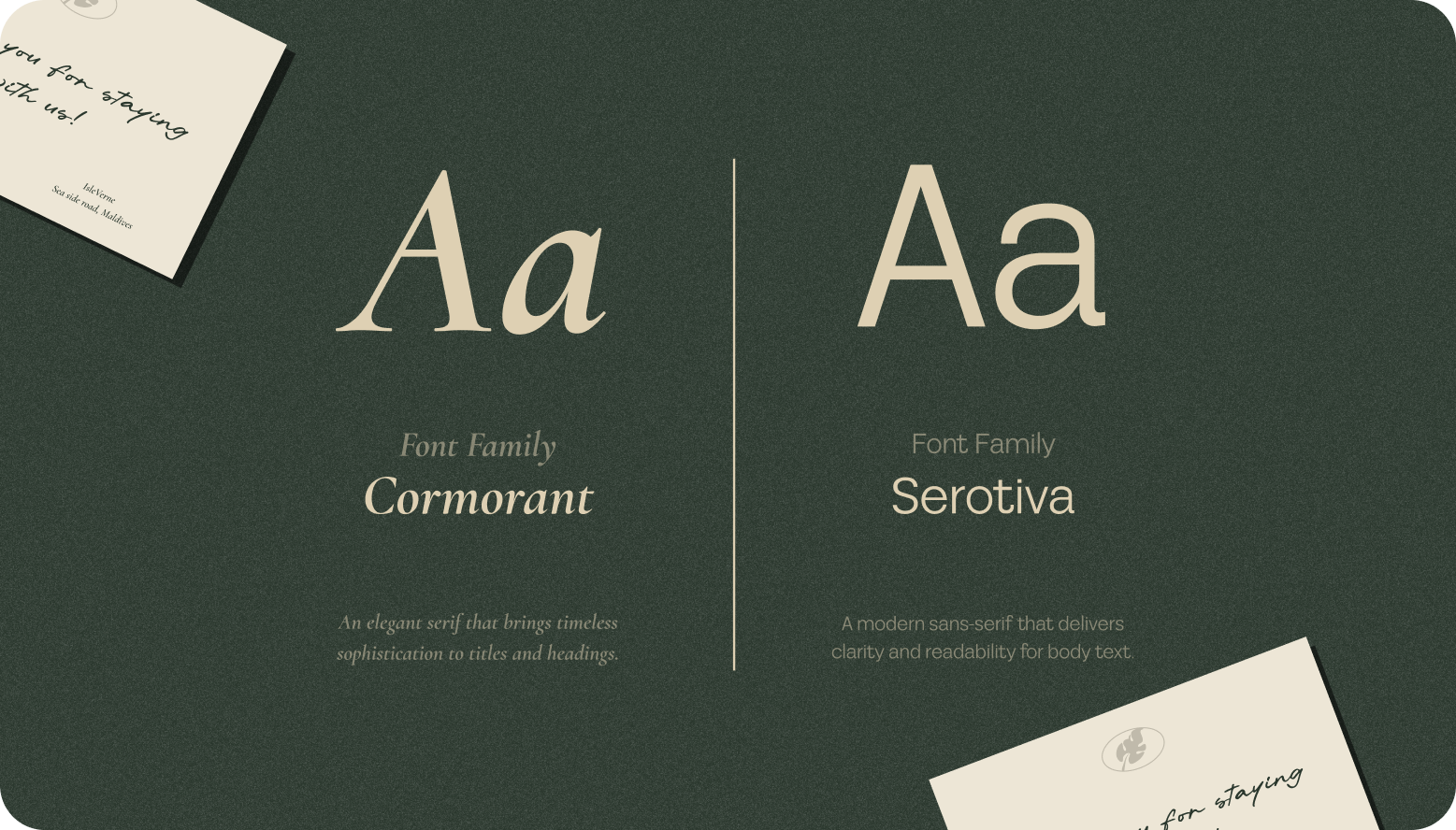
Elegant, refined typography carried quiet sophistication across every single brand touchpoint.
- Solution 3
Organic forms and soft gold accents balanced luxury with nature's calming presence.

Design Process
We follow a structured UI/UX design process focused on research, strategy, and seamless execution to create digital products that engage users and drive business results.

Style Guide & Component
.png)
.png)


Wireframe
& UI Design
Workflow Scenario
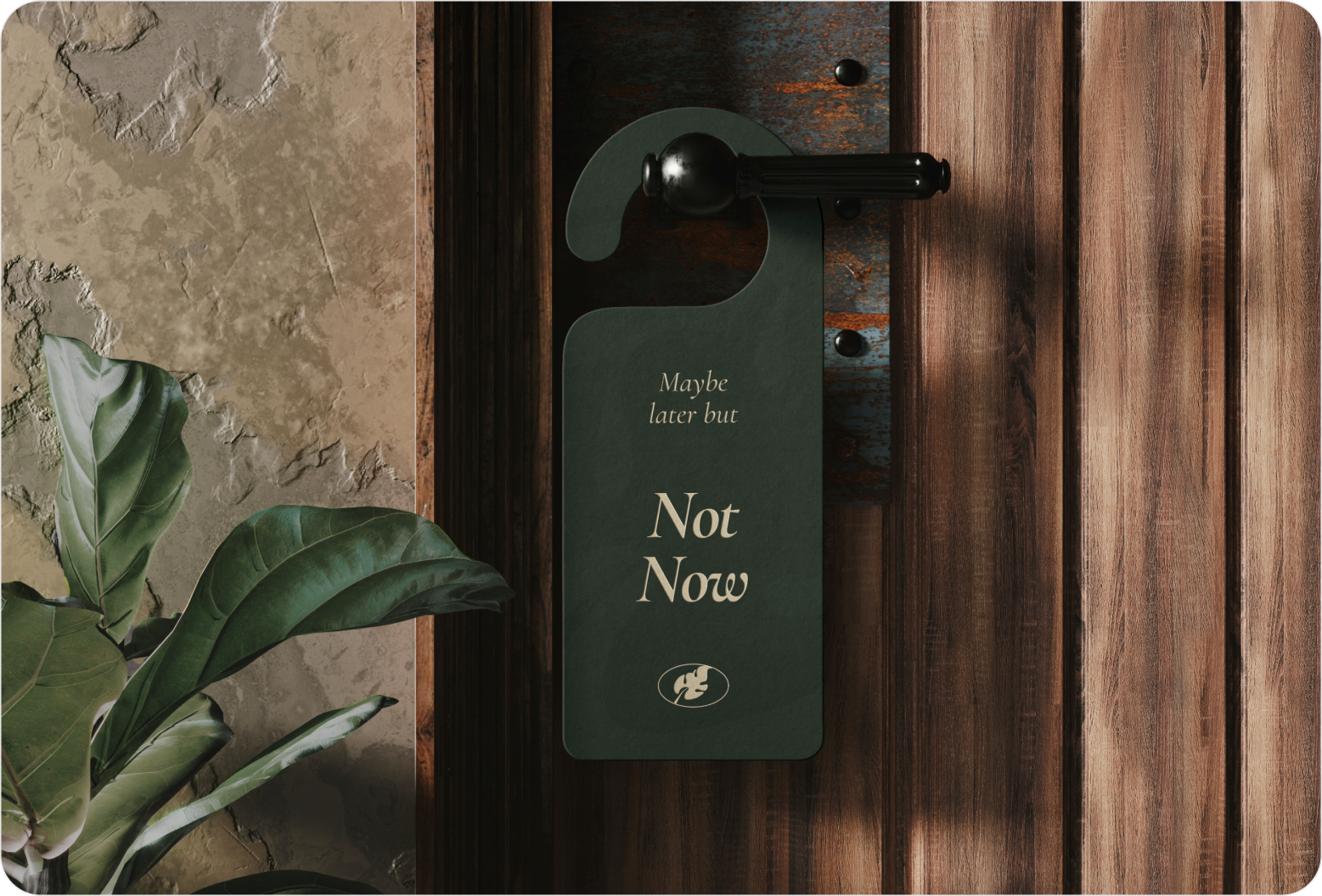
Process here felt more like listening than executing. Research into tropical textures and resort culture shaped an emotional direction before a single asset was built. From palette to typography to form, each stage moved with intention, refining quiet luxury layer by layer until the identity felt inevitable, not designed.

The Result
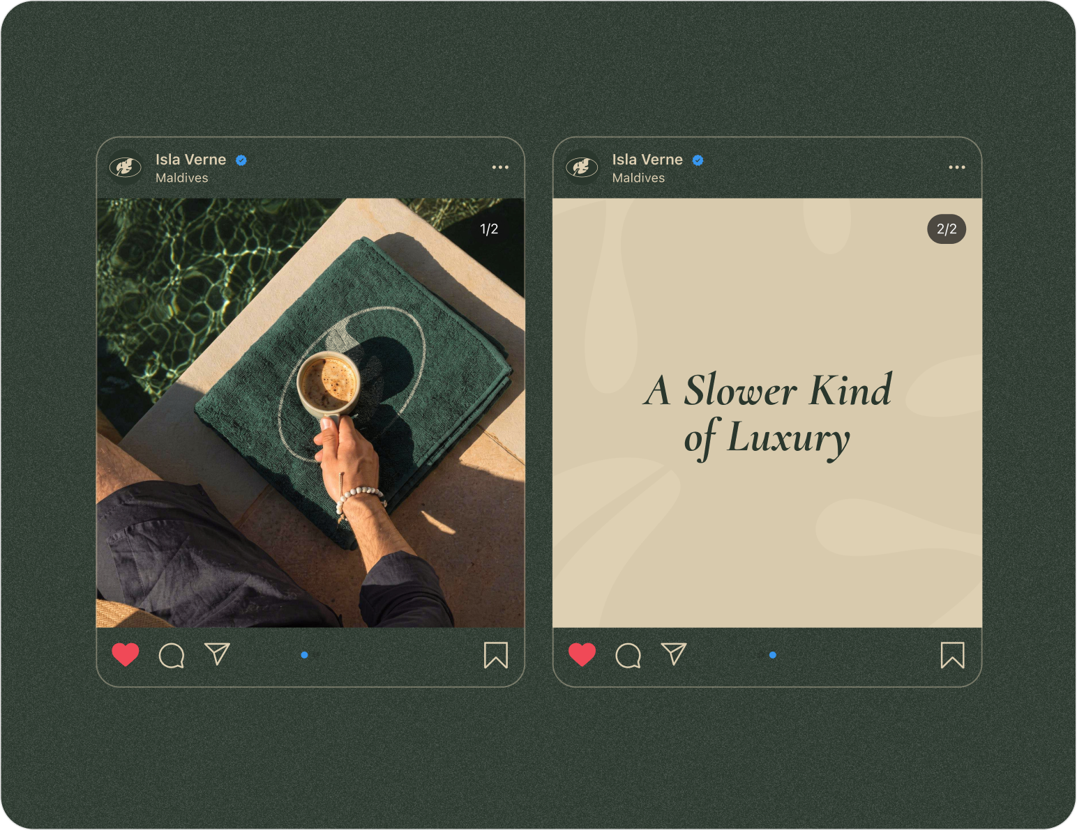
Some brands announce themselves. Isla Verne simply arrives, calm and unmistakable. The finished identity carries the hush of green canopies and the warmth of golden sand into every touchpoint, proving luxury doesn't need volume to be felt. What emerged wasn't just a resort's visual system, but a feeling captured in color, form, and typography, ready to greet every guest before they even step onshore.
Client feedback

.svg)
.png)
.png)

Success Stories
That Inspire Us

Design Monks delivered beautiful, functional UX that truly drove business results. Their expert team blends aesthetics with real business value, boosting our user engagement and growth. Highly recommended!

Fahim Aziz
Founder @ Backpack (YC), Affine, AlpineX


Fantastic experience working with Design Monks. They did more homework than I expected and actually studied details related to a whole new industry to iterate designs. Super professional, sleek, and fresh design output.
Rifah Tasfia
Product Consultant @ Carbobon



I've had the pleasure of collaborating with Design Monks for a while now on my new project.They're lightning-quick in addressing any questions or feedback I have, and they consistently go the extra mile to make sure I'm thrilled with the final outcome. I wholeheartedly endorse them
.avif)
Ted Nash
Founder & CEO @ Yenex

Enhance Your Brand Potential At No Cost!
Expect a response from us within 24 hours
We’re happy to sign an NDA upon request.
Get access to a team of dedicated product specialists.



Why risk it with the wrong partner? Get 100% value and guarantee. Don’t miss out - Secure your brand’s future today.
Why risk it with the wrong partner? Get 100% value and guarantee. Don’t miss out - Secure your brand’s future today.