.svg)


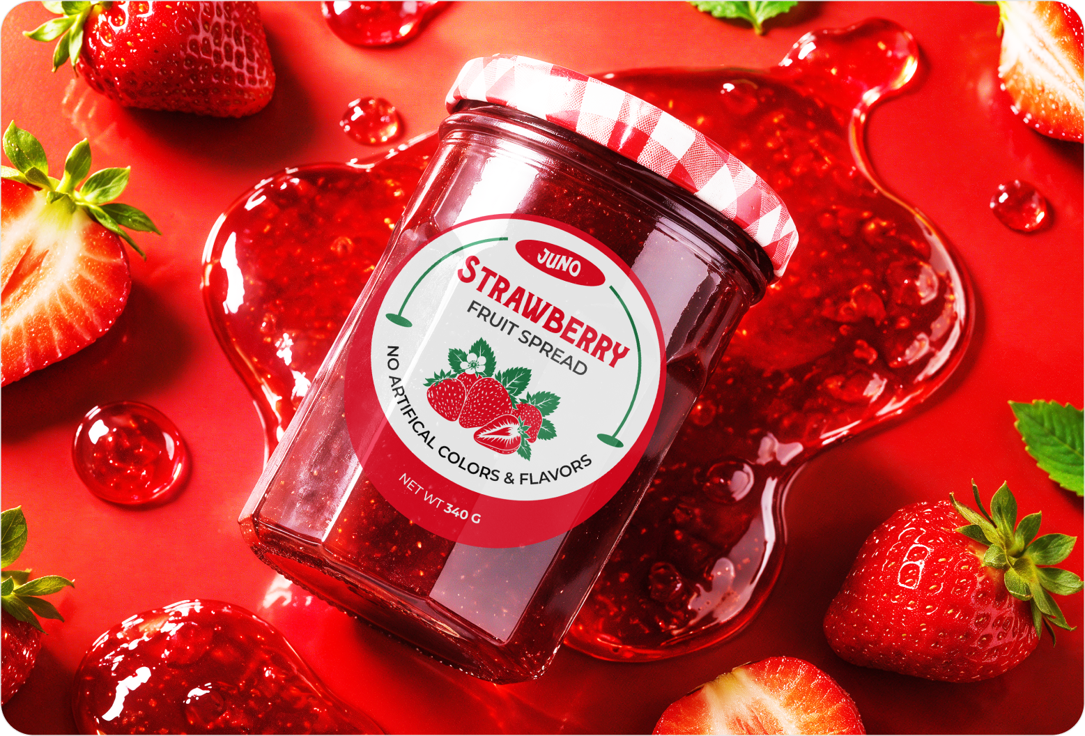
Project Description
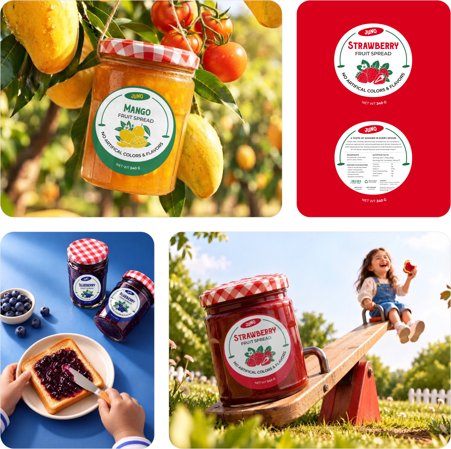
A little jar can carry a lot of personality when the visuals get it right. JUNO needed a cheerful brand identity that could make fruit preserves feel fresh, friendly, and memorable. We have created a colorful visual system combining expressive typography, playful illustrations, and packaging that gives each flavor its own character.
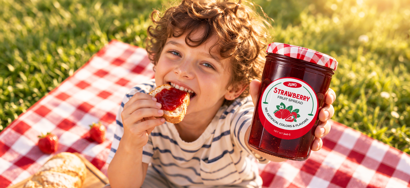
Problem
JUNO needed a visual identity that could feel playful without losing its natural, approachable character. Each preserve flavor also needed clear recognition while staying connected to one brand. The packaging had to balance expressive visuals, product information, and brand consistency across different flavors and everyday touchpoints.
- Problem 1
Keeping each flavor visually distinct while maintaining one recognizable brand identity.
- Problem 2
Balancing playful illustrations with clear product information across the packaging.
- Problem 3
Making vibrant visuals feel natural, approachable, and consistent across brand touchpoints.
Solution
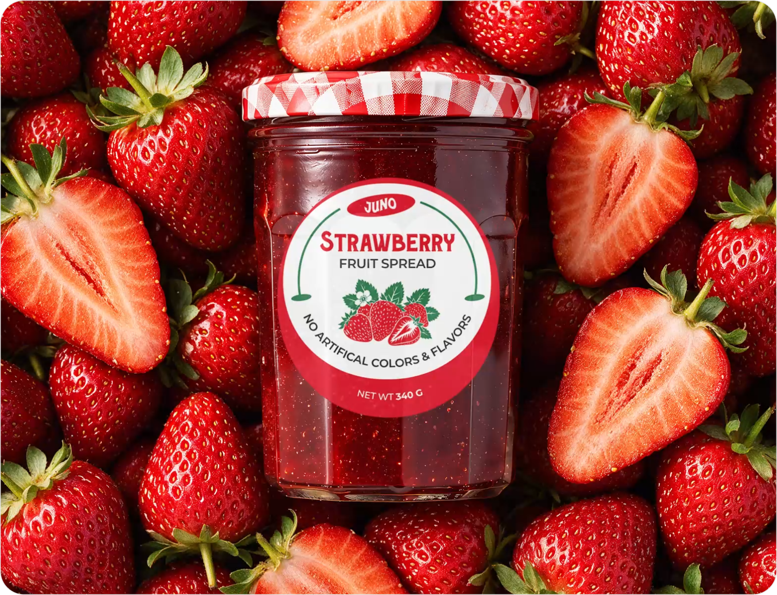
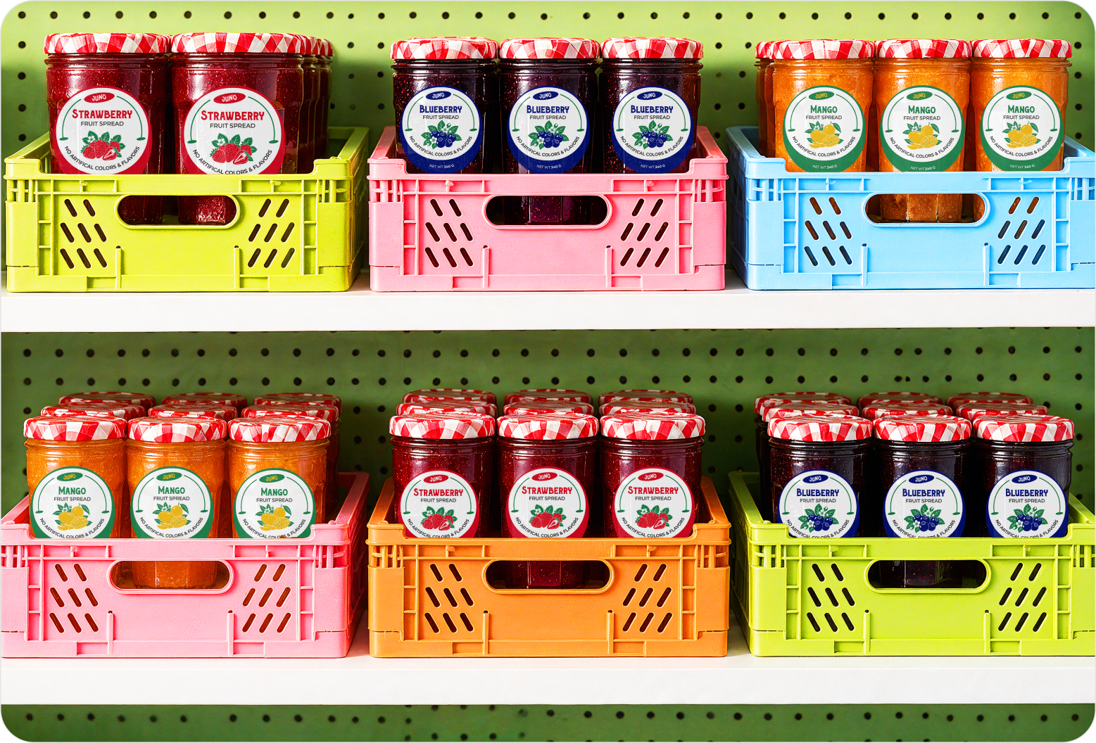
The visual language had to do more than make the jars look cheerful. It needed to give every flavor a distinct personality while keeping JUNO recognizable at first glance. Vibrant colors, expressive type, fruit illustrations, and clear information worked together to create a flexible packaging system with genuine shelf appeal.
- Solution 1
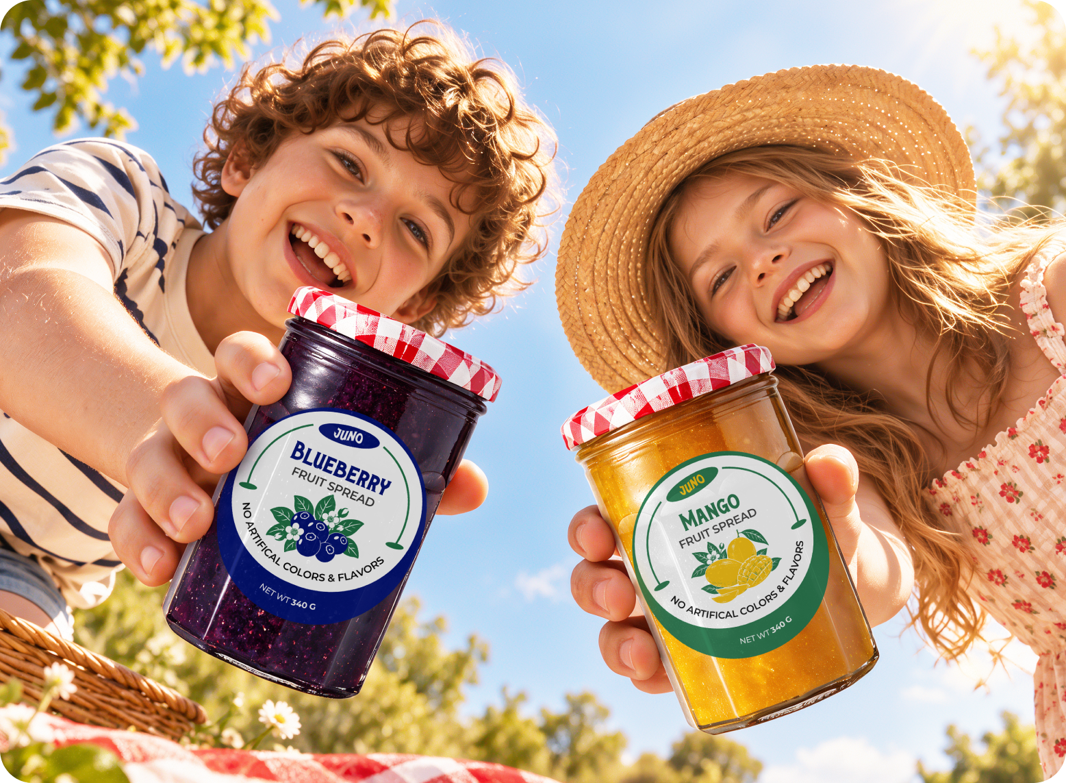
Vibrant flavor colors give strawberry, blueberry, and mango their own recognizable personalities.
- Solution 2
Expressive typography makes flavor names prominent while keeping the packaging playful and easy to read.
- Solution 3
Fruit illustrations, product details, and brand elements create a consistent visual rhythm across packaging.

Design Process
We follow a structured UI/UX design process focused on research, strategy, and seamless execution to create digital products that engage users and drive business results.

Style Guide & Component
.png)
.png)
.png)


Wireframe
& UI Design
Workflow Scenario
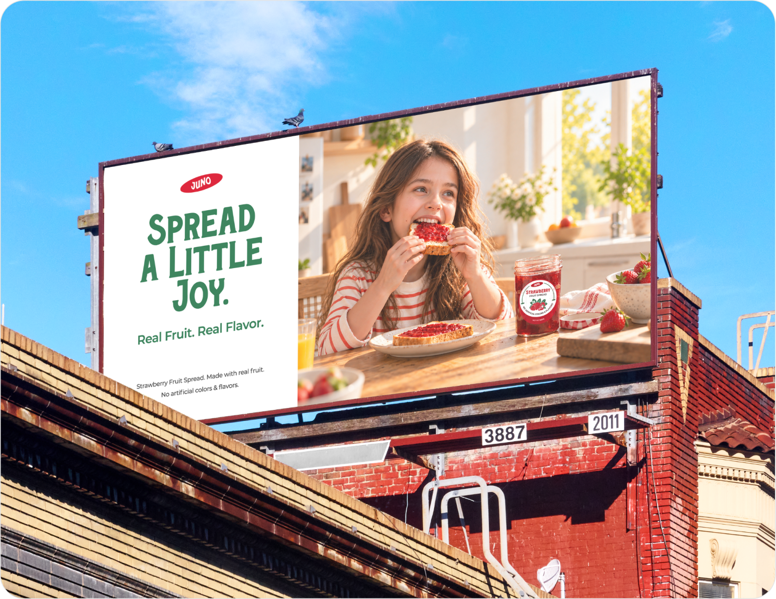
The work began by defining the visual personality and the role each element needed to play. We then explored color, typography, fruit illustrations, and packaging layouts until the pieces felt connected. Each flavor received its own visual character, while the wider system stayed consistent across labels, photography, and social media.

The Result
A brighter shelf presence came together, where every flavor has something of its own to say. The final identity gives strawberry, blueberry, and mango distinct visual personalities without losing JUNO’s recognizable character. Across packaging, photography, and social media, the same cheerful language carries through, giving the brand a cohesive presence that feels fresh and memorable.
Client feedback

We’re excited about the Äike T redesign. The team delivered a clear & intuitive experience across web and mobile, which makes it easier for users to buy or rent scooters. Their thoughtful approach to navigation, plan comparisons, and overall consistency has improved engagement and strengthened our brand’s presence in urban mobility.
.svg)
.png)
.png)

Success Stories
That Inspire Us

Design Monks delivered beautiful, functional UX that truly drove business results. Their expert team blends aesthetics with real business value, boosting our user engagement and growth. Highly recommended!

Fahim Aziz
Founder @ Backpack (YC), Affine, AlpineX


Fantastic experience working with Design Monks. They did more homework than I expected and actually studied details related to a whole new industry to iterate designs. Super professional, sleek, and fresh design output.

Rifah Tasfia
Product Consultant @ Carbobon



I've had the pleasure of collaborating with Design Monks for a while now on my new project.They're lightning-quick in addressing any questions or feedback I have, and they consistently go the extra mile to make sure I'm thrilled with the final outcome. I wholeheartedly endorse them
.avif)
Ted Nash
Founder & CEO @ Yenex

Enhance Your Brand Potential At No Cost!
Expect a response from us within 24 hours
We’re happy to sign an NDA upon request.
Get access to a team of dedicated product specialists.



Why risk it with the wrong partner? Get 100% value and guarantee. Don’t miss out - Secure your brand’s future today.
Why risk it with the wrong partner? Get 100% value and guarantee. Don’t miss out - Secure your brand’s future today.