.svg)


Project Description
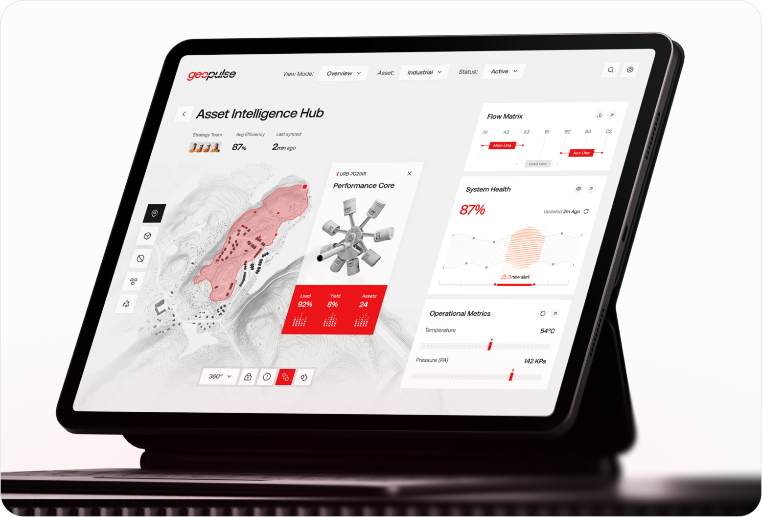
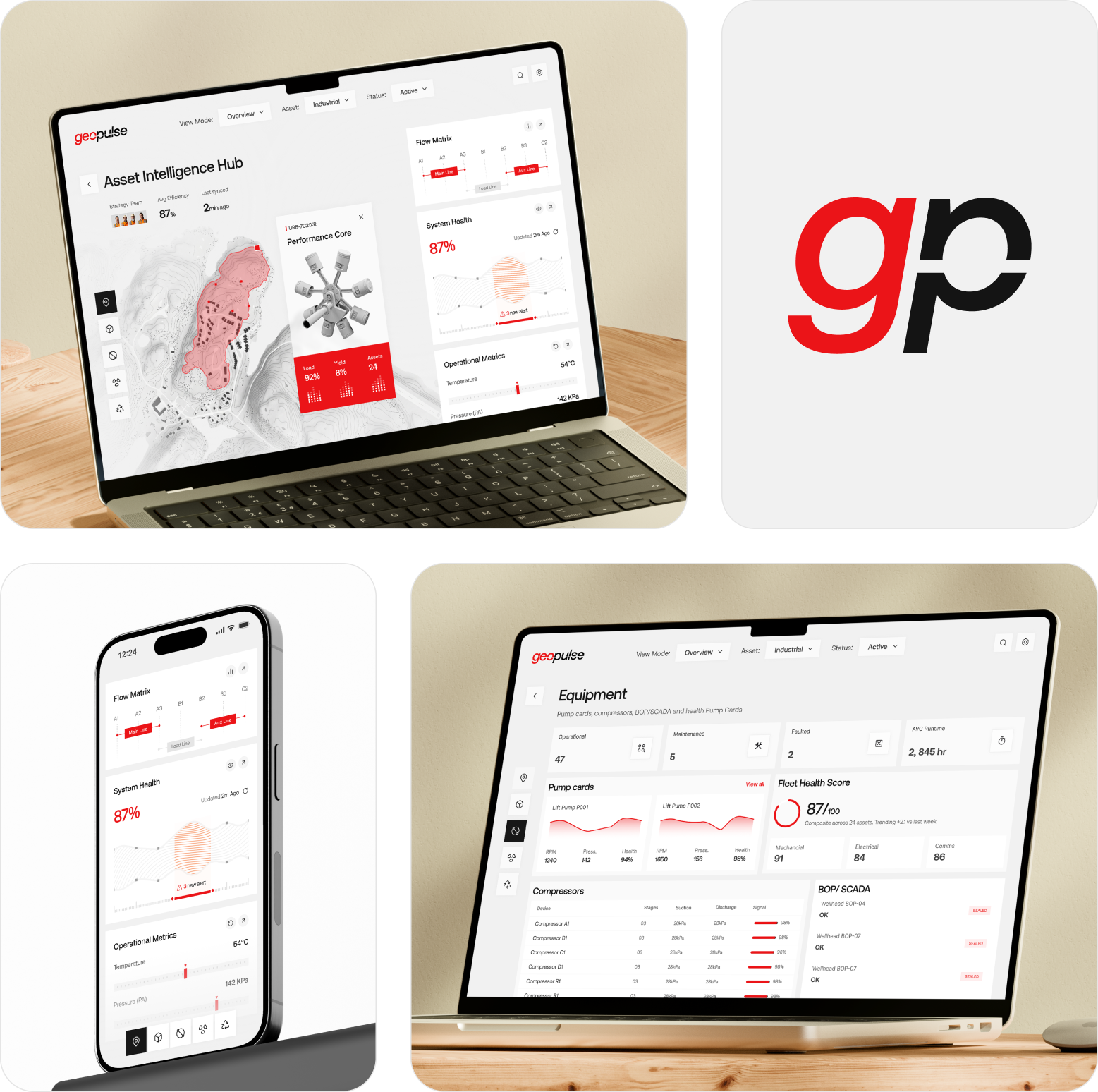
Industrial operations rarely wait for perfect information. Geopulse was designed for teams managing complex oil and gas assets, bringing real-time monitoring, production analytics, alerts, and performance data into one focused dashboard. The project gave operational teams a clearer way to track equipment, spot issues, and respond with confidence.
Problem
The challenge was making a large volume of operational information feel clear and manageable on screen. We had to establish a strong visual hierarchy, organize complex data, make critical alerts noticeable, and present performance metrics without making the dashboard feel crowded or difficult to navigate.
- Problem 1
Complex operational data needed a clear hierarchy without overwhelming the dashboard experience.
- Problem 2
Keeping crypto-heavy features approachable for both beginners and experienced users.
- Problem 3
Critical alerts needed prominent placement without disrupting the overall interface flow.
Solution
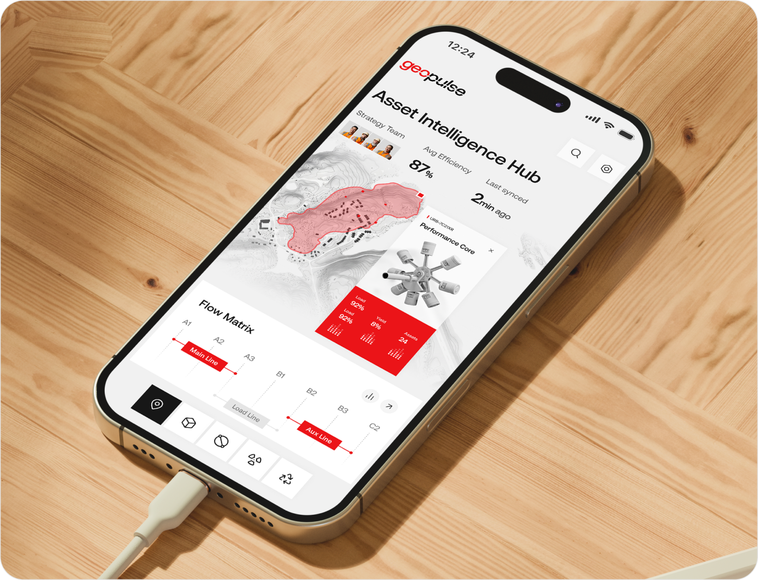
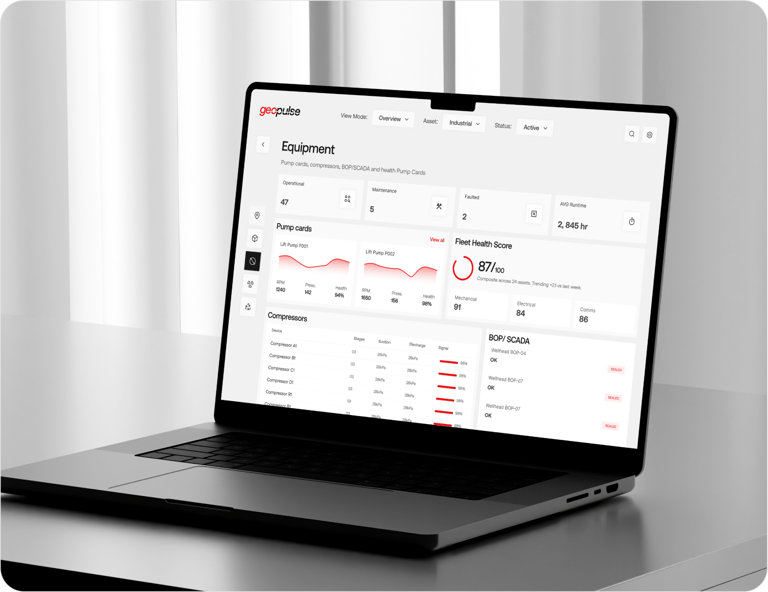
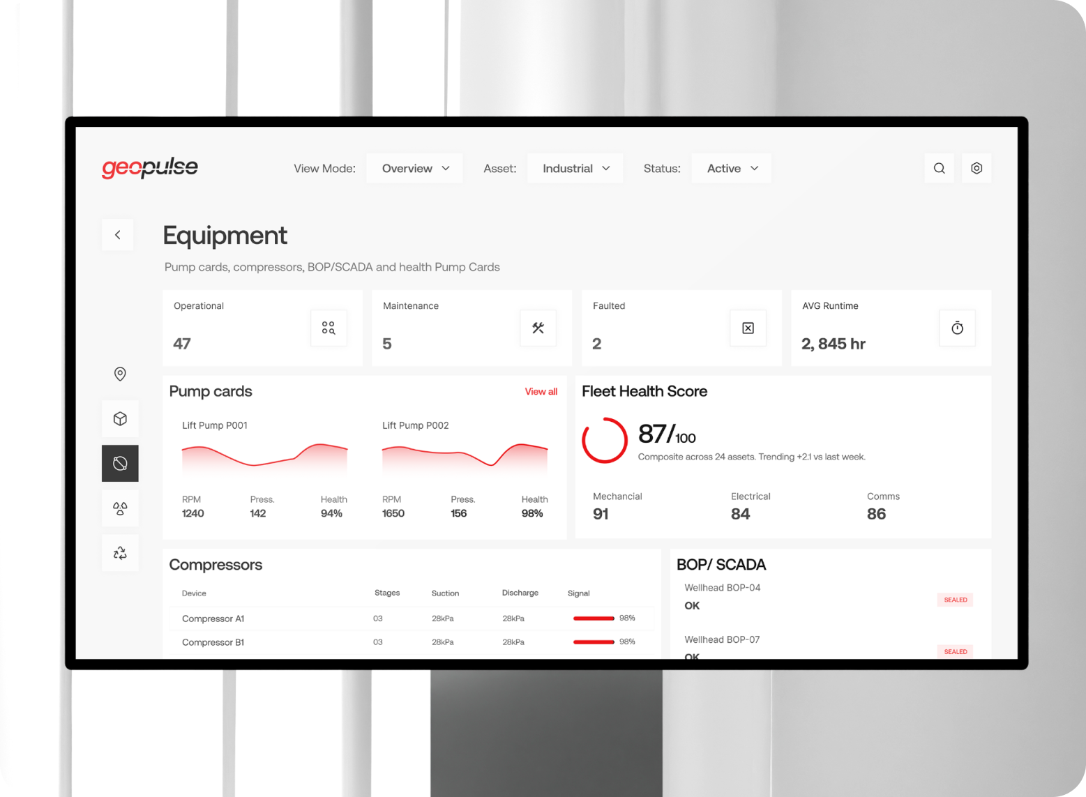
Clarity became the starting point for every screen. We organized complex operational information into a structured dashboard where assets, performance, alerts, and system health had distinct visual roles. Clear data visualization and purposeful hierarchy helped users scan critical information quickly, compare performance, and respond to operational issues with greater confidence.
- Solution 1
A structured dashboard grouped asset data, system health, alerts, and performance into clear sections.
- Solution 2
Focused data visualizations made complex metrics easier to scan, compare, and interpret.
- Solution 3
Strong visual hierarchy brought urgent alerts forward without making the interface feel crowded.

Design Process
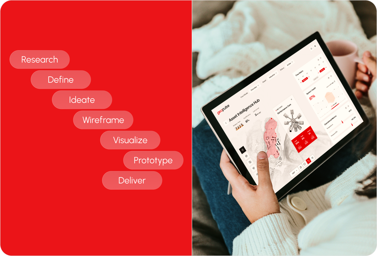
We follow a structured UI/UX design process focused on research, strategy, and seamless execution to create digital products that engage users and drive business results.

Style Guide & Component
.png)
.png)
.png)


Wireframe
& UI Design
Workflow Scenario
The process started by mapping the information users need most during daily operations. We then organized the dashboard around clear priorities, tested different ways to present complex data, and refined the interface around readability and speed. Each screen received careful attention to hierarchy, consistency, and how quickly users could reach critical information.

The Result
When complex operations have a clearer visual language, important information starts working harder. Geopulse brings asset performance, production analytics, system health, and critical alerts into one organized experience. The final interface gives operational teams a clearer view of what is happening across their assets, helping them spot important signals and respond with greater confidence.
Client feedback

We’re excited about the Äike T redesign. The team delivered a clear & intuitive experience across web and mobile, which makes it easier for users to buy or rent scooters. Their thoughtful approach to navigation, plan comparisons, and overall consistency has improved engagement and strengthened our brand’s presence in urban mobility.
.svg)
.png)

Success Stories
That Inspire Us

Design Monks delivered beautiful, functional UX that truly drove business results. Their expert team blends aesthetics with real business value, boosting our user engagement and growth. Highly recommended!

Fahim Aziz
Founder @ Backpack (YC), Affine, AlpineX


Fantastic experience working with Design Monks. They did more homework than I expected and actually studied details related to a whole new industry to iterate designs. Super professional, sleek, and fresh design output.

Rifah Tasfia
Product Consultant @ Carbobon



I've had the pleasure of collaborating with Design Monks for a while now on my new project.They're lightning-quick in addressing any questions or feedback I have, and they consistently go the extra mile to make sure I'm thrilled with the final outcome. I wholeheartedly endorse them
.avif)
Ted Nash
Founder & CEO @ Yenex

Enhance Your Brand Potential At No Cost!
Expect a response from us within 24 hours
We’re happy to sign an NDA upon request.
Get access to a team of dedicated product specialists.



Why risk it with the wrong partner? Get 100% value and guarantee. Don’t miss out - Secure your brand’s future today.
Why risk it with the wrong partner? Get 100% value and guarantee. Don’t miss out - Secure your brand’s future today.