
.svg)


Key Takeaways
- Slow UI breaks trust faster than slow systems.
- Users need instant feedback, not instant results, to stay confident.
- Skeleton screens and progress bars make waiting feel shorter and intentional.
- Disabled buttons and loading states prevent duplicate actions and user errors.
- Clear feedback at every interaction keeps users in control and engaged.
A product can be powerful, fast, and well-built and still lose users in seconds, not because it is slow, but because it feels slow. In the most common UI examples of slow user action response time, perception is the real problem, not performance.
A button that shows no reaction when clicked leaves users wondering if it registered. A search bar that stays blank after typing gives no signal that anything is happening. In both cases, the system may be working perfectly fine in the background, but because the interface stayed silent, the user lost trust.
Let's dig deep, see where this gap appears, and how you can close it.
What Is Slow User Action Response Time in UI Design?
When we talk about response time in UI design, we mean the gap between when a user does something and when the interface acknowledges it.
That acknowledgment doesn't have to mean the task is done. It just means the system has noticed. A simple spinner, a button color change, a progress bar, any of these tells the user: "Got it. Working on it."
Without this kind of feedback, users are left in silence, and that silence quickly turns into confusion. To understand why this matters so much, we need to separate how fast a system is from how fast it feels.
Understanding System Response Time vs Perceived Response Time
There are two sides to response time. System response time is the technical part, it is how quickly the backend processes a request. It’s measured in milliseconds and handled mostly by engineering.
But in UX design, perceived response time matters more. This is how fast the interaction feels to the user.
And here’s where things get interesting, these two don’t have to match. A system can be technically slow but feel fast, or technically fast but feel slow. The difference comes down to feedback.
When users see movement, loading indicators, or small visual changes, they feel like something is happening. That sense of activity reduces uncertainty and makes waiting feel shorter.
For example, a form that takes two seconds to submit feels almost instant if the button immediately shows a loading state. But without any visual change, even that same two seconds feels like the system has frozen.
And once users start feeling delays, their expectations change instantly.
Why Users Expect Instant Feedback?
Users are usually focused on completing a task, not waiting for a system to respond. Because of that, even the smallest delay can feel noticeable. The moment there is no immediate feedback, the brain starts questioning what is happening.
That uncertainty breaks the flow. Instead of continuing smoothly, users pause mentally and wonder if something went wrong. This is exactly where frustration starts building, not because the system is actually slow, but because it is not communicating clearly.
And once that doubt enters the experience, even small interactions begin to feel unreliable.
Why Slow UI Responses Create Poor User Experiences?
Slow UI response time is not just about small annoyances during use. It has real consequences for both users and businesses because every delay changes how people feel about the product and how they behave inside it.
To understand the impact clearly, we need to look at what happens at different stages of the user experience:
Increased User Frustration and Uncertainty
When an interface does not respond immediately, users are left guessing. They start asking simple questions in their mind:
- Did the action work?
- Is the system still processing?
- Did something go wrong?
This uncertainty builds frustration very quickly. Instead of staying focused on their task, users begin to second-guess the system. Many of them try clicking again, which can make the situation worse by triggering duplicate actions. Others assume the product is broken or unreliable.
In both cases, the result is the same, trust starts to break down, not because of a major failure, but because of missing feedback at the right moment.
Higher Error Rates and Repeated Actions
When users lose clarity, they often repeat actions like clicking submit buttons, tapping payment options, or refreshing the page.
This leads to issues such as double-clicking, duplicate submissions, and accidental errors. For example, a user may click a payment button twice and trigger double charges, or submit a form multiple times, creating duplicate entries.
Refreshing during processing can also interrupt actions and cause incomplete results. These problems don’t happen because users are careless. They happen because the interface fails to show clear feedback that something is already in progress.
Without a visible “processing” state, users assume nothing happened and act again.
Reduced Conversion and Retention Rates
When these small moments of confusion keep happening, users slowly lose patience with the product. Over time, they start avoiding it altogether.
Research from the Nielsen Norman Group consistently shows that even small delays in response time can significantly increase user drop-off rates. The faster and clearer the response, the more likely users are to continue interacting.
In ecommerce, even a one-second delay during page response can reduce conversions. In SaaS tools, slow dashboards or laggy interactions frustrate users who depend on speed to complete their work efficiently.
So the impact of slow UI response goes beyond frustration, it directly affects user retention, conversion rates, and overall business performance.
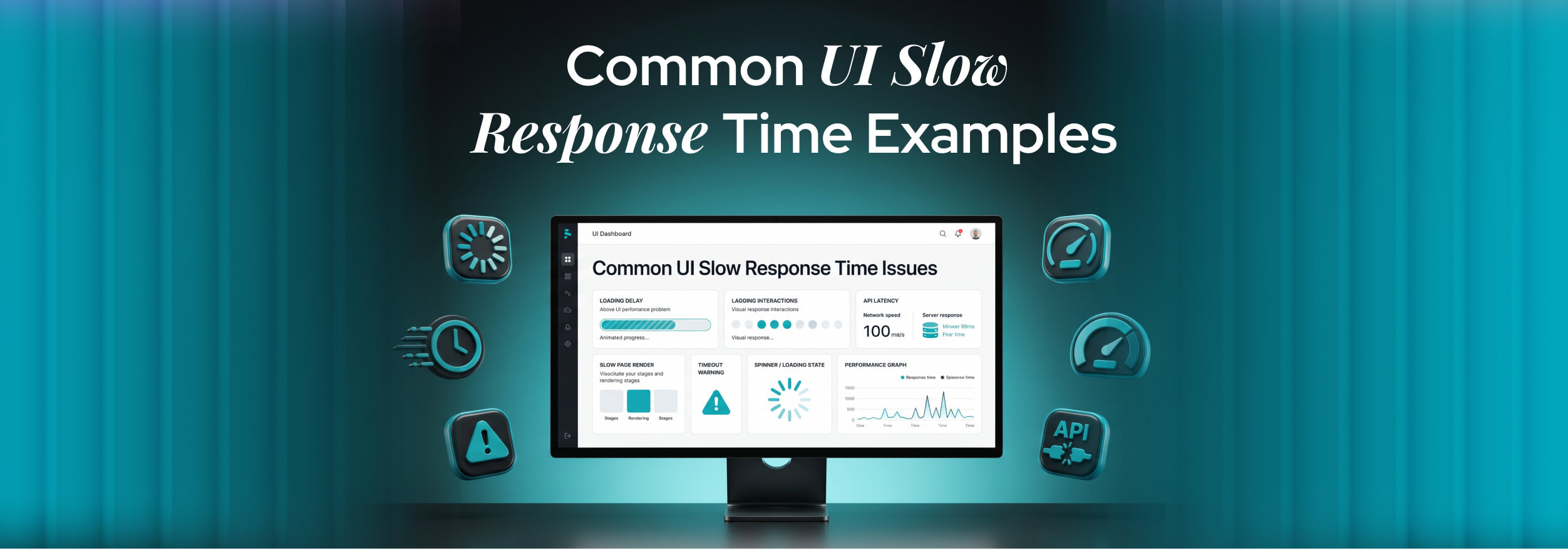
Common UI Examples of Slow User Action Response Time
Let’s look at where this problem actually shows up in real products. These are everyday UI patterns most users have already experienced, even if they didn’t know what caused the frustration:
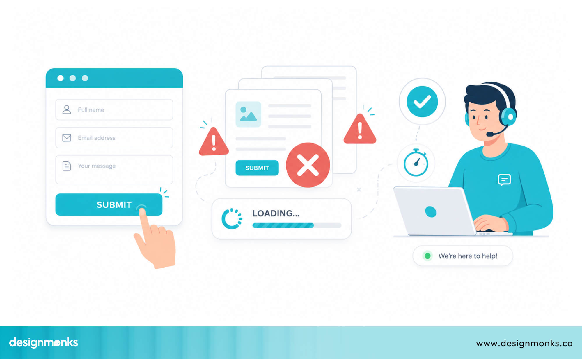
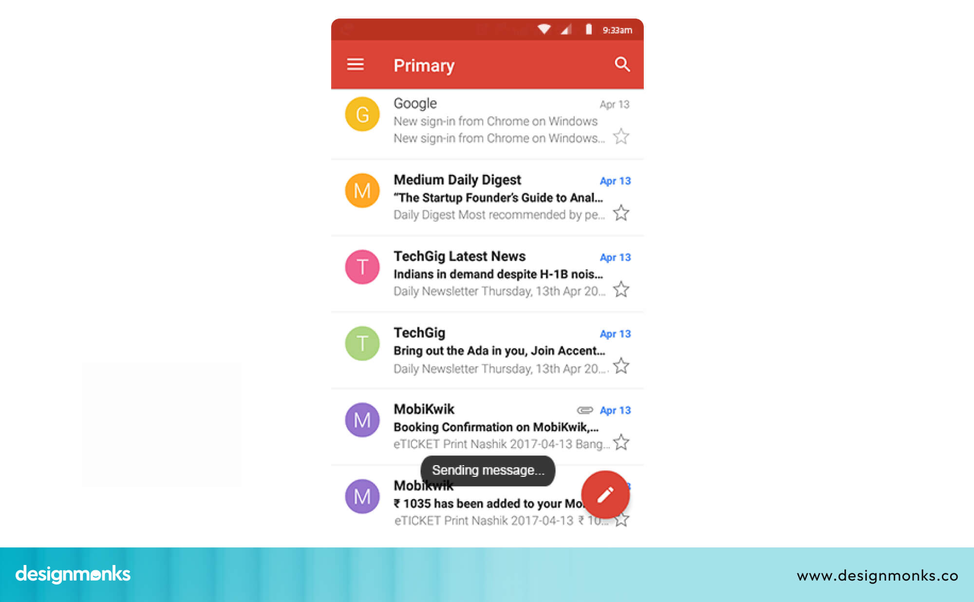
Submit Buttons That Show No Immediate Feedback
This is one of the most common issues in UI design. A user fills out a form such as sign-up, checkout, or contact and clicks “Submit,” but nothing changes on the screen. No spinner, no color change, no message.
This creates immediate confusion. Users start wondering if the click worked, if the page is loading, or if there is a system error.
The solution is simple. The moment it is clicked, the button UI design should respond by disabling it and showing a clear state like “Submitting…” or a loading spinner. This small feedback removes uncertainty instantly.
Search Bars With Delayed Results
Autocomplete search is powerful, but only when it feels instant. When there is a delay between typing and results appearing, users lose rhythm. They either type faster trying to “force” results or stop and question whether the search is working.
Even a delay of a few hundred milliseconds can feel noticeable. If it stretches to a few seconds, users often abandon the search completely. Smooth, near-instant feedback is what keeps the experience feeling responsive and reliable.
Dropdown Menus That Take Too Long to Open
In complex apps and dashboards, dropdown menus often load data dynamically. When this takes time, users click and wait in silence, staring at an empty or partially loaded menu.
This is especially frustrating in workflows where dropdowns are used repeatedly, such as filtering data or assigning tasks. Even small delays add up over time and break the natural flow of interaction.
Slow Page Transitions After User Actions
When users click a link or perform an action that leads to another page, they expect a fast transition. If the screen stays blank or pauses before loading, it feels like the system has frozen.
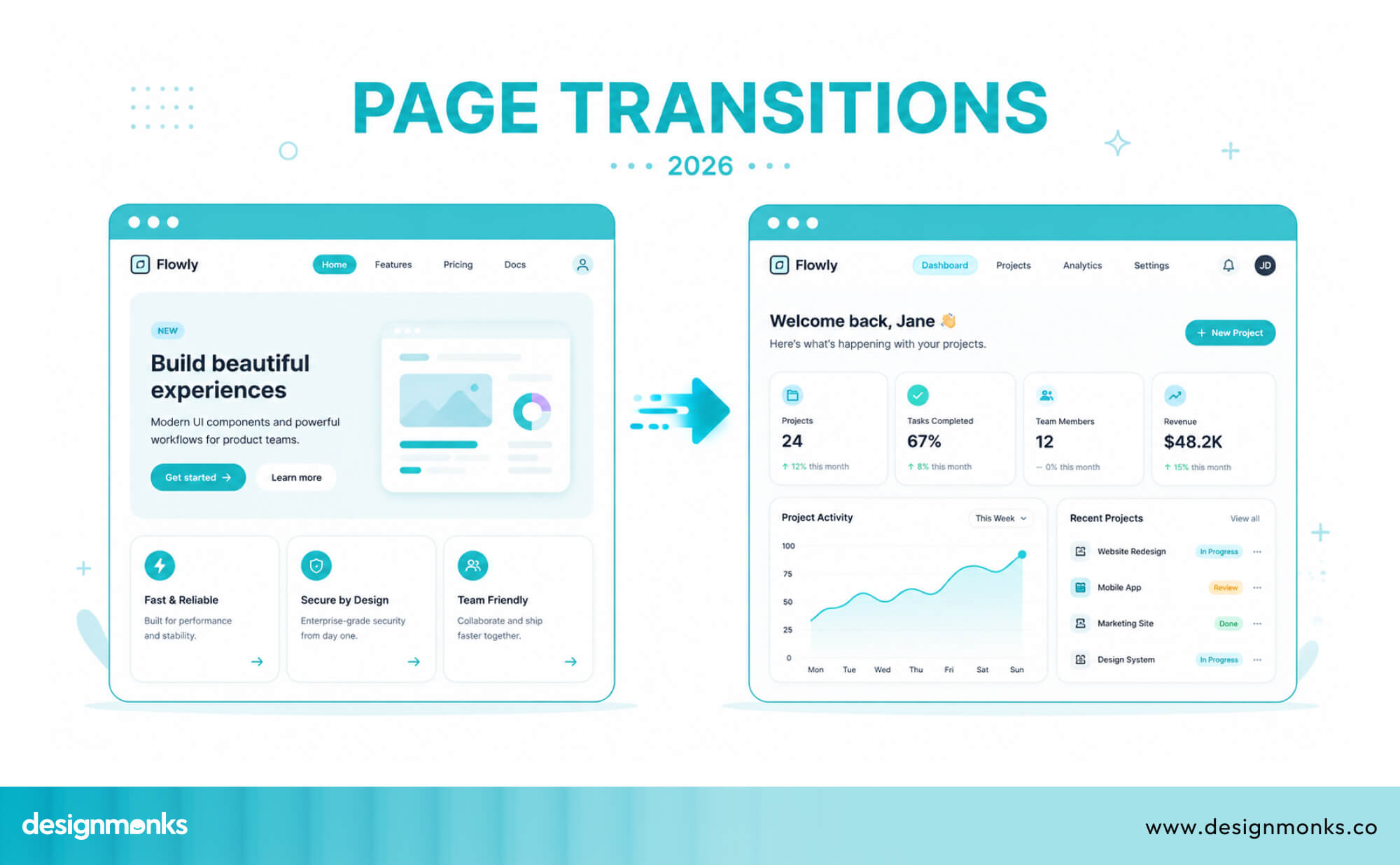
This is common in single-page applications where heavy data loading happens during route changes. Without proper loading states, users lose their sense of control over the interface.
Shopping Cart Updates That Lag Behind Clicks
In ecommerce, adding an item to the cart should feel instant. Users expect the cart count to update immediately, along with a quick confirmation.
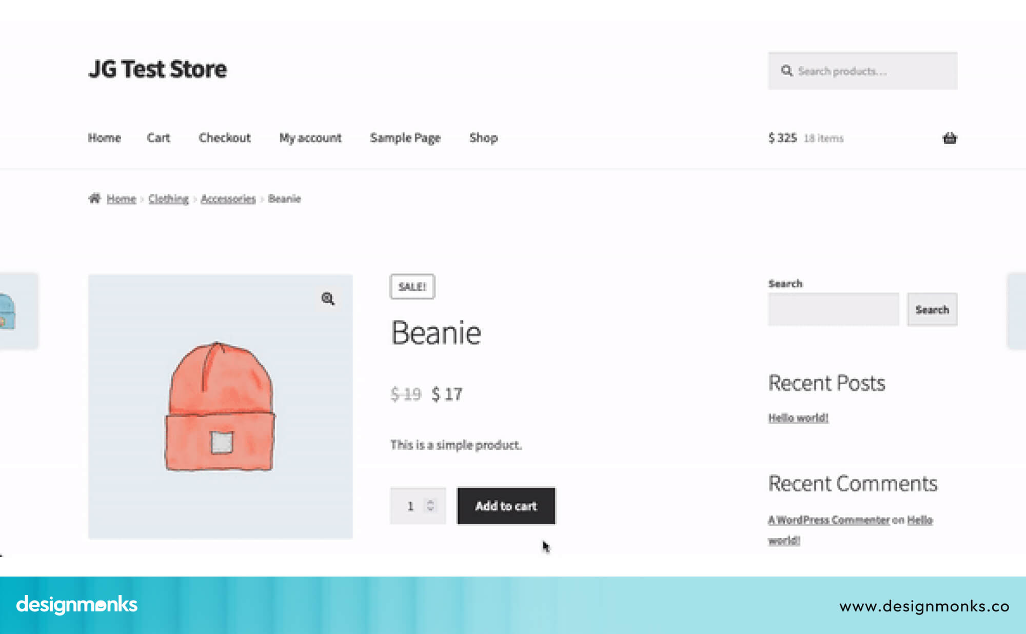
When there is a delay, users get uncertain and may click again, leading to duplicate actions or confusion. This hesitation breaks the shopping flow and increases the chance of cart abandonment.
Mobile App Screens That Freeze During Data Fetching
On mobile devices, delays feel even worse. Users often tap into a screen and see nothing happening, no animation, no loading indicator, just a frozen interface.
Since mobile users are often on slower networks, any lack of feedback makes the app feel broken. That's why designers need to be extra careful when designing mobile UI/UX.
A simple loading state or skeleton screen can completely change this perception.
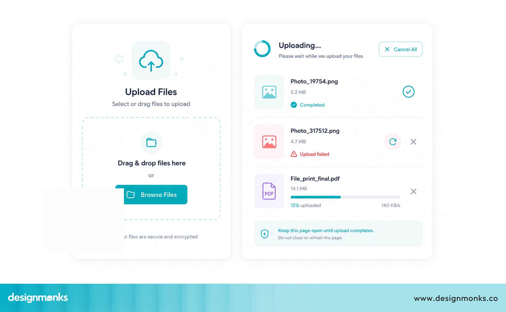
File Upload Interfaces Without Progress Indicators
File uploads naturally take time, but silence makes them feel worse. When users upload a file without any progress indicator, they are left guessing if it is working or stuck.
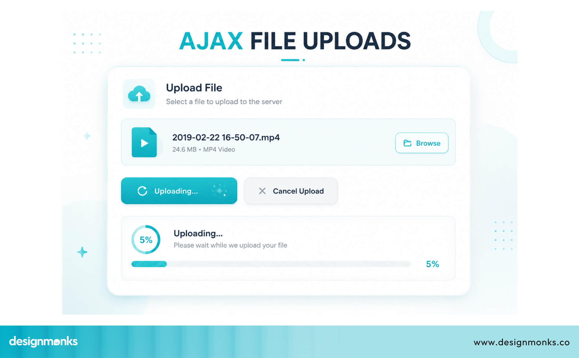
A clear progress bar or percentage indicator solves this by showing movement and progress. Without it, users often retry or close the page, risking failed uploads or duplication.
Slow Dashboard Filtering and Sorting Interactions
In SaaS tools and analytics dashboards, users frequently apply filters and sort large datasets. When each action takes time to reflect, it creates constant interruption.
For power users, this repeated waiting breaks focus and makes the tool feel inefficient, even if the data itself is accurate. Smooth, responsive filtering is essential for maintaining workflow momentum.
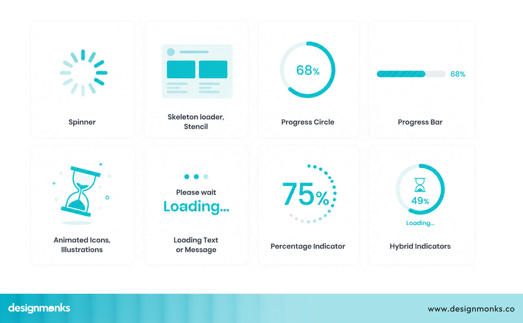
UI Feedback Patterns That Reduce Perceived Waiting Time
You don’t always need a faster system to create a better experience, you need better feedback. UI feedback patterns help reduce the feeling of waiting by showing users that something is happening.
Instead of silence, users see immediate visual responses that guide them through the process. This simple shift from no feedback to clear feedback can make interactions feel faster, smoother, and far more reliable. Here's how you can do them:
Skeleton Screens Instead of Blank Loading Pages
A skeleton screen is a placeholder layout that mimics the shape of the content that's about to load. Instead of a blank page or a spinning loader, users see a gray silhouette of the interface.
It also has blocks where text will appear and shapes where images will go.
This works because it gives users something to look at. Their brain starts processing the layout even before the real content arrives.
Facebook, LinkedIn, and YouTube all use skeleton screens, and these skeleton screens make loading feel nearly invisible.
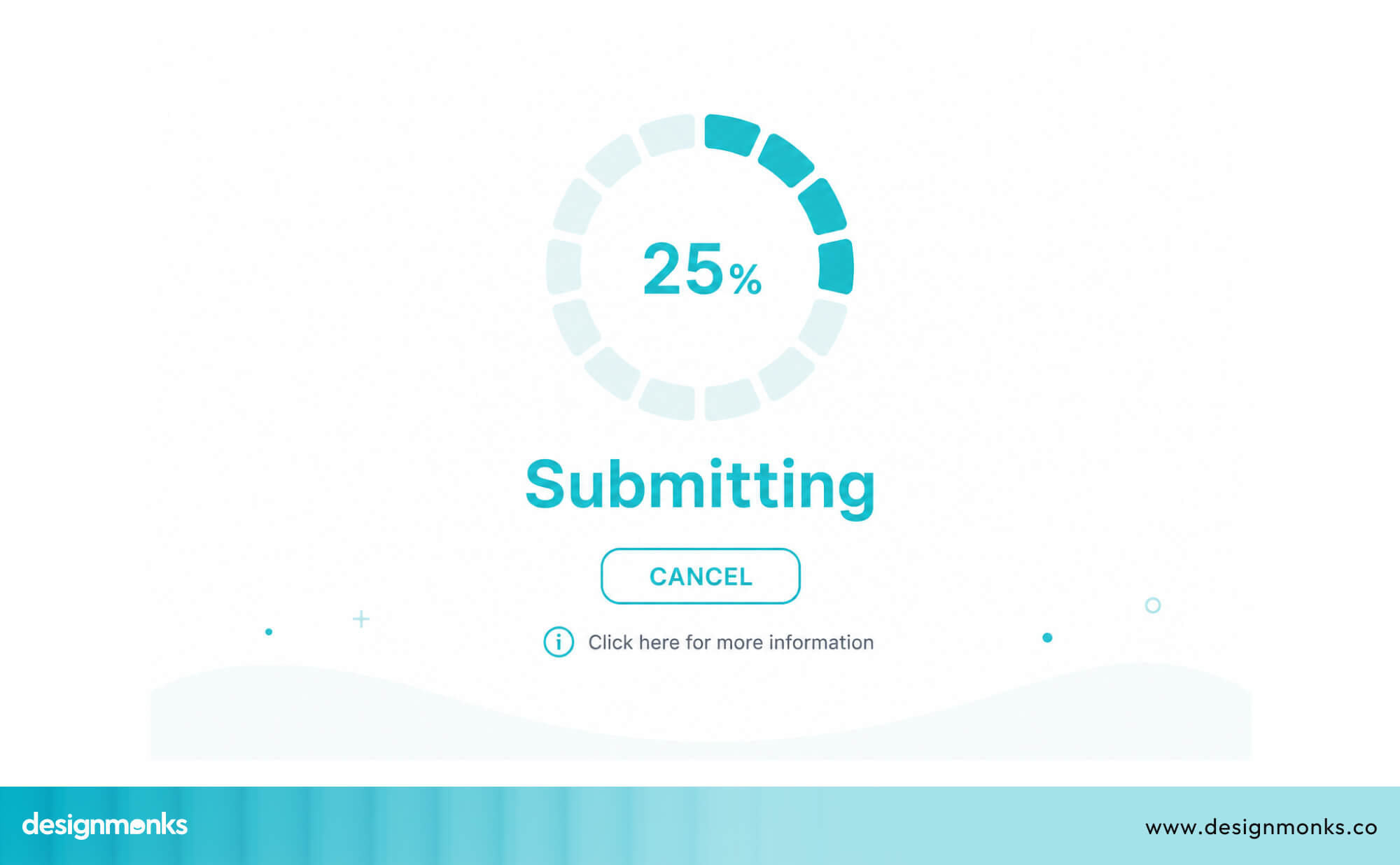
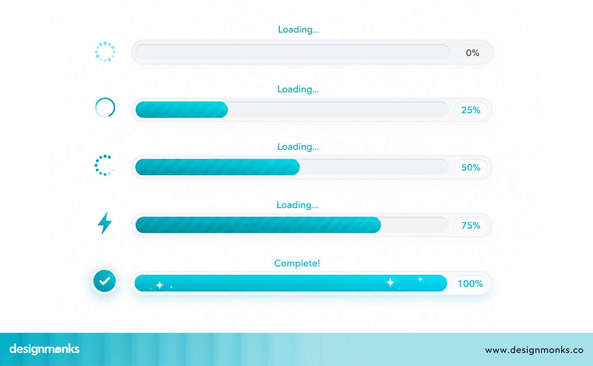
Progress Bars for Long Operations
When an operation genuinely takes time, like a large file upload, a data export, or a background sync, a progress bar is your best friend. It tells the user exactly how far along the process is, which transforms "I have no idea what's happening" into "I'm 70% there."
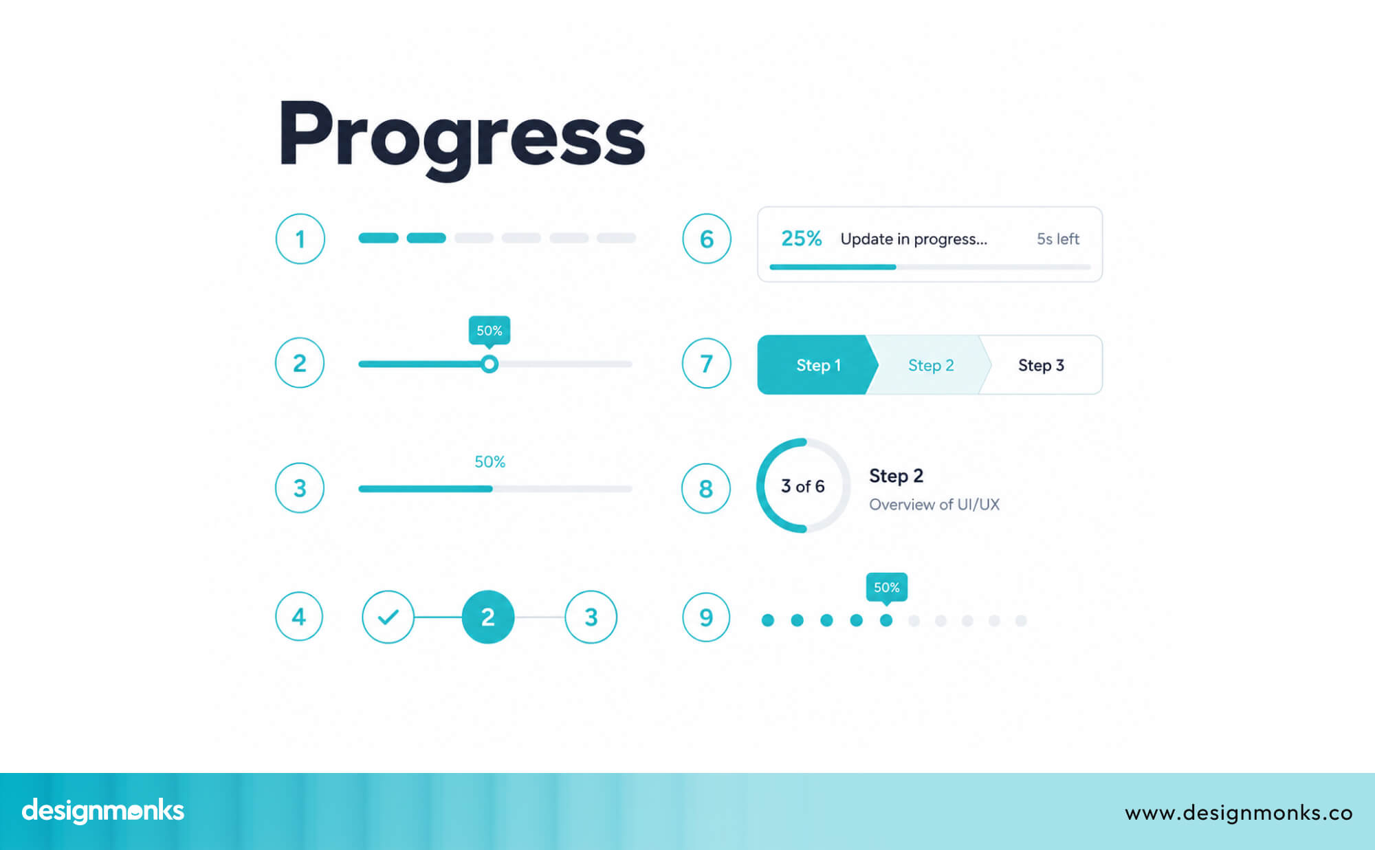
Progress bars don't just provide information. They reduce anxiety. Even if the process takes two minutes, users are far more patient when they can see progress.
Optimistic UI Updates
This is a clever pattern where the interface updates before the server confirms the action. For example, when a user likes a post, the like count goes up immediately even before the server has processed the request.
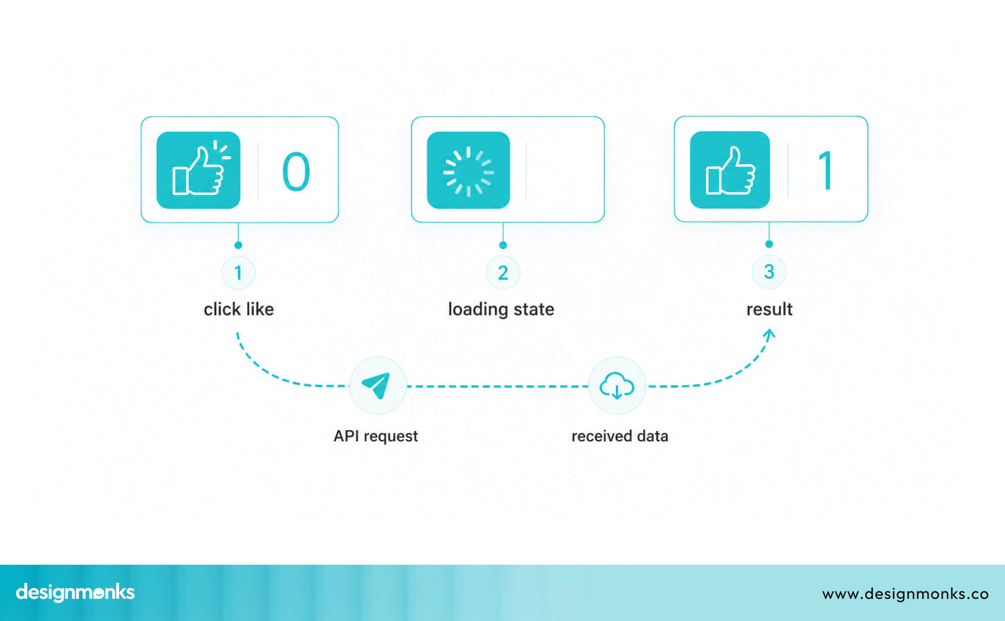
But if the server responds with an error, the update rolls back. It sounds risky, but for low-stakes actions (likes, saves, toggles), it works extremely well. The experience feels instant because it is instant from the user's perspective.
Inline Status Messages and Micro-feedback
Small, subtle signals can make a big difference. A brief "Saving..." text near a form field. A checkmark that appears when a field is valid. A toast notification that says "Changes saved" after an action completes.
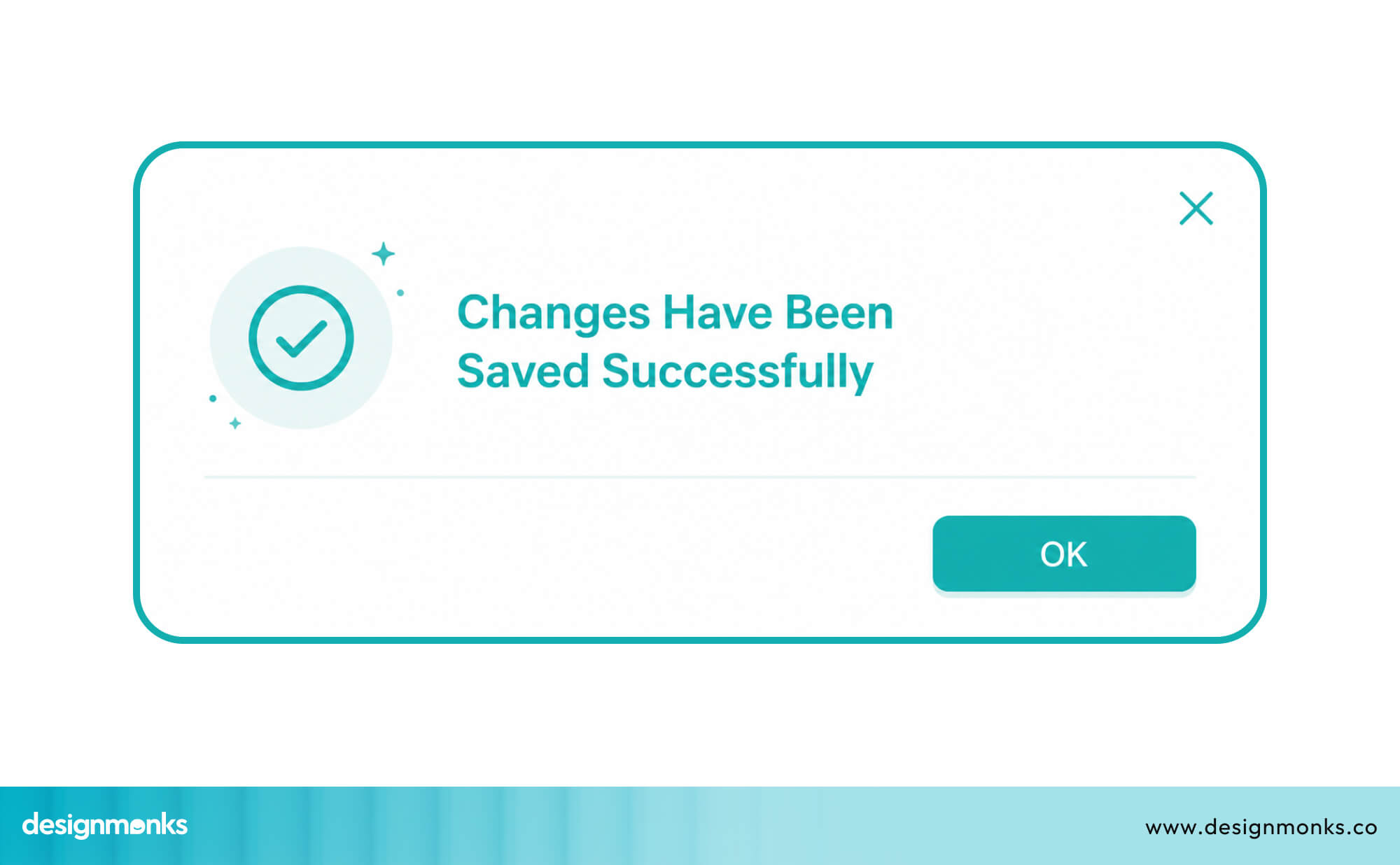
These micro-interactions tell users that the system is aware of what they're doing. They don't need to be loud or flashy, just present and clear.
UX Response Time Guidelines Every Designer Should Know
Jakob Nielsen, one of the most respected voices in UX research, identified three key response time thresholds decades ago. They still hold up today, they are:
The 0.1 Second Rule
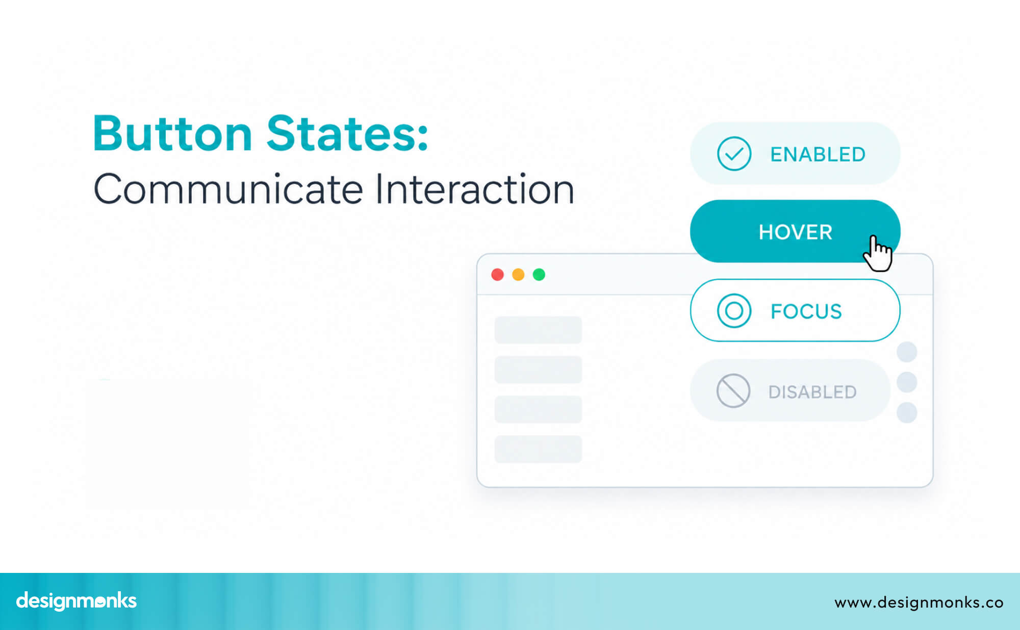
Any response under 0.1 seconds (100 milliseconds) feels instantaneous. Users don't perceive any delay, the interface feels directly connected to their input. This is the gold standard for button clicks, hover states, and basic interactions.
The 1 Second Rule
Responses under 1 second keep users in their flow. They notice the delay, but it doesn't break their concentration.
However, you still need to show some kind of acknowledgment, even if processing is happening in the background. Without visual feedback, even one second starts to feel long.
The 10 Second Rule
Ten seconds is the absolute maximum before users start to disengage. Beyond this point, many will abandon the task entirely. If any operation in your product takes more than 10 seconds, you need a clear progress indicator and ideally the ability to continue doing other things while it processes.
Best Practices for Designing Around Slow System Performance
Sometimes you can't make the backend faster. Servers have limits, APIs have latency, and networks are unpredictable. But you can design around those constraints:
Always Acknowledge User Actions Immediately
No matter how slow the backend is, the frontend should respond to user actions within 100 milliseconds. That means the button should change state, the spinner should appear, or the field should show a visual cue the moment the user acts.
This one rule, applied consistently, eliminates most of the frustration around slow response time.
Disable Duplicate Actions During Processing
When a user clicks a button that triggers a slow process, disable that button immediately. This prevents the user from clicking it again, which would cause duplicate submissions, errors, or worse.
Also consider disabling related form fields during processing to prevent users from making changes mid-submission.
Communicate What's Happening Behind the Scenes
If a process takes more than a second or two, tell the user what's going on. "Uploading your file..." or "Fetching your data..." is far better than silence. It reassures users that the system is working and they should stay patient.
For very long processes, consider adding estimated time remaining. Even a rough estimate like "This usually takes about 30 seconds" sets expectations and reduces frustration.
Design for Progressive Loading
Instead of waiting for all data to load before showing anything, load and display content incrementally. Show the top of the page first, while the bottom loads. Show cached data immediately, then refresh it silently.
This pattern, often called progressive loading, makes pages feel snappier even when the total load time is the same. Users can start reading or interacting with content before everything has fully arrived.
Real-World UI Examples From Popular Products
Let's look at how some of the best-designed products handle this challenge:
How Gmail Handles Sending Delays
When you send an email in Gmail, the interface immediately shows a "Sending..." toast notification at the bottom of the screen. Within moments, it changes to "Message sent" with an option to undo.
The whole experience feels fast and controlled, even though email delivery involves multiple servers working in sequence. Gmail also lets you keep composing or navigating while the email sends in the background, you're never blocked from doing other things.
How Slack Uses Loading Feedback
Slack handles network delays gracefully. When a message fails to send due to connectivity issues, it shows a clear warning inline. It will be right next to the message with a "Retry" option. As a result, users always know the status of their messages.
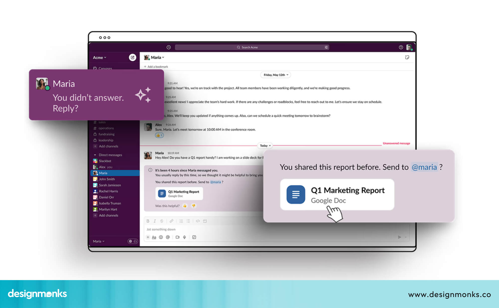
Slack also uses optimistic UI for most message sends. The message appears in the chat immediately, and syncs to the server in the background.
The result is a conversation that feels real-time, even on imperfect connections.
How Figma Manages Collaborative Updates
Figma is a collaborative design tool where multiple people can edit the same file simultaneously. Handling all those real-time updates without making the app feel laggy is a massive challenge, but Figma pulls it off remarkably well.
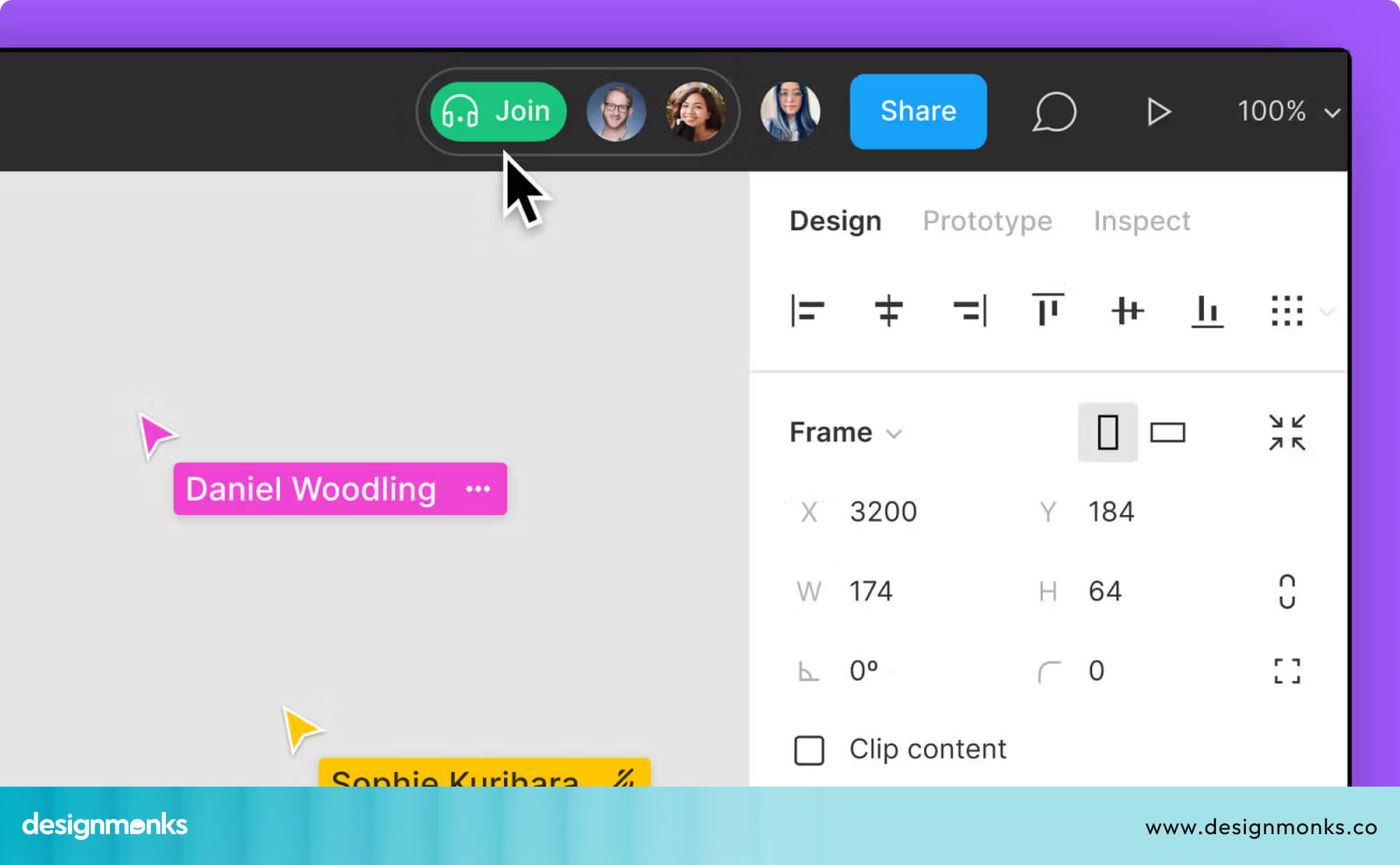
It uses a combination of optimistic updates, graceful conflict resolution, and subtle indicators (like showing collaborators' cursors in real-time) to keep the experience smooth.
Users always feel in control, even in complex multi-user sessions.
How Airbnb Uses Skeleton Screens
Airbnb is one of the most prominent users of skeleton screens. When you search for a listing and results are loading, you see a grid of gray placeholder cards. It's the exact shape and size of the real listing cards.
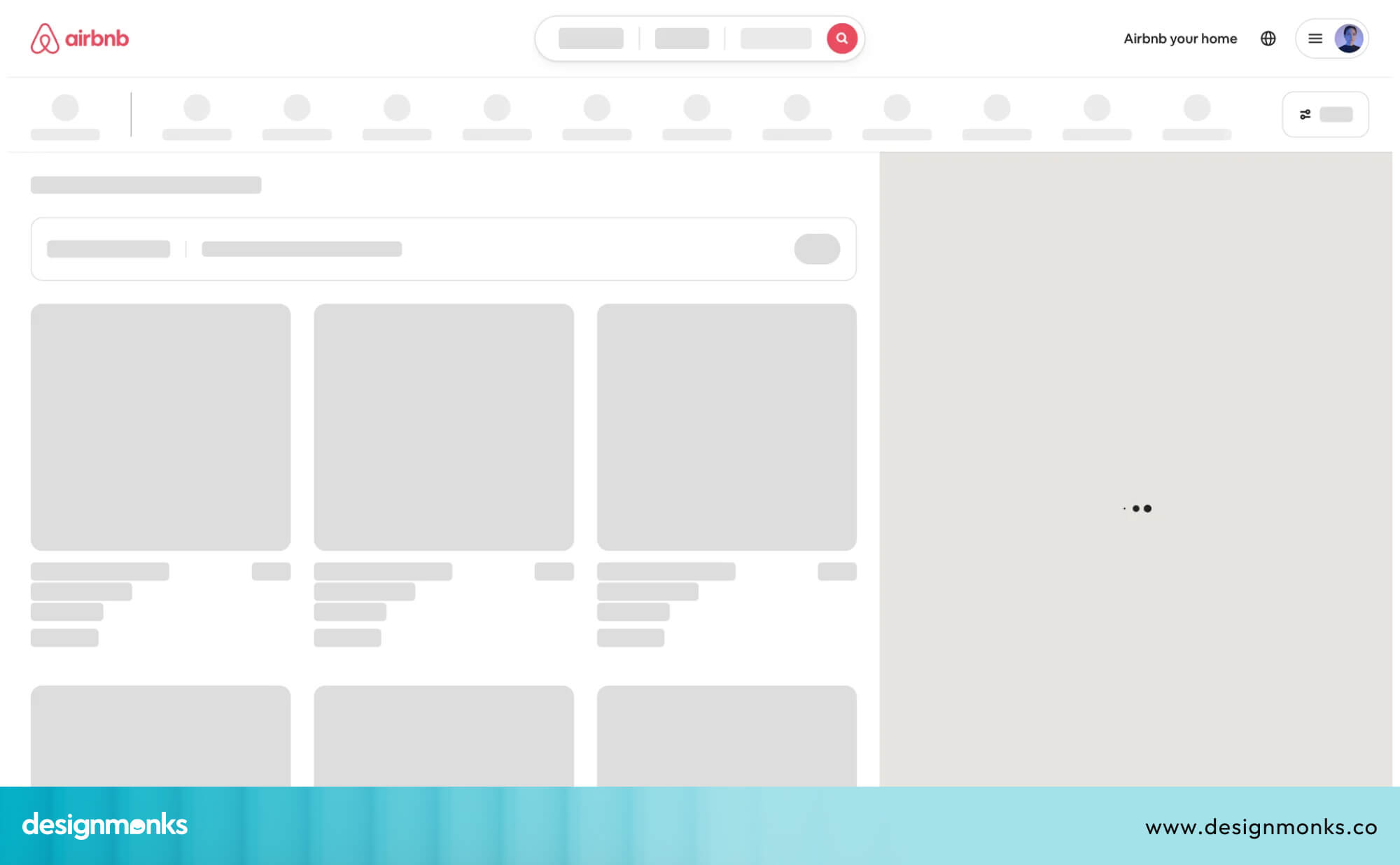
This makes the loading process feel smooth and intentional, rather than like a broken page.
The result is that users feel like results are "almost there," which keeps them engaged through the loading period instead of bouncing away.
How Design Monks Designs for Perceived Speed
In many of their product designs, Design Monks focuses heavily on perceived performance. Instead of leaving users waiting, their interfaces use clear loading states, smooth transitions, and immediate feedback patterns.
For example, actions like form submissions or dashboard updates are designed to respond instantly with visual confirmation, even if the system is still processing in the background.
This keeps users informed and reduces uncertainty during interactions. The result is a smoother experience where users feel in control, even when dealing with complex or data-heavy systems.
UX Audit Checklist for Identifying Slow Response Issues
If you're doing a UX audit on your own product, here are the key areas to check for slow response time problems:
- Missing loading states: Does every action that takes longer than ~100ms show clear feedback? Check buttons, forms, search fields, and navigation links. Users should never feel like nothing is happening.
- Delayed button feedback: Do buttons respond instantly when clicked? They should visually change state right away (pressed, loading, or disabled) to confirm the action was received and to prevent double clicks.
- Search latency: How fast do autocomplete or search results appear? Test this under slower network conditions too, since users with weak connections will experience delays more often.
- Dashboard refresh delays: When users filter, sort, or update tables and charts, does the interface respond quickly? If not, is there a loader or progress indicator showing that something is happening?
- Mobile interaction lag: Test taps and gestures on a real mobile device. If screens freeze or show blank states while data loads, you likely need skeleton screens or better loading feedback.
- Upload feedback gaps: Any file upload feature should clearly show progress. Users should be able to see how much has been uploaded and how long it might take.
- Error state communication: When something fails (like a form submission, network issue, or timeout), is the message clear? Avoid vague errors, users should understand what went wrong and what to do next.
Wrapping Up
Slow user action response time is a common but often overlooked UX issue. Users don’t expect instant results every time, but they do expect clear feedback that something is happening.
Simple fixes like loading states, skeleton screens, progress bars, and better error messages can greatly improve the experience. You don’t always need major technical changes, just better communication between the system and the user.
When feedback is clear and immediate, the product feels faster, smoother, and more trustworthy overall.

.avif)
.avif)
.avif)
.avif)


.avif)
.avif)
.avif)
.avif)


.avif)


