
Key Takeaways
- The best Shopify website design ideas combine strong branding with easy navigation.
- Choose consistent colors, typography, and imagery to create a memorable storefront.
- Use clear product pages, customer reviews, and visible purchase buttons.
- Prioritize mobile-friendly layouts, fast loading, and simple checkout experiences.
- Choose a Shopify theme that supports your brand and business goals.
What makes a shopper fall in love with an online store before buying? It's an experience that makes browsing enjoyable, finding products easier, and shopping feel effortless. The best Shopify website design ideas combine thoughtful layouts, strong visuals, and simple features to help customers shop with confidence.
But what does that look like in practice? A fashion store might use editorial photography, while a skincare brand may rely on soft colors and clean product displays. Different products call for different design approaches.
Let's look at real Shopify store examples, discover what makes their websites memorable, and find ideas you can adapt to your own online business.
What Makes a Shopify Website Design Great?
The best Shopify website design ideas combine visual appeal with a smooth shopping experience. A great store doesn't just look attractive; it helps shoppers discover products, understand what they're buying, and complete their purchases without confusion. From bold brand colors to clean product pages, the right design choices can make your store more memorable and easier to use.
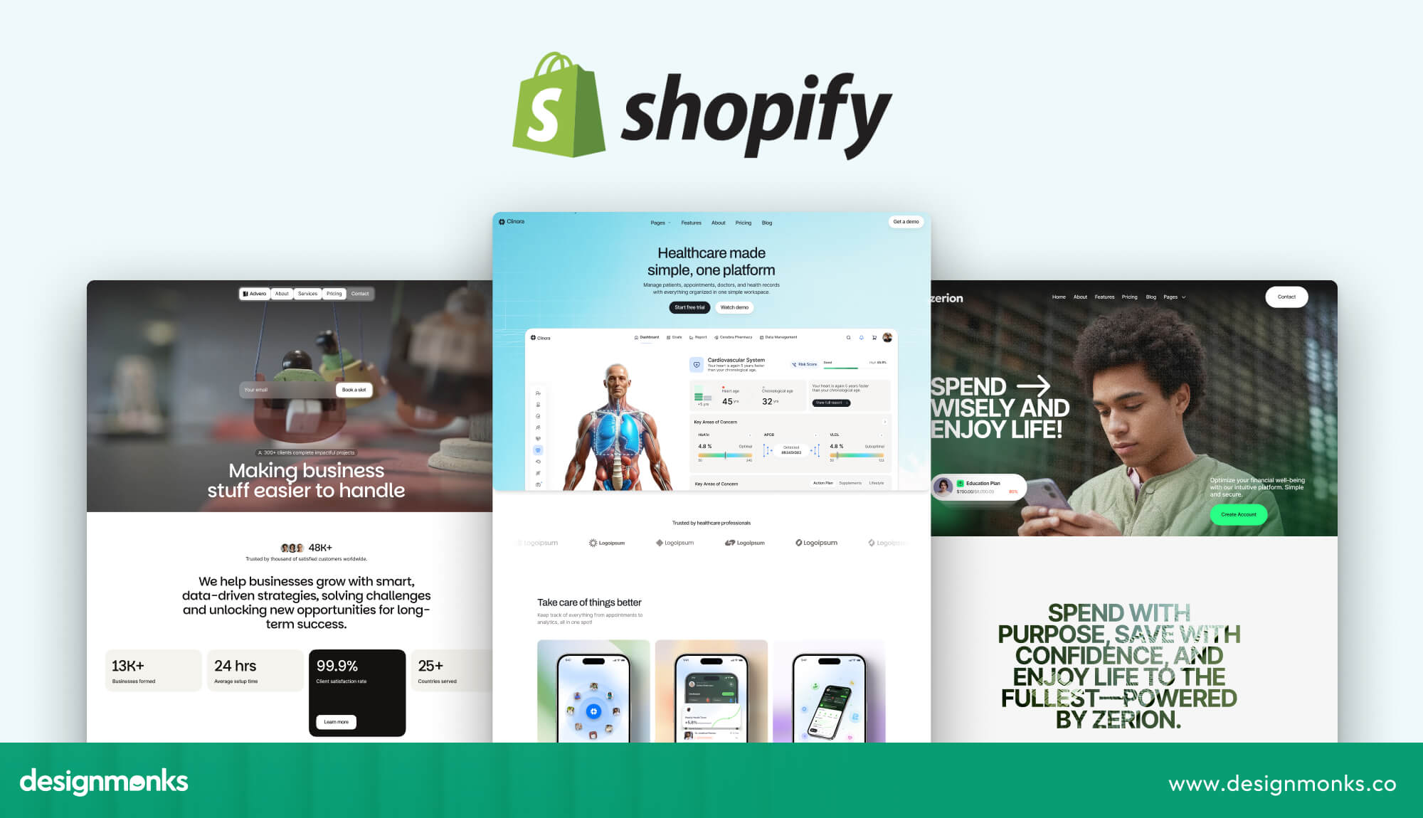
Here are some key ideas to look for when exploring Shopify website designs:
- Strong brand identity: Use colors, fonts, and visuals that reflect your brand's personality.
- Clear navigation: Make it easy for shoppers to browse categories and find products.
- Engaging product displays: Use high-quality photos, videos, and helpful product details.
- Trust-building elements: Include customer reviews, ratings, and clear shipping and return policies.
- Simple shopping experience: Keep product selection, cart access, and checkout straightforward.
Now, let's explore real Shopify stores and the creative design ideas you can borrow from them.
Best Shopify Website Design Examples to Learn From
The best Shopify designs stay consistent. A useful pattern among strong stores is to use one color palette, no more than two fonts, and one consistent photo style across the site.
Each example below shows what works and what you can borrow:
Fashion and Apparel Examples
Fashion shoppers often want to see how products look, fit, and work together. Your website should make those details easy to explore while giving your brand a recognizable style.
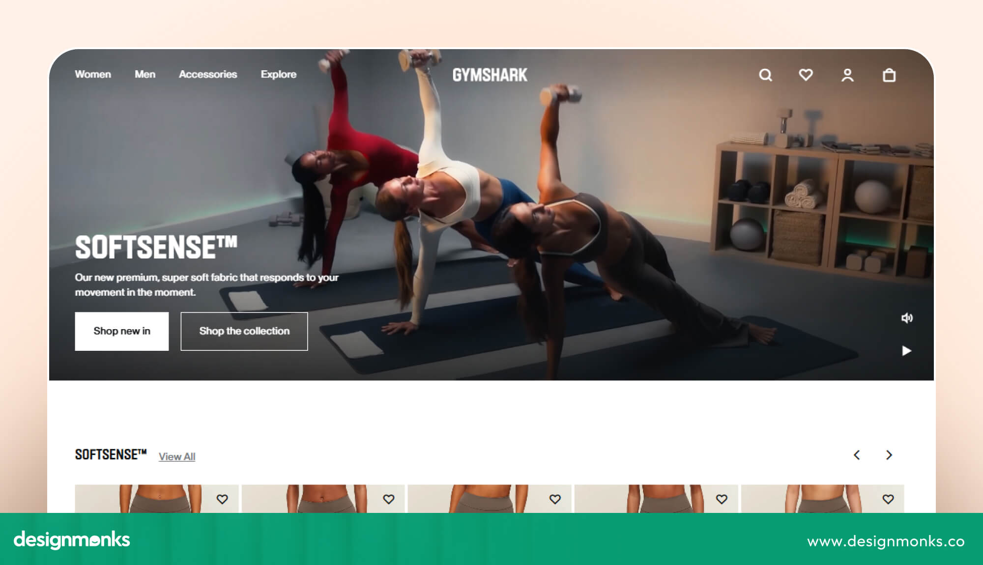
Gymshark is a strong example of a product-focused fashion store. In a 2026 review of 10 Shopify stores, it received a 4.7/5 design score. Its organized product categories and prominent product imagery help shoppers explore different collections.
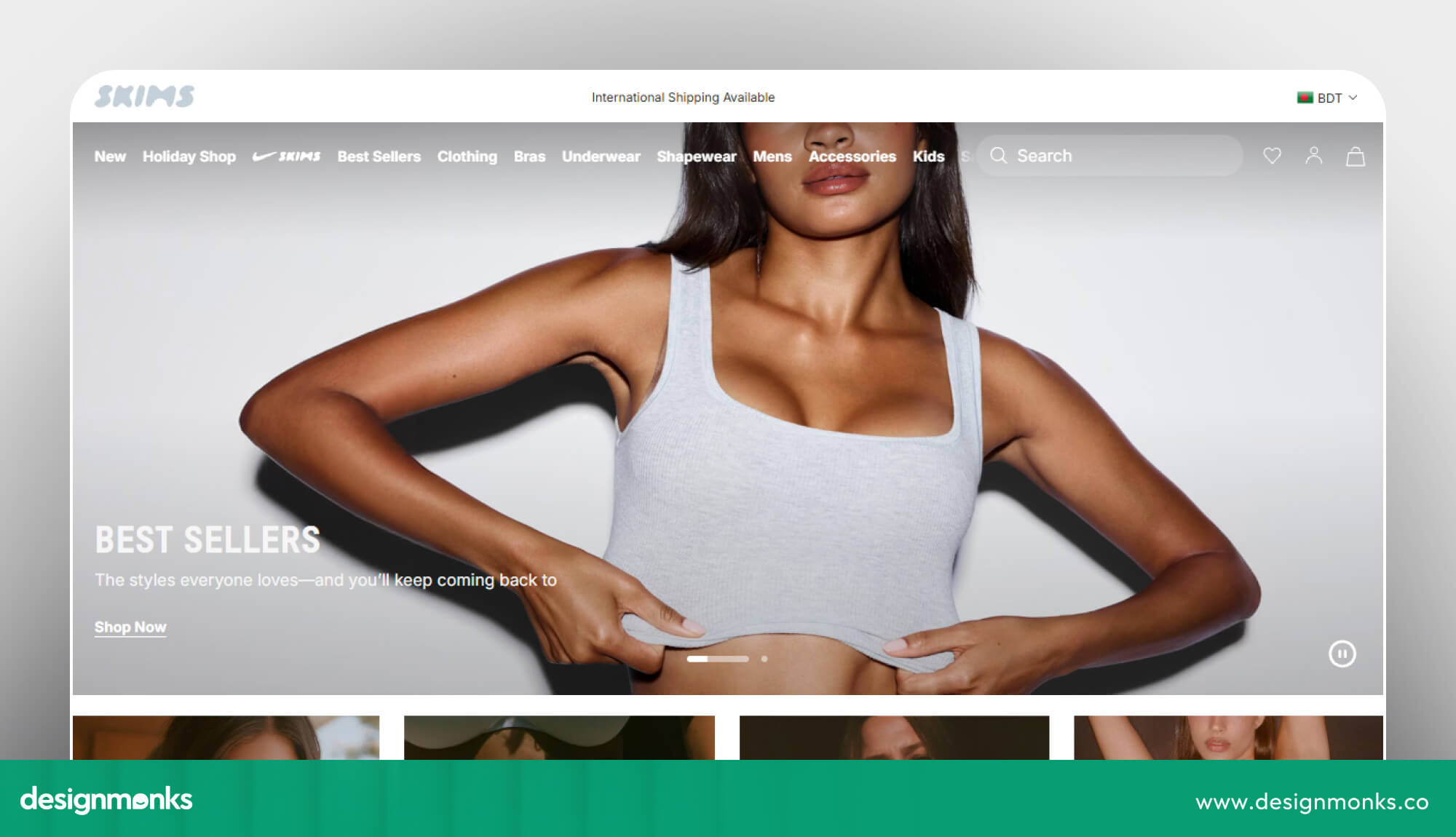
SKIMS takes a different approach with its tonal color palette. It uses shades from the same color family rather than relying on strong contrasts, and this creates a consistent and polished look.
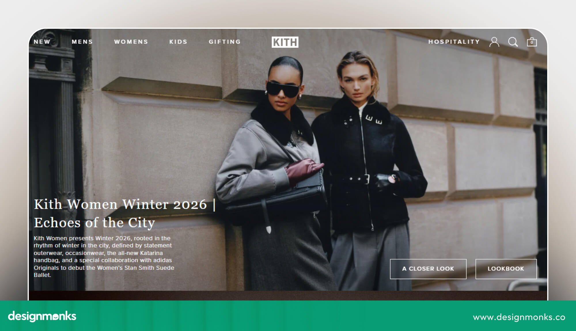
Kith offers another useful approach. Its website feels like a fashion magazine, with seasonal collections, lookbooks, and strong product imagery. This editorial style works particularly well for brands that release seasonal collections or limited-edition products.
Idea to steal: Build your store around a consistent color palette and style. It helps shoppers recognize your brand and gives different pages a more connected appearance.
Beauty and Skincare Examples
Beauty shoppers often want to understand what a product does, how to use it, and whether it suits their needs. A clean layout with clear product information can make those decisions easier.
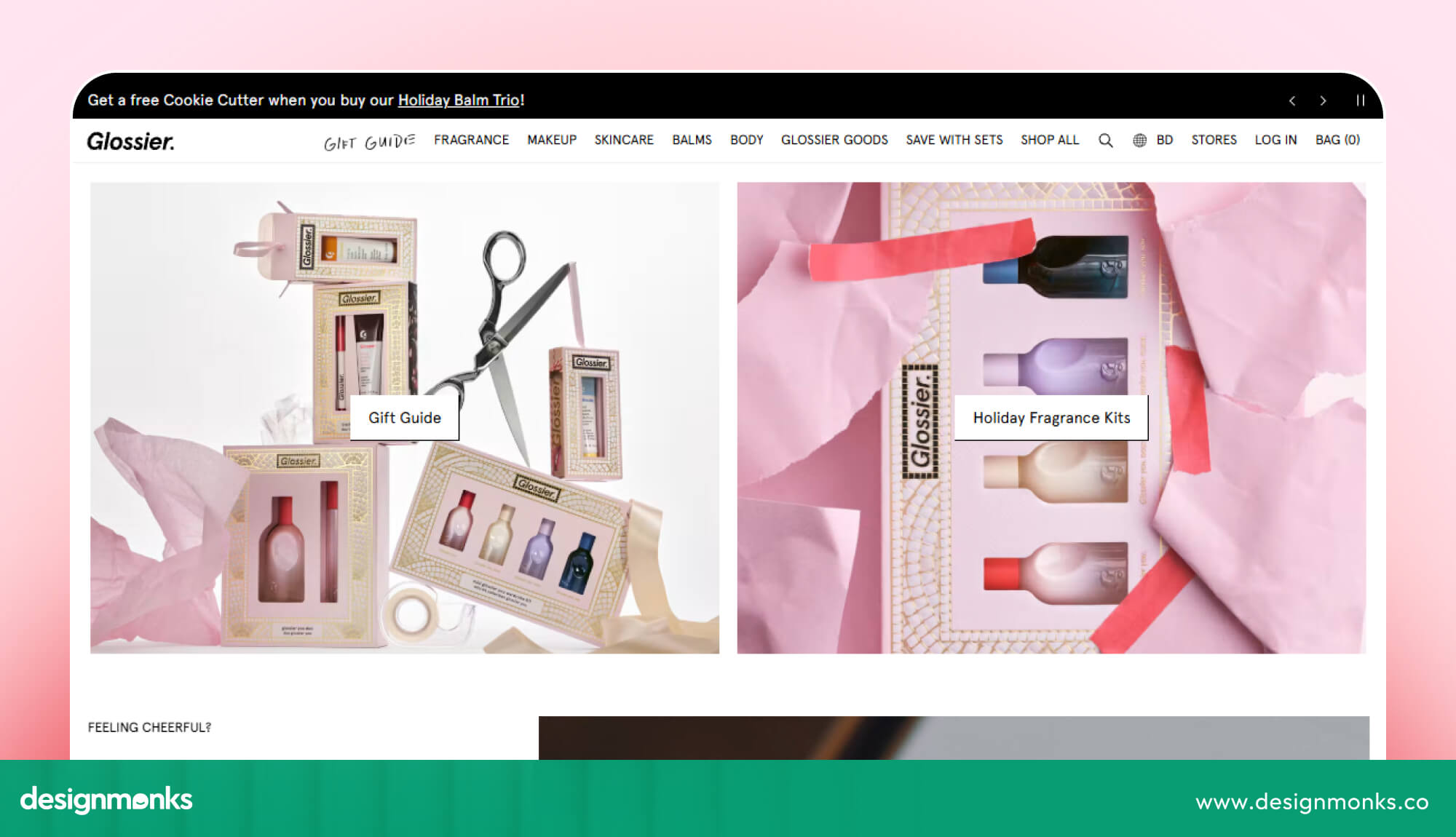
Glossier is a great example of matching website design with brand personality. Its soft pink palette, rounded shapes, and friendly typography create an approachable look that reflects its simple beauty products.
Idea to steal: Let your product and brand personality guide your design. Soft colors and simple layouts can create a calm experience, while bolder products may call for stronger visuals.
Food and Beverage Examples
Food and beverage stores need to make products look appealing while helping shoppers understand their options. Strong packaging visuals, clear product descriptions, and easy-to-find purchase options can make browsing more enjoyable.
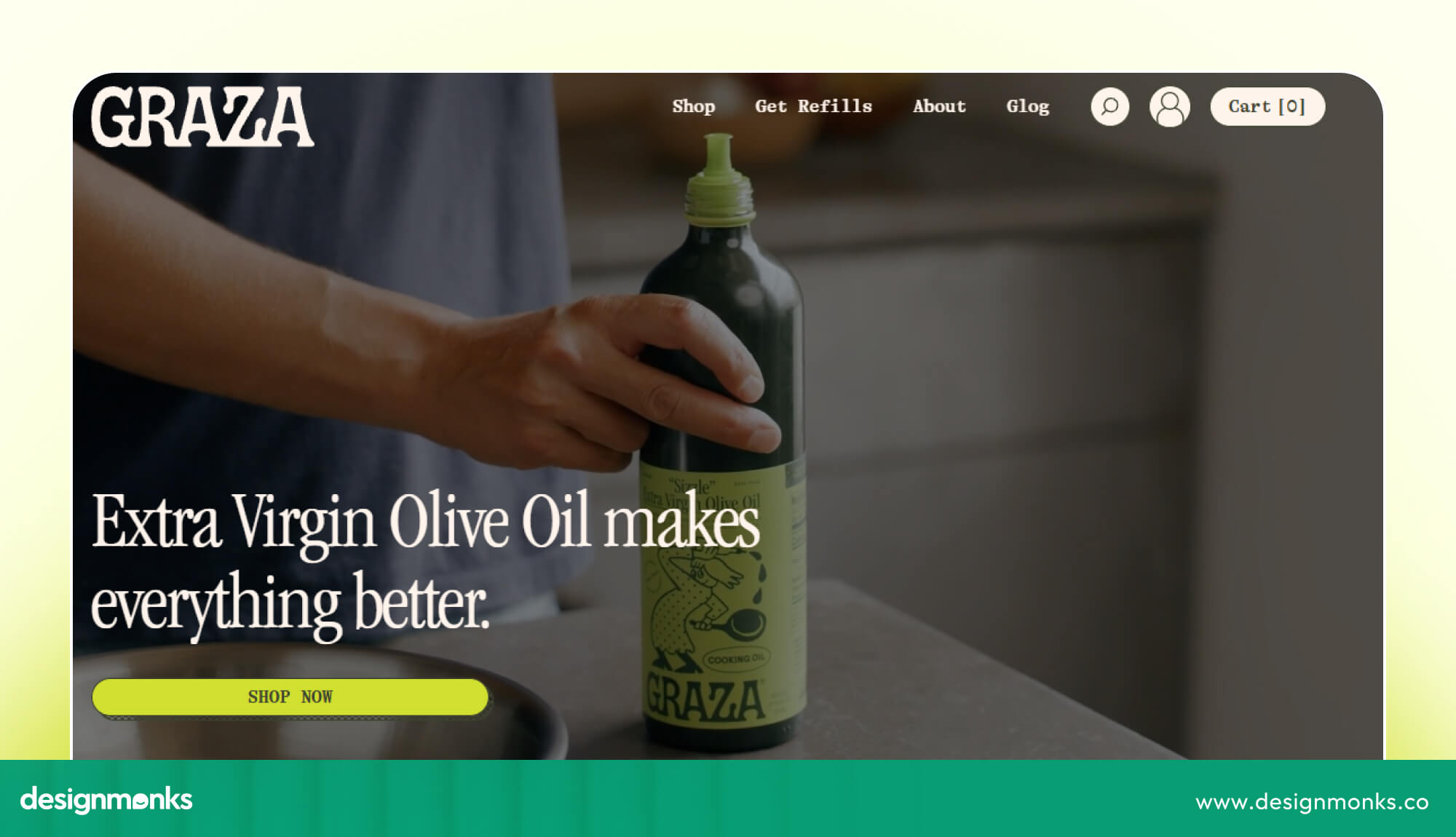
Graza stands out for its consistent visual identity. In the same 10-store review, it received the highest design score at 4.8/5. Its recognizable packaging, bold colors, and repeated visual style give the website a distinctive personality.
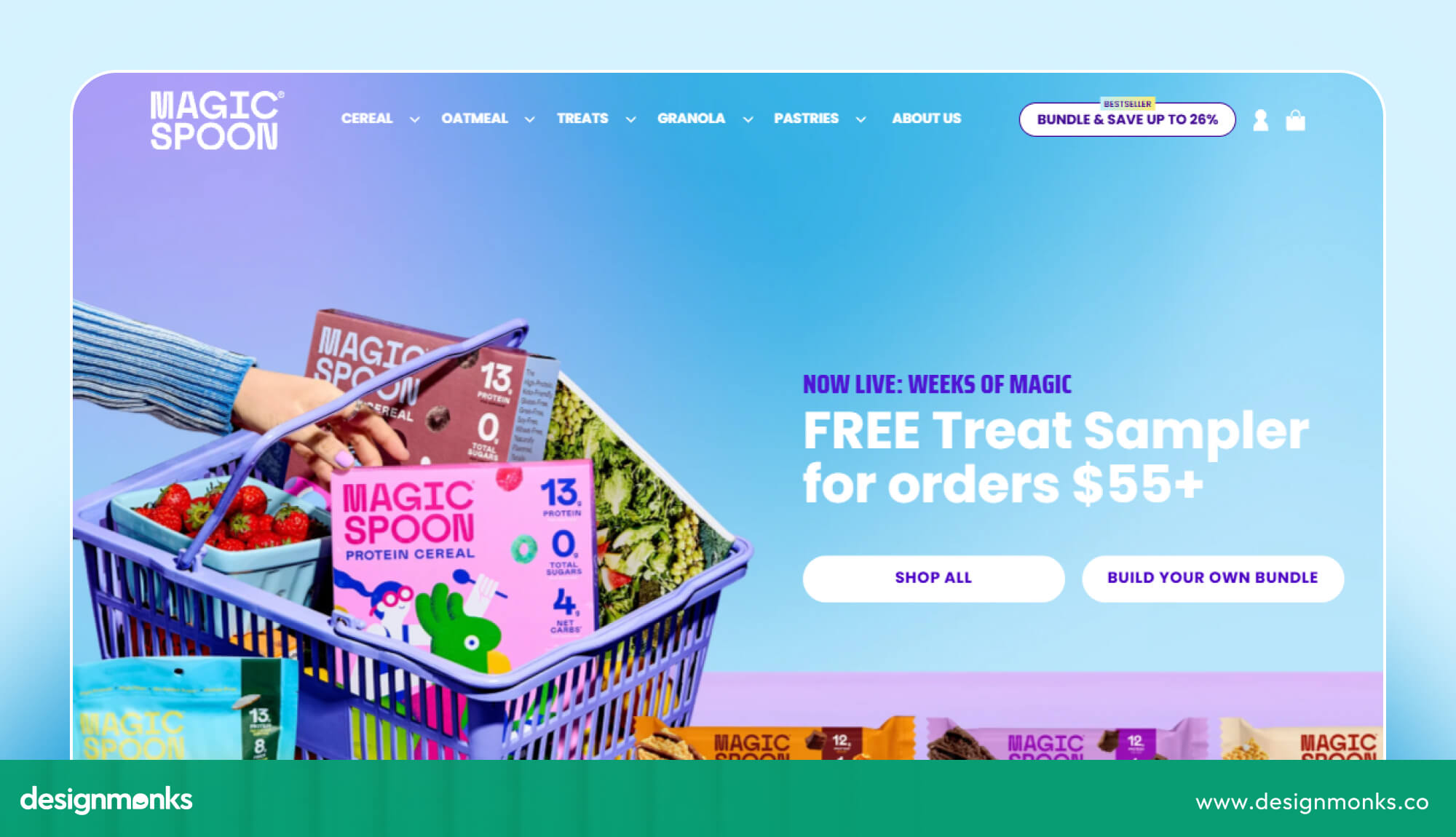
Magic Spoon takes a more playful approach. Shopify highlights its bright colors, fun graphics, and interactive "build your own box" experience. The brand has also identified this page as its highest-converting page.
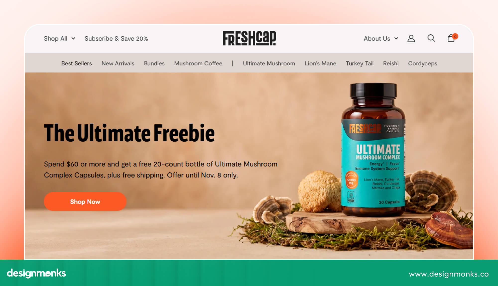
FreshCap is another example of practical ecommerce design. It uses Shopify's Impact theme, which includes quick-buy buttons on collection pages and sticky Add to Cart buttons on longer product pages.
Idea to steal: Repeat your brand colors, typography, and visual elements across the website. Consistency makes your store easier to recognize and remember. Give shoppers more control when your products naturally go together and keep important shopping actions within easy reach
Home, Wellness, and Lifestyle Examples
Home and lifestyle stores often benefit from warm colors, spacious layouts, and lifestyle photography. These elements help shoppers imagine how products might look or feel in their own spaces.
For a zero-waste retailer, natural colors and clear product information can also reinforce its sustainability message.
Idea to steal: Use colors, imagery, and product descriptions that communicate what your brand stands for. This helps shoppers understand not just what you sell, but why your products may be right for them.
You can apply these ideas to other industries, too, including jewelry, electronics, and B2B ecommerce. The key is to choose a design that reflects your products, speaks to your target audience, and makes shopping straightforward.
Shopify Homepage Design Ideas That Make Shopping Easier
You have only a few moments to turn a curious visitor into an interested shopper. Your Shopify homepage needs to grab attention, communicate your brand, and make exploring products feel effortless.
A well-planned layout can guide visitors from their first impression to the products they want to explore. Here are a few homepage design elements that can make that journey smoother:
Create an Eye-Catching Hero Section
Start with a strong headline, a clear call to action, and a product-focused image or video. Show visitors what your store offers without filling the screen with too much text. Make the main shopping button easy to spot.
Keep Navigation Clear and Simple
Help shoppers find their preferred products without digging through multiple pages. A sticky header, visible search bar, category links, and mega menu can make browsing easier, especially for stores with large product collections.
Allbirds uses a split hero section with separate shopping buttons for men's and women's collections. Below it, category tiles highlight new arrivals, popular products, and bestsellers.
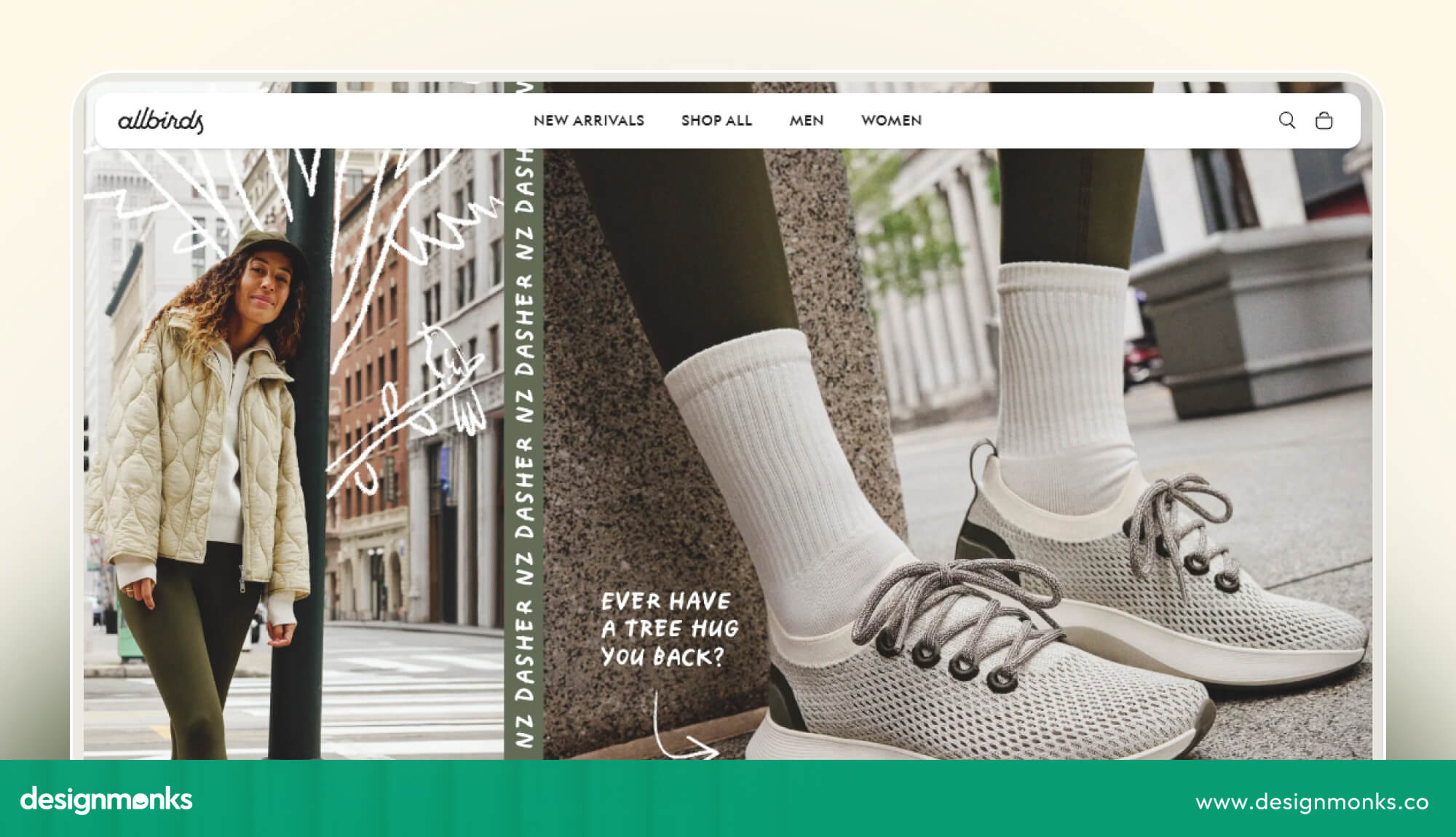
This approach helps visitors choose the right shopping path without browsing through unrelated products. It reduces the effort shoppers need to find relevant products and makes the homepage easier to navigate.
Choose a Homepage Layout That Fits Your Store
Different stores need different homepage structures:
- Single-product stores: Highlight product benefits, reviews, and a clear purchase button.
- Large catalogs: Feature search, popular categories, and bestsellers.
- Subscription stores: Explain how subscriptions work and highlight flexible options.
Add Sections That Help Shoppers Choose
Use your homepage to answer common buying questions and build confidence. Feature bestsellers, customer reviews, a short brand story, and relevant product recommendations. Keep each section focused, with clear headings and enough space to make browsing comfortable.
A well-organized homepage gives shoppers a clear path from discovering your brand to finding something they want to buy.
Shopify Product Page Design Ideas That Encourage Purchases
Your product page is where browsing turns into buying. The right combination of product visuals, useful details, and well-placed shopping features can make your products more appealing and help customers feel ready to purchase.
Here are some Shopify product page design ideas that can make that happen:
- High-quality photos and videos: Show products from different angles and in real-life settings, so shoppers know what to expect.
- Visible customer reviews: Display ratings and feedback near product details to help visitors make informed decisions.
- Sticky Add to Cart button: Keep the purchase option accessible while shoppers explore the page.
- Clear product information: Explain sizes, materials, features, shipping, and return policies.
- Helpful size guides: Give clothing and footwear shoppers a better idea of what will fit.
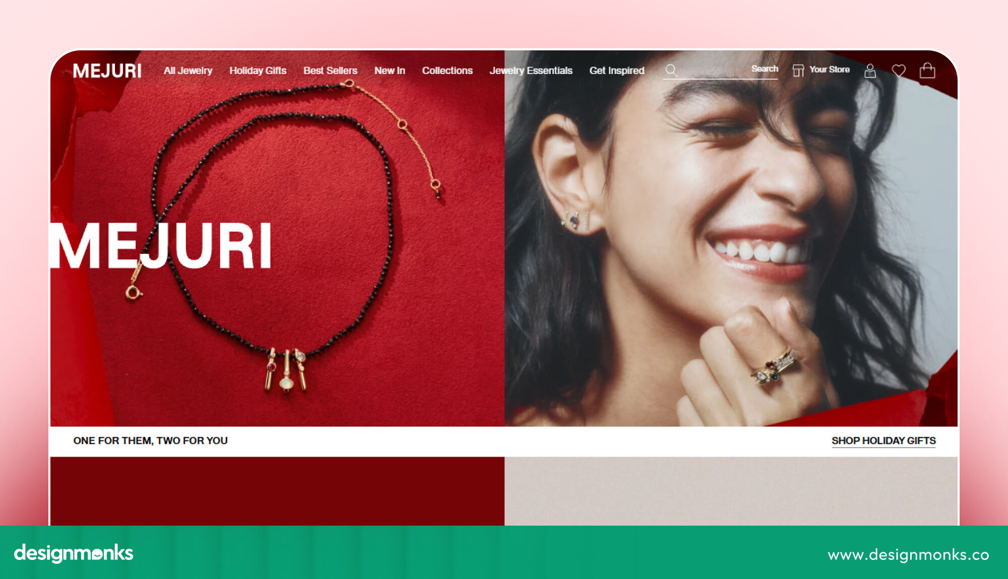
Mejuri is a good example of product presentation. Its close-up jewelry photography helps shoppers see fine details that might otherwise be difficult to notice on a screen.
Mobile-First Shopify Design Ideas
A store that looks great on desktop can become frustrating on a smaller screen. Since many shoppers browse and buy through their phones, you need to make mobile usability a priority. You can start with these essentials:
- Easy-to-tap buttons: Make important actions comfortable to tap.
- Readable text: Avoid tiny fonts and crowded layouts.
- Fast loading: Compress images and limit heavy animations.
- Simple navigation: Keep mobile menus clear and easy to explore.
- Smooth checkout: Minimize unnecessary steps and form fields.
Test your homepage, product pages, and checkout on an actual phone. A few small adjustments can make shopping much easier.
Shopify Website Design Trends for 2026
Shopify design trends keep changing, but some ideas are worth trying in your store. Here are a few to watch:
- Large product images: Use clear, attractive photos and simple headlines to grab attention.
- Product videos: Add short clips to show how your products look, work, or feel.
- Matching colors: Use shades from the same color family to create a clean, consistent look.
- Premium-looking designs: Choose simple layouts, elegant fonts, and matching colors to give your store a polished feel.
- Sustainability messaging: Highlight eco-friendly products, packaging, and materials to show what your brand cares about.
- AI personalization: Use features like recently viewed products to help shoppers find items they liked before.
You don't need to follow every trend. Choose the ones that match your brand and make shopping easier for your customers.
How to Choose a Shopify Theme
Your Shopify theme shapes how your store looks and works. The right choice should match your brand, support your products, and make shopping easy for customers. Here are four options to consider:
- Free themes: A good starting point for new stores with a limited budget.
- Premium themes: Offer more layouts, design options, and built-in features.
- Page builder apps: Let you create custom pages without writing code.
- Custom themes: Give established brands more control over their store's design and features. Magic Spoon, for example, uses a custom storefront design.
Start with a simple, clean theme. Good product photos and clear content matter more than fancy layouts. You can always upgrade as your store grows. Before choosing, check that your theme:
- Loads quickly.
- Works well on mobile devices.
- Supports the apps and features your store needs.
Common Shopify Design Mistakes to Avoid
Even an attractive Shopify store can lose shoppers if its design makes browsing difficult. You need to watch out for these common mistakes:
- Cluttered homepage: Too many messages compete for attention.
- Slow loading: Large, unoptimized images make pages take longer to load.
- Hidden trust signals: Reviews and return policies are difficult to find.
- Poor mobile design: Small text and buttons make shopping frustrating.
- Copying other brands: Their design may not suit your products or audience.
- Too many pop-ups: Frequent interruptions make browsing less enjoyable.
Remember, a beautiful store should also be easy to use. Keep your design clear, useful, and focused on helping customers shop.
How to Apply These Ideas to Your Store
Finding inspiration is easy. The real challenge is turning those ideas into a store that fits your brand and makes shopping easier. You don't have to change everything at once. Start with these simple steps:
- Study similar stores: Pick two or three Shopify websites in your industry and note what works well.
- Choose your design style: Decide whether your brand needs a clean, minimal look or something bold and playful.
- Improve one page at a time: Start with your homepage, then move to product pages and navigation.
- Check the mobile experience: Make sure images, text, buttons, and menus work well on smaller screens.
- Test and refine: Use customer feedback and website analytics to see what needs improvement.
If you need help bringing these ideas together, Design Monks' Shopify design services can help you create a storefront that matches your brand and supports your customers' shopping journey.
From homepage layouts to product pages and mobile experiences, a well-planned design can make your store easier to explore and use.
FAQs
Which Shopify theme should I start with?
Start with a clean free theme. Look for fast loading, strong mobile layouts, and support for the apps you need. You can upgrade later as your store grows.
Can a free theme look professional?
Yes, a free theme can look professional. Strong photography, a clear palette, consistent fonts, and good copy matter more than the price of the theme.
How many colors and fonts should I use?
You should use one main color palette and no more than two fonts. Consistency matters more than the exact colors you choose.
Should I design for mobile first?
For many stores, yes, especially if mobile is your main traffic source. Design the small-screen experience first, then refine the desktop layout.
Final Thoughts
The best Shopify website design ideas are not always the flashiest. They are clear, consistent, mobile-friendly, and easy to buy from.
Pick a style that fits your brand, use strong product photography, make mobile excellent, and improve one page at a time. Start with your homepage today. Small improvements there can make a meaningful difference.